[updated April 2016]
Is car occupancy trending down as car ownership goes up? What factors influence car occupancy? What is the impact of parents driving kids to school?
Following a suggestion in the comments on my last post about car ownership, this post takes a detailed look at car/vehicle occupancy.
What are the trends in car occupancy?
This first chart shows average vehicle occupancy from a number of different measures that are more recently updated:
- Australian passenger vehicles – measured as the ratio of person-kms in passenger vehicles, to total passenger vehicle kms (both estimates, and unfortunately this can only be calculated for all of Australia, using BITRE data).
- Sydney weekday vehicle occupancy, both per trip and per km, from the Sydney Household Travel Survey (SHHTS). These figures include all private vehicles (not just cars).
- Melbourne weekday vehicle occupancy per km, from the Victoria Integrated Survey of Travel and Activity (2012/13 data wasn’t available at the unlinked trip level at the time of updating this post). Again, these figures include all private vehicles (not just cars).
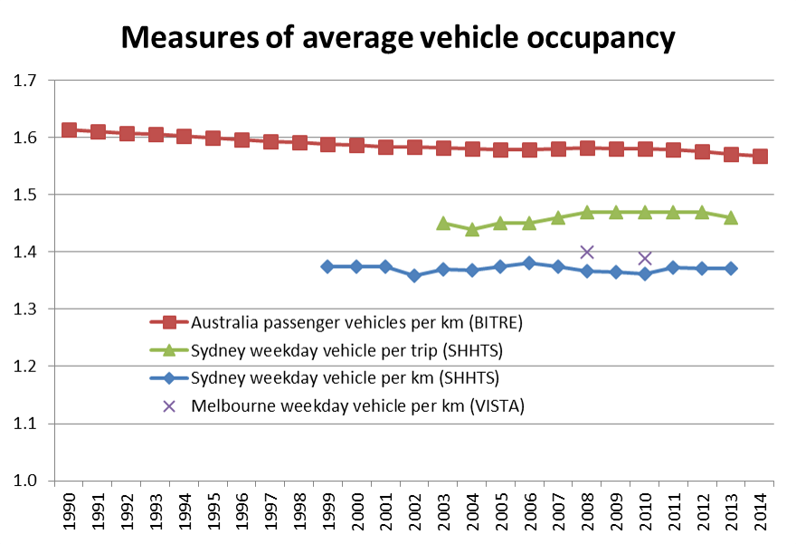
The BITRE figures show a fairly smooth and slow downwards trend from 1.62 in 1990 to 1.57 in 2014. The Sydney figures are a little more noisy, but surprisingly quite flat around 1.37 (on a distance measure), and increasing on a trip basis (suggesting occupancy is rising on shorter trips and/or declining on longer trips). Only the BITRE figures are confined to passenger vehicles, which probably explains the differences between the series (the SHHTS and VISTA data will include private vehicles such as motorbikes, trucks and light commuter vehicles).
The census journey to work question gathers data on how people travelled to work, including car drivers and car passengers. While not a clean measure, it is possible to calculate an implied car occupancy as (car drivers + car passengers) / (car drivers). For the purposes of this calculation, I have only taken “car driver only” and “car passenger only” trips (which excludes park-and-ride and kiss-and-ride public transport trips). I do not have data on trip lengths, and average car passenger trips might be different on average to car driver trips.

There’s a pretty clear downwards trend as relatively fewer people travel to work as car passengers. In fact, the data suggests extremely low levels of car pooling, and that over 90% of car journeys to work have no passengers in most cities. But keep in mind that car-only mode share of journeys to work peaked in 1996, so the net change is proportionally less people travelling as car passengers and proportionally more people travelling on non-car modes.
So in summary, there is some evidence of very gradual declines in car occupancy for all travel purposes, and strong evidence of a decline in vehicle occupancy on the journey to work.
Trends in car occupancy by time of day
Many state road agencies make direct and regular measurements of vehicle occupancy in capital cities and their data is collated by AustRoads.
Unfortunately only four cities report such data to AustRoads. Brisbane data has several missing years – and the three most recent years’ figures reported are all identical, so I’m inclined not to plot them. That leaves Melbourne, Sydney and Adelaide. Unfortunately the AustRoads website hosting these statistics appears to no longer work, but VicRoads separately publish Melbourne data (but much less for more recent years). What follows is all the data I have been able to collect.
Firstly, all day (weekday) average occupancy:

There doesn’t appear to be much in the way of clear trends as the data seems quite noisy (I’m not sure anyone could explain the year by year variations). Perhaps Melbourne average all day occupancy was trending down.
Data is available for three sub-periods:

Again lots of noise, and no clear trends.

Noisy again. It’s looks like Melbourne is no longer trending down.

This data is remarkably flat for Sydney, while Melbourne appears to still be trending down.
It’s little surprise that AM peak has the lowest occupancy, as it is dominated by journeys to work. More on that soon.
Notes on the AustRoads/VicRoads data:
Along with the noise in the data, there is some ambiguity in the methodology. The AustRoads website reports “car” occupancy, but the methodology doesn’t seem to filter for cars. Are buses included or not? It says the survey should be undertaken in March/April to avoid school and public holidays. But March and April have heaps of holidays (Easter, Anzac Day, and Labour Day in many states).
But the AustRoads data is certainly collected on representative arterial roads, where you might expect lower occupancy because of longer trips that are more likely to be work-related.
What’s the relationship between car ownership and car occupancy?
You might expect car occupancy to go down as car ownership goes up. In other words: we have more cars and need to share them less.
Here’s what the relationship looks like for Australia as a whole (using car occupancy derived from BITRE data):

There are five quite different periods:
- From 1993 to 1999 (bottom right) car occupancy declined as car ownership increased. As you might expect.
- From 1999 to 2001 car ownership stalled, but car occupancy continued to decline.
- From 2001 to 2005 car ownership rose again, but car occupancy declined more slowly.
- From 2005 to 2010 car occupancy increased slightly, while car ownership had slow growth. This is the period when public transport mode shift took hold in most Australian cities.
- From 2010 to 2014 car occupancy dropped more quickly, while car ownership had slow growth. In this period there was much less mode shift to public transport in most Australian cities.
The relationship is changing, probably influenced by other factors. BUT it could also be that I’m reading too much into the precision of the car occupancy figures – we are talking about variations in the fourth significant figure only for the last few years. The BITRE figures are estimates themselves. Maybe someone from BITRE would care to comment on the precision?
What about different road types?
Looking at Melbourne data in more detail, car occupancy appears to have declined most on freeways and divided arterials:

On freeways, the decline is most evident during business hours:

Here is a chart comparing car occupancy figures for arterial roads in Melbourne (2009/10):

You can see car occupancy lowest on freeways, and highest on undivided arterials with trams (all in the inner suburbs). Otherwise very little difference (in 2009/10 at least).
How do Australian cities compare?
To try to take out some of the noise, I’ll take the average of the last four years for the AustRoads data and Sydney and Melbourne household travel survey data:

Melbourne appears to have the lowest occupancy, and Sydney the highest – except when it comes to household travel survey data where Melbourne is much higher. But this might just be differences in methodologies between states.
Factors influencing car/vehicle occupancy (in Melbourne)
Having access to the 2007-08 VISTA data, it’s possible to disaggregate vehicle occupancy on almost any dimension you can imagine. I’ll try to restrict myself to the more interesting dimensions!
For most charts I have used vehicle occupancy rather than car occupancy. Cars and 4WD/SUVs combined accounted for 88% of vehicle kms in the dataset so there shouldn’t be a lot of difference. But I’ll start with looking at..
Vehicle type

Now that’s a surprise: 4WD/SUVs have a much higher average occupancy than cars. Why is that?
Are they used for different purposes?

Not a great deal of difference between cars and 4WD/SUVs, although 4WD/SUVs are slightly more commonly used to pick up or drop off someone.
More likely explanations (from the data) are:
- 4WD/SUV come from larger households on average (3.5 people v 3.1 for cars).
- 4WD/SUVs are also more likely than cars to belong to households that are couples with kids.
Day of the week

Probably not a huge surprise that cars have less occupants on weekdays than weekends. Male drivers are much more likely to have no passengers on weekdays, but an average of one passenger on weekends. Whereas there is much less variation for females.
Is this traditional gender roles in the family? (There is a chart to answer almost any question you know..)

There you go: dads much more likely to drive the family around on weekends, and mums more likely to drive them around on weekdays. And while on the subject…
Household types and sizes

Little surprise that car occupancy increases with household size. It is easier to car pool when you have the same origin.
Note that the sample size of one parent households of size 5 are small (especially for male drivers). But curiously single mothers have much higher occupancies than single fathers.
There is also a small sample of other household structures with 5 people.
Unsurprisingly, people living alone are likely to have the lowest car occupancies. With increasingly prevalence of sole person households, you might expect continuing declines in average car occupancy.
Trip purpose

Again work trips are the least likely to involve passengers, particularly on weekdays (average occupancy 1.07). Driven trips to education are not far behind. Little surprise that accompanying someone, or picking up or dropping off someone averages around 2 or more. Occupancies for personal business, shopping, recreational and social trips are in the middle, but much higher on weekends when householders are probably more likely to travel together to common destinations.
Many people would argue that demand for public transport is lower on the weekend. These figures would support that argument, but lower weekend patronage would also reflect lower service levels.
Note: the sample sizes of weekend education and accompanying someone trips were too small to be meaningful so I left them off.
Time of day

There you go, car occupancy peaks between 8 and 9am and between 3 and 4 pm on school days: parents driving kids to/from school.
But vehicle occupancy is highest on Saturday nights when people are socialising, and interestingly Sundays are well above Saturdays (less personal business on Sundays perhaps?). Non-school weekdays have higher occupancies than school weekdays, possibly with parents also taking time off work and spending time with kids.
Just looking at the school peak more closely, here is a chart showing car driver trip purposes by hour of the day on school weekdays. You’ll almost certainly have to click on this one to read the detail.

The most frightening statistics are in the school peaks. A staggering 40% of car trips between 8 and 9am, and 42% of car trips between 3 and 4pm are to pick up or drop off someone (suggesting a fault in the reported vehicle occupancy for trips picking up somebody). This will almost certainly be dominated by school children. No wonder traffic congestion eases so much in school holidays.
That said, car trips to/from school are shorter than other trip types (as we saw in an earlier post). The data suggests 19% of car kilometres of trips starting between 8-9am are to pick-up/drop-off someone, and for 3-4pm the figure is 24%. That’s still a sizeable chunk of total road traffic. It suggests there are huge congestion relief benefits to be had in getting kids to walk, ride or use public transport to/from school.
Geography

There’s not a lot of difference other than for the inner city, where school day occupancies are lower. For someone in the inner city to drive a car, they are probably heading out of the city and any other members of their household might be less likely to have the same destination and/or would have good public transport options for their travel.
The non-school weekday figures show some variation, and while the sample sizes are all over 250, there are some vehicles with an occupancy of 14 recorded. unfortunately because the underlying data is discrete, medians aren’t an easy way around this issue.
Age

This would suggest traditional gender roles are in play: Average car occupancy is highest for drivers aged 30-45, the most common age groups for parents of pre-driving aged children. And women seem to be doing more ferrying of the kids than men. In the older age groups men are more likely to be driving with passengers.
Income

Vehicle occupancy seems to go down as we have higher incomes (moreso for females), but there seems to be some noise in the data (eg the spike at 3000 is due to one vehicle with 12 occupants). Females with lower household incomes have higher vehicle occupancies (maybe those without an income but looking after a family).
This trend reflects the fact that car/vehicle ownership goes up as wealth goes up:

The threshold for car ownership is around $1250 per week (equivalised to a single occupant household). As Australians have become increasingly wealthy in real terms, we can afford to own more cars.
Trip distance

While there is probably a little noise in this data, there is a fairly clear pattern. Very short trips and very long trips are likely to have higher occupancies. The median trip distance for non-work trips is around 4kms, while work trips are much longer, which fits with the average occupancies for different trip purposes.
In fact, here is a mode share breakdown by trip distance (for trip legs):

You can see car passenger becomes more common for very long trips (note the X axis scale is not uniform). (Don’t ask me why driving is so popular for distances of 16-16.9 kms! It’s probably a bit of noise)
And if you look at the trip purposes of these very long trips, you’ll longer trips are more likely to be social or personal business:

(note: this chart is by trips, and not trip legs)
Main Activity

Probably little surprise that those “keeping house” have the highest occupancy in general, but that full-time workers have very low occupancy on weekdays, but very high occupancy on weekends.
There you go, possibly more than you ever wanted or needed to know about vehicle occupancy!


 Posted by chrisloader