[Updated in June 2015 with 2013 inventory data. First published May 2012. For some more recent data see this post published in December 2019]
Are greenhouse gas emissions from transport still on the rise in Australia? Are vehicle fuel efficiency improvements making a difference?
This post takes a look at available emissions data.
Australian Transport Emissions
The Department of Environment’s National Greenhouse Gas Inventory reports Australia’s emissions in great detail, and 1990 to 2013 data was available at the time of updating this post (there is usually more than a year’s lag before this data is released).
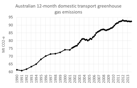
More recent but less detailed data is available in quarterly reports and here’s what the rolling 12 month trend looks like up to September 2014:
Emissions have grown by 50% since 1990, although a peak was experienced in the 12 months to December 2012 with a slight decline since then.
Transport was responsible for 17.2% of total Australian emissions in the year to September 2014 (excluding land use), an increase from around 15% in 2002.
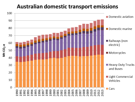
Here’s the make up of those emissions to 2013:
Road transport contributed 84% of transport emissions in 2013 (down slightly from a peak of 89% in 2004). Cars accounted for 48% of Australia’s transport emissions in 2013, down from 57% in 1990.
Note that the above chart does not include electric rail emissions (see below), indirect emissions, or emissions from international shipping and aviation. Estimates for these are included in the following chart lifted from an 2008 ATRF paper by BITRE’s David Cosgrove. It shows this components add a lot on top (and the future projections are frightfully unsustainable). International transport emissions seem to sneak under the radar in the published figures.
Per capita transport emissions
The following chart shows Australian transport emissions per capita have been fairly flat at around 4 tonnes per person since around 2004:
To put that in context, 4 tonnes per capita is just above Romania or Mexico’s total greenhouse gas emissions per capita (from all sectors, not just transport).
An aside on electric rail emissions
Electric rail emissions are included under stationary energy, rather than “transport” in the main inventory. Melbourne train and tram electricity emissions have been estimated at 505 Gg for 2007 (ref page 8). Apelbaum 2006 estimated that Australia electric rail emissions in 2004/05 were 2,082 Gg (ref page 68), which is very similar to the inventory figures. I’ve struggled to find any other figures on electric rail emissions in the public domain.
Sectoral growth trends
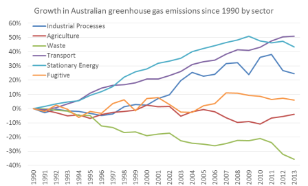
Transport is now Australia’s second largest emissions sector (after stationary energy), and transport has had the highest rate of emissions growth since 1990:
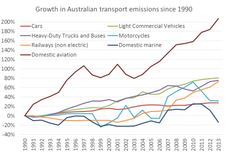
Within the transport sector, civil aviation has had by far the strongest growth since 1990 (but note this comes off a low 1990 base as airlines were recovering from the 1989 pilot’s strike). There’s been a lot of growth in light commercial vehicles, trucks and buses, and in more recent times, railways. Emissions from cars are continuing to grow, while domestic marine and motorcycle emissions have fallen (there appears to be a lot of fluctuation in the motorcycle estimates so I’m not sure I’d read too much into the movements).
Road transport emissions by state
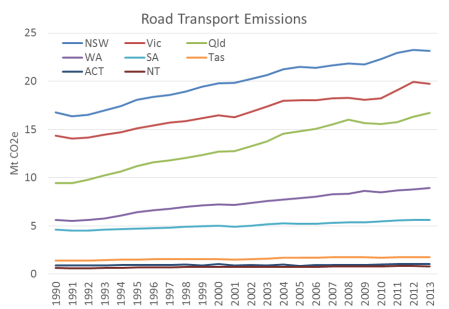
The national inventory data allows us to see what is happening at a state level. Here is a chart of road emissions by state:
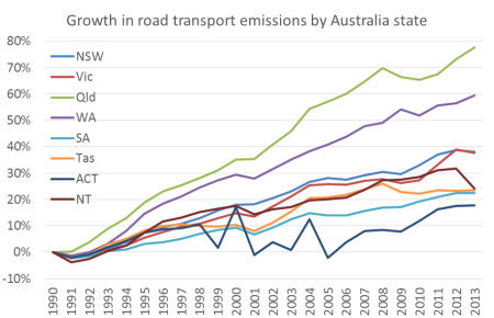
The quantities largely reflect the sizes of each state, but here are the growth trends since 1990:
Queensland and WA have grown the fastest by far, followed by New South Wales and Victoria.
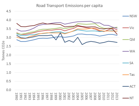
The following charts remove the impact of population growth on trends by showing emissions per capita figures for each state. Some states appear to be declining while others appear relatively static.
Car emissions reductions – mode shift or fuel efficiency?
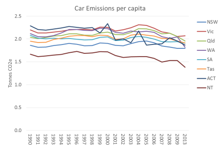
The following chart shows car emissions per capita (which essentially removes freight from the road transport figures).
Again, all states show a decline in recent years.
So is the drop in road transport emissions related to behaviour change and/or fuel/emissions efficiency?
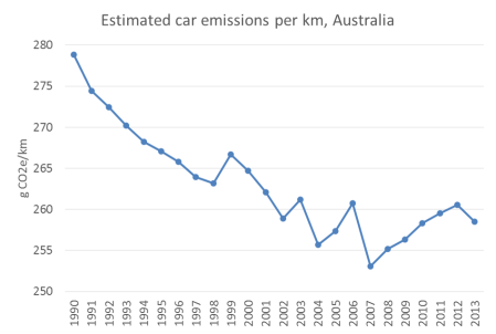
The following chart shows that the average emissions per km of Australia cars was trending downwards until around 2007 but has since increased (I’ve used BITRE 2014 Yearbook data on car kms travelled hence a little noise):
Since 2007, car emissions per capita have been declining, but car emissions per kilometre have not – suggesting the reduction in emissions would be primarily due to changes in travel behaviour, not improvements in engine technology (or at least that improvements in engine technology are being cancelled out by us buying cars that are heavier and/or that have more energy intensive features).
What about transport emissions in cities?
As part of the Victorian Transport Plan, the Victorian Department of Transport commissioned the Nous Group to do a wedges exercise on Victorian transport emissions. This report included estimates of Melbourne’s 2007 transport emissions (12,270 Mt). In addition, Apelbaums’s Queensland Transport Facts 2006 was for a brief time on the internet and I was lucky enough to grab a copy. From that report, estimates of Brisbane’s 2003-04 transport emissions can be derived (7,312 Mt).
The breakdowns are remarkably similar:
What does this look like per capita? I’ve also added London and Auckland figures (though I am not aware of the make up of the Auckland data) to create the following chart:
Obviously these cities’ transport systems and energy sources are very different, but it shows what is possible even for a large city like London. Transport emissions will closely follow transport energy use per capita, which has been the focus of a lot of research, particularly by Prof Peter Newman (eg his Garnaut Review submission).
For 1995 measures of passenger transport emissions per capita for other cities, see this wikipedia chart created using UITP Millenium Cities Database for 1995. Note: these figures only include passenger transport and hence are different to the above.
Also, here is some data for US cities from the Brookings Institute, but it excludes industry and non-highway transportation so is not comparable to the above chart.
Where are transport emissions headed?
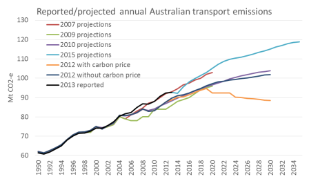
Numerous projections of Australia’s domestic transport emissions have been made over recent years, as summarised by the following chart:
We appear to be tracking fairly closely to the 2007 projections. The 2010 projections anticipated a reduction in emissions per kilometre travelled, which has not eventuated, as we saw above.
Note the 2015 projections do not include abatement measures – no prediction was made about the effect of abatement measures of which there are few in the transport space of which I am aware.
The only projection that included a decline in transport emissions was a 2012 scenario including a carbon price, which has since been abandoned by the Abbott Government.






 Posted by chrisloader