[first posted January 2010, last updated July 2013]
Each year, VicRoads publishes Traffic Systems Performance Monitoring bulletins that contain a wealth of data. However the bulletins don’t always show the longer term trends, so here are some charts to illuminate some of what is happening, particularly around congestion and total traffic volumes in Melbourne, and also a comparison of road traffic and public transport use growth.
Since the 2010-11 bulletin, VicRoads have changed the way they report various statistics. This post includes some charts of measures no longer reported, and in many cases the figures for 2010-11 and 2011-12 have been read off charts (as numbers were not published), so there is a little less precision.
Travel Speeds
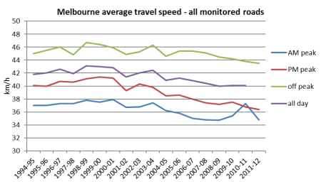
The first chart shows average travel speed around Melbourne by time of day.
The figures show a gradual slowing of speeds, although with some more erratic results in the AM peak in recent time (VicRoads haven’t offered an explanation, and I don’t have one either).
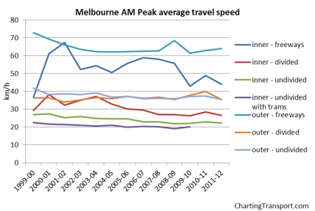
What about for different types of roads?
Speeds have been declining on some road types, particularly inner freeways and inner undivided roads. Upgrades to the M1 completed in late 2009 may have increased speeds in 2010-11, but this appears to have been largely eroded in 2011-12.
Curiously, freeways slowed down after CityLink opened in 2001. Inner roads have been trending downwards slightly while outer roads seem to be steady (though with a slight increase in 2009-10). Outer freeways showed an increase in speed in 2008-09, which is related to the opening of Eastlink, but this was more than eroded in 2009-10, possibly related to the Ring Road widening works.
How does Melbourne compare to other Australian cities? This data is from AustRoads (except the 2011-12 figure for Melbourne):
A gradual slowing trend is evident in most cities, except for speeding up in Melbourne and Brisbane up to 2010-11 (although Melbourne slowed down again in 2011-12). The Perth and Brisbane data seems to move around a lot more than the other cities. See the AustRoads website for qualifications on the data.
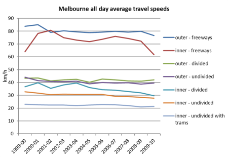
All-day average speeds by road type have not been reported for years after 2009-10, but here are the previous results:
Is speed a good thing? If you want to get to your destination sooner, then obviously it is. If you want to improve safety and the liveability of streets, it possibly isn’t. A lot of road safety initiatives (eg right turn signal controls) actually slow down traffic. The other consideration is whether you experience the same travel speed each day – which brings us to…
Travel time variability
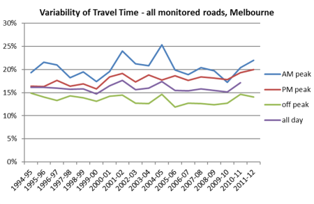
Another measure of congestion is travel time variability. If it sometimes takes 40 minutes to get to work, and you need to arrive at work on time, you have to leave yourself 40 minutes, even if on average it takes 30 minutes.
The recent trend has been towards increased variability after some improvements in 2009-10.
Traffic volumes
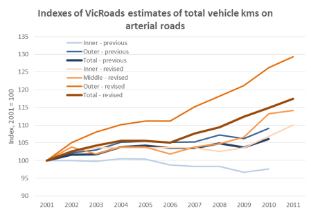
Since the 2010-11 Traffic Monitor report, VicRoads have completely revised their estimates for total arterial road traffic volumes and have divided Melbourne into three zones (inner, middle and outer) whereas previous results were for two zones (inner and outer). The new results show some quite different trends. I’ve read the data off the charts (not an exact process), to produce the following chart showing growth index figures (old figures in blue, revised figures in orange):
The previous estimates suggested traffic volumes stopped growing around 2004-05, whereas the revised estimates suggest an outer suburban growth spurt from around 2006, and a strong middle suburban growth spurt from around 2010. The 2011-12 bulletin did not include estimates for 2011-12.
This is what VicRoads says about the new method:
VicRoads has recently developed a new method for estimating road use in Melbourne. The new method uses all available vehicle counts to calculate VKT for all arterial roads and freeways in Melbourne. VKT values used in previous editions of the Traffic Monitor were derived from the monitored network only. The new method captures travel for the whole of Melbourne and allows estimates to be retrospectively made for previous years.
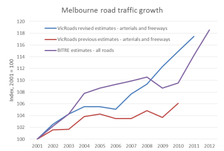
BITRE also estimate total Melbourne vehicle kilometres (using fuel sales data, so including all roads, not just arterials and freeways). The most recent data at the time of updating this post was Information Sheet 44. Here’s a comparison (again using index values):
The BITRE data suggests a slightly different trend, but a similar overall growth figure and recent stronger growth. Putting the two VKT estimates together suggests that around 75% of Melbourne vehicle kilometres are travelled on arterials and freeways.
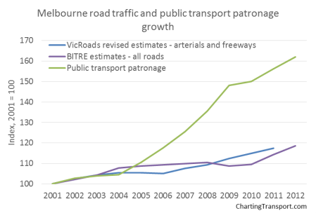
To add a little more context, here is a chart comparing road traffic and public transport patronage growth:
This chart really tells a story. Over eleven years to 2012, Melbourne public transport patronage has grown around three times more than road traffic.
Traffic growth on different road types
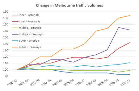
Here is a chart with 2010-11 data using the new road type classifications:
And here is the longer term trend using the older road types (up to 2009-10 only):
Traffic on freeways has risen substantially – not surprising given massive investment in freeway infrastructure over the last couple of decades. There has been a substantial growth in the last few years, reflecting the opening of Eastlink in 2008, the widening of the M1 in 2009, and diversion of some traffic off other outer roads (and you can see a decline in “outer – divided”). Otherwise, freeway traffic volumes seem to be growing while arterial roads are showing stagnant or declining traffic volumes.
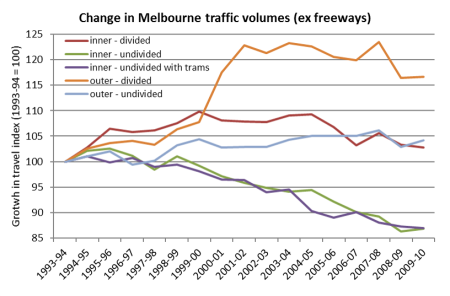
Take the freeways off the chart and you can see trends on other roads a bit more clearly:
Traffic volumes have trended downwards on undivided inner roads (including those with trams), and have largely stagnated on all other non-freeway roads in recent times. You can also see a significant drop on outer-divided roads in 2008-09 – possible some of it from Springvale and Stud Roads that parallel EastLink.
For more detail (including other charts), I suggest reading the Traffic Systems Performance Monitoring bulletins on the VicRoads website.



How do Australian/Victorian journey to work speeds compare with o/s?
LikeLike
[…] is entirely consistent with the trends of traffic volume’s on Melbourne’s roads, which show stagnation of inner metropolitan traffic volumes. Further evidence that mode shift to […]
LikeLike
[…] Figures have indicated that we are currently at a rate of 40% over-loading on trains in peak hours, and in the next five years this could jump to 44%. […]
LikeLike
Hi Chris, very nice and informative post! Do you know where I could find information on average commute time for Melbourne Metropolitan area?
LikeLike
Thanks for the feedback.
Probably the best source is VISTA data. Click that link to register for access if you don’t already have it.
See also Estimating time use in Melbourne.
LikeLike
That’s great Chris. I’ll take a look!
LikeLike