[updated December 2012 with more Canberra and Hobart data, and removing ‘method of travel not stated’ from all mode share calculations]
The ABS has just released census data for the 2011 journey to work (amongst other things). This post takes a city-level view of mode share trends.
Public transport
The following chart shows the public transport share for journeys to work for people within Statistical Divisions (up to 2006) and Greater Capital City Statistical Areas (for 2011) for each of the Australian major capital cities.

You can see 2011 increases in public transport more share in all cities except Adelaide, Hobart and Canberra. Melbourne grew by 2.2%, Perth by 2.1%, Sydney by 2.0%, Brisbane by 1.1% while Adelaide, Canberra and Hobart dropped by 0.1%.
But there are limitations of this data:
- Census data is usually available by place of enumeration (where you actually were on census night) and/or place of usual residence. In the above chart the following years are by place of enumeration: 1991, 2001, 2006, 2011. I am just not sure whether the other years are place of enumeration or place of usual residence (ABS were unfortunately not as rigorous with their labelling of data tables in the past). There may be small differences in the results for place of usual residence.
- The data available to me has been summarised in a “lossy” fashion when it comes to public transport mode share. It means that a journey involving tram or ferry and one or more non-PT modes is not counted as public transport in any of the results (it falls under “other two modes” or “other three modes” which includes PT and non PT journeys). For example, car + ferry or bicycle + tram. That means the true share of trips involving public transport will be slightly higher than the charts above, particularly for Melbourne and Sydney.
- The 2011 figures relate to Greater Capital City Statistical Areas. For Perth, Melbourne, Adelaide, Brisbane and Hobart these are larger than the statistical divisions used for 2006 and early data. This means people on the fringe are now included, and they are likely to have lower rates of public transport use. So the underlying trends are likely to be higher growth in public transport mode share.
The limitations in counting of tram and ferry trips can be overcome by measuring mode share by workplace location, although I can only get such data for 2001, 2006 and 2011:

These figures are all higher because they include people travelling to work in the metropolitan areas from outside (where PT might have a higher mode share via rail networks for example) and they count all journeys involving ferry and tram. Between 2006 and 2011, Melbourne grew the fastest – by 2.4%, Sydney and Perth were up 2.0%, Brisbane up 1.2% and very little change in Adelaide, Canberra and Hobart.
Cycling
The following chart shows cycling only journey to work mode share:

(Adelaide and Perth are both on 1.3% in 2011)
Canberra is the stand-out city, owing to a good network of off-road bicycle paths through the city. But Melbourne has shown the fastest increase, going from 1.o% in 2001 to 1.6% in 2011.
Adelaide, Perth, Brisbane and Melbourne had a significant drop between 1991 and 1996, but this did not occur in Hobart, Canberra or Sydney.
Canberra, Melbourne and Sydney have shown the most growth in recent times. Adelaide and Hobart unfortunately went backwards in 2011. I’m not sure why Adelaide dropped so much, maybe it was a product of weather on the two census days?
Here’s another view that includes journeys with bicycle and other modes (by work location, not home location):
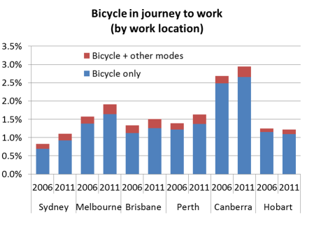
Perth and Canberra had the largest growth in journeys involving cycling and other modes.
Walking only

Walking only rose in all cities 2001 to 2006, but then fell in most cities between 2006 and 2011 (Perth and Brisbane the exceptions). Perhaps surprisingly, Hobart had a higher rates of walking to work than all other cities.
Car
The following chart shows the proportion of journeys to work made by car only (either as driver or passenger):

(both Adelaide and Hobart were on 82.7% in 2011)
You can see car mode share peaked in 1996 in all cities except Canberra where it peaked in 2001, and Hobart where the 2011 result was just under the 1996 result.
Hobart, Adelaide and Canberra had small rises in 2011 (1.0%, 0.4% and 0.1% respectively) while Perth had the biggest drop in car mode share (down 2.6%), followed by Melbourne (down 2.0%), Sydney (down 1.8%) and Brisbane (down 0.9%).
Vehicle passenger
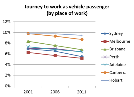
Travel as a vehicle passenger has declined in all cities, suggesting we are doing a lot less car pooling and commuter vehicle occupancy is continuing to decline in line with increasing car ownership. Curiously Hobart and Canberra topped the cities for vehicle passenger mode share.
Overall mode split
Because of the issue of under-counting of tram and ferry data for place of enumeration, I’ve constructed the following chart using place of work and a “main mode” summary:
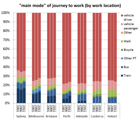
I assigned a ‘main mode’ based on a hierarchy as follows:
- Any journey involving train is counted with the main mode as train
- Any other journey involving bus is counted with the main mode as bus
- Any other journey involving tram and/or ferry is counted as “PT Other”
- Any other journey involving car as driver, truck or motorbike/scooter is counted as “vehicle driver”
- Any other journey involving car as passenger or taxi is counted as “vehicle passenger
In future posts I plan to look at the change in spatial distribution of journey to work mode share (by home and work location).
I’d like to acknowledge Dr John Stone for assistance with historical journey to work data.


This analysis is terrific, but where is the data for Hobart?
LikeLike
tassiedi, sorry about the delay. I haven’t had much time to devote to blogging recently. I trust you will find the Hobart results quite interesting.
LikeLike
are you going to look at travel distances for bicycles. It would be interesting to see if there is an increase in the number riding the longer distances. See if the increase in cycling is more due to short hops to work or from further afield which is where the congestion element comes in.
LikeLike
Hi Norman,
Unfortunately I’m not aware of census journey to work distance data being readily available. It would be technically possible to calculate the distance from home SA1 to the centre of the work SA2 for every home/work pair but that would be very approximate (SA2s are large).
Chris
LikeLike
Great report – is it possible to see the original census questions to understand what exactly is being represented – also for previous census’ to see if there was a change in question format?
LikeLike
Hobart having the highest walking rate is not a surprise because it is the smallest by a long way (a greater proportion of the distances to work are thus walkable), and it is relatively old structurally (walkable griddish streets not tangled messes).
LikeLike
[…] Sydneysiders have the highest public transport use of any Australian city. (This isn’t really new information, given that transport is one of the questions asked in each 5 year census.) The video of the story […]
LikeLike
Thankyou!
LikeLike
[…] 2011 Census shows Canberra is the stand-out city with 2.8% of workers commuting by bicycle (see first exhibit). It was followed at some distance by Melbourne. Sydney is a distant last in this […]
LikeLike