[updated March 2016 to add Canadian and New Zealand cities]
Just how much denser are European cities compared to Australian cities? What about Canadian and New Zealand cities? And does Australian style suburbia exist in European cities?
This post calculates the population-weighted density of 53 Australian, European, and Canadian cities with a population over 1 million, plus the three largest New Zealand cities (only Auckland is over 1 million population). It also shows a breakdown of the densities at which these cities’ residents live, and includes a set of density maps with identical scale and density shading.
Why Population Weighted Density?
As discussed in previous posts, population-weighted density attempts to measure the density at which the average city resident lives. Rather than divide the total population of a city by the entire city area (which usually includes large amounts of sparsely populated land), population weighted density is a weighted average of population density of all the parcels that make up the city. As I’ve shown previously, the size of the parcels used makes a big difference in the calculation of population-weighted density, which makes comparing cities difficult internationally.
To overcome the issue of different parcel sizes, I’ve used kilometre grid population data that is now available for both Europe and Australia. I’ve also generated my own kilometre population grids for Canadian and New Zealand cities by proportionally summing populations of the smallest census parcels available.
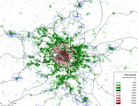
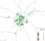
Some measures of density exclude all non-residential land, but the square kilometre grid approach means that partially populated grid parcels are counted, and many of these parcels will include non-residential land, and possibly even large amounts of water. It’s not perfect, particularly for cities with small footprints. For example, here is a density map around Sydney harbour (where light green is lower density, dark green is medium density and red is higher density):

You can see that many of the grid cells that include significant amounts of water show a lower density, when it fact the population of those cells are contained within the non-water parts of the grid cell. The more watery cells, the lower the calculated density. This is could count against a city like Sydney with a large harbour.
Defining cities
The second challenge with these calculations is a definition of the city limits. For Australia I’ve used Urban Centre boundaries, which attempt to include contiguous urbanised areas (read the full definition). For Europe I’ve used 2011 Morphological Urban Areas, which have fairly similar rules for boundaries. For Canada I’ve used Population Centre, and for New Zealand I’ve used Urban Areas.
These methodologies tend to exclude satellite towns of cities (less so in New Zealand and Canada). While these boundaries are not determined in the exactly the same way, one good thing about population-weighted density is that parcels of land that have very little population don’t have much impact on the overall result (because their low population has little weighting).
For each city, I’ve included every grid cell where the centroid of that cell is within the defined boundaries of the city. Yes that’s slightly arbitrary and not ideal for cities with dense cores on coastlines, but at least I’ve been consistent. It also means some of the cells around the boundary are excluded from the calculation, which to some extent offsets the coastline issues. It also means the values for Australian cities are slightly different to a previous post.
All source data is dated 2011, except for France which is 2010, and New Zealand which is 2013.
Comparing population-weighted density of Australian, European, Canadian and New Zealand cities
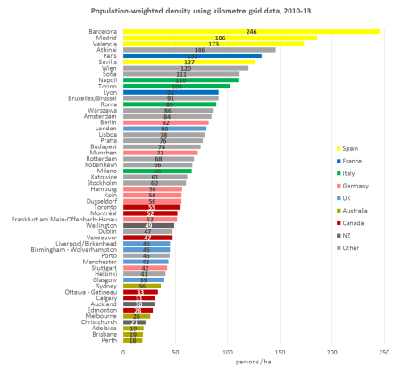
You can see the five Australian cities are all at the bottom, most UK cities are in the bottom third, and the four large Spanish cities are within the top seven.
Sydney is not far below Glasgow and Helsinki. Adelaide, Perth and Brisbane are nothing like the European cities when it comes to (average) population-weighted density.
Three Canadian cities (Vancouver, Toronto and Montreal) are mid-range, while the other three are more comparable with Australia. Of the New Zealand cities, Auckland is surprisingly more dense than Melbourne. Wellington is more dense that Vancouver (both topographically constrained cities).
But these figures are only averages, which makes we wonder…
How much diversity is there in urban density?
The following chart shows the proportion of each city’s population that lives at various urban density ranges:
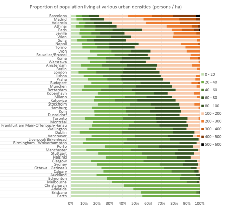
Because of the massive variations in density, I had to break the scale interval sizes at 100 persons per hectare, and even then, the low density Australian cities are almost entirely composed of the bottom two intervals. You can see a lot of density diversity across European cities, and very little in Australian cities, except perhaps for Sydney.
You can also see that only 10% of Barcelona has an urban density similar to Perth or Adelaide. Which makes me wonder…
Do many people in European cities live at typical Australian suburban densities?
Do many Europeans living in cities live in detached dwellings with backyards, as is so common in Australian cities?
To try to answer this question, I’ve calculated the percentage of the population of each city that lives at between 10 and 30 people per hectare, which is a generous interpretation of typical Australian “suburbia”.
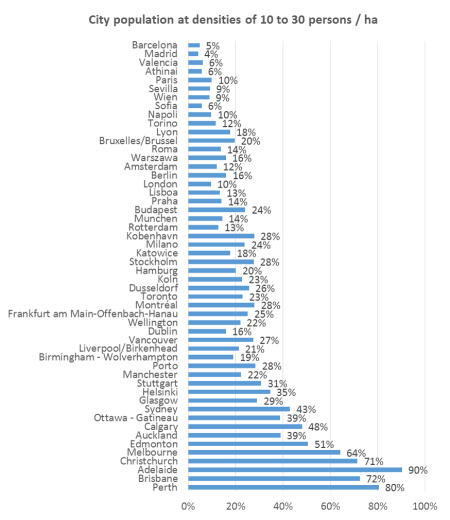
It’s a minority of the population in all European cities (and even for Sydney). But it does exist. Here are examples of Australian-style suburbia in outer Hamburg, Berlin, London, Milan, and even Barcelona (though I hate to think what some of the property prices might be!)
How different is population-weighted density from regular density?
Now that I’ve got a large sample of cities, I can compare regular density with population weighted densities (PWD):
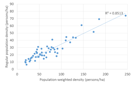
The correlation is relatively high, but there are plenty of outliers, and rankings are very different. Rome has a regular density of 18, but a PWD of 89, while London has a regular density of 41 and PWD of 80. Dublin’s regular density of 31 is relatively close to its PWD of 47.
Wellington’s regular density is 17, but its PWD is 49 (though the New Zealand cities regular density values are impacted by larger inclusions of non-urbanised land within definitions of Urban Areas).
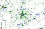
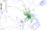
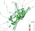
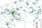
So what does the density of these cities look like on a map?
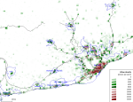
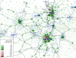
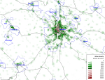
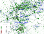
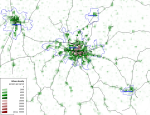
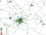
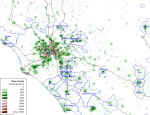
The following maps are all at the same scale both geographically and for density shading. The blue outlines are urban area boundaries, and the black lines represent rail lines (passenger or otherwise, and including some tramways). The density values are in persons per square kilometre (1000 persons per square kilometre = 10 persons per hectare). (Apologies for not having coastlines and for some of the blue labels being difficult to read).
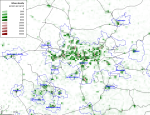
Here’s Barcelona (and several neighbouring towns), Europe’s densest large city, hemmed in by hills and a coastline:

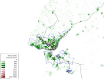
At the other extreme, here is Perth, a sea of low density and the only city that doesn’t fit on one tile at the same scale as the other cities (Mandurah is cut off in the south):
Here is Paris, where you can see the small high density inner core matches the high density Metro railway area:
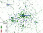
Similarly the dense inner core of London correlates with the inner area covered by a mesh of radial and orbital railways, with relatively lower density outer London more dominated by radial railways:

There are many more interesting patterns in other cities.
What does this mean for transport?
Few people would disagree that higher population densities increase the viability of high frequency public transport services, and enable higher non-car mode shares – all other things being equal. But many (notably including the late Paul Mees) would argue that “density is not destiny” – and that careful design of public and active transport systems is critical to transport outcomes.
Zurich is a city often lauded for the high quality of its public transport system, and its population weighted density is 51 persons/ha (calculated on the kilometre grid data for a population of 768,000 people) – which is quite low relative to larger European cities.
In a future post I’ll look at the relationship between population-weighted density and transport mode shares in European cities.
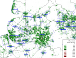
All the density maps
Finally, here is a gallery of grid density maps of all the cities for your perusing pleasure (plus Zurich, plus many smaller neighbouring cities that fit onto the maps). All maps have the same scale and density shading colours.
Please note that the New Zealand and Canada maps do not include all nearby urbanised areas. Apologies that the formats are not all identical.
-

- Adelaide
-
- Amsterdam Rotterdam
-

- Athens
-
- Auckland
-
- Barcelona
-

- Berlin
-

- Birmingham
-

- Brisbane
-
- Brussels
-
- Budapest
-

- Calgary
-

- Christchurch
-
- Cologne Essen Dusseldorf
-

- Copenhagen
-

- Dublin
-
- Edmonton
-
- Frankfurt
-

- Glasgow
-

- Hamburg
-

- Helsinki
-
- Katowice
-
- Lisbon
-
- Liverpool-Manchester
-

- London
-

- Lyon
-

- Madrid
-

- Melbourne
-

- Milan
-

- Montreal
-
- Munich
-

- Naples
-

- Ottawa
-

- Paris
-

- Perth
-

- Porto
-
- Prague
-
- Rome
-

- Seville
-

- Sofia
-
- Stuttgart
-
- Stockholm
-

- Sydney
-
- Toronto
-

- Turin
-

- Valencia
-

- Vancouver
-

- Vienna
-

- Warsaw
-

- Wellington
-
- Zurich


Thank you for that, it’s interesting, valuable and relevant.
I wonder if you have looked at two smaller cities, using the same methodology: Canberra and Freiburg.
The ACT government plans to spend up more than $800 million – or $5000 per household – to build a tramline to the city’s northern suburbs. Supporters argue than Canberra is of a similar size to Freiburg, where expanding tramlines has been a success. However, as you argue, population density is what matters, not population. Canberra has fewer than 400,000 people spread across more than 50 km from north to south; I suspect it is the least densely-populated city in Australia; Freiburg is far more compact and densely-populated, creating a market for high-frequency tram services.
Any factual info you can offer would be appreciated.
LikeLike
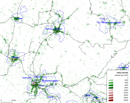
For Canberra I calculate a population weighted density of 16 persons/ha, while Freiburg (im Breisgau) comes in at 50 persons/ha. The cells included for Canberra have a total population of 343,097 (439 square kms), and for Freiberg I have an included population of 266,271 (147 square kms).
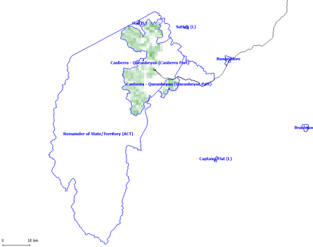
Here’s a density map of Canberra:
And here is a density map of Freiburg (plus Basel):
I’m sure some people will argue that you need higher population density to make high frequency light rail viable, while others will argue that you need high frequency light rail to make higher population density viable! 🙂
LikeLike
Great work Chris. Density is so important, yet so misunderstood. It’s too easy to focus on just “average density”. For transport planning, the pattern of density or spatial distribution of density is also important. Love the diversity of density bar chart. Having been in Canberra recently, which has pockets of suburbia widely separated by bush, I understand Tim’s comment. Hope your work gets the attention it deserves.
LikeLike
This is fascinating, actually… it’s one thing to hear about these differences, but seeing them like this is incredibly eye-opening!
LikeLike
Thanks Chris for sharing this once again.
You mention the complications that can arise with water in the landscape when estimating density using a 1km grid. The other important thing to raise in this context is parkland. If you look at most European cities you tend to find – due to factors such as their origin as medieval walled cities – that open space is restricted to just a few specific areas. Whereas in a city like Melbourne, it’s actually quite difficult to find a 1km square that doesn’t include a substantial amount of parkland, whether it’s a creek valley or a municipal park. There are odd exceptions such as Brunswick, which is actually more typically European in its relative lack of open space. But in inner Melbourne for example you have vast oases such as Royal Park and Albert Park eating into the density figures for the adjacent closely-settled urban neighbourhoods.
In any event, we can see confirmation of why few are seriously pushing a Paris Metro standard of high-volume transport for Australian cities. On the other hand, general consensus among transport planners is that bus-based transport networks can break even at around 12-15 people per hectare if the service is high-quality enough to achieve mode shares around 20 per cent. (That’s the ca.1990 Metro Toronto benchmark that Paul Mees documented some time ago.) It’s good to have confirmation that (even with the effects of water and parkland) the majority of our urban areas are significantly more dense than this. This of course means light and conventional rail are also likely to pay off in at least parts of Australian cities if the service is good enough.
LikeLike
Very cool, I’ve been trying to calculate weighted density of European cities for a while but could not find data that was sufficiently apples to apples compared to Canadian and American census tracts. These were my estimates for cities I looked at (first number) for which I could find data for areas relatively close to census tracts in size and how they compare to yours
Paris: 125 vs 133
Amsterdam: 85 vs 84 – although I included Haarlem and Velsen
Berlin: 95 vs 86
Budapest: 70 vs 74
Barcelona: 250 vs 256
Vienna: 135 vs 120
So all in all it was in the same ball-park.
Any stats on Belgrade, Zurich and Bucharest? It would be interesting to see eastern European cities like Moscow, Kiev and St Petersburg too. Smaller cities would be cool too like Krakow or Marseilles or Oslo. I assumed this was for EU countries only but I see you have the map (but not average number) for Zurich?
Census tracts would be relatively comparable to 1km2 grids, especially for cities with census tract weighted densities in the 40-60/ha range, which would include Montreal, Toronto, Vancouver, the Bay Area, LA and Honolulu. In more average American cities like Houston or Louisville or Minneapolis census tracts would be a big too big at 2-3km2 typically, although that’s probably still not going to make a huge difference in the final numbers. New York would be tricky since the highest densities are next to two rivers and a big park, neither of which are included in the census tracts, and many of New York’s census tracts are in the 0.2-0.5km2 range.
Some of the Asian cities and other non-western cities would be cool to compare to as well of course. Here would be my “educated guesses”
Hong Kong: 500
Cairo: 450
Most big South Asian cities: ~400
Shenzhen: 400
Guangzhou: 350
Shanghai: 350
Istanbul: 350
Manilla: 300
Seoul: 300
Hanoi: 250
Beijing: 200
Bangkok: 200
Jakarta: 175
Singapore: 175
Tokyo: 150
Mexico City: 120
Buenos Aires: 110
Sao Paulo & Rio: 100
LikeLike
Chris great work as always. Well done
LikeLike
Chris, this is really great work, thank you. I’m interested in seeing whether weighted density increases with population size (from your first chart it seems like it does, but not very strongly), and if so which cities are more or less dense for their size than others. Do you think you could do a labelled scatterplot of city population and weighted density?
LikeLiked by 1 person
Sorry for very delayed reply. Here’s a quick plot with the outliers labelled. Note I have mostly excluded cities of less than 1 million population. There’s no real correlation.

LikeLike
Good work.
LikeLike
Thanks for the update. Looks like the Toronto map is missing though.
LikeLike
Sorry. It’s there now.
LikeLike
Interestingly when you compare the weighted density of NZ cities using suburbs as opposed to the km grid, the results are fairly different with Aukland being the densest by a solid margin and Christchurch and Wellington being relatively similar.
Numbers I got were
Aukland: 32.12
Wellington: 22.32
Christchurch: 21.40
The ratio of Aukland density to Christchurch density is pretty similar to what you got for the km grid but Wellington’s km grid density is about 2x higher than you’d expect based off the numbers that use suburb boundaries.
LikeLike
Great works thanks for posting
LikeLike
I calculated the results for several American cities, and created graphs and maps similar to your style above (though the map aren’t on the scale nor have coastlines or roads). Let me know if you’re interested in my data if you’d like to add them to your charts and maps. The cities I’ve done so far are posted here:
http://www.city-data.com/forum/43499130-post253.html
New York City had a weighted density of 111 / ha, Boston and Philadelphia were both in the low or mid 30s.
LikeLiked by 1 person
Have you looked at the NSW Bureau of Transport Statistics Household Travel Survey data? It provides mode share by Local Government area for all trips, not just journeys to work. I would expect sampling error is quite high, but it is interesting that even the LGA’s with high density (eg Waverley, Sydney and Leichhardt), don’t have high public transport mode shares. They are similar to Hornsby, an outer suburb.
It would be easy to look at the international comparisons on city population density and conclude that, well, no wonder Australians’ use of public transport is low when our cities are so disperse. But if even our relatively dense inner suburbs have low PT mode share, then maybe that demonstrates that the design of our public transport networks is not up to scratch, just as Paul Mees argued.
LikeLike
Do the high density LGAs have comparable auto-mode shares to Hornsby as well?
In many Canadian cities the mode share pattern is somewhat like this:
Inner Core: High walk/bike, moderate PT, low auto
Inner suburbs: Low walk/bike, high PT, moderate auto
Outer suburbs: Low walk/bike, low PT, high auto
Is Hornsby typical of Sydney’s other outer suburban LGAs in terms of mode share.
LikeLike
I should have checked the private car and pedestrian mode shares! It’s a similar story to the pattern you described for Canadian cities. In a most unscientific way, I split Sydney’s 42 local government areas into “inner” and “outer”. The inner LGAs were 13.8% PT; 51% PMV; 31.2% walking. The outer LGAs were 9.7% PT; 75% PMV; and 13.4% walking.
It is clear the walking substitutes for PT in the inner suburbs.
LikeLike
Saw this post as part of research for a project. To give back a bit, I’d like to post the results of my research, which compiled data from multiple sources on weighted population densities for metropolitan areas in the US, Europe, Canada, Australia, and New Zealand:
City Weighted Population Density (ppl/sq-mi) Per hectare Per acre
Barcelona 63,714 246 100
Madrid 48,174 186 75
Valencia 44,807 173 70
Athens 37,814 146 59
Paris 34,447 133 54
Seville 32,893 127 51
New York 31,471 122 49
Vienna 31,080 120 49
Naples 28,490 110 45
Turin 26,677 103 42
Lyon 23,569 91 37
Brussels 23,569 91 37
Rome 23,051 89 36
Warsaw 22,274 86 35
Amsterdam21,756 84 34
Berlin 21,238 82 33
London 20,720 80 32
Lisbon 20,202 78 32
Prague 19,684 76 31
Budapest 19,166 74 30
Munich 18,389 71 29
Rotterdam 17,612 68 28
Copenhagen17,094 66 27
Milan 17,094 66 27
Stockholm 15,540 60 24
San Francisco 14,740 57 23
Hamburg 14,504 56 23
Cologne 14,504 56 23
Dusseldorf 14,504 56 23
Toronto 14,245 55 22
Montreal 13,468 52 21
Frankfurt am Main13,468 52 21
Wellington 12,691 49 20
Los Angeles12,543 48 20
Dublin 12,173 47 19
Vancouver 12,173 47 19
Liverpool 11,655 45 18
Birmingham11,655 45 18
Porto 11,655 45 18
Manchester11,137 43 17
Stuttgart 10,878 42 17
Helsinki 10,619 41 17
Glasgow 10,101 39 16
Sydney 9,324 36 15
Chicago 9,047 35 14
San Jose 8,766 34 14
Ottawa 8,547 33 13
Philadelphia 8,457 33 13
Boston 8,158 31 13
Calgary 8,029 31 13
Auckland 7,770 30 12
Hamilton 7,744 30 12
Winnipeg 7,643 30 12
Miami 7,446 29 12
Washington, D.C. 7,405 29 12
Edmonton 7,252 28 11
San Diego 7,186 28 11
Baltimore 6,952 27 11
Quebec City 6,760 26 11
Melbourne 6,734 26 11
Milwaukee 5,830 23 9
Saskatoon 5,686 22 9
Halifax 5,472 21 9
Christchurch 5,439 21 8
Denver 5,231 20 8
Adelaide 4,921 19 8
Brisbane 4,921 19 8
Seattle 4,747 18 7
Phoenix 4,716 18 7
Perth 4,662 18 7
Dallas-Fort Worth 4,641 18 7
Houston 4,553 18 7
Riverside-San Bernardino 4,514 17 7
Portland 4,383 17 7
Atlanta 2,416 9 4
LikeLike
Hi Nikhil,
Thanks for the contribution. Can you please tell me how you calculated those weighted densities? It’s critical to know what the underlying calculation geography was.
Thanks,
Chris
LikeLike
Hi Nikhil,
Please explain why there are four figures, say for Atlanta 2, 416, 9, 4, yet there are only three sets of units, namely ppl/ sq mile, ppl/ hectare and ppl / acre.
Thanks.
Rod
LikeLike
Rod – the first comma there is a thousands separator.
LikeLike
[…] Australia is increasingly linked to a fast-growing global population. The populations of Sydney and Melbourne are both expected to exceed 8.5 million by 2061. What will Australia’s cities look like then? Will they still be among the world’s lowest-density cities? […]
LikeLiked by 1 person