With the first major release of 2016 census data, it’s possible to take a detailed look at the latest population density numbers in Melbourne. This post will explore how and where Melbourne’s density is increasing by comparing data from the 2006, 2011, and 2016 censuses.
About the data
This post looks at data mostly at the mesh block level. Mesh blocks are the smallest geographic unit at which the ABS publishes population and dwelling counts. They aim for each mesh block to have the same land use, and between 30 and 60 dwellings (where residential).
I’ve used Tableau Public to create this post, so you will be able to explore the maps in more detail yourself, using the links in this post. Be warned though: Tableau tried to dissuade me several times from adding so many mesh blocks to the maps and charts, so they may take a little time to load and update.
Background map data has been used that is copyright © The State of Victoria, Department of Environment, Land, Water & Planning 2017
What does Melbourne’s population density look like?
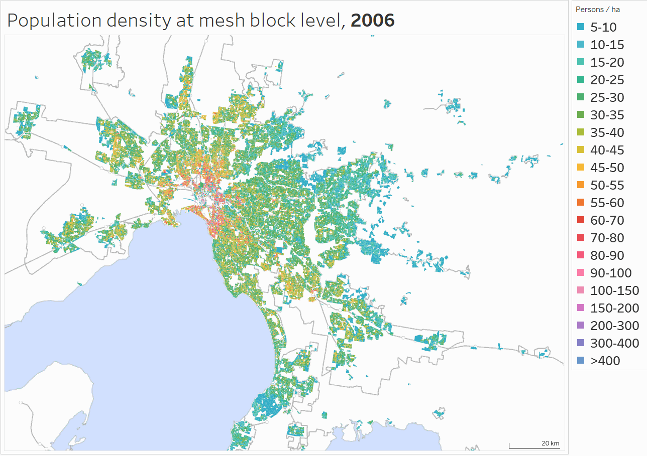
Firstly, here’s the population density picture for most of Melbourne (you will probably need to open this is in a new window to see it more clearly).
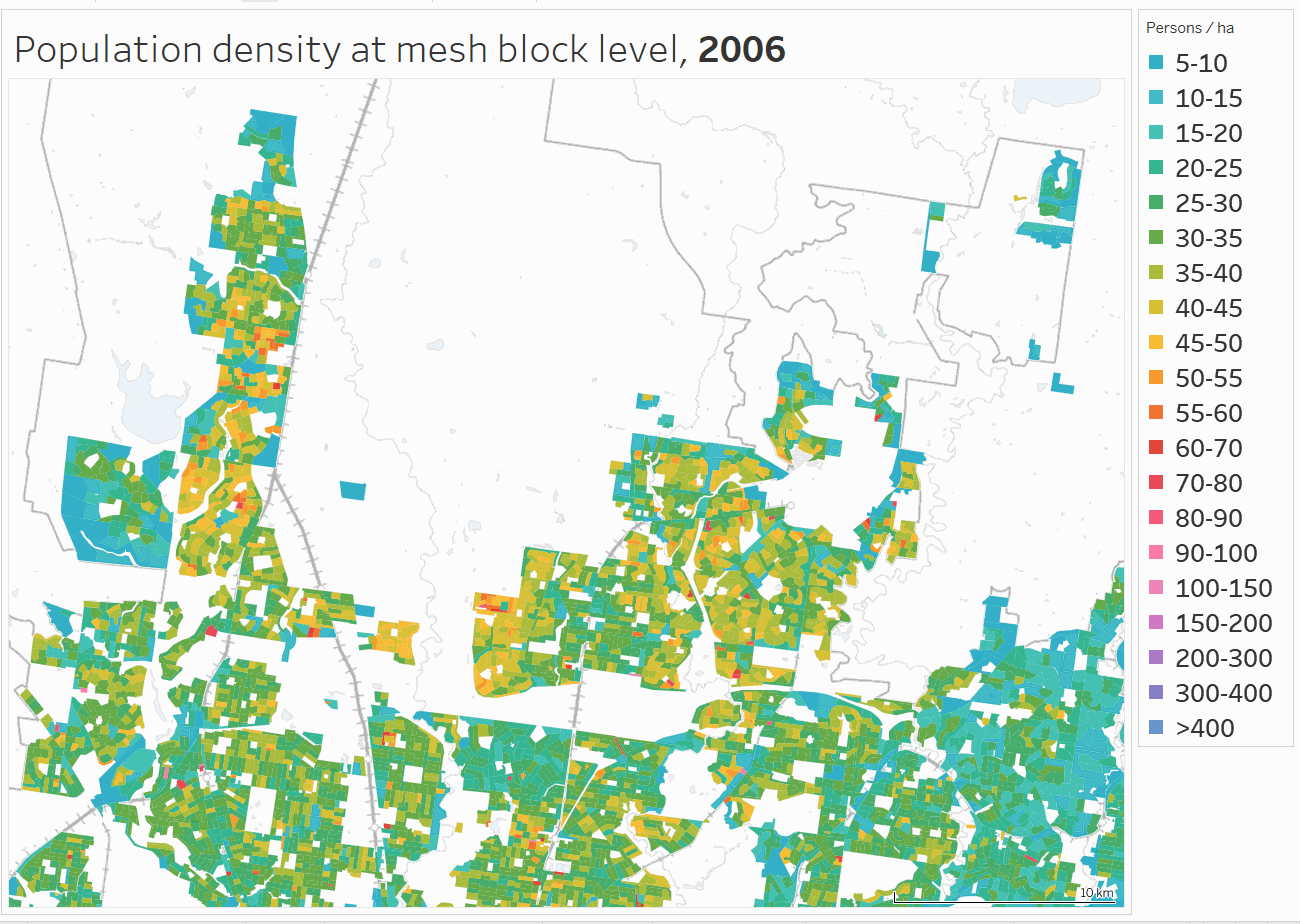
Here is a closer look at Melbourne’s growing west, stretching as far as Bacchus Marsh:

You can see the expanding urban area, and you might also notice some of the new areas are coming up in red (densities in the 60-70s). This demonstrates that recent urban growth areas are much more dense than growth areas of 5-10 years ago. However that’s not happening in growth areas of Bacchus Marsh (which is outside Melbourne’s Urban Growth Boundary.
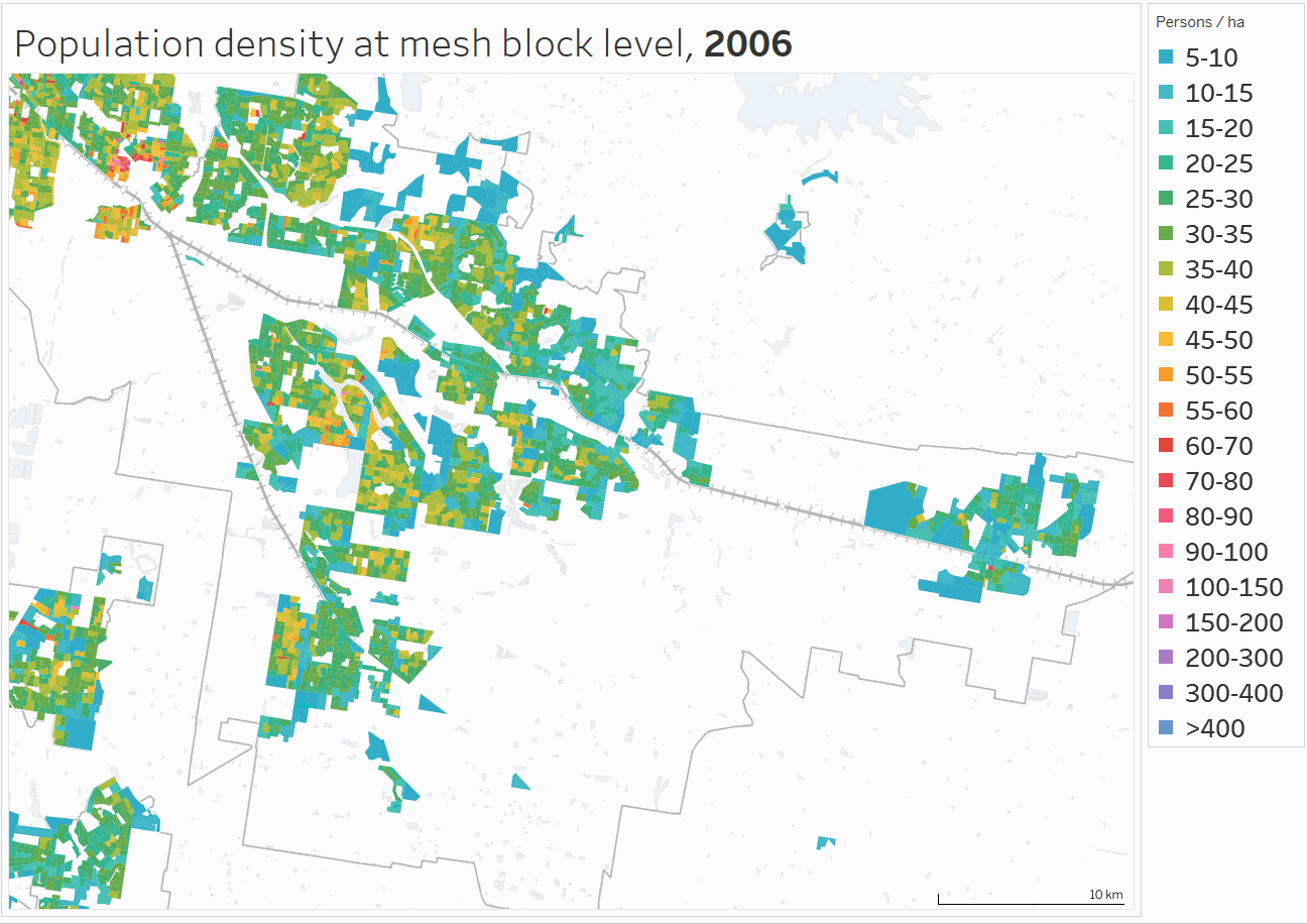
Here is a closer look at the northern growth areas:
You can see large areas of orange and red in north-western Craigieburn (top left of map) and Roxburgh Park in 2016 – that’s around 50-60 people per hectare, around double that of old-school suburbia.
Here’s the south-east growth corridors, where new high density areas are less widespread:
There’s also been plenty of change in population density in the inner city:
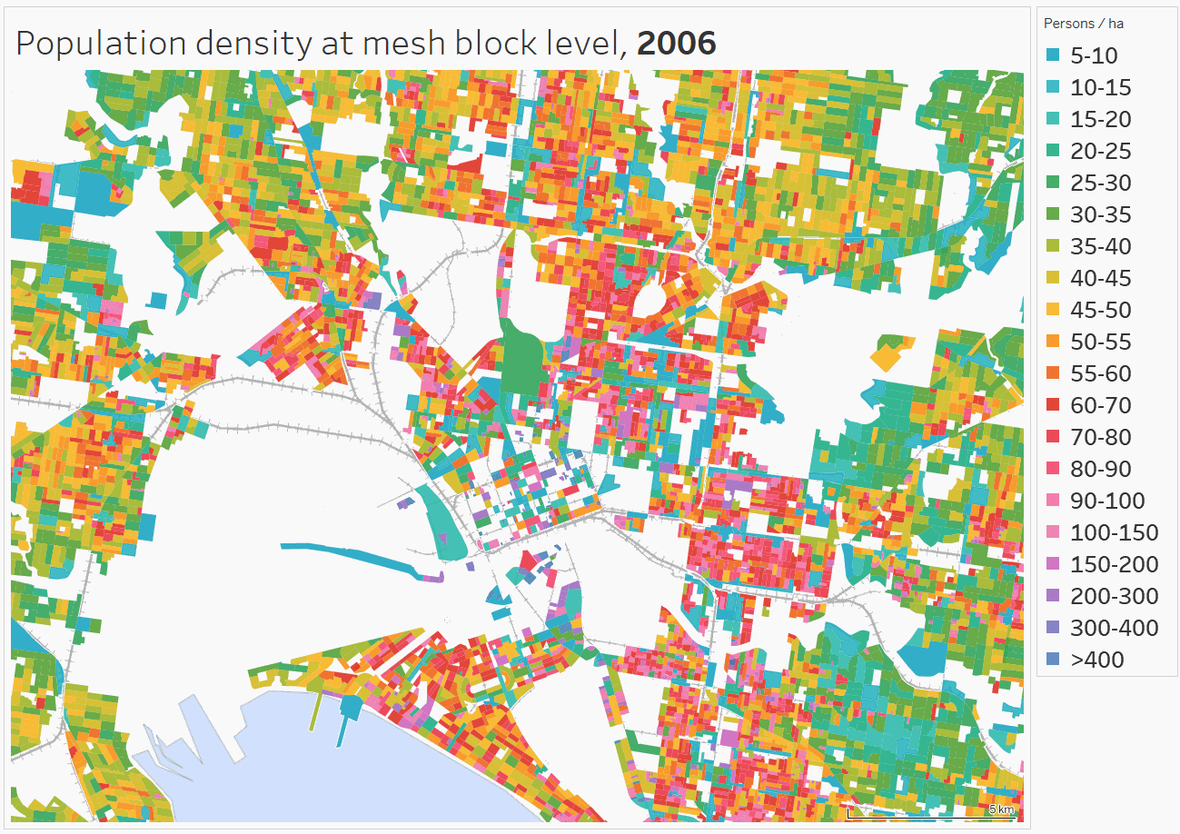
If you look carefully you can see a lot more purple around the city centre, but also plenty of population density increase around Brunswick in the north and Footscray in the west.
So this is this increase in population density due to rising dwelling densities or more people per dwelling?
Here is the dwelling density around Craigieburn:
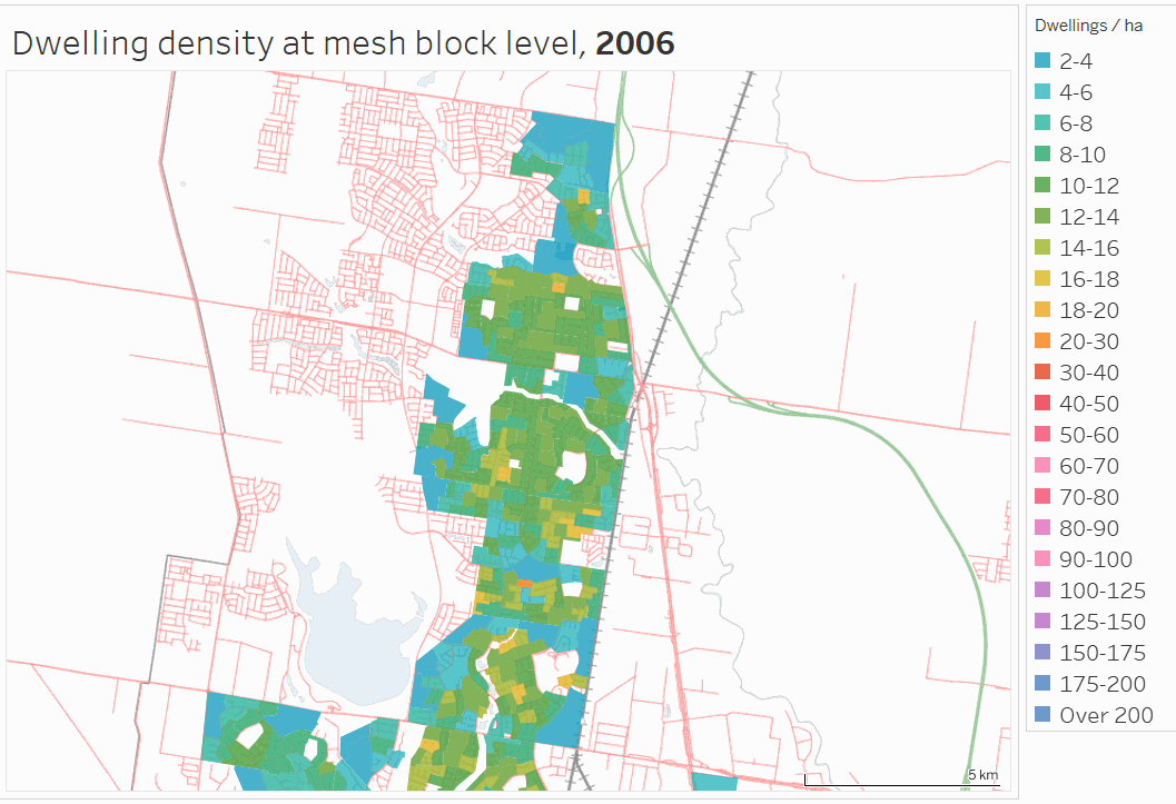
There are dwelling densities of over 20 per hectare in the new north-western areas, which is likely to be contributing to higher population density.
Here’s a map showing the average dwelling occupancy – the ratio of population to dwelling counts. Note: this includes unoccupied dwellings at census time, so it’s not the average occupancy of occupied dwellings.
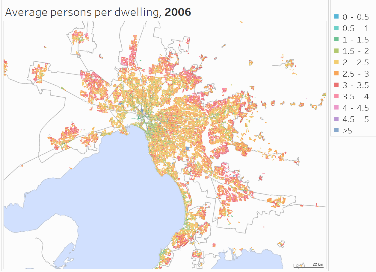
One clear trend is that the growth areas have higher average dwelling occupancy, quite probably related to young families moving into those areas. This, together with smaller block sizes, is likely leading to higher population density in growth areas.
If you look carefully you’ll also see some older outer areas with reducing average dwelling occupancy – quite possibly family homes where children have moved out.
What are the broader trends in density?
The above maps are incredibly detailed, and you are probably struggling a little with so many blocks of different colours. Time to take a step back.
Calculating the straight population density of Greater Melbourne makes no sense because most of the land within the statistical boundary is non-urban.
In other posts I’ve looked at population-weighted density, which is the average population density of all areas, weighted by the population of each area. It aims to summarise the population density at which the “average” person lives, which takes out the impact of large areas that are sparsely populated. But it is important to keep in mind that “average” does not mean typical (I’ll come back to that).
Here’s a chart showing Melbourne’s populated weighted density, as well as average density for mesh blocks with a population density of at least 5 persons/ha (an arbitrary threshold for urban residential areas).
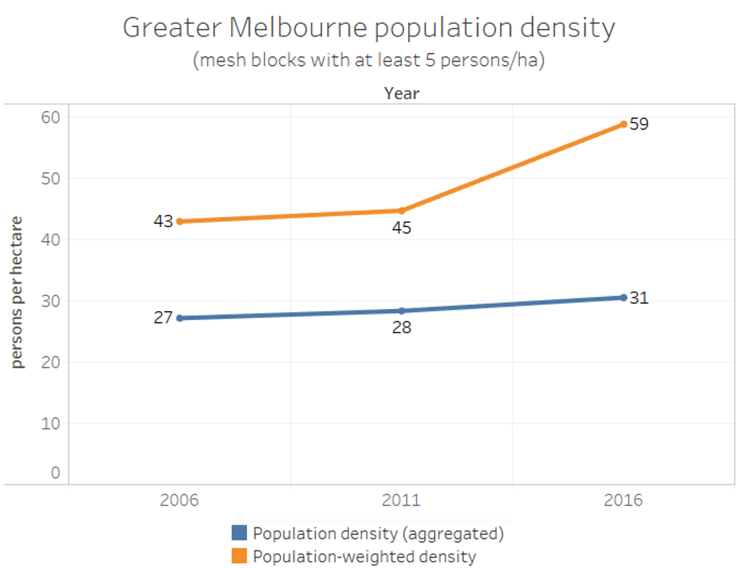
Yes, that’s a massive increase in population-weighted density. So what’s going on here?
Well, here’s a chart showing the densities at which people in Melbourne lived at each census:
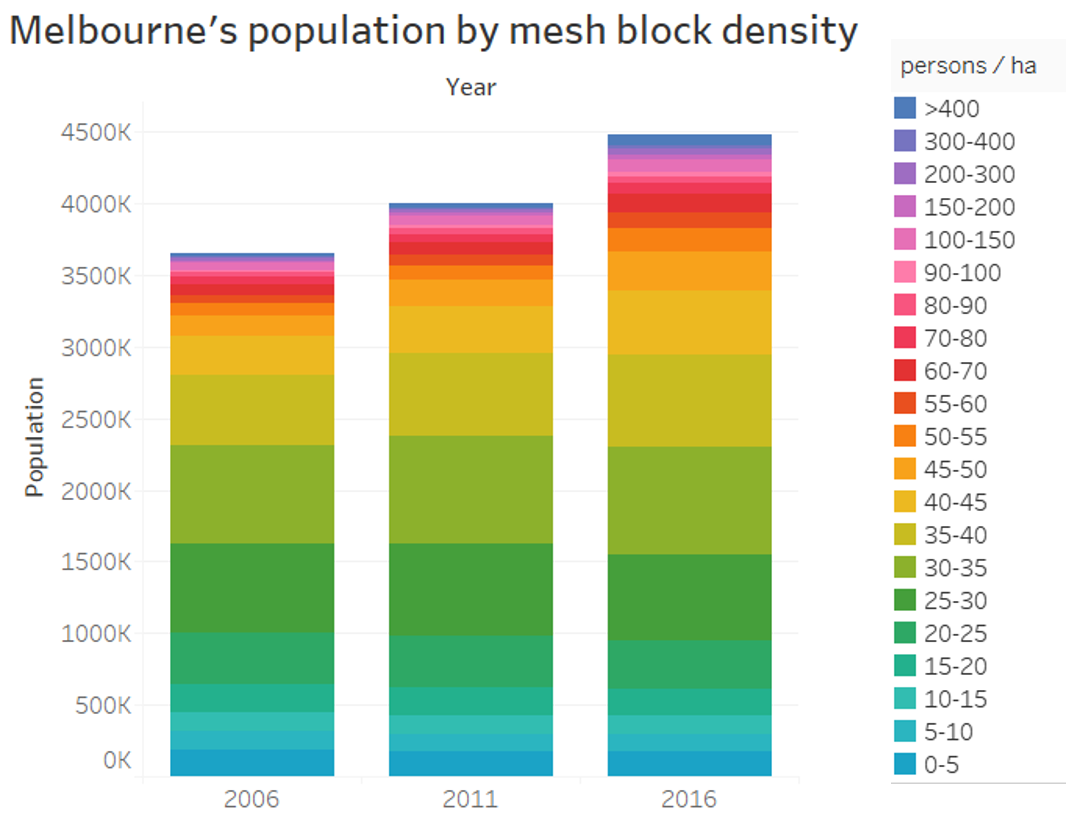
If you look at the green levels and below, you’ll notice in all years less than 2.5 million people lived at densities of below 35 persons/ha. There’s been little population growth at such lower densities – it’s mostly been at 35 persons/ha and above, pushing up the population-weighted density.
Greater Melbourne’s population-weighted density of 59 is quite high relative to the density distribution within Melbourne. Only around 600,000 people live at this or higher densities, with around 4 million living at lower densities. That’s a classic problem with summary statistics.
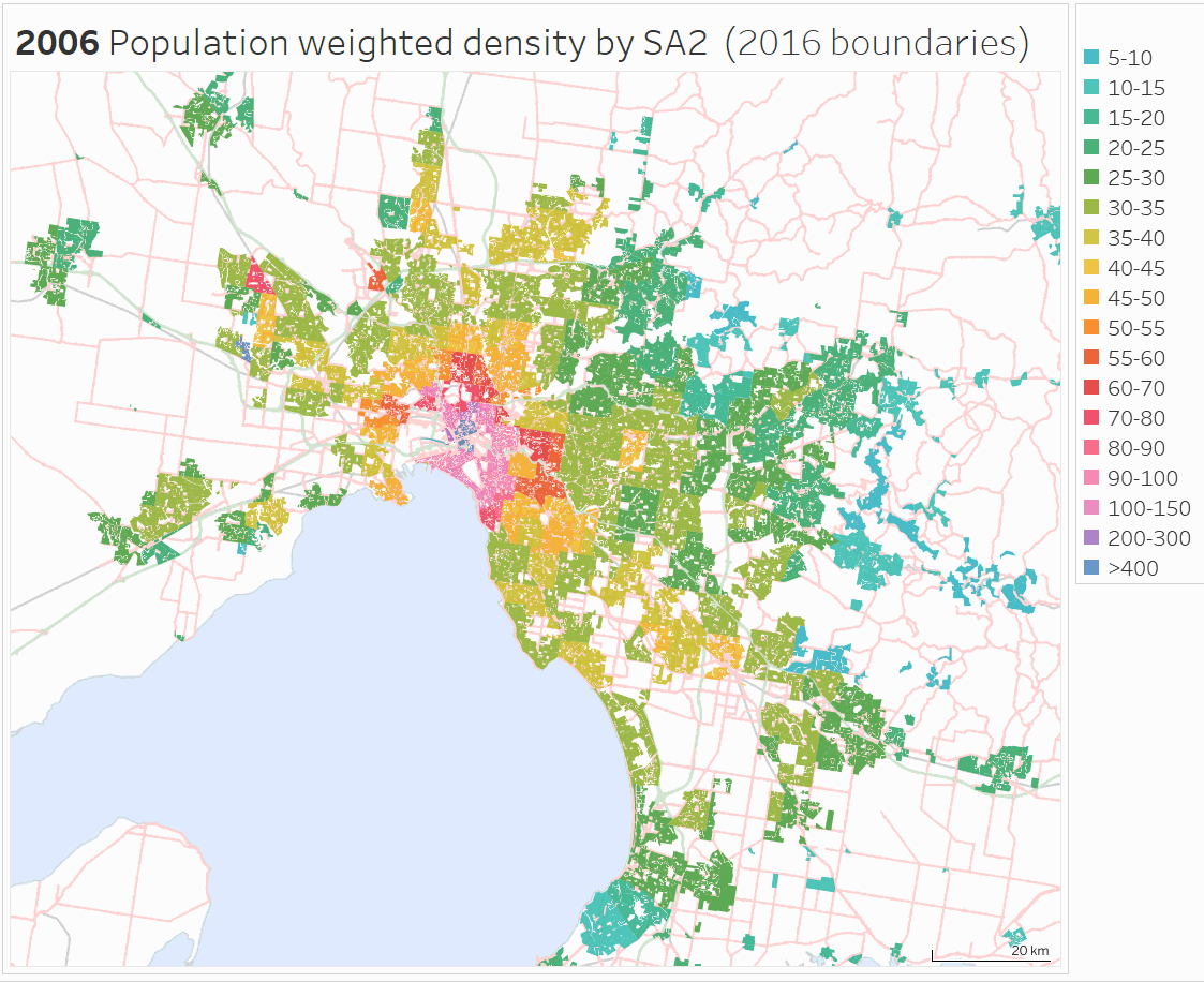
Where is the population-weighted density increasing the most? Here’s a map showing population-weighted densities by SA2 (2016 boundaries):
(explore in Tableau)
There are big increases in population weighted densities across inner Melbourne, but also in places like Clayton, Box Hill, Preston East, Doncaster.
What’s going on there? Box Hill’s population-weighted density went from 45 in 2011 to 72 in 2016. Here’s a look at the mesh block density for the area:
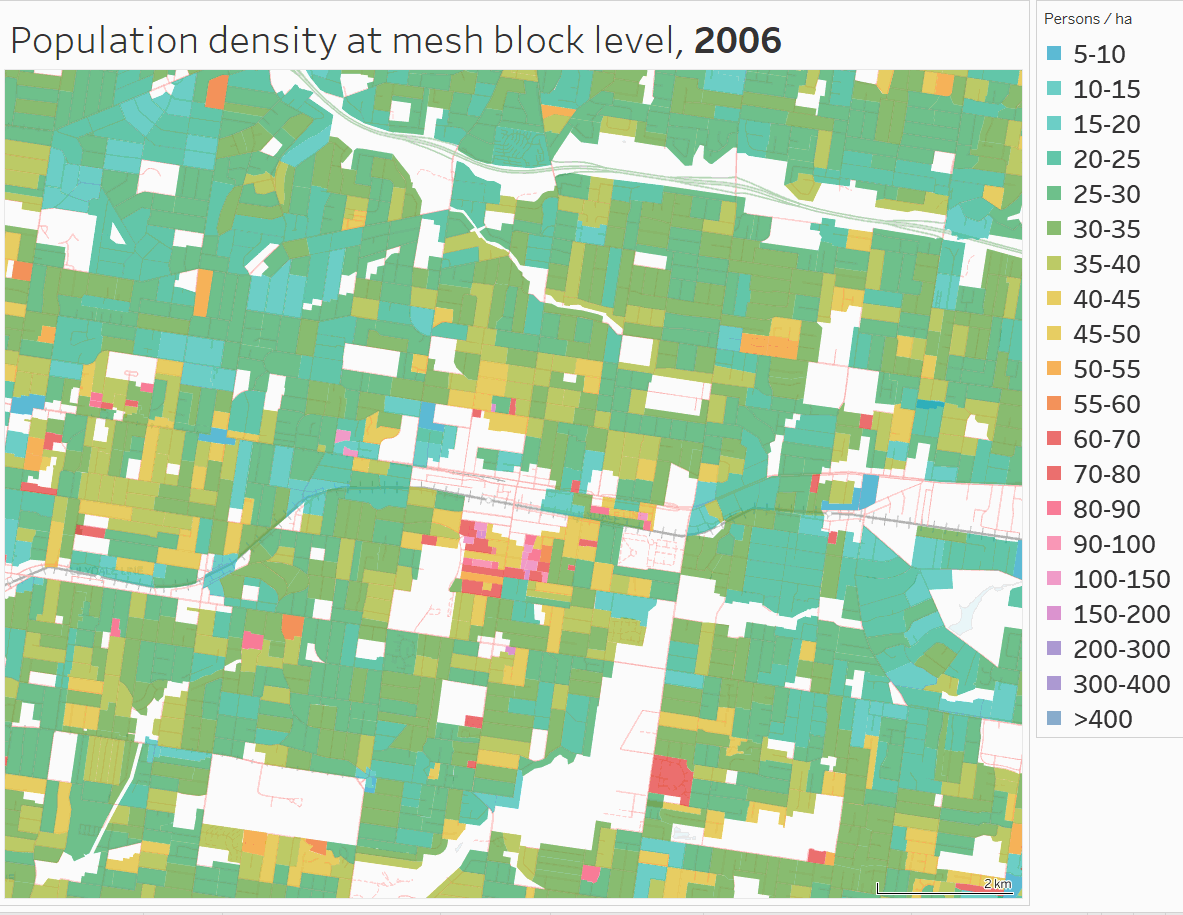
You can see a little densification outside the main centre on the rail line, but if you look really carefully, you’ll see some tiny purple mesh blocks right in the centre – apartment towers with large populations are bringing up the populated weighted density of the whole SA2.
What about median densities?
While no one statistic will tell you about “typical” density, we can calculate median density, which tells you the density in which the middle person lives.
Greater Melbourne’s median population density hasn’t increased a great deal:

Here’s a look at median density by SA2 (open in a new window to see more detail, including the numbers):

(note that a different set of colour ranges used to the previous maps because the medians are so close)
You can see a lot more red on the map – i.e. more and more areas of Melbourne have a median population density of in the 40s.
How has population and density changed by distance from the CBD?
Firstly, here’s a reference map of distances from the CBD:

Here’s the population of Melbourne by density and distance from the CBD:
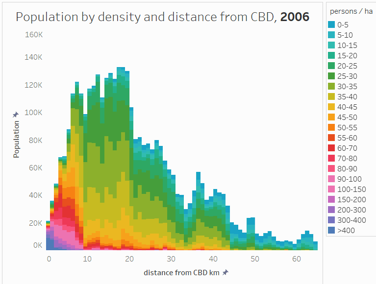
You can see a lot of growth close to the CBD, but also around 20-23 km from the CBD, which includes several outer suburban growth areas.
Here’s a look at five year population growth by distance from the CBD:
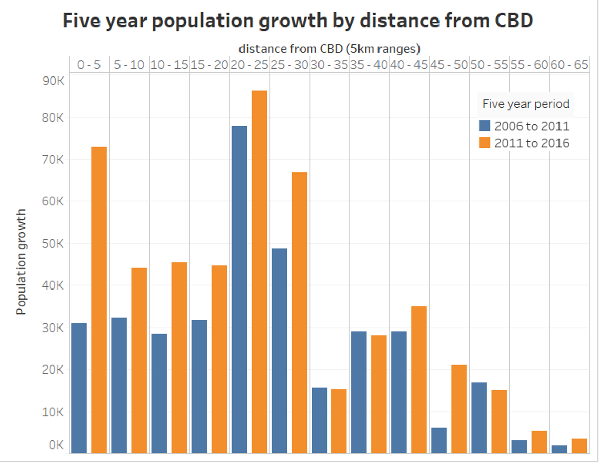
In the five years to 2016 there was a lot more growth within 30 kms of the CBD, particularly within 5 km.
Finally, which mesh block densities are becoming more common. Here is the five year change in population by (mesh block) population density:
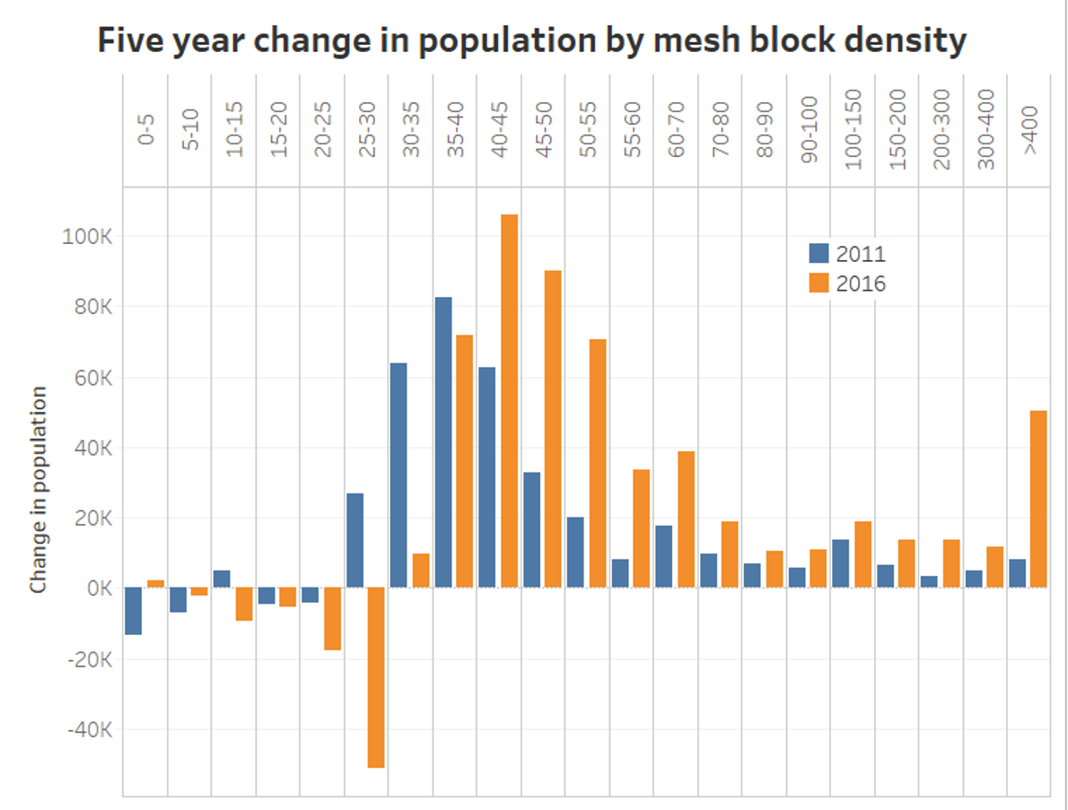
In the five years to 2011, the biggest population increase was at densities of 30 to 45 persons/ha. In the five years to 2016, the biggest population growth was at densities of 35 to 55 persons/ha. There was also considerable growth at densities of more than 400 persons/ha, which is likely to reflect new apartment towers.
You’ll find a few other charts in Tableau. Hope you enjoyed this post.


Great piece of work Chris. It’s interesting to see how packed together the new fringe suburbs can be.
Ian Radbone 0402 965 929 radboneian@gmail.com
>
LikeLike
So interesting Chris. Thanks for all your work
LikeLike
Chris,
Excellent charts as usual.
Regards
Bill
Bill Unkles Director
bill.unkles@saturneconomics.com.au +61 (0) 412 084 831
LikeLike
Fantastic charts! Could you map changes in vehicle numbers and vehicle densities in the same way? (Maybe you have already – but anyway I’d like to see it).
LikeLike
Nice work Chris. Time to download some data!
LikeLiked by 1 person
Cool stuff. That’s a pretty big increase in weighted density. Do you know how the increase in weighted density at a coarser level of measurement would compare, like at the km grid? That’s closer in scale to walking distance and a typical neighbourhood.
LikeLike
Do you mind me using some of these graphs in a presentation on High Speed Rail?
LikeLike
Hi David, happy for you to reproduce graphs with appropriate attribution and no assumption that I necessarily endorse any of your viewpoints.
LikeLike
Hi Chris, these visualisations are great – do you think you’ll be able to add the 2021 census data now too? As I imagine there will have been some big changes in certain areas since 2016
LikeLike
Looking at population distribution changes in 2021 is one of the many things on my to do list.
LikeLike