Young adults are much more likely to use public transport (PT) than older adults.
Is it because younger adults are more likely to live and/or work near the city centre? Is it because they are more likely to live near train stations? Is it because they tend to live in higher density areas with better public transport? Is it because they are less likely to own a car? Is it because they are less likely to own a driver’s licence? Is it because they are less likely to be parents? Is it to do with their income? Is it related to how many of them are recent immigrants? Or is it a generational thing?
The answers are not as simple as you might expect. This is the first post in a series that aims to understand what influences mode choice across different ages. I’ll focus on (pre-COVID19) data about general travel and journeys to work in my home city of Melbourne, but I suspect the patterns will be similar in comparable cities.
About the data (boring but important)
My largest data source is the 2016 ABS census of population and housing which provides detailed demographic data about residents, captures the modes used for journeys to work, but doesn’t record travel for any other purposes and only covers a single day in August. There’s data on the travel choices of millions of people, and so it is possible to disaggregate data by several dimensions before you run into problems with small counts.
For general travel mode shares my data source is the Victoria Integrated Survey of Travel and Activity (VISTA) which is Victoria’s household travel survey, recording the transport and activity of a representative sample of Melbourne and Geelong residents across the whole year. The data set is smaller than the census (being a survey), but also contains rich demographic information and covers all travel purposes by people of all ages. I have used aggregated data over the survey years 2012-2018 to form a larger sample, so any underlying trends in behaviour over that period will be averaged out.
For this analysis I am filtering my data to either Greater Melbourne (for 2011 and 2016 census data) or otherwise the 31 local government areas (LGAs) that make up metropolitan Melbourne (all are entirely inside Greater Melbourne except Yarra Ranges).
All of this data was collected before the COVID19 pandemic, and of course travel patterns may well not return to similar patterns once the pandemic is over.
Consistent with elsewhere on this blog, I attribute
- any journey involving a train, tram, bus, or ferry as a public transport journey (even if other modes were also used, including private transport),
- a journey only involving walking and cycling as an active transport journey, and
- any other journey as a private transport journey (mostly being car journeys).
This post mostly focuses on public transport – which I will often abbreviate to PT.
While the data sets I am using only identify sex as male or female, I want to acknowledge that not all people fit into binary classifications.
How does PT mode share vary by age and sex for general travel?
Here’s a chart showing public transport mode shares by age and gender using VISTA data for all travel purposes:
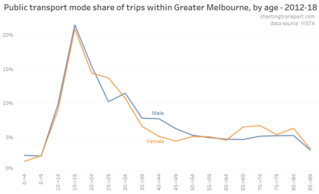
Public transport mode share peaked in the 15-19 age group – essentially around the later years of secondary school and early years of tertiary education or working life where people have more independence, may need to travel longer distances to get to school or university, and are too young and/or cannot afford private transport.
Public transport mode share then fell away with age, though the profile by gender is slightly different (some of this may be noise in the survey). Women under the age of 30 were more likely to use PT, but then they became less likely to use PT after age 30 – perhaps after the arrival of children.
Children under 10 years were least likely to use public transport, and there was only a small increase in public transport use amongst women aged over 65. Public transport use dropped considerably for those aged 85-89, and there wasn’t sufficient sample to confidently calculate mode shares for any older age groups.
How does PT mode share vary by age and sex for journeys to work?
Here is a chart of public transport mode share of journeys to work in Greater Melbourne by age and sex (using census data):
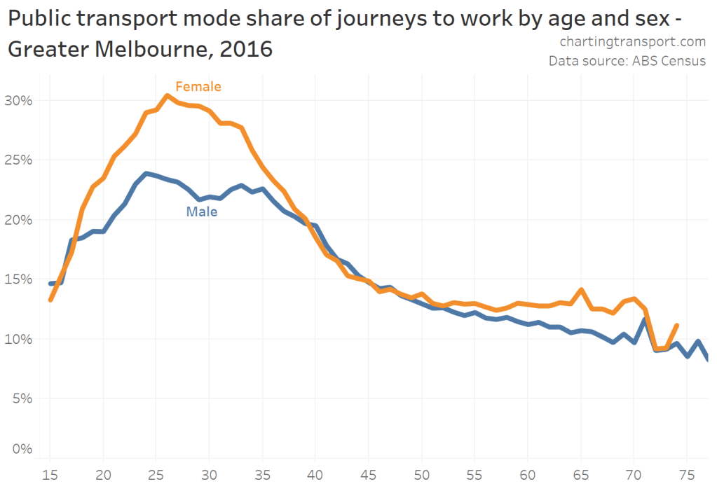
The chart shows women were much more likely to use public transport to get to work than men, particularly for young adults but also those in their 60s. Overall PT mode share was 17.7% for males and 20.3% for females. PT mode share peaked for females at age 26, and for males at age 24.
So what might explain the variations across age and gender? In this first post I’m going to explore the how mode share varies by home and work distance from the CBD.
Travelling to the city centre
We know that travel to/from the central city is much more likely to involve public transport, so here are general travel PT mode shares dis-aggregated by whether or not the trip was to/from the City of Melbourne (local government area):
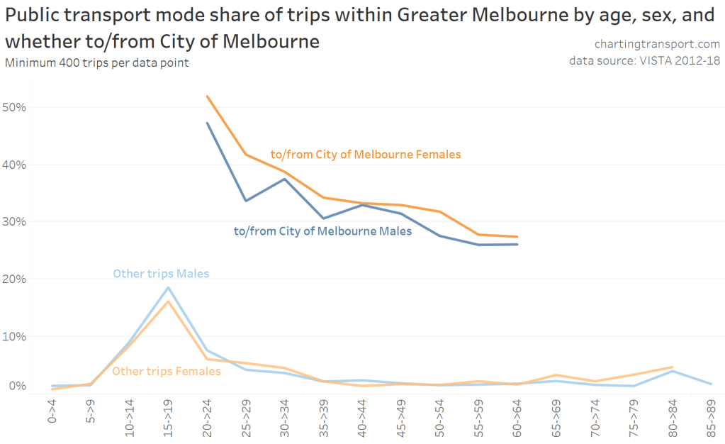
For travel to/from the City of Melbourne, PT mode shares peaked around 50% for workers in their early 20s, and generally fell away with age, with females showing a higher PT mode share in all age groups (mode shares are only shown for ages 20-64 due to small samples of trips in other age groups).
For travel not to/from the City of Melbourne, PT mode shares peaked for teenagers and was very low for all other age groups, with only slightly higher mode shares for those in their 20s, early 30s, and early 80s.
With census journey to work data, we can increase the resolution to 2 year age-bands and dis-aggregate work destinations by distance bands from the CBD. The darker line of each colour is for females, the lighter for males.
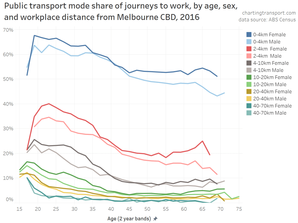
Public transport mode share was much higher for workplaces near the CBD, and then declined with workplace distance from the CBD.
But within each workplace distance band from the CBD there was also a generally declining PT mode share with age, flattening out somewhat for ages above 45. While there was a difference between genders at all workplace distance bands, it was generally smaller than the overall mode share difference between genders for journeys to work.
How can these lines have quite a different curve shape to overall PT mode share by age/sex? Well, here is a chart showing the proportion of Greater Melbourne workers at every age who worked within 4 kms – and within 10 kms – of the Melbourne CBD:
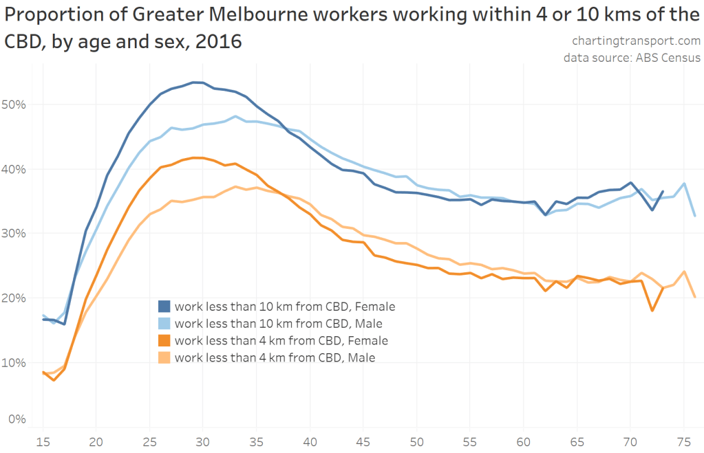
Young adults were much more likely to work closer to the CBD than older adults, and women even more so (although they are not actually a majority of workers close to the CBD).
Teenagers were least likely to work in the City of Melbourne, which likely reflects their lack of qualifications for high-skill jobs that tend to locate in the central city.
The curves for men and women peaked at different ages, with younger adult women more likely to work in the City of Melbourne than younger adult men, which then flipped for ages 38+. This isn’t because of stay-at-home mums because the data only counts people who travelled to work.
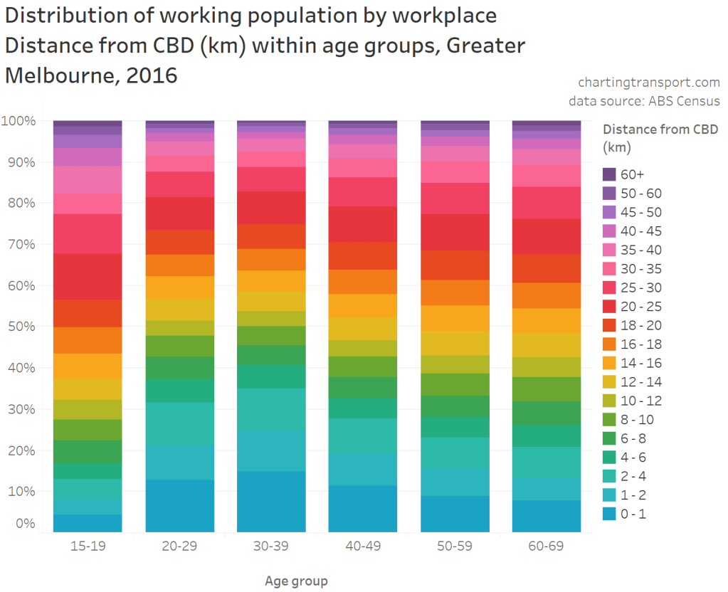
Here’s another look at that data – showing the distribution of work locations from the CBD for age bands. Around 40% of young adult workers worked within 6 km of the CBD:
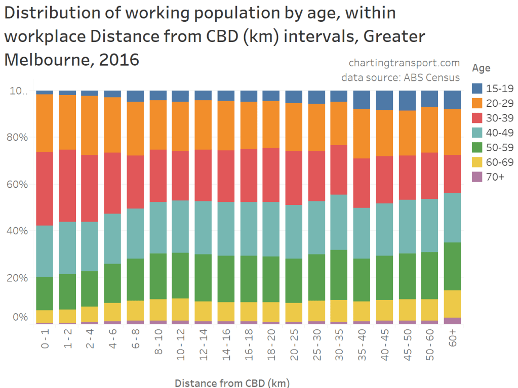
And flipping that, workplaces closer to the CBD have a higher proportion of younger adults:
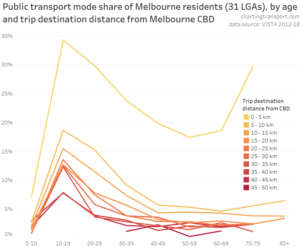
Public transport mode shares for general travel (in the VISTA survey) were related to both age and trip destination distance from the CBD, with those in their 50s least likely to use PT for destinations within 5 km of the CBD:
So a major explanation why younger adults were more likely to use public transport in their journey to work is that they were more likely to work in the central city. However, when you control for travel proximity to the CBD there is still a significant relationship between PT mode share and age – other factors must be at play.
I’m curious – is the fact that younger adults (particularly women) were more likely to work in the city centre related to their…
Educational qualifications
Well, younger adults turn out to have the highest educational qualifications of any age group, with those in their early 30s generally being the most qualified (as at 2016):
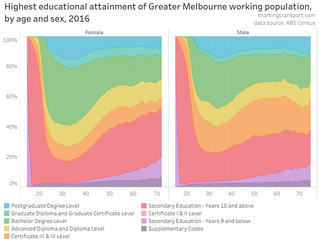
Note: Supplementary codes includes people with no educational attainment.
Furthermore, younger women are generally more qualified than younger men, which could explain why a higher proportion of younger women work in the City of Melbourne, and therefore have a higher public transport mode share overall.
[As an aside: I find that chart fascinating – there’s been a generational shift in educational attainment which will continue to work it’s way up the age brackets in the decades ahead, resulting in an increasingly skilled workforce over time. Part of this will be skilled migration, part may be temporary migrants (eg international postgraduate students), and another part presumably reflects greater access to higher education in recent decades.]
Looking to the future perhaps this cohort of highly educated young adults will continue to work in the inner city as they age, along with younger skilled graduates, leading to more centralisation of employment in Melbourne as we become more of a “knowledge economy”? Or maybe the recent mass working-from-home experience of highly skilled workers during the COVID-19 pandemic will see more workers based in the central city but travelling to their workplace less often.
But back to the how education levels impact work location and mode choice…
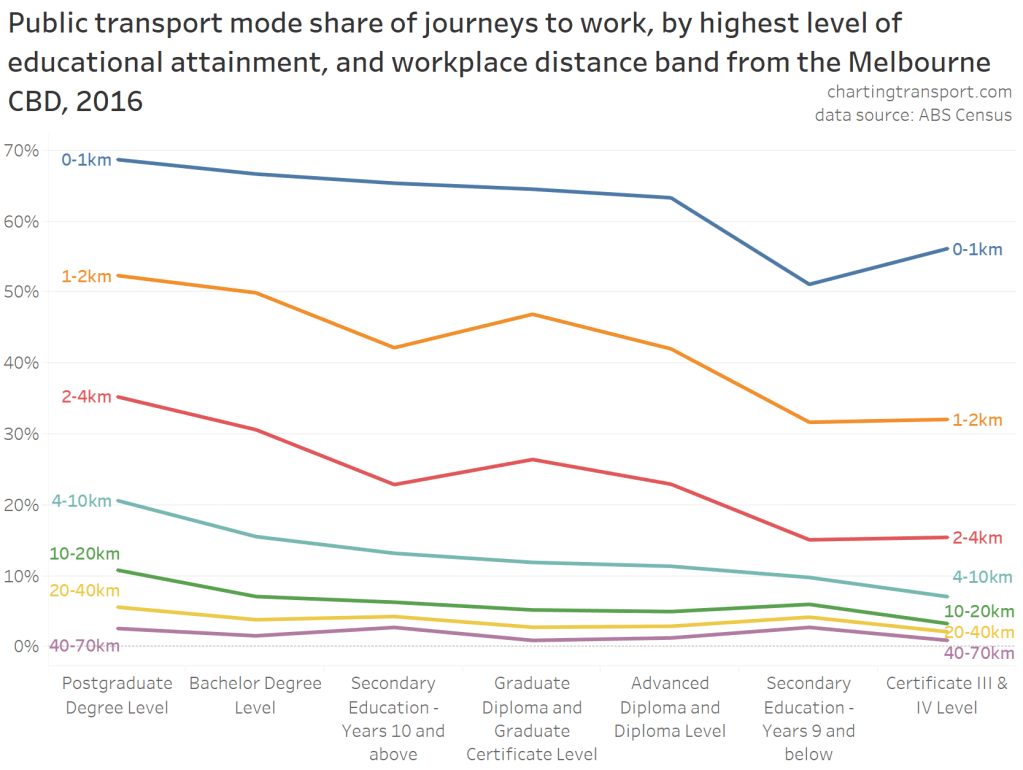
People with higher educational attainment are more likely to work closer to the CBD:
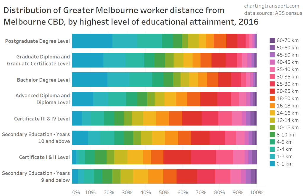
The chart shows around half of workers with postgraduate degrees worked within 4 km of the CBD, whereas those who didn’t complete secondary education were much more likely to work in the suburbs.
We know that workplace distance from the CBD impacts PT mode shares, but does varying educational qualifications explain the differences in mode share between ages?
The following animated chart shows how PT mode shares for journeys to work vary by age for people with the same level of educational qualifications and working the same distance from the Melbourne CBD. I have animated the chart across workplace distance from the CBD bands.
If you watch and study the chart, you’ll see that there is a relationship between age and PT mode share for most combinations of educational attainment and workplace distance from the CBD. That is, age is significant in itself, or there is some other explanation for mode share difference by ages.
You’ll also see that public transport mode shares were generally higher for higher levels of educational attainment, with postgraduate degrees mostly showing the highest public transport mode share.
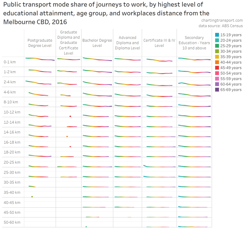
Here’s an alternative, non-animated view of that data. It’s a matrix of mini line charts showing PT mode share by age, for each combination of workplace distance from the CBD and highest level of educational attainment. You could call it a matrix of worms. The light horizontal line within each matrix box represents a 50% PT mode share, and the colours give you a rough sense of age (refer legend). I don’t expect you to be able read the mode share values for any age band on any line, but it does show PT mode shares falls with rising age for all education levels and workplace distances from the CBD (except some further out where PT mode share is just very low for all ages).
Here is yet another view: the relationship between PT mode share, workplace distance from the CBD, and highest level of educational attainment. I have roughly sorted the education levels by PT mode share, rather than ordering by level of qualification.
PT mode shares were not directly proportional to education levels, but I suspect this will be partly related to occupations – eg Certificate III and IV qualifications often related to trades where driving to non-centralised work sites is a more convenient option.
Those with postgraduate degrees generally showed the highest public transport mode share at each distance interval.
So we’ve explored work distance from the CBD, but what about…
Home distance from CBD
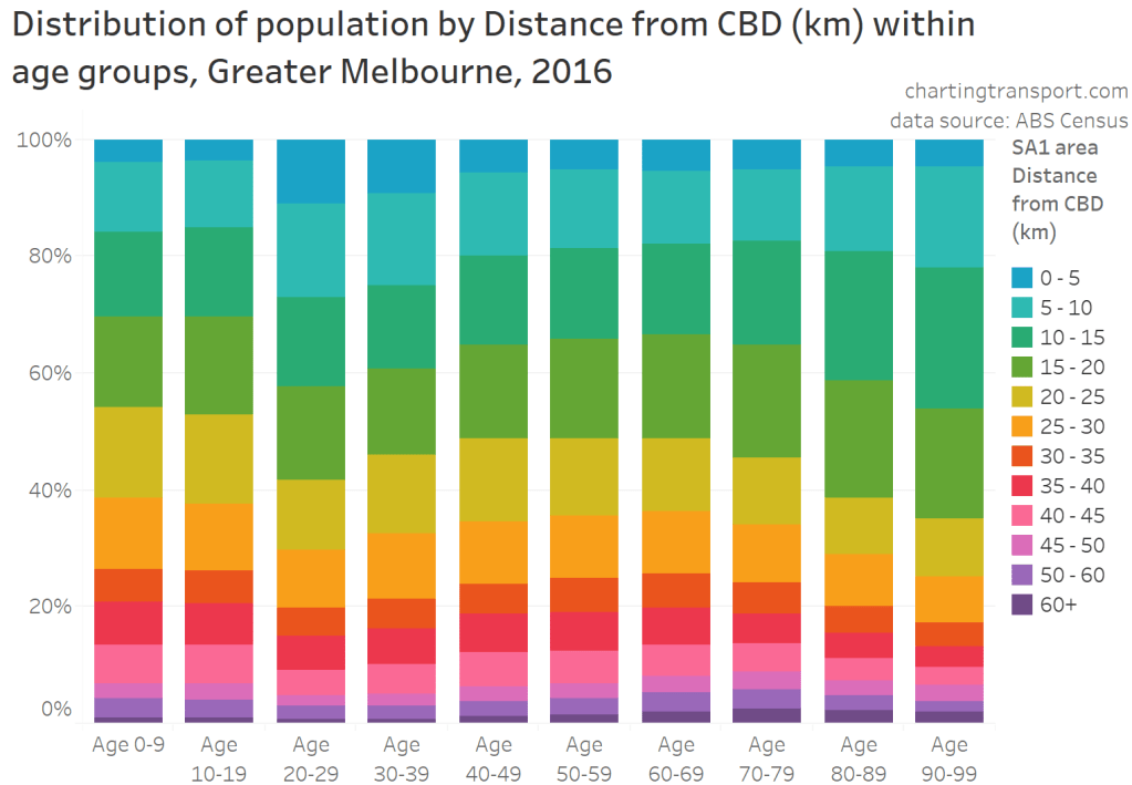
Younger adults were more likely to live closer to the Melbourne CBD compared to other age groups:
Public transport service quality is generally higher closer to the CBD, so does the fact that younger adults were more likely to live closer to the city explain their higher PT mode shares?
The following chart shows how public and active transport journey to work mode shares vary by home distance from the Melbourne CBD:
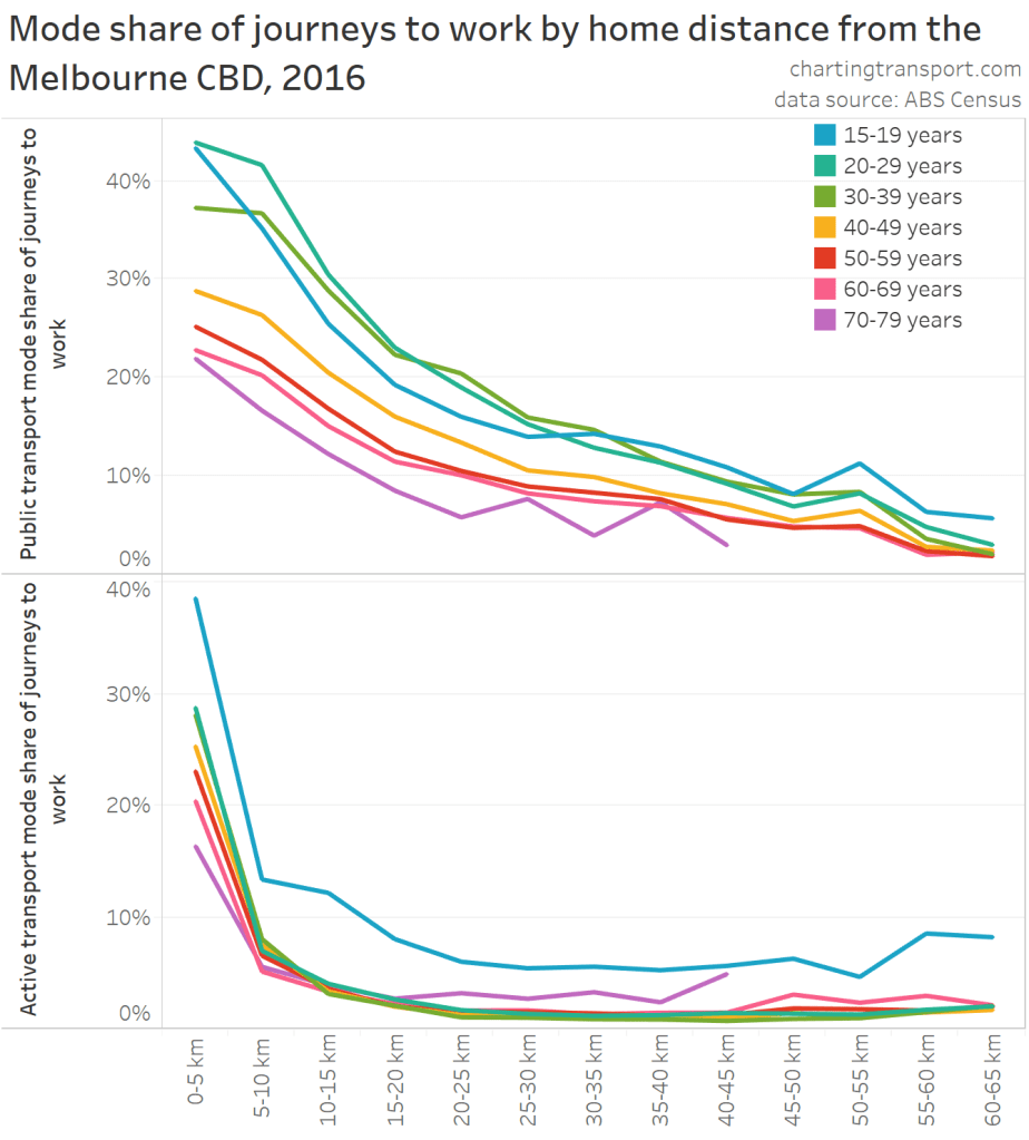
Public transport mode shares show a relationship with both home distance from the CBD and age – with mode shares peaking for ages 20-39, and dropping with older age bands. I’ve plotted active transport mode shares as well (for interest), which shows teenage workers much more likely to get to work by active transport – which makes sense as many of them will be below driving age and/or unable to afford private transport. Curiously those aged 70-79 who live in the suburbs are slightly more likely to walk to work.
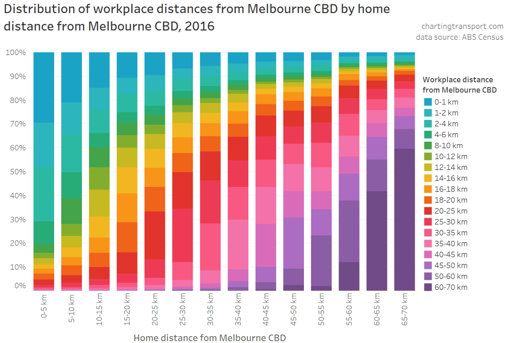
Okay, but people who live closer to the CBD are more likely to work closer to the CBD, as the following chart shows:
Or another way of looking at it:
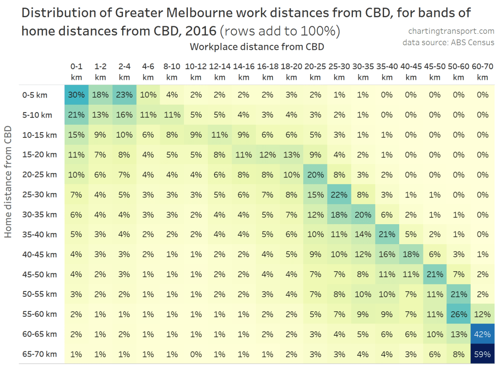
While the distance bands vary on each axis (more intervals for work distances from the CBD), you can see a very common scenario is that people’s work is a very similar distance from the CBD as their home. That is, they work relatively locally (for more on this, see Introducing a census journey to work origin-destination explorer, with Melbourne examples)
The following chart looks at mode shares for those who worked within 2 km of the CBD:
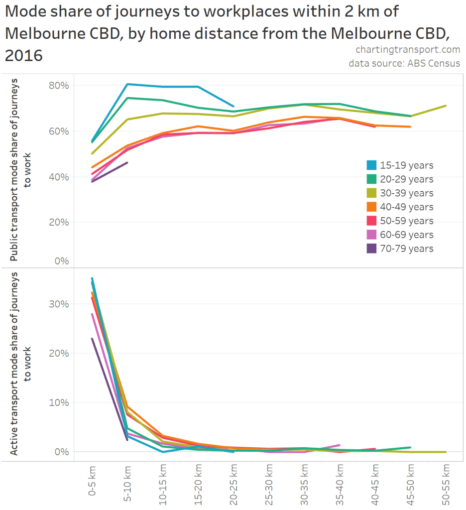
PT mode shares for these commuters were relatively high and flat for workers who live more 5 km from the CBD (those closer are more likely to use active transport – as per the bottom half of the chart). PT mode shares rose slightly with distance from the CBD for home distances 25-40 km from the CBD. But there was still a difference between age bands, with younger adults more likely to have used PT to get to work, regardless of how far from the CBD they lived.
So are there still PT mode share differences by age if you control for both home and work distance from the CBD?
Home AND work distance from the CBD
Firstly, here are PT mode shares for journeys to work by home and work distance from the CBD, animated over age bands:
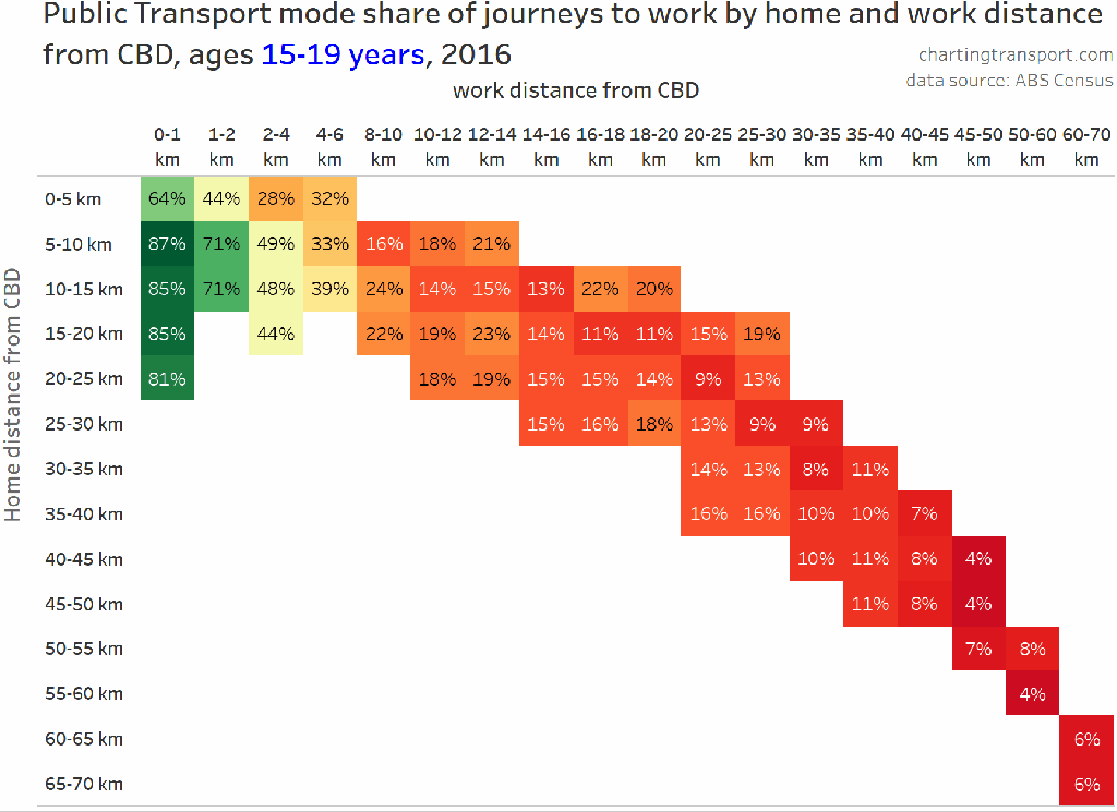
Technical notes: the chart only shows mode shares where at least 200 people fell within the age and distance bands – which is quite a low threshold so there is a little noise – so please try not to get distracted by small differences in numbers. For teenagers and those aged 60-69, many combinations failed this threshold so are left blank.
The chart shows that work distance from the CBD is a very strong driver of mode shares at all age bands. Home distance from the CBD is much weaker driver of PT mode share – and only really significant for those living within 5 km of the CBD, and those under 40 years within 15 km of the CBD.
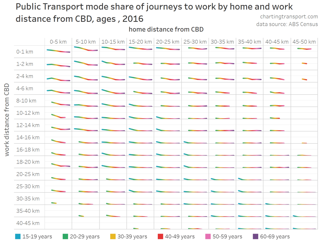
If the animation is hard to follow, here’s another matrix-of-worms chart. It shows PT mode share by age band – for every combination of home and work distance from the CBD.
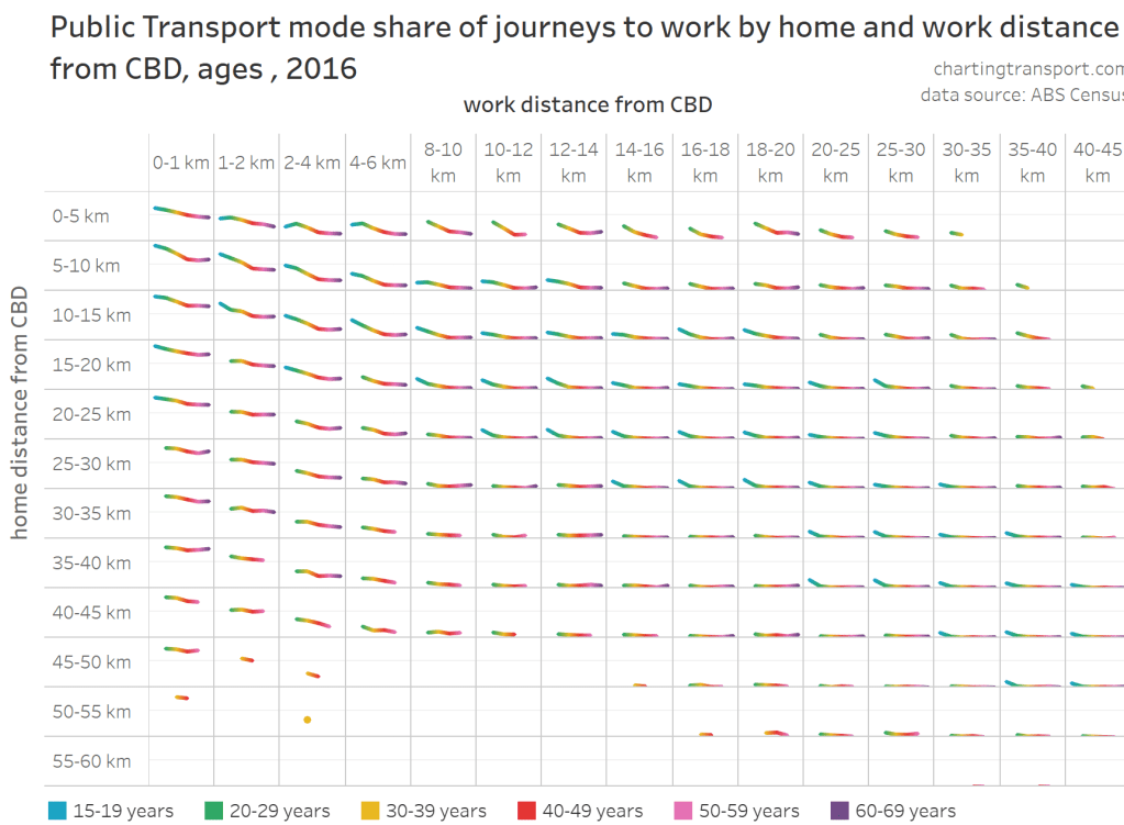
The thin horizontal lines within each square of the matrix represent 50% PT mode share. While you cannot read off the PT mode shares for any age and distance combination, you can see that within each pane PT mode share either generally fell with increasing age, or were very low for all ages. That is to say, that home and workplace distance from the CBD doesn’t fully explain the relationship between age and PT mode shares for journeys to work. Other factors must be at play.
The above chart makes it hard to compare mode shares for the different work distances from the CBD, so here is a transposed version with work distances as rows and home distances as columns:
There’s not a lot of difference between home distance bands for each work distance band, except for younger adults living closer to the CBD and working in the city centre. This confirms the earlier finding that work distance from the CBD is a much stronger determinate in PT mode shares.
So in summary, younger adults are more likely to live and work closer to the CBD, and that is likely related to them generally having higher educational qualifications. While these factors generally lead to higher public transport use, we’ve found they don’t fully explain why younger adults have higher public transport mode shares.
Further posts in this series will look at other demographic factors that may explain these differences. Read on to part two.


Student concession discounts would help student PT patronage, probably helping graduate PT usage by creating a PT friendly mindset in students.
LikeLike
Another fine investigation Chris. As to the unexplained reduction in PT mode share with age, my hypothesis is that driving a car to work is still seen as a badge of status in many quarters – and perhaps more crucially, that senior employees are more likely to be provided with employer-subsidised cars and/or car parking (with a generous tax concession thrown in for good measure).
Comparing work and non-work travel and controlling for origin and destination distance from the CBD as you’ve done here might shed some light on the issue. Unfortunately as we know, there’s much less high-quality data available for non-work travel.
LikeLike
Would love to see if these findings hold across different jurisdictions and am particularly interested in WA trends. Post covid I believe patronage is still suppressed but we have no enforcement of SD measures and people are comfortable enough to sit in adjacent seats especial during AM peak periods.
LikeLike