According to census data, private dwelling occupancy has been declining in most Australian cities (refer my earlier post on the topic). Could an increase in private dwellings dedicated to Airbnb rental – but vacant on census night (a Tuesday in winter) – explain much of this decline? Let’s look at the data.
Firstly here’s a reminder of private dwelling occupancy trends in Australia’s 16 largest cities.
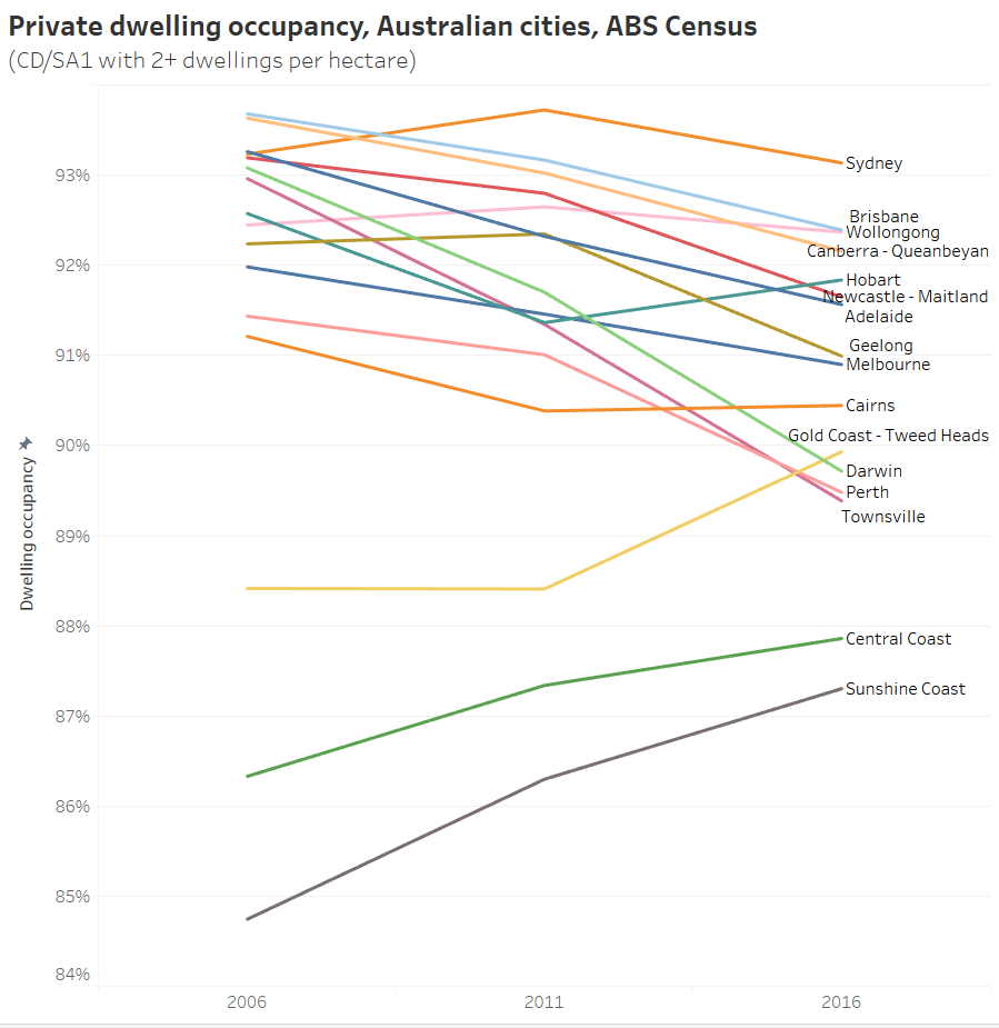
Dwelling occupancy rates declined in all large cities (but rose in some smaller urban areas, particularly on Central (NSW), Sunshine, and Gold Coasts).
The ABS have advised me that their field officers would have no way of telling whether a dwelling is on Airbnb, and would therefore count them as private dwellings. So vacant Airbnb dwellings could account for unoccupied private dwellings.
How many of the additional unoccupied dwellings might be dedicated to Airbnb?
The fantastic site Inside Airbnb provides data scraped from the Airbnb website about listings in various cities. I’ve used available data extracted on 4 September 2016 for Melbourne and 4 December 2016 for Sydney (the closest data sets available to the August 2016 census). I’ve then filtered for entire home/apartment listings that had more than 90 days availability in the 12 months ahead and had been reviewed at least once in the last six months, to estimate the number of “active and dedicated” Airbnb dwellings. Definitely just an estimate.
For the area for which Melbourne Airbnb data is available (I’ve approximated Inside Airbnb’s unpublished boundary as SA3s with any listings in 2016) these Airbnb dwellings account for 0.19% of total private dwellings. For that same area, dwelling occupancy dropped 0.71% from 92.61% to 91.90% between 2011 and 2016.
According to a Melbourne University study using data from commercial Airbnb data site AIRDNA, around 62% of entire home/apartment Melbourne listings (that were not blocked out by owners) were unoccupied on Saturday 27 August 2016.
I’m guessing the Airbnb vacancy rate might have been higher on census night (a Tuesday). If say 70% of the Airbnb dwellings were empty on census night (just a guess), then they would account for 0.09% out of the 0.71% decrease in dwelling occupancy in Melbourne between 2011 and 2016, which is about 19%. Note: Airbnb barely existed in Melbourne in 2011 – there were only 161 Airbnb listings.
If somewhere between 60% to 80% of active/dedicated Airbnb properties were vacant, then they might explain between 16% and 21% the decline in dwelling occupancy in Melbourne.
For the equivalent area of Sydney, these Airbnb dwellings account for 0.22% of private dwellings, and there was a drop in private dwelling occupancy of 0.58% between 2011 and 2016. If somewhere between 60% to 80% of active/dedicated Airbnb properties were vacant, then they would explain between 23% and 30% of the decline in overall dwelling occupancy.
However I must stress these are rough estimates and might be over or under the actuals for several reasons:
- It’s possible that some of these “entire home/apartment” listings are not counted by the ABS as dwellings (eg granny flats or segmented buildings that don’t have separate addresses) which would lead to over-estimates.
- Some Airbnb listings that have less than 90 days availability in the 12 months ahead might just be very popular – leading to underestimates (my guess is that is unlikely).
- The Sydney figure might be an overestimate because the Airbnb data was extracted three months after the census, and the total number of Airbnb listings almost doubled in 2016.
- The actual Airbnb vacancy rate on census night might not have been in the 60-80% range.
- I don’t know exactly where the city boundary was drawn for the Inside Airbnb data, but my approximation is more likely to be larger – which would lead to slight underestimates (probably very slight as the differences would be in peri-urban areas with few dwellings).
- There may be other reasons – please comment.
That said, it looks like Airbnb might explain somewhere in the order of a fifth of the drop in private dwelling occupancy in Melbourne and Sydney between 2011 and 2016. Certainly not all of it, but probably not none of it either.
What proportion of dwellings are dedicated to Airbnb in different parts of Melbourne and Sydney?
Here’s a map of active/dedicated Airbnb dwellings (as per filter above) as a percentage of total dwellings in Melbourne at SA2 level:
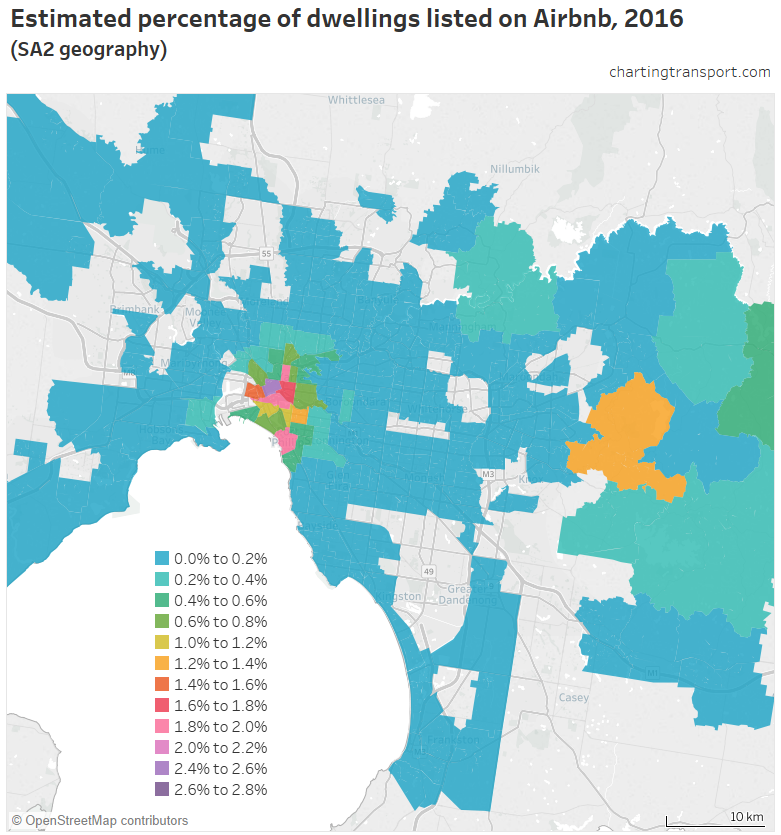
It maxes out at 2.5% in the Melbourne CBD (that’s 1 in 40 dwellings), followed by Southbank and Fitzroy at around 1.9%. Mount Dandenong – Olinda is the orange patch to the east which measures 1.3%. View the data in Tableau.
As you would expect, Airbnb properties appear to be more prevalent around the inner city and tourist areas (eg St Kilda and the Dandenongs). These are also the areas with generally lower dwelling occupancy, and certainly some of the unoccupied dwellings in the census will be Airbnb dwellings.
Here is Sydney:
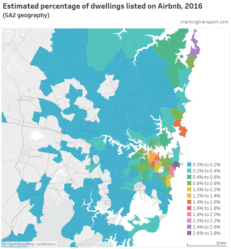
The highest rates are 2.6% around Bondi Beach, and 2.5% at Avalon – Palm Beach. Manly comes in at 1.5%, Surry Hills is 1.5%, Potts Point – Woolloomooloo is 1.4%, while the CBD area is 1.3%. Again, you can explore this Airbnb data in Tableau.
Could Airbnb properties explain the spatial differences in dwelling occupancy?
Here’s a plot of dwelling occupancy and Airbnb percentages for SA2s in Melbourne and Sydney.
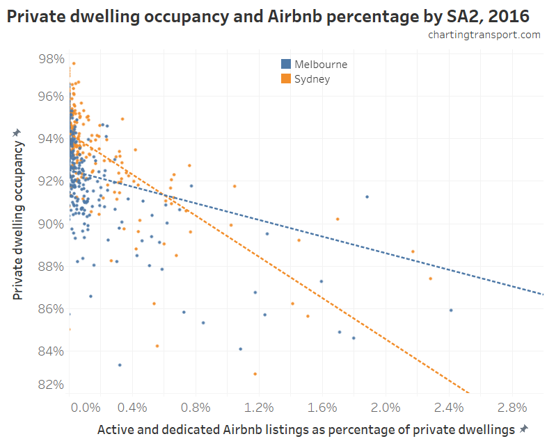
I’ve done a linear regression on each city, and while the relationships are significant, they are not strong, and the correlation coefficients are -4.9 in Sydney and -1.5 in Melbourne. The signs are as expected (ie more Airbnb, lower occupancy), but the magnitudes are much higher than would be the case if Airbnb was the main explanation for lower dwelling occupancy (otherwise they would be around -1 or smaller). Which essentially means Airbnb presence is correlating with other drivers that would explain lower dwelling occupancy.
Indeed inner city and tourist areas had lower dwelling occupancy in both 2006 (when Airbnb didn’t exist) and 2011 (when Airbnb only had a tiny presence in Australia).
Therefore I think we can conclude Airbnb properties are more prevalent in areas where dwelling occupancy is lower for other reasons – one of which is likely to be popular places for visitors. Unoccupied Airbnb properties are almost certainly part of the pattern, but cannot explain the majority of the decrease in dwelling occupancy.
Can you do those Airbnb maps at higher resolution?
It’s getting a bit beyond the topic of transport, but yes I can go down to SA1 level. It’s not particularly important, but certainly interesting.
A disclaimer: Airbnb introduce randomised errors on property locations of up to 150 metres, so there will be some mis-attribution of properties to SA1s, but hopefully not too much. Also, I’m still only counting properties that match the above criteria.
Here’s inner Melbourne (note: different colour scale to last map):
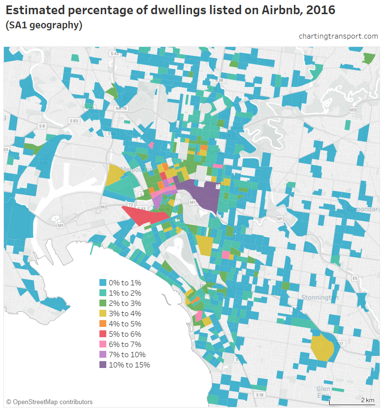
Airbnb maxes out at 11% for three city blocks around Swanston Street and Collins Street, plus a large SA1 in East Melbourne that actually only contains a small residential area close to the CBD (including an apartment tower at 279 Wellington Parade). There’s also an SA1 in Southbank behind Crown Casino that is 10% Airbnb.
Curiously, there were only about 6 Airbnb listings in the New Quay apartments in Docklands that had 65-70% occupancy (refer earlier post), so Airbnb is definitely not to blame of the low occupancy of those towers.
Outside the central city, other hot spots are St Kilda around Acland Street (6%), just east of South Yarra Station (6%), and a patch of Olinda (5%). Explore in Tableau.
Here’s Sydney:
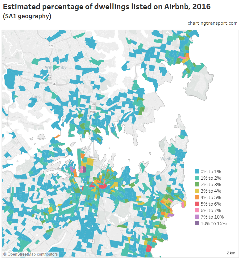
It tops out at 11% in the southern part of the CBD, with 10% in part of Pyrmont and 7% in pockets near Manly and Bondi Beach. Other hotspots include Coogee (6%) and Whale Beach further north (5%). Explore in Tableau.


 Posted by chrisloader
