I’ve recently completed my big annual refresh of the Trends pages on Charting Transport (accessible from the Trends menu above). Here is a quick scan of some headline trends, plus a few new interesting charts.
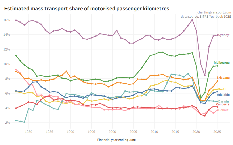
First up: mass transport mode share has increased around 0.75% in Brisbane following the introduction of 50 cent fares, but is relatively flat in most other cities, and below pre-pandemic levels (probably related to CBD workers working from home much more often).
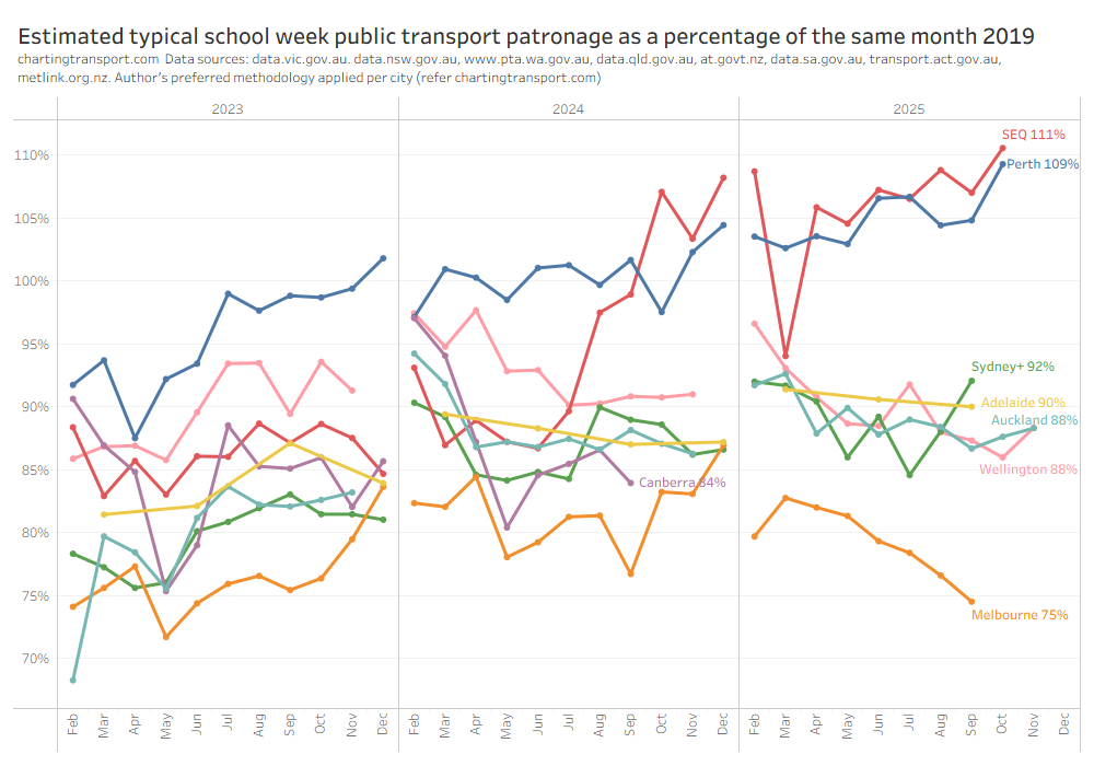
Public transport patronage levels relative to 2019 are highest in Perth (likely due to many new rail lines) and South East Queensland (likely due to 50c fares):
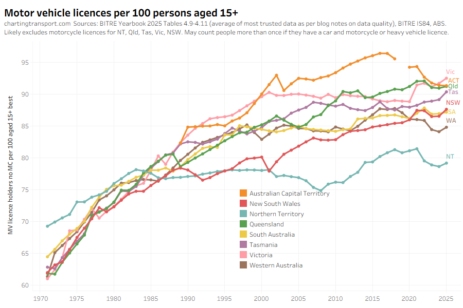
Driver’s licence ownership rates have risen slightly in most states:
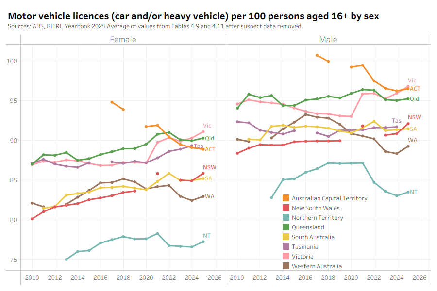
I’ve now got more analysis by gender, and females seem to be slowly closing the gap with males when it comes to motor vehicle licence ownership (but the male figures may double count those with car and heavy vehicle and/or motorcycle licences – it’s not entirely clear – data quality is a bit of a nightmare):
Motor vehicle licence ownership continues to rise rapidly for older people, especially females:
That said, people are still losing their licences as they get older, but the ages at which they lose their licence has been shifting older.
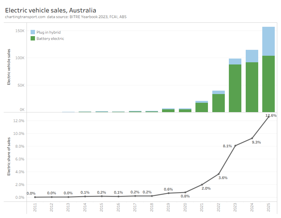
Plug-in hybrid vehicle sales have taken off, whilst pure battery vehicle sales are growing more slowly:
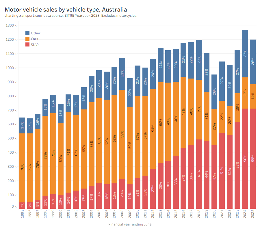
Sales of regular passenger cars are down again, as SUVs take a much larger share:
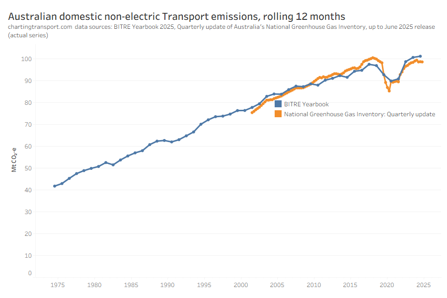
Transport emissions are not coming down. According to BITRE they are hitting new highs:
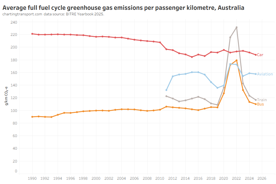
Here’s a new chart on estimated emissions per passenger kilometre for passenger transport, interestingly showing (domestic) aviation more efficient than cars:
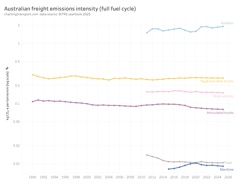
Next is a new chart showing freight emissions intensity. You may have known that trains and ships are very efficient at moving freight – but did you know they emit around 8 times less emissions than articulated trucks (per tonne-km), and around 190 times less emissions than than aeroplanes?
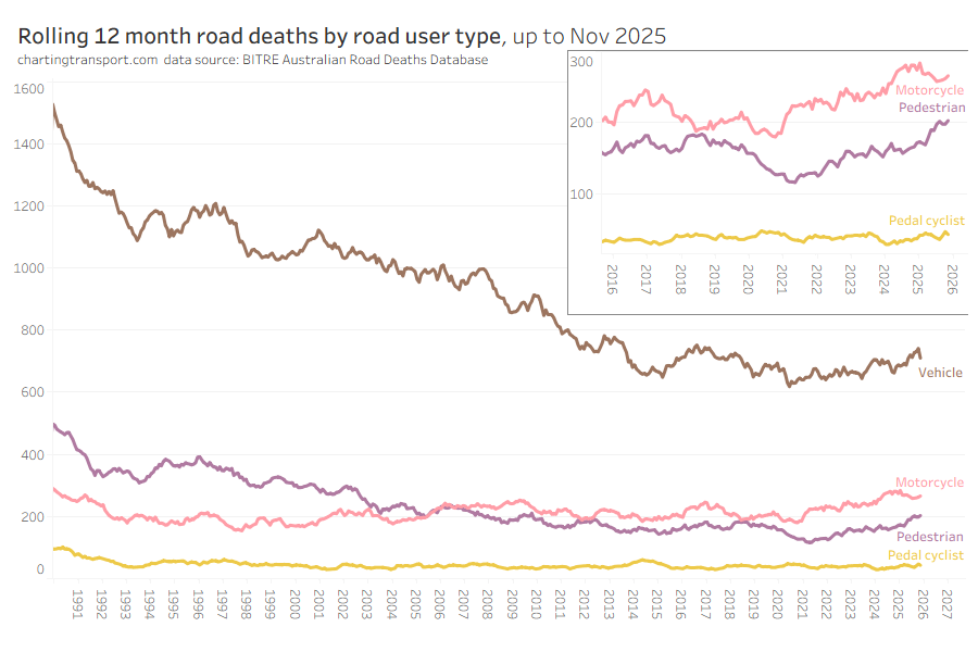
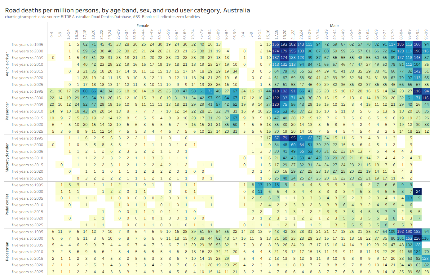
Pedestrian road deaths are continuing to increase:
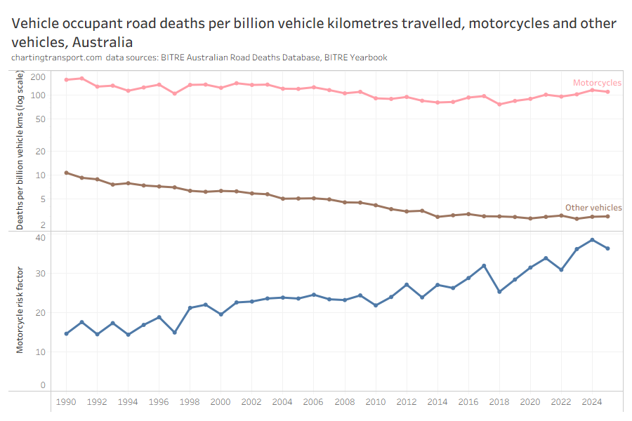
Motorcycles are around 36 times more deadly for vehicle occupants compared to other vehicles on a per-kilometre travelled basis:
This new chart might take a little time to get your head around, but it shows road deaths per capita by age band, sex, and road user category. There’s a lot going on, and you’ll likely need to click/tap to enlarge this one.
Deaths per capita have thankfully been coming down across most ages, both sexes, and most road user types since the 1990s.
The elderly are still significantly over-represented in deaths per capita for vehicle drivers, vehicle passengers, and pedestrians. And males still have much higher death rates per capita than females in most categories (except older vehicle passengers).
However there have been concerning increases in deaths per capita over time for males on motorcycles across most age bands, despite a decline in motorcycle kilometres travelled per capita since 2010.
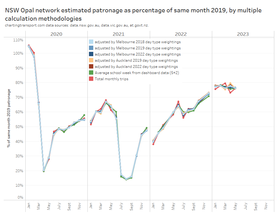
With the COVID19 pandemic seemingly behind us, what has been happening to public transport patronage? Has it recovered to 2019 levels? In which cities is public transport patronage recovering the strongest?
This post provides my best estimates of how much public transport patronage has recovered in major Australian and New Zealand cities.
In my last post I talked about the problems when transit agencies only publish monthly total patronage (or weekly or quarterly totals). For those cities that don’t publish more useful data, I’ve used what I think is a reasonable methodology to try to adjust those figures to take into account calendar effects.
Unlike most of my posts, I’ll present the findings first then explain how I got them (because I reckon a good portion of even this blog’s readers might be less interested in the methodology).
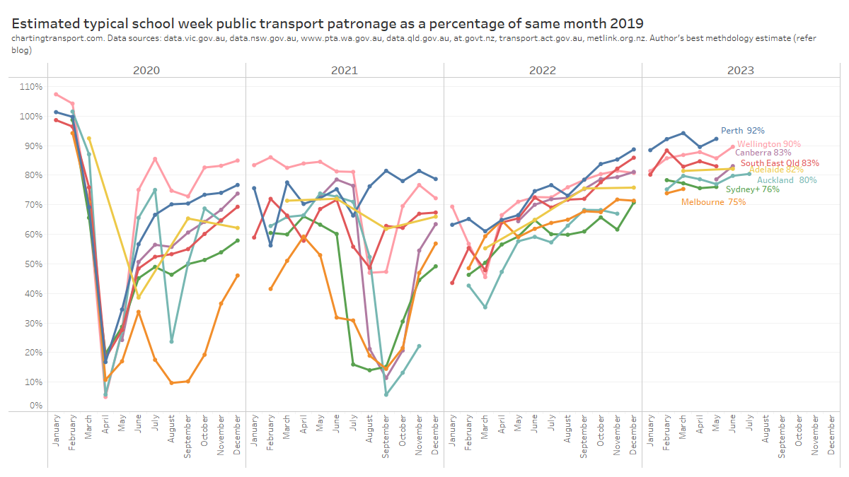
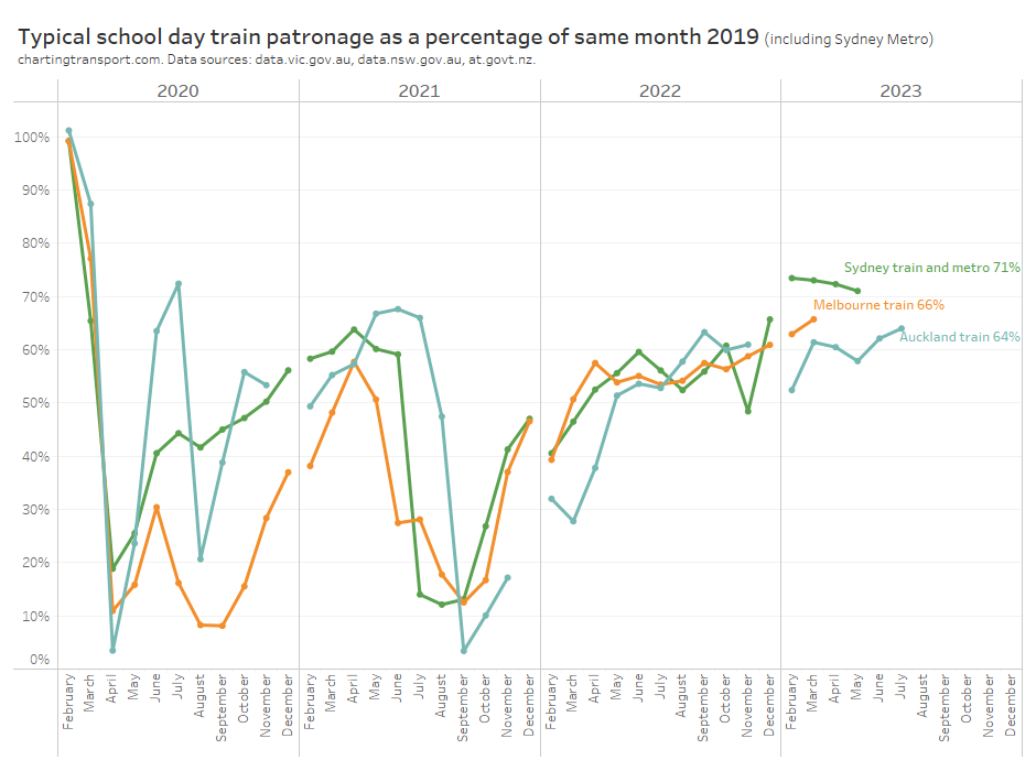
Estimates of typical school week public transport patronage recovery
Here’s a chart comparing estimated typical school week patronage per month to the same month in 2019 (the year before the COVID19 pandemic) where clean data is available. My confidence levels around estimates for each city is discussed further below.
Technical notes: Sydney+ refers to the Opal ticketing region that includes Greater Sydney, Newcastle/Hunter, Blue Mountains, and the Illawarra.Typical school week patronage is the sum of the median patronage for each day of the week (where available), otherwise an estimate of average school week patronage. More explanation below.
Perth has been at or near the top of patronage recovery for most recent months, perhaps partly boosted by a new rail line opening to the airport and High Wycombe in October 2022.
Wellington – which I suspect is an unsung public transport powerhouse – is in second place at 90%, whilst all other cities are between 75% and 83%.
Looking at the 2023 data, most cities appear to be relatively flat in their patronage recovery (except Perth and Wellington), which might suggest that travel patterns have settled following the pandemic (including a share of office workers working remotely some days per week).
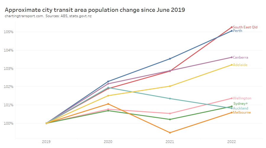
How does patronage recovery compare to population growth?
I’ve calculated the change in population for each city since June 2019. For South East Queensland I’ve used an approximation of the Translink service area, and for “Sydney+” I’ve used an approximation of the Opal fare region covering Sydney and surrounds. At the time of writing, population estimates were only available until June 2022.
There are significant differences between the cities.
So how does public transport patronage recovery compare to population change? The following chart shows June 2022 patronage and population as a proportion of June 2019 levels:
The changes in population are much smaller than the changes in patronage and I have deliberately used a similar scale on each axis to illustrate this. Population growth certainly does not explain most of the variation in patronage recovery, but it is very likely to be a factor.
Perth had the highest patronage recovery in June 2022, but only some of this could be attributed to high population growth. Wellington had little population growth but the second highest patronage recovery to June 2022.
Perth might have the highest patronage recovery rate overall because it spent the least amount of time under lockdown, and so commuters had less time getting used to working at home. Melbourne, Sydney, Canberra, and Auckland spent the longest periods under lockdown, and – with the exception of Canberra – seem to be tracking at the bottom end of the patronage recovery ratings, which might reflect their workers becoming more comfortable with working from home during the pandemic. However I’m just speculating.
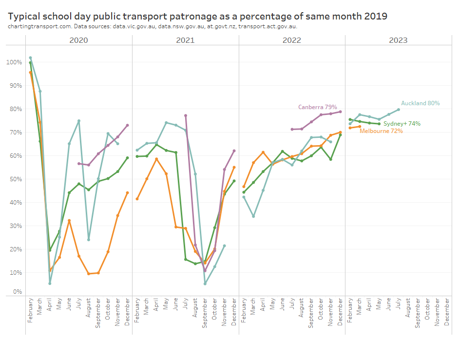
How has patronage recovery varied by day type?
Here’s patronage recovery for school weekdays (for cities which publish weekday data):
Note: Canberra estimates are only available for July to December because daily patronage data has unfortunately not been published for January to June 2019.
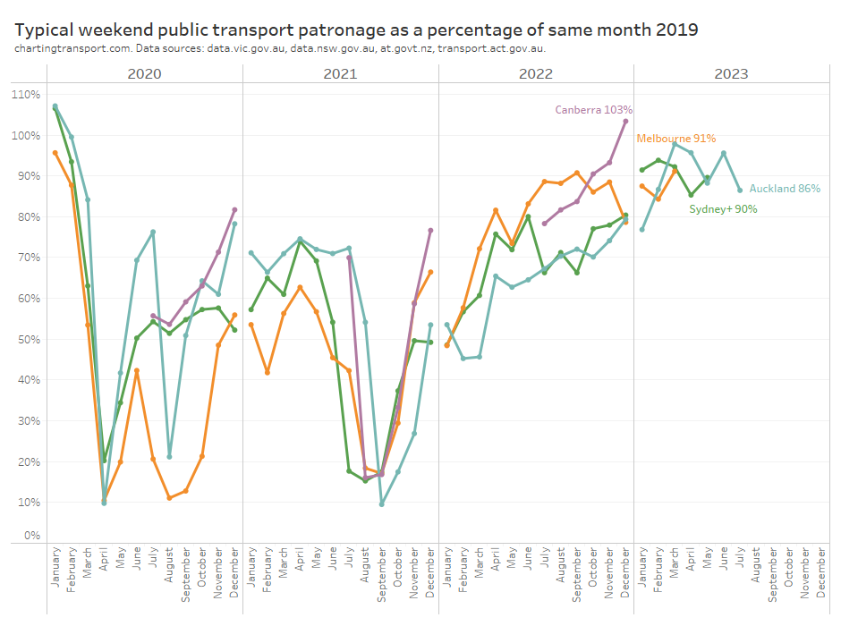
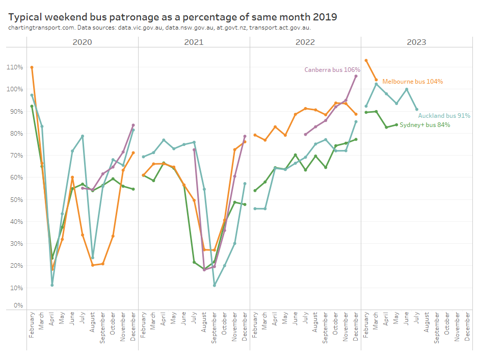
And here is the same for weekends (again for the same four cities that publish weekend data):
Weekend patronage is a bit more volatile as weekends typically have varying levels of major events and planned service disruptions. Most months also only have 8 weekend days, so a couple of unusual days can skew the month average and create “noise” in the data.
However all cities have been above 90% patronage recovery on weekends. Weekend patronage has returned more strongly than weekday patronage, probably because new remote working patterns only significantly impact weekdays.
How has patronage recovery varied between cities by mode?
I’m only confident about predicting modal patronage in cities that report daily or average day type patronage by mode, as the day type weightings used from another city might not apply equally to all modes.
Here is school weekday train patronage recovery for Sydney, Melbourne, and Auckland:
Auckland is slightly below Sydney and Melbourne, and recovery rates are lower than public transport overall. I suspect this may be due to train networks having a significant role in CBD commuting – a travel market most impacted by remote working.
And here is the data for weekends:
Curiously there is a lot more variation between cities. There’s also a lot more variation between months, which could well be related to the “noise” of occasional planned service disruptions and major events.
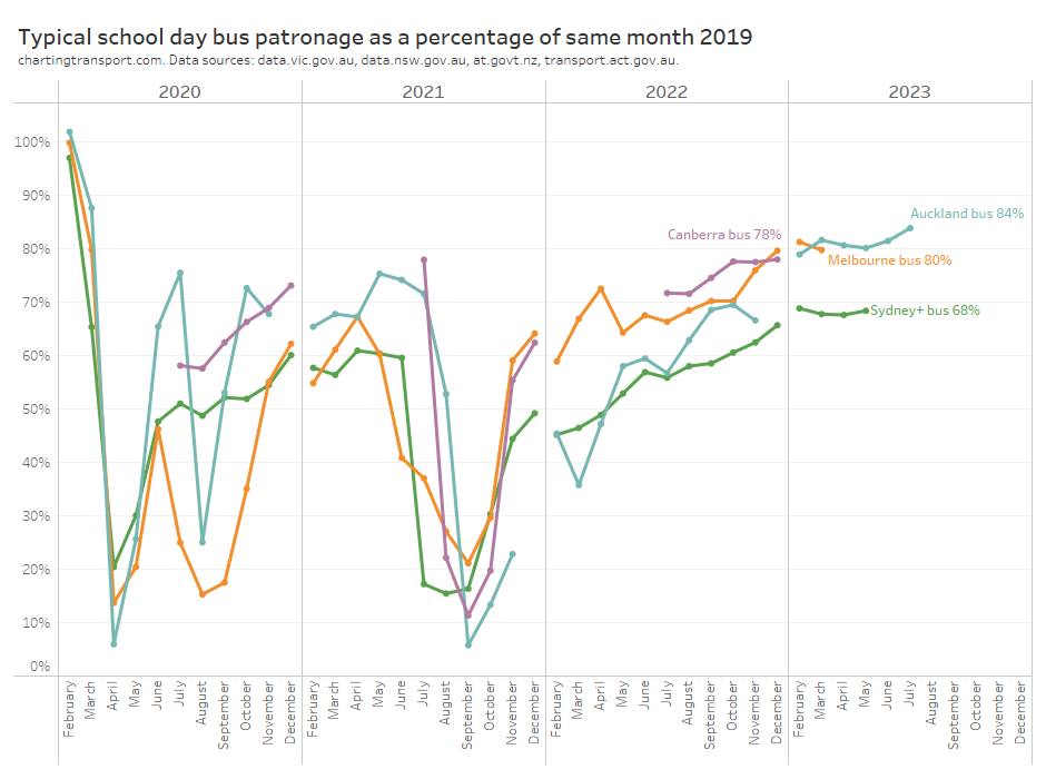
Here is average school day bus patronage for four cities where data is available:
Bus patronage recovery is lowest in Sydney, perhaps because buses play a more significant role in Sydney CBD commuter travel which will be impacted by working from home (Melbourne’s bus services are mostly not focussed on the CBD). However buses also play a major role in public transport travel to the CBDs of Auckland and Canberra, although with probably lower public transport mode shares (unfortunately it doesn’t seem possible to get public transport mode share for the Auckland CBD from 2018 NZ Census data).
And for completeness, here is a chart for weekend bus patronage:
Weekend bus patronage recovery is higher than weekdays, and higher than weekend train patronage recovery, in all cities. Reported weekend bus patronage in Canberra, Melbourne, and Auckland has exceeded 2019 level in recent months.
How good are these estimates?
Some agencies publish very useful data such as daily patronage or day type average patronage, while others only publish monthly or quarterly totals which is much less useful for trend analysis. Here’s a summary of how I estimated time-series patronage and therefore patronage recovery in each city (which I will explain below).
South East Queensland (Translink) – including Brisbane, Gold Coast, Sunshine Coast
Reported weekly totals, aggregated to months, and adjusted by day type weightings calculated for Melbourne 2022.
Lower
Adelaide
Reported quarterly totals, adjusted by day type weightings calculated for Auckland 2022.
Lower
Perth
Reported monthly totals, adjusted by day type weightings calculated for Auckland 2022.
Lower
Canberra
Reported daily patronage (from July 2019) and monthly total patronage for May and June 2019 adjusted by day type weightings calculated for Canberra 2022 (weekdays) and 2019 (weekends and public holidays). Data pre-May 2019 has been excluded as there was a step change in boardings when a new network was implemented in late April 2019. May 2019 has been included however I should note it had unusually high boardings.
Moderate
Auckland
Reported daily patronage (up to 23 July 2023 at the time of writing).
High
Wellington
Reported monthly totals, adjusted by day type weightings calculated for Auckland 2022.
Lower
For Melbourne and Auckland excellent data is published that allows calculation of typical school week patronage for February to December, which gives me high confidence in the estimates. Canberra has published daily patronage data but only from July 2019 so I’ve had to estimate school week patronage for May and June 2019 from monthly totals (process described below).
You’ll notice I’ve referred to “typical” patronage rather than average patronage. For cities with daily data, I’ve summed the median patronage of each relevant day of the week, rather than taking a simple average of days of that day type in the month. Taking the median can help remove outlier days, and summing over the days of the week means I’m weighting each day of the week equally, regardless of how many occurrences there are in a month (eg a month with 5 Sundays and 4 Saturdays). For Melbourne I’ve only got the average patronage per day of the week, but I’m still summing one value of each day of the week.
Transport for NSW have an interactive dashboard from which you can manually transcribe (but not copy or download) the average school weekday patronage and average weekend daily patronage for each mode and each month. I’ve compiled a typical school week estimate using 5 times the average school weekday plus 2 times the average weekend day. This is likely pretty close to what true average school week patronage is (more discussion below).
But what about the other cities?
How can you estimate patronage trends in cities where only monthly, quarterly, or weekly total patronage data is available?
Rather than simply calculating percentage patronage recovery on monthly totals (which has all the issues I explained in my previous post), I’ve made an attempt to compensate for the day type composition of each month in each city.
Basically this method involves calculating a weighting for each month, based on the day type composition of each month. If you divide total monthly patronage by the sum of weightings for all days of each month you can get a school weekday equivalent figure on which you can do time series analysis.
This requires a calendar of day types, and assumptions around the relative patronage weightings of each day type.
Technical note: In New Zealand it seems schools generally are able to vary their start and end of year by up to 5 regular weekdays. I’ve excluded these 10 weekdays from many calculations because they do not represent clean school or school holiday weekdays. For December 2019 I have also excluded two weeks for Auckland due to unusually low reported patronage due to bus driver industrial action.
The assumed day type weightings need to come from another city, on the hope that they will be similar to the true value. But which city, and measured in what year?
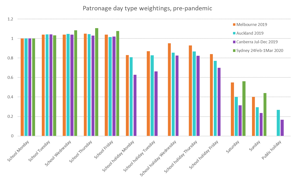
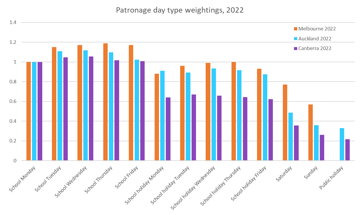
I’ve calculated the relative patronage weights of each day type for Melbourne, Canberra, Auckland, plus one school week sample from February 2020 for Sydney+ (Opal region). These are indexed to a school Monday being 1.
Note: no data is available for public holidays in Melbourne, and the Sydney data does not include school holiday weekdays or public holidays.
Melbourne, Canberra, and Auckland weightings are pretty similar across days of the week for school days, but Melbourne’s school holiday weekdays and weekends were relatively busier than both Auckland and Canberra. The Canberra school holiday figures are highly variable between weekdays and are only available for the second half of 2019 (so are impacted more significantly by the timing of Christmas).
The data suggests the big cities of Sydney and Melbourne attract much more weekend patronage compared to the smaller cities. They also have higher public transport mode shares – refer Update on Australian transport trends (December 2022) for comparisons between Australia cities. In terms of public transport share of journeys to work, Auckland was at around 14% in 2018, while Melbourne was 18.2% in 2016). This suggest Melbourne day type weightings might be suitable for larger cities while Auckland day type weightings might be suitable for smaller cities.
The next question is: which year’s weightings should be used? The chart above showed day type weightings from pre-pandemic times, but it turns out they have changed a bit since the pandemic. Here are 2022 day type weightings:
In all cities in 2022 there is a lot more variation across Monday to Friday school days (Mondays and Fridays being popular remote working days) and school holiday weekdays are much more similar between Melbourne and Auckland, while weekends remain quite different.
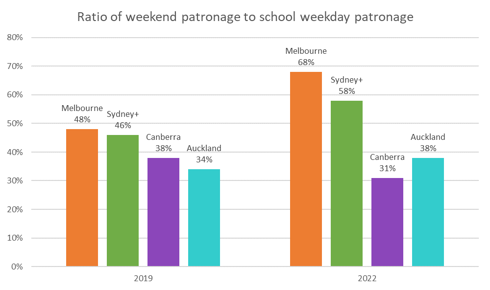
In fact here’s how the cities with available data compare for ratios between weekends and school weekdays in 2019 and 2022:
The ratios increased in all cities between 2019 and 2022 except Canberra. The 2019 ratios are remarkably close between Melbourne and Sydney, but the 2022 data shows a higher weighting for weekends in Melbourne than Sydney. The Auckland and Canberra ratios are substantially lower in both years. The ratio went down in Canberra in 2022 possibly due to issues obtaining enough drivers to run weekend timetables in that city.
So what day type weightings should we use for each city?
Should we use Melbourne, Auckland, or Canberra weightings, and from what year should we derive these weightings? And how worried should we be about getting these weightings right?
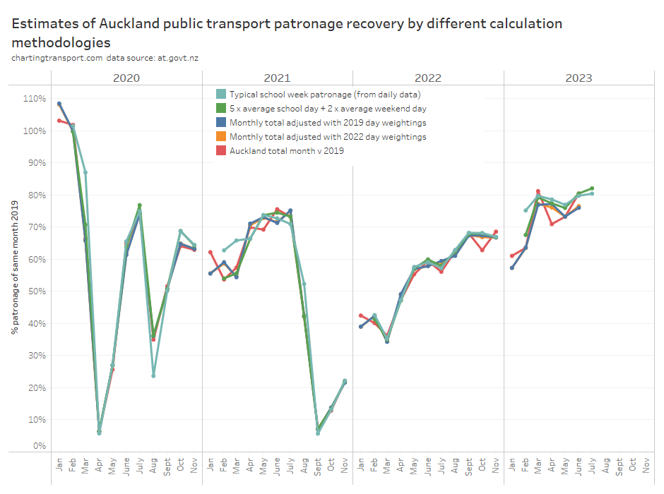
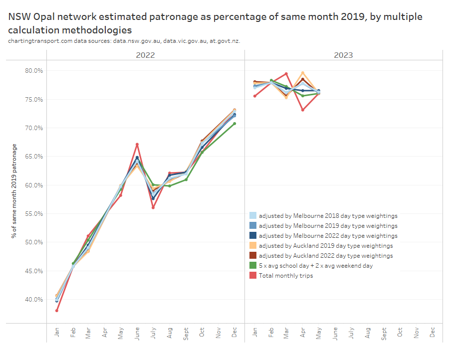
Well, Auckland provides us with daily patronage data for a “medium sized” city, which allows us to compare calculated typical school week patronage, and also allows calculations as if only more summary data was available (as per other cities). However we need to exclude both January and December, as there were no normal school weekdays in those months in 2019.
The red line (total monthly patronage with no calendar effect adjustments) has the most fluctuations month to month and I’m pretty confident this is misleading for all the reasons mentioned in my last post.
Most of the other methodologies produce a figure fairly close to the best estimate (teal line), except in 2021 and 2023.
The green line (compiled 5 x average school day + 2 x average weekend day) is mostly within 2% of the (arguably) best estimate, but there are variations that will be explained by the green line not taking into account the day of the week composition of the month, nor excluding outlier busy/quiet days (unlike medians). So if you only have average school weekday and average weekend day data you’re not going to be too far off the best estimate. That gives me “moderate” confidence to use Sydney’s average school weekday and average weekend day patronage data to estimate patronage recovery.
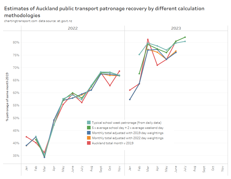
But what if you only have total monthly patronage and have to use day type weightings? It’s a bit hard to see the differences in the above chart, so here’s a zoom in for 2022 and 2023:
There’s not a lot of difference between the 2019 and 2022 day type weightings, and notably both methods underestimate patronage recovery for most months of 2023, which is not ideal. Note: February 2023 had several days of significant disruptions due to major flooding events which impacted most measures (except the “typical school week” measure that uses medians to reduce the impact of outliers).
Sydney also provides data that allows us to compare day type weighting estimates to the probably quite good compiled school week estimate (based on 5 average school weekdays and 2 average weekend days). The next chart includes estimates of Sydney patronage recovery using day type weightings from Melbourne and Auckland for different years:
Technical note: I have assumed Melbourne public holidays have the same day type weighting as Sundays, for want of more published data.
The estimates are mostly pretty close, but let’s zoom into recent months to see the differences between the methodologies more clearly:
The closest estimate to the compiled average school week data is using Melbourne 2022 day type weightings to adjust monthly totals (the difference is up to 0.9% in April 2023). This suggests Melbourne is probably the best city from which to source day type weightings to apply to Sydney (both large cities), and 2022 (a post-pandemic year) might be a better source year for these weightings. That’s consistent with Sydney having similar ratios of weekday to weekend patronage as Melbourne.
You can see the red line (a simple total monthly patronage comparison) is again often the biggest outlier, which is what happens when you don’t control for calendar effects. I mentioned at the start of my last post that the raw monthly totals suggested a misleadingly large 6.4% drop in patronage recovery from 79.5% in March 2023 to 73.1% in April 2023. On the average school week estimates, patronage recovery dropped only 1.8% from 77.2% to 75.6%.
So which city’s day type weightings are most appropriate for the smaller cities of Perth, Adelaide, Wellington, and Brisbane that don’t currently publish day type patronage? Does it even make a lot of difference?
Well here are patronage recovery estimates for Adelaide, Brisbane, Wellington, and Perth using both Melbourne and Auckland day type weightings from 2022.
Most of the estimates are within 1%, although there are some larger variances for Wellington and Perth.
The Wellington recovery line is smoother for Melbourne weightings in 2021, but smoother with Auckland weightings in 2022 and 2023 (so far). The Wellington estimates can differ by up to 2% and a smoother trend line may or may not mean that one source city for day type weightings is better than the other.
The fact that Melbourne day weightings worked better than Auckland day weightings when it came to Sydney suggests that larger city weightings might be appropriate for other large cities, and perhaps smaller city weightings might be appropriate for other smaller cities.
I have adopted Melbourne day type weightings for South East Queensland, and Auckland day type weightings for Adelaide, Perth, and Wellington, on the principle that larger cities are likely to have relatively higher public transport patronage on weekends (compared to weekdays). Of course I would really rather prefer to not have make assumptions.
That was pretty complicated and involved – is there a lazy option?
Okay, so if you don’t have – or want to compile – calendar data and/or you don’t want to use day type weightings from another city, you can still compile rolling 12 month patronage totals and compare those year-on-year to estimate patronage growth.
The worst times of year at which to measure year-on-year patronage growth are probably at the end of March, June, September, and December (because of when school holidays fall). Of course being quarter ends, these are also probably the most common times it is measured!
It’s slightly better to measure year on year growth for 12 month periods ending with February, May, August, and/or November, as years ending in these months will contain four complete sets of school holidays, and exactly one Easter (at least for countries with similar school terms to Australia and New Zealand). However there will still be errors because of variations in day type composition of those 12 month periods.
In my last post I introduced the mythical city of Predictaville, where public transport patronage is perfectly constant by day type and they follow Victorian school and public holidays. Here is what Predictaville patronage growth would look like measured year on year at end of November each year:
Calculated growth ranges between +0.8% and -0.9%, which is about half as bad as +1.6% to -1.6% when measured at other month ends, but still not ideal (the true value is zero). The errors in the real world will depend on the relative mix of patronage between day types (Predictaville patronage per day type was modelled on Melbourne’s buses).
That’s a not-too-terrible option for patronage growth, but if you are interested in patronage recovery versus 2019 on a monthly basis, I’m not sure there is any reasonable lazy option.
Let’s hope the usefulness of published patronage data improves soon so complicated assumptions-based calendar adjustments and problematic lazy calculation options can be avoided!
With some effort and assistance from others, I’ve managed to compile public transport patronage data for major cities in Australia and New Zealand. What follows are trends on what I do have, including figures for 2013-14 for most cities.
A large number of caveats are required around the data (particularly Sydney). I have used South East Queensland (the TransLink service area) and what I am calling Sydney and surrounds (the catchment for CityRail including Sydney, Newcastle/Hunter, and Wollongong/Illawarra). See below for full details.
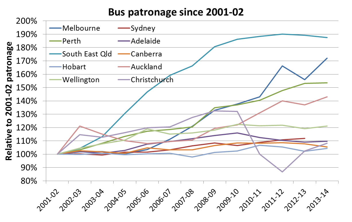
Overall Patronage growth
This chart shows growth in patronage since 2001-02 (an arbitrary start year).
Observations:
Several cities have shown very strong growth:
In Perth part of this can be attributed to the opening of the Mandurah rail line in late 2007.
Melbourne saw strong patronage growth between 2004 and 2011, with a particularly big jump in 2008-09.
South East Queensland invested in bus services between 2003 and 2009, including radial busways to the Brisbane CBD. However patronage peaked in 2009-10, and has been flat or declining since. This may be impacted by the floods and associated free travel periods (not counted as patronage), and recent above-CPI fare price rises. Also train patronage under the old paper ticketing system may have been overestimated – creating an inconsistency in the time series as people transition to Go Card.
Auckland and Christchurch had very strong growth to a peak in 2002-03 (attributed by some to a boom in international students), a lull and then strong growth again from 2007. Christchurch patronage fell dramatically in 2010-11 following a major earthquake that closed large parts of the CBD (where PT probably had a high mode share) and led to population decline.
The other cities are languishing significantly behind:
Sydney’s problems with public transport are often discussed, and I understand there has been relatively little expansion in services in recent years. Some modest growth is evident from 2010 onwards. It is very difficult to obtain Sydney bus patronage data, and I do not have a 2013-14 data point.
Adelaide has not been investing significantly in bus or train services in recent years (although that is now changing). Patronage peaked in 2009-10. The completion of recent rail upgrades may see rises in the coming years.
Canberra has seen both funding cuts and increases over the years.
Hobart is included for completeness. I cannot comment on reasons for patronage trends there. Their annual report does.
Wellington has also had only modest patronage growth, although it maintains the strongest rate of public transport use in New Zealand.
Note:
Greater Sydney data is very difficult to obtain – mostly because private bus, ferry and light rail data is not published in any consistent form. In the above I have used a dataset prepared by BITRE and data published by the NSW Bureau of Transport Statistics.
Train patronage
Auckland train patronage growth is off the chart. 2013-14 patronage was around 508% higher than 2001-02 patronage, following 10 consecutive years of annual growth above 10% (there was actually a decline in patronage in 2012-13 of 8.3% but growth rebounded in 2013-14 to 14.4%). Auckland has been heavily investing in services, a new city terminal, and electrification. Patronage growth is off a very small base, such that percentage growth rates are very large.
You can see the significant surge in Perth train patronage following the opening of the Mandurah line in late 2007. Patronage has more than doubled in 10 years, although curiously declined in 2013-14.
Melbourne saw a steady increase in train patronage between 2005 and 2011, an easing in 2011-12, but further growth since then.
South East Queensland train patronage figures dropped after 2009. TransLink make a comment about a change of ticketing system impacting these figures in their tracker report (previous estimates probably being inflated), so it is unclear what the “real” trend is.
Adelaide train patronage dropped until 2012 as lines closed for extended periods to enable electrification works. Lines have reopened and electric services are running, with a bounce in patronage evident from 2012.
Bus patronage
South East Queensland is by far the standout for bus patronage growth, which has followed substantial investment in busways and increases in bus frequency. Patronage almost doubled to 2012 on SEQ buses, although there has been a decline post 2012.
Melbourne’s bus patronage has grown significantly since 2006-07 onwards, although with a difficult to explain spike in 2011-12.
Perth’s bus patronage is an interesting story. Between 2007-08 and 2009-10, patronage increased by 14%, while timetabled kms only increased by 2.8%. When the Mandurah line was opened in late 2007, buses that previously travelled into the city were converted into rail feeder buses. This significantly reduced the bus trip lengths and hence passenger trip lengths for people who now transfer onto trains (the introduction of transfers might also have increased total boardings more than the total number of “journeys”). Presumably it meant that bus frequencies could be improved and/or buses were reconfigured to meet travel demands that were not well catered for previously.
Ferry and light rail patronage
Brisbane ferry patronage almost doubled between 2002-03 and 2008-09, collapsed in 2010-11 following service suspensions and cutbacks resulting from flood damage, and then bounced back from 2011 and is growing stronger still. The strong growth to 2008-09 followed increased services, and fare integration with other modes.
Adelaide tram patronage grew significantly following the tram extensions into the city that opened in 2007 and 2010 (travel within the CBD area being free). For reasons better known to others, Adelaide tram patronage has declined since 2011.
Sydney ferry patronage has been mostly flat until 2013 (note: at the time of writing I did not have a good estimate of private ferry patronage (approx 9% of all ferry patronage) – from 2009-10 onwards I have simply assumed no change in those numbers for want of something better).
Boardings per capita
Trends in public transport patronage will of course be impacted by population growth, so the ratio of the two can be a good indicator of system performance.
However, it is not necessarily fair to compare cities. The Sydney transit area includes many urban areas significantly detached from the main Sydney metropolitan area, including the cities of Newcastle and Wollongong. South East Queensland includes the Gold and Sunshine Coasts. But the Melbourne catchment does not include Victoria’s equivalent city of Geelong. The boardings per capita figure for the main Sydney and Brisbane metropolitan areas would likely be higher than the figures here. So it is more important to look at trends (household travel survey mode share figures may be a better method of comparison).
This chart shows Melbourne as the stand-out in terms of increasing boardings per capita, a trend that started in 2004-05 (as many other of my posts have shown), although with some decline in 2012-13.
South East Queensland showed an increasing trend between around 2003-04 and 2008-09 but has since been in decline.
Perth had a significant increase in 2008-09, following the opening of the Mandurah rail line.
Adelaide has declined in recent years (in part due to rail works) while Canberra and Hobart remain flat.
Sydney+surrounds has bucked the trend of the larger cities, with no great increase in boardings per capita.
Wellington has the highest boardings per capita in New Zealand (notionally higher than most Australian cities). When you take into account that Wellington does not have a heavily transfer-orientated PT network, a figure for PT “journeys” per capita for Wellington is likely to be very competitive with Melbourne and Sydney.
Auckland has seen some steady growth in recent years from a low base.
Christchurch had seen some small growth to 2009-10, but collapsed in 2010-11, after major earthquake disruptions in the city. They appear to have arrested the decline in 2012-13.
Again, I must stress that it is dangerous to read too much into comparisons between cities because of the somewhat arbitrary definitions of transit system area boundaries.
For New Zealand, I have used “service area population” estimates kindly provided to me by Ian Wallis and Associates (for up to 2009-10) and then applied district population growth rates to estimate 2010-11 (and subsequent) service area populations.
A slightly better measure than public transport boardings per capita might be public transport journeys (or linked trips) per capita. This is something I would like to explore more in a future post.
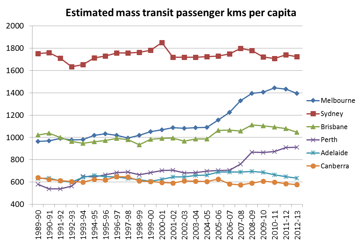
The BITRE yearbook includes data on passenger kms per mode per city. From this data it is possible to obtain estimates of mass transit passenger kms per capita (I say mass transit, as they do not distinguish public and private bus). Here’s a chart using the 2014 yearbook data:
The trends are not dissimilar to my chart above. The BITRE figures are presumably a multiplication of estimated boardings (very similar data to mine) by estimated average route length (I suspect highly accurate time series, data on this is hard to find), or similar.
Long term patronage data
David Cosgrove from BITRE recently collated annual data on public transport patronage for all Australian capital cities, right back to 1900. His very interesting ATRF 2011 paper is here. He includes several summary charts which I won’t repeat here. What follows is some further analysis of this particular dataset.
The following chart shows estimated public transport trips per capita over 110 years:
Note BITRE used Sydney statistical division population with all Cityrail patronage, which is different to my approach above. It probably explains why Sydney figures are much higher.
Public transport usage rates grew until Word War 1, dropped in the Great Depression, peaked during petrol rationing in World War 2, and then declined until around 1980. In the bottom right corner you can see several cities trending upwards in recent times.
It is interesting to see Canberra had comparatively very low rates of public transport use until the 1980s – perhaps the product a low density car-based city from the start? Although public transport was clearly important leading up to Word War 2.
The Darwin figures are even lower – I’m not sure of the history but perhaps Darwin only became big enough to need public transport in the 1950s, a time when the car was becoming widely affordable.
You can see a spike in Hobart PT use from 1975 to 1977 – when the Tasman Bridge connecting the two sides of the city was severed after being struck by a ship.
The paper also includes estimates of passenger kms by mode since 1945. Here is a chart showing public transport mode share of motorised passenger kms:
Again I think the Sydney figures are inflated by non-Sydney Cityrail patronage.
This stuff is important, particularly for Sydney figures. (Similar caveats would apply to the long-term data from BITRE immediately above)
Patronage is invariably an estimation exercise, as not all passengers buy or validate a ticket when they board. The methodology used by agencies probably varies quite a bit. For example, Translink don’t seem to estimate free trips. The figures I have presented however are estimates of boardings (including boardings on journeys involving transfers). As far as I am aware, they include school children travelling on government funded bus services.
I have adjusted official Melbourne bus patronage figures to account for a change in estimation methodology.
Sydney bus patronage is very difficult to estimate, as figures are not routinely published for private operators. I’ve used a BITRE time series for Greater Sydney bus patronage (related to this paper).
The Sydney ferries figures include private operators (maybe 1-2 million per year), but I have had to estimate figures post 2009-10.
Sydney Metro light rail don’t generally publish their patronage figures to great precision. The 2008-09 figure I have is 7 million (rounded to the nearest million).
I have calculated the population of “Sydney+surrounds” as a combination of SA3 areas covering metropolitan Sydney, Newcastle, the Hunter Valley and Illawarra region. Here’s a map. Unfortunately it’s not a perfect match for the footprint of CityRail and “outer metropolitan” bus services, but I think reasonably close, particularly for trend analysis purposes.
South East Queensland includes Greater Brisbane Statistical Area plus the SA4 areas of Sunshine Coast and Gold Coast.
For other cities I have used population figures for Greater Perth (which includes Mandurah), Greater Adelaide and the Melbourne Statistical Division (estimated for 2011-12 based on an SA2 mapping, as towns within the “Greater Melbourne” Statistical Area that are not in the old Melbourne Statistical Division are not counted in official metropolitan bus and train patronage figures).
For all financial year population figures I have averaged the June 30 estimates at either end of each financial year.
Queanbeyan buses (which connect Canberra with the satellite town of Queanbeyan, just over the border in NSW)
Metropolitan V/Line services in Melbourne: diesel train services currently operate to Melton which is in the Melbourne Statistical Division and has bus patronage that is counted as “metropolitan”. In previous years, V/line diesel trains also serviced the metropolitan area between St Albans and Sunbury and between Broadmeadows and Craigieburn (until these sections were electrified). I understand the metropolitan patronage on these services is in the order of a few million boardings per year, which is less than 1% of total Melbourne public transport patronage.
School holidays typically impact on public transport patronage (particularly suburban buses), and not all financial years contain the same number of (high patronage) school days as school holidays often straddle the June/July break of month. Different states have holidays in different weeks. This means that the individual growth figure for one year in one city might be impacted by up to 1-2% away from the underlying trend. However, this should wash out over several years for index values.
Compiling patronage figures is a very messy business. I’ve done the best I can, but I cannot guarantee that there are no omissions or calculation errors.
Data sources:
Data compiled by the “Federal Department of Transport” and the West Australian newspaper (credit to Andrew Probyn).
[post revised and updated October 2012 with new data from Sydney, Brisbane, and New Zealand]
Arguably the best source of public transport mode share statistics is from household travel surveys that are conducted in most large Australia cities and all of New Zealand (unfortunately some surveys more regularly than others). A common measure is public transport’s share of motorised trips (although public transport will also be competing with unmotorised transport modes).
In household travel survey speak, a linked trip is a journey between two distinct non-travel activities, and may involve several trip legs or unlinked trips. For example, if you walk to a bus stop, catch a bus to the train station, then catch a train to the city, then walk to your workplace, that is one linked trip made up of 4 unlinked trips (walk, bus, train, walk). Similarly if you drive from your home to your workplace, that’s one linked trip made up of one unlinked trip (unless you decide to count walking to and from the car). Hence mode share figures that relate to unlinked motorised trips will always be higher than mode share figures that relate to linked trips.
The data I have been able to obtain for cities is sometimes linked trips, sometimes unlinked trips, and sometimes both. It should be possible to get figures for both for any city, and I hope to obtain such data from state transport agencies in the future.
Here is the data I have for linked trips:
And here are the results for unlinked trips:
The Melbourne and Sydney measures are for weekdays only, whereas the New Zealand data appears to be for all days of the year.
In 2008, Melbourne appeared on track to overtake Sydney on unlinked trip public transport mode share, however the 2009-10 result for Melbourne was lower than predicted. Note that the error bars on the 2007-08 and 2009-10 VISTA survey results for Melbourne indicate the actual mode share might not have actually gone down significantly (similar error bars would apply to the linked trip data points). Over the same period public transport patronage grew by 11% and arterial road traffic grew by around 1.2%.
How reliable is this data?
Given that most household travel surveys interview thousands of households in any one year, the results should be pretty accurate for a high level reported figure such as mode share of trips. Household travel survey techniques have matured over the years, so it is likely they are reasonably reliable (particularly more recent results in larger cities).
The Perth survey data for 2003 to 2006 does not correlate with public transport patronage figures, that show a 12% growth over the same period.
For Brisbane 2003-04 I had to add whole number shares for each mode and divide by the sum of motorised mode shares. So there is some uncertainty about the precise motorised mode share.
The Melbourne official estimates for 2002-2007 were calculated using VicRoads traffic data, and public transport patronage figures.
(For more detail see the end of this post).
Linked or unlinked trips?
Calculating mode share based on linked trips removes the impact of public transport transfers. Cities where the public transport network is structured around feeder services with free transfers (eg bus to train) may have more public transport boardings (unlinked trips) than cities where transfers are “less encouraged” by the network design and fare systems (eg Wellington, Auckland, Sydney).
In fact, here is a chart showing the ratio of unlinked to linked public transport trips for four cities where I have data:
The Perth and Adelaide data is based on patronage figures that are reported as ‘initial boardings’ and ‘all boardings’. Annual reports comment that recent through-routing of bus services through the Adelaide CBD may have reduced the number of transfer boardings. You can see the transfer rate for Perth jumped after the southern suburbs railway opened at the end of 2007 (replacing many CBD bus routes with train feeder bus routes).
The Perth, Adelaide and Melbourne public transport fare systems are dominated by products that allow unlimited transfers within a time window (anywhere from 2 hours to 365 days). So while there may be a time and convenience penalty for transferring between two services, there is no financial penalty. Sydney’s public transport fare system has largely involved tickets for a single trip and/or one mode, such that another fare must be paid to transfer. Sydney’s CBD is also served by seemingly hundreds of bus routes – many of which parallel train lines – which enable people to travel to the city without having to transfer onto trains and pay a higher fare (even if that could provide a faster over journey).
The lower Sydney transfer rate partly explains why Melbourne and Sydney are much closer on mode share of unlinked trips, compared to mode share of linked trips. Network design will probably also have an impact.
There was a slight dip in the trend for Sydney around 2007-08 followed by a rise. I’m not sure what might explain that trend – the revamp of the fare system in April 2010 (introducing more multi-modal and multi-operator tickets) may have had a small impact on the 2009-10 figure.
The difference in these rates suggests that there could be quite substantial change in Sydney public transport use patterns should the fare system be revised to make free transfers the norm. Perhaps this might help ease the bus congestion issues in the CBD and allow higher bus frequencies in the suburbs? (assuming there is capacity to transfer bus passengers onto trains in the suburbs). There is one small area of Sydney where train+bus link tickets are available (no fare penalty for transferring), and the census data reveals a very significant rate of bus+train journeys to work in the Bondi Beach area, much higher than anywhere else in Sydney.
Other measures of public transport mode share
In another post, I looked at BITRE data on estimated passenger kms per mode in Australian cities (presumably calculated using patronage figures and average trip lengths from household travel survey data or elsewhere). That enabled calculation of estimated public transport mode share of motorised passenger kilometres, with continuous time series available for all Australia cities. However there will be many assumptions involved in these estimates.
Another measure is boardings per capita (covered here), although this also has the problem of different transfer rates in different cities.
The quest for a fair measure of public transport use continues!
Household travel survey sources:
Melbourne: Victorian Department of Transport (personal communications), but also available in the Growing Victoria Together Progress Report (page 387), in the 2009-10 Victorian State Budget Papers. Figures until 2001 were from the VATS survey, while the 2008 result is from the VISTA survey.
Sydney Household Travel Survey: Data was supplied by NSW Transport Data Centre by email. Public transport trips are inclusive of trains, buses, ferries, monorail and light rail.
South East Queensland Travel Survey: Brisbane Fast Facts Brochure (unclear dating, but PDF was created in 2006 so I assume the results are for 2003-04. The report does not mention whether these are mode shares for trips or kms, however it seems highly likely they are for trips as the walking mode share was 10% and we know walking trips are generally shorter than motorised trips). I also have results for 2008-09 courtesy of Ian Wallis and Associates. I unfortunately do not yet have results for the 2006-2008 survey.
Perth and Regions Travel Survey (PARTS): Data is from the PARTS Key Findings Report (by Data Analysis Australia). The 2003-2006 results are from PARTS, the 2000 figure is a TravelSmart estimate, and 2001 and 2008 estimates are from unspecified sources.
The New Zealand Household Travel Survey: Because of sample sizes, the figures for the New Zealand cities are two years combined (ie the “2010” figure is for 2008/09 and 2009/10). The Canterbury region includes Christchurch as well as a not insignificant surrounding population. The Auckland region is more similar to the Australian cities statistical divisions. The Wellington figures are for the Wellington Region, but are dominated by metropolitan Wellington.


 Posted by chrisloader