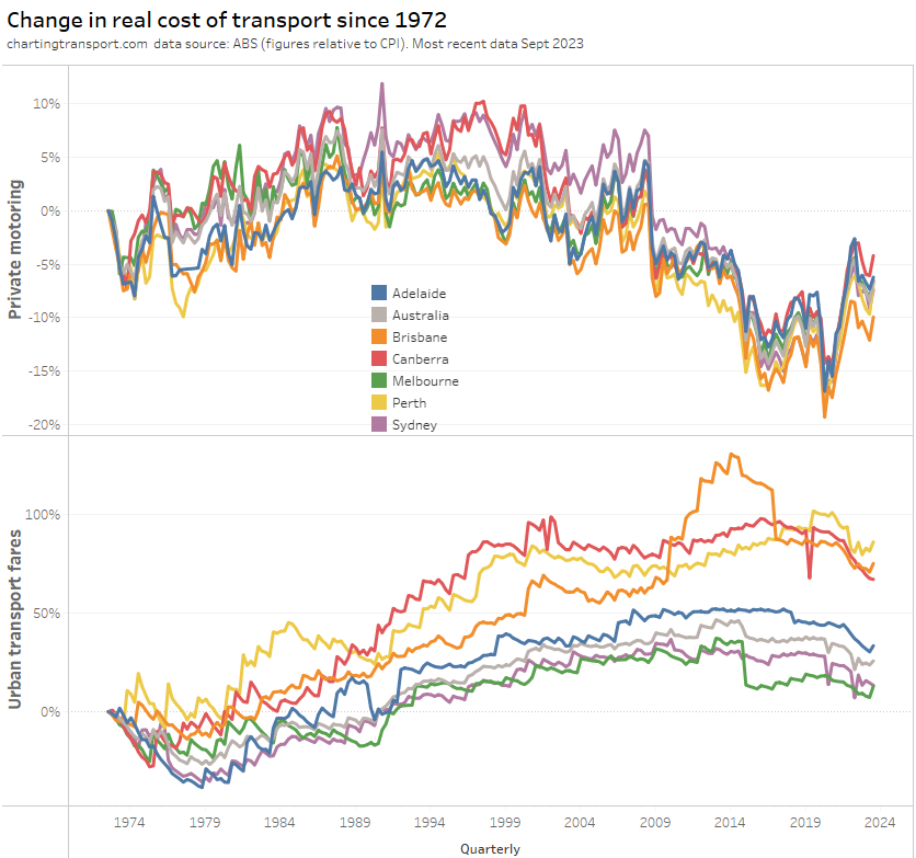
I’ve been exploring why younger adults are more likely to use public transport, looking at data sets available for Melbourne. This fourth post in the series looks at the relationship between public transport mode share and income, socio-economic advantage/disadvantage, occupation, hours worked per week, and whether people are studying.
It concludes with a summary of the findings from the four posts in this series. For more detail about the data, see the first post in the series.
(note: I started writing this post quite a while ago – apologies I got distracted by new data releases including the 2021 census data)
Here’s an index as to which posts look at which factors (including many combinations of these factors):
- part 1: age, sex, travelling to city centre (or not), workplace distance from CBD, education qualifications, home distance from CBD.
- part 2: proximity to train stations, population density, job density, motor vehicle ownership, driver’s licence ownership.
- part 3: parenthood, birth year, immigrant arrival year.
- part 4 (this post): income, socio-economic advantage/disadvantage, occupation, hours worked per week, whether people are studying.
Income
Could income explain different levels of PT use by age, if older workers are earning more and therefore more able to afford to drive to work?
Well, do older adults actually earn more than younger adults? Here is the distribution of worker incomes by age group, split between people who work inside and outside the City of Melbourne, for the last pre-pandemic census (2016):

Apart from the few people still working in their 90s (presumably because they are making great money), income was generally highest for people in their 40s in 2016. Older working aged adults generally earnt less! This may well reflect the higher levels of educational attainment of younger adults (as we saw in part 1).
So the idea that older adults are driving to work because they are generally earning more just isn’t supported by the evidence.
The above chart also confirms people working in the City of Melbourne were much more likely to have higher incomes.
But is there a relationship between income and mode choice? The following chart shows public transport mode shares for journeys to work by both income bands and age.
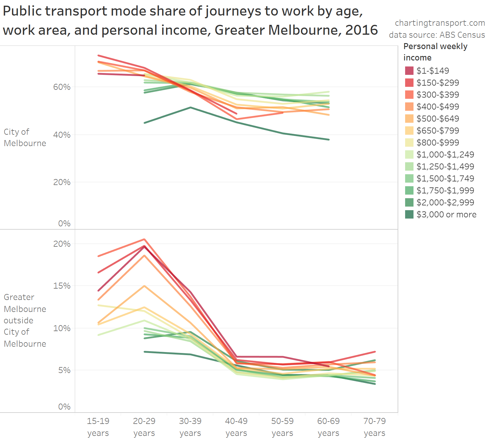
Each line is for an income band, and you can see age-based variations in PT mode share for people within each income band. The biggest age-based variations were for people on lower incomes – with younger workers much more likely to use public transport than older workers.
There was less variation across age groups in public transport mode shares for people on higher incomes, particularly those working in the City of Melbourne.
Most of the higher income bands had high public transport mode shares for journeys to work in the City of Melbourne. The exception was the top band ($3000+ per week), many of whom probably have a car and/or parking space provided by their employer. Also, over 10% of people in the top income band walked or cycled to work which might be because they can afford to live close to work.
For those who worked outside the City of Melbourne, PT mode shares were generally higher for younger workers and those on lower incomes.
Here’s another view of the same data, with income on the X-axis and different colours used for different age ranges:
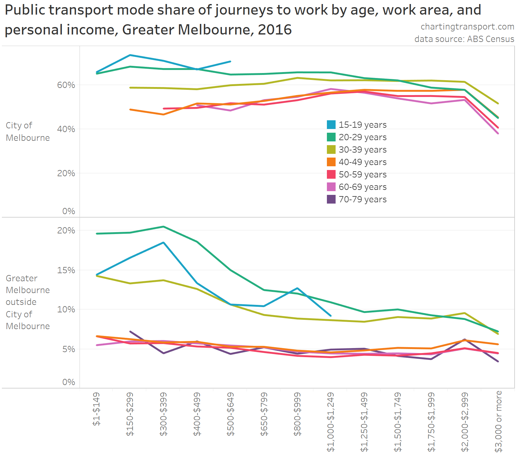
On this chart you can see income not having a strong relationship with PT mode share within many age groups. For those under 30, PT mode shares generally declined with increasing income. For workers over 40, mode shares slowly went up with income in the City of Melbourne, and declined slowly with increasing income for those working outside the City of Melbourne.
Overall it looks like age probably had a stronger relationship with PT mode shares than incomes, although both factors are relevant.
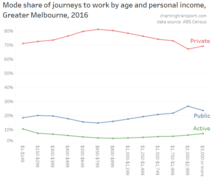
Here’s a chart that simply shows journey to work mode shares by personal income (regardless of age):
However, personal income is not necessarily the best measure here to measure the impact of income. A person living alone earning $2000 per week has more to spend on their transport than a person earning $2000 per week but also supporting a family. The ABS calculates a metric known as household-equivalised income, which considers total household income in the context of household size and composition. Unfortunately household equivalised income isn’t readily available for journey to work data which includes work location, hence why the above analysis uses personal income. But it is available if I’m only concerned with where people live.
Here’s a chart showing the relationship between household-equivalised income and mode shares for people who live in Greater Melbourne:
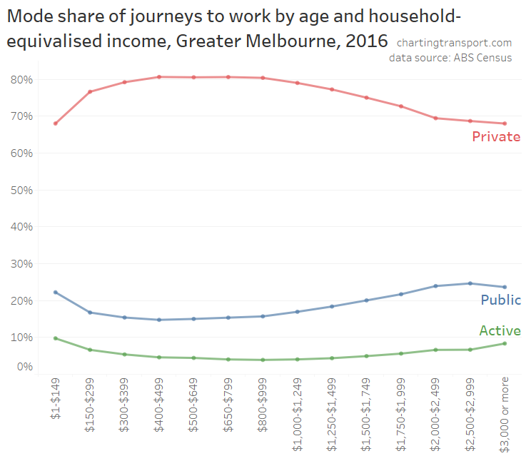
This chart is similar to the mode share chart for personal income, but there some noticeable differences at the lower incomes – with high private mode share for those on a household equivalised income between $300 and $1000 per week.
Public transport mode shares were highest at the top and bottom of the income spectrum, and lowest for those earning $400-$499 per week.
Similarly, active transport mode share was highest for the bottom and top income bands (probably out of necessity at the bottom end, and from living in walkable and cycling-friendly suburbs at the top end), while private transport mode share showed the inverse pattern, being highest for incomes between $400 and $1000 per week.
The above data was for journeys to work, but what about other travel purposes?
VISTA data shows some similar patterns for the income/age relationships, although the survey sample size doesn’t allow for a split between travel within/outside the City of Melbourne.
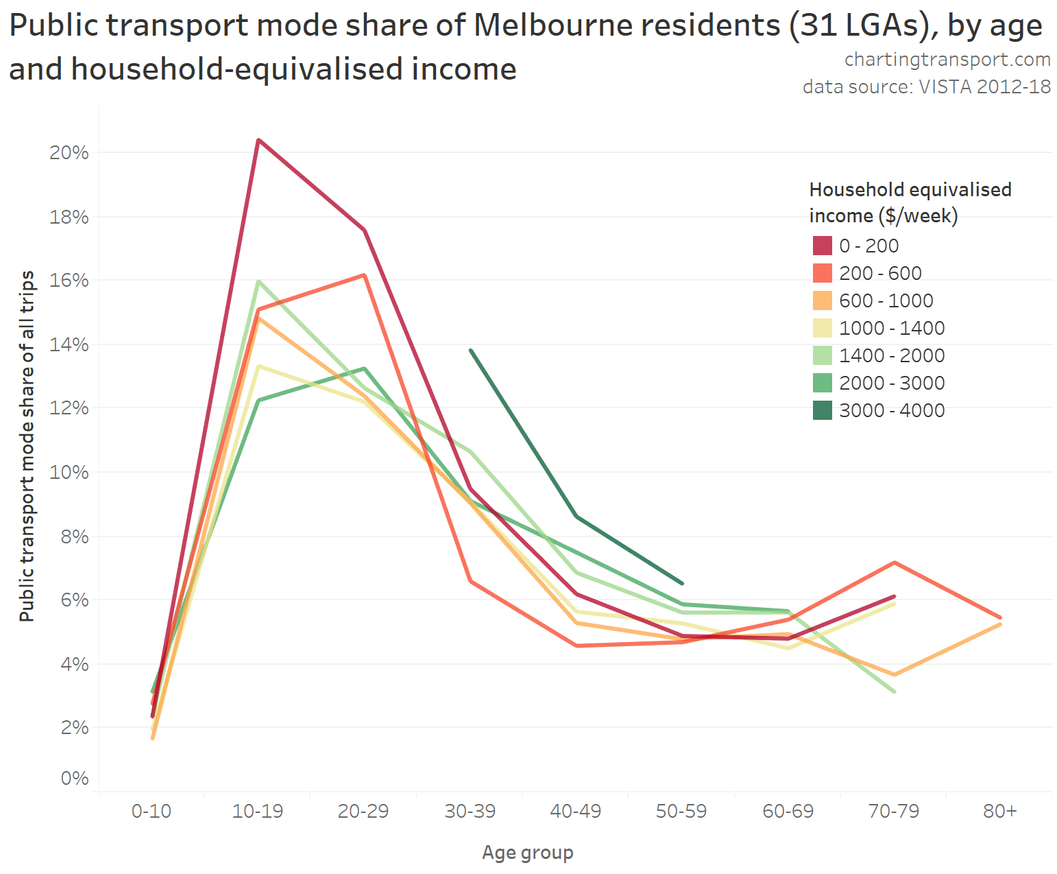
PT mode share was highest for those aged 10-29 for all income bands, although the relationship with income is more mixed.
For those in their 40s and 50s, PT mode share was generally higher for those in higher income bands (with the exception of the bottom income band), which may reflect home and work locations.
Younger children had very low public transport mode shares for all income ranges – which is consistent with other findings on this blog about young families.
Here’s an alternative view of the same data with income on the X-axis and a line per age group:
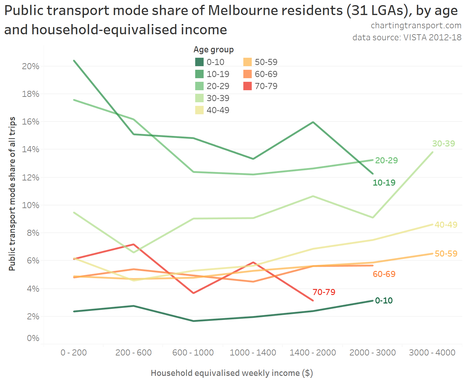
For those aged 30-59 PT mode share generally increased with income (possibly related to higher incomes more likely to work in the city centre), while for those aged 10-29 it generally declined with increasing income. Again, it would appear that age has a much stronger relationship with PT mode share than household income.
Here are overall travel mode shares by income:
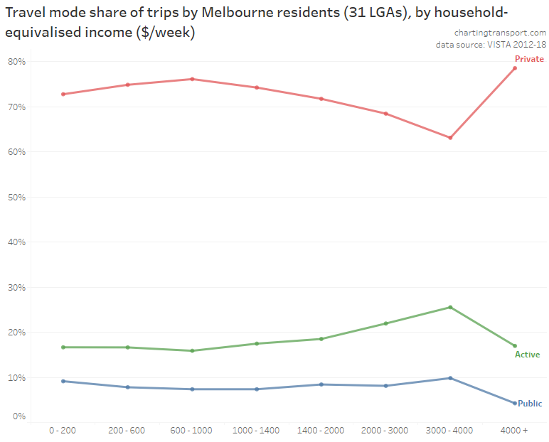
It’s a little hard to see, but the mode share pattern is very similar to journeys to work. PT mode shares were higher for the lowest and second highest income bands and lower at middle income bands – with the exception of the highest income band which had much higher private transport mode share.
Socio-economic advantage/disadvantage
Firstly here is the distribution of Greater Melbourne population by age across the 10 deciles for ABS’s index of socio-economic advantage and disadvantage (part of SEIFA). Those deciles are actually for the state of Victoria, and because Melbourne is relatively advantaged compared to regional Victoria, there is a skew to higher deciles. 10 is for the most advantaged areas, and 1 is the most disadvantaged.
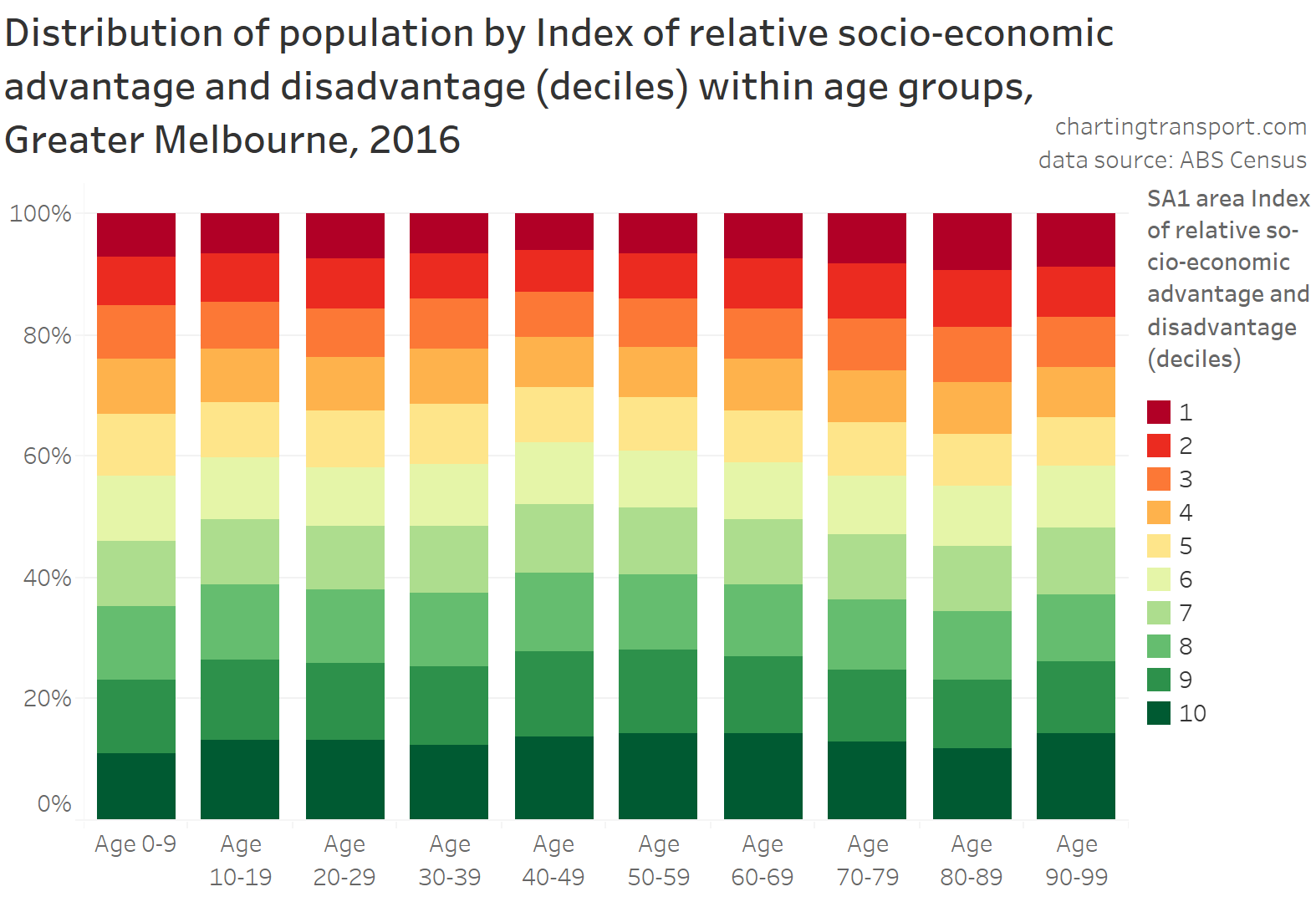
Similar to the analysis of income, people in their 40s were more likely to live in more advantaged areas.
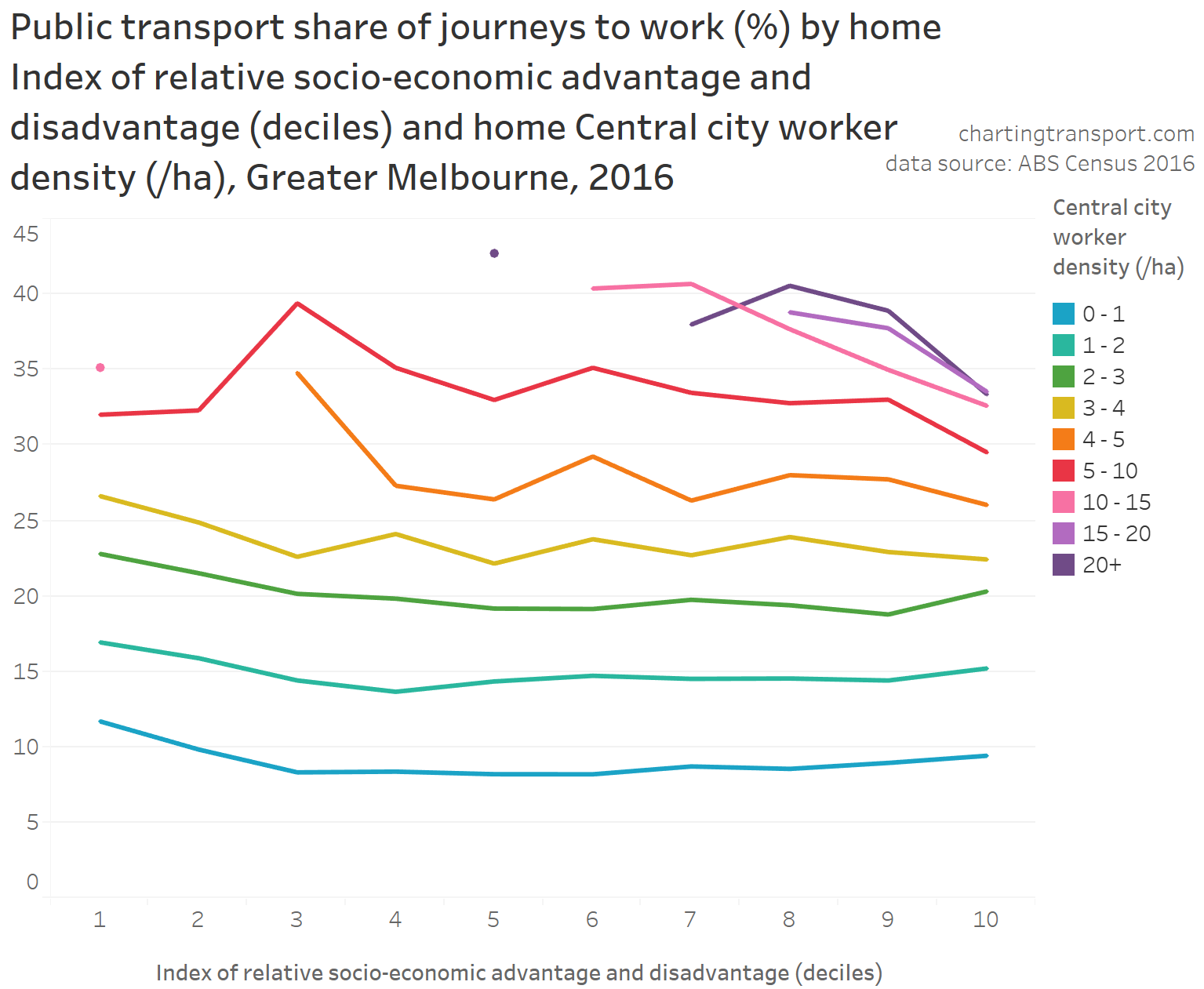
Here is a chart of journey to work mode shares by advantage/disadvantage, split between workers aged 20-39 and 40-69:
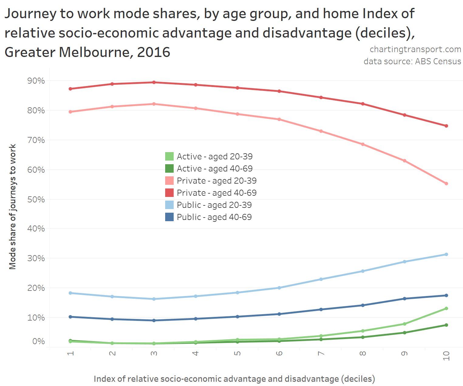
Somewhat similar to the pattern with income, public transport mode shares were higher for both the most advantaged and most disadvantaged, bottoming out in the third (lowest) decile. This relationship held over younger and older workers, but there was still variance within age bands. When it comes to public transport use, both age and socio-economic advantage/disadvantage were relevant factors, but again it appears that age has a stronger relationship.
As an aside – because it is interesting – here are some charts showing the interaction between socio-economic advantage/disadvantage and other factors for explaining PT mode share, starting with motor vehicle ownership rates (measured at SA1 geography):
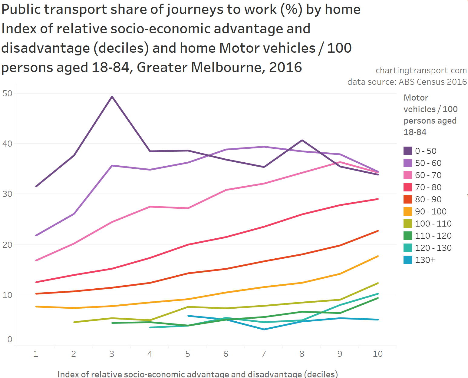
There was a relationship between PT mode share and both socio-economic disadvantage/advantage and motor vehicle ownership (except for areas with very high motor vehicle ownership), but motor vehicle ownership appears to have a much larger impact on PT mode share.
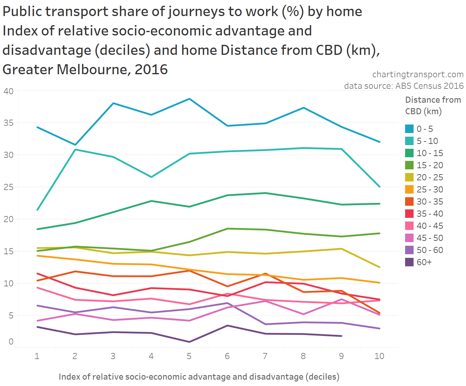
The following chart shows home distance from the CBD had a much stronger relationship with PT mode shares than socio-economic advantage/disadvantage:
The density of central city workers also was a much stronger determinant of average public transport mode share than socio-economic advantage/disadvantage:
Occupation
How do PT mode shares vary by occupation? And could variations in the occupation mix across age groups explain variations in PT mode share across age groups?
Firstly, here is the distribution of workers by occupation (using the most aggregated occupation categories defined by ABS), age, and work location (inside v outside City of Melbourne):
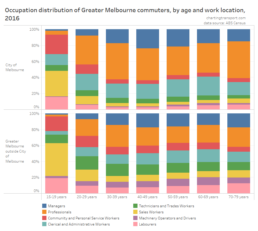
There is some variation in occupation distribution across age groups, with 15-19 and 20-29 the most different with many more sales workers and labourers (noting this data excludes people who did not commute to a workplace on census day). Workers aged 30-49 were more likely to be managers or professionals than most other age groups (consistent with income data).
The next chart shows public transport mode shares for journeys to work by occupation and age, disaggregated by other major factors that I have previously found to be significant: parenting status, work location, and immigrant status:
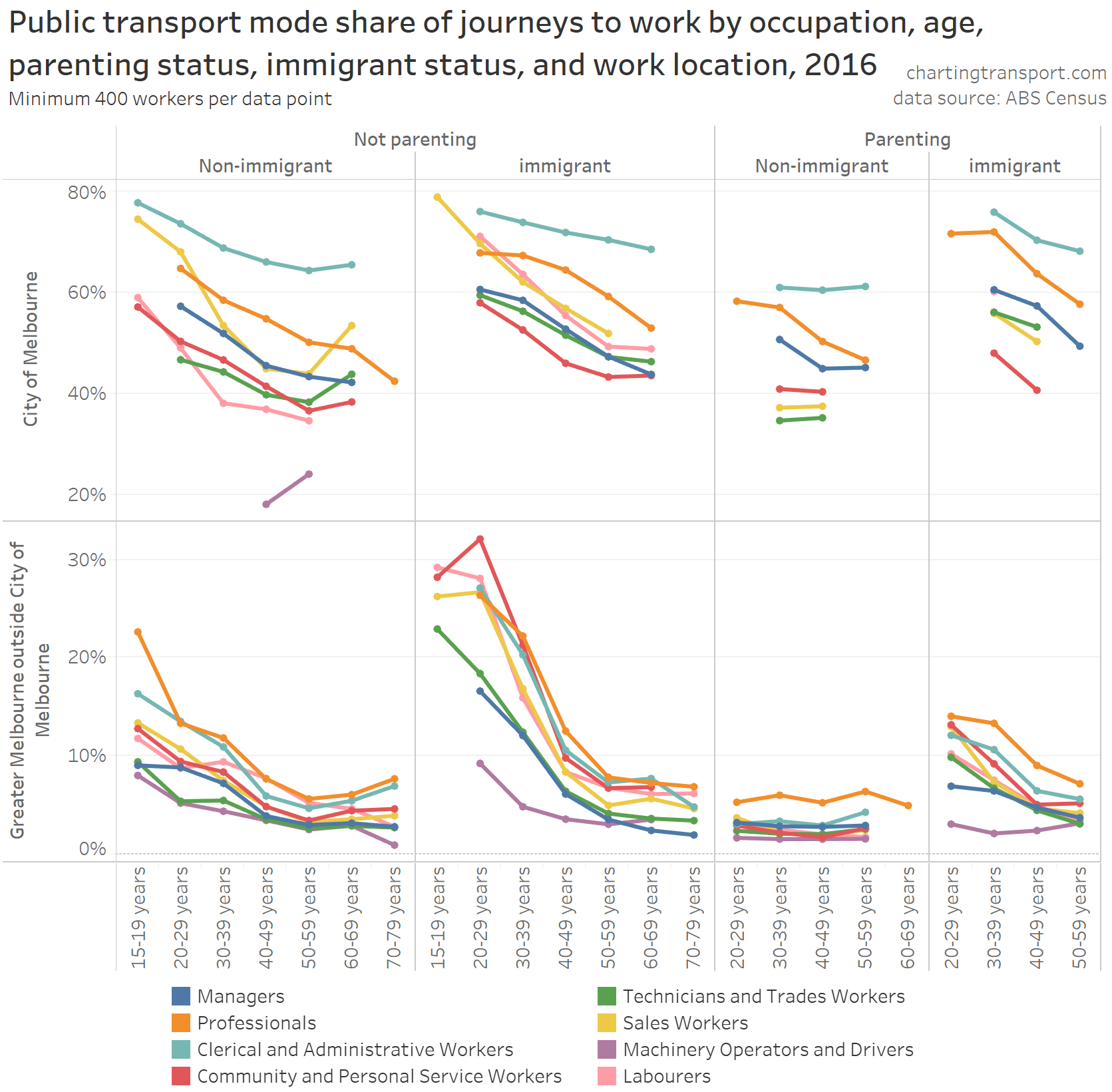
Clerical and administrative workers and professionals generally had the highest PT mode share for all categories. Labourers, machinery operators and (professional) drivers had the lowest PT mode shares, mostly followed by community and personal service workers (many of whom might do shift work – eg aged care, policing, emergency services, hospitality). Managers had significantly lower PT mode shares than professionals – perhaps due to company subsidised cars and/or parking.
You can see a clear relationship between age and public transport mode share in all “panes” of the chart. That is – even when you control for occupation and the other factors – there were still aged-related variations in public transport mode shares. Either some other factor is at work, of age itself is directly a factor influencing mode shares.
Hours worked
Does the amount of hours people worked in a week vary by age, and does it relate to PT mode shares?
Here is the distribution of hours worked by age group:
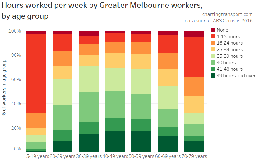
Workers aged 30-59 were most likely to be working 35+ hours per week, with those older and younger likely to be working fewer hours. So hours worked does not have a linear relationship with age for working-aged adults, and younger adults tend to work less hours.
So what was the relationship between hours worked, age, and PT mode share? Here’s a heat map table of PT mode share by hours worked and age band:
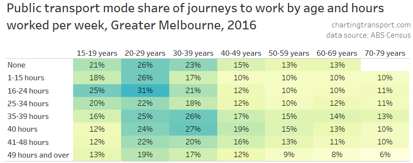
Technical note: you might be wondering why there is a “None” row. That’s for people who worked on census day, but didn’t work any hours in the previous week, for whatever reason.
This chart shows a very clear relationship between PT mode share and age for all ranges of hours worked.
You can also see public transport mode shares were generally highest for people working “full-time” (35-40 hours) and those who didn’t work in the previous week, and were generally lower for people who worked more then 40 hours (possibly working long shifts or multiple jobs – making public transport less convenient?) or less than 35 hours (juggling part-time paid work with other commitments?).
However this didn’t hold for those aged under 30, with full-time teenage workers less likely to use public transport. We’ve already seen that teenage workers generally had lower qualifications, were less likely to work in central Melbourne, less likely to work near a train station, less likely to work somewhere with high job density, less likely to be a recent immigrant, and more likely to work in occupations with lower public transport mode share.
On the bigger question, while PT mode share was generally higher for “full-time” workers, younger adults were less likely to be working full-time. So hours worked actually works against explaining why younger adults were more likely to use public transport.
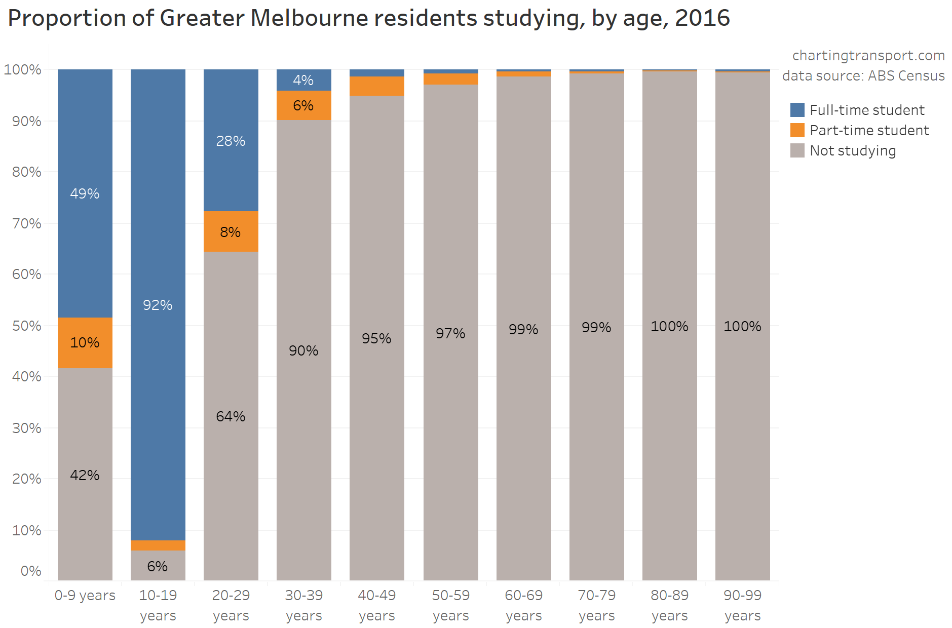
Studying
Were younger adults more likely to use PT to get to work because they were more likely to also be students?
Certainly younger adults were more likely to be studying, although this dropped to only 10% for those in their 30s:
Here are average journey to work public transport modes shares by age and student-status:
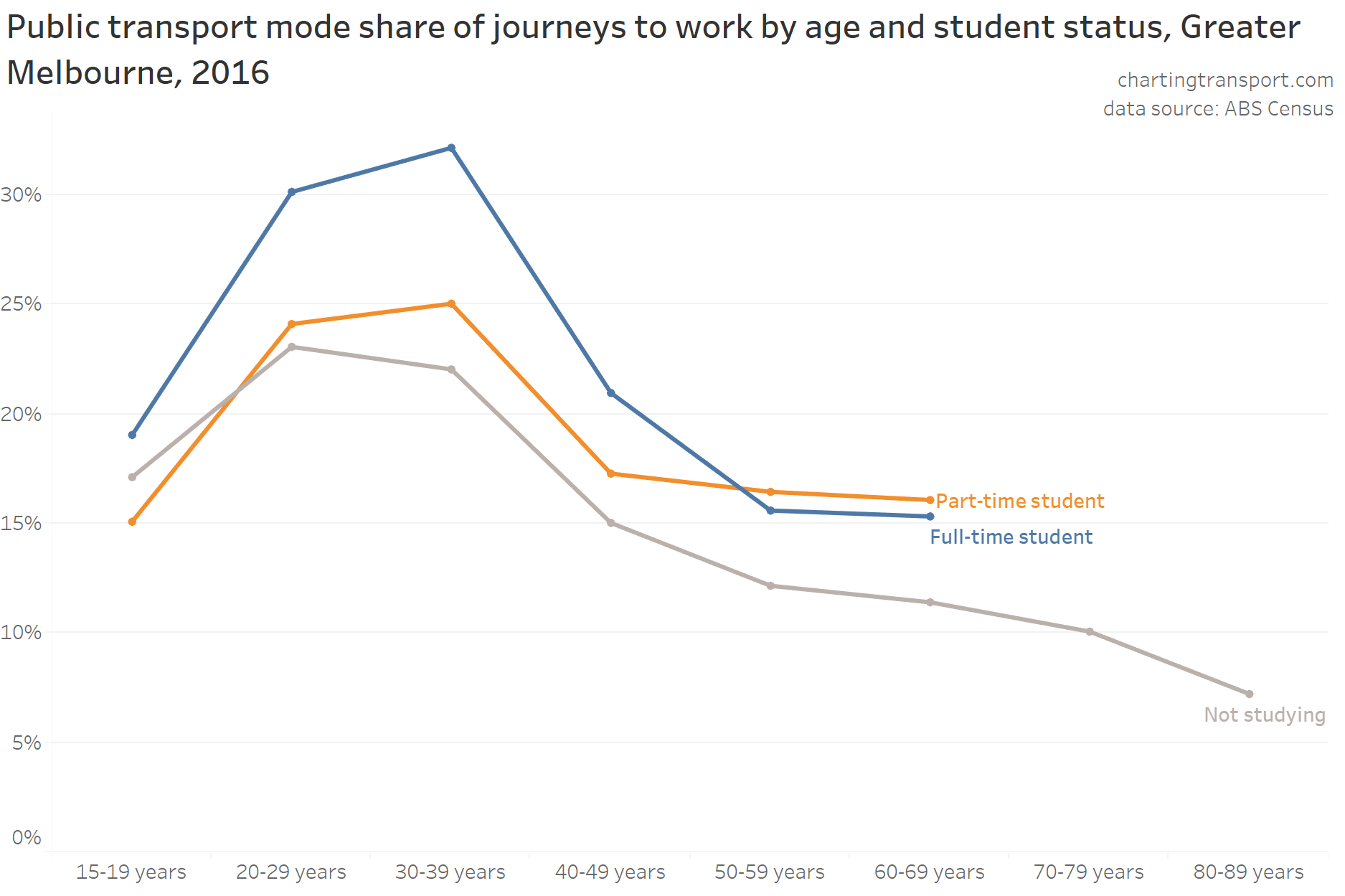
So while workers who were studying certainly had much higher public transport mode shares than those not studying, there was still a strong relationship between age and PT mode share, regardless of whether workers were also students.
Which got me thinking – we’ve learnt that recent immigrants have been predominantly younger adults, and there have been many international students in Melbourne in recent years (at least up until the pandemic). Do these factors inter-play?
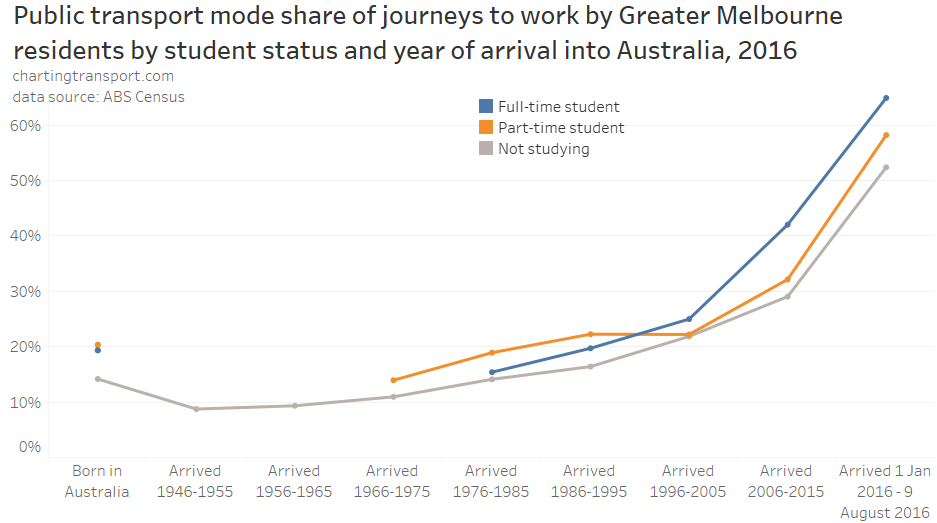
Firstly, census data certainly shows that more-recent immigrants were indeed much more likely to be studying, compared to the rest of the population:
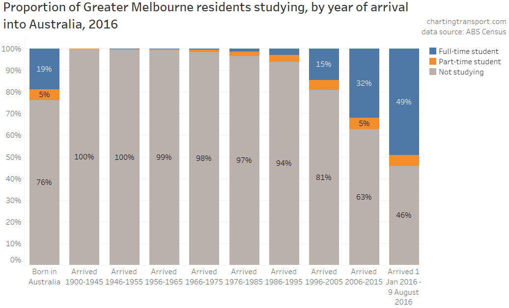
In fact, over half of immigrants living in Melbourne who arrived in Australia between the start of 2016 and the census on 9 August 2016 were studying, and more than a third who arrived in the ten years before the census were studying.
So what if we control for how recently someone immigrated to Australia?
Within most arrival year bands, PT mode shares generally declined with age (except for those under 20). So again, these factors do not explain the total variations in public transport mode share by age.
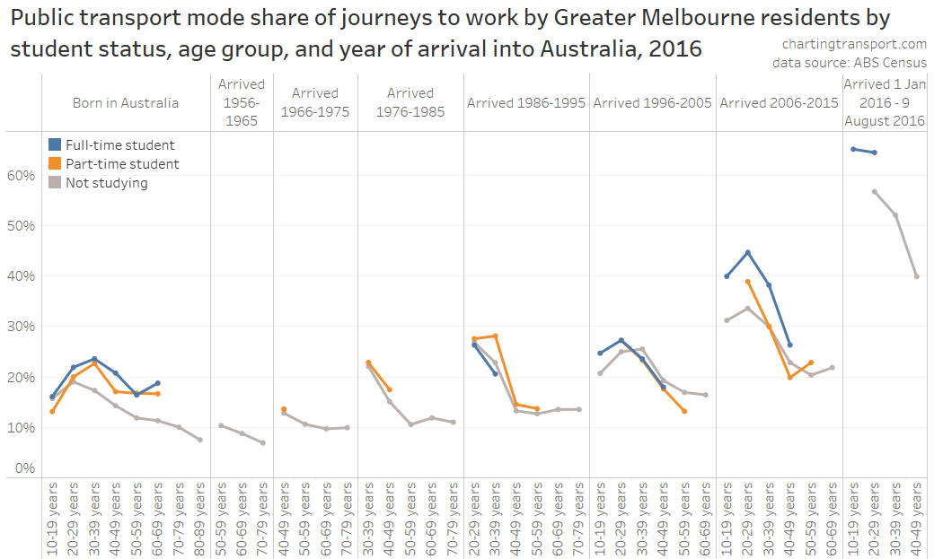
For interest, here are public transport mode shares by student-status and year of arrival into Australia:
Full-time students who also worked were more likely to use public transport to get to work, although they were overtaken by part-time students for those who arrived before 1996. Also, recent immigrants who were not studying were still much more likely to use public transport.
Summary of geographic and demographic factors influencing public transport mode shares
I’ve covered a lot of material over four long posts. So here’s a summary of what I’ve learnt about demographics and public transport mode share in Melbourne in recent pre-pandemic years:
- Public transport mode share (of all travel) was generally highest for older teenagers, and then fell away with age for those older or younger.
- Public transport mode share of journeys to work was a little different – peaking for those aged in the mid 20s, and was much lower for teenagers and older adults.
- Public transport mode share was generally higher in the following circumstances – all of which are generally more common for younger adults (and many of which are closely interrelated). Most of these relationships are quite strong.
- Geographic factors:
- living closer to the city centre (strong)
- living closer to a train station (strong)
- living in areas with higher residential densities
- working closer to the city centre (strong)
- working closer to a train station (strong)
- working in areas with higher job density (strong)
- generally travelling to destinations closer to the city centre (strong)
- Demographic factors:
- being highly educated
- having lower rates of motor vehicle ownership (strong)
- not owning a driver’s licence (strong)
- not being a parent (strong), particularly a mother
- being an immigrant, and having more recently immigrated to Australia (strong)
- being a student (strong)
- Geographic factors:
- However, these factors don’t seem to fully explain why there are variations in public transport mode share by age (particularly for non-parents). I’ve controlled for several combinations of the stronger factors and still found variations across age bands. There’s likely to be something else about age that influences mode choice.
- There are other factors (all demographic) that have a relationship with public transport mode shares, but these factors did not peak for young adults, unlike public transport mode share. So they actually work against explaining higher public transport use by younger adults. These saw higher public transport mode shares being associated with:
- both very low and high incomes (but not the highest incomes)
- both highly socio-economically advantaged areas and highly socio-economically disadvantaged areas
- working full-time (35-40 hours per week)
- having a professional or administrative/clerical occupation
- not being a labourer, machinery operator, or professional driver
- Women were more likely than men to use public transport to get to work for most age ranges (except ages 38-48), and this seems to be at least partly related to their higher levels of education, which in turn probably explains why they are more likely to work in the city centre.
For more about factors associated with higher public transport use, see What explains variations in journey to work mode shares between and within Australian cities?
How are these factors changing over time?
Elsewhere on this blog I’ve uncovered other likely explanations for increased public transport mode share, including things such as increasing population density and employment density – see What might explain journey to work mode shifts in Australia’s largest cities? (2006-2016). However that analysis didn’t look at changes in the geography and demographics of people of different ages.
In this series I’ve confirmed some “demographic” factors that are related to public transport use that have also changed in favour of public transport use over those pre-pandemic years:
- The proportion of the working population who are relatively recent immigrants had increased significantly, particularly for younger adults (see part 3). In 2006 just over 10% of people working in the City of Melbourne had arrived in Australia within the previous 10 years. In 2016 this was up to almost 18%. See also: Why were recent immigrants to Melbourne more likely to use public transport to get to work? Of course immigration all but ground to a halt in 2020 so this has probably contributed to reduce public transport mode share since.
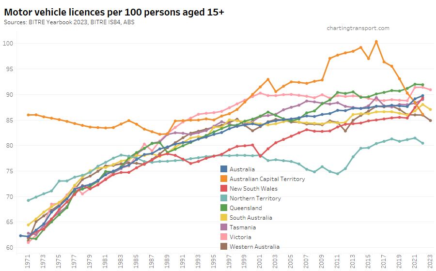
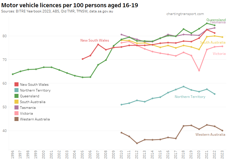
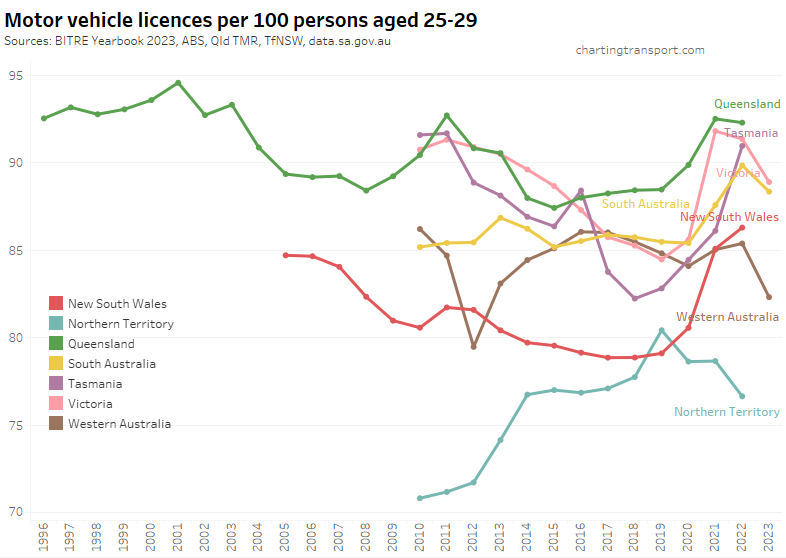
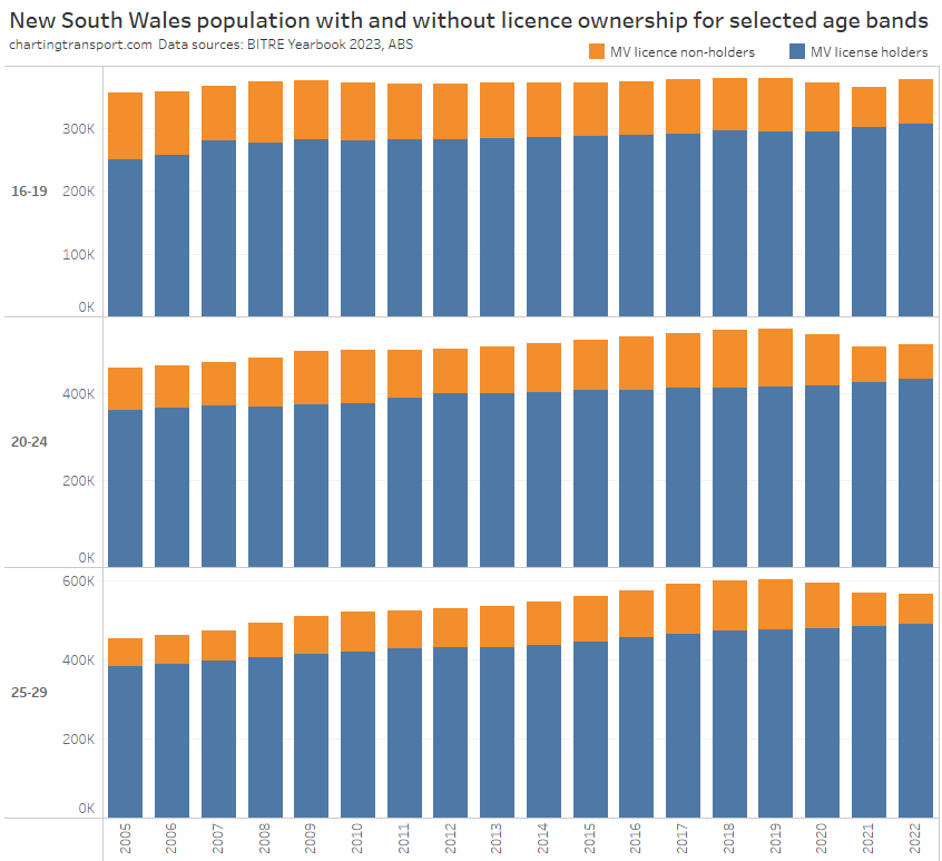
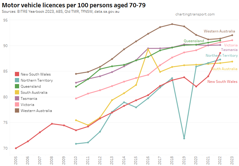
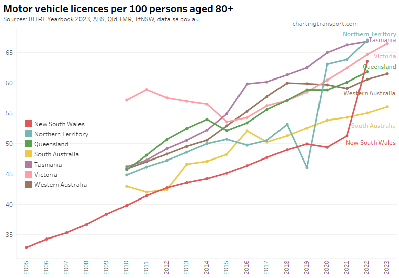
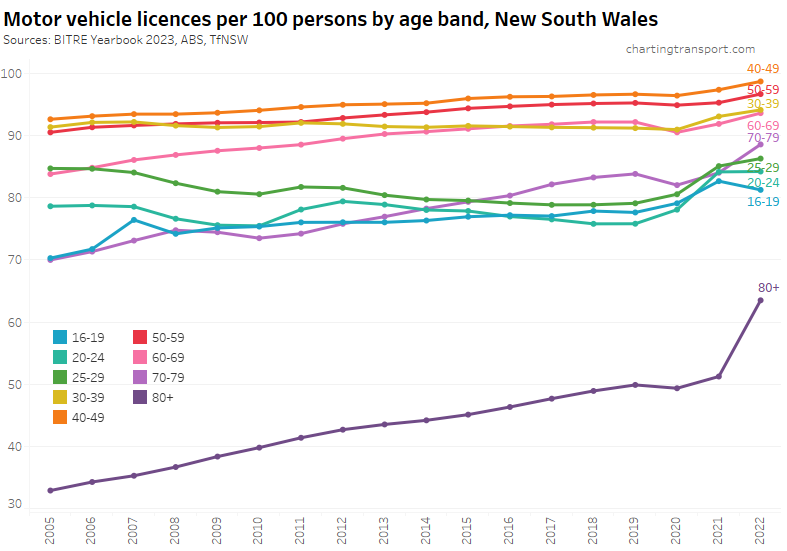
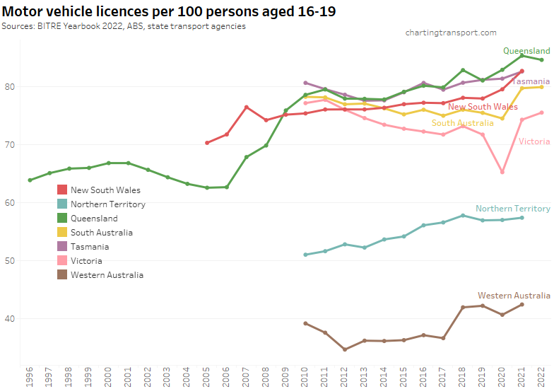
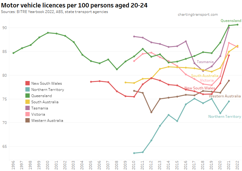
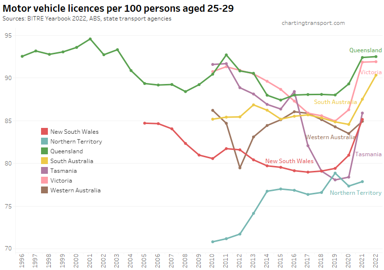
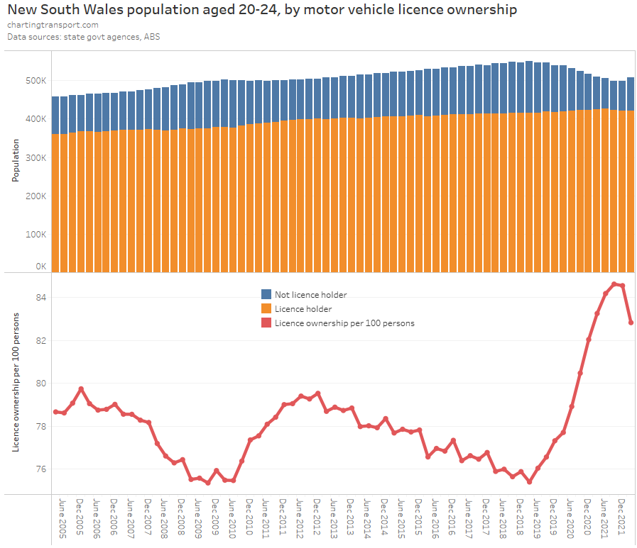
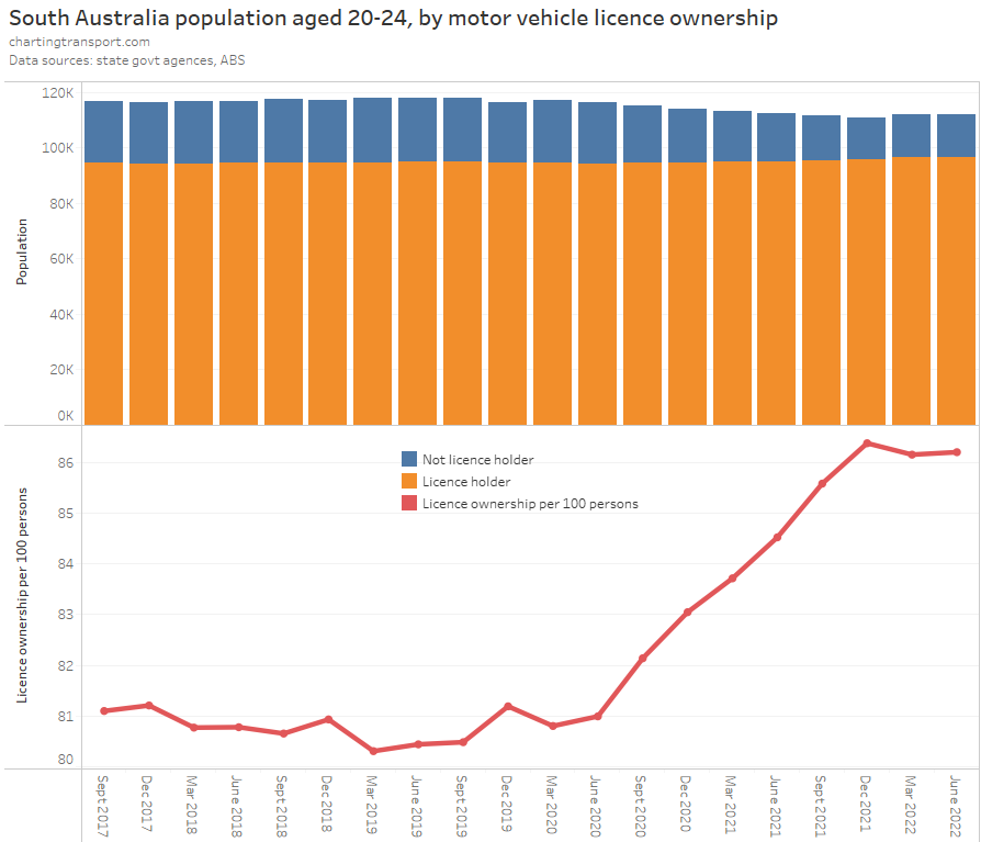
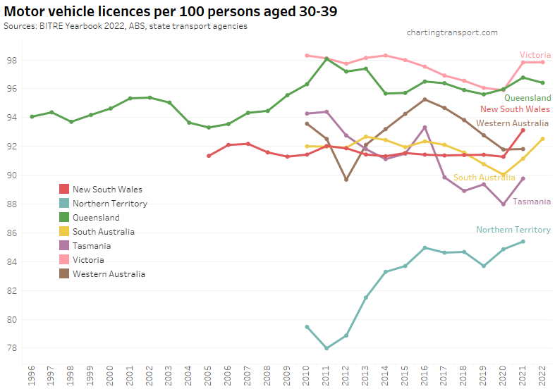
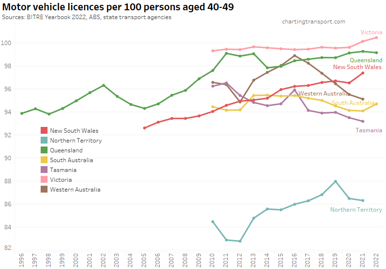
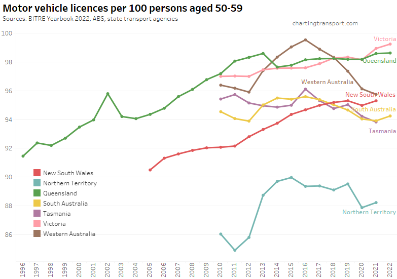
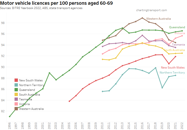
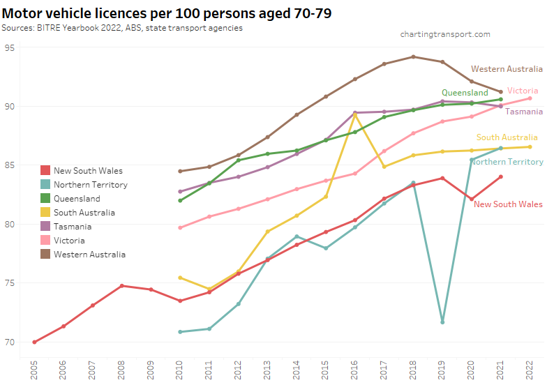
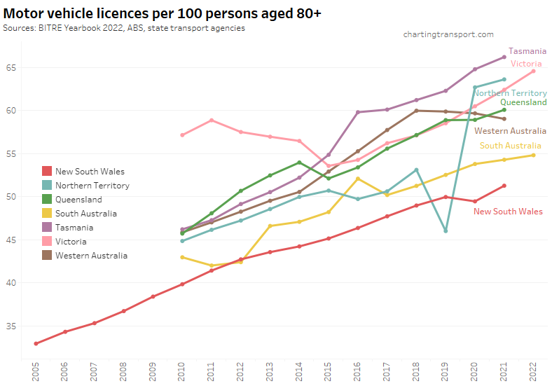
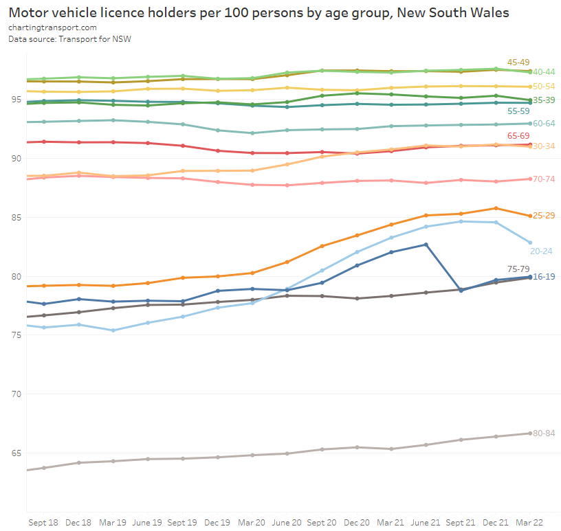
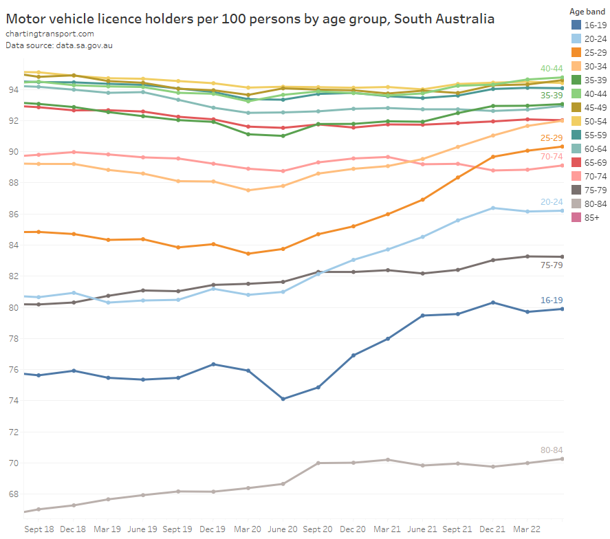
- Motor vehicle licence ownership has declined in younger adults between around 2011 and at least 2019 (see: Update on Australian transport trends (December 2020))
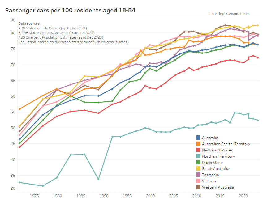
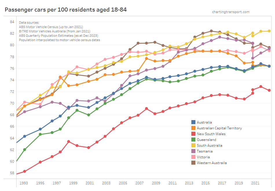
- Motor vehicle ownership was declining for younger adults in Melbourne, Canberra, and on some indicators in Sydney (see: Update on Australian transport trends (December 2023))
But there have been other demographic shifts that probably worked against increasing public transport mode share over the pre-pandemic years:
- The proportion of the working population who were parents rose from 22.6% to 27.1% for those working in the City of Melbourne, and from 25.3% to 27.3% for the rest of Greater Melbourne (2006 to 2016). As an aside: there was the little change in the average age of working parents – for women it went from 38.6 years in 2006 to 39.6 years in 2016 and for men it went from 40.0 to 40.3 years.
- The proportion of people working in the City of Melbourne who were under 40 years of age declined slightly from 58.3% to 57.2% (2006 to 2016).
- Motor vehicle ownership rates have risen significantly for adults over 60. Or put another way, for people born before around 1950, there was almost no change in their rates of motor vehicle ownership between 2011 and 2016, despite them aging 5 years. See: How has motor vehicle ownership changed in Australian cities for different age groups?
In a future post I might look at whether there has been a shift in where younger adults live and work geographically (eg proximity to the CBD, proximity to train stations, residential densities). This would be particularly interesting for the “post-pandemic” world, however it will probably need to wait for 2026 census data.


 Posted by chrisloader