Post updated 11 May 2018. See end of post for details.
My last post looked at the overall trends in journeys to work in Melbourne, with a focus on public and private transport at the aggregate level. This post dives down to look at particular modes or modal combinations, including mode shares, mode shifts and the origins and destinations of new trips.
Train
Here’s mode share for journeys involving train by home location (journeys may also include other modes):
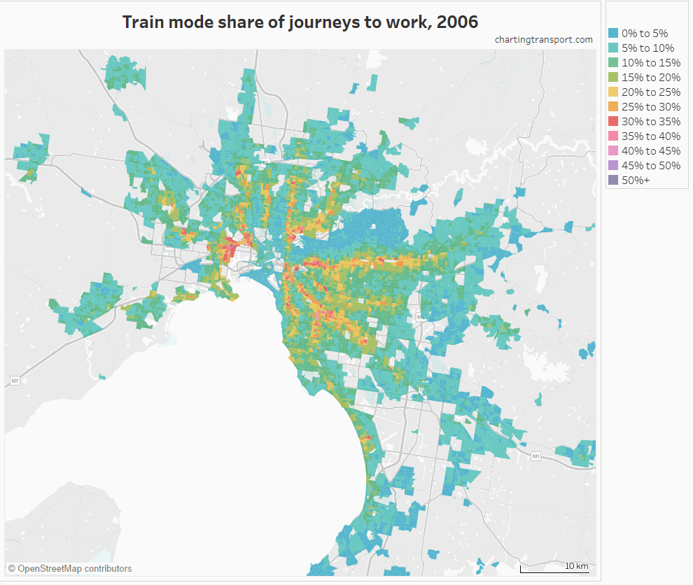
The highest train mode shares can be seen mostly along the train lines, which will surprise no one.
In fact, we can measure what proportion of train commuters live close to train stations. The following chart looks at how far commuters live from train stations, for commuters who use only trains, used trains and possible other modes, and for all commuters.
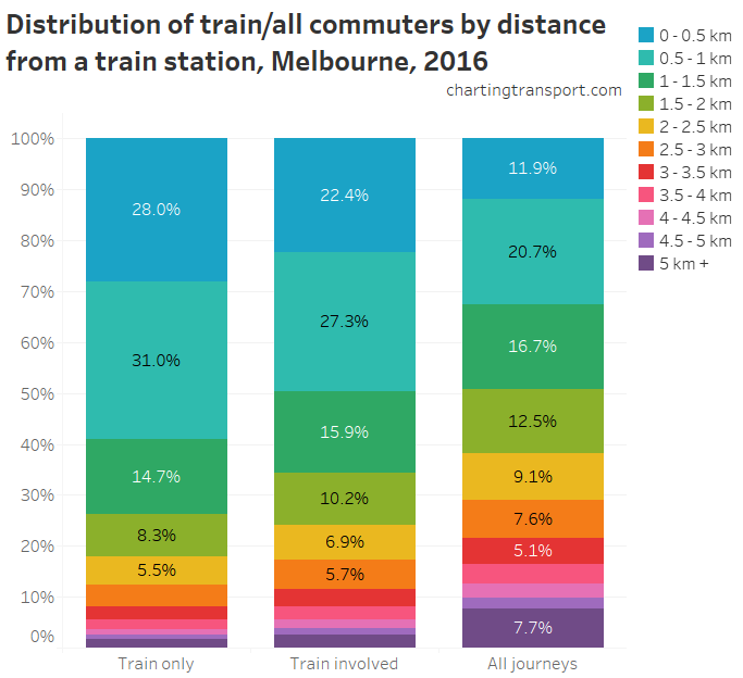
This chart shows that almost 60% of people who only used train (and walking) to get to work lived within 1 km of a station, and almost three-quarters were within 1.5 km. But around 8% of people only reporting train in their journey to work were more than 3 km from a train station. That’s either a long walk, or people forgot to mention the other modes they used (a common problem it seems).
For journeys involving train, 50% were from within 1 km of a station, but around a quarter were from more than 2 km from a station.
Interestingly, around a third of all Melbourne commuters lived within 1 km of a train station, but a majority of them did not actually report train as part of their journey to work.
So where were the mode shifts to and from train (by home location)?
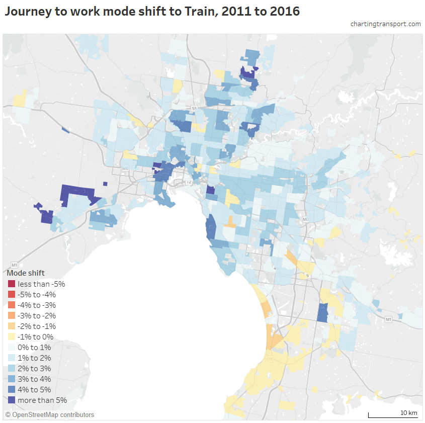
There were big mode shifts to train around new stations including Wyndham Vale, Tarneit, Lynbrook, South Morang, and Williams Landing. Other bigger shifts were in West Footscray – Tottenham, South Yarra – East, Brighton, Viewbank – Yallambie, Yarrville, Footscray, Kensington, and Pascoe Vale (some of which might be gentrification leading to more central city workers?).
There was also a significant shift to trains in Point Cook, which doesn’t have a train station, but is down the road from the new Williams Landing Station. Almost 28% of commuters from Point Cook South work in the Melbourne CBD, Docklands or Southbank, and most of those journeys were by public transport.
We can also look at mode shares by work location. Here is train mode share by workplace location for 2011 and 2016 (I’ve zoomed into inner Melbourne as the mode shares are negligible elsewhere, and I do not have equivalent data for 2006 sorry):

The highest shares are in the CBD, Docklands and East Melbourne. Notable relatively high suburban shares include the pocket of Footscray containing State Trustees office tower (30.7% in 2016), a pocket of Caulfield including a Monash University campus (29.5%), Box Hill (up to 19.6%), Swinburne University in Hawthorn (37.4%), and 17.5% in a pocket of Yarraville.
The biggest workplace mode shifts to train were in Docklands (+8.6%), Southbank (+5.5%), Abbotsford (+5.5%), Richmond (+5.3%), Collingwood (+5.1%), Parkville (+4.9%), and South Yarra – East (+4.8%).
Bus
Across Melbourne, bus mode share had a significant rise from 2.6% in 2006 to 3.3% in 2011, and then a small rise to 3.4% in 2016. Here’s how it looks spatially for any journey involving bus:
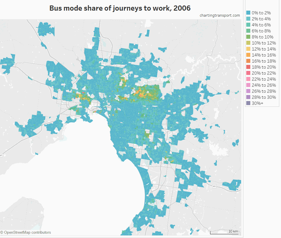
The highest bus mode shares are in the Kew-Doncaster corridor, around Clayton (Monash University), in the Footscray – Sunshine corridor, a pocket of Heidelberg West, around Box Hill and in Altona North. These are areas of Melbourne with higher bus service levels (and most lack train and tram services).
Here’s a map showing mode shift 2011 to 2016 at the SA2 level:
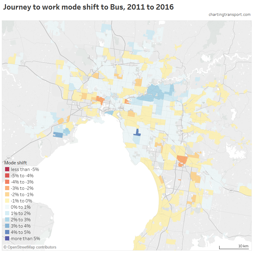
Outside the Kew – Doncaster corridor there were small mode shifts in pockets that received bus network upgrades between 2011 and 2016, including Point Cook, Craigieburn, Epping – West, Mernda, Port Melbourne, and Cairnlea.
There was also a shift to buses in Ormond – Glenhuntly, which can be largely explained by Bentleigh and Ormond Stations being closed on census day due to level crossing removal works, with substitute buses operating.
There were larger declines in Dandenong, Footscray, and Abbotsford.
In terms of workplaces, Westfield Doncaster topped Melbourne with 14.4% of journeys involving bus, followed by Monash University Clayton with 12.8% (remember this figure does not include students who didn’t also work at the university on census day), 13.3% at Northland Shopping Centre, and 12.3% in a pocket of Box Hill.
SmartBus
“SmartBus” services operate from 5 am to midnight weekdays, 6 am to midnight Saturdays, and 7 am to 9 pm Sundays, with services every 15 minutes or better on weekdays from 6:30 am to 9 pm, and half-hourly or better services at other times. These are relatively high service levels by Melbourne standards.
SmartBus includes four routes that connect the city to the Manningham/Doncaster region via the Eastern Freeway, three orbital routes, and a couple of other routes in the middle south-eastern suburbs. All routes are relatively direct and none are particularly short. Seven of these routes serve the Manningham region.
To assist analysis, I’ve created a “SmartBus zone” which includes all SA1 and CD areas which have a centroid within 600 m of a SmartBus route numbered 900-908. These routes were all introduced between 2006 and 2011, generally replacing existing routes that operated at lower service levels (I’ve excluded SmartBus route 703 because it was not significant upgraded between 2006 and 2016).
Here are mode shares inside and outside the SmartBus zone:
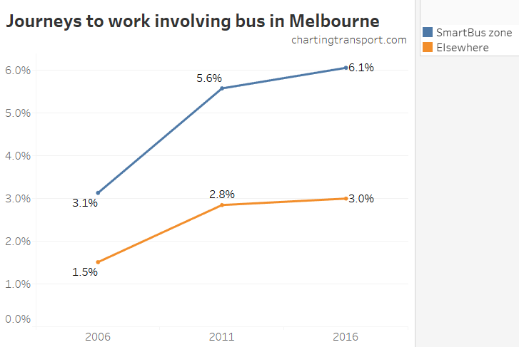
In 2006 the SmartBus zone already had double the bus mode share of the rest of Melbourne, as existing routes had relatively good service levels, including Eastern Freeway services. Following SmartBus (and other bus) upgrades between 2006 and 2011, there was a 2.5% mode shift to bus in the SmartBus zone, and a 1.3% mode shift to bus elsewhere. The SmartBus zone had a further 0.5% shift between 2011 and 2016 while the shift was only 0.2% in the rest of Melbourne.
Here’s an animated look at bus mode shares for just the SmartBus zone.
You can see plenty of mode shift in the Manningham area (where many SmartBus routes overlap), but also some mode shifts along the others routes – particularly in the south-east.
Notes:
- the SmartBus zone includes overlaps with some other high service bus routes – those pockets generally had higher starting mode shares in 2006.
- The orbital SmartBus routes do overlap with trains and/or trams which provide radial public transport at high service levels, negating the need or bus as a rail feeder mode (still useful for cross-town travel).
- I haven’t excluded sections of SmartBus freeway running from the SmartBus zone. Sorry, I know that’s not perfect analysis, particularly along the Eastern Freeway.
Train + bus
Journeys involving train and bus rose from 1.1% in 2006 to 1.5% in 2011 and 1.7% in 2016, which is fairly large growth off a small base and represents around half of all journeys involving bus. I suspect there might be some under-reporting of bus in actual bus-train journeys, as we saw many people a long way from train stations only reporting train as their travel mode.
Here’s a map showing train + bus mode share. Note the mode shares are very small, and I’m not willing to calculate a mode share where less than 6 trips were reported but they result in more than 3% mode share (I’ve shaded those zones grey):
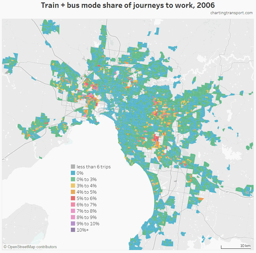
Large increases are evident around the middle eastern suburbs (particularly around SmartBus routes), the Footscray-Sunshine corridor (which have frequent bus services running to frequent trains at Footscray Station), Point Cook (where relatively frequent bus routes feeding Williams Landing Station were introduced in 2013, resulting in 750 train+bus journeys in 2016), Craigieburn (again bus service upgrades with strong train connectivity), and Wollert (likewise).
Ormond – Glen Huntly shows up in 2016 because of the rail replacement bus services at Bentleigh and Ormond Stations at the time (as previously mentioned).
If you look closely, you’ll see higher shares in the Essendon – East Keilor corridor, where bus route 465 provides high peak frequencies meeting just about every train (service levels have not changed between 2006 and 2016)
Tram
Here’s a map of tram mode shares, overlaid on the 2016 tram network (there haven’t been any significant tram extensions since 2005).

Higher tram mode shares closely follow the tracks, with the highest shares in Brunswick, North Fitzroy, St Kilda, Richmond, and Docklands.
It’s also interesting to note that several outer extremities of the tram network have quite low tram mode shares – including East Brighton, Vermont South, Box Hill, Camberwell / Glen Iris (where the Alamein line crosses tram 75), Carnegie, and to a lesser extent Airport West and Bundoora. These areas have overlapping train services and/or are a long travel time from the CBD.
Overall tram mode share increased from 4.0% in 2006 to 4.6% in 2011 and 4.8% in 2016. Here’s a map of tram mode shift 2011 to 2016 by home SA2:
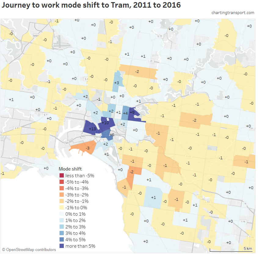
The biggest mode shift was +13% in Docklands, followed by +10% in the CBD. This no doubt reflects the introduction of the free tram zone across these areas. Walk-only journey to work mode share fell 4% in Docklands and 6% in the CBD.
Abbotsford had a 9% mode shift to trams, which possibly reflects the extension of route 12 to Victoria Gardens, providing significantly more capacity along Victoria Street (the only tram corridor serving Abbotsford).
There were small mode share declines in many suburbs, although this does not necessarily mean a reduction in the number of journeys by tram. In Port Melbourne there was a shift from tram to bus and bicycle.
Here are tram mode shares by workplace for 2011 and 2016:

The highest workplace tram mode shares were in the CBD, along St Kilda Road south of the CBD, Carlton, Fitzroy, Parkville, Albert Park, South Melbourne, and St Kilda.
Cycling
Cycling mode share increased from 1.5% in 2006 to 1.8% in 2011 and 1.9% in 2016. These are low numbers, but the bicycle mode share was anything but uniform across Melbourne.
Firstly here’s a map of cycling mode share by home location:
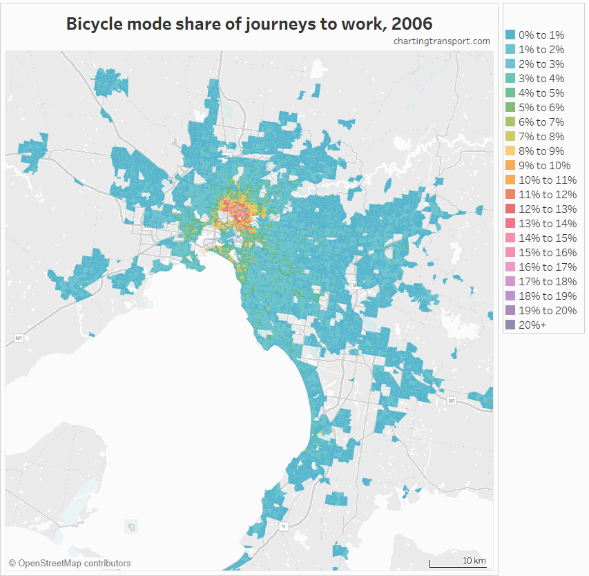
There’s not much action outside the inner city, so let’s zoom in:
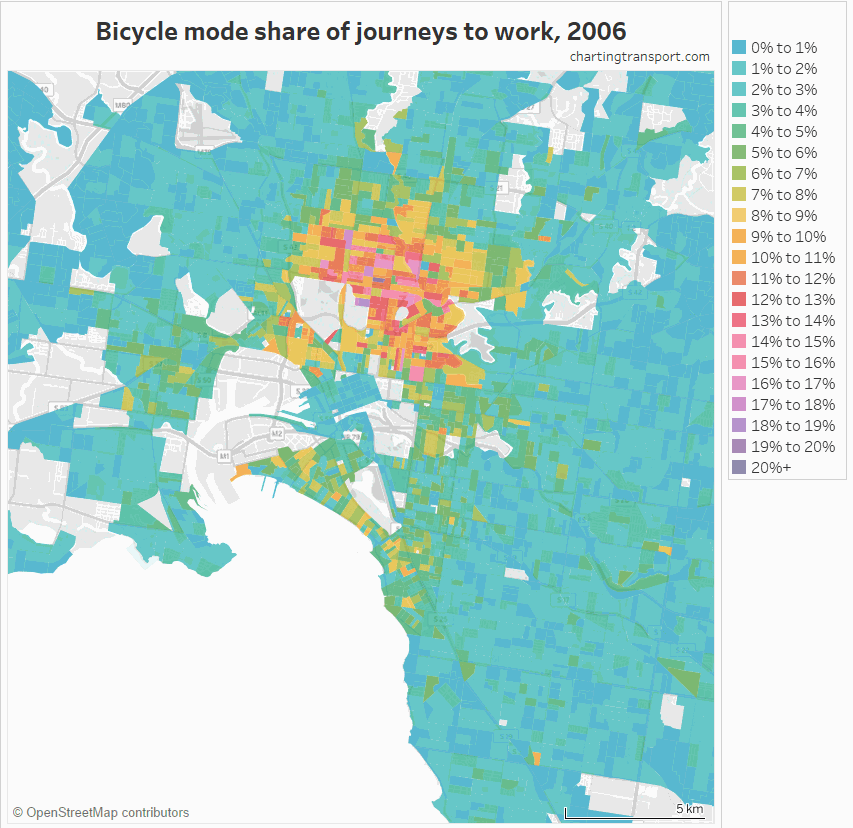
The highest mode shares are in the inner northern suburbs (pockets around 25%) where there has been considerable investment in cycling infrastructure.
Here’s a chart showing the mode shift at SA2 level:
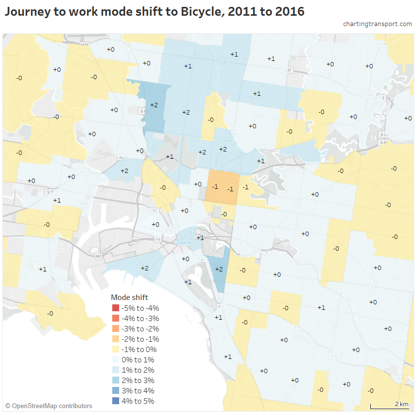
The biggest mode shift were 2% in Brunswick West and South Yarra West. However aggregating to SA2 level hides some of the other changes. If you study the detailed map you can see larger mode shifts in more isolated pockets and/or corridors (including a corridor out through Footscray).
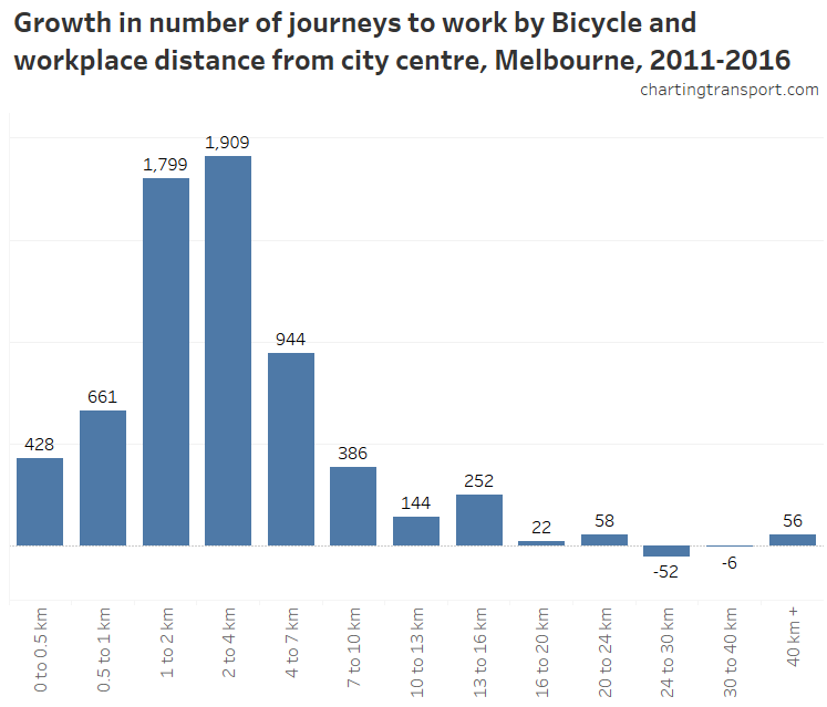
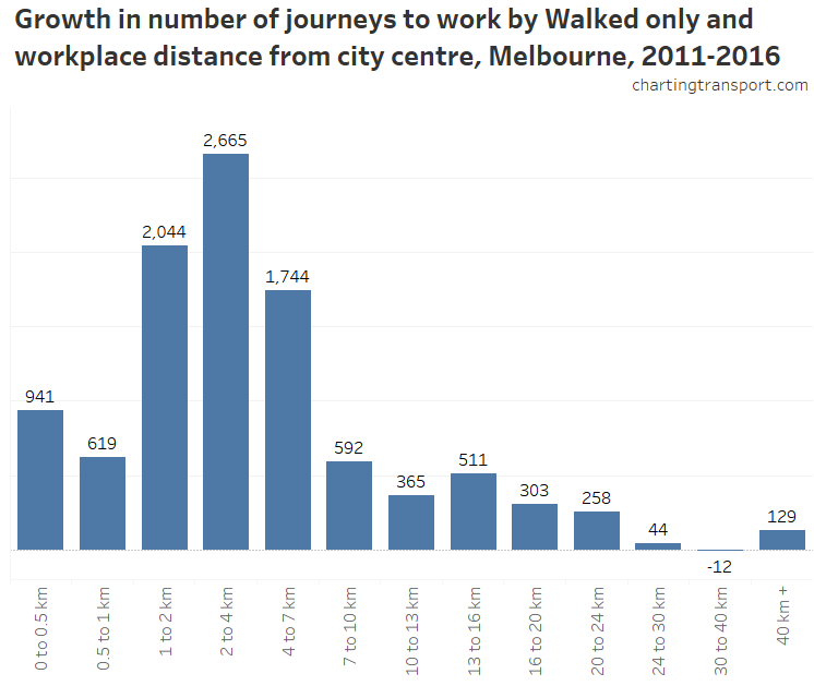
Here is the growth in bicycle trips between 2011 and 2016 by home distance from the city centre:
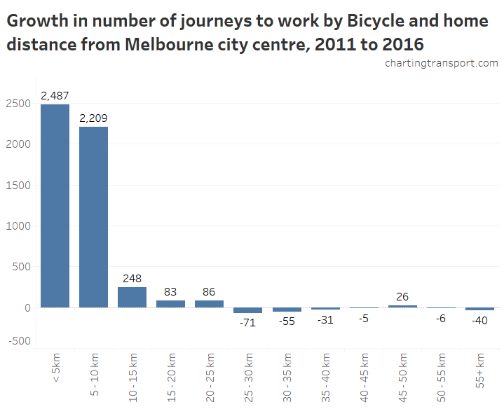
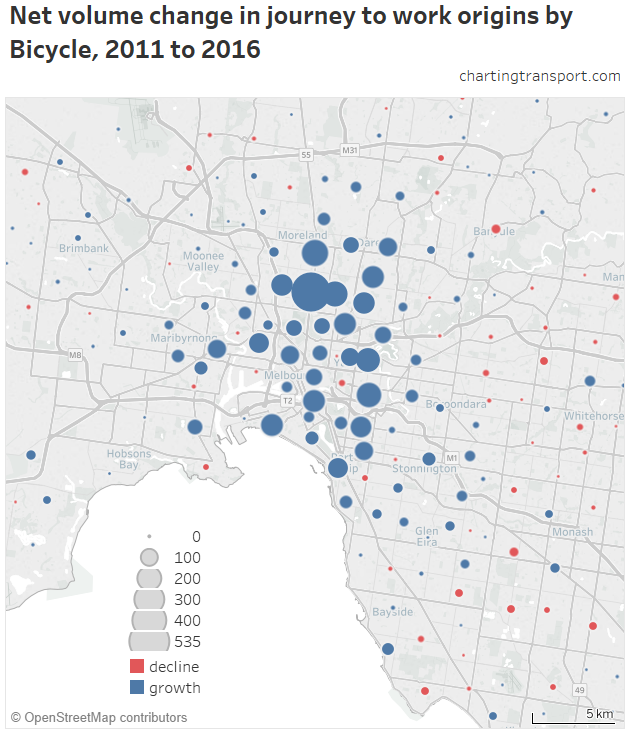
Significant growth was only seen for homes within 10km of the city centre. Here are those new trips mapped, with Brunswick SA2 showing the largest growth:
What about cycling mode shares by workplaces? I’ve gone straight to the inner city so you can see the interesting detail:
The highest workplace mode shares are in the inner northern suburbs, including Parkville (9%) and Fitzroy North (8%).
You’ll note the CBD does not have a high cycling mode share (3.8%) compared to the inner northern suburbs. But if you look at the concentration of cycling commuter workplaces, you get quite a different story:
This shows the CBD having the highest concentrations of commuter cycling destinations, although there were also relatively high densities at the Parkville hospitals and the Alfred Hospital. The highest concentration of commuter cyclists in 2016 was a block bound by Lonsdale Street, Exhibition Street, Little Lonsdale Street and Spring Street (it had a mode share of 4.3%).
However if you look at the increase in bicycle commuter trips between 2011 and 2016 by workplace distance from the city, the biggest growth was for destinations 1-4 km from the city centre:
Note: I am using a different scale for charts by workplace distance from the CBD.
How has walking changed?
Overall walking-only mode share in Melbourne as measured by the census has hardly changed, from 3.6% in 2006 to 3.5% in both 2011 and 2016. However there are huge spatial variations.
Here’s walking by home location:
The highest walking mode shares are around the central city with mode shares above 40% in parts of the CBD, Southbank, Carlton, Docklands, North Melbourne, and Parkville. Outside the city centre relatively high mode shares are seen around Monash University Clayton, the Police Academy in Glen Waverley, Box Hill, and Swinburne University in Hawthorn. Walking-only trips are very rare in most other parts of the city.
Here are walking mode shares by workplace location:
The highest walking shares by SA2 in 2016 were in St Kilda East, Prahran – Windsor, South Yarra, Carlton, Carlton North, Fitzroy, and Elwood. There were also smaller pockets of high walking mode share in Yarraville, Footscray, Flemington, Northcote, Ormond – Glenhuntly, Richmond, and Box Hill.
The biggest mode shifts away from walking were in the CBD (-7.3%) and Docklands (-4.0%), which also had big shifts to tram – probably due to the new Free Tram Zone.
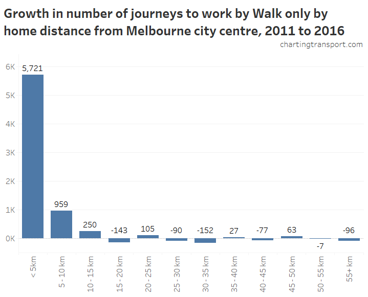
Overall, the biggest increase in walking journeys was seen within 5km of the city centre:
For workplaces, the biggest growth in walking was to jobs between 2-4 km from the CBD (be aware of different X-axis scales):
Most common non-car mode
Here is a map showing the most common non-car mode in 2016*. Note the most common non-car mode might still have a very small mode share so interpret this map with caution.
*actually, I’ve not checked motorbike/scooter, taxi, or truck on the basis they are very unlikely to be the most common.
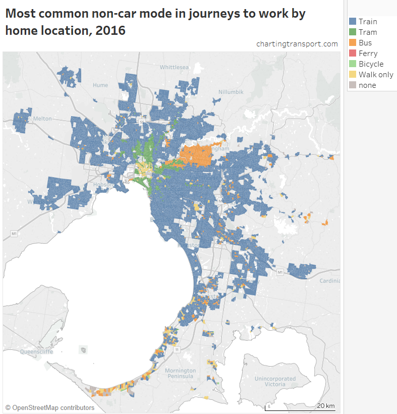
Train dominates most parts of Melbourne, with notable exceptions of the Manningham region (served by buses but not trains), several tram corridors that are remote from trains, and walking around the city centre.
The southern Mornington Peninsula is a mix of bus and walking, plus some SA1s where no one travelled to work by train, tram, bus, ferry, bicycle, or walk-only!
The next map zooms into the inner suburbs, showing the tram network underneath:
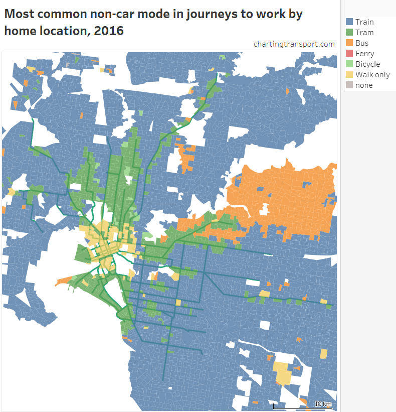
Generally tram is only the dominant mode in corridors where trains do no overlap (we saw lower tram mode shares in these areas above). In most of the inner south-eastern suburbs served by trams and trains, train is the dominant non-car mode.
If you look carefully, there are a few SA1s where bicycle is the dominant non-car mode.
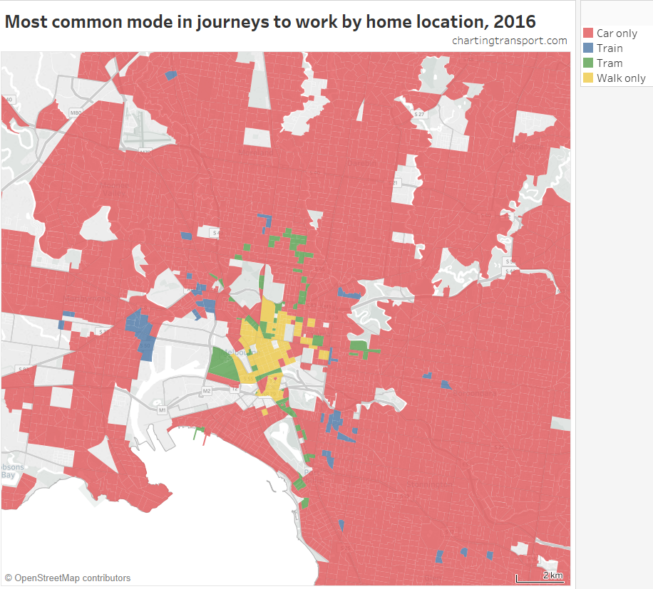
In case you are wondering, there are places in Melbourne where train, tram, or walking-only trumped car-only as the most common mode. They are all on this map:
Mode with the most growth
Finally, another way to look at the data is the mode with the highest growth in trips.
Here is a map showing the mode (out of car, train, tram, bus, ferry, bicycle, walk-only) that had the biggest increase in number of trips between 2011 and 2016, by SA2:
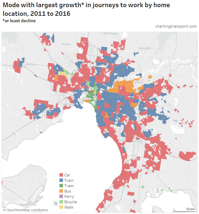
Car trips dominated new trips in most outer suburbs (particularly in the south-east), but certainly not all of Melbourne. Train was most common in many middle suburbs (and even some outer suburbs).
Bicycle was the most common new journey mode in Albert Park (+56 journeys), South Yarra – West (+54), Carlton North – Princes Hill (+80), Fitzroy North (+162) and Brunswick West (+158).
Walking led Fitzroy (+147) and Keilor Downs (+15, with most other modes in small decline, so don’t get too excited).
Bus topped SA2s in the Doncaster corridor, but also Port Melbourne (+176), Vermont South (+30), Kings Park (+10) and Ormond – Glen Huntly (+275 with rail replacement buses operating on census day in 2016).
Tram topped several inner SA2s including the CBD, Docklands and Southbank.
A caution on this map: the contest might have been very close between modes and the map doesn’t tell you how close.
Want to explore the data in Tableau?
I’ve built visualisations in Tableau Public where you can choose your mode of interest, year(s) of interest, and zoom into whatever geography you like.
By home location:
- Mode share
- Mode shift
- Trip growth
- Most common non-car mode
- Mode share of net new journeys
- Mode with largest journey growth
By work location:
Have fun exploring the data!
This post was updated on 24 March 2018 with improved maps. Also, data reported at SA2 level is now as extracted at SA2 level for 2011 and 2016, rather than an aggregation of CD/SA1/DZ data (each of which has small random adjustment for privacy reasons, which amplifies when you aggregate, also some work destinations seem to be coded to an SA2 but not a specific DZ). This does have a small impact, particularly for mode shifts, and mode with the most growth.
This post was further updated on 11 May 2018 to include minor adjustments to DZ workplace counts in 2011 to account for jobs where the SA2 was known but the DZ was not, and to improve mapping from 2011 DZs to 2016 SA2s. Refer to the appendix in the Brisbane post for all the details about the data.


 Posted by chrisloader