Significantly updated August 2026 with monthly data mostly up to May/June 2026 (varies by region), and annual data up to 2024-25 (including per-capita metrics for cities to 2024-25).
Recent patronage relative to 2019 (monthly)
Most transit agencies in Australia and New Zealand publish some sort of public transport patronage data. Sometimes daily, sometimes weekly, sometimes monthly, sometimes only quarterly. Sometimes a mix of these, including or excluding data for modes. I’ve done my best to process this data in a way that overcomes the deficiencies in the usefulness of the published data (see: We need to do better at reporting and analysing public transport patronage). For more background on these calculations, see the original post in which this first appeared.
While these charts compare recent patronage to 2019, they are not just measuring patronage “recovery” as many other factors will be influencing patronage – population growth, service upgrades, new lines, changed fares, etc. But 2019 serves as a handy pre-pandemic baseline to show relative trends since then.
Technical note: For Melbourne train patronage I have included all of Metro Train patronage plus a percentage of V/Line train patronage, as a significant and fast growing share of V/Line station boardings are in the metropolitan area (I’m including stations out to Wyndham Vale, Melton, and Donnybrook as metropolitan). Using station entrance data I’ve calculated a monthly metropolitan share of V/Line train station entries based on a linear trend from financial year data (which ranges from 31% in 2018-19 to 42% in 2023-24). It’s not perfect but I’d argue it’s better than leaving out V/Line. I could refine this approach with a lot more effort but the differences might not be noticeable. This inflates the percentages for Melbourne (by less than 1%), and Melbourne train (by around 2%) in 2025.
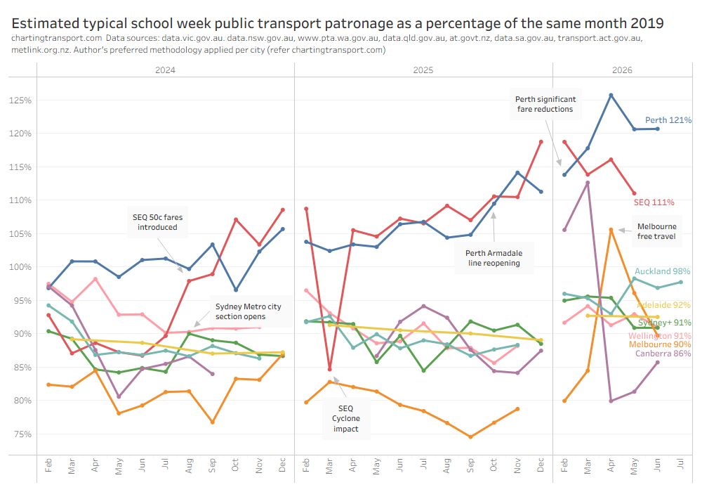
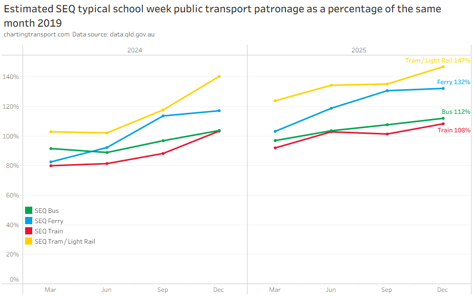
South East Queensland (SEQ) and Perth have shown the highest patronage relative to 2019, probably a product of 50 cent fares in SEQ and three new train lines and new fare caps in Perth.
The March 2025 result for SEQ was significantly impacted by ex Tropical Cycle Albert (I have excluded data for the most impacted week, but the impact likely lingered longer).
Sydney saw a large uptick from August 2024 when the Metro extension through the city centre opened.
I am a little concerned about the Melbourne figures for 2025Q3, particularly as there has been an unexpected significant decline in reported weekday tram patronage.
Estimated school week patronage
The following chart plots estimated school week patronage for all cities. Note that the Y-axis is a log scale, such that you can see the relative movements for each city, but the relative gaps between the cities can be understated.
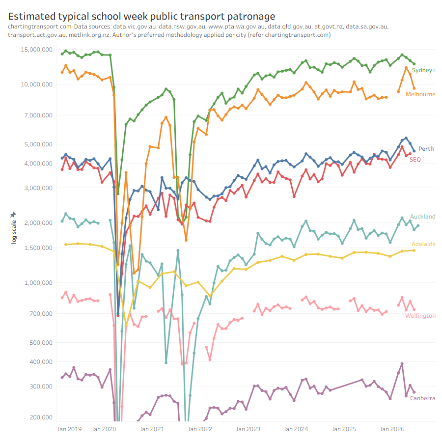
This data puts Perth above Brisbane, despite having a smaller population. However there are no guarantees that agencies are calculating patronage using a comparable methodology, and the BITRE data below suggests Brisbane passenger trips are higher than Perth.
Patronage relative to 2019, by city
Sydney:
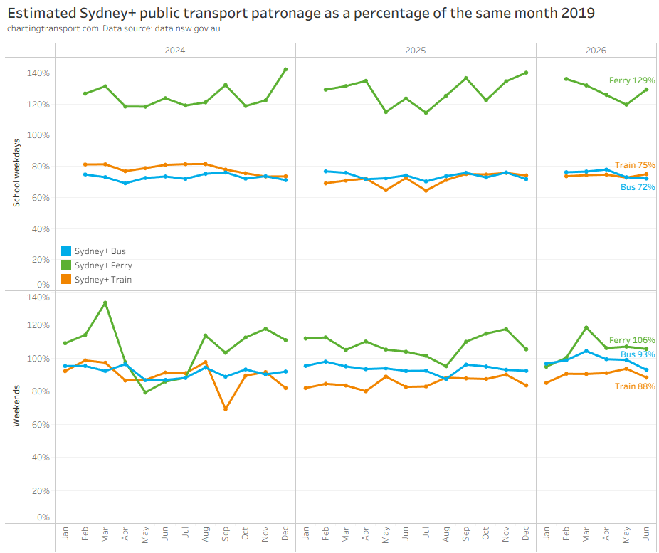
I have excluded Metro and Light Rail from the above chart because they have had very significant increases in service since 2019.
Here’s a view of estimated school week patronage over time for all modes (note the log scale on the Y axis):
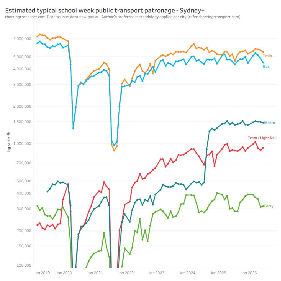
The Sydney Metro was extended through to the city in August 2024, resulting in tripling of Metro patronage, and a slight decline in train patronage. However train patronage has since returned to 2024 levels, indicating a large net increase across the two modes.
You can also see the highly cyclical ferry patronage, with significantly lower patronage in the colder months.
Melbourne:
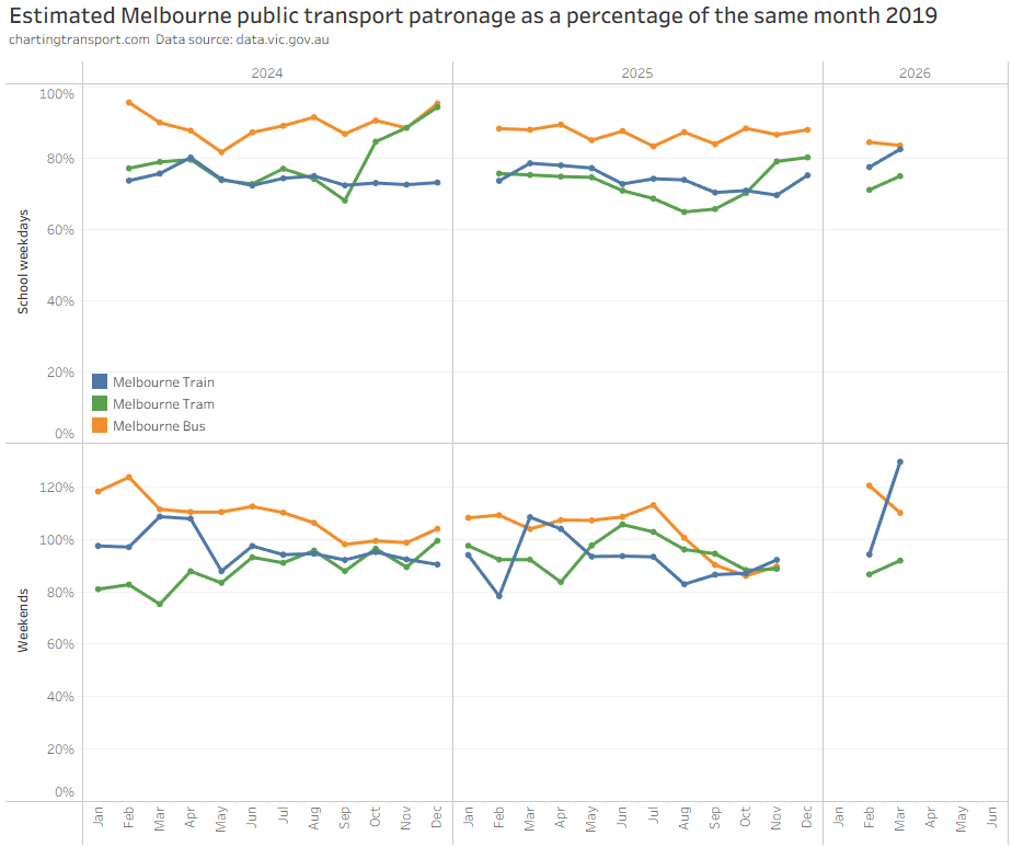
Note: many recent data points are missing from the above chart as average day type patronage figures have not been published for months with free travel.
There might be a little “noise” in the weekend figures that bounce around. Weekend train patronage in March and April 2019 was unusually low relative to surrounding months, contributing to high percentage figures for March and April in the chart above. The four months of high weekend tram patronage in mid 2023 is difficult to explain, particularly as there was no uptick in weekday patronage those months.
It is possible to estimate average school week patronage by mode for Melbourne, including for free travel months by using day type ratios from other months. You can see the impact of free travel was most pronounced on trains which shot up to 132% of 2019 levels.
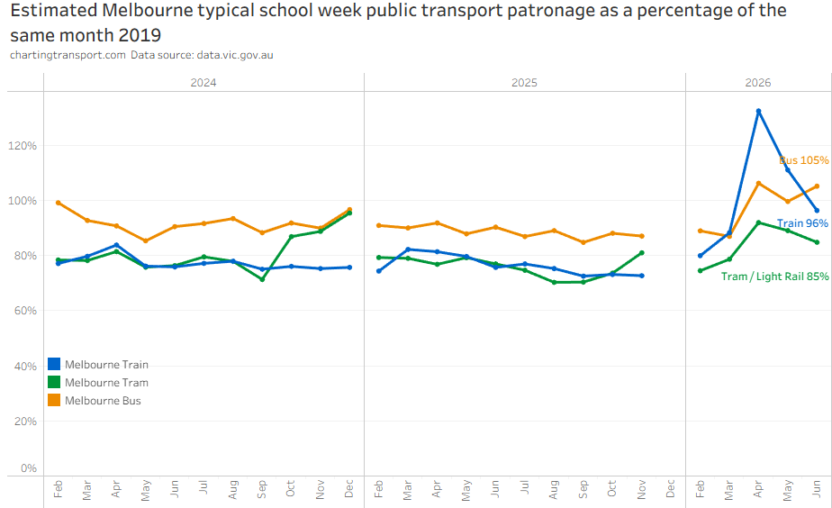
The reported significant decline in tram patronage in late 2025 is unexpected and difficult to explain.
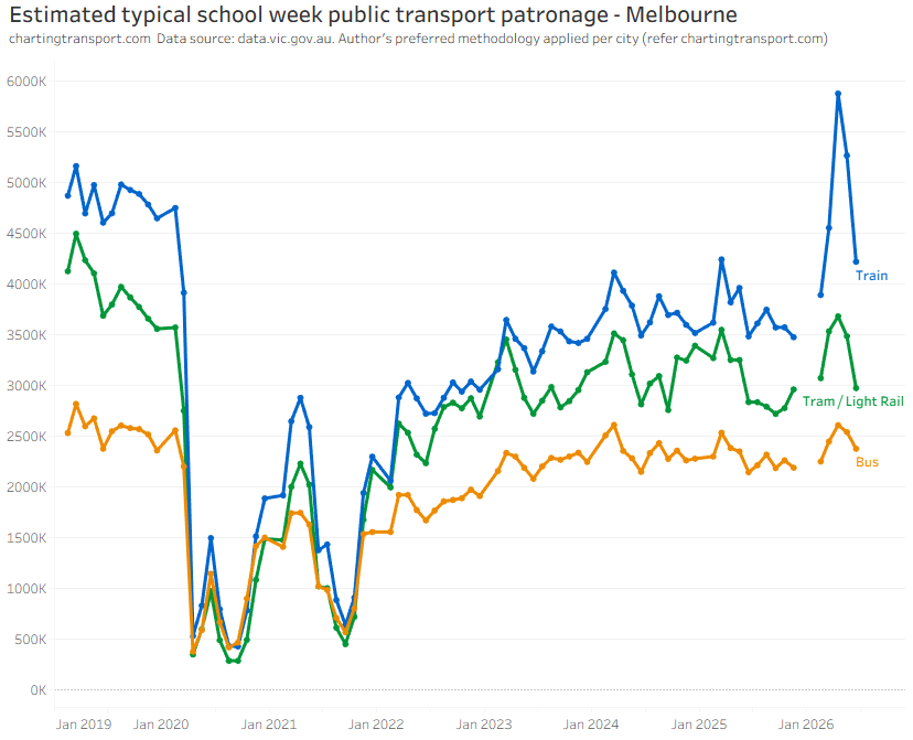
The following chart shows estimated school week patronage (note: linear scale on Y-axis).
Perth:
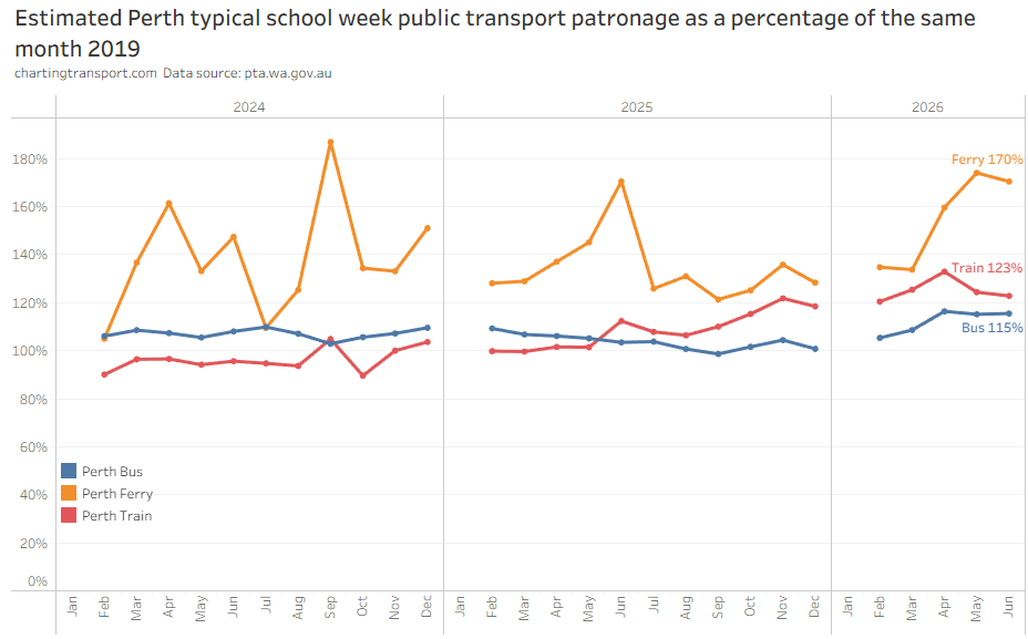
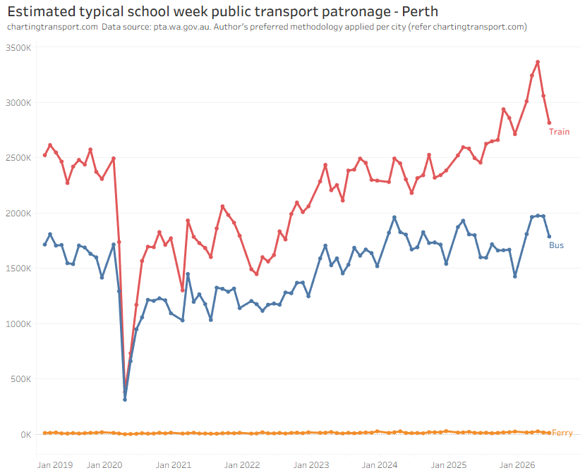
Perth’s Airport train line opened in October 2022, its Ellenbrook train line opened in December 2024, and the Cockburn-Thornlie line opened in July 2025. These openings may have slightly dampened demand on Perth’s bus network.
Here’s a look at train patronage by line. I have grouped the lines which have significant stretches of shared stations, as patronage at some stations will have become shared between old and new lines.
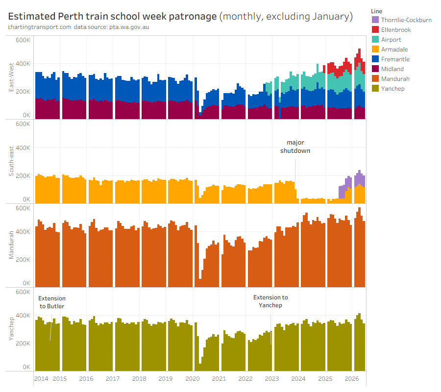
You can see the independent Yanchep line has roughly returned to 2019 levels (helped by a major extension to Yanchep in late 2023), and the essentially* independent Mandurah line is now busier than 2019 (*yes you can now catch a train from Cockburn to Perth via Thornlie but it takes almost twice as long).
There was an almost two-year shutdown on the Armadale line while level crossings were removed and an extension to Byford was completed. The Thornlie-Cockburn spur line was opened in July, and the Armadale line reopened in October 2025. The combined patronage across the two lines well exceeds pre-shutdown patronage levels. While we cannot be sure based on published data, it would appear patronage fully bounced back when the line reopened, as only three stations were added across the two lines.
With what I am describing as the east-west lines, there’s certainly been growth associated with the opening of the Airport and Ellenbrook lines. The Airport line overlaps considerable sections of the Fremantle and Midland lines, however patronage did not appear to drop on those lines when the Airport line opened – which suggests the increased overall frequency probably induced more patronage in the overlapping sections. Frequency doubled between the city and Claremont, and tripled between the city and Bayswater with the new lines opening.
When the Ellenbrook line opened, patronage fell on the overlapping Midland line from around 500k per week to around 400k per week, while the Ellenbrook line was also carrying around 400k per week – suggesting the Ellenbrook line induced around 300k new trips per week. The Ellenbrook line also overlaps the Airport line, but there was no noticeable drop in Airport line patronage when it opened.
Like many cities, patronage peaked in April 2026, the month where petrol prices spiked due to war in the Middle East.
The following chart includes a reminder that Perth’s ferry system is tiny:
Brisbane
Per-mode data back to 2019 is unfortunately only available at a quarterly resolution (and at the time of updating this page, only available until the end of 2025)
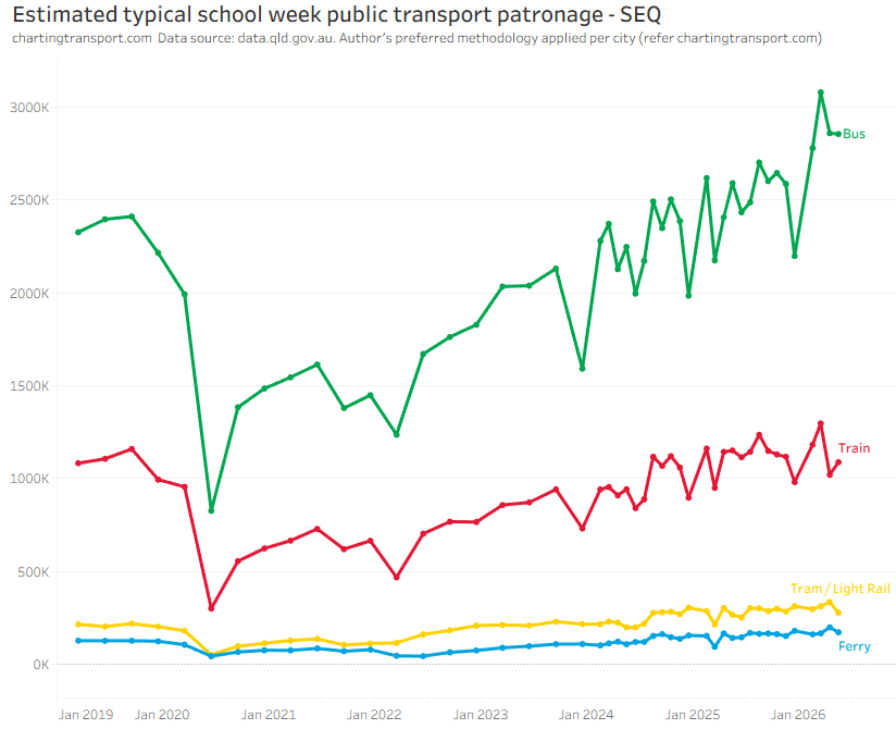
Unlike Sydney, Melbourne, and Perth, bus is the largest mode in SEQ.
Auckland:
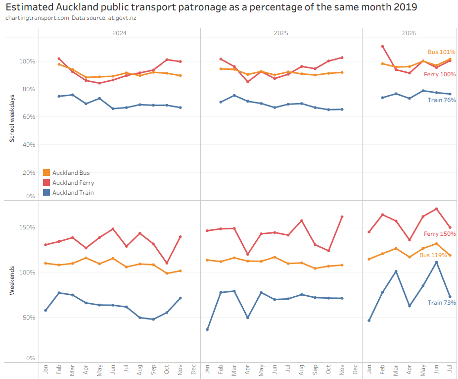
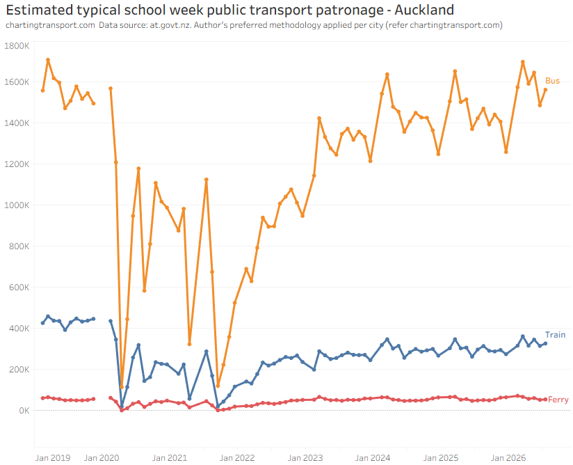
Wellington:
Daily patronage data is only available for weekdays.
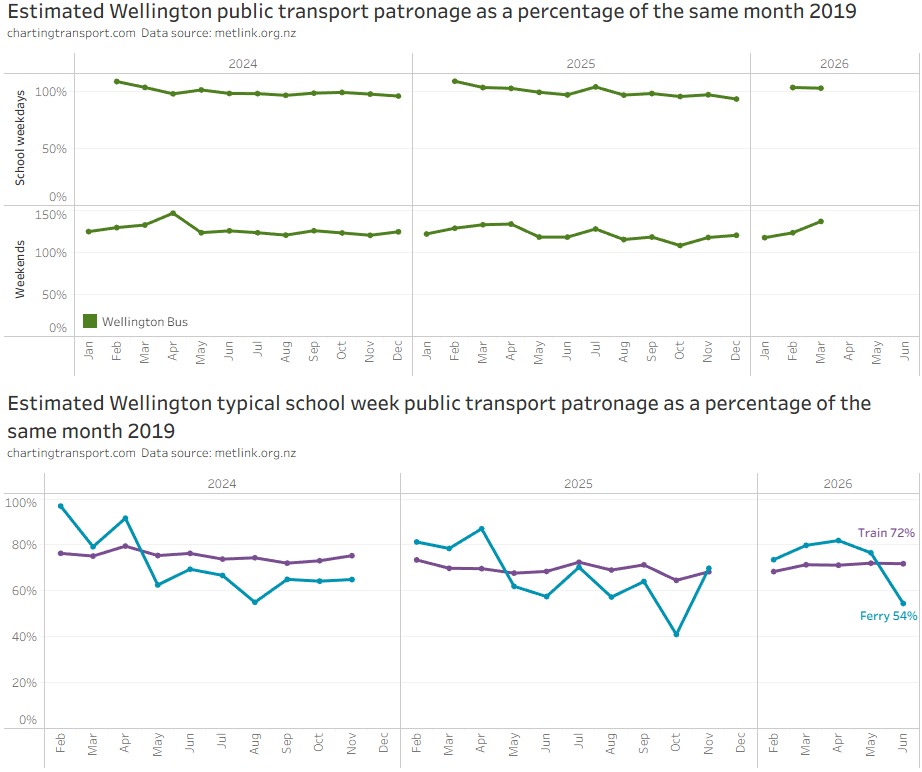
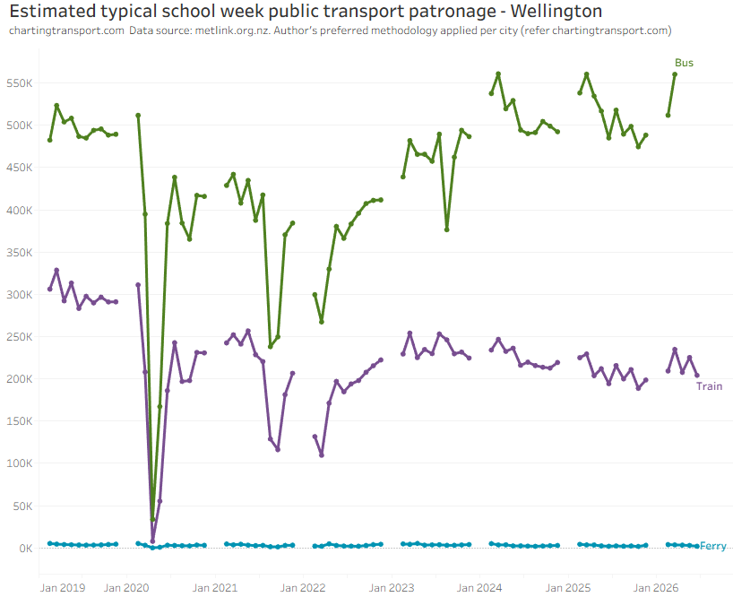
Wellington also has a tiny ferry mode.
Patronage relative to 2019, by mode, across all cities
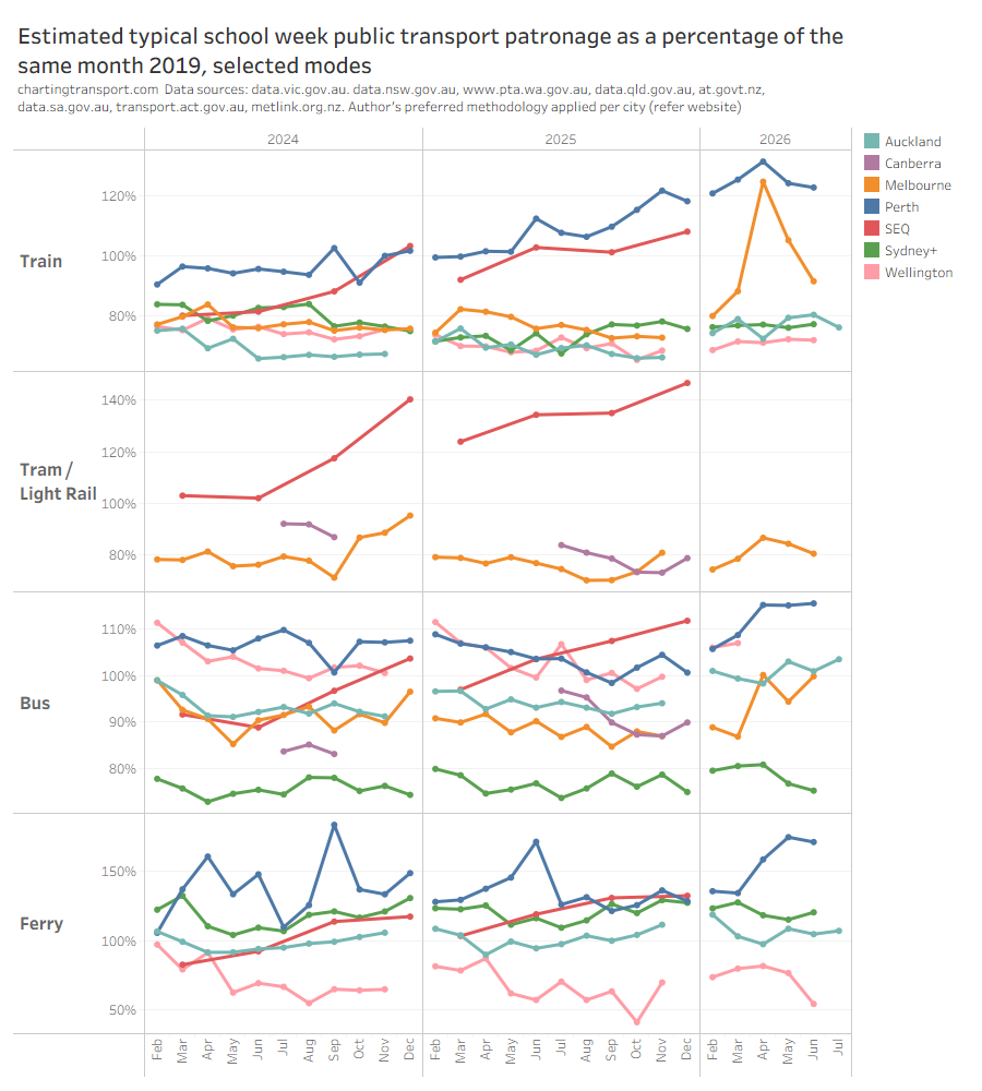
Train patronage is less than 80% of 2019 levels in Sydney, Auckland, Wellington. Sydney might have been above 80% had stations not been converted to Metro. Perth is the standout – with significant network expansion and frequency upgrades. Melbourne broke through 80% in 2026, probably related to the Metro tunnel opening in February 2026, free travel in April-May 2026, and half-price fares from June 2026.
South East Queensland patronage fired up in the second half of 2024 following the introduction of 50 cent fares.
Recent patronage growth
The following chart estimates recent school-week patronage growth comparing to the same quarter a year earlier (at the time of updating, complete 2026Q2 was unavailable for SEQ, and there are gaps in Canberra patronage estimates).
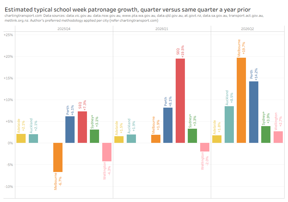
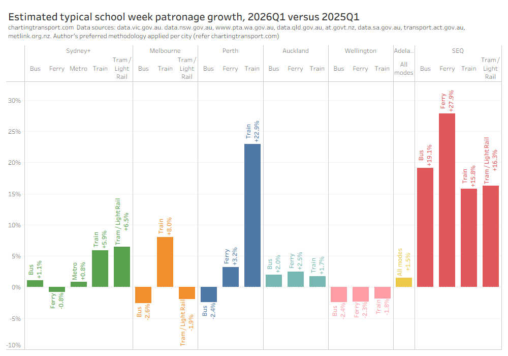
Here is recent patronage growth by mode for cities where this is available:
Longer term patronage trends (BITRE data)
Data source for this section: Australian Bureau of Infrastructure and Transport Research Economics (BITRE) Infrastructure and Transport Statistics Yearbook 2024.
BITRE are now reporting estimates of public transport passenger trips. From experience, I know that estimating and reporting public transport patronage is a minefield especially for boardings that don’t generate ticketing transactions. BITRE have estimated capital city passenger boardings, which will be less than some ticketing region boardings (Sydney’s Opal ticketing region extends to the Illawarra and Hunter, and South East Queensland’s Go Card network includes Brisbane plus the Sunshine and Gold Coasts). I’ll report them as-is, but bear in mind that they might not be perfectly directly comparable between cities. As indeed are all the figures reported above.
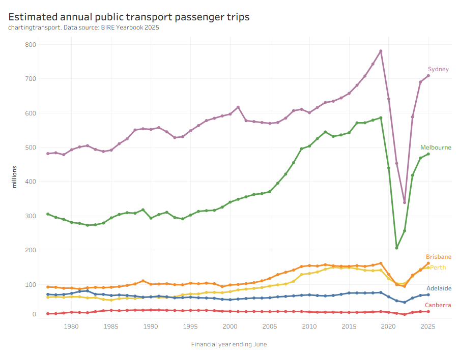
Brisbane saw a relatively large uptick in passenger trips in 2024-25, likely due to 50 cent fares in Queensland.
Note: the BITRE estimates put Brisbane passenger trips above Perth for most years, unlike the state-reported figures above, which might not be consistently measured and reported.
Here’s the same data as a percentage difference from 2018-19:
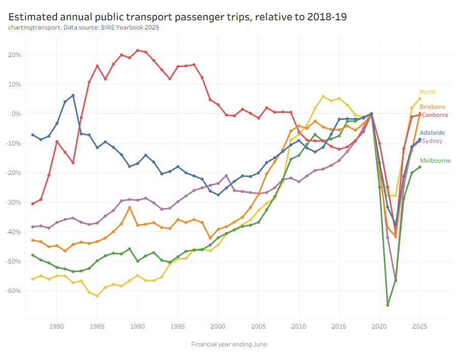
On a financial year basis, Perth has the highest patronage relative to 2018-19, while Melbourne has the lowest.
Of course bigger cities tend to generate more boardings, so it’s probably worth looking at passenger trips per capita per year (this data updated March each year, and I’m now calculating FY population as the average population across the FY)
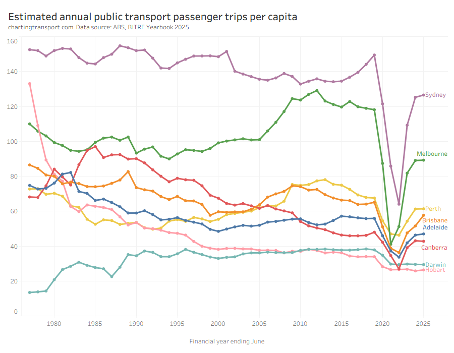
First the latest trends: In 2024-25, public transport passenger trips per capita were up in Brisbane from 51.5 to 57.6, up slightly in Sydney, but pretty much flat in other cities.
In most cities passengers trips per capita has bounced back strongly since the pandemic (except Darwin and Hobart), but to lower levels than 2019.
This chart produces some unexpected outliers. Hobart shows up with very high public transport trips per capita in the 1970s, which might be relate to the Tasman Bridge Disaster which severed the bridge between 1975 and 1977 and resulted in significant ferry traffic for a few years (over 7 millions trips in 1976-77).
Canberra also shows up with remarkably high trips per capita in the 1980s for a relatively small, low density, car-friendly city, but has been in steady decline since. BITRE advise me that Canberra trip values for before 2012 are very approximate because of patchy and varying trip collation/recording methods, so this might just be poor quality data rather than a real trend.
Canberra, Sydney, and Brisbane were seeing rising patronage per capita up to June 2019, just before the pandemic hit.
There are further reasons why comparing cities is still not straight forward. Smaller cities such as Darwin, Canberra, and Hobart are almost entirely served by buses, and so most public transport journeys will only require a single boarding. Larger cities have multiple modes and often grid networks that necessitate transfers between services for many journeys, so there will be a higher boardings to journeys ratio. If a city fundamentally transforms its network design there could be a sudden change in boardings that doesn’t reflect a change in mode share.
Indeed, here is the relationship between population and boardings over time. I’ve drawn a trend curve to the pre-pandemic data points only (up to 2019).
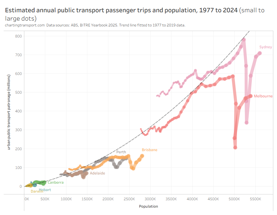
Larger cities are generally more conducive to high public transport mode share (for various reasons discussed elsewhere on this blog) but also often require transfers to facilitate even radial journeys.
So boardings per capita is not a clean objective measure of transit system performance. I would much prefer to be measuring public transport passenger journeys per capita (journeys potentially involving multiple boardings) which might overcome the limitations of some cities requiring transfers and others not.
The BITRE data is reported as “trips”, but comparing with other sources it appears the figures are indeed boardings. Most agencies unfortunately don’t report public transport journeys at this time, however boardings to journeys ratio could be estimated from household travel survey data for some cities.
Rail Passenger travel
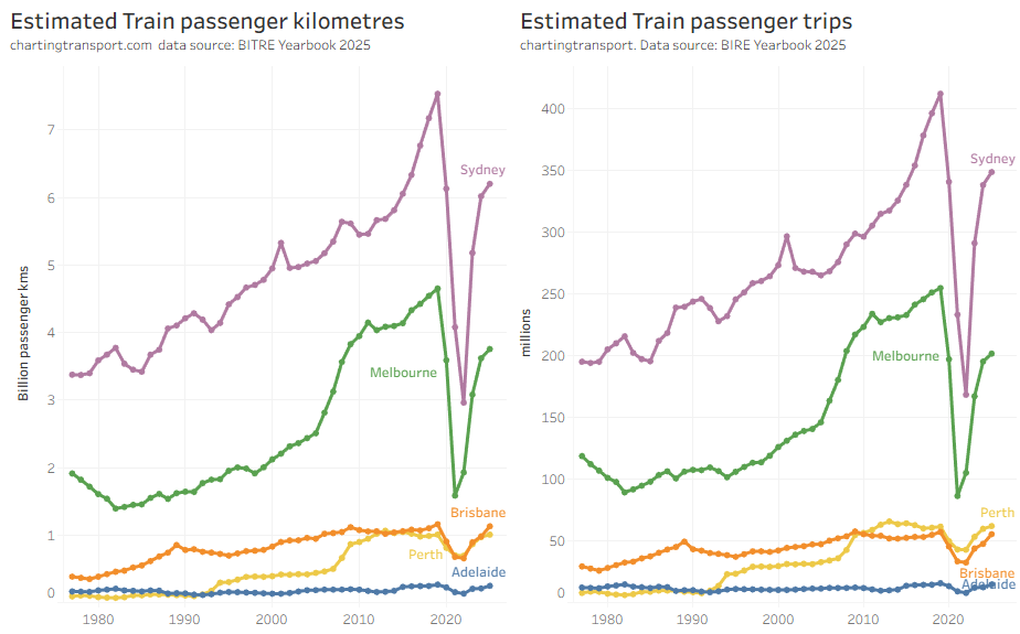
Note there are some variances between the ranking of the cities – particularly Perth and Brisbane (BITRE have average train trip length in Brisbane at around 20.3 km while Perth is 16.3 km in 2023).
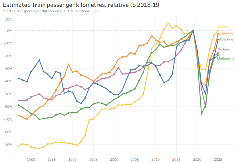
All cities are bouncing back after the pandemic, with Perth the strongest (likely related to some major new rail network extensions opening). I’m not quite sure why Adelaide saw such large growth in 2024-25.
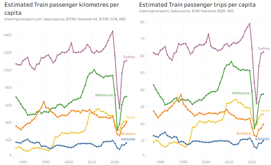
On a per-capita basis, most cities are bouncing back, and Sydney has bounced back strongest (and the Sydney Metro extension through the CBD wasn’t yet open in 2023-24).
In 2024-25 most cities saw an increase in train usage per capita, but less so in Perth.
Bus passenger travel
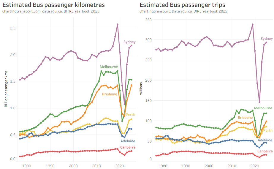
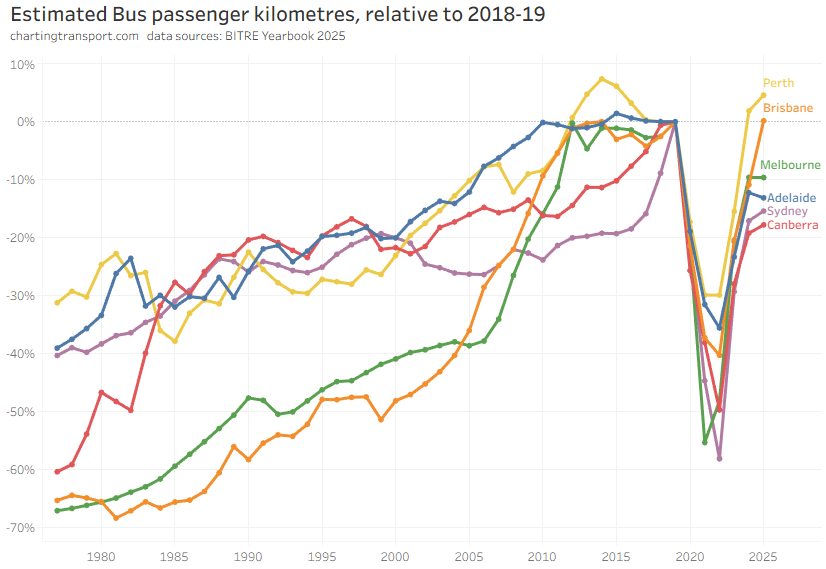
Brisbane saw the largest increase in bus passenger trips in 2024-25, likely related to 50 cent fares.
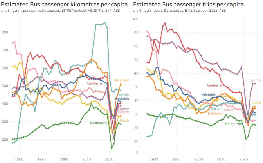
Note that Melbourne has the second highest volume of bus travel (being a large city), but the lowest per-capita usage of buses, primarily because – unlike most other cities – trams perform most of the busy on-street public transport task in the inner city. It probably doesn’t make sense to directly compare cities for bus patronage per capita, and indeed I won’t show such figures for the other public transport modes.
Darwin had elevated bus passenger kilometres from 2014 to 2019 due to bus services to a resources project (BITRE might not have counted these trips as urban public transport).
Only Brisbane shows a significant change in bus use per capita over 2024-25.
Ferry passenger travel
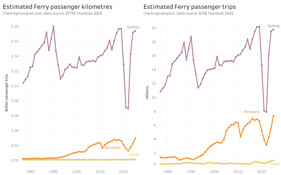
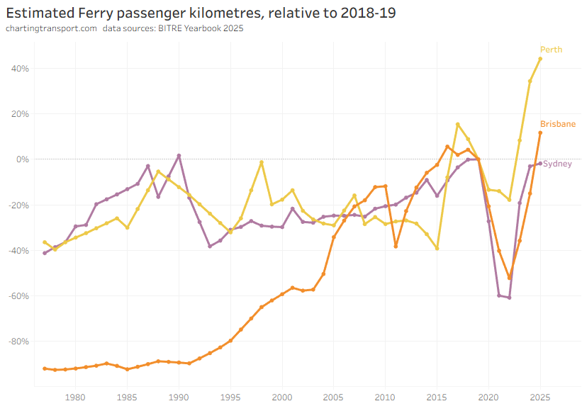
Brisbane saw the biggest increase in ferry trips in 2024-25, again likely related to 50 cent fares.
Light rail / tram passenger travel
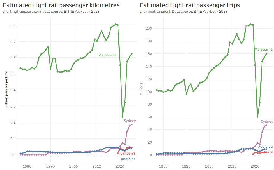
Sydney light rail patronage is now growing strongly – after two new lines opened a few months before the pandemic hit.


