I’ve recently completed my big annual refresh of the Trends pages on Charting Transport (accessible from the Trends menu above). Here is a quick scan of some headline trends, plus a few new interesting charts.
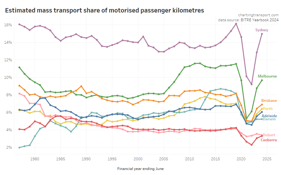
First up: mass transport mode share has increased around 0.75% in Brisbane following the introduction of 50 cent fares, but is relatively flat in most other cities, and below pre-pandemic levels (probably related to CBD workers working from home much more often).
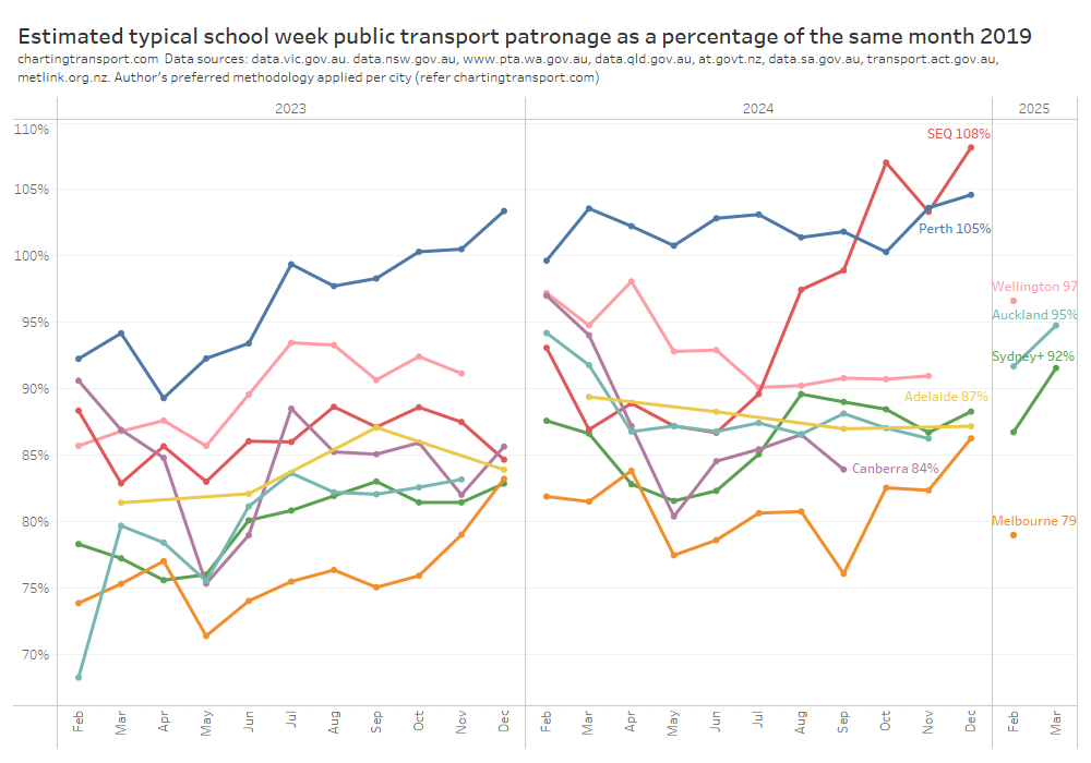
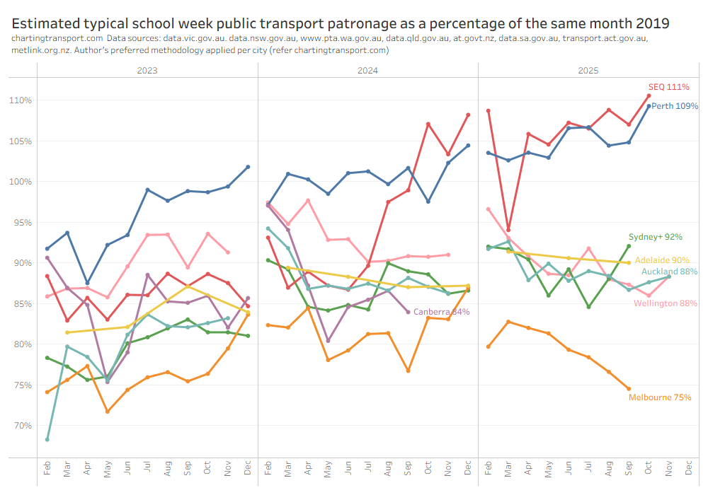
Public transport patronage levels relative to 2019 are highest in Perth (likely due to many new rail lines) and South East Queensland (likely due to 50c fares):
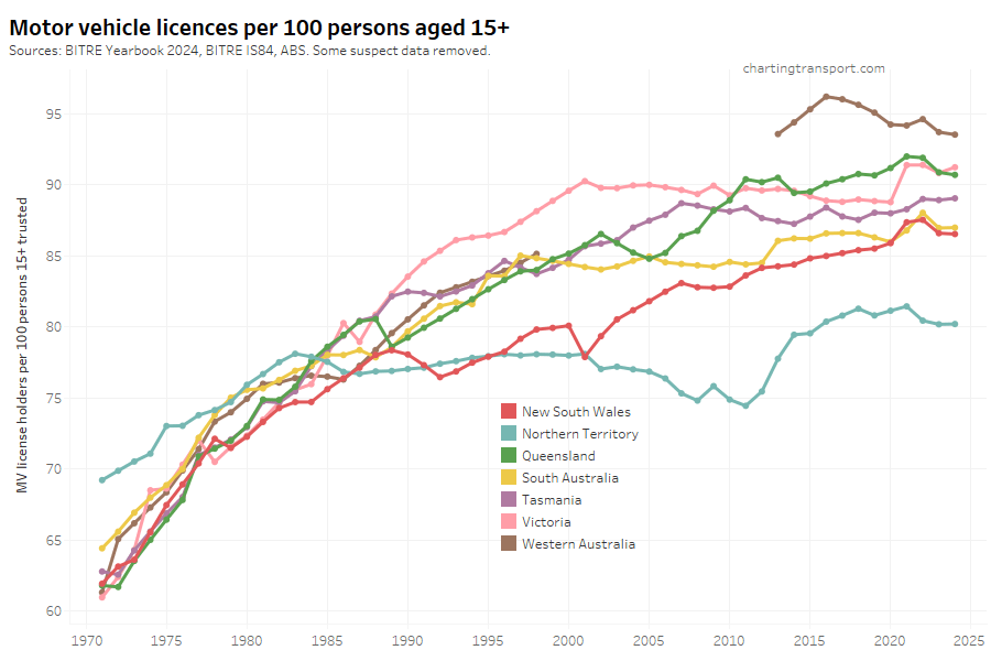
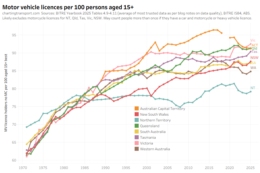
Driver’s licence ownership rates have risen slightly in most states:
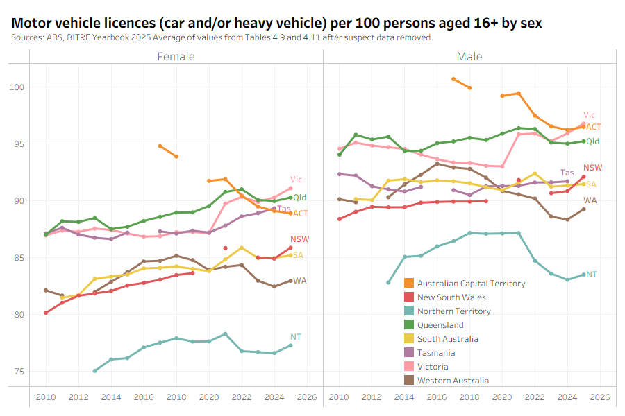
I’ve now got more analysis by gender, and females seem to be slowly closing the gap with males when it comes to motor vehicle licence ownership (but the male figures may double count those with car and heavy vehicle and/or motorcycle licences – it’s not entirely clear – data quality is a bit of a nightmare):
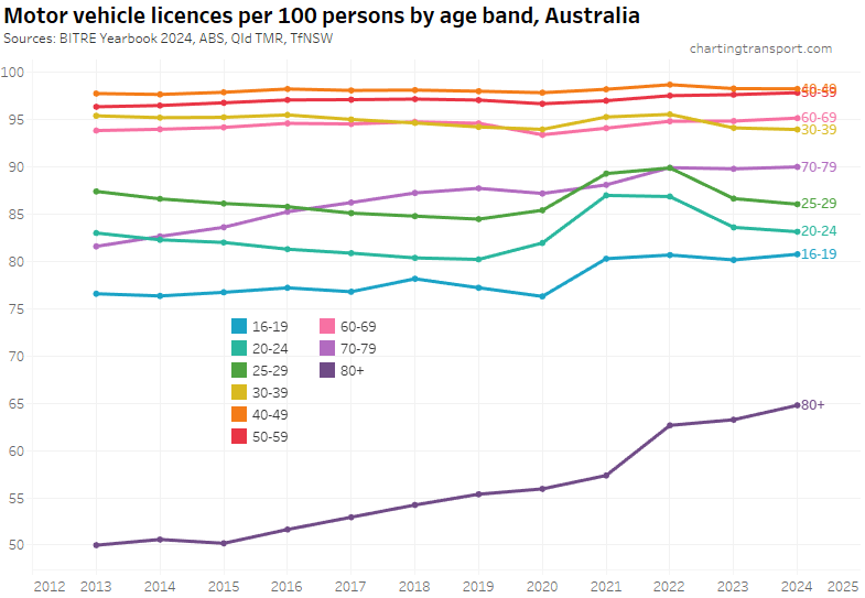
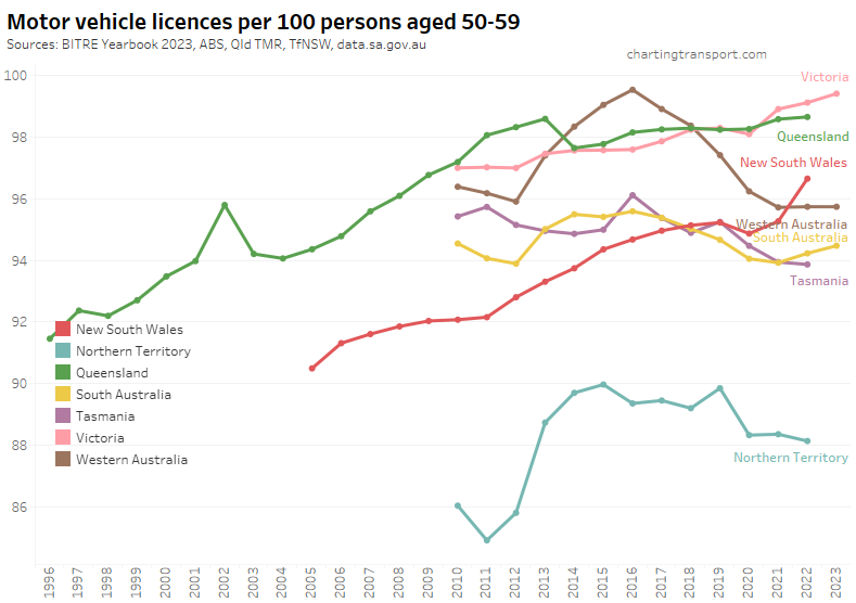
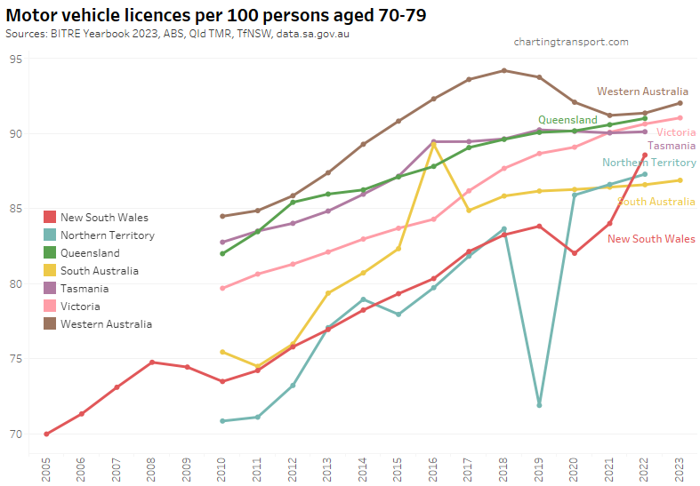
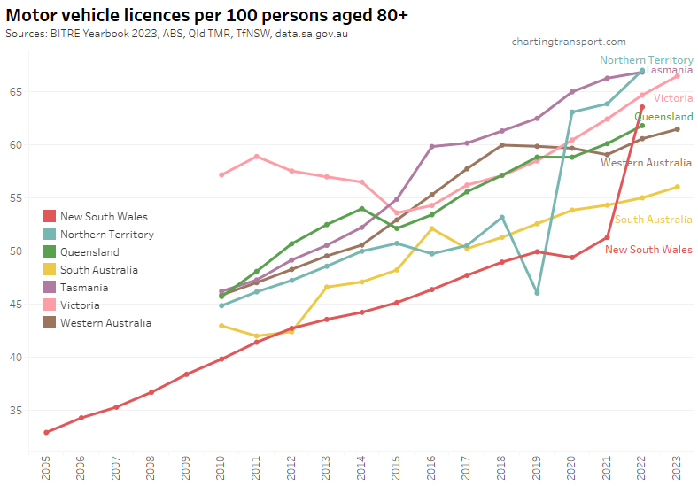
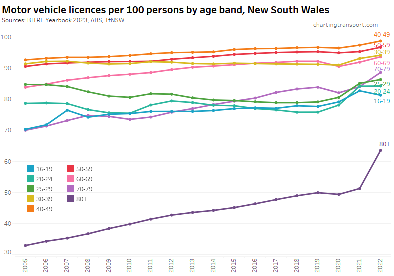
Motor vehicle licence ownership continues to rise rapidly for older people, especially females:
That said, people are still losing their licences as they get older, but the ages at which they lose their licence has been shifting older.
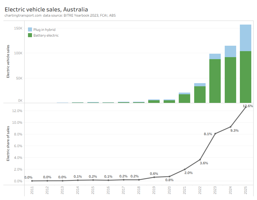
Plug-in hybrid vehicle sales have taken off, whilst pure battery vehicle sales are growing more slowly:
Sales of regular passenger cars are down again, as SUVs take a much larger share:
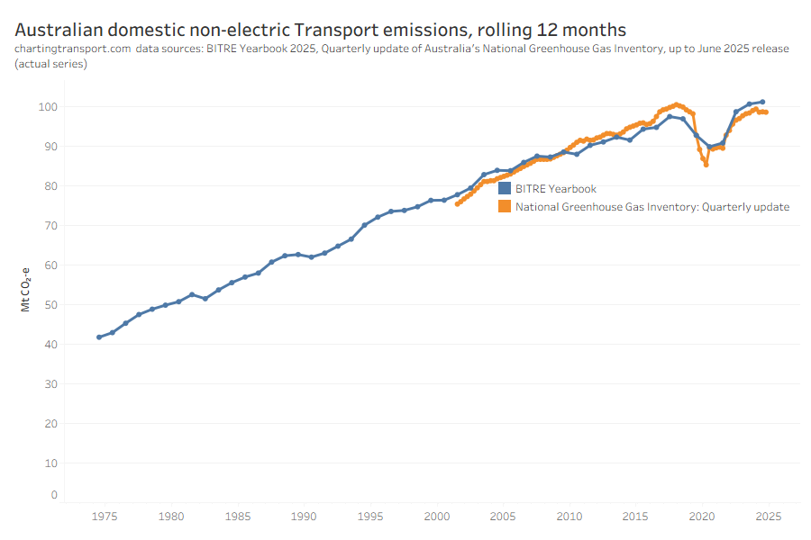
Transport emissions are not coming down. According to BITRE they are hitting new highs:
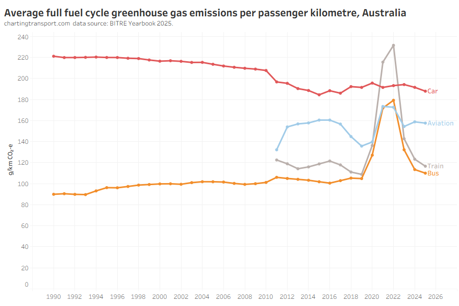
Here’s a new chart on estimated emissions per passenger kilometre for passenger transport, interestingly showing (domestic) aviation more efficient than cars:
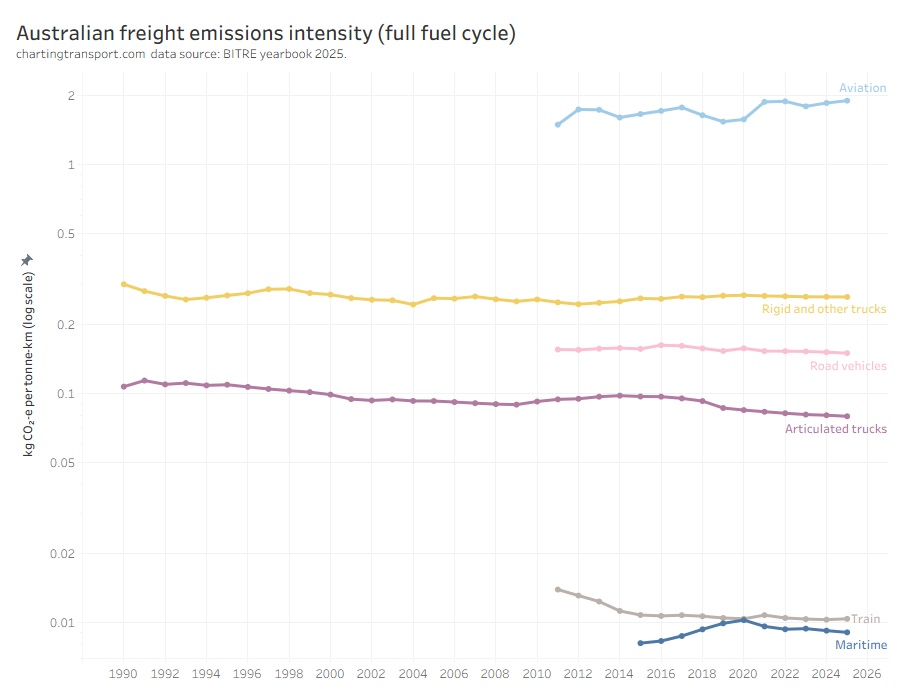
Next is a new chart showing freight emissions intensity. You may have known that trains and ships are very efficient at moving freight – but did you know they emit around 8 times less emissions than articulated trucks (per tonne-km), and around 190 times less emissions than than aeroplanes?
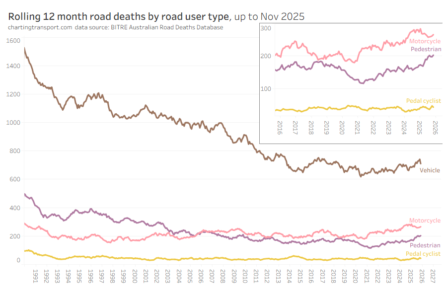
Pedestrian road deaths are continuing to increase:
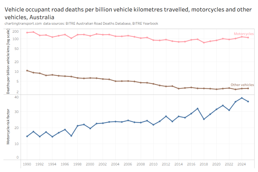
Motorcycles are around 36 times more deadly for vehicle occupants compared to other vehicles on a per-kilometre travelled basis:
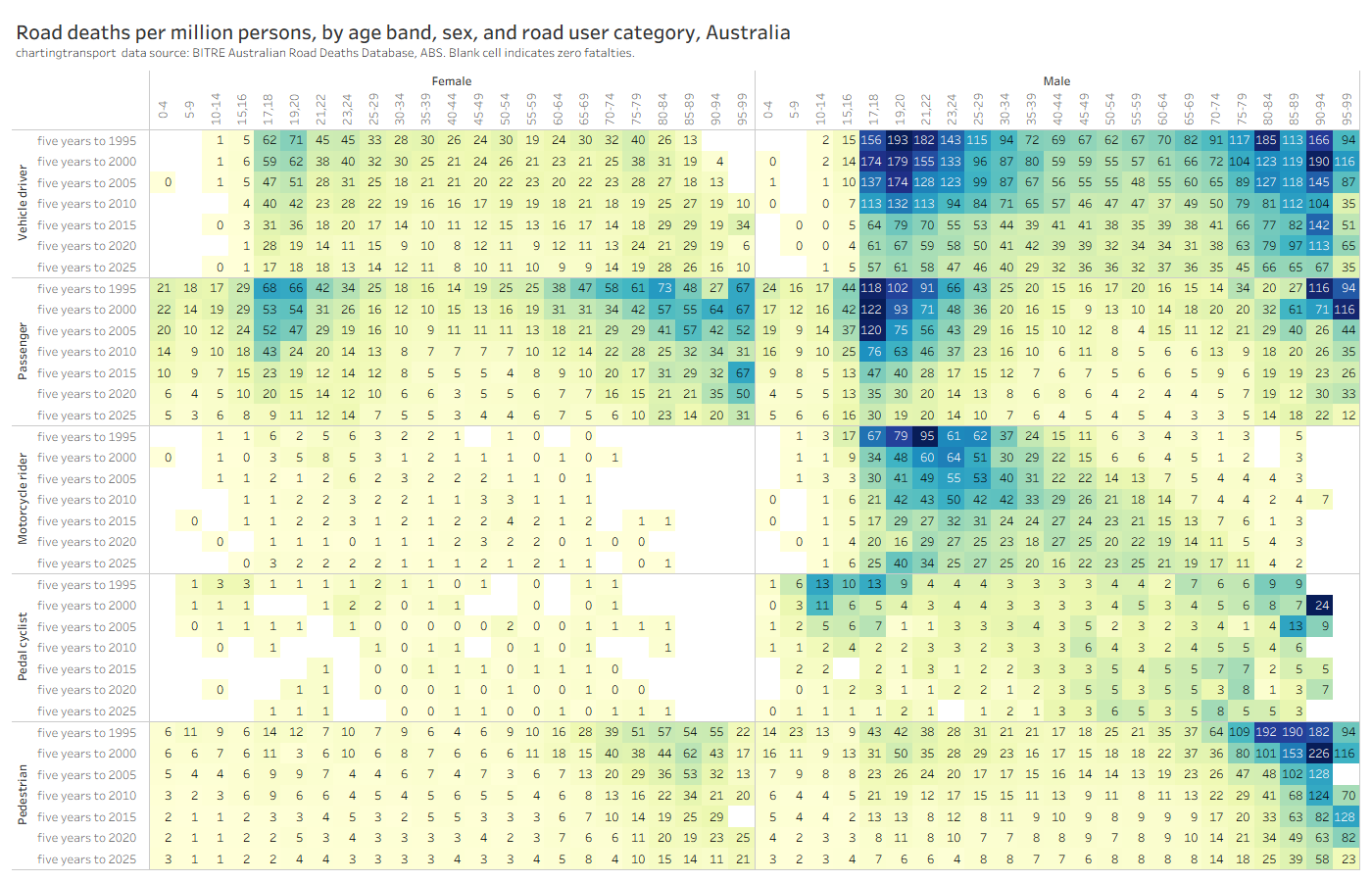
This new chart might take a little time to get your head around, but it shows road deaths per capita by age band, sex, and road user category. There’s a lot going on, and you’ll likely need to click/tap to enlarge this one.
Deaths per capita have thankfully been coming down across most ages, both sexes, and most road user types since the 1990s.
The elderly are still significantly over-represented in deaths per capita for vehicle drivers, vehicle passengers, and pedestrians. And males still have much higher death rates per capita than females in most categories (except older vehicle passengers).
However there have been concerning increases in deaths per capita over time for males on motorcycles across most age bands, despite a decline in motorcycle kilometres travelled per capita since 2010.
In the last few months I’ve been updating the Trends pages on Charting Transport with new data from BITRE, ABS, and other sources. This post provides summary charts across numerous aspects of transport with links for further detail.
The charts below are current at the time of this post, but I will be updating the charts on the Trends pages periodically (mostly 2-4 times per year), so go to those pages if you want to be sure you have the latest charts.
Mass transit mode shares bounced back a fair bit in 2023-24, although only Sydney appears to be close to pre-pandemic levels. Mass transit mode shares are below pre-pandemic levels presumably at least partly because of working from home.
Public transport patronage has risen significantly in South East Queensland (followed a massive fare reduction). Perth is the only other city to have exceeded 2019 patronage levels so far.
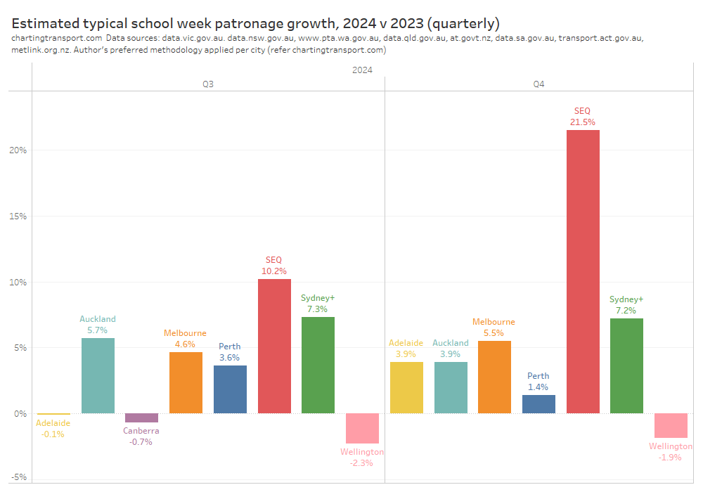
Patronage growth has slowed in most cities, but as of 2024 Q4 was still tracking above population growth in most cities (except Perth and Wellington).
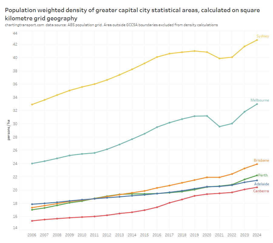
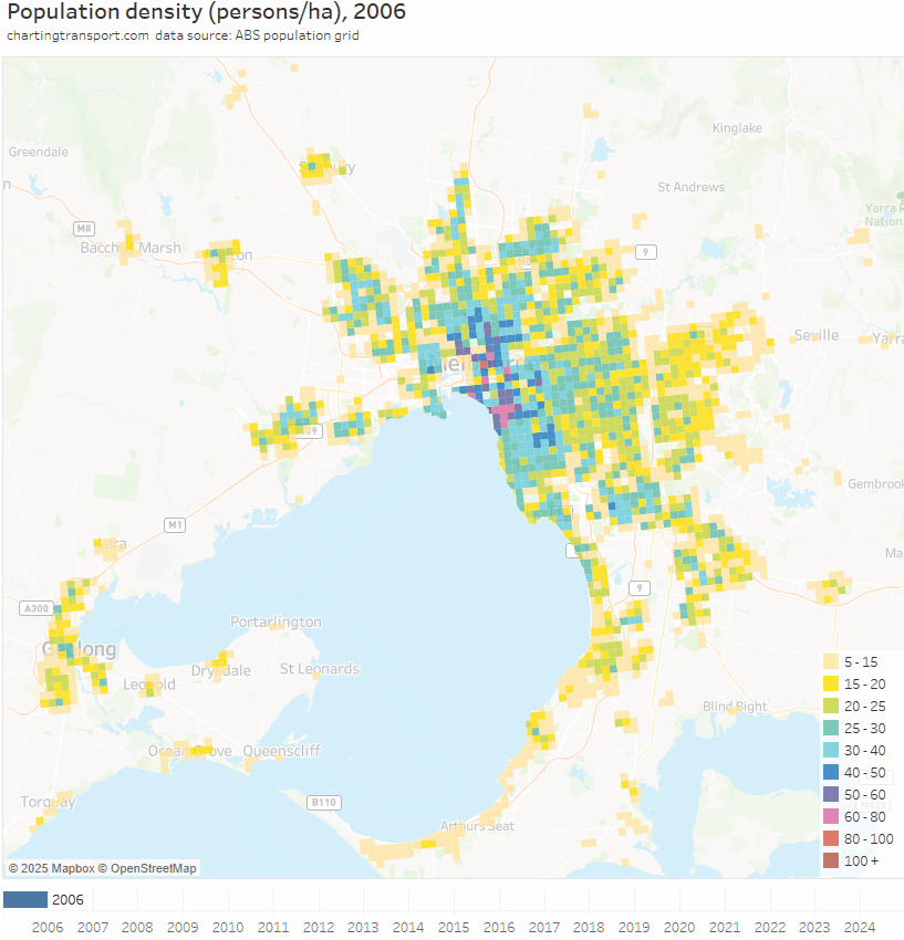
Population density is now rising rapidly in Australia’s largest cities, with Perth pulling ahead of Adelaide.
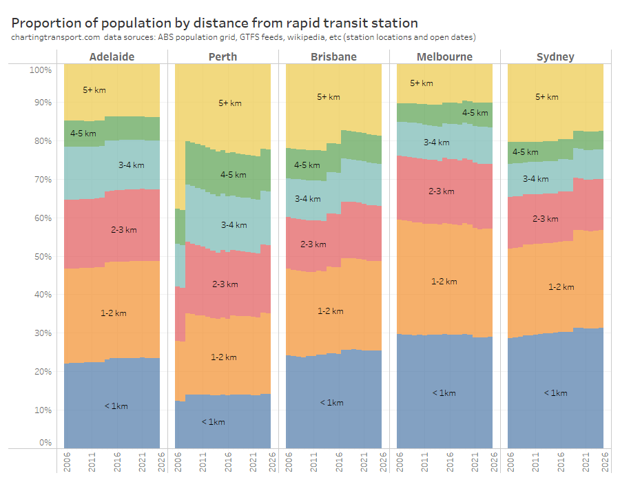
Most cities are improving the share of their population living close to stations over time. You can see the impact of opening new train lines/stations in several cities.
I’ve also created some new animated density maps for each city (2006 to 2024). Here’s Melbourne:
In 2023-24, driver’s licence ownership rates were flat in most states and territories.
Motor vehicle licence ownership rates have varied by age group:
For those in their 20s, licence rates were declining but then peaked during pandemic as a lot of temporary residents left. It has since gone back into decline, but is above 2019 levels.
Licence ownership rates for teenagers jumped in 2021 but have been relatively flat since then.
Licence ownership rates for older Australians continue to increase (especially for those aged 80+)
New South Wales, Victoria, and Western Australia saw a slight decline in motor vehicle ownership rates in the year to January 2024. Tasmania and South Australian were up, while ACT and Queensland were flat.
A lot of published transport analysis – including on this blog – has been gender-blind. Yet there are quite significant differences in travel patterns between men and women, and also between parents and non-parents. Advances in equality of opportunity have not eliminated these differences.
This post goes all-in with disaggregating a wide range of available data on transport behaviour on gender and parenting status in Melbourne, and explores some factors likely influencing these behaviours.
I will look at trip rates, trip chaining, time spent travelling, destination distance from home, distance travelled, travel to the central city, time of day, mode splits, use of different modes, trip purposes, and radial-ness of travel. I’ll also look at explanatory variables including main activity, occupation, employment industry, access to independent private mobility, and geographic distribution of home and work locations. Yeah that’s a lot, but don’t worry, there is a summary towards the end.
There’s also an interesting aside about dwelling bedroom counts around train stations.
This post is mostly focussed on working aged people (approximated by the age range 20-64), as children and seniors are likely to have different travel patterns again. And for the purposes of this analysis, I’m classifying people as “parents” or “parenting” if they live with their children – i.e. they are likely caring for their children (although some might have relatively independent adult children living with them). Parents whose adult children have all left home will be classified as other males/females.
About the data
I have access to very detailed household travel survey data for my home city of Melbourne for the pre-pandemic years 2012-2018, so that’s my primary source (officially VISTA – the Victorian Integrated Survey of Travel and Activity, get data here). It covers all types of non-commercial travel by residents, on all days of the year. Of course that data is pre-COVID and things will have changed somewhat since then but rich post-COVID data is not yet available.
I’m aggregating outputs to differentiate school weekdays, non-school weekdays, and weekends (I have excluded data for public holidays).
The VISTA data reports on binary gender, so unfortunately I can only cover males and females. That said, even if it did include more diverse gender categories, it would likely be very difficult to get statistically significant sample sizes for non-binary gender groupings.
There’s no special treatment required for same-sex parenting couples – they each count as mums or dads based on their reported gender.
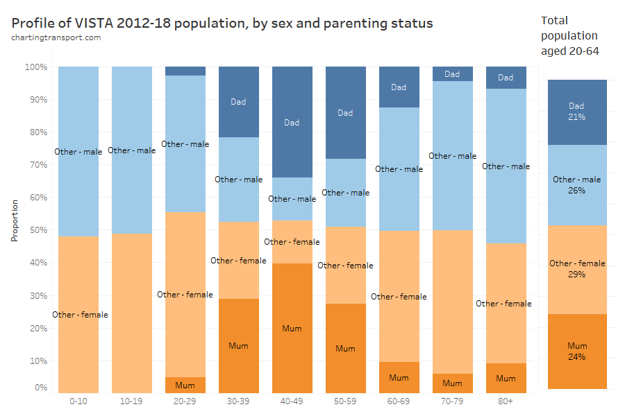
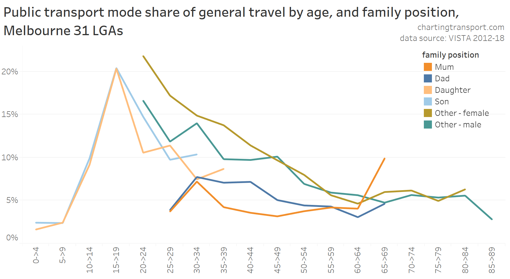
Here’s how prevalent the different gender + parenting classifications are by age band in the weighted VISTA data for 2012-18:
The survey weightings don’t quite lead to a perfectly balance between genders across all age bands.
Parenting was most common amongst those aged 40-49 (almost three-quarters), and lower prevalence in younger and older age groups (under 8% for those aged 20-29).
Curiously there was a slight uptick in parents living with their children for ages 80+, which might be elderly parents living with – and being cared by – their adult children.
Across the approximate working aged population (20-64), parents accounted for 45% of the population.
In some sections I’ve also used ABS Census data from 2016 and 2021. This data is segmented slightly differently, with parenting being indicated by whether the person does unpaid work to care for their own children (so might exclude parents with relatively independent adult children living with them). Unless noted otherwise, it includes people aged 15+, and journey to work data only includes those who travelled to work and reported their travel modes.
Let’s get into it..
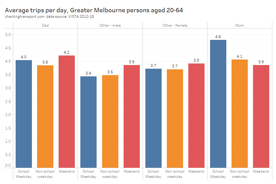
Trips per day
For this analysis a trip is travel between two places where a purposeful activity takes place, and may involve multiple trip legs (eg walk-bus-walk-train-walk).
Mums easily made the most number of trips on school weekdays, but dads made more trips on weekends than mums. Trip rates were higher on weekends for all person classifications except mums.
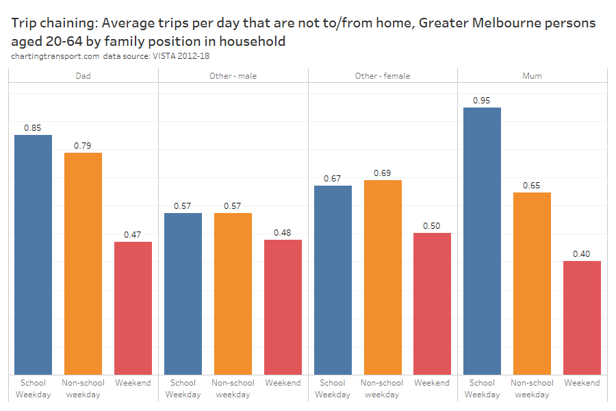
Trip chaining
I’ve heard much about women doing a lot more trip chaining – where a person leaves home and travels to one activity, then one or more other activities, before returning home. For example: home to school drop-off to work to school pickup to home.
As a simple measure of trip chaining, I’m counting the number of trips that don’t have an origin or destination at a place of accommodation (places of accommodation almost always being the survey home). I am aware of other definitions of trip chaining that only count where there is a short activity between trips but that would be require much more complex analysis.
As expected, mums were doing a lot of trip chaining on school weekdays, but curiously dads weren’t that far behind. And in the school holidays and on weekends dads were doing more train chaining than mums (perhaps to give mums a break?).
Trip chaining was much less common on weekends for all groups.
For mums the most common trip type not involving travel to or from home was between work and pick-up or drop-off of someone (most likely between a school and a workplace). A long way behind was travel between work and shopping, pick-up/drop-off someone and shopping, and between two pick-up/drop-off someone activities.
For dads the most common trip type not involving travel to/from home was between two work-related activities, closely followed by between work and pick-up / drop-off someone, and then between work and social activities.
So mums’ trip chaining was dominated by pick-ups and drop-offs of people, while dads’ was not.
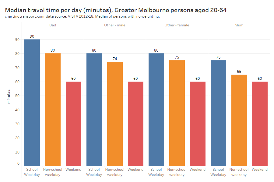
Time spent travelling
There’s not a huge variation in median travel time per day between person groups, but dads had the highest on weekdays and mums generally had the lowest. Note that reported travel times were very often rounded to multiples of 5 minutes hence most of these medians are also multiples of 5.
Technical note: I have created a chart with average travel times and the numbers were higher but the shape of the chart was almost identical so I’m not including that here.
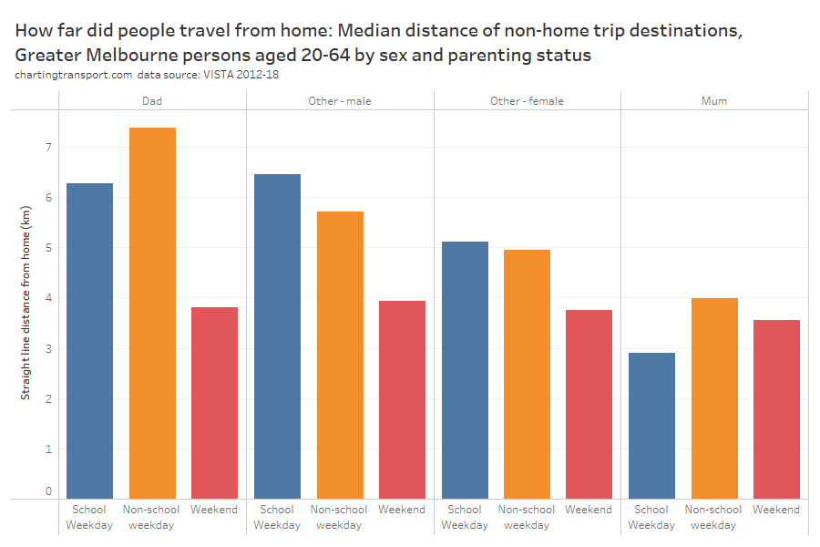
Travel distance from home
So were dads travelling further from home? I’ve calculated the straight distance between the home location and all travel destinations, and this chart shows the medians:
Dads sure did travel further from home on weekdays (particularly on school holidays when they might not be doing school drop-offs / pick-ups), with mums generally staying much closer to home.
Curiously, other males also travelled further from home than other females, so this pattern appears to be related to gender to some extent.
There was a lot less variation on weekends, with people generally travelling closer to home, as you might expect.
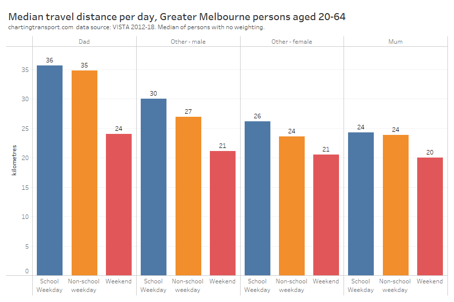
Daily distance travelled
Let’s broaden that out to median total distance travelled per day:
Dads generally travelled further on all day types, and mums the least. Everyone generally travelled less on weekends, and to some extent during school holidays (compared to school weekdays).
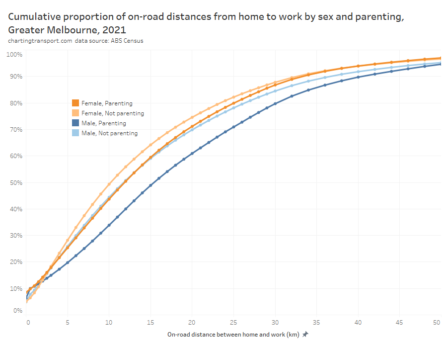
Travel distance to work
We can use ABS Census data to understand the on-road distance between home and workplaces, including for 2021. This data is for the working population aged 15+, and differentiates people based on whether they are caring for their own children (which is slightly different from living with their children).
The median distances to work were highest for dads at around 15.4 km for dads, followed by 11.9 km for mums, 11.7 km for other males, and 10.2 km for other females.
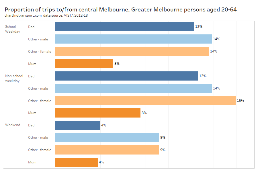
Travel to/from Central Melbourne
Public transport has its highest mode shares for travel to/from central Melbourne, so how did that vary by sex and parenting status? (for this analysis I’ve defined central Melbourne as the SA2s of Melbourne, Docklands, Southbank, and East Melbourne – on 2016 boundaries).
Before you get too excited about the differences, it’s worth pointing out all the proportions are small. The vast majority of people in Greater Melbourne don’t travel to central Melbourne on any given day. And of course people who lived in central Melbourne had many of their trips counted in this chart.
Sure enough, on weekdays dads were much more likely to travel to central Melbourne, and mums were least likely (although it was higher in the school holidays). On weekends, non-parents were much more likely to travel to the central city than parents (a fair bit of socialising by younger independent adults, no doubt).
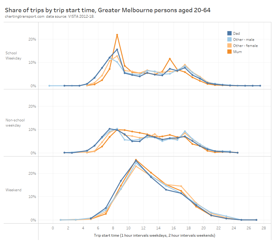
Time of day of travel
The following chart shows the share of trip start times across the day for the different person types, and different day types:
Technical note: due to smaller sample sizes, weekend travel has been aggregated into 2-hour intervals. Weekdays have been aggregated into 1-hour intervals.
You can clearly see that on school weekdays, mums are doing a lot of travel between 8 and 9am, and between 3 and 4pm, which obviously relate to school start and finish times. In the school holidays, mums are doing a lot more travel through the interpeak period, probably reflecting parenting activities for kids not at school.
On school days, trips by dads started earlier and finished later than mums. But during school holidays dads made a smaller proportion of their trips between 8am and 9am, suggesting they also had a significant role in school drop offs in the morning.
During the weekday inter-peak period dads were less likely to travel than mums (except around lunchtime). Other females had a small peak in travel around 5-6pm, which is probably related to them being more likely to work full time.
On weekends it seems dads were slightly more likely to travel in the morning compared to mums who were slightly more likely to travel in the afternoon.
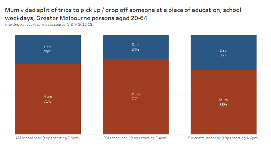
Did mum or dad take the kids to/from school?
We’re seeing some pretty strong themes related to the school peaks. It is possible to filter for trips to pick up or drop off someone from a place of education on school weekdays and then disaggregate between mums and dads. I’ve split this analysis into an AM peak, a PM school peak (2-4pm), and a PM commuter peak (4-6pm) – as there were significant numbers of pick ups later in the afternoon – presumably following after-school care.
Mums did the bulk of school drop offs and pick ups at all times of day, particularly in the PM school peak. In the PM commuter peak, dads share of pick ups rose to 35% – no doubt related to the ability to do these pick ups after a full-time day at work.
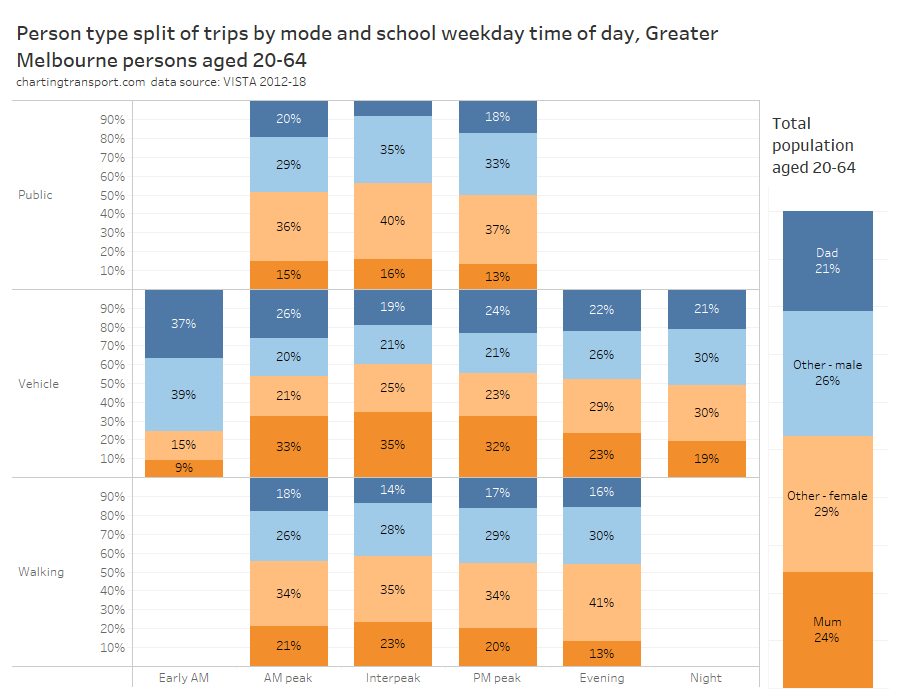
What types of adults are using modes at different times of day?
For this question I have limited analysis to school weekdays, aggregated all of public transport to one group, and aggregated vehicle drivers, passengers, and motorcyclists into “vehicle” to overcome issues with small sample sizes. I’ve included the proportion of the working aged population sample on the right-hand side for ready reference.
In general, parents were over-represented in vehicles in peak periods, mums were over-represented in the interpeak in vehicles, and parents were under-represented in public and active transport at most times of day.
The peak periods saw more public transport trips by dads than mums, while the roads (and footpaths) saw a lot more trips by mums than dads.
Early morning travel was predominately by males (76%), while females were slightly more prevalent in vehicles during the interpeak (60%). Reported walking trips skewed female at all times of day.
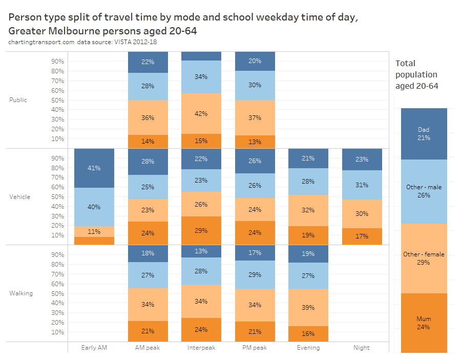
However if we look at travel time, rather trip counts, we get a slightly different picture:
Dads spent more time travelling than mums in peak periods on both public and private transport, but much less time than mums in the inter-peak.
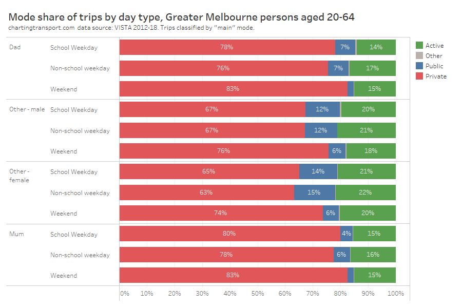
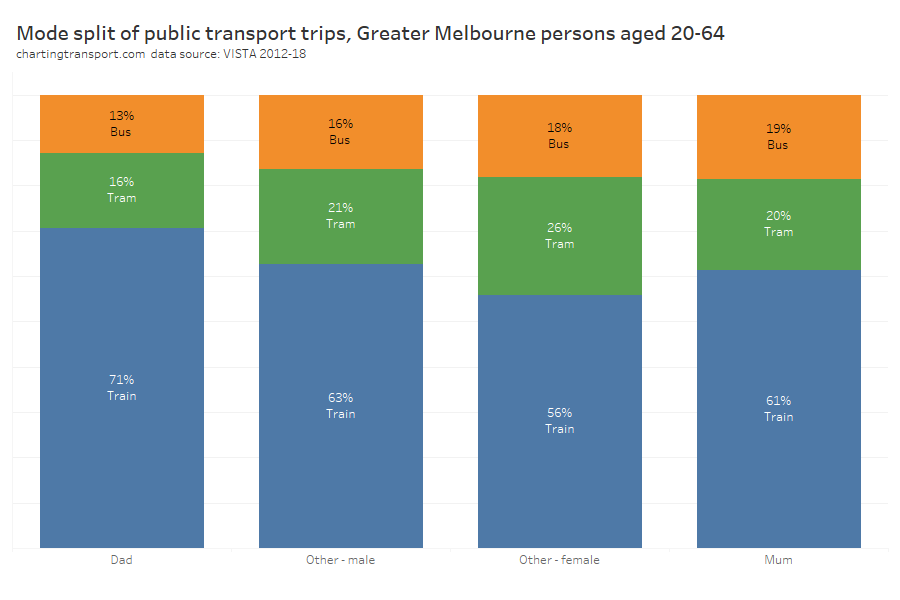
Mode split
Here’s how it looks for travel in general:
Mums were the least likely to use public transport (especially on the weekend), closely followed by dads.
Non-parents had the lowest private transport mode share (although still a majority mode share), and were most likely to use active transport.
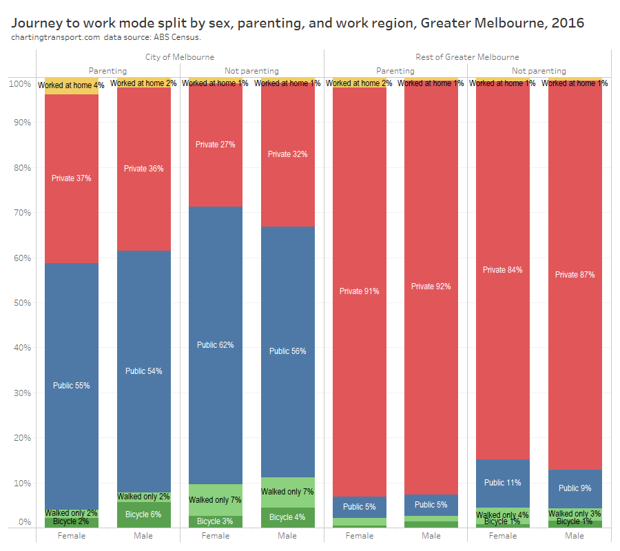
Here’s overall mode shares of journeys to work (Greater Melbourne 2016), which I’ve disaggregated for workplaces inside and outside the City of Melbourne area (as workplace location has a massive impact on mode shares):
Parents were much more likely to use private transport across the geographies and sexes. Of those working outside the City of Melbourne, parents also had about half the public transport mode share of non-parents.
Men were much more likely to cycle to work than women, and dads were more likely to cycle than other men.
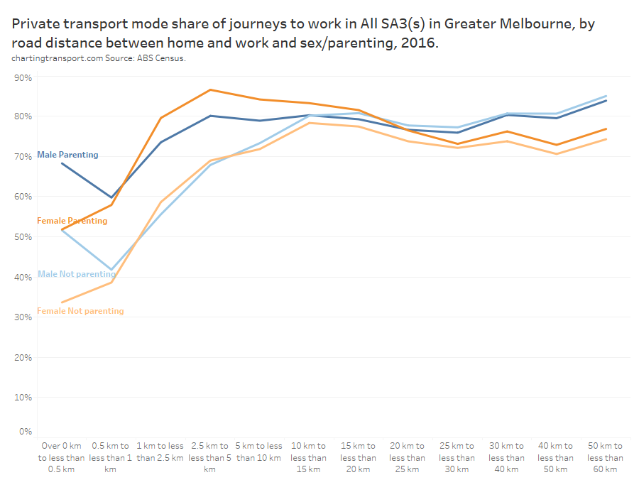
Here is a look at private transport mode shares by distance between home and work, gender and parenting status:
The difference in private mode share between parents and non-parents was largest for journeys up to 10 km. Mums had the highest private mode share for journeys 1 to 20 kms. For journeys over 25 km, sex became more influential than parenting status with men more likely to use private transport.
Another curiosity here is the very short journeys (less than 0.5 km) where men were much more likely to use private transport than women (regardless of parenting status) – for what is probably a walkable distance for most people. Are men more lazy when it comes to short walks to work? And/or are men more likely to need their car at work?
For ages 35 to 59, mums generally had lower public transport mode share than dads. Younger non-parenting women had higher public transport mode shares than younger non-parenting men.
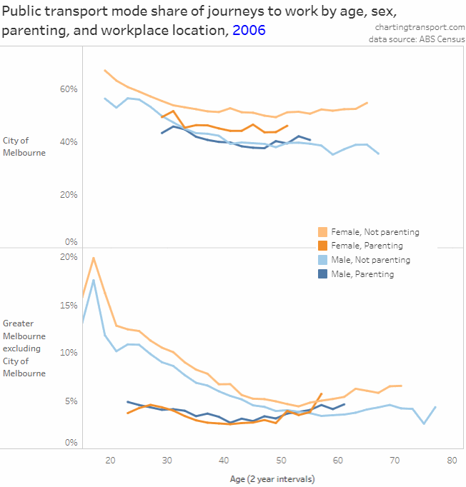
Here’s how it looks for 2016 journeys to work (I’m not using 2021 data because of COVID lockdowns):
Note there is a very different Y-axis scale for City of Melbourne and elsewhere.
There were a few really interesting take-aways:
Public transport (PT) mode shares increased over time for almost all age bands, work locations, and for parenting and non-parenting workers.
Parenting workers mostly had lower public transport mode shares than non-parenting workers of the same age, except for:
dads over 30 who worked in the City of Melbourne,
mums in their early 30s who worked in the City of Melbourne in 2016, and
mums and dads in their 50s who worked outside the City of Melbourne (who had low PT mode shares around 4-5%, similar to non-parenting workers of the same age)
Public transport mode shares for journeys to work in the City of Melbourne mostly declined with increasing age between 20 and 50, regardless of parenting responsibilities.
For people who worked outside the City of Melbourne, the mode share profile across age changed significantly over time for young adults. In 2006 there was a steady decline with age, but in 2011 PT mode shares were generally flat for those in their 20s, and in 2016 PT mode shares peaked for women in their late 20s (and also had a quite new pattern for dads in their 20s).
For parenting workers who worked outside the City of Melbourne there was actually a slightly higher PT mode share for those over the age of 50. Parents over 50 might have older children who are more independent and therefore less reliant on their parents for transport. This might make it easier for the parents to use public transport. However this trend did not hold for dads in 2016.
PT mode shares for non-parenting women increased slightly beyond age 55 for all work locations. This will include women who were never parents, as well mums with non-dependent children so might again reflect a small return to public transport once children become independent. It may also be influenced by discounted PT “Seniors” fares available to people over 60 who are not working 35+ hours per week.
Mode split of public transport use
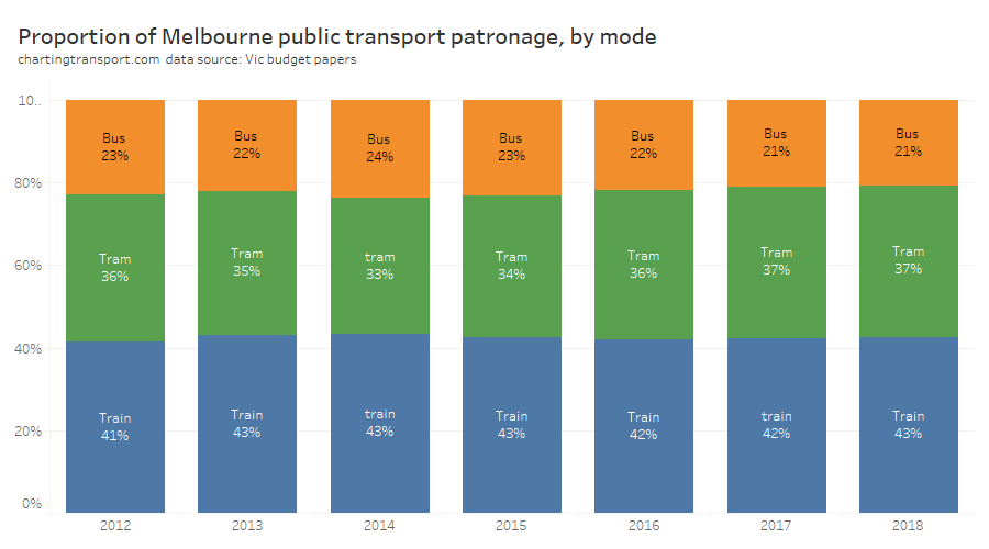
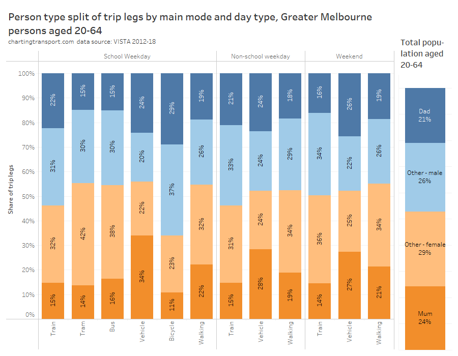
Which modes of public transport were the different person classifications using in Melbourne? Sufficient survey sample is only available for school weekdays, and it’s important to keep in mind that trams dominate inner city radial on-street public transport in Melbourne (unlike most comparable cities where buses dominate this function). This chart adds up all trip legs so there is no data loss with multi-modal public trips:
Unfortunately this data doesn’t line up with reported public transport patronage for the same time period (below), suggesting that tram travel may be under-reported in VISTA (although the above chart is filtered for persons aged 20-64):
Biased as the VISTA data might be towards certain modes, it still suggests dads were more likely to be using trains and least likely to be using buses.
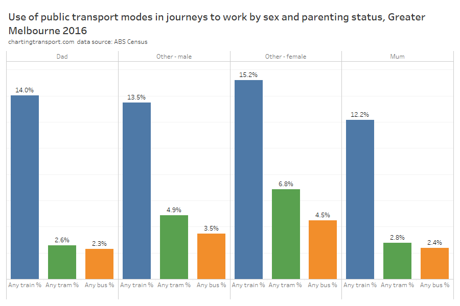
I’ve also looked at use of public transport in journeys to work for 2016. Workers can report up to three modes of travel, and I’ve extracted counts of workers who used each of the three main modes of public transport in Greater Melbourne (note: people who used multiple public transport modes will be counted in multiple columns).
Parents (who travelled to work) were much less likely use bus or tram to get to work than non parents. But the story is bit different for trains: Dads were slightly more likely to commute by train than other males, while mums were less likely to commute by train than other females. This might be related to where mums work – more on that soon.
Mode use by sex and parenting
We can flip the mode-split charts around to look at the composition of adult users of different travel modes:
Technical Note: there’s insufficient sample of tram, bus, and bicycle travel on non-school weekdays and weekends so those are not on the chart.
Trams, buses, private vehicles, and walking generally skewed female, while trains and particularly bicycles skewed male (except weekend trains).
Mums were under-represented on all modes except private vehicles where they were significantly over-represented. Mums were least represented on bicycles.
Dads were under-represented on trams and buses, and over-represented in vehicles, and on bicycles.
Non-parents were over-represented on trains and trams, and walking on weekends.
There were many more dads than mums on trains on weekdays, and many more mums than dads travelling in (private) vehicles on school weekdays (but not so much on weekends and school holidays).
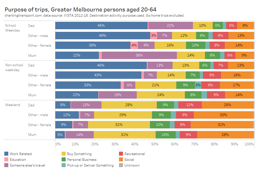
Trip purposes
We want to know the purposes of people’s travel, but actually purpose can only really be attributed to the activity before and after a trip. For this analysis I’ve used the trip destination purpose as the trip purpose, and I’ve excluded trips where the destination was home (as that would be close to half of trips and not very interesting). Also keep in mind that trips can also vary considerably in length and duration.
On weekdays, significantly more trips by males were work-related. Mums had a standout different pattern on school weekdays with many more trips being about someone else’s travel (particularly school children) and much less often being work-related (or should we say “paid work”-related).
During school holidays, about 1 in 5 trips by mums were about other people’s travel. But on weekends dads were doing slightly more trips that are about other people’s travels (perhaps to make up for them doing less of such trips on weekdays?).
On weekends social and shopping trips were much more common than work trips, as you’d expect.
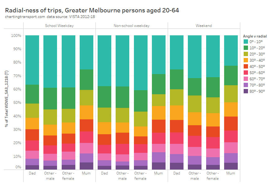
Radial-ness of travel
A while ago I looked at the radial-ness of travel – that is the difference in bearing (angle) between a trip aligned directly to/from the Melbourne CBD and the actual alignment of the trip. Trips generally skew towards being radial, reflecting the importance of the central city, and just generally the shape of the city. Previously I’ve disaggregated by age, sex, and many other variables.
So how does radial-ness vary across sex and parenting status?
On weekdays mums were the clear outlier, with substantially fewer radial trips and more non-radial trips, likely including many trips to/from schools and other caring destinations.
Weekend travel was a fair bit less radial in general, and again mums had the least radial travel of all person groups.
Okay so that’s a lot of ways we can compare travel patterns by sex and parenting (let me know if you think I’ve missed any other useful breakdowns). Now…
What can explain these differences?
A lot of the above data is probably unsurprising, because males and females, and particularly mums and dads, generally have different levels of workforce participation and caring responsibility, amongst other differences. What follows is an examination of potential explanatory variables for the different travel behaviour observed.
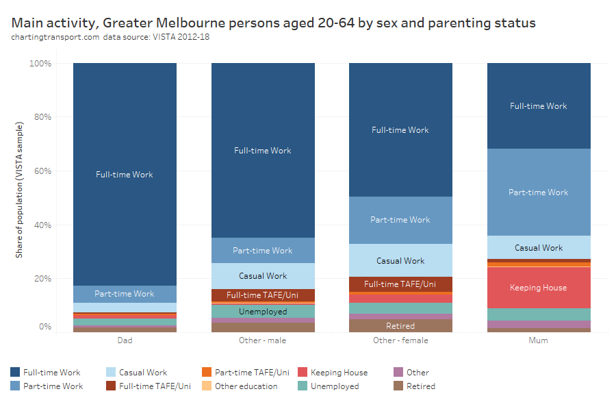
Main activity
First up, main activity as captured by VISTA:
Dads were most likely to be working full-time, and mums least likely to be working full-time. Mums were much more likely to be working part-time or “keeping house”.
As an aside: I actually find “keeping house” to be a bit devaluing of parents (usually mums) who dedicate much of their time doing the critically important work of raising children. And I know from personal experience it’s pretty hard to actually “keep house” when you have young children who need active engagement across most of their waking hours. No doubt others falling in the “keeping house” category might be caring for other adults or the elderly. Is it time for a caring-related category?
Curiously non-parenting females were much less likely to be working full time than non-parenting males. Perhaps non-parenting females were more likely to be doing some caring for others not living with them? Perhaps some mums decide to stay working part-time after their children move out? Or it might be something else?
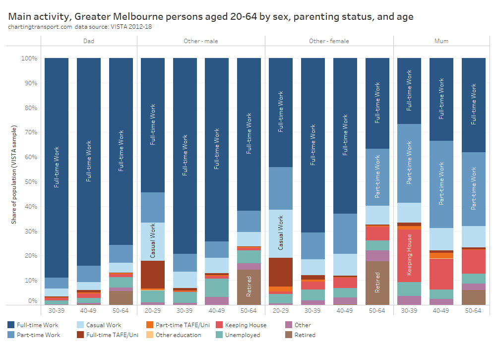
We can break the analysis down further by age:
Technical note: Data isn’t presented for mums and dads aged 20-29 due to insufficient survey sample.
Curiously, dads were less likely to be working full-time with increasing age, while mums became slightly more likely to be working full-time at older ages (as children get older and require less supervision?).
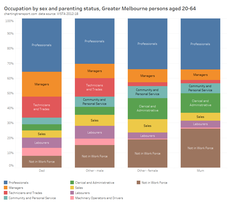
Occupation (employment)
We call drill down further by looking at employment occupations:
Mums were much less likely to be in the workforce than dads, but curiously had almost the same proportion of professionals (perhaps reflecting women’s slightly higher levels of education, on average).
Men were more likely to work in occupations where public transport is probably less competitive, including technicians, trades workers, labourers, and machinery operators and drivers (with likely exceptions for central city work sites).
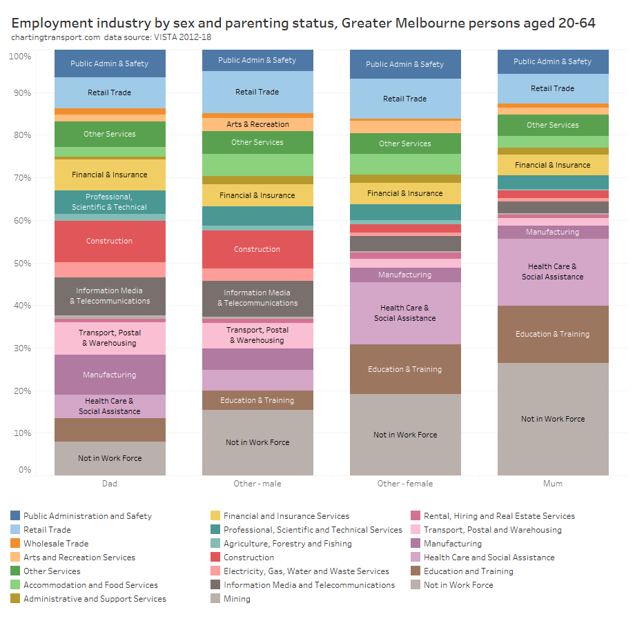
Employment Industry
There are also notable differences in employment industries by sex and parenting:
There are probably no great surprises in the above chart, with men much more likely to work in construction, information media and telecommunications, manufacturing, transport, postal, and warehousing, and women much more likely to work in education, training, health care, and social assistance.
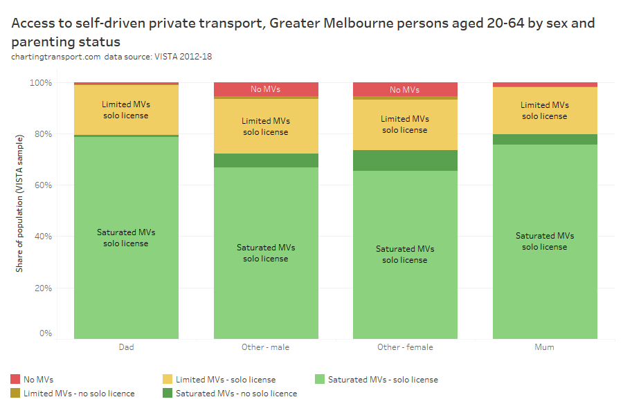
Access to independent private mobility
Does the ability of people to drive themselves around in private vehicles differ by gender and parenting status? And could this explain their different travel patterns?
For this analysis, I’ve re-used the following household classifications from a previous post:
No MVs – no motor vehicles,
Limited MVs – fewer motor vehicles than licenced drivers, or
Saturated MVs – at least as many motor vehicles as licenced drivers.
I’ve also classified individuals as to whether or not they have a “solo” driving licence (i.e. probationary or full licence, but not learner’s permit).
I’ve then combined these two dimensions (except for people in households with no motor vehicles as driver’s licence ownership is largely immaterial for this analysis).
There were small differences between mums and dads, with mums slightly less likely to have a solo driver’s licence than dads (95% v 98%), mums slightly less likely to have independent private mobility (75.5% v 78.6%), and mums slightly more likely to live in a household without any motor vehicles (1.7% v 1.0%). These slight differences might suggest mums would have lower private transport mode shares than dads, but we’ve actually seen above that the opposite is true. Therefore access to independent private mobility is unlikely to explain much of the differences in travel between mums and dads.
There weren’t substantial differences between non-parenting men and women, other than non-parenting men having slightly high solo licence ownership (91% v 88%).
Parents were more likely to have a solo driver’s licence than non-parents, and over three-quarters lived in a household with saturated motor vehicle ownership. Access to independent private mobility aligns strongly with parents’ much higher private transport mode shares, and is probably considered essential for parents in most parts of Melbourne.
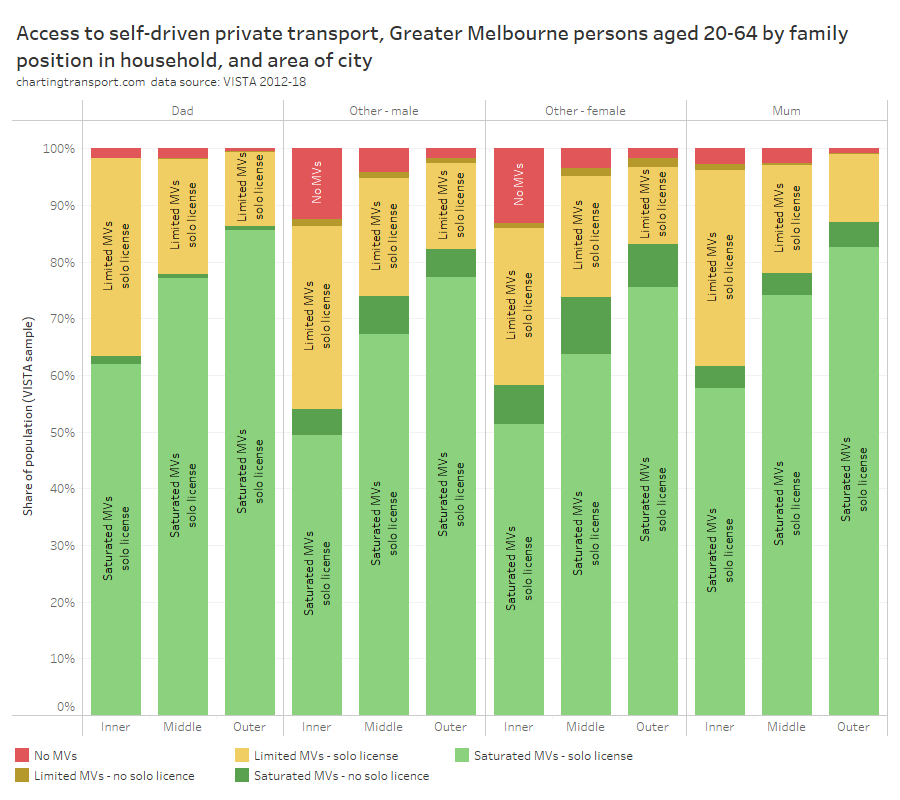
Indeed, we can also break this down by geography – using a simple inner/middle/outer disaggregation of Melbourne:
For all person categories there’s a strong relationship with distance from the city centre, with significantly lower levels of motor vehicle ownership in the inner areas. However solo licence ownership was very high for parents even in the inner suburbs (94% of mums and 98% of dads).
86% of dads and 87% of mums in outer Melbourne lived in households with saturation motor vehicle ownership. However, 5% of mums in the outer suburbs didn’t have a solo licence, which could make getting around quite challenging, and highlights the importance of quality public transport services in these areas.
Around 14% of non-parents in the inner suburbs lived in households without motor vehicles.
Where do parents tend to live?
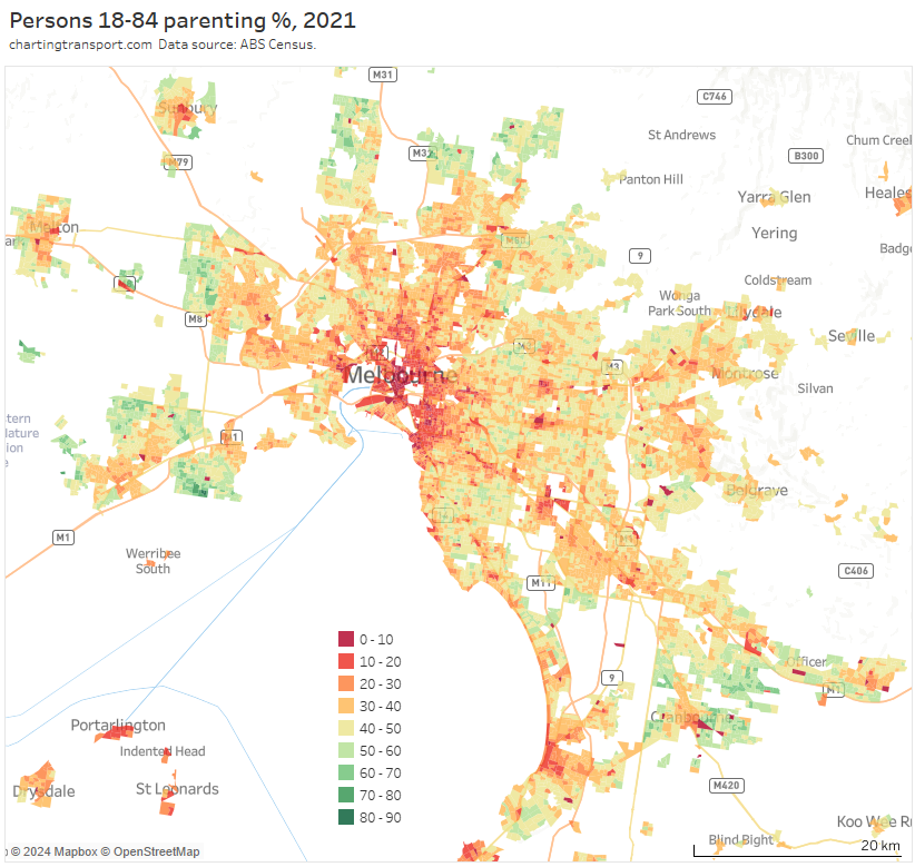
It probably won’t surprise many readers to hear that parents made up a much larger share of the residential population in the outer suburbs, particularly urban growth areas:
But if you look closely, you’ll also see quite low proportions of parents along train lines, tram lines, and the public transport rich inner suburbs.
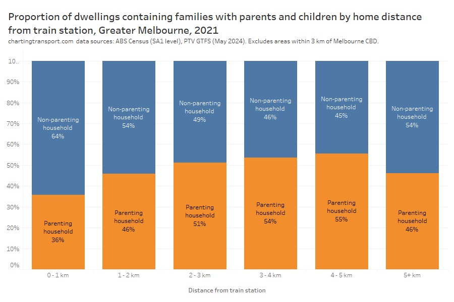
In fact, it’s possible to examine the type of households per dwelling by distance from train stations (I’m excluding areas within 3 km of the CBD).
Technical notes: I’ve calculated straight distance between SA1s centroids and their nearest train station points as per GTFS data in May 2024. The only significant change in train stations between August 2021 and May 2024 was the merger of Surrey Hills and Mont Albert into Union Station in 2023. So it’s not perfect analysis but I’m also not interested in precision below 1% resolution. I’ve also excluded unoccupied and non-private dwellings.
Dwellings close to train stations are significantly less likely to contain parents.
Is this because parents cannot afford family-friendly dwellings near train stations? Is it because dwellings near train stations are less family-friendly? Or is it because many parents like to build their own home on the urban fringe? Or some combination of these?
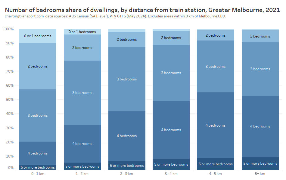
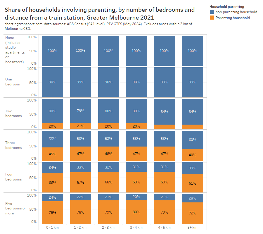
Well, the census tells us how many bedrooms there are in most occupied private dwellings, and the following chart shows the relationship between number of bedrooms and distance from train stations (again, excluding areas within 3 km of the CBD):
Sure enough, dwellings near train stations generally had fewer bedrooms.
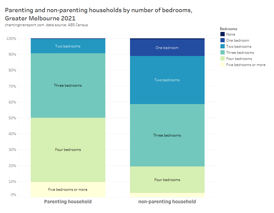
And we can also use census data to show the relationship between number of bedrooms in a dwelling, and whether the household includes parents + children:
Over 90% of parenting households had three or more bedrooms, and half had four or more bedrooms. But almost half of all dwellings within 1 km of a train station had two or fewer bedrooms rendering them not very family-friendly.
Just to take it slightly further, I’ve put all three dimensions on one chart and this shows that dwellings close to stations with three or more bedrooms were slightly less likely to house parenting families:
I think the lower availability of family-friendly housing near rapid public transport is quite likely to be contributing to lower public transport mode shares for parents, particularly as there is a clear relationship between public transport use and proximity to rapid transit stations (see: Are Australian cities growing around their rapid transit networks?)
That said, there may also be an issue around whether many families can afford three-bedroom homes close to train stations as they often have less than two full-time incomes supporting three or more people. Might young professional couples with no kids and/or share houses of young professionals be better placed to compete for this housing?
Where do men and women work in Melbourne?
Could differences in journey to work mode splits be explained by differences in workplace location?
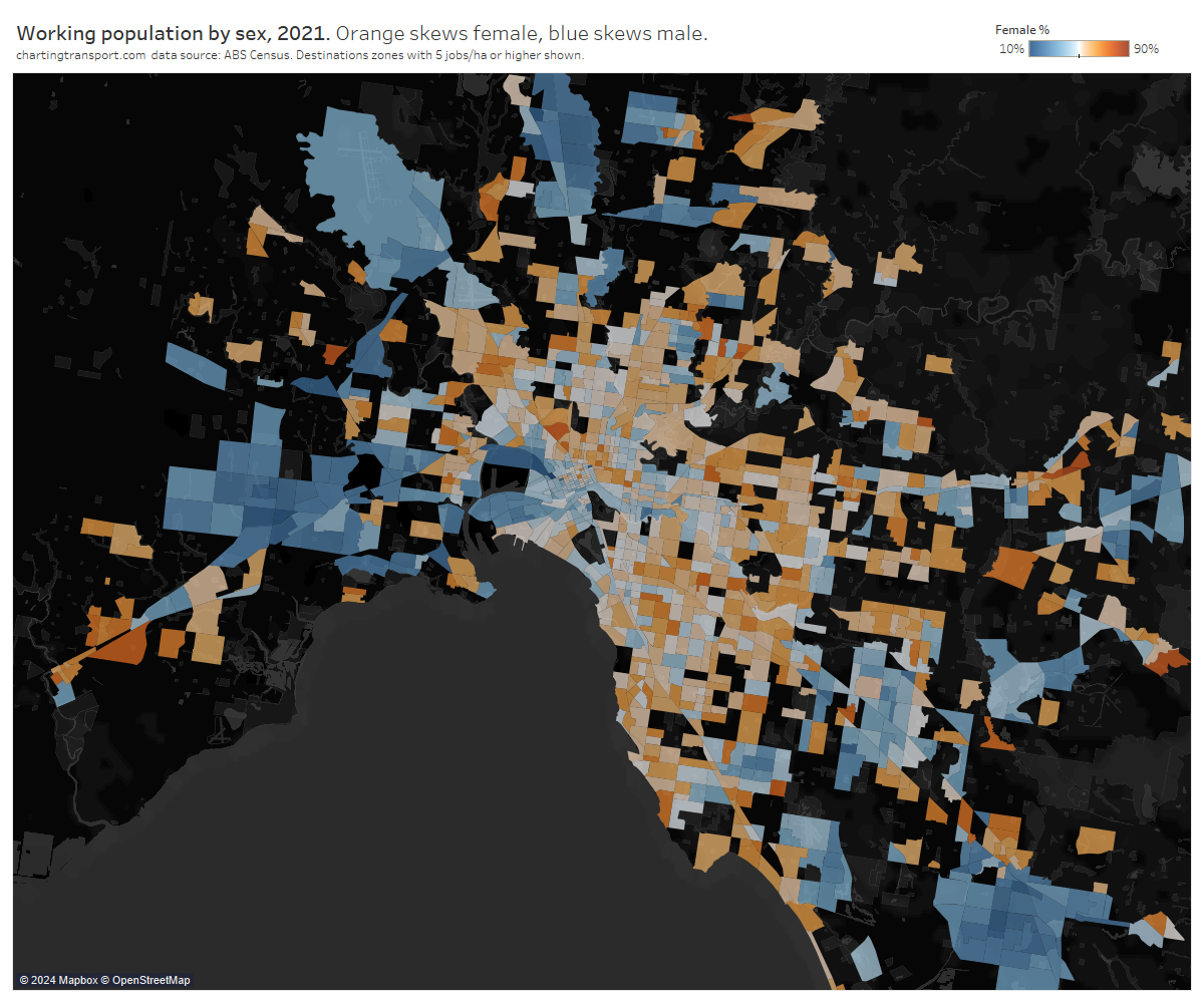
Here’s a map of gender balance by workplace location across Melbourne for 2021 at destination zone geography (DZs) (sorry not all outer suburbs included on the map as I didn’t want to lose the inner area detail). Blue areas skew male, orange areas skew female.
Anyone with knowledge of Melbourne’s urban geography will instantly see large industrial areas shaded blue, and plenty of orange in most other places.
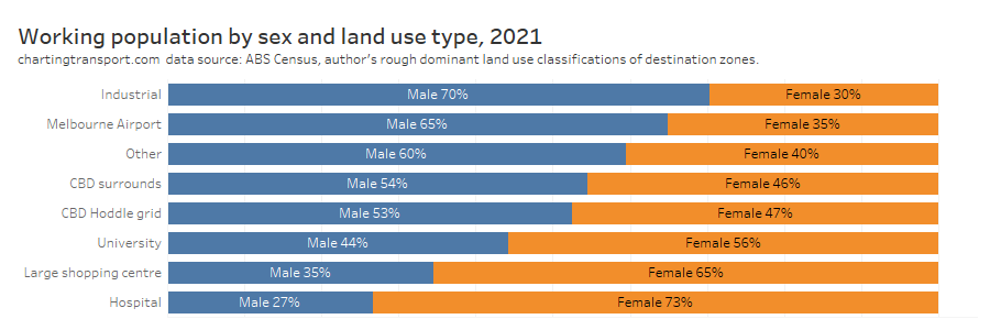
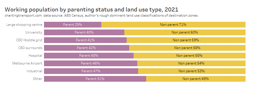
These skews follow industries with male and female dominant workforces. In fact, I’ve manually done some rough grouping of destination zones where there is a clear dominant land uses (not exhaustive but results should be fairly indicative), and here is the sex breakdown by land use type:
Industrial areas and Melbourne Airport skewed heavily male, while hospitals and large shopping centres skewed female. Universities skewed female, and the CBD and surrounding areas slightly skewed male.
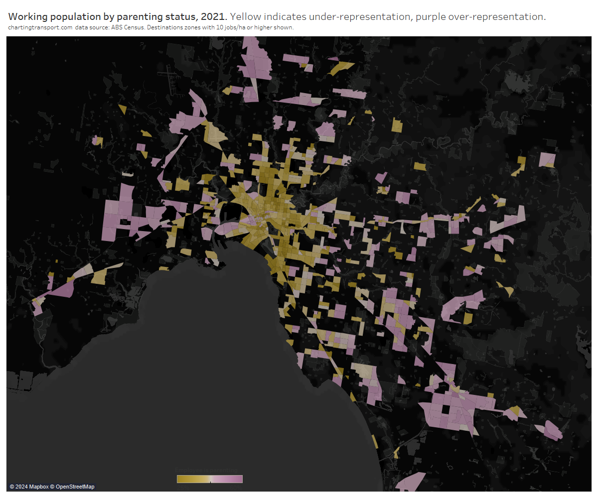
What about parenting? Something to keep in mind is that 43% of the working population were living with their children.
Parenting workers were seen more in the middle and outer suburbs, which is also where parents skewed as a home location, so there’s undoubtedly a relationship there.
Here’s the parenting breakdown by dominant land use classification:
Parents were under-represented in major shopping centres (I’m guessing a skew to younger employees), but also to a small extent universities and the central city. Parents were slightly over-represented in hospitals, Melbourne Airport, industrial areas, and the rest of Melbourne.
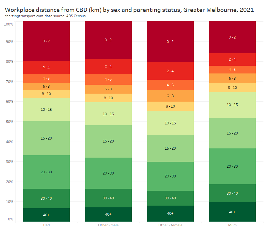
Another way to represent this data is looking at the distribution of workplace locations by distance from the Melbourne CBD:
Probably the biggest stand-out is that mums skewed towards suburban employment locations, while non-parenting females were more likely to be working closer to the city centre.
The distribution of workplace distance from the CBD for males only differed slightly between those parenting and non-parenting. Dads were less likely to be work between 2-10 km from the Melbourne CBD than non-parenting males.
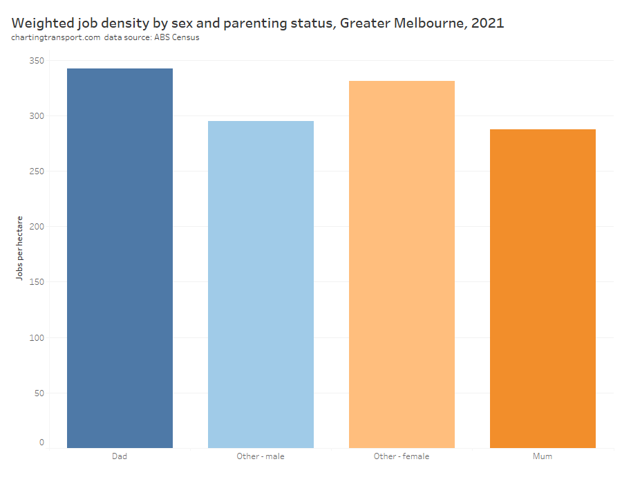
Employment density
I’ve previously shown that private transport mode shares are generally much lower in areas with higher job density (likely due to higher car parking costs and increased public transport accessibility). So do mums/dads/others typically work in areas of lower or higher job density, and could this explain differences in their mode splits?
To answer this I’ve calculated an aggregate weighted job density of the areas in which each category of person tends to work. How does that work? Well to start with I’ve calculated the job density of every destination zone in Greater Melbourne. I’ve then calculated a weighted average of these densities, where the density of each destination zone is weighted by the number of dads/mums/other males/other females working in that zone.
For females, those non-parenting generally worked in more jobs dense areas, compared to mums. This probably partly explains the lower public transport mode shares of mums.
For males it was the reverse – dads generally worked in more jobs-dense locations.
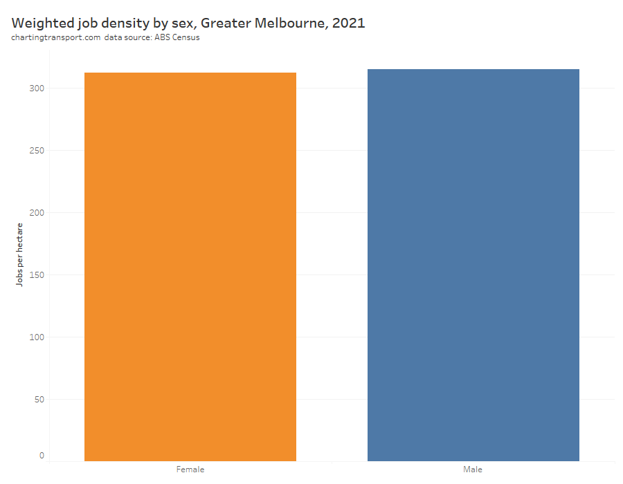
Overall was only a tiny difference between men and women in aggregated weighted job density:
That was a lot of charts, can you summarise that?
The following table attempts to highlight key variations from the overall average for different types of adults:
Type of adult
Travel patterns
Destination patterns
Mode split
Explanatory factors
Parents
More trips per person on weekdays. More trip chaining.
Higher private mode share.
Live further from public transport. Lack of family-friendly dwellings near public transport. Live in outer suburbs. Higher car ownership.
Mums
More travel during weekday interpeak. Highest trip chaining.
Travel closer to home. Work closer to home. Less radial travel. Least likely to work in CBD.
Very high private transport mode share.
Do most school drop offs / pick ups. Least likely to work full time. Less likely to work in job-dense areas.
Dads
Travel longer distances. Travel further from home. More time spent travelling.
Travel further from home. Work further from home. More likely to work in CBD.
More likely to use trains. More likely to use bicycles.
Most likely to work full time. More likely to work in job-dense areas.
Non-parenting women
Travel closer to home. Work closer to home.
Higher public transport use.
More likely to work in job-dense areas. Most likely to work in central city.
The explanatory factors in the right hand column will not be independent. For example, many parents probably find it infeasible to live near public transport, so they live further away and are more car-dependent.
What does all this mean for transport planning interventions?
I won’t say a lot on this topic (I tend to avoid policy prescriptions on this blog) but I will say I think some caution is required here.
One perspective might be that the proportion of males and females travelling on a mode at a particular time of the week will not change, and therefore interventions might predominantly benefit the existing user base (eg higher inter-peak public transport service frequencies might benefit women more than men).
However another perspective might be that interventions remove the barriers for one gender to utilise a mode of transport and might have significant benefits for the minority gender in the current user base. For example, significantly safer cycling infrastructure might encourage more women to cycle and lead to a more even balance between genders – indeed I’ve uncovered evidence about that on this blog.
So many mums driving kids to school!
One thing that really stands out to me is that mums do the vast majority of school drop offs and pick ups, and most of this travel is (now) happening by private vehicle. This is potentially impacting women’s workforce participation, and the traffic volumes are certainly contributing to road congestion. It might also be impacting women’s mode choices as school trips are generally more difficult on public transport, and mums do a lot of trip chaining. They might be using private transport for some trips mostly because those trips are chained with school drop-off/pick-ups.
What could you do to reduce private transport trips for school drop off / pick ups, and potentially also increase women’s workforce participation and public transport mode share?
Make interventions that increase the share of school students who travel to/from school independently by active or public transport
For school trips that are accompanied by a parent, encourage a mode shift towards active transport (realistically, public transport is less likely to be an attractive mode for many accompanied trips to school, unless it is on the way to another destination)
Provide at-school before-school and after-school care to enable both parents the opportunity to work full time (indeed government subsidies are provided in Victoria at least)
How might things have have changed post-COVID?
Unfortunately at the time of writing rich data is only really available for pre-COVID times.
A major change post-COVID is that many white collar professionals are now working from home some days per week, which has reduced travel to major office precincts.
I would not be surprised to see dads taking a slightly higher share of the school drop-off pick-up task as this can be easier to do on a work-from-home day. Might this have enabled women to work longer hours? There have also been higher child-care subsidies implemented recently that might also lift women’s workforce participation.
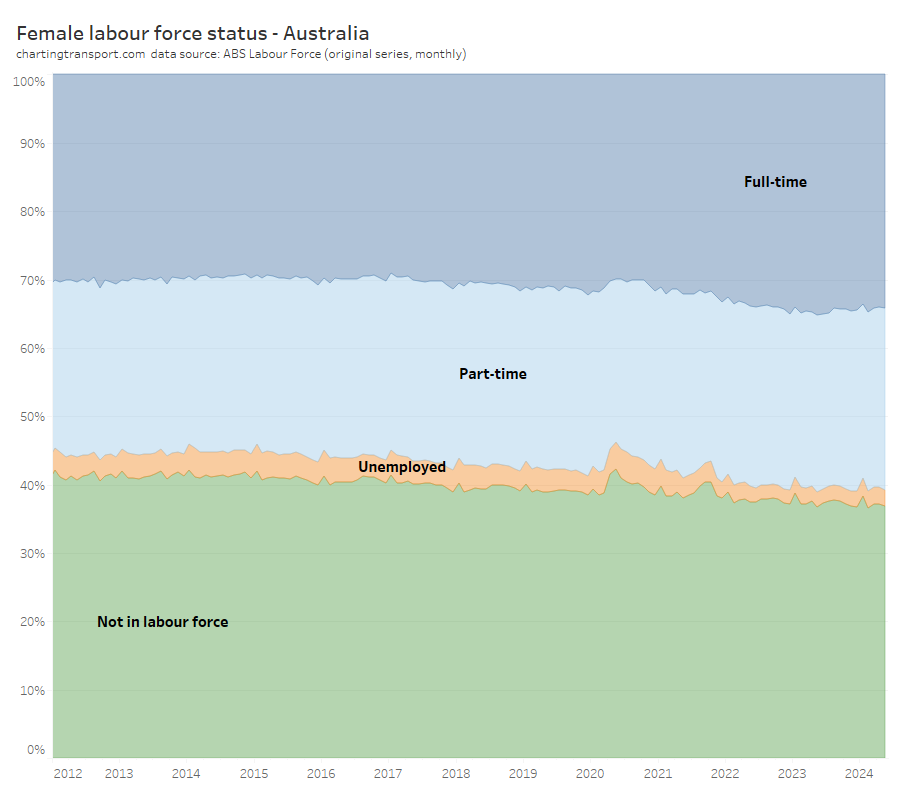
Indeed here’s a chart summarising female labour force status since 2012 (not seasonally-adjusted):
Technical note: I would have preferred to use seasonally adjusted or trend series numbers to remove the noise, but these data sets do not include counts for “not in labour force”
Following the major COVID disruption period around 2020-2021, women have been more likely to be working full time and more likely to be in the labour force. This might be partly related to new working-from-home patterns.
Hopefully more post-COVID travel data will be released before too long and I can investigate if there are any substantial shifts in the patterns between men and women, parents and non-parents.
Do let me know if you think there is more that should explored regarding the differences in travel patterns and explanatory variables for men and women, parents and non-parents.
[Updated 29 March 2024: Capital city per-capita charts updated using estimated residential population data for June 2023]
What’s the latest data telling us about transport trends in Australia?
The Australian Bureau of Infrastructure and Transport Research Economics (BITRE) have recently published their annual yearbook full of numbers, and this post aims to turn those (plus several other data sources) into information and insights about the latest trends in Australian transport.
This is a long and comprehensive post (67 charts) covering:
I’ve been putting out similar posts in past years, and commentary in this post will mostly be around recent year trends. See other similar posts for a little more discussion around historical trends (December 2022, January 2022, December 2020, December 2019, December 2018).
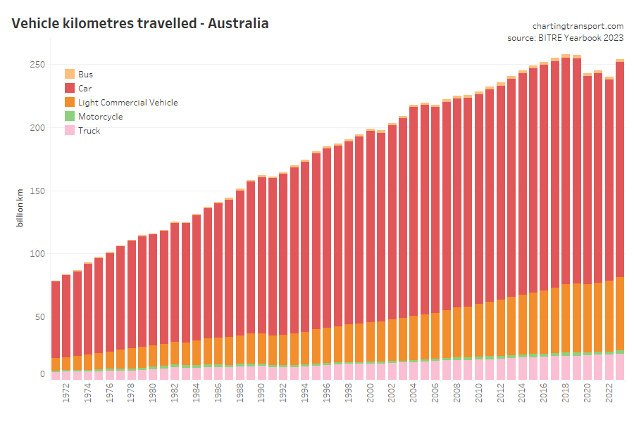
Vehicle kilometres travelled
Vehicle and passenger kilometre figures were significantly impacted by COVID lockdowns in 2020 and 2021 which has impacted financial years 2019-20, 2020-21, and 2021-22. Data is now available for 2022-23, the first post-pandemic year without lock downs.
Total vehicle kilometres for 2022-23 bounced back but were still lower than 2018-19:
The biggest pandemic-related declines in vehicle kilometres were in cars, motorcycles, and buses:
All modes showed strong growth in 2022-23.
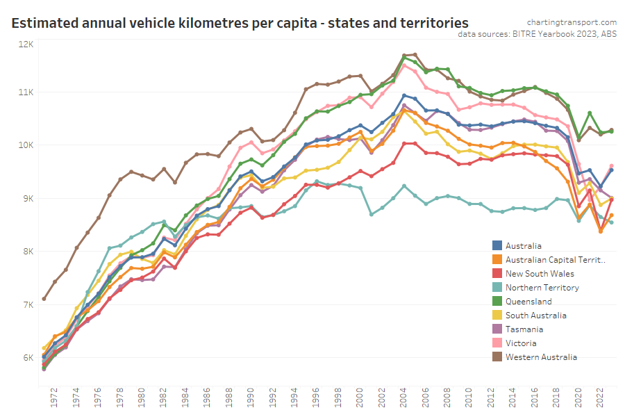
Here’s the view on a per-capita basis:
Vehicle kilometres per capita peaked around 2004-05 and were starting to flatline in some states before the pandemic hit with obvious impacts. In 2022-23 vehicle kilometres per capita increased in all states and territories except the Northern Territory and Tasmania.
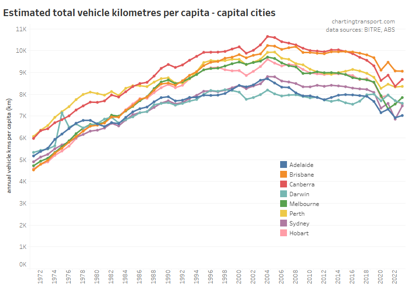
Here is the same data for capital cities:
Cities with COVID lockdowns in 2021-22 (Melbourne, Sydney, Canberra) bounced up in 2022-23, while Brisbane and Perth were relatively flat, Adelaide was slightly up, and Darwin slightly down. All large cities are still well below 2018-19 levels, consistent with an underlying long-term downwards trend.
Canberra has dramatically reduced vehicle kilometres per capita since around 2014 leaving Brisbane as the top city.
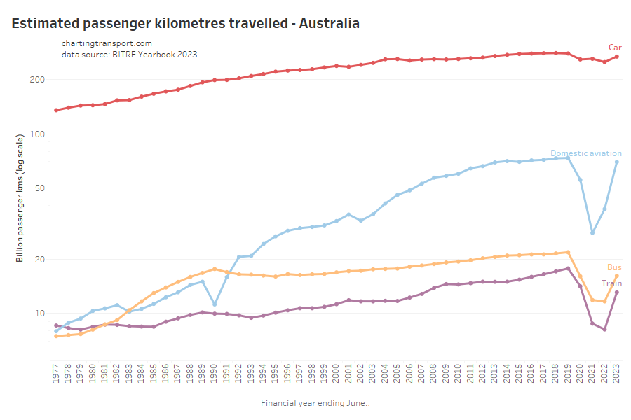
Passenger kilometres travelled
Here are passenger kilometres travelled overall (log scale):
The pandemic had the biggest impact on rail, bus, and aviation passenger kilometres. Aviation has bounced back to pre-COVID levels while train and bus are still down (probably due to working from home patterns, reduced total bus vehicle kilometres, amongst other reasons).
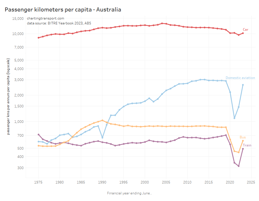
Here is the same on a per-capita basis which shows very similar patterns (also a log scale):
Car passenger kilometres per capita have reduced from a peak of 13,113 in 2004 to 10,152 in 2023.
Curiously aviation passenger kilometres per capita peaked in 2014, well before the pandemic. Rail passenger kilometres per capita in 2019 were at the highest level since 1975.
Here’s total car passenger kilometres for cities:
The COVID19 pandemic certainly caused some fluctuations in car passenger volumes in all cities for 2019-20 to 2021-22. In 2022-23, Sydney and Melbourne had not recovered to pre-pandemic levels, while Perth hit a new high.
Here are per capita values for cities:
Car passenger kilometres per capita bounced back in Sydney, Melbourne, and Canberra – however most cities had 2022-23 figures that were in line with a longer-term downward trend – if you disregard the COVID years.
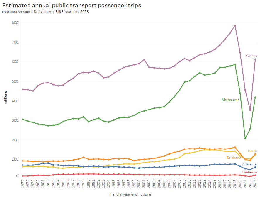
Public transport patronage
BITRE are now reporting estimates of public transport passenger trips (as well as estimated passenger kilometres). From experience, I know that estimating and reporting public transport patronage is a minefield especially for boardings that don’t generate ticketing transactions. While there are not many explanatory notes for this data, it appears BITRE have estimated capital city passenger boardings, which will be less than some ticketing region boardings (Sydney’s Opal ticketing region extends to the Illawarra and Hunter, and South East Queensland’s Go Card network includes Brisbane plus the Sunshine and Gold Coasts). I’ll report them as-is, but bear in mind that they might not be perfectly directly comparable between cities.
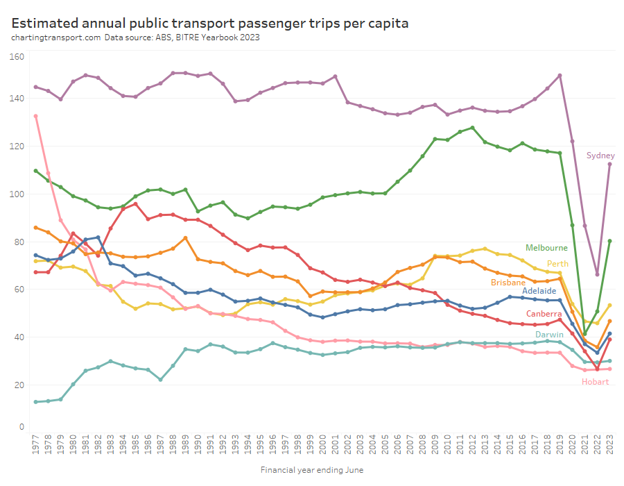
Of course bigger cities tend to generate more boardings, so it’s probably worth looking at passenger trips per capita per year:
This chart produces some unexpected outliers. Hobart shows up with very high public transport trips per capita in the 1970s, which might be relate to the Tasman Bridge Disaster which severed the bridge between 1975 and 1977 and resulted in significant ferry traffic for a few years (over 7 millions trips in 1976-77). Canberra also shows up with remarkably high trips per capita in the 1980s for a relatively small, low density, car-friendly city, but has been in steady decline since.
Canberra, Sydney, and Brisbane were seeing rising patronage per capita up to June 2019, just before the pandemic hit.
Most cities (except Darwin and Hobart), showed a strong bounce back in public transport trips per capita in 2022-23, although none reached 2018-19 levels.
There are further reasons why comparing cities is still not straight forward. Smaller cities such as Darwin, Canberra, and Hobart are almost entirely served by buses, and so most public transport journeys will only require a single boarding. Larger cities have multiple modes and often grid networks that necessitate transfers between services for many journeys, so there will be a higher boardings to journeys ratio. If a city fundamentally transforms its network design there could be a sudden change in boardings that doesn’t reflect a change in mode share.
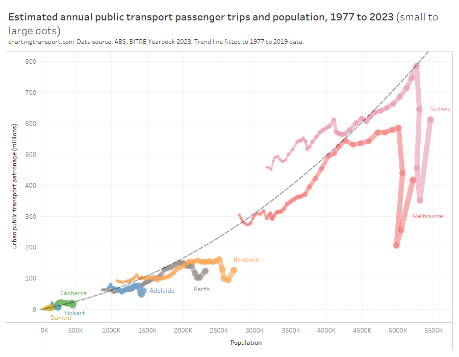
Indeed, here is the relationship between population and boardings over time. I’ve drawn a trend curve to the pre-pandemic data points only (up to 2019).
Larger cities are generally more conducive to high public transport mode share (for various reasons discussed elsewhere on this blog) but also often require transfers to facilitate even radial journeys.
So boardings per capita is not a clean objective measure of transit system performance. I would much prefer to be measuring public transport passenger journeys per capita (as opposed to boardings) which might overcome the limitations of some cities requiring transfers and others not.
The BITRE data is reported as “trips”, but comparing with other sources it appears the figures are boardings rather than journeys. Most agencies unfortunately don’t report public transport journeys at this time, however boardings to journeys ratio could be estimated from household travel survey data for some cities.
Public transport post-pandemic patronage recovery
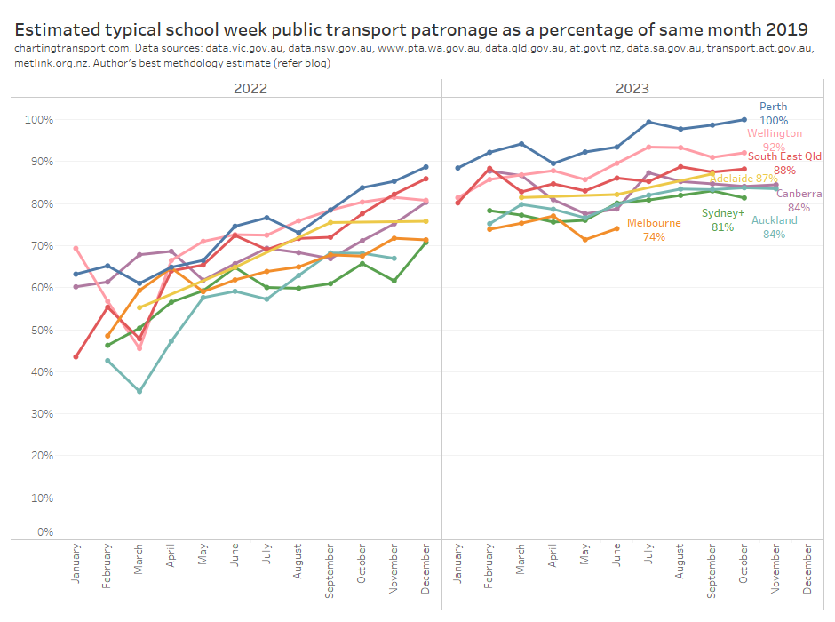
I’ve been estimating public transport patronage recovery using the best available data for each city (as published by state governments – unfortunately the usefulness and resolution of data provided varies significantly, refer: We need to do better at reporting and analysing public transport patronage). This data provides a more detailed and recent estimate of patronage recovery compared to 2019 levels. Here’s the latest estimates at the time of preparing this post:
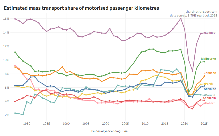
It’s possible to calculate “mass transit” mode share using the passenger kilometres estimates from BITRE (note: I use “mass transit” as BITRE do not differentiate between public and private bus travel):
Mass transit mode shares obviously took a dive during the pandemic, but have since risen, although not back to 2019 levels – presumably at least partly because of working from home.
The relative estimates of share of motorised passenger kilometres are quite different to the estimates of passengers trips per capita we saw just above. Canberra is much lower than the other cities, and Brisbane and Melbourne are closer together. The passenger kilometre estimates rely on data around average trip lengths (which is probably not regularly measured in detail in all cities), while the passenger boardings per capita figures are subject to varying transfer rates between cities. Neither are perfect.
So what else is there? I have been looking at household travel survey data to also calculate public transport mode share, but I am getting unexpected results that are quite different to BITRE estimates (especially Melbourne) and with unexpected trends over time (especially Brisbane), so I’m not comfortable to publish such analysis at this point.
What would be excellent is if agencies published counts of passenger journeys (that might involve multiple boardings), so we could compare cities more readily.
Rail Passenger travel
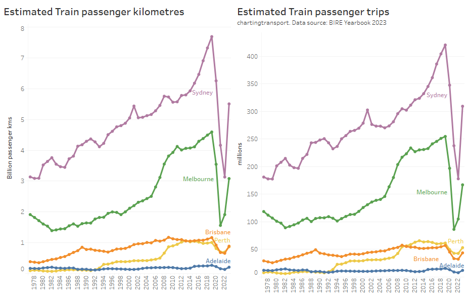
Here’s a chart showing estimates of annual train passenger kilometres and trips.
All cities are bouncing back after the pandemic.
Note there are some variances between the ranking of the cities – particularly Perth and Brisbane (BITRE have average train trip length in Brisbane at around 20.3 km while Perth is 16.3 km).
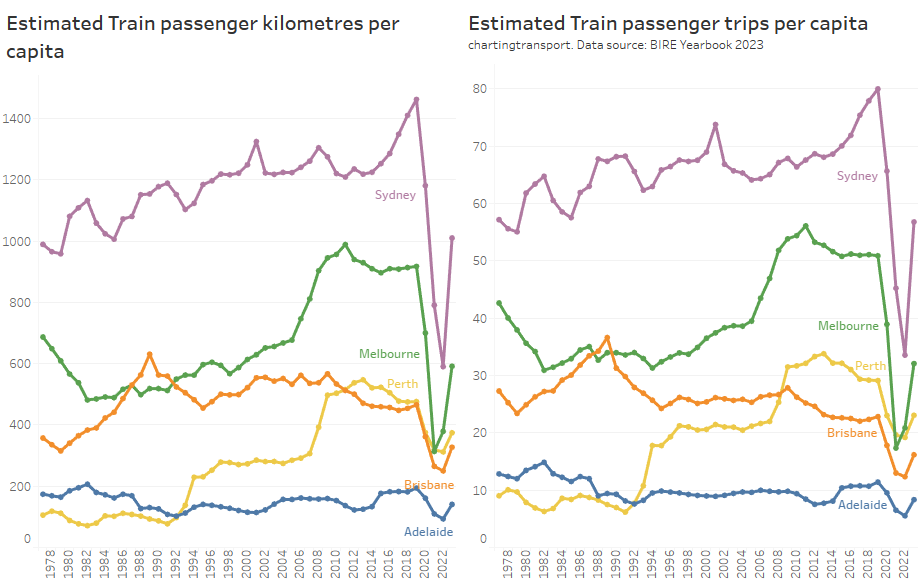
Here’s rail passenger kilometres per capita, but only up to 2021-22:
Bus passenger travel
Here’s estimates of total bus travel for capital cities:
And per capita bus travel up to 2021-22:
Note that Melbourne has the second highest volume of bus travel (being a large city), but the lowest per-capita usage of buses, primarily because – unlike most other cities – trams perform most of the busy on-street public transport task in the inner city. It probably doesn’t make sense to directly compare cities for bus patronage per capita, and indeed I won’t show such figures for the other public transport modes.
Darwin had elevated bus passenger kilometres from 2014 to 2019 due to bus services to a resources project (BITRE might not have counted these trips as urban public transport).
Ferry passenger travel
Sydney ferry patronage has almost recovered to pre-pandemic levels, while Brisbane’s ferries have not (as at 2022-23).
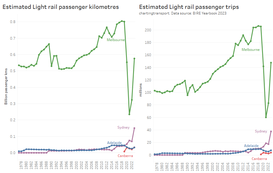
Light rail / tram passenger travel
Sydney light rail patronage is now growing strongly – after two new lines opened a few months before the pandemic hit.
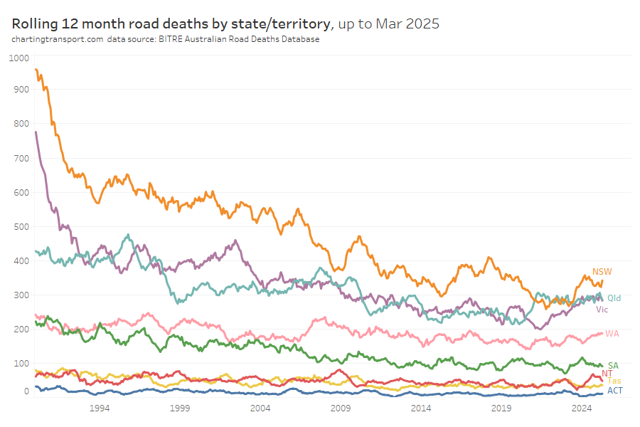
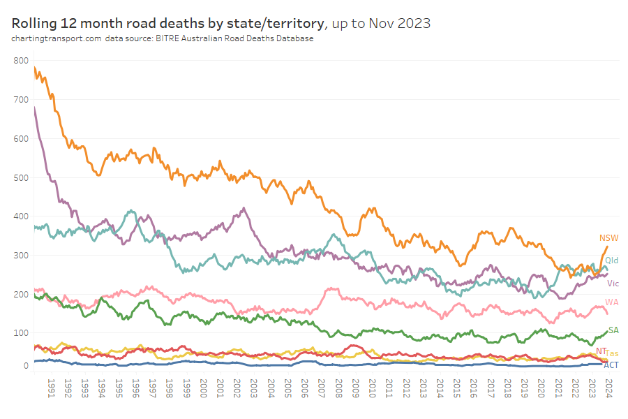
Road deaths
In recent months there has been an uptick in road deaths in NSW and SA. Victorian road deaths dropped during the pandemic but are back to pre-pandemic levels.
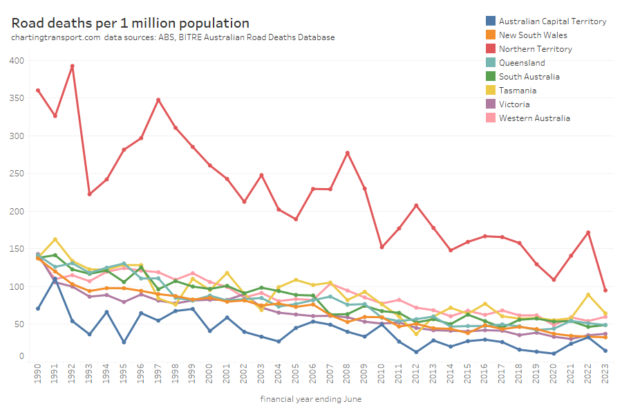
It’s hard to compare total deaths between states with very different populations, so here are road deaths per capita, for financial years:
There is naturally more noise in this data for the smaller states and territories as the discrete number of trips in these geographies is small. The sparsely populated Northern Territory has the highest death rate, while the almost entirely urban ACT has the lowest death rate.
Another way of looking at the data is deaths per vehicle kilometre:
This chart is very similar – as vehicle kilometres per capita haven’t shifted dramatically.
Next is road deaths by road user type, including a close up of recent years for motorcycles, pedestrians, and cyclists. I’ve not distinguished between drivers and and passengers for both vehicles and motorcycles.
Vehicle occupant fatalities were trending down until around 2020. Motorcyclist fatalities have been relatively flat for a long time but have risen slightly since 2021.
Pedestrian fatalities were trending down until around 2014 and have been bouncing up and down since (perhaps a dip associated with COVID lock downs).
Cyclist fatalities have been relatively flat since the early 1990s (apart from a small peak in 2014).
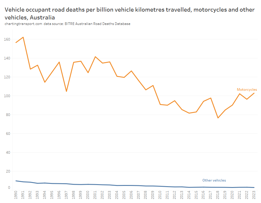
It’s possible to distinguish between motorcycles and other vehicles for both deaths and vehicle kilometres travelled, and the following chart shows the ratio of these across time:
The death rate for motorcycle riders and passengers per motorcycle kilometre was 38 times higher than other vehicle types in 2022-23. The good news is that the death rate for other vehicles has dropped from 9.8 in 1989-90 to 2.7 in 2022-23. The death rate for motorcycles was trending down from 1991 to around 2015 but has since risen again in recent years.
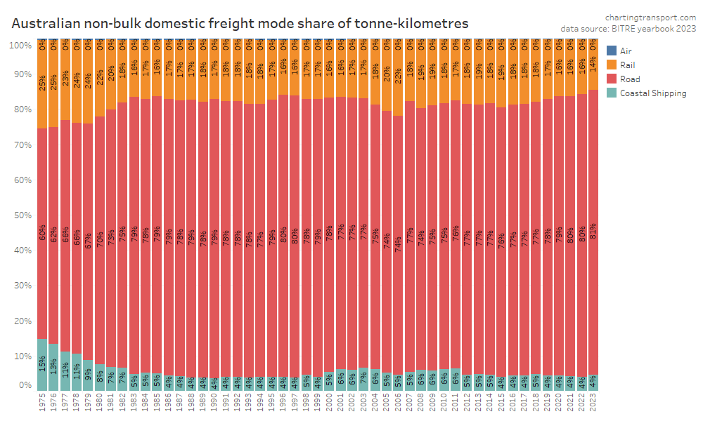
Freight volumes and mode split
First up, total volumes:
This data shows a dramatic change in freight volume growth around 2019, with a lack of growth in rail volumes, a decline in coastal shipping, but ongoing growth in road volumes. Much of this volume is bulk commodities, and so the trends will likely be explained by changes in commodity markets, which I won’t try to unpack.
Non-bulk freight volumes are around a quarter of total freight volume, but are arguably more contestable between modes. They have flat-lined since 2021:
Here’s that by mode split:
In recent years road has been gaining mode share strongly at the expense of rail. This is a worrying trend if your policy objective is to reduce transport emissions as rail is inherently more energy efficient.
Air freight tonnages are tiny in the whole scheme of things so you cannot easily see them on the charts (air freight is only used for goods with very high value density).
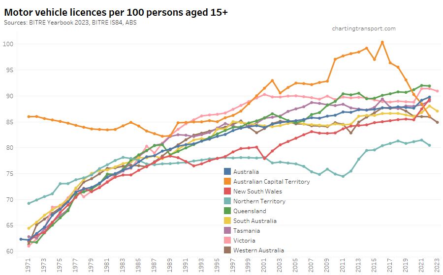
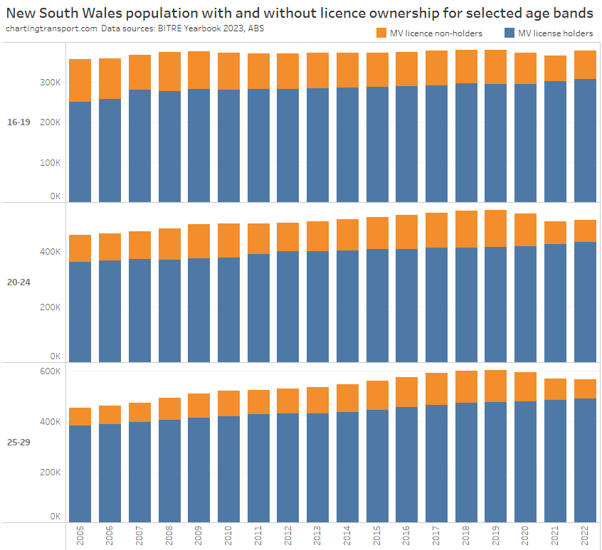
Driver’s licence ownership
Here is motor vehicle licence ownership for people aged 15+ back to 1971 (I’d use 16+ but age by single-year data is only available at a state level back to 1982). Note this includes any form of driver’s licence including learner’s permits.
Technical note: the ownership rate is calculated as the sum of car, motorbike and truck licenses – including learner and probationary licences, divided by population. Some people have more than one driver’s licence so it’s likely to be an over-estimate of the proportion of the population with any licence.
Unfortunately data for June 2023 is only available for South Australia, Western Australia and Victoria, so we don’t know the latest trends in all states. South Australia and New South Wales regrettably appear to have recently stopped publishing useful licence holder numbers.
2023 saw a decline in licence ownership in the three states that reported. 2022 was a mixed bag with some states going up (NSW, South Australia, Tasmania), many flat, and the Northern Territory in decline.
Licence ownership rates have fluctuated in many states since the COVID19 pandemic hit, most notably in Victoria and NSW which saw a big uptick in 2021.
The data series for the ACT is unusually different in trends and values – with very high but declining rates in the 1970s, seemingly elevated rates from 2010 to around 2018, followed by a sharp drop. BITRE’s Information Sheet 84 (published in 2017) reports that ACT licences might remain active after people leave the territory (e.g. to nearby parts of NSW) because of delays in transferring their licences to another state, resulting in a mismatch between licence holder counts and population. However, New South Wales requires people to transfer their licence within 3 months of moving there, and other states likely do also. But that requirement might be new, changed, and/or differently enforced over time (please comment if you know more).
Here’s the breakdown of reported licence ownership by age band for the ACT:
Many age bands exceed 100 (more licence holders than population) and there are some odd kinks in the data around 2015-2017 for all age bands (especially 70-79). I’m not sure that it is plausible that licencing rates of teenagers might have plummeted quite so fast in recent years. I’m inclined to treat all of this ACT data as suspect, and I will therefore exclude the ACT from further charts with state/territory disaggregation.
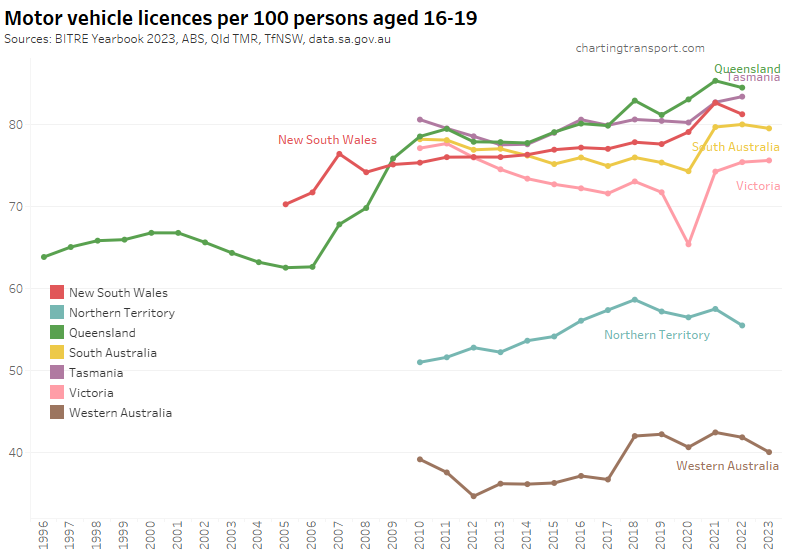
Here’s licence ownership by age band for Australia as a whole (to June 2022):
Between 2021 and 2022 ownership rates for 16-24 year-olds fell slightly, while ownership rates continued to rise for older Australians (quite dramatically for those 80 and over, mostly due to NSW, see below).
Let’s look at the various age bands across the states:
Victoria saw a sharp decline in Victoria to June 2020, followed by a bounce back to a higher rate in 2021. The pandemic has also been associated with increased rates in South Australia, Tasmania, and New South Wales (although it dropped again in 2022). Western Australia and the Northern Territory have much lower licence rates, likely due to different eligibility ages for learner’s permits.
For 20-24 year olds the pandemic caused big increases in the rate of licence ownership in most states, however Victoria, South Australia, and Western Australian appear to have peaked. Licence ownership among 20-24 year olds was still surging in Tasmania up to June 2022.
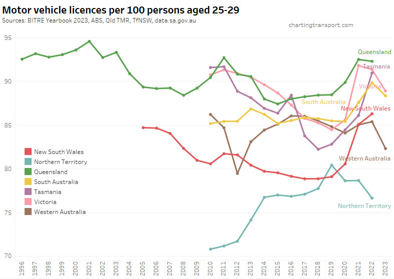
Similar patterns are evident for 25-29 year olds:
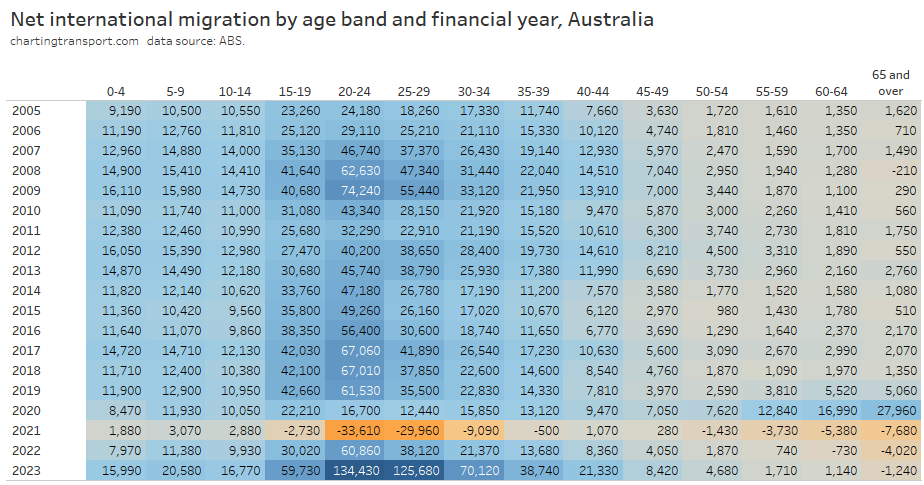
One trend I identified a year ago was that the increasing rate of licence ownership seemed to largely reflect a decline in the population in these age bands during the pandemic period when temporary migrants were told to go home, and immigration almost ground to a halt. Most of the population decline was those without a licence, while the number of licence holders remained fairly steady.
New South Wales appears to follow this pattern, although there was strong growth in licence holders in 2021 and 2022 for teenagers.
Victoria saw a decline in licence holders in 2020 (likely teenagers unable to get a learner’s permit due to lockdowns), but the number of teenage licence holders has since grown. While for those in their 20s, the increase in the licence ownership rate is mostly explained by a loss of population without a licence:
Queensland has experienced strong growth in licence holders at the same time as a decline in population aged 20-29 in 2022. This might be the product of departing temporary immigrants partly offset by interstate migration to Queensland.
To illustrate how important migration is to the composition of young adults living in Australia, here’s a look at the age profile of net international immigration over time for Australia:
For almost all years, the age band 20-24 has had the largest net intake of migrants. This age band also saw declining rates of driver’s licence ownership – until the pandemic, when there was a big exodus and at the same time a significant increase in the drivers licence ownership rate. The younger adult age bands have seen a surge in 2022-23, and in the three states with data the licence ownership rates have dropped (as I predicted a year ago).
Curiously as an aside, 2019-20 saw a big increase in older people migrating to Australia (perhaps people who were overseas returning home during the pandemic lock downs). But then big negative numbers were seen in 2020-21, and since then there has continued to be net departures in 65+ age band.
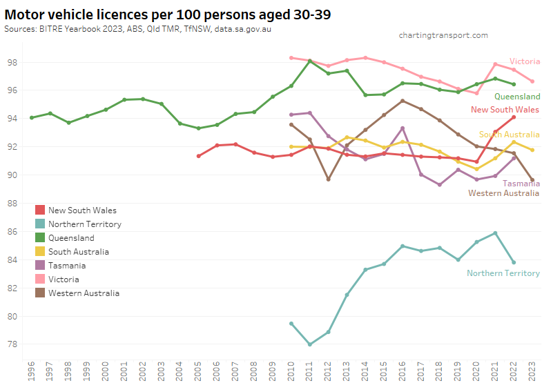
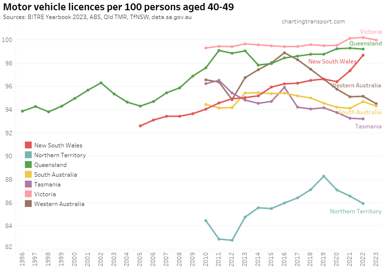
For completeness, here are licence ownership rate charts for other age groups:
There appear to be a few dodgy outlier data points for the Northern Territory (2019) and South Australia (2016).
You might have noticed some upticks for New South Wales in 2022, particularly for those aged over 80. I’m not sure how to explain this. Here’s all the age bands for NSW:
Here’s Victoria, which includes data to 2023:
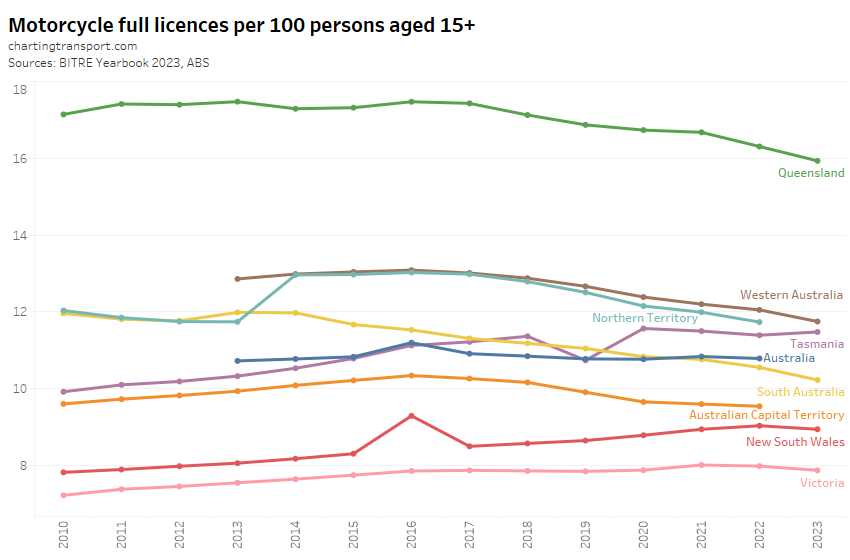
For completeness, here are motor cycle licence ownership rates:
Motorcycle licence ownership per capita has been declining in most states and territories, except Tasmania. I suspect dodgy data for New South Wales 2016, and Tasmania 2019.
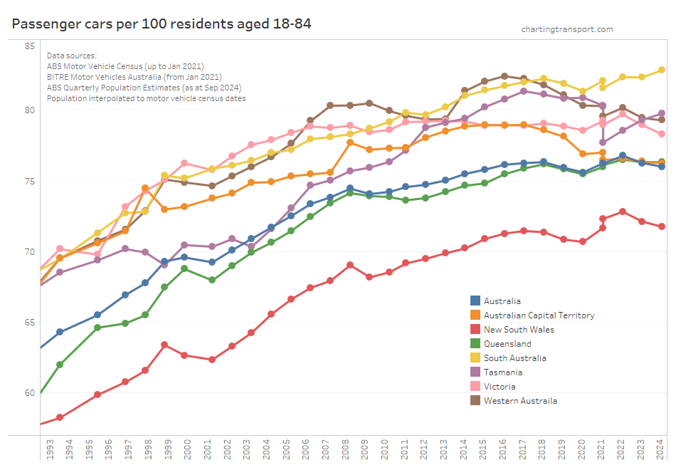
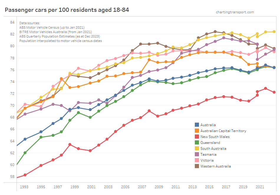
Car ownership
Thankfully BITRE has picked up after the ABS terminated it’s Motor Vehicle Census, and are now producing a new annual report Motor Vehicle Australia. They’ve tried to replicate the ABS methodology, but inevitably have come up with slightly different numbers in different states for different vehicle types for 2021 (particularly Tasmania). So the following chart shows two values for January 2021 – both the ABS and BITRE figures so you can see the reset more clearly. I suggest focus on the gradient of the lines between surveys and try to ignore the step change in 2021.
Let’s zoom in on the top-right of that chart:
All except South Australia, Tasmania, and ACT showed a decline in motor vehicle ownership between January 2022 and January 2023. This might reflect the recent return of “recent immigrants” (as I predicted a year ago).
Tasmania had a large difference in 2021 estimates between ABS and BITRE that seems to be closing so who knows what might be going on there.
Several states appear to have had peaks – Tasmania in 2017, Western Australia in 2016, and ACT in 2017.
Vehicle fuel types
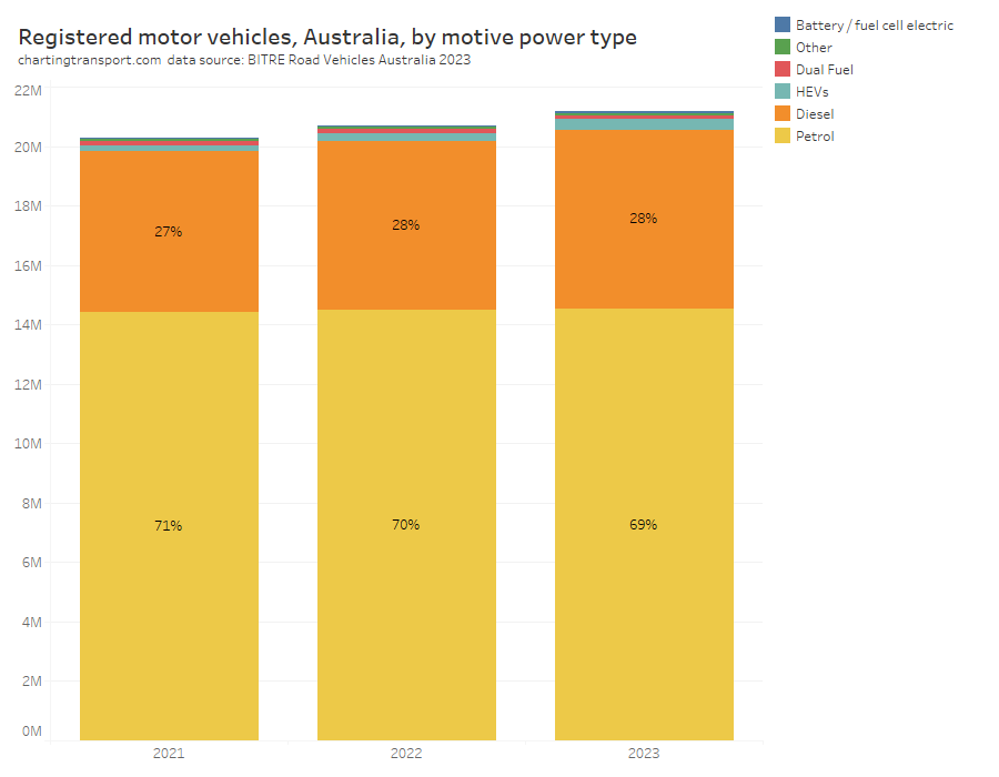
Petrol vehicles still dominate registered vehicles, but are slowly losing share to diesel:
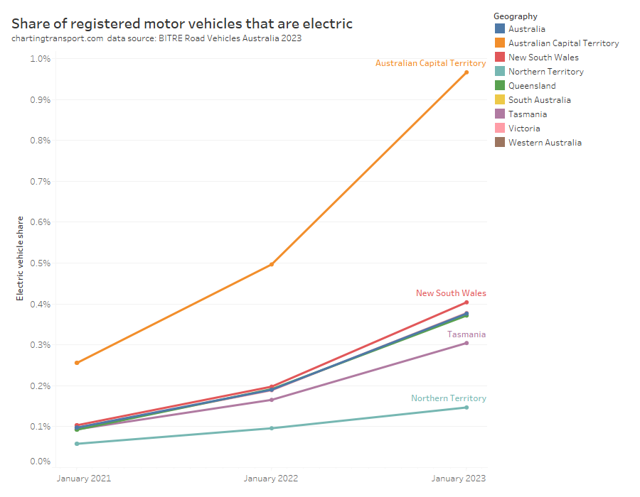
Can you see that growing slither of blue at the top, being electric vehicles? Nor can I, so here’s the share of registered vehicles that are fully electric (battery or fuel cell, but not hybrids):
The almost entirely urban Australian Capital Territory is leading the country in electric vehicle adoption, while the Northern Territory is the laggard.
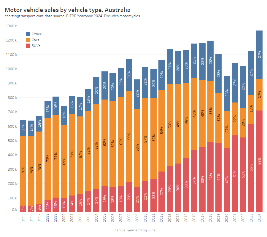
Motor vehicle sales
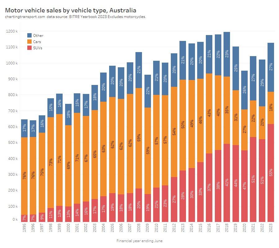
Here are motor vehicle sales by vehicle type:
The trend to larger and heavier vehicles (SUVs) might make it harder to bring down transport emissions (and perhaps reduce road deaths).
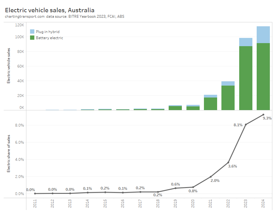
Electric vehicle sales are small but currently growing fast in volume and share:
[Updated 7 January 2024:] I’ve included calendar year 2023 sales from FCAI (their 2022 figures were very close to BITRE’s) and calculated the percentage of sales that were battery electric based on FCAI/ABS totals.
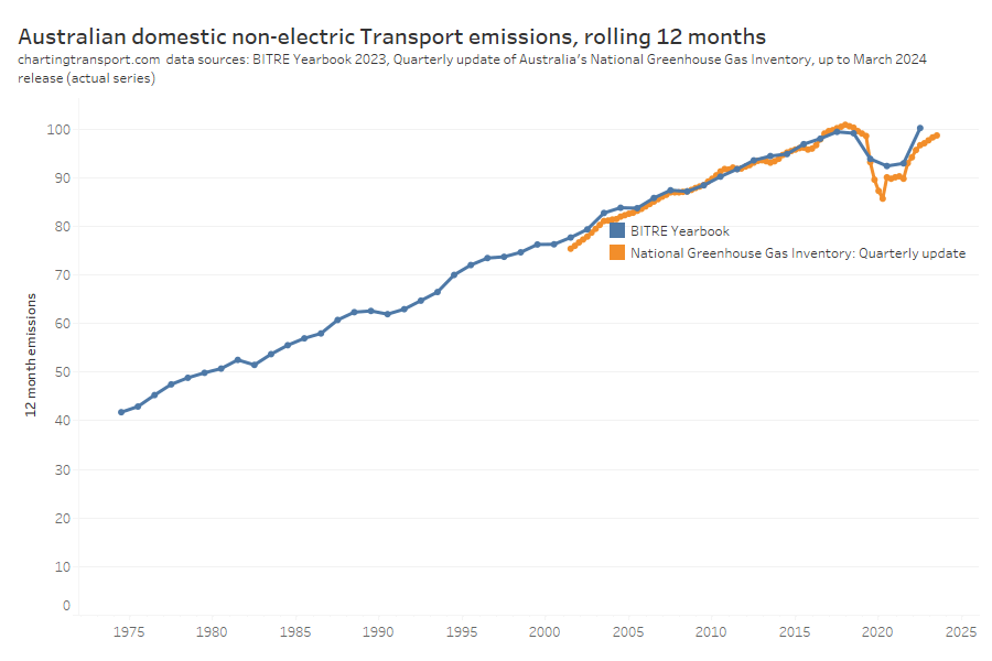
Transport Emissions
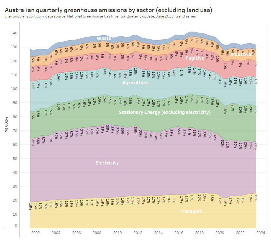
Transport now makes up 19% of Australia’s greenhouse gas emissions (excluding land use), up from 15% in 2001:
You can see that Australia’s total emissions excluding land use have actually increased since 2001. Emissions reductions in the electricity sector have been offset by increases in other sectors, including transport.
Australia’s transport rolling 12 month emissions dropped significantly with COVID lockdowns, but are bouncing back strongly:
Here are seasonally-adjusted quarterly estimates, showing September 2023 emissions back to 2018 levels:
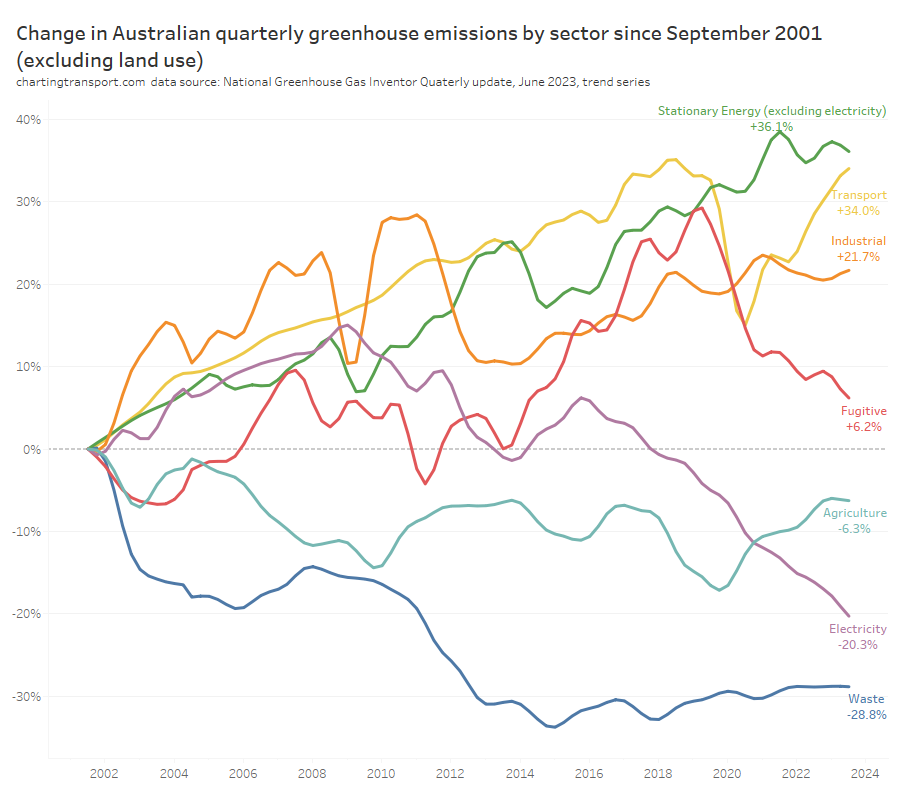
Transport emissions are around 34% higher in September 2023 than in September 2001, the second highest growth of all sectors since that time:
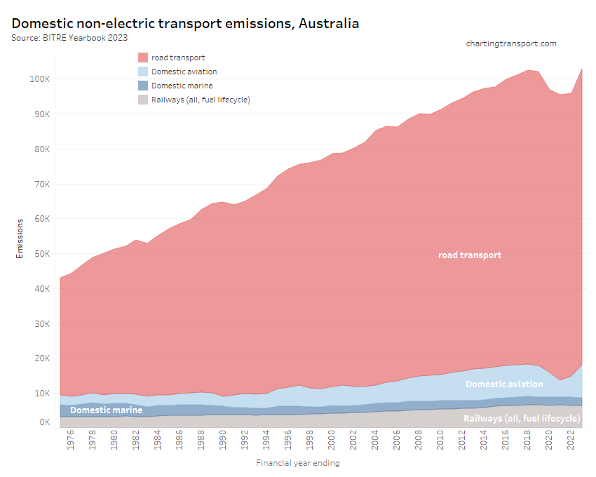
Here are annual Australian transport emissions since 1975:
And in more detail since 1990:
The next chart shows the growth trends by sector since 1990:
Aviation emissions saw the biggest dip during the pandemic but are now back above 2018 levels.
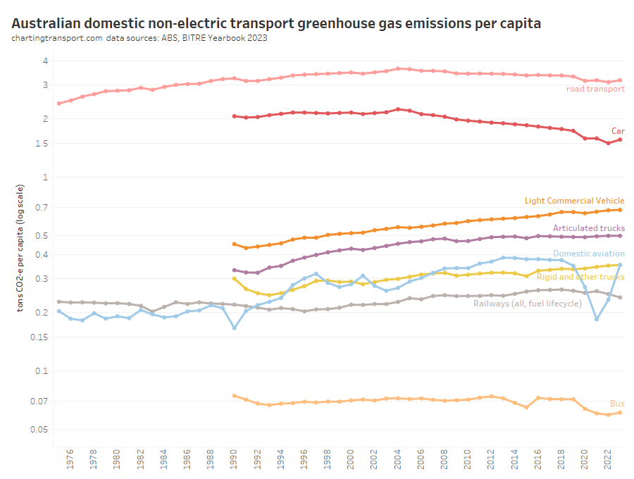
Here are per capita emissions by transport sector (note: log scale used on Y-axis):
Truck and light commercial vehicle emissions per capita have continued to grow while many other modes have been declining, including a trend reduction in car emissions per capita since around 2004.
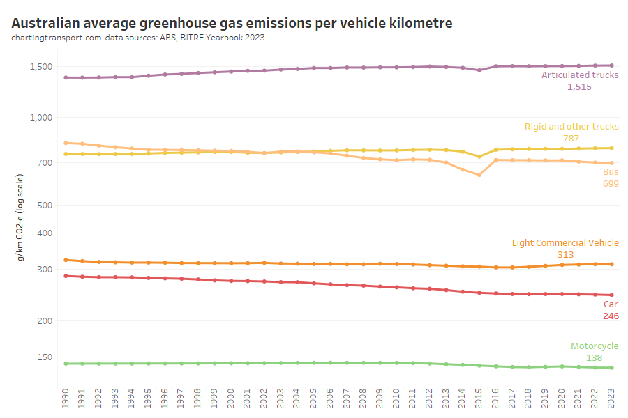
Next up, emissions intensity (per vehicle kilometre):
I suspect a blip in calculation assumptions in 2015 for bus and trucks.
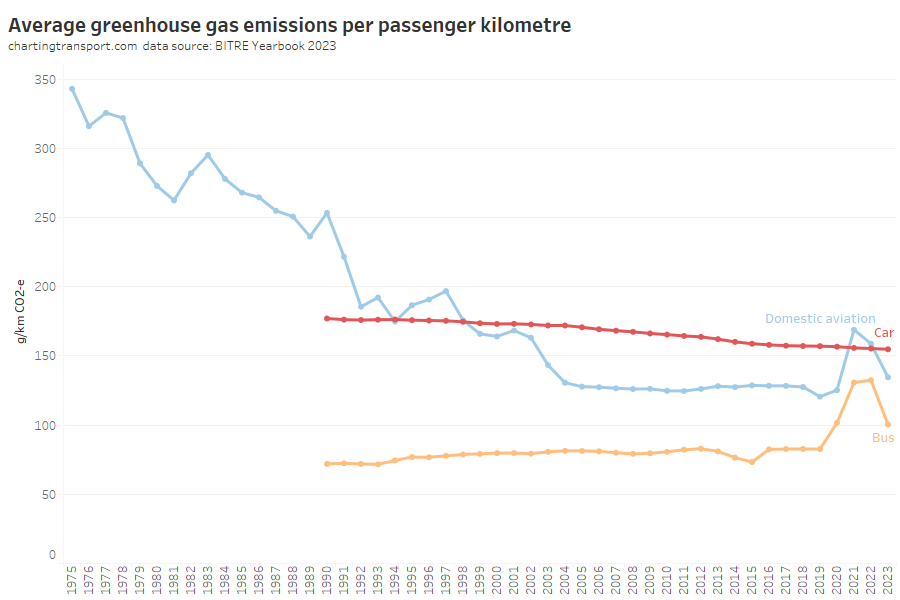
Emissions per passenger kilometre can also be estimated:
Car emissions have continued a slow decline, but bus and aviation emissions per passenger km increased in 2021, presumably as the pandemic reduced average occupancy of these modes.
Aviation was reducing emissions per passenger kilometre strongly until around 2004, but has been relatively flat since, and the 2022-23 value is above 2004 levels. This seems a little odd as newer aircraft are generally more energy efficient.
Transport consumer costs
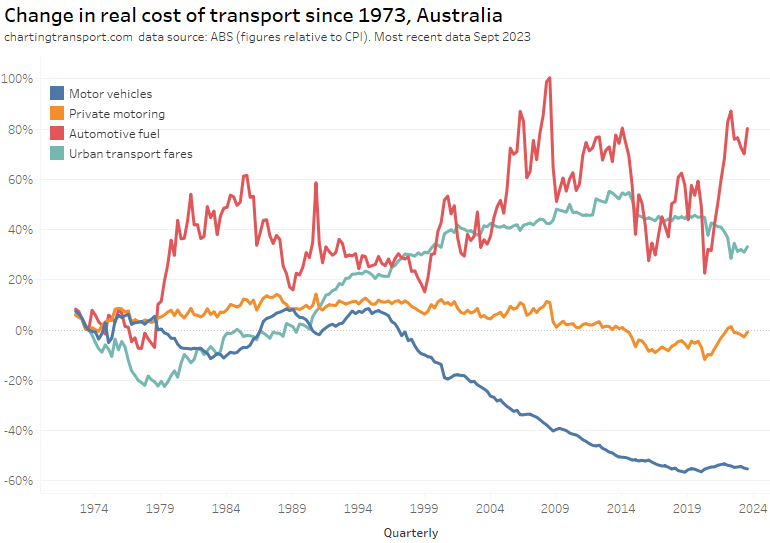
The final category for this post is the real cost of transport from a consumer perspective. Here are headline real costs (relative to CPI) for Australia, using quarterly ABS Consumer Price Index data up to September 2023:
Technical note: Private motoring is a combination of factors, including motor vehicle retail prices and automotive fuel.
The cost of motor vehicles was in decline from around 1995 to 2018 and has been stable or slightly rising since then. Automotive fuel has been volatile, which has contributed to variations in the cost of private motoring.
Urban transport fares (a category which unfortunately blends public transport and taxis/rideshare) have increased faster than CPI since the late 1970s, although they were flat in real terms between 2015 and 2020, then dropped in 2021 and 2022 in real terms – possibly as they had not yet been adjusted to reflect the recent surge in inflation. They picked up slightly in 2023.
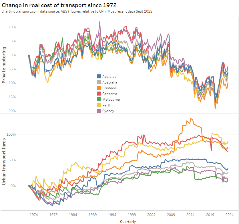
The above chart shows a weighted average of capital cities, which washes out patterns in individual cities. Here’s a breakdown of the change in real cost of private motoring and urban transport fares since 1972 by city (note different Y-axis scales):
Technical note: The occasional dips in urban transport fares value are likely related to periods of free travel – eg May 2019 in Canberra.
The cost of private motoring moves much same across the cities.
Urban transport fares have grown the most in Brisbane, Perth, and Canberra – relative to 1972. However all cities have shown a drop in the real cost of urban transport fares in June 2022 – as discussed above.
If you choose a different base year you get a different chart:
What’s most relevant is the relative change between years – e.g. you can see Brisbane’s experiment with high urban transport fare growth between 2009 and 2017 in both charts.
Melbourne recorded a sharp drop in urban transport fares in 2015, which coincided with the capping of zone 1+2 fares at zone 1 prices.
And that’s a wrap on Australian transport trends. Hopefully you’ve found this useful and/or interesting.


 Posted by chrisloader