It’s that time of year again when BITRE release their annual yearbook chock full of numbers, and this post aims to turn them into useful information. It’s also a prompter for me to update my feeds of other transport metrics and pull together this post covering the latest trends in licence ownership, motor vehicle ownership, transport emissions, vehicle kilometres, passenger kilometres, freight volumes, and transport pricing.
I’ve been putting out similar posts in past years, and commentary in this post will mostly be around recent year trends. See other similar posts for a little more discussion around historical trends (January 2022, December 2020, December 2019, December 2018).
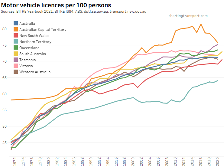
Driver’s licence ownership
Here is motor vehicle licence ownership for people aged 15+ back to 1971 (I’d use 16+ but age by single-year data is only available at a state level back to 1982). Note this includes any form of driver’s licence including learner’s permits.
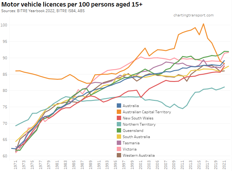
Technical note: the ownership rate is calculated as the sum of car, motorbike and truck licenses – including learner and probationary licences, divided by population. Some people have more than one driver’s licence so it’s likely to be an over-estimate of the proportion of the population with any licence.
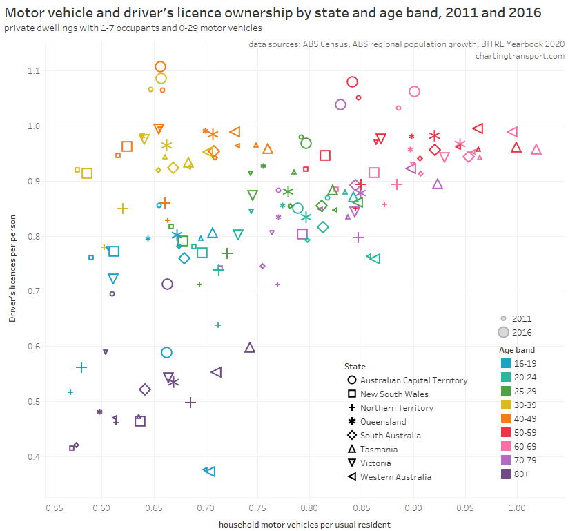
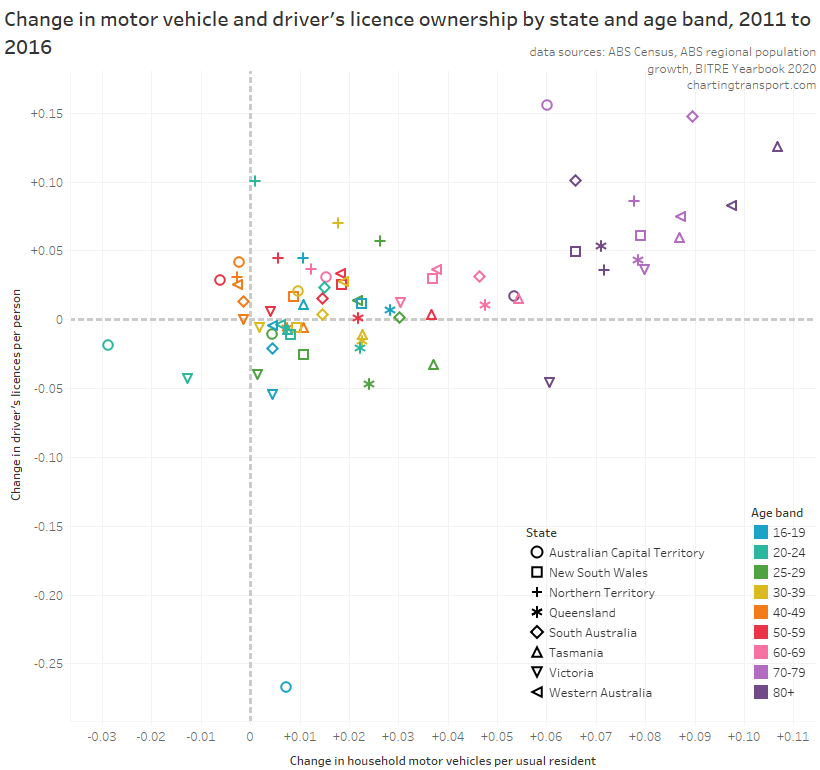
Overall the trend has been a flattening of licence ownership rates, and indeed Victoria was showing declining licence ownership before the pandemic. The ACT and Northern Territory had much higher rates of licence ownership in the 1970s compared to other states. But then the Northern Territory has maintained lower rates of licence ownership than most other states since the 1990s. The ACT showed very high rates of licence ownership around 2009 to 2017 – not sure if this is real or an artefact of the imperfect data (eg counting people with multiple licences).
Most states saw an uptick in 2021 with the notable exception of Western Australia – a state that was largely COVID-free until early 2022 so any COVID-avoidance incentive to get a driver’s licence might not have been very strong. Licence ownership rates in Queensland and Victoria have somewhat levelled out between 2021 and 2022, perhaps reflecting a return of international arrivals and the end of COVID lockdowns.
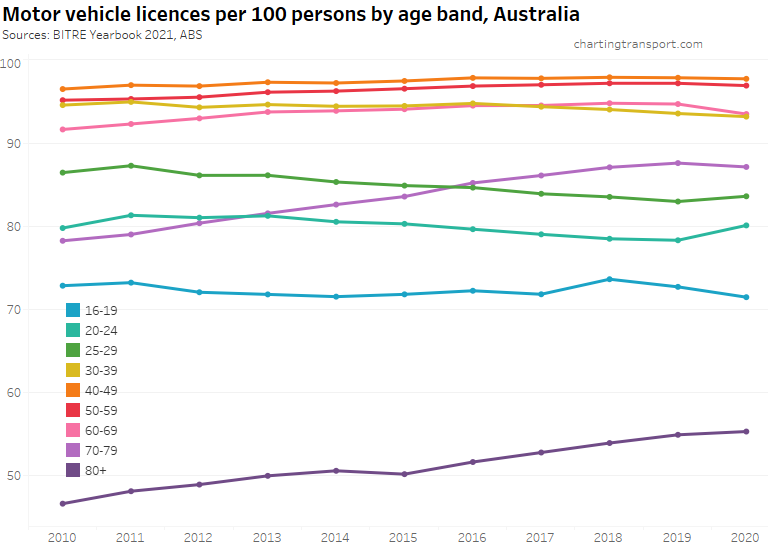
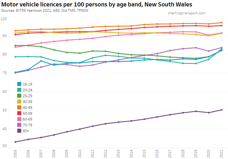
Here’s licence ownership by age band for Australia as a whole (to June 2021):
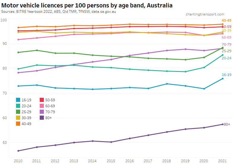
In 2020 and 2021 there was an uptick in ownership for people aged 16 to 29 in particular. Let’s look at the various age bands across the states:
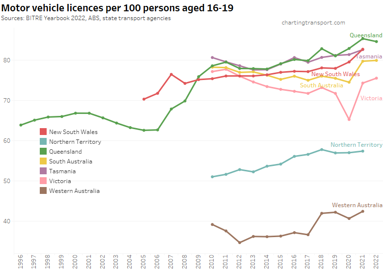
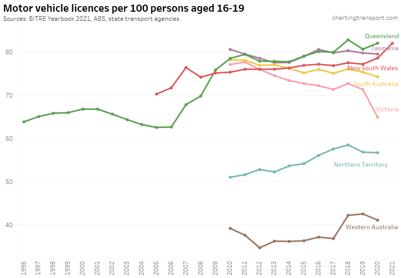
There are some interesting recent trends for people aged 16-19. Victoria saw a big drop in 2020 but then some big increases in 2021 and 2022. South Australia and New South Wales have also seen big increases in recent years.
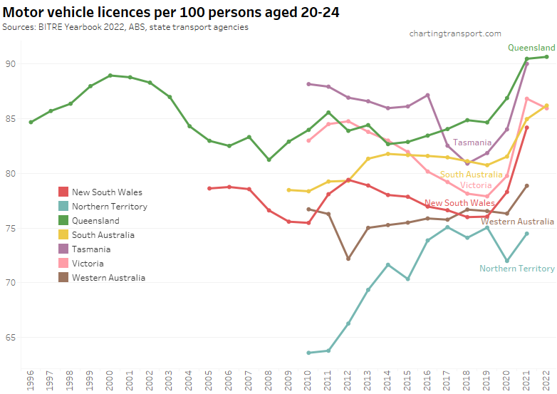
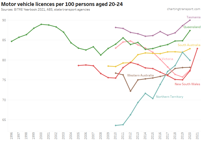
There were even bigger increases for 20-24 year olds following the start of the pandemic, except Western Australia and the Northern Territory (states that largely avoided COVID in 2021).
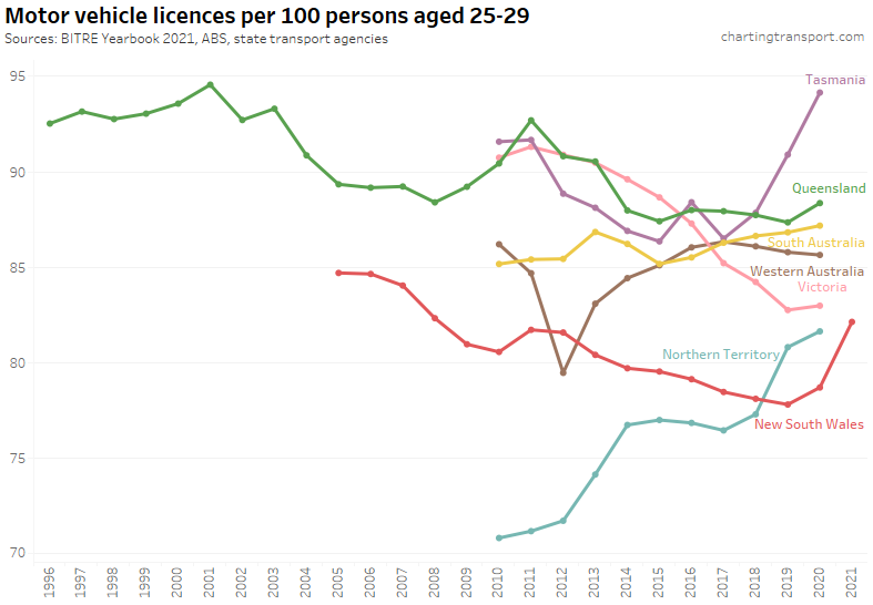
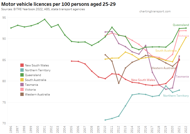
Ages 25-29 were similar:
So why have licence ownership rates increased for younger adults? Is it mode shift away from public transport to avoid the risk of COVID infection on public transport? Or is it because non-licence holders left the country?
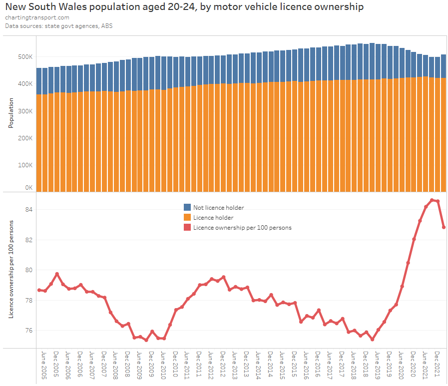
South Australia and New South Wales publish quarterly licencing data by age band which allows us to see the impact of the pandemic more closely. I’ve combined this with ABS quarterly population data to calculate quarterly licence ownership rates:
South Australia has less historical data published:
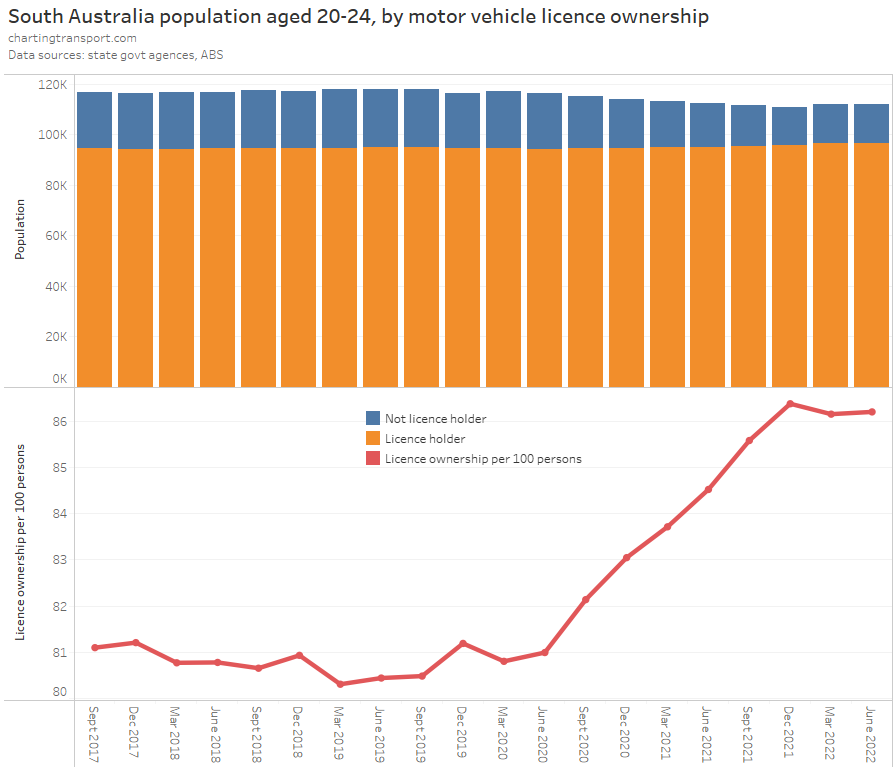
The population aged 20-24 declined after March 2019 in both New South Wales and South Australia – a year before the pandemic hit. Then both states saw a more rapid decline after March 2020 – the onset of the pandemic.
However the number of people in this age band with a licence only increased slightly – in line with pre-pandemic trends. That is, the licence ownership rate increased sharply primarily because there was a net loss of non-licence holders.
Here’s a look at Australia’s population by age band:
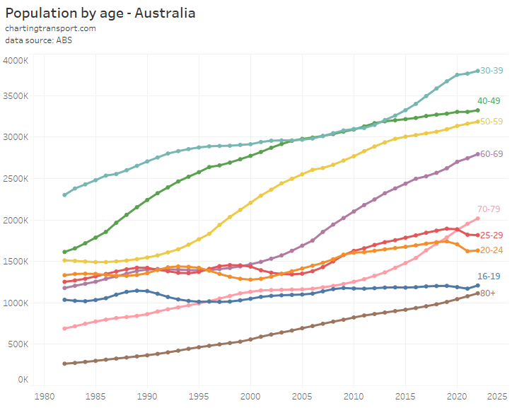
There are some fairly smooth trends over time in all age bands, but then from 2020 there were some sudden shifts, particularly for age bands 16-19, 20-24, 25-59 and to lesser extent 30-39.
A plausible explanation is that international students and other non-permanent residents left Australia – many could not attend classes and were encouraged to leave Australia by the government of the day. These departures were not replaced by new arrivals as the international borders were essentially closed. Indeed once the borders reopened in early 2022, there was a sharp increase in non-licence holders in New South Wales that sent the motor vehicle licence ownership rate down sharply in March 2022 (June 2022 data has not been published at the time of writing).
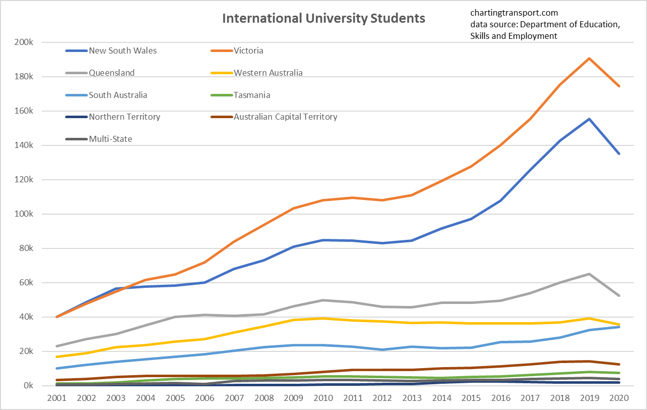
Other data shows a sharp fall in the number of international students in Australia between 2019 and 2020, particularly in NSW, Victoria and Queensland (more recent student numbers unfortunately not available at the time of writing):
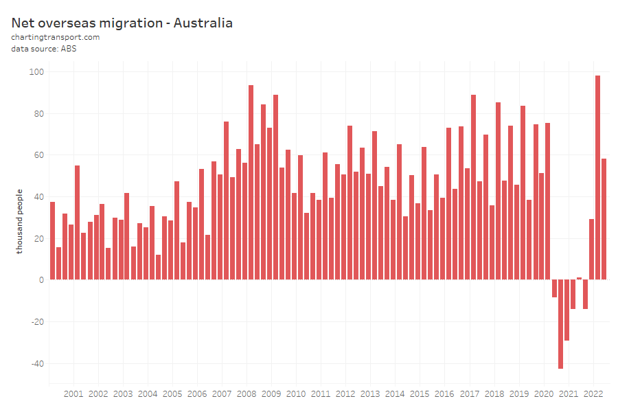
And there was a dramatic shift to net outbound overseas migration from the June quarter of 2020:
In previous posts (see Why are young adults more likely to use public transport? (an exploration of mode shares by age – part 3) I’ve established that recent immigrants skew to the younger adult ages as Australia generally attracts international students and skilled migrants, which also fits with the hypothesis that there was a great exodus of young adults who didn’t have a driver’s licence.
[Side note: the first quarter of 2022 represented a new record for international migration into Australia as the borders re-opened – almost 98k people.]
It’s entirely plausible that long-time residents also increased their rate of licence ownership during the pandemic, but I think the most likely major explanation is the departure of international students and temporary residents. And so I expect the return of international migration will result in lower licence ownership, car ownership, and increased public transport mode share in 2023.
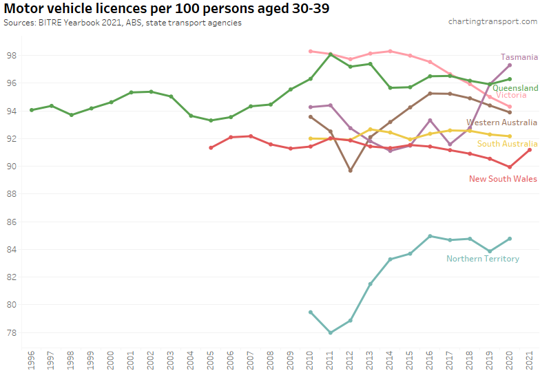
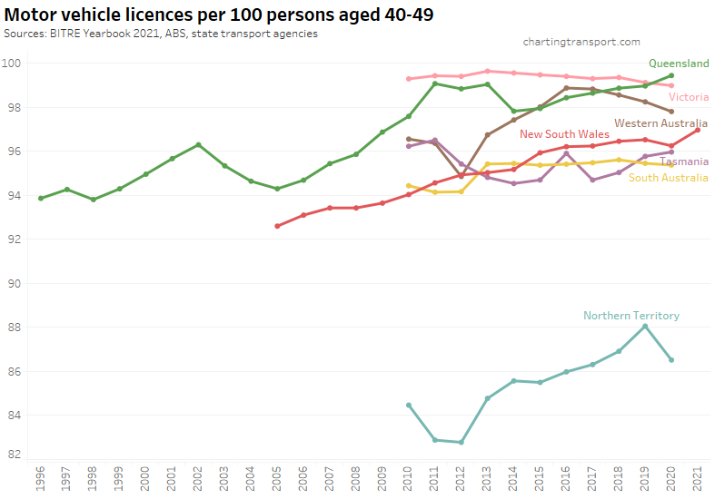
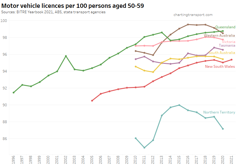
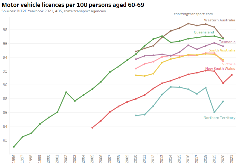
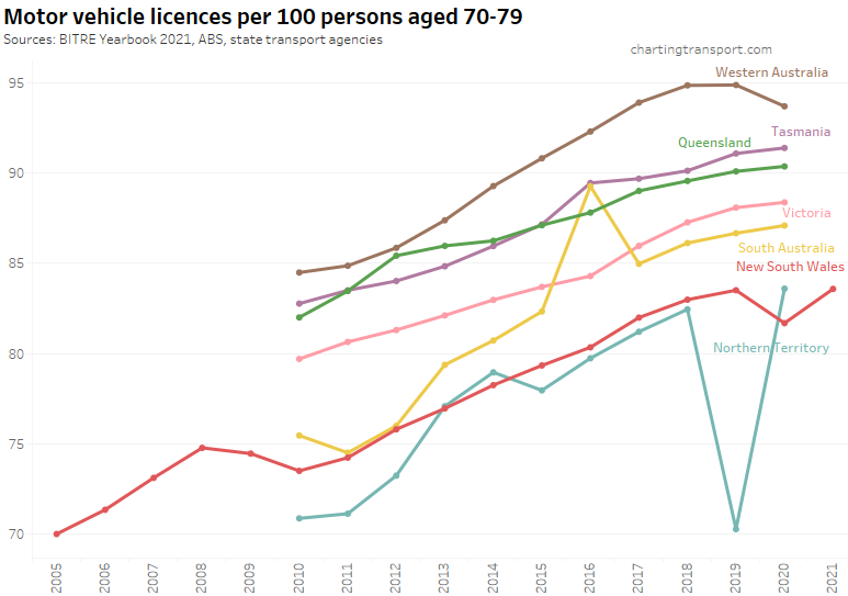
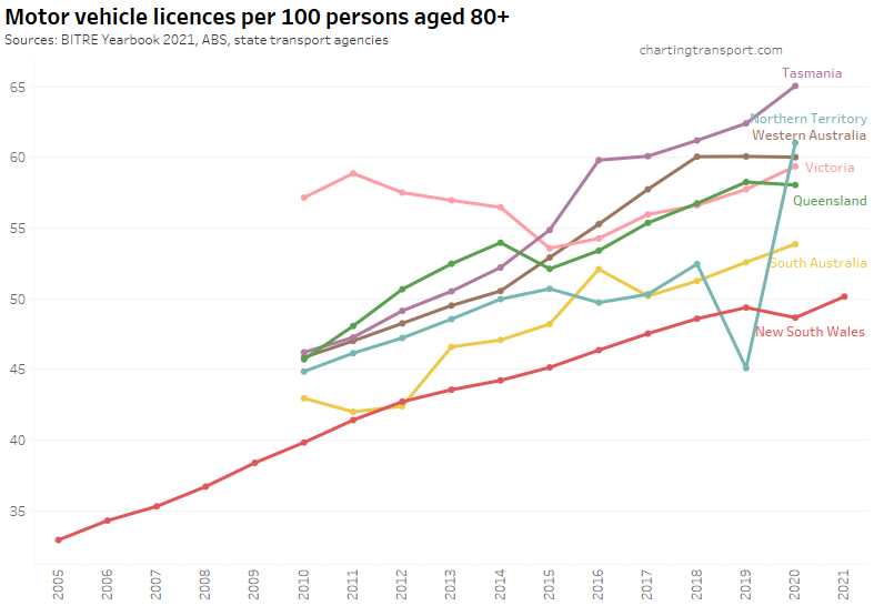
For completeness, here are licence ownership rate charts for other age groups:
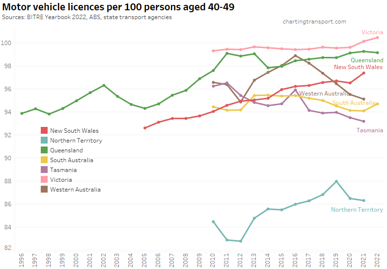
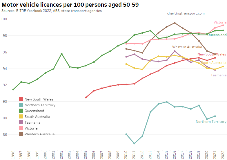
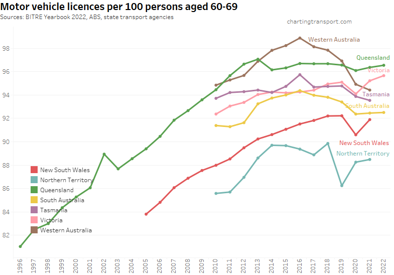
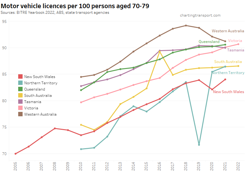
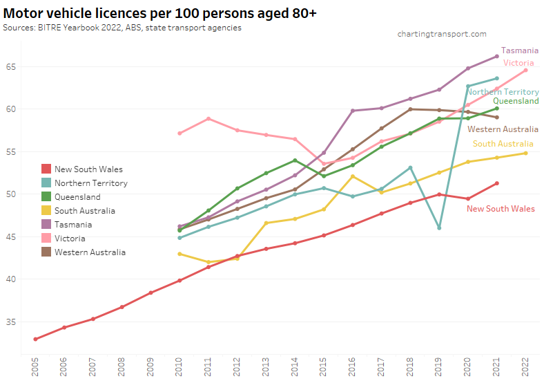
There appear to be a few suspicious outlier data points for the Northern Territory (2019) and South Australia (2016).
To get a better understanding of recent trends, here are quarterly licence ownership rates by age band for New South Wales since mid 2018:
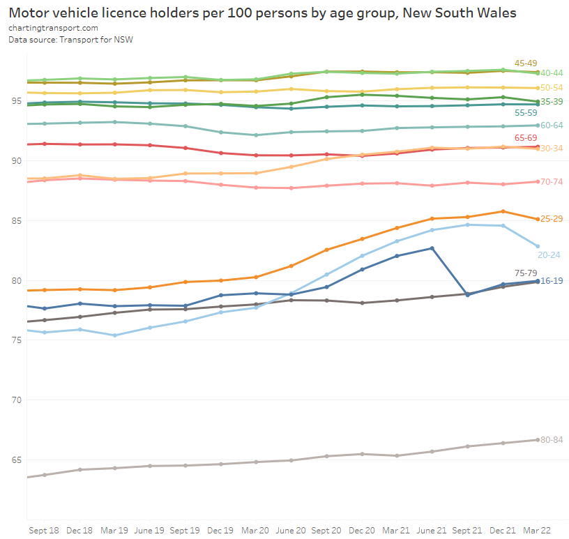
You can see the rise – and more recent fall – in licence ownership rates for the age bands 20-24 and 25-29. There was also a sharp fall for those aged 16-19 in September 2021, possibly due to Sydney entering a long COVID lockdown in the winter of 2021 (perhaps learners permits were not renewed or people didn’t bother applying for them if they could not take lessons). 30-34 year olds showed a small rise in licence ownership from the start of the pandemic and this seems to have been sustained, which might reflect some mode shift to avoid infection risk.
Here’s the same quarterly data for South Australia:
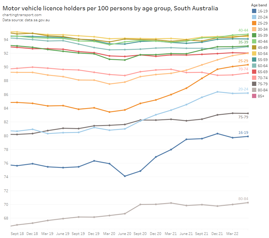
Licence ownership rates rose strongly for those aged 16-34, although there was an initial dip for those aged 16-19 in June-September 2020 around the start of the pandemic. Perhaps it has remained high because international students have not yet returned in great numbers to Adelaide, and/or because of a permanent mode shift towards private transport?
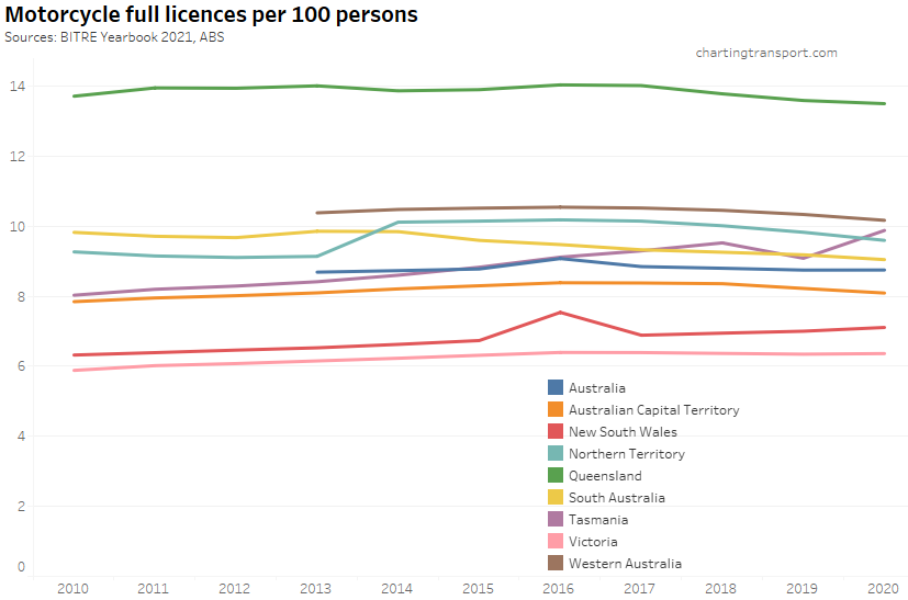
For completeness, here are motor cycle licence ownership rates:
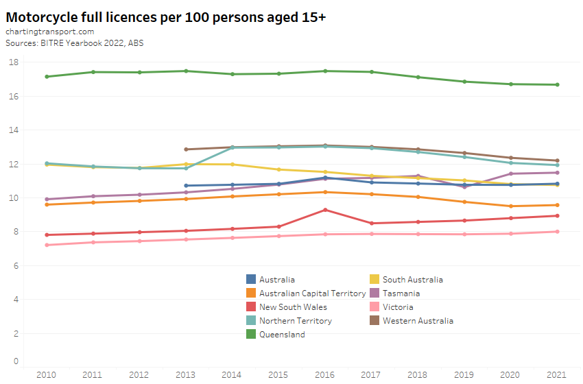
Motorcycle licence ownership has been trending up slightly in New South Wales and Victoria, and slightly down in Queensland, South Australia, Norther Territory and Western Australia.
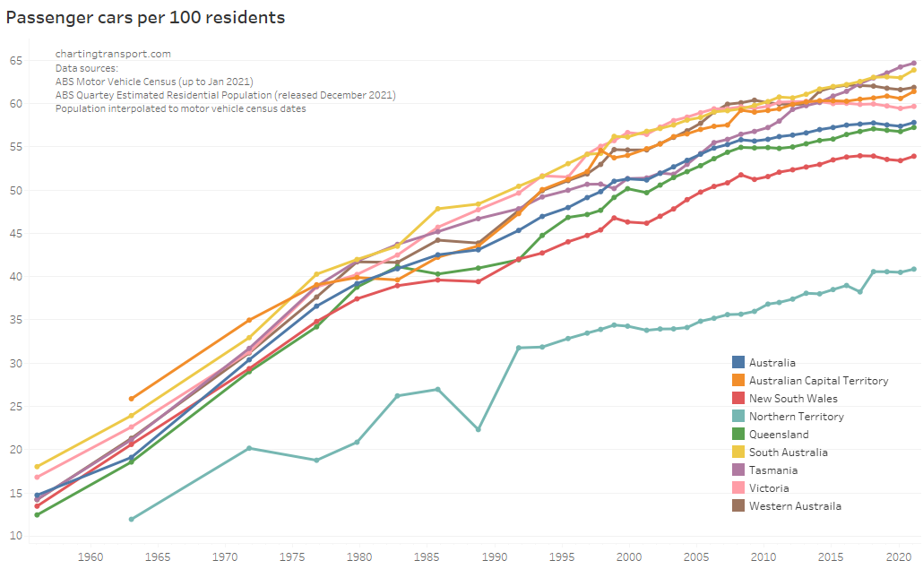
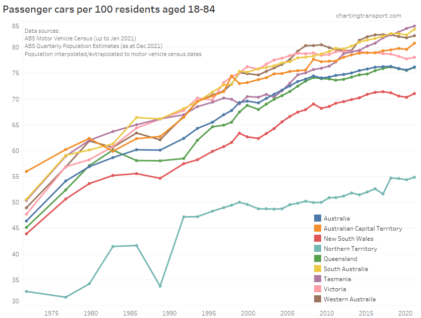
Car ownership
Thankfully BITRE has picked up after the ABS terminated it’s Motor Vehicle Census, and are now producing a new annual report Motor Vehicle Australia. They’ve tried to replicate the ABS methodology, but inevitably have come up with slightly different numbers in different states for different vehicle types for 2021. So the following charts will show two values for January 2021 – both the ABS and BITRE figures so you can see the reset more clearly. I suggest focus on the gradient of the lines between surveys and try to ignore the step change in 2021.
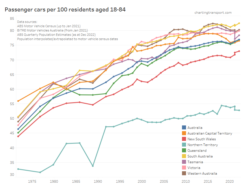
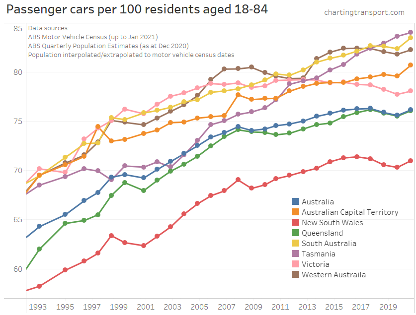
Between January 2020 and January 2022 most states show an upwards trend in motor vehicles per population aged 18-84 (an imperfect approximation of the driving age population).
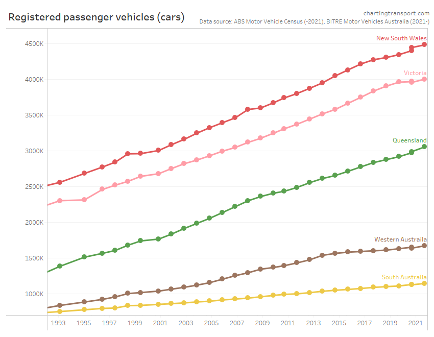
However when you look at the stock of cars per state, there was not a significant uptick in the total number of cars – indeed Victoria saw an almost flattening of total motor vehicles between January 2020 and January 2021:
Again, a highly plausible explanation is that non-driving (and non-licence holding) residents departed Australia while long-term residents largely continued their background trends in motor vehicle ownership. We might therefore see a decline in motor vehicle ownership rates in the January 2023 survey with the return of overseas immigration.
Transport Emissions
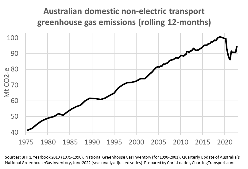
Australia’s transport emissions have been reduced by COVID lockdowns over the last couple of years but have more recently bounded back:
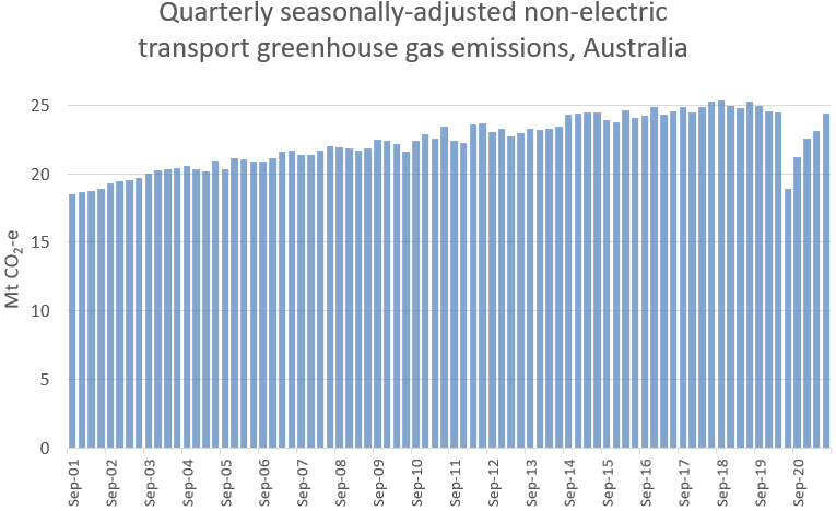
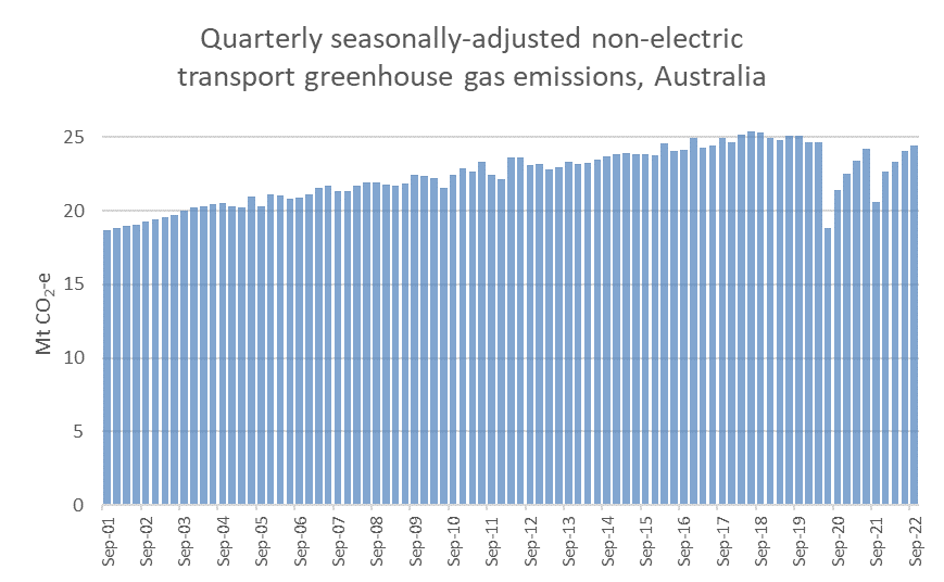
The above chart showing rolling 12 months emissions which washed out the lockdown period. The next chart shows seasonally-adjusted quarterly data to get around the rolling 12 month averaging – with the September 2022 quarter close to 2019 levels:
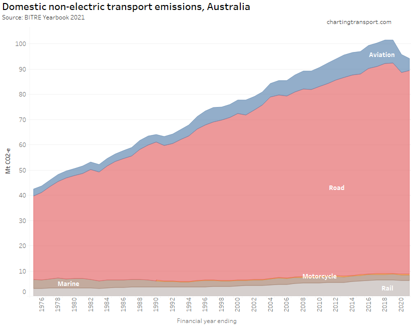
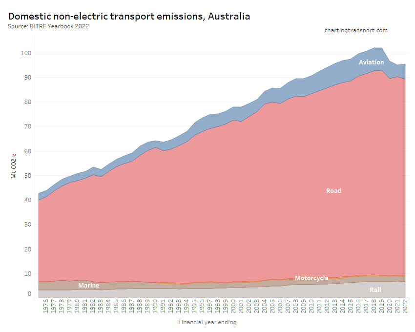
Here are Australian transport emissions since 1975:
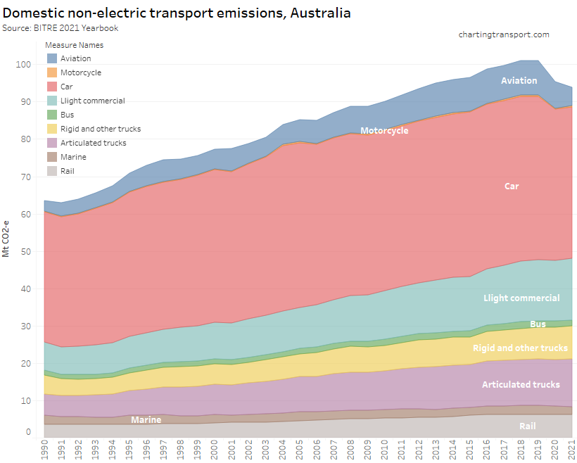
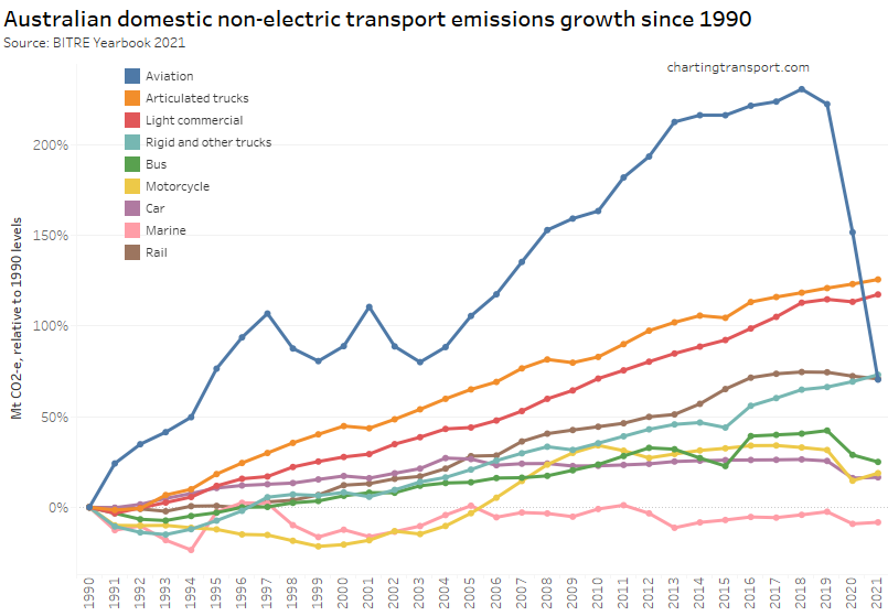
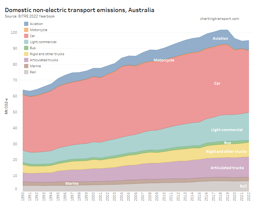
And in more detail since 1990:
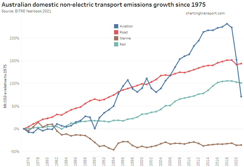
The next chart shows the more recent growth trends by sector:
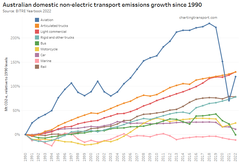
Aviation emissions saw the biggest decline from the pandemic but were bouncing back in 2021-22. Car and bus emissions have declined in line with pandemic lockdowns whilst most other modes have continued to see growth in emissions.
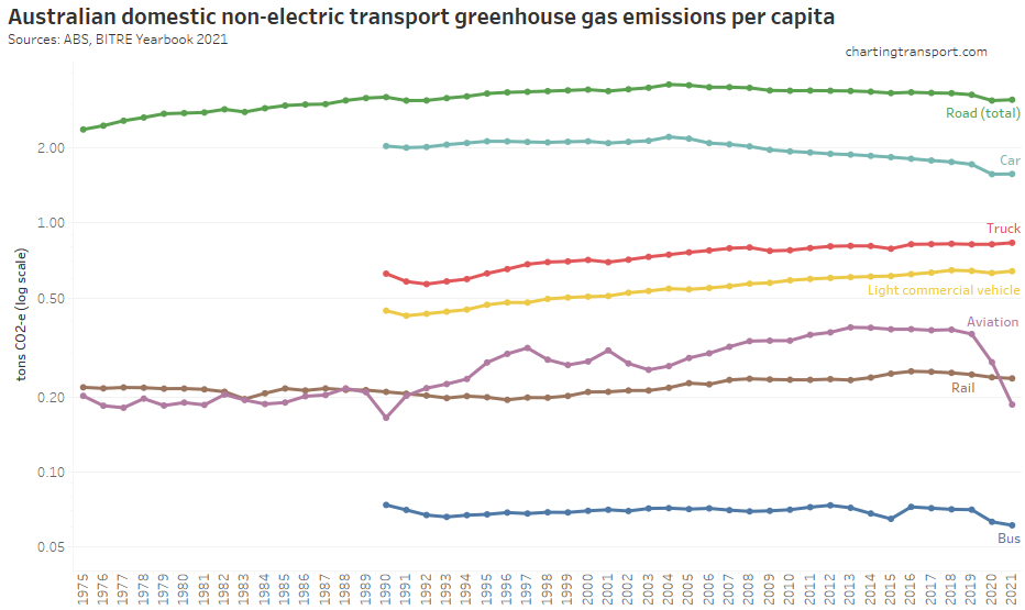
Here are per-capita emissions by transport sector (note: log scale used on Y-axis):
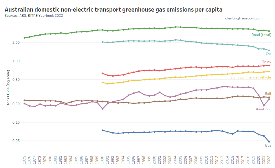
Truck and light commercial vehicle emissions per capita have continued to grow while many other modes have been declining, including a continued reduction in car emissions per capita since around 2004.
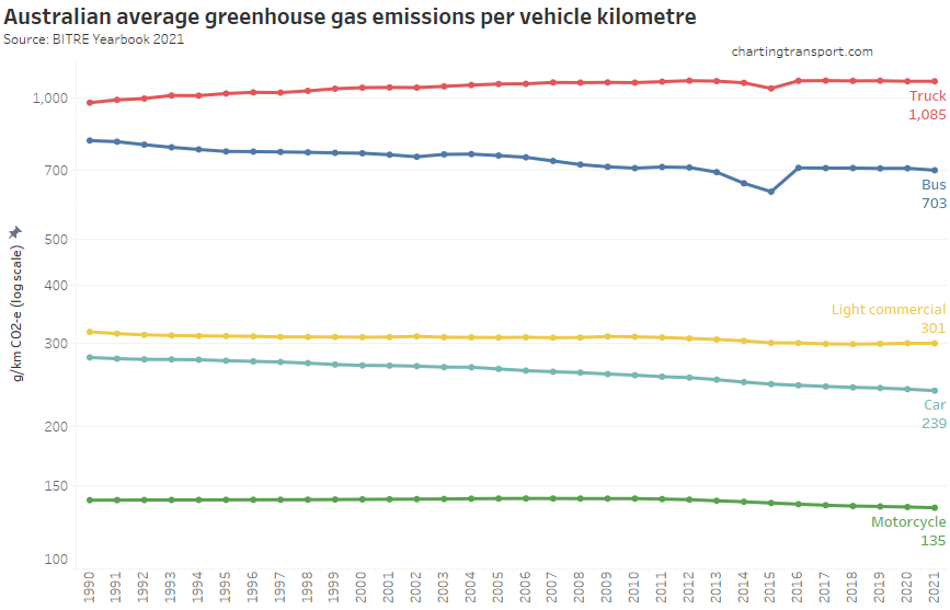
Next up, emissions intensity (per vehicle kilometre):
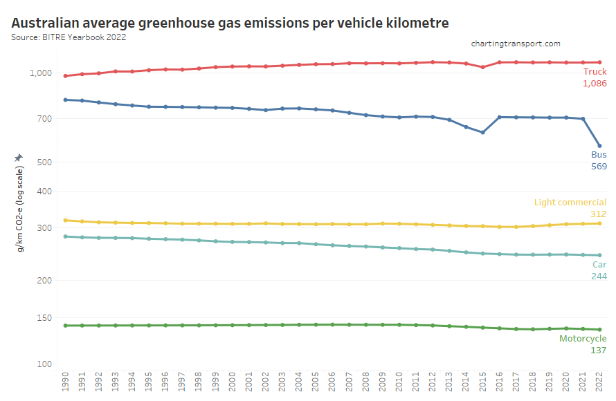
Curiously the figures suggest a sudden drop in bus emissions per km in 2022, but I am not sure this is plausible as electric buses are still only being rolled out in small numbers. There was also an unexpected dip in emissions per km in 2015 which jumped back up in 2016. The 2015 dip in bus emissions per km is primarily a product of a dip in BITRE’s estimated bus emissions and not bus vehicle kilometres travelled, which is a hard to explain (this bus emissions dip is not seen in AGEIS estimates). I suspect this may be an artefact of BITRE methodological issues.
Emissions per passenger-km can also be estimated:
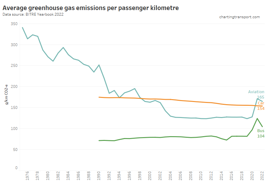
Car emissions have continued a slow decline, but bus and aviation emissions per passenger km increased in 2021, presumably as the pandemic reduced average occupancy of these modes.
Vehicle kilometres travelled
Vehicle and passenger kilometre figures have been significantly impacted by COVID lockdowns in 2020 and 2021, and so the financial year figures are a mix of restricted and unrestricted travel periods. Accordingly we cannot readily infer new trends from this data, and it should be interpreted with caution.
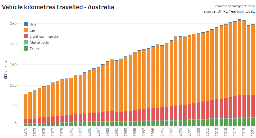
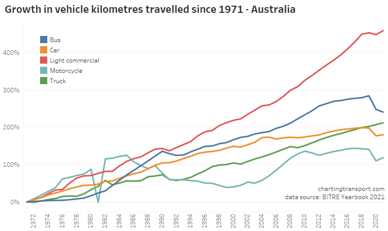
Total vehicle kms for 2021-22 were lower than 2019-20 and 2020-21:
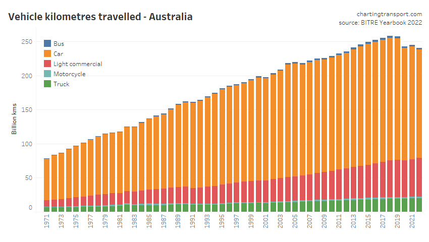
As per emissions, the biggest declines were in cars, motorcycles, and buses:
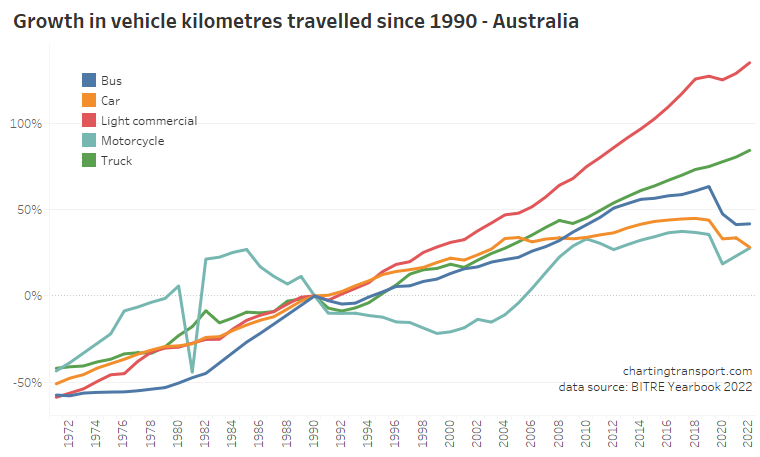
Light commercial vehicles and trucks have shown the biggest increase since 1990.
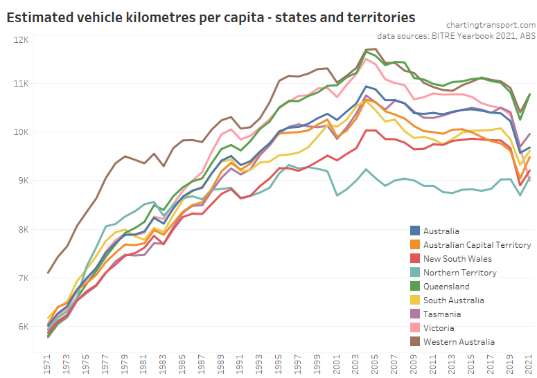
Here’s the view on a per-capita basis:
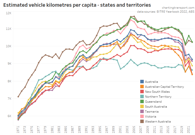
Vehicle kilometres per capita peaked around 2004-05 and were starting to flatline in some states before the pandemic hit with obvious impacts.
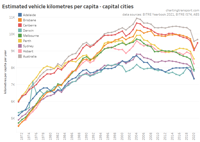
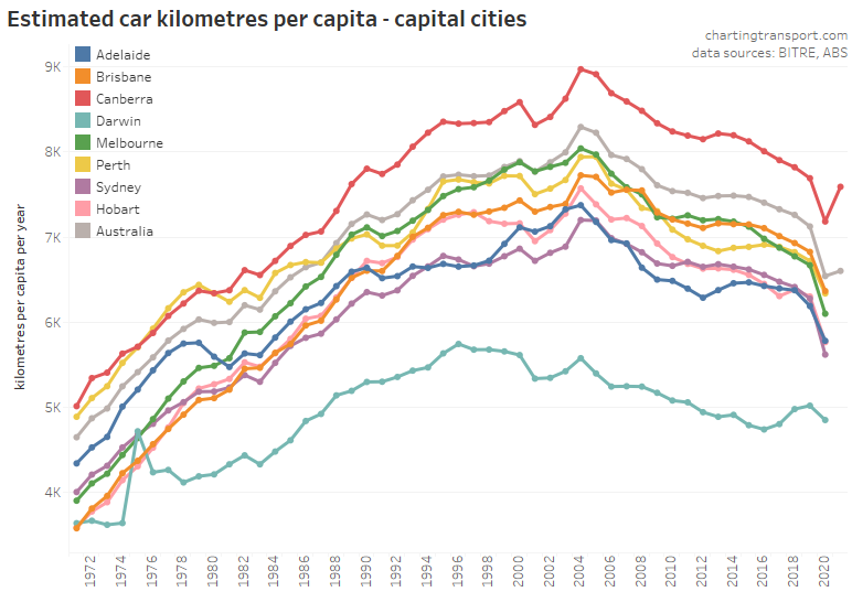
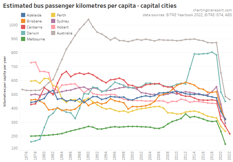
Here is the same data for capital cities (capital city population data comes out only once a year with some delay, so most city data points are only up to financial year 2020-21).
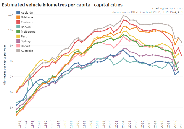
Canberra has dramatically reduced vehicle kilometres per capita since around 2014 leaving Brisbane as the top city.
Once again BITRE have kindly supplied me data on estimated car vehicle kilometres for capital cities that is not included in the yearbook:
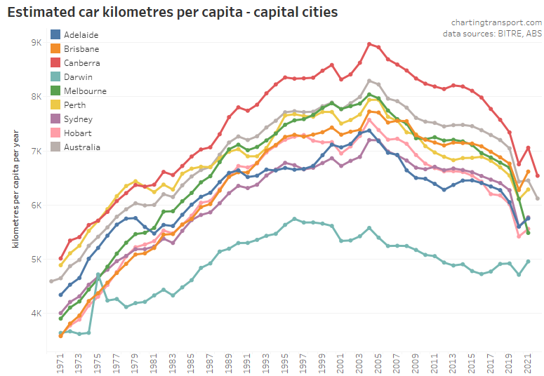
Canberra is still on top for car kilometres per person but this rate has been reducing strongly over recently years.
Passenger kilometres travelled
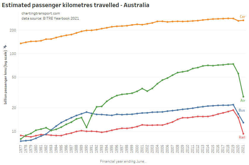
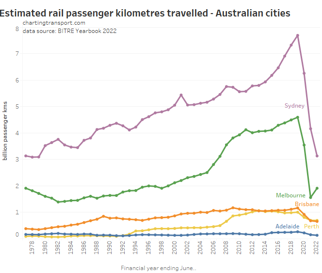
Here are passenger kilometres travelled overall (log scale):
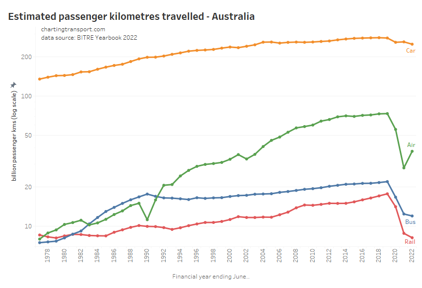
The pandemic had the biggest impact on rail, bus, and aviation passenger kilometres.
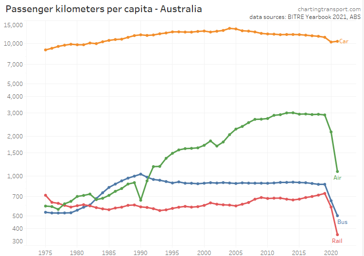
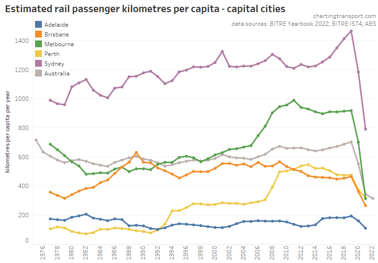
Here is the same on a per-capita basis which shows very similar patterns (also a log scale):
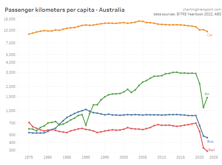
Curiously aviation passenger kilometres per capita peaked in 2014, well before the pandemic. Rail passenger kilometres per capita in 2019 were at the highest level since 1975 before the pandemic hit. Only air travel has rebounded on a financial year basis.
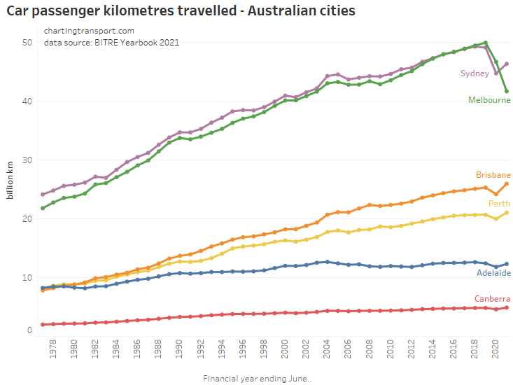
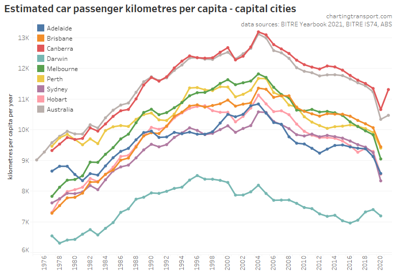
Here’s total car passenger kilometres for capital cities:
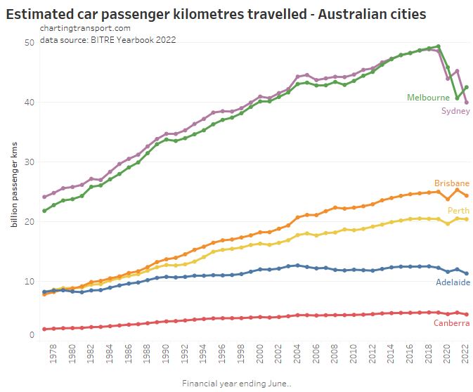
Melbourne, Sydney, and Canberra were impacted by extensive lockdowns in 2021-22, while the other cities were mostly lockdown free. However the then-unprecedented large wave of COVID cases in the summer of 2021-22 may have led to voluntarily suppressed travel behaviour across many cities.
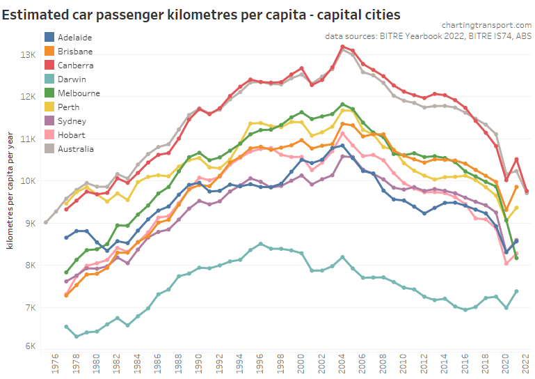
Here’s car passenger kilometres per capita (again only to 2020-21 for most cities):
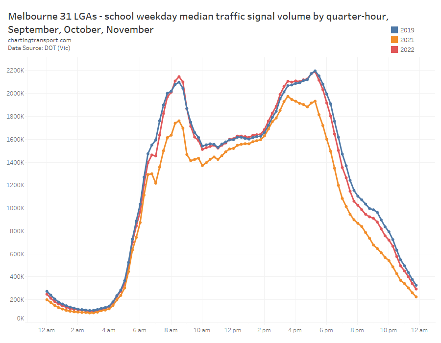
It’s hard to estimate any post-COVID trends based on this annual data. However, I have been processing VicRoads traffic signal count data which gives some indication about more recent traffic volumes in Melbourne. The following chart shows the change from 2019 median signalised intersection traffic count volumes per week. I’ve deliberately locked the scale as -20% to +10% as I want to focus on the difference between 2019 and 2022 traffic, and so the 2020 and 2021 lines go off the scale during lockdowns.
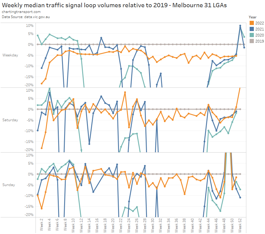
It’s very interesting that volumes in late 2022 were about 5% lower than 2019 levels on weekdays (a bit higher on weekends although there’s no such thing as a normal weekend).
And if you look at the time of day profile for Melbourne (below), the biggest reductions have been in the early AM peak, and evenings, while there have been increases during the AM and PM school peaks (which might be a response to COVID infection fear and/or because parents working from home can more easily drive their children to and from school):
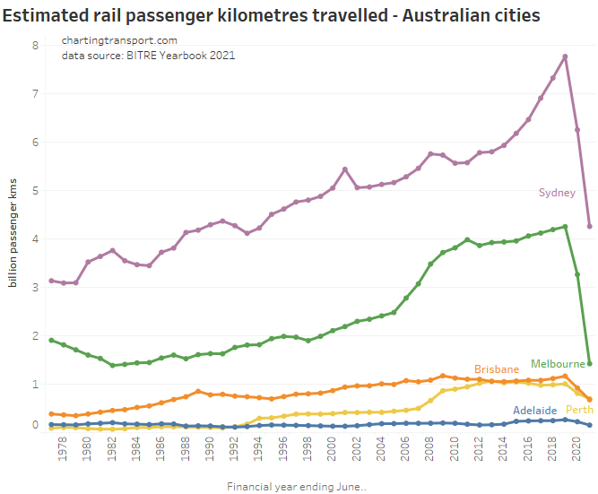
Rail Passenger travel
The pandemic has put a large dent in rail passenger kilometres travelled, and these are likely to remain below 2019 for some time as new working-from-home behaviours stick following the pandemic:
Melbourne saw a slight increase in 2021-22, but this was probably more a product of the how long the city was in lockdown during financial years 2020-21 and 2021-22. Sydney saw a reduction in 2021-22 probably because there was little in the way of lockdowns in 2020-21.
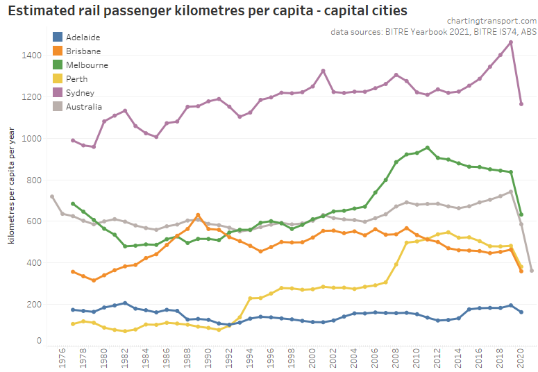
Here’s rail passenger kms per capita (again, only up to 2020-21):
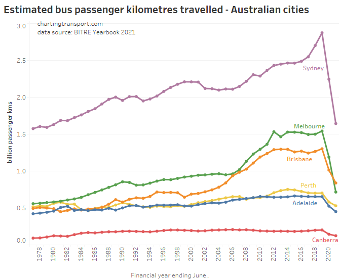
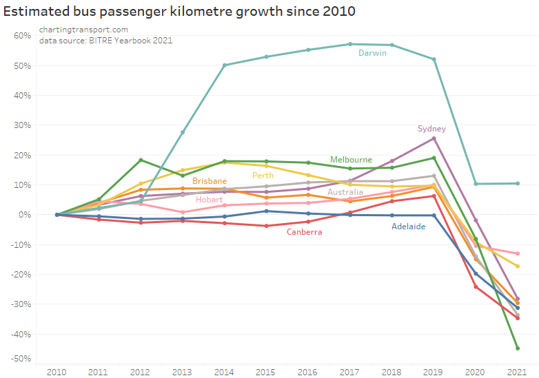
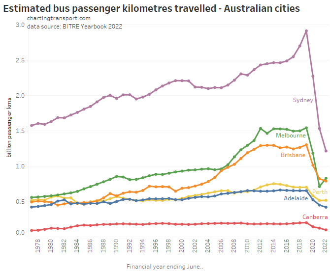
Bus passenger kilometres have reduced significantly with the pandemic:
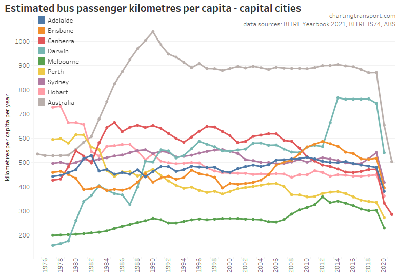
Including on a per-capita basis:
I would expect to see these figure bounce back up as there are unlikely to be any lockdowns during 2022-23.
It would appear that the surge in Darwin bus use due to a major LNG project may have ended.
Mode split
It’s possible to calculate “mass transit” mode share using the passenger kilometres estimates from BITRE (note: it’s not possible to readily differentiate public and private bus travel):
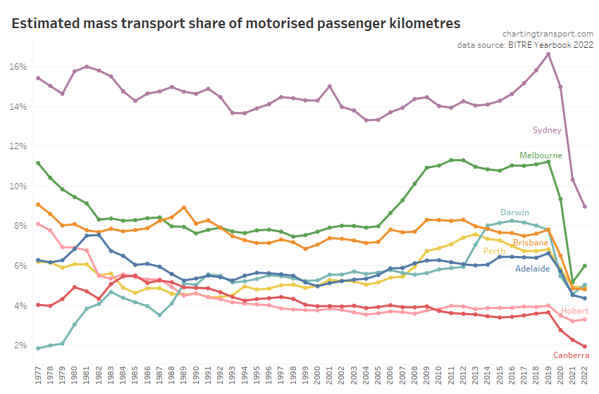
Mass transit mode shares have taken a large dive during the pandemic, and I expect this to be strongly associated with COVID lockdowns where many people – especially central city workers – worked from home. It’s still difficult to know to what extent this is people switching travel modes for ongoing trips, to and what extent it is public transport trips being replaced by staying home. I hope to have more to offer on this subject in an upcoming blog post.
Transport for New South Wales conducts a rolling household travel survey, although it was suspended during COVID lockdowns in 2020 and 2021. Estimated total person trips and kilometres by mode are reported, and from this we can get an idea around mode split (including non-motorised modes):
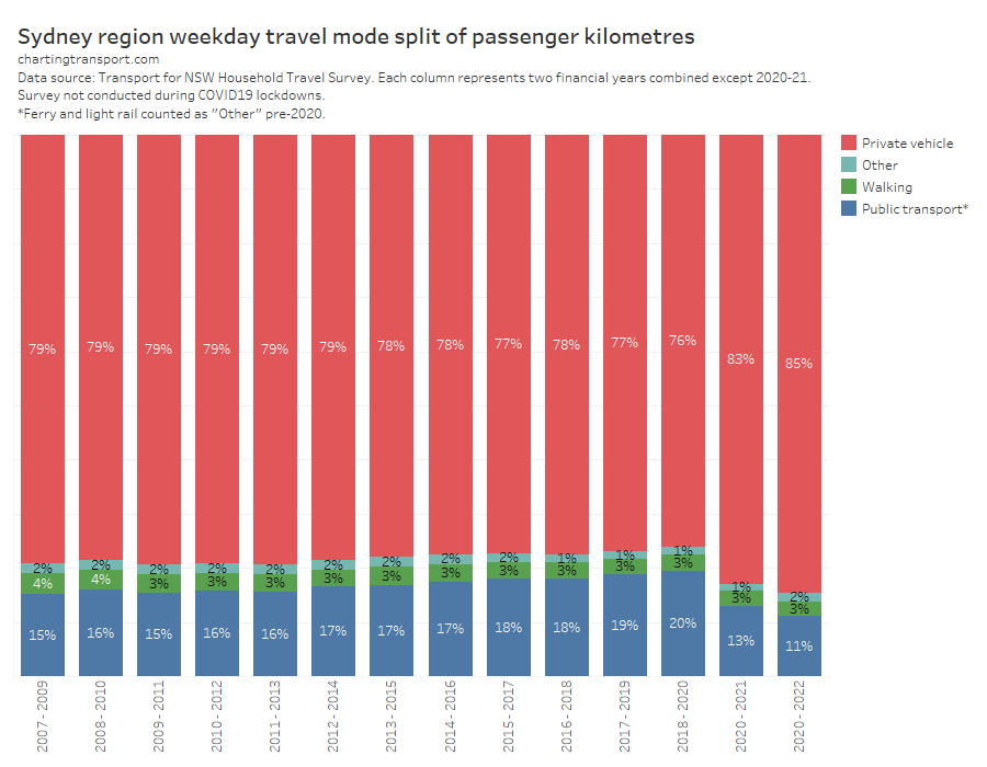
On this data, the public transport mode share of person kilometres travelled is much higher than that derived from the BITRE data, with a peaking of around 20% before the pandemic.
Unlike Victoria, New South Wales unfortunately does not provide any detailed household travel survey data, which means it is not possible to perfectly calculate public transport mode share (ferry and light rail were bundled with “Other” pre 2020), and it’s also not possible to calculate mode share by trip purpose. All this and more is possible with Victorian published data, but unfortunately post-COVID data will not be published until late 2024.
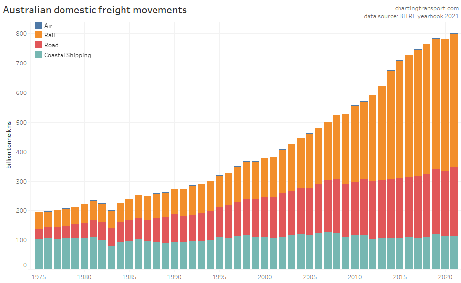
Freight
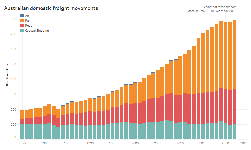
This data shows a dramatic inflection point in freight volume growth in 2019, with a lack of growth in rail volumes and a decline in coastal shipping. Much of this volume is bulk commodities, and so the trends will likely be explained by changes in commodity markets, which I won’t try to unpack.
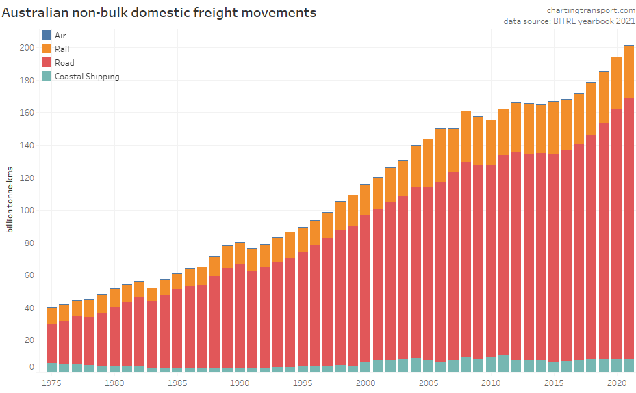
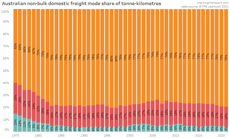
Non-bulk freight volumes are around a quarter of total freight volume, and are arguably more contestable between modes:
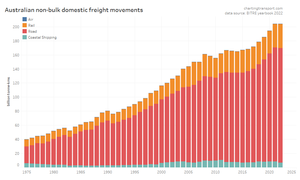
2022 saw a sudden flatlining in non-bulk freight volumes, with road increased market share to 80%, seemingly mostly at the expense of coastal shipping:
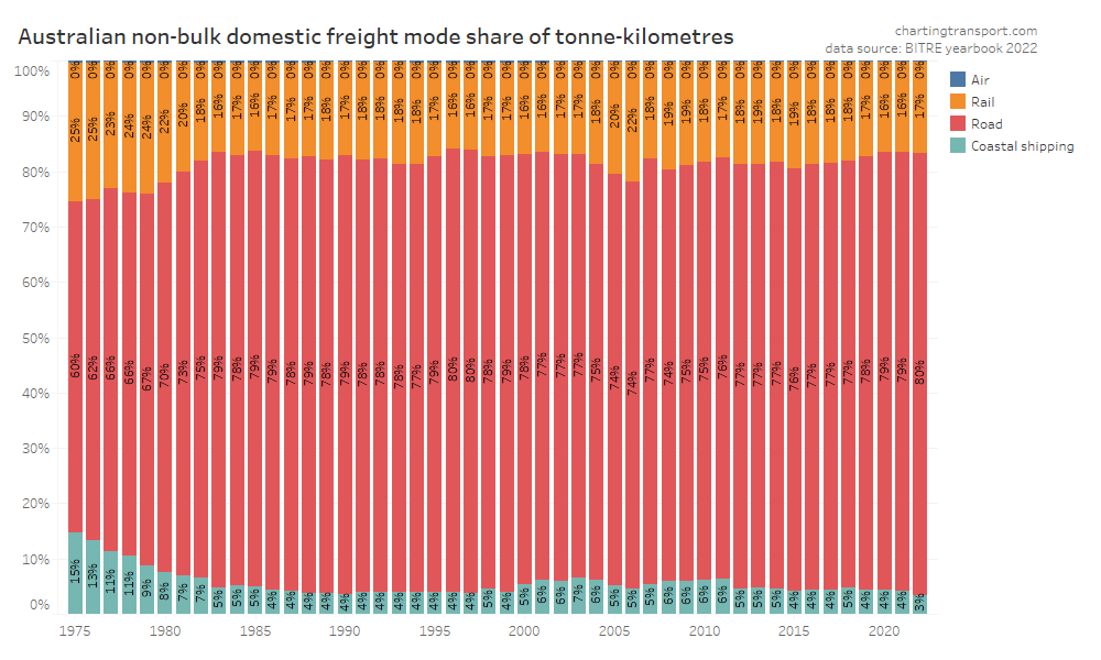
Air freight tonnages are tiny in the whole scheme of things so you cannot easily see them on the charts.
Transport Costs
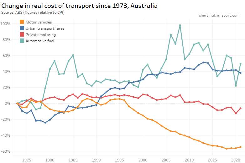
The final category for this post is the real cost of transport from a individual perspective. Here are headline real costs (relative to CPI) for Australia, using Q2 ABS Consumer Price Index data up to June 2022:
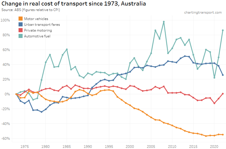
Technical note: Private motoring is a combination of factors, including motor vehicle retail prices and automotive fuel. Urban transport fares include public transport as well as taxi/ride-share (which possibly move quite independently, which is a little frustrating).
The cost of private motoring mostly declined in real terms from around 2008 to 2020, followed by sharp increases in 2021 and 2022 in line with the rapidly rising cost of automotive fuel. The real cost of motor vehicles has plummeted since 1996, although it bottomed out in 2018.
Urban transport fares (a category which unfortunately blends public transport and taxis/rideshare) have increased faster than CPI since the late 1970s, although they were flat in real terms between 2015 and 2020, then dropped in 2021 and 2022 in real terms – possibly as they had not yet been adjusted to reflect the recent surge in inflation.
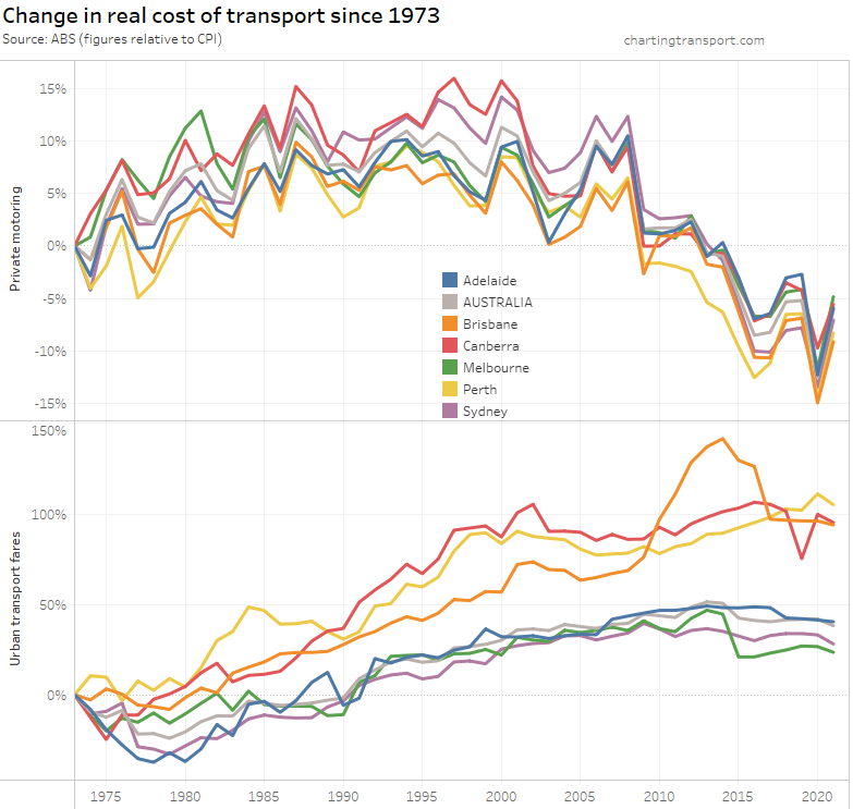
The above chart shows a weighted average of capital cities, which washes out patterns in individual cities. Here’s a breakdown of the change in real cost of private motoring and urban transport fares since 1973 by city (note different Y-axis scales):

Technical note: I suspect there is some issue with the urban transport fares figure for Canberra in June 2019. The index values for March, June, and September 2019 were 116.3, 102.0, and 118.4 respectively.
Urban transport fares have grown the most in Brisbane, Perth, and Canberra – relative to 1973. However all cities have shown a drop in the real cost of urban transport fares in June 2022 – as discussed above.
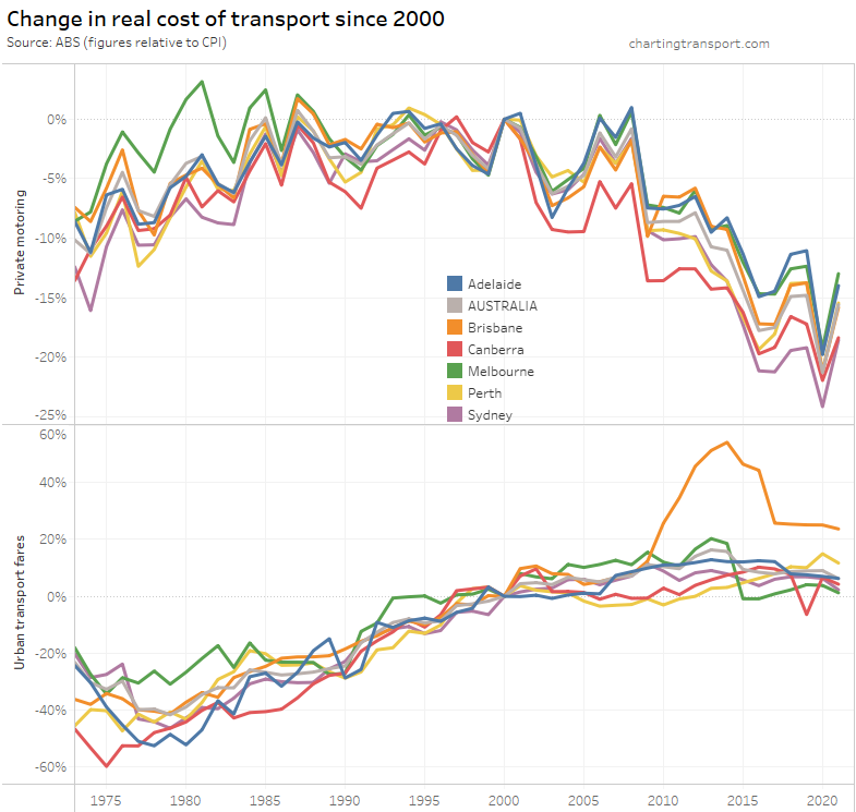
If you choose a different base year you get a different chart:
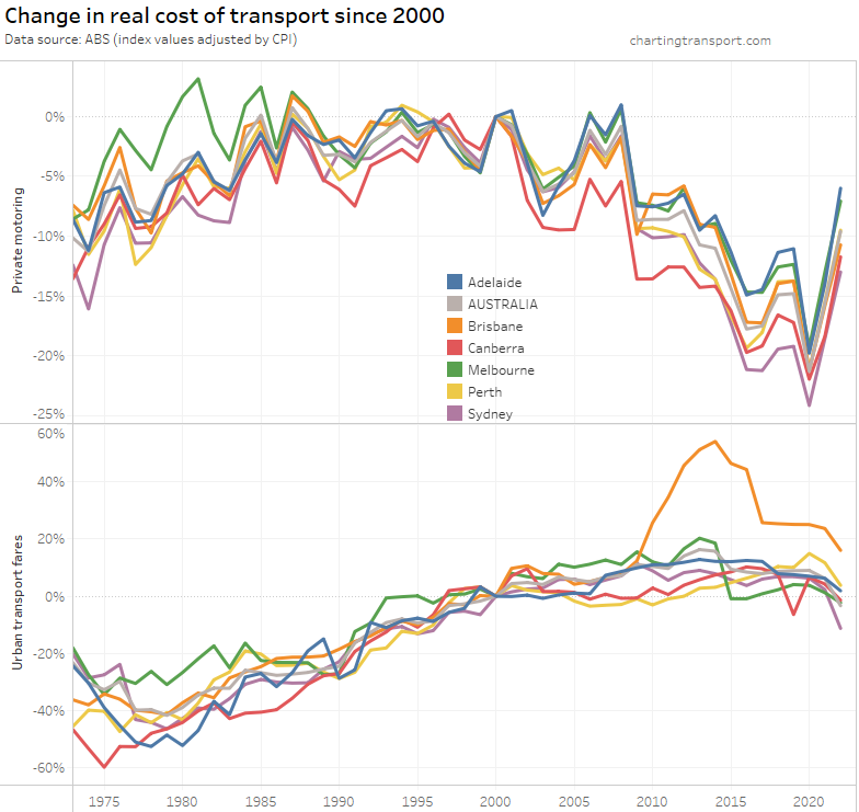
What’s most relevant is the relative change between years – eg. you can see Brisbane’s experiment with high urban transport fare growth between 2009 and 2017 in both charts.
Melbourne recorded a sharp drop in urban transport fares in 2015, which coincided with the capping of zone 1+2 fares at zone 1 prices.
What does all this mean for post-pandemic transport trends?
I also tackled this question a year ago and my thoughts haven’t changed significantly.
One thing that has become clearer is that the increase in motor vehicle licence ownership and car ownership is very likely related to the lack of recent international immigrants during the pandemic. Therefore the reopening of international borders is likely to push these rates down once more across 2022 and 2023, although they may or may not return to pre-pandemic levels. In turn, this will probably increase public transport patronage and mode share, although it is still likely to remain subdued following the wide scale acceptance and adoption of working from home, particularly for central city workers.
A key question for me is the extent to which commuter trips have shifted from public to private transport, as opposed to simply disappearing as many more people work from home. I’ll have more to say on this soon in an upcoming post about 2021 census journey to work data.


 Posted by chrisloader