[Updated 29 June 2018 with further analysis of parking levies and their impact]
Between 2011 and 2016, journey to work public transport mode shares went up significantly in Melbourne and Sydney but dropped significantly in Perth and Brisbane. Private transport mode shifts did the opposite. Can this be explained by the changing distribution of jobs within cities, or other factors such as changes in transport costs?
In a recent post focused on Brisbane I found that stronger growth in suburban jobs relative to central city jobs could explain around half of the city’s mode shift towards private transport, with other factors (mostly the changes in relative attractiveness of modes) explaining the rest.
So how is job distribution changing in other Australian cities? How much of the mode shifts can be attributed to changing job distribution and how much could be attributed to other factors like changes in transport costs, or increasing employment density?
(for details about how I define public, private and active transport, see the appendix in this post)
How is job distribution changing in Australian cities?
Here’s a view of the changing distribution of all jobs within each city by workplaces distance from the city centre.

(Unfortunately I only have 2006 data for Sydney and Melbourne)
The changes are relatively subtle, but if look at how the bands shift between years, you’ll see increasing centralisation in Sydney but a decentralisation in all other cities between 2011 and 2016.
The strongest decentralisation was in Brisbane and Perth, which also showed the biggest increases in private transport mode share.
However Melbourne saw both a slight decentralisation of jobs and a mode shift away from private transport between 2011 and 2016.
So we need to dig deeper to find out what’s going on here.
How does private mode share vary by distance from the city centre?
The following chart shows private transport mode shares by distance from the city centre for the last two or three censuses for each city. The darkest line for each city is for 2016, with lighter lines being previous years (I only have 2006 data for Melbourne and Sydney).
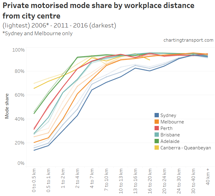
There’s a clear pattern in all cities that private mode shares are lower in areas closer to the city centre, with Sydney the lowest, followed by Melbourne, Brisbane, Perth, Adelaide, and Canberra (which is also the order of their population size).
Notably Sydney private mode share averaged lower than 90% out as far as 24km from the city centre, whereas Adelaide sees 90% mode shares as close as 2km from the city centre.
If you look carefully you can see that Brisbane increased private transport mode shares in the central city between 2011 and 2016, while private mode shares dropped or were stable in all other cities at most distances.
You can also see that the central city mode shifts away from private transport were largest in Melbourne, something I’ll come back to.
Here’s the same again but for public transport:

Sydney and Melbourne saw mode shifts to public transport at most distances from the city centre, unlike all other cities.
What mode shift can we attribute to changing job distributions?
A city’s mode share (measured by place of work) will be fundamentally impacted by two types of changes between censuses:
- Changes in the volume of jobs in each SA2 – because different SA2s generally have different mode shares due to factors like proximity to the city centre and public transport access. If there is stronger jobs growth in areas that already had lower private mode shares, you would get a mode shift away from private transport, all other things being equal.
- Changes in the mode share in each SA2 – because different modes became more or less attractive for commuters between census years. This might be due to changes in public transport service quality, transport infrastructure provision, and relative changes in the cost of public transport, private motoring, and commuter parking. It could also be influenced by broader demographic changes.
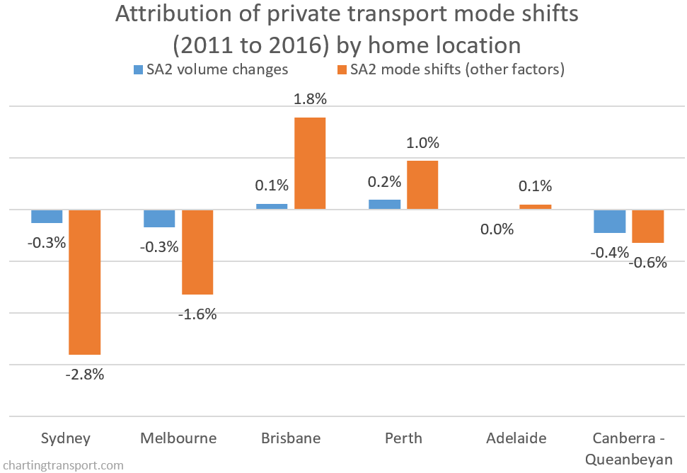
For each city I have calculated what the city-level private transport mode share would have been in 2016, had mode shares in each workplace SA2 remained exactly the same as 2011, but the job volumes in each SA2s had still changed. The city level mode shift due to SA2 volume changes is then the difference between this hypothetical 2016 mode share and the 2011 mode share. The remainder of the city-level mode shift between 2011 and 2016 results can then be attributed to mode shifts at the SA2 level.
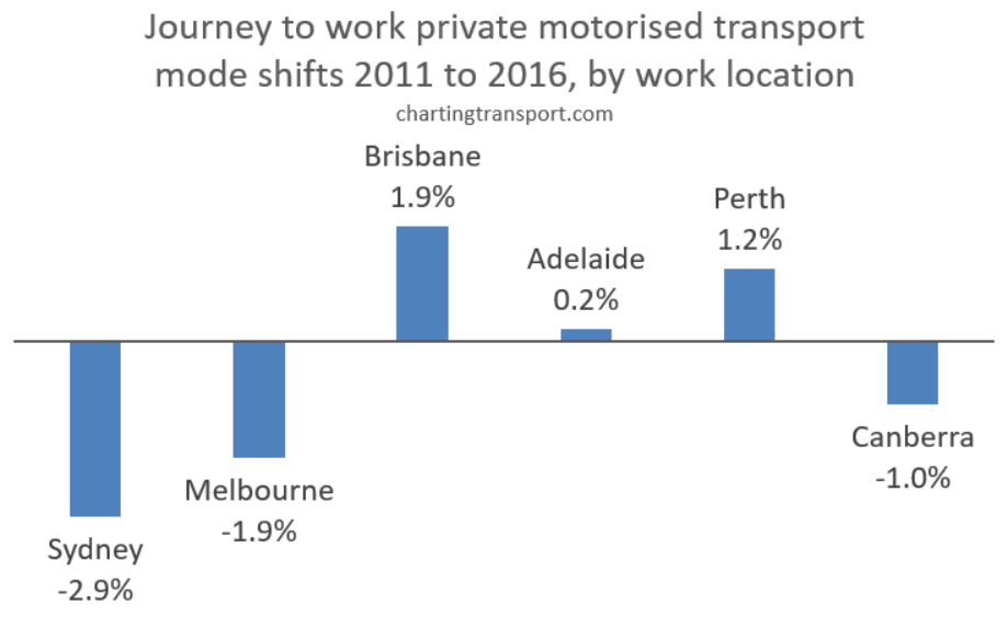
Here’s a chart showing the mode shift impact of both volume changes at the SA2 level, and mode shifts at the SA2 level:
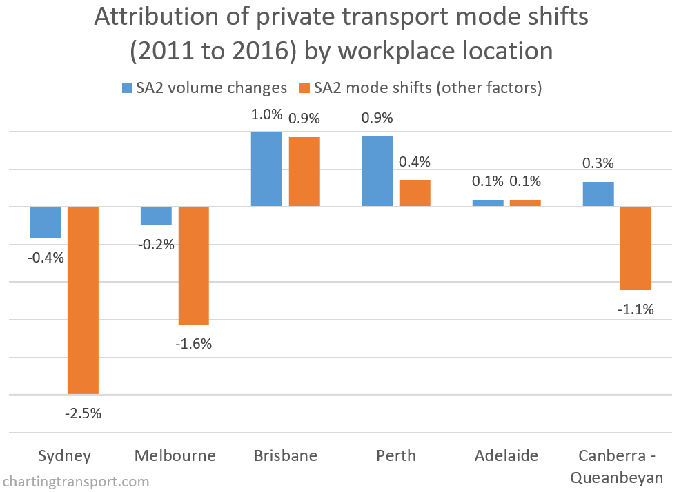
As we noted above, Sydney saw a slight trend to centralisation of jobs between 2011 and 2016, and it had the largest volume change attributed reduction in private mode share (-0.4%). However other factors were responsible for a further 2.5% of the mode shift away from private transport.
The story is similar in Melbourne but to a smaller magnitude in both aspects. Both of these cities also saw increasing inner city job density – which matters – and I’ll back come to that in a moment.
In Brisbane you can see that the total mode shift towards private transport was roughly equally attributable to SA2 volume changes and SA2 mode shifts (as I discussed in my earlier post).
Perth had an overall 1.3% mode shift to private transport, and the majority of this was due to significant jobs growth in the suburbs compared to the CBD (in fact, the SA2 with the largest jobs growth was Murdoch in the southern suburbs). But there were also other factors that led to a mode shift to private transport.
In Canberra – Queanbeyan, volume changes by themselves would have seen a mode shift to private transport, but other factors were larger and led to an overall mode shift away from private transport (although it is actually complicated because the 2011 census day was in a federal parliamentary sitting week, while 2016 was not).
Nothing much changed in Adelaide.
Next I’m going to explore what could be behind the mode shifts at SA2 level, in terms of job density and real transport costs.
Can increases in workplace density impact mode shares?
As discussed in my Brisbane analysis, if the relative attractiveness of modes hadn’t changed, you might still expect a mode shift to public transport in high density employment areas with increasing jobs numbers because you would expect the cost of parking provision to increase with increasing land use density (i.e. more competition for space).
Indeed, in Sydney and Melbourne a number of inner city SA2s became significantly more job dense between 2011 and 2016, and also saw mode shifts away from private transport:
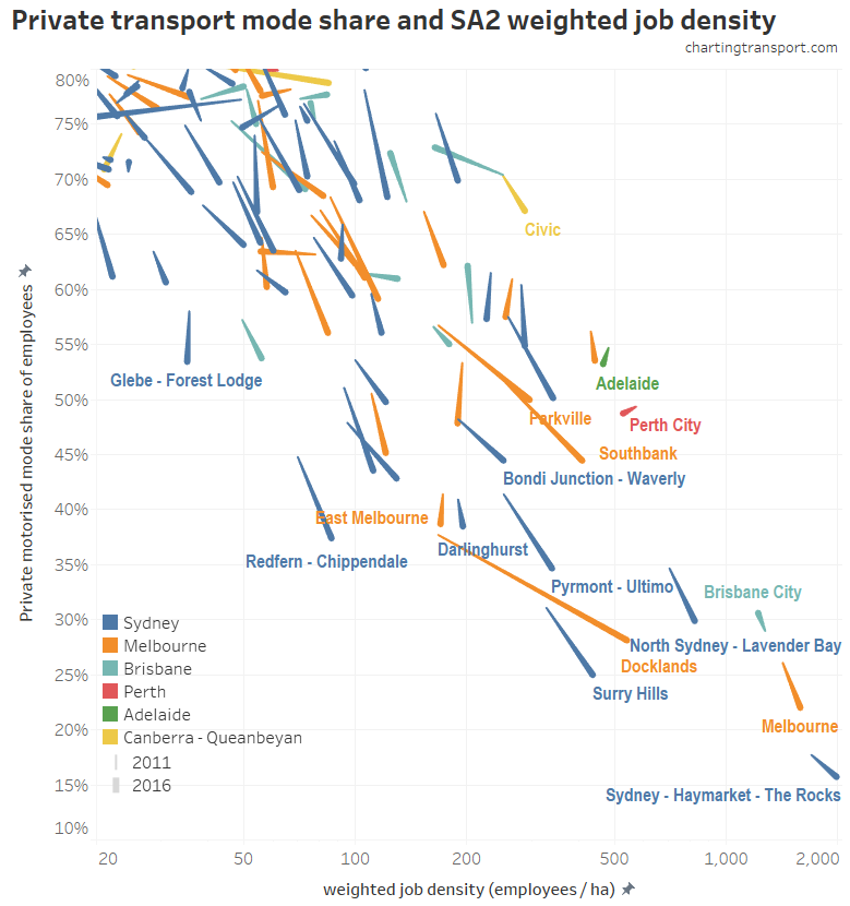
(inspect this data in Tableau)
A similar thing happened in Civic (the main centre of Canberra).
But Adelaide and Perth saw both declining job density and declining private transport mode share, which suggests something else is at play.
Job density didn’t really go down in Brisbane – see my Brisbane post for an explanation (basically, ABS redrew the SA2 boundary along the Brisbane River).
Could changes in the real cost of transport be causing mode shifts?
The following chart shows the real change in urban transport fares in Australian cities since 2000, as measured by the ABS as part of the Consumer Price Index series (which unfortunately includes public transport, taxis, and “ride share” but is for a representative sample of journeys so hopefully mostly dominated by public transport fares):
![]()
The lines are somewhat saw-toothed because public transport fares generally only rise once a year, and become better value in real terms over the course of the following 12 months.
Many cities have seen above-CPI public transport fare increases at various times, most notably Brisbane in 2010-2014. Melbourne has had above CPI fare increases, but also reduced zone 1+2 fares in 2015 which lead to a reduction on the ABS measure (the fare reduction only really applied to people travelling across zones 1 and 2 – which roughly summarised means travel between the outer and inner suburbs). Brisbane fares peaked in 2014, which was followed by a freeze and then a large reduction in 2017.
By contrast, here is the (negative) growth in the cost of “private motoring” (which includes vehicles, fuel and maintenance):
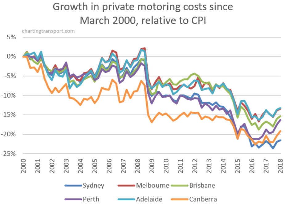
Private motoring costs have declined in real terms since 2000, although they increased a little during the second half of 2017.
The next chart shows the change in ratio between the two costs. Urban transport fares have become less competitive than private motoring over time in all cities:
![]()
But if we are looking at changes between census figures, we should probably also look at cost changes between the times of each census. Here’s how prices changed in real terms between the September quarters of 2011 and 2016 (which cover the August census dates):
![]()
The real cost of private motoring dropped in all cities, but so did the real “average” cost of urban transport fares in Sydney and Melbourne (the Melbourne drop being mostly around large fare reductions for travel across zones 1 and 2).
The biggest differences in cost changes were in Brisbane and Perth (around 18%), which I think will go a fair way to explaining why these cities had the biggest shifts to private transport attributable to SA2 mode shifts.
Brisbane saw a rapid increase in public transport fares between 2011 and 2014 which is likely to have changed many commuting habits, but those habits may or may not have changed back when fares were subsequently reduced (e.g. if someone bought a car due to fare increases, they may not have subsequently sold their car when fares reduced). Perth certainly had less mode shift at the SA2 level compared to Brisbane, which might support this hypothesis.
What about changes in car parking costs?
The ABS CPI’s private motoring cost index does not include car parking costs – which would be difficult as they vary considerably with geography.
However we do know about central city car parking levies that governments charge in a bid to reduce road congestion and fund inner city transport initiatives. Sydney, Melbourne, and Perth apply levies to central city non-residential car parking spaces, and ultimately these levies will need to be recovered through parking prices.
I’ve calculated these levies in 2017 dollars (adjusting for inflation as measured in June quarters), and here’s how they have changed since 2000:

Melbourne increased its central city parking levy by 40% per space in 2014 (category 1), and created a new lower-priced levy area in some neighbouring areas to the north and south in 2015 (category 2, see map). This is likely to have contributed to the larger mode shifts away from private transport in the central city area of Melbourne compared to most other cities (particularly considering there were similar changes in average private motoring and urban transport fares in Melbourne between 2011 and 2016).
Sydney’s category 1 fee applies in the Sydney CBD area, Milsons Points and North Sydney. It was $2390 in 2017, and has only risen with indexation since 2009 (when it was doubled). A lower category 2 levy applies in the business districts centres of Bondi Junction, Chatswood, Parramatta, and St Leonards.
Perth has an annual licence fee per bay which ranged from $1039 to $1169 in 2017. The Perth fee was increased by around 167% in 2010, and there were also above-inflation increases from 2014. The fee increased 63% in real terms between 2011 and 2016 for “long stay” spaces, and 69% for “tenant” spaces.
I am not aware of any such fees or levies in place in Brisbane or Adelaide (a proposal for Adelaide was voted down).
So how are CBD parking prices changing?
Unfortunately good data is a little hard to find, but this Colliers Car Parking White Paper provides “average daily rates” for CBDs for 2009-2015, and early bird rates for 2015. I expect most commuters would pay early bird rates – which average between 28% and 62% of daily rates depending on the city (quite some variation!). I’ve adjusted the pre-2015 figures for inflation to be in 2015 dollars:

In real terms, “average daily” parking costs have declined in Melbourne, rocketed up in Brisbane and Canberra, and moved less in Sydney and Perth. I don’t know whether these reflect trends in early bird prices. And we don’t know how prices changed between 2015 and the census year of 2016.
So how much are parking levies contributing to parking prices?
I have to make some assumptions (guesstimates) here. Regular weekdays represent about 60% of the days of the year. If we assume say 80% of the levy is recovered from weekday commuter parking (there generally being less demand for parking on weekends), we can calculate the average weekday commuter cost of the levy to be 27% of the Sydney early bird price, 25% of the Melbourne early bird price, and 15% of the Perth early bird price. Certainly not insignificant.
Here’s a summary of the levy and “average daily” price changes and mode shifts in the central city parking levy areas:
| Changes 2011 to 2016 | |||||
| Parking levy area or CBD SA2 | Levy real increase | Average daily real price change (2011 to 2015) | Private mode shift | New private trips | Private share of new trips |
| Perth | 63% | -5% | -0.8% | -60 | -3% |
| Melbourne – category 1 | 40% | -11% | -5.3% | 3200 | 5% |
| Melbourne – category 2 | (new) | n/a | -6.4% | 5315 | 30% |
| Sydney CBD | 0% | +1% | -2.6% | 6204 | 9% |
| Brisbane City SA2 | n/a | +64% | +1.7% | 3135 | 68% |
| Adelaide SA2 | n/a | -11% | -1.5% | 2567 | 35% |
| Canberra Civic SA2 | n/a | +71% | -3.2% | 746 | 30% |
Firstly, “average daily” parking prices don’t seem to be following the changes in parking levies in Perth and Melbourne (category 1 area). Other factors influencing parking prices will include supply (influenced by competition for real estate and planning rules) and demand (influenced by employment density) with the market ultimately determining prices.
Car park operators appear to be absorbing the increased cost of the levy (although we don’t know the trends in early bird prices so we cannot be entirely sure). But that’s not to say that the levy hasn’t had any impact on prices – for example, the price reductions might have been larger if the levies had not increased.
Secondly, price changes do not appear to be correlated with mode shifts as you might expect (except Canberra). Brisbane prices increased dramatically, but so did private mode share! Price reductions in Perth, Adelaide, and Melbourne did not result in increased private transport shares.
Maybe other factors are driving mode shift away from private transport in those cities. Maybe early bird prices are trending differently to “average daily” prices. Maybe increased traffic congestion persuaded people to shift modes. Maybe there were significant price changes between 2015 and 2016. Maybe most existing public transport users were not aware of reductions in parking prices.
I don’t know what happened to parking prices in the new category 2 areas of Melbourne but there was a large mode shift away from private transport (-6.4%), and they may well be linked. Indeed, Infrastructure Victoria has recently recommended the category 2 area be expanded to include the inner-eastern suburbs of Richmond, South Yarra, Windsor and Prahran. And the Grattan Institute has recommended increasing the levy to match Sydney’s rates.
Curiously, when I look at City of Melbourne Census of Land Use and Employment (CLUE) data, the category 1 area (approximated with CLUE areas) had an increase of only around 367 non-residential parking bays between 2011-12 and 2015-16 (a four year period), a lot less than the additional 3200 private trips, which might suggest increased average occupancy.
Also, it is likely that a significant portion of people who drive to city centres are not paying for their parking costs (eg employer provided car parking). Employers may simply be absorbing price increases.
For more interesting discussion and research about car parking in the City of Melbourne, see a recent discussion paper and background report prepared by Dr Elizabeth Taylor.
Did changes in population distribution impact mode shares?
While this post has been focused on changes by workplace location, it is possible to separate the overall mode shifts into the two components by home location. Here are the results:
In Sydney, Melbourne, and Canberra, stronger population growth in areas that already had low private mode shares in 2011 made a small contribution to overall mode shifts away from private transport. These cities have all seen densifying population in inner city areas better served by public transport.
The distribution of population growth in Perth and Brisbane had a small effect in the opposite direction.
And again, nothing much changed in Adelaide.
What about active transport?
Cycling-only mode share was pretty stable in most cities (except Canberra up 0.2%). Walking-only mode share declined in Sydney (-0.2%), Brisbane (-0.3%), Adelaide (-0.4%), Perth (-0.3%) but was steady in Melbourne and increased in Canberra (+0.2%). So Canberra has the biggest shift to active transport.
Can you summarise all that?
If your head is spinning with all that information, here’s a summary of what some of the major factors could be in each city between 2011 and 2016. I say “could be” because I’ve not looked at every possible factor influencing mode share.
Sydney: the 2.9% mode shift away from private transport was probably mostly to do with increasing job density in employment centres (more on that in my next post), but was also partly by a shift to more centralised jobs, and increasing population density in places well served by public transport.
Melbourne: The 1.8% mode shift away from private transport probably had a fair bit to do with increasing central city job density, the significant spatial expansion of the central city parking levy area and rates (although we don’t know if early bird prices also rose), a reduction in some public transport fares, and strong population growth in areas well served by public transport.
Brisbane: The 1.9% mode shift towards private transport appears roughly half about the decentralisation of jobs, and half the reduced attractiveness of public transport – particularly following significant fare rises between 2010 and 2014, and possibly/arguably declines in service quality.
Perth: The 1.2% mode shift towards private transport was probably mostly due to a decentralisation of jobs, and partly due to public transport becoming less cost competitive with private transport (despite an increase in the central city parking levy). Urban sprawl is probably also a factor.
Adelaide: The 0.2% mode shift to private transport is probably mostly due to public transport becoming less cost competitive with private transport. Changes in job and population distribution, and employment density do not appear to have had a significant impact.
Canberra: The 1.0% mode shift away from private transport was probably the result of competing forces of higher jobs growth in car-dominated workplace areas with increasing job density in dense employment centres, increasing central city parking prices, higher population growth in areas better served by public transport (and possibly cycling facilities), and also the fact census 2016 was not a parliamentary sitting week while 2011 was (so really, it’s hard to be too sure!).
You might want to add your own views about changes in the service quality of public transport and cycling infrastructure in each city. I also haven’t looked at the impact of major new public transport infrastructure and service initiatives (such as the opening of new train stations), which we know does impact mode shares at a local level (maybe that’s for a future post).
I hope you found this interesting. My next post will look at suburban employment centres, and their role in changing mode shares in cities.


As usual, this is a really good analysis, Chris. If one was to expand it further, including the detailed motor vehicle census data might add some colour as well.
LikeLiked by 1 person
I have been looking at the change in jobs by LGA across Melbourne by industry. The five years to 2016 saw large increase in jobs the middle suburbs where there had not been as much growth before. Especially Brimbank in the West and Yarra, Boroondara andWhitehorse in the East. The 2006 -2011 period seems to have been a (fortunate) aberration when the relatively little total growth across Melbourne was largely centred on the City of Melbourne, which is well served by PT.
Decomposing the jobs growth in 2011-2016 by industry Health and Community Services have driven a lot of the growth and to a lesser degree Education. These are areas where the public sector has a large impact on jobs location. In Melbourne, it seems the Governments pushing of the Major Activity Centres is beginning take effect, while this is partly driven by the (so called) 20 Minute city concept, it ignores the fact that there is always a large disparity between the location of jobs and the residences of the job holders. A fact not helped by the high price of changing residence.
Paradoxically the success of Govt policy in influencing job locations may be adversely affecting the capacity for PT to service jobs areas effectively. Your analysis at the SA2 level is clearly finer than mine, but I would be happy to link my industry based thoughts with your work. If anything it seems to be saying there is greater role for buses, if we could get the right routes going regularly.
LikeLike