10 August 2021 was an Australian census like no other. Sydney and Melbourne were under fairly strict “lockdown” restrictions due to the COVID19 pandemic, Brisbane was two days out of a lockdown, while Adelaide, Perth, and Canberra had temporarily eliminated COVID and were living a life of few restrictions.
So how did the way people go to work change? There’s lots to unpack on this question and I’ll do that over a few blog posts.
This post will focus on how many people worked from home in 2021, how many of these people were working remotely, how this compared across locked-down and COVID-free cities, which occupations were more likely to work from home in different cities, and what this might mean for future public transport patronage. I’ll also have a quick look at what proportion of employees were not working on census day.
What was happening on Census day 2021?
Melbourne and Sydney were in “lockdown” with workers required to work from home if possible, Brisbane was just out of lockdown, while the other cities were pretty much COVID-free, although Adelaide had experienced a short lockdown in July 2021. Here’s a summary of some key metrics (CBD office occupancy sourced from the Property Council):
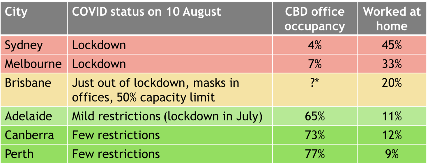
*The Property Council reported a figure of 60% for August 2021, but this would have been illegal on 10 August as there was a 50% capacity limit. We don’t know the exact dates when the survey was conducted, I can only assume later in that month when restrictions were eased. 47% of Brisbane CBD employees reported working at home on census day.
How have mode shares changed between censuses?
Given working at home now represents a much more significant share of all workers, I’ve calculated public transport mode shares both including and excluding people who travelled to a workplace:
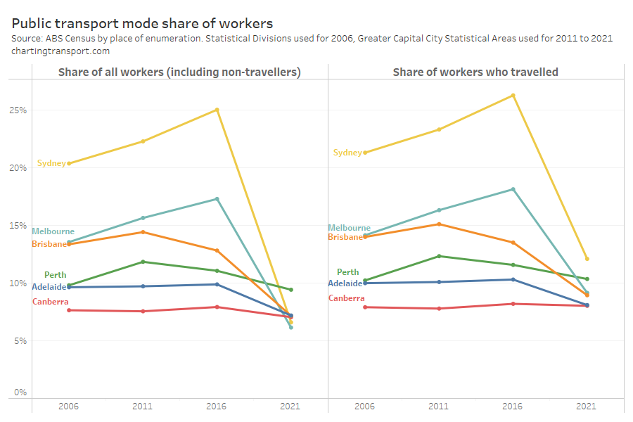
It will be no surprise that public transport mode shares dropped dramatically in most cities. The biggest mode share drops were in the locked down cities of Melbourne and Sydney, but there were large falls also in Brisbane and Adelaide (which was also impacted by closure of the Gawler train line during 2021). Relatively COVID-free Canberra and Perth saw more modest reductions in line with the trend from 2011 to 2016, and for Canberra there was little change in the public transport mode share of people who did travel to work.
Here’s a look at the total mode split (including people who worked at home as a “mode”):
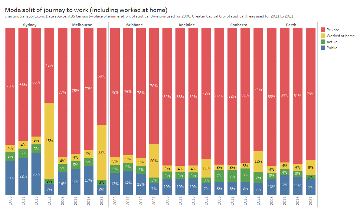
The largest rates of working at home in 2021 were unsurprisingly in the most COVID-impacted cities at the time.
The biggest mode shift in 2021 was from public transport to working-at-home, but there were also mode shifts away from active transport and private transport, even in the COVID-free cities.
How many people were working remotely?
All of Australia had experienced COVID lockdowns in March 2020, and for that period a significant portion of the workforce suddenly transitioned to working at home. What was a fringe activity in 2016 suddenly became the new normal for many employees and employers. This was most acutely noticed in the central business districts of our cities where office workers went almost entirely remote.
As discussed in my previous post on this topic, historically most people who worked at home on census day reported their work SA2 as the same as their home SA2, and I am assuming the vast majority of these people have their home as their regular workplace.
To better understand working at home, I’ve extracted worked at home counts from the 2011, 2016 and 2021 censuses, and then split the “worked at home” workers by whether or not their workplace SA2 was the same as their home SA2.
This allows an estimation of the number and share of people who worked remotely and those who regularly worked at home. I say estimation because the ABS aims to protect privacy by “randomly” adjusting small numbers in downloadable data and never reports values of 1 or 2. When I add up the number of people remote working within Greater Melbourne in 2021, 22% of that total comes from counts of 3 people between specific home SA2 – work SA2 pairs (Sydney was 21%, Brisbane 24%, Perth 29%). The true count for many of these pairs will not be exactly 3 people, so summing lots of small volumes that are “randomly adjusted” may result in a biased accumulation of small number errors. For 2011 and 2016 the summation of remote workers includes an even larger share of 3s so I’m not going to give the summation value here, but I’m confident the true summation is still tiny (much less than 1%).
These imperfect estimates of “home in work SA2” share and “remote working” shares don’t perfectly add up to the known total working at home share for the city (eg Sydney the sum was 2% over the actual for 2021 but other cities were pretty close). For want of a better method, I’ve scaled these estimated volumes such that their sum equals the known total worked at home volume, and I’m not going to quote any decimal places.
Here are my estimated shares of workers who classify as “remote working” and “home in workplace SA2” by census year:
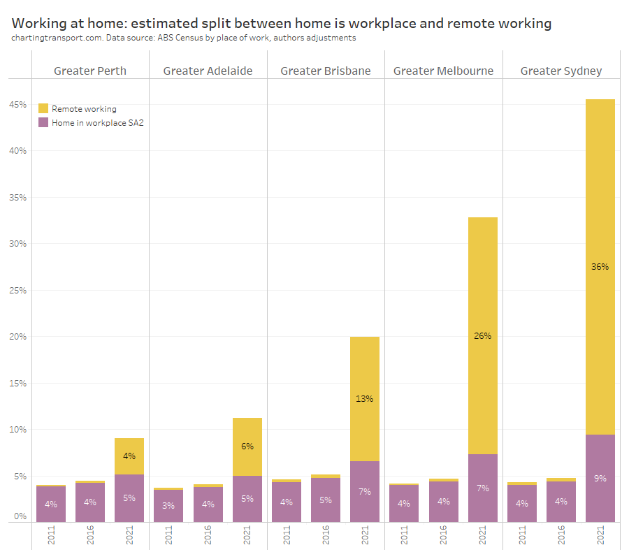
The pre-COVID regularly working at home rates were mostly around 4-5%, but this was estimated to have increased significantly in Sydney, Melbourne, and Brisbane in 2021. I suspect this is a mix of people who gave up their regular workplace and permanently shifted to working at home and some people who filled in the census inaccurately and indicated that their workplace at the time was their home, even though that might have been a temporary arrangement during COVID restrictions.
The COVID-free cities experienced remote working rates of only 4-6%, whereas the heavily restricted cities of Sydney and Melbourne had remote working rates of 36% and 26% respectively.
Where was remote working most common?
What follows are maps showing estimated rates of remote working for workplace SA2s across the five big cities. There’s definitely an issue of aggregating many small numbers that are ‘randomly adjusted’, so I’m not going to report exact numbers, but rather classify SA2s into bands.
Here are the remote working hotspots for Sydney:
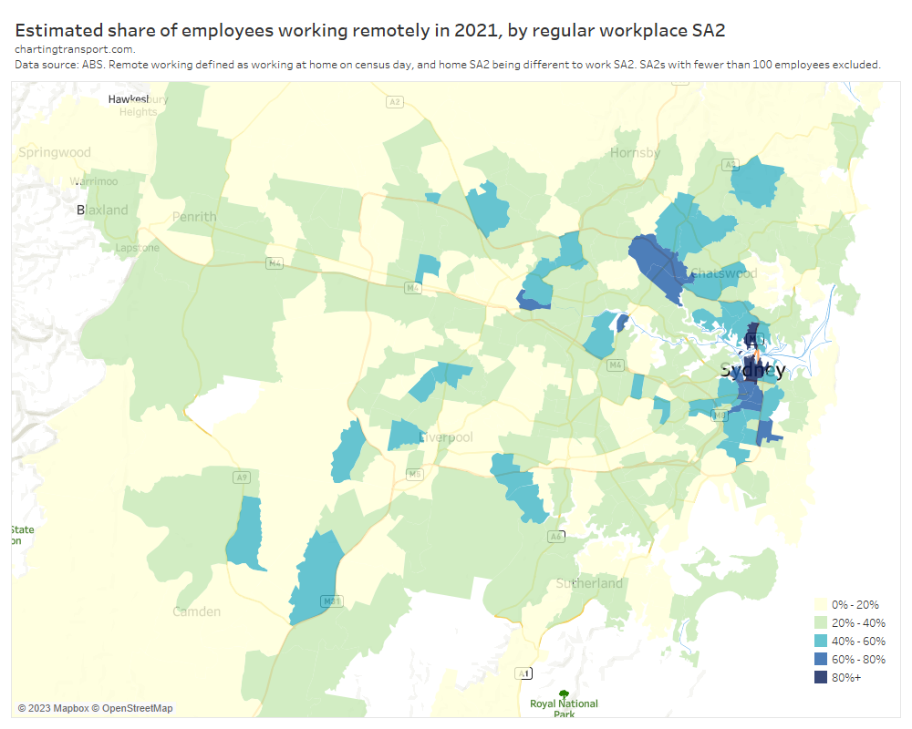
The highest rates of remote working were seen for workplaces in the dense employment areas of central Sydney, North Sydney, Macquarie Park / Ryde, Parramatta, Rhodes, and Kensington (which is dominated by a university campus). All white collar hotspots.
Here’s Melbourne:
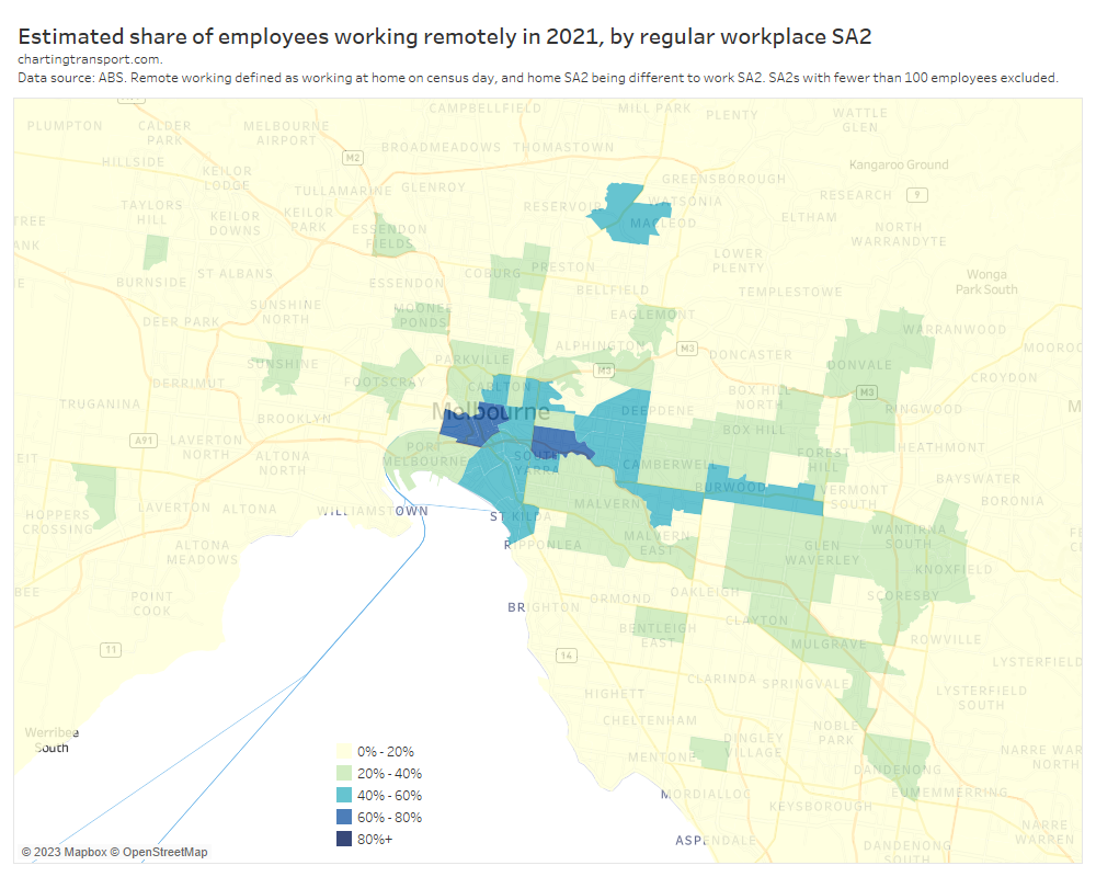
Melbourne had a lot fewer remote working hotspots, in line with it having a lot fewer suburban employment clusters (see: Suburban employment clusters and the journey to work in Australian cities). Apart from the central city and inner suburbs, remote working hotpots included SA2s with large university campuses such as Kingsbury, Burwood, and Hawthorn.
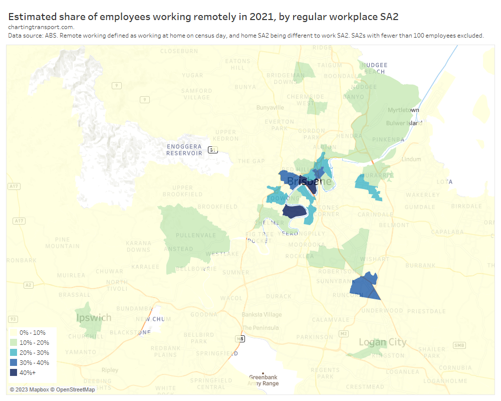
Remote working was less prevalent in Brisbane so I’ve used a different colour scale:
And for the COVID-free cities I’ve used an even smaller colour scale and focussed on SA2s that had rates above 5%.
Adelaide:
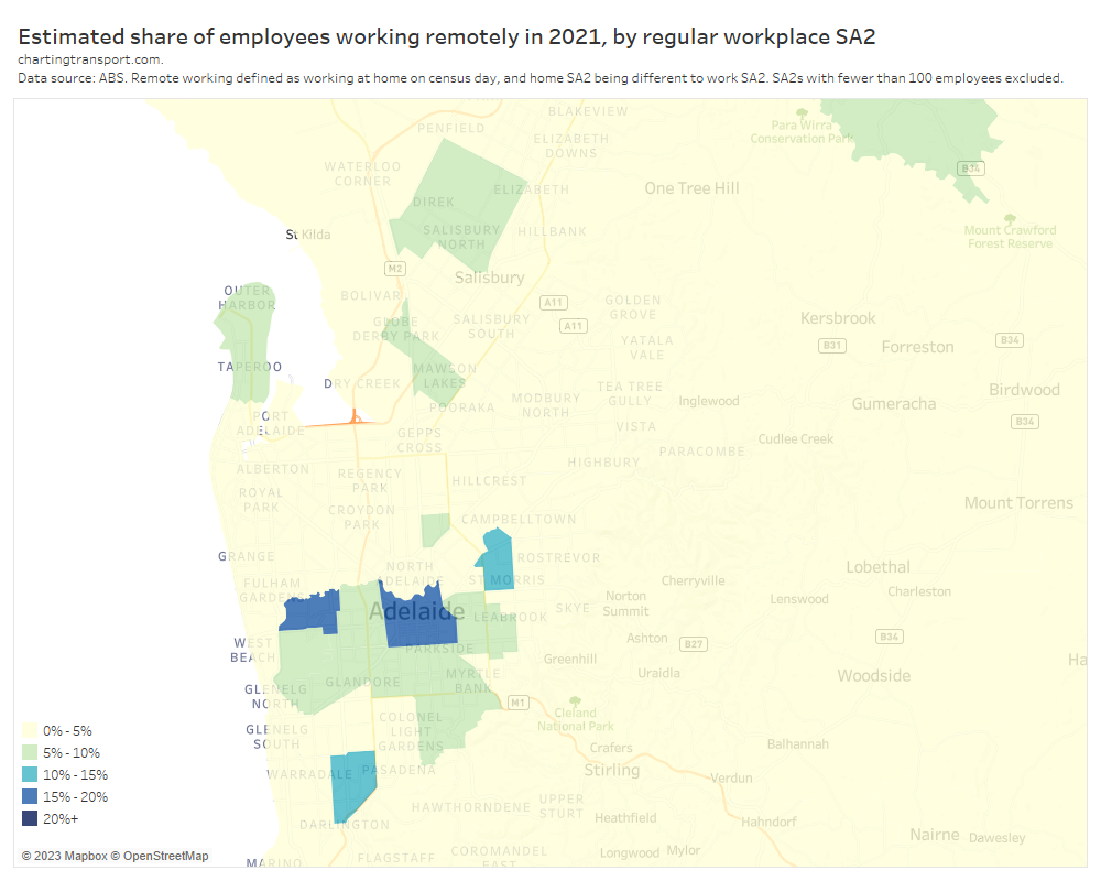
I’m not sure why there was a relatively high rate of remote working in Lockleys in the inner-west. Does anyone have any thoughts on this?
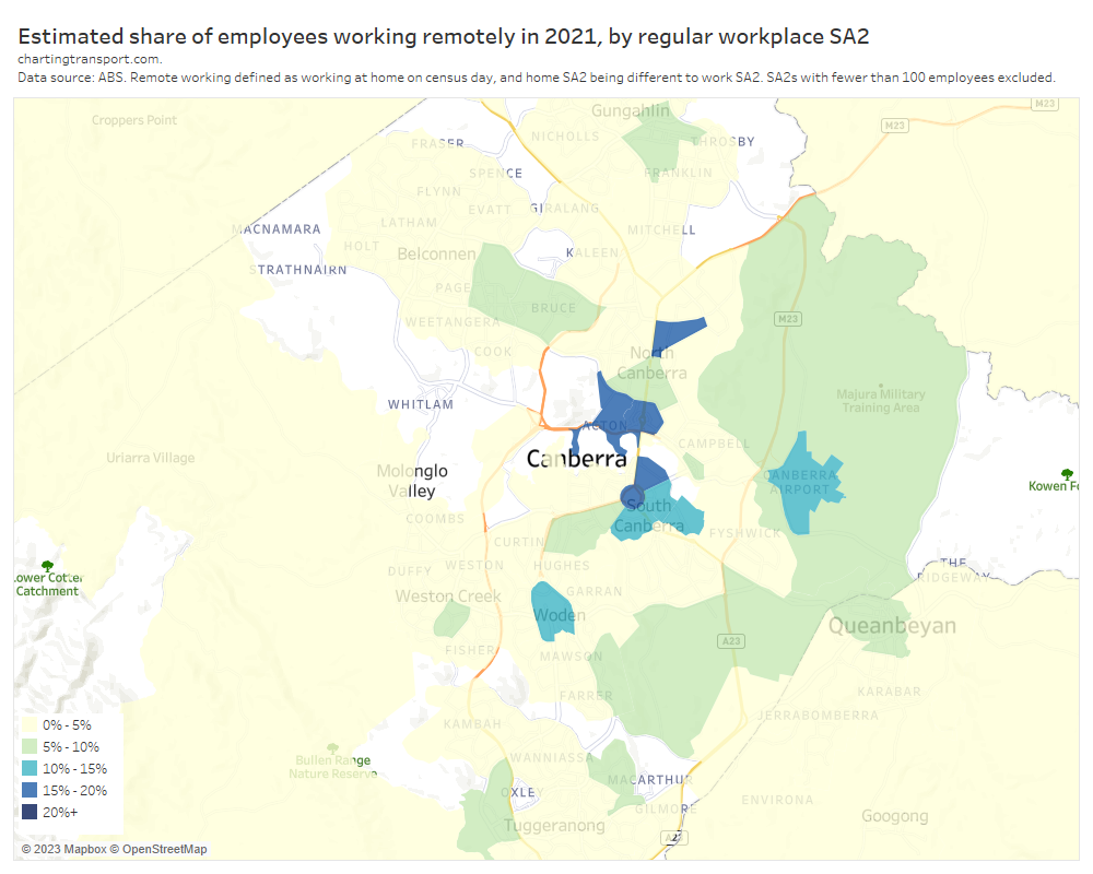
Canberra:
Perth:
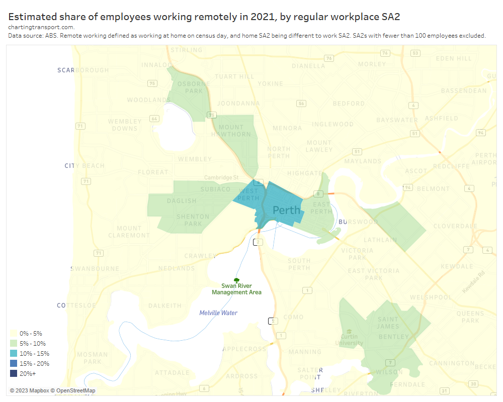
Remote working was unsurprisingly more common in CBDs, some inner-city SA2s that contain concentrations of white collar employment, and some suburban SA2s that contain universities.
Central business districts are obvious areas to see high levels of remote working. My next post in this series will focus in more detail on changing commuter patterns for CBD workers in Australia’s five biggest cities.
Which occupation types transitioned to working at home?
The following chart shows the rates of working at home by occupation for locked down Sydney and Melbourne in 2021:
As you read down the occupations listed there are no great surprises, with white collar jobs showing much higher rates of working at home. I’ve classified the occupations into four different bands of working at home rates based on conditions in locked-down Sydney and Melbourne. I’ll re-use these groupings for other cities shortly.
Many of these occupations had high public transport mode shares in 2016 (at least for Greater Melbourne), which is consistent with the dramatic drops in public transport volumes and mode share:
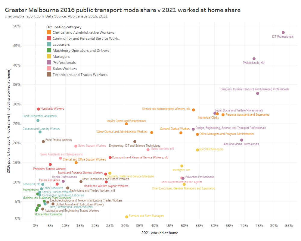
Many of the occupations with high public transport mode share in 2016 had high rates of working at home in 2021 (top right quadrant of the chart).
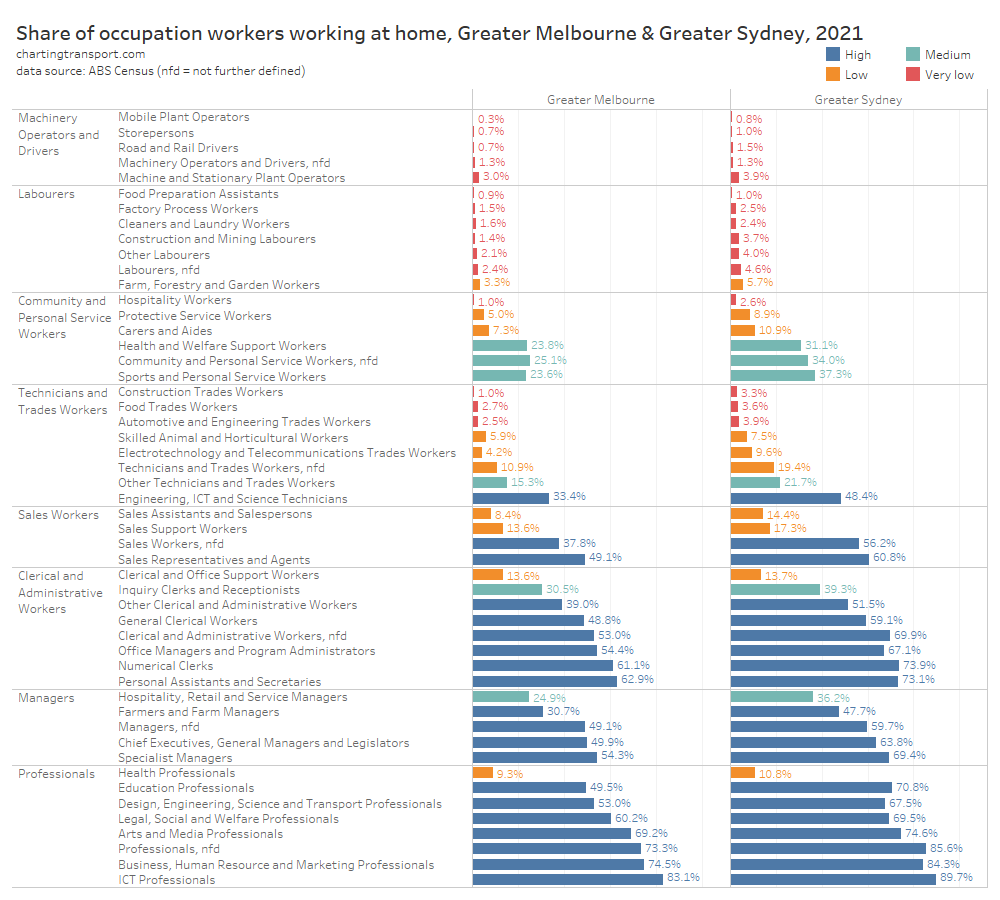
How do locked down cities compare to COVID-free Perth in 2021? The following chart includes Sydney and Perth for comparison purposes:
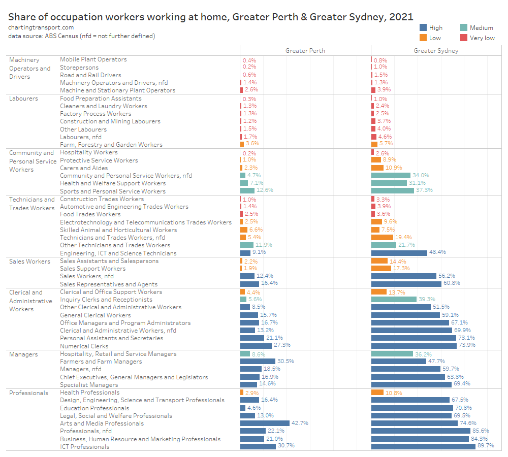
The occupations with relatively higher rates of working at home in Perth 2021 were fairly similar to those in Sydney, just at a much smaller scale (about four times). Occupations with much lower working at home rates in Perth than Sydney include education workers (schools and universities were not running remotely in Perth). Arts and media professionals topped working from home in Perth – but this occupation group also had relatively high rates of working at home in 2016. Other occupations with high levels of working from home in Perth were famers and farm managers (for obvious reasons) and ICT professionals (likely very adaptable to working remotely).
The following chart again compares 2021 working from home mode shares with 2016 public transport mode shares, but this time for Perth:
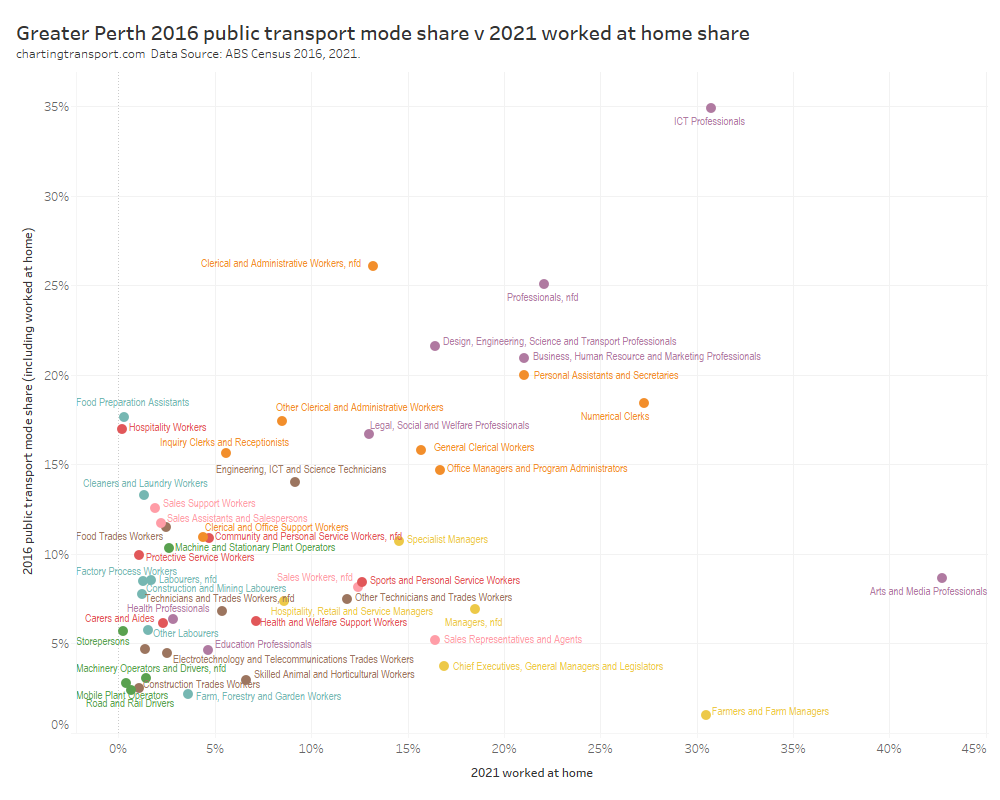
The same white-collar jobs appear in the top-right of the chart, suggesting a significant mode shift from public transport to working at home.
Here’s a look at public transport and worked-at-home mode shifts by occupation across the six big cities:
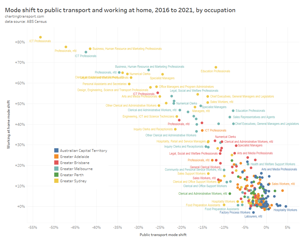
You can clearly see the relationship between public transport and home-working mode shifts, particularly for Sydney, Melbourne, and Brisbane. The relationships is very roughly that the working at home mode shift was around double the public transport mode shift. However the relationship is a little less clear in Adelaide, Perth, and Canberra.
I think this tells us that occupations that had high rates of public transport use in pre-pandemic times are mostly the same occupations that are highly amenable to working remotely. And of course these occupations have concentrations of workers in CBDs (hence the high use of public transport). To the extent that employers facilitate ongoing working from home, there will likely be a reduction in public transport commuter volumes. From a congestion and emissions point of view, that’s undoubtedly a good thing. There are of course also arguments about the agglomeration benefits of workers being physically in the same place.
Are occupations more amenable to working from home on the rise?
Thinking to the future, are these occupations with higher rates of working at home in 2021 on the rise or decline? The following chart attempts to answer this question:
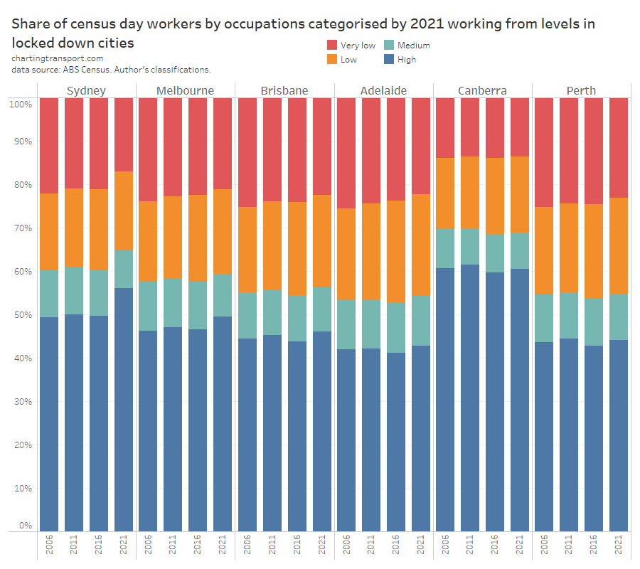
Unfortunately I’m not sure the chart provides a clear answer. Many people were simply unable to work due to lockdowns on census day in Sydney and Melbourne. They aren’t on the chart. This appears to skews the overall share of jobs by category in those cities to the “High” end.
In the COVID-free cities, there doesn’t appear to be a clear trend over time. In 2016 the “High” occupations reduce share in all cities but then bounced back up in 2021.
However one important insight from this chart is that Canberra has the largest share of “High” occupations – followed by the bigger cities of Sydney and Melbourne. These cities are likely to have more specialist white collar professionals, and therefore they may have higher overall rates of ongoing remote working in the post-pandemic world. Public transport patronage will likely take longer to return to pre-pandemic levels these cities.
One final thing…
How many people were not working on census day in 2021?
Not every employed person works on census day, perhaps because they work part-time, casual, shift-work, or were unable to work that day. And of course in August 2021 a lot more people than usual were unable to work in Sydney and Melbourne. Here’s a look at the share of employed people who did not work on census day, by occupation category and census year:
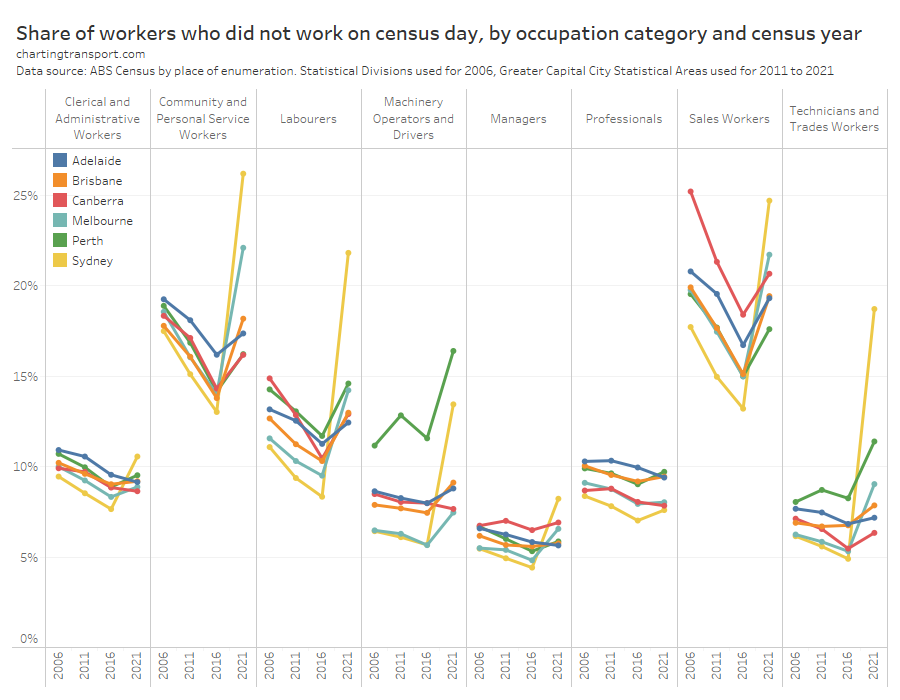
After a downwards trend between 2006 and 2016, most occupation categories in most cities had a big uptick in not working on census day in 2021, most notably in Sydney where there were very strict lockdown rules. Curiously these upticks were present even in COVID-free cities like Adelaide, Perth, and Canberra, possibly reflecting an overall economic downturn, a lack of interstate and international travel, supply chain breakdowns, and/or maybe some other factors.
I hope you’ve found this post interesting. I’ll be unpacking more census data in some upcoming posts, including a more detailed look at CBD workers and a look at changes in demographics – particularly from the impact of suspending immigration during the pandemic. Stay tuned.


Thanks Chris
A nice summary of census 2021. As we know this is rather limited and especially the failure to know the number of days per week people WFH which is the importanmt number. Our 3 year iMOVE project major report on WFH will be on their web soon.
https://imoveaustralia.com/project/working-from-home-revising-metro-strategic-transport-models/
David Hensher
LikeLike
Hi Chris I know Lockleys for call centres. I know Westpac has a big call centre there and think that there are others. Thanks for all your work. Ian
Ian Radbone radboneian@gmail.com 0402 965 929
>
LikeLike