A lot of published transport analysis – including on this blog – has been gender-blind. Yet there are quite significant differences in travel patterns between men and women, and also between parents and non-parents. Advances in equality of opportunity have not eliminated these differences.
This post goes all-in with disaggregating a wide range of available data on transport behaviour on gender and parenting status in Melbourne, and explores some factors likely influencing these behaviours.
I will look at trip rates, trip chaining, time spent travelling, destination distance from home, distance travelled, travel to the central city, time of day, mode splits, use of different modes, trip purposes, and radial-ness of travel. I’ll also look at explanatory variables including main activity, occupation, employment industry, access to independent private mobility, and geographic distribution of home and work locations. Yeah that’s a lot, but don’t worry, there is a summary towards the end.
There’s also an interesting aside about dwelling bedroom counts around train stations.
This post is mostly focussed on working aged people (approximated by the age range 20-64), as children and seniors are likely to have different travel patterns again. And for the purposes of this analysis, I’m classifying people as “parents” or “parenting” if they live with their children – i.e. they are likely caring for their children (although some might have relatively independent adult children living with them). Parents whose adult children have all left home will be classified as other males/females.
About the data
I have access to very detailed household travel survey data for my home city of Melbourne for the pre-pandemic years 2012-2018, so that’s my primary source (officially VISTA – the Victorian Integrated Survey of Travel and Activity, get data here). It covers all types of non-commercial travel by residents, on all days of the year. Of course that data is pre-COVID and things will have changed somewhat since then but rich post-COVID data is not yet available.
I’m aggregating outputs to differentiate school weekdays, non-school weekdays, and weekends (I have excluded data for public holidays).
The VISTA data reports on binary gender, so unfortunately I can only cover males and females. That said, even if it did include more diverse gender categories, it would likely be very difficult to get statistically significant sample sizes for non-binary gender groupings.
There’s no special treatment required for same-sex parenting couples – they each count as mums or dads based on their reported gender.
Here’s how prevalent the different gender + parenting classifications are by age band in the weighted VISTA data for 2012-18:
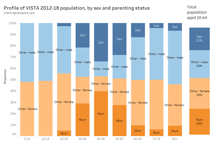
The survey weightings don’t quite lead to a perfectly balance between genders across all age bands.
Parenting was most common amongst those aged 40-49 (almost three-quarters), and lower prevalence in younger and older age groups (under 8% for those aged 20-29).
Curiously there was a slight uptick in parents living with their children for ages 80+, which might be elderly parents living with – and being cared by – their adult children.
Across the approximate working aged population (20-64), parents accounted for 45% of the population.
In some sections I’ve also used ABS Census data from 2016 and 2021. This data is segmented slightly differently, with parenting being indicated by whether the person does unpaid work to care for their own children (so might exclude parents with relatively independent adult children living with them). Unless noted otherwise, it includes people aged 15+, and journey to work data only includes those who travelled to work and reported their travel modes.
Let’s get into it..
Trips per day
For this analysis a trip is travel between two places where a purposeful activity takes place, and may involve multiple trip legs (eg walk-bus-walk-train-walk).
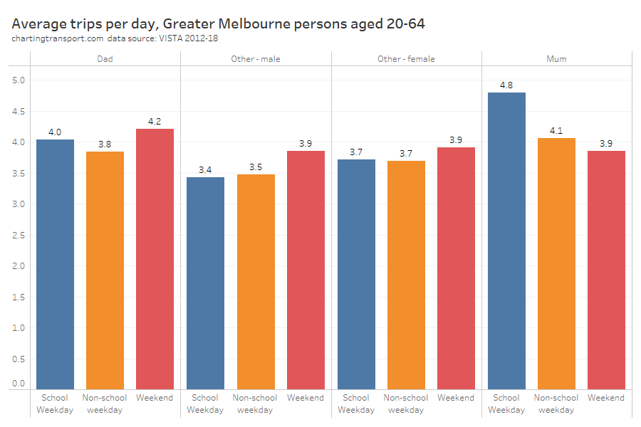
Mums easily made the most number of trips on school weekdays, but dads made more trips on weekends than mums. Trip rates were higher on weekends for all person classifications except mums.
Trip chaining
I’ve heard much about women doing a lot more trip chaining – where a person leaves home and travels to one activity, then one or more other activities, before returning home. For example: home to school drop-off to work to school pickup to home.
As a simple measure of trip chaining, I’m counting the number of trips that don’t have an origin or destination at a place of accommodation (places of accommodation almost always being the survey home). I am aware of other definitions of trip chaining that only count where there is a short activity between trips but that would be require much more complex analysis.
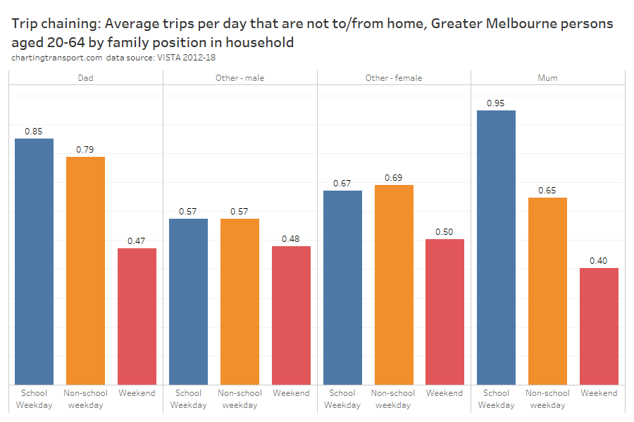
As expected, mums were doing a lot of trip chaining on school weekdays, but curiously dads weren’t that far behind. And in the school holidays and on weekends dads were doing more train chaining than mums (perhaps to give mums a break?).
Trip chaining was much less common on weekends for all groups.
For mums the most common trip type not involving travel to or from home was between work and pick-up or drop-off of someone (most likely between a school and a workplace). A long way behind was travel between work and shopping, pick-up/drop-off someone and shopping, and between two pick-up/drop-off someone activities.
For dads the most common trip type not involving travel to/from home was between two work-related activities, closely followed by between work and pick-up / drop-off someone, and then between work and social activities.
So mums’ trip chaining was dominated by pick-ups and drop-offs of people, while dads’ was not.
Time spent travelling
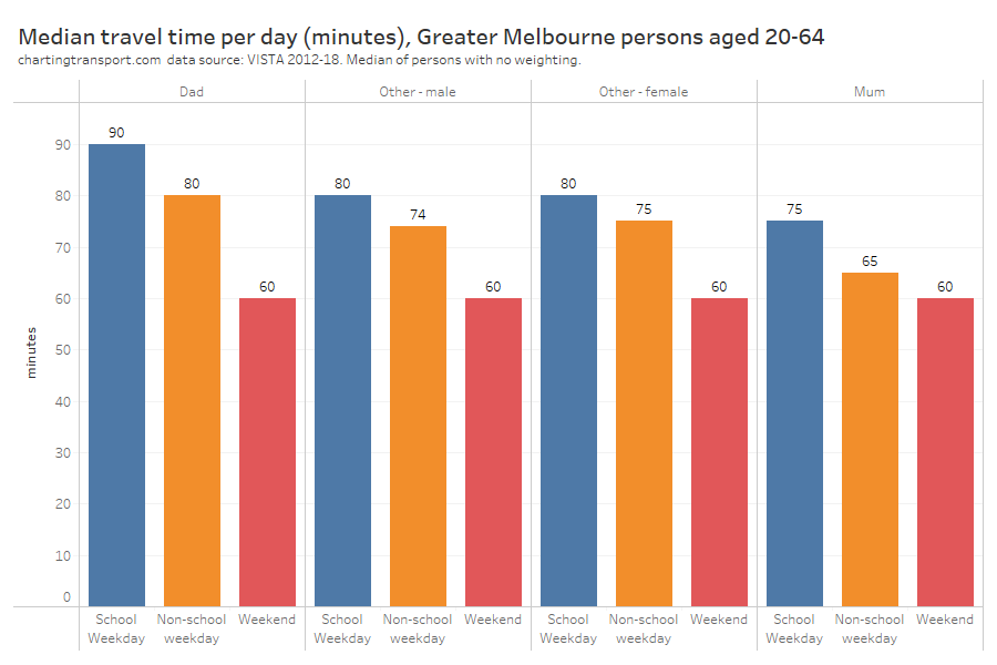
There’s not a huge variation in median travel time per day between person groups, but dads had the highest on weekdays and mums generally had the lowest. Note that reported travel times were very often rounded to multiples of 5 minutes hence most of these medians are also multiples of 5.
Technical note: I have created a chart with average travel times and the numbers were higher but the shape of the chart was almost identical so I’m not including that here.
Travel distance from home
So were dads travelling further from home? I’ve calculated the straight distance between the home location and all travel destinations, and this chart shows the medians:
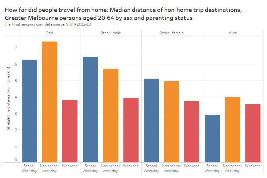
Dads sure did travel further from home on weekdays (particularly on school holidays when they might not be doing school drop-offs / pick-ups), with mums generally staying much closer to home.
Curiously, other males also travelled further from home than other females, so this pattern appears to be related to gender to some extent.
There was a lot less variation on weekends, with people generally travelling closer to home, as you might expect.
Daily distance travelled
Let’s broaden that out to median total distance travelled per day:
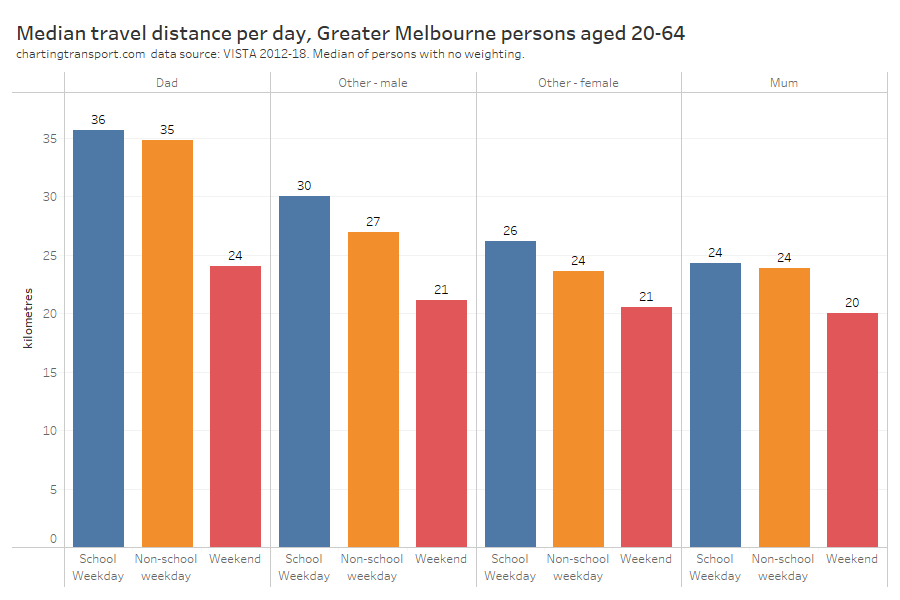
Dads generally travelled further on all day types, and mums the least. Everyone generally travelled less on weekends, and to some extent during school holidays (compared to school weekdays).
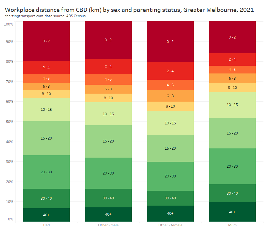
Travel distance to work
We can use ABS Census data to understand the on-road distance between home and workplaces, including for 2021. This data is for the working population aged 15+, and differentiates people based on whether they are caring for their own children (which is slightly different from living with their children).
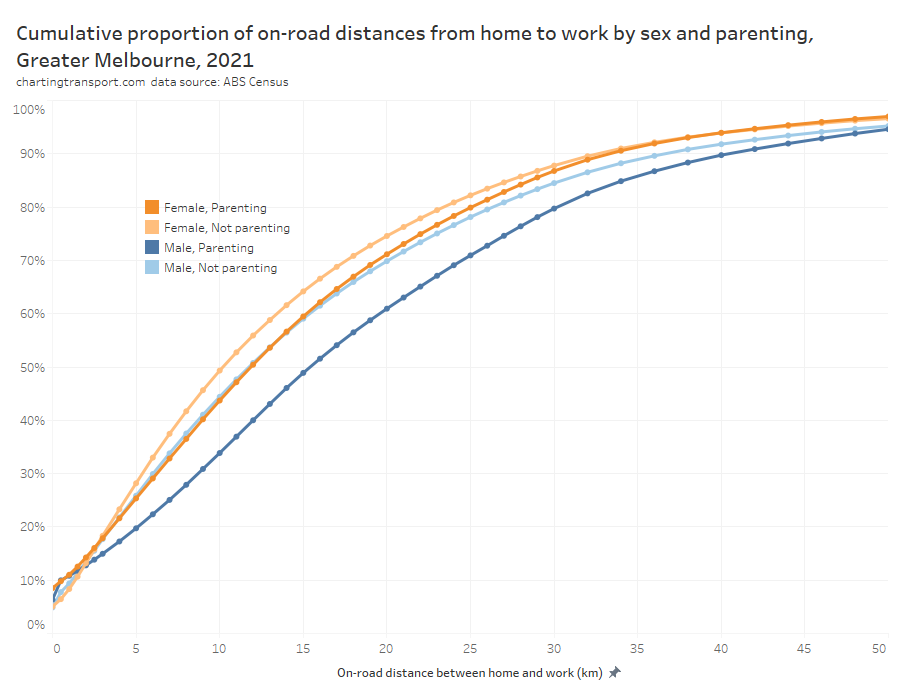
The median distances to work were highest for dads at around 15.4 km for dads, followed by 11.9 km for mums, 11.7 km for other males, and 10.2 km for other females.
Travel to/from Central Melbourne
Public transport has its highest mode shares for travel to/from central Melbourne, so how did that vary by sex and parenting status? (for this analysis I’ve defined central Melbourne as the SA2s of Melbourne, Docklands, Southbank, and East Melbourne – on 2016 boundaries).
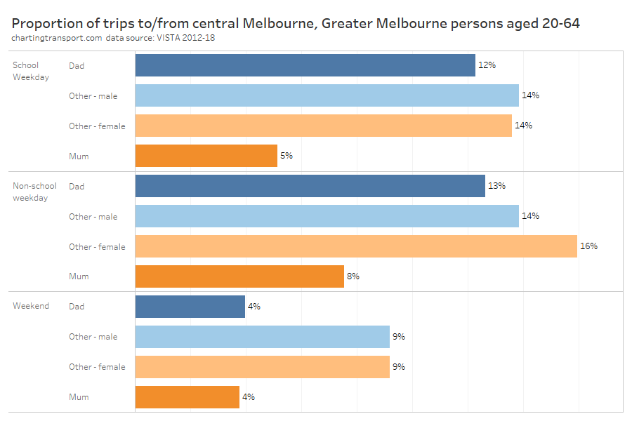
Before you get too excited about the differences, it’s worth pointing out all the proportions are small. The vast majority of people in Greater Melbourne don’t travel to central Melbourne on any given day. And of course people who lived in central Melbourne had many of their trips counted in this chart.
Sure enough, on weekdays dads were much more likely to travel to central Melbourne, and mums were least likely (although it was higher in the school holidays). On weekends, non-parents were much more likely to travel to the central city than parents (a fair bit of socialising by younger independent adults, no doubt).
Time of day of travel
The following chart shows the share of trip start times across the day for the different person types, and different day types:
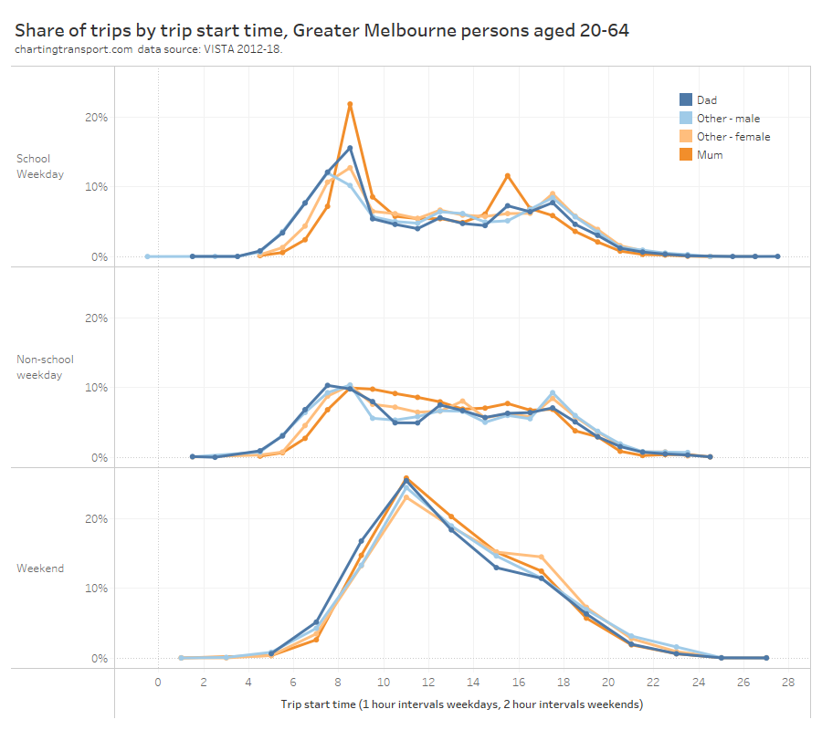
Technical note: due to smaller sample sizes, weekend travel has been aggregated into 2-hour intervals. Weekdays have been aggregated into 1-hour intervals.
You can clearly see that on school weekdays, mums are doing a lot of travel between 8 and 9am, and between 3 and 4pm, which obviously relate to school start and finish times. In the school holidays, mums are doing a lot more travel through the interpeak period, probably reflecting parenting activities for kids not at school.
On school days, trips by dads started earlier and finished later than mums. But during school holidays dads made a smaller proportion of their trips between 8am and 9am, suggesting they also had a significant role in school drop offs in the morning.
During the weekday inter-peak period dads were less likely to travel than mums (except around lunchtime). Other females had a small peak in travel around 5-6pm, which is probably related to them being more likely to work full time.
On weekends it seems dads were slightly more likely to travel in the morning compared to mums who were slightly more likely to travel in the afternoon.
Did mum or dad take the kids to/from school?
We’re seeing some pretty strong themes related to the school peaks. It is possible to filter for trips to pick up or drop off someone from a place of education on school weekdays and then disaggregate between mums and dads. I’ve split this analysis into an AM peak, a PM school peak (2-4pm), and a PM commuter peak (4-6pm) – as there were significant numbers of pick ups later in the afternoon – presumably following after-school care.
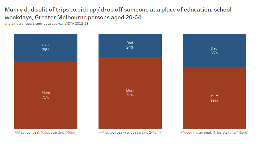
Mums did the bulk of school drop offs and pick ups at all times of day, particularly in the PM school peak. In the PM commuter peak, dads share of pick ups rose to 35% – no doubt related to the ability to do these pick ups after a full-time day at work.
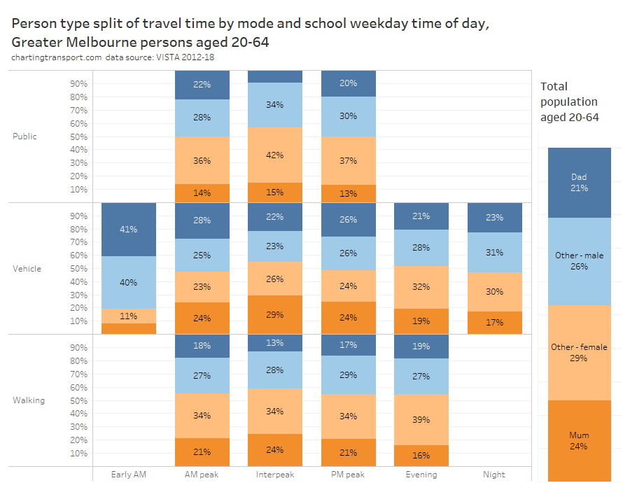
What types of adults are using modes at different times of day?
For this question I have limited analysis to school weekdays, aggregated all of public transport to one group, and aggregated vehicle drivers, passengers, and motorcyclists into “vehicle” to overcome issues with small sample sizes. I’ve included the proportion of the working aged population sample on the right-hand side for ready reference.
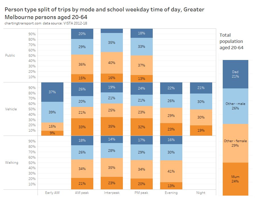
In general, parents were over-represented in vehicles in peak periods, mums were over-represented in the interpeak in vehicles, and parents were under-represented in public and active transport at most times of day.
The peak periods saw more public transport trips by dads than mums, while the roads (and footpaths) saw a lot more trips by mums than dads.
Early morning travel was predominately by males (76%), while females were slightly more prevalent in vehicles during the interpeak (60%). Reported walking trips skewed female at all times of day.
However if we look at travel time, rather trip counts, we get a slightly different picture:
Dads spent more time travelling than mums in peak periods on both public and private transport, but much less time than mums in the inter-peak.
Mode split
Here’s how it looks for travel in general:
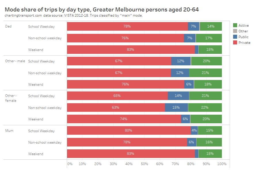
Mums were the least likely to use public transport (especially on the weekend), closely followed by dads.
Non-parents had the lowest private transport mode share (although still a majority mode share), and were most likely to use active transport.
Here’s overall mode shares of journeys to work (Greater Melbourne 2016), which I’ve disaggregated for workplaces inside and outside the City of Melbourne area (as workplace location has a massive impact on mode shares):
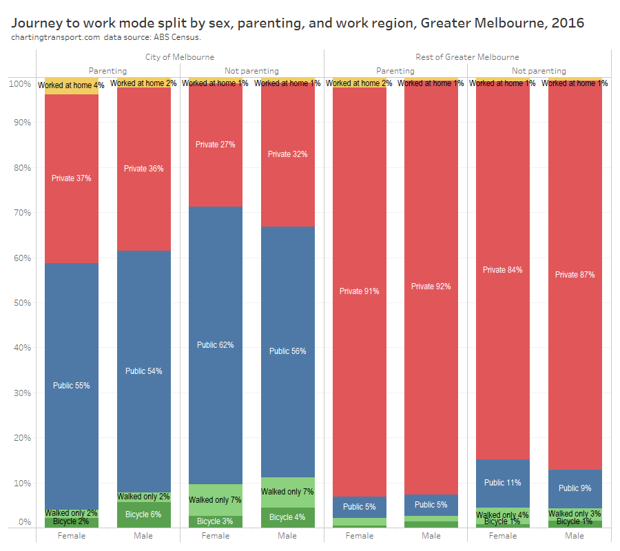
Parents were much more likely to use private transport across the geographies and sexes. Of those working outside the City of Melbourne, parents also had about half the public transport mode share of non-parents.
Men were much more likely to cycle to work than women, and dads were more likely to cycle than other men.
Here is a look at private transport mode shares by distance between home and work, gender and parenting status:
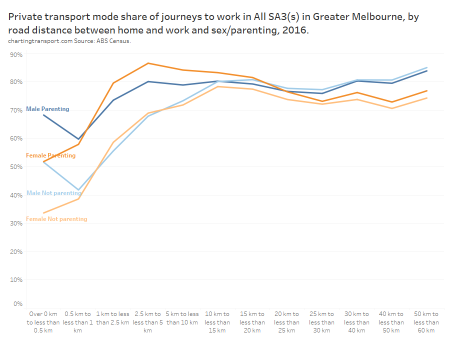
The difference in private mode share between parents and non-parents was largest for journeys up to 10 km. Mums had the highest private mode share for journeys 1 to 20 kms. For journeys over 25 km, sex became more influential than parenting status with men more likely to use private transport.
Another curiosity here is the very short journeys (less than 0.5 km) where men were much more likely to use private transport than women (regardless of parenting status) – for what is probably a walkable distance for most people. Are men more lazy when it comes to short walks to work? And/or are men more likely to need their car at work?
I have previously also analysed public transport mode share by age and family position. I’ve reproduced that analysis here:
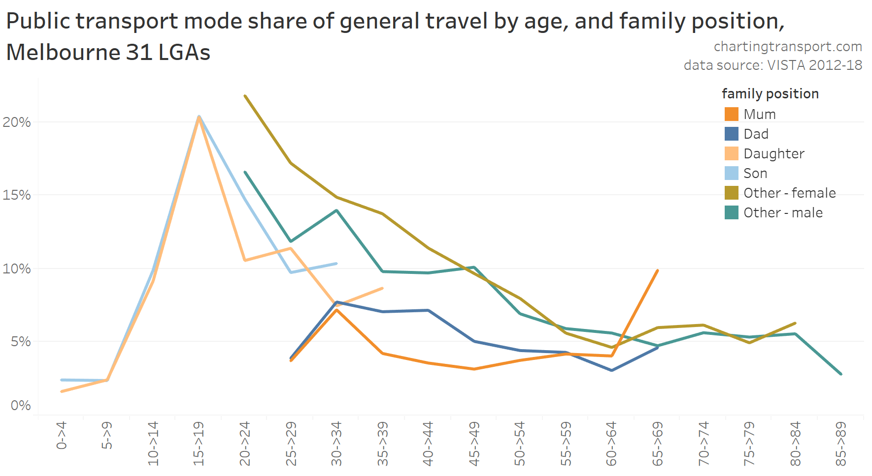
For ages 35 to 59, mums generally had lower public transport mode share than dads. Younger non-parenting women had higher public transport mode shares than younger non-parenting men.
Here’s how it looks for 2016 journeys to work (I’m not using 2021 data because of COVID lockdowns):
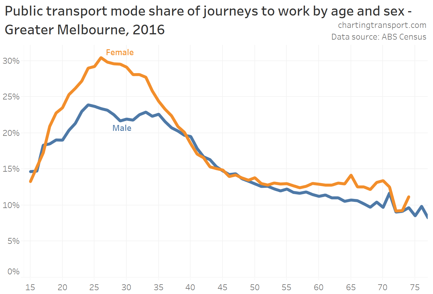
Female public transport mode share was signficantly higher than males for most ages – except for those typical parenting years between their late 30s to early 50s. Younger adults were much more likely to work in the inner city, and even more so for females. For more discussion on this, see Why are younger adults more likely to use public transport? (an exploration of mode shares by age – part 1)
I’ve also split this by sex and parenting status and analysed the changes between 2006 and 2016 (analysis lifted from: Why are young adults more likely to use public transport? (an exploration of mode shares by age – part 3))
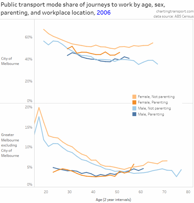
Note there is a very different Y-axis scale for City of Melbourne and elsewhere.
There were a few really interesting take-aways:
- Public transport (PT) mode shares increased over time for almost all age bands, work locations, and for parenting and non-parenting workers.
- Parenting workers mostly had lower public transport mode shares than non-parenting workers of the same age, except for:
- dads over 30 who worked in the City of Melbourne,
- mums in their early 30s who worked in the City of Melbourne in 2016, and
- mums and dads in their 50s who worked outside the City of Melbourne (who had low PT mode shares around 4-5%, similar to non-parenting workers of the same age)
- Public transport mode shares for journeys to work in the City of Melbourne mostly declined with increasing age between 20 and 50, regardless of parenting responsibilities.
- For people who worked outside the City of Melbourne, the mode share profile across age changed significantly over time for young adults. In 2006 there was a steady decline with age, but in 2011 PT mode shares were generally flat for those in their 20s, and in 2016 PT mode shares peaked for women in their late 20s (and also had a quite new pattern for dads in their 20s).
- For parenting workers who worked outside the City of Melbourne there was actually a slightly higher PT mode share for those over the age of 50. Parents over 50 might have older children who are more independent and therefore less reliant on their parents for transport. This might make it easier for the parents to use public transport. However this trend did not hold for dads in 2016.
- PT mode shares for non-parenting women increased slightly beyond age 55 for all work locations. This will include women who were never parents, as well mums with non-dependent children so might again reflect a small return to public transport once children become independent. It may also be influenced by discounted PT “Seniors” fares available to people over 60 who are not working 35+ hours per week.
Mode split of public transport use
Which modes of public transport were the different person classifications using in Melbourne? Sufficient survey sample is only available for school weekdays, and it’s important to keep in mind that trams dominate inner city radial on-street public transport in Melbourne (unlike most comparable cities where buses dominate this function). This chart adds up all trip legs so there is no data loss with multi-modal public trips:
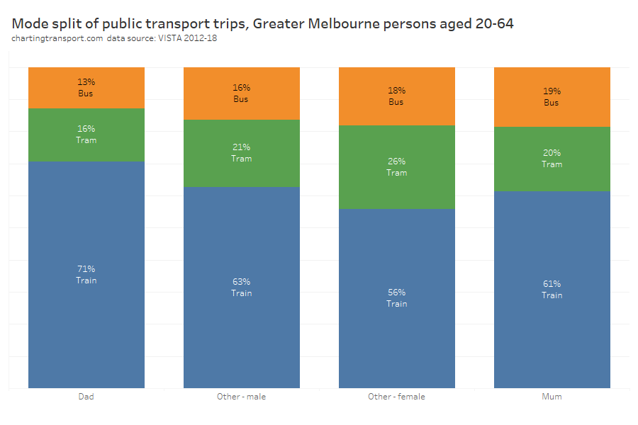
Unfortunately this data doesn’t line up with reported public transport patronage for the same time period (below), suggesting that tram travel may be under-reported in VISTA (although the above chart is filtered for persons aged 20-64):
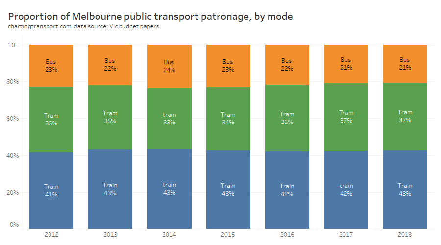
Biased as the VISTA data might be towards certain modes, it still suggests dads were more likely to be using trains and least likely to be using buses.
I’ve also looked at use of public transport in journeys to work for 2016. Workers can report up to three modes of travel, and I’ve extracted counts of workers who used each of the three main modes of public transport in Greater Melbourne (note: people who used multiple public transport modes will be counted in multiple columns).
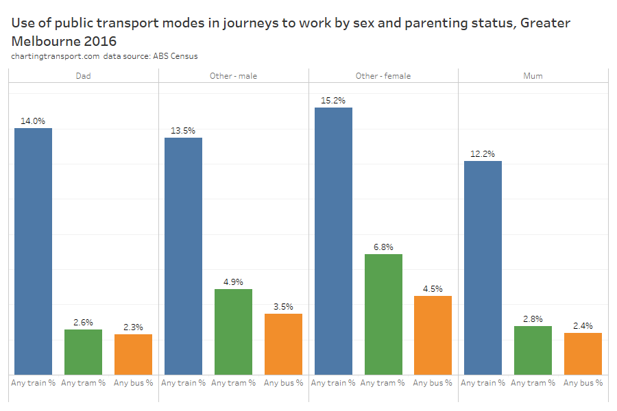
Parents (who travelled to work) were much less likely use bus or tram to get to work than non parents. But the story is bit different for trains: Dads were slightly more likely to commute by train than other males, while mums were less likely to commute by train than other females. This might be related to where mums work – more on that soon.
Mode use by sex and parenting
We can flip the mode-split charts around to look at the composition of adult users of different travel modes:
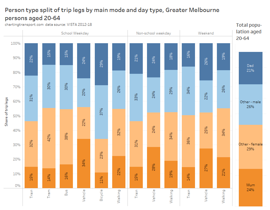
Technical Note: there’s insufficient sample of tram, bus, and bicycle travel on non-school weekdays and weekends so those are not on the chart.
Trams, buses, private vehicles, and walking generally skewed female, while trains and particularly bicycles skewed male (except weekend trains).
Mums were under-represented on all modes except private vehicles where they were significantly over-represented. Mums were least represented on bicycles.
Dads were under-represented on trams and buses, and over-represented in vehicles, and on bicycles.
Non-parents were over-represented on trains and trams, and walking on weekends.
There were many more dads than mums on trains on weekdays, and many more mums than dads travelling in (private) vehicles on school weekdays (but not so much on weekends and school holidays).
Trip purposes
We want to know the purposes of people’s travel, but actually purpose can only really be attributed to the activity before and after a trip. For this analysis I’ve used the trip destination purpose as the trip purpose, and I’ve excluded trips where the destination was home (as that would be close to half of trips and not very interesting). Also keep in mind that trips can also vary considerably in length and duration.
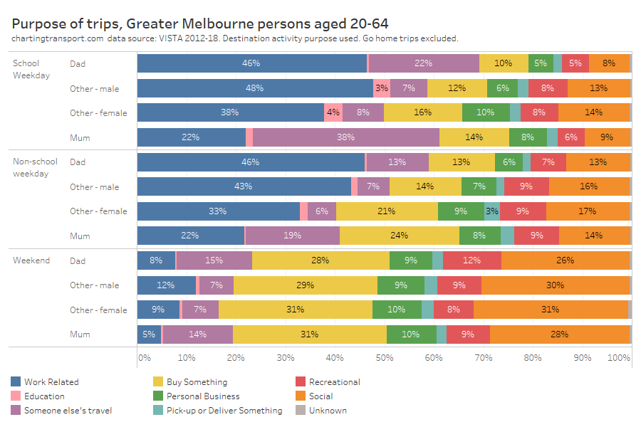
On weekdays, significantly more trips by males were work-related. Mums had a standout different pattern on school weekdays with many more trips being about someone else’s travel (particularly school children) and much less often being work-related (or should we say “paid work”-related).
During school holidays, about 1 in 5 trips by mums were about other people’s travel. But on weekends dads were doing slightly more trips that are about other people’s travels (perhaps to make up for them doing less of such trips on weekdays?).
On weekends social and shopping trips were much more common than work trips, as you’d expect.
Radial-ness of travel
A while ago I looked at the radial-ness of travel – that is the difference in bearing (angle) between a trip aligned directly to/from the Melbourne CBD and the actual alignment of the trip. Trips generally skew towards being radial, reflecting the importance of the central city, and just generally the shape of the city. Previously I’ve disaggregated by age, sex, and many other variables.
So how does radial-ness vary across sex and parenting status?
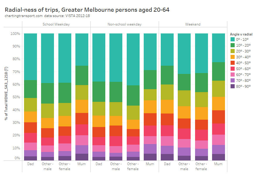
On weekdays mums were the clear outlier, with substantially fewer radial trips and more non-radial trips, likely including many trips to/from schools and other caring destinations.
Weekend travel was a fair bit less radial in general, and again mums had the least radial travel of all person groups.
Okay so that’s a lot of ways we can compare travel patterns by sex and parenting (let me know if you think I’ve missed any other useful breakdowns). Now…
What can explain these differences?
A lot of the above data is probably unsurprising, because males and females, and particularly mums and dads, generally have different levels of workforce participation and caring responsibility, amongst other differences. What follows is an examination of potential explanatory variables for the different travel behaviour observed.
Main activity
First up, main activity as captured by VISTA:
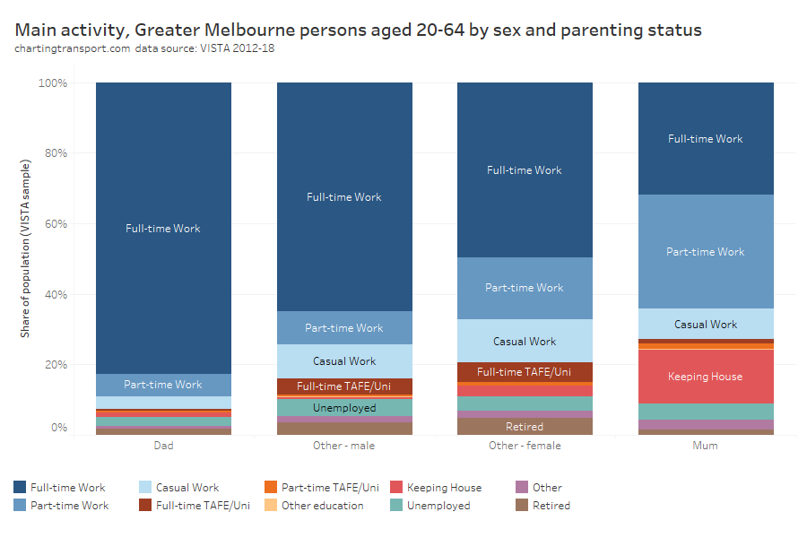
Dads were most likely to be working full-time, and mums least likely to be working full-time. Mums were much more likely to be working part-time or “keeping house”.
As an aside: I actually find “keeping house” to be a bit devaluing of parents (usually mums) who dedicate much of their time doing the critically important work of raising children. And I know from personal experience it’s pretty hard to actually “keep house” when you have young children who need active engagement across most of their waking hours. No doubt others falling in the “keeping house” category might be caring for other adults or the elderly. Is it time for a caring-related category?
Curiously non-parenting females were much less likely to be working full time than non-parenting males. Perhaps non-parenting females were more likely to be doing some caring for others not living with them? Perhaps some mums decide to stay working part-time after their children move out? Or it might be something else?
We can break the analysis down further by age:
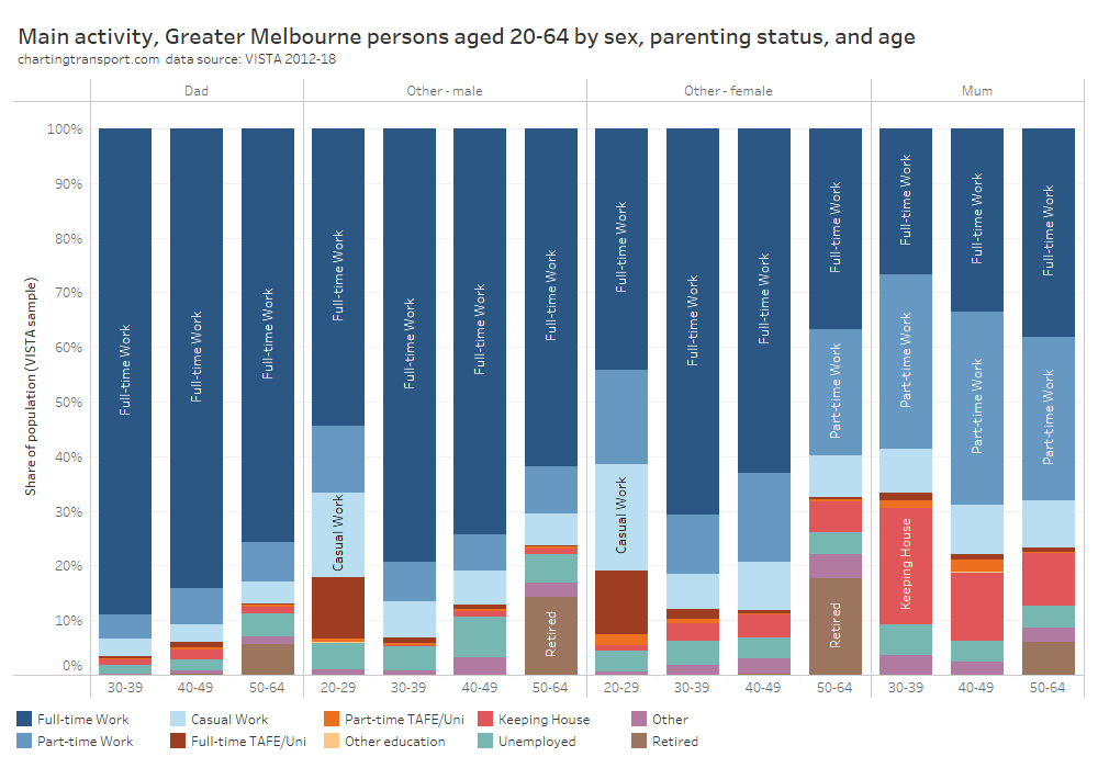
Technical note: Data isn’t presented for mums and dads aged 20-29 due to insufficient survey sample.
Curiously, dads were less likely to be working full-time with increasing age, while mums became slightly more likely to be working full-time at older ages (as children get older and require less supervision?).
Occupation (employment)
We call drill down further by looking at employment occupations:
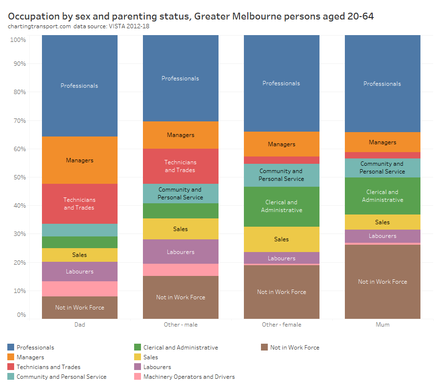
Mums were much less likely to be in the workforce than dads, but curiously had almost the same proportion of professionals (perhaps reflecting women’s slightly higher levels of education, on average).
Men were more likely to work in occupations where public transport is probably less competitive, including technicians, trades workers, labourers, and machinery operators and drivers (with likely exceptions for central city work sites).
Employment Industry
There are also notable differences in employment industries by sex and parenting:
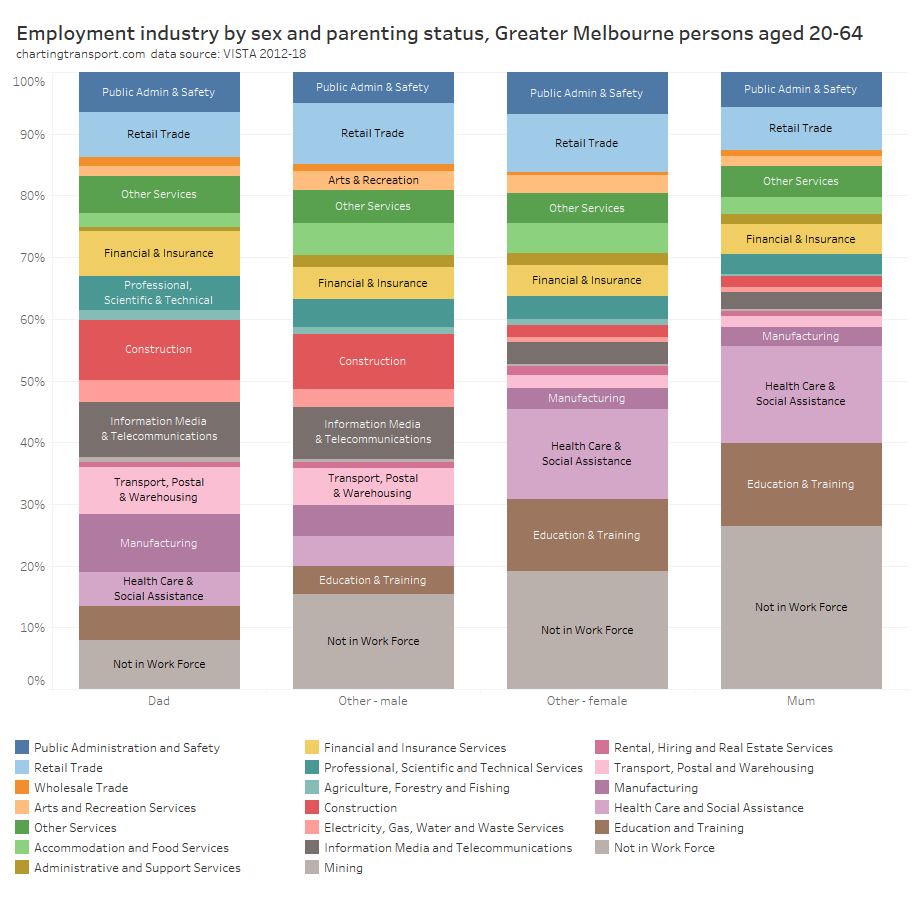
There are probably no great surprises in the above chart, with men much more likely to work in construction, information media and telecommunications, manufacturing, transport, postal, and warehousing, and women much more likely to work in education, training, health care, and social assistance.
Access to independent private mobility
Does the ability of people to drive themselves around in private vehicles differ by gender and parenting status? And could this explain their different travel patterns?
For this analysis, I’ve re-used the following household classifications from a previous post:
- No MVs – no motor vehicles,
- Limited MVs – fewer motor vehicles than licenced drivers, or
- Saturated MVs – at least as many motor vehicles as licenced drivers.
I’ve also classified individuals as to whether or not they have a “solo” driving licence (i.e. probationary or full licence, but not learner’s permit).
I’ve then combined these two dimensions (except for people in households with no motor vehicles as driver’s licence ownership is largely immaterial for this analysis).
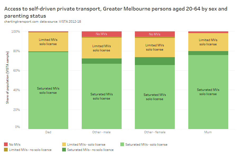
There were small differences between mums and dads, with mums slightly less likely to have a solo driver’s licence than dads (95% v 98%), mums slightly less likely to have independent private mobility (75.5% v 78.6%), and mums slightly more likely to live in a household without any motor vehicles (1.7% v 1.0%). These slight differences might suggest mums would have lower private transport mode shares than dads, but we’ve actually seen above that the opposite is true. Therefore access to independent private mobility is unlikely to explain much of the differences in travel between mums and dads.
There weren’t substantial differences between non-parenting men and women, other than non-parenting men having slightly high solo licence ownership (91% v 88%).
Parents were more likely to have a solo driver’s licence than non-parents, and over three-quarters lived in a household with saturated motor vehicle ownership. Access to independent private mobility aligns strongly with parents’ much higher private transport mode shares, and is probably considered essential for parents in most parts of Melbourne.
Indeed, we can also break this down by geography – using a simple inner/middle/outer disaggregation of Melbourne:
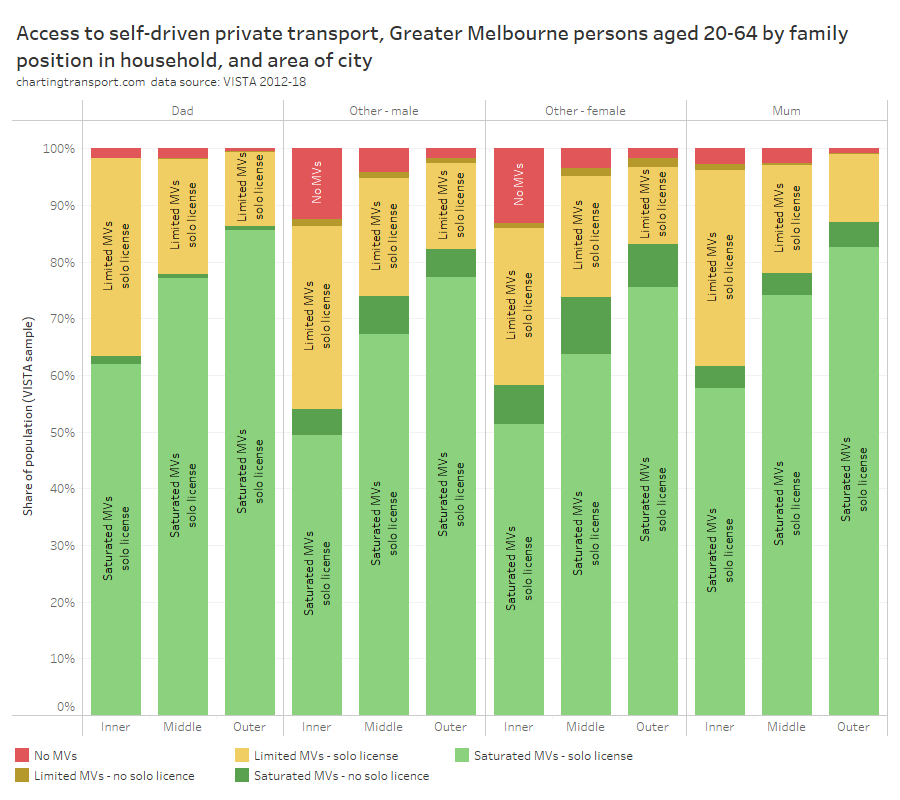
For all person categories there’s a strong relationship with distance from the city centre, with significantly lower levels of motor vehicle ownership in the inner areas. However solo licence ownership was very high for parents even in the inner suburbs (94% of mums and 98% of dads).
86% of dads and 87% of mums in outer Melbourne lived in households with saturation motor vehicle ownership. However, 5% of mums in the outer suburbs didn’t have a solo licence, which could make getting around quite challenging, and highlights the importance of quality public transport services in these areas.
Around 14% of non-parents in the inner suburbs lived in households without motor vehicles.
Where do parents tend to live?
It probably won’t surprise many readers to hear that parents made up a much larger share of the residential population in the outer suburbs, particularly urban growth areas:
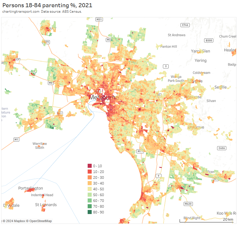
But if you look closely, you’ll also see quite low proportions of parents along train lines, tram lines, and the public transport rich inner suburbs.
In fact, it’s possible to examine the type of households per dwelling by distance from train stations (I’m excluding areas within 3 km of the CBD).
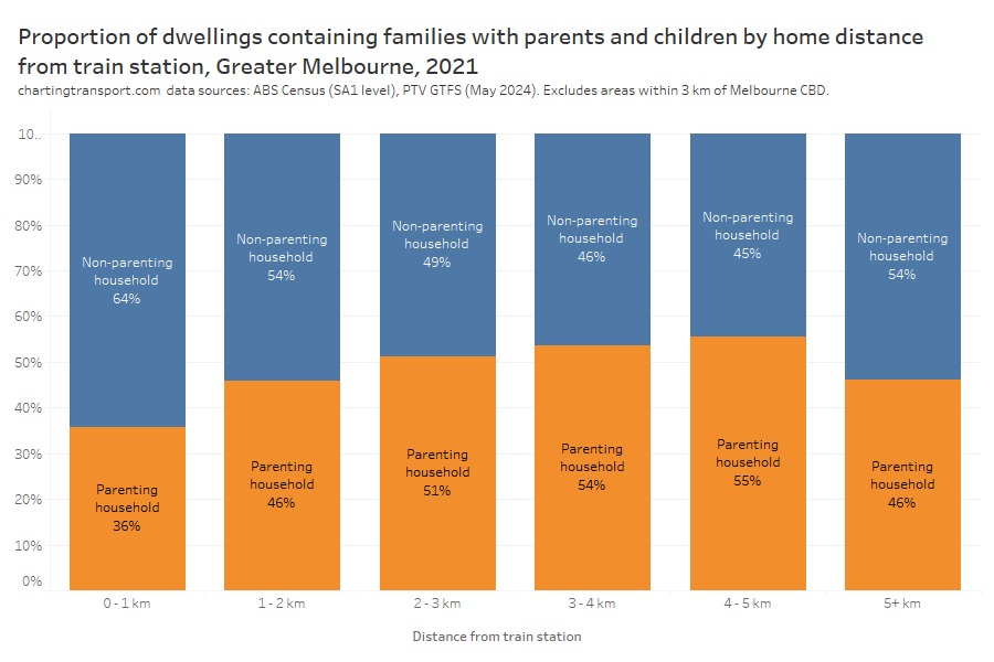
Technical notes: I’ve calculated straight distance between SA1s centroids and their nearest train station points as per GTFS data in May 2024. The only significant change in train stations between August 2021 and May 2024 was the merger of Surrey Hills and Mont Albert into Union Station in 2023. So it’s not perfect analysis but I’m also not interested in precision below 1% resolution. I’ve also excluded unoccupied and non-private dwellings.
Dwellings close to train stations are significantly less likely to contain parents.
Is this because parents cannot afford family-friendly dwellings near train stations? Is it because dwellings near train stations are less family-friendly? Or is it because many parents like to build their own home on the urban fringe? Or some combination of these?
Well, the census tells us how many bedrooms there are in most occupied private dwellings, and the following chart shows the relationship between number of bedrooms and distance from train stations (again, excluding areas within 3 km of the CBD):
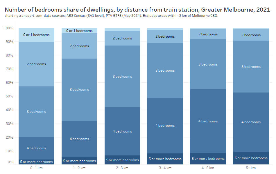
Sure enough, dwellings near train stations generally had fewer bedrooms.
And we can also use census data to show the relationship between number of bedrooms in a dwelling, and whether the household includes parents + children:
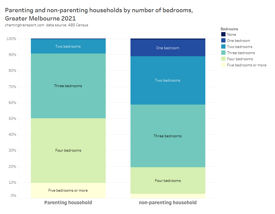
Over 90% of parenting households had three or more bedrooms, and half had four or more bedrooms. But almost half of all dwellings within 1 km of a train station had two or fewer bedrooms rendering them not very family-friendly.
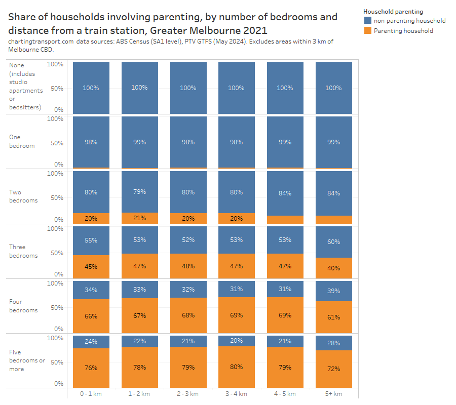
Just to take it slightly further, I’ve put all three dimensions on one chart and this shows that dwellings close to stations with three or more bedrooms were slightly less likely to house parenting families:
I think the lower availability of family-friendly housing near rapid public transport is quite likely to be contributing to lower public transport mode shares for parents, particularly as there is a clear relationship between public transport use and proximity to rapid transit stations (see: Are Australian cities growing around their rapid transit networks?)
That said, there may also be an issue around whether many families can afford three-bedroom homes close to train stations as they often have less than two full-time incomes supporting three or more people. Might young professional couples with no kids and/or share houses of young professionals be better placed to compete for this housing?
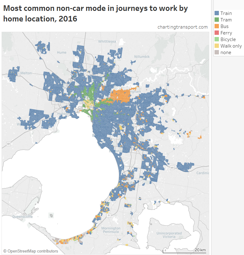
Where do men and women work in Melbourne?
Could differences in journey to work mode splits be explained by differences in workplace location?
Here’s a map of gender balance by workplace location across Melbourne for 2021 at destination zone geography (DZs) (sorry not all outer suburbs included on the map as I didn’t want to lose the inner area detail). Blue areas skew male, orange areas skew female.
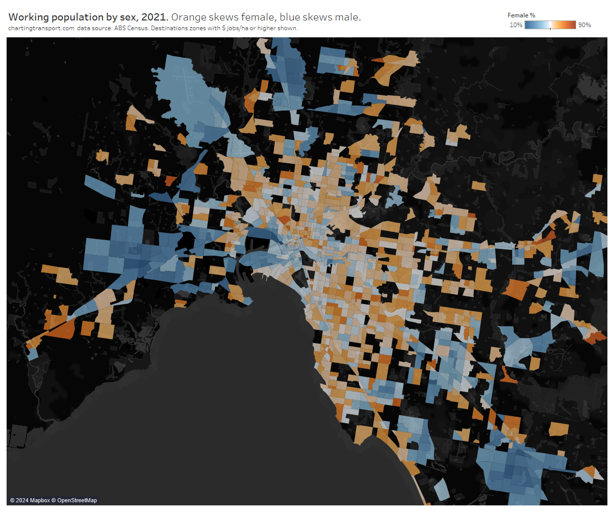
Anyone with knowledge of Melbourne’s urban geography will instantly see large industrial areas shaded blue, and plenty of orange in most other places.
These skews follow industries with male and female dominant workforces. In fact, I’ve manually done some rough grouping of destination zones where there is a clear dominant land uses (not exhaustive but results should be fairly indicative), and here is the sex breakdown by land use type:
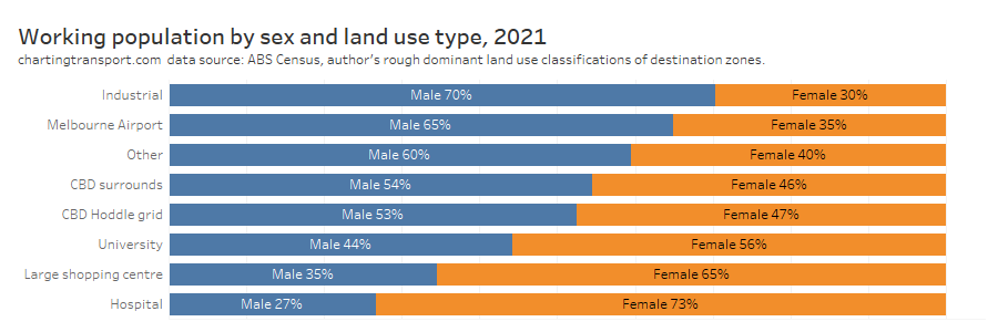
Industrial areas and Melbourne Airport skewed heavily male, while hospitals and large shopping centres skewed female. Universities skewed female, and the CBD and surrounding areas slightly skewed male.
What about parenting? Something to keep in mind is that 43% of the working population were living with their children.
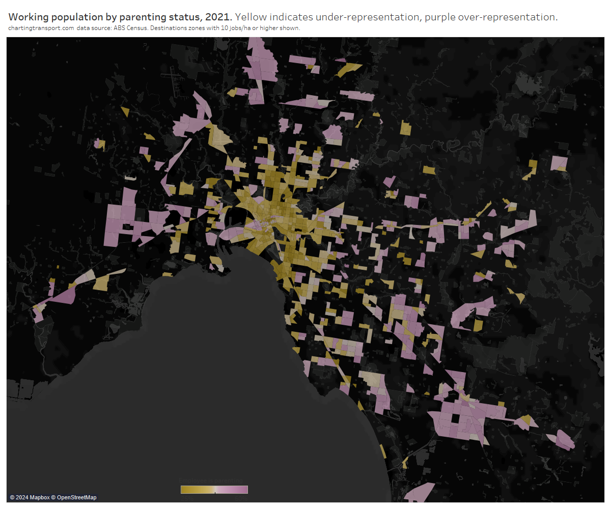
Parenting workers were seen more in the middle and outer suburbs, which is also where parents skewed as a home location, so there’s undoubtedly a relationship there.
Here’s the parenting breakdown by dominant land use classification:
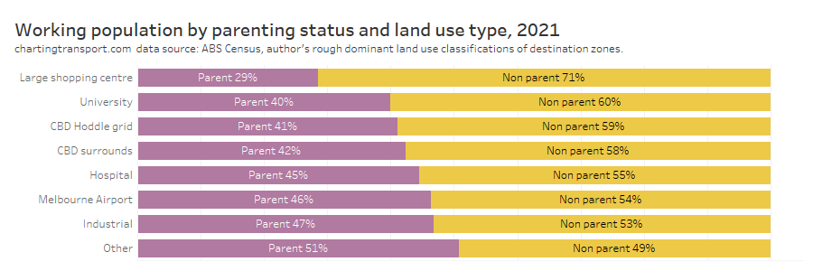
Parents were under-represented in major shopping centres (I’m guessing a skew to younger employees), but also to a small extent universities and the central city. Parents were slightly over-represented in hospitals, Melbourne Airport, industrial areas, and the rest of Melbourne.
Another way to represent this data is looking at the distribution of workplace locations by distance from the Melbourne CBD:
Probably the biggest stand-out is that mums skewed towards suburban employment locations, while non-parenting females were more likely to be working closer to the city centre.
The distribution of workplace distance from the CBD for males only differed slightly between those parenting and non-parenting. Dads were less likely to be work between 2-10 km from the Melbourne CBD than non-parenting males.
Employment density
I’ve previously shown that private transport mode shares are generally much lower in areas with higher job density (likely due to higher car parking costs and increased public transport accessibility). So do mums/dads/others typically work in areas of lower or higher job density, and could this explain differences in their mode splits?
To answer this I’ve calculated an aggregate weighted job density of the areas in which each category of person tends to work. How does that work? Well to start with I’ve calculated the job density of every destination zone in Greater Melbourne. I’ve then calculated a weighted average of these densities, where the density of each destination zone is weighted by the number of dads/mums/other males/other females working in that zone.
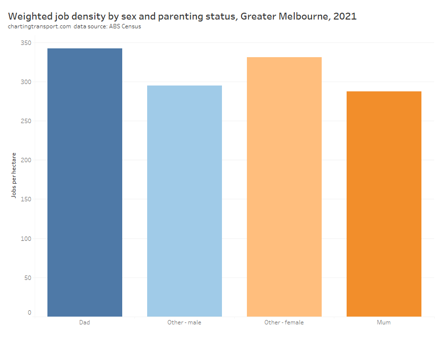
For females, those non-parenting generally worked in more jobs dense areas, compared to mums. This probably partly explains the lower public transport mode shares of mums.
For males it was the reverse – dads generally worked in more jobs-dense locations.
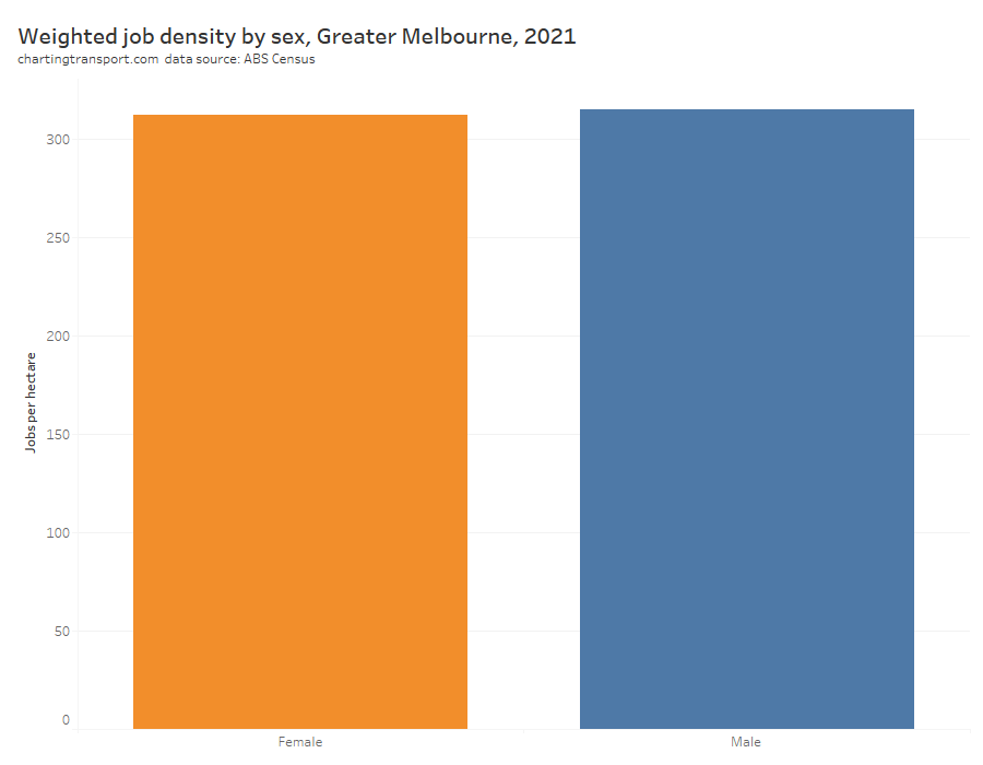
Overall was only a tiny difference between men and women in aggregated weighted job density:
That was a lot of charts, can you summarise that?
The following table attempts to highlight key variations from the overall average for different types of adults:
| Type of adult | Travel patterns | Destination patterns | Mode split | Explanatory factors |
| Parents | More trips per person on weekdays. More trip chaining. | Higher private mode share. | Live further from public transport. Lack of family-friendly dwellings near public transport. Live in outer suburbs. Higher car ownership. | |
| Mums | More travel during weekday interpeak. Highest trip chaining. | Travel closer to home. Work closer to home. Less radial travel. Least likely to work in CBD. | Very high private transport mode share. | Do most school drop offs / pick ups. Least likely to work full time. Less likely to work in job-dense areas. |
| Dads | Travel longer distances. Travel further from home. More time spent travelling. | Travel further from home. Work further from home. More likely to work in CBD. | More likely to use trains. More likely to use bicycles. | Most likely to work full time. More likely to work in job-dense areas. |
| Non-parenting women | Travel closer to home. Work closer to home. | Higher public transport use. | More likely to work in job-dense areas. Most likely to work in central city. |
The explanatory factors in the right hand column will not be independent. For example, many parents probably find it infeasible to live near public transport, so they live further away and are more car-dependent.
What does all this mean for transport planning interventions?
I won’t say a lot on this topic (I tend to avoid policy prescriptions on this blog) but I will say I think some caution is required here.
One perspective might be that the proportion of males and females travelling on a mode at a particular time of the week will not change, and therefore interventions might predominantly benefit the existing user base (eg higher inter-peak public transport service frequencies might benefit women more than men).
However another perspective might be that interventions remove the barriers for one gender to utilise a mode of transport and might have significant benefits for the minority gender in the current user base. For example, significantly safer cycling infrastructure might encourage more women to cycle and lead to a more even balance between genders – indeed I’ve uncovered evidence about that on this blog.
So many mums driving kids to school!
One thing that really stands out to me is that mums do the vast majority of school drop offs and pick ups, and most of this travel is (now) happening by private vehicle. This is potentially impacting women’s workforce participation, and the traffic volumes are certainly contributing to road congestion. It might also be impacting women’s mode choices as school trips are generally more difficult on public transport, and mums do a lot of trip chaining. They might be using private transport for some trips mostly because those trips are chained with school drop-off/pick-ups.
What could you do to reduce private transport trips for school drop off / pick ups, and potentially also increase women’s workforce participation and public transport mode share?
- Make interventions that increase the share of school students who travel to/from school independently by active or public transport
- For school trips that are accompanied by a parent, encourage a mode shift towards active transport (realistically, public transport is less likely to be an attractive mode for many accompanied trips to school, unless it is on the way to another destination)
- Provide at-school before-school and after-school care to enable both parents the opportunity to work full time (indeed government subsidies are provided in Victoria at least)
How might things have have changed post-COVID?
Unfortunately at the time of writing rich data is only really available for pre-COVID times.
A major change post-COVID is that many white collar professionals are now working from home some days per week, which has reduced travel to major office precincts.
I would not be surprised to see dads taking a slightly higher share of the school drop-off pick-up task as this can be easier to do on a work-from-home day. Might this have enabled women to work longer hours? There have also been higher child-care subsidies implemented recently that might also lift women’s workforce participation.
Indeed here’s a chart summarising female labour force status since 2012 (not seasonally-adjusted):
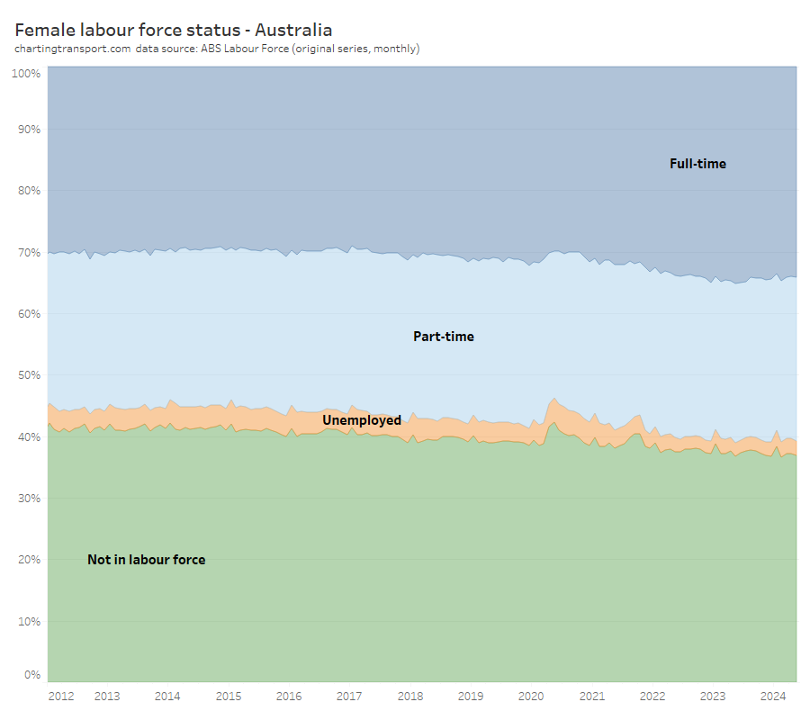
Technical note: I would have preferred to use seasonally adjusted or trend series numbers to remove the noise, but these data sets do not include counts for “not in labour force”
Following the major COVID disruption period around 2020-2021, women have been more likely to be working full time and more likely to be in the labour force. This might be partly related to new working-from-home patterns.
Hopefully more post-COVID travel data will be released before too long and I can investigate if there are any substantial shifts in the patterns between men and women, parents and non-parents.
Do let me know if you think there is more that should explored regarding the differences in travel patterns and explanatory variables for men and women, parents and non-parents.


 Posted by chrisloader