Between 2011 and 2016, Greater Brisbane saw a 2% mode shift towards private motorised transport for journeys to work, the largest such shift of all large Australian cities. Was it to do with where jobs growth happened, or because public transport became less attractive over that time?
This post takes a more detailed look at the spatial changes in private transport mode shares, and then examines the relative impact on spatial variations in jobs growth compared to other factors.
Greater Brisbane main mode shares
Firstly for reference, here are the Brisbane Greater Capital City Statistical Area main mode shares and shifts for 2011 and 2016, measured by place of enumeration and place of work:
| 2011 | 2016 | Change | ||
| Private | Place of enumeration | 80.0% | 81.9% | +1.9% |
| Place of work | 79.1% | 81.1% | +2.0% | |
| Public | Place of enumeration | 15.1% | 13.5% | -1.6% |
| Place of work | 15.9% | 14.2% | -1.7% | |
| Active | Place of enumeration | 4.9% | 4.6% | -0.3% |
| Place of work | 5.0% | 4.7% | -0.3% |
More information about main mode definitions and data in general is available at the appendix at the end of this post.
Mode shares and shifts by home location
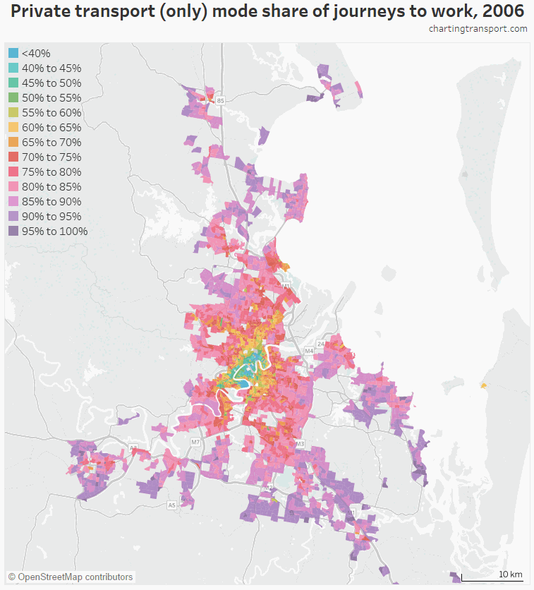
Here are private transport mode shares by home location for 2006, 2011, and 2016:
(you might need to click on these charts to see them larger and more clearly)
You can see lower private mode shares around the central city and to some extent along the rail lines. In case you are wondering, the Redcliffe Peninsula railway opened in October 2016 – after the August 2016 census.
The changes between years are a little difficult to make out on the map above, so here are the mode shifts to private transport by home location at SA2 level:
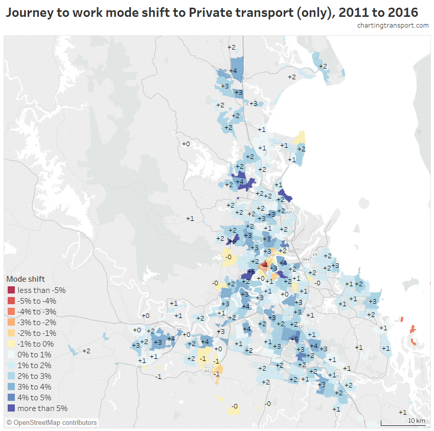
Mode shifts to private transport can be seen over most parts of Brisbane, with the biggest being Auchenflower (+6%), Lawnton (+6%), Toowong (+5%), Norman Park (+5%), Strathpine – Brendale (+5%), Keperra (+5%), and Sandgate – Shorncliffe (+5%). Many of the large mode shifts to private transport were actually seen around the train network.
The Redland Islands area had a larger shift to public transport – but keep in mind this will include use of car ferries.
Here’s a map showing the mode split of net new trips by home SA2:

There were a lot of new trips from outer growth areas in the north, west and south, and the vast majority of these trips were by private transport (although the southern growth area of Springfield Lakes, where a rail line opened in 2010, had a relatively high 15% of new trips by public transport). Private transport mode shares of new new trips were also high in middle and most inner suburbs (unlike inner Melbourne).
To sum all that up, here are the changes in trip volumes by main mode and home distance from the CBD:
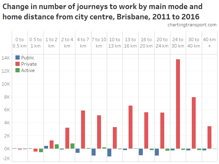
Private transport dominated most new trips, and there were net declines in public transport trips beyond 2 km from the CBD.
Here’s a look at the main mode split over time, by distance from the CBD:

Brisbane achieved significant mode shift away from private transport between 2006 and 2011, but that was pretty much reversed between 2011 and 2016.
Private transport mode shares dropped in 2011 but pretty much returned to 2006 values in 2016. On average, only the city centre saw a mode shift away from private transport between 2011 and 2016, and that’s only a tiny fraction of the Brisbane’s population.
Mode shares and shifts by work location
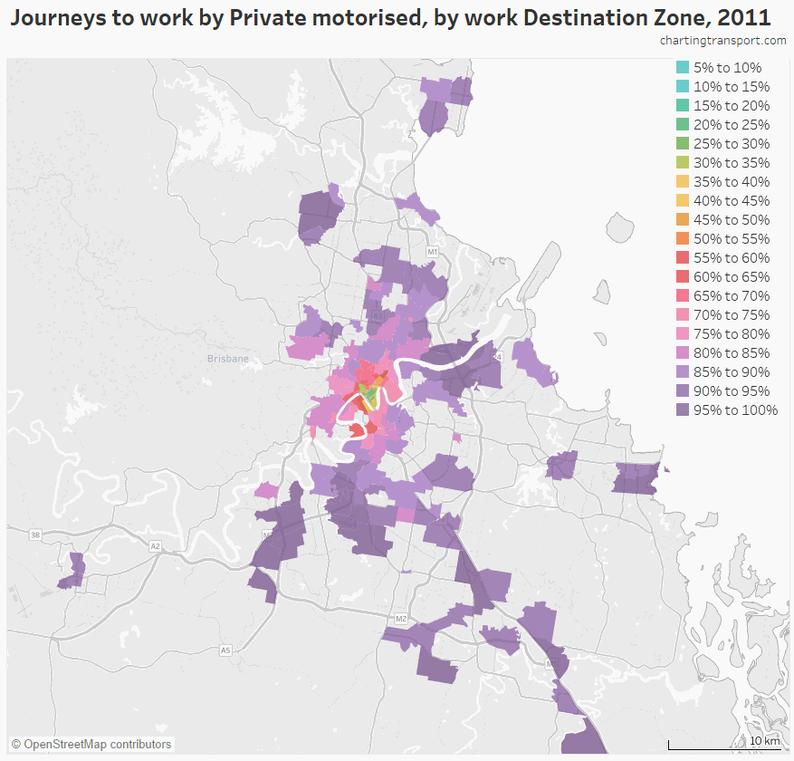
Here are workplace private transport mode shares for 2011 and 2016:
(more areas are coloured in 2016 because they reached my minimum density threshold of 4 jobs per hectare at destination zone level for inclusion on the map)
Low private mode share is only really seen around the city centre. Some lower mode share areas further out include St Lucia (UQ campus, 52% in 2016) and Nundah (74%), but most of the suburban jobs are dominated by private transport.
Here are the mode shifts by workplace location:
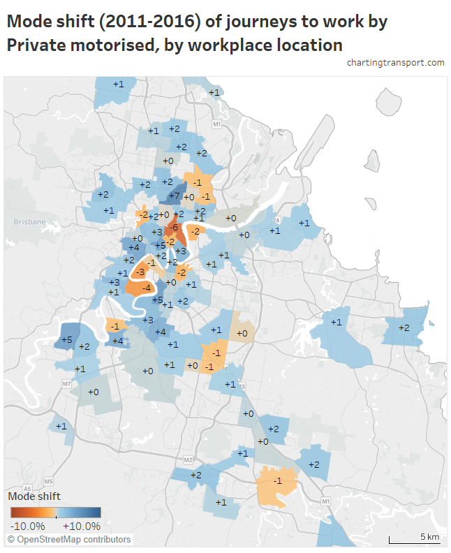
The biggest mode shifts to private transport were to workplaces in Wooloowin – Lutwyche (+7%), Spring Hill (just north of the CBD, +5%) and Jindalee – Mount Ommaney (+5%). The biggest shifts away from private transport were in Newstead – Bowen Hills (-6%), St Lucia (-4%, which includes the University of Queensland main campus), and West End (-3%).
Notably, the job rich Brisbane CBD had a 2% shift to private transport (with 3,135 more private transport trips in 2016).
Here’s a map of the net new jobs and their main mode splits:

And a zoom in on the inner city to separate the overlapping pie charts:

The SA2 with the biggest jobs growth was “Brisbane City” (covering the CBD) with 4584 new jobs – with 68% of this net increase attributable to private transport. North Lanes – Mango Hill in the northern suburbs was not far behind (4472 new jobs at 96% by private transport), followed by Newstead – Bowen Hills (4266 new jobs at 49% private transport) and Brisbane Airport (4197 new jobs at 95% private transport).
The distribution of jobs growth was not heavily concentrated in central Brisbane – in stark contrast to Melbourne where the central city jobs growth was much more signficant.
Here’s a clearer view of new jobs by workplace distance from the city centre and main mode:
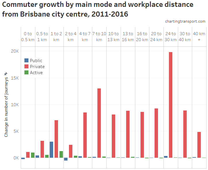
At all distances from the CBD, private transport new trips outnumbered active and public transport new trips (and there was a decline in public transport trips to the very city centre). The vast majority of net new trips were to workplaces more than 4 km from the city centre, and by private transport.
So why was there an overall 2% mode shift to private transport?
The relative lack of jobs growth in the public transport rich city centre is very likely to have contributed to the mode shift to private transport. The vast majority of new jobs were in the suburbs where public transport is significantly less competitive (relative to the CBD).
Others will point to factors that have made public transport less attractive relative to private transport, including problems on the train network, extensive new motorway infrastructure, and public transport fares growing around twice the rate of inflation after 2010.
There was very rapid growth in fares between 2010 and 2015, but then fares were frozen in 2016 and substantially reduced in 2017:

Looking at people working in Greater Brisbane (Greater Capital City Statistical Area), there were 94,055 new private transport commutes, just 246 new public transport commutes, and 2,506 new active transport commutes. So around 97% of net new trips in 2016 were by private transport, much higher than the 2011 baseline private transport mode share of 79% of trips (measured for workplaces in Greater Brisbane), hence the overall 2% mode shift.
Looking at people living in Greater Brisbane, there were 61,557 new private transport commutes, a net reduction of 6,069 public transport commutes, and a net reduction of 54 active transport commutes. Thus every new commute was accounted for by private transport, and further to this there was mode shift away from active and public transport.
So how much of the mode shift can be explained by spatial changes in jobs distribution? If mode shares in each workplace SA2 had not changed between 2011 and 2016 then city level mode shares would be influenced only by spatial variations in jobs growth.
I’ve done the calculations at SA2 geography: if place of work mode shares in Brisbane had not changed between 2011 and 2016 (but volumes had), then the overall private transport mode share would have increased only 1.0% in 2016 (essentially because of higher jobs growth in the suburbs compared to the centre).
Actual private mode share increased by 2.0% (measured by place of work).
So this suggests only half of the mode shift can be explained the spatial variations in jobs growth. The other half will be explained by other factors, particularly changes in the relative attractiveness of modes.
Changes in the relative attractiveness of modes will include public transport service quality, public transport fares, fuel prices, toll prices, and infrastructure provision for private and active transport. Car ownership will undoubtedly be a factor, but I suspect many ownership decisions will be influenced by workplace locations and relative modal attractiveness. Other factors might include changes in real incomes, demographic changes, changes in employment density, and the locations of population growth. I’ll explore the last two in more detail.
What about the relationship between job density and mode share?
You could argue that if general public transport “attractiveness” had not changed, you could still expect a mode shift towards public transport in areas with both high and increasing job density, as car parking might struggle to grow at the same rate as jobs growth (as the land becomes increasingly valuable/scarce). This might particularly be the case in the city centre.
I’ve calculated weighted job density for each SA2 – that is, the average density of destination zones in the SA2, weighted by the number of jobs in each zone (similar to population weighted density, so that large areas within SA2s that house few jobs make little contribution to such scores).
Here’s how weighted job density and workplace private mode share changed in Brisbane for higher density SA2s:
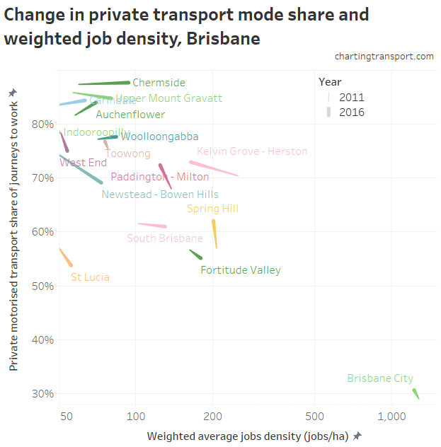
While there is some relationship between job density and private mode share overall, there wasn’t a consistent negative correlation between changes in those values. If there was, you would expect all lines on the chart to be on a similar diagonal orientation (upper left – lower right).
South Brisbane and Upper Mount Gravatt saw increased density but little change in private mode share. Chermside, Auchenflower, and Woolloongabba (which incidentally is at the southern end of the Clem 7 motorway) saw increased job density but also increased private transport mode share (the opposite effect of what you might expect). Spring Hill had only a small drop in job density but a large increase in private mode share.
Newstead – Bowen Hills had the largest shift away from private transport, and also one of the largest increases in job density
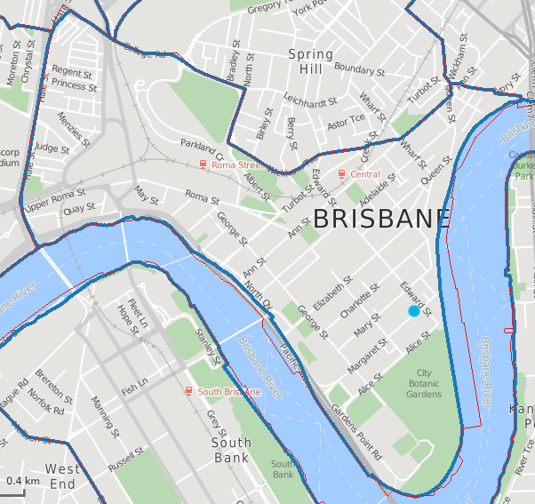
You might be wondering how the Brisbane City SA2 (which includes the CBD) can have had an increase in total jobs, but a slight decline in weighted jobs density. It turns out that the 2016 SA2 boundary goes further into the Brisbane River than the 2011 boundary. Here’s a map generated on the ABS website, where blue lines are the 2011 boundaries and red the 2016 boundaries:
If you discounted the increase in area, you might expect a slight increase in job density (about 4% in unweighted average density) to result in a small mode shift away from private transport, quite the opposite of what actually happened. If increasing job density by itself might have pushed a mode shift away from private transport, it appears it was overpowered by factors working in the opposite direction.
The Brisbane City SA2 accounted for 12.5% of Brisbane’s jobs so its mode split impacts more than most on overall city mode shares.
So what might be the stand-alone impact of increased job density in the city centre on private mode share? It’s very hard to quantify. I can certainly look at other city centres, but there will be so many factors at play in those cities that it would be almost impossible to isolate the impact.
But as a rough stab, had Brisbane City SA2’s private mode share increased from 29.0% to 29.5% (instead of 30.6%), and all other things were the same, then the overall Brisbane private mode share would have been 0.14% lower.
While the actual impact is uncertain, it would only increase the influence of the “other factors” that are responsible for at least half of the 2% mode share towards private transport.
And what about the spatial distribution of population growth?
All other things being equal, if population growth had disproportionately occurred in places with high private transport mode share (eg the middle and outer suburbs), you might expect a mode shift to private transport. However I don’t think this was significant in Brisbane as there has also been inner city population growth.
Indeed, if the home-based private transport mode share of each SA2 had not changed between 2011 and 2016 (but population numbers had), then the overall Brisbane private mode share (by place of enumeration) would have increased only 0.1% (rather than 1.9%). So the overall mode shift doesn’t seem to have a lot to do with where population growth happened.
So what are these effects other cities? I’ll cover that in an upcoming post.
Appendix: about the data
Here’s how I have defined “main mode”:
| Private (motorised) transport | any journey to work involving car, motorcycle, taxi, truck and/or “other”, but not involving any mode of public transport (train, tram, bus, or ferry) |
| Public transport | any journey involving train, bus, tram, or ferry (journeys could also involve private or active transport modes) |
| Active tranport | journeys by walking or cycling only |
I have extracted data from the ABS census for 2006, 2011, and 2016 for areas within the 2011 boundary of the Brisbane Significant Urban Area. The detailed maps are at the smallest available geography – Census Collector Districts (CD) for 2006 and Statistical Area Level 1 (SA1) for 2011 and 2016 for home locations, and Destination Zones (DZ) for workplaces in 2011 and 2016 (detailed workplace data is not readily available for 2006 for most cities). I’ve aggregated this data for distance from city centre calculations (filtered by 2011 Significant Urban Area boundaries), which means the small randomisations will have amplified slightly.
In 2011, a significant number of jobs were not assigned to a destination zone:
- 3.8% of jobs were assigned to an SA2 but not a DZ – I’ve imputed these proportionately to the DZs in their SA2 based on modal volumes reported for each DZ (for want of something better).
- 18,540 Queensland jobs (0.9%) were only known to be somewhere in Greater Brisbane.
- 115,011 jobs (5.8%) were only known to be somewhere in Queensland (hopefully mostly outside Greater Brisbane!).
These special purpose codes are not present in the 2016 data – presumably the ABS did a much better job of coding jobs to DZs. It means that the volumes in 2011 may be slightly understated, and so growth between 2011 and 2016 might be slightly overstated.
I’ve also extracted the data at SA2 (Statistical Area Level 2) based on 2016 boundaries for the purposes of calculating mode shifts and changes in trip volumes at SA2 level (to avoid aggregating small random adjustments ABS applies). However this wasn’t possible for jobs where 2011 SA2s were split into smaller SA2s in 2016 – because some 2011 jobs were assigned an SA2 but not a DZ, so we cannot map those to a specific 2016 SA2 (I aggregated imputed DZ numbers to 2016 SA2 boundaries instead).
I also extracted data at the Brisbane Greater Capital City Statistical Area level, as noted (the boundary did not change between 2011 and 2016).
I have not counted jobs that were reported to have no fixed address in my place of work analysis. I’ve also excluded people who worked at home, did not go to work on census day, or did not provide information about their mode(s) of travel. These workers are also excluded from job density calculations.


Hi Chris. Two issues: First, I plan to convene a meeting at the October Australia Walking and Cycling Conference, to establish am Australian or Australasian walking advocacy group that can be represented on Cycling and Walking Australia and New Zealand. Are you interested in participating, or do you know of any groups that I could approach? So far I have identified the Heart Foundation, Pedestrian Council of Australia, Victoria Walks, Living Streets Aotearoa and the WA Sustainable Transport Coalition. Second, have you looked at the travel impacts of changes in the proportion of workers who travel as car passengers, as distinct from as car drivers? My analysis of journeys to work in the ACT has found that from 2011 to 2016 there were increases in walking, cycling, public transport AND car driving, and that the biggest change was a fall in the number of car passengers – in effect, the increases in “sustainable” travel did not reduce car use, because the additional “active travellers” were people who would otherwise have travelled as passengers in other people’s cars. Cheers Le
LikeLike
Hi there, I’m disappointed but unsurprised by this and, having moved to Brisbane from Melbourne 12 years ago, think that our acceptance of long commutes is cultural, and that infrastructure in Brisbane does not do enough to change that culture!
Would you be able to write a brief conclusion to your findings on why mode share has shifted towards private vehicles? I found the article hard to follow, even concentrating hard 🙂 Thank you
LikeLike