The Australian census provides incredibly rich data about journeys to work, with every journey classified by origin, destination, and mode(s) of transport. So you can ask questions such as “where did workers living in X commute to and how many used public transport?” or “where did workers in Y commute from and what percentage used private transport?”, or “What percentage of people in each home location work in the central city?”.
It’s very possible to answer these questions with census data, but near-impossible to produce an atlas of maps that would answer most questions.
But thanks to new data visualisation platforms, it’s now possible to build interactive tools that allow exploration of the data. I’ve built one in Tableau Public, using both 2011 and 2016 census data for all of Australia at the SA2 geography level (SA2s are roughly suburb sized). This means you can look at each census year, as well and the changes between 2011 and 2016.
I’m going to talk through what I’ve built with plenty of interesting examples from my home city Melbourne.
I hope you find exploring the data as fascinating and useful as I do. I also hope this tool makes it easier to inform transport discussions with evidence.
Also, a warning that this is a longer post, so get comfortable.
About the data (boring but important)
The census asks people which modes they used in the journey to work, and the data is encoded for up to three modes.
I’ve extracted a count of the number of trips between all SA2s within each state, by “main mode” for both 2011 and 2016. I’ve aggregated all responses into one of the following “main mode” categories:
- Private (motorised) transport only – any journey involving car, truck, motorbike or taxi, but no modes of public transport, or people who only responded with “other”. Around 89% of journeys in this category were simply “car as driver”.
- Walking/cycling only (or “active transport”) – journeys by walking or cycling only.
- Public transport – any journey involving any public transport mode (train, tram, bus, and/or ferry). These journeys might also involve private motorised transport and/or cycling.
There are 466,597 rows of data all up – so you will need to be a little patient while Tableau prepares charts for you.
Things to note:
- I’ve had to extract each state separately to stop the number of possible origin-destination combinations getting too large. This means that interstate journeys to work are not included in the data. I have however combined New South Wales (NSW) and the small Australian Capital Territory (ACT), as many people commute between Queanbeyan (NSW) and Canberra (ACT). Apologies to other areas near state borders!
- When you ask the ABS for the number of people meeting certain criteria, the answer will never be 1 or 2. The ABS randomly adjust small numbers to protect privacy, and it’s not a good idea to add up lots of small randomly adjusted figures. That’s another reason why I haven’t gone smaller than SA2 geography and why I’ve aggregated mode combinations to just three modal categories. You will still see counts of 3 or 4, which need to be treated with caution.
- Not all SA2s are the same size in terms of residential population, and particularly in terms of working population. The biggest source of commuters for a work area might simply be an SA2 with a larger total residential population.
- The ABS change the SA2 boundaries between censuses. With each census some SA2s are split into smaller SA2s, particularly in fast growing areas. If you want to compare 2011 and 2016 figures, it is necessary to aggregate the 2016 data to 2011 boundaries, which the tool does where required. Some visualisation pages will give you the option of aggregating 2016 data to 2011 boundaries to make it easier to compare 2011 and 2016 data.
- I’ve only counted journeys where the origin, destination and mode are known. Anyone who didn’t go to work on census day, didn’t state their mode(s) of travel, or didn’t state a fixed land-based work location are excluded.
- Assigning “other” only trips as private transport might not be perfect, as it might include non-motorised modes like skateboards and foot scooters. It will also count air travel, and it’s arguable whether that is private or public transport (it’s certainly not low-carbon transport). However, overall numbers are quite small – 0.81% of all journeys with a stated mode in Australia.
Mode share maps to/from a location
First up, you can produce maps showing the main mode share of commuters from all home SA2 for a particular work SA2, or all workplaces for a particular home SA2.
Here is a map of private transport mode shares for journeys to work from Point Cook North:

Private transport dominates most middle and outer work destinations (even local trips), with many at 100%. Lower shares are evident for central city destinations, although Southbank next to the CBD is relatively high at 65%, and 100% of commuters who travelled to Fishermans Bend did so by private transport.
You can also look at it the other way around. Here’s private transport mode share for commutes to Parkville (just north of the CBD):
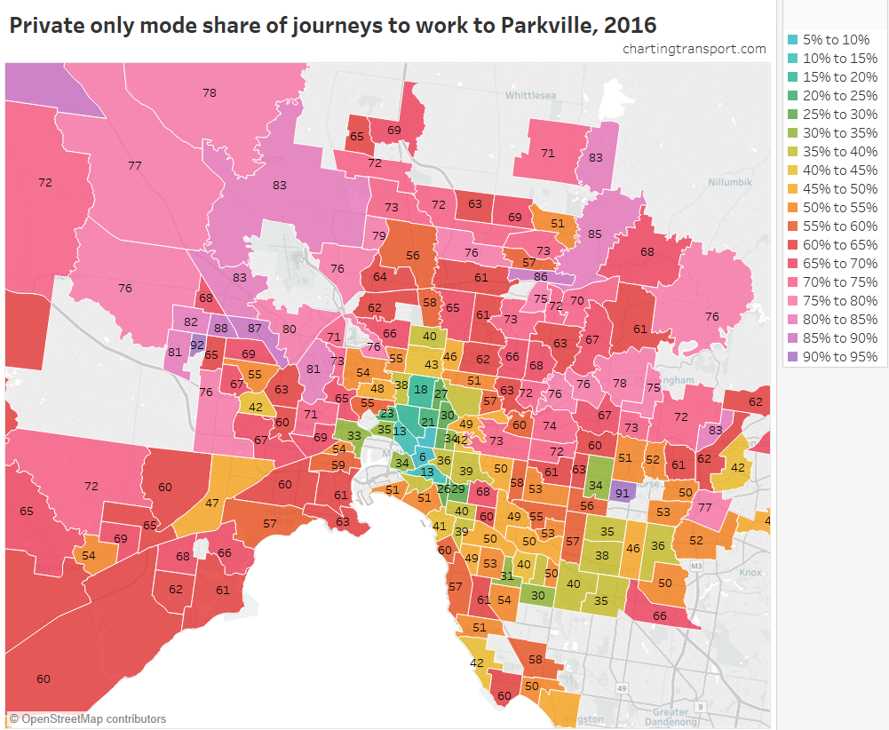
There was a low private transport mode share from the city centre and Brunswick to the north, roughly 40-50% mode shares from the south-eastern suburbs (accessible by train), but very high mode shares from the middle and outer suburbs to the north and west (public transport access more difficult). The new Metro Tunnel could make a dent in these mode shares, with a new train station in Parkville.
Here is a map of private transport only mode share for journeys to the “Melbourne” SA2 (which represents the Melbourne CBD):
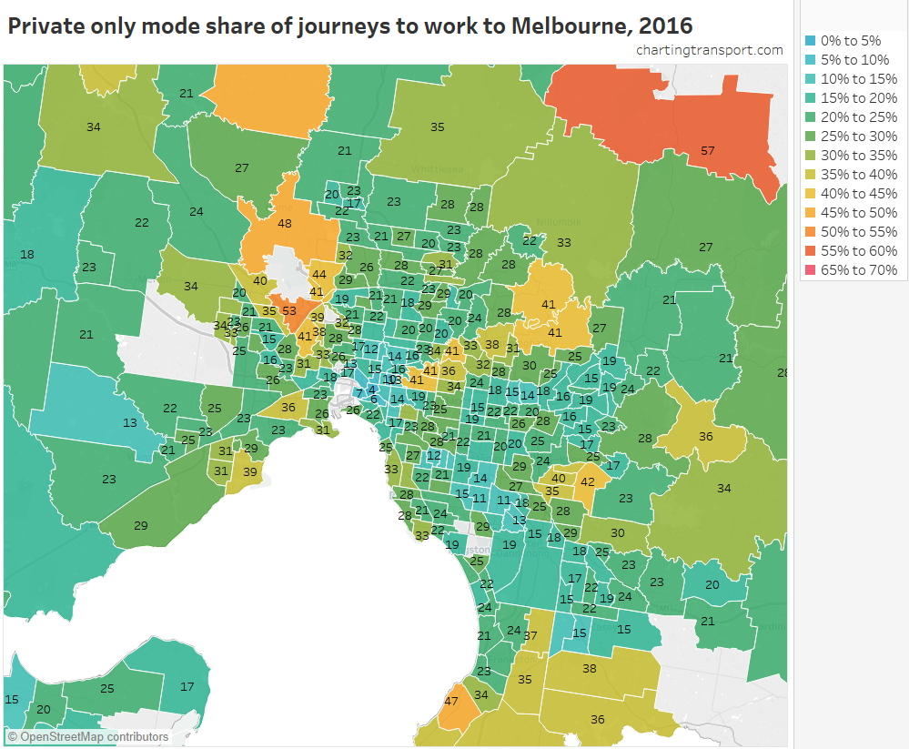
Private transport (only) mode shares were lower than 30% for most areas, as public and active transport options are generally cheaper and more convenient for travel to the CBD. However you can see corridors with higher private transport mode share, including Kew – Bulleen – Doncaster – Warrandyte, and Keilor East – Keilor – Greenvale (around Melbourne Airport). These corridors are more remote from heavy rail lines. Other patches of higher private mode share include Rowville – Lysterfield, Altona North, and Point Cook East (including Sanctuary Lakes).
A high private transport mode share does not necessary mean a flood of private vehicles are coming from these areas. Kinglake is the rich orange area in the north-east of the above map, and according the 2016 census, 57% of people commuted to the Melbourne CBD by private transport only. Except that 57% is actually just 23 out of just 40 people making that commute – which is pretty small number in whole scheme of things.
Which leads me to…
Journey volume and mode split maps
These maps show the volume (size of pie) and mode split for journeys from/to a selected SA2.
The following map shows the volume and mode split of journeys to the “Melbourne” SA2 in 2016:
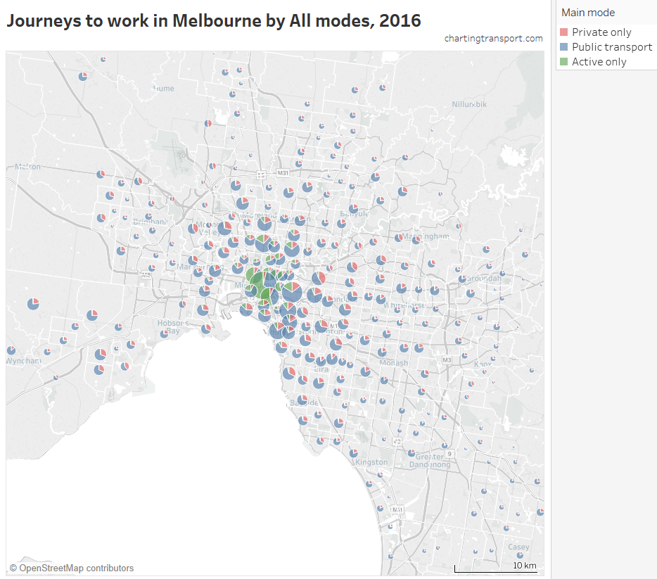
As I discussed in a recent post, not many people actually commute from the outer suburbs to the central city. Indeed, only 767 people commuted from Rowville to the Melbourne CBD in 2016, which is less than one train full.
Unfortunately all the pie charts in the inner city tend to overlap, while the pie charts in the outer suburbs are tiny. Here’s a zoomed in map for the inner suburbs with a lot less overlap:
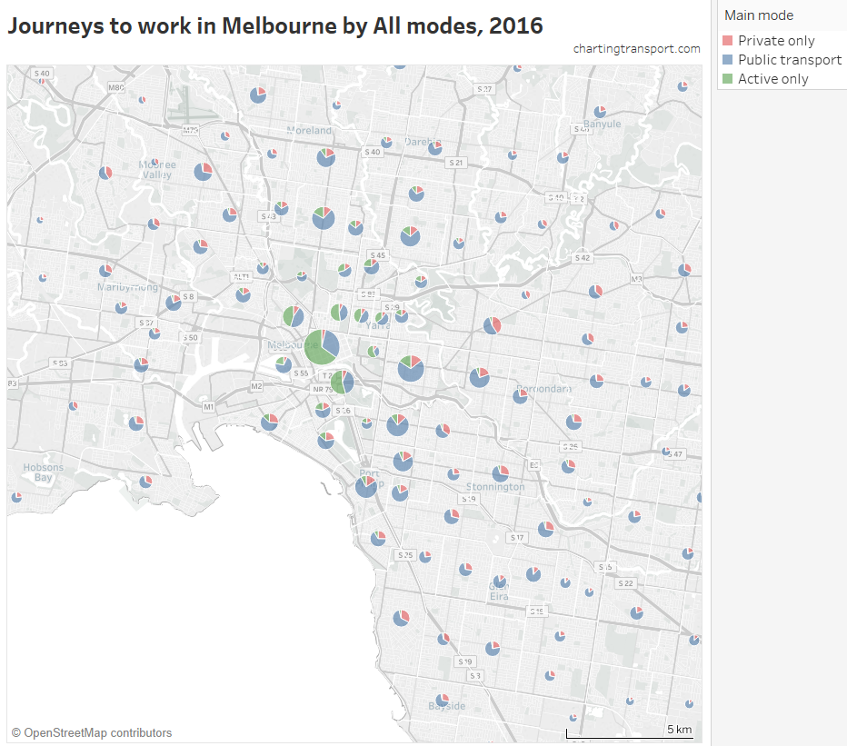
You can see large green wedges in the inner city, where walking or cycling to the CBD is practical. You can also see that almost everywhere the blue wedges (public transport) are much larger than the red (private transport).
What does stand out more in this map is Kew – where 716 people travelled to the Melbourne CBD by private transport (highest of any SA2) – with a relatively high 41% mode share for a location so close to the city, despite it being connected to the CBD by four frequent tram and bus lines. Kew is also a quite wealthy area, so perhaps parking costs do not trouble such commuters (maybe employers are paying?). Other home SA2s with high volumes and relatively high private mode shares are Essendon – Alberfeldie (521 journeys, 28% private mode share), Brighton (493, 33%), Keilor East (419, 41%), Toorak (404, 35%) and Balwyn North (396, 35%). Most of these are wealthy suburbs, with the notable exception of Keilor East, which does not have a nearby train station.
Here is the same for Parkville:
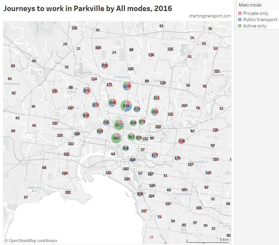
The home areas with significant numbers of Parkville commuters are in the inner northern suburbs, and active and public transport were the dominant mode share for these trips. While 92% of commuters from Burnside Heights to Parkville were by private transport, there were only 35 such trips. The overall private transport mode share for Parkville as a destination was 50%.
Here is the same type of map for Fishermans Bend (Port Melbourne Industrial), which is just south-west of the CBD:
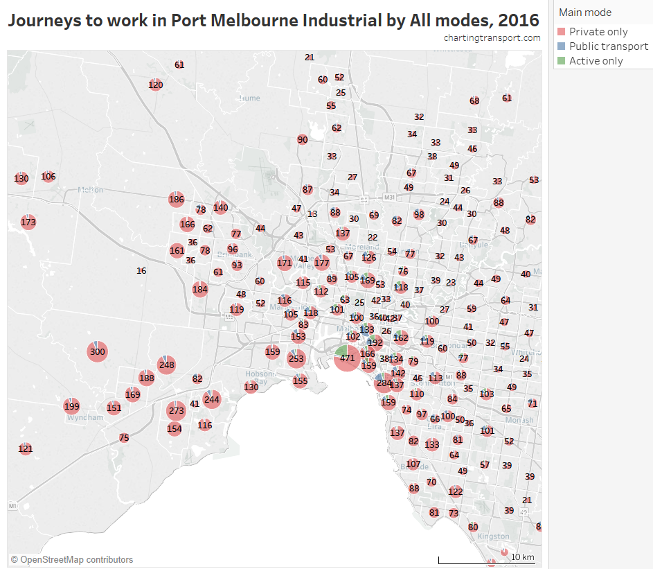
Private transport dominates mode share, and you can see a slight bias towards the western suburbs. Which means a lot of cars driving over the Westgate Bridge.
Around 30,000 people travelled to work in Clayton in Melbourne’s south-east. Here’s a map showing the origins of those commutes:
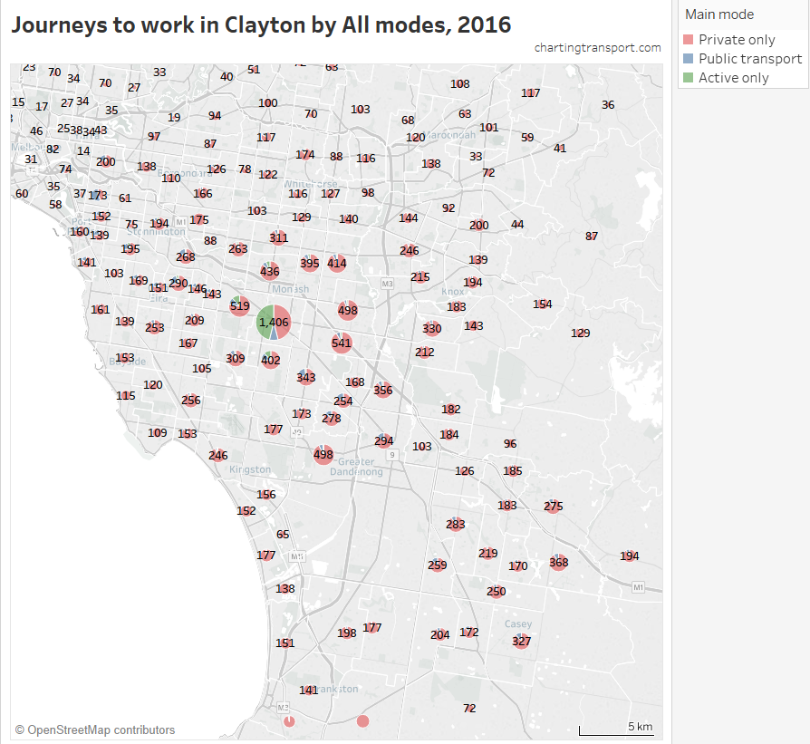
Almost half of the workers who both live and work in Clayton walked or cycled (only) to work, of which I suspect many work at Monash University. The public transport mode shares are higher towards the north-west, particularly around the Dandenong train line that connects to Clayton. Very few people put themselves through the pain of commuting from Melbourne’s western and northern suburbs to Clayton.
Over 60,000 people commuted to Dandenong in 2016, which includes the large Dandenong South industrial area. Here are the volumes and mode splits for where they came from:
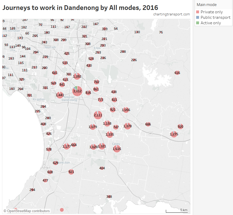
You can see a significant proportion of the workforce lived to the south-east, and much less to the north and west. You can also see private transport dominates travel from all directions (despite there being two train lines through the Dandenong activity centre, and a north-south SmartBus route through the industrial area).
Here‘s a look at people who commuted to work at Melbourne Airport:
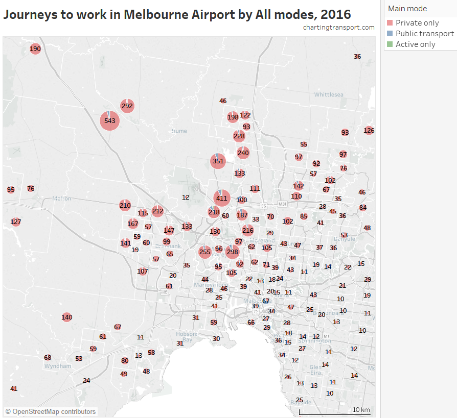
You can see that airport workers predominantly came from the nearby suburbs, and the vast majority commuted by private transport. The most common home locations of airport workers include Sunbury South (543), Gladstone Park – Westmeadows (411), and Greenvale – Bulla (351 – note Greenvale has a much higher population than Bulla).
The largest public transport volume actually came from the CBD (48 out of 67 commuters, which is a 72% mode share), probably using staff discount tickets on SkyBus. The biggest trip growth 2011 to 2016 was from Craigieburn – Mickelham: 367 more trips of which 355 were by private transport only.
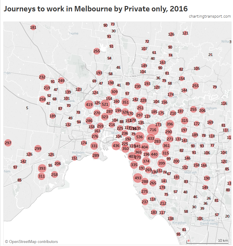
The data can also be filtered to only show a particular main mode. For example, here is a map of the origins for private transport trips to the Melbourne CBD (ie who drives to work in the CBD):
Which can also be shown as a sorted bar chart:
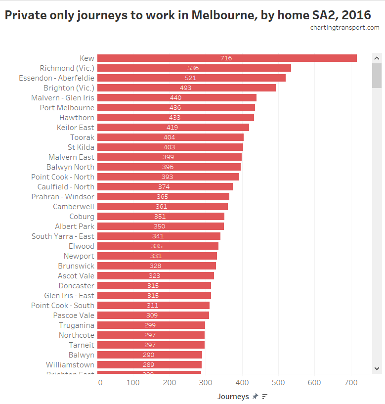
The most common sources of private transport trips to the CBD were generally very wealthy suburbs, where many people are probably untroubled by the cost of car parking (they can easily afford it, or someone else is paying). However bear in mind that not all SA2s have the same population so larger SA2s will be higher on the list (all other things being equal).
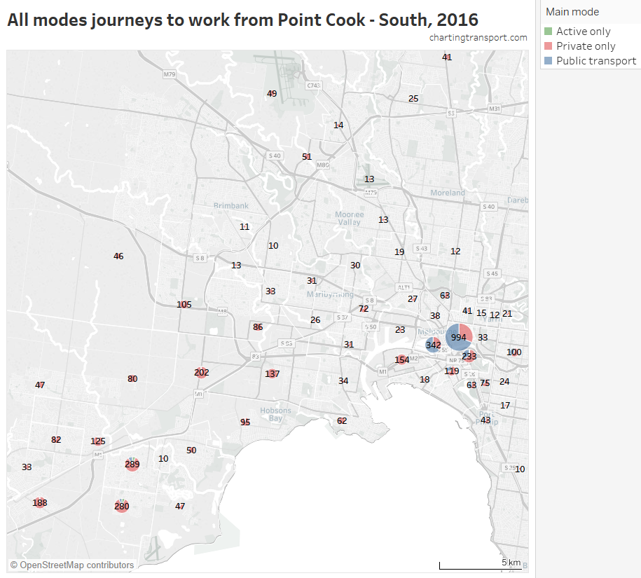
This data can also be viewed the other way around. Here are the volumes and mode splits of journeys from Point Cook South in 2016. The Melbourne CBD was the biggest destination (994 journeys) with 69% public transport mode share followed by Docklands (342 journeys) with 64% public transport mode share.
Here is yet another way to look at this data, which is particularly relevant for the central city…
Percentage of commuters who travel to selected workplace SA2s
Here is a map showing the proportion of commuters in each home SA2 who work in the Melbourne, Southbank or Docklands SA2s (the tool allows selection of up to three workplace SA2s):
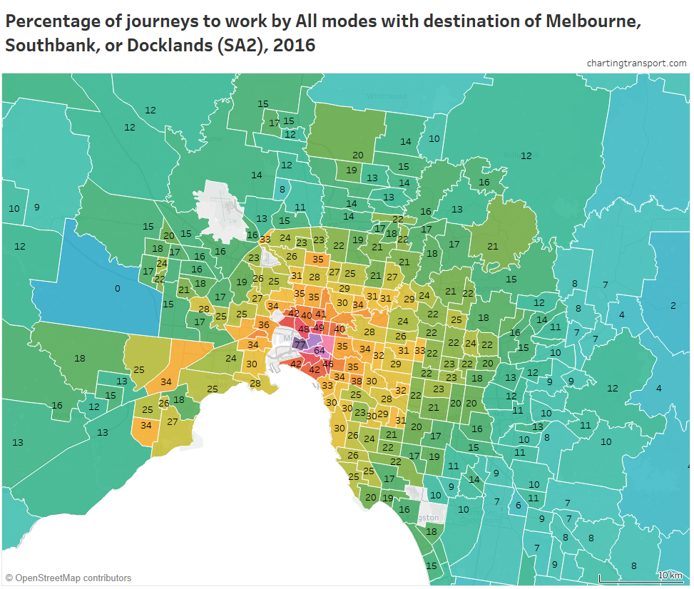
There are some interesting patterns in this map. Generally the percentage of people commuting to central Melbourne declined with distance from the CBD. There are however some outlier SA2s that had relatively high percentages of people travelling to central Melbourne, despite being some distance from the city centre.
In fact, here is a chart showing distance from the CBD, and the percentage of commuters travelling to the central city:

Tableau has labelled some of the points, but not all (interact with the data in Tableau to explore more). The outliers above the curve are generally west or north of the city, with Point Cook South being the most significant outlier. Further from the city, the commuter towns of Macedon, Riddells Creek and Gisborne have unusually high percentage of commuters travelling to the central city for that distance from the city (made possible by upgraded V/Line train services). Many of the outliers below the curve are less wealthy areas, where people were less likely to work in the central city.
The previous map showed the proportion of all commuters that went to the central city. The tool can also filter that by mode. Here’s a map showing the percentage of public transport commuters who had a destination of Melbourne, Docklands or Southbank:
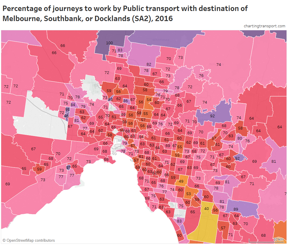
Typically around two-thirds of public transport journeys to work from most parts of Greater Melbourne are to Melbourne, Docklands, or Southbank SA2s. The lowest percentages were in the local jobs rich SA2s of Clayton (49%) and Dandenong (40%).
Adding Carlton and East Melbourne to the above three central city SA2s roughly takes the proportion up to around 70%. That’s a lot of public transport commutes to other destinations, but still a vast majority are focussed on the central city.
We can also look at this data from the origin end…
Where do people from a particular area commute to?
As an example, here is a map showing the percentage of commuters from Point Cook – South (a new and relatively wealthy area in Melbourne’s south-west) who worked in each work SA2 (destinations with less than 20 workers excluded):
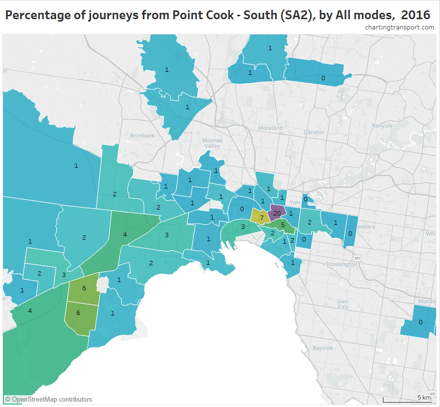
You can see that 20% worked in the Melbourne CBD, followed by 7% in Docklands, and 6% in each of Point Cook North and Point Cook South (local). The largest nearby employment area is the industrial areas of Laverton, but this industrial area only attracted 4% of commuters from Point Cook South.
Here is a map for “Rowville – Central” SA2:
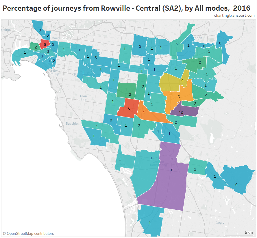
You can see that journeys to work are very scattered, with only 6% travelling to the Melbourne CBD.
(these maps can also be filtered by mode)
Another way to look at that data is a…
List of top commuter destinations
Here’s a chart showing the top work destinations from Rowville – Central in 2016, split by mode (this is a screenshot so the scroll bar doesn’t work):
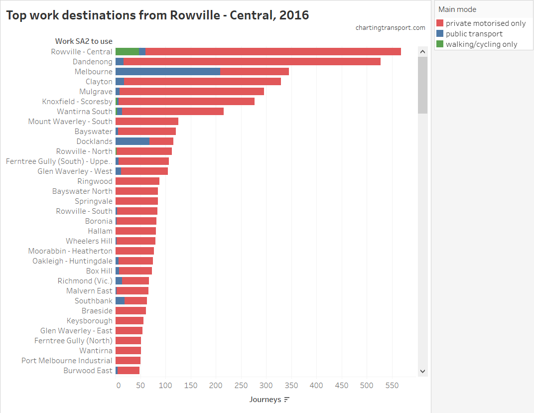
You can see local trips are most numerous, and are dominated by private transport (although there were 48 active transport local trips). Dandenong was the second most common destination, with 97% private transport mode share, followed by Melbourne CBD with 40% private transport mode share (137 private transport journeys). The only other destination with high public transport mode share was Docklands at 59% (48 private transport journeys).
Changes between 2011 and 2016
We’ve so far looked at volumes and mode shares, but of course we can also look at the changes in volumes and mode share between 2011 and 2016.
There were around 15,000 more commutes to Dandenong in 2016 compared to 2011. Here are the changes in volumes by main mode for home SA2s with the largest total number of journeys:
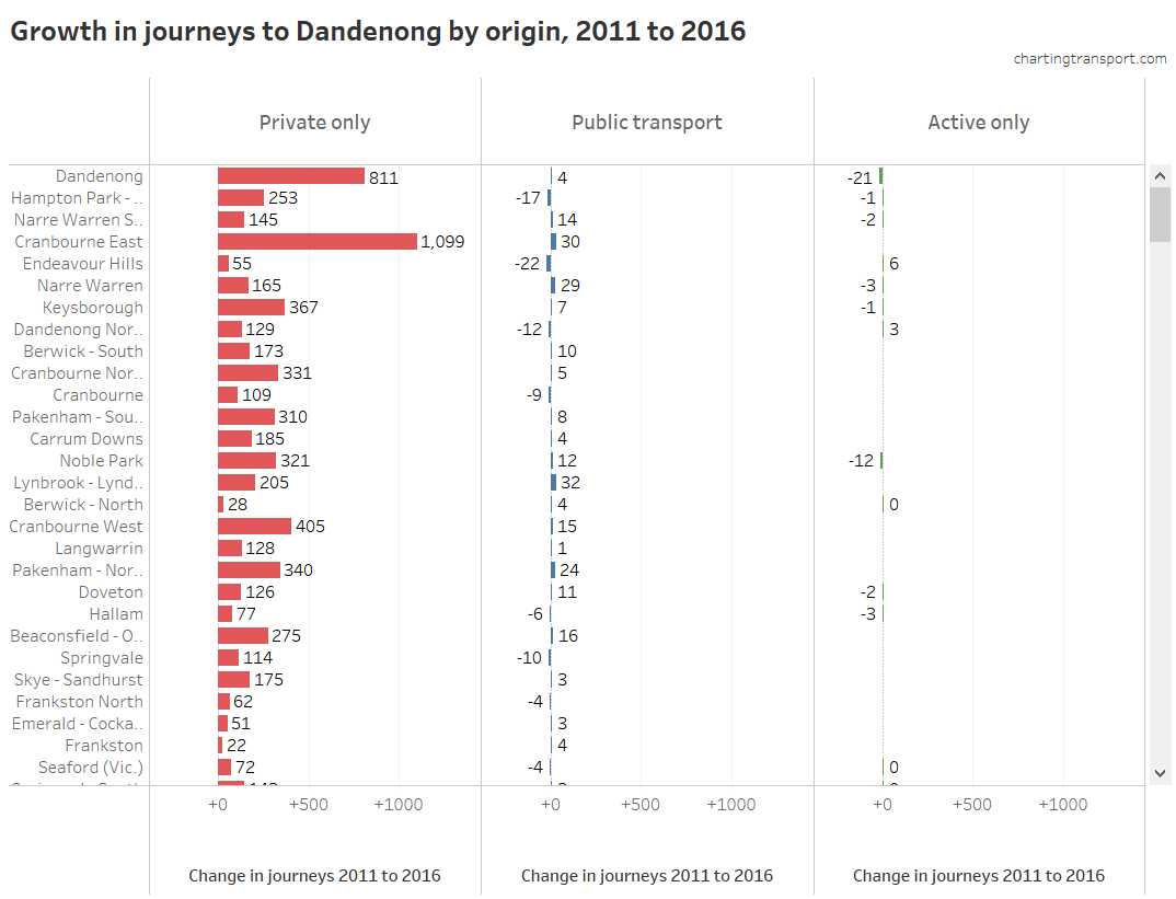
You can see almost all of the new journeys to work were by private transport, no doubt putting a lot of pressure on the road network. A lot of the growth was from the suburbs to the east and south-east, none of which had a direct public transport connection to the Dandenong South industrial area at the time of the 2016 census. That’s now changed, with new bus route 890 linking the Cranbourne train line at Lynbrook with the Dandenong South industrial area (it operates every 40 minutes).
Note: a row with no figure or bar drawn (quite common in the Active only column) means that there were no such trips in either 2011 and/or 2016. Unfortunately the tool doesn’t show the change in volume in such circumstances (I’ll try to fix this in the future).
Contrast this with Parkville:
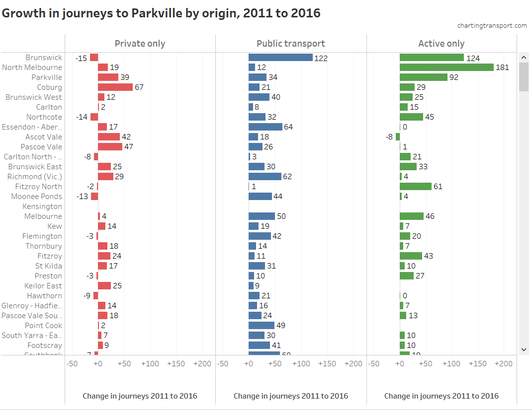
Brunswick is Parkville’s biggest source of workers, and there were many more such workers coming in by public and active transport, and a decline in workers who commuted by private transport. However there was an increase in private transport from places further out like Coburg and Pascoe Vale.
Of course you can do this the other way around too. Here‘s the new trips from Tarneit, a major growth area in Melbourne’s south-west where a train station opened in 2015:
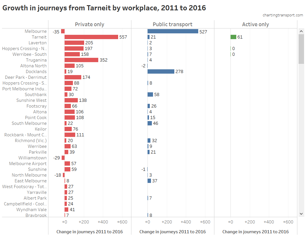
Access to the Melbourne CBD by public transport improved significantly with the new train station, and 527 more people did that trip in 2016 compared to 2011. But the number of people who drove declined by only 35. The train line didn’t reduce the number of people driving out of Tarneit in total, but there probably would have been a lot more had it not opened. In the case of the Melbourne CBD, there were simply a lot more CBD workers living in Tarneit in 2016 (some CBD workers may have moved to Tarneit, and people otherwise in Tarneit were probably more likely to choose the CBD for work).
Here is a map of private transport mode shifts for journeys to the Melbourne CBD (were blue is mode shift to private transport and orange is mode shift away from private transport):
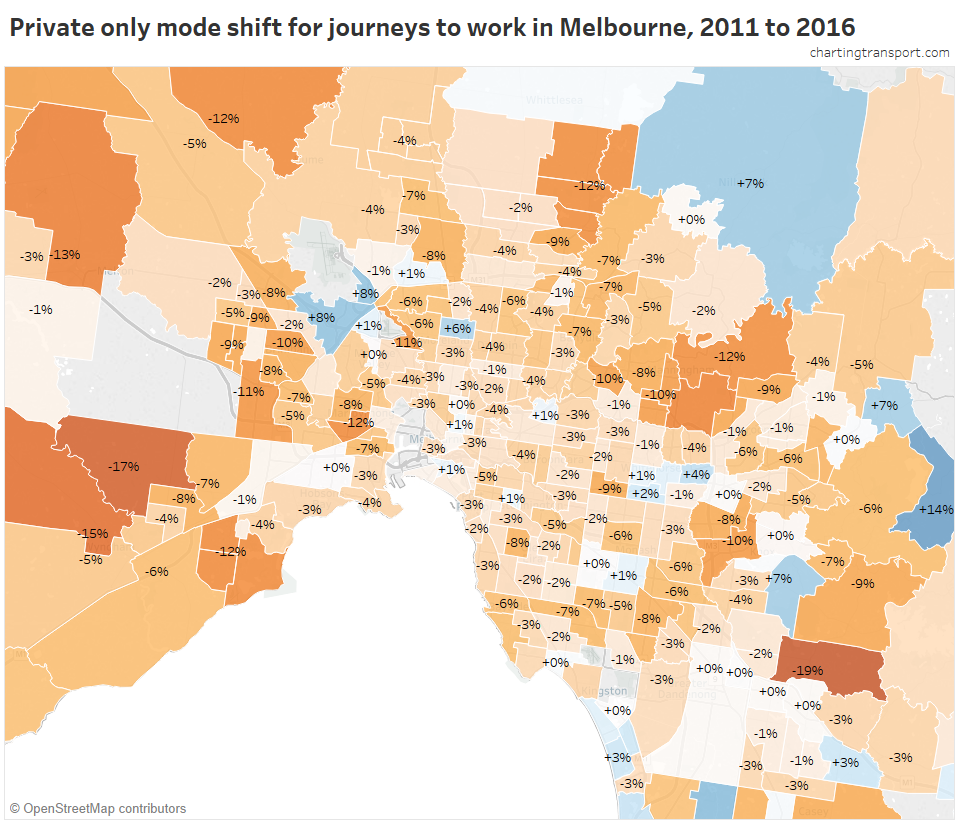
The biggest shifts away from private transport include Narre Warren North (-19%, but small volumes), Tarneit (-17%, with a train station opening in 2015), Wyndham Vale (-15%, also new train station), Don Vale – Park Orchards (-15%, with buses being primary mode for access to the CBD), Melton (-13%), and then -12% in Point Cook (new train station and bus upgrades in 2013), West Footscray – Tottenham, Sunbury (rail electrification 2012), South Morang (new train station), and Warrandyte – Wonga Park (SmartBus to city).
The biggest mode shifts to private transport were in low volume areas, including Monbulk – Silvan (+14%, which is an extra 5 trips), Keilor (+8%, 8 extra trips), Tullamarine (+8%, 16 extra trips), Lysterfield (+7%, 4 extra trips), Panton Hill – St Andrews (+7%, 4 extra trips) and more surprisingly Coburg North (+6%, up from 47 to 97 trips).
Again, you can see the problem with mode share and mode shift figures is that the volumes may be inconsequential. The map doesn’t show regions with less than 30 travellers, or less than 4 travellers by the selected mode. There was an overwhelming mode shift away from private transport for travel to the Melbourne CBD.
Here’s another view of the data: the change in the number of private transport trips to the Melbourne CBD, mapped:
![]()
That’s a peculiar mix of increases in decreases, but most of the volume changes are relatively small (note the scale).
The biggest increase was +142 trips from Truganina, a growth area with two nearby train stations built between 2011 and 2016. If that sounds alarming, it should be compared with an increase of 555 public transport trips from Truganina to the Melbourne CBD.
The larger declines were from suburbs like:
- -85 from Doncaster East (bus upgrades),
- -67 from Donvale – Park Orchards (bus upgrades),
- -66 from Templestowe (also bus upgrades), and
- -61 from Deer Park – Derrimut (also bus and train service upgrades).
Curiously, there was an increase of 71 private transport journeys to work entirely within the Melbourne CBD (to a new total of 236). Why anyone living and working in the CBD would go by private transport is almost beyond me – it’s very walkable and the trams are now free. Digging deeper…in 2016: 137 drove a car, 20 were a car passenger, 17 used motorbike/scooter, 13 a taxi, and 31 were “other” (okay, some of those 31 might have been skateboards or kick scooters, but we don’t know).
We can do the same by home location. Here are the net new trip destinations from Wyndham Vale in Melbourne’s outer south-west:
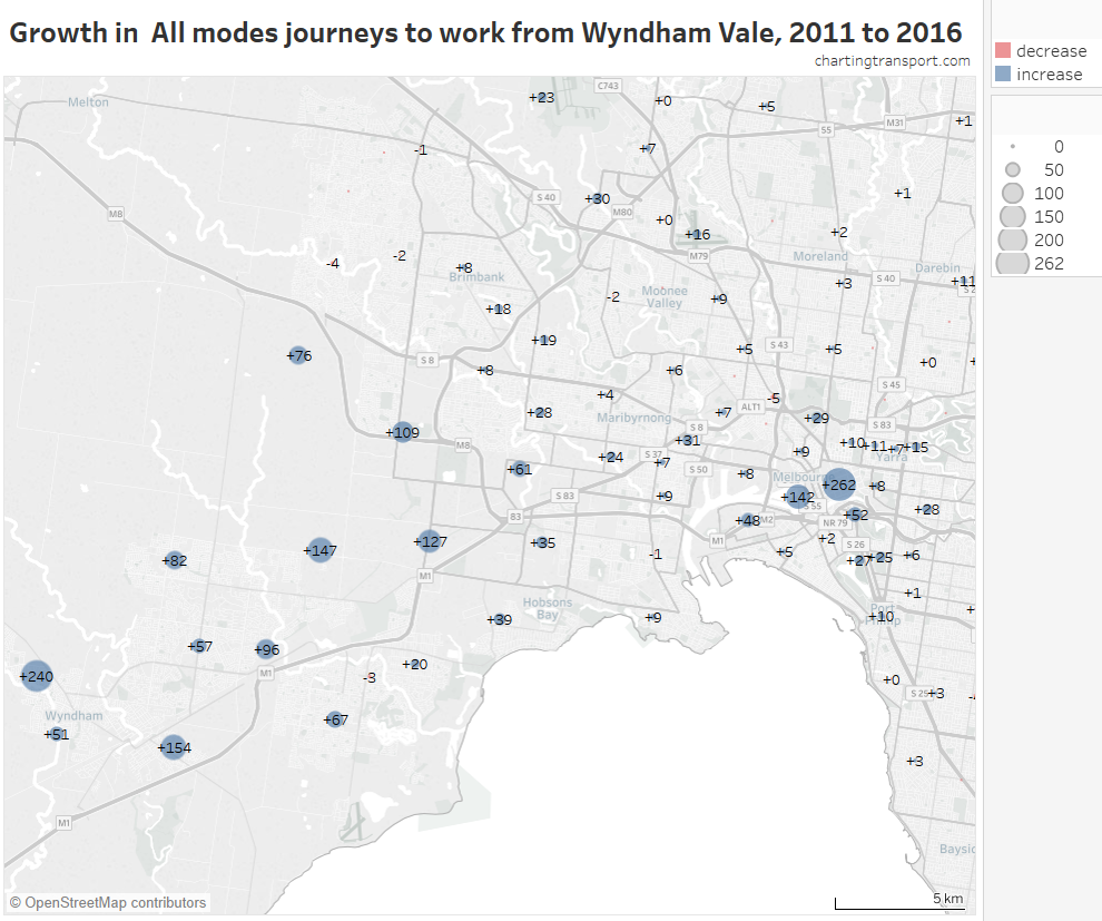
Wyndham Vale added more trips to the Melbourne CBD than trips to local workplaces.
Find your own stories
As mentioned, I’ve built interactive visualisations for all of this data, in Tableau Public, which you can use for free.
If you have a reasonably large screen, you might want to start with one of these four “dashboards” that show you volumes and mode shares, or volume changes and mode shifts. Choose a state, then an SA2, then you might need to zoom/pan the maps to show the areas of interest (unfortunately I can’t find a way to change the map zoom to be relevant to your selected SA2). The good thing about these dashboards is that you see mode shares and volumes on the same page.
- Mode shares and volumes for a selected work SA2 (2011 or 2016)
- Mode shares and volumes for a selected home SA2 (2011 or 2016)
- Mode shifts and volume changes for a selected work SA2 (changes 2011 to 2016)
- Mode shifts and volume changes for a selected home SA2 (changes 2011 to 2016)
Play around with the various filtering options to get different views of the data, including an option to turn on/off labels (which can overlap a lot when you zoom out), and change the colour scheme for mode share maps.
If you want more detail and/or have a smaller screen, then you might want to use one of the following links to a single map/chart:
| Journey volumes by mode | on a map | to selected work location | from selected home location |
| on a bar chart | to selected work location | from selected home location | |
| Mode share | on a map | to selected work location | from selected home location |
| on a bar chart | to selected work location | from selected home location | |
| Percent of journeys | on a map | to selected work location(s) | from selected home location |
| on a box chart | to selected work location | from selected home location | |
| Journey volume change 2011 to 2016 | on a map | to selected work location | from selected home location |
| on a bar chart | to selected work location | from selected home location | |
| Mode shift 2011 to 2016 |
on a map | to selected work location | from selected home location |
| on a bar chart | to selected work location | from selected home location |
Once you have the tool open in Tableau Public you can switch between the dashboards and worksheets with the tabs at the top (note: it will reset if you don’t use it for a while). You can mouse over the data to see more details (I’ve tried to list relevant data for each area), and often your filtering selections will apply to related tabs.
Finally remember to be careful in your analysis:
- A large mode share or mode shift might not be for a significant volume.
- A large change in volume might not be a significant mode shift.
Have fun!
[This post and the Tableau tool were updated 3 February 2018 with better label positions on maps. For larger SA2s, label positions better reflect the centre of residential or working population, as appropriate to the type of map. The Tableau tool should also be faster to load]


Do you plan to break down the public transport mode shares to rail/bus/ferry etc? I know this is problematic because an assumption has to made about what is the “main mode” used when a journey involves, for example, a transfer from a bus to a train.
LikeLike
It’s also problematic because the volumes will be small (you’ll see lots of 3s and 4s), and the number of rows of data would quickly blow out (it’s already half a million). However it could probably be attempted for journeys within a metropolitan area only. I’ll contemplate that.
LikeLike
Fascinating insights as always – many thanks!!
Re “Why anyone living and working in the CBD would go by private transport is almost beyond me – it’s very walkable and the trams are now free.” From what I see when I take my wife dancing at the Exford on Little Bourke Street, there are a lot of very wealthy restaurant owners who drive their BMW 5 series or Mercedes S class from their city apartment to their restaurant in Chinatown. I think it’s more of a status symbol than a question of practicality. Paying for parking doesn’t faze them either.
Hope that helps!
LikeLike
Hi Chris, could you point me to where I could find historic data on licensed drivers in Victoria by gender?
From VicRoads data I use to have access to I recall that it was not until the 1970s? that the number of women licensed to drive were similar to the number of men.
Cheers
Warwick
LikeLike