Paid parking is often used when too many people want to park their car in the same place at the same time. Does it encourage people to cycle or use public transport instead of driving? Does that depend on the type of destination and/or availability of public transport? Are places with paid parking good targets for public transport upgrades?
In this post I’m going to try to answer the above questions. I’ll look at where there is paid parking in Melbourne, how transport mode shares vary for destinations across the city, and then the relationship between the two. I’ll take a deeper look at different destination types (particularly hospitals), explore the link between paid parking and employment density, and conclude with some implications for public transport planners. There’s a bit to get through so get comfortable.
This post uses data from around 158,000 surveyed trips around Greater Melbourne collected as part of a household travel survey (VISTA) between 2012 and 2018, as well as journey to work data from the 2016 ABS census.
Unfortunately the data available doesn’t allow for perfect analysis. The VISTA’s survey sample sizes are not large, I don’t have data about how much was paid for parking, nor whether other parking restrictions might impact mode choice (e.g. time limits), and I suspect some people interpreted survey questions differently. But I think there are still some fairly clear insights from the data.
Where is there paid parking in Melbourne?
I’m not aware of an available comprehensive car park pricing data set for Melbourne. Parkopedia tells you about formal car parks (not on street options) and doesn’t share data sets for free, while the City of Melbourne provides data on the location, fees, and time restrictions of on-street bays (only). So I’ve created my own – using the VISTA household travel survey.
For every surveyed trip involving parking a car, van, or truck, we know whether a parking fee was payable. However the challenge is that VISTA is a survey, so the trip volumes are small for any particular place. For my analysis I’ve used groups of ABS Destination Zones (2016 boundaries) that together have at least 40 parking trips (excluding trips where the purpose was “go home” as residential parking is unlikely to involve a parking fee). I’ve chosen 40 as a compromise between not wanting to have too small a sample, and not wanting to have to aggregate too many destination zones. In some cases a single destination zone has enough parking trips, but in most cases I have had to create groups.
I’ve tried to avoid merging different land uses where possible, and for some parts of Melbourne there are just not enough surveyed parking trips in an area (see appendix at the end of this post for more details). Whether I combine zones or use a single zone, I’m calling these “DZ groups” for short.
For each DZ group I’ve calculated the percentage of vehicle parking trips surveyed that involved someone paying a parking fee. The value will be low if only some circumstances require parking payment (eg all-day parking on weekdays), and higher if most people need to pay at most times of the week for both short and long stays (but curiously never 100%). The sample for each DZ group will be a small random sample of trips from different times of week, survey years, and durations. For DZ groups with paid parking rates above 20%, the margin of error for paid parking percentage is typically up to +/- 13% (at a 90% confidence interval).
Imperfect as the measure is, the following map shows DZ groups with at least 10% paid parking, along with my land use categorisations (where a DZ group has a specialised land use).

There are high percentages of paid parking in the central city, as you’d expect. Paid parking is more isolated in the suburbs – and mostly occurs at university campuses, hospitals, larger activity centres, and of course Melbourne Airport.
The next chart shows the DZ groups with the highest percentages of paid parking (together with the margin of error).
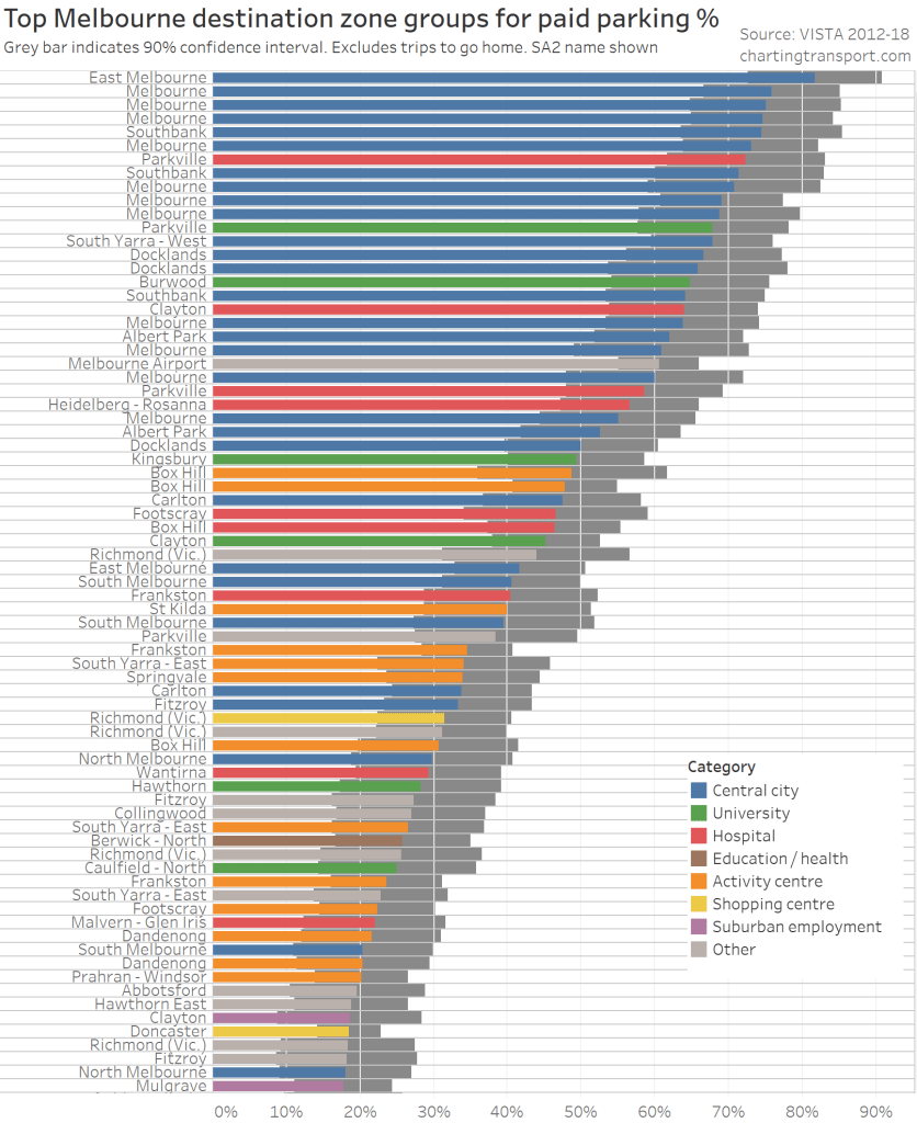
Technical note: the Y-axis shows the SA2 name, rather than the (unique but meaningless) DZ code(s), so you will see multiple DZ groups with the same SA2 name.
At the top of the chart are central city areas, major hospitals, several university campuses, and Melbourne Airport.
Further down the chart are:
- larger activity centres – many inner suburban centres plus also Dandenong, Frankston, Box Hill, and curiously Springvale (where some controversial parking meters were switched off in 2017),
- the area around Melbourne Zoo (Parkville SA2 – classified as “other”),
- some inner city mixed-use areas,
- two shopping centres – the inner suburban Victoria Gardens Shopping Centre in Richmond (which includes an IKEA store), and Doncaster (Westfield) – the only large middle suburban centre to show up with significant paid parking (many others now have time restrictions), and
- some suburban industrial employment areas (towards the bottom of the chart) – in which I’ve not found commercial car parks.
These are mostly places of high activity density, where land values don’t support the provision of sufficient free parking to meet all demand.
While the data looks quite plausible, the calculated values not perfect, for several reasons:
- Some people almost certainly forget that they paid for parking (or misinterpreted the survey question). For example, on the Monash University Clayton campus, 45% of vehicle driver trips (n = 126) said no parking fee was payable, 2% said their employer paid, and 12% said it was paid through a salary arrangement. However there is pretty much no free parking on campus (at least on weekdays), so I suspect many people forgot to mention that they had paid for parking in the form of a year or half-year permit (I’m told that very few staff get free parking permits).
- Many people said they parked for free in an employee provided off-street car park. In this instance the employer is actually paying for parking (real estate, infrastructure, maintenance, etc). If this parking is rationed to senior employees only then other employees may be more likely to use non-car modes. But if employer provided is plentiful then car travel would be an attractive option. 22% of surveyed trips involving driving to the Melbourne CBD reported parking in an employer provided car park, about a quarter of those said no parking fee was required (most others said their employer paid for parking).
- As already mentioned, the sample sizes are quite small, and different parking events will be at different times of the week, for different durations, and the applicability of parking fees may have changed over the survey period between 2012 and 2018.
- The data doesn’t tell us how much was paid for parking. I would expect price to be a significant factor influencing mode choices.
- Paid parking is not the only disincentive to travel by private car – there might be time restrictions or availability issues, but unfortunately VISTA does not collect such data (it would be tricky to collect).
How does private transport mode share vary across Melbourne?
The other part of this analysis is around private transport mode shares for destinations. As usual I define private transport as a trip that involved some motorised transport, but not any modes of public transport.
Rich data is available for journeys to work from the ABS census, but I’m also interested in general travel, and for that I have to use the VISTA survey data.
For much of my analysis I am going to exclude walking trips, on the basis that I’m primarily interested in trips where private transport is in competition with cycling and public transport. Yes there will be cases where people choose to walk instead of drive because of parking challenges, but I’m assuming not that many (indeed, around 93% of vehicle driver trips in the VISTA survey are more than 1 km). An alternative might be to exclude trips shorter than a certain distance, but then that presents difficult decisions around an appropriate distance threshold.
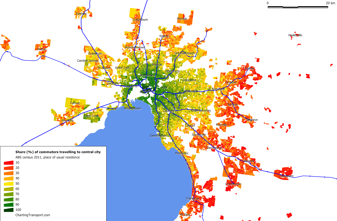
Here’s a map of private transport mode share of non-walking trips by SA2 destination:
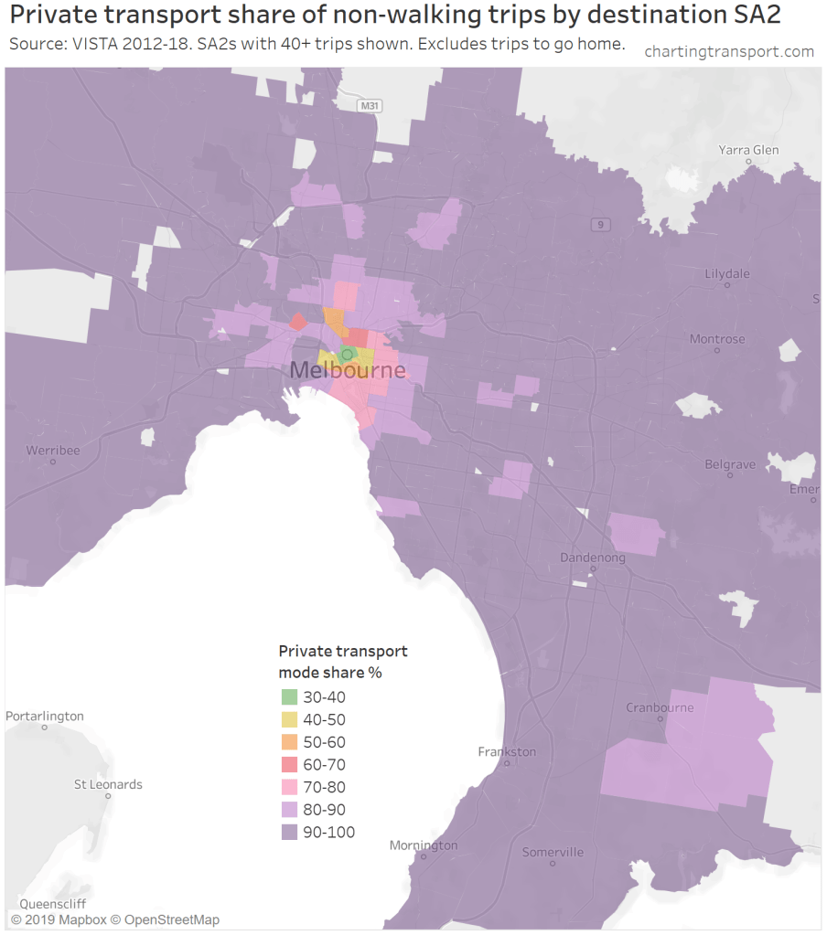
Technical note: I have set the threshold at 40 trips per SA2, but most SA2s have hundreds of surveyed trips. The grey areas of the map are SA2s with fewer than 40 trips, and/or destination zones with no surveyed trips.
For all but the inner suburbs of Melbourne, private transport is by far the dominant mode for non-walking trips. Public transport and cycling only get a significant combined share in the central and inner city areas.
Where is private transport mode share unusually low? And could paid parking explain that?
The above chart showed a pretty strong pattern where private transport mode share is lower in the central city and very high in the suburbs. But are there places where private mode share in unusually low compared to surround land uses? These might be places where public transport can win a higher mode share because of paid parking, or other reasons.
Here’s a similar mode share map, but showing only DZ groups that have a private mode share below 90%:

If you look carefully you can see DZ groups with lower than 80% mode share, including some university/health campuses.
To better illustrate the impact of distance from the city centre, here’s a chart summarising the average private transport mode share of non-walking trips for selected types of places, by distance from the city centre:

Most destination place types are above 90% private transport mode share, except within the inner 5 km. The lowest mode shares are at tertiary education places, workplaces in the central city, secondary schools and parks/recreation. Up the top of the chart are childcare centres, supermarkets and kinders/preschool. Sorry it is hard to decode all the lines – but the point is that they are mostly right up the top.
The next chart brings together the presence of paid parking, distance from the CBD, destination place type, and private transport mode shares. I’ve greyed out DZ groups with less than 20% paid parking, and you can see they are mostly more than 3 km from the CBD. I’ve coloured and labelled the DZ groups with higher rates of paid parking. Also note I’ve used a log scale on the X-axis to spread out the paid DZ groups (distance from CBD).
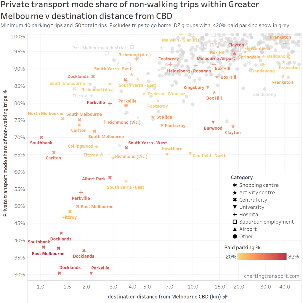
Most of the DZ groups follow a general curve from bottom-left to top-right, which might reflect generally declining public transport service levels as you move away from the city centre.
The outliers below the main cloud are places with paid parking where private modes shares are lower than other destinations a similar distance from the CBD. Most of these non-private trips will be by public transport. The biggest outliers are university campuses, including Parkville, Clayton, Caulfield, Burwood, and Hawthorn. Some destinations at the bottom edge of the main cloud include university campuses in Kingsbury and Footscray, and parts of the large activity centres of Box Hill and Frankston.
Arguably the presence of paid parking could be acting as a disincentive to use private transport to these destinations.
Contrast these with other paid parking destinations such as hospitals, many activity centres, and Melbourne Airport. The presence of paid parking doesn’t seem to have dissuaded people from driving to these destinations.
Which raises a critical question: is this because of the nature of travel to these destinations means people choose to drive, or is this because of lower quality public transport to those centres? Something we need to unpack.
How strongly does paid car parking correlate with low private transport mode shares?
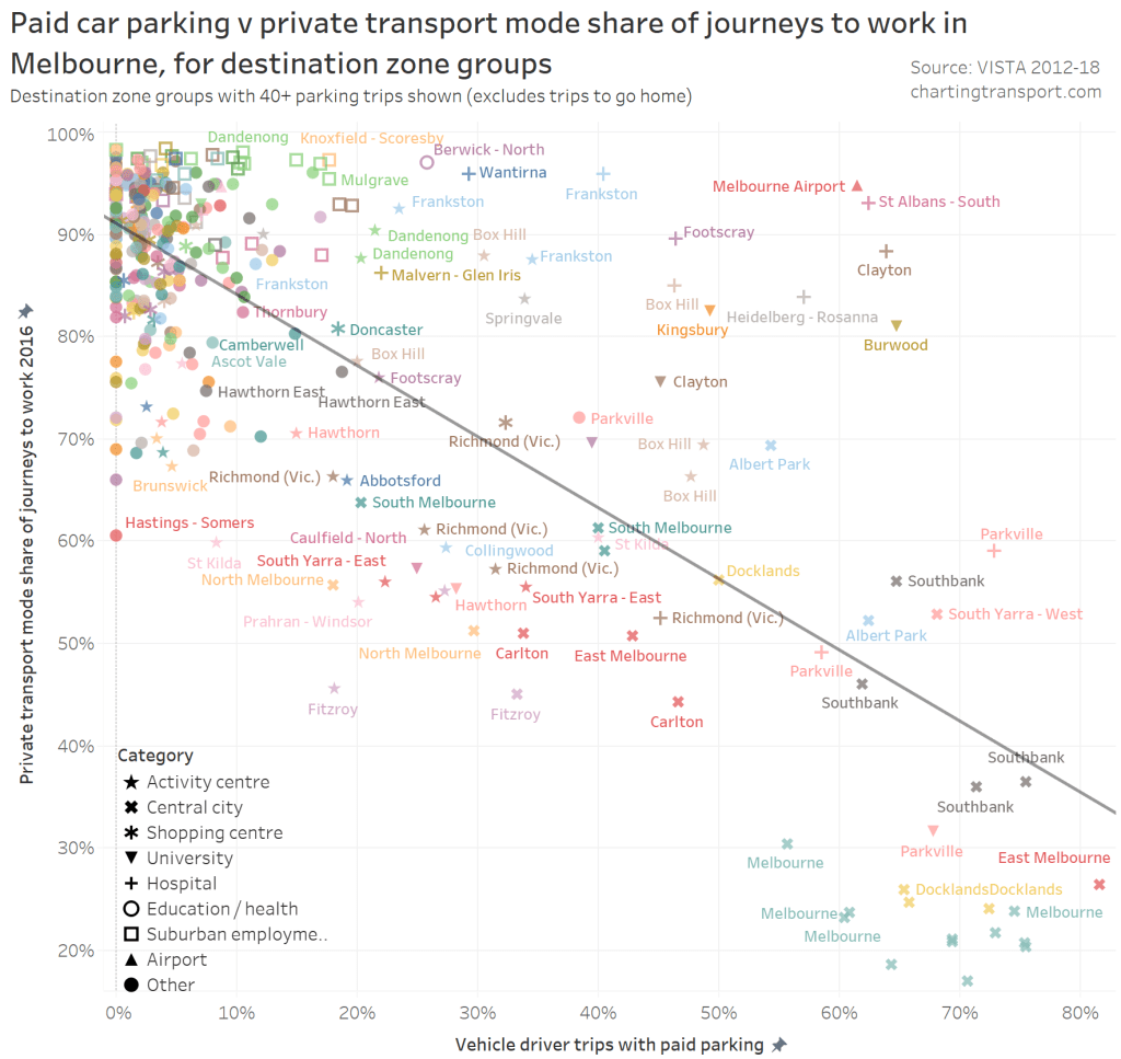
Here’s a chart showing DZ groups with their private transport mode share of (non-walking) trips and percent of vehicle parking trips involving payment.
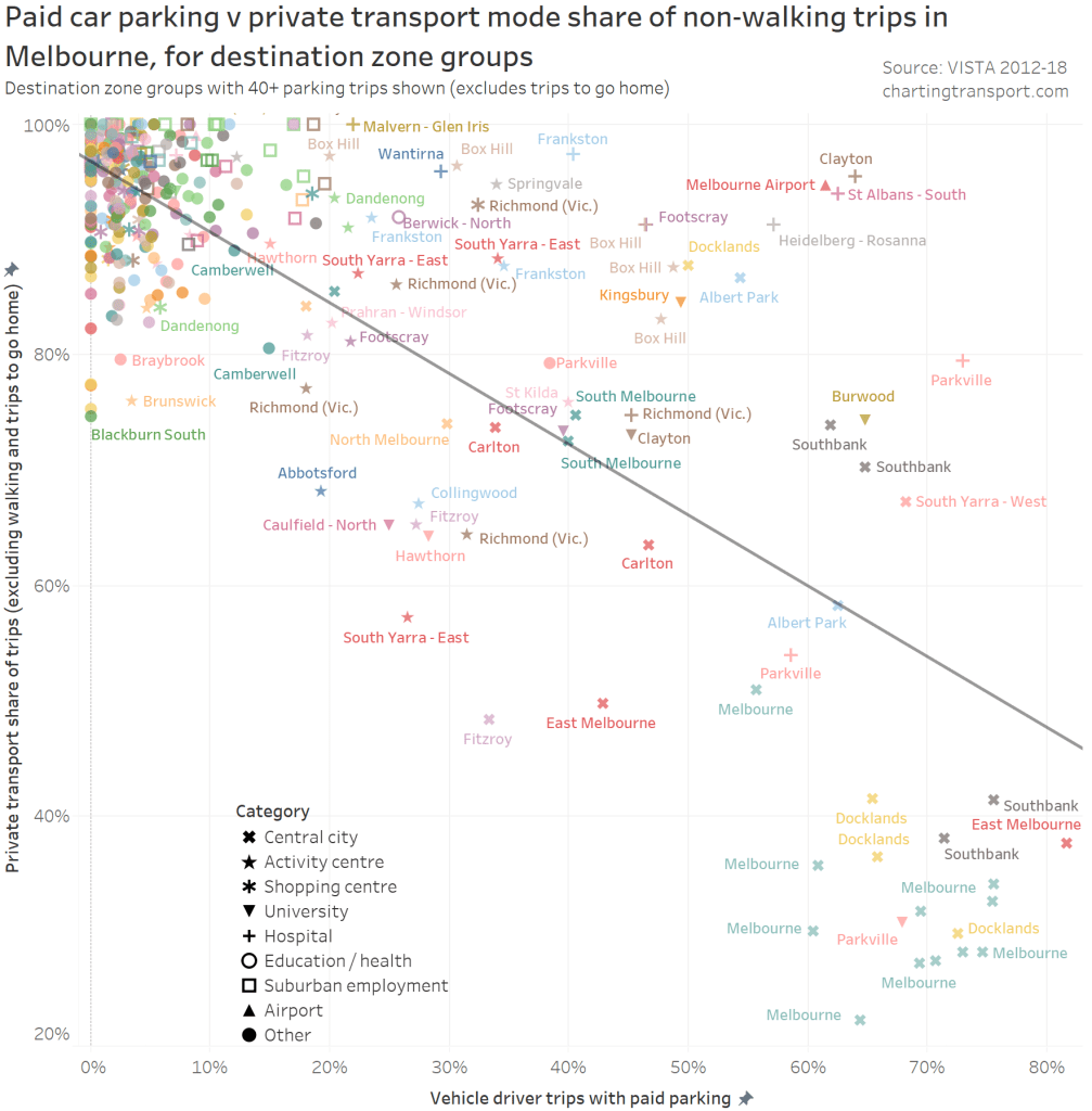
Technical note: A colour has been assigned to each SA2 to help associate labels to data points, although there are only 20 unique colours so they are re-used for multiple SA2s. I have endeavoured to make labels unambiguous. It’s obviously not possible to label all points on the chart.
In the top-left are many trip destinations with mostly free parking and very high private transport mode share, suggesting it is very hard for other modes to compete with free parking (although this says nothing about the level of public transport service provision or cycling infrastructure). In the bottom-right are central city DZ groups with paid parking and low private transport mode share.
There is a significant relationship between the two variables (p-value < 0.0001 on a linear regression as per line shown), and it appears that the relative use of paid parking explains a little over half of the pattern of private transport mode shares (R-squared = 0.61). But there is definitely a wide scattering of data points, suggesting many other factors are at play, which I want to understand.
In particular it’s notable that the data points close to the line in the bottom-right are in the central city, while most of the data points in the top-right are mostly in the suburbs (they are also the same land use types that were an exception in the last chart – Melbourne Airport, hospitals, some university campuses, and activity centres).
As always, it’s interesting to look at the outliers, which I am going to consider by land use category.
Melbourne Airport
The airport destination zone has around 62% paid parking and around 92% private transport mode share for general trips (noting the VISTA survey is only of travel by Melbourne and Geelong residents). The airport estimates 14% of non-transferring passengers use some form of public transport, and that 27% of weekday traffic demand is employee travel.
Some plausible explanations for high private mode share despite paid parking include:
- shift workers travelling when public transport is infrequent or unavailable (I understand many airport workers commence at 4 am, before public transport has started for the day),
- unreliable work finish times (for example, if planes are delayed),
- longer travel distances making public transport journeys slower and requiring transfers for many origins,
- travellers with luggage finding public transport less convenient,
- highly time-sensitive air travellers who might feel more in control of a private transport trip,
- active transport involving long travel distances with poor infrastructure, and
- many travel costs being paid by businesses (not users).
It’s worth noting that the staff car park is remote from the terminal buildings, such that shuttle bus services operate – an added inconvenience of private transport. But by the same token, the public transport bus stops are a fairly long walk from terminals 1 and 2.
The destination zone that includes the airport terminals also includes industrial areas on the south side of the airport. If I aggregate only the surveyed trips with a destination around the airport terminals, that yields 69% paid parking, and 93% private mode share. Conversely, the industrial area south of the airport yields 6% paid parking, and 100% private mode share.
Hospitals
Almost all hospitals are above the line – i.e. high private mode share despite high rates of paid parking.
The biggest outliers are the Monash Medical Centre in Clayton, Austin/Mercy Hospitals in Heidelberg, and Sunshine Hospital in St Albans South.
The Heidelberg hospitals are adjacent to Heidelberg train station. The Monash Medical Centre at Clayton is within 10 minutes walk of Clayton train station where trains run every 10 minutes or better for much of the week, and there’s also a SmartBus route out the front. Sunshine Hospital is within 10 minutes walk of Ginifer train station (although off-peak services mostly run every 20 minutes).
It’s not like these hospitals are a long way from reasonably high quality public transport. But they are a fair way out from the CBD, and only have high quality public transport in some directions.
The DZ containing Royal Melbourne Hospital, Royal Women’s Hospital, and Victoria Comprehensive Cancer Centre in Parkville is the exception below the line. It is served by multiple high frequency public transport lines, and serves the inner suburbs of Melbourne (also well served by public transport) which might help explain its ~45% private transport mode share.
The Richmond hospital DZ group is close to the line – but this is actually a blend of the Epworth Hospital and many adjacent mixed land uses so it’s not a great data point to analyse unfortunately.
So what might explain high private transport mode shares? I think there are several plausible explanations:
- shift workers find public transport infrequent, less safe, or unavailable at shift change times (similar to the airport),
- visitors travel at off-peak times when public transport is less frequent,
- longer average travel distances (hospitals serve large population catchments with patients and visitor origins widely dispersed),
- specialist staff who work across multiple hospitals on the same day,
- patients need travel assistance when being admitted/discharged, and
- visitor households are time-poor when a family member is in hospital.
The Parkville hospital data point above the line is the Royal Children’s Hospital. Despite having paid parking and being on two frequent tram routes, there is around 80% private transport mode share. This result is consistent with the hypotheses around time-poor visitor households, patients needing assistance when travelling to/from hospitals, and longer average travel distances (being a specialised hospital).
We can also look at census journey to work data for hospitals (without worrying about small survey sample sizes). Here’s a map showing the relative size, mode split and location of hospitals around Melbourne (with at least 200 journeys reported with a work industry of “Hospital”):
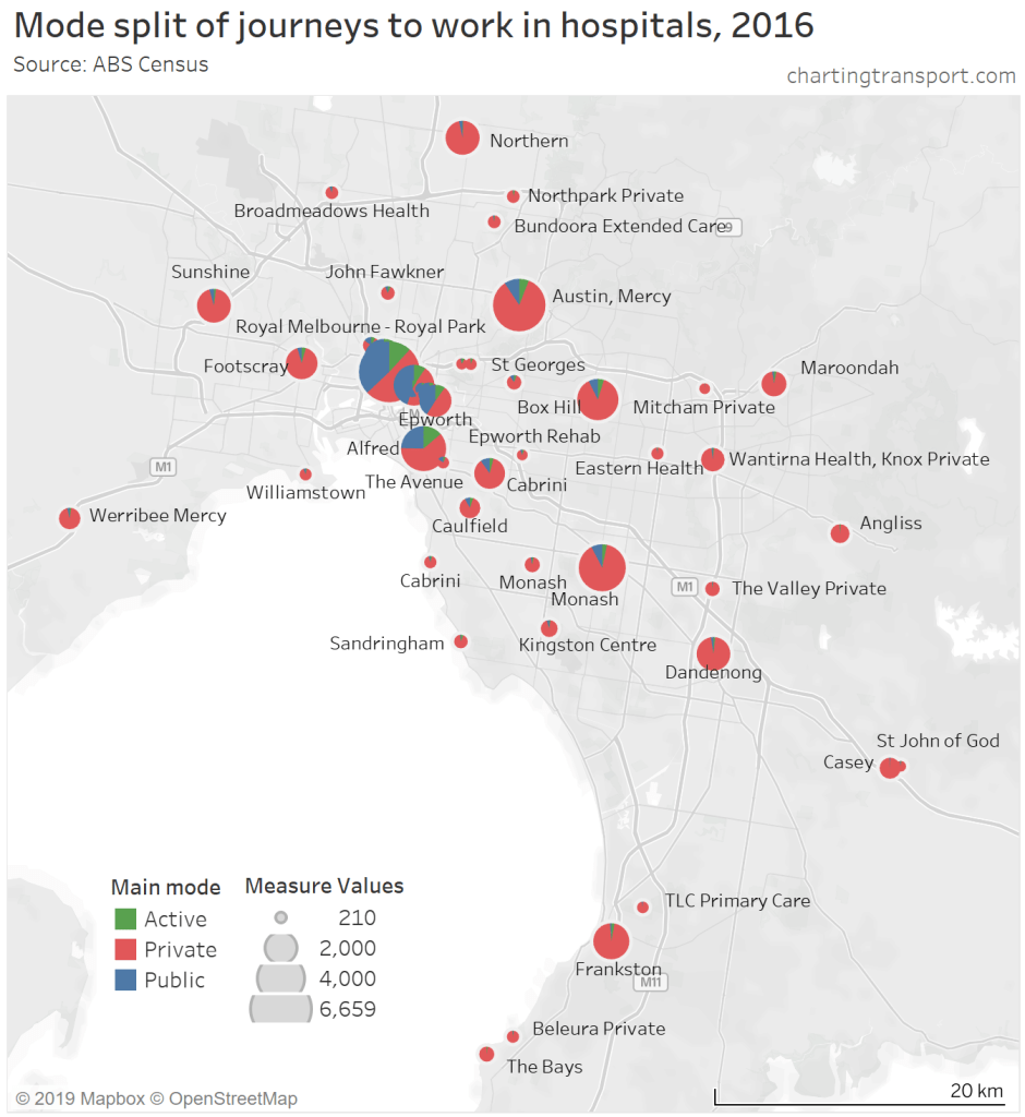
It’s a bit congested in the central city so here is an enlargement:
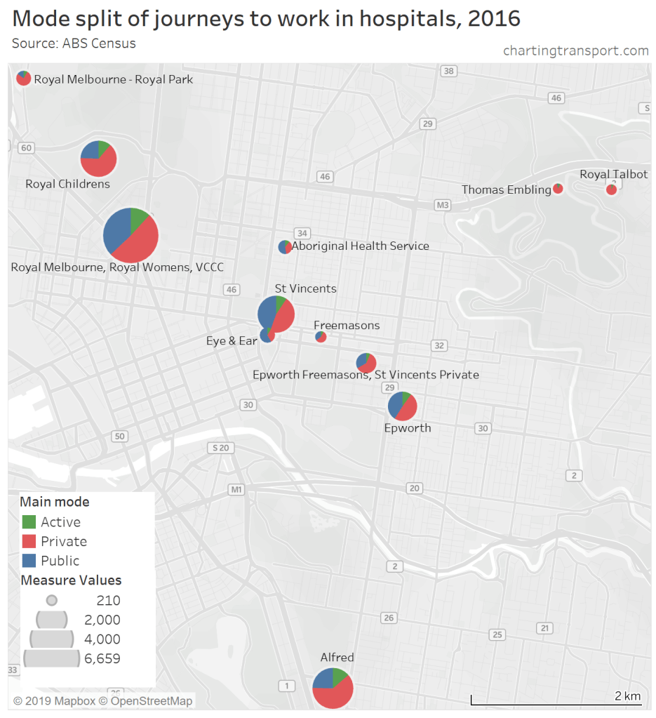
The only hospitals with a minority private mode share of journeys to work are the Epworth (Richmond), St Vincent’s (Fitzroy), Eye & Ear (East Melbourne), and the Aboriginal Health Service (Fitzroy) (I’m not sure that this is a hospital but it’s the only thing resembling a hospital in the destination zone).
Here’s another chart of hospitals showing the number of journeys to work, private transport mode share, and distance from the Melbourne CBD:

Again, there’s a very strong relationship between distance from the CBD and private transport mode share.
Larger hospitals more than 10 km from the CBD (Austin/Mercy, Box Hill, Monash) seem to have slightly lower private mode shares than other hospitals at a similar distance, which might be related to higher parking prices, different employee parking arrangements, or it might be that they are slightly closer to train stations.
The (relatively small) Royal Talbot Hospital is an outlier on the curve. It is relatively close to the CBD but only served by ten bus trips per weekday (route 609).
To test the public transport quality issue, here’s a chart of journey to work private mode shares by distance from train stations:

While being close to a train station seems to enable lower private transport mode shares, it doesn’t guarantee low private transport mode shares. The hospitals with low private transport mode shares are all in the central city.
So perhaps the issue is as much to do with the public transport service quality of the trip origins. The hospitals in the suburbs largely serve people living in the suburbs which generally have lower public transport service levels, while the inner city hospitals probably more serve inner city residents who generally have higher public transport service levels and lower rates of motor vehicle ownership (see: What does the census tell us about motor vehicle ownership in Australian cities? (2006-2016)).
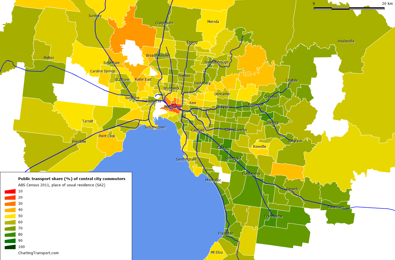
Indeed, here is a map showing private transport mode share of non-walking trips by origin SA2:
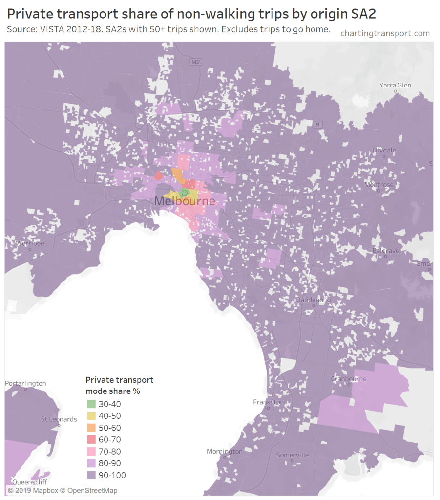
Technical notes: grey areas are SA1s (within SA2s) with no survey trips.
Finally for hospitals, here is private transport mode share of journeys to work (from the census) compared to paid parking % from VISTA (note: sufficient paid parking data is only available for some hospitals, and we don’t know whether staff have to pay for parking):
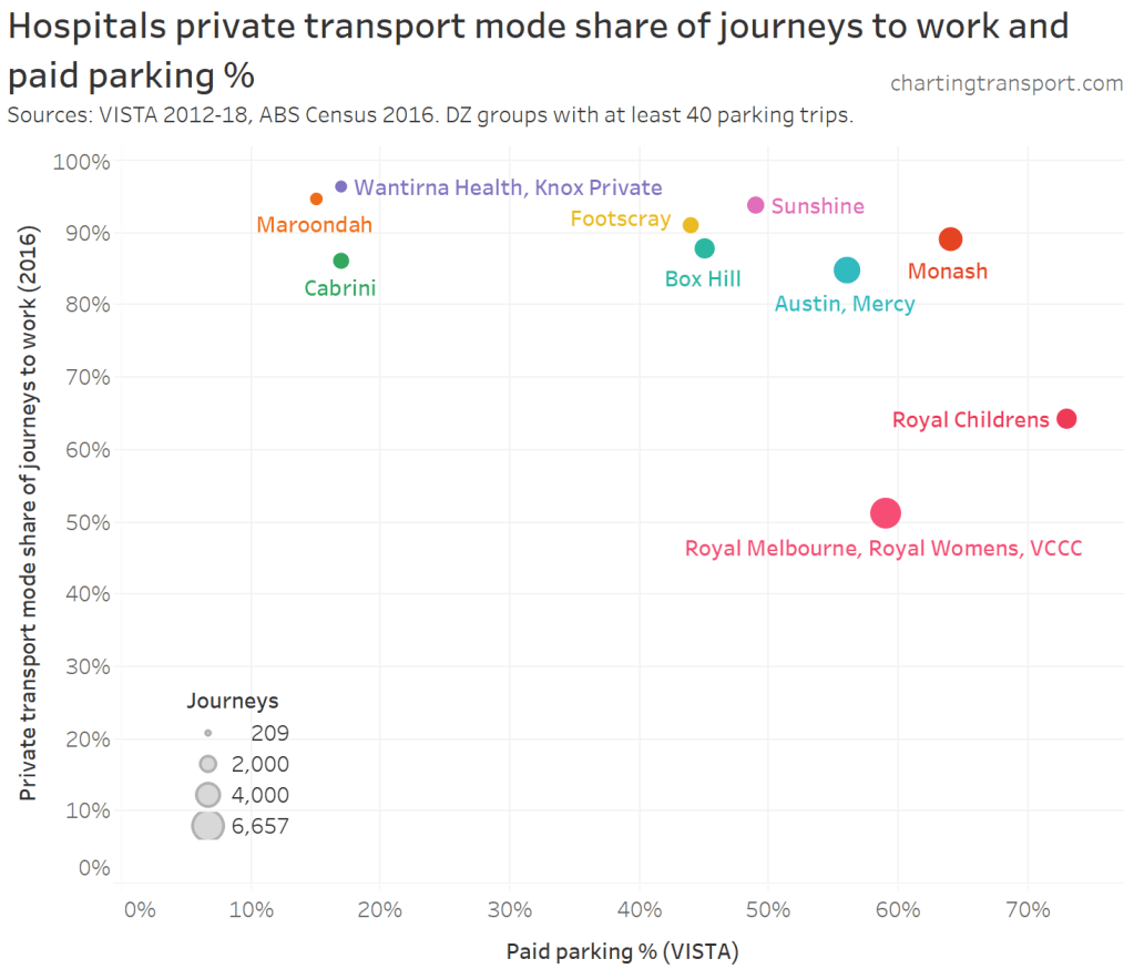
There doesn’t appear to be a strong relationship here, as many hospitals with high rates of paid parking also have high private transport mode shares.
In summary:
- The distance of a hospital from the CBD seems to be the primary influence on mode share.
- Specialised hospitals with larger catchments (eg Children’s Hospital) might have higher private transport mode shares.
- The quality of public transport to the hospital seems to have a secondary impact on mode shares.
Activity centres
Suburban activity centres such as Frankston, Box Hill, Dandenong, and Springvale have high private mode shares, which might reflect lower public transport service levels than the inner city (particularly for off-rail origins).
Box Hill is the biggest outlier for activity centres in terms of high private mode share despite paid parking. But compared to other destinations that far from the Melbourne CBD, it has a relatively low private transport mode share. It is located on a major train line, and is served by several frequent bus routes.
In general, there are fewer reasons why increased public transport investment might not lead to higher public transport mode share compared to airports and hospitals. Travel distances are generally shorter, many people will be travelling in peak periods and during the day, there are probably few shift workers (certainly few around-the-clock shift workers).
University campuses
The biggest university outliers above the line (higher private mode shares and higher paid parking %) are Deakin University (Burwood) and La Trobe University (Kingsbury). Furthermore, private transport also has a majority mode share for Monash University Clayton, Victoria University Footscray Park, Monash University (Caulfield) and Swinburne University (Hawthorn).
As discussed earlier, I suspect the rates of paid parking may be understated for university campuses because people forget they have purchased long-term parking permits.
The following chart shows the full mode split of trips to the University DZ groups in various SA2s (this time including walking trips):
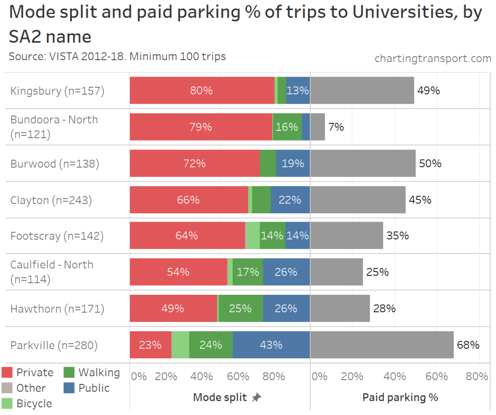
Of the campuses listed, only Hawthorn and Caulfield are adjacent to a train station. Of the off-rail campuses:
- Parkville (Melbourne Uni, 43% public transport) is served by multiple frequent tram routes, plus a high frequency express shuttle bus to North Melbourne train station. In a few years it will also have a train station.
- Clayton (Monash, 22% PT) is also served by a high frequency express shuttle bus service to Huntingdale train station.
- Burwood (Deakin, 19% PT) is on a frequent tram route, but otherwise moderately frequent bus services (its express shuttle bus service to Box Hill train station – route 201 – currently runs every 20 minutes)
- Footscray (Park) (Victoria Uni, 14% PT) has bus and tram services to Footscray train station but they operate at frequencies of around 15 minutes in peak periods, and 20 minutes inter-peak.
- Kingsbury (La Trobe Uni, 13% PT) has an express shuttle bus service from Reservoir station operating every 10 minutes on weekdays (introduced in 2016).
The success of high frequency express shuttle bus services to Parkville and Clayton may bode well for further public transport frequency upgrades to other campuses.
University campuses are also natural targets for public transport as university students on low incomes are likely to be more sensitive to private motoring and parking costs.
However university campuses also have longer average travel distances which might impact mode shares – more on that shortly.
Central city
Most central city DZ groups are in the bottom-right of the scatter plot, but there are some notable exceptions:
- A Southbank DZ around Crown Casino has 65% paid parking and 70% private transport mode share. This was also an exception when I analysed journey to work (see: How is the journey to work changing in Melbourne? (2006-2016)) and might be explained be relatively cheap parking, casino shift workers, and possibly more off-peak travel (eg evenings, weekends).
- Similarly, a Southbank DZ group around the Melbourne Convention and Exhibition Centre / South Wharf retail complex has 62% paid parking and around 74% private mode share. Many parts of this area are a long walk from public transport stops, and also there are around 2,200 car parks on site (with $17 early bird parking at the time of writing).
- Albert Park – a destination zone centred around the park – has around 54% paid parking and 87% private transport mode share. Most of the VISTA survey trips were recreation or sport related, which may include many trips to the Melbourne Sports and Aquatic Centre. The park is surrounded by tram routes on most sides, but is relatively remote from the (rapid) train network.
- Northern Docklands shows up with around 50% paid parking and around 88% private transport mode share, despite being very close to the Melbourne CBD. While this area is served by multiple frequent tram routes, it is a relatively long walk (or even tram ride) from a nearby a train station (from Leven Avenue it is 16 minutes by tram to Southern Cross Station and around 18 minutes to Flagstaff Station, according to Google). The closest train station is actually North Melbourne, but there is currently no direct public transport or pedestrian connection (the E-gate rail site and future Westgate Tunnel road link would need to be crossed).
Inner suburbs
Some places to the bottom-left of the cloud on the chart include inner suburban areas such as South Yarra, Fitzroy, Richmond, Abbotsford, Brunswick, and Collingwood. While paid parking doesn’t seem to be as common, private transport mode shares are relatively low (even when walking trips are excluded). These areas typically have dense mixed-use activity with higher public transport service levels, which might explain the lower private transport mode shares. These areas probably also have a lot of time-restricted (but free) parking.
What is the relationship between paid parking and journey to work mode shares?
For journeys to work we thankfully have rich census data, with no issues of small survey sample sizes.
The following chart combines VISTA data on paid parking, with 2016 census data on journey to work mode shares (note: the margin of error on the paid parking percentage is still up to +/-12%).
The pattern is very similar to that for general travel, and the relationship is of a similar strength (r-squared = 0.59).
There are more DZ groups below the line on the left side of the chart, meaning that the private transport mode share of journeys to work is often lower than for general travel.
Indeed, here is a chart comparing private transport mode share of general travel (VISTA survey excluding walking and trips to go home) with journeys to work (ABS census):
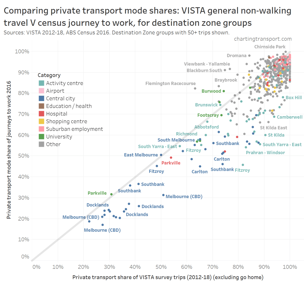
Note the margin of error for private transport mode shares is around +/-10% because of the small VISTA sample sizes.
For most DZ groups of all types, private transport mode shares are lower for journeys to work compared to general travel (ie below the diagonal line). This might reflect public transport being more competitive for commuters than for visitors – all-day parking might be harder to find and/or more expensive. This suggests investment in public transport might want to target journeys to work.
The DZ groups above the line include Flemington Racecourse (census day was almost certainly not a race day so there was probably ample parking for employees, while many VISTA survey trips will be from event days), Deakin Uni (Burwood), and a few others. Some of these DZ groups are dominated by schools, where workers (teachers) drive while students are more likely to cycle or catch public transport.
What about public transport mode shares?
The following chart shows VISTA public transport mode shares (for general travel) against paid parking percentages:

There are similar patterns to the earlier private transport chart, but flipped. The outliers are very similar (eg hospitals and Melbourne Airport in the bottom-right), although the top-left outliers include some destinations in socio-economically disadvantaged areas (eg Braybrook, Broadmeadows, Dandenong).
The DZ group in Blackburn South with no paid parking but 22% public transport mode share contains several schools but otherwise mostly residential areas, and the survey data includes many education related trips.
Are shift workers less likely to use public transport?
Shift workers at hospitals, Melbourne Airport, and the casino might be less likely to use public transport because of the inconvenience of travelling at off-peak shift change times, when service levels may be lower or non-existent.
Here’s a chart showing the mode split of VISTA journeys to work by destination type categories, and also type of working hours:
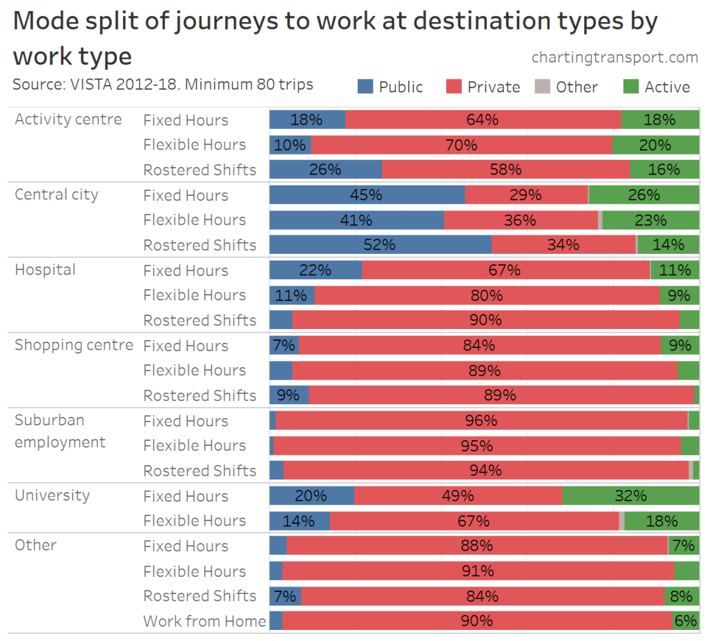
For hospitals, rostered shifts had a lower public transport mode share, compared to fixed and flexible hours workers, so this seems to support (but not prove) the hypothesis.
Public transport use is actually higher for rostered shift workers at other destination types, but I suspect these are mostly not around-the-clock shifts (eg retail work), and are more likely to be lower paid jobs, where price sensitivity might contribute more to mode choice.
Unfortunately there are not enough VISTA journey to work survey responses for Melbourne Airport to get sensible estimates of mode shares for different work types.
Do longer travel distances result in lower public transport mode shares?
Another earlier hypothesis was that destinations that attract longer distance trips (such as universities, hospitals, and airports) are more likely to result in private transport mode choice, as public transport journeys are more likely to require one or more transfers.

Trip distances to specialised places such as airports, suburban employment areas, universities and hospitals are indeed longer. But the central city also rates here and that has low private transport mode shares.
Digging deeper, here are median travel distances to DZ groups around Melbourne:

The central city has higher median trip distances but low private mode shares, while many suburban destinations (particularly employment/industrial areas, universities, and hospitals) have similar median travel distances but much higher public transport mode shares.
I think a likely explanation for this is that public transport to the central city is generally faster (often involving trains), more frequent, and involves fewer/easier transfers. Central city workers are also more likely to live near radial public transport lines. On the other hand, the trip origins for suburban destinations are more likely to be in the suburbs where public transport service levels are generally lower (compared to trip origins in the inner suburbs).
Cross-suburban public transport travel will often require transfers between lower frequency services, and will generally involve at least one bus leg. Very few Melbourne bus routes are currently separated from traffic, so such trips are unlikely to be as fast as private motoring (unless parking takes a long time to find), but they might be able to compete on marginal cost (if there is more expensive paid parking).
Of course this is not to suggest that cross-suburban public transport cannot be improved. More direct routes, higher frequencies, and separation from traffic can all make public transport more time-competitive.
How does parking pricing relate to employment density?
My previous research has confirmed a strong relationship between job density and lower journey to work private transport mode shares (see: What explains variations in journey to work mode shares between and within Australian cities?). Can this be explained by more paid parking in areas with higher job density?
The following chart compares weighted job density (from census 2016) and paid parking percentages (from VISTA):

Technical notes: Weighted job density is calculated as a weighted average of the job densities of individual destination zones in a DZ group, with the weighting being the number of jobs in each zone (the same principle as population weighted density). I have used a log-scale on the X-axis, and not shown DZ groups with less than 1 job/ha as they are not really interesting
There appears to be a relationship between job density and paid parking – as you would expect. The top right quadrant contains many university campuses, hospitals, and central city areas with high job density and high paid parking percentages.
In the bottom-right are many large job-dense shopping centres that offer “free” parking. Of course in reality the cost of parking is built into the price of goods and services at the centres (here’s a thought: what if people who arrive by non-car modes got a discount?). An earlier chart showed us that employees are less likely to commute by private transport than visitors.
The outliers to the top-left of the chart are actually mostly misleading. An example is Melbourne Airport where the density calculation is based on a destination zone that includes runways, taxiways, a low density business park, and much green space. The jobs are actually very concentrated in parts of that zone (e.g. passenger terminals) so the density is vastly understated (I’ve recommended to the ABS that they create smaller destination zones around airport terminal precincts in future census years).
Inclusion of significant green space and/or adjacent residential areas is also an issue at La Trobe University (Kingsbury data point with just under 50% mode share), RMIT Bundoora campus (Mill Park South), Royal Children’s Hospital (Parkville), Sunshine Hospital (St Albans South), Victoria University (Footscray (Park)), Albert Park (the actual park), and Melbourne Polytechnic Fairfield campus / Thomas Embling Hospital (Yarra – North).
I am at a loss to explain paid parking in Mooroolbark – the only major employer seems to be the private school Billanook College.
Can you summarise the relationship between paid parking and mode shares?
I know I’ve gone down quite a few rabbit holes, so here’s a summary of insights:
- Distance from the Melbourne CBD seems to be the strongest single predictor of private transport mode share (as origin or destination). This probably reflects public transport service levels generally being higher in the central city and lower in the suburbs. Destinations further from the central city are likely to have trip origins that are also further from the central city, for which public transport journeys are often slower.
- Paid parking seems to be particularly effective at reducing private transport mode shares at university campuses, and the impact is probably greater if there are higher quality public transport alternatives available.
- There’s some evidence to suggest paid parking may reduce private transport mode shares at larger activity centres such as Box Hill and Frankston.
- Most hospitals have very high private transport mode shares, despite also having paid parking. Hospitals with better public transport access have slightly lower private transport mode shares.
- Destinations with around-the-clock shift workers (e.g. hospitals and airports) seem generally likely to have high private transport mode shares, as public transport services at shift change times might be infrequent or unavailable.
- Suburban destinations that have longer median travel distances (such as hospitals, airports and industrial areas) mostly have higher private transport mode shares.
- Even if there isn’t much paid parking, destinations well served by public transport tend to have lower private transport mode shares (although this could be related to time-restricted free parking).
If you’d like more on factors influencing mode shares, I’ve also explored this more broadly elsewhere on this blog, with employment density (related to parking prices), cycling infrastructure quality, proximity to rapid public transport, and walking catchment density found to be significant factors (see: What explains variations in journey to work mode shares between and within Australian cities?).
Are places with paid parking good targets for public transport investments?
Many of my recent conversations with transport professionals around this topic have suggested an hypothesis that public transport wins mode share in places that have paid parking. While that’s clearly the case in the centre of Melbourne and at many university campuses, this research has found it’s more of a mixed story for other destinations.
While this post hasn’t directly examined the impact of public transport investments on mode shares in specific places, I think it can inform the types of destinations where public transport investments might be more likely to deliver significant mode shifts.
Here’s my assessment of different destination types (most of which have paid parking):
- Suburban hospitals may be challenging due to the presence of shift workers, patients needing assistance, visitors from time-poor households, and long average travel distances making public transport more difficult for cross-suburban travel. There’s no doubt many people use public transport to travel to hospitals, but it might not include many travellers who have a private transport option.
- Larger activity centres with paid parking show lower private transport mode shares. Trips to these centres involve shorter travel distances that probably don’t require public transport transfers, and don’t suffer the challenges of around-the-clock shift workers, so they are likely to be good targets for public transport investment.
- Universities are natural targets for public transport, particularly as many students would find the cost of maintaining, operating and parking a car more challenging, or don’t have access to private transport at all (around 35% of full time university/TAFE students do not have a full or probationary licence according to the VISTA sample). Universities do attract relatively higher public transport mode shares (even in the suburbs) and recent investments in express shuttle services from nearby train stations appear to have been successful at growing public transport patronage.
- Melbourne Airport has high rates of paid parking and private transport mode share. It is probably a challenging public transport destination for employees who work rostered shifts. However already public transport does well for travel from the CBD, and this will soon be upgraded to heavy rail. Stations along the way may attract new employees in these areas, but span of operating hours may be an issue.
- Job dense central city areas that are not currently well connected to the rapid public transport network could be public transport growth opportunity. In a previous post I found the largest journey to work mode shifts to public transport between 2011 and 2016 were in SA2s around the CBD (see: How is the journey to work changing in Melbourne? (2006-2016)). The most obvious target to me is northern Docklands which is not (yet) conveniently connected its nearby train station. Public transport is also gaining patronage in the densifying Fishermans Bend employment area (buses now operate as often as every 8 minutes in peak periods following an upgrade in October 2018).
- Lower density suburban employment/industrial areas tend to have free parking, longer travel distances, and very high private transport mode shares. These are very challenging places for public transport to win significant mode share, although there will be some demand from people with limited transport options.
An emerging target for public transport might be large shopping centres that are starting to introduce paid or time-restricted car parking (particularly those located adjacent to train stations, e.g. Southland). That said, Westfield Doncaster, which has some paid parking (around 19%), has achieved only 6% public transport mode share in the VISTA survey (n=365), athough this may be growing over time. Meanwhile, Dandenong Plaza has around 16% public transport mode share despite only 6% paid parking.
Upgraded public transport to shopping centres might be particularly attractive for workers who are generally on lower incomes (we’ve already seen staff having lower private transport mode shares than visitors). Also, customer parking may be time-consuming to find on busy shopping days, which might make public transport a more attractive option, particularly if buses are not delayed by congested car park traffic.
There’s a lot going on in this space, so if you have further observations or suggestions please comment below.
Appendix: About destination group zones
Here is a map showing my destination zone groups in the central city area which have 15% or higher paid parking. Each group is given a different colour (although there are only 20 unique colours used so there is some reuse). The numbers indicate the number of surveyed parking trips in each group:
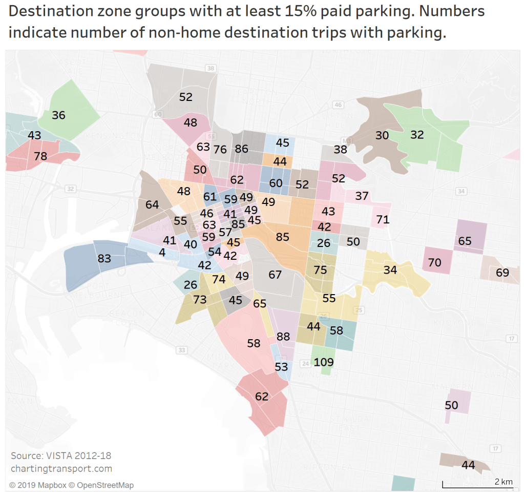
Some of the DZ groups have slightly less than 40 parking trips, which means they are excluded from much of my analysis. In many cases I’ve decided that merging these with neighbouring zones would be mixing disparate land uses, or would significantly dilute paid parking rates to not be meaningful (examples include northern Abbotsford, and parts of Kew and Fairfield). Unfortunately that’s the limitation of the using survey data, but there are still plenty of qualifying DZ groups to inform the analysis.
I have created destination zone groups for most destination zones with 10%+ paid parking, and most of the inner city area to facilitate the DZ group private transport mode share chart. I haven’t gone to the effort of creating DZ groups across the entire of Melbourne, as most areas have little paid parking and are not a focus for my analysis.


 Posted by chrisloader