Update on Australian transport trends (December 2023)

Mon 1 January, 2024

[Updated 29 March 2024: Capital city per-capita charts updated using estimated residential population data for June 2023]

What’s the latest data telling us about transport trends in Australia?

The Australian Bureau of Infrastructure and Transport Research Economics (BITRE) have recently published their annual yearbook full of numbers, and this post aims to turn those (plus several other data sources) into information and insights about the latest trends in Australian transport.

This is a long and comprehensive post (67 charts) covering:

I’ve been putting out similar posts in past years, and commentary in this post will mostly be around recent year trends. See other similar posts for a little more discussion around historical trends (December 2022, January 2022, December 2020, December 2019, December 2018).

Vehicle kilometres travelled

Vehicle and passenger kilometre figures were significantly impacted by COVID lockdowns in 2020 and 2021 which has impacted financial years 2019-20, 2020-21, and 2021-22. Data is now available for 2022-23, the first post-pandemic year without lock downs.

Total vehicle kilometres for 2022-23 bounced back but were still lower than 2018-19:

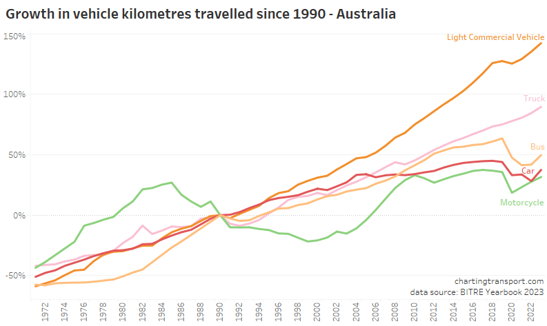
The biggest pandemic-related declines in vehicle kilometres were in cars, motorcycles, and buses:

All modes showed strong growth in 2022-23.

Here’s the view on a per-capita basis:

Vehicle kilometres per capita peaked around 2004-05 and were starting to flatline in some states before the pandemic hit with obvious impacts. In 2022-23 vehicle kilometres per capita increased in all states and territories except the Northern Territory and Tasmania.

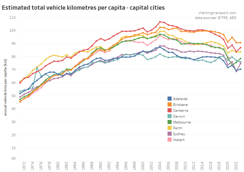
Here is the same data for capital cities:

Cities with COVID lockdowns in 2021-22 (Melbourne, Sydney, Canberra) bounced up in 2022-23, while Brisbane and Perth were relatively flat, Adelaide was slightly up, and Darwin slightly down. All large cities are still well below 2018-19 levels, consistent with an underlying long-term downwards trend.

Canberra has dramatically reduced vehicle kilometres per capita since around 2014 leaving Brisbane as the top city.

Passenger kilometres travelled

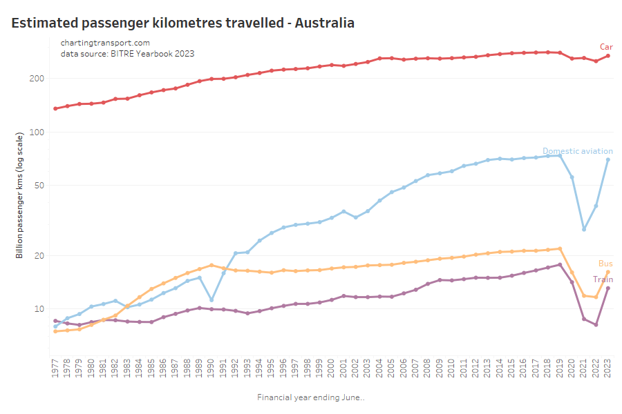
Here are passenger kilometres travelled overall (log scale):

The pandemic had the biggest impact on rail, bus, and aviation passenger kilometres. Aviation has bounced back to pre-COVID levels while train and bus are still down (probably due to working from home patterns, reduced total bus vehicle kilometres, amongst other reasons).

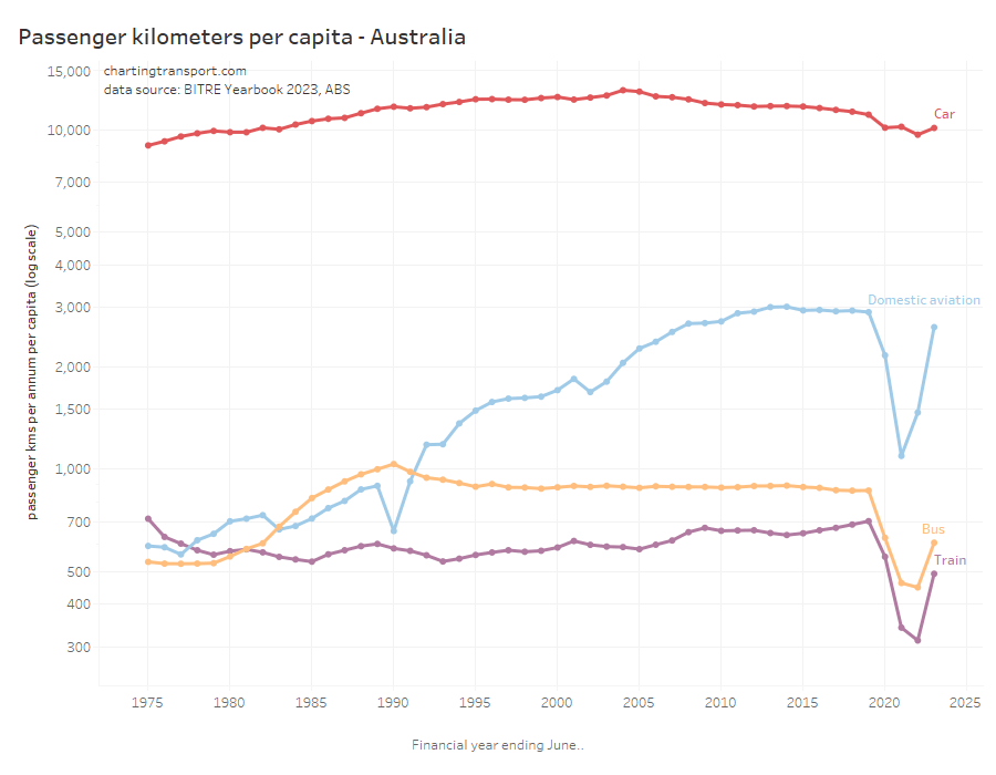
Here is the same on a per-capita basis which shows very similar patterns (also a log scale):

Car passenger kilometres per capita have reduced from a peak of 13,113 in 2004 to 10,152 in 2023.

Curiously aviation passenger kilometres per capita peaked in 2014, well before the pandemic. Rail passenger kilometres per capita in 2019 were at the highest level since 1975.

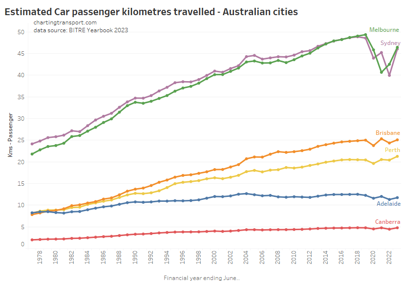
Here’s total car passenger kilometres for cities:

The COVID19 pandemic certainly caused some fluctuations in car passenger volumes in all cities for 2019-20 to 2021-22. In 2022-23, Sydney and Melbourne had not recovered to pre-pandemic levels, while Perth hit a new high.

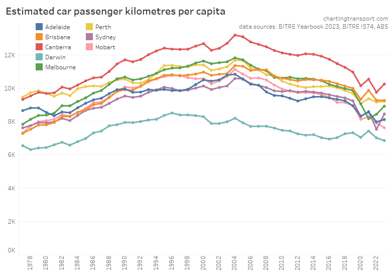
Here are per capita values for cities:

Car passenger kilometres per capita bounced back in Sydney, Melbourne, and Canberra – however most cities had 2022-23 figures that were in line with a longer-term downward trend – if you disregard the COVID years.

Public transport patronage

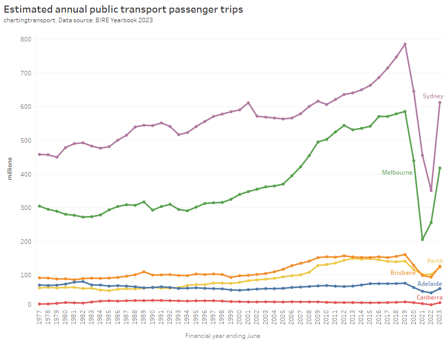
BITRE are now reporting estimates of public transport passenger trips (as well as estimated passenger kilometres). From experience, I know that estimating and reporting public transport patronage is a minefield especially for boardings that don’t generate ticketing transactions. While there are not many explanatory notes for this data, it appears BITRE have estimated capital city passenger boardings, which will be less than some ticketing region boardings (Sydney’s Opal ticketing region extends to the Illawarra and Hunter, and South East Queensland’s Go Card network includes Brisbane plus the Sunshine and Gold Coasts). I’ll report them as-is, but bear in mind that they might not be perfectly directly comparable between cities.

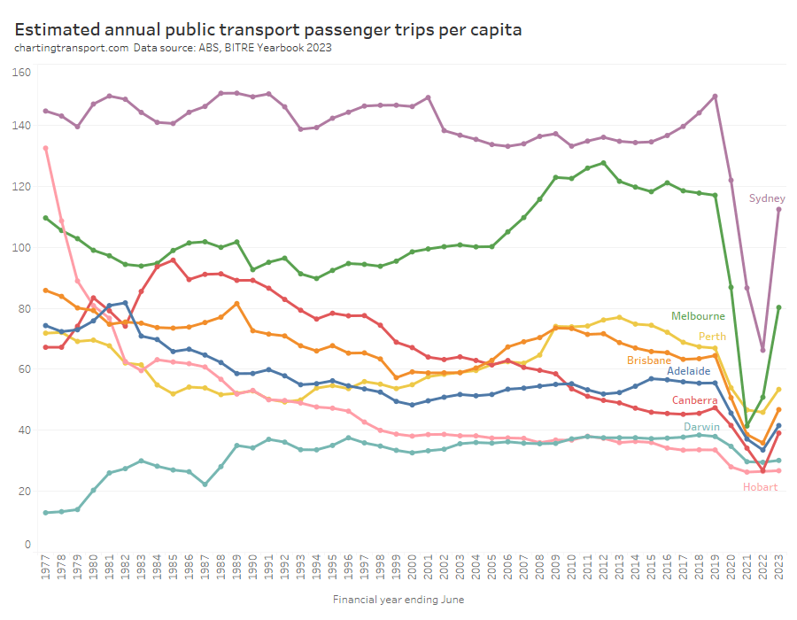
Of course bigger cities tend to generate more boardings, so it’s probably worth looking at passenger trips per capita per year:

This chart produces some unexpected outliers. Hobart shows up with very high public transport trips per capita in the 1970s, which might be relate to the Tasman Bridge Disaster which severed the bridge between 1975 and 1977 and resulted in significant ferry traffic for a few years (over 7 millions trips in 1976-77). Canberra also shows up with remarkably high trips per capita in the 1980s for a relatively small, low density, car-friendly city, but has been in steady decline since.

Canberra, Sydney, and Brisbane were seeing rising patronage per capita up to June 2019, just before the pandemic hit.

Most cities (except Darwin and Hobart), showed a strong bounce back in public transport trips per capita in 2022-23, although none reached 2018-19 levels.

There are further reasons why comparing cities is still not straight forward. Smaller cities such as Darwin, Canberra, and Hobart are almost entirely served by buses, and so most public transport journeys will only require a single boarding. Larger cities have multiple modes and often grid networks that necessitate transfers between services for many journeys, so there will be a higher boardings to journeys ratio. If a city fundamentally transforms its network design there could be a sudden change in boardings that doesn’t reflect a change in mode share.

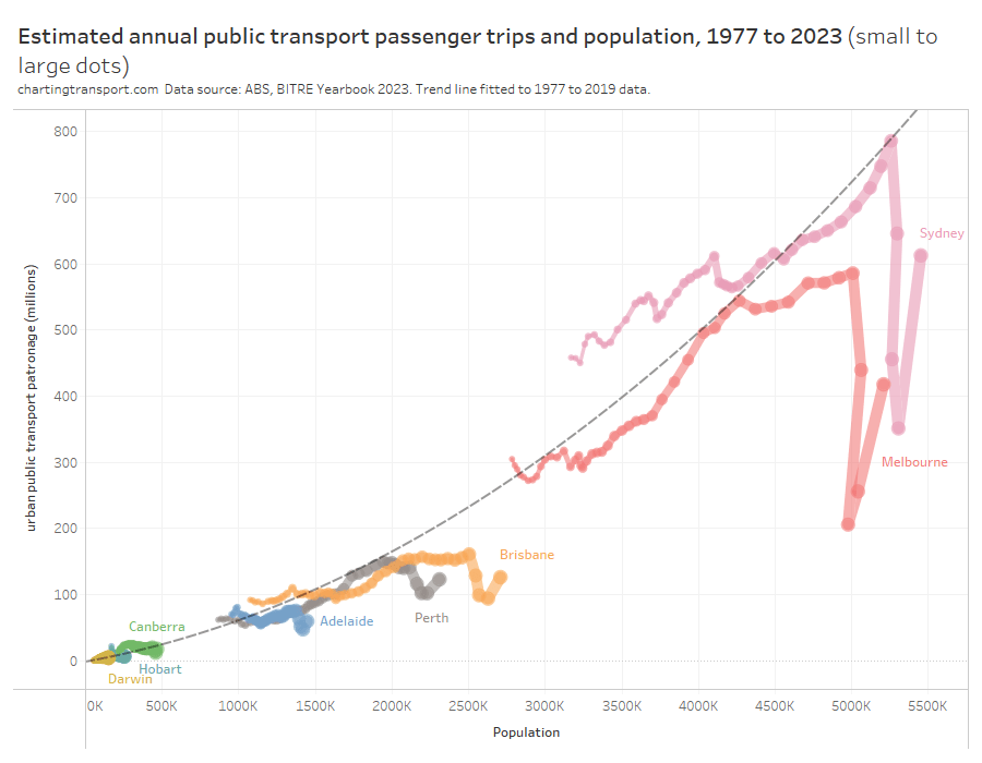
Indeed, here is the relationship between population and boardings over time. I’ve drawn a trend curve to the pre-pandemic data points only (up to 2019).

Larger cities are generally more conducive to high public transport mode share (for various reasons discussed elsewhere on this blog) but also often require transfers to facilitate even radial journeys.

So boardings per capita is not a clean objective measure of transit system performance. I would much prefer to be measuring public transport passenger journeys per capita (as opposed to boardings) which might overcome the limitations of some cities requiring transfers and others not.

The BITRE data is reported as “trips”, but comparing with other sources it appears the figures are boardings rather than journeys. Most agencies unfortunately don’t report public transport journeys at this time, however boardings to journeys ratio could be estimated from household travel survey data for some cities.

Public transport post-pandemic patronage recovery

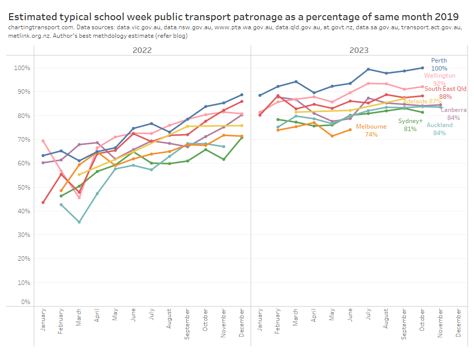
I’ve been estimating public transport patronage recovery using the best available data for each city (as published by state governments – unfortunately the usefulness and resolution of data provided varies significantly, refer: We need to do better at reporting and analysing public transport patronage). This data provides a more detailed and recent estimate of patronage recovery compared to 2019 levels. Here’s the latest estimates at the time of preparing this post:

Perth seems to be consistently leading Australian and New Zealand cities on patronage recovery, while Melbourne appears to be the laggard in both patronage recovery and timely reporting. For more discussion and details around these trends see How is public transport patronage recovering after the pandemic in Australian and New Zealand cities?.

[refer to my twitter feed for more recent charts]

Passenger travel mode split

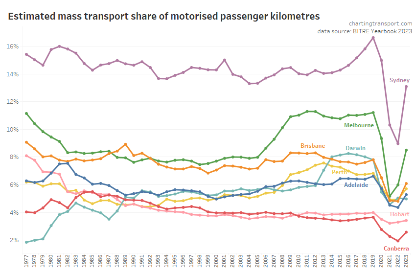
It’s possible to calculate “mass transit” mode share using the passenger kilometres estimates from BITRE (note: I use “mass transit” as BITRE do not differentiate between public and private bus travel):

Mass transit mode shares obviously took a dive during the pandemic, but have since risen, although not back to 2019 levels – presumably at least partly because of working from home.

The relative estimates of share of motorised passenger kilometres are quite different to the estimates of passengers trips per capita we saw just above. Canberra is much lower than the other cities, and Brisbane and Melbourne are closer together. The passenger kilometre estimates rely on data around average trip lengths (which is probably not regularly measured in detail in all cities), while the passenger boardings per capita figures are subject to varying transfer rates between cities. Neither are perfect.

So what else is there? I have been looking at household travel survey data to also calculate public transport mode share, but I am getting unexpected results that are quite different to BITRE estimates (especially Melbourne) and with unexpected trends over time (especially Brisbane), so I’m not comfortable to publish such analysis at this point.

What would be excellent is if agencies published counts of passenger journeys (that might involve multiple boardings), so we could compare cities more readily.

Rail Passenger travel

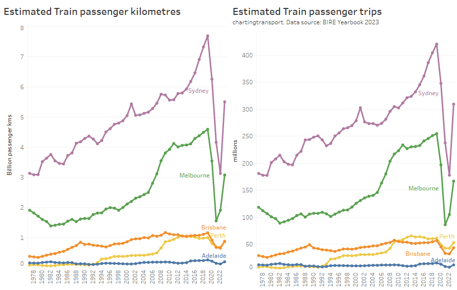
Here’s a chart showing estimates of annual train passenger kilometres and trips.

All cities are bouncing back after the pandemic.

Note there are some variances between the ranking of the cities – particularly Perth and Brisbane (BITRE have average train trip length in Brisbane at around 20.3 km while Perth is 16.3 km).

Here’s rail passenger kilometres per capita, but only up to 2021-22:

Bus passenger travel

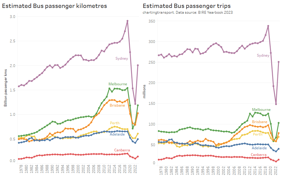
Here’s estimates of total bus travel for capital cities:

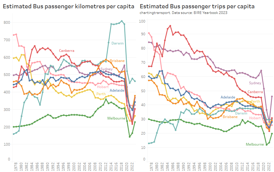
And per capita bus travel up to 2021-22:

Note that Melbourne has the second highest volume of bus travel (being a large city), but the lowest per-capita usage of buses, primarily because – unlike most other cities – trams perform most of the busy on-street public transport task in the inner city. It probably doesn’t make sense to directly compare cities for bus patronage per capita, and indeed I won’t show such figures for the other public transport modes.

Darwin had elevated bus passenger kilometres from 2014 to 2019 due to bus services to a resources project (BITRE might not have counted these trips as urban public transport).

Ferry passenger travel

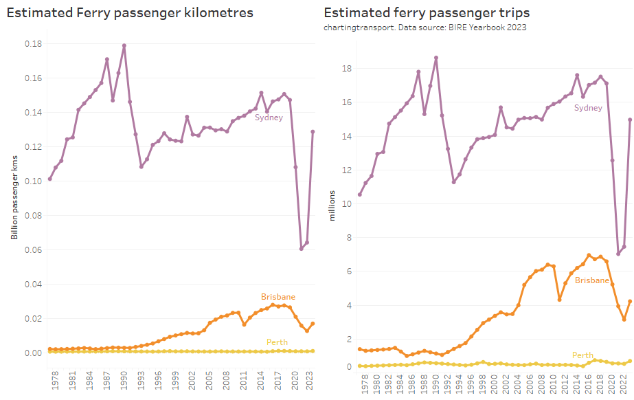
Sydney ferry patronage has almost recovered to pre-pandemic levels, while Brisbane’s ferries have not (as at 2022-23).

Light rail / tram passenger travel

Sydney light rail patronage is now growing strongly – after two new lines opened a few months before the pandemic hit.

Road deaths

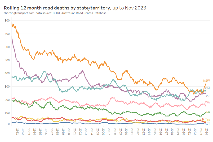
In recent months there has been an uptick in road deaths in NSW and SA. Victorian road deaths dropped during the pandemic but are back to pre-pandemic levels.

It’s hard to compare total deaths between states with very different populations, so here are road deaths per capita, for financial years:

There is naturally more noise in this data for the smaller states and territories as the discrete number of trips in these geographies is small. The sparsely populated Northern Territory has the highest death rate, while the almost entirely urban ACT has the lowest death rate.

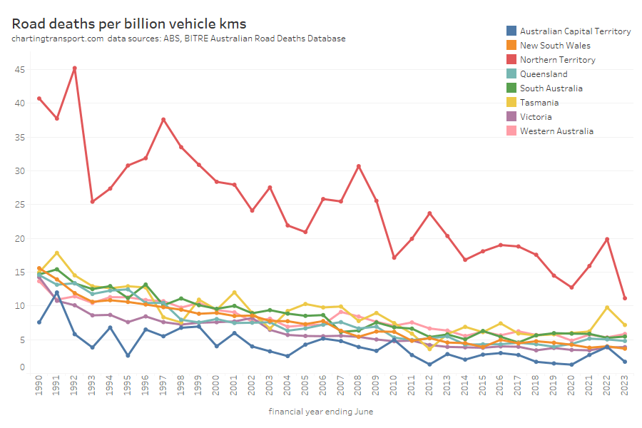
Another way of looking at the data is deaths per vehicle kilometre:

This chart is very similar – as vehicle kilometres per capita haven’t shifted dramatically.

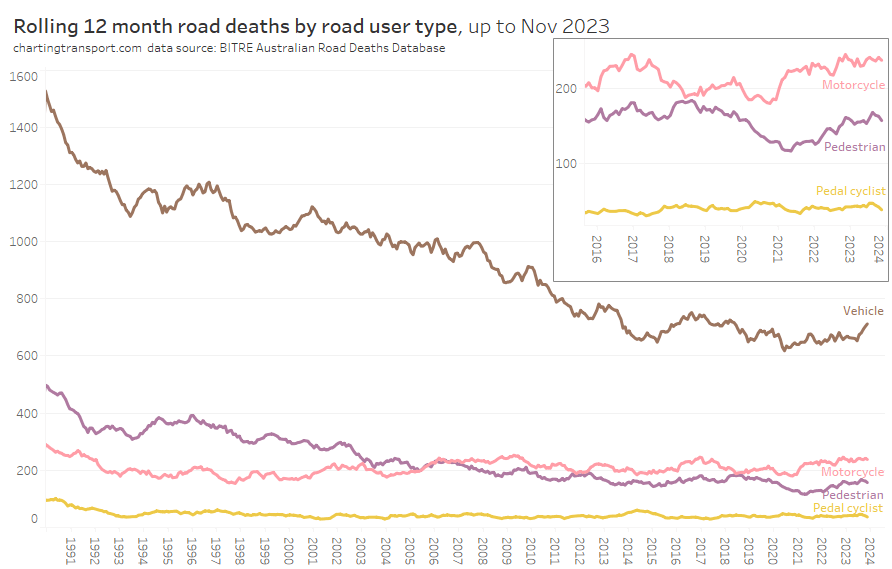
Next is road deaths by road user type, including a close up of recent years for motorcycles, pedestrians, and cyclists. I’ve not distinguished between drivers and and passengers for both vehicles and motorcycles.

Vehicle occupant fatalities were trending down until around 2020. Motorcyclist fatalities have been relatively flat for a long time but have risen slightly since 2021.

Pedestrian fatalities were trending down until around 2014 and have been bouncing up and down since (perhaps a dip associated with COVID lock downs).

Cyclist fatalities have been relatively flat since the early 1990s (apart from a small peak in 2014).

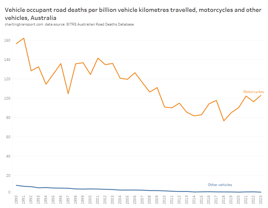
It’s possible to distinguish between motorcycles and other vehicles for both deaths and vehicle kilometres travelled, and the following chart shows the ratio of these across time:

The death rate for motorcycle riders and passengers per motorcycle kilometre was 38 times higher than other vehicle types in 2022-23. The good news is that the death rate for other vehicles has dropped from 9.8 in 1989-90 to 2.7 in 2022-23. The death rate for motorcycles was trending down from 1991 to around 2015 but has since risen again in recent years.

Freight volumes and mode split

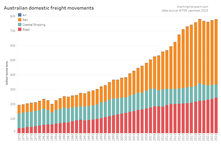
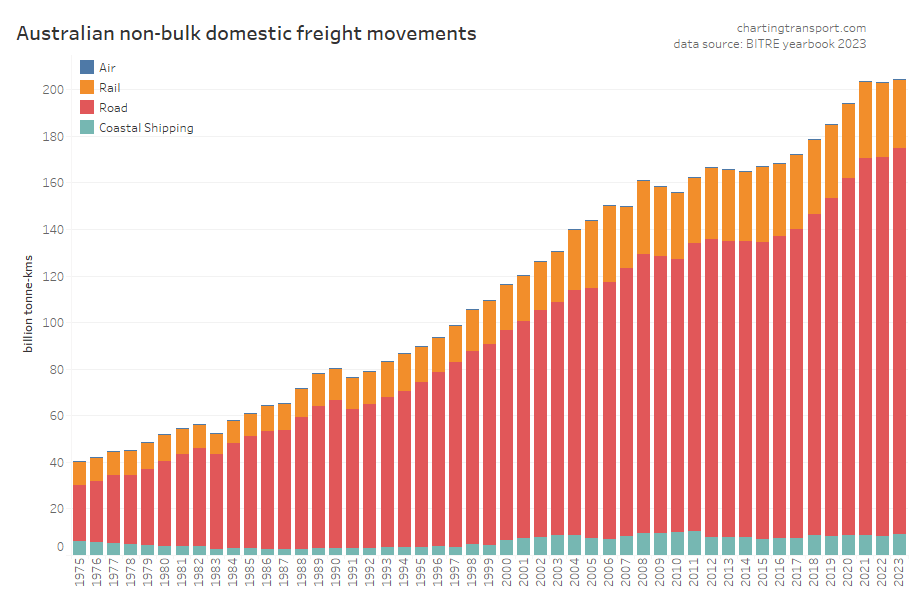
First up, total volumes:

This data shows a dramatic change in freight volume growth around 2019, with a lack of growth in rail volumes, a decline in coastal shipping, but ongoing growth in road volumes. Much of this volume is bulk commodities, and so the trends will likely be explained by changes in commodity markets, which I won’t try to unpack.

Non-bulk freight volumes are around a quarter of total freight volume, but are arguably more contestable between modes. They have flat-lined since 2021:

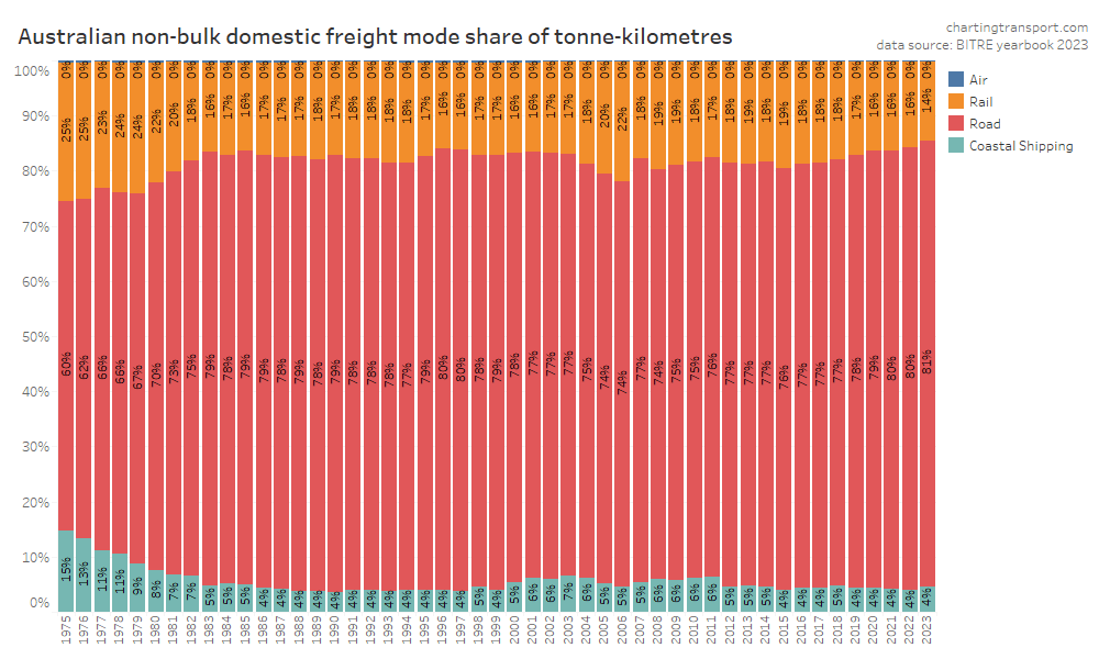
Here’s that by mode split:

In recent years road has been gaining mode share strongly at the expense of rail. This is a worrying trend if your policy objective is to reduce transport emissions as rail is inherently more energy efficient.

Air freight tonnages are tiny in the whole scheme of things so you cannot easily see them on the charts (air freight is only used for goods with very high value density).

Driver’s licence ownership

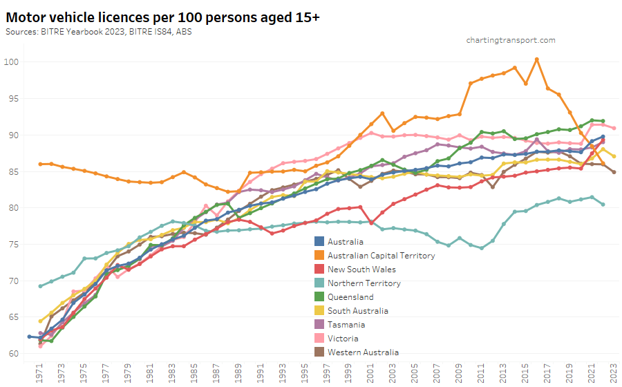
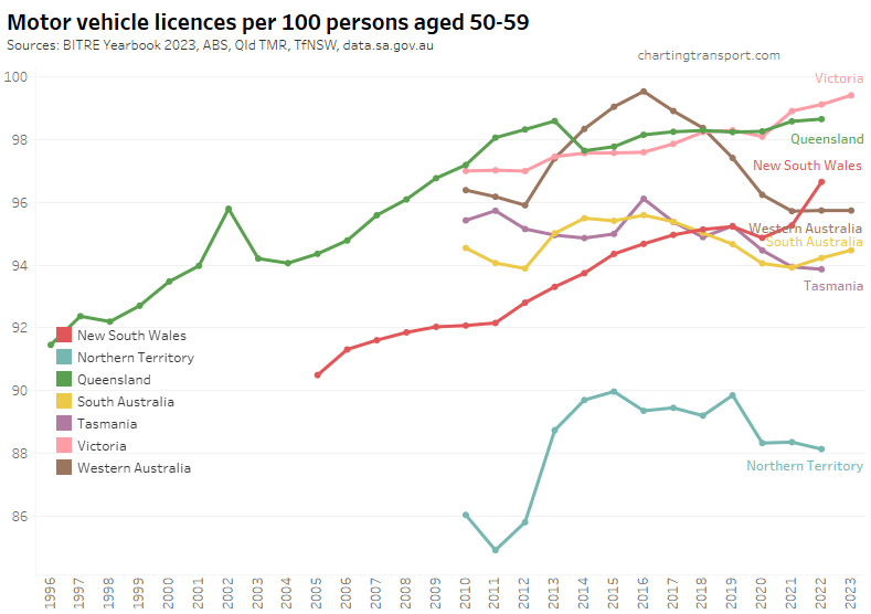
Here is motor vehicle licence ownership for people aged 15+ back to 1971 (I’d use 16+ but age by single-year data is only available at a state level back to 1982). Note this includes any form of driver’s licence including learner’s permits.

Technical note: the ownership rate is calculated as the sum of car, motorbike and truck licenses – including learner and probationary licences, divided by population. Some people have more than one driver’s licence so it’s likely to be an over-estimate of the proportion of the population with any licence.

Unfortunately data for June 2023 is only available for South Australia, Western Australia and Victoria, so we don’t know the latest trends in all states. South Australia and New South Wales regrettably appear to have recently stopped publishing useful licence holder numbers.

2023 saw a decline in licence ownership in the three states that reported. 2022 was a mixed bag with some states going up (NSW, South Australia, Tasmania), many flat, and the Northern Territory in decline.

Licence ownership rates have fluctuated in many states since the COVID19 pandemic hit, most notably in Victoria and NSW which saw a big uptick in 2021.

The data series for the ACT is unusually different in trends and values – with very high but declining rates in the 1970s, seemingly elevated rates from 2010 to around 2018, followed by a sharp drop. BITRE’s Information Sheet 84 (published in 2017) reports that ACT licences might remain active after people leave the territory (e.g. to nearby parts of NSW) because of delays in transferring their licences to another state, resulting in a mismatch between licence holder counts and population. However, New South Wales requires people to transfer their licence within 3 months of moving there, and other states likely do also. But that requirement might be new, changed, and/or differently enforced over time (please comment if you know more).
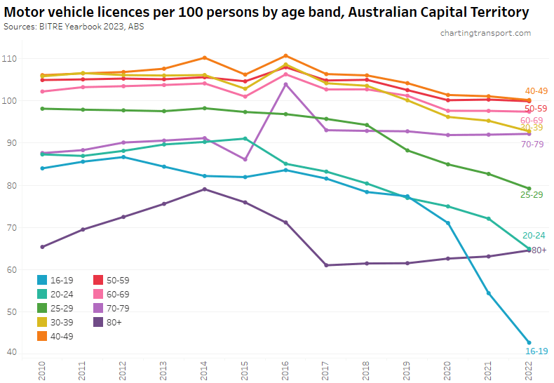
Here’s the breakdown of reported licence ownership by age band for the ACT:

Many age bands exceed 100 (more licence holders than population) and there are some odd kinks in the data around 2015-2017 for all age bands (especially 70-79). I’m not sure that it is plausible that licencing rates of teenagers might have plummeted quite so fast in recent years. I’m inclined to treat all of this ACT data as suspect, and I will therefore exclude the ACT from further charts with state/territory disaggregation.

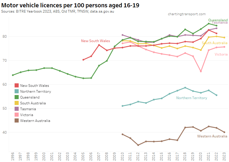
Here’s licence ownership by age band for Australia as a whole (to June 2022):

Between 2021 and 2022 ownership rates for 16-24 year-olds fell slightly, while ownership rates continued to rise for older Australians (quite dramatically for those 80 and over, mostly due to NSW, see below).

Let’s look at the various age bands across the states:

Victoria saw a sharp decline in Victoria to June 2020, followed by a bounce back to a higher rate in 2021. The pandemic has also been associated with increased rates in South Australia, Tasmania, and New South Wales (although it dropped again in 2022). Western Australia and the Northern Territory have much lower licence rates, likely due to different eligibility ages for learner’s permits.

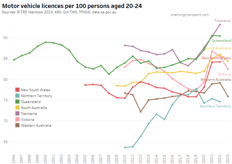
For 20-24 year olds the pandemic caused big increases in the rate of licence ownership in most states, however Victoria, South Australia, and Western Australian appear to have peaked. Licence ownership among 20-24 year olds was still surging in Tasmania up to June 2022.

Similar patterns are evident for 25-29 year olds:

One trend I identified a year ago was that the increasing rate of licence ownership seemed to largely reflect a decline in the population in these age bands during the pandemic period when temporary migrants were told to go home, and immigration almost ground to a halt. Most of the population decline was those without a licence, while the number of licence holders remained fairly steady.

New South Wales appears to follow this pattern, although there was strong growth in licence holders in 2021 and 2022 for teenagers.

Victoria saw a decline in licence holders in 2020 (likely teenagers unable to get a learner’s permit due to lockdowns), but the number of teenage licence holders has since grown. While for those in their 20s, the increase in the licence ownership rate is mostly explained by a loss of population without a licence:

Queensland has experienced strong growth in licence holders at the same time as a decline in population aged 20-29 in 2022. This might be the product of departing temporary immigrants partly offset by interstate migration to Queensland.

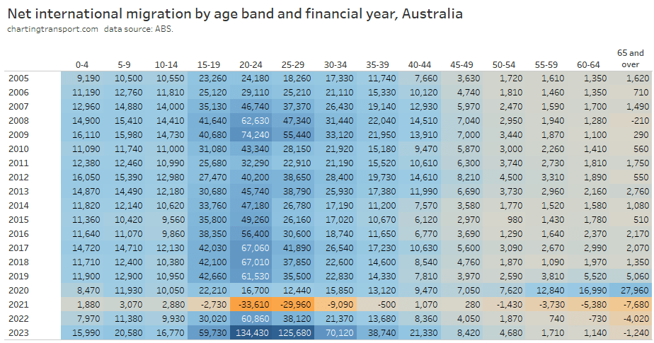
To illustrate how important migration is to the composition of young adults living in Australia, here’s a look at the age profile of net international immigration over time for Australia:

For almost all years, the age band 20-24 has had the largest net intake of migrants. This age band also saw declining rates of driver’s licence ownership – until the pandemic, when there was a big exodus and at the same time a significant increase in the drivers licence ownership rate. The younger adult age bands have seen a surge in 2022-23, and in the three states with data the licence ownership rates have dropped (as I predicted a year ago).

Curiously as an aside, 2019-20 saw a big increase in older people migrating to Australia (perhaps people who were overseas returning home during the pandemic lock downs). But then big negative numbers were seen in 2020-21, and since then there has continued to be net departures in 65+ age band.

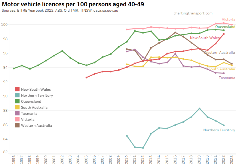
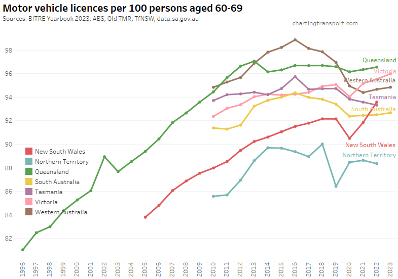
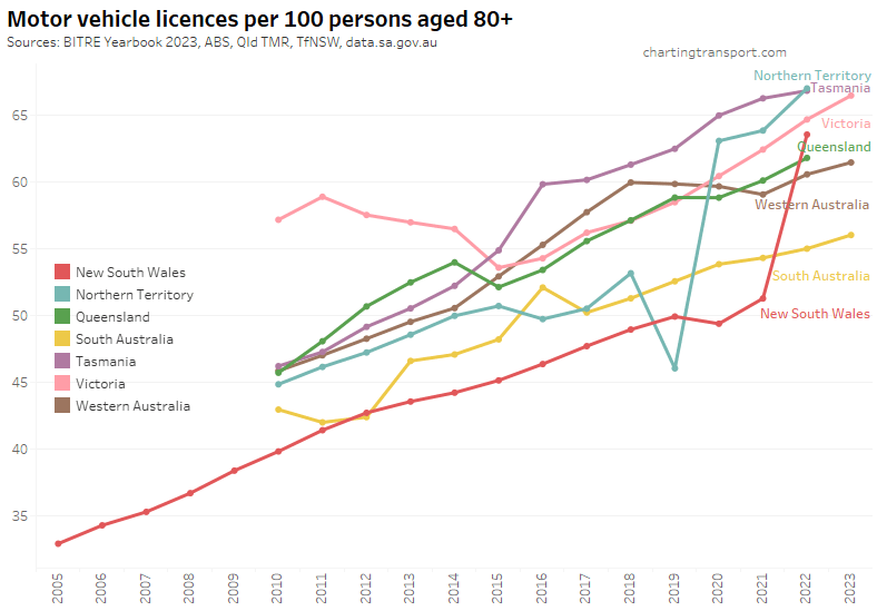
For completeness, here are licence ownership rate charts for other age groups:

There appear to be a few dodgy outlier data points for the Northern Territory (2019) and South Australia (2016).

You might have noticed some upticks for New South Wales in 2022, particularly for those aged over 80. I’m not sure how to explain this. Here’s all the age bands for NSW:

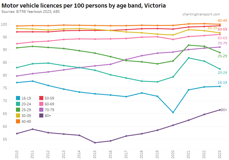
Here’s Victoria, which includes data to 2023:

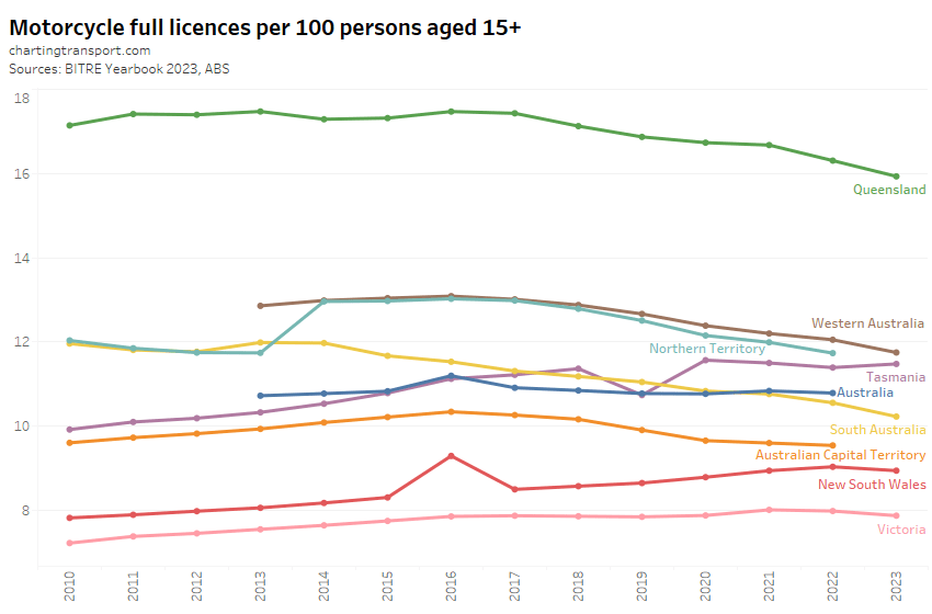
For completeness, here are motor cycle licence ownership rates:

Motorcycle licence ownership per capita has been declining in most states and territories, except Tasmania. I suspect dodgy data for New South Wales 2016, and Tasmania 2019.

Car ownership

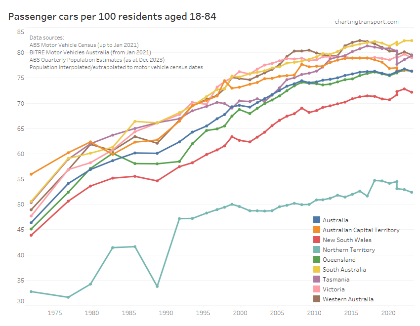
Thankfully BITRE has picked up after the ABS terminated it’s Motor Vehicle Census, and are now producing a new annual report Motor Vehicle Australia. They’ve tried to replicate the ABS methodology, but inevitably have come up with slightly different numbers in different states for different vehicle types for 2021 (particularly Tasmania). So the following chart shows two values for January 2021 – both the ABS and BITRE figures so you can see the reset more clearly. I suggest focus on the gradient of the lines between surveys and try to ignore the step change in 2021.

Let’s zoom in on the top-right of that chart:

All except South Australia, Tasmania, and ACT showed a decline in motor vehicle ownership between January 2022 and January 2023. This might reflect the recent return of “recent immigrants” (as I predicted a year ago).

Tasmania had a large difference in 2021 estimates between ABS and BITRE that seems to be closing so who knows what might be going on there.

Several states appear to have had peaks – Tasmania in 2017, Western Australia in 2016, and ACT in 2017.

Vehicle fuel types

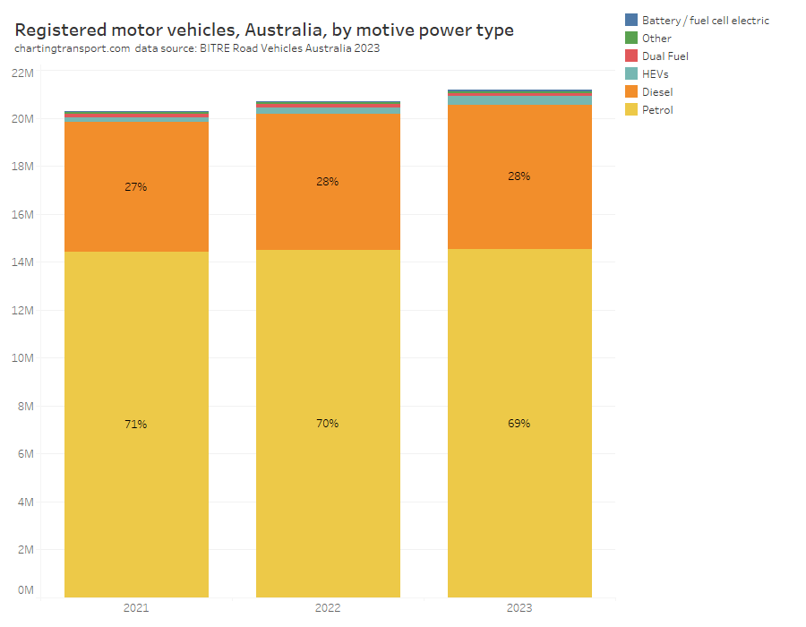
Petrol vehicles still dominate registered vehicles, but are slowly losing share to diesel:

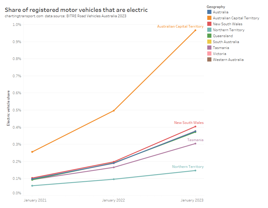
Can you see that growing slither of blue at the top, being electric vehicles? Nor can I, so here’s the share of registered vehicles that are fully electric (battery or fuel cell, but not hybrids):

The almost entirely urban Australian Capital Territory is leading the country in electric vehicle adoption, while the Northern Territory is the laggard.

Motor vehicle sales

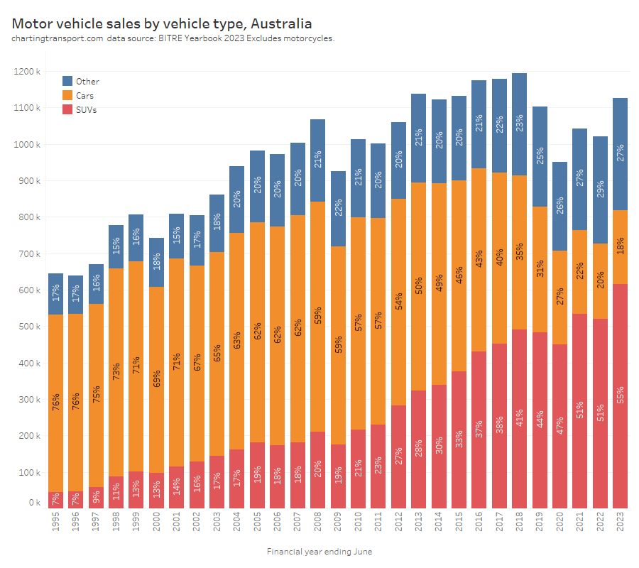
Here are motor vehicle sales by vehicle type:

The trend to larger and heavier vehicles (SUVs) might make it harder to bring down transport emissions (and perhaps reduce road deaths).

Electric vehicle sales are small but currently growing fast in volume and share:

[Updated 7 January 2024:] I’ve included calendar year 2023 sales from FCAI (their 2022 figures were very close to BITRE’s) and calculated the percentage of sales that were battery electric based on FCAI/ABS totals.

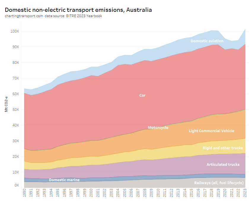
Transport Emissions

Transport now makes up 19% of Australia’s greenhouse gas emissions (excluding land use), up from 15% in 2001:

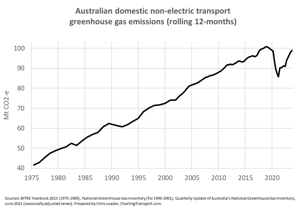
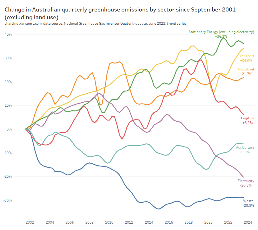
You can see that Australia’s total emissions excluding land use have actually increased since 2001. Emissions reductions in the electricity sector have been offset by increases in other sectors, including transport.

Australia’s transport rolling 12 month emissions dropped significantly with COVID lockdowns, but are bouncing back strongly:

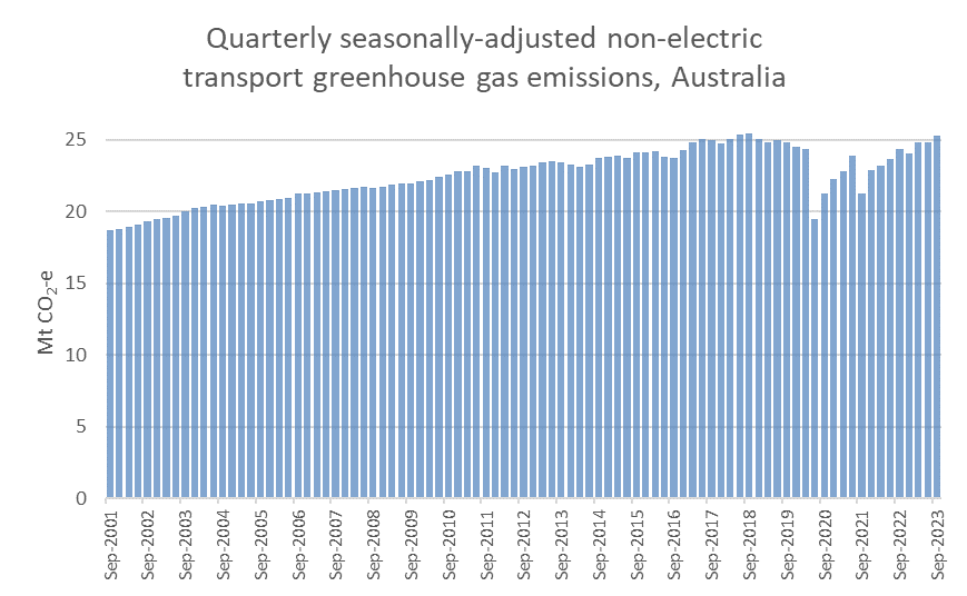
Here are seasonally-adjusted quarterly estimates, showing September 2023 emissions back to 2018 levels:

Transport emissions are around 34% higher in September 2023 than in September 2001, the second highest growth of all sectors since that time:

Here are annual Australian transport emissions since 1975:

And in more detail since 1990:

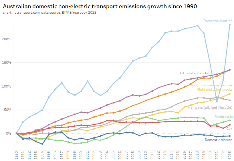
The next chart shows the growth trends by sector since 1990:

Aviation emissions saw the biggest dip during the pandemic but are now back above 2018 levels.

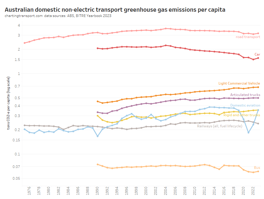
Here are per capita emissions by transport sector (note: log scale used on Y-axis):

Truck and light commercial vehicle emissions per capita have continued to grow while many other modes have been declining, including a trend reduction in car emissions per capita since around 2004.

Next up, emissions intensity (per vehicle kilometre):

I suspect a blip in calculation assumptions in 2015 for bus and trucks.

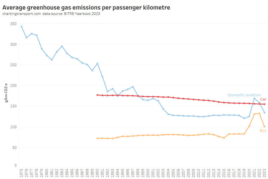
Emissions per passenger kilometre can also be estimated:

Car emissions have continued a slow decline, but bus and aviation emissions per passenger km increased in 2021, presumably as the pandemic reduced average occupancy of these modes.

Aviation was reducing emissions per passenger kilometre strongly until around 2004, but has been relatively flat since, and the 2022-23 value is above 2004 levels. This seems a little odd as newer aircraft are generally more energy efficient.

Transport consumer costs

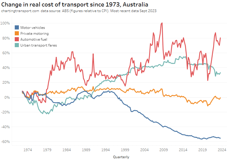
The final category for this post is the real cost of transport from a consumer perspective. Here are headline real costs (relative to CPI) for Australia, using quarterly ABS Consumer Price Index data up to September 2023:

Technical note: Private motoring is a combination of factors, including motor vehicle retail prices and automotive fuel.

The cost of motor vehicles was in decline from around 1995 to 2018 and has been stable or slightly rising since then. Automotive fuel has been volatile, which has contributed to variations in the cost of private motoring.

Urban transport fares (a category which unfortunately blends public transport and taxis/rideshare) have increased faster than CPI since the late 1970s, although they were flat in real terms between 2015 and 2020, then dropped in 2021 and 2022 in real terms – possibly as they had not yet been adjusted to reflect the recent surge in inflation. They picked up slightly in 2023.

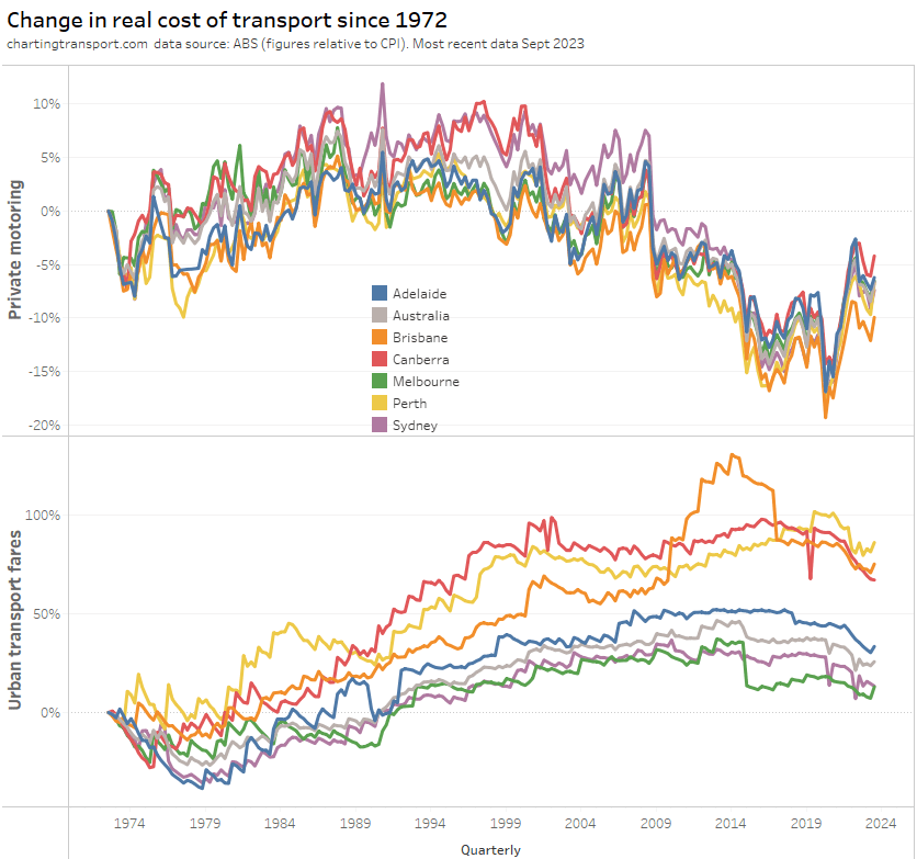
The above chart shows a weighted average of capital cities, which washes out patterns in individual cities. Here’s a breakdown of the change in real cost of private motoring and urban transport fares since 1972 by city (note different Y-axis scales):

Technical note: The occasional dips in urban transport fares value are likely related to periods of free travel – eg May 2019 in Canberra.

The cost of private motoring moves much same across the cities.

Urban transport fares have grown the most in Brisbane, Perth, and Canberra – relative to 1972. However all cities have shown a drop in the real cost of urban transport fares in June 2022 – as discussed above.

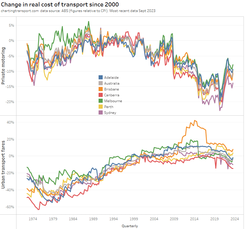
If you choose a different base year you get a different chart:

What’s most relevant is the relative change between years – e.g. you can see Brisbane’s experiment with high urban transport fare growth between 2009 and 2017 in both charts.

Melbourne recorded a sharp drop in urban transport fares in 2015, which coincided with the capping of zone 1+2 fares at zone 1 prices.

And that’s a wrap on Australian transport trends. Hopefully you’ve found this useful and/or interesting.


How do commuting distances vary across Australian cities?

Mon 9 October, 2023

Having previously analysed commuting distances in Melbourne and Victoria, this post turns attention to other Australian cities. I’ll answer questions such as: Where are there longer commutes? What might explain differences in commute distances? How long are commutes in outer urban growth areas in different cities?

I’m using ABS calculated on-road distances between homes and regular workplaces from the 2021 census, regardless of whether people travelled to work on census day. For more on the data and calculations see the last post.

How do median distances to work vary by city overall?

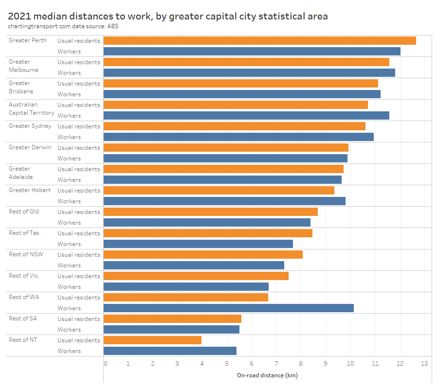
I’ve measured the median distance to work for both the usual residents and the workers of each greater capital city statistical area (GCCSA) for 2021. These are often a bit different because some people live and work in different GCCSAs, and I’ll come back to that.

The chart shows that the capital city areas all have longer median distances to work than other parts of each state, which is unsurprising. Here’s some comments on the cities in order:

  • Perth tops the chart with the longest median distances to work. Perth has a large and long low density footprint sprawled along the coastline, so long commuter distances are not hugely surprising.
  • Melbourne comes in second place. It is the largest city by area, but is more dense than Perth.
  • Brisbane comes in third place. Brisbane is slightly larger than Perth in area, but not stretched out quite so far, and with a larger population than Perth, but lower density than Melbourne.
  • Canberra is next. It’s a relatively small city so you might expect shorter commute distances, but overall it is quite a low density city with a fragmented urban structure (divided by green areas). It also has an extensive high-speed and rarely-congested highway network that makes driving longer distances relatively easy.
  • Sydney is next, the largest city by population and population density, and a city with multiple significant employment clusters, which probably contributes to a smaller median distance than most other big cities.
  • Darwin is a tiny city, but like Canberra it has a fragmented urban structure, and Darwin’s CBD is at the end of a peninsula (with a median distance for employees of 12 km), which probably contributes to relatively long median commutes.
  • Adelaide is the smallest of the five larger cities, with a mostly contiguous urban structure, which probably explains it’s lower median distances.
  • Hobart is another very small city, which probably explains shorter commutes, although it is split over a wide river mouth which would lengthen many commute distances.

On the chart you can also observe small differences between median distances for usual residents and workers in some cities that I think are worth mentioning:

  • Canberra has a longer median distance for workers, which probably reflects many workers living across the border in NSW.
  • Perth has a longer median distance for usual residents than workers, which might reflect fly-in-fly-out commuters who live in Perth.
  • Sydney and Melbourne have a longer median distance for workers, which might reflect commuters from outside the metropolitan area (particularly Melbourne’s many commuter towns which I explored in the last post).
  • Workers in the “rest of WA” and “rest of NT” have relatively long median distances, which I suspect reflects fly-in-fly-out employment in the resources sector.

How do distances to work vary across cities

I’ve already examined Melbourne in my last post. What follows are maps and some discussion for other cities, followed by some observations across the cities.

Sydney

(you might want to click/tap to expand some of these maps to see the detail more clearly)

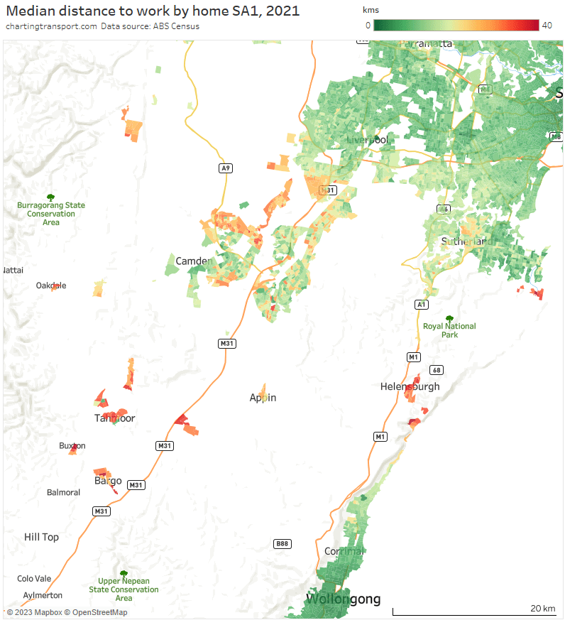
Shorter median distances were found around in areas around the Sydney CBD, which is no surprise. Generally longer distances were seen in the growth areas to the south-west (including Oran Park, Leppington, Gledswood Hills, Gregory Hills, Edmondson), north-west (including Schofields, Marsden Park, Box Hill) and eastern Blue Mountains (including Springwood and Hazelbrook, but not Katoomba).

Other relative outliers include:

  • Bundeena in the far south-east (median distances up to 50 km), which is connected to the rest of Sydney by a very long and windy road journey through the Royal National Park, plus a short ferry to Cronulla (not considered by ABS when calculating commute distances).
  • Pockets of Bonnet Bay in the south (median distance of 26 km) which have a rather indirect access road to the rest of Sydney.
  • Palm Beach (median distance of 37 km) at the tip of the northern beaches region.

Does Sydney have commuter towns? Yes, but perhaps not as many as Melbourne. The map above shows long median distances as far as Hazelbrook in the west, and the map below shows several towns to the south that show longer median distances (many commuters from these towns might also work in Wollongong).

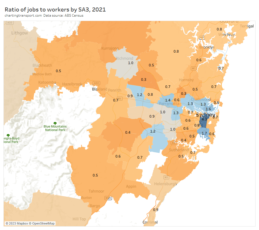
Here’s how Sydney looks for the ratio of jobs to workers in SA3s:

The outer south-west has a low ratio and is quite remote from any SA3 with a surplus of jobs, hence relatively long median distances to work. Some pockets of the north-west had low ratios, but were adjacent to higher ratio areas nearby.

Here are median distances to work by workplace destination zones (DZs):

Unlike Melbourne there were not large industrial areas with median distances over 20 km.

There were a few isolated pockets with long distances including Badgerys Creek (Western Sydney International Airport construction site), the Holsworthy Army Barracks, and Waterfall (maybe related to a rail depot).

Here’s the proportion of workers who were employed in central Sydney (including Sydney CBD, Haymarket, Millers Point, The Rocks):

Like most cities, the influence of the central city declines with distance from the CBD. Some relative anomalies for their distance include:

  • Outer north-western suburbs (including Baulkham Hills and Blacktown – North SA3s) have relatively high dependence on the Sydney CBD for jobs, and associated longer median commuter distances.
  • Bankstown is relatively close to the Sydney CBD but with with many SA2s below 10% for central city workers, perhaps reflecting relative socio-economic disadvantage.

South East Queensland

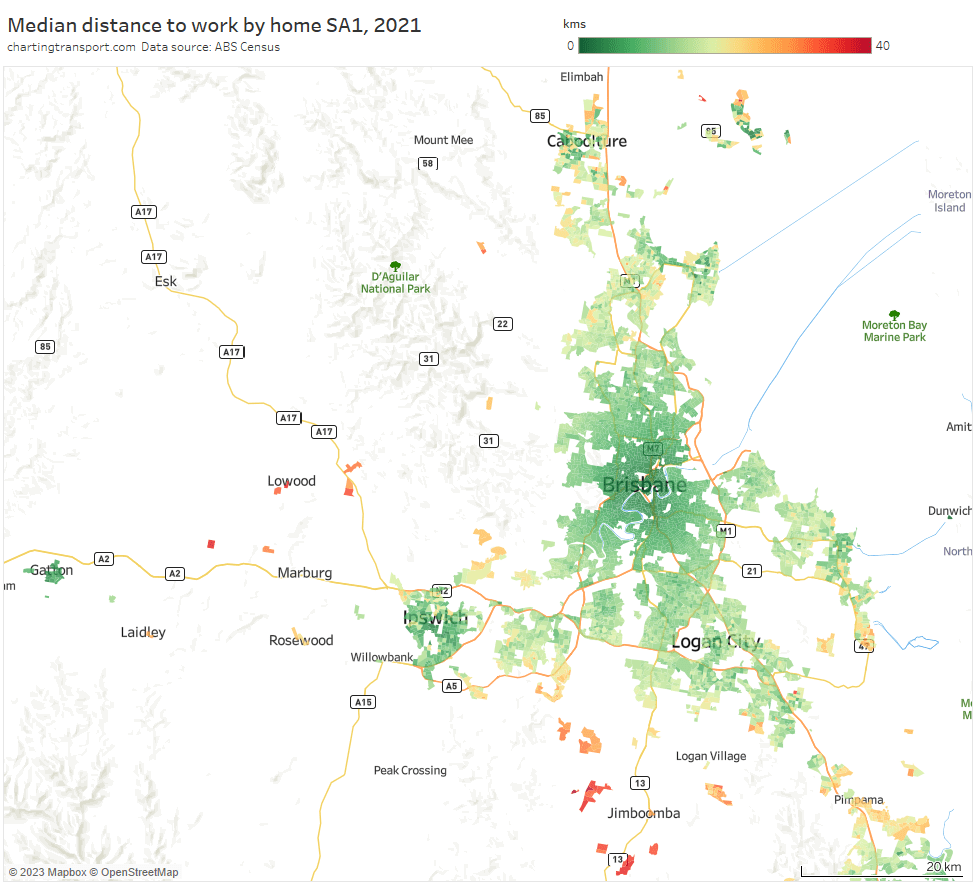
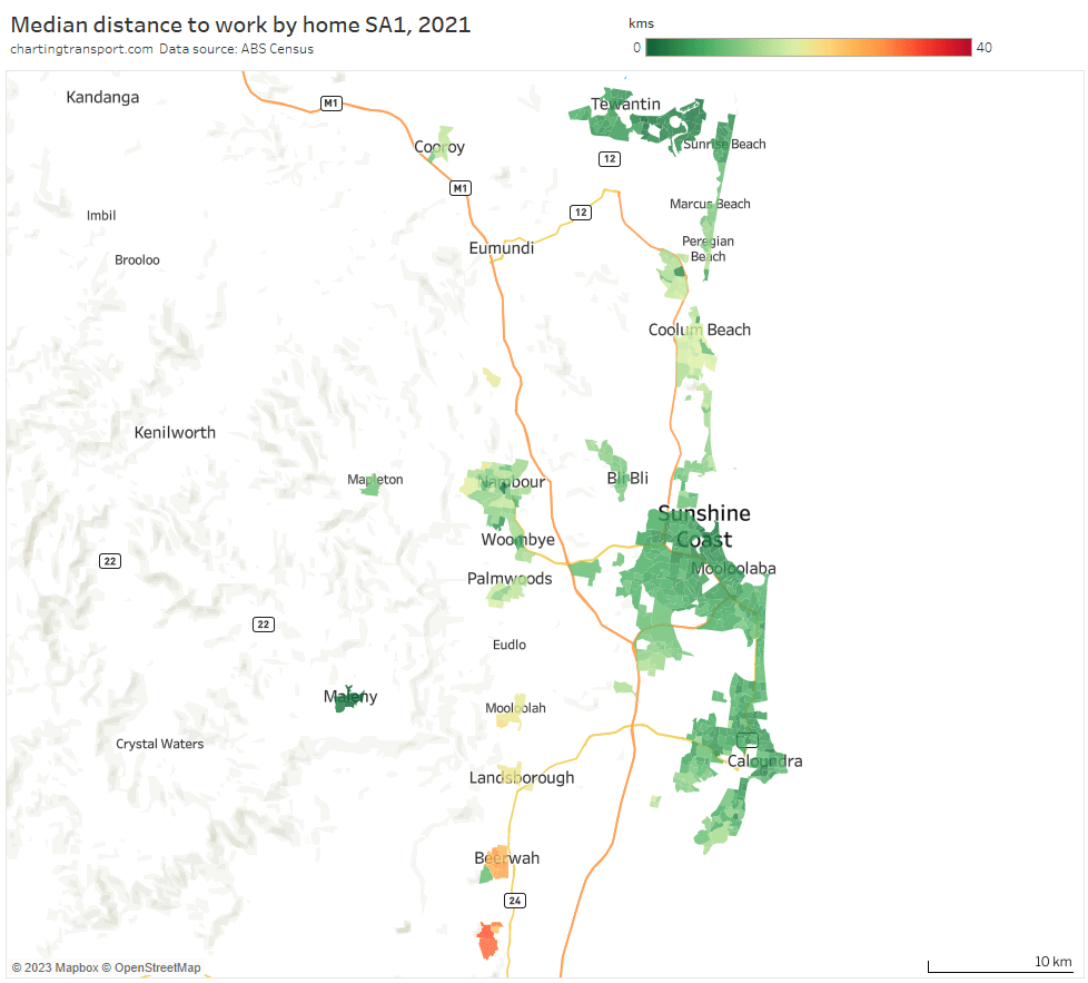
First up, Brisbane medians distances by home SA1:

The longest median distances can be found in some low density suburban areas around Jimboomba, Yarrabilba, New Beith, Lowood, and the Lockyer Valley. Some relatively long median distances were also seen around Ormeau and Pimpama (suburbs between Brisbane and the Gold Coast), Springfield Lakes, parts of Caboolture, and Bribie Island. Looking at the urban fabric, these appear to be mostly relatively modern low density residential estates (rather than old towns). I’m not seeing many commuter towns around Brisbane.

Curiously there are relatively short median distances around the outer suburban area of Ipswich in the west (I’ll come back to this).

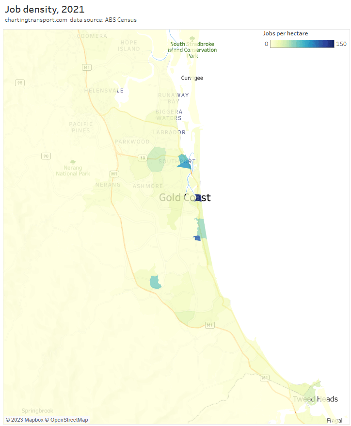
Here’s the Gold Coast:

Median distances are mostly relatively short except for the northern fringe and around Tambourine Mountain in the hinterland. Jobs are much more distributed across the Gold Coast (see map below) compared to other cities dominated by one CBD, which might explain relatively short commute distances.

Here’s the Sunshine Coast:

Distances are relatively short except for the Glass House Mountains and Beerwah to the south (probably containing commuters to Brisbane and the Sunshine Coast).

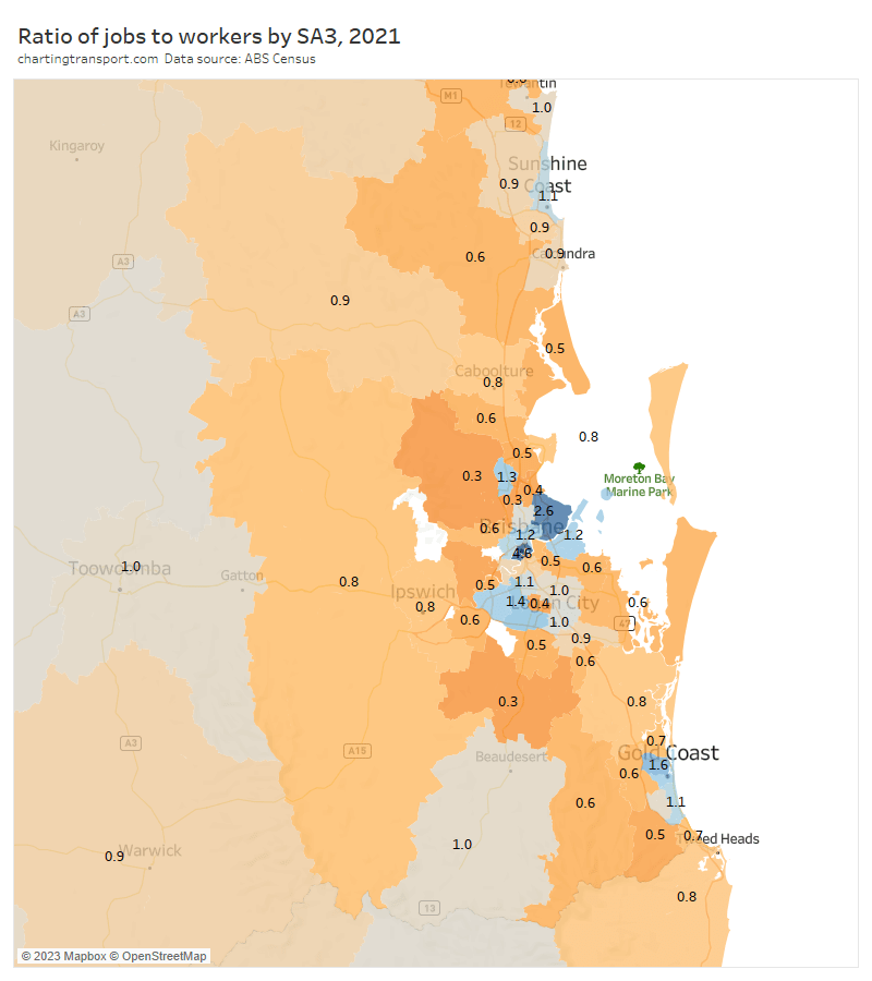
Here’s how South East Queensland looks for jobs to workers ratio:

You can see surpluses of jobs in the central parts of Brisbane, the Gold Coast and the Sunshine Coast.

The outer suburban Ipswich area comes in surprisingly high at 0.8, which almost certainly explains the relatively shorter distances to work found in the area. I’m not very familiar with Brisbane’s urban history, but the presence of so many jobs in the Ipswich area is probably saving a fair amount commuting distance and taking some pressure of the transport network.

Jimboomba and The Hills District had a ratio as low as 0.3. Jimboomba’s low density, fragmented urban structure, lack of local jobs, and remoteness from the main Brisbane urban area likely explains the very long median distances to work, and likely high levels of car dependency.

Here are median distances to work by workplace DZs for the Brisbane area:

Long distances were seen around Brisbane Airport and the Port of Brisbane (24-25 km, both relatively remote from residential areas), the Yatala industrial areas on Brisbane’s outer south (25-26 km), Wacol (21 km, which is dominated by correctional facilities), Swanbank (22 km, dominated by power stations), and the RAAF Amberley air base in Rosewood (22 km).

Here is map showing the proportion of workers who worked in “central Brisbane” (defined as the Brisbane CBD plus Spring Hill SA2):

There aren’t huge anomalies by distance. But I might perhaps call out New Beith in the south, Elimbah in the north, and North Stradbroke Island in the east as relative outliers with not-so-low (5-10%) percentages working in central Brisbane. You can also see the Ipswich area had a low dependence on central Brisbane for employment, consistent with the relatively high rate of job self-sufficiency.

Perth

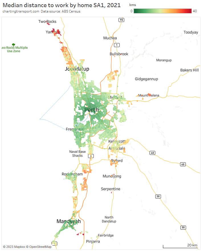
Perth has the longest median distance to work of all capital cities, and you can see many suburbs with relatively long distances, most acutely in the far-north around Two Rocks and Yanchep (several SA1s having a median above 40 km) and Yunderup (between Mandurah and Pinjarra in the south). Long median distances are seen north of Joondalup, throughout the satellite Ellenbrook region in the north-east, in Mount Helena and other hills towns to the east, around Byford in the south-east, around Wellard and Baldivis in the south, and in coastal areas between Rockingham and Mandurah.

I should point out that the map only includes Greater Perth SA1s. The SA2 of Chittering to the north east of Perth (including Muchea and Bindoon) has a median distance to work of 46 km, and 54% of its workers worked in Greater Perth (to which is it connected by a freeway). It contains quite a few very low density rural-living residential areas.

Here’s the jobs to worker ratio map:

There were very low ratios in the outer northern, eastern, and south-eastern suburbs, which explains the long median distances to work from these areas.

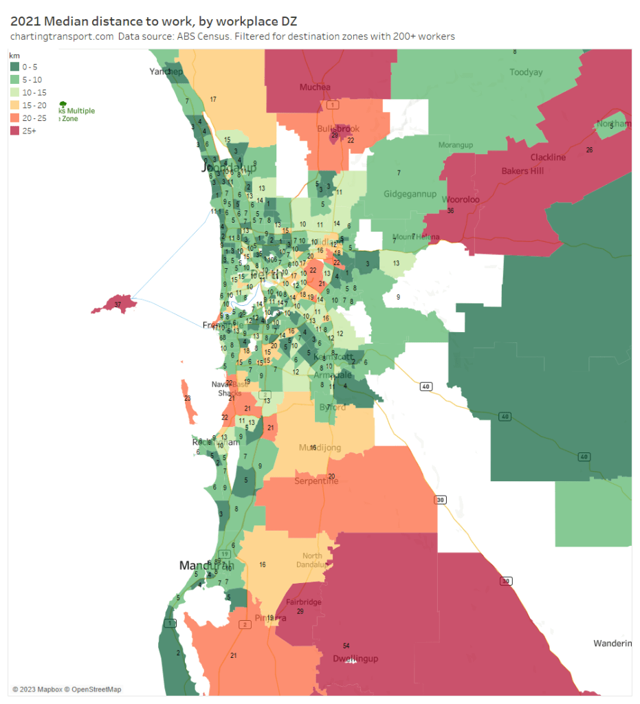
Here are median distances to work by workplace destination zones:

The longest medians were seen for Perth Airport and around the Kwinana industrial areas. Other destination zones with long distances are rural areas outside of Perth (not unexpected), plus Wadjemup (Rottnest Island) where distances are obviously not on-road but imputed to be 1.3 times the straight line distance. Many workers are likely to commute by ferry from Perth.

Here’s the proportion of workers who work in central Perth (defined as including the CBD, Northbridge and East Perth):

The dependence on central Perth extends a fair way into the jobs-poor northern suburbs. Both the northern suburbs train line and the Mitchell Freeway have been extended several times as the urban area has expanded, perhaps a case of transport-driven sprawl.

The CBD’s influence also extends a fair distance south including Wellard and Baldivis that have relatively long median distances to work (and are closer to the Kwinana Freeway than the Mandurah rail line).

Adelaide

Median distances to work were relatively short for most of the main contiguous urban area of Adelaide. Higher medians were seen in the detached urban areas of Gawler in the north, Aldinga Beach in the south, and many Adelaide Hills towns (particularly outer parts of Mount Barker).

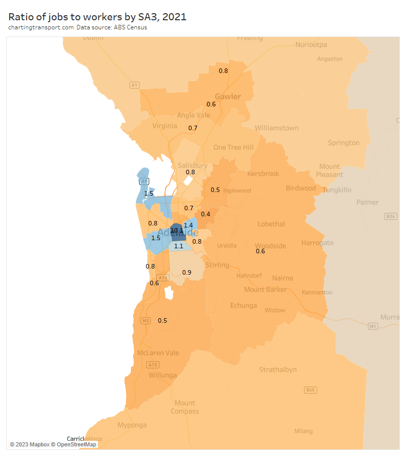
Here is the jobs to workers ratio map:

The outer suburbs on all sides had low ratios and hence longer median distances to work.

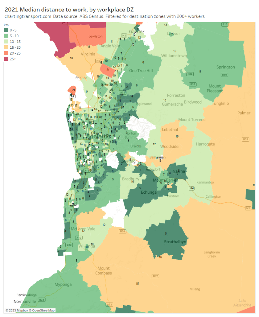
Here are median distances to workplaces by destination zone:

Median distances are relatively short for most workplace areas with the relatively urban exceptions of North Haven / Outer Harbour (at the tip of a peninsula), and the RAAF Edinburgh air base in the north.

Canberra

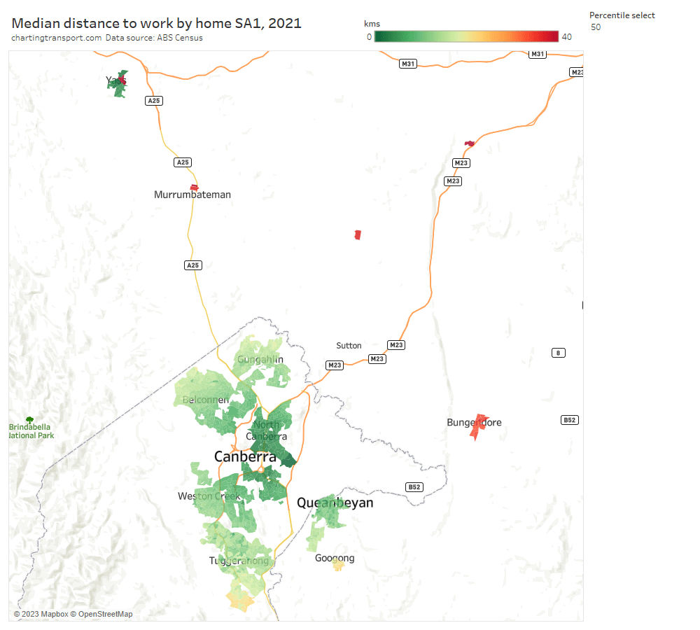
Most areas of Canberra had median distances under 20km, except around Banks in the far south, and Googong to the south-east (over the border in New South Wales, where 73% of workers work in the ACT).

I’ve previously described towns with a very long median distance as commuter towns – and for Canberra this would include Murrumbateman, Gundaroo, Bungendore, and Collector.

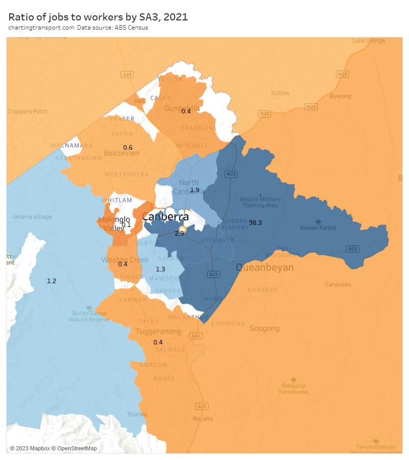
Here is the jobs to worker ratio map for SA3s:

Canberra East had a huge ratio – only 532 workers lived in that SA3 dominated by employment land uses. Low ratios were seen in Tuggeranong in the south, Gungahlin in the north, and Queanbeyan to the east (which had a ratio 0.5 and 71% of workers in the Queanbeyan SA2 worked in the ACT).

An extremely low ratio of 0.1 was seen around the Molonglo Valley, but this area is right next door to jobs rich areas of central Canberra.

The Young – Yass SA3 to the north west of Canberra came in at 0.7, unusually low for a regional area suggesting some dependence on Canberra for jobs. In fact 52% of workers in Yass Surrounds and 34% of the Yass township worked in the ACT. The town of Yass had median distances to work mostly under 5 km, however the 75th percentile distances to work in many parts of Yass was over 40 km.

Here are median distances to work for workplace destination zones:

The only urban area with relatively long workplace median distances was Canberra airport.

I’m not going to do as detailed analysis for the smaller cities that follow.

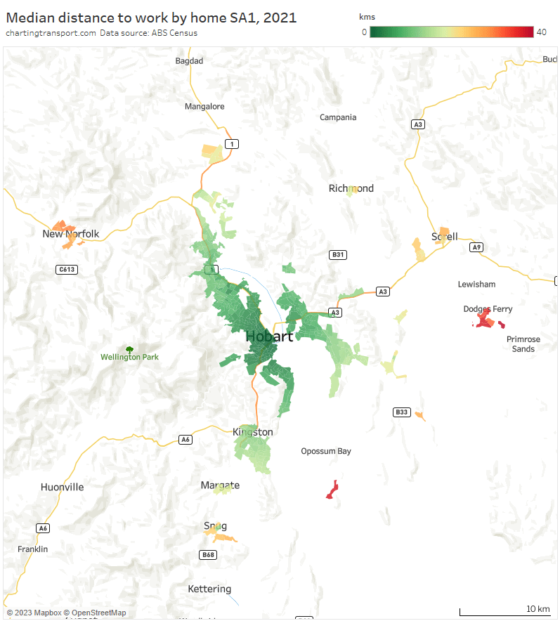
Hobart

The main urban areas of Hobart had relatively short distances, with outlying commuters towns such as New Norfolk, Brighton, Sorell, Dodges Ferry, Snug, and particularly South Arm showing much longer medians.

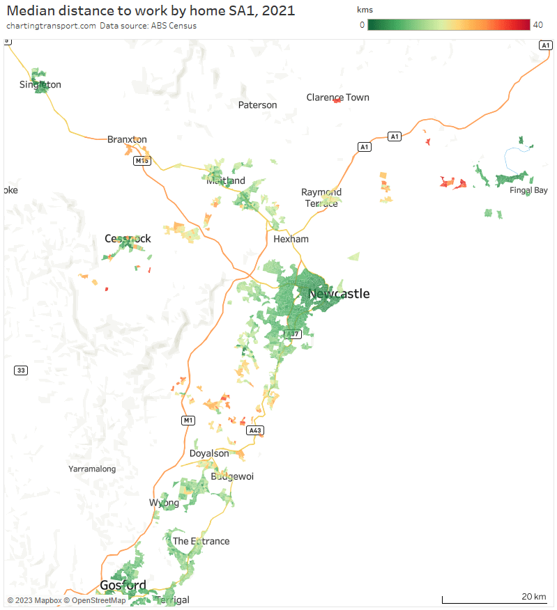
Newcastle / Central Coast / Hunter region

Longer median distances are seen at several small urban areas between Wyong and Newcastle, around Kurri Kurri – Abermain. Branxton, Clarence Town, Lemon Tree Passage, and Tanilba Bay. Singleton, Cessnock, and Nelson Bay have relatively short median distances and are likely less reliant on Newcastle for employment.

Wollongong

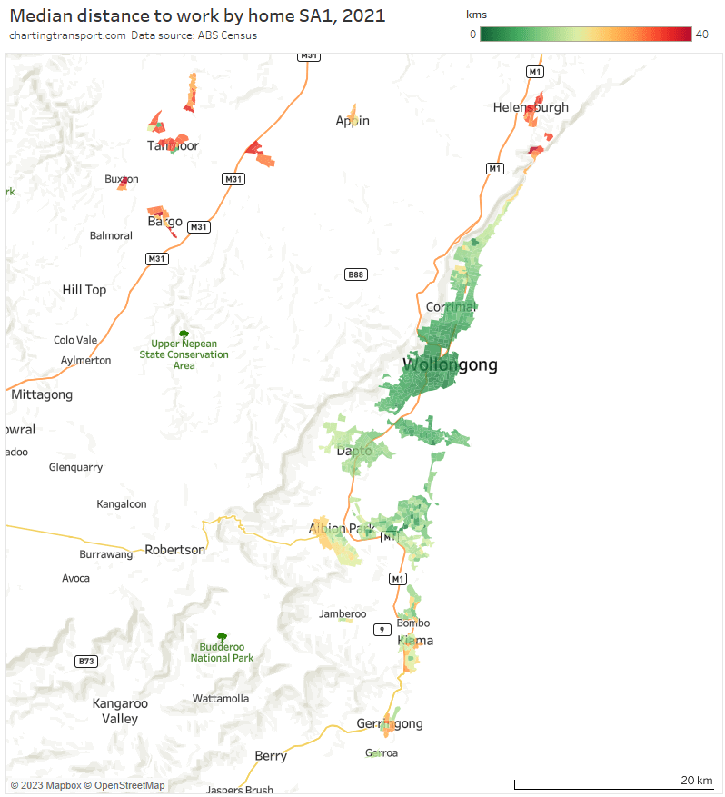
Note data is not shown for urban areas around Robertson and Mittagong.

Median distances were mostly relatively short, with exceptions in the north (Helensburgh) and south (Albion Park, Kiama, and Gerringong) of what is also a skinny coast-hugging urban settlement pattern.

How do the urban growth areas of big cities compare?

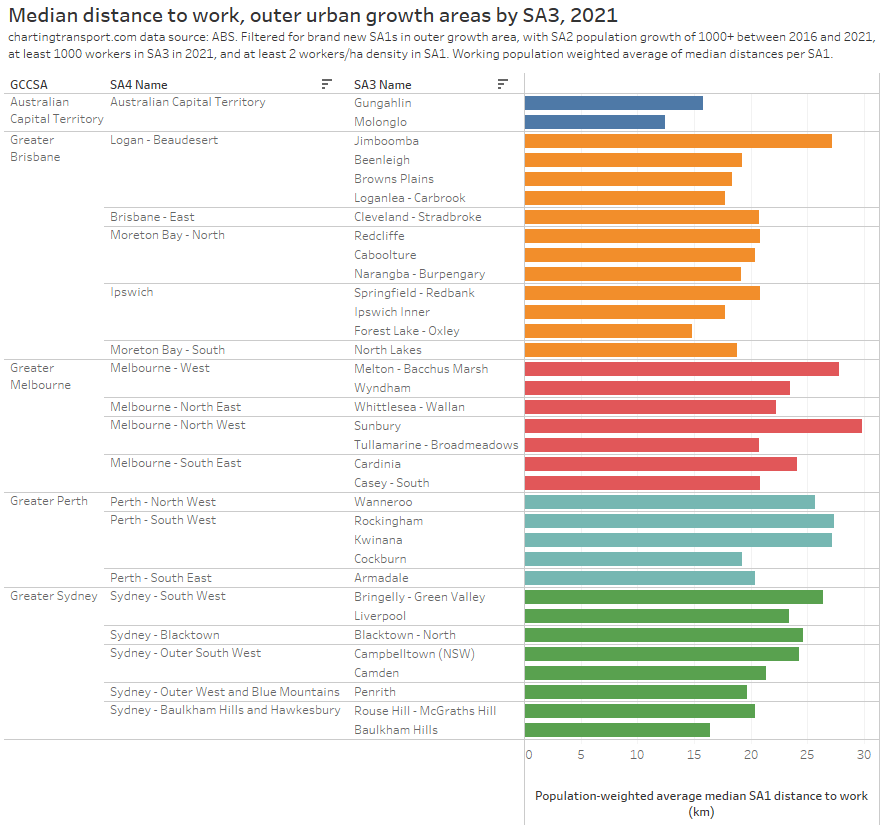
For this analysis I’ve filtered for new (in 2021) outer urban growth SA1s, and calculated the population-weighted-average median distance to work of these SA1s aggregated to SA3 level (not a perfect calculation, but hopefully close enough).

Note: The Tullamarine – Broadmeadows SA3 in Melbourne is perhaps poorly named – it actually includes Craigieburn and stretches north to Mickleham.

The outer urban growth SA3s with the longest median distances to work (perhaps call them commuter suburbs) were Sunbury in Melbourne’s north-west, followed by Melton – Bacchus Marsh in Melbourne’s west, Jimboomba south of Brisbane, Rockingham and Kwinana south of Perth, and Bringelly – Green Valley in Sydney’s west.

The outer urban growth SA3s with the shortest median distances to work included those around the smaller city of Canberra, the Ipswich region of western Brisbane, and the Baulkham Hills region of north-western Sydney. New residents in these areas will be generating fewer commuter kilometres to their city’s transport task (relative to other outer growth areas).

You might be wondering why Adelaide is missing from the above chart. It is a city with quite slow population growth and did not have enough growth in each SA3s to qualify with my filters.

Here’s the same data aggregated up to city level, which shows Adelaide actually with the longest commute distances from outer growth areas, followed by Perth.

What can we take away from this city analysis?

Longer commute distances seem to be strongly associated with imbalances in the distribution of jobs and workers within cities, particularly where these imbalances stretch out over long distances (Perth being the classic example). That’s probably no great surprise to many readers.

So if a city wanted to reduce commuting distances (and therefore demand on its transport system) it could consider:

  • slowing urban sprawl – particularly in corridors which already have worker to jobs imbalances and long commute distances,
  • increasing residential densities around existing major employment clusters, and/or
  • attempting to distribute more employment to outside the CBD – probably easier said than done, but Sydney has done it successfully with relatively high public transport mode share, while Canberra has done it with low public transport mode share (~12%) in town centres.

How is public transport patronage recovering after the pandemic in Australian and New Zealand cities?

Tue 8 August, 2023

With the COVID19 pandemic seemingly behind us, what has been happening to public transport patronage? Has it recovered to 2019 levels? In which cities is public transport patronage recovering the strongest?

This post provides my best estimates of how much public transport patronage has recovered in major Australian and New Zealand cities.

In my last post I talked about the problems when transit agencies only publish monthly total patronage (or weekly or quarterly totals). For those cities that don’t publish more useful data, I’ve used what I think is a reasonable methodology to try to adjust those figures to take into account calendar effects.

Unlike most of my posts, I’ll present the findings first then explain how I got them (because I reckon a good portion of even this blog’s readers might be less interested in the methodology).

Estimates of typical school week public transport patronage recovery

Here’s a chart comparing estimated typical school week patronage per month to the same month in 2019 (the year before the COVID19 pandemic) where clean data is available. My confidence levels around estimates for each city is discussed further below.

Technical notes: Sydney+ refers to the Opal ticketing region that includes Greater Sydney, Newcastle/Hunter, Blue Mountains, and the Illawarra. Typical school week patronage is the sum of the median patronage for each day of the week (where available), otherwise an estimate of average school week patronage. More explanation below.

Perth has been at or near the top of patronage recovery for most recent months, perhaps partly boosted by a new rail line opening to the airport and High Wycombe in October 2022.

Wellington – which I suspect is an unsung public transport powerhouse – is in second place at 90%, whilst all other cities are between 75% and 83%.

Looking at the 2023 data, most cities appear to be relatively flat in their patronage recovery (except Perth and Wellington), which might suggest that travel patterns have settled following the pandemic (including a share of office workers working remotely some days per week).

How does patronage recovery compare to population growth?

I’ve calculated the change in population for each city since June 2019. For South East Queensland I’ve used an approximation of the Translink service area, and for “Sydney+” I’ve used an approximation of the Opal fare region covering Sydney and surrounds. At the time of writing, population estimates were only available until June 2022.

There are significant differences between the cities.

So how does public transport patronage recovery compare to population change? The following chart shows June 2022 patronage and population as a proportion of June 2019 levels:

The changes in population are much smaller than the changes in patronage and I have deliberately used a similar scale on each axis to illustrate this. Population growth certainly does not explain most of the variation in patronage recovery, but it is very likely to be a factor.

Perth had the highest patronage recovery in June 2022, but only some of this could be attributed to high population growth. Wellington had little population growth but the second highest patronage recovery to June 2022.

Perth might have the highest patronage recovery rate overall because it spent the least amount of time under lockdown, and so commuters had less time getting used to working at home. Melbourne, Sydney, Canberra, and Auckland spent the longest periods under lockdown, and – with the exception of Canberra – seem to be tracking at the bottom end of the patronage recovery ratings, which might reflect their workers becoming more comfortable with working from home during the pandemic. However I’m just speculating.

How has patronage recovery varied by day type?

Here’s patronage recovery for school weekdays (for cities which publish weekday data):

Note: Canberra estimates are only available for July to December because daily patronage data has unfortunately not been published for January to June 2019.

And here is the same for weekends (again for the same four cities that publish weekend data):

Weekend patronage is a bit more volatile as weekends typically have varying levels of major events and planned service disruptions. Most months also only have 8 weekend days, so a couple of unusual days can skew the month average and create “noise” in the data.

However all cities have been above 90% patronage recovery on weekends. Weekend patronage has returned more strongly than weekday patronage, probably because new remote working patterns only significantly impact weekdays.

How has patronage recovery varied between cities by mode?

I’m only confident about predicting modal patronage in cities that report daily or average day type patronage by mode, as the day type weightings used from another city might not apply equally to all modes.

Here is school weekday train patronage recovery for Sydney, Melbourne, and Auckland:

Auckland is slightly below Sydney and Melbourne, and recovery rates are lower than public transport overall. I suspect this may be due to train networks having a significant role in CBD commuting – a travel market most impacted by remote working.

And here is the data for weekends:

Curiously there is a lot more variation between cities. There’s also a lot more variation between months, which could well be related to the “noise” of occasional planned service disruptions and major events.

Here is average school day bus patronage for four cities where data is available:

Bus patronage recovery is lowest in Sydney, perhaps because buses play a more significant role in Sydney CBD commuter travel which will be impacted by working from home (Melbourne’s bus services are mostly not focussed on the CBD). However buses also play a major role in public transport travel to the CBDs of Auckland and Canberra, although with probably lower public transport mode shares (unfortunately it doesn’t seem possible to get public transport mode share for the Auckland CBD from 2018 NZ Census data).

And for completeness, here is a chart for weekend bus patronage:

Weekend bus patronage recovery is higher than weekdays, and higher than weekend train patronage recovery, in all cities. Reported weekend bus patronage in Canberra, Melbourne, and Auckland has exceeded 2019 level in recent months.

How good are these estimates?

Some agencies publish very useful data such as daily patronage or day type average patronage, while others only publish monthly or quarterly totals which is much less useful for trend analysis. Here’s a summary of how I estimated time-series patronage and therefore patronage recovery in each city (which I will explain below).

City/regionData used to estimate time-series patronageConfidence
MelbourneReported average patronage by day of the week and day typeHigh
Sydney+ = Greater Sydney, Newcastle/Hunter, Blue Mountains, Wollongong (Opal catchment)Reported average school weekday and average weekend day patronage per month (dashboard)Moderate
South East Queensland (Translink) – including Brisbane, Gold Coast, Sunshine CoastReported weekly totals, aggregated to months, and adjusted by day type weightings calculated for Melbourne 2022.Lower
AdelaideReported quarterly totals, adjusted by day type weightings calculated for Auckland 2022.Lower
PerthReported monthly totals, adjusted by day type weightings calculated for Auckland 2022.Lower
CanberraReported daily patronage (from July 2019) and monthly total patronage for May and June 2019 adjusted by day type weightings calculated for Canberra 2022 (weekdays) and 2019 (weekends and public holidays). Data pre-May 2019 has been excluded as there was a step change in boardings when a new network was implemented in late April 2019. May 2019 has been included however I should note it had unusually high boardings.Moderate
AucklandReported daily patronage (up to 23 July 2023 at the time of writing).High
WellingtonReported monthly totals, adjusted by day type weightings calculated for Auckland 2022.Lower

For Melbourne and Auckland excellent data is published that allows calculation of typical school week patronage for February to December, which gives me high confidence in the estimates. Canberra has published daily patronage data but only from July 2019 so I’ve had to estimate school week patronage for May and June 2019 from monthly totals (process described below).

You’ll notice I’ve referred to “typical” patronage rather than average patronage. For cities with daily data, I’ve summed the median patronage of each relevant day of the week, rather than taking a simple average of days of that day type in the month. Taking the median can help remove outlier days, and summing over the days of the week means I’m weighting each day of the week equally, regardless of how many occurrences there are in a month (eg a month with 5 Sundays and 4 Saturdays). For Melbourne I’ve only got the average patronage per day of the week, but I’m still summing one value of each day of the week.

Transport for NSW have an interactive dashboard from which you can manually transcribe (but not copy or download) the average school weekday patronage and average weekend daily patronage for each mode and each month. I’ve compiled a typical school week estimate using 5 times the average school weekday plus 2 times the average weekend day. This is likely pretty close to what true average school week patronage is (more discussion below).

But what about the other cities?

How can you estimate patronage trends in cities where only monthly, quarterly, or weekly total patronage data is available?

Rather than simply calculating percentage patronage recovery on monthly totals (which has all the issues I explained in my previous post), I’ve made an attempt to compensate for the day type composition of each month in each city.

Basically this method involves calculating a weighting for each month, based on the day type composition of each month. If you divide total monthly patronage by the sum of weightings for all days of each month you can get a school weekday equivalent figure on which you can do time series analysis.

This requires a calendar of day types, and assumptions around the relative patronage weightings of each day type.

I’ve compiled calendars for each city using various public sources (including this handy machine readable public holiday data by data.gov.au).

Technical note: In New Zealand it seems schools generally are able to vary their start and end of year by up to 5 regular weekdays. I’ve excluded these 10 weekdays from many calculations because they do not represent clean school or school holiday weekdays. For December 2019 I have also excluded two weeks for Auckland due to unusually low reported patronage due to bus driver industrial action.

The assumed day type weightings need to come from another city, on the hope that they will be similar to the true value. But which city, and measured in what year?

I’ve calculated the relative patronage weights of each day type for Melbourne, Canberra, Auckland, plus one school week sample from February 2020 for Sydney+ (Opal region). These are indexed to a school Monday being 1.

Note: no data is available for public holidays in Melbourne, and the Sydney data does not include school holiday weekdays or public holidays.

Melbourne, Canberra, and Auckland weightings are pretty similar across days of the week for school days, but Melbourne’s school holiday weekdays and weekends were relatively busier than both Auckland and Canberra. The Canberra school holiday figures are highly variable between weekdays and are only available for the second half of 2019 (so are impacted more significantly by the timing of Christmas).

The data suggests the big cities of Sydney and Melbourne attract much more weekend patronage compared to the smaller cities. They also have higher public transport mode shares – refer Update on Australian transport trends (December 2022) for comparisons between Australia cities. In terms of public transport share of journeys to work, Auckland was at around 14% in 2018, while Melbourne was 18.2% in 2016). This suggest Melbourne day type weightings might be suitable for larger cities while Auckland day type weightings might be suitable for smaller cities.

The next question is: which year’s weightings should be used? The chart above showed day type weightings from pre-pandemic times, but it turns out they have changed a bit since the pandemic. Here are 2022 day type weightings:

In all cities in 2022 there is a lot more variation across Monday to Friday school days (Mondays and Fridays being popular remote working days) and school holiday weekdays are much more similar between Melbourne and Auckland, while weekends remain quite different.

In fact here’s how the cities with available data compare for ratios between weekends and school weekdays in 2019 and 2022:

The ratios increased in all cities between 2019 and 2022 except Canberra. The 2019 ratios are remarkably close between Melbourne and Sydney, but the 2022 data shows a higher weighting for weekends in Melbourne than Sydney. The Auckland and Canberra ratios are substantially lower in both years. The ratio went down in Canberra in 2022 possibly due to issues obtaining enough drivers to run weekend timetables in that city.

So what day type weightings should we use for each city?

Should we use Melbourne, Auckland, or Canberra weightings, and from what year should we derive these weightings? And how worried should we be about getting these weightings right?

Well, Auckland provides us with daily patronage data for a “medium sized” city, which allows us to compare calculated typical school week patronage, and also allows calculations as if only more summary data was available (as per other cities). However we need to exclude both January and December, as there were no normal school weekdays in those months in 2019.

The red line (total monthly patronage with no calendar effect adjustments) has the most fluctuations month to month and I’m pretty confident this is misleading for all the reasons mentioned in my last post.

Most of the other methodologies produce a figure fairly close to the best estimate (teal line), except in 2021 and 2023.

The green line (compiled 5 x average school day + 2 x average weekend day) is mostly within 2% of the (arguably) best estimate, but there are variations that will be explained by the green line not taking into account the day of the week composition of the month, nor excluding outlier busy/quiet days (unlike medians). So if you only have average school weekday and average weekend day data you’re not going to be too far off the best estimate. That gives me “moderate” confidence to use Sydney’s average school weekday and average weekend day patronage data to estimate patronage recovery.

But what if you only have total monthly patronage and have to use day type weightings? It’s a bit hard to see the differences in the above chart, so here’s a zoom in for 2022 and 2023:

There’s not a lot of difference between the 2019 and 2022 day type weightings, and notably both methods underestimate patronage recovery for most months of 2023, which is not ideal. Note: February 2023 had several days of significant disruptions due to major flooding events which impacted most measures (except the “typical school week” measure that uses medians to reduce the impact of outliers).

Sydney also provides data that allows us to compare day type weighting estimates to the probably quite good compiled school week estimate (based on 5 average school weekdays and 2 average weekend days). The next chart includes estimates of Sydney patronage recovery using day type weightings from Melbourne and Auckland for different years:

Technical note: I have assumed Melbourne public holidays have the same day type weighting as Sundays, for want of more published data.

The estimates are mostly pretty close, but let’s zoom into recent months to see the differences between the methodologies more clearly:

The closest estimate to the compiled average school week data is using Melbourne 2022 day type weightings to adjust monthly totals (the difference is up to 0.9% in April 2023). This suggests Melbourne is probably the best city from which to source day type weightings to apply to Sydney (both large cities), and 2022 (a post-pandemic year) might be a better source year for these weightings. That’s consistent with Sydney having similar ratios of weekday to weekend patronage as Melbourne.

You can see the red line (a simple total monthly patronage comparison) is again often the biggest outlier, which is what happens when you don’t control for calendar effects. I mentioned at the start of my last post that the raw monthly totals suggested a misleadingly large 6.4% drop in patronage recovery from 79.5% in March 2023 to 73.1% in April 2023. On the average school week estimates, patronage recovery dropped only 1.8% from 77.2% to 75.6%.

So which city’s day type weightings are most appropriate for the smaller cities of Perth, Adelaide, Wellington, and Brisbane that don’t currently publish day type patronage? Does it even make a lot of difference?

Well here are patronage recovery estimates for Adelaide, Brisbane, Wellington, and Perth using both Melbourne and Auckland day type weightings from 2022.

Most of the estimates are within 1%, although there are some larger variances for Wellington and Perth.

The Wellington recovery line is smoother for Melbourne weightings in 2021, but smoother with Auckland weightings in 2022 and 2023 (so far). The Wellington estimates can differ by up to 2% and a smoother trend line may or may not mean that one source city for day type weightings is better than the other.

The fact that Melbourne day weightings worked better than Auckland day weightings when it came to Sydney suggests that larger city weightings might be appropriate for other large cities, and perhaps smaller city weightings might be appropriate for other smaller cities.

I have adopted Melbourne day type weightings for South East Queensland, and Auckland day type weightings for Adelaide, Perth, and Wellington, on the principle that larger cities are likely to have relatively higher public transport patronage on weekends (compared to weekdays). Of course I would really rather prefer to not have make assumptions.

That was pretty complicated and involved – is there a lazy option?

Okay, so if you don’t have – or want to compile – calendar data and/or you don’t want to use day type weightings from another city, you can still compile rolling 12 month patronage totals and compare those year-on-year to estimate patronage growth.

The worst times of year at which to measure year-on-year patronage growth are probably at the end of March, June, September, and December (because of when school holidays fall). Of course being quarter ends, these are also probably the most common times it is measured!

It’s slightly better to measure year on year growth for 12 month periods ending with February, May, August, and/or November, as years ending in these months will contain four complete sets of school holidays, and exactly one Easter (at least for countries with similar school terms to Australia and New Zealand). However there will still be errors because of variations in day type composition of those 12 month periods.

In my last post I introduced the mythical city of Predictaville, where public transport patronage is perfectly constant by day type and they follow Victorian school and public holidays. Here is what Predictaville patronage growth would look like measured year on year at end of November each year:

Calculated growth ranges between +0.8% and -0.9%, which is about half as bad as +1.6% to -1.6% when measured at other month ends, but still not ideal (the true value is zero). The errors in the real world will depend on the relative mix of patronage between day types (Predictaville patronage per day type was modelled on Melbourne’s buses).

That’s a not-too-terrible option for patronage growth, but if you are interested in patronage recovery versus 2019 on a monthly basis, I’m not sure there is any reasonable lazy option.

Let’s hope the usefulness of published patronage data improves soon so complicated assumptions-based calendar adjustments and problematic lazy calculation options can be avoided!


We need to do better at reporting and analysing public transport patronage

Wed 12 July, 2023

Sydney’s public transport total patronage in March 2023 was at 79.5% of March 2019 patronage, but then April 2023 total patronage was 73.1% of April 2019 patronage. Does that mean there was a 6.4% decline in the rate of public transport use in April 2023? Actually, no, not at all.

The most common, simple, and obvious way to report public transport patronage is monthly totals. Plenty of agencies do this, but I’m here to argue that invites bad analysis and false conclusions. We can and need to do better.

Let me explain…

Not all days are the same

This is stating the obvious, but patronage generally varies by day of the week, and also between school and non-school weekdays. Here’s how it looks for Melbourne 2019 (thanks to newly published data):

The variations across Monday to Friday have increased even more post the pandemic, but that’s another story.

Not all months are the same

Obviously months are not all the same length. A month with 31 days is generally likely to have higher patronage than a month with 28 or 30 days.

Also, most months have a number of days that is not a multiple of 7 – which means that any month is going have a different mix of days of the week in any year (although three-quarters of Februarys are an exception). And we know patronage varies by individual day of the week.

Furthermore, school holidays and public holidays don’t always fall in the same months each year. In particular, Easter is sometimes in March and sometimes in April, and many jurisdictions shift school holidays to line up with Easter in each year. The end result is that the composition of each month can vary considerably between years, both in terms of days of the week and day types.

Here’s the day type make up of each month for Victoria for 2000 to 2025:

Some months are pretty consistent – May generally has 21 to 23 school weekdays. But other months vary wildly. March can have anywhere between 8 and 17 school weekdays and anywhere between 1 and 5 public holidays (counting all days of the Easter long weekend as public holidays). There are also big fluctuations in June and July, with school holidays mostly falling in July but sometimes partly or fully in June. And any given month might have 4 or 5 Saturdays and 4 or 5 Sundays (or maybe even 3 if one of them is a public holiday).

In March 2006, Victorian autumn school holidays were in March (when Melbourne hosted the Commonwealth Games) instead of the normal April, and the winter school holidays were entirely in June (normally mostly in July). This will happen again in 2026 when Victoria again hosts the Commonwealth Games.

Not all quarters are the same

If months are quite variable in composition, does aggregating to quarters reduce the issues?

In Victoria (and most Australian states), school holidays generally straddle or fall very close to the start/end of quarters. This means there is a fair amount of variability in the day type makeup of most quarters:

In Victoria, quarter 1 can have anywhere between 35 and 44 school days, and between 3 and 7 public holidays. You might also notice that a new Q3 public holiday was introduced in 2016 (Grand Final Eve in late September), and then there was a one-off extra public holiday for the Queen’s death in 2022. The number of public holidays also increases when Christmas Day falls on a Saturday or Sunday.

If you want to understand underling patronage trends, you don’t want to be led astray by these sorts of changes. Quarters are no better than months for analysing total public transport patronage.

Not all financial years are the same either

Another very common way to report patronage data – especially in annual reports – is by financial years (July – June) but they aren’t all that consistent over time either, given that school holidays can slide between June and July, like has happened in Victoria:

Hopefully you’ve got the idea that it isn’t a great idea to analyse total monthly, quarterly, or even financial year patronage if you want to assess trends over time. Yet that’s exactly the most common data you are likely to find.

Calendar years are slightly better for day type composition consistency, but in Victoria calendar years can vary between 50 and 54 school holiday weekdays. And of course every fourth year is one day longer than the others.

A better way: average daily patronage by day of the week and day type

Victoria is now publishing average daily patronage by day of the week and day type (school or non-school weekday) for each month (excluding public holidays).

This means it is possible to compile average school week patronage (being the sum of average daily Sunday, school Monday, school Tuesday, school Wednesday, school Thursday, school Friday, and Saturday patronage). An average school week patronage figure is readily calculable for all months except January (because they have few school days and variable start dates between schools make it a bit messy).

An average school week figure can be calculated regardless of shifting dates of school holidays, public holidays and the general day of the week composition of any month across years. And analysts don’t need to worry about having their own calendar of school and public holidays.

How much cleaner is average school week patronage? Victoria also publishes monthly totals, which makes it possible to compare to average school week figures, as per the following chart:

Note: This time period of course includes the COVID pandemic including lockdowns which is interesting in itself, but for the point of this post I suggest you focus on pre-pandemic years 2018 and 2019.

Monthly total patronage jumps up and down a fair bit in 2018 and 2019 (with higher totals for most 31-day months, who would have guessed?), but average school weekday patronage was relatively smooth across the year as you might expect. The average school week patronage data also shows clearly that March is the busiest month of the year. But if you looked at the monthly totals you might draw the false conclusion that days in May are generally as busy as days in March (at least for 2018).

To further illustrate the differences, the next chart compares monthly average school week patronage to total monthly patronage, for all months February 2018 to March 2023 (excluding Januarys). Each dot is a mode and a month/year, and if total monthly patronage was as good a representation of patronage as school week patronage then this would need to be a fairly thin cloud as data points.

You can see the cloud is not very thin. March and April are often outliers, as they are subject to shifting Easter and school holidays.

March 2020 is actually one of the biggest outliers – as it was also when Melbourne first went into a COVID lockdown.

Another common form of analysis in recent (pandemic) times has been to compare monthly patronage to the same month in (pre-pandemic) 2019, to get an indication of patronage recovery. The following chart shows patronage relative to 2019 using both total monthly patronage and average school week patronage for Melbourne’s public transport:

You can see the orange line (total monthly patronage) is prone to bouncing around month to month, while the blue line (average school week) generally shows a smoother trend. Someone not knowing any better might have been slightly alarmed or confused about the steep decline in total monthly patronage recovery in October 2022, whereas on the average school week measure it was only a slight drop on September 2022 (perhaps because of planned disruptions to the network?).

Total March 2023 Melbourne public transport patronage was 78.8% of the total in March 2019, but 75.3% of the March 2019 average school week patronage. The total monthly patronage approach arguably overestimates the likely underlying patronage recovery by 3.5%.

How much noise gets introduced when analysing monthly totals?

Let me introduce you to the mythical city of Predictaville. Nothing ever changes in Predictaville. There is no population growth, no behaviour change, no pandemics, no seasons, no illness. It’s very boring and entirely predictable.

Every school weekday there are exactly 440,000 public transport boardings, every school holiday weekday it is 340,000, every Saturday 195,000, Sunday 135,000, and public holiday 110,000. Remarkable round numbers, I know. It’s been like this since 2001 and all indications are that it will be like this until at least 2025.

These numbers just happen to be pretty similar to average Melbourne bus patronage in 2019, and Predictaville just happens to follow the Victorian school and public holiday calendar.

So public transport patronage growth in Predictaville is going to be exactly zero all the time, right?

That’s what you will get when measuring growth by average school weeks.

But what if you were measuring growth year on year using total monthly patronage?

According to this measure, patronage in Predictaville sometimes grows at +1.6% per annum and sometimes declines at -1.6% per annum. You might think 2012 and 2020 were growth years, while 2005, 2008 and 2021 saw declines. All misleading.

This is actually a chart indicating the sort of avoidable error introduced when you do analysis on total monthly patronage. We don’t need and shouldn’t have this sort of error in our analysis; particularly if it is going to influence policy decisions.

How is patronage data being reported in Australia and New Zealand now?

At the time of writing…

Transperth and Wellington’s Metlink only publish monthly totals, which is problematic, as explained above.

Transport for NSW publishes monthly total patronage which is likewise problematic.

They also have an interactive dashboard that effectively provides average weekday patronage, average school weekday patronage, and average weekend/public holiday daily patronage (but not average school holiday weekday patronage). Unfortunately you cannot download this data, and it doesn’t take into account that different months contain different numbers of Sundays, Mondays, Tuesdays, Wednesday, Thursdays, Fridays, and Saturdays. We know patronage varies by day of the week. Worse still, there is likely a significant difference between typical Saturday and Sunday patronage and different months might have 4 or 5 Saturdays and 4 or 5 Sundays. This means the average weekend daily patronage figures have avoidable misleading variations between months and years.

NSW have also published very detailed Opal data for selected weeks in 2016 and 2020 (only two were pre-pandemic school weeks), but no such data on an ongoing basis.

Transport Canberra reports average weekday and weekend daily boardings by quarter, but doesn’t distinguish school and non-school weekdays and bundles public holidays with weekends, which makes it very difficult to cleanly analyse growth trends. However they also publish daily data which is useful, but you need a calendar of school and public holidays.

The South Australian government reports quarterly Adelaide boardings (buried in a dataset about complaints) which is problematic as I’ve explained above. You can also get daily Metrocard validations by route (not quite the same as boardings), although exact numbers are not reported – just bands in multiples of 10, which makes it pretty much impossible to sum to estimate total daily patronage.

Translink (south east Queensland) publishes weekly passenger trip counts (to 2 decimal places!), which is slightly better than monthly, but analysts still need to have their own calendar of school holidays or public holidays to make sense of variations week to week. And at the time of writing data unfortunately hadn’t been updated since October 2022.

Auckland publishes monthly and daily patronage figures which is very handy. The daily data allows you to construct average school week patronage, but you need a calendar of school and public holidays.

So my plea to all agencies is to consider publishing average daily patronage by day type and day of the week, as Victoria now does. This will enable external analysts to do cleaner patronage analysis with much less effort. Perhaps an organisation like BITRE could even compile a national database of such data.

Even better would be for agencies to also publish daily patronage estimates, along with a day type calendar including school and public holidays, which would enable analysts to do even more with the data.

Can we do even better for patronage reporting and analysis?

Average patronage by day of the week and day type avoids much of the misleading variations in total monthly patronage data, helping us to better understand underlying trends.

But there will still be other smaller sources of misleading variations and you could definitely take this further, for example:

  • Filter out Mondays next to a Tuesday public holiday and Fridays next to a Thursday public holiday, as these are popular days for workers to take leave to create a long weekend.
  • Likewise, filter out weeks with more two or more public holidays falling within Monday to Friday – which are also popular times to generate longer holidays with fewer annual leave days.
  • Filter out the first / last weeks of the school year if some schools follow a slightly different calendar (particularly in New Zealand). I discarded January above partly for this reason. All Decembers (in Australia at least) will also be impacted by senior students finishing school earlier, but the impact might vary year to year.
  • Filter only for weeks where both school and most universities are teaching (although that leaves you with only about six months of the year, plus not all universities follow the same academic calendar).
  • Filter out any days with free travel or large-scale disruptions (planned or unplanned). For example, free travel is usually offered on New Year’s Eve and Christmas Day in Victoria. And Sydney had several free travel days following major unplanned disruptions in 2022.
  • Filter out Saturdays and Sundays on long weekends and during school holidays, which are probably more likely to be impacted by larger scale planned disruptions.

I mentioned at the start of this post that variations in Sydney monthly total patronage recovery figures were misleading, and hopefully you now understand why. In an upcoming post I’ll estimate underlying patronage recovery across big cities in Australia and New Zealand, and explain why I think actual underlying patronage recovery in Sydney didn’t change so much between March and April 2023.