Mapping Melbourne’s journeys to work

Mon 24 June, 2019

The unwritten rules of mapping data include avoiding too much data and clutter, and not using too much colour. This blog often violates those rules, and when it comes to visualising journeys to work, I think we can learn a lot about cities with somewhat cluttered colourful animated maps.

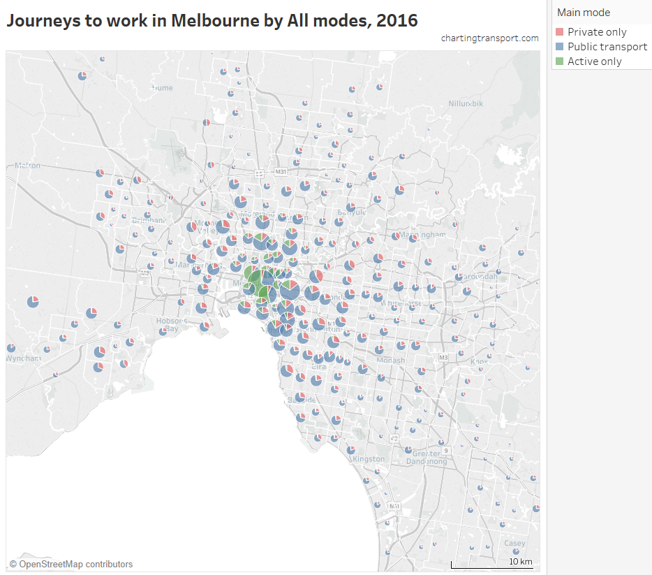
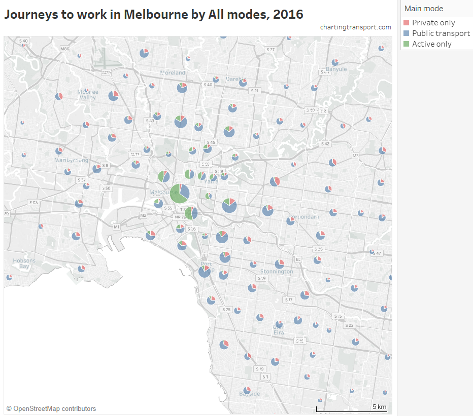
This post maps journeys to work in Melbourne, using data from the 2016 census. I will look at which types of home-work pairs have different public, private and active transport mode shares and volumes.

Although this post will focus on Melbourne, I will include a brief comparison to Sydney at the end.

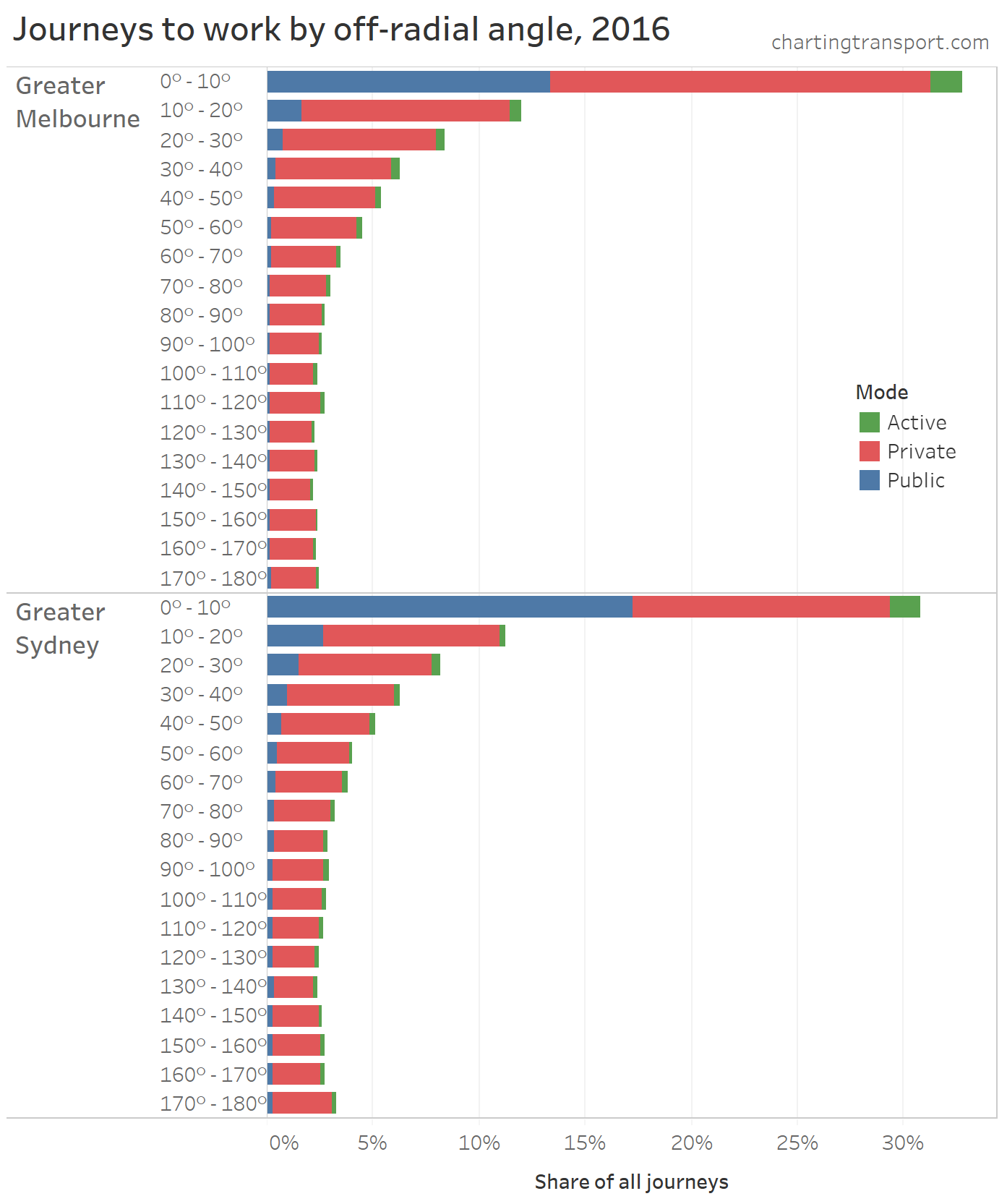
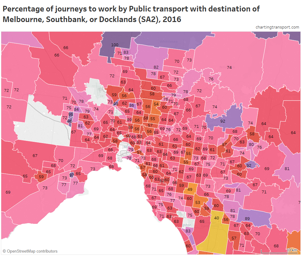
Where are public transport journeys to work in Melbourne?

First I need to explain the maps you are about to see.

So that I can show mode shares, I’ve grouped journeys between SA2s (which are roughly the size of a suburb). Lines are drawn from the population centroid of the home SA2 (thin end) to the employment centroid of the work SA2 (thicker end). Centroids are calculated as the weighted average location residents/jobs in each SA2 (using mesh block / destination zone data). This generally works okay for urban areas, but be aware that actual trips will be distributed across SA2s, and some SA2s on the urban fringe are quite large.

The thickness of each line at the work end is roughly proportional to the number of journeys by the mode of interest between the home-work pair (refer legends), but it’s difficult to use a scale that is meaningful for smaller volumes. Unfortunately there’s only so much you can do on a 2-D chart.

I’ve not drawn lines where there are fewer than 50 journeys in total (all modes), or where there were no journeys of the mode that is the subject of the map. This threshold of 50 isn’t perfect either as SA2s are not consistently sized within and between cities, so larger SA2s are more likely to generate lines on the map.

To try to help deal with the clutter, I’ve made the lines somewhat transparent, and also animated the map to highlight trips with different mode share intervals. For frames showing all lines, the lines with highest mode share are drawn on top.

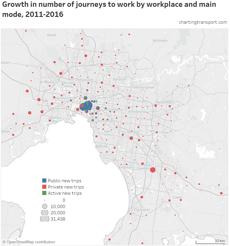
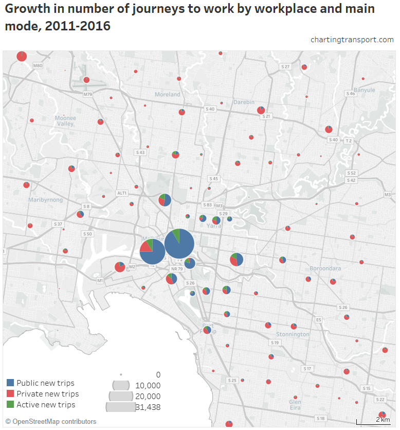
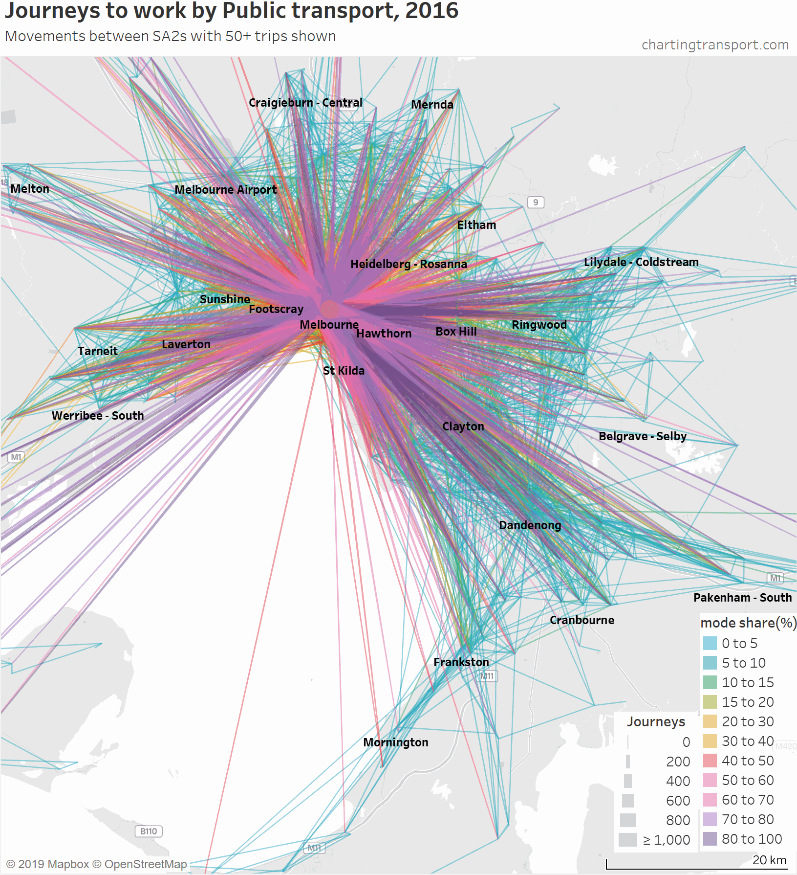
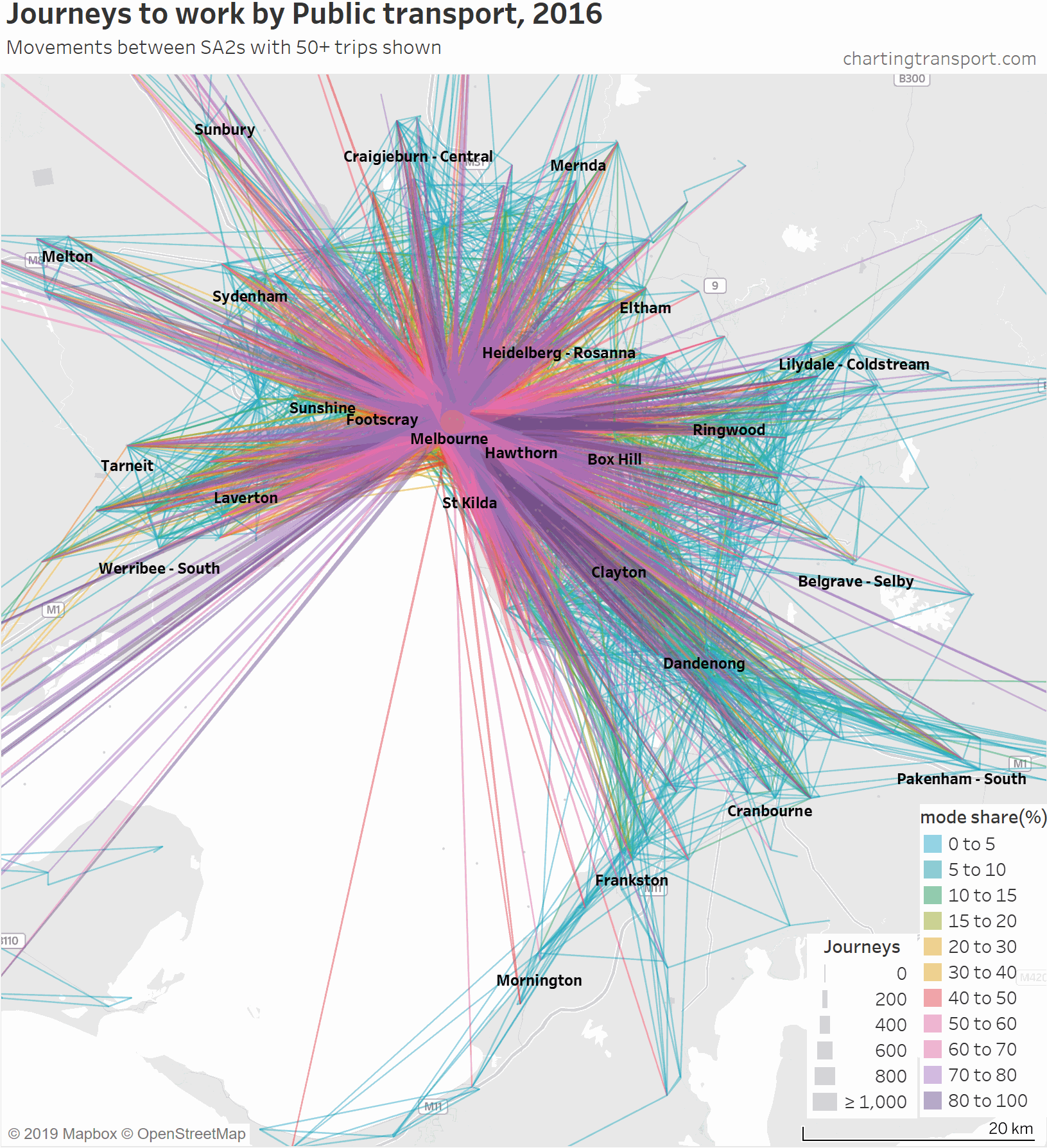
So here is an animated map showing public transport journeys to work in Melbourne, by different mode share ranges and overall:

Technical note: I have included journeys to work that are internal to an SA2. Usually these appear as simple circles, but sometimes they appear as small teardrops where the population and employment centroids are sufficiently far apart.

You can see that the highest PT shares and largest PT volumes are for journeys to the central city, and generally from SA2s connected to Melbourne CBD by train (including many outer suburbs).

As the animation moves to highlight lower PT mode share ranges, the lines become a little less radial, a little shorter on average, and the lowest (non-zero) PT mode shares are mostly for suburban trips.

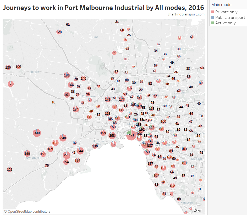
A notable exception is journeys to Port Melbourne Industrial SA2 (also known as Fishermans Bend), which is located at the junction of two major motorways and is remote from rapid public transport (it does however have a couple of high frequency bus lines from the CBD).

The lowest PT mode shares are seen for trips around the outer suburbs. The maps above unfortunately aren’t very good at differentiating small volumes. The following animated map shows public transport journeys with a filter progressively applied to remove lines with small numbers of public transport journeys (refer blue text in title):

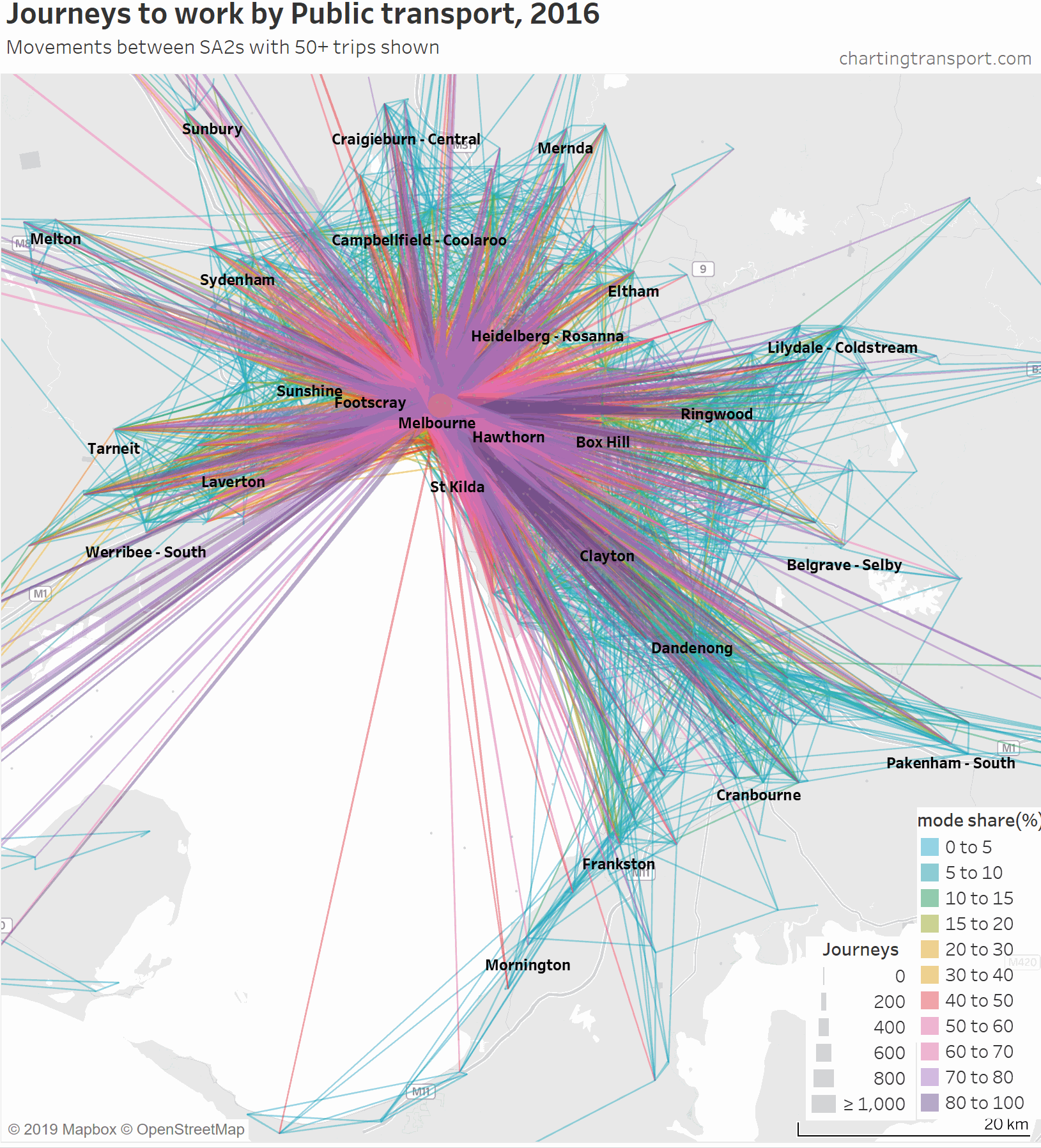
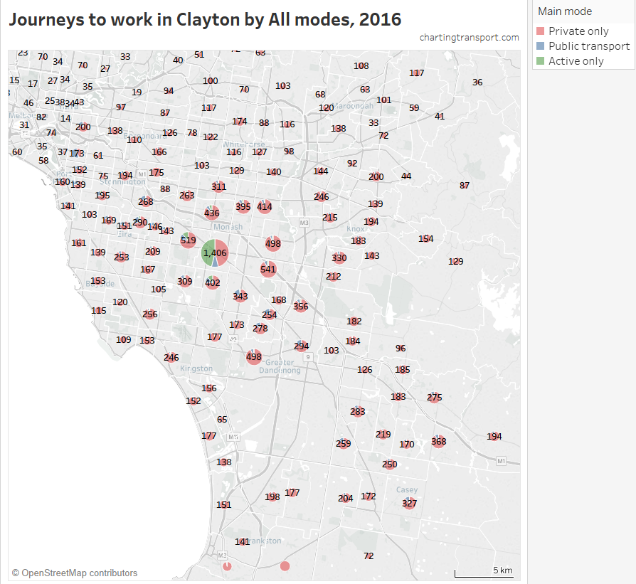
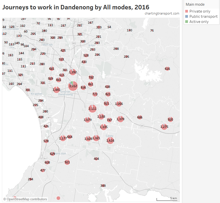
You can see that most of the outer suburban lines quickly disappear as they have very small volumes. Inter-suburban lines with more than 50 public transport journeys go to centres including Dandenong, Clayton, Box Hill, and Heidelberg.

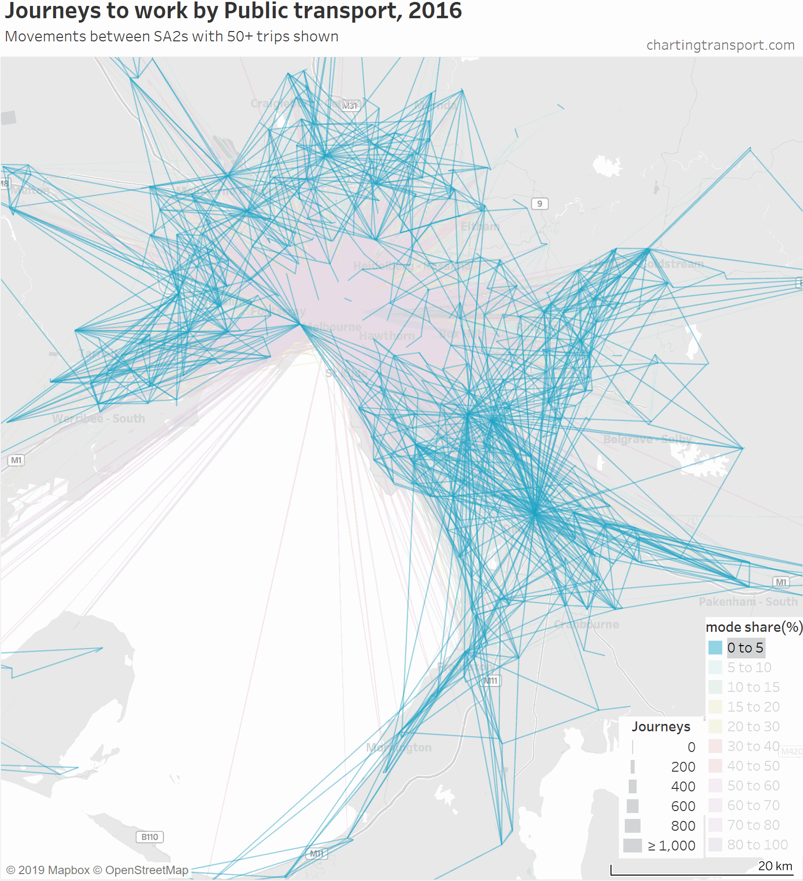
Here’s another animation that builds up the map starting with low public transport mode share lines, and then progressively adds lines with higher public transport mode shares:

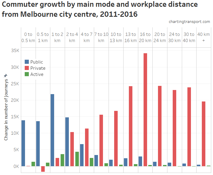
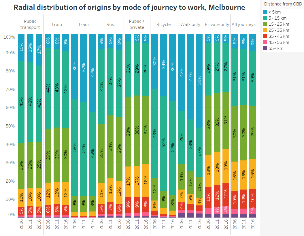
As an aside, here is a chart showing journeys to work by straight line distance (between SA2 centroids), public transport mode share, work distance from the CBD and home-work volume:

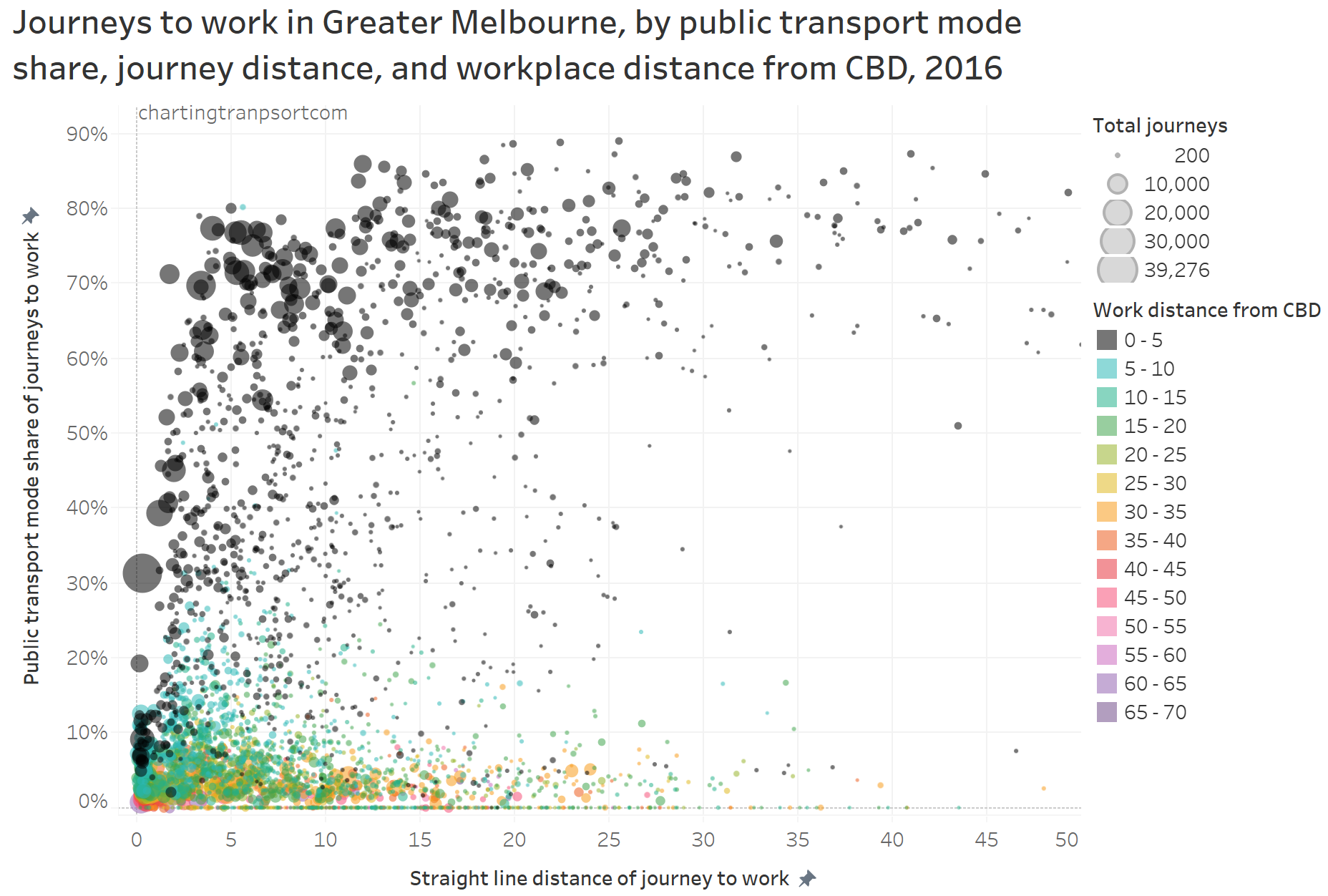
The black dots represent journeys to the inner 5km of the city, and you can see public transport has a high mode share of longer trips. Public transport mode share falls away for shorter journeys to the inner city as people are more likely to use active transport. A dot on the top left of the curve is 8,874 journeys from Docklands to Melbourne – which benefits from the free tram zone and the distances can be 1-2 km. Most of the longer journeys with low public transport mode share are to workplaces remote from the CBD (coloured dots).

Another way to deal with the clutter of overlapping lines around the CBD is to progressively remove lines to workplaces in and around the CBD. Here is another animated map that does exactly so that you can better see journeys in the nearby inner and middle suburbs.

As you strip away the CBD and inner suburbs, you lose most lines with high public transport mode shares and volumes. However some high public transport mode share lines remain, including the following outbound journeys:

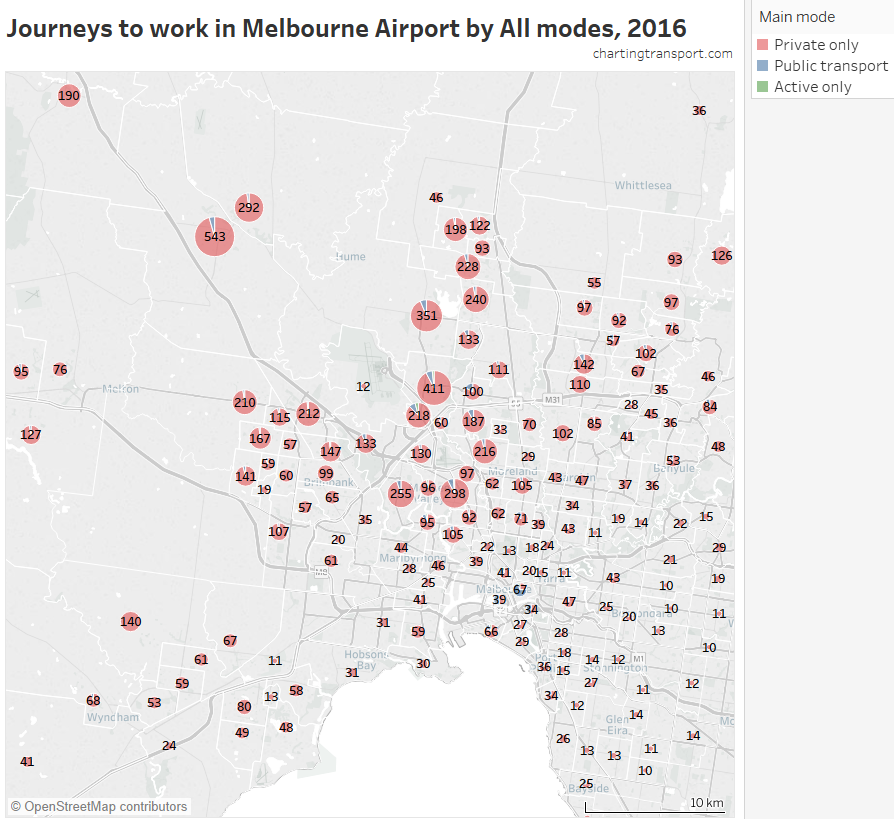
  • Melbourne (CBD) to Melbourne Airport: 72% of 64 journeys
  • Melbourne (CBD) to Box Hill: 66% of 76 journeys
  • Melbourne (CBD) to Clayton: 57% of 82 journeys
  • South Yarra – East to Clayton: 57% of 173 journeys

Just keep in mind that these are all very small volumes compared to total journeys in Melbourne.

You might have noticed on the western edge of the map some yellow and orange lines from the Wyndham area (south-west Melbourne) that go off the map towards the south west. These journeys go to Geelong.

Here’s a map showing journeys around Geelong and between Geelong and Greater Melbourne (journeys entirely within Greater Melbourne excluded):

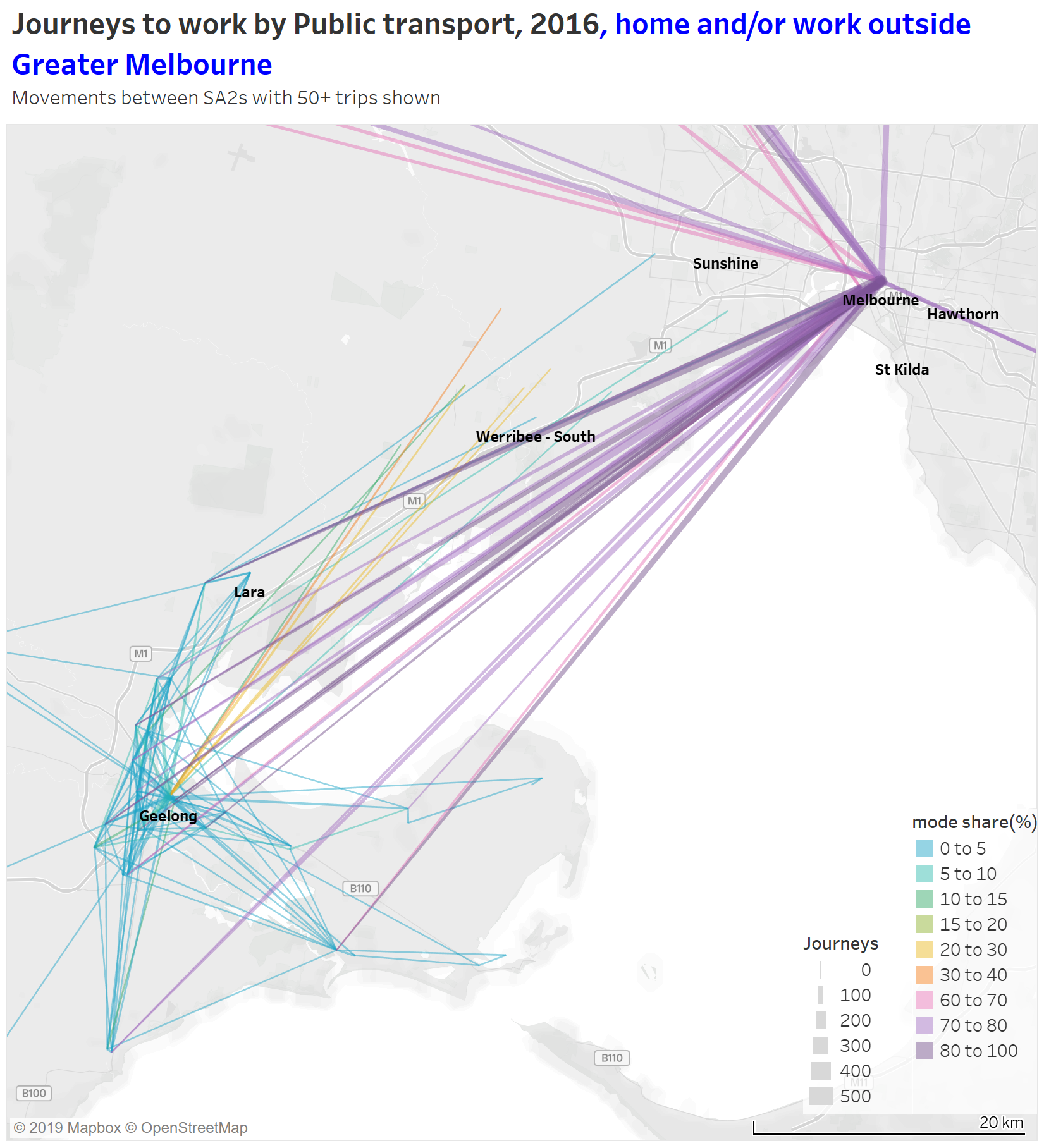
You can see very high public transport mode shares for journeys from the Geelong and Bellarine region to the Melbourne CBD and Docklands (and fairly large volumes), but no lines to Southbank, East Melbourne, Parkville or Carlton – all more remote from Southern Cross Station, the city terminus for regional trains.

(The other purple lines to the CBD are from Ballarat, Bacchus Marsh, Daylesford, Woodend, Kyneton, Castlemaine, Kilmore-Broadford and Warragul, with at least 60 journeys each.)

You can also see those orange and yellow lines from the Wyndham area to central Geelong, being mode shares of 20-40%. The Geelong train line provides frequent services between Tarneit, Wyndham Vale, and Geelong, and has proved reasonably popular with commuters to Geelong (frequency was significantly upgraded in June 2015 with the opening of the Regional Rail Link, just 14 months before the census of August 2016).

However, public transport mode shares for travel within Greater Geelong are very small – even for SA2 that are connected by trains. This might reflect Geelong train station being on the edge of its CBD, relatively cheap parking in central Geelong, limited stopping frequency at some stations (many at 40 minute base pattern), and/or limited walk-up population catchments at several of Geelong’s suburban train stations.

Does public transport have significant mode share for cross-suburban journeys to work?

To search for cross-suburban journeys with relatively high public transport mode shares, here is a map that only shows lines with public transport mode shares above 20% between homes and workplaces both more than 5 km from the CBD (yes, those are arbitrary thresholds):

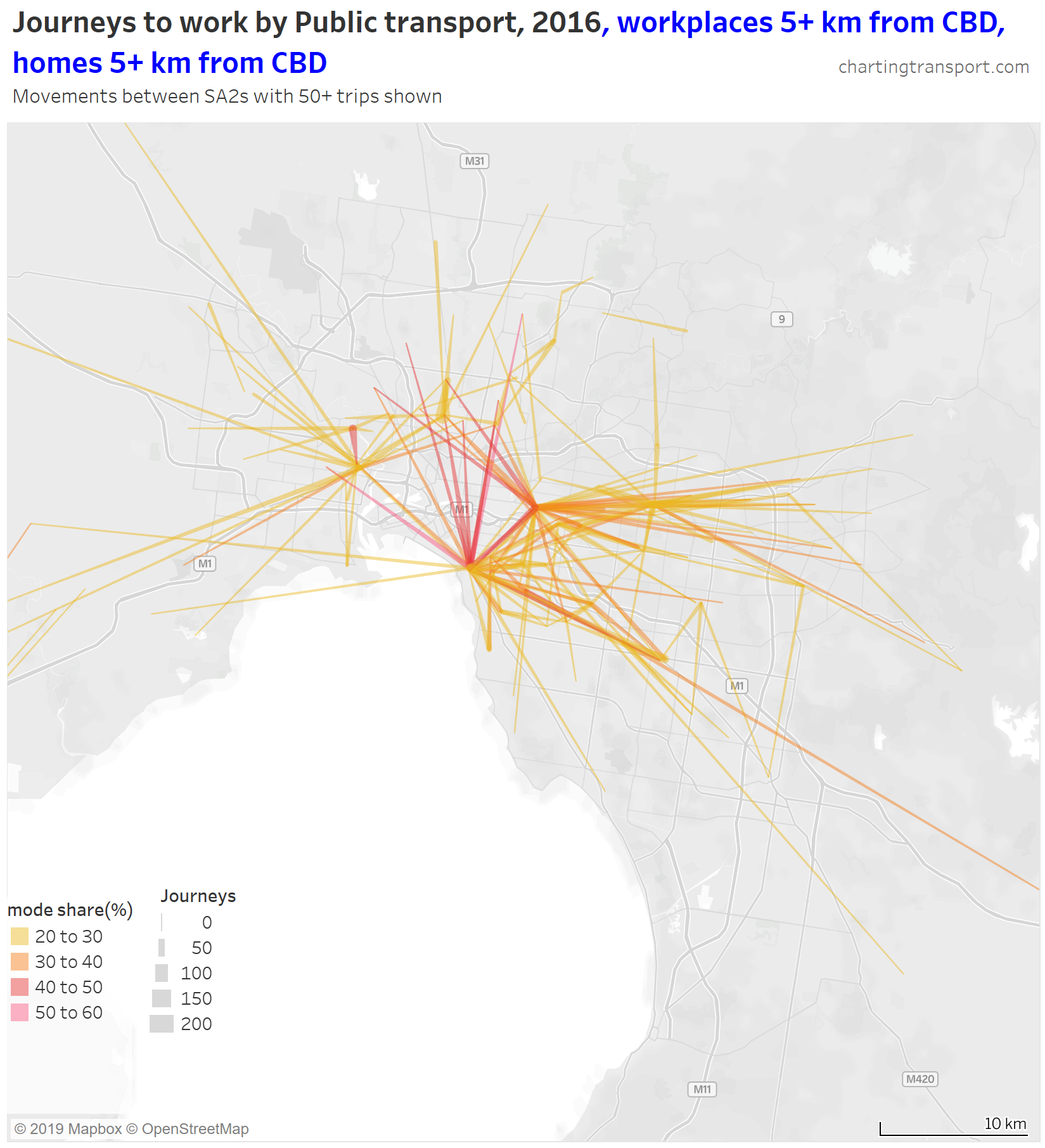
Of these journeys, the highest mode shares are for journeys from the inner northern suburbs to St Kilda and Hawthorn. There’s also a 49% mode share from Footscray to Maribyrnong (connected by frequent trams and buses).

The tear drop to the north of the city is 114 people who used PT from Coburg to Brunswick (connected by two tram routes and one train route).

Most of the other links on this map are fairly well aligned with train, tram, or SmartBus routes, suggesting high quality services are required to attract significant mode shares.

But these trips are a tiny fraction of journeys to work around Melbourne. In fact 3.0% of journeys to work in Melbourne were by public transport to workplaces more than 5 km from the CBD. The same statistic for Sydney is more than double this, at 7.3%.

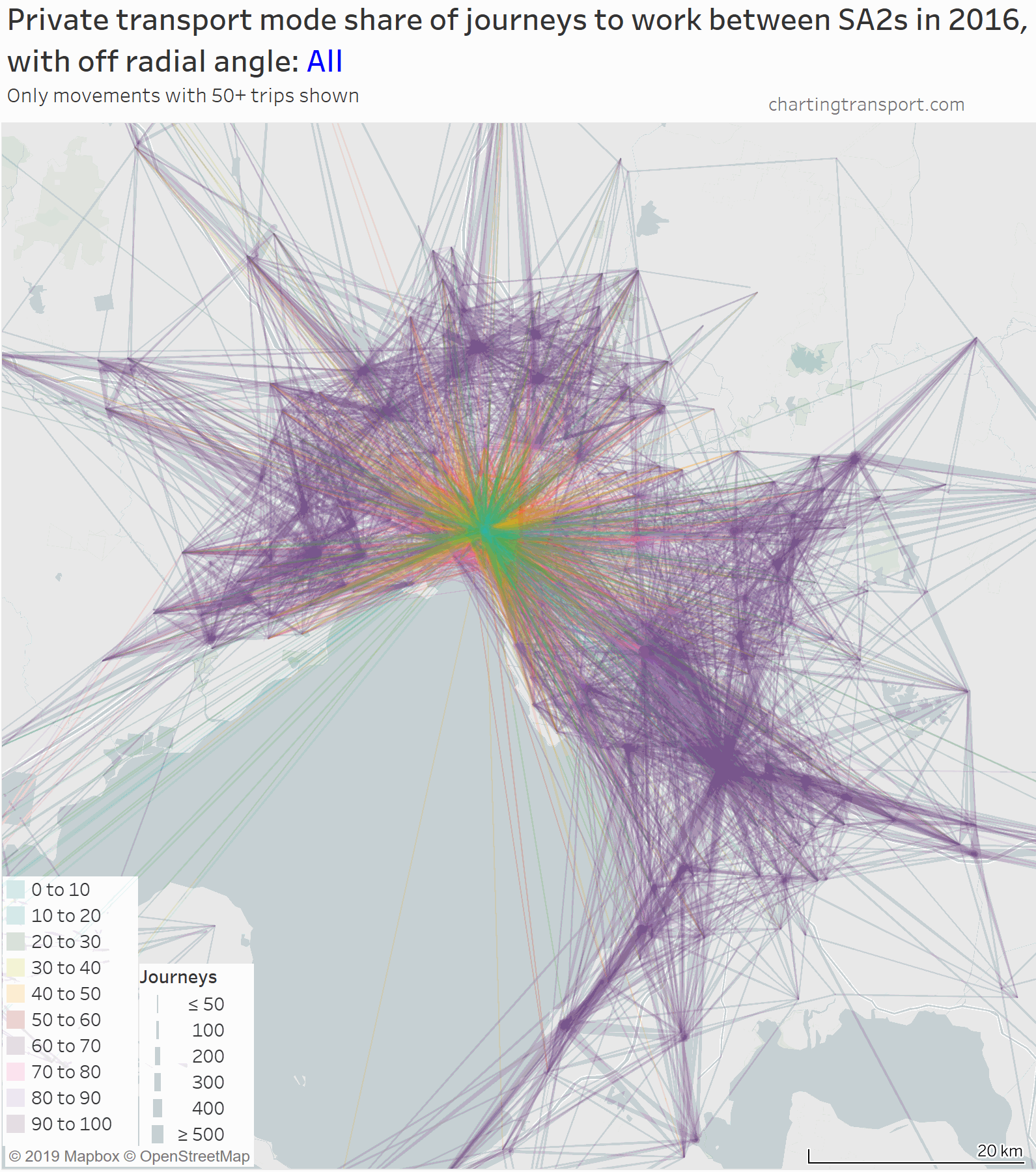
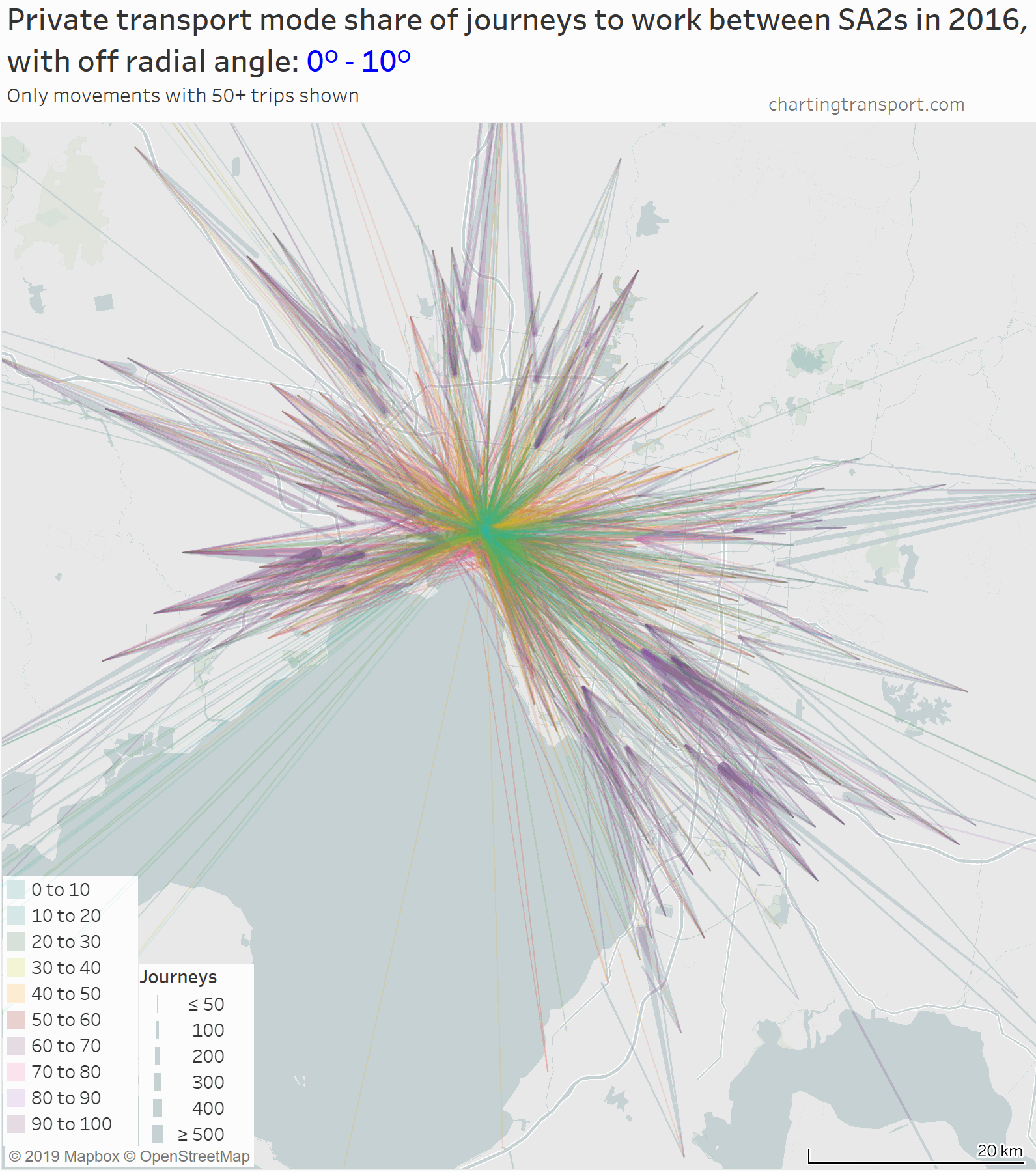
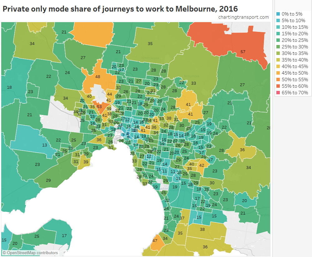
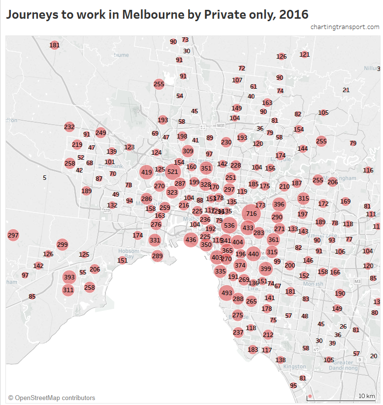
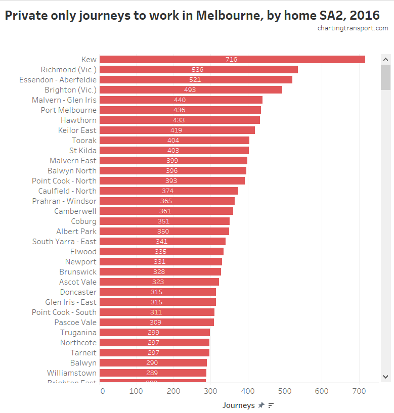
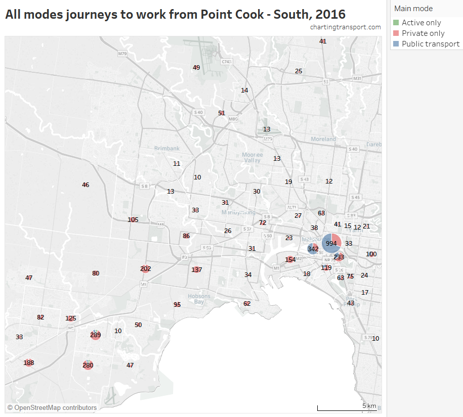
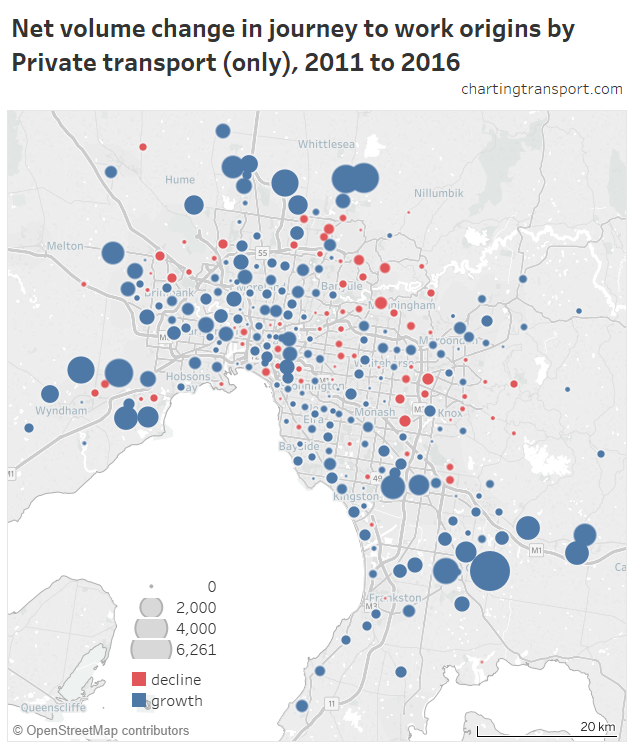
What about private transport journeys?

Firstly, here’s a map showing private transport mode shares and volumes, building up the map starting with low private mode share lines.

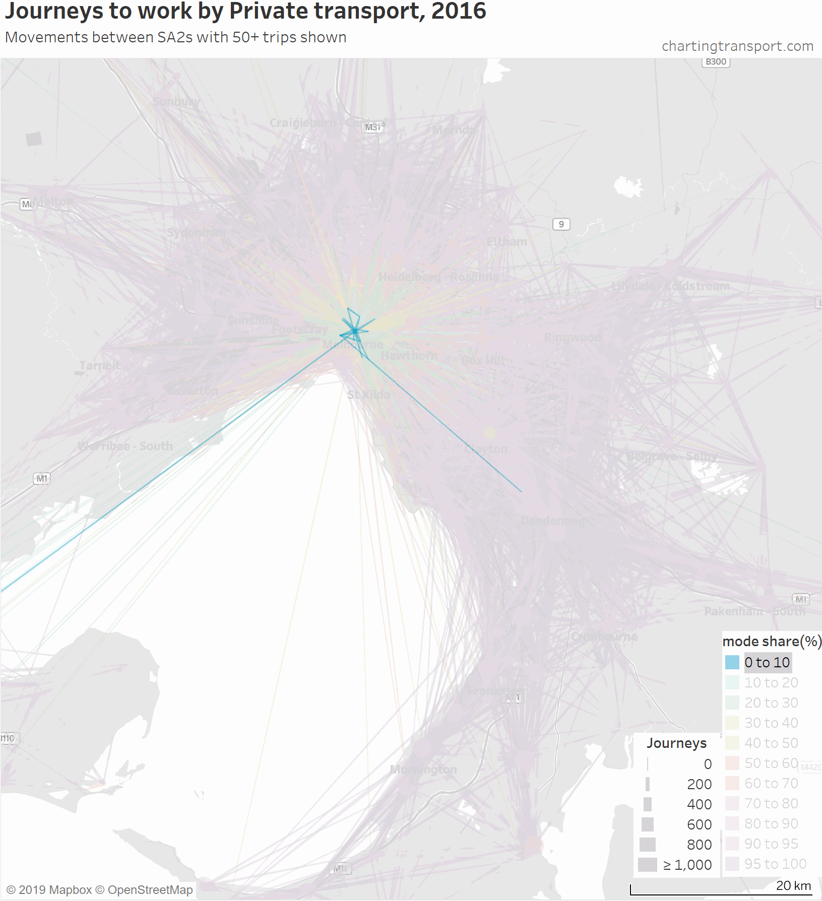
The links with lowest private transport mode shares are very radial as you might expect (pretty much the inverse of the public transport maps). Progressively less radial lines get added to the map before there is a big bang when the final private transport mode share band of 95-100% gets added, with large volumes of outer suburban trips.

For completeness, here’s an animation that highlights each mode share range individually.

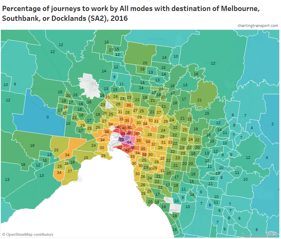
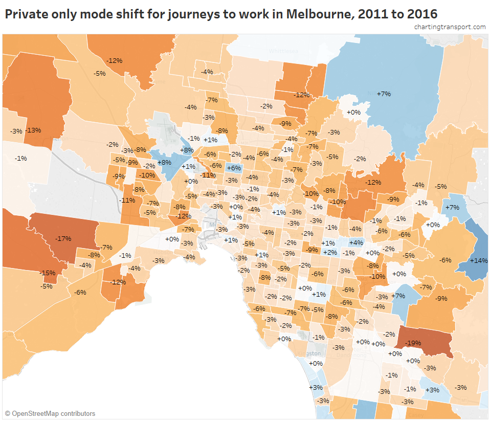
There are some other interesting stories in this data. The following map shows private transport mode share of journeys to work, excluding workplaces up to 10 km from the CBD to remove some clutter.

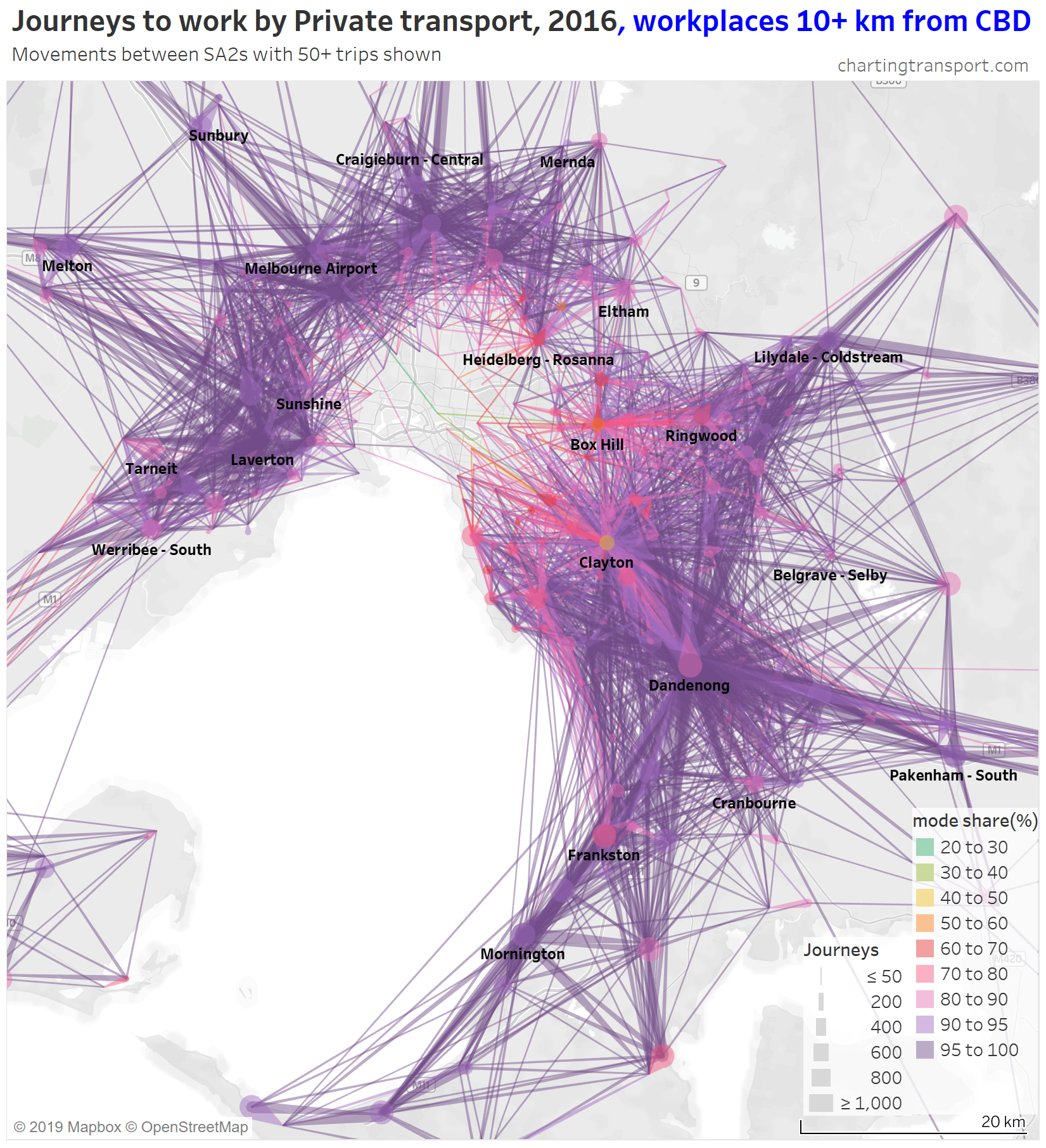
If you look carefully you’ll see that there is a much lower density of trips that cross the Yarra River (which runs just south of Heidelberg and Eltham). There are limited bridge crossings, and this is probably inhibiting people considering such journeys.

The construction of the North East Link motorway will add considerable cross-Yarra road capacity, and I suspect it may induce more private transport journeys to work across the Yarra River (although tolls will be a disincentive).

What about active transport journeys?

Next is a map for active transport journeys, but this time I’ve progressively added a filter for the number of active transport journeys, as most of the lines on the full chart are for very small volumes.

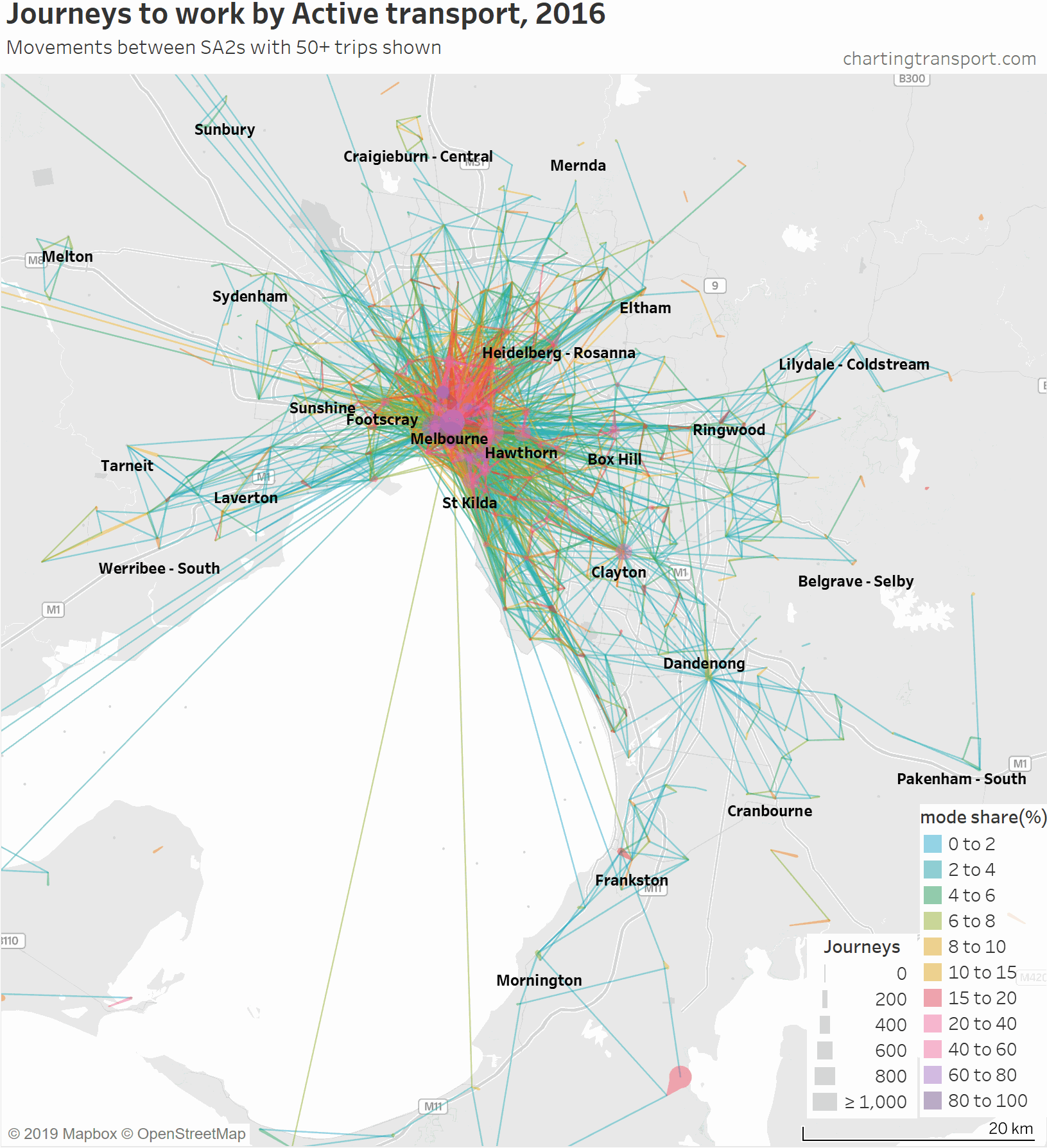
As soon as the filter reaches a minimum of 50 active journeys most of the lines between SA2s in the middle and outer suburbs disappear. Note that journeys between SA2s are not necessarily long, they might just be a short trip over the boundary.

Then at minimum 200 journeys you can only see central city journeys plus intra-SA2 journeys in relatively dense centres such as Hawthorn, Heidelberg, Box Hill, Clayton, Frankston, Mornington, Footscray, and St Kilda. The large volume in the south of the map that hangs around is Hastings – Somers, where 882 used active transport (probably mostly walking to work on the HMAS Cerebus navy base).

Active transport journeys are mostly much shorter than private and public transport journeys – as you might expect as most people will only walk or ride a bicycle so far. But there are people who said they made very long active transport journeys to work – the map shows some journeys from Point Nepean, Torquay, Ballarat, Daylesford, and Castlemaine to Melbourne. That’s some keen cyclists, incredible runners, people who changed jobs in the week of the census (the census asks for work location the prior week, and modes used on census day), and/or people who didn’t fill in their census forms accurately. The volumes of these trips are very small (mostly less than 5).

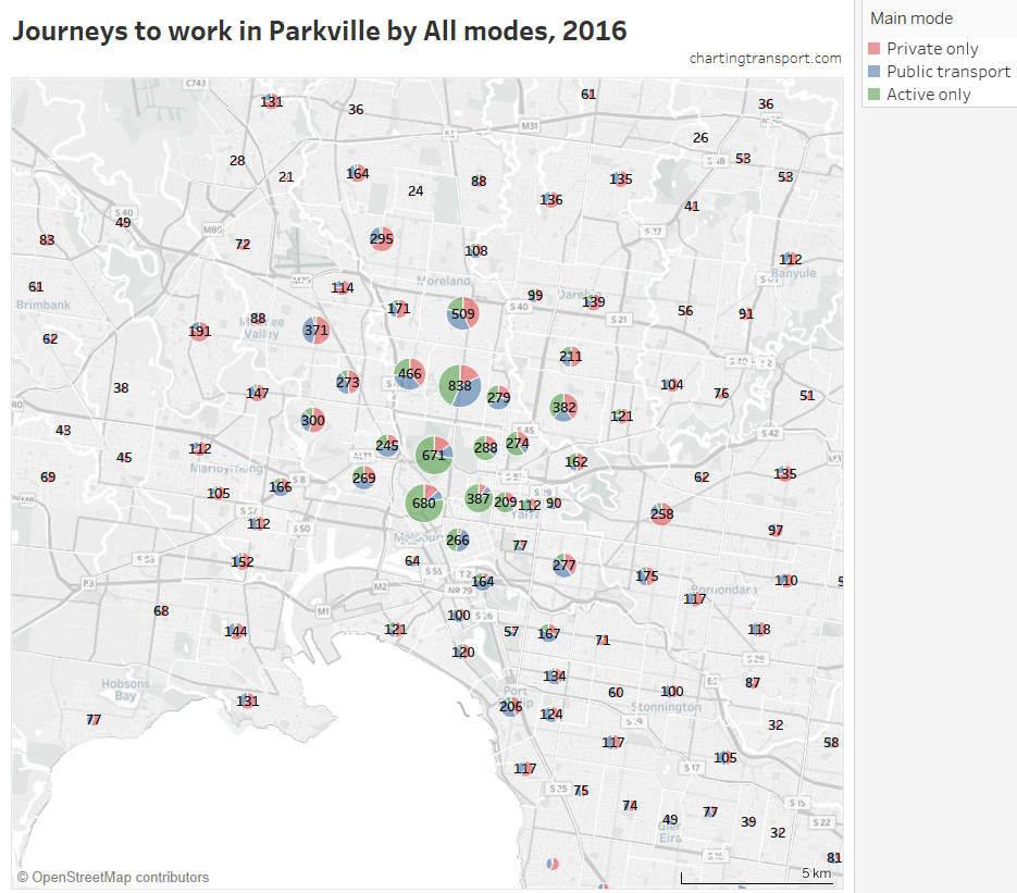
That map is very congested around the central city, so here is a map zoomed into the inner suburbs and this time animated by building up the map starting with high active transport mode share lines.

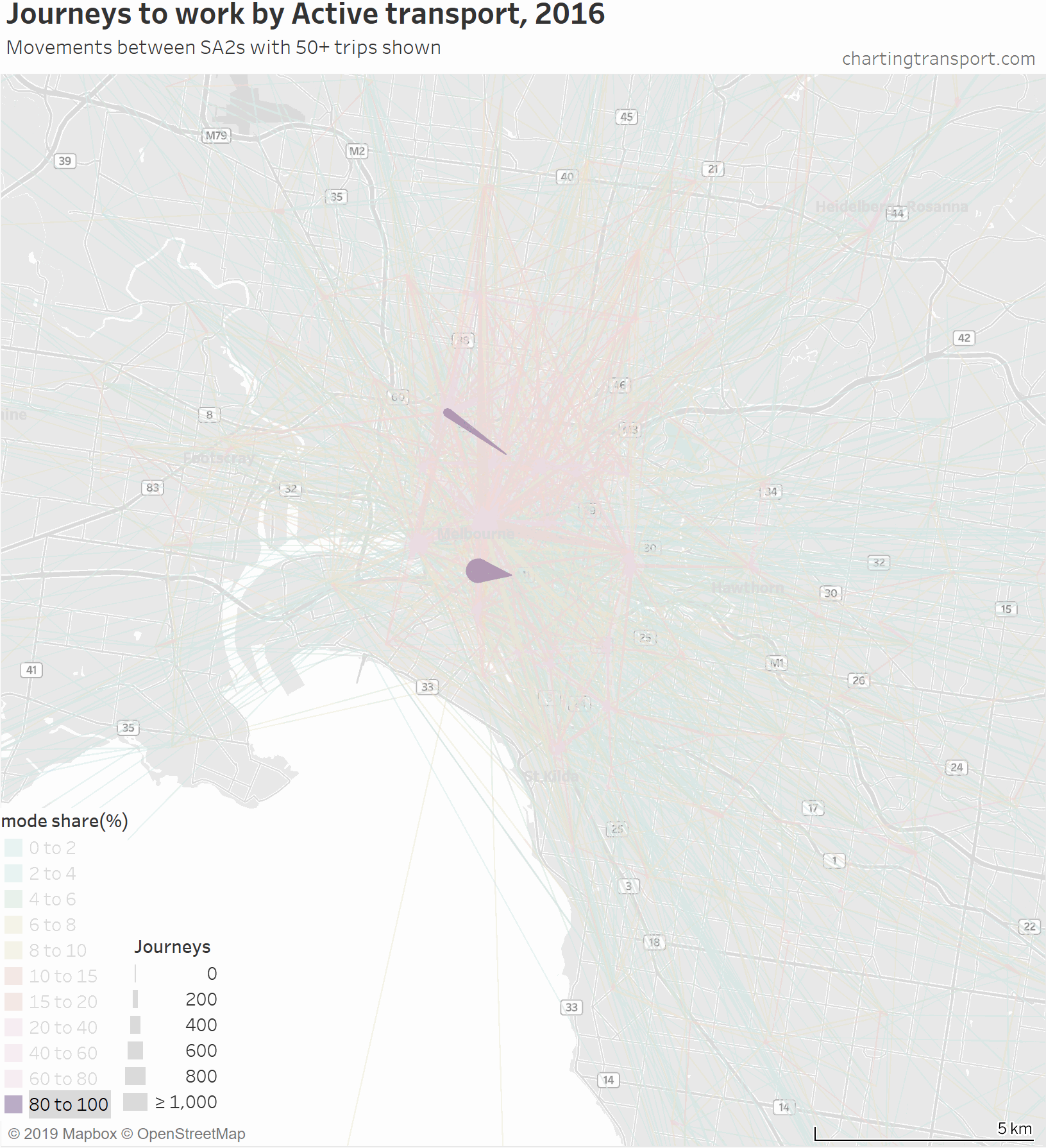
The highest active transport mode shares are for travel within Southbank and from Carlton to Parkville, followed by journeys to places like the CBD, Docklands, South Yarra, South Melbourne, Carlton, Fitzroy, Parkville, and Carlton.

Then you see a lot of trips added from the inner northern suburbs, which are connected to the central city by dare-I-say “above average” cycling infrastructure across some relatively flat terrain. In particular, a thick red line on the map is for 471 active transport journeys from Brunswick to Melbourne (CBD) with a mode share of 17%. A second thick red line is Richmond to Melbourne (CBD) being 589 journeys with 16% active mode share.

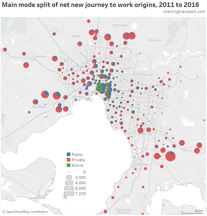
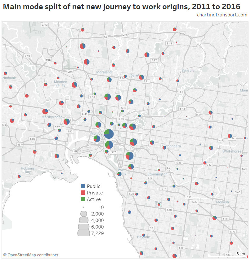
Another way of summarising mode shares by work and home distance from the CBD

I’ve experimented with another visualisation approach to overcome the clutter issues. The next charts have home distances from the CBD on the Y axis, work distances from the CBD on the X axis, bubble size representing number of journeys, and colour showing mode shares. I’m drawing smaller journey volumes on top, and I’ve used some transparency to help a little with the clutter.

Firstly here is public transport (animated to show each mode share range individually):

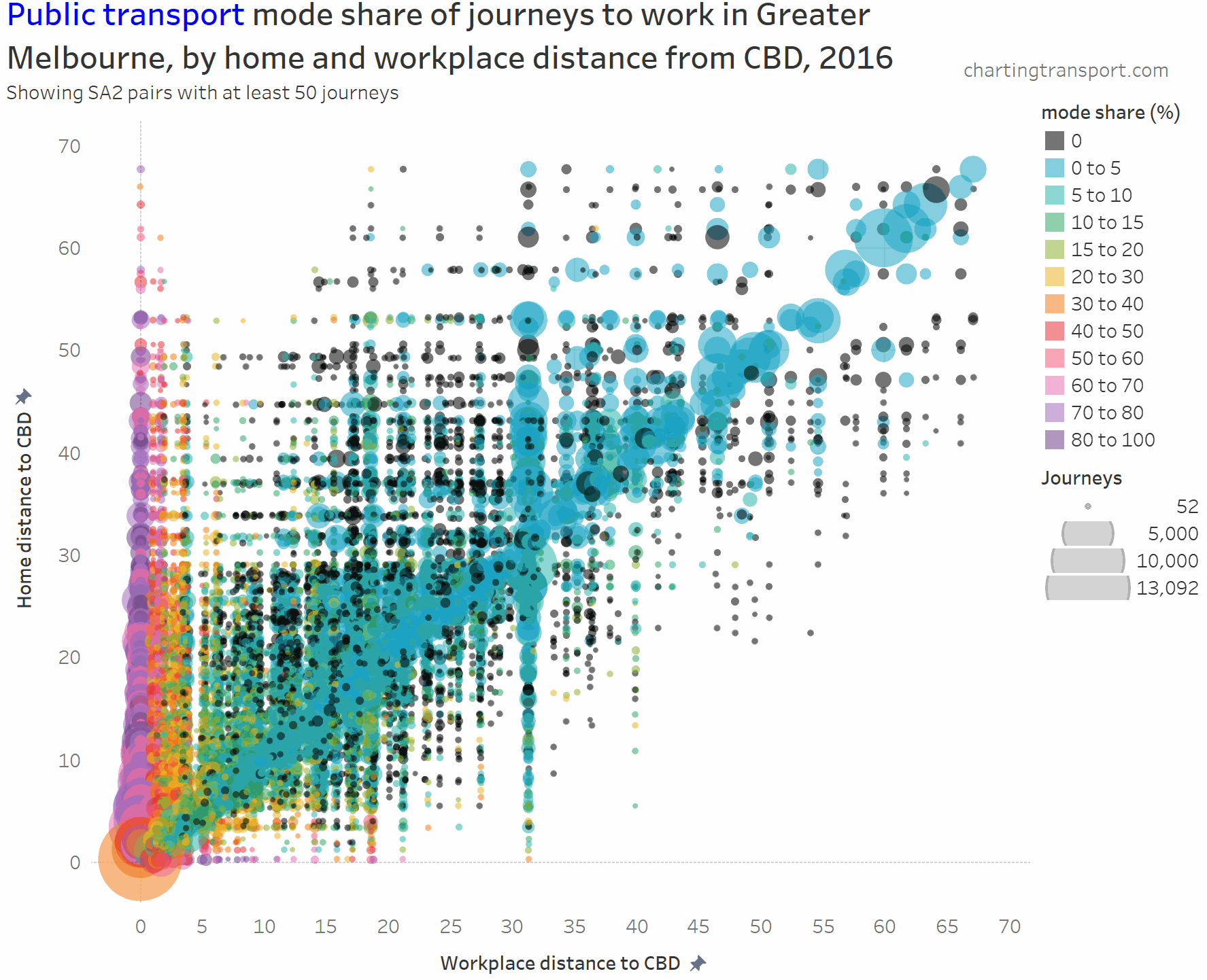
The chart is roughly a V-shape with many trips on the left edge and along a diagonal (mostly representing intra-SA2 journeys), then with several vertical stripes being major suburban employment destinations (including Dandenong at 31 km, Clayton at 19 km, and Frankston at 40 km). Trips above the diagonal are roughly inbound, while trips below the diagonal are roughly outbound.

Some observations:

  • The diagonal line (mostly local journeys) has very low public transport mode shares (sometimes zero).
  • Higher PT mode shares are only seen on the far left and bottom left hand corner of the chart. Some outliers include Richmond to Box Hill (32%), Clayton to Malvern East (32%), and South Yarra – East to Clayton (57%).
  • PT mode shares of 80+% are only seen for journeys to the CBD from home SA2s at least 11 km out (with one exception of Melbourne CBD to St Kilda with 80% PT share).
  • Home-work pairs with zero public transport journeys are scattered around the middle and outer suburbs, most being longer distance journeys (home and work at different distances from the CBD).

Here’s the same chart for private transport:

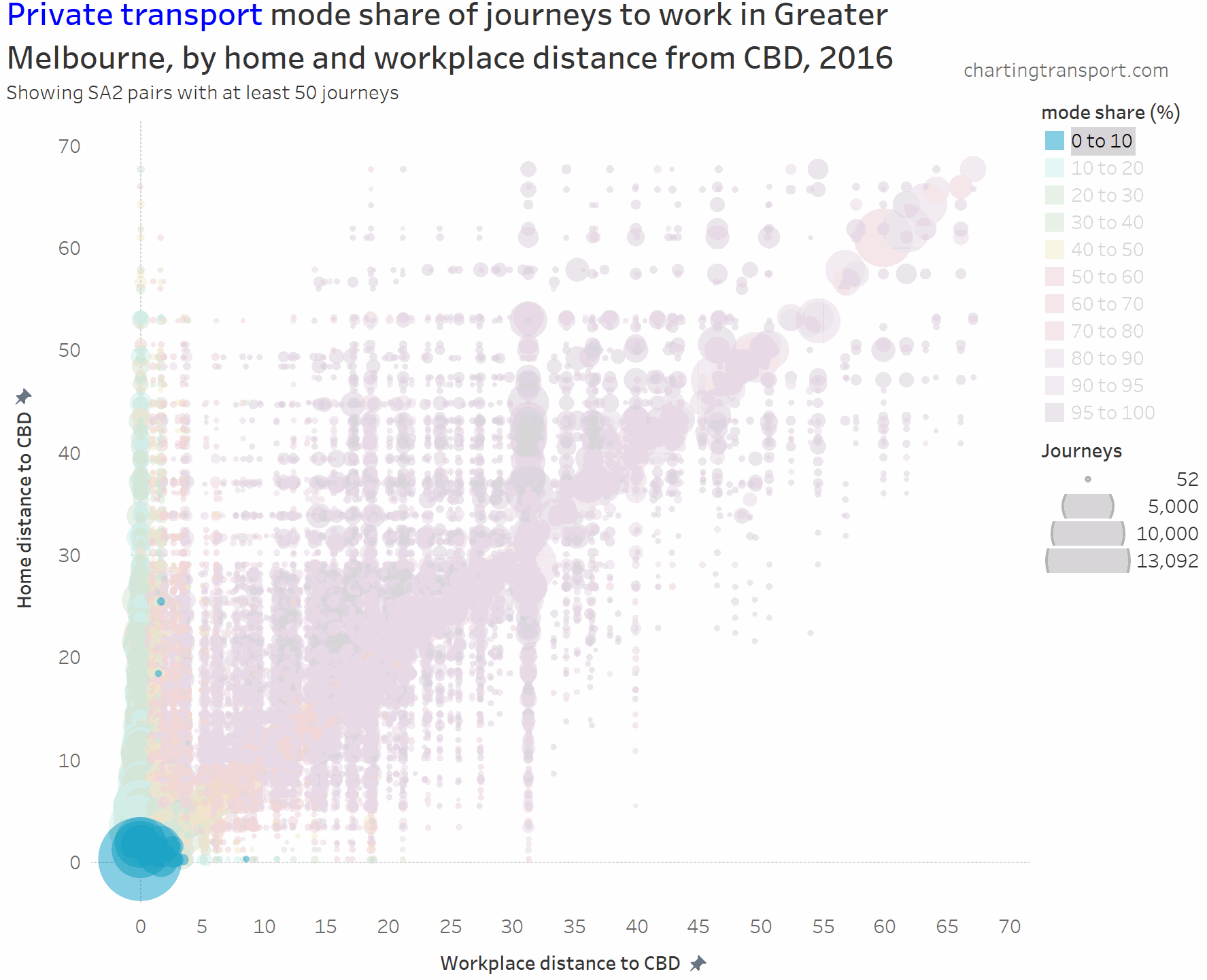
The lowest private transport shares are seen for journeys to the CBD. The diagonal has many mode shares in the 80-90% range.

And here is active transport:

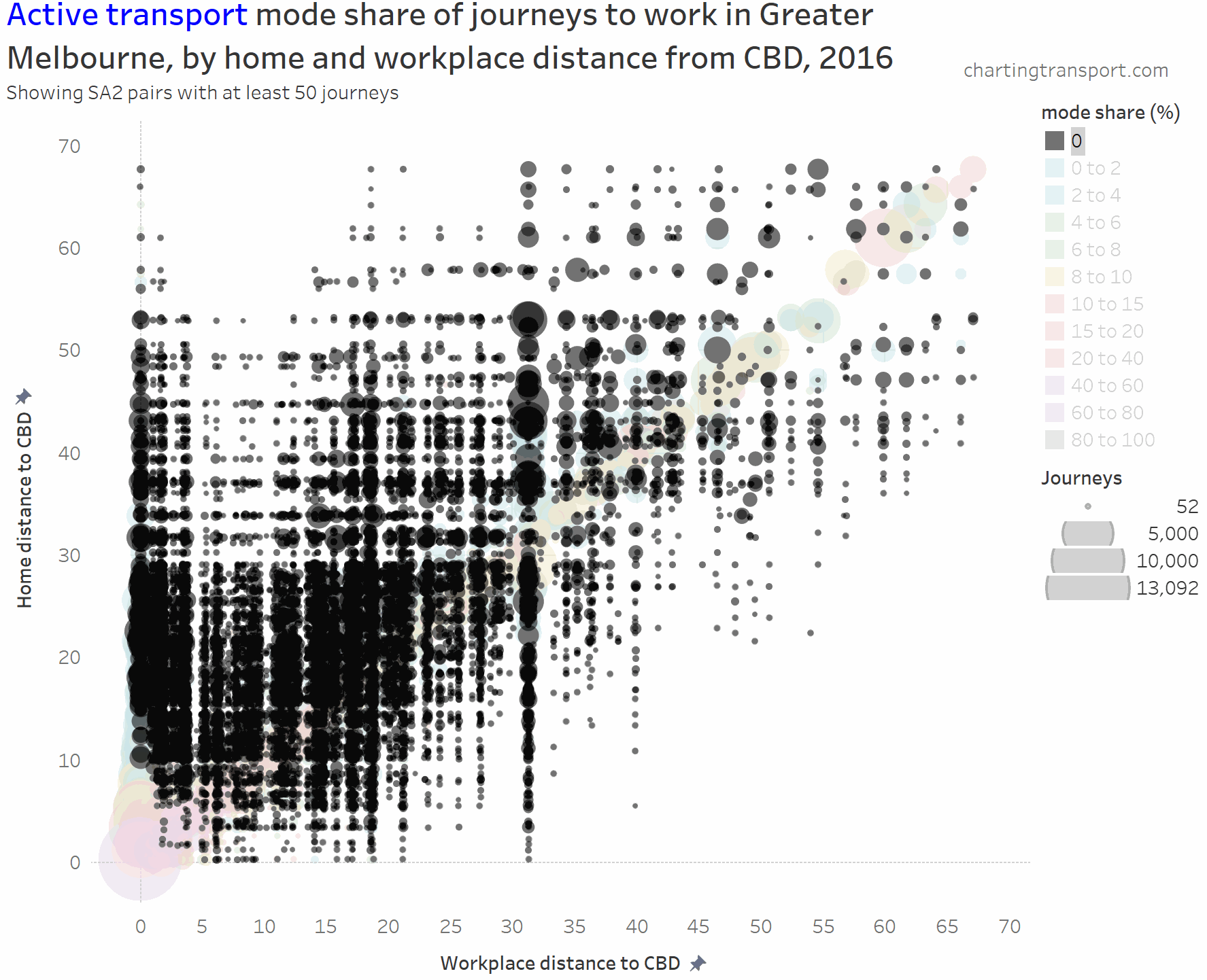
The highest active transport mode shares are seen in the central city area, followed by the diagonal mostly representing local journeys (with generally higher shares closer to the CBD). Some notable outliers include local trips within Clayton (1,298 active trips / 46% active mode share), Box Hill (914 / 40%), Hastings – Somers (1,762 / 27%), Flinders (240 / 24%), Glen Waverley – West (308 / 21%), and Mentone (226 / 23%).

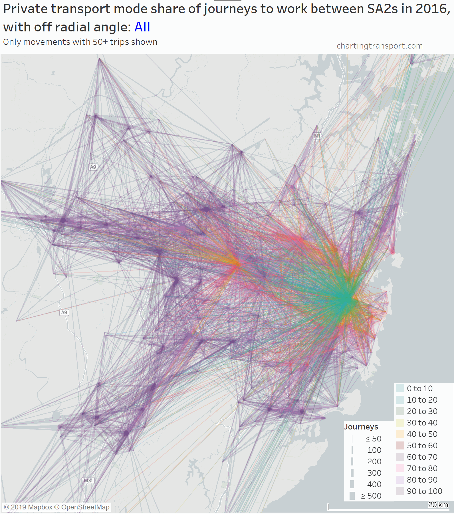
How does Sydney compare to Melbourne?

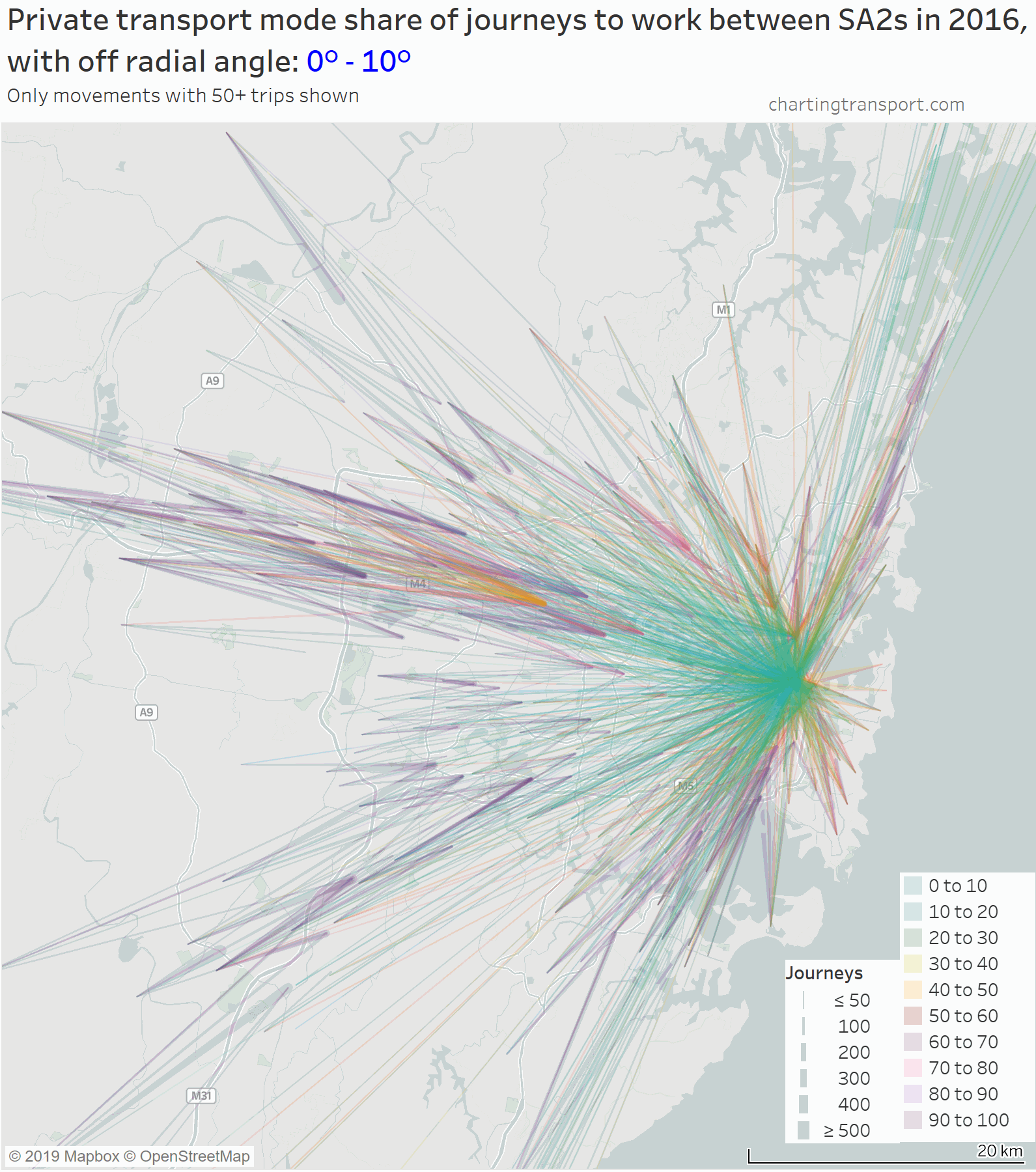
Here is a chart with private transport mode share maps for both Melbourne and Sydney, animated in tandem to progressively add higher mode share journeys.

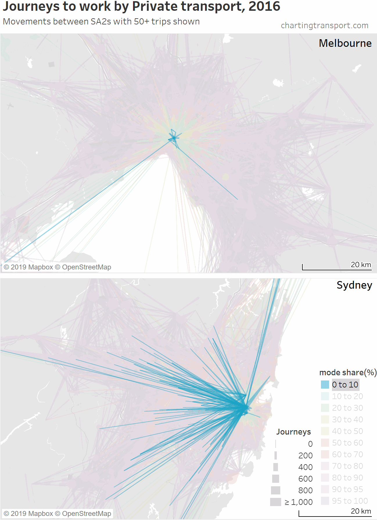
You can see that Sydney has a lot more trips at lower private transport mode shares, and that workplaces outside the city centre start to show up earlier in the animation in Sydney – being the dense transit-orientated suburban employment clusters that are largely unique to Sydney (see: Suburban employment clusters and the journey to work in Australian cities).

If time permits, I may do similar analysis for Sydney and other cities in future posts.


How radial are journeys to work in Australian cities?

Fri 14 June, 2019

In almost every city, hordes of people commute towards the city centre in the morning and back away from the city in the evening. This largely radial travel causes plenty of congestion on road and public transport networks.

But only a fraction of commuters in each city actually work in the CBD. So just how radial are journeys to work? How does it vary between cities? And how does it vary by mode of transport?

This post takes a detailed look at journey to work data from the ABS 2016 Census for Melbourne, Sydney, and to a less extent Brisbane, Perth, Adelaide and Canberra. I’ve included some visualisations for Melbourne and Sydney that I hope you will find interesting.

How to measure radialness?

I’m measuring radialness by the difference in degrees between the bearing of the journey to work, and a direct line from the home to the CBD of the city. I’m calling this the “off-radial angle”.

So an off-radial angle of 0° means the journey to work headed directly towards the CBD. However that doesn’t mean the workplace was the CBD, it might be have been short of the CBD or even on the opposite side of the CBD.

Similarly, an off-radial angle of 180° means the journey to work headed directly away from the CBD. And a value of 90° means that the trip was “orbital” relative to the CBD (a Melbourne example would be a journey from Box Hill that headed either north or south). And then there are all the angles in between.

To deal with data on literally millions of journeys to work, I’ve grouped journeys by home and work SA2 (SA2s are roughly the size of a suburb), and my bearing calculations are based on the residential centroid of the home SA2 and the employment centroid of the work SA2.

So it is certainly not precise analysis, but I’ve also grouped off-radial angles into 10 degree intervals, and I’m mostly looking for general trends and patterns.

So how radial are trips in Melbourne and Sydney?

Here’s a chart showing the proportion of 2016 journeys to work at different off-radial angle intervals:

Technical note: As per all my posts, I’ve designated a main mode for journeys to work: any journey involving public transport is classed as “Public”, any journey not involving motorised transport is classed as “Active”, and any other journey is classed as “Private”.

In both cities over 30% of journeys to work were what you might call “very radial” – within 10 degrees of perfectly radial. It was slightly higher in Melbourne.

You can also see that public transport trips are even more radial, particularly in Melbourne. In fact, around two-thirds of public transport journeys to work in 2016 had a destination within 2 km of the CBD.

Melbourne’s “mass transit” system (mostly trains and trams) is very radial, so you might be wondering why public transport accounts for less than half of those very radial journeys (41% in fact).

Here are Melbourne’s “very radial” journeys broken down by workplace distance from the Melbourne CBD:

very-radial-trips-by-mode-distance-from-cbd

Public transport dominates very radial journeys to workplaces within 2 km of the centre of the CBD, but is a minority mode for workplaces at all other distances. Many of these highly radial journeys might not line up with a transit line towards the city, and/or there could well be free parking at those suburban workplaces that make driving all too easy. I will explore this more shortly.

Sydney however had higher public transport mode shares for less radial journeys to work. I think this can be explained by Sydney’s large and dense suburban employment clusters that achieve relatively high public transport mode shares (see: Suburban employment clusters and the journey to work in Australian cities), the less radial nature of Sydney’s train network, and generally higher levels of public transport service provision, particularly in inner and middle suburbs.

Visualising radialness on maps

To visualise journeys to work it is necessary to simplify things a little so maps don’t get completely cluttered. On the following maps I show journey to work volumes between SA2s where there are at least 50 journeys for which the mode is known. The lines between home and work SA2s get thicker at the work end, and the thickness is proportional to the volume (although it’s hard to get a scale that works for all scenarios).

First up is an animated map that shows journeys to work coloured by private transport mode share, with each frame showing a different interval of off-radial angle (plus one very cluttered view with all trips):

(click/tap to enlarge maps)

I’ve had to use a lot of transparency so you have a chance at making out overlapping lines, but unfortunately that makes individual lines a little harder to see, particularly for the larger off-radial angles.

You can see a large number of near-radial journeys, and then a smattering of journeys at other off-radial angles, with some large volumes across the middle suburbs at particular angles.

The frame showing very radial trips was rather cluttered, so here is an map showing only those trips, animated to strip out workplaces in the CBD and surrounds so you can see the other journeys:

Private transport mode shares of very radial trips are only very low for trips to the central city. When the central city jobs are stripped out, you see mostly high private transport mode shares. Some relative exceptions to this include journeys to places like Box Hill, Hawthorn, and Footscray. More on that in a future post.

Here are the same maps for Sydney:

Across both of these maps you can find Sydney’s suburban employment clusters which have relatively low private transport mode shares. I explore this, and many other interesting ways to visualise journeys to work on maps in another post.

What about other Australian cities?

To compare several cities on one chart, I need some summary statistics. I’ve settled on two measures that are relatively easy to calculate – namely the average off-radial angle, and the percent of journeys that are very radial (up to 10°).

The ACT (Canberra) actually has the most radial journeys to work of these six cities, despite it being something of a polycentric city. Adelaide has the next most radial journeys to work, but there’s not a lot of difference in the largest four cities, despite Sydney being much more a polycentric city than the others. Note the two metrics do not correlate strongly – summary statistics are always problematic!

Here are those radialness measures again, but broken down by main mode:

Sydney now looks the least radial of the cities on most measures and modes, particularly by public transport.

The Australian Capital Territory (Canberra) has highly radial private and active journeys to work, but much less-radial public transport journeys than most other cities. This probably reflects Canberra’s relatively low cost parking (easy to drive to the inner city), but also that the public transport bus network is orientated around the suburban town centres that contain decent quantities of jobs.

Adelaide has the most radial journeys to work when it comes to active and public transport.

What about other types of travel?

In a future post, I’ll look at the radialness of general travel around Melbourne using household travel survey data (VISTA), and answer some questions I’ve been pondering for a while. Is general travel around cities significantly less radial than journeys to work? Is weekend travel less radial than weekday travel?

Follow the blog on twitter or become an email subscriber (see top-right of this page) to get alerted when that comes out.


Introducing a census journey to work origin-destination explorer, with Melbourne examples

Sun 28 January, 2018

The Australian census provides incredibly rich data about journeys to work, with every journey classified by origin, destination, and mode(s) of transport. So you can ask questions such as “where did workers living in X commute to and how many used public transport?” or “where did workers in Y commute from and what percentage used private transport?”, or “What percentage of people in each home location work in the central city?”.

It’s very possible to answer these questions with census data, but near-impossible to produce an atlas of maps that would answer most questions.

But thanks to new data visualisation platforms, it’s now possible to build interactive tools that allow exploration of the data. I’ve built one in Tableau Public, using both 2011 and 2016 census data for all of Australia at the SA2 geography level (SA2s are roughly suburb sized). This means you can look at each census year, as well and the changes between 2011 and 2016.

I’m going to talk through what I’ve built with plenty of interesting examples from my home city Melbourne.

I hope you find exploring the data as fascinating and useful as I do. I also hope this tool makes it easier to inform transport discussions with evidence.

Also, a warning that this is a longer post, so get comfortable.

About the data (boring but important)

The census asks people which modes they used in the journey to work, and the data is encoded for up to three modes.

I’ve extracted a count of the number of trips between all SA2s within each state, by “main mode” for both 2011 and 2016. I’ve aggregated all responses into one of the following “main mode” categories:

  • Private (motorised) transport only – any journey involving car, truck, motorbike or taxi, but no modes of public transport, or people who only responded with “other”. Around 89% of journeys in this category were simply “car as driver”.
  • Walking/cycling only (or “active transport”) – journeys by walking or cycling only.
  • Public transport – any journey involving any public transport mode (train, tram, bus, and/or ferry). These journeys might also involve private motorised transport and/or cycling.

There are 466,597 rows of data all up – so you will need to be a little patient while Tableau prepares charts for you.

Things to note:

  • I’ve had to extract each state separately to stop the number of possible origin-destination combinations getting too large. This means that interstate journeys to work are not included in the data. I have however combined New South Wales (NSW) and the small Australian Capital Territory (ACT), as many people commute between Queanbeyan (NSW) and Canberra (ACT). Apologies to other areas near state borders!
  • When you ask the ABS for the number of people meeting certain criteria, the answer will never be 1 or 2. The ABS randomly adjust small numbers to protect privacy, and it’s not a good idea to add up lots of small randomly adjusted figures. That’s another reason why I haven’t gone smaller than SA2 geography and why I’ve aggregated mode combinations to just three modal categories. You will still see counts of 3 or 4, which need to be treated with caution.
  • Not all SA2s are the same size in terms of residential population, and particularly in terms of working population. The biggest source of commuters for a work area might simply be an SA2 with a larger total residential population.
  • The ABS change the SA2 boundaries between censuses. With each census some SA2s are split into smaller SA2s, particularly in fast growing areas. If you want to compare 2011 and 2016 figures, it is necessary to aggregate the 2016 data to 2011 boundaries, which the tool does where required. Some visualisation pages will give you the option of aggregating 2016 data to 2011 boundaries to make it easier to compare 2011 and 2016 data.
  • I’ve only counted journeys where the origin, destination and mode are known. Anyone who didn’t go to work on census day, didn’t state their mode(s) of travel, or didn’t state a fixed land-based work location are excluded.
  • Assigning “other” only trips as private transport might not be perfect, as it might include non-motorised modes like skateboards and foot scooters. It will also count air travel, and it’s arguable whether that is private or public transport (it’s certainly not low-carbon transport). However, overall numbers are quite small – 0.81% of all journeys with a stated mode in Australia.

Mode share maps to/from a location

First up, you can produce maps showing the main mode share of commuters from all home SA2 for a particular work SA2, or all workplaces for a particular home SA2.

Here is a map of private transport mode shares for journeys to work from Point Cook North:

Private transport dominates most middle and outer work destinations (even local trips), with many at 100%. Lower shares are evident for central city destinations, although Southbank next to the CBD is relatively high at 65%, and 100% of commuters who travelled to Fishermans Bend did so by private transport.

You can also look at it the other way around. Here’s private transport mode share for commutes to Parkville (just north of the CBD):

There was a low private transport mode share from the city centre and Brunswick to the north, roughly 40-50% mode shares from the south-eastern suburbs (accessible by train), but very high mode shares from the middle and outer suburbs to the north and west (public transport access more difficult). The new Metro Tunnel could make a dent in these mode shares, with a new train station in Parkville.

Here is a map of private transport only mode share for journeys to the “Melbourne” SA2 (which represents the Melbourne CBD):

Private transport (only) mode shares were lower than 30% for most areas, as public and active transport options are generally cheaper and more convenient for travel to the CBD. However you can see corridors with higher private transport mode share, including Kew – Bulleen – Doncaster – Warrandyte, and Keilor East – Keilor – Greenvale (around Melbourne Airport). These corridors are more remote from heavy rail lines. Other patches of higher private mode share include Rowville – Lysterfield, Altona North, and Point Cook East (including Sanctuary Lakes).

A high private transport mode share does not necessary mean a flood of private vehicles are coming from these areas. Kinglake is the rich orange area in the north-east of the above map, and according the 2016 census, 57% of people commuted to the Melbourne CBD by private transport only. Except that 57% is actually just 23 out of just 40 people making that commute – which is pretty small number in whole scheme of things.

Which leads me to…

Journey volume and mode split maps

These maps show the volume (size of pie) and mode split for journeys from/to a selected SA2.

The following map shows the volume and mode split of journeys to the “Melbourne” SA2 in 2016:

As I discussed in a recent post, not many people actually commute from the outer suburbs to the central city. Indeed, only 767 people commuted from Rowville to the Melbourne CBD in 2016, which is less than one train full.

Unfortunately all the pie charts in the inner city tend to overlap, while the pie charts in the outer suburbs are tiny. Here’s a zoomed in map for the inner suburbs with a lot less overlap:

You can see large green wedges in the inner city, where walking or cycling to the CBD is practical. You can also see that almost everywhere the blue wedges (public transport) are much larger than the red (private transport).

What does stand out more in this map is Kew – where 716 people travelled to the Melbourne CBD by private transport (highest of any SA2) – with a relatively high 41% mode share for a location so close to the city, despite it being connected to the CBD by four frequent tram and bus lines. Kew is also a quite wealthy area, so perhaps parking costs do not trouble such commuters (maybe employers are paying?). Other home SA2s with high volumes and relatively high private mode shares are Essendon – Alberfeldie (521 journeys, 28% private mode share), Brighton (493, 33%), Keilor East (419, 41%), Toorak (404, 35%) and Balwyn North (396, 35%). Most of these are wealthy suburbs, with the notable exception of Keilor East, which does not have a nearby train station.

Here is the same for Parkville:

The home areas with significant numbers of Parkville commuters are in the inner northern suburbs, and active and public transport were the dominant mode share for these trips. While 92% of commuters from Burnside Heights to Parkville were by private transport, there were only 35 such trips. The overall private transport mode share for Parkville as a destination was 50%.

Here is the same type of map for Fishermans Bend (Port Melbourne Industrial), which is just south-west of the CBD:

Private transport dominates mode share, and you can see a slight bias towards the western suburbs. Which means a lot of cars driving over the Westgate Bridge.

Around 30,000 people travelled to work in Clayton in Melbourne’s south-east. Here’s a map showing the origins of those commutes:

Almost half of the workers who both live and work in Clayton walked or cycled (only) to work, of which I suspect many work at Monash University. The public transport mode shares are higher towards the north-west, particularly around the Dandenong train line that connects to Clayton. Very few people put themselves through the pain of commuting from Melbourne’s western and northern suburbs to Clayton.

Over 60,000 people commuted to Dandenong in 2016, which includes the large Dandenong South industrial area. Here are the volumes and mode splits for where they came from:

You can see a significant proportion of the workforce lived to the south-east, and much less to the north and west. You can also see private transport dominates travel from all directions (despite there being two train lines through the Dandenong activity centre, and a north-south SmartBus route through the industrial area).

Here‘s a look at people who commuted to work at Melbourne Airport:

You can see that airport workers predominantly came from the nearby suburbs, and the vast majority commuted by private transport. The most common home locations of airport workers include Sunbury South (543), Gladstone Park – Westmeadows (411), and Greenvale – Bulla (351 – note Greenvale has a much higher population than Bulla).

The largest public transport volume actually came from the CBD (48 out of 67 commuters, which is a 72% mode share), probably using staff discount tickets on SkyBus. The biggest trip growth 2011 to 2016 was from Craigieburn – Mickelham: 367 more trips of which 355 were by private transport only.

The data can also be filtered to only show a particular main mode. For example, here is a map of the origins for private transport trips to the Melbourne CBD (ie who drives to work in the CBD):

Which can also be shown as a sorted bar chart:

The most common sources of private transport trips to the CBD were generally very wealthy suburbs, where many people are probably untroubled by the cost of car parking (they can easily afford it, or someone else is paying). However bear in mind that not all SA2s have the same population so larger SA2s will be higher on the list (all other things being equal).

This data can also be viewed the other way around. Here are the volumes and mode splits of journeys from Point Cook South in 2016. The Melbourne CBD was the biggest destination (994 journeys) with 69% public transport mode share followed by Docklands (342 journeys) with 64% public transport mode share.

Here is yet another way to look at this data, which is particularly relevant for the central city…

Percentage of commuters who travel to selected workplace SA2s

Here is a map showing the proportion of commuters in each home SA2 who work in the Melbourne, Southbank or Docklands SA2s (the tool allows selection of up to three workplace SA2s):

There are some interesting patterns in this map. Generally the percentage of people commuting to central Melbourne declined with distance from the CBD. There are however some outlier SA2s that had relatively high percentages of people travelling to central Melbourne, despite being some distance from the city centre.

In fact, here is a chart showing distance from the CBD, and the percentage of commuters travelling to the central city:

Tableau has labelled some of the points, but not all (interact with the data in Tableau to explore more). The outliers above the curve are generally west or north of the city, with Point Cook South being the most significant outlier. Further from the city, the commuter towns of Macedon, Riddells Creek and Gisborne have unusually high percentage of commuters travelling to the central city for that distance from the city (made possible by upgraded V/Line train services).  Many of the outliers below the curve are less wealthy areas, where people were less likely to work in the central city.

The previous map showed the proportion of all commuters that went to the central city. The tool can also filter that by mode. Here’s a map showing the percentage of public transport commuters who had a destination of Melbourne, Docklands or Southbank:

Typically around two-thirds of public transport journeys to work from most parts of Greater Melbourne are to Melbourne, Docklands, or Southbank SA2s. The lowest percentages were in the local jobs rich SA2s of Clayton (49%) and Dandenong (40%).

Adding Carlton and East Melbourne to the above three central city SA2s roughly takes the proportion up to around 70%. That’s a lot of public transport commutes to other destinations, but still a vast majority are focussed on the central city.

We can also look at this data from the origin end…

Where do people from a particular area commute to?

As an example, here is a map showing the percentage of commuters from Point Cook – South (a new and relatively wealthy area in Melbourne’s south-west) who worked in each work SA2 (destinations with less than 20 workers excluded):

You can see that 20% worked in the Melbourne CBD, followed by 7% in Docklands, and 6% in each of Point Cook North and Point Cook South (local). The largest nearby employment area is the industrial areas of Laverton, but this industrial area only attracted 4% of commuters from Point Cook South.

Here is a map for “Rowville – Central” SA2:

You can see that journeys to work are very scattered, with only 6% travelling to the Melbourne CBD.

(these maps can also be filtered by mode)

Another way to look at that data is a…

List of top commuter destinations

Here’s a chart showing the top work destinations from Rowville – Central in 2016, split by mode (this is a screenshot so the scroll bar doesn’t work):

You can see local trips are most numerous, and are dominated by private transport (although there were 48 active transport local trips). Dandenong was the second most common destination, with 97% private transport mode share, followed by Melbourne CBD with 40% private transport mode share (137 private transport journeys). The only other destination with high public transport mode share was Docklands at 59% (48 private transport journeys).

Changes between 2011 and 2016

We’ve so far looked at volumes and mode shares, but of course we can also look at the changes in volumes and mode share between 2011 and 2016.

There were around 15,000 more commutes to Dandenong in 2016 compared to 2011. Here are the changes in volumes by main mode for home SA2s with the largest total number of journeys:

You can see almost all of the new journeys to work were by private transport, no doubt putting a lot of pressure on the road network. A lot of the growth was from the suburbs to the east and south-east, none of which had a direct public transport connection to the Dandenong South industrial area at the time of the 2016 census. That’s now changed, with new bus route 890 linking the Cranbourne train line at Lynbrook with the Dandenong South industrial area (it operates every 40 minutes).

Note: a row with no figure or bar drawn (quite common in the Active only column) means that there were no such trips in either 2011 and/or 2016. Unfortunately the tool doesn’t show the change in volume in such circumstances (I’ll try to fix this in the future).

Contrast this with Parkville:

Brunswick is Parkville’s biggest source of workers, and there were many more such workers coming in by public and active transport, and a decline in workers who commuted by private transport. However there was an increase in private transport from places further out like Coburg and Pascoe Vale.

Of course you can do this the other way around too. Here‘s the new trips from Tarneit, a major growth area in Melbourne’s south-west where a train station opened in 2015:

Access to the Melbourne CBD by public transport improved significantly with the new train station, and 527 more people did that trip in 2016 compared to 2011. But the number of people who drove declined by only 35. The train line didn’t reduce the number of people driving out of Tarneit in total, but there probably would have been a lot more had it not opened. In the case of the Melbourne CBD, there were simply a lot more CBD workers living in Tarneit in 2016 (some CBD workers may have moved to Tarneit, and people otherwise in Tarneit were probably more likely to choose the CBD for work).

Here is a map of private transport mode shifts for journeys to the Melbourne CBD (were blue is mode shift to private transport and orange is mode shift away from private transport):

The biggest shifts away from private transport include Narre Warren North (-19%, but small volumes), Tarneit (-17%, with a train station opening in 2015), Wyndham Vale (-15%, also new train station), Don Vale – Park Orchards (-15%, with buses being primary mode for access to the CBD), Melton (-13%), and then -12% in Point Cook (new train station and bus upgrades in 2013), West Footscray – Tottenham, Sunbury (rail electrification 2012), South Morang (new train station), and Warrandyte – Wonga Park (SmartBus to city).

The biggest mode shifts to private transport were in low volume areas, including Monbulk – Silvan (+14%, which is an extra 5 trips), Keilor (+8%, 8 extra trips), Tullamarine (+8%, 16 extra trips), Lysterfield (+7%, 4 extra trips), Panton Hill – St Andrews (+7%, 4 extra trips) and more surprisingly Coburg North (+6%, up from 47 to 97 trips).

Again, you can see the problem with mode share and mode shift figures is that the volumes may be inconsequential. The map doesn’t show regions with less than 30 travellers, or less than 4 travellers by the selected mode. There was an overwhelming mode shift away from private transport for travel to the Melbourne CBD.

Here’s another view of the data: the change in the number of private transport trips to the Melbourne CBD, mapped:

That’s a peculiar mix of increases in decreases, but most of the volume changes are relatively small (note the scale).

The biggest increase was +142 trips from Truganina, a growth area with two nearby train stations built between 2011 and 2016. If that sounds alarming, it should be compared with an increase of 555 public transport trips from Truganina to the Melbourne CBD.

The larger declines were from suburbs like:

  • -85 from Doncaster East (bus upgrades),
  • -67 from Donvale – Park Orchards (bus upgrades),
  • -66 from Templestowe (also bus upgrades), and
  • -61 from Deer Park – Derrimut (also bus and train service upgrades).

Curiously, there was an increase of 71 private transport journeys to work entirely within the Melbourne CBD (to a new total of 236). Why anyone living and working in the CBD would go by private transport is almost beyond me – it’s very walkable and the trams are now free. Digging deeper…in 2016: 137 drove a car, 20 were a car passenger, 17 used motorbike/scooter, 13 a taxi, and 31 were “other” (okay, some of those 31 might have been skateboards or kick scooters, but we don’t know).

We can do the same by home location. Here are the net new trip destinations from Wyndham Vale in Melbourne’s outer south-west:

Wyndham Vale added more trips to the Melbourne CBD than trips to local workplaces.

Find your own stories

As mentioned, I’ve built interactive visualisations for all of this data, in Tableau Public, which you can use for free.

If you have a reasonably large screen, you might want to start with one of these four “dashboards” that show you volumes and mode shares, or volume changes and mode shifts. Choose a state, then an SA2, then you might need to zoom/pan the maps to show the areas of interest (unfortunately I can’t find a way to change the map zoom to be relevant to your selected SA2). The good thing about these dashboards is that you see mode shares and volumes on the same page.

Play around with the various filtering options to get different views of the data, including an option to turn on/off labels (which can overlap a lot when you zoom out), and change the colour scheme for mode share maps.

If you want more detail and/or have a smaller screen, then you might want to use one of the following links to a single map/chart:

Journey volumes by mode on a map to selected work location from selected home location
on a bar chart to selected work location from selected home location
Mode share on a map to selected work location from selected home location
on a bar chart to selected work location from selected home location
Percent of journeys on a map to selected work location(s) from selected home location
on a box chart to selected work location from selected home location
Journey volume change 2011 to 2016 on a map to selected work location from selected home location
on a bar chart to selected work location from selected home location
Mode shift
2011 to 2016
on a map to selected work location from selected home location
on a bar chart to selected work location from selected home location

Once you have the tool open in Tableau Public you can switch between the dashboards and worksheets with the tabs at the top (note: it will reset if you don’t use it for a while). You can mouse over the data to see more details (I’ve tried to list relevant data for each area), and often your filtering selections will apply to related tabs.

Finally remember to be careful in your analysis:

  • A large mode share or mode shift might not be for a significant volume.
  • A large change in volume might not be a significant mode shift.

Have fun!

[This post and the Tableau tool were updated 3 February 2018 with better label positions on maps. For larger SA2s, label positions better reflect the centre of residential or working population, as appropriate to the type of map. The Tableau tool should also be faster to load]


How is the journey to work changing in Melbourne? (2006-2016)

Tue 5 December, 2017

Post last updated 11 May 2018. See end of post for details.

While journeys to work only represents around a quarter of all trips in Melbourne, they represent around 39% of trips in the AM peak (source: VISTA 2012-13). Thanks to the census there is incredibly detailed data available about the journey to work, and who doesn’t like exploring transport data in detail?

Between 2006 and 2016, Melbourne has seen mode shifts away from private transport and walking, and towards public transport and cycling. The following measures are by place of enumeration (and 2011 Significant urban area boundaries):

2006 2011 2016
Public transport (any) 14.16% 16.34% 18.15%
+2.18% +1.82%
Private transport (only) 80.43% 78.16% 76.20%
-2.28% -1.96%
Walk only 3.63% 3.46% 3.47%
-0.18% +0.01%
Bicycle only 1.34% 1.56% 1.63%
+0.23% +0.06%

This post unpacks where mode shifts and trip growth is happening, by home locations, work locations, and home-work pairs. It tries to summarise the spatial distribution of journeys to work in Melbourne. It will also look at the relationship between car parking, job density and mode shares.

I’m afraid this isn’t a short post. So get comfortable, there is much fascinating data to explore about commuting in Melbourne.

Public transport share by home location

Here’s an animated public transport mode share map 2006 to 2016 – you might want to click to enlarge, or view this map in Tableau (be patient it can take some time to load and refresh). For those with some colour-blindness, you can also get colour-blind friendly colour scales in Tableau.

The higher mode shares pretty clearly follow the train lines and the areas covered by trams, with mode share growing around these lines. Public transport mode shares of over 50% can be found in a sizeable patch of Footscray, and pockets of West Footscray, Glenroy, Ormond – Glen Huntly, Murrumbeena, Flemington, Docklands, Carlton, and South Yarra. Larger urban areas with very low public transport mode share can be found around the outer east and south-east of the city, particularly those remote from the rail network.

Here’s a map showing mode shift at SA2 level:

(explore in Tableau)

The biggest shifts to public transport in the middle and outer suburbs were in Wyndham Vale, Tarneit, South Morang, Lynbrook/Lyndhurst, Sanctuary Lakes (Point Cook – East), Truganina / Williams Landing, Rockbank, Pascoe Vale, and Glenroy. That’s almost a roll call of all the new train stations opened between 2011 and 2016. The exceptions are Rockbank (a small community at present which received significantly more frequent trains in 2015), Point Cook East (a bus service was introduced in 2015), and Pascoe Vale / Glenroy (where more people are commuting to the city centre and increasingly by public transport).

Inner suburban areas with high mode shifts include West Footscray, Yarraville, Seddon – Kingsville, Collingwood, Abbotsford, Kensington, Flemington, South Yarra – East, and Brighton. The Melbourne CBD itself had a 13% shift to public transport – and actually a 6% mode shift away from walking (which probably reflects the new Free Tram Zone in the CBD area).

The biggest mode shifts away from public transport (of 1 to 2%) were at Ardeer – Albion, Coburg North, Chelsea – Bonbeach, Seaford, Frankston, Dandenong, Hampton Park – Lynbrook, and Lysterfield. At the 2016 census there were no express trains operating on the Frankston railway line due to level crossing removal works, which might have slightly impacted public transport demand in Frankston, Seaford and Chelsea – Bonbeach. I’m not sure of explanations for the others, but these were not large mode shifts.

Here’s a chart showing mode split over time, by home distance from the CBD:

Public transport mode share by work location

Here’s a map showing work location public transport mode share (Destination Zones with less than 5 travellers per hectare not shown):

It’s no surprise that public transport mode share is highest in the CBD and surrounding area, and lower in the suburbs. But note the scale – public transport mode share falls away extremely quickly as you move away from the city centre.

Private transport mode shares are very high in the middle and outer suburbs:

Large areas of Melbourne have near saturation private transport mode share. In most suburban areas employee parking is likely to be free and public transport would struggle to compete with car travel times, even on congested roads (particularly for buses that are also on those congested roads).

There are some isolated pockets of relatively high public transport mode share in the suburbs, including

  • 34% in a pocket of Caulfield – North (right next to Caulfield Station),
  • 33% in a pocket of Footscray (includes the site of the new State Trustees office tower near the station),
  • 25% in a pocket of Box Hill near the station, and
  • 17% at the Monash University Clayton campus.

Explore the data yourself in Tableau.

Here’s an enlargement of the inner city area:

And here’s a map showing the mode shift between 2011 and 2016 by workplace location (for SA2s with at least 4 jobs per hectare):

The biggest shifts to public transport were in the inner city. The biggest shifts away from public transport were 1.4% in Ormond – Glen Huntly (rail stations temporarily closed) and North Melbourne.

Here’s a closer look at the inner city:

Docklands had the highest mode shift to public transport of 9% (almost all of it involving train) followed by Collingwood with 7%, and Parkville, Southbank, and Abbotsford with 6%.

North Melbourne saw a decline of 1.4% – at the same time private transport mode share and active (only) mode shares increased by 1%.

Another way to slice this data is by distance from the CBD. Here are main mode shares by workplace distance from the centre, over time:

For this and several upcoming pieces of analysis, I have aggregated journeys into three “main mode” categories:

  • Public transport (any trip involving public transport)
  • Private transport (any journey involving private transport that doesn’t also involve public transport)
  • Active transport only (walking or cycling)

Here are the mode shifts by workplace distance from the centre between 2006 and 2016:

The biggest mode shift from private to public transport was for distances of 1-2km from the city centre, which includes Docklands, East Melbourne, most of Southbank, and southern Carlton and Parkville (see here for a reference map). A mode shift to public transport (on average) was seen for workplaces up to 40km from the city centre. The biggest mode shift to active transport was for jobs 2-4 km from the city centre (but do keep in mind that weather can impact active transport mode shares on census day).

What about job density?

Up until now I’ve been looking at mode shifts by geography – but the zones can have very different numbers of commuters. What matters more is the overall change in volumes for different modes. A big mode shift for a small number of journeys can be a smaller trip count than a small mode shift on a large number of journeys.

Firstly, here’s a map of jobs per hectare in Melbourne (well, jobs where someone travelled on census day and stated their mode, so slight underestimates of total employment density):

Outside the city centre, relatively high job density destination zones include:

  • Heidelberg (Austin/Mercy hospitals with 10.2% PT mode share),
  • Monash Medical Centre in Clayton (8.3% PT mode share),
  • Northern Hospital (3.8% PT mode share),
  • Victoria University Footscray Park campus (21.1% PT mode share),
  • Swinburne University Hawthorn (39.8% PT mode share),
  • a pocket of Box Hill (19.9% PT mode share),
  • a zone including the Coles head office in Tooronga (11.2% PT mode share),
  • an area near Camberwell station (26.8% PT mode share),
  • a pocket of Richmond on Church Street (27.8% PT mode share), and
  • a pocket of Richmond containing the Epworth Hospital (39.5% PT mode share).

Explore this map in Tableau.

You’ll probably not be very surprised to see that there is a very strong negative correlation between job density and private transport mode share. The following chart shows the relationship between the two for each Melbourne SA2 with the thin end of each “worm” being 2006 and the thick end 2016 (note: the job density scale is exponential):

Correlation of course is not necessarily causation – high job density doesn’t automatically trigger improved public and active transport options. But parking is likely to be more expensive and/or less plentiful in areas with high employment density, and many employers will be attracted to locations with good public transport access so they can tap into larger labour pools.

The Melbourne CBD SA2 is at the bottom right corner of the chart, if you were wondering.

The Port Melbourne Industrial and Clayton SA2s are relatively high density employment areas with around 90% private transport mode shares.

Here’s a zoom in on the “middle” of the above chart, with added colour and labels to help distinguish the lines:

Not only is there a strong (negative) relationship between job density and private transport mode share, most of these SA2s are moving down and to the right on the chart (with the exception of North Melbourne which saw only small change between 2011 and 2016). However the correlation probably reflects many new jobs being created in areas with good public and active transport access, particularly as Melbourne grows its knowledge economy and employers want access to a wide labour market.

How does private transport mode share relate to car parking provision?

Do more people drive to work if parking is more plentiful where they work?

Thanks to the City of Melbourne’s Census of Land Use and Employment, I can create a chart showing the number of non-residential off-street car parks per 100 employees in the City of Melbourne (which I will refer to as “parking provision” as shorthand):

(see a map of CLUE areas)

Car parking provision per employee has increased in Carlton, North Melbourne and Port Melbourne and decreased in Docklands, West Melbourne (industrial), and Southbank. Docklands had the highest car parking provision in 2002 but this has fallen dramatically and land has been developed for employment usage. Southbank, which borders the CBD, has relatively high car park provisioning – much higher than Docklands and East Melbourne.

Here’s the relationship between parking provision and journey to work private transport mode share between 2006 and 2016:

It’s little surprise to see a strong relationship between the two, although Carlton is seeing increasing parking provision but decreasing private transport mode share (maybe those car parks aren’t priced for commuters?).

If all non-resident off street car parks were used by commuters, then you would expect the private transport mode share to be the same as the car parks per employee ratio.

Private transport mode shares were much the same as parking provision rates in Melbourne CBD, Docklands, and Southbank, suggesting most non-residential car parks are being used by commuters (with the market finding the right price to fill the car parks?). Private transport mode share was higher than car parking provision in East Melbourne, Parkville, South Yarra, North Melbourne, and West Melbourne (industrial). This might be to do with on-street parking and/or more re-use of car parks by shift workers (eg hospital workers).

Port Melbourne parking provision is very high (there is also lots of on-street parking). It’s possible some people park in Port Melbourne and walk across Lorimer Street (the CLUE border) to work in “Docklands” (which includes a significant area just north of Lorimer Street). It’s also likely that many parking spaces are reserved for visitors to businesses. Carlton similarly had higher parking provision than private transport mode share (again, could be priced for visitors).

(Data notes: For 2011, I have taken the average of 2010 and 2012 data as CLUE is conducted every even year. I’ve done a best fit of destinations zones to CLUE areas, which is not always a perfect match)

Where are the new jobs and how did people get to them?

Here’s a map showing the relative number of new jobs per workplace SA2, and the main mode used to reach them:

The biggest growth in jobs was in the CBD (+31,438), followed by Docklands (+22,993), Dandenong (+11,136), and then Richmond (+6,242).

And here’s an enlargement of the inner city:

(explore this data in Tableau)

The CBD added 31,438 jobs, and almost all of those were accounted for by public transport journeys, although 2,630 were by active transport, and only 449 new jobs by private transport (1%).

Likewise most of the growth in Docklands and Southbank was by public transport, and then in several inner suburbs private transport was a minority a new trips.

However, Southbank still has a relatively high private transport mode share of 46% for an area so close to the CBD. The earlier car parking chart showed that Southbank has about one off-street non-residential car park for every two employees. These include over 5000 car parks at the Crown complex alone (with $16 all day commuter parking available as at November 2017). It stands to reason that the high car parking provision could significantly contribute to the relatively high private transport mode share, which is in turn generating large volumes of radial car traffic to the city centre on congested roads. Planning authorities might want to consider this when reviewing applications for new non-residential car parks in Southbank.

Here’s a chart look looking at commuter volumes changes by workplace distance from the CBD (see here for a map of the bands).

(Note: the X-axis is quasi-exponential)

Public transport dominated new journeys to work up to 4km from the city centre. Private transport dominated new journeys to workplaces more than 4km from the city centre – however that doesn’t necessarily mean a mode shift away from public transport if the new trips have a higher public transport mode share than the 2011 trips. Indeed there was a mode shift towards public transport for workplaces in most parts of Melbourne.

Here is a map showing the private transport mode share of net new journeys to work by place of work:

Private transport had the lowest mode share of new jobs in the inner city. As seen on the map, some relative anomalies for their distance from the CBD include Box Hill (64%), Hampton (57%), Brunswick East (34%), Dingley Village (28%), and Albert Park (6%). Explore the data in Tableau.

Where did the new commuters come from and what mode did they use?

Here’s a map showing the (relative) net volume change of private transport journeys to work, by home location:

As you can see many of the new private transport journeys to work commenced in the growth areas, although there were also some substantial numbers from inner suburbs such as South Yarra, Richmond, Braybrook, Maribyrnong and Abbotsford.

There are many middle suburban SA2s with declines. These are also suburbs where there has been population decline – which I suspect are seeing empty nesting (adult children moving out) and people retiring from work. For example Templestowe generated 566 fewer private transport trips, 28 fewer active transport only trips, but only 70 new public transport trips.

Here’s a similar map showing change in public transport journeys:

The biggest increases were from the inner city, with the CBD itself generating the largest number of new public transport trips (including almost 2500 journeys involving tram). However there were a number of new public transport trips from the Wyndham area in the south-west (where new train stations opened).

Here’s a map of the total new trip volume and main mode split:

(explore in Tableau)

You can see that private transport dominates new journeys from the outer suburbs, but less so in the south-west where a new train line was opened. The middle and inner suburbs are hard to see on that map, so here is a zoomed in version:

You can see many areas where private transport accounted for a minority of new trips. Also, around half of new trips in several middle northern suburbs were by public transport.

Here’s how it looks by distance from the city centre:

Public transport dominated new journeys to work for home locations up until 10km from the city centre, was roughly even with private transport from 10km to 20km (hence a net mode shift to public transport). However private transport dominated new commuter journeys beyond 20km – most of which is from urban growth areas. The 24-30 km band covers most of the western and northern growth areas, while the 40km+ band is almost entirely the south-east growth areas.

Here is a view of the private transport mode share of net new trips:

(explore in Tableau)

The pink areas had a net decline in the number of private transport trips (or total trips) generated, so calculating a mode share doesn’t make a lot of sense. There are some areas with 100%+ which means more new private transport trips were generated than total new trips – ie active and/or public transport trips declined.

You can again see that private transport dominated new trips in the most outer suburbs, with notable exceptions in the west:

  • Wyndham in the south-west where two new train stations opened. 41% of new trips from Wyndham Vale and 30% of new trips from Tarneit were by public transport.
  • Sunbury in the north-west, to which the Metro train network was extended in 2012.  Around 37% of new trips from Sunbury -South were by public transport (that’s 307 trips).

How has the distribution of home and work locations in Melbourne changed by distance from the city?

Here’s a chart showing the number of journey to work origins and destinations by distance from the city centre by year. Note the distance intervals are not even, so look for the vertical differences in this chart:

You can see most of the worker population growth (origins) has been in the outer suburbs. The destination (job) growth was much more concentrated in the inner city between 2006 and 2011, but then more evenly distributed across the city in 2016.

The median distance of commuter home locations from the city centre increased from 18.2 km in 2006 to 18.6 km in 2016. The median distance from the city centre of commuter workplaces decreased from 13.3 km in 2006 to 12.8 km in 2011 but then increased back to 13.3 km in 2016.

Here’s another way at looking at the task. I’ve split Melbourne by SA2 distance from the CBD (to create 10km wide rings) for home and work locations (and further split out the CBD as a place of work) to create a matrix. Within each cell of the matrix is a pie chart – the size of which represents the relative number of commuter trips between that home and work ring, and the colours showing the main mode. I’ve then animated it over 2011 and 2016 (to make it five dimensional!).

I think this chart fairly neatly summarises journeys to work in Melbourne:

  • Private transport dominates all journeys that stay more than 5km from the city centre (all but top left corner)
  • Active transport is only significant for commuters who work and live in the same ring (diagonal top left – bottom right), or for trips entirely within 15 km of the centre (six cells in top left corner)
  • Public transport dominates journeys to the CBD, no matter how far away people’s homes are, but the number of such journeys falls away rapidly with home distance from the CBD. Very few people commute from the outer suburbs to the CBD.
  • Private transport commuters are mostly travelling between middle suburbs, not to the CBD or even the to within 5 km of the city. However on average they are travelling towards the centre. This will become clearer shortly.
  • Public transport otherwise only gets 15% or better mode share for trips to within 5 km of the centre or the relatively small number of outward trips from the inner 5km.

Here’s a look at the absolute change in number of trips between the rings:

You can see:

  • A significant growth in private transport trips, particularly within 5 – 25 km from the CBD.
  • A significant growth in public transport trips, mostly to the CBD and areas within 5 km from the CBD.

Where are commuters headed on different modes?

This next analysis looks at the distribution of origins and destinations for people using particular modes, which can be compared to all journeys.

The next chart looks at the distributions of work destinations by main mode for each census year (using a higher resolution set of distances from the CBD).

On the far right is the distribution of jobs across Melbourne (with roughly equal numbers in each distance interval), and then to the left you can see the distribution of workplace locations for people who used particular modes. You can see how different modes are more prominent in different parts of the city.

You might need to click to enlarge to read the detail.

In 2016, trips to within 2km of the city centre accounted for 19% of all journeys, but 62% of public transport journeys, 31% of walking journeys, and only 7% of private transport only journeys.

Train, tram, and bicycle journeys are biased towards the inner city, while private transport only journeys are biased to the outer suburbs. Walking and bus journeys are only slightly biased towards the inner city. This should come as no surprise given the maps above showing high public transport mode shares in the inner city and very high private transport mode shares in most of the rest of the city.

Over time, public transport journeys to work became less likely to be to the central city as public transport gained more trips to the suburbs. However bus journeys to work became more likely to be in the city centre (this probably reflects the significant upgrades in bus services between the Doncaster area and city centre).

Notes on the data:

  • Unless a mode is labelled “only”, then I’ve counted journeys that involved that mode (and possibly other modes).
  • Sorry I don’t have public transport mode specific data for 2006 so there are some blank columns.

Where do commuters using different modes live?

Here’s the same breakdown, but by home distance from the city centre:

Private transport commuters were slightly more likely to come from the middle and outer suburbs. Tram and bicycle commuters were much more likely to come from the inner city. Bus commuters were over-represented in the 15-25 km band – probably dominated by the Doncaster area. Train commuters were over-represented in distances 5-25 km from the city, and under-represented in distances 35 km and beyond. Journeys by both public and private transport were more likely to come from the middle suburbs.

51% of people walking to work live within 5 km of the city centre, and the growth in walking journeys to work has been much stronger in the inner city.

Here’s a chart showing the most common home-work pairs for distance rings from the CBD for public transport journeys. It’s like a pie chart, but rectangular, larger and much easier to label (I haven’t labelled the small boxes in the bottom right hand corner):

You can see the most common combination is from 5-15 kms to 0-5 kms. This is followed by 15-25 to 0-5 kms and 0-5 to 0-5 kms.

Here’s the same for private transport only journeys:


There is a much more even distribution.

Finally, here is the same for active-only journeys to work:

This is much more polarised, with almost 40% of active transport trips being entirely within 5 km of the city centre. The second most common journey is within 5-15km of the city followed by from 5-15 km to 0-5 km.

In future posts I will look at more specific mode shares and shifts in more detail, the relationship between motor vehicle ownership and journey to work mode shares, and much more!

I hope you have found this analysis at least half as interesting as I have.

(note: this post uses data re-issued in December 2017 after ABS pulled the original Place of Work data in November 2017 due to quality concerns)

This post was updated on 24 March 2018 with improved maps. Also, data reported at SA2 level is now as extracted at SA2 level for 2011 and 2016, rather than an aggregation of CD/SA1/DZ data (each of which has small random adjustment for privacy reasons, which amplifies when you aggregate, also some work destinations seem to be coded to an SA2 but not a specific DZ). This does have a small impact, particularly for mode shifts and mode shares of new trips. On 7 April 2018 this post was updated to count journeys by “Other” and “Bicycle, Other” as private transport to ensure completeness of total mode share (we don’t actually know what modes “Other” is, so this isn’t perfect).

This post was further updated on 11 May 2018 to include minor adjustments to DZ workplace counts in 2011 to account for jobs where the SA2 was known but the DZ was not, and to improve mapping from 2011 DZs to 2016 SA2s. Refer to the appendix in the Brisbane post for all the details about the data.