In a recent post I confirmed the link between driver’s licence ownership and public transport use at the individual level in Melbourne:
Unfortunately, spatial data around driver’s licence ownership is quite scarce in Australia, so not a lot is known about the spatial variations of licence ownership, nor what might explain them.
However, Transport for New South Wales do publish quarterly licensing statistics at the postcode level, and so this post takes a closer look at the patterns and possible demographic explanations of driver licence ownership across Sydney. I’ll also touch on the relationship between licence ownership and journey to work mode shares.
I have measured rates of licence ownership at the postcode level, and then compared these with other demographic factors that have shown to be significant in explaining variations in public transport mode shares in Melbourne (see my series on “Why are young adults more likely to use public transport”, parts 1, 2, and 3). These factors include socio-economic advantage and disadvantage, workplace location, age, recency of immigration, educational attainment, parenting status, motor vehicle ownership, population weighted density, proximity to high quality public transport, English proficiency, and student status.
I’m sorry it’s not a short post, but I have put some less profound analysis in appendices.
About the data
To calculate licence ownership rates you need counts of licences and population for geographic areas for the same point in time (or very close). Estimates of postcode population are only available from census data, so for most of the following analysis, I’ve combined 2016 “quarter 2” driver’s licence numbers (which includes learner permits) with (August) 2016 ABS census population counts. This is of course pre-COVID19, and patterns may (or may not) have changed since then.
I’ve mostly used population counts for persons aged 16-84. Obviously there are people over the age of 84 with licences, but I am attempting to discount people who may lose their eligibility to hold a licence due to aging.
I’ve also mapped postcodes to the Greater Sydney Greater Capital City Statistical Area boundary, and filtered for postcodes with a significant region within the Greater Sydney boundary (note that the boundaries do not perfectly align).
How does driver’s licence ownership vary across Sydney?
Here’s a map showing 2016 licence ownership rates for Sydney postcodes, with red signifying very high ownership, and green very low.
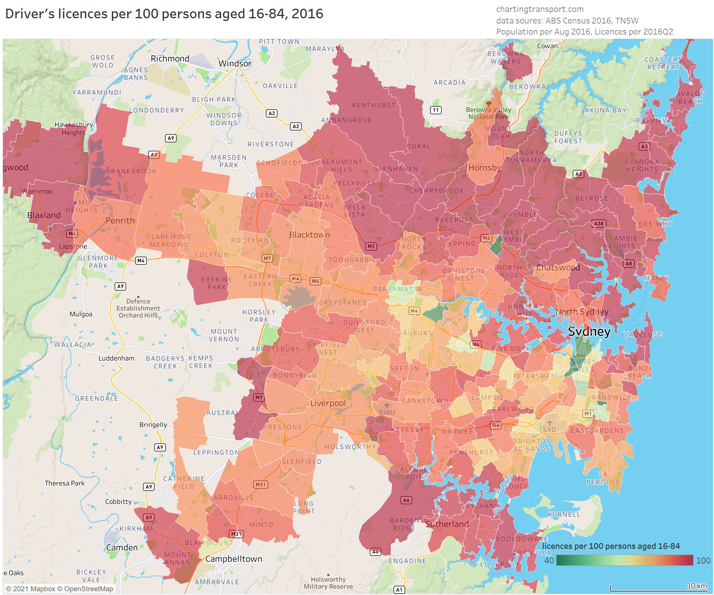
Technical note: For this map I have filtered to only show postcodes averaging at least 3 persons per hectare to focus on urban Sydney, but some excluded postcodes will be a mix of urban and non-urban land use so this is imperfect. Postcodes are not a great spatial geography for analysis as they vary significantly in size, but unfortunately that’s how the data is published (much easier for TNSW to extract I am sure).
The lowest licence ownership rates can be seen in and around the Sydney CBD, around major university campuses (especially UNSW/Randwick, Macquarie Park, University of Sydney/Camperdown), and at Silverwater (which includes a large Correctional Complex – inmates probably don’t renew their licence and would have a hard time gaining one!). There are also relatively low rates in some inner southern suburbs, in and near Parramatta, and near Sydney Airport.
Most outer urban postcodes have very high levels of licence ownership. One exception is postcode 2559 in the outer south-west, which contains a large public housing estate in the suburb of Claymore. More on that shortly.
Is there a relationship between licence ownership and journey to work transport mode share?
It will probably surprise no one that there was a relationship between driver’s licence ownership and private transport mode share of journeys to work. The following chart shows the average postcode mode share for the commuter population within specified bands of driver’s licence ownership.
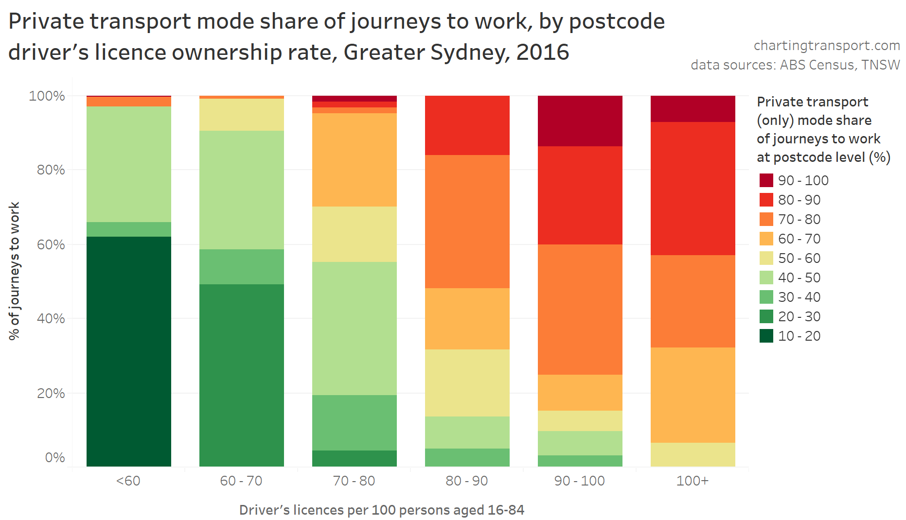
I should point out that this a relationship, but not necessarily direct causality (either way). People might be more likely to get a driver’s licence because that is the only practical way to get work from where they live, and other people who do not want to – or cannot – get a driver’s licence may be able to choose to live and work in places that don’t require private transport to get to work.
And then there are some postcodes with pretty much saturated driver’s licence ownership but less than 60% private transport journey to work mode shares (top right). I’ll have more to say on these postcodes shortly.
The rest of this post will consider potential explanations for the spatial patterns of licence ownership, using demographic data for postcodes.
Socio-economic advantage and disadvantage
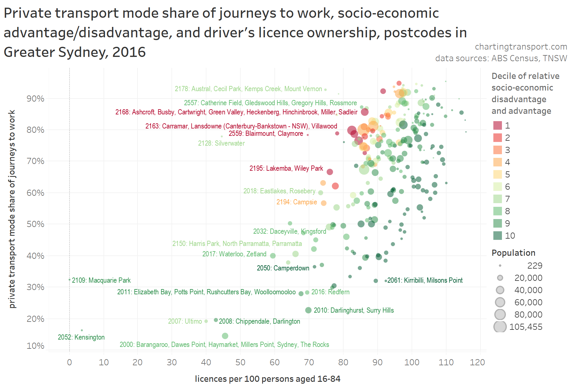
The following chart compares licence ownership with ABS’s Index of Socio-economic relative advantage and disadvantage (ISRAD, part of SEIFA), at the postcode level:
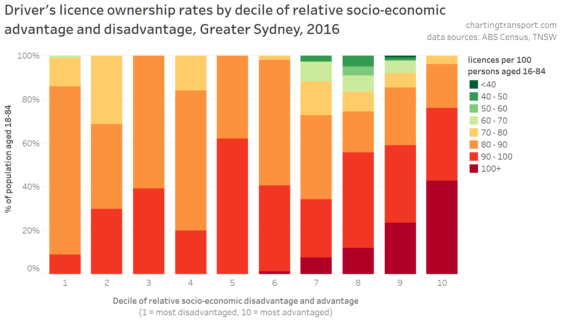
Near-saturated licence ownership was more common in the more advantaged postcodes, but lower rates of licence ownership were seen in postcodes in deciles 1, 7, and 8. Decile 1 stands to reason as areas of disadvantage (probably including many people unable to get a driver’s licence, eg due to disability), and the postcodes with very low licence ownership rates in deciles 7 and 8 contain or are adjacent to major university campuses.
However there are postcodes with licence ownership rates below 80 in all deciles – the relationship here is not super-strong and there are many exceptions to the pattern.
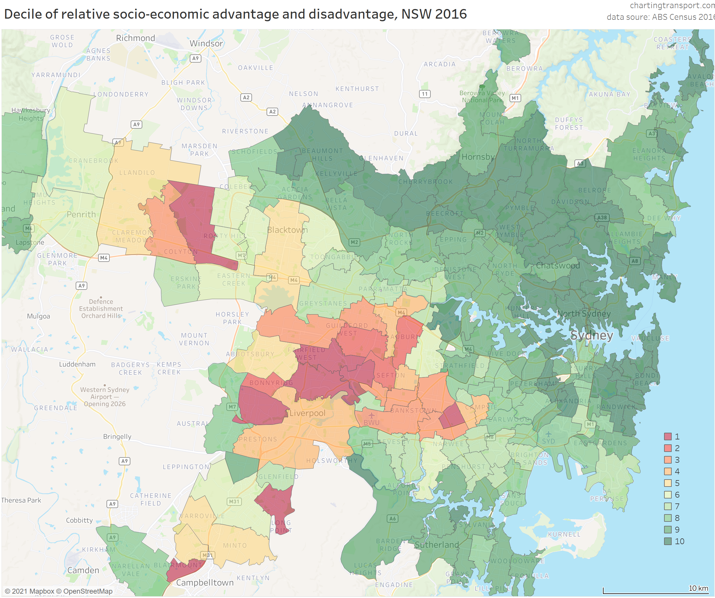
For people less familiar with the demographics of Sydney, here is a map showing 2016 ISRAD deciles for Sydney postcodes. Note that these deciles are calculated relative to the entire New South Wales population, and Sydney overall is more advantaged than the rest of the state, hence more green areas than red.
Workplace location
Workplace location is a known major driver of commuter mode share, with people working in the CBD much more likely to commute by public or active transport (see Why are younger adults more likely to use public transport? (an exploration of mode shares by age – part 2, plus analysis below). So how does it compare with licence ownership?
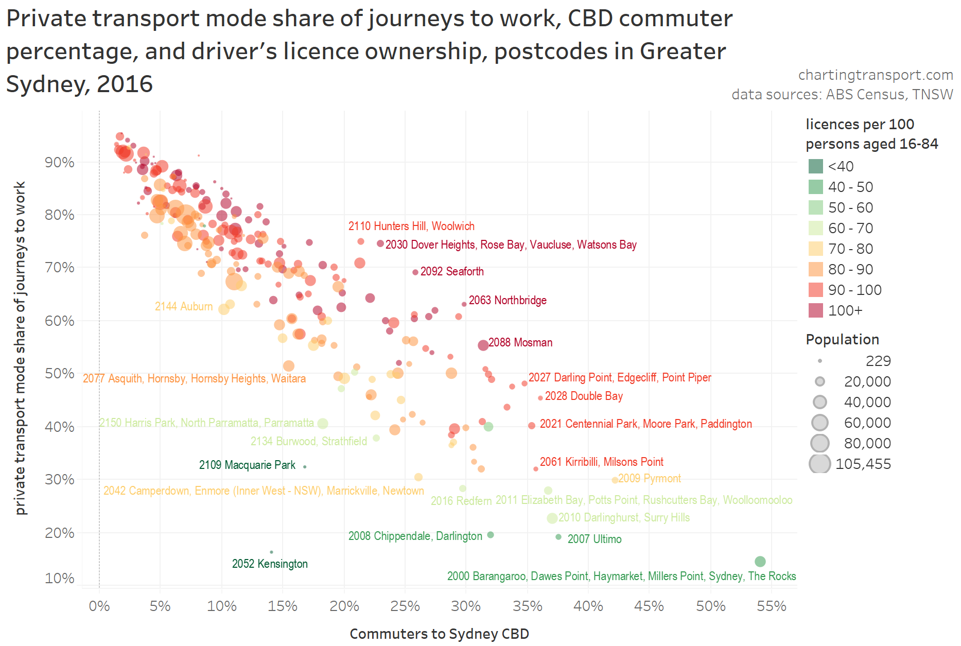
Here’s a scatter plot that shows that relationship. I’ve added socio-economic advantage and disadvantage colouring for further context, and labelled selected outlier and cloud-edge postcodes (unfortunately there is a slight bias against labelling postcodes containing many suburbs).
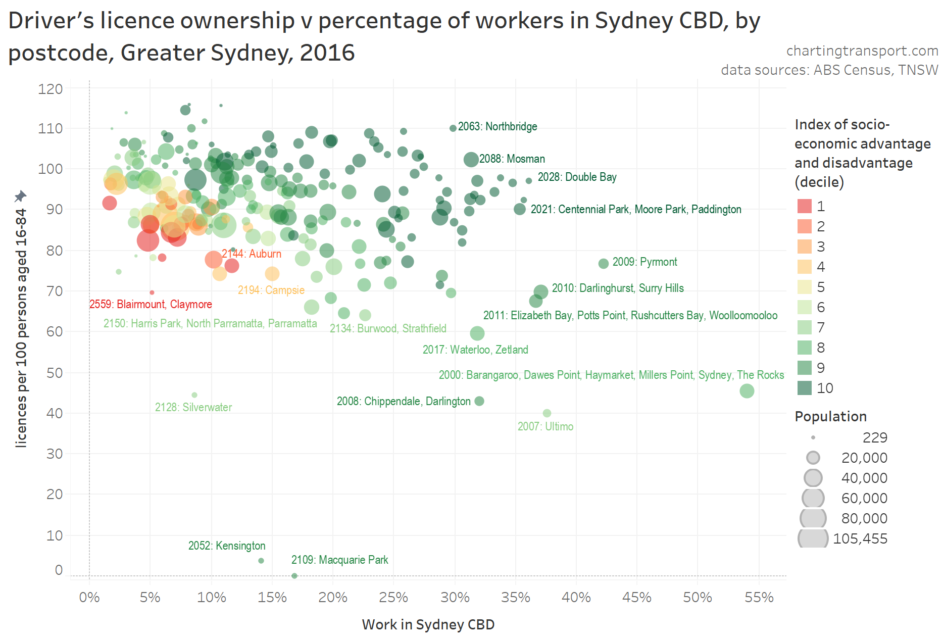
There is perhaps a weak relationship between work in Sydney CBD percentage and licence ownership, with postcodes containing larger shares of commuters going to the CBD (30%+) having lower licence ownership.
The chart also shows that disadvantaged postcodes generally had both fewer CBD commuters (as a proportion) and lower rates of licence ownership.
Commuter mode shares were much more strongly related to workplace location than licence ownership, as the following chart shows. Note that for this chart colour indicates licence ownership rate.
Within the main cloud, postcodes with lower rates of licence ownership (shades of orange) had slightly lower private transport mode shares and/or slightly lower percentage of commuters heading to the CBD. The upper outliers from the cloud include many wealthy postcodes that were not well connected to the CBD by the train network, while postcodes in the bottom-left of the cloud are on the train network.
To explore that further, here’s a similar chart, but with the data marks coloured by a relatively blunt measure: whether or not the postcode contained a train or busway station (based on point locations for stations, which is not perfect as some postcodes are very large and only part of the area might be within reach of a station, while other postcodes might have a station just outside the area):
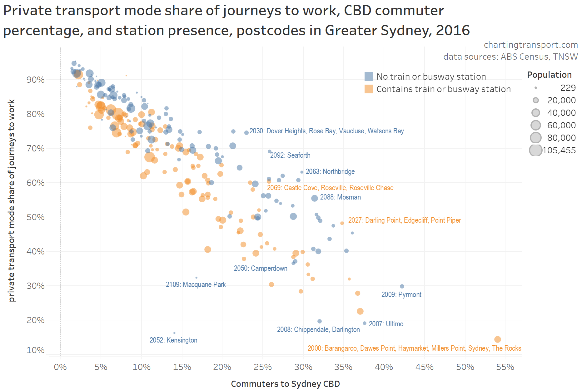
Generally the postcodes with a train or busway station are towards the bottom-left of the cloud, and those without towards the top-right. I’ve labelled a few exceptions, which include university suburbs such as Macquarie Park, Kensington, Camperdown, and some larger postcodes where a station only serves a minority of the postcode area (eg 2027 and 2069).
The next chart plots commuter mode shares, licence ownership, and socio-economic advantage/disadvantage:
You can see a significant – but not tight – relationship between licence ownership and commuter mode share. Within the main cloud, disadvantaged postcodes are to the top-left, and the more advantaged postcodes to the bottom-right. That is, many disadvantaged postcodes had high private transport mode share despite lower licence ownership, and many more advantaged areas had lower private mode share despite higher licence ownership.
This suggests licence ownership was not the strongest driver of commuter mode choice, at least at the postcode level. Workplace location seems far more influential.
Many advantaged areas are closer to CBD(s) and often have higher quality public transport, walking, and cycling options. People in more advantaged areas are also more likely to work in well-paying jobs in the central city, where public transport is a more convenient and affordable mode. These people also probably face fewer barriers in obtaining a driver’s licence for when they do want to drive (eg access to a car).
While disadvantaged postcodes generally had lower rates of licence ownership, fewer people in these postcodes worked in the Sydney CBD, and they also tended to have high private transport commuter mode shares. I suspect this may be related to many lower income workplace locations being generally less accessible by public transport (particularly jobs in industrial areas). Any cost advantage of public transport is less likely to offset the relatively high convenience of private transport (not to suggest the design quality of public transport services is not important, and not to go into the issues of capital v operating cost of private transport).
However, I suspect public transport could be more competitive for travel from these disadvantaged low-licence-ownership areas to local schools and activity centres. I am aware of some disadvantaged areas of Melbourne that have highly productive bus routes, but not necessarily high public transport mode shares of journeys to work (particularly parts of Brimbank). These areas may be worth targeting for all-day public transport service upgrades, to contribute to both patronage growth and social inclusion objectives.
Just to round this out, here’s a very similar chart, but with Sydney CBD commuter percentage used for colour:

For most rates of licence ownership, there was a wide range of private transport mode shares and a wide range of Sydney CBD commuter percentages. There is a relationship between licence ownership and mode share, but it is not nearly as tight as the relationship between Sydney CBD commuter percentage and mode share.
Age
There’s obviously a relationship between age and licence ownership and NSW thankfully publishes detailed data on licence ownership by individual age. The following chart shows licence ownership by age, animated over time from 2005 to 2020.
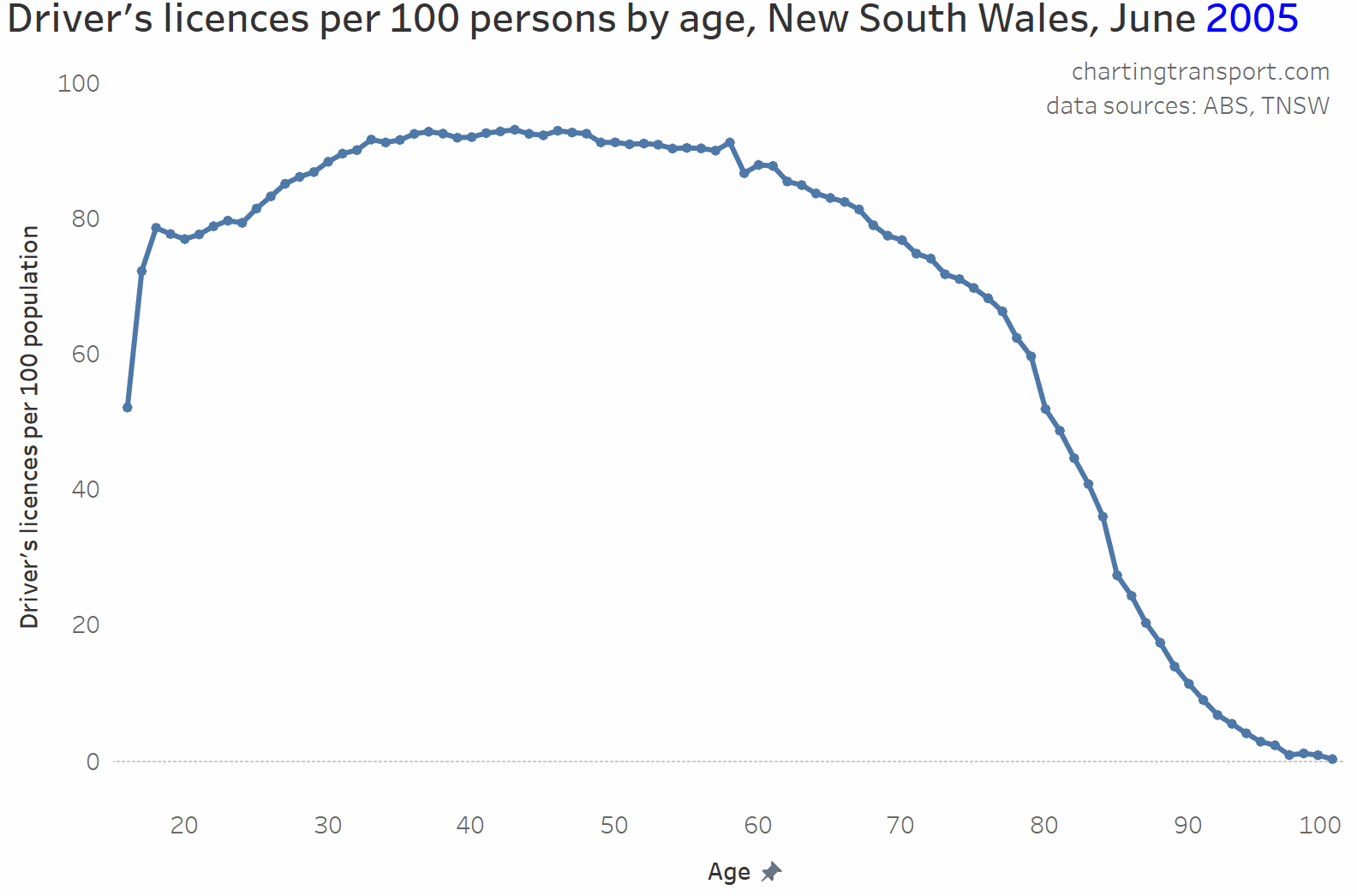
Licence ownership peaks for ages around 35-70, and is lower for younger adults and tails off for the elderly as people become less capable of driving.
But there is a very curious dip in licence ownership around age 23-24, which became more pronounced after around 2008. Why might this be?
One hypothesis: People getting learner’s permits around age 18 but not progressing to a full licence and having their learner’s permit expire after 5 years – i.e. around age 22 or 23. I wonder whether people are getting a learner’s permit largely for proof of age purposes. NSW does have a specific Photo Card you can get for that, but the fee is $55 (or $5 at the time you get your driver’s licence), whereas a learner’s permit costs just $25 (and an Australia Post Keypass proof of age card costs $40). As of September 2020, there were 185,329 people aged 18-25 with a Photo Card, and 211,004 people aged 16-25 with a learner’s permit (unfortunately data isn’t available for perfectly aligning age ranges). Did something change about proof of age in 2008? I don’t live in Sydney but maybe locals could comment further on this?
However, I think I have uncovered a more likely explanation which I’ll discuss in the next section.
It would stand to reason that postcodes with more people in age ranges with lower licence ownership might have lower rates of licence ownership overall. I’ve calculated the ratio of the population aged 35-69 (roughly the peak licence-owning age range for 2016) to the population aged 15-84 (roughly the age range of most licence holders) for all postcodes to create the following chart:

You can see a very strong relationship between age make-up and licence ownership rates for postcodes (a linear regression gives an R-squared of 0.75). That is, the more the population skews to people aged 35-69, generally the higher the licence ownership rate.
Recent immigrants
My previous analysis found a strong relationship between public transport use and recency of immigration to Australia (see: Why were recent immigrants to Melbourne more likely to use public transport to get to work?). So does a similar relationship apply for licence ownership?
While I cannot directly match licence ownership and immigrant status at the individual level, I can compare these measures at the postcode level.
For the following chart I have classified postcodes by the percentage of residents who arrived between 2006 and 2016 – as at the 2016 census (my arbitrary definition of “recent immigrants” based on available data for this analysis), and compared that with licence ownership levels.
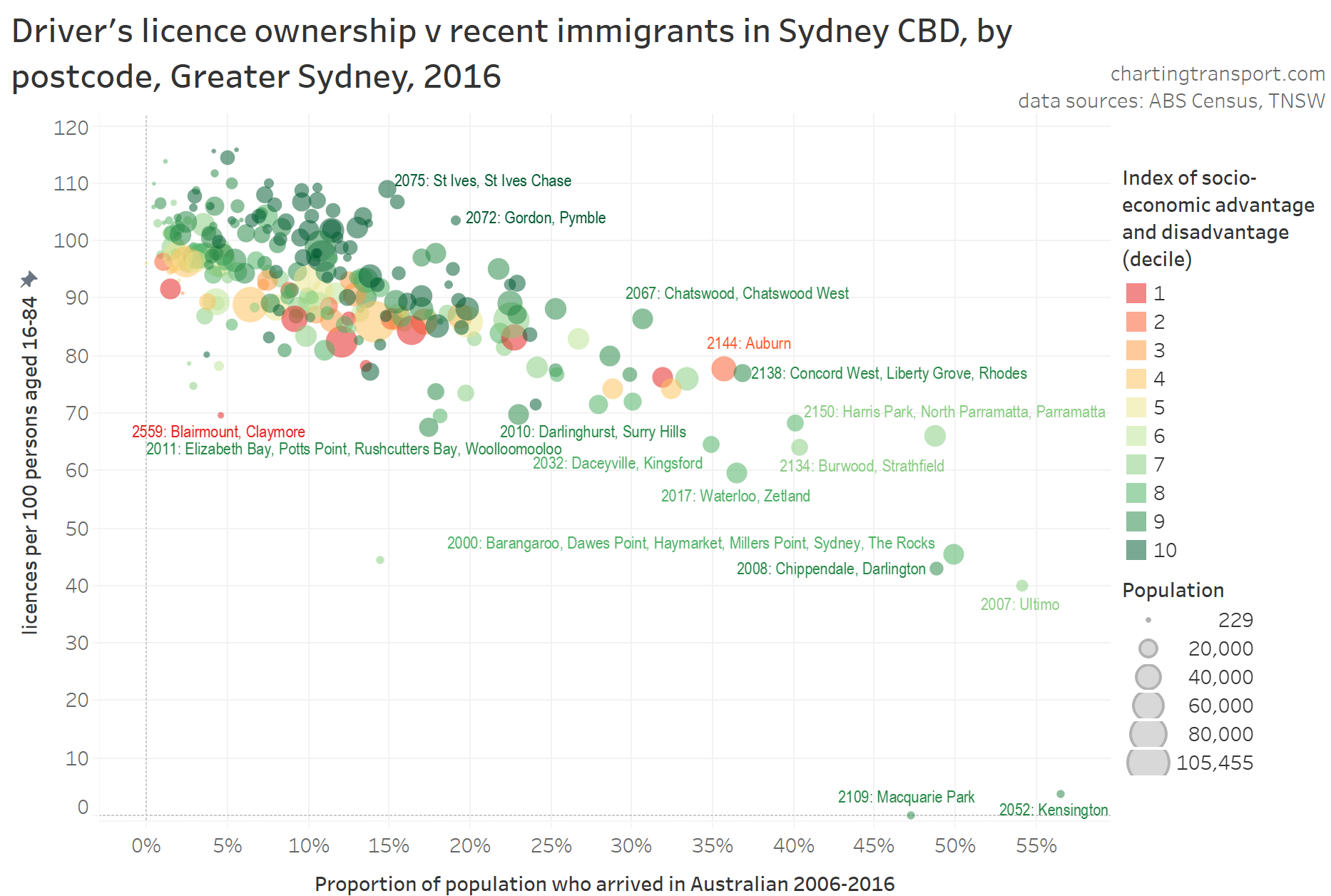
This chart shows a fairly strong relationship, and suggests more recent immigrants were less likely to have a driver’s licence – although the relationships is weaker for more disadvantaged postcodes (red/orange postcodes).
So why might recent immigrants be less likely to have a licence?
- As we’ve already seen, some of these postcodes with low licence ownership are adjacent to universities, and no doubt included many international students who did not have a need for licence to get to study or work.
- Many other skilled immigrants would work in the CBD(s), for which high quality public transport connections are generally available. In Melbourne, I found many recent immigrants live closer to the city where public transport is more plentiful, and many also live near train stations. Sydney is likely to be similar (more on that in a moment).
- For some it might be because they cannot (yet) afford private transport (particularly immigrants on humanitarian visas) and/or that they don’t have sufficient English to get a learner’s permit (more on that later).
- For some it might be that they are happy and attuned to using public transport, walking and/or cycling to get around, like they did in their country of origin. However when I analysed Melbourne commuter PT mode shares by immigrant country of origin, I didn’t find relationships I expected.
- The age profile of immigrants skew towards younger adults, who for various reasons are less likely to own a driver’s licence.
- I had wondered if some immigrants were driving using international licences instead, but NSW rules state that you can only drive on an international licence for up to three months, so that’s unlikely to explain the pattern.
Here’s a chart showing that immigrants skew towards young adults. The chart shows the New South Wales 2011 population for each calculated approximate age of immigrants when they arrived in Australia (= age + arrival year – 2011) (the best data I have available at present):
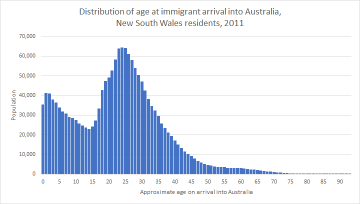
The most common ages at arrival were around 23-25 years. Sound familiar? It is also the age where driver’s licence ownership rates dip in New South Wales. I reckon there’s a good chance the influx of immigrants of this age may explain the dip in licence ownership rates for people in their early 20s.
My recent Melbourne research found recent immigrants were also less likely to own a motor vehicle. This evidence suggests low rates of driver’s licence ownership is also strongly related to the relatively high use of public transport by recent immigrants.
For reference, here’s a map showing the percentage of residents in 2016 who had moved to Australia between 2006 and 2016. If you know a little about the urban geography of Sydney, you’ll see higher concentrations around the CBDs, university campuses, and along some major train lines.

Parenting status
We know parents are less likely to use public transport (at least in Melbourne, but probably in all Australian cities), so are they also more likely to own a driver’s licence? The following data compares licencing and parenting rates (defined as proportion of adults doing unpaid caring work for their own children aged under 15) for postcodes:
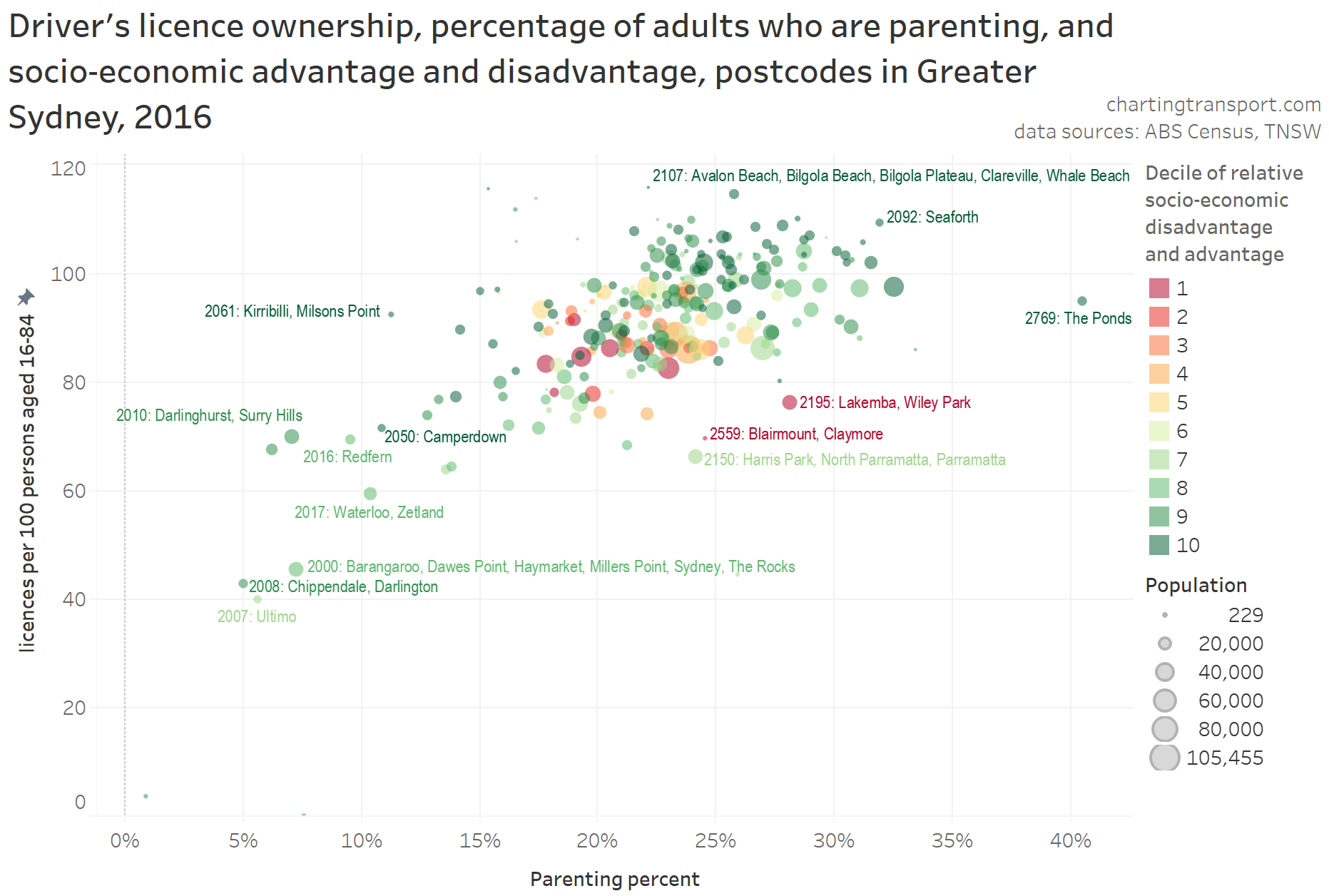
There is a significant relationship, with postcodes with higher rates of parenting generally have higher rates of driver’s licence ownership. This may well be related to licence ownership rates also peaking for people of the most common parenting ages, and also the fact many young families live in the outer suburbs (where private transport is often more competitive than public transport). The postcodes with the lowest licence ownership rates also have very low proportions of parents (and probably contain many young adults who are studying).
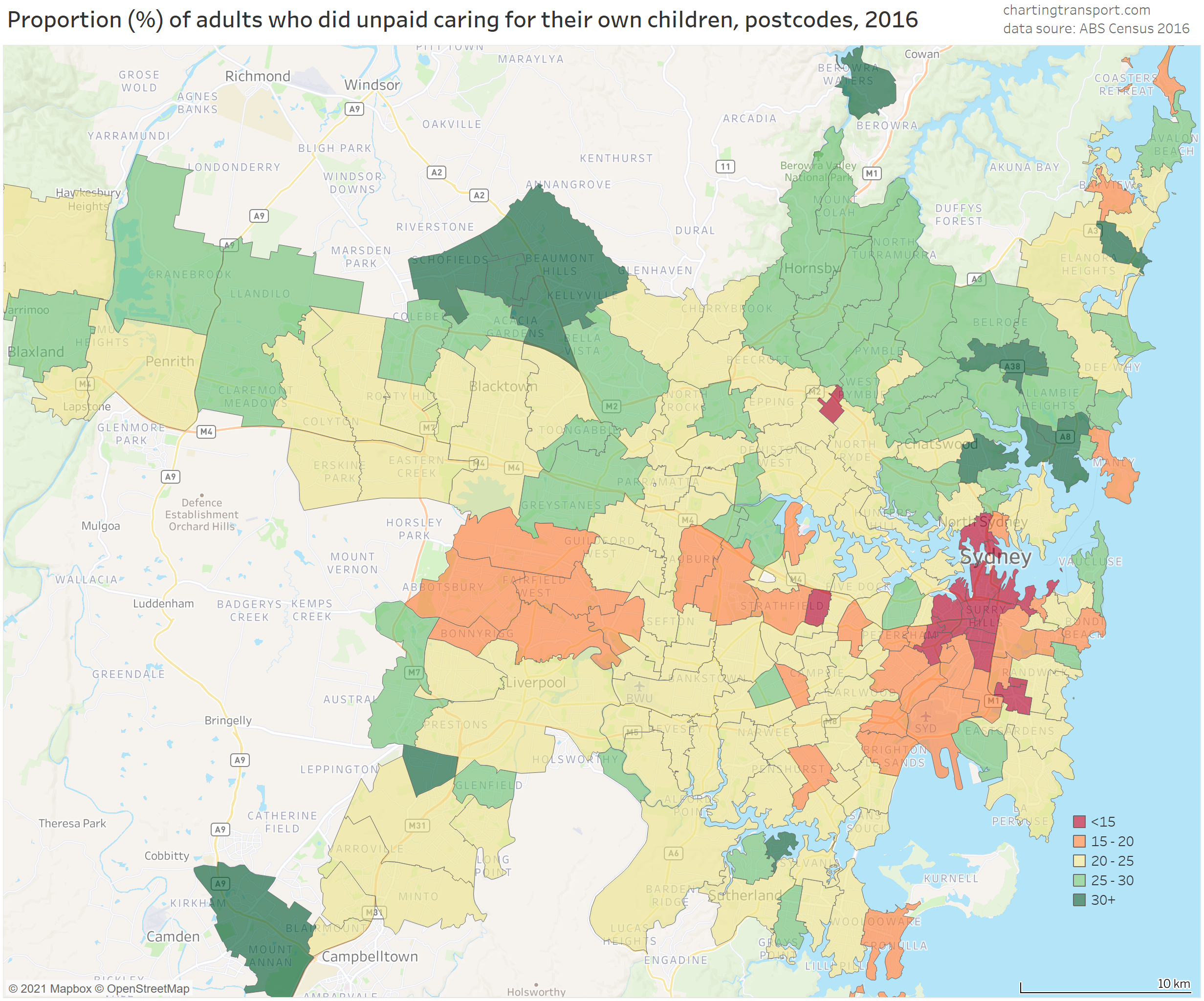
For reference here is a map of parenting percentages for Sydney postcodes:
Motor vehicle ownership
It stands to reason that areas with higher driver’s licence ownership rates might also have higher motor vehicle ownership rates. I’ve calculated the ratio of persons aged 18-84 to household motor vehicles for each postcode, to create the following chart:
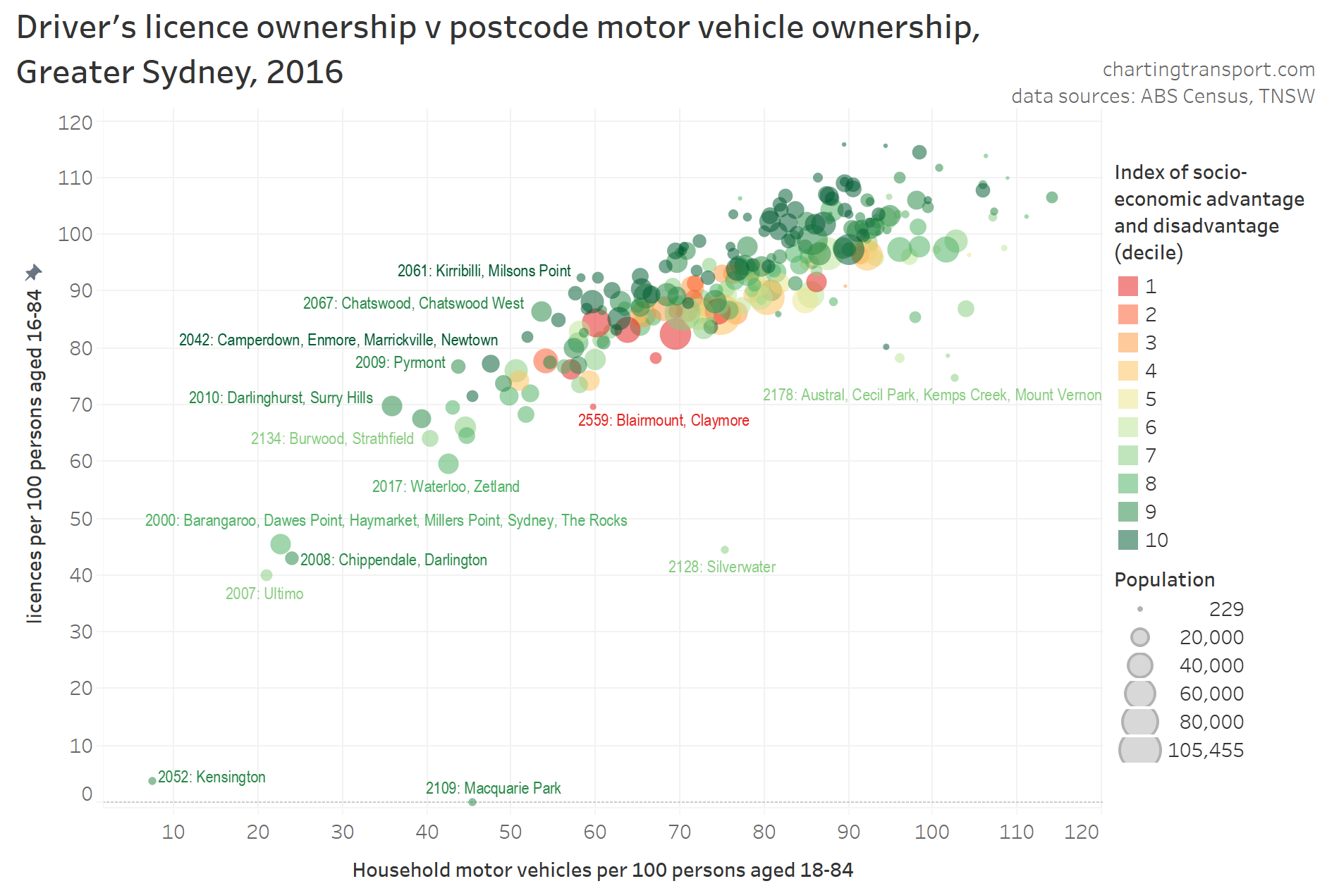
You can see the relationship is very strong, with more advantaged (and often near-CBD) postcodes towards the top of the cloud, and more disadvantaged postcodes mostly at the bottom and middle of the cloud.
Silverwater is an outlier – but I should point out that my calculation of motor vehicle ownership only counts people living in private dwellings while licence ownership is for all residents (including the many who resided in Silverwater’s correctional facilities).
There are also a small curious bunch of outliers with around 100 motor vehicles per 100 persons aged 18-84 but only 70-90 licences per 100 persons aged 16-84. These include urban fringe suburbs such as Marsden Park, Riverstone, Oakville, Rossmore, Gregory Hills, Leppington, Voyager Point, Kemps Creek, and Horsley Park. Perhaps these areas may contain farm vehicles that might skew the motor vehicle ownership rates.
While spatial data about licence ownership is unfortunately not readily available for most states of Australia, this chart suggested that motor vehicle ownership (something thankfully still captured by the census, despite ABS trying to drop the question) is a reasonably strong proxy for licence ownership.
Population weighted density
Given postcodes can be quite large (one has a population of over 100,000!), I prefer to use population-weighted density as a metric of urban density (as opposed to raw density). Here’s how that related to licence ownership (note a log scale on the X-axis):
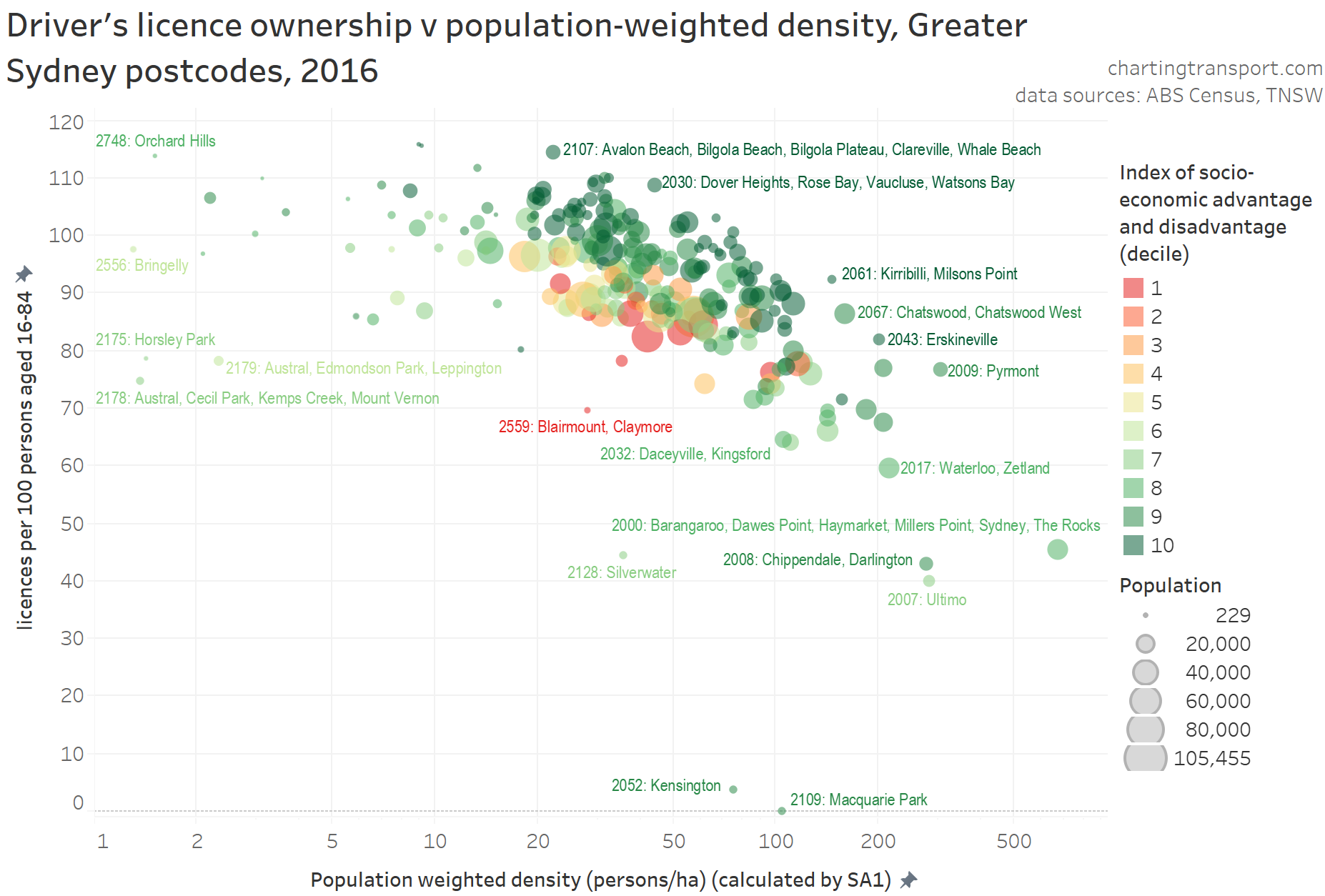
That’s a pretty strong relationship, and of course not unexpected. Areas with higher population density generally have great public transport services, and more services and jobs would likely be accessible by walking, reducing the need for a car or driver’s licence.
Proximity to high quality public transport
I’ve previously confirmed a relationship between public transport mode share and proximity to high quality public transport, so does the presence of high quality public transport also relate to driver’s licence ownership?
As mentioned above, I’ve classified postcodes as to whether or not there was a train or busway station contained within the postcode boundary in 2016. It’s a blunt measure because stations may only serve a small part of large postcodes, or there may be a station just outside a postcode’s boundary that still provides good rail access to that postcode. Some postcodes were also served by light rail and/or very high frequency bus services, just not a train or busway station. I’d love to be able to look at licence ownership by distance from stations, but licensing data is unfortunately only available for postcodes, which does not provide enough resolution.
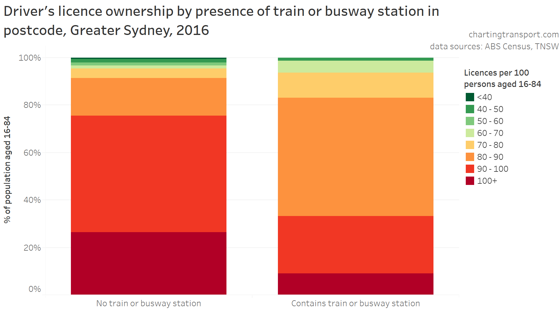
You can see postcodes with a station generally have lower rates of licence ownership than those without, but there is still plenty of variance across postcodes.
The green postcodes in the top of the left column include Camperdown (University of Sydney, close to the CBD with very high frequency on-road buses), Ultimo (just next to Central Station and the CBD), Kensington (includes UNSW campus, with strong bus (and now light rail) connections), Chippendale / Darlington (wedged between Central and Redfern Stations), and Waterloo / Zetland (very close to Green Square Station and also served by high frequency on-road buses).
Many of the postcodes with stations but high licence ownership (bottom of right hand column) are in the outer suburbs, where train frequencies may be lower, and public transport services in non-radial directions may have lower quality.
So the exceptions to the relationship are quite explainable, and I’d suggest there is a strong relationship. Again, it may be people without a licence choosing to live near public transport, and/or people not near high quality public transport deciding they must have a licence to get around.
Educational qualifications
I have also found a relationship between educational qualifications and commuter mode shares in Melbourne, so are licencing rates related to levels of educational attainment in Sydney?
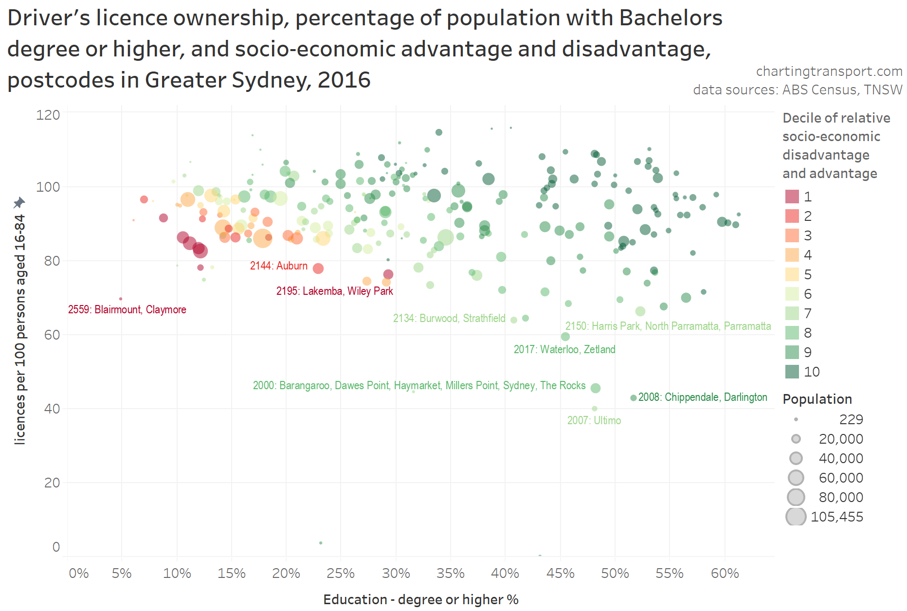
There’s not much of a relationship happening here between licence ownership and education, other than some inner city postcodes with a high proportion of educated residents and lower rates of licence ownership. There is of course an (expected) relationship between advantage and education.
But just on that, one curious outlier postcode on the chart is Lakemba / Wiley Park (2195), with 29% of the population having a Bachelor’s degree or higher, but it being in the most disadvantaged decile. This postcode has a large proportion of people not born in Australia, with significant numbers born in Lebanon and Bangladesh. Perhaps this reasonably well-educated but highly disadvantaged population is a product of lack of recognition of overseas qualifications, and/or maybe issues with discrimination.
Distance from Sydney CBD
In Melbourne, distance from the CBD has a strong relationship with mode choice, and I would not be surprised if there was similarly a relationship with licence ownership. However Melbourne only has one large dense employment cluster (the central city), while Sydney has multiple large dense employment clusters which is likely to lead to different patterns (see Suburban employment clusters and the journey to work in Australian cities).
From the first map in this post you cannot see a strong relationship between licence ownership and distance from the Sydney CBD – it is clear that many other factors are influencing licence ownership rates across Sydney (such as proximity to university campuses and employment clusters). Having said that, it seems clear that most “outer” suburban postcodes have high levels of licence ownership, but distance from the CBD is probably not a good proxy for “outer”.
Also some postcodes are quite large, and are a little problematic to assign to a distance value or range from the CBD, and the presence of two large harbours means crow-flies distance to the Sydney CBD is not necessarily reflective of ease/speed of travel to the Sydney CBD.
For these reasons I’ve not crunched data on home distance from the Sydney CBD. With a lot more effort, perhaps a metric could be created that considers travel time to Sydney’s major centres (although these centres vary in size).
Which factors have the strongest relationship with licence ownership?
The factors shown above had the strongest relationships with licence ownership (I tested three other factors which had weaker relationships, covered in the appendices below).
I put all the factors for Greater Sydney postcodes into a simple linear multiple regression model, and without labouring the details, I found that the following factors were significant at explaining postcode licence ownership rates (each with p-values less than 0.05 and overall an R-squared of 0.83), listed with the most significant first:
- Ratio of population aged 35-69 : population aged 15-84. For every 1% this ratio is higher, licence ownership per 100 persons aged 16-84 is generally 1.0 higher (all other things being equal)
- Rate of motor vehicle ownership: every extra motor vehicle per 100 persons aged 18-84, there are generally 0.35 more licences per 100 persons aged 16-84 (all other things being equal)
- People who have a bachelors degree or higher: For every 1% this is higher, licence ownership per 100 persons aged 16-84 is generally 0.18 higher (all other things being equal)
- Postcodes containing or adjacent to a major university campus or correctional centre. These postcodes generally had 14 fewer licences per 100 persons aged 18-64 (all other things being equal)
Factors that fell out of the regression as not significant were Sydney CBD commuter percentage, presence of a train or busway station, socio-economic advantage/disadvantage, population weighted density, parenting percentage, student status, and percent of population speaking English very well. Of course many of these metrics would correlate with the four significant factors above.
I was a little surprised to see educational qualifications show up as significant, given the weak direct relationship seen in the scatter plot, however the impact was small (0.18) and it may be acting as a proxy for other factors such as proportion of commuters working in the Sydney CBD (which was the “strongest” factor that fell out – having a p-value of 0.11).
This analysis was done using postcode level which has issues in terms of blending populations. It is possible to look at individuals using household travel survey data, and I’ve had a quick look using VISTA data from Melbourne. Without going into full detail in this post, I’ve found stronger relationships with age, sex, household income, parenting status, main activity, distance from train stations, and a weaker relationship with distance from CBD. Maybe that could be the focus of a future post.
I hope you’ve found this interesting.
Appendix 1: English proficiency
Probably related to recent immigrant figures, postcodes with a larger proportion of residents speaking English very well generally had slightly higher levels of licence ownership, although the relationship is not tight:
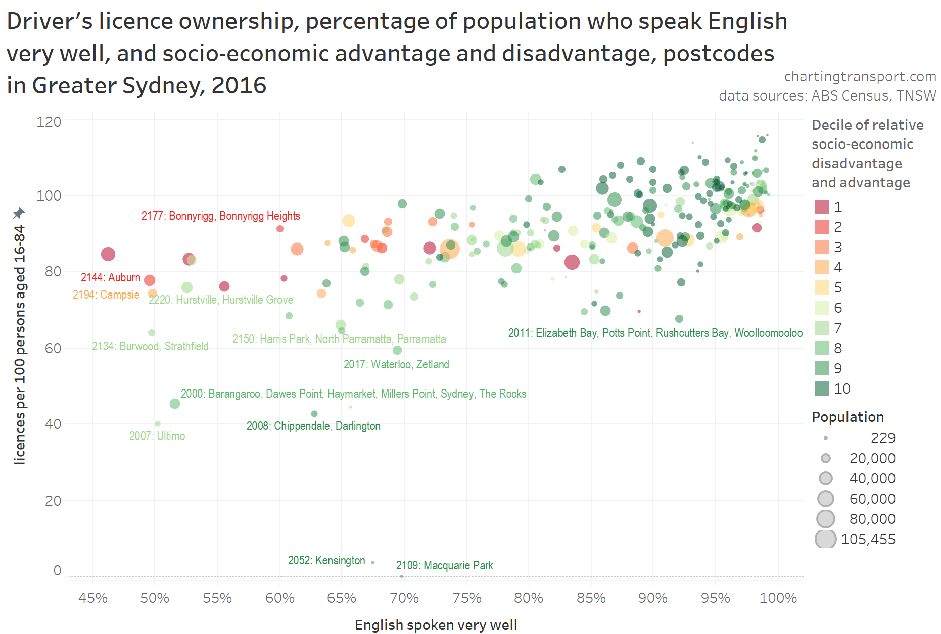
Curiously though, the relationship seems to be stronger for more advantaged postcodes. Disadvantaged postcodes with lower levels of English proficiency still had licence ownership rates of around 80 per 100 persons aged 16-84 (top-left of the cloud).
As an aside: is English proficiency lower in postcodes with many recent immigrants?
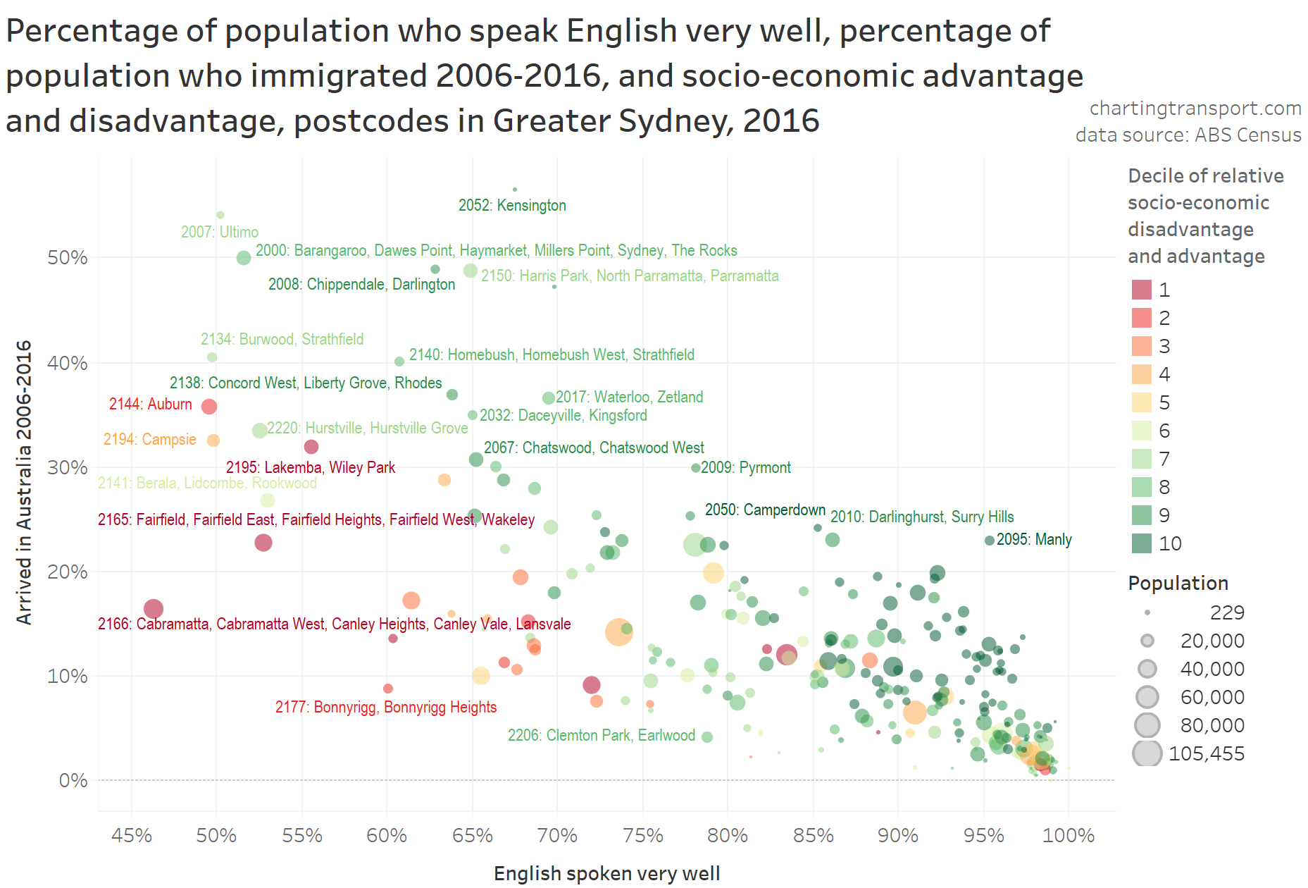
The answer is yes, but lower levels of English proficiency are not always explained by recent immigration. Of course some of the recent immigrants will speak English very well (many settling in places like Manly, Darlinghurst, Waterloo, Pyrmont), while others will not, depending on their country of origin. The large red dot to the bottom-left is postcode 2166, which includes the migrant area of Cabramatta (sorry about the label that overlaps other data points). It would appear that this postcode has many longer term residents who don’t speak English very well (although they might rank themselves as speaking English “well” rather than “very well”, which is below my arbitrary threshold of “very well” plus native English speakers).
Appendix 2: Student status
I have recently found a relationship between student-status and and journey to work mode shares in Melbourne (although yet to be published at the time of writing). So does the proportion of residents (over 15) who are studying have a relationship with driver licence ownership rates?
Here’s a scatter plot, with socio-economic advantage and disadvantage overlaid:
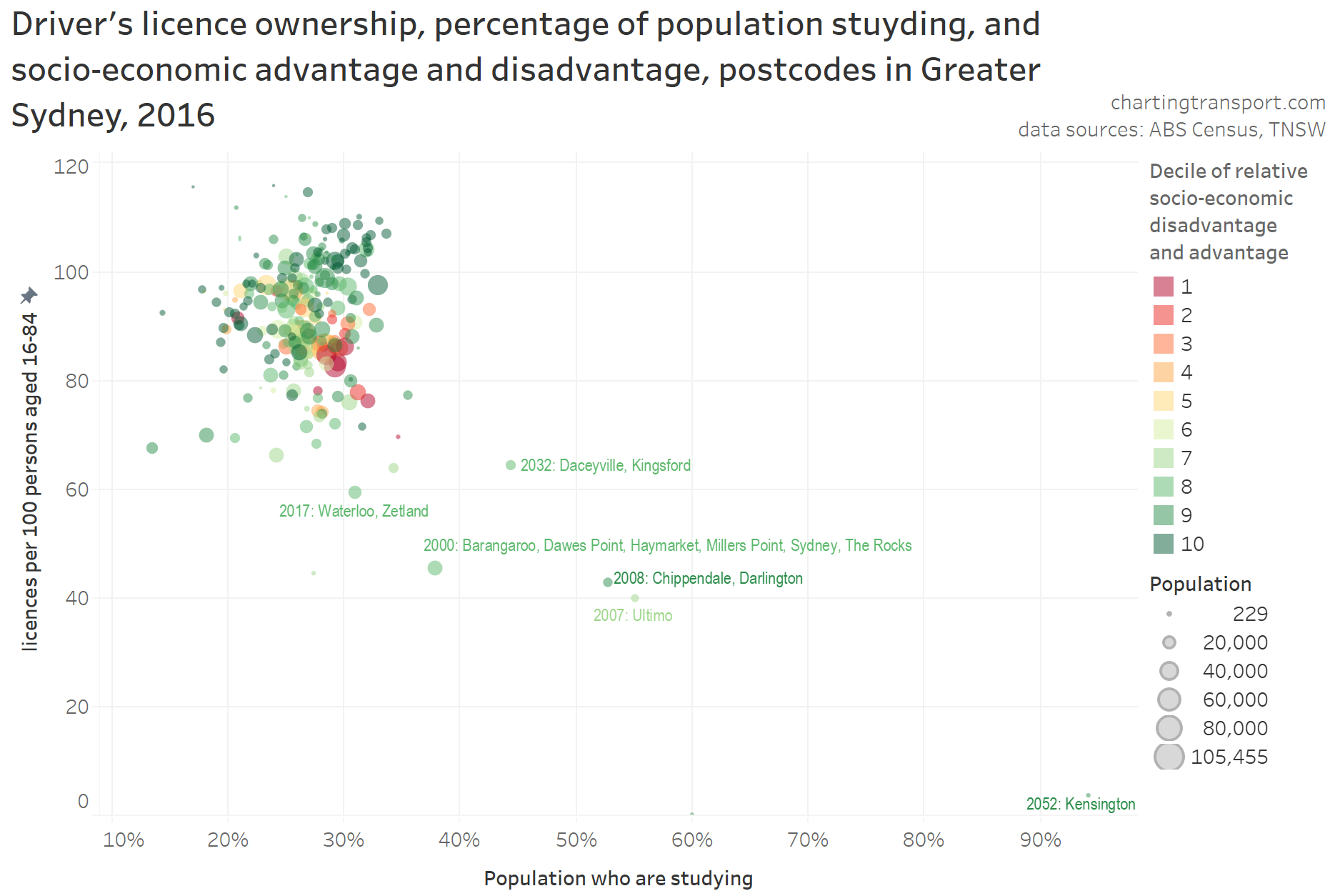
Apart from some exceptional postcodes with larger proportions of students, there appears to be little to no relationship between studying and licence ownership.


 Posted by chrisloader