Where do workers have the longest travel distance to work? What workplace locations have workers that live far away? How far are commuters in new urban greenfield areas from their workplaces? How do distances to work vary by gender? Where is a lack of local jobs leading to longer commute distances? Where are Victoria’s commuter towns?
This post explores ABS census data on the on-road distances between homes and workplaces around Melbourne and Victoria (a future post may cover other parts of Australia).
See the appendix at the end of this post for more details on the data and calculations.
Melbourne and surrounds
Here are median on-road distances to work around Melbourne for 2021:
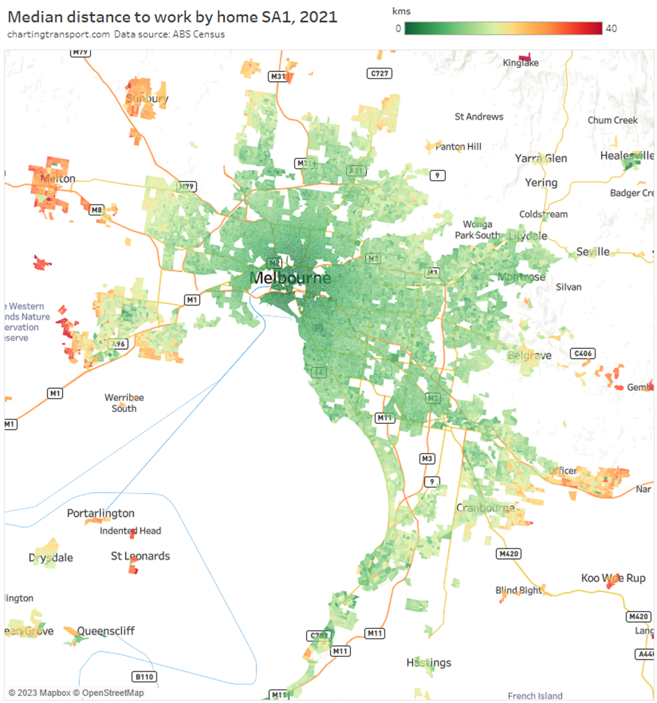
Technical note: I’ve filtered for SA1s with 2+ persons aged 15+ per hectare to focus on relatively urban areas.
The shortest median distances in 2021 were around the central city. Longer distance were seen in the outer suburbs with the longest distances on the urban fringe – particularly Manor Lakes, Werribee West, and Pakenham, the “satellite” urban areas of Melton, Sunbury, and Eynesbury, and in some hills towns between Belgrave and Gembrook in the east. This makes sense as outer suburban area are generally further away from jobs.
Urban fringe growth areas
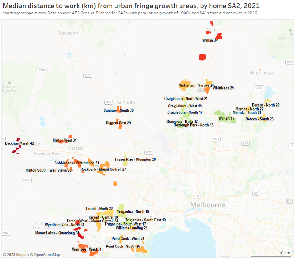
The following map shows the typical distances to work from greenfields areas on the western and northern urban fringe of Melbourne.
You might want to click/tap on this one to make the labels easier to read.
And here are the south-east urban growth areas:
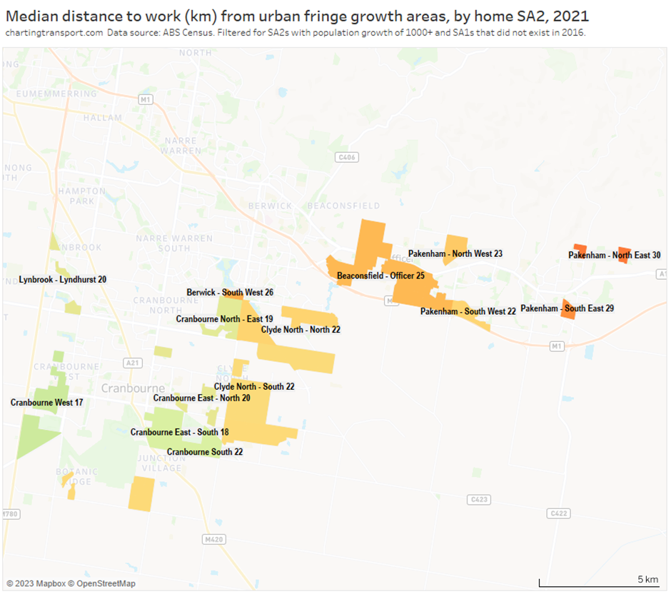
Technical notes: I’ve filtered for brand new SA1s (in 2021) on the urban fringe where the containing SA2 has had population growth of 1000+ people between 2016 and 2021 (consistent with previous analysis of urban fringe areas on this blog). I’ve then aggregated to a median distance to work for each SA2 (being the median of the new SA1 medians). Labels are mostly SA2 names but I’ve renamed some for clarity.
Different growth fronts have very different median distances to work. For example, median distances to work from Manor Lakes were almost double those of Truganina, Wollert, Roxburgh Park, and Cranbourne.
How did distance to work relate to distance to Melbourne?
Here’s a scatter plot comparing home distances from the Melbourne CBD and median distances to work at SA1 geography (using same urban filter as above):
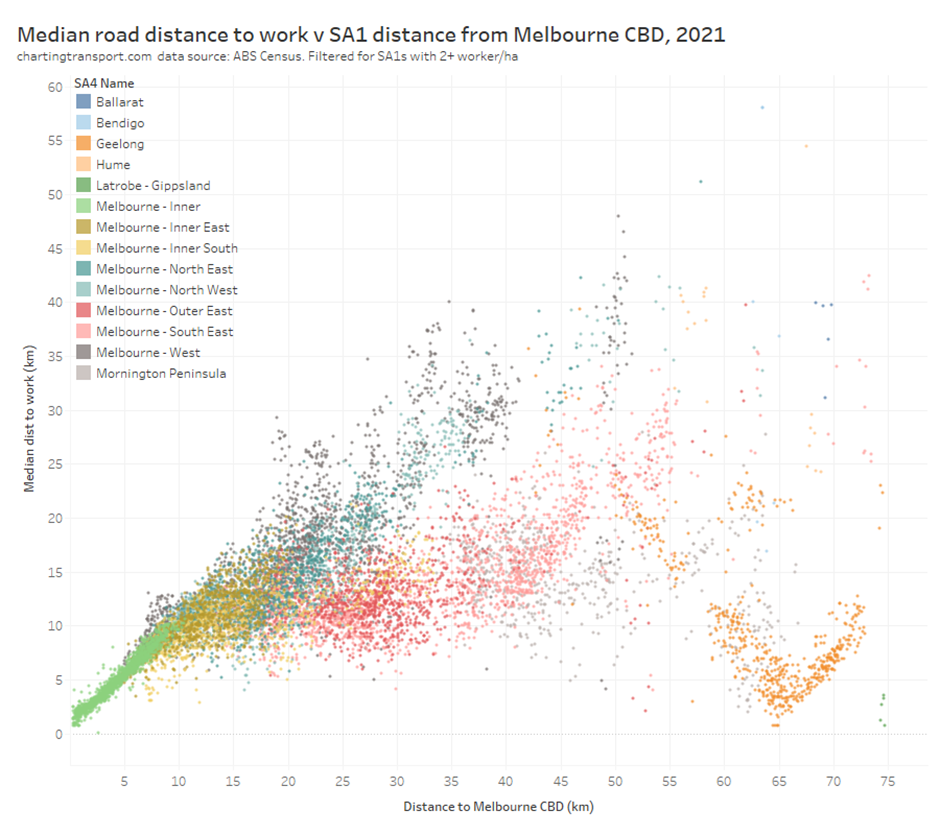
There’s a bit going on here. In areas very close to the Melbourne CBD, median distances to work increase pretty much linearly with distance from the CBD, suggesting these areas are probably fairly dependent on central Melbourne for employment. Then things start to spread out a bit as you get further from the city, with some median distances to work being largely proportional to distance from the CBD, while many other areas have median distances to work of 10-15km. The linear trend fades away as you get further from Melbourne.
A series of orange dots form a “V” shape either side of 65km from the CBD – these are in the Geelong SA4 area, and central Geelong is around 65 km from Melbourne (straight-line distance). This suggests median distances to work in the Geelong region are largely proportional to distance from central Geelong.
The chart is a bit messy with lots of overlapping dots so let’s simplify things by aggregating to SA2s. For each SA2 I’ve calculated the median straight-line distance to the CBD (of centroids of the SA1s in the SA2), and the weighted average of the median on-road distances to work of the SA1s in the SA2 (weighted by number of workers in each SA1):
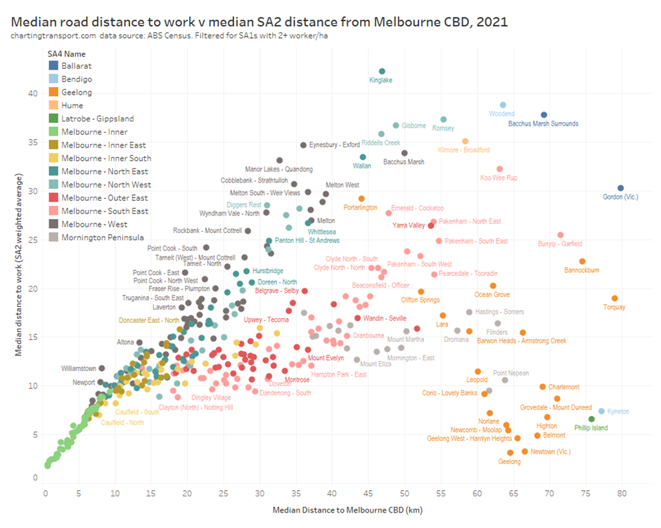
You can see more clearly that in Melbourne’s west and north west the median distance to work is roughly proportional to the distance from the CBD, while in Melbourne’s outer east and south east, the median distance doesn’t rise as much with increasing distance from the CBD – suggesting these areas are less dependent on central city jobs with more people working locally.
Melbourne’s commuter towns
The top-right of the above chart shows towns remote from the main Melbourne urbanised area including Bacchus March, Kilmore, Riddells Creek, Gisborne, Kinglake, Eynesbury, Wallan, Melton, Lancefield, Ballan, Kilmore, Romsey, and Woodend. These all have a long median distance to work, suggesting they are fairly dependent on Melbourne for employment.
So let’s go back to the map and focus on towns to the north-west of Melbourne:
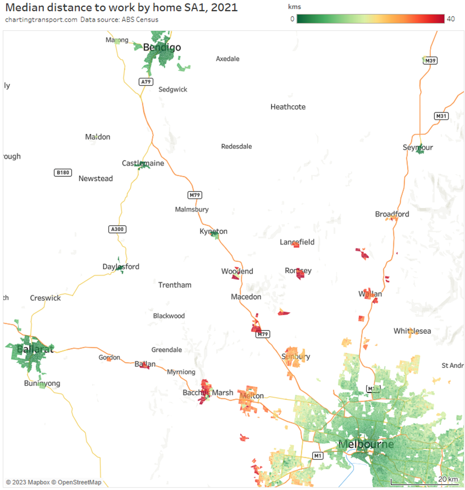
Firstly, the regional cities of Ballarat, and Bendigo have quite low median distances to work – suggesting the “median worker” is working locally.
Closer to Melbourne are what you might call commuter towns that I listed above. Basically, at least half of the workers in these towns worked way out of town, the median distance to work not dissimilar to the town’s distance from central Melbourne. Most of these towns have a relatively fast and frequent train service to the Melbourne CBD, which no doubt helps facilitates some such long commutes.
These commuter towns only spread so far out, likely reflecting a limit to how far (or how long) people are prepared to commute. While in most parts of Woodend the “median” worker was a long distance commuter, the median worker in Kyneton (the next town down the line) appears to have worked locally. Broadford was more a mix. The limit appears to be around 70 km straight-line distance from Melbourne’s CBD.
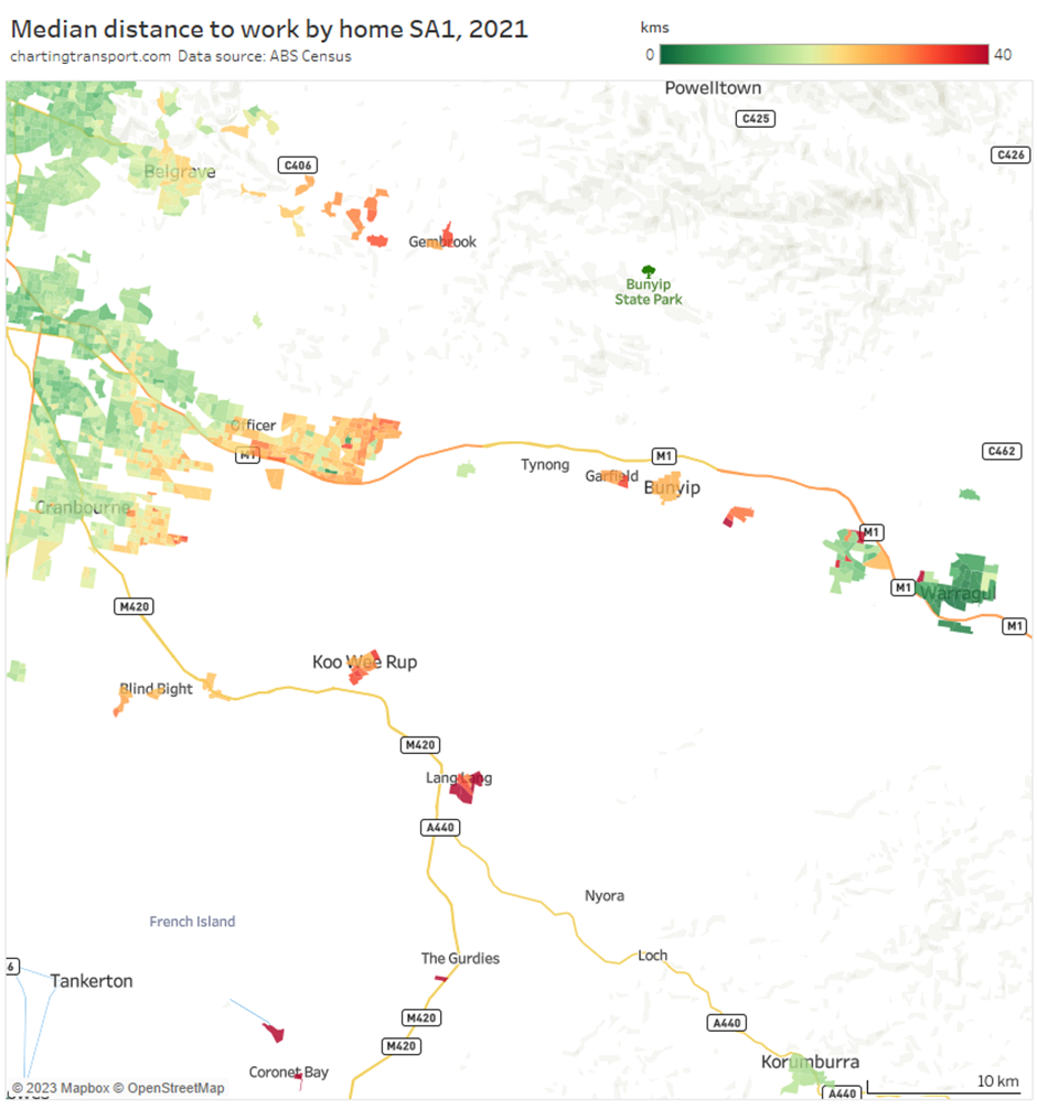
Similarly south east of Melbourne, the small towns of Garfield, Bunyip, Longwarry, Koo Wee Rup and Lang Lang had long median distances to work, but then then Korumburra, Drouin, and Warragul mostly had short median distances, as shown in the following map:
Okay so the median worker is doing a long commute in these towns, but do those distances drop away at lower percentiles? Below is a map showing the 25th percentile distance to work. The commuter towns still have very long distances (although Woodend is now a mix and Broadford comes in around 20 km):
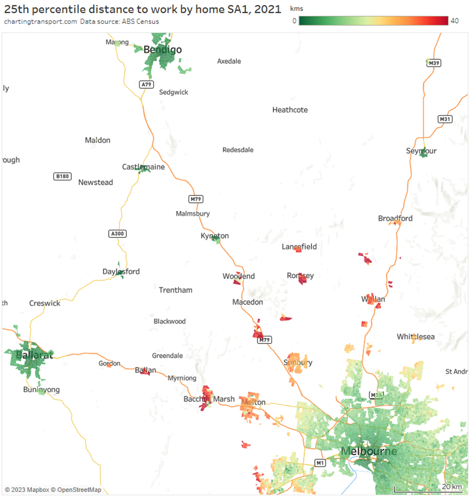
In the mostly red towns, over three-quarters of workers had workplaces a long distance out of town (although of course many may work some or all of their hours from home / remote from their workplace, particularly in the post-pandemic world).
But were these towns actually dependent on central Melbourne jobs?
How dependent are different areas on Melbourne CBD employment?
The next map shows the percentage of workers in each SA2 with a workplace in central Melbourne (defined by a set of SA2s, refer chart).
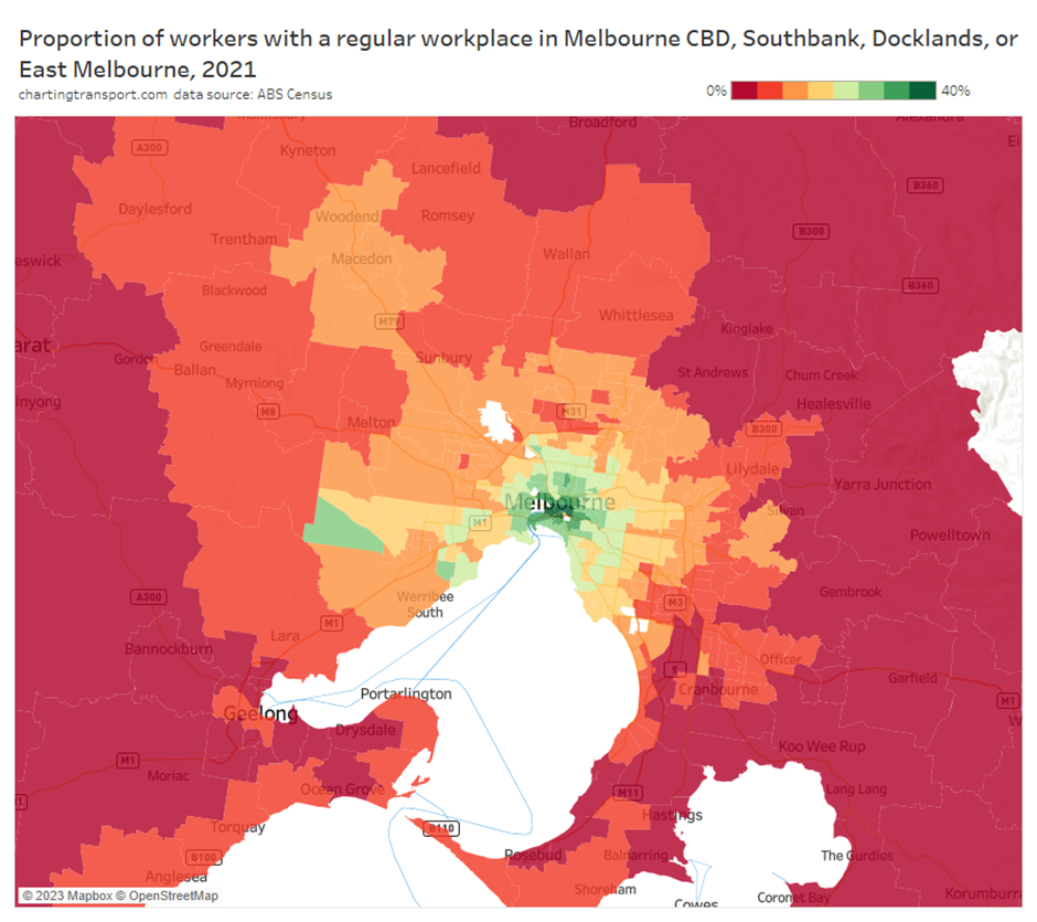
Technical note: I’ve capped the top end of the colour scale at 40% but the central city itself was higher.
The proportion of workers working in central Melbourne generally declined with distance from the CBD, with relative anomalies in Melbourne’s south west, along the Bendigo rail corridor to the north-west, and in coastal areas south of Melbourne.
The commuter town with the highest share of central Melbourne workers was Woodend at just 14%. This suggests these commuter towns are not so much dependent on central Melbourne, but broader Melbourne for employment, which means a lot of long car journeys to work.
In fact, here is a similar map showing the proportion of workers who worked in Greater Melbourne statistical area:
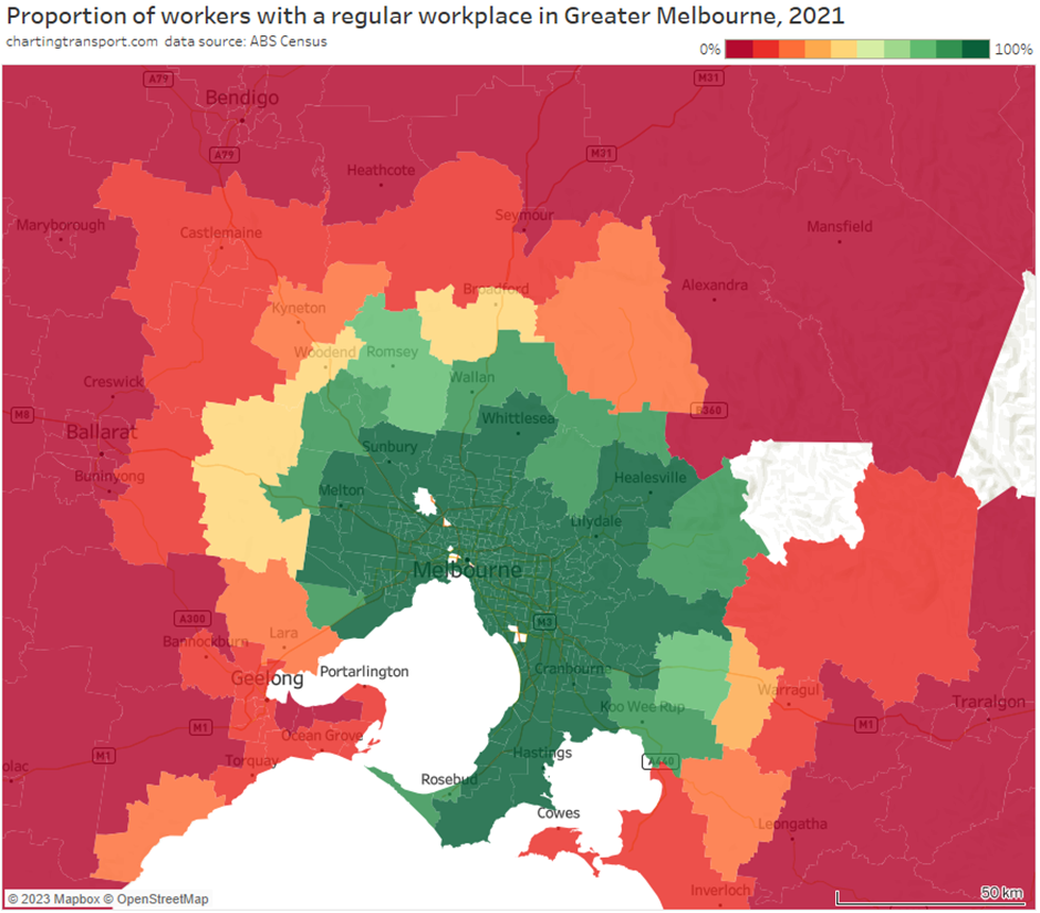
All home SA2s that are within Greater Melbourne show us as a shade of green (over 60%) – as the many local workers in these SA2s will be classed as working in Greater Melbourne.
The Woodend SA2 comes in with 48% of workers working within Greater Melbourne, which means 34% of Woodend workers had a workplace in Greater Melbourne but outside the central city. In fact around 235 of them worked in nearby Gisborne, Romsey, and Macedon which are included within Greater Melbourne.
Greater Melbourne accounted for 14% of Geelong workers, 6% of Ballarat workers, and just 2% of Bendigo workers. The Lorne-Anglesea SA2 is a relatively anomaly, with 24% of workers working in Greater Melbourne (I wonder if it contained some people working remotely from holiday homes who considered their holiday home to be their “usual residence” at the time of the census, which was a time of COVID lockdown in Melbourne).
You might be wondering why many distances to work were almost directly proportional to the distances to Melbourne for commuter towns, but that only a small proportion worked in central Melbourne. This can be explained in that the distances to work are measured on-road, while I’ve calculated straight-line distances to central Melbourne. The ABS says that on-road distances are typically 30% longer than straight line distances. When I look at origin-destination data I see that many of these workers worked on their home side of the Melbourne CBD.
What about the rest of Victoria?
If we expand the SA2 scatter plot out to include the whole state it looks like this (you might need to click/tap to enlarge to read the labels):

The diagonal pattern at the left of the chart burns out with Kinglake and Bacchus Marsh surrounds (around 70 km from the Melbourne CBD). Most further out towns are along the bottom of the chart – i.e. the median distance to work is very short, probably to a workplace in that town.
However there are some SA2s remote from Melbourne that have relatively long median commuter distances. I’ve looked at the home SA2 to work SA2 volume data and confirmed several are towns (or SA2s) that are within the catchment of a much larger nearby town (or set of towns), as per the table below (which is not exhaustive). They are in effect commuter towns for nearby larger towns.
| Small town / SA2 | Nearby larger town/SA2(s) |
| Beaufort | Ballarat |
| Shepparton Surrounds (including Tatura, Murchison, Merrigum, Tallygaroopna), Numurkah | Shepparton |
| Trafalgar | Warragul, Moe, and Morwell |
| Rosedale | Sale, Traralgon |
| Maffra | Sale |
| Paynesville | Bairnsdale |
| Yackandanda, Chiltern, Towong | Wodonga / Albury |
| Red Cliffs | Mildura |
| Moyne West / Port Fairy | Warrnambool |
| Loddon (including Inglewood and Wedderburn) | Bendigo |
| Winchelsea | Geelong |
Does distance to work differ by gender?
Inspired by the Gender Equality Toolkit In Transport (with the wonderful acronym GET-IT), I’m going to make more effort to disaggregate transport data by gender (where possible) on this blog. Unfortunately the ABS only provides 2021 census data for binary sex categories, so this will restrict the analysis that can be undertaken.
I’ve calculated the median distance to work by sex for every SA1, but unfortunately it is more susceptible to issues around small counts being randomly adjusted. ABS’s TableBuilder never reports counts of 1 or 2 and this might impact the median distance calculation in SA1s with a smaller number of workers of a sex (particularly women). So there may be some noise in the calculations.
Here’s a side by side comparison of median distance to work around Melbourne (you will probably want to click/tap this to expand):
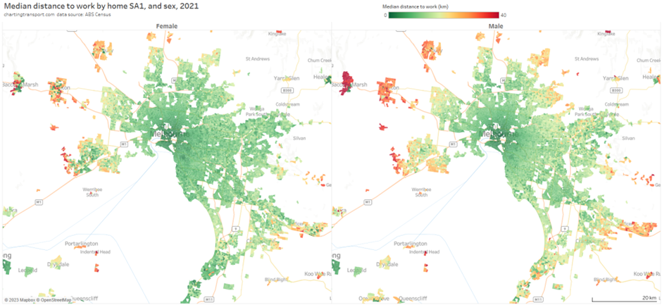
Both male and female workers show a trend to longer distances in the outer suburbs of Melbourne, but a bit less so for female workers. Indeed the outer suburban areas of Melton, Bacchus March, Sunbury, Wyndham, and Pakenham show a more speckled pattern for female workers, with some SA1s having short median distances and other long median distances.
This variation (or noise) is more evident when I plot the ratio of male to female median distances to work:
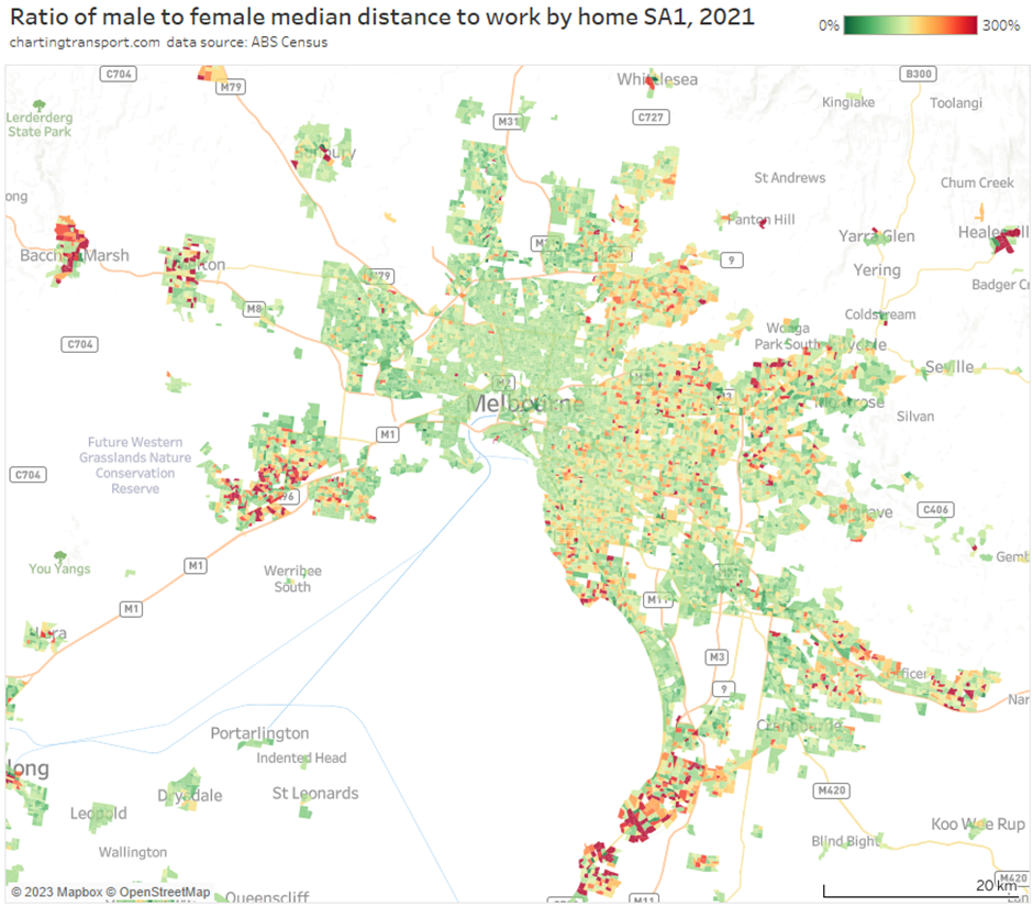
In many outer suburban areas (both recent growth and more established) there are SA1s where the male median distance to work is two or three times longer than the female median.
To reduce the noise a bit, I’ve aggregated median distances at SA2 geography (using a weighted average of SA1 median distances), and plotted this against distance from central Melbourne:
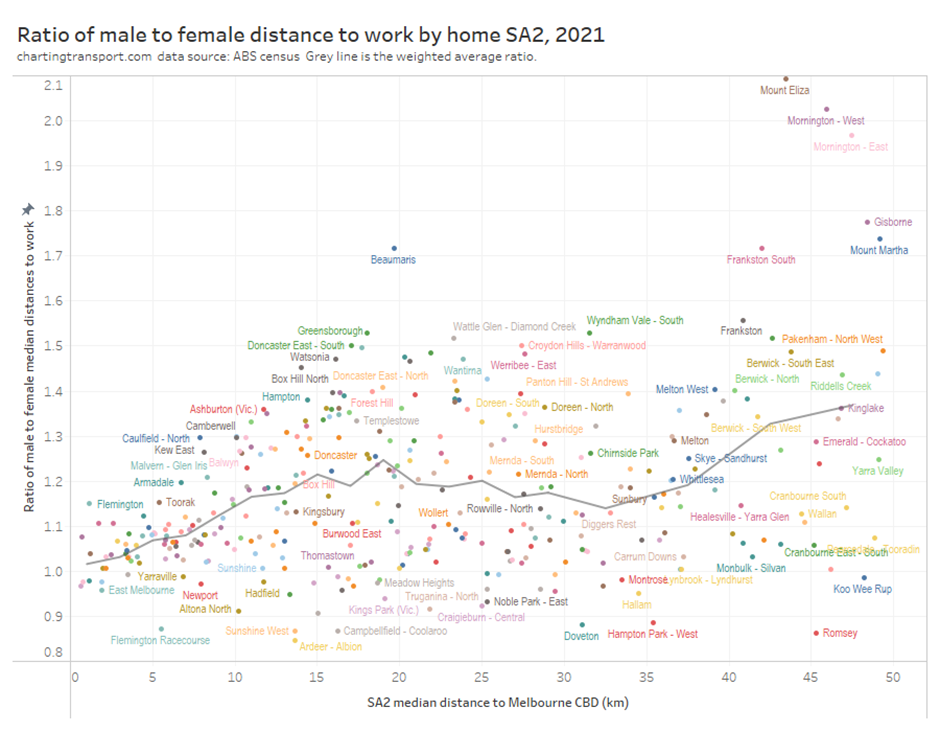
The weighted average ratio (grey line) was just above 1 in the central city, and then increased to around 1.2 to 1.3 in the middle suburbs, then grew to almost 1.4 in the outer suburbs and commuter towns. But as you can see there is significant variation between SA2s, and I’ve labelled as many SA2s as possible on the chart. I notice many relatively wealthy areas at the top of the chart, while the bottom of the chart contains many more disadvantaged areas.
Where was there a job / worker imbalance?
We can calculate the ratio of workers to jobs in a region to understand if there is a surplus of workers or jobs. However it is important to keep in mind that around 5% of workers do not have a fixed workplace and will be excluded from the count of jobs, so the average ratio will be around 0.95.
I have done this analysis at SA3 geography as I think SA2s are too small (some include employment areas and many do not) and SA4s are a bit too big.
This chart shows the ratio of workers to jobs for SA3s around Melbourne:

Technical note: this analysis counts only employed persons. You could repeat this analysis including looking for work to understand access (or lack thereof) to opportunities, but that’s another issue.
As you’d expect there was a big surplus of jobs relative to workers in the central city, with many people commuting into the City of Melbourne. There was also a surplus of jobs in SA3s that contain major employment areas, including Monash, Dandenong, Keilor, and Tullamarine – Broadmeadows (which includes Melbourne Airport).
The grey areas were pretty well balanced including Kingston, Stonnington, and Geelong. Box Hill and Maribyrnong were just below 1.
The orange areas had a large surplus of workers compared to jobs. This generally leads to longer commutes, although a neighbouring region with a surplus of jobs might mean these commutes are not very long. The biggest worker surpluses around Melbourne were in the SA3s of Casey – South, and Manningham – East, Sunbury, and Nillumbik – Kinglake. These areas generally had the longest median commutes as we saw above.
Wyndham and Melton – Bacchus Marsh SA3s in Melbourne’s outer west had slightly higher ratios but they were also a long way from SA3s with surpluses – you needed to travel to Keilor, central Melbourne or Port Melbourne to find an SA3 with a surplus, so this explains the long median distances to work. By comparison, in the outer south-east of Melbourne the Casey – South SA3 had a low ratio but is adjacent to Dandenong which had a surplus of jobs.
What about the worker : job balance in regional Victoria?
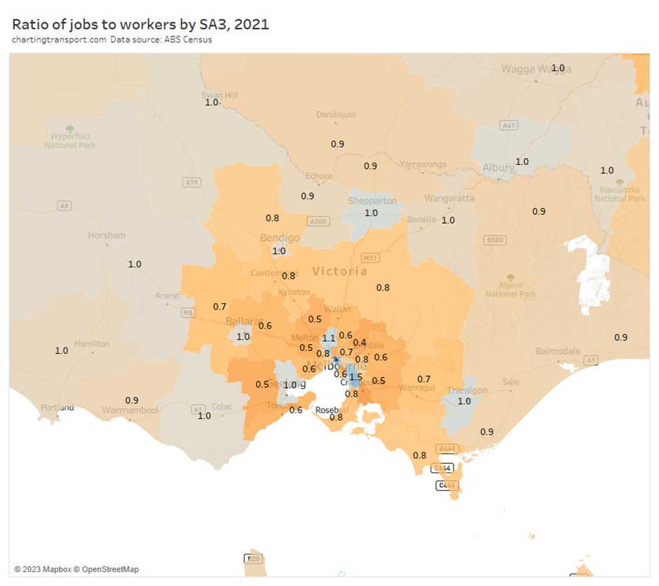
There was an even balance of workers and jobs in the major regional cities of Ballarat, Bendigo, Shepparton, and the Latrobe Valley. In rural areas further away from Melbourne the ratios were 0.9 or 1.
Commute distances by work location
We can also do distance to work analysis for workplace locations. Here are median commute distances by workplace locations around Melbourne:
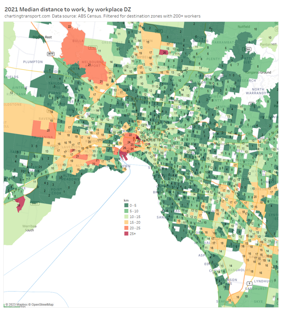
The longest median commutes were to jobs in:
- West Melbourne and the Port of Melbourne
- Fishermans Bend
- Melbourne Airport
- a pocket of Werribee South including the Werribee Open Range Zoo
- some industrial areas in the west
- the Police Academy in Glen Waverley
- a pocket of Lalor – West that includes the Melbourne Wholesale Fruit and Vegetable Market which was relocated from West Melbourne in 2015.
Many of these areas contain blue collar jobs where employees perhaps cannot readily afford to live in nearby housing, and/or there was no immediately adjacent housing areas because of land use segregation.
Then in a lot of residential areas the median distances were relatively short – most jobs being filled by relatively local residents.
Here’s a closeup of central Melbourne:
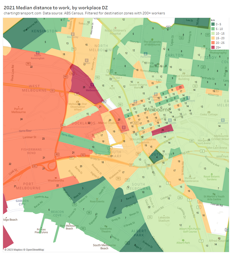
Most of the CBD had median distances of between 11 and 17 km, while Docklands was mostly a bit longer – between 15 and 22 km (I’m not sure I have a good explanation for that difference).
Curiously the zones around North Melbourne Station, Flinders Street Station, and Southern Cross Station had very long median distances – perhaps including train drivers with a notional workplace address of a central station or train yard who might actually start their day at a stabling yard in the suburbs?
There’s also a block on the corner of La Trobe Street and Spring Street with a 23 km median distance. In 2021 the dominant industries of employment for this block were construction and telecommunications services (with a total of only 376 employees).
I’ve examined data for peri-urban and regional employment areas. Most had median commute distances below 15 km with the exceptions of:
- Pakenham South West 23km (which is on the edge of the Melbourne metropolitan area)
- Broadford 17 km (which includes the Mitchell Shire Council offices and a major Nestle factory)
- Parts of Corio 17 km (which is on the northern edge of Geelong)
- Tatura 16 km (which might be attracting workers from Shepparton, Mooroopna, and Kyabram)
And for anyone interested, regional areas with relatively long 75th percentile commuter distances were:
- Warracknabeal 39 km
- Castlemaine 38 km
- Broadford 39 km
- Daylesford 37k
- Seymour 37 km
- Kyneton 35 km
- Beechworth 31 km
- Warragul South 32 km
- Wonthaggi 31 km
I hope you’ve found this interesting. In future posts I hope to compare Melbourne to other Australian cities, and look at how distances vary by industry of employment.
Appendix: estimating percentile distances to work
Distance to work is estimated by the ABS looking at the mesh block location of the persons usual residence and workplace address and calculating the shortest on-road distance between these locations. Where a worker does not have a fixed workplace address there is no calculation (about 5% of workers).
The ABS don’t publish the actual distance to work for every worker (that would be too much data and could breach privacy) but workers are banded into distance intervals that are 0.5 km wide up to 3 km, then 1 km wide up to 30 km, then 2km wide up to 80 km, then 5 km wide up to 100 km, and so on.
I’ve extracted a count of employees in each of these intervals, and then looked up the intervals either side of the 25th, 50th, and 75th percentile worker. I’ve then used a straight line interpolation between the middle distance of the interval below the percentile and the middle distance of the interval above the percentile to estimate the median distance to work. It’s not perfect but I reckon it would be pretty close to the true value, and the maps show a fairly smooth pattern across the city (except sometimes when disaggregated by sex).

