Having previously analysed commuting distances in Melbourne and Victoria, this post turns attention to other Australian cities. I’ll answer questions such as: Where are there longer commutes? What might explain differences in commute distances? How long are commutes in outer urban growth areas in different cities?
I’m using ABS calculated on-road distances between homes and regular workplaces from the 2021 census, regardless of whether people travelled to work on census day. For more on the data and calculations see the last post.
How do median distances to work vary by city overall?
I’ve measured the median distance to work for both the usual residents and the workers of each greater capital city statistical area (GCCSA) for 2021. These are often a bit different because some people live and work in different GCCSAs, and I’ll come back to that.

The chart shows that the capital city areas all have longer median distances to work than other parts of each state, which is unsurprising. Here’s some comments on the cities in order:
- Perth tops the chart with the longest median distances to work. Perth has a large and long low density footprint sprawled along the coastline, so long commuter distances are not hugely surprising.
- Melbourne comes in second place. It is the largest city by area, but is more dense than Perth.
- Brisbane comes in third place. Brisbane is slightly larger than Perth in area, but not stretched out quite so far, and with a larger population than Perth, but lower density than Melbourne.
- Canberra is next. It’s a relatively small city so you might expect shorter commute distances, but overall it is quite a low density city with a fragmented urban structure (divided by green areas). It also has an extensive high-speed and rarely-congested highway network that makes driving longer distances relatively easy.
- Sydney is next, the largest city by population and population density, and a city with multiple significant employment clusters, which probably contributes to a smaller median distance than most other big cities.
- Darwin is a tiny city, but like Canberra it has a fragmented urban structure, and Darwin’s CBD is at the end of a peninsula (with a median distance for employees of 12 km), which probably contributes to relatively long median commutes.
- Adelaide is the smallest of the five larger cities, with a mostly contiguous urban structure, which probably explains it’s lower median distances.
- Hobart is another very small city, which probably explains shorter commutes, although it is split over a wide river mouth which would lengthen many commute distances.
On the chart you can also observe small differences between median distances for usual residents and workers in some cities that I think are worth mentioning:
- Canberra has a longer median distance for workers, which probably reflects many workers living across the border in NSW.
- Perth has a longer median distance for usual residents than workers, which might reflect fly-in-fly-out commuters who live in Perth.
- Sydney and Melbourne have a longer median distance for workers, which might reflect commuters from outside the metropolitan area (particularly Melbourne’s many commuter towns which I explored in the last post).
- Workers in the “rest of WA” and “rest of NT” have relatively long median distances, which I suspect reflects fly-in-fly-out employment in the resources sector.
How do distances to work vary across cities
I’ve already examined Melbourne in my last post. What follows are maps and some discussion for other cities, followed by some observations across the cities.
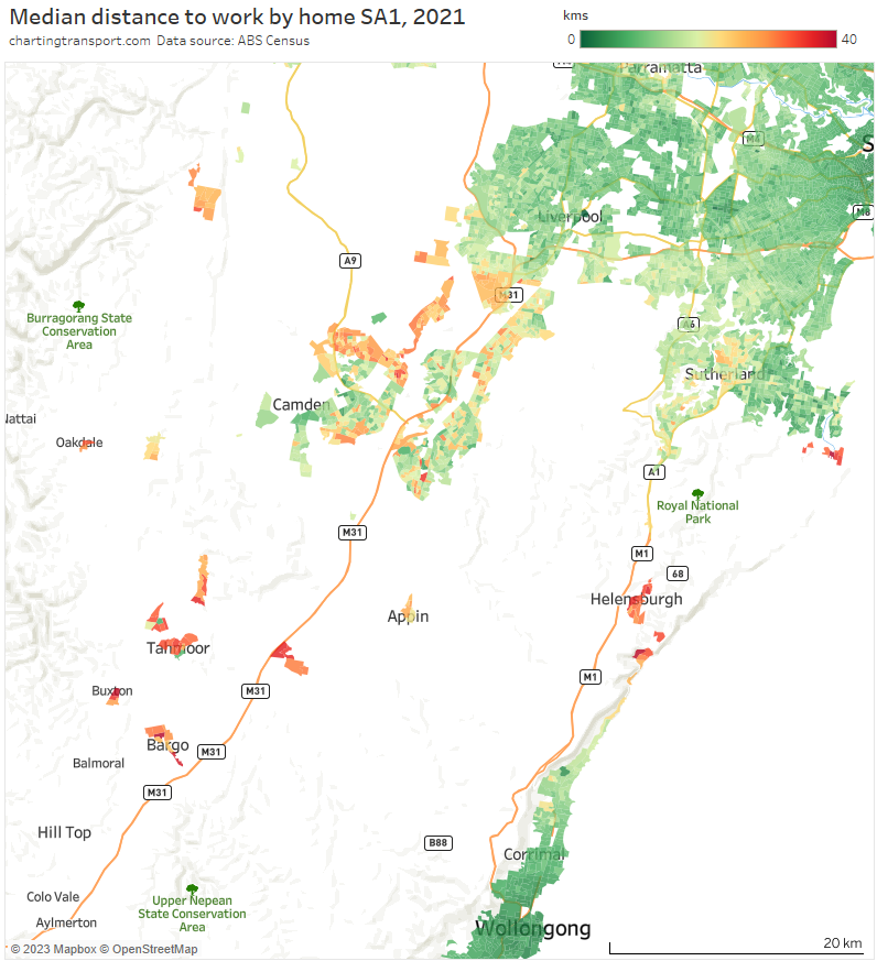
Sydney

(you might want to click/tap to expand some of these maps to see the detail more clearly)
Shorter median distances were found around in areas around the Sydney CBD, which is no surprise. Generally longer distances were seen in the growth areas to the south-west (including Oran Park, Leppington, Gledswood Hills, Gregory Hills, Edmondson), north-west (including Schofields, Marsden Park, Box Hill) and eastern Blue Mountains (including Springwood and Hazelbrook, but not Katoomba).
Other relative outliers include:
- Bundeena in the far south-east (median distances up to 50 km), which is connected to the rest of Sydney by a very long and windy road journey through the Royal National Park, plus a short ferry to Cronulla (not considered by ABS when calculating commute distances).
- Pockets of Bonnet Bay in the south (median distance of 26 km) which have a rather indirect access road to the rest of Sydney.
- Palm Beach (median distance of 37 km) at the tip of the northern beaches region.
Does Sydney have commuter towns? Yes, but perhaps not as many as Melbourne. The map above shows long median distances as far as Hazelbrook in the west, and the map below shows several towns to the south that show longer median distances (many commuters from these towns might also work in Wollongong).
Here’s how Sydney looks for the ratio of jobs to workers in SA3s:
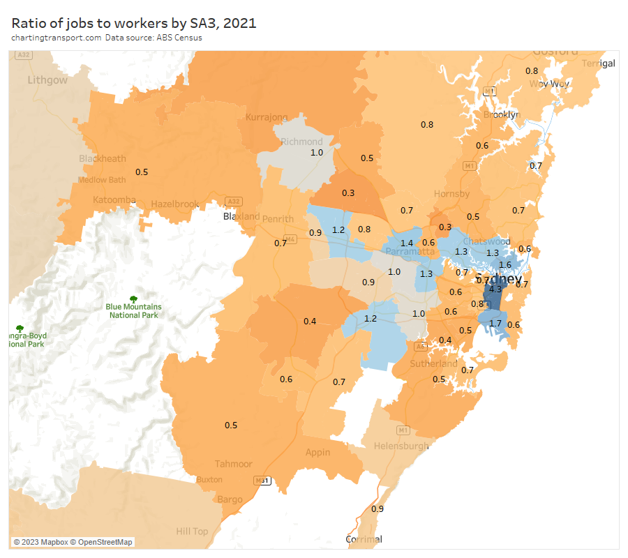
The outer south-west has a low ratio and is quite remote from any SA3 with a surplus of jobs, hence relatively long median distances to work. Some pockets of the north-west had low ratios, but were adjacent to higher ratio areas nearby.
Here are median distances to work by workplace destination zones (DZs):
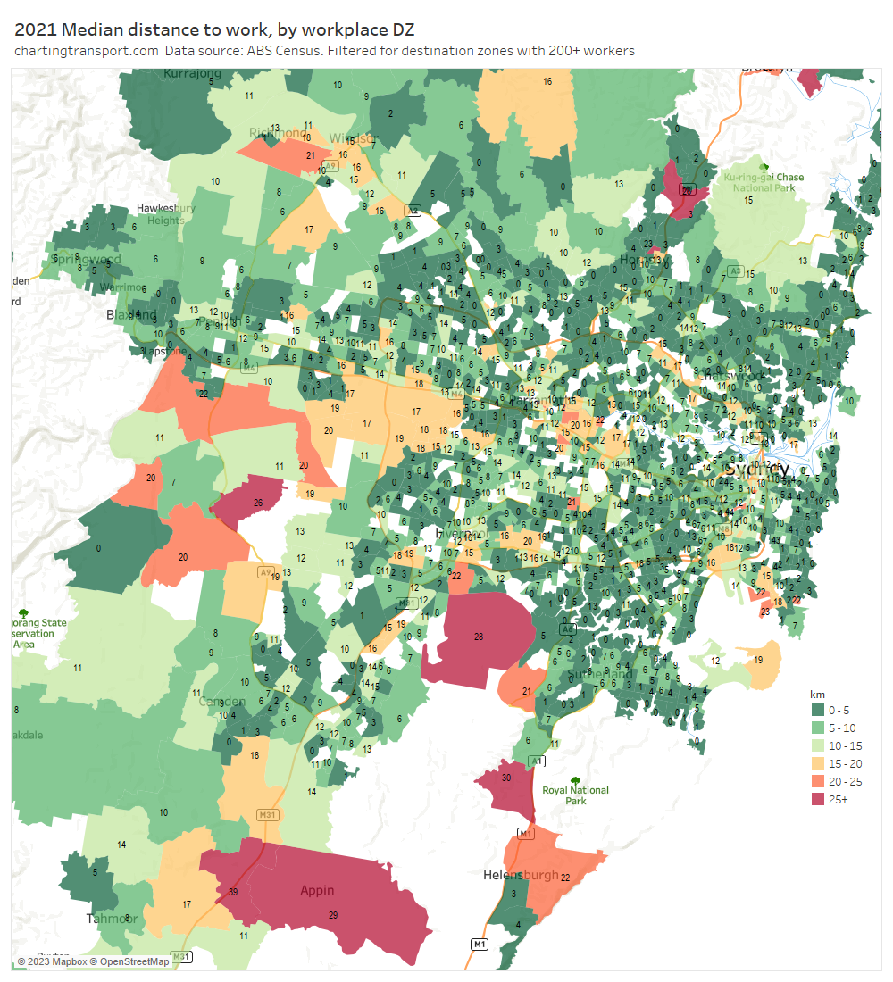
Unlike Melbourne there were not large industrial areas with median distances over 20 km.
There were a few isolated pockets with long distances including Badgerys Creek (Western Sydney International Airport construction site), the Holsworthy Army Barracks, and Waterfall (maybe related to a rail depot).
Here’s the proportion of workers who were employed in central Sydney (including Sydney CBD, Haymarket, Millers Point, The Rocks):
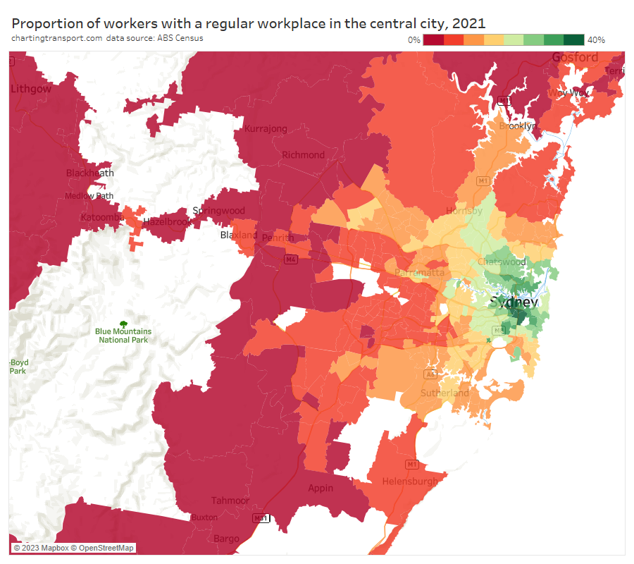
Like most cities, the influence of the central city declines with distance from the CBD. Some relative anomalies for their distance include:
- Outer north-western suburbs (including Baulkham Hills and Blacktown – North SA3s) have relatively high dependence on the Sydney CBD for jobs, and associated longer median commuter distances.
- Bankstown is relatively close to the Sydney CBD but with with many SA2s below 10% for central city workers, perhaps reflecting relative socio-economic disadvantage.
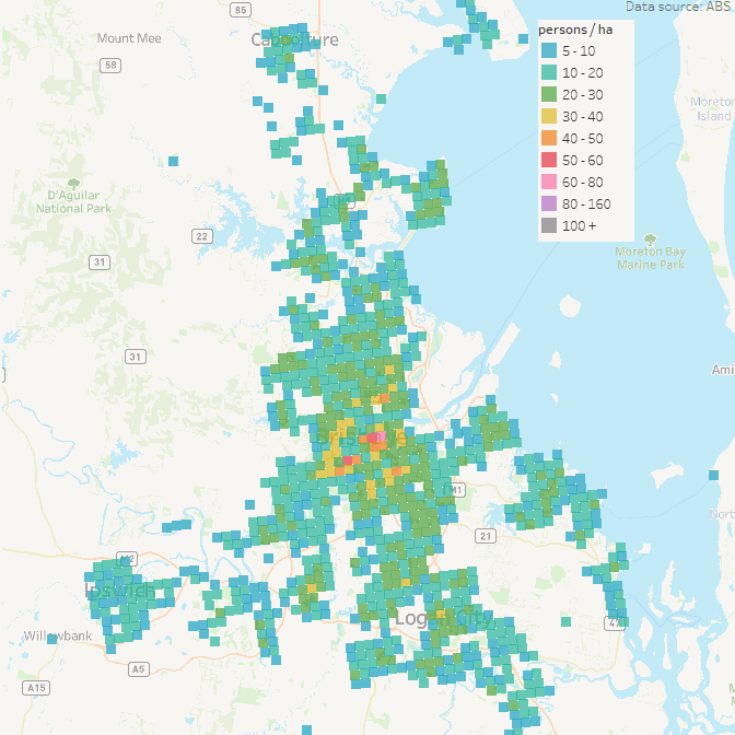
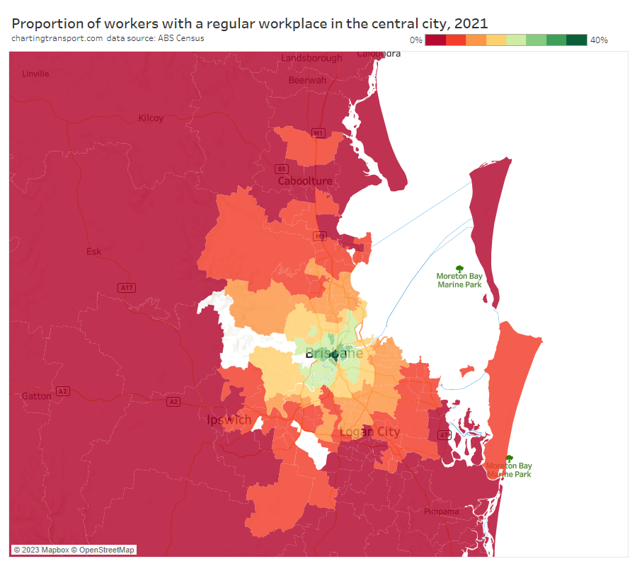
South East Queensland
First up, Brisbane medians distances by home SA1:
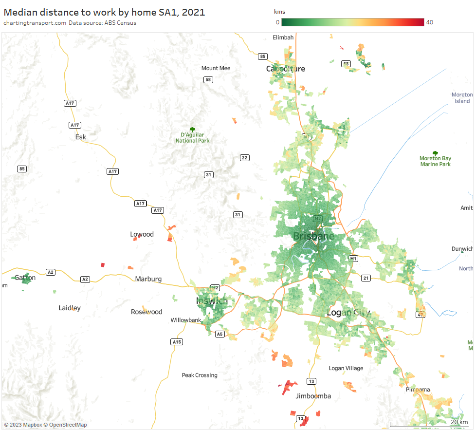
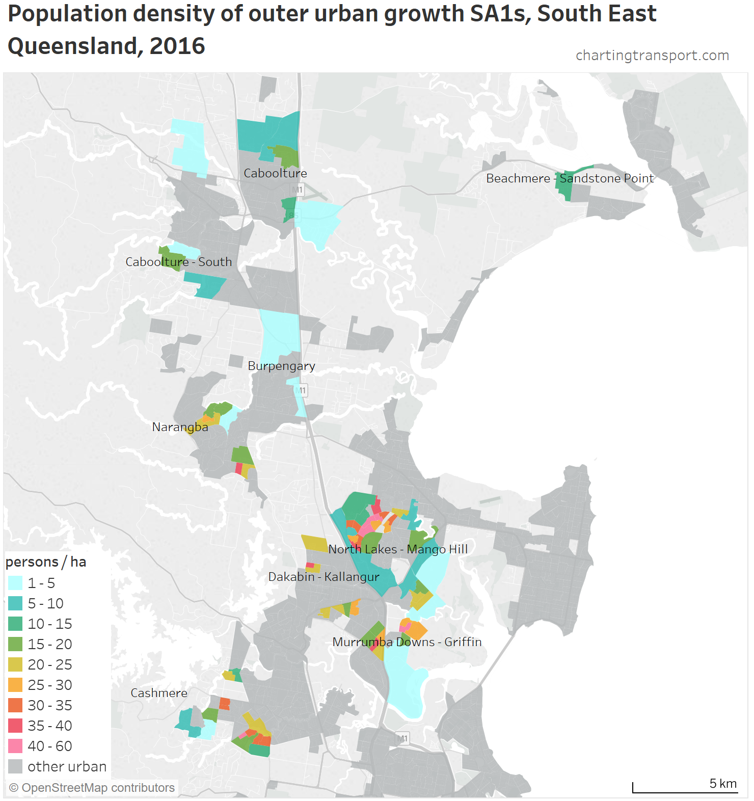
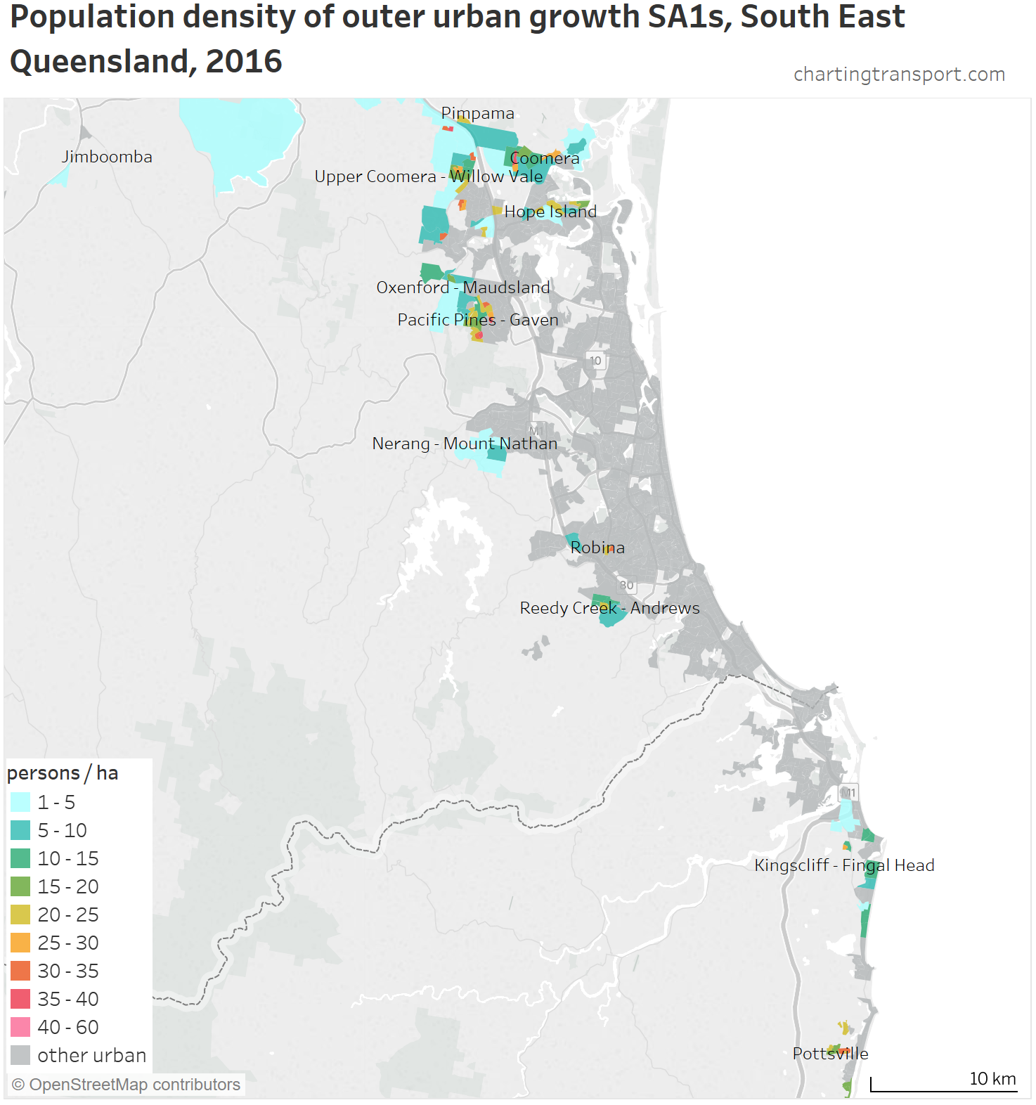
The longest median distances can be found in some low density suburban areas around Jimboomba, Yarrabilba, New Beith, Lowood, and the Lockyer Valley. Some relatively long median distances were also seen around Ormeau and Pimpama (suburbs between Brisbane and the Gold Coast), Springfield Lakes, parts of Caboolture, and Bribie Island. Looking at the urban fabric, these appear to be mostly relatively modern low density residential estates (rather than old towns). I’m not seeing many commuter towns around Brisbane.
Curiously there are relatively short median distances around the outer suburban area of Ipswich in the west (I’ll come back to this).
Here’s the Gold Coast:
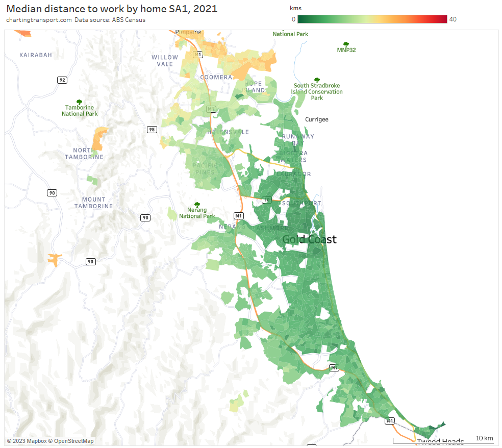
Median distances are mostly relatively short except for the northern fringe and around Tambourine Mountain in the hinterland. Jobs are much more distributed across the Gold Coast (see map below) compared to other cities dominated by one CBD, which might explain relatively short commute distances.

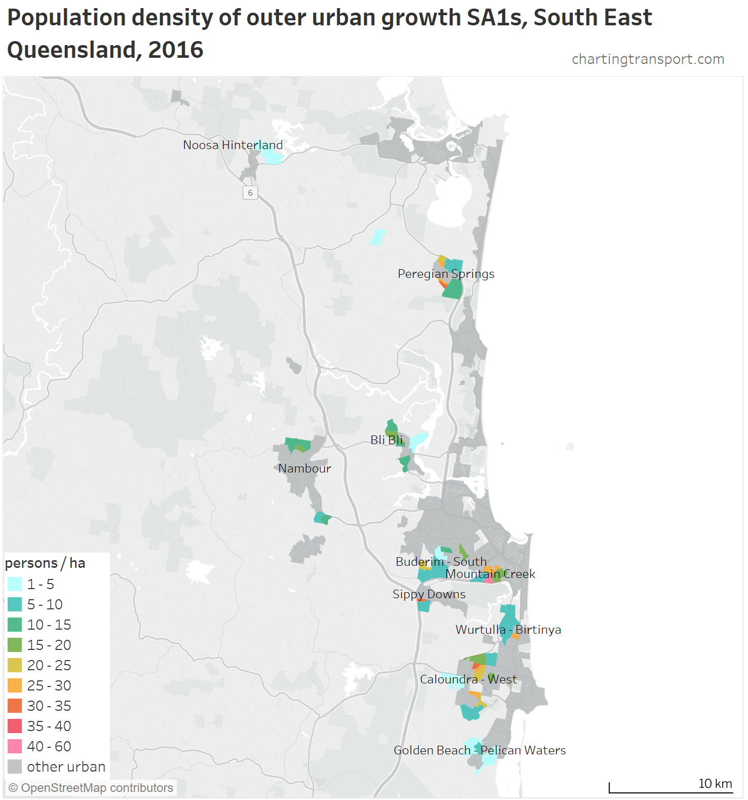
Here’s the Sunshine Coast:
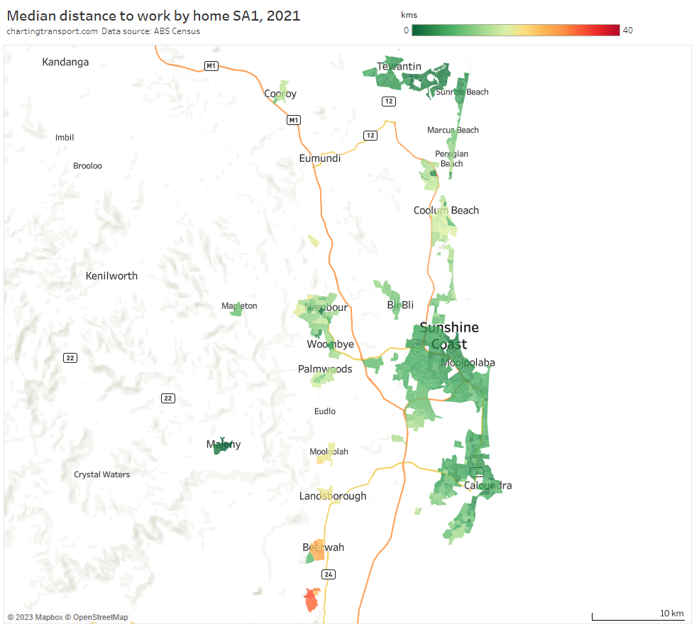
Distances are relatively short except for the Glass House Mountains and Beerwah to the south (probably containing commuters to Brisbane and the Sunshine Coast).
Here’s how South East Queensland looks for jobs to workers ratio:
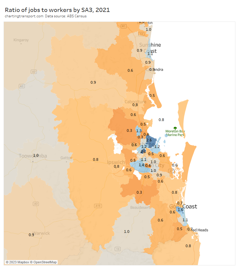
You can see surpluses of jobs in the central parts of Brisbane, the Gold Coast and the Sunshine Coast.
The outer suburban Ipswich area comes in surprisingly high at 0.8, which almost certainly explains the relatively shorter distances to work found in the area. I’m not very familiar with Brisbane’s urban history, but the presence of so many jobs in the Ipswich area is probably saving a fair amount commuting distance and taking some pressure of the transport network.
Jimboomba and The Hills District had a ratio as low as 0.3. Jimboomba’s low density, fragmented urban structure, lack of local jobs, and remoteness from the main Brisbane urban area likely explains the very long median distances to work, and likely high levels of car dependency.
Here are median distances to work by workplace DZs for the Brisbane area:
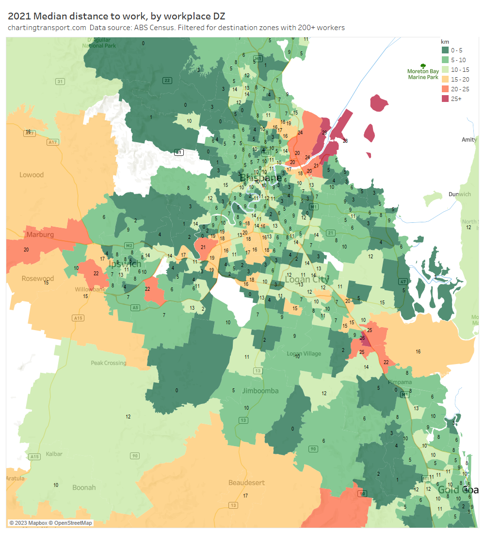
Long distances were seen around Brisbane Airport and the Port of Brisbane (24-25 km, both relatively remote from residential areas), the Yatala industrial areas on Brisbane’s outer south (25-26 km), Wacol (21 km, which is dominated by correctional facilities), Swanbank (22 km, dominated by power stations), and the RAAF Amberley air base in Rosewood (22 km).
Here is map showing the proportion of workers who worked in “central Brisbane” (defined as the Brisbane CBD plus Spring Hill SA2):
There aren’t huge anomalies by distance. But I might perhaps call out New Beith in the south, Elimbah in the north, and North Stradbroke Island in the east as relative outliers with not-so-low (5-10%) percentages working in central Brisbane. You can also see the Ipswich area had a low dependence on central Brisbane for employment, consistent with the relatively high rate of job self-sufficiency.
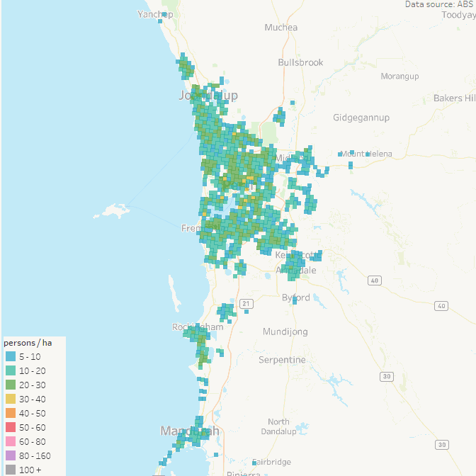
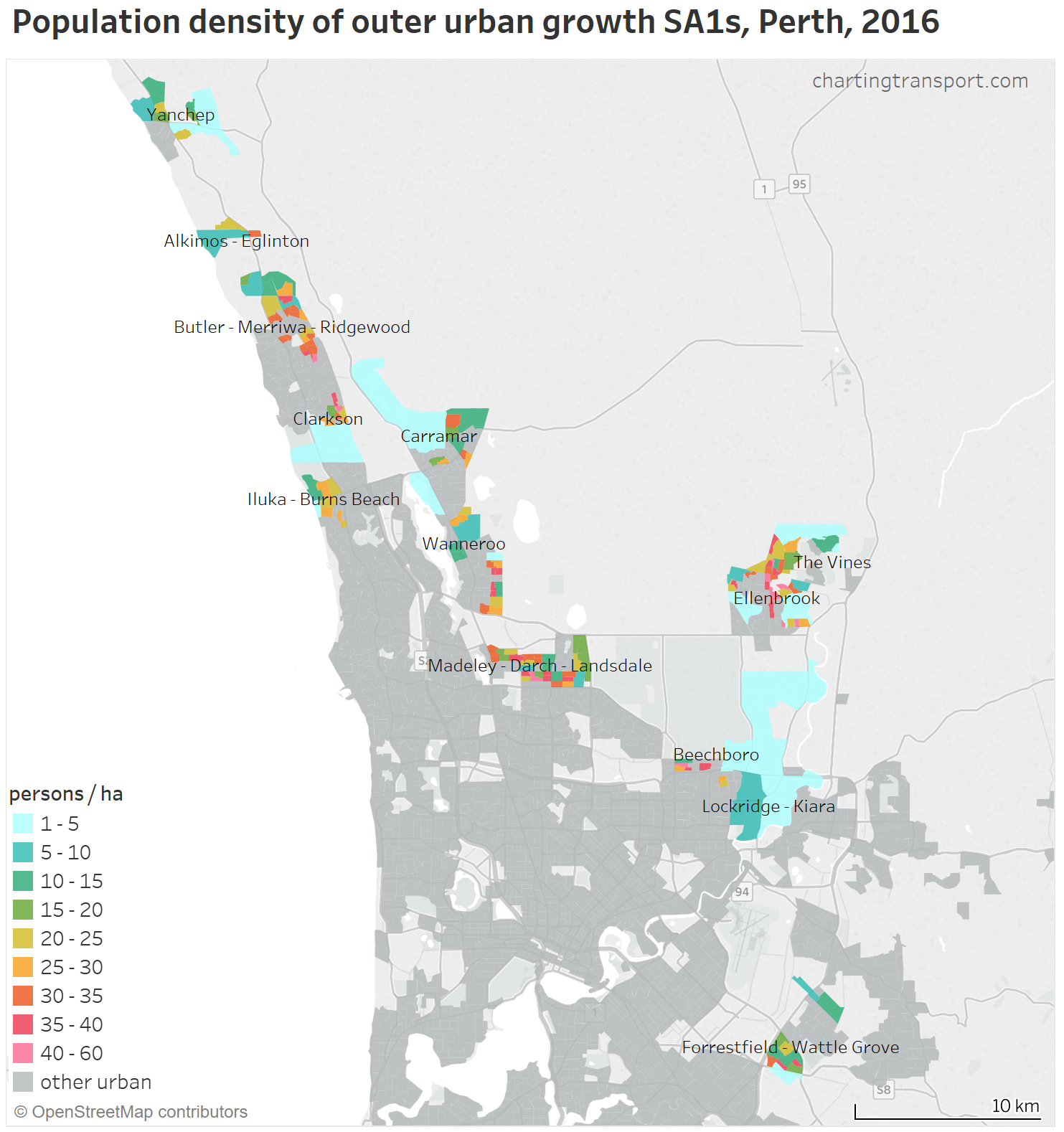
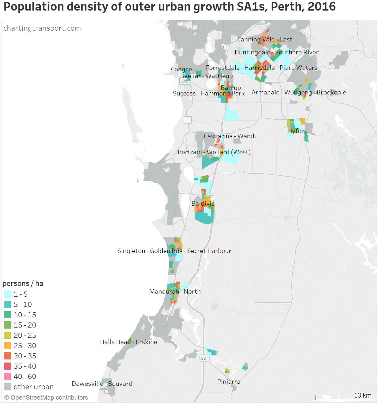
Perth
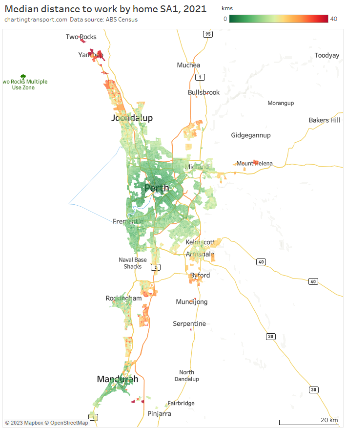
Perth has the longest median distance to work of all capital cities, and you can see many suburbs with relatively long distances, most acutely in the far-north around Two Rocks and Yanchep (several SA1s having a median above 40 km) and Yunderup (between Mandurah and Pinjarra in the south). Long median distances are seen north of Joondalup, throughout the satellite Ellenbrook region in the north-east, in Mount Helena and other hills towns to the east, around Byford in the south-east, around Wellard and Baldivis in the south, and in coastal areas between Rockingham and Mandurah.
I should point out that the map only includes Greater Perth SA1s. The SA2 of Chittering to the north east of Perth (including Muchea and Bindoon) has a median distance to work of 46 km, and 54% of its workers worked in Greater Perth (to which is it connected by a freeway). It contains quite a few very low density rural-living residential areas.
Here’s the jobs to worker ratio map:
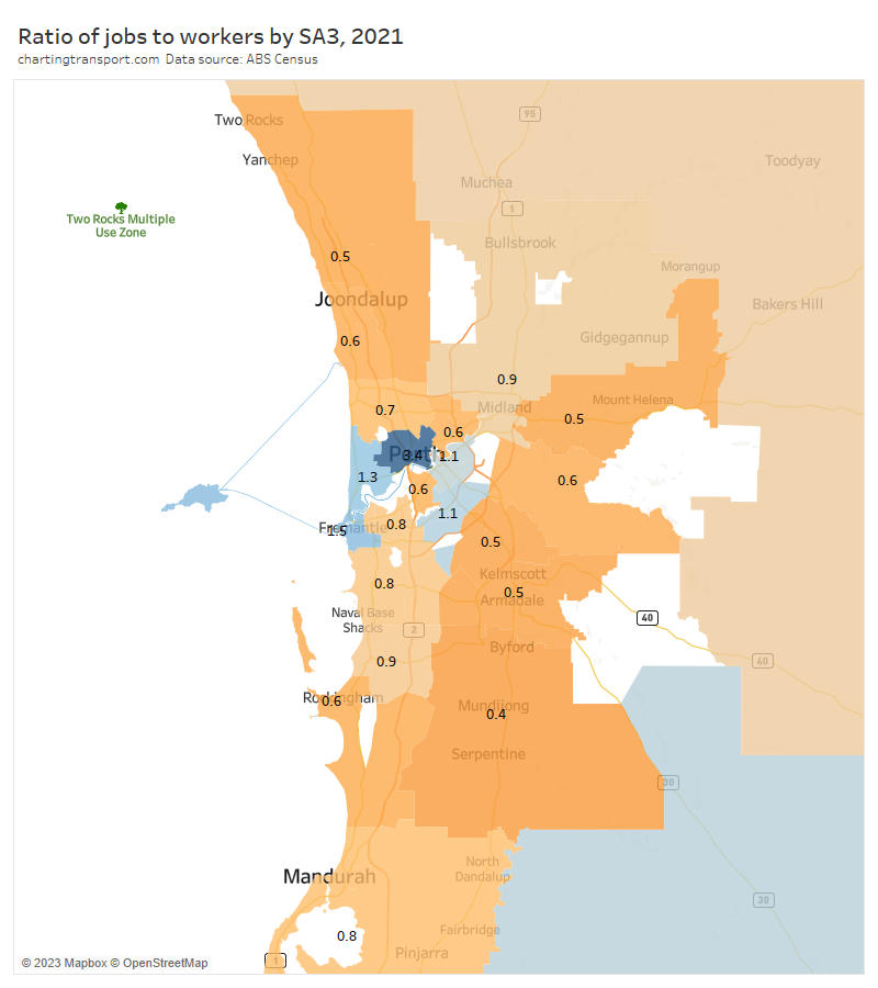
There were very low ratios in the outer northern, eastern, and south-eastern suburbs, which explains the long median distances to work from these areas.
Here are median distances to work by workplace destination zones:

The longest medians were seen for Perth Airport and around the Kwinana industrial areas. Other destination zones with long distances are rural areas outside of Perth (not unexpected), plus Wadjemup (Rottnest Island) where distances are obviously not on-road but imputed to be 1.3 times the straight line distance. Many workers are likely to commute by ferry from Perth.
Here’s the proportion of workers who work in central Perth (defined as including the CBD, Northbridge and East Perth):

The dependence on central Perth extends a fair way into the jobs-poor northern suburbs. Both the northern suburbs train line and the Mitchell Freeway have been extended several times as the urban area has expanded, perhaps a case of transport-driven sprawl.
The CBD’s influence also extends a fair distance south including Wellard and Baldivis that have relatively long median distances to work (and are closer to the Kwinana Freeway than the Mandurah rail line).
Adelaide
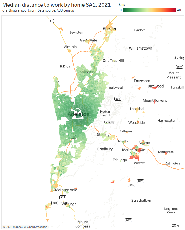
Median distances to work were relatively short for most of the main contiguous urban area of Adelaide. Higher medians were seen in the detached urban areas of Gawler in the north, Aldinga Beach in the south, and many Adelaide Hills towns (particularly outer parts of Mount Barker).
Here is the jobs to workers ratio map:

The outer suburbs on all sides had low ratios and hence longer median distances to work.
Here are median distances to workplaces by destination zone:
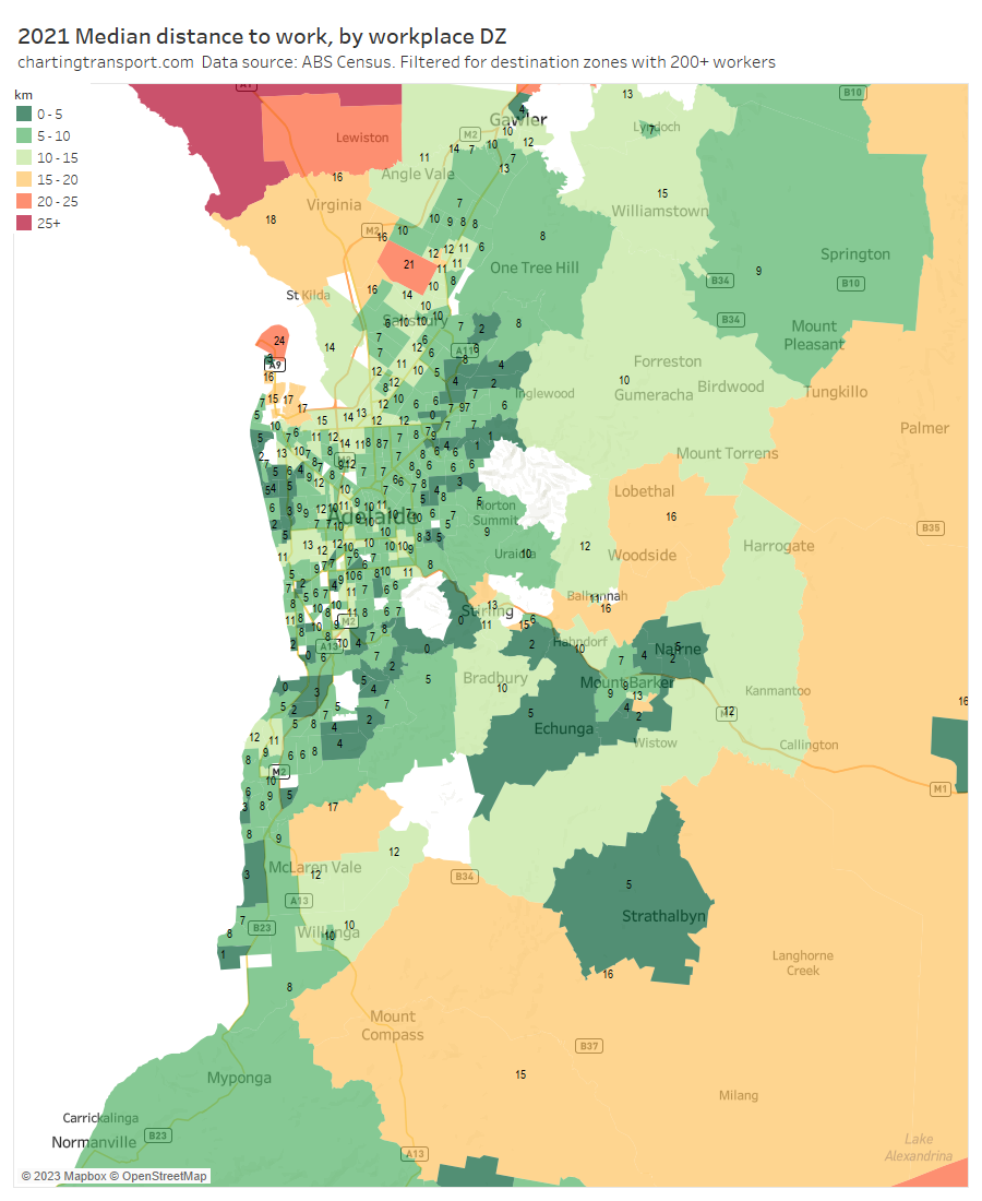
Median distances are relatively short for most workplace areas with the relatively urban exceptions of North Haven / Outer Harbour (at the tip of a peninsula), and the RAAF Edinburgh air base in the north.
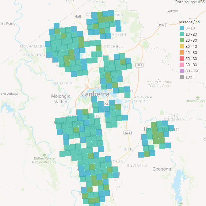
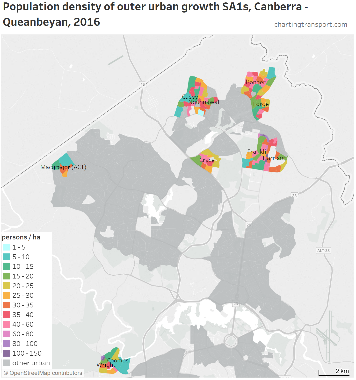
Canberra

Most areas of Canberra had median distances under 20km, except around Banks in the far south, and Googong to the south-east (over the border in New South Wales, where 73% of workers work in the ACT).
I’ve previously described towns with a very long median distance as commuter towns – and for Canberra this would include Murrumbateman, Gundaroo, Bungendore, and Collector.
Here is the jobs to worker ratio map for SA3s:
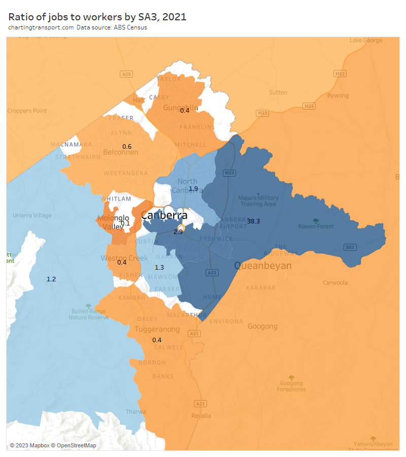
Canberra East had a huge ratio – only 532 workers lived in that SA3 dominated by employment land uses. Low ratios were seen in Tuggeranong in the south, Gungahlin in the north, and Queanbeyan to the east (which had a ratio 0.5 and 71% of workers in the Queanbeyan SA2 worked in the ACT).
An extremely low ratio of 0.1 was seen around the Molonglo Valley, but this area is right next door to jobs rich areas of central Canberra.
The Young – Yass SA3 to the north west of Canberra came in at 0.7, unusually low for a regional area suggesting some dependence on Canberra for jobs. In fact 52% of workers in Yass Surrounds and 34% of the Yass township worked in the ACT. The town of Yass had median distances to work mostly under 5 km, however the 75th percentile distances to work in many parts of Yass was over 40 km.
Here are median distances to work for workplace destination zones:

The only urban area with relatively long workplace median distances was Canberra airport.
I’m not going to do as detailed analysis for the smaller cities that follow.
Hobart

The main urban areas of Hobart had relatively short distances, with outlying commuters towns such as New Norfolk, Brighton, Sorell, Dodges Ferry, Snug, and particularly South Arm showing much longer medians.
Newcastle / Central Coast / Hunter region
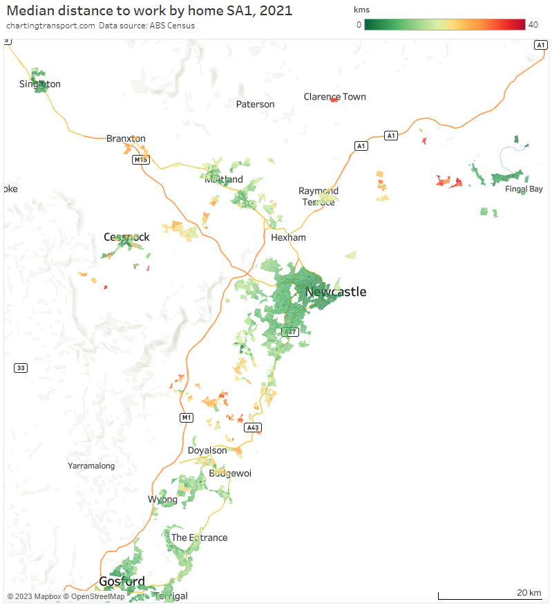
Longer median distances are seen at several small urban areas between Wyong and Newcastle, around Kurri Kurri – Abermain. Branxton, Clarence Town, Lemon Tree Passage, and Tanilba Bay. Singleton, Cessnock, and Nelson Bay have relatively short median distances and are likely less reliant on Newcastle for employment.
Wollongong
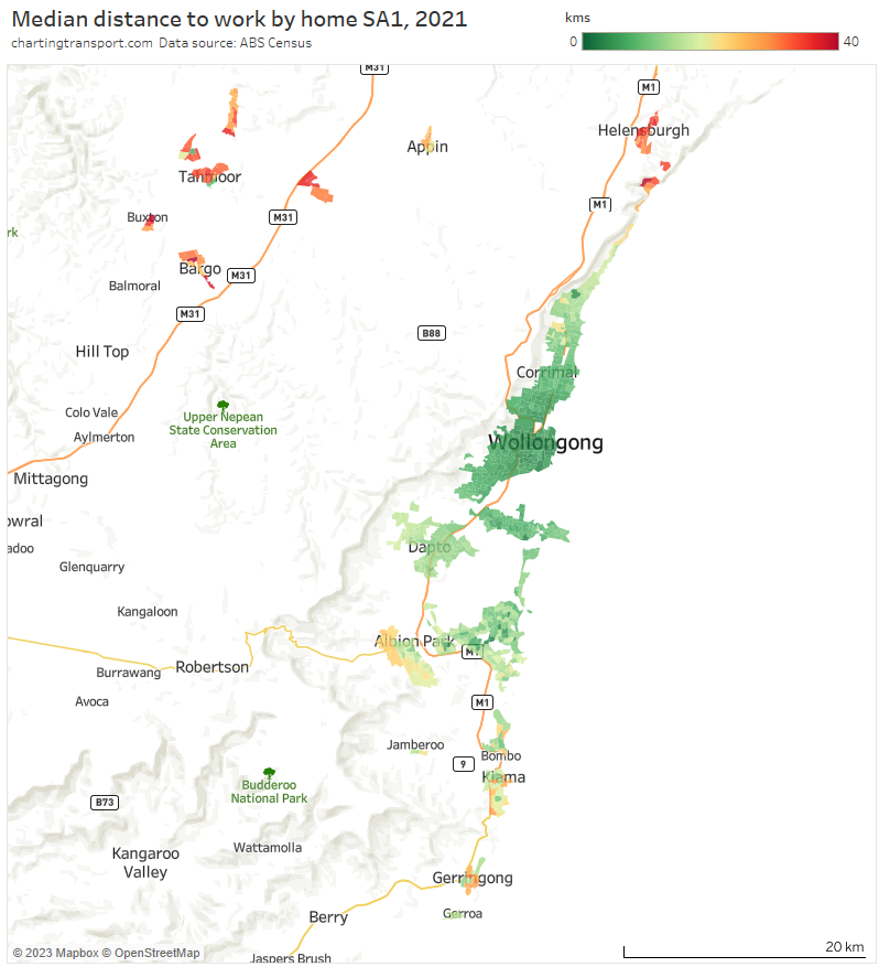
Note data is not shown for urban areas around Robertson and Mittagong.
Median distances were mostly relatively short, with exceptions in the north (Helensburgh) and south (Albion Park, Kiama, and Gerringong) of what is also a skinny coast-hugging urban settlement pattern.
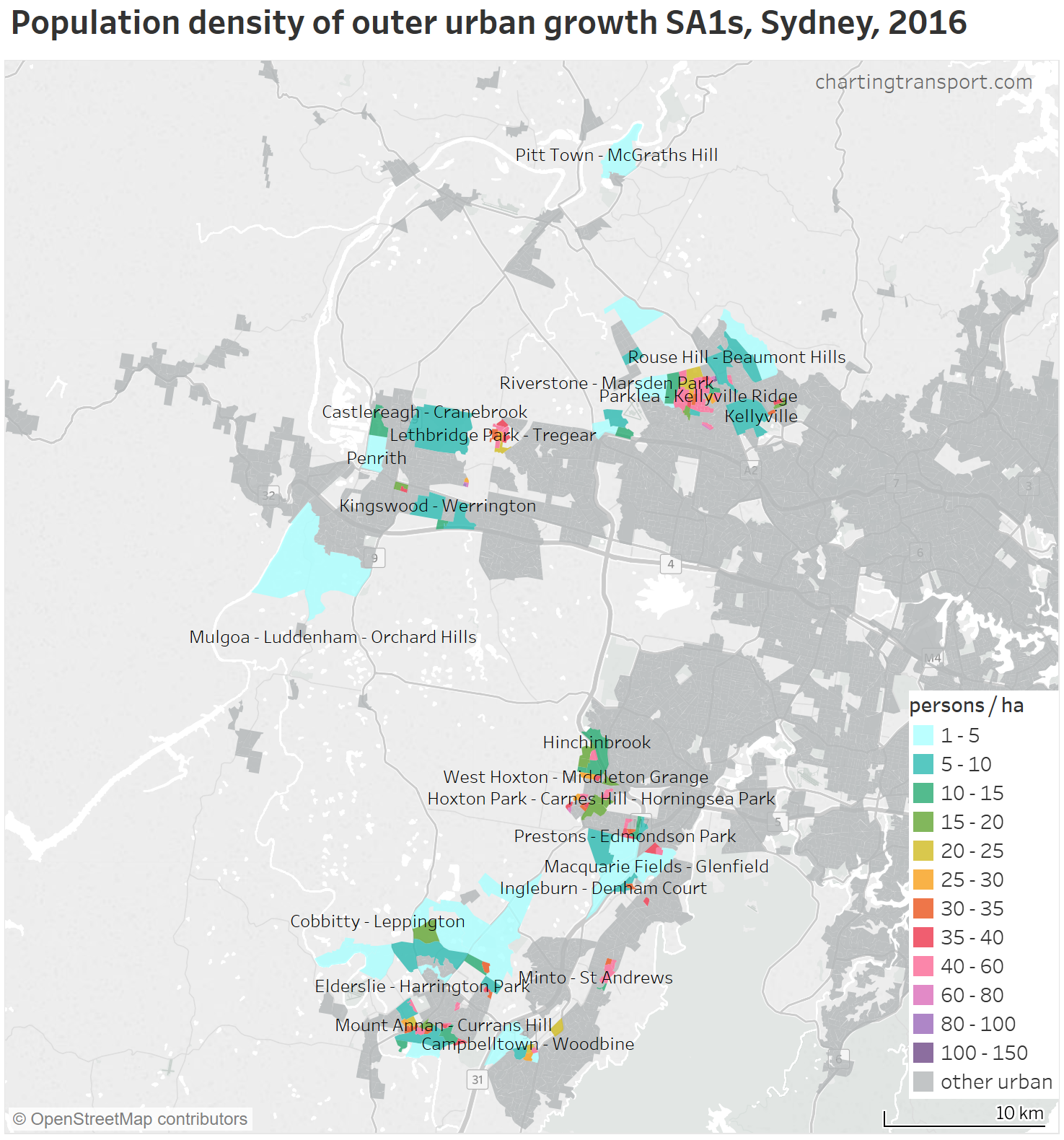
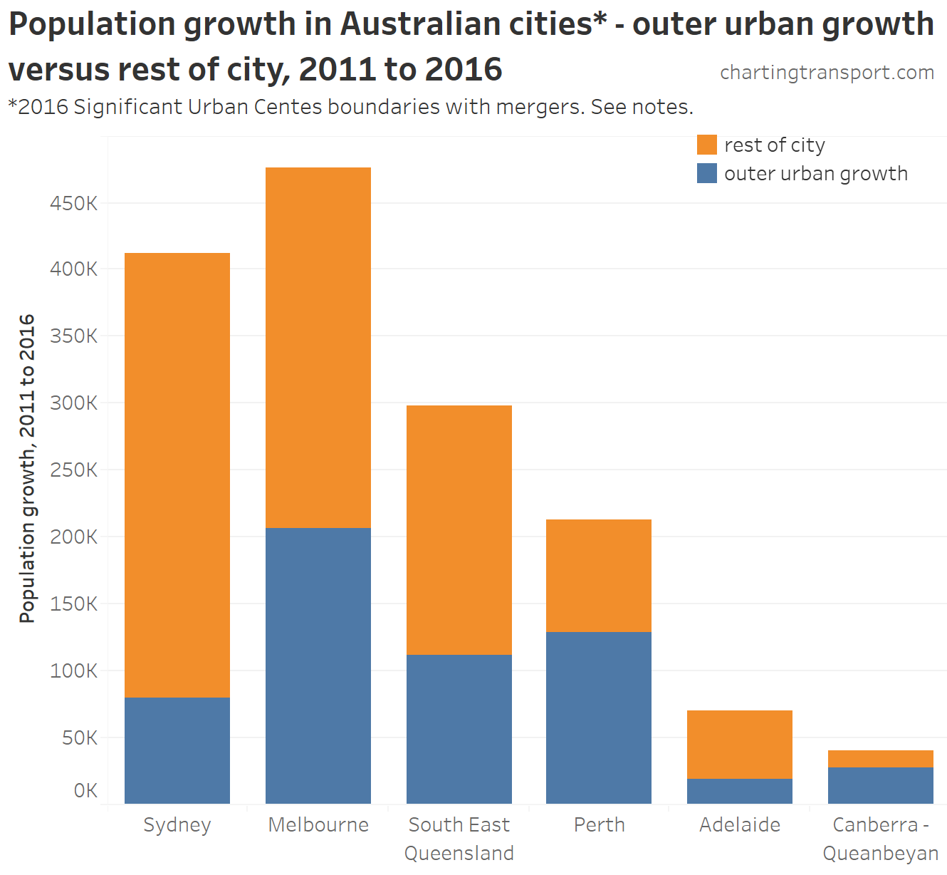
How do the urban growth areas of big cities compare?
For this analysis I’ve filtered for new (in 2021) outer urban growth SA1s, and calculated the population-weighted-average median distance to work of these SA1s aggregated to SA3 level (not a perfect calculation, but hopefully close enough).
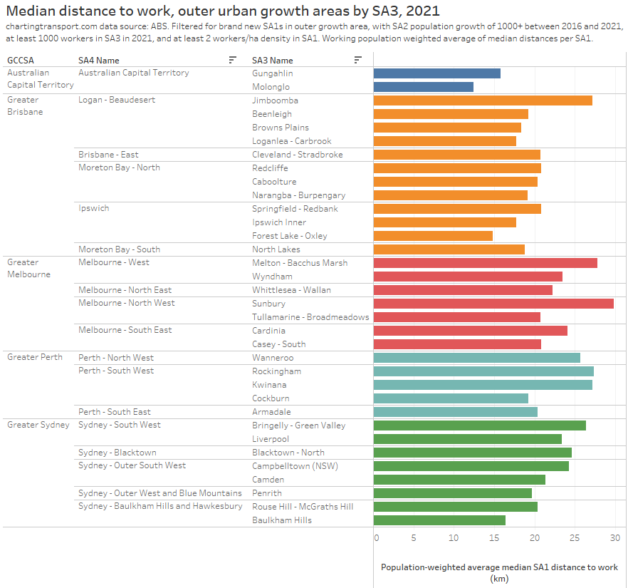
Note: The Tullamarine – Broadmeadows SA3 in Melbourne is perhaps poorly named – it actually includes Craigieburn and stretches north to Mickleham.
The outer urban growth SA3s with the longest median distances to work (perhaps call them commuter suburbs) were Sunbury in Melbourne’s north-west, followed by Melton – Bacchus Marsh in Melbourne’s west, Jimboomba south of Brisbane, Rockingham and Kwinana south of Perth, and Bringelly – Green Valley in Sydney’s west.
The outer urban growth SA3s with the shortest median distances to work included those around the smaller city of Canberra, the Ipswich region of western Brisbane, and the Baulkham Hills region of north-western Sydney. New residents in these areas will be generating fewer commuter kilometres to their city’s transport task (relative to other outer growth areas).
You might be wondering why Adelaide is missing from the above chart. It is a city with quite slow population growth and did not have enough growth in each SA3s to qualify with my filters.
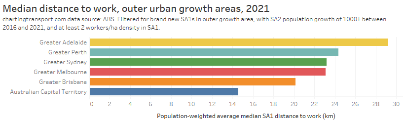
Here’s the same data aggregated up to city level, which shows Adelaide actually with the longest commute distances from outer growth areas, followed by Perth.
What can we take away from this city analysis?
Longer commute distances seem to be strongly associated with imbalances in the distribution of jobs and workers within cities, particularly where these imbalances stretch out over long distances (Perth being the classic example). That’s probably no great surprise to many readers.
So if a city wanted to reduce commuting distances (and therefore demand on its transport system) it could consider:
- slowing urban sprawl – particularly in corridors which already have worker to jobs imbalances and long commute distances,
- increasing residential densities around existing major employment clusters, and/or
- attempting to distribute more employment to outside the CBD – probably easier said than done, but Sydney has done it successfully with relatively high public transport mode share, while Canberra has done it with low public transport mode share (~12%) in town centres.


 Posted by chrisloader