[updated April 2020 with 2019 population data]
While Australian cities are growing outwards, densities are also increasing in established areas, and newer outer growth areas are some times at higher than traditional suburban densities.
So what’s the net effect – are Australian cities getting more or less dense? How has this changed over time? Has density bottomed out? And how many people have been living at different densities?
This post maps and measures population density over time in Australian cities.
I’ve taken the calculations back as far as I can with available data (1981), used the highest resolution population data available. I’ll discuss some of the challenges of measuring density using different statistical geographies along the way, but I don’t expect everyone will want to read through to the end of this post!
[This is a fully rewritten and updated version of a post first published November 2013]
Measuring density
Under traditional measures of density, you’d simply divide the population of a city by the area of the metropolitan region.
At the time of writing Wikipedia said Greater Sydney’s density was just 4.23 people per hectare (based on its Greater Capital City Statistical Area). To help visualise that, a soccer pitch is about 0.7 hectares. So Wikipedia is saying the average density of Sydney is roughly about 3 people per soccer field. You don’t need to have visited Sydney to know that is complete nonsense (don’t get me wrong, I love Wikipedia, but it really need to use a better measure for city density!).
The major problem with metropolitan boundaries – in Australia we use now Greater Capital City Statistical Areas – is that they include vast amounts of rural land and national parks. In fact, in 2016, at least 53% of Greater Sydney’s land area had zero population. That statistic is 24% in Melbourne and 14% in Adelaide – so there is also no consistency between cities.
Below is a map of Greater Sydney (sourced from ABS), with the blue boundary representing Greater Sydney:
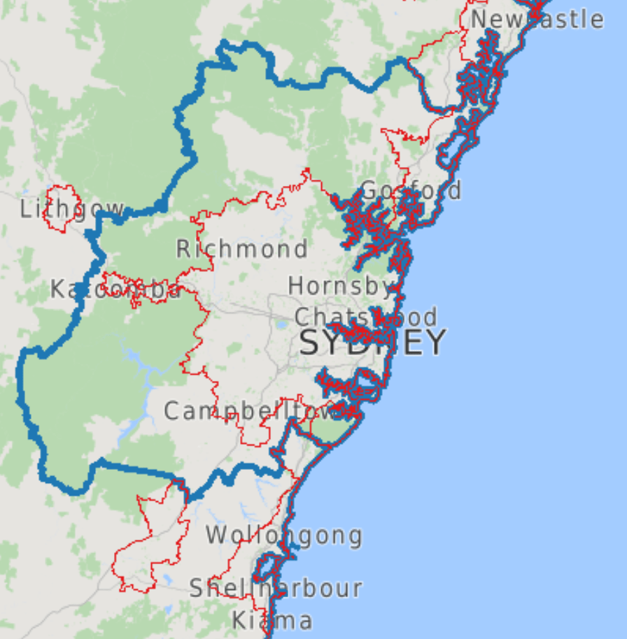
One solution to this issue is to try to draw a tighter boundary around the urban area, and in this post I’ll also use Significant Urban Areas (SUAs) that do a slightly better job (they are made up of SA2s). The red boundaries on the above map show SUAs in the Sydney region.
However SUAs they still include large parks, reserves, industrial areas, airports, and large-area partially-populated SA2s on the urban fringe. Urban centres are slightly better (they are made of SA1s) but population data for these is only available in census years, the boundaries change with each census, the drawing of boundaries hasn’t been consistent over time, they include non-residential land, and they split off most satellite urban areas that are arguably still part of cities, even if not part of the main contiguous urban area.
Enter population-weighted density (PWD) which I’ve looked at previously (see Comparing the densities of Australian, European, Canadian, and New Zealand cities). Population-weighted density takes a weighted average of the density of all parcels of land that make up a city, with each parcel weighted by its population. One way to think about it is the average density of the population, rather than the average density of the land.
So parcels of land with no population don’t count at all, and large rural parcels of land that might be inside the “metropolitan area” count very little in the weighted average because of their relatively small population.
This means population-weighted density goes a long way to overcoming having to worry about the boundaries of the “urban area” of a city. Indeed, previously I have found that removing low density parcels of land had very little impact on calculations of PWD for Australian cities (see: Comparing the residential densities of Australian cities (2011)). More on this towards the end of this post.
Calculations of population-weighted density can also answer the question about whether the “average density” of a city has been increasing or decreasing.
But… measurement geography matters
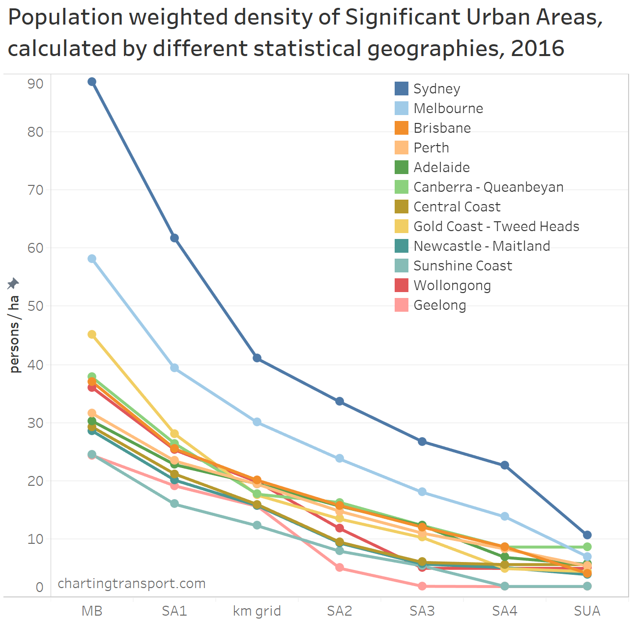
One of the pitfalls of measuring population weighted density is that it very much depends on the statistical geography you are using.
If you use larger geographic zones you’ll get a lower value as most zones will include both populated and unpopulated areas.
If you use very small statistical geography (eg mesh blocks) you’ll end up with a lot fewer zones that are partially populated – most will be well populated or completely unpopulated, and that means your populated weighted density value will be much higher, and your measure is more looking at the density of housing areas.
To illustrate this, here’s an animated map of the Australian Capital Territory’s 2016 population density at all of the census geographies from mesh block (MB) to SA3:
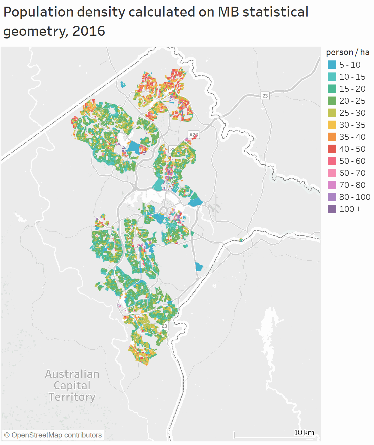
Only at the mesh block and SA1 geographies can you clearly see that several newer outer suburbs of Canberra have much higher residential densities. The density calculation otherwise gets washed out quickly with lower resolution statistical geography, to the point where SA3 geography is pretty much useless as so much non-urban land is included (also, there are only 7 SA3s in total). I’ll come back to this issue at the end of the post.
Even if you have a preferred statistical geography for calculations, making international comparisons is very difficult because few countries will following the same guidelines for creating statistical geography. Near enough is not good enough. Worse still, statistical geography guidelines do not always result in consistently sized areas within a country (more on that later).
We need an unbiased universal statistical geography
Thankfully Europe and Australia have adopted a square kilometre grid geography for population estimates, which makes international PWD comparisons readily possible. Indeed I did one a few years ago looking at ~2011 data (see Comparing the densities of Australian, European, Canadian, and New Zealand cities).
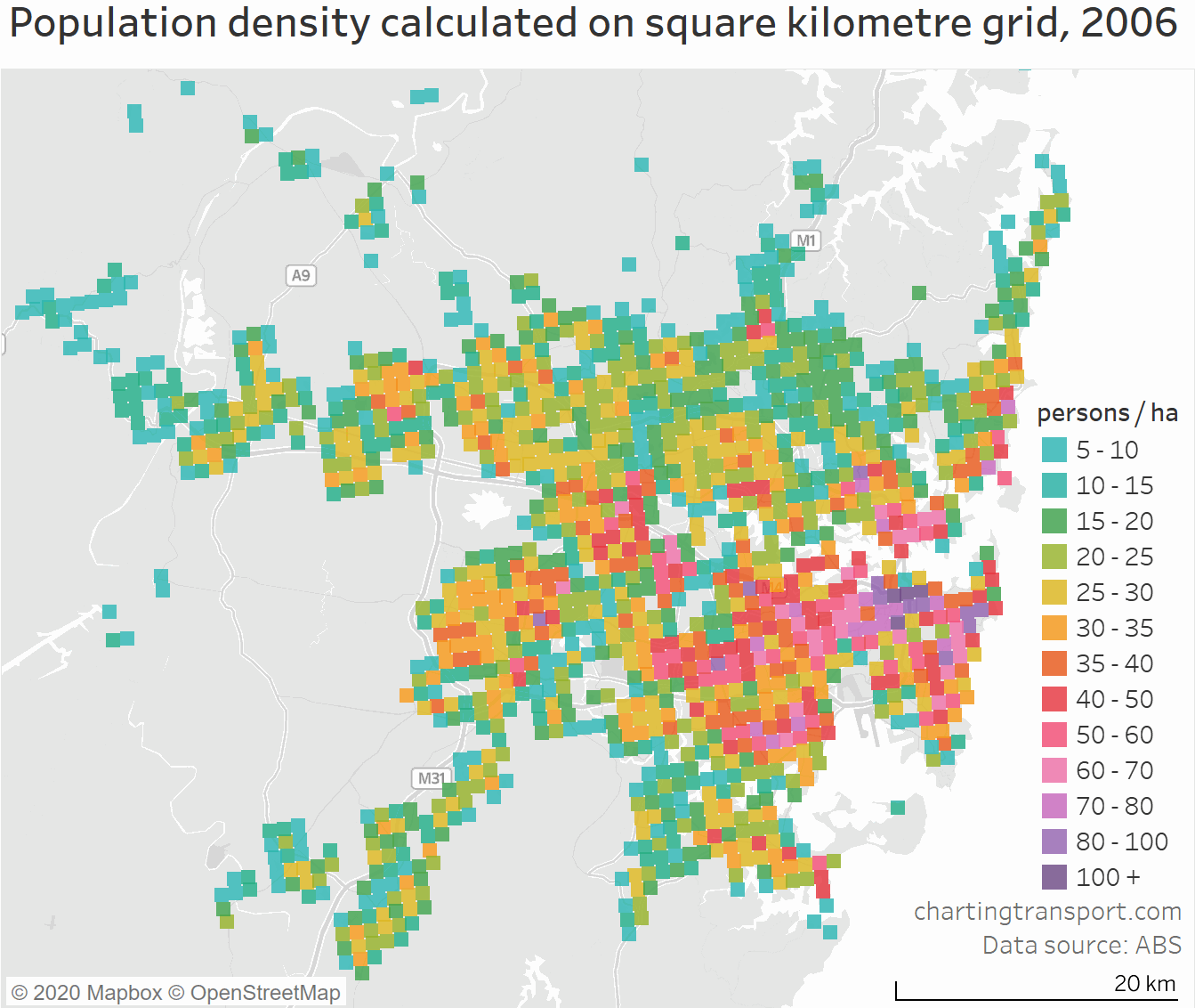
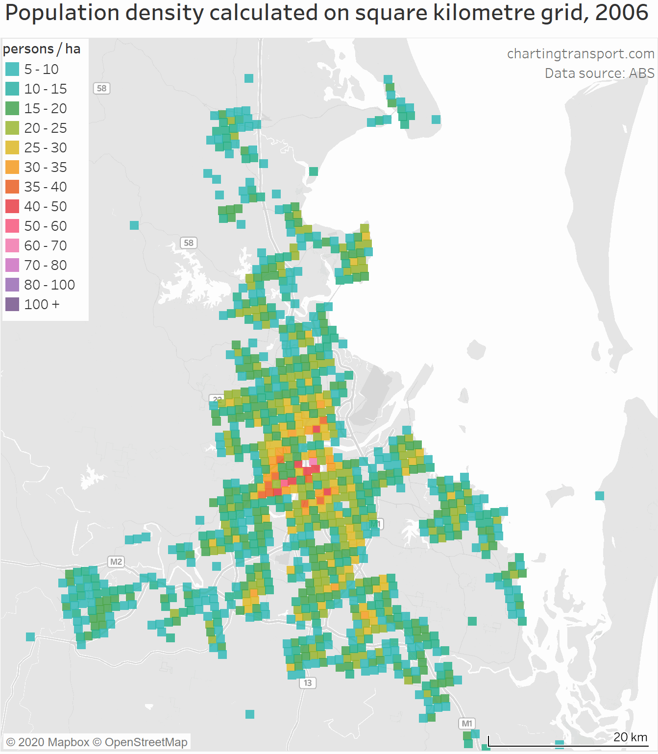
This ABS is now providing population estimates on a square km grid for every year from 2006.
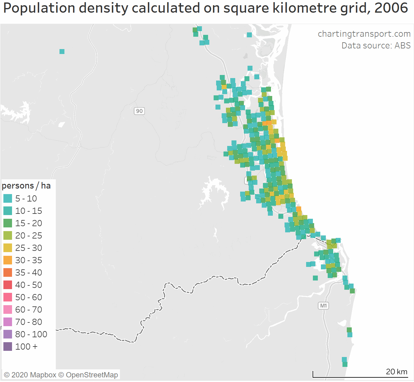
Here is what Melbourne’s estimated population density looks like on a km square grid, animated from 2006 to 2019:

The changes over time are relatively subtle, but if you watch the animation several times you’ll see growth – including relatively high density areas emerging on the urban fringe.
It’s a bit chunky, and it’s a bit of a matter of luck as to whether dense urban pockets fall entirely within a single grid square or on a boundary, but there is no intrinsic bias.
There’s also an issue that many grid squares will contain a mix of populated and non-populated land, particularly on the urban fringe (and a similar issue on coastlines). In a large city these will be in the minority, but in smaller cities these squares could make up a larger share of the total, so I think we need to be careful about this measure in smaller cities. I’m going to arbitrarily draw the line at 200,000 residents.
How are Australian cities trending for density using square km grid data? (2006 to 2019)
So now that we have an unbiased geography, we can measure PWD for cities over time.
The following chart is based on 2016 Significant Urban Area boundaries (slightly smaller than Greater Capital City Statistical Areas but also they go across state borders as appropriate for Canberra – Queanbeyan and Gold Coast – Tweed).

Technical notes: You cannot perfectly map km squares to Significant Urban Areas. I’ve included all kilometre grid squares which have a centroid within the 2016 Significant Urban Area boundaries (with a 0.01 degree tolerance added – which is roughly 1 km). Hobart appears only from 2018 because that’s when it crossed the 200,000 population threshold.
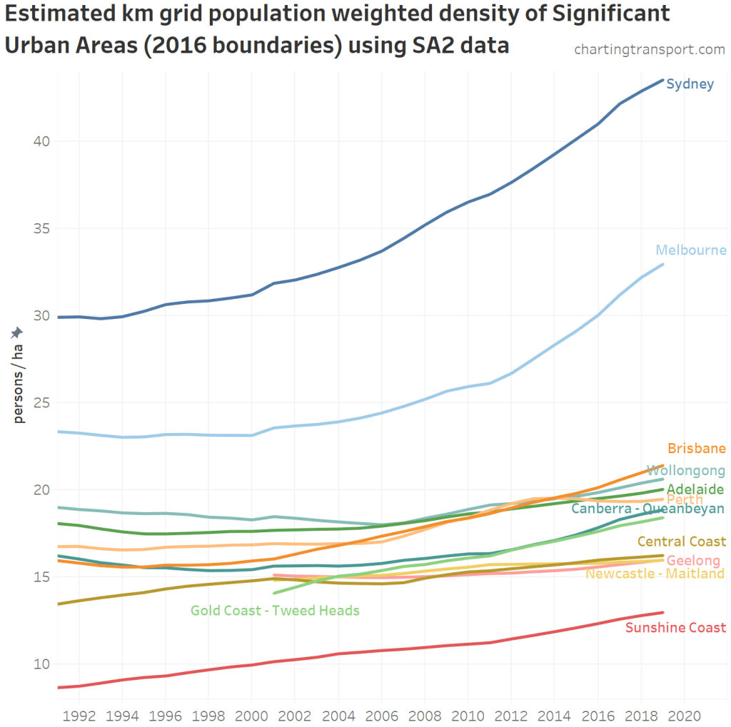
The above trend chart was a little congested for the smaller cities, so here is a zoomed in version without Sydney and Melbourne:

You can see most cities getting denser at various speeds, although Perth, Geelong, and Newcastle have each flat-lined for a few years.
Perth’s population growth slowed at the end of the mining boom around 2013, and infill development all but dried up, so the overall PWD increased only 0.2 persons/ha between 2013 and 2018.
Canberra has seen a surge in recent years, probably due to high density greenfield developments we saw above.
How is the mix of density changing? (2006 to 2019)
Here’s a look at the changing proportion of the population living at different densities for 2006-2019 for the five largest Australian cities, using square km grid geography:

It looks very much like the Melbourne breakdown bleeds into the Sydney breakdown. This roughly implies that Melbourne’s density distribution is on trend to look like Sydney’s 2006 distribution in around 2022 (accounting the for white space). That is, Melbourne’s density distribution is around 16 years behind Sydney’s on recent trends. Similarly, Brisbane looks a bit more than 15 years behind Melbourne on higher densities.
In Perth up until 2013 there was a big jump in the proportion of the population living at 35 persons / ha or higher, but then things peaked and the population living at higher densities declined, particularly as there was a net migration away from the inner and middle suburbs towards the outer suburbs.
Here’s the same for the next seven largest cities:
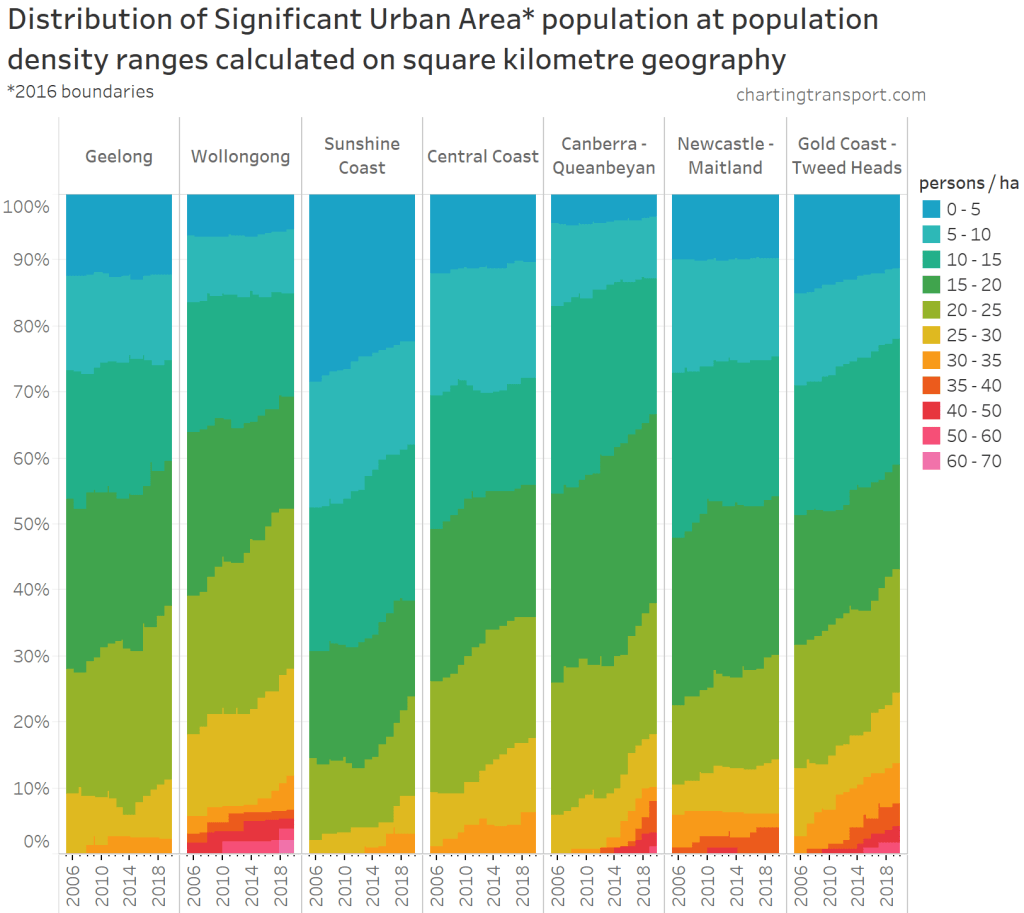
Of the smaller cities, densities higher than 35 persons/ha are only seen in Gold Coast, Newcastle, Wollongong and more recently in Canberra.
The large number of people living at low densities in the Sunshine Coast might reflect suburbs that contain a large number of holiday homes with no usual residents (I suspect the dwelling density would be relatively higher). This might also apply in the Gold Coast, Central Coast, Geelong (which actually includes much of the Bellarine Peninsula) and possibly other cities.
Also, the Central Coast and Sunshine Coast urban patterns are highly fragmented which means lots of part-urban grid squares, which will dilute the PWD of these “cities”.
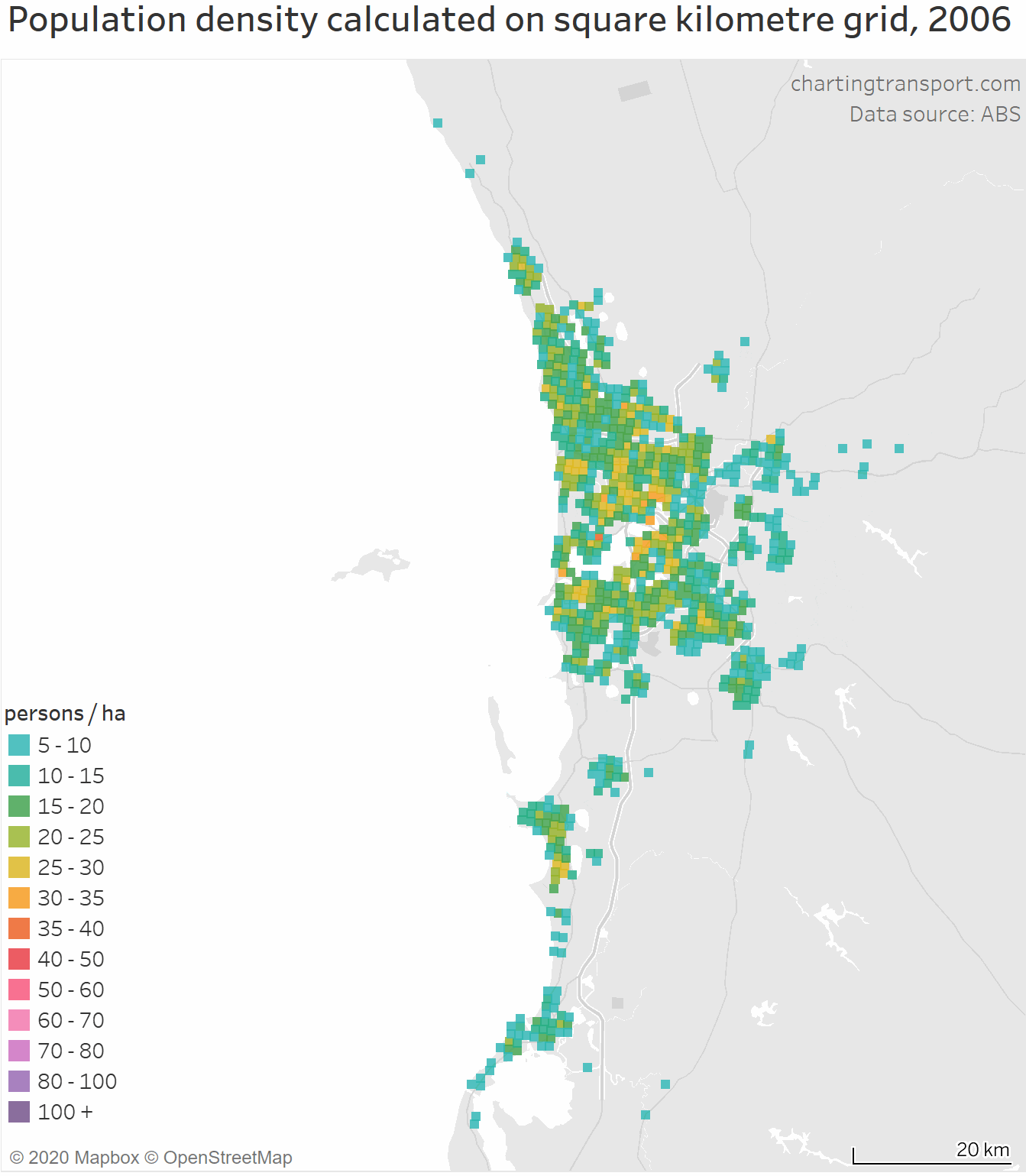
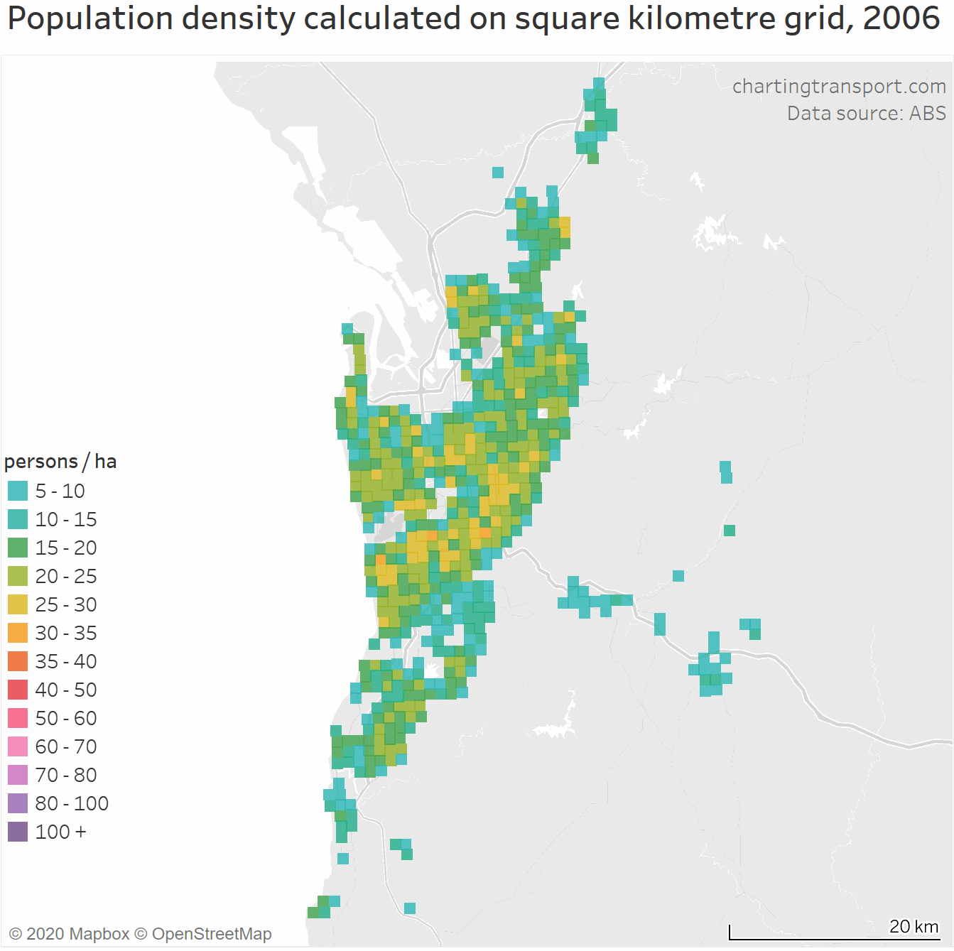
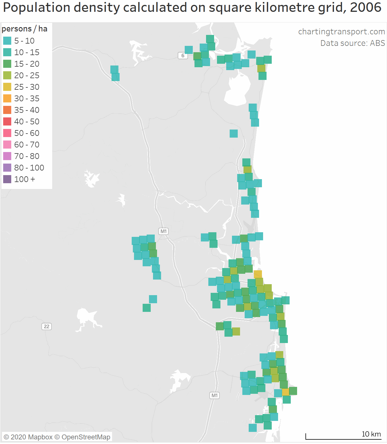
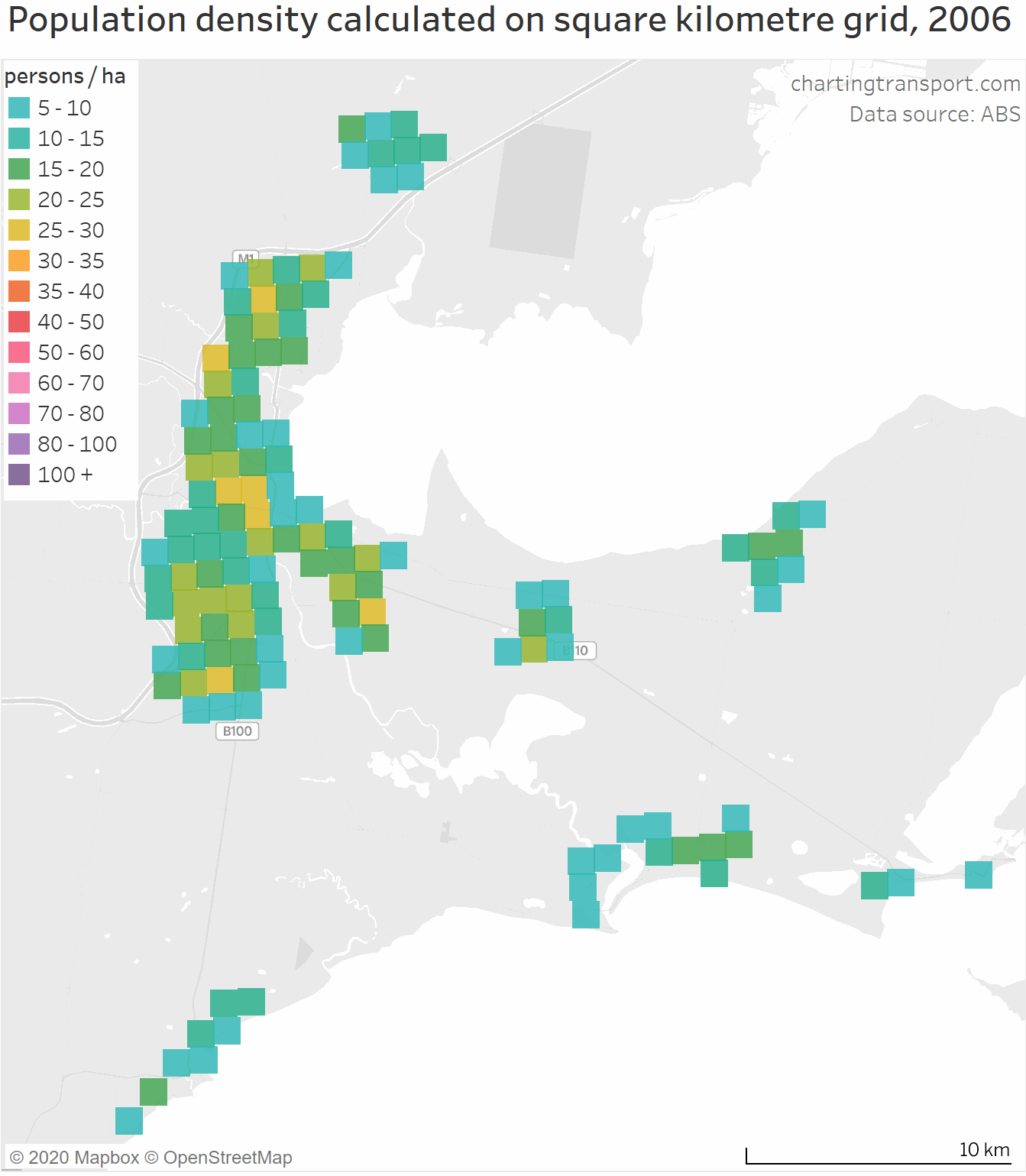
Because I am sure many of you will be interested, here are animated maps for these cities:
Sydney
Brisbane
Perth
Adelaide
Canberra – Queanbeyan

Sunshine Coast
Gold Coast
Newcastle – Maitland and Central Coast
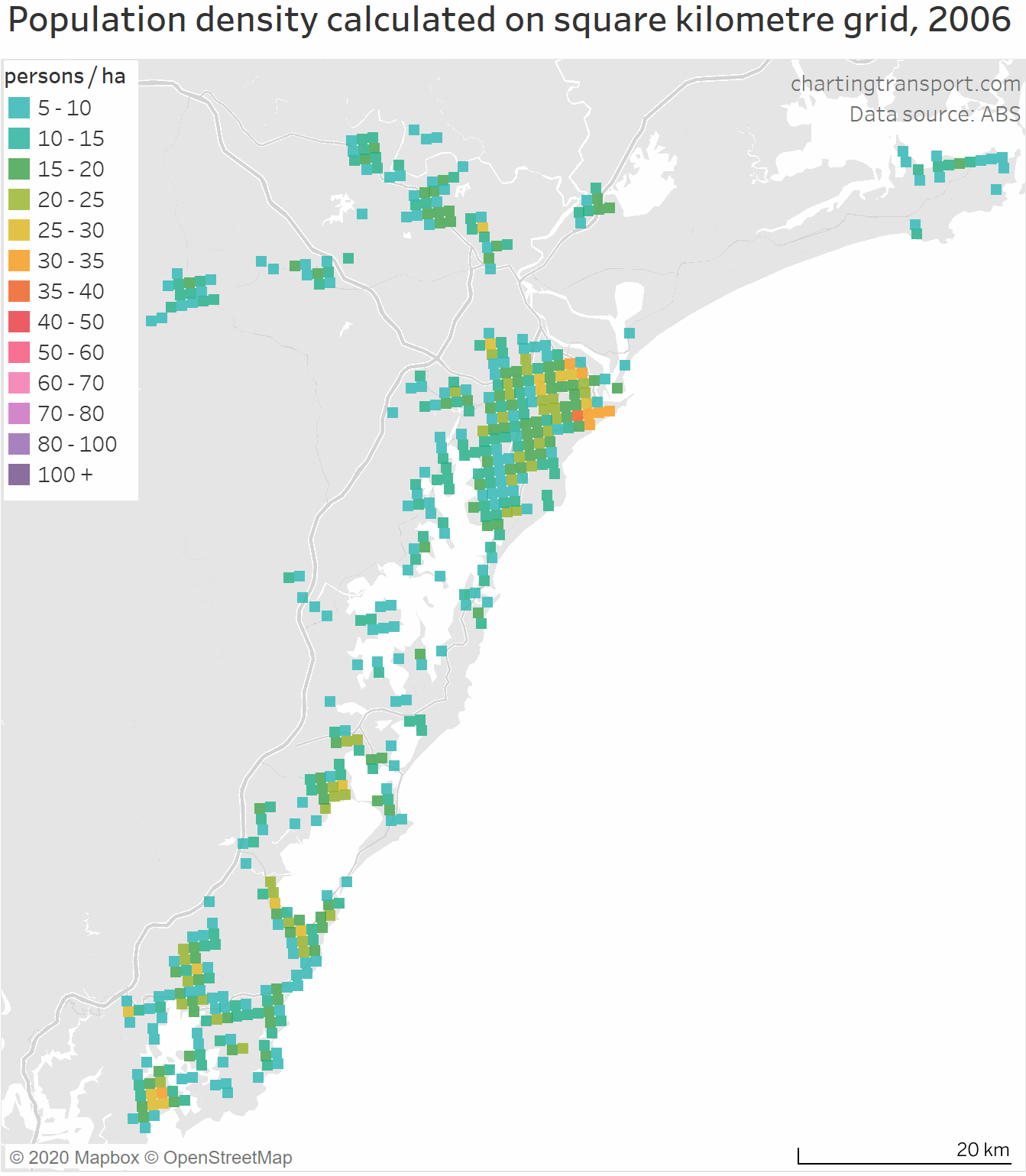
Wollongong
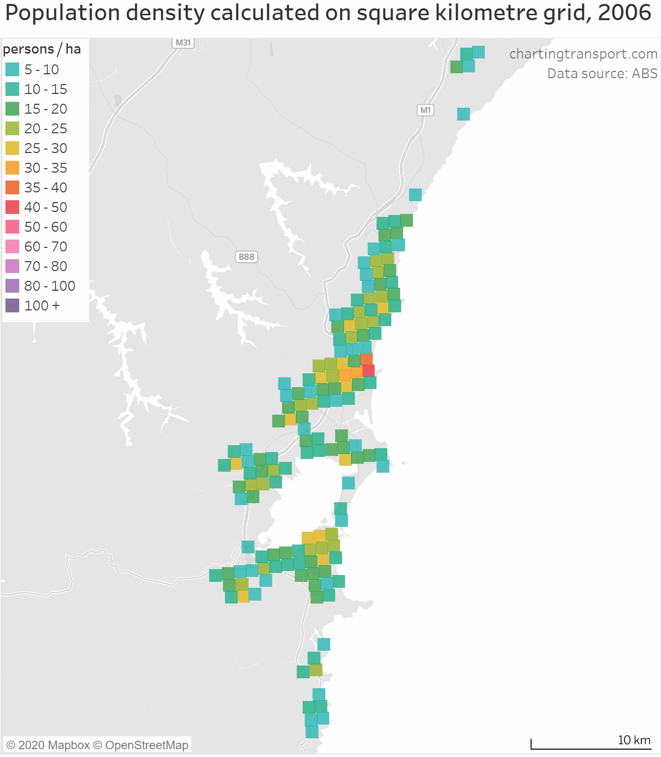
Geelong
What are the density trends further back in time using census data?
The census provides the highest resolution and therefore the closest measure of “residential” population weighted density. However, we’ve got some challenges around the statistical geography.
Prior to 2006, the smallest geography at which census population data is available is the collector district (CD), which average around 500 to 600 residents. A smaller geography – the mesh block (MB) – was introduced in 2006 and averages around 90 residents.
Unfortunately, both collector districts and mesh blocks are not consistently sized across cities or years (note: y axis on these charts does not start at zero):

Technical note: I have mapped all CDs and MBs to Greater Capital City Statistical Area (GCCSA) boundaries, based on the entire CD fitting within the GCCSA boundaries (which have not yet changed since they were created in 2011).
There is certainly some variance between cities and years, so we need to proceed with caution, particularly in comparing cities. Hobart and Adelaide have the smallest CDs and MBs on average, while Sydney generally has larger CDs and MBs. This might be a product of whether mesh blocks were made too small or large, or it might be that density is just higher and it is more difficult to draw smaller mesh blocks. The difference in median population may or may not be explained by the creation of part-residential mesh blocks.
Also, we don’t have a long time series of data at the one geography level. Rather than provide two charts which break at 2006, I’ve calculated PWD for both CD and mesh block geography for 2006, and then estimated equivalent mesh block level PWD for earlier years by scaling them up by the ratio of 2006 PWD calculations.
In Adelaide, the mesh block PWD for 2006 is 50% larger than the CD PWD, while in the Australian Capital Territory it is 110% larger, with other cities falling somewhere in between.
Would these ratios hold for previous years? We cannot be sure. Collector Districts were effectively replaced with SA1s (with an average population of 500, only slightly smaller) and we can calculate the ratio of mesh block PWD to SA1 PWD for 2011 and 2016. For most cities the ratio in 2016 is within 10% of the ratio in 2011. So hopefully the ratio of CD PWD to mesh block PWD would remain fairly similar over time.
So, with those assumptions, here’s what the time series then looks like for PWD at mesh block geography:

As per the square km grid values, Sydney and Melbourne are well clear of the pack.
Most cities had a PWD low point in 1996. That is, until around 1996 they were sprawling at low densities more than they were densifying in established areas, and then the balance changed post 1996. Exceptions are Darwin which bottomed out in 2001 and Hobart which bottomed in 2006.
The data shows rapid densification in Melbourne and Sydney between 2011 and 2016, much more so than the square km grid data time series. But we also saw a significant jump in the median size of mesh blocks in those cities between 2011 and 2016 (and if you dig deeper, the distribution of mesh block population sizes also shifted significantly), so the inflection in the curves in 2011 are at least partly a product of how new mesh block boundaries were cut in 2016, compared to 2011. Clearly statistical geography isn’t always good for time series and inter-city analysis!
How has the distribution of densities changed in cities since 1986?
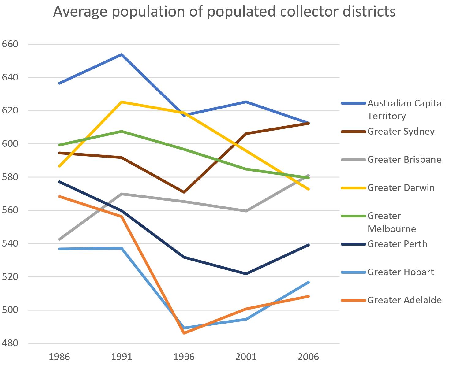
The next chart shows the distribution of population density for Greater Capital City Statistical Areas based on collector districts for the 1986 to 2006 censuses:
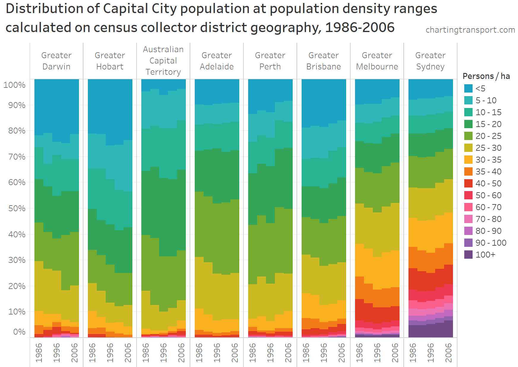
You can more clearly see the decline in population density in most cities from 1986 to 1996, and it wasn’t just because most of the population growth was a lower densities. In Hobart, Canberra, Adelaide, Brisbane and Melbourne, the total number of people living at densities of 30 or higher actually reduced between 1986 and 1996.
Here is the equivalent chart for change in density distribution by mesh block geography for the capital cities for 2006, 2011, and 2016:

I’ve used the same colour scale, but note that the much smaller geography size means you see a lot more of the population at the higher density ranges.
The patterns are very similar to the distribution for square km grid data. You can see the how Brisbane seems to bleed into Melbourne and then into Sydney, suggesting a roughly 15 year lag in density distributions. This chart also more clearly shows the recent rapid rise of high density living in the smaller cities of Canberra and Darwin.
The next chart shows the 2016 distribution of population by mesh block density using Statistical Urban Area 2016 boundaries, including the smaller cities:

Gold Coast and Wollongong stand out as smaller cities with a significant portion of their population at relatively high densities, but a fair way off Sydney and Melbourne.
(Sorry I don’t have a mesh block times series of density distribution for the smaller cities – it would take a lot of GIS processing to map 2006 and 2011 mesh blocks to 2016 SUAs, and the trends would probably be similar to the km grid results).
Can we measure density changes further back in history and for smaller cities?
Yes, but we need to use different statistical geography. Annual population estimates are available at SA2 geography back to 1991, and at SA3 geography back to 1981.
However, there are again problems with consistency in statistical geography between cities and over time.
Previously on this blog I had assumed that guidelines for creation of statistical geography boundaries have been consistently applied by the ABS across Australia, resulting in reasonably consistent population sizes, and allowing comparisons of population-weighted density between cities using particular levels of statistical geography.
Unfortunately that wasn’t a good assumption.
Here are the median population sizes of all populated zones for the different statistical geographies in the 2016 census:

Note: I’ve used a log scale on the Y-axis.
While there isn’t a huge amount of variation between medians at mesh block and SA1 geographies, there are massive variations at SA2 and larger geographies.
SA2s are intended to have 3,000 to 25,000 residents (a fairly large range), with an average population of 10,000 (although often smaller in rural areas). You can see from the chart above that there are large variances between medians of the cities, with the median size in Canberra and Darwin below the bottom of the desired range.
I have asked the ABS about this issue. They say it is related to the size of gazetted localities, state government involvement, some dense functional areas with no obvious internal divisions (such as the Melbourne CBD), and the importance of capturing indigenous regions in some places (eg the Northern Territory). SA2 geography will be up for review when they update statistical geography for 2021.
While smaller SA2s mean you get higher resolution inter-censal statistics (which is nice), it also means you cannot compare raw population weighted density calculations between cities at SA2 geography.
However, all is not lost. We’ve got calculations of PWD on the unbiased square kilometre grid geography, and we can compare these with calculations on SA2 geography. It turns out they are very strongly linearly correlated (r-squared of over 0.99 for all cities except Geelong).
So it is possible to estimate square km grid PWD prior to 2006 using a simple linear regression on the calculations for 2006 to 2018.
But there is another complication – ABS changed the SA2 boundaries in 2016 (as is appropriate as cities grow and change). Data is available at the new 2016 boundaries back to 2001, but for 1991 to 2000 data is only available on the older 2011 boundaries. For most cities this only creates a small perturbation in PWD calculations around 2001 (as you’ll see on the next chart), but it’s larger for Geelong, Gold Coast – Tweed Heads and Newcastle Maitland so I’m not willing to provide pre-2001 estimates for those cities.
The bottom of this chart is quite congested so here’s an enlargement:

Even if the scaling isn’t perfect for all history, the chart still shows the shape of the curve of the values.
Consistent with the CD data, several cities appear to have bottomed out in the mid 1990s. On SA2 data, that includes Adelaide in 1995, Perth and Brisbane in 1994, Canberra in 1998 and Wollongong in 2006.
Can we go back further?
If we want to go back another ten years, we need to use SA3 geography, which also means we need to switch to Greater Capital City Statistical Areas as SA3s don’t map perfectly to Significant Urban Areas (which are constructed of SA2s). Because they are quite large, I’m only going to estimate PWD for larger cities which have reasonable numbers of SA3s that would likely have been fully populated in 1981.
I’ve applied the same linear regression approach to calculate estimated square kilometre grid population weighted density based on PWD calculated at SA3 geography (the correlations are strong with r-squared above 0.98 for all cities).
The following chart shows the best available estimates for PWD back to 1981, using SA3 data for 1991 to 2000, SA2 data for 2001 to 2005, and square km grid data from 2006 onwards:
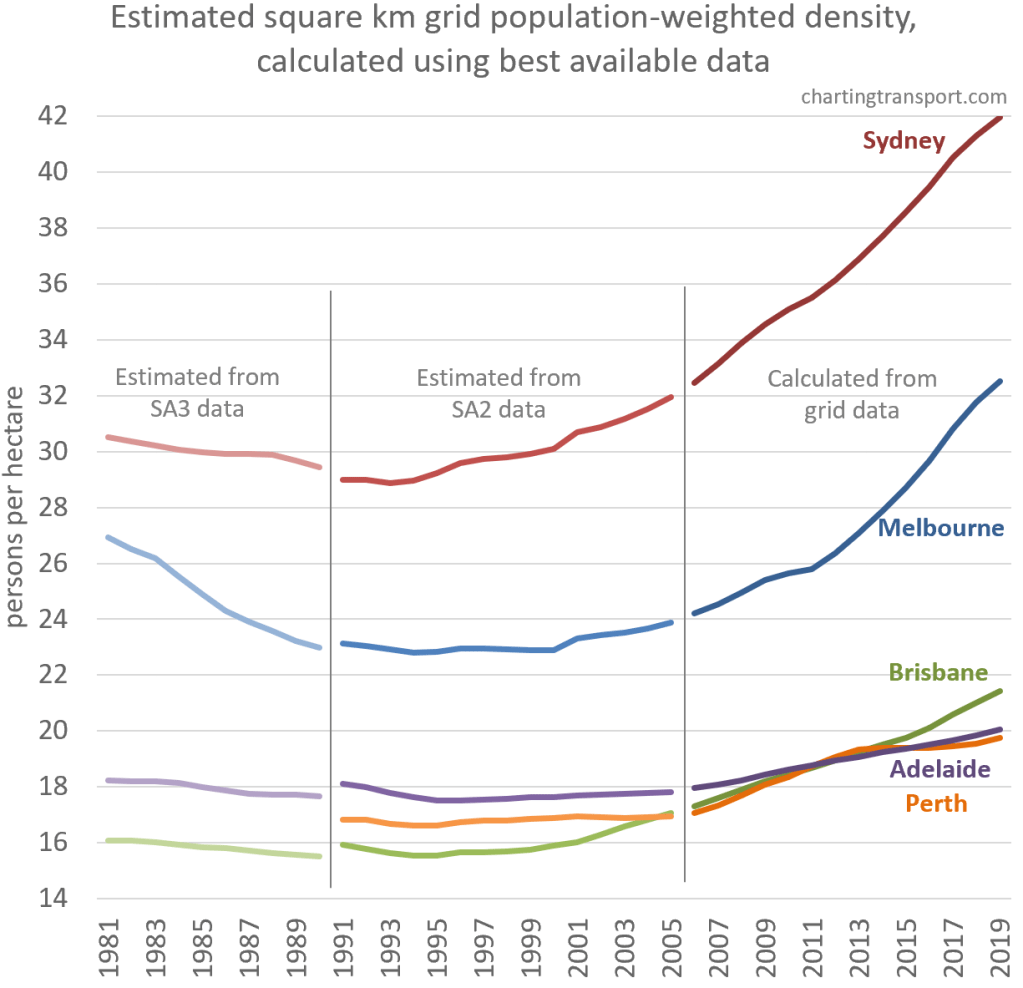
Technical notes: SA3 boundaries have yet to change within capital cities, so there isn’t the issue we had with SA2s. The estimates based on SA2 and SA3 data don’t quite line up between 1990 and 1991 which demonstrates the limitations of this approach.
The four large cities shown appear to have been getting less dense in the 1980s (Melbourne quite dramatically). These trends could be related to changes in housing/planning policy over time but they might also be artefacts of using such a coarse statistical geography. It tends to support the theory that PWD bottomed out in the mid 1990s in Australia’s largest cities.
Could we do better than this for long term history? Well, you could probably do a reasonable job of apportioning census collector district data from 1986 to 2001 censuses onto the km grid, but that would be a lot of work! It also wouldn’t be perfectly consistent because ABS use dwelling address data to apportion SA1 population estimates into kilometre grid cells. Besides we have reasonable estimates using collector district geography back to 1986 anyway.
Melbourne’s population-weighted density over time
So many calculations of PWD are possible – but do they have similar trends?
I’ve taken a more detailed look at my home city Melbourne, using all available ABS population figures for the geographic units ranging from mesh blocks to SA3s inside “Greater Melbourne” and/or the Melbourne Significant Urban Area (based on the 2016 boundary), to produce the following chart:

Most of the datasets show an acceleration in PWD post 2011, except the SA3 calculations which are perhaps a little more washed out. The kink in the mesh block PWD is much starker than the other measures.
The Melbourne SUA includes only 62% of the land of the Greater Melbourne GCCSA, yet there isn’t much difference in the PWD calculated at SA2 geography – which is the great thing about population-weighted density.
All of the time series data suggests 1994 was the year in which Melbourne’s population weighted density bottomed out.
Appendix 1: How much do PWD calculations vary by statistical geography?
Census data allows us to calculate PWD at all levels of statistical geography to see if and how it distorts with larger statistical geography. I’ve also added km grid PWD calculations, and here are all the calculations for 2016:
Technical note: square km grid population data is estimated for 30 June 2016 while the census data is for 9 August 2016. Probably not a significant issue!
You can see cities rank differently when km grid results are compared to other statistical geography – reflecting the biases in population sizes at SA2 and larger geographies. Wollongong and Geelong also show a lot of variation in rank between geographies – probably owing to their small size.
The cities with small pockets of high density – in particular Gold Coast – drop rank with large geography as these small dense areas quickly get washed out.
I’ve taken the statistical geography all the way to Significant Urban Area – a single zone for each city which is the same as unweighted population density. These are absurdly low figures and in no way representative of urban density. They also suggest Canberra is more dense than Melbourne.
Appendix 2: Issues with over-sized SA1s
As I’ve mentioned recently, there’s an issue that the ABS did not create enough reasonably sized SA1s in some city’s urban growth areas in 2011 and 2016. Thankfully, it looks like they did however create a sensible number of mesh blocks in these areas, as the following map (created with ABS Maps) of the Altona Meadows / Point Cook east area of Melbourne shows:
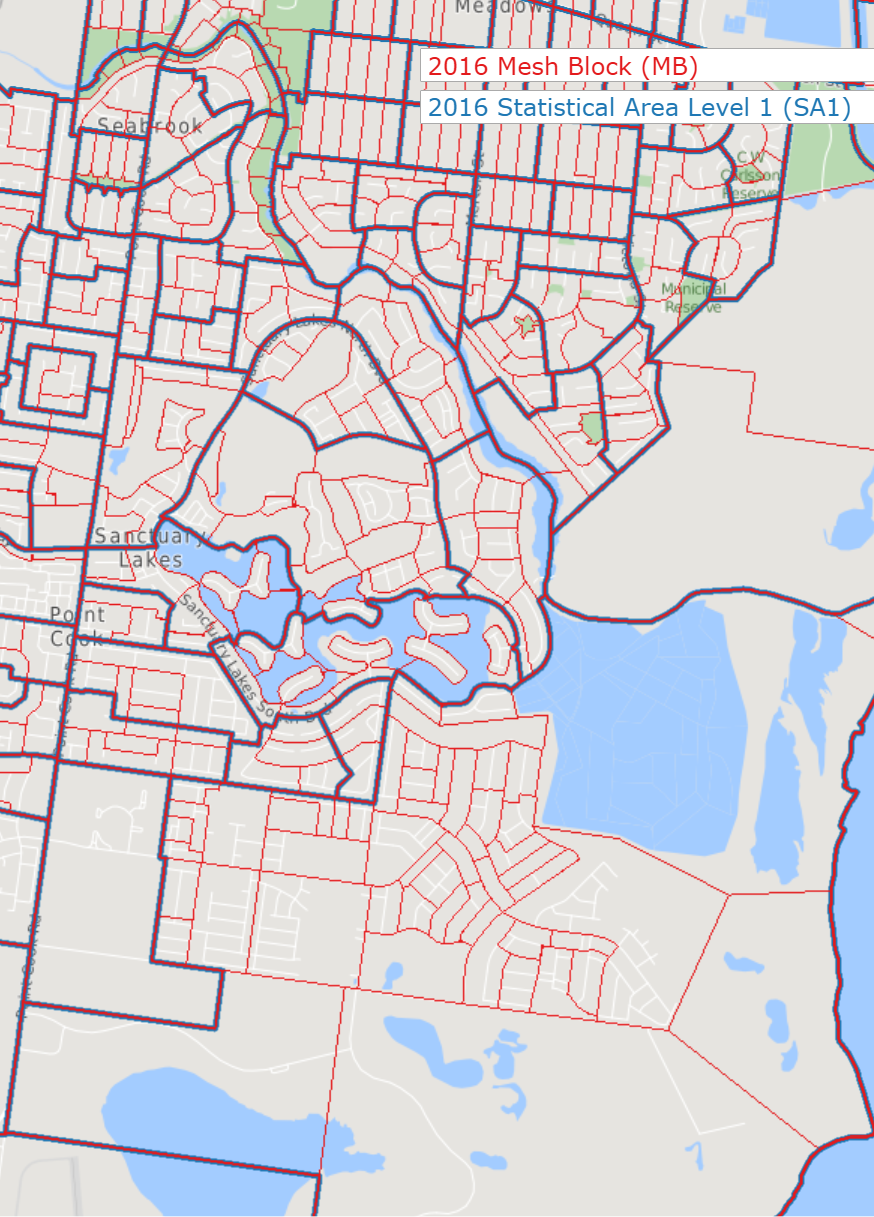
In the north parts of this map you can see there are roughly 4-8 mesh blocks per SA1, but there is an oversized SA1 in the south of the map with around 50 mesh blocks. This will impact PWD calculated at SA1 geography, although these anomalies are relatively small when you are looking at a city as large as Melbourne.


I suspect the boundaries of SA1s and SA2s are altered mainly in reaction to populations that have already grown. In 2016, East Bentleigh was subdivided into 2 SA2 (North and South) but the Richmond SA2 (Which includes Cremorne and Burnley) remains undivided, despite having a population larger than the combined population of the two East Bentleigh SA2s but the Richmond SA2 had previously had a smaller population than East Bentleigh.
Mesh blocks are also subject to being mixed between residential and non-residential uses and I suspect a significant proportion of low density mesh blocks have their residential components at higher densities but have lower density areas. Some of examples of this are:
Monash Uni, Clayton Campus, 2,211 people at 19 persons/ha (2016) but most of the mesh block devoted to tertiary education and parking. This single mesh block comprised over 1.1% of all people living in a 15-20 person/ha mesh block in Melbourne in 2016. This is not the only Uni campus with a relatively low density (for their area) because of the rest of the campus being in the same mesh block as the housing.
The former Highett Gasworks site. The portion that was not turned into a park was a single mesh block in 2016, with 315 people at 27 persons/ha but the residential development is confined to one corner and is relatively high density.
LikeLike