Australian cities are growing in population as a result of international migration, internal migration, and births outnumbering deaths. But which of these factors are most at play in different parts of the country?
Thanks to ABS publishing data on the components of population growth with their Regional Population Growth product, we now have estimates of births, deaths, internal/international arrivals, and internal/international departures right down to SA2 geography for 2016-17 and 2017-18.
This post aims to summarise the main explanation for population change in different parts of the country.
This post isn’t much about transport, but I hope you also find the data interesting. That said, it’s possible that immigrants from transit-orientated countries might be more inclined to use public transport in Australia, and that might impact transport demand patterns. We know that recent immigrants are more likely to travel to work by public transport than longer term residents, but that probably also has a lot to do with where they are settling.
How is population changing in bigger and smaller cities?
First up, I’ve divided Australia into Capital Cities (Greater Capital City Statistical Areas), Large regional cities (Significant Urban Areas with population 100,000+, 2016 boundaries), small regional cities (Significant Urban Areas, with population 10,000 to 100,000, 2016 boundaries ) and “elsewhere”.
Here’s a chart showing the total of the six components of population change in each of those four place types. I’ve animated the chart (and most upcoming charts) to show changes in the years to June 2017 and June 2018, with a longer pause on 2018.

There were significant internal movements in all parts of Australia (shown in green) – even more so in 2018. These include people moving between any SA2s, whether they adjacent within a city or across the country.
International arrivals and departures were much larger in capital cities and there were more arrivals than departures in all four place types. International arrivals declined between 2017 and 2018, while international departures increased slightly between 2017 and 2018.
Births also outnumbered deaths in all place categories in both years.
Here’s a look at the larger capital cities individually:
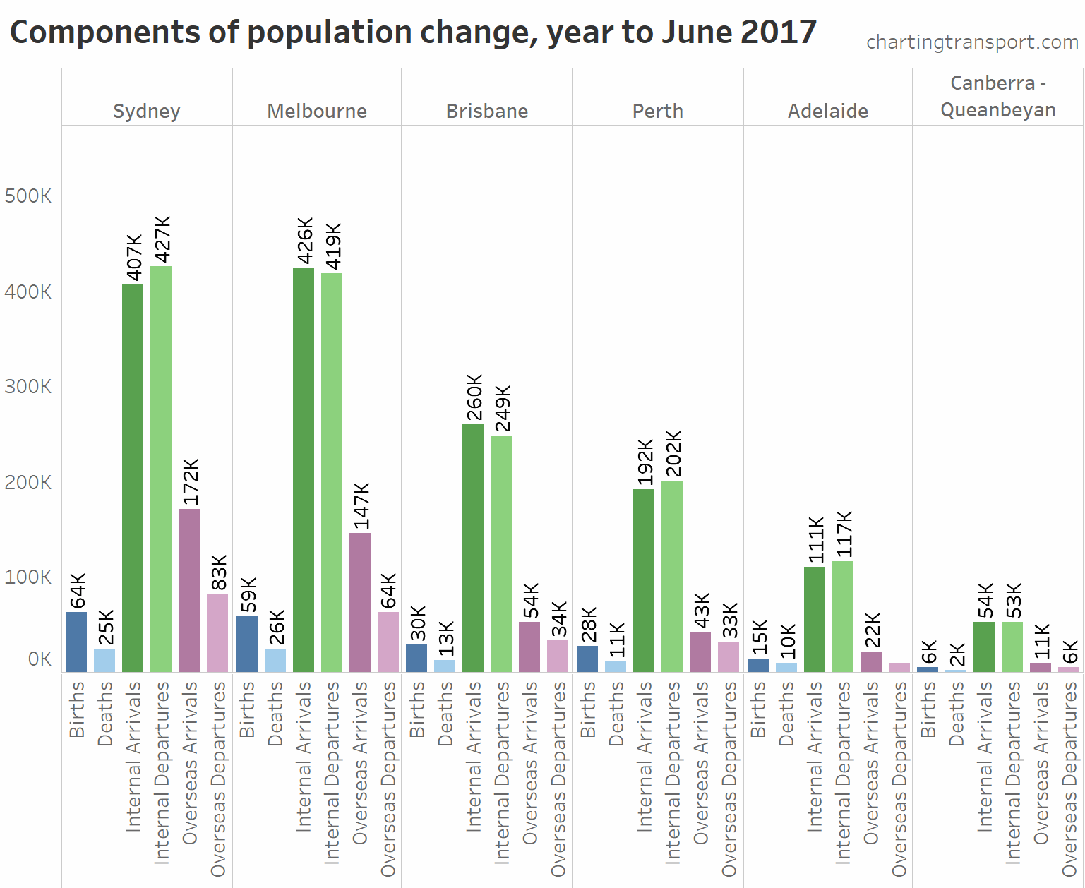
The chart shows Sydney, Perth, and Adelaide had more internal departures than arrivals. These cities only grew in total population because of natural increase and net international immigration. Melbourne and Brisbane had a net increase from internal movements in both 2017 and 2018, while Canberra has been a lot more even.
International arrivals outnumbered international departures and births significantly outnumbered deaths in all cities. Melbourne and Canberra were the only cities to see a significant increase in international arrivals between 2017 and 2018.
Here is the same chart but for medium sized cities:
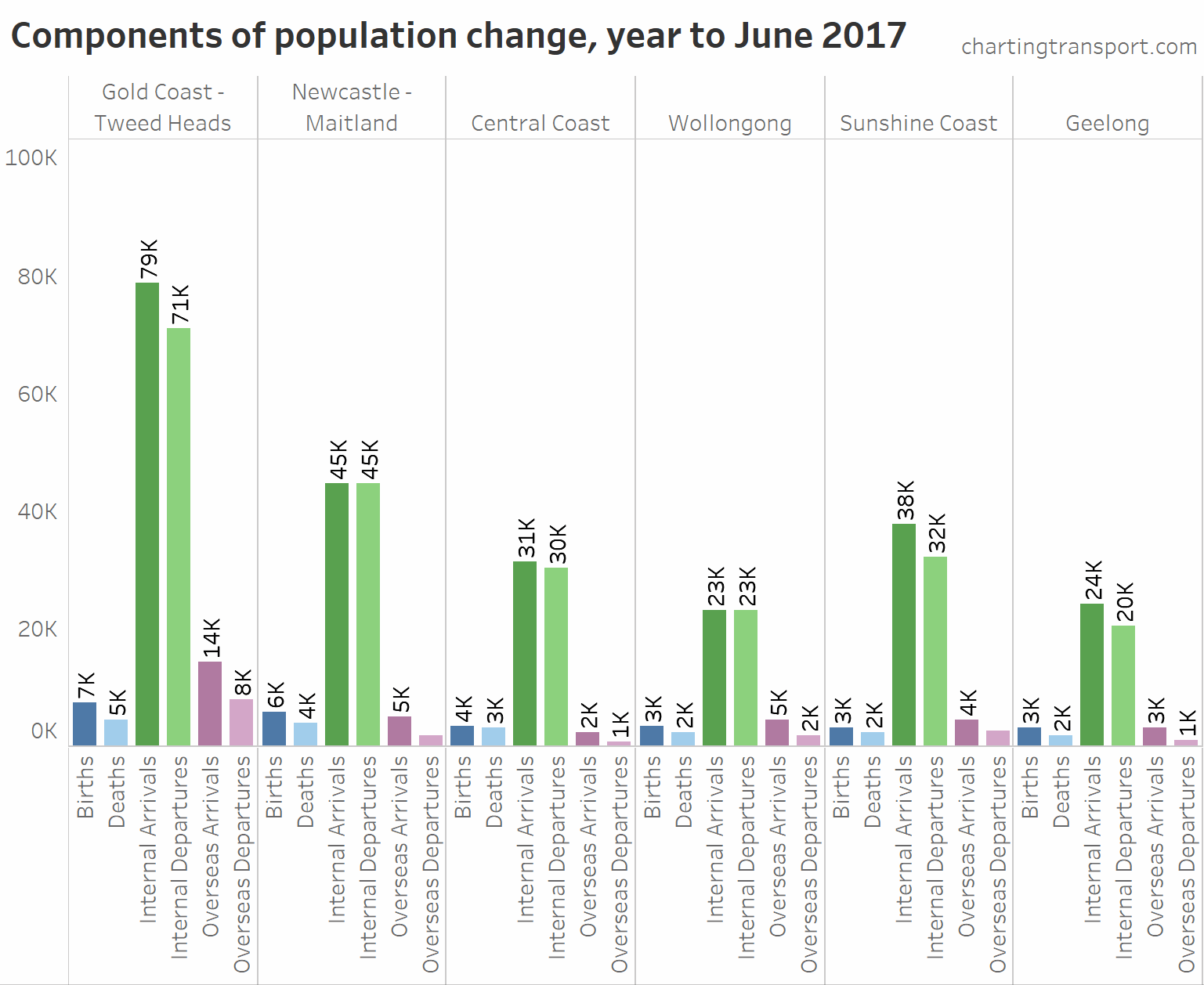
Again, there were much larger volumes of internal migration in 2017-18 compared to 2016-17.
The Gold Coast is the only medium-sized city to have significant volumes of international movements. The fast population growth of the Gold and Sunshine Coasts is mostly coming from internal arrivals.
What is the dominant explanation for population change in different parts of Australia?
As mentioned the ABS data goes down to SA2 statistical geography which allows particularly fine grain analysis, with six measures available for each SA2. However it is difficult to show those six components spatially. They can be consolidated into three categories: net natural increase, net internal arrivals/departures, and net international arrivals/departures, but that is still three different metrics for all SA2s.
One way to look at this is simply the component with the largest contribution to population growth (or decline). Here is a map showing that for each SA2 in Melbourne:

You can see that international arrivals dominated population growth in most inner and middle suburbs, while internal arrivals dominated population growth in most outer suburbs. There are also some SA2s where births dominated (often low growth outer suburbs).
This representation is quite simplified, and doesn’t show what else might be happening. For example, here is a summary of the population changes in Sunshine for the year to June 2018:
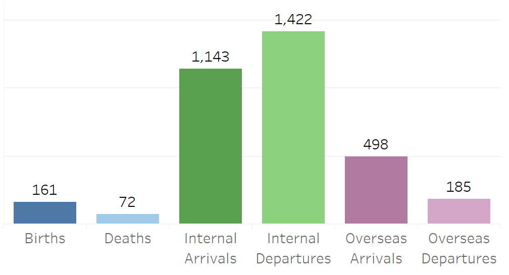
Overseas arrivals dominated population growth (net +313), but the otherwise hidden story here is that they were largely offset by net internal departures of 279.
So to add more detail to the analysis, I’ve created a slightly more detailed classification system that looks at the largest component and often a secondary component, as per the following table.
| Explanation summary | Largest component | Other components |
| Growth – mostly births replacing locals | Natural increase | Net internal departures more than 50 and net internal departures more than net overseas departures |
| Growth – mostly births | Natural increase | Net internal and overseas departures of no more than 50 |
| Growth – mostly immigrants replacing locals | Net overseas arrivals | Net internal departures of at least 50 and/or natural decrease of at least 50. |
| Growth – mostly immigration | Net overseas arrivals | Net internal departures less than 50 (or net arrivals). |
| Growth – mostly internal arrivals replacing deaths | Net internal arrivals | Net natural decrease of 50 or more, and bigger than net overseas departures |
| Growth – mostly internal arrivals | Net internal arrivals | Net internal arrivals greater than net overseas arrivals and natural increase |
| Decline – mostly internal departures | Net internal departures | Natural increase and net overseas arrivals both less than 50 |
| Decline – mostly internal departures partly offset by births | Net internal departures | Natural increase of at least 50, and natural increase larger than net overseas arrivals. |
| Decline – mostly internal departures partly offset by immigrants | Net internal departures | Net overseas arrivals of at least 50, and net overseas arrivals larger than natural increase. |
| Decline – mostly deaths | Natural decrease | – |
There are no SA2s where net international departures was the major explanation for population change.
Here’s what these summary explanations look like in Melbourne (again, animated to show years to June 2017 and June 2018):
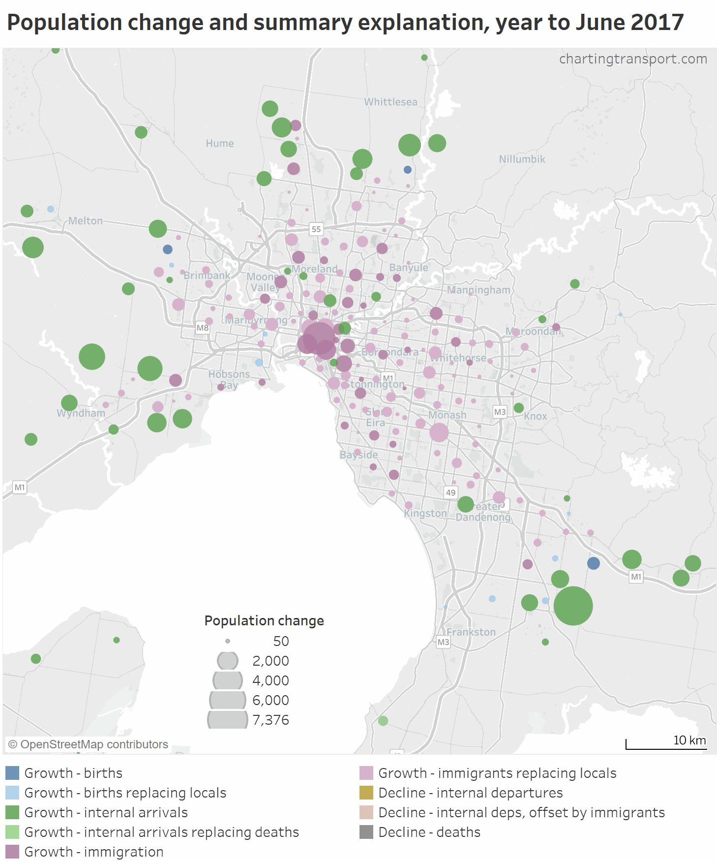
Technical notes: On these maps I’ve omitted SA2s where there was population change of less than 50 people, or where no components of population change were more than 1% of the population. Not all classifications are present on all maps.
You can now see that in most middle suburbs there has been a net exodus of locals, more than offset by net international arrivals (light purple). Also, many of the outer suburbs with low growth actually involve births offsetting internal departures (light blue).
Turning near-continuous data into discrete classifications is still slightly problematic. For example the summary explanations don’t tell you by how much one component was larger than the others. For example if there were 561 net international arrivals and 560 net internal arrivals, it would be classified as “Growth – mostly immigration”. Also, SA2s are not consistently sized across Australia (see: How is density changing in Australian cities?), so my threshold of 50 is not perfect. At the end of the post I provide a link to Tableau where you can inspect the data more closely for any part of Australia.
The inner city area of Melbourne was a little congested with data marks on the above map, so here is a map zoomed into inner and middle Melbourne:
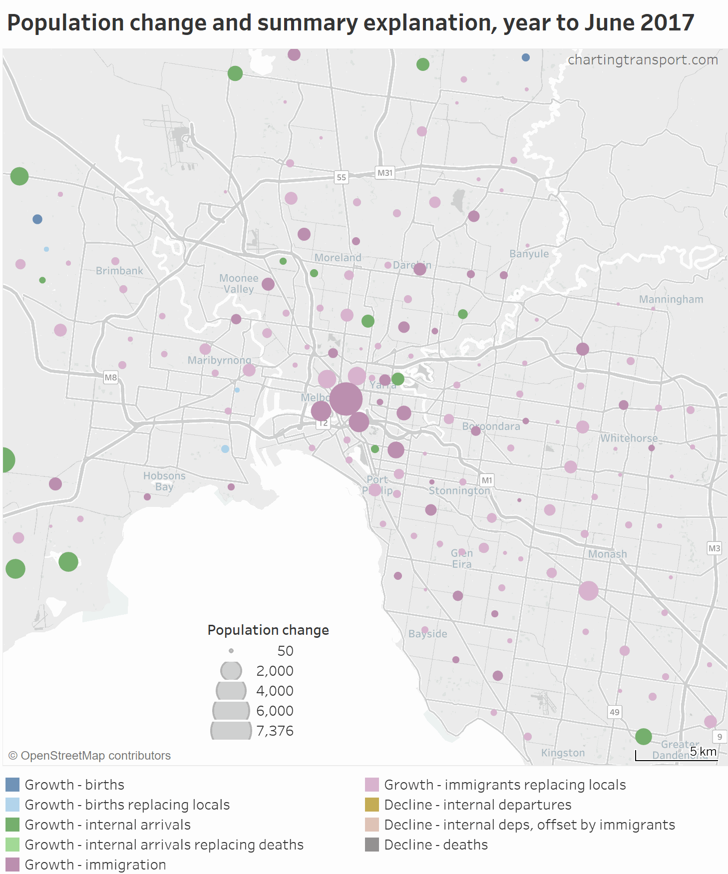
You can see significant population growth in the Melbourne CBD and surrounding SA2s, particularly in 2017. The main explanation for inner city growth is international immigration, although internal arrivals came out on top in Southbank in 2018. Curiously, net internal arrivals were larger the international migration in Brunswick East in both years. And natural increase was dominant in Newport in the inner-west.
Zooming out to include the bigger regional centres of Victoria (note: many regional SA2s don’t show up because of very little population change):
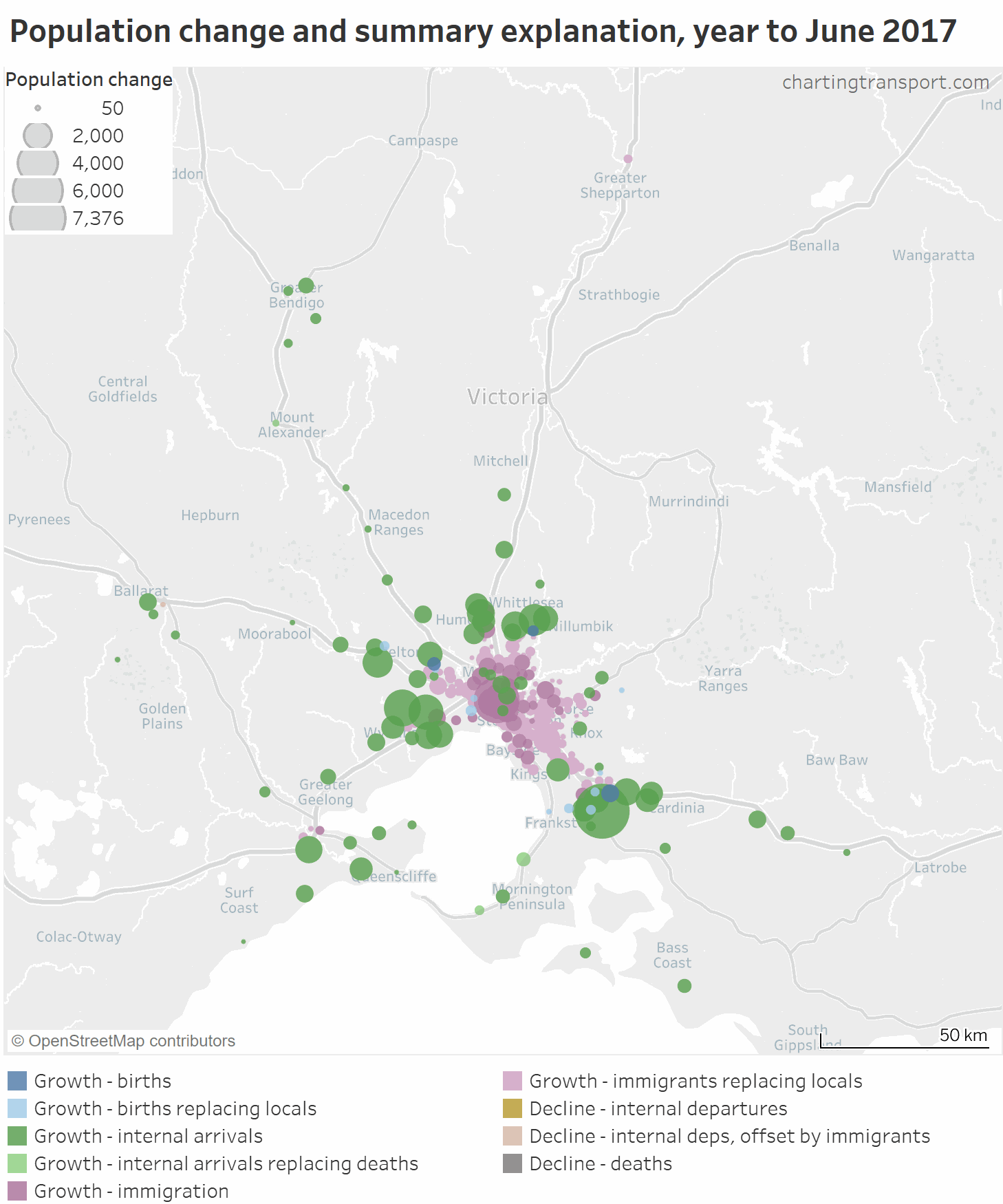
In most regional Victorian cities, internal arrivals account for most of the population growth, although the net growth in “Shepparton – North” of +222 in 2017 and +152 in 2018 was mostly made up of international arrivals.
The only other SA2s to show international arrivals as the main explanation were in inner Geelong.
(I haven’t shown all of Victoria because few SA2s outside the above map had significant population change).
Heading up to Sydney, the picture is fairly similar to Melbourne:
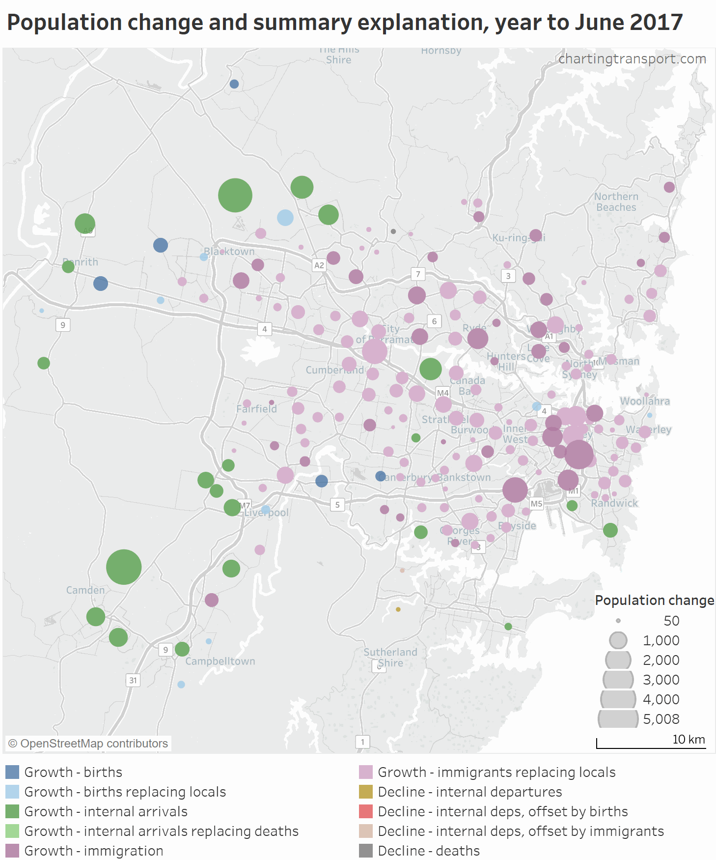
Like Melbourne, internal arrivals accounted for most of the population growth in outer growth areas.
International immigration dominated the inner and middle suburbs in 2017, but in 2018 immigration eased off, and births became the main explanation for population growth in more SA2s.
The middle SA2s of Homebush Bay – Silverwater and Botany are noticeable exceptions to the pattern, dominated by internal arrivals.
Zooming out to New South Wales:
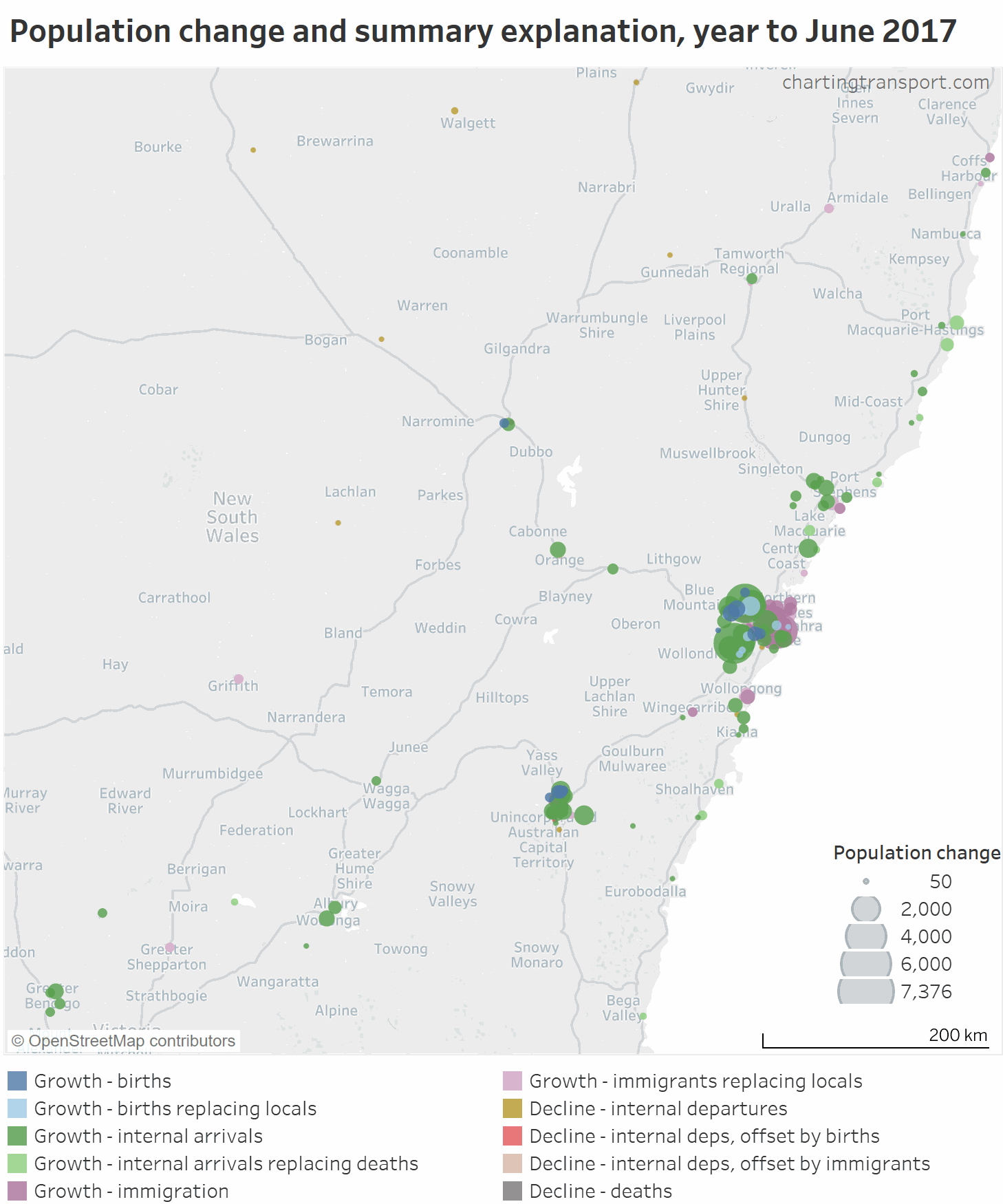
Central Newcastle, central Wollongong, Armidale and Griffith saw mostly international immigration led population growth. Most larger regional towns saw growth from internal arrivals, but further inland there was population decline – mostly from internal departures.
Next up, Brisbane:
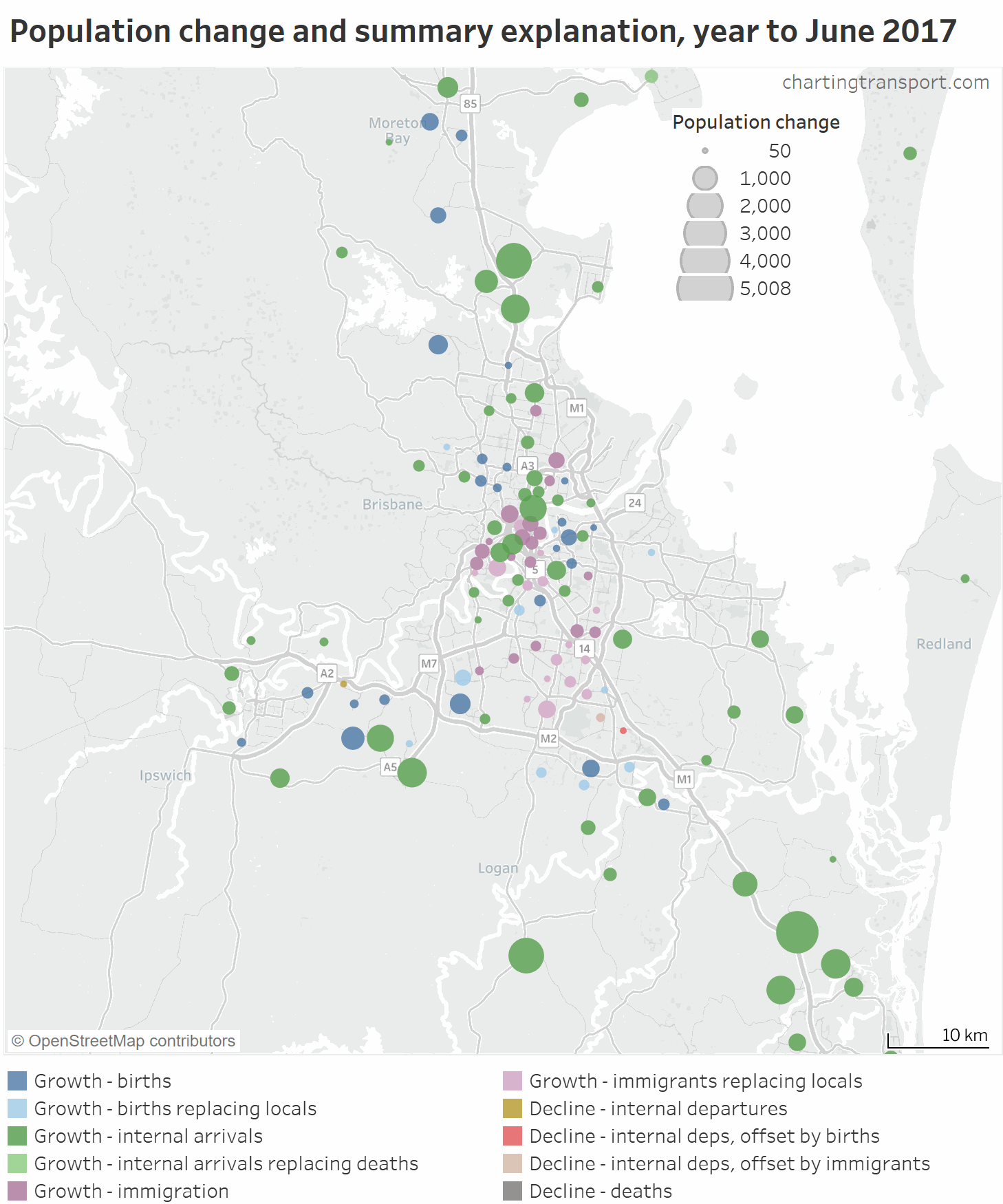
Population growth in Brisbane’s inner suburbs is much more of a mix of internal and overseas arrivals. There are also more SA2s where births dominate population growth. There were also some SA2s with slight population decline for various reasons.
Zooming out to South East Queensland:

International arrivals dominated areas on the Gold Coast closer to the coastline, but much less so on the Sunshine Coast and in Toowoomba.
Looking at other parts of Queensland:
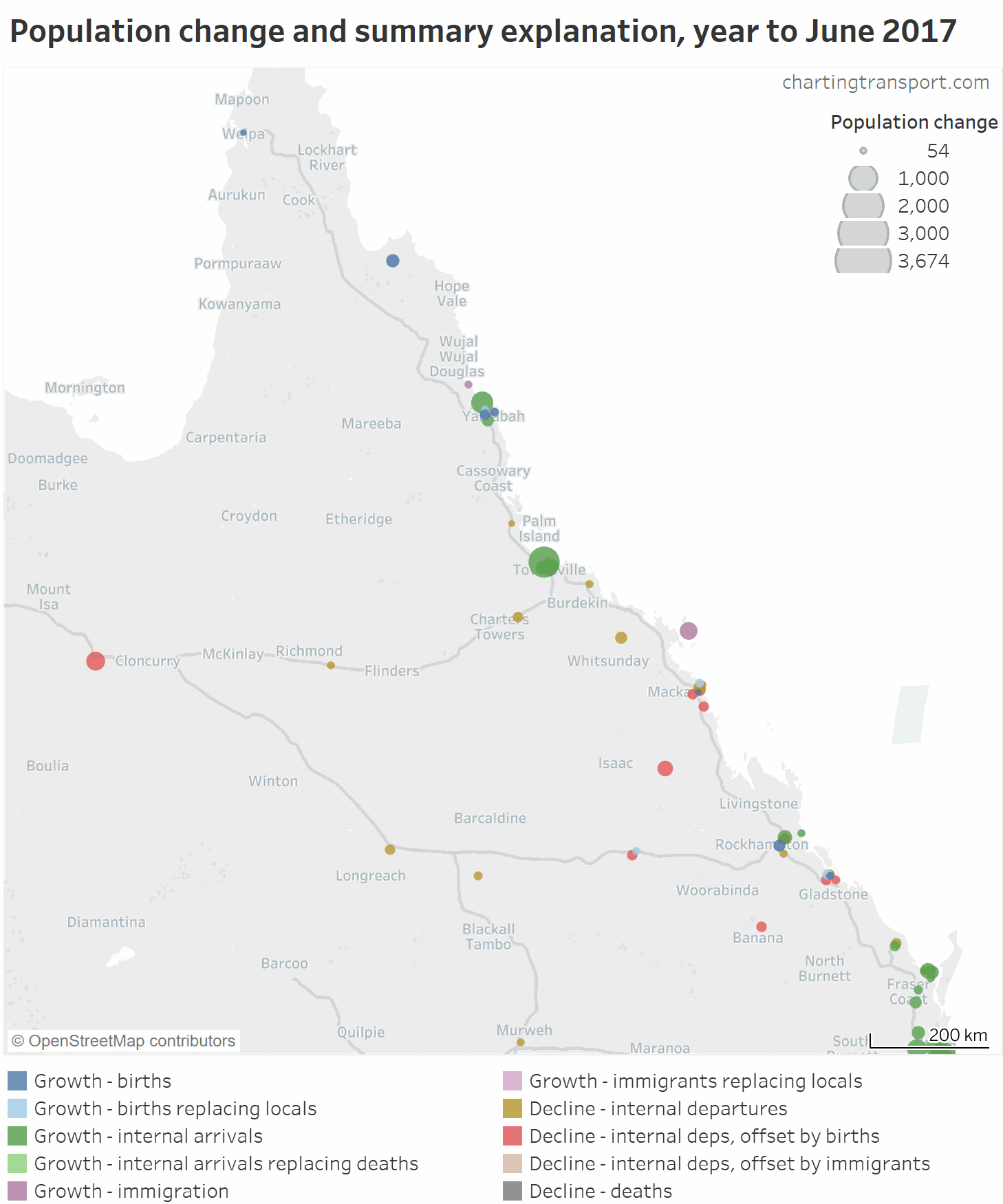
There was population decline in several areas, including Mackay and Mount Isa. Rockhampton and Cairns saw population growth mostly through internal arrivals. Townsville was dominated by internal arrivals in 2017, and births in 2018.
Airlie – Whitsundays stands out as having population growth mostly from international arrivals in both years.
Next up, Perth:
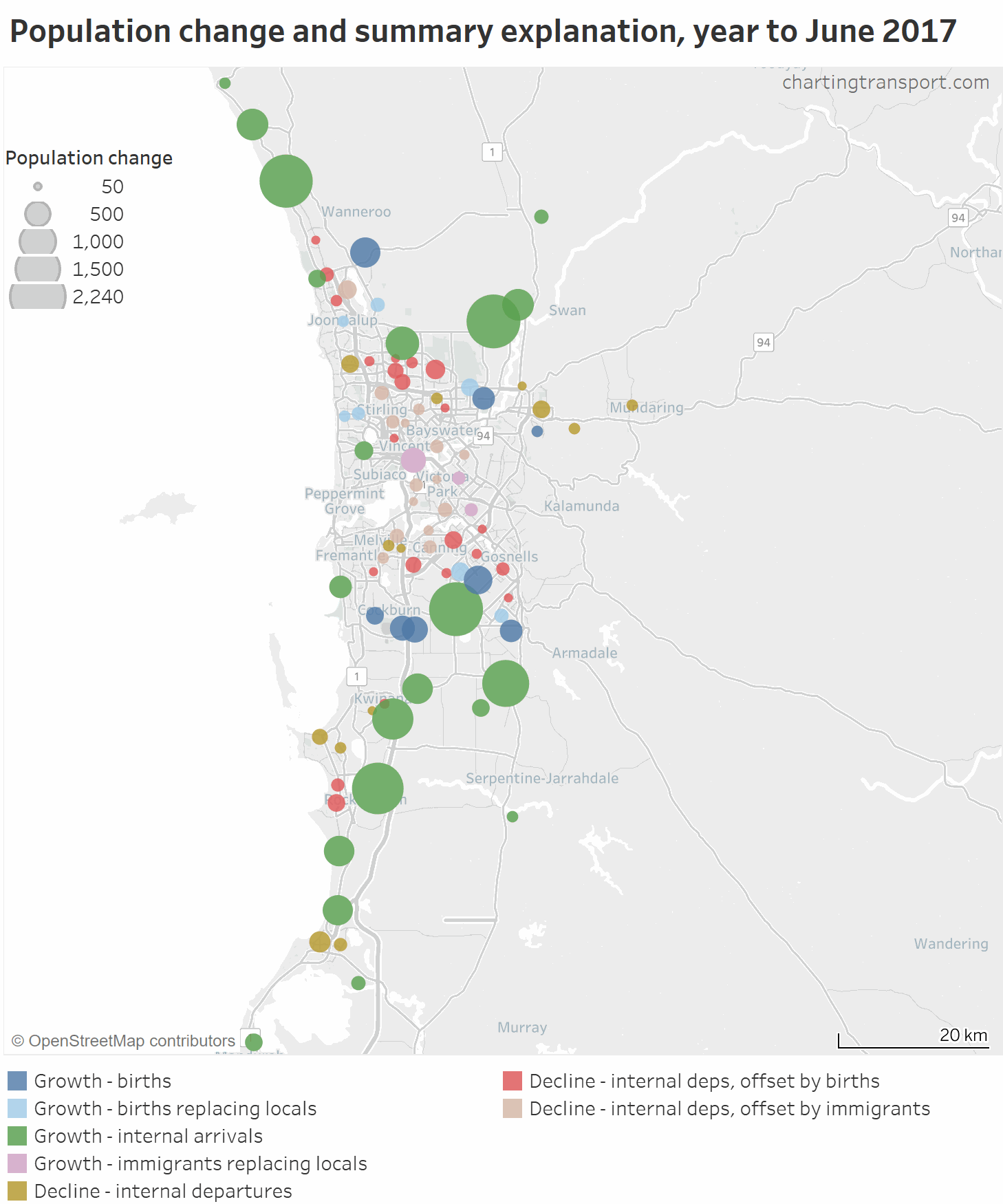
Like other cities, population growth in the outer suburbs was dominated by internal arrivals. There were a lot more SA2s showing population decline, and this was largely due to internal departures, partly offset by natural increases or net overseas arrivals.
Zooming out to Western Australia:
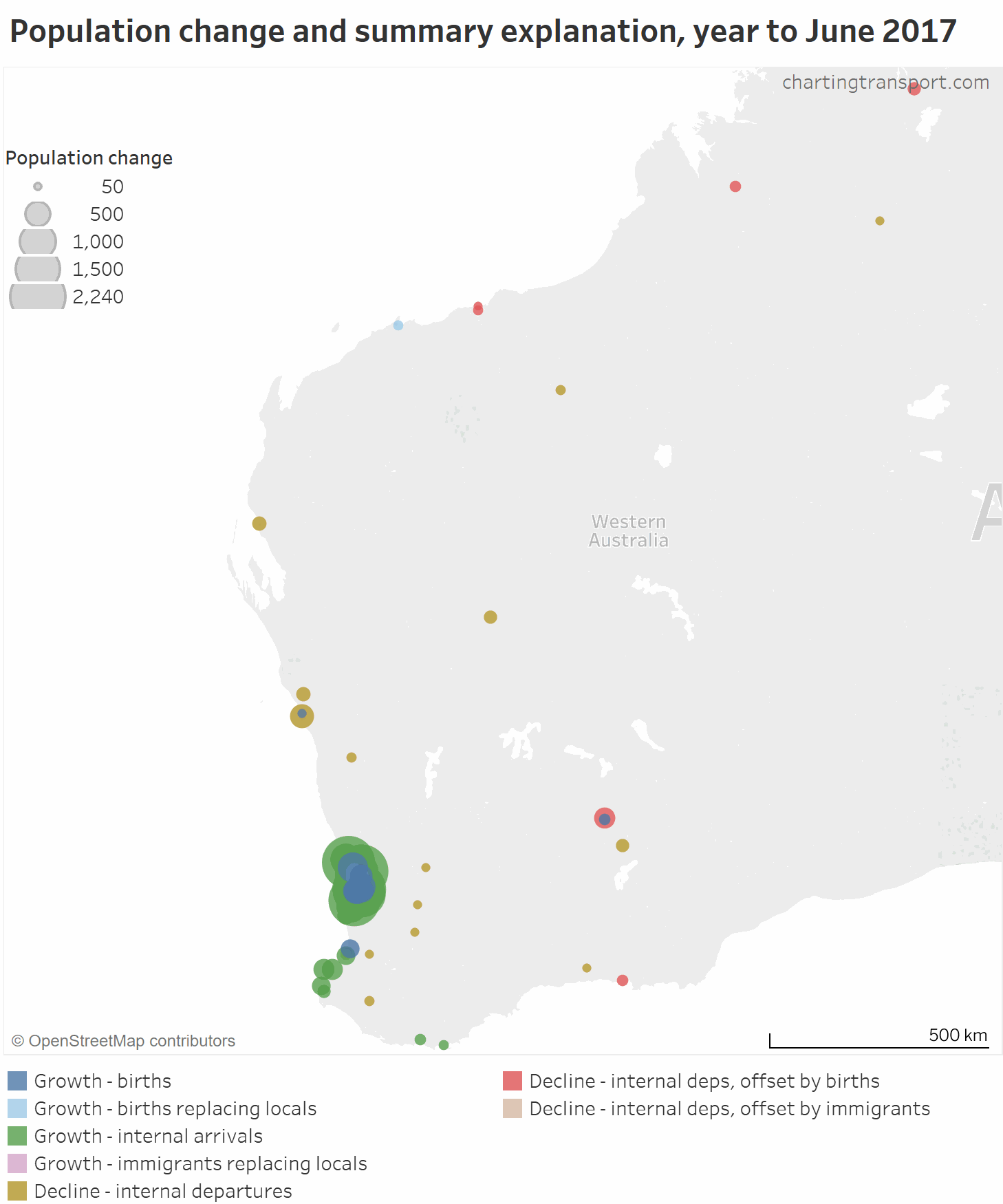
Population growth on the south-west coast was mostly dominated by internal arrivals, while in many other centres around the state there was population decline, mostly due to internal departures, however in many areas this was offset partly by births.
Next up, Adelaide:
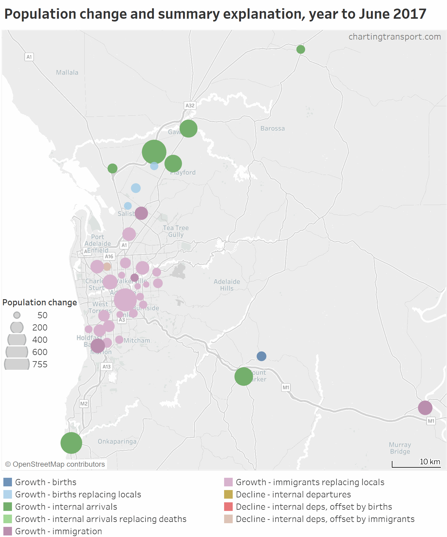
Firstly, keep in mind that there has been relatively slow population growth in Adelaide (the scale is adjusted). The inner and middle suburbs mostly show population growth from international arrivals (often offsetting net internal departures), and the outer growth areas were again mostly about internal arrivals.
Zooming out to South Australia:
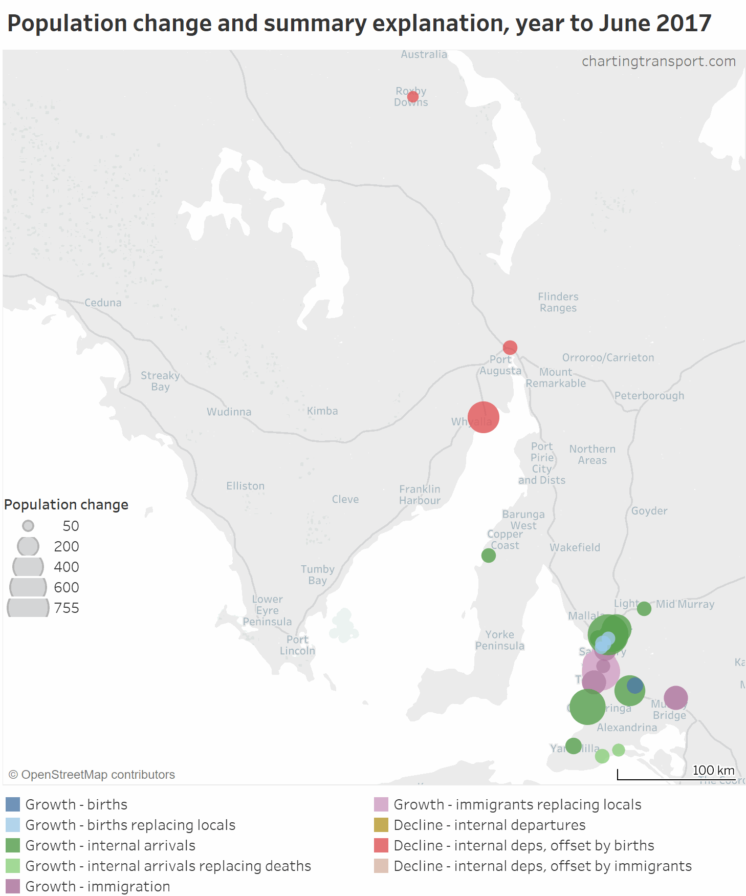
In 2017 there was considerable population decline in Whyalla and Port Augusta. Murray Bridge is another rare regional centre where population growth was largely driven by almost 400 overseas arrivals each year.
Next is Tasmania:

Note the circle size scale is even smaller. Overseas arrivals dominated population growth in central Hobart and Newman – Mayfield in Launceston (possibly related to university campuses), while internal migration dominated most other areas.
Here is Canberra:
International immigrants dominated population growth around Civic and the inner north. Internal arrivals dominated Kingston and Griffith and most outer growth areas. The outer suburbs saw a mixture of births and internal arrivals as the dominant explanation.
And finally, Darwin, which actually saw net population decline in the year to June 2018:
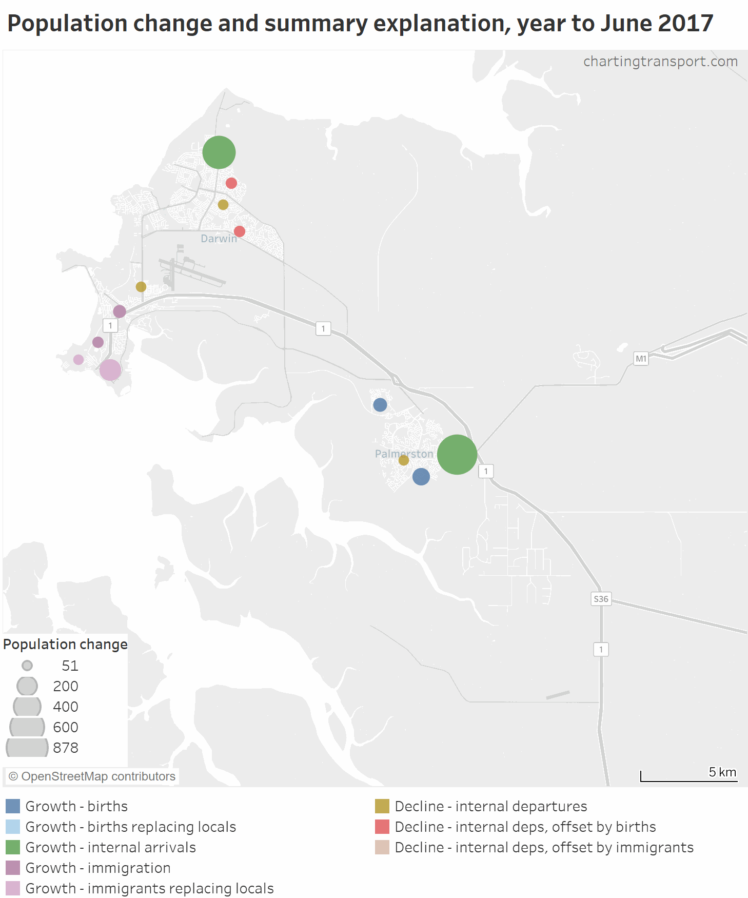
Palmerston South saw the largest population growth – mostly from internal arrivals. International arrivals were significant around Darwin city in 2017, but were much less significant in 2018. Most of the northern suburbs saw population decline in the year to June 2018.
Didn’t see your area, or want to explore further? You can view this data interactively in Tableau (you might want to filter by state as that will change the scale of circle sizes).
Where were international arrivals most significant?
I’ve calculated the ratio of international arrivals to population for each SA2. The SA2s where international arrivals in the year to June 2018 make up a significant portion of the 2018 population are all near universities and/or CBDs. Namely:
- Melbourne CBD and neighbouring Carlton at 20% (Melbourne Uni, RMIT, and others)
- Brisbane CBD at 18% and neighbouring Spring Hill at 20% (QUT and others)
- Clayton in Melbourne at 18% (Monash Uni)
- Sydney – Haymarket – The Rocks at 15% and neighbouring Pyrmont – Ultimo at 17% (near to UTS, Sydney Uni, and various others)
- Acton (ACT) at 17% (ANU)
- Kingsford (in Sydney) at 16% (UNSW)
- St Lucia (Brisbane) at 15% (UQ)
I hope you’ve found this interesting. In a future post I might look at internal migration origin-destination flows, including how people are moving within and between cities.

