The location of population growth has a big impact on transport outcomes. It’s also interesting in its own right. So where is Australia’s population growing?
This post primarily uses the ABS’s Regional Population Growth data set, which is the highest resolution geography level for which per-year population estimates are published and the data series goes back to 1991.
Population growth by part of Australia
At the top level I’ve divided Australia’s population into those living within:
- Capital cities – defined by Greater Capital City Statistical Areas (GCCSA)
- Large regional cities – defined as Significant Urban Areas (SUA) (2011 boundaries) with more than 100,000 population in 2011 – the smallest city qualifying being Toowoomba, the largest city not qualifying being Ballarat
- Small regional cities – all other Significant Urban Areas with at least 10,000 population (in 2011)
- Elsewhere – ie smaller towns and rural areas
Here’s the history of Australia’s population and growth since 1991, by these four categories:
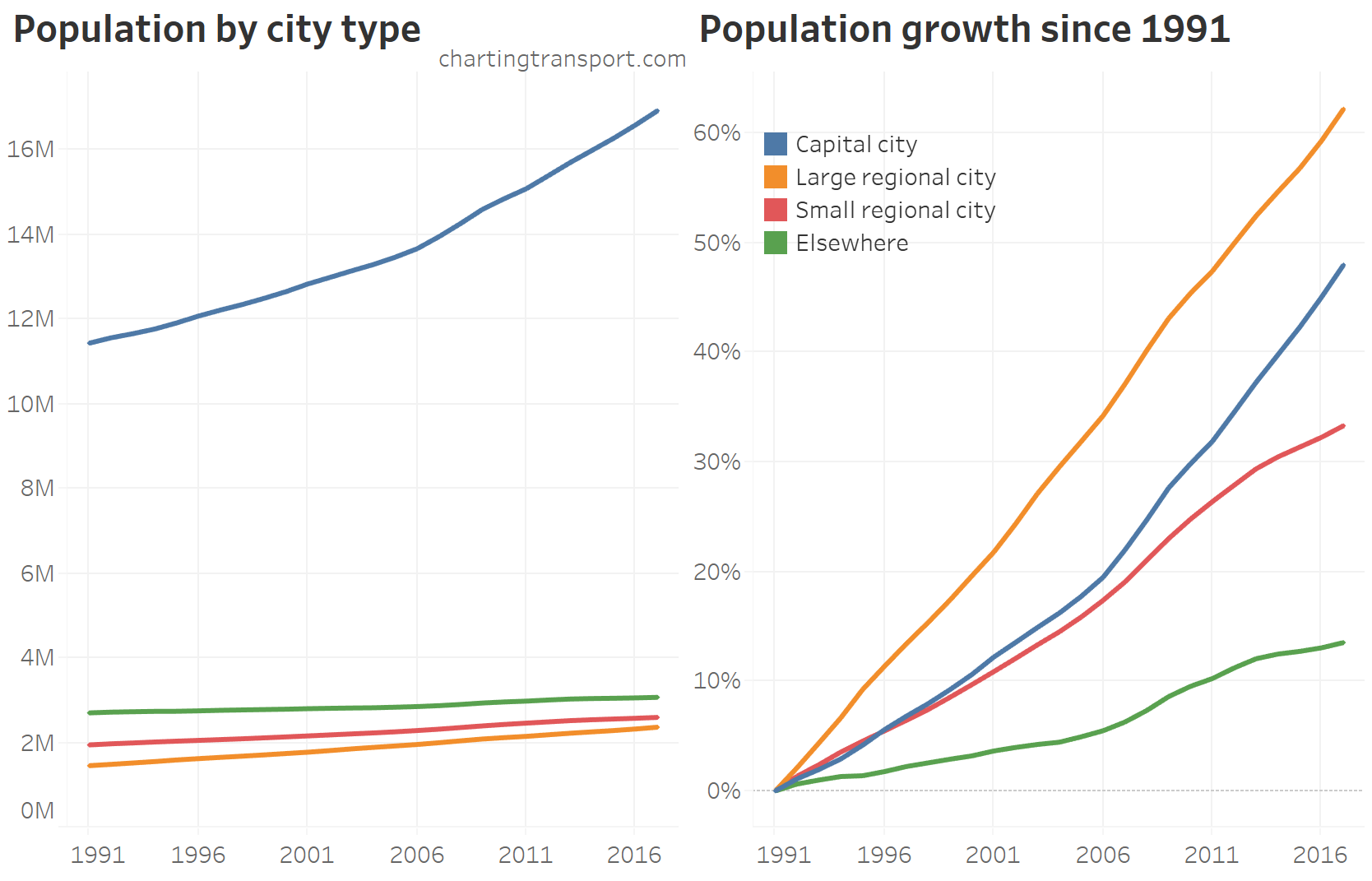
While the capital cities have seen the largest absolute growth, the large regional cities have seen the highest percentage growth.
Here is the annual population growth by each category:
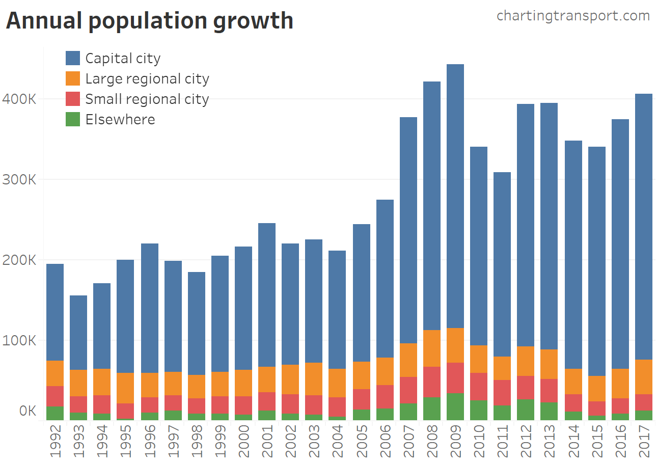
The capital cities have dominated the quantity of population growth, particularly since around 2007, with “elsewhere” having very small net growth in recent years. But as the first chart showed, large regional cities have had the fastest percentage growth – so it all depends on how you want to think about “growth”!
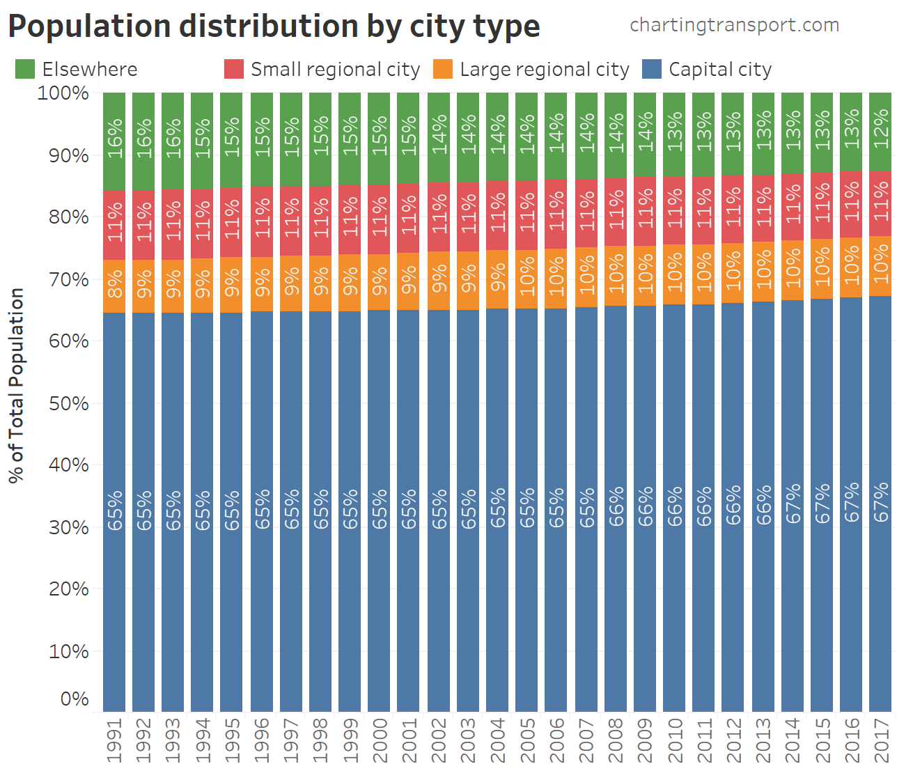
The distribution of total population across the four categories has very slowly shifted towards capital cities:
So what proportion of Australians live in urban areas?
Here’s a breakdown of Australia’s population from the 2016 census by size of city/town and rural areas (using urban centre and locality boundaries – different to the above analysis):
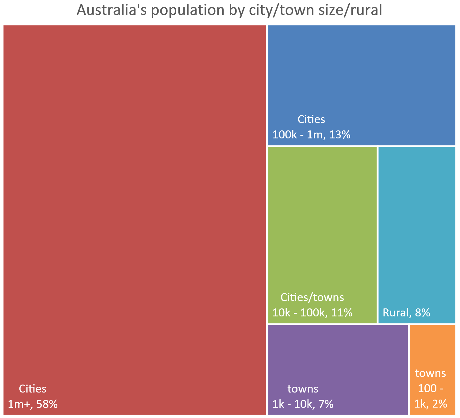
The United Nations cannot land on a single definition of urban (is a locality of 100 people urban?) so it’s hard to perfectly answer the question. But I can say: well over 90% of Australians live in urban areas.
Dominance of capital cities within states and territories
In all states, capital cities have been increasing their share of the population:
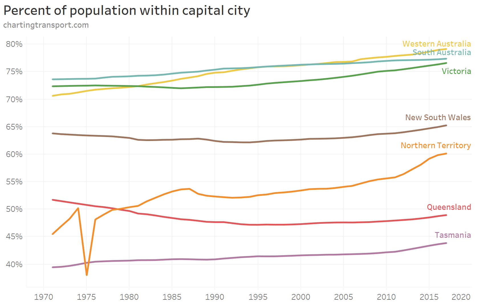
The blip in the Northern Territory represents a temporary exodus of population after Cyclone Tracy devastated much of Darwin on Christmas Day 1974.
Population growth of cities
The following chart shows the population of capital cities and large regional cities. Note I’ve again used a log scale on the Y-axis to separate the cities.
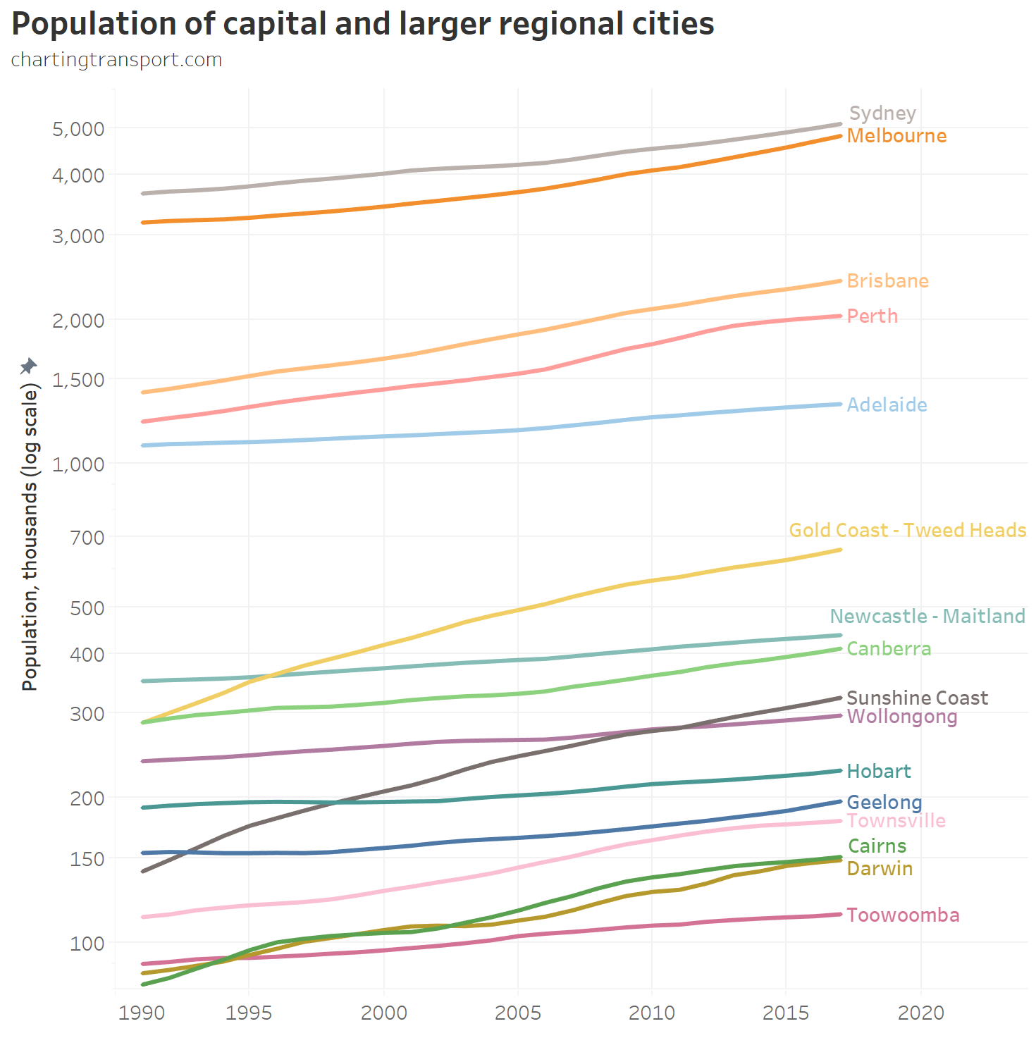
You can see the Gold Coast and Sunshine Coasts have overtaken several other cities.
Here’s a longer time series history of the capital cities (this time not a log scale):
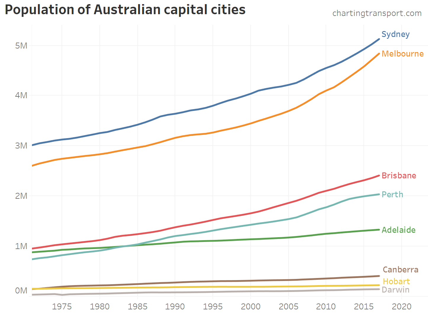
Technical note: Historical population estimates on Greater Capital City Statistical Area boundaries are only available back to 1971, and for Significant Urban Areas boundaries back to 1991. Estimates for earlier years are on inconsistent boundaries.
Perth overtook Adelaide in 1984, and Canberra overtook Hobart in 1972.
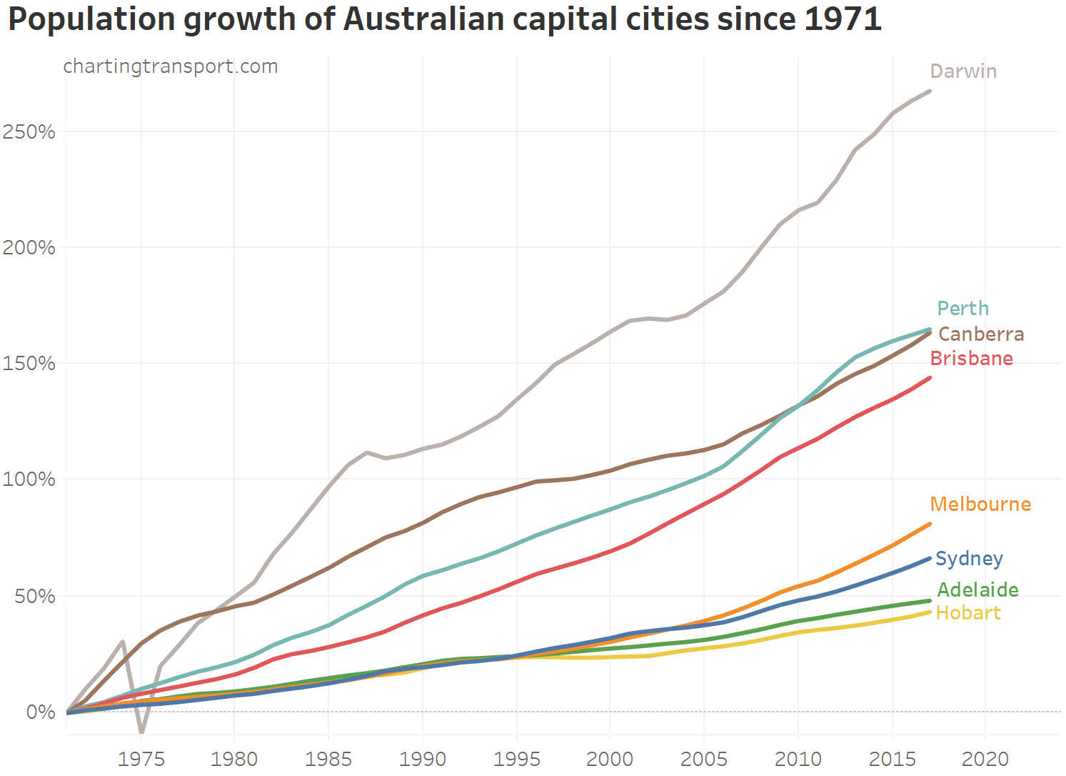
Here is the percentage population growth since 1971 for capitals:
And for more recent history, here is the percentage population growth since 2001 for capital and large regional cities:
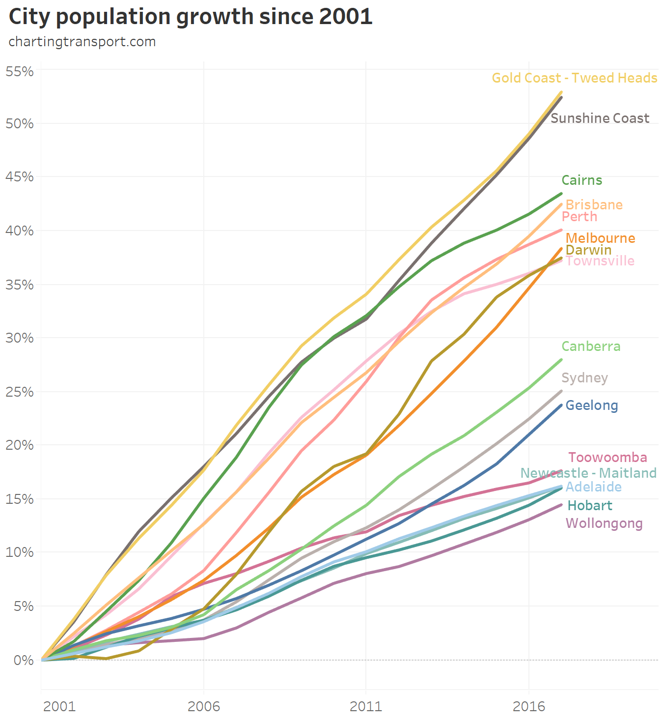
The Gold and Sunshine Coasts are the fastest growing cities by far, followed by Cairns, Brisbane and Perth. Hobart and Adelaide are the slowest growing capital cities.
Another view is annual growth rates:
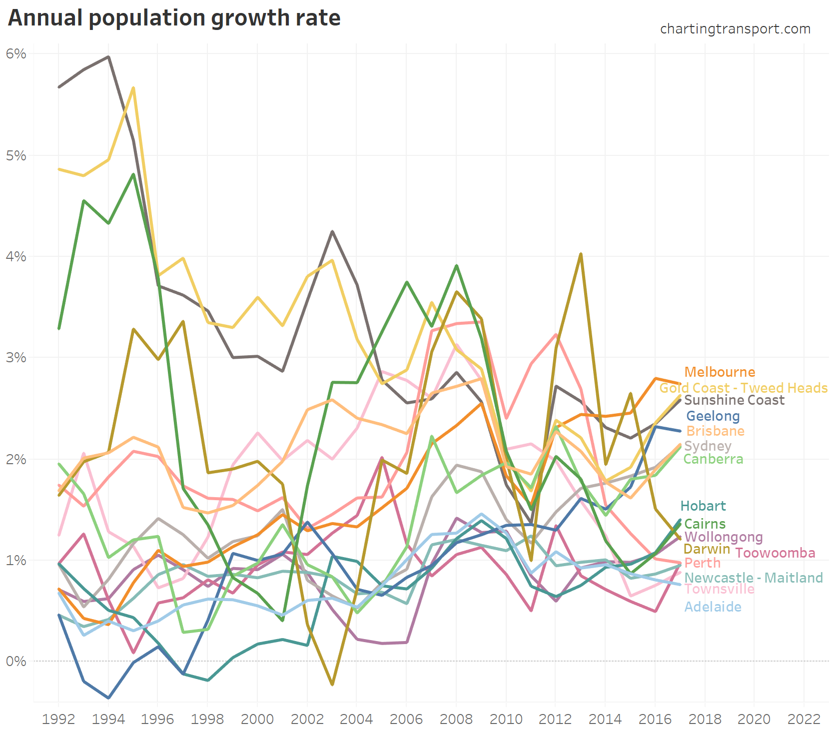
In 2017, Melbourne had the fastest population growth rate, and Adelaide the slowest. The Gold and Sunshine Coasts have had relatively high growth since 1991. All cities have fluctuated a fair bit over time.
Here’s the annual population change for each city – again on a log scale Y-axis:

Technical note: because of the log scale, negative values are omitted from the chart.
Melbourne has been adding more people than Sydney every year since 2002 (hence predictions it will become Australia’s largest city), while Perth’s recent strong growth spurt ran between 2006 and 2013.
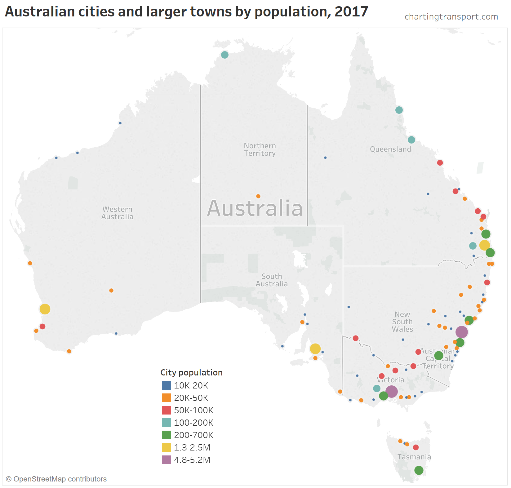
Here’s a simple map of Australian cities and towns by size (based on 2016 GCCSA and SUA boundaries, which is different to the time series data shown above):
Explore this data in Tableau Public.
Note: the intervals are arbitrary and it’s hard to get them perfect. For example, Ballarat had 103,581 residents and Bendigo 97,470 (in 2017), so they are coloured differently. Note: Ballarat had less than 100,000 residents in 2011 so was not included in the earlier charts for regional cities.
Also many of these SUAs include a lot of hinterland – eg Geelong includes Torquay
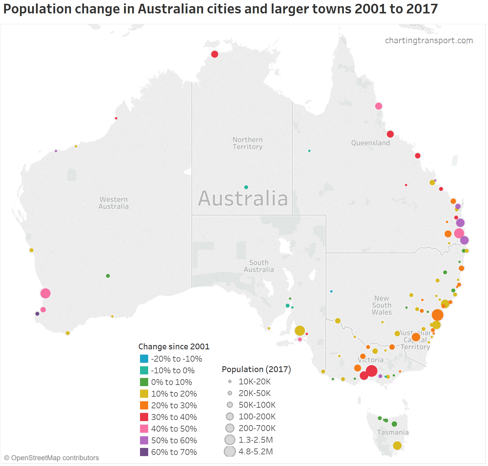
Here is a similar map, but colours now indicate percentage population change 2001 to 2017:
Explore this data in Tableau Public.
The city or town with the highest percentage growth is Bussleton in WA (+66%), followed by Hervey Bay in Queensland (+58%). Broken Hill (NSW) has seen the biggest population decline (-15%), followed by Mount Isa in Queensland (-7%).
Where is population growing within larger cities?
Melbourne
Firstly, my home town Melbourne. Here’s the population growth in the five years to 2017:
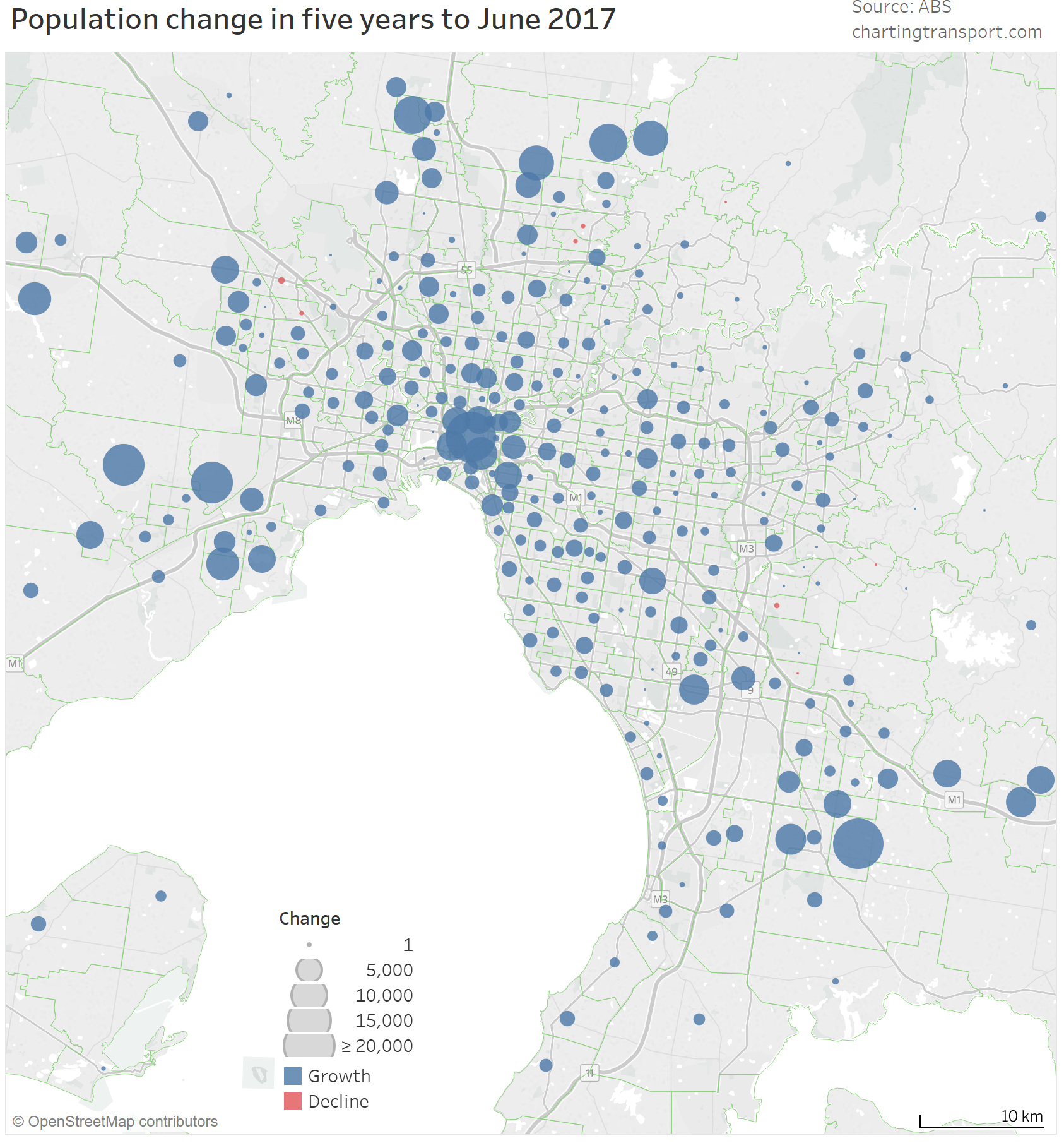
Technical note: I’ve used point circles for each SA2, rather than fill colour (which should never be used for non-ratio data because the size of the zone can too easily distort the message!). Alternatives are to show population density, population growth density, or growth rate percentages. However some metro fringe SA2s include a relatively small urban area coupled with a large rural area, so the density gets washed out by the rural area. Growth rate percentages also depend a lot on the population in the base year. If an SA2 goes from 2000 residents to 8000 residents the growth rate is 300%, but that’s the same increase as a SA2 that goes from 30,000 to 36,000 (20%).
Melbourne’s SA2s (on 2016 boundaries) with the largest population growth were in the outer west, outer north, outer south-east, and central city. SA2s with population slight decline were Rowville South, Upwey – Tecoma, Endeavour Hills South, Keilor Downs, Taylors Lakes and Mill Park.
I think it’s also important to note that SA2 boundaries are somewhat arbitrary and they only change every five years.
In fact, South Morang was reported by the ABS (and media) as the fastest growing SA2 in Australia in 2015-16 (on 2011 boundaries) in terms of absolute growth, but by then it had 64,354 residents and was by far the largest SA2 in Australia (the next largest, Point Cook, had 52,253). It was time to split into smaller SA2s – which indeed happened shortly thereafter with the new 2016 boundaries (ditto Point Cook). So it was probably the fastest growing SA2 more because the ABS had not yet split it into smaller SA2s. Unfortunately this issue isn’t always picked up by the ABS and the media.
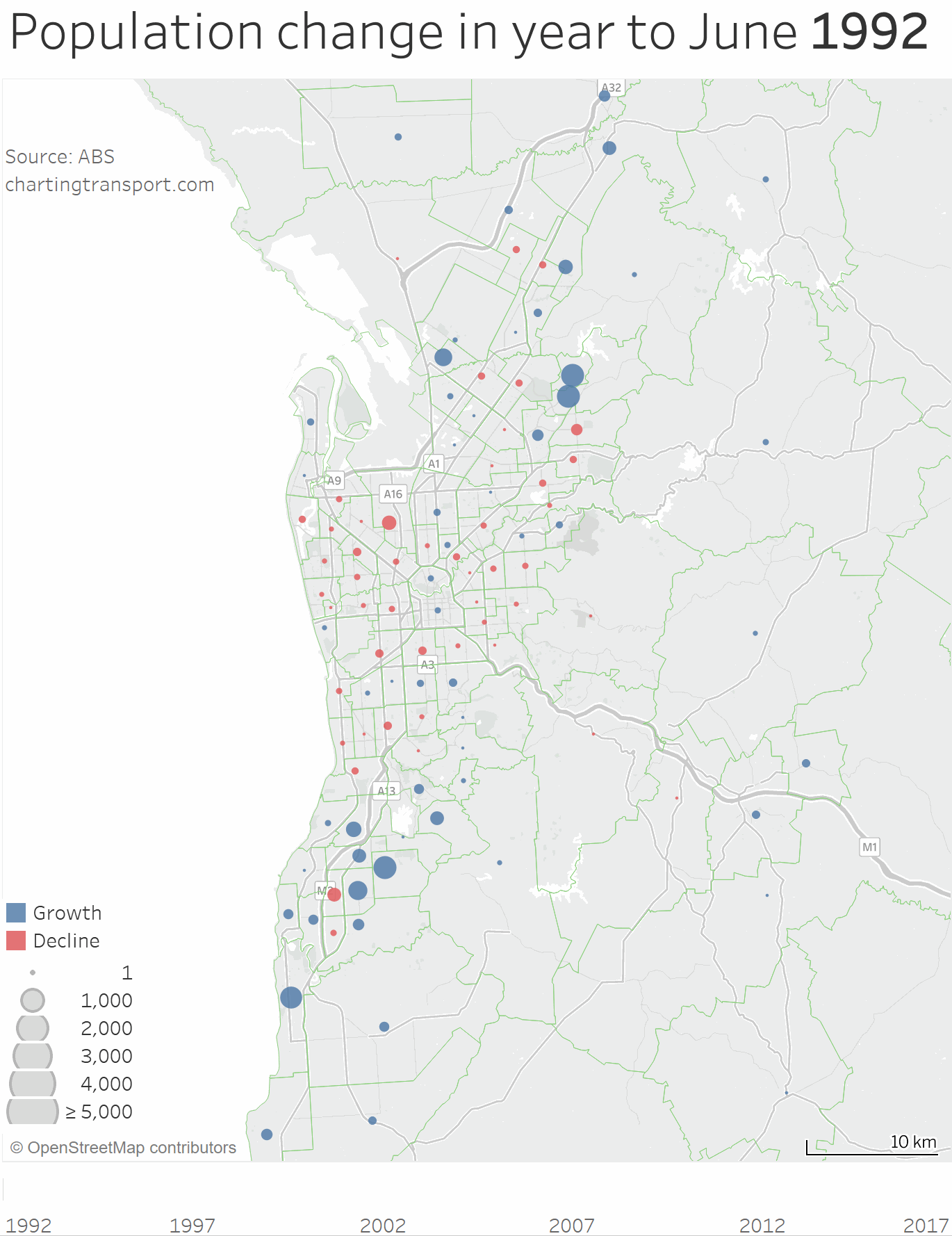
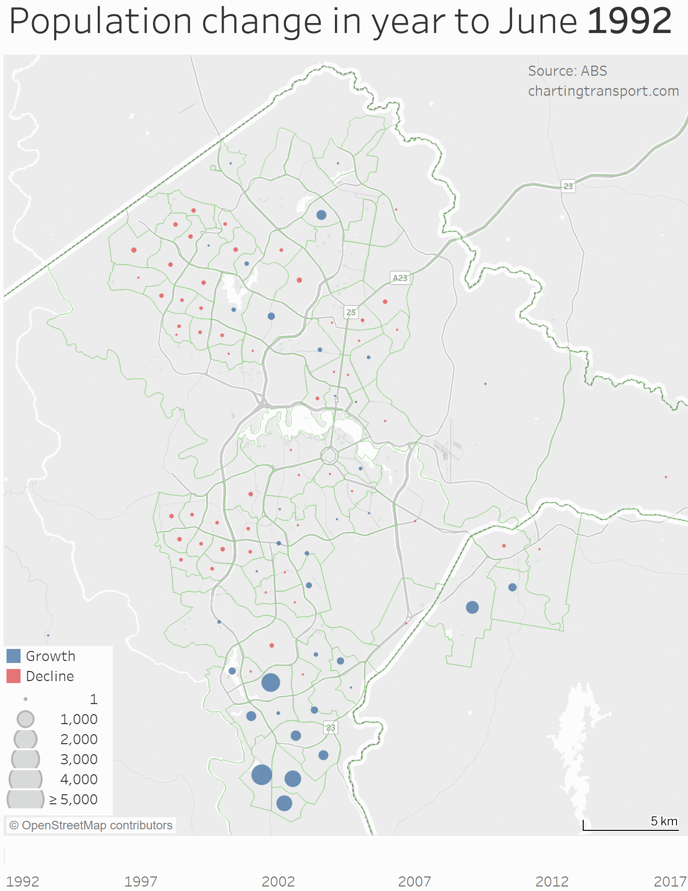
How has population growth changed over the years? That is a four-dimensional question, so my answer will be a four-dimensional visualisation. Here’s an animated map showing the annual growth for each SA2 for each year 1992 to 2017 (you might need to click to enlarge to see it clearly):
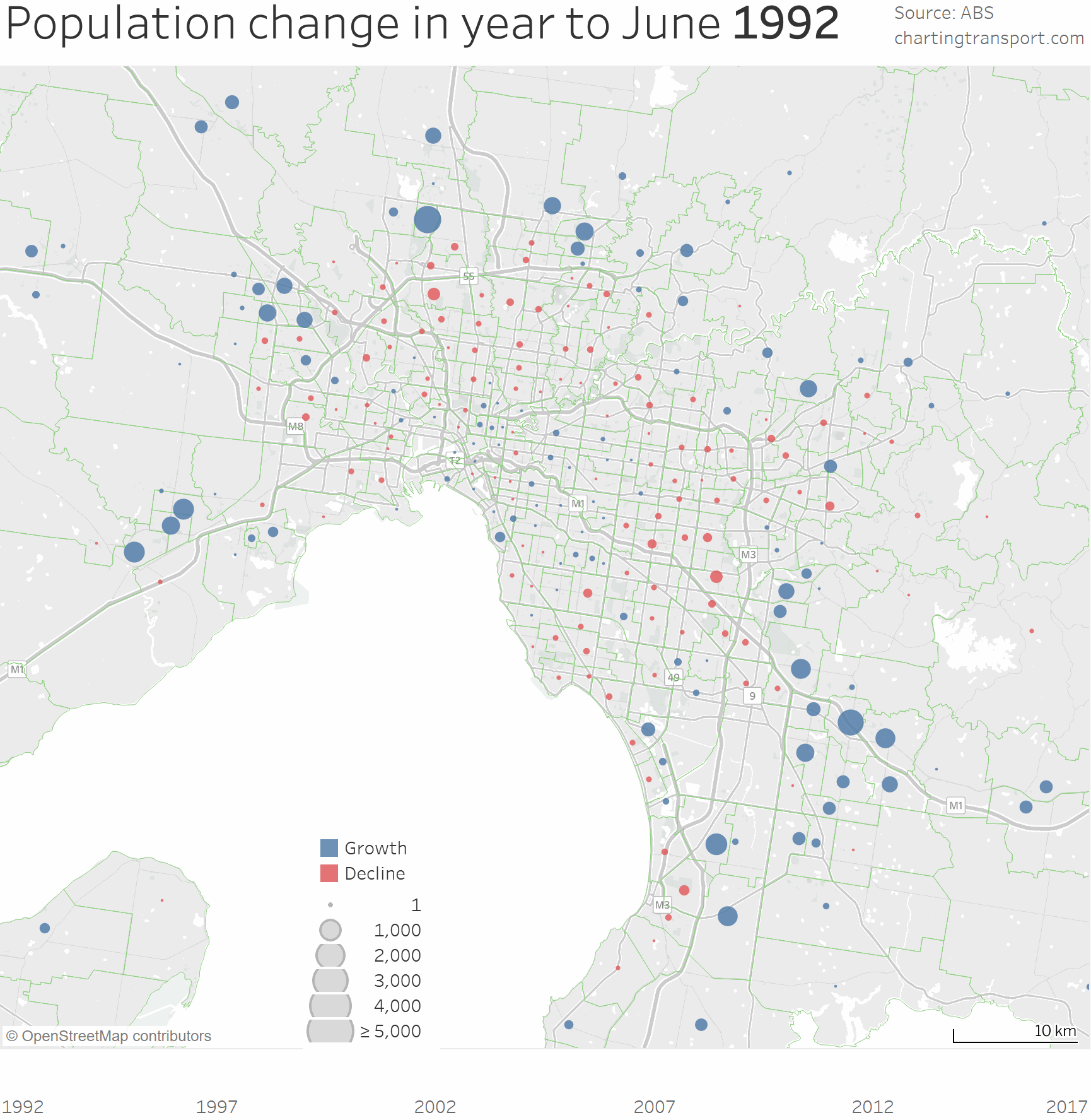
Technical note: until 2001 the maps shows SA2s on 2011 boundaries and then from 2002 onwards the map shows 2016 boundaries. There were several SA2s that split with the 2016 boundaries, mostly in the northern suburbs.
While there has been fairly consistent growth on the fringe in all years, the amount of growth in established areas has fluctuated over time. Here’s a summarised view of the same data, but simplifying the geographic element to distance from the CBD:
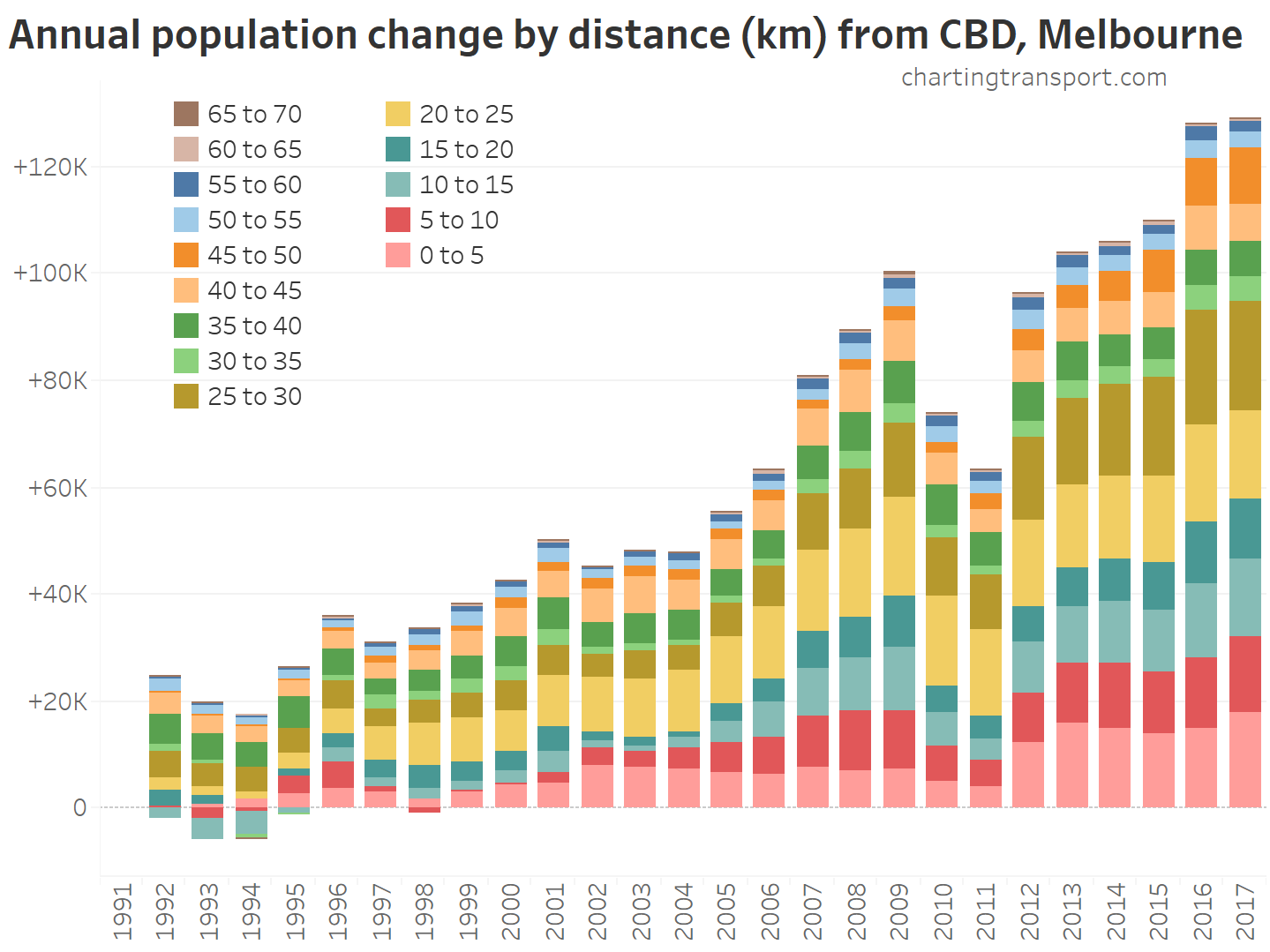
You can see many of Melbourne’s middle suburbs (particularly 10-15 km) saw population decline around 1992 to 1995 while Victoria was under economic stress (but also Australia’s total population growth rate fell below 1% during this period).
Most of Melbourne’s outer growth areas are 20+ km from the CBD, and you can see reasonably steady growth in bands that far out and beyond. But within 20 km there was a big population growth slow-down in 2010 and 2011.
Sydney
Here are the same two charts for Sydney:
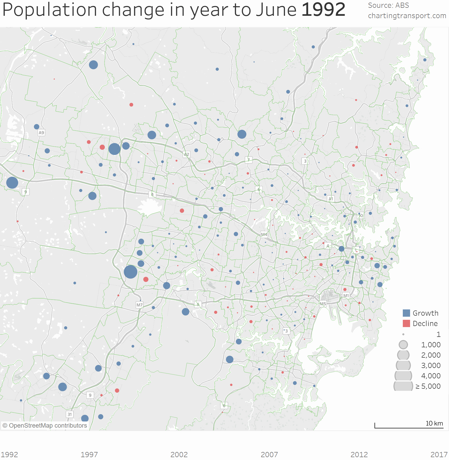

Sydney’s population growth has also varied considerably between years, but the most consistent band for population growth is within 5 km of the CBD. Population growth in the inner and middle suburbs has been strong since 2007.
Brisbane


Brisbane seems to have been a mixed bag. There’s been growth on the fringe to the north and south-west. From around 2002 there was an increase in central city population growth, with a particularly strong surge in 2003 and 2017.
Perth

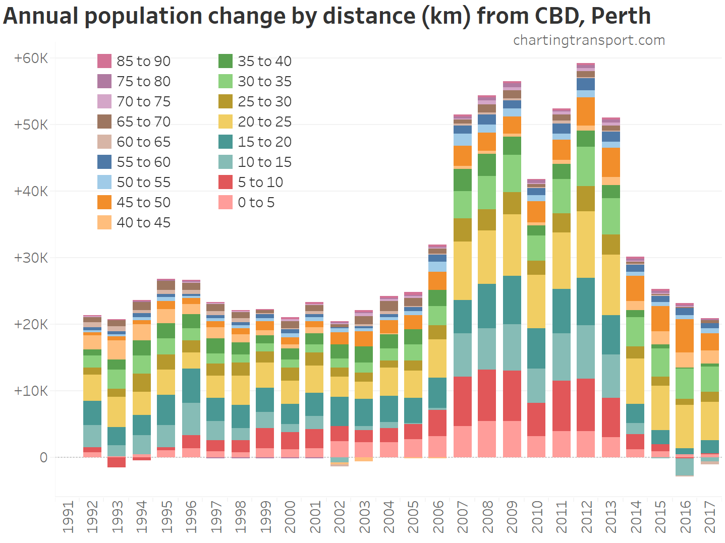
Perth is an interesting story. Apart from the mining boom years 2007 to 2013, most of the population growth has been through urban sprawl. During the mining boom the central and inner suburbs saw substantial population growth (along with the fringe), but since 2014 that’s crashed and there was substantial population decline in the inner and middle suburbs, particularly 10-15 km out from the CBD in 2016.
Adelaide

Adelaide saw substantial population decline in the inner suburbs in the early 1990s, with instead sprawl to the south and north. Things were quieter around the turn of the century before population growth rose around 2005, with quite significant inner suburban population growth, but still plenty of sprawl on the fringe.
Canberra

In the early 1990s, population growth was mostly in the far north and south. Then at the turn the century the south quietened down and Queanbeyan West – Jerrabomberra had a growth spurt. Growth in the outer north took off around 1995. Infill growth took off around 2007, particularly in Belconnen, Bruce, Civic and Kingston – Barton. And then from around 2014 a brand new growth front opened in the west (Wright and Coombs).
Hobart

Note: I’ve used a different scale for the bubbles. because of the smaller changes and smaller geography.
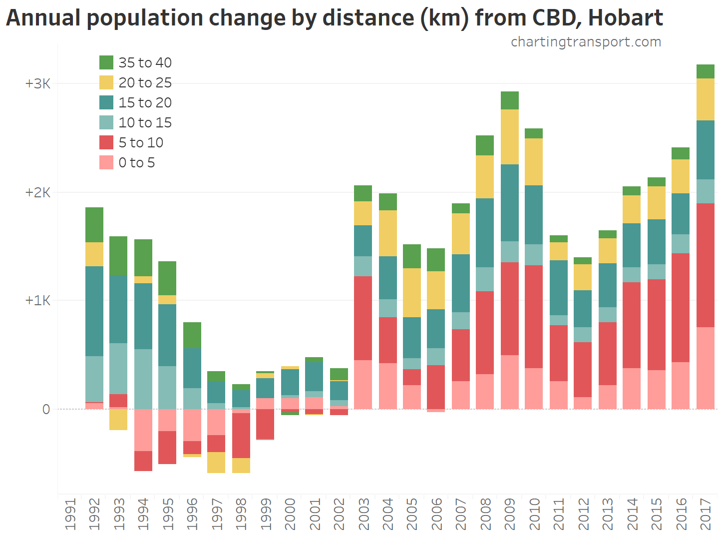
Hobart had net population decline in the late 1990s but then grew quickly from 2003 onwards, with particularly strong growth in 2009 and 2017. The majority of population growth in recent years has been within 10km of the CBD.
Population growth in regional areas
Here is a map showing population growth percentage from 2001 to 2017 for all SA2s in Australia:

No, a new gigantic dense rectangular city has not emerged in the north-west of Western Australia. That’s an artefact of coloured maps and large geographic zones. The “East Pilbara” SA2 population simply grew from 2441 to 6789, which is 178% growth. But the 2017 average density was 0.00017 persons per hectare.
Otherwise places of higher percentage growth are mostly around the major cities. Population decline is common in most inland/outback areas.
I hope this has provided you some new insights on population growth around Australia.
My next post will look at the urban growth areas of large cities in more detail.


Thank you for another great post! I like the bar graphs showing the spatial distribution of population growth in the cities. I’m in Hobart – it would be interesting to see how our growth pattern compares to the other cities. I would imagine an even higher proportion of growth has been on the peri-urban fringes, however we are starting to see a real increase in inner urban residential development in the last year or two…
LikeLike
Hi Sarah, and thanks for the feedback. I’ve just added Hobart to the post. There certainly has been a surge in inner urban population growth recently.
LikeLike
Thanks Chris!
LikeLike