For more recent trend information – skip to the December 2019 update on Australian transport trends.
Each year, just in time for Christmas, the good folks at the Australian Bureau of Infrastructure, Transport, and Regional Economics (BITRE) publish a mountain of data in their Yearbook. This post aims to turn those numbers (and some other data sources) into useful knowledge – with a focus on vehicle kilometres travelled, passenger kilometres travelled, mode shares, car ownership, driver’s licence ownership, greenhouse gas emissions, and transport costs.
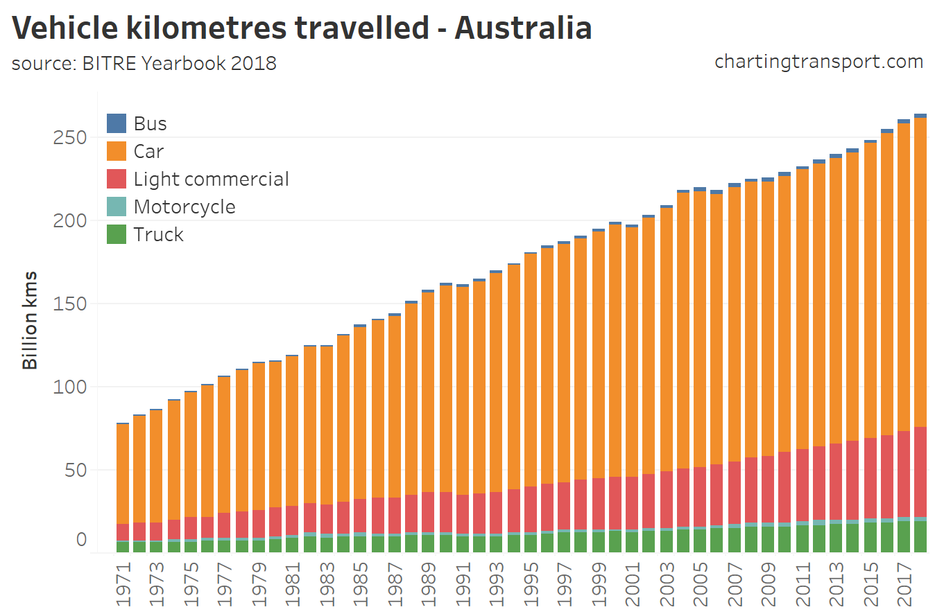
Vehicle kilometres travelled
Road transport volumes are rising, and most of the traffic is of course cars:
Here’s the growth by vehicle type since 1971:
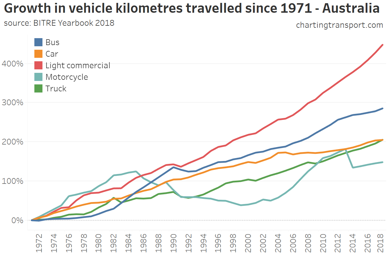
Light commercial vehicle kilometres have grown the fastest, curiously followed by buses (although much of that growth was in the 1980s).
Car kilometre growth has slowed significantly since 2004.
In fact, on a per capita basis car use peaked in 2004 and then declined until 2014, with a little growth since. Here’s the Australian trend (in grey) as well as city level estimates to 2015 (from BITRE Information Sheet 74):
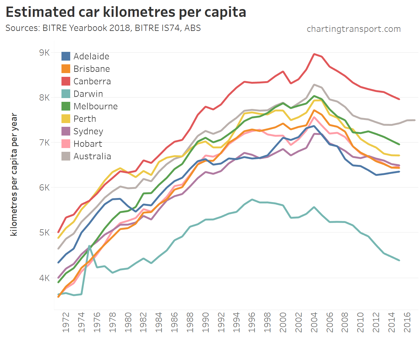
Technical note: “Australia” lines in these charts represent data points for the entire country (including areas outside capital cities).
Darwin has the lowest average which might reflect the small size of the city. The blip in 1975 is related to a significant population exodus after Cyclone Tracey caused significant destruction in late 2014 (the vehicle km estimate might be on the high side).
Canberra, the most car dependent capital city, has had the highest average car kilometres per person (but it might also reflect kilometres driven by people from across the NSW border in Queanbeyan).
The Australia-wide average is higher than most cities, with areas outside capital cities probably involving longer average car journeys and certainly a higher car mode share.
Passenger kilometres travelled
It’s also possible to look at car passenger kilometres per capita, which takes into account car occupancy – and also includes more recent estimates up until 2017:
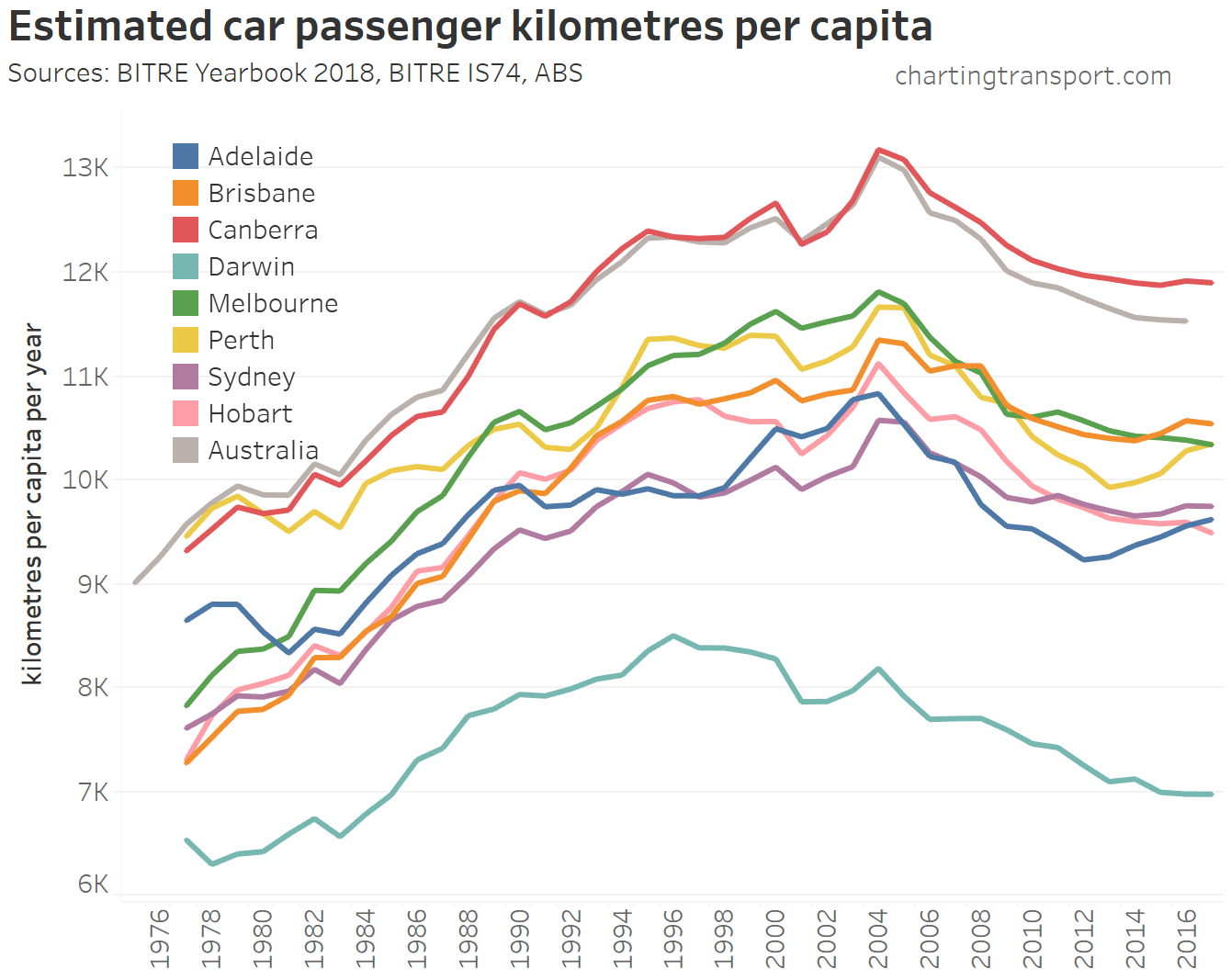
While car passenger kilometres per capita also peaked in 2004, they have increased slightly in recent years in Perth, Adelaide, Brisbane, and Sydney.
BITRE also produce estimates of passenger kilometres for other modes (data available up to 2017 at the time of writing).
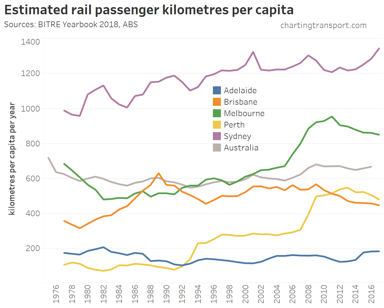
Rail use is highest in Sydney followed by Melbourne. You can see two big jumps in Perth following the opening of the Joondalup line in 1992 and the Mandurah line in 2007.
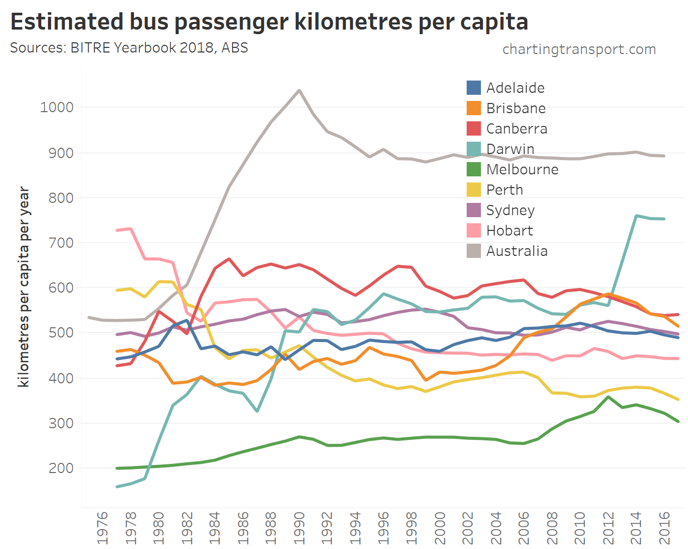
(note: this includes both public and private bus travel)
Australia-wide bus usage is surprisingly high. While public transport bus service levels and patronage would certainly be on average low outside capital cities, buses do play a large role in carrying children to school – particularly over longer distances in rural areas. The peak for bus usage in 1990 may be related to deregulation of domestic aviation, which reduced air fares by around 20%.
Darwin saw a massive increase in bus use in 2014 thanks to a new nearby LNG project running staff services, while investments in increased bus services in Melbourne and Brisbane in the first decade of this century led to significant patronage growth.
We can sum all of the mass transit modes (I use the term “mass transit” to account for both public and private bus services):
![]()
We can also calculate mass transit mode share of motorised passenger kilometres (walking and cycling kilometres are unfortunately not estimated):
![]()
Sydney has maintained the highest mass transit mode share, while Melbourne made significant gains between 2005 and 2009, and Brisbane also grew strongly 2007 to 2013.
Here’s how car and mass transit passenger kilometres have grown since car used peaked in 2004:
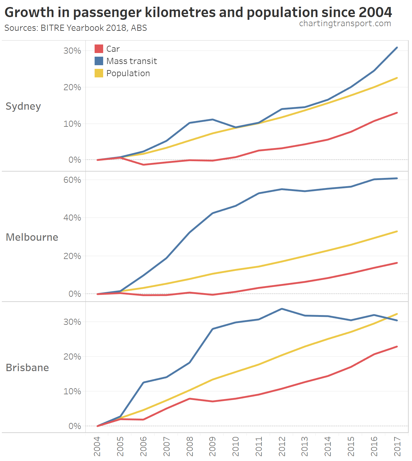
Mass transit use has grown much faster than car use in Australia’s three largest cities. In Sydney and Melbourne it has exceeded population growth also.
Mass transit has also outpaced car use in Perth, Adelaide, and Hobart:
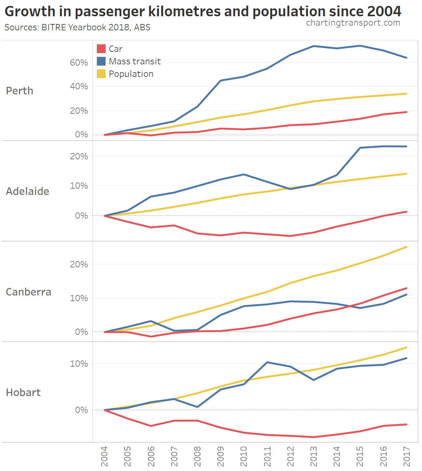
In Canberra, both car and mass transit use has grown much slower than population, and it is the only city where car growth exceeded public transport growth between 2004 and 2017.
Car ownership
The ABS regularly conduct a Motor Vehicle Census, and the following chart includes data up until January 2018.
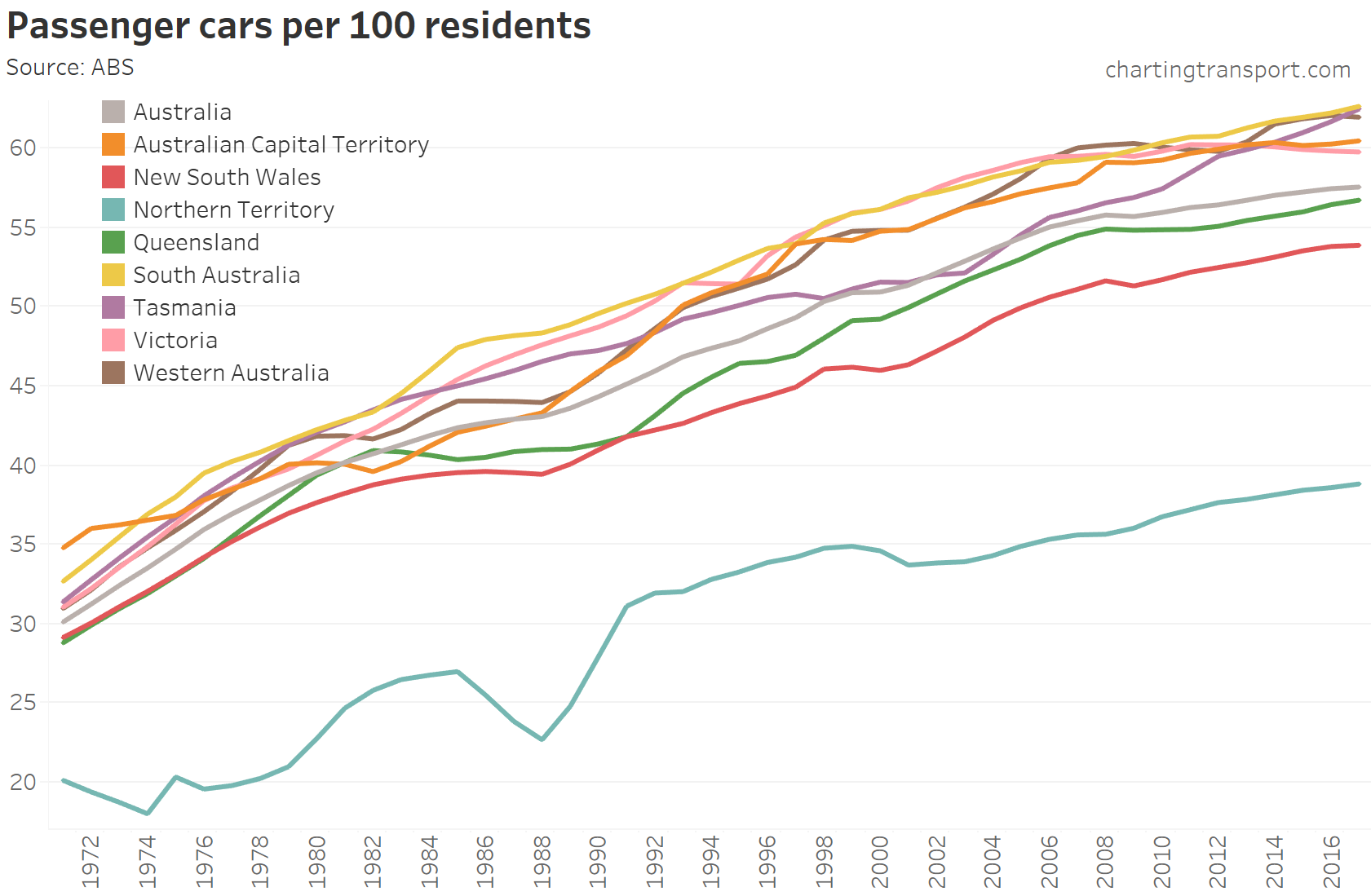
Technical note: Motor Vehicle Census data (currently conducted in January each year) has been interpolated to produce June estimates for each year.
Car ownership has continued to rise slowly in all states – except Victoria, which is consistent with a finding of declining motor vehicle ownership in Melbourne from census data (see also an older post on car ownership).
Driver’s licence ownership
Thanks to BITRE Information Sheet 84, here is motor vehicle licence ownership per 100 persons (of any age) going back to 1971:
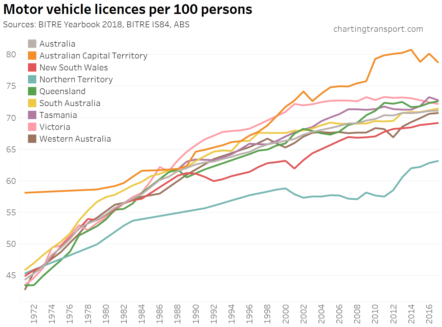
Technical note: the ownership rate is calculated as the sum of car, motorbike and truck licenses – including learner and probationary licences, divided by population. Some people have more than one driver’s licence so it’s likely to be an over-estimate of the proportion of the population with a licence.
There’s been slowing growth over time, but Victoria has seen slow decline since 2011.
Here’s a breakdown by age bands (note each chart has a different Y-axis scale):
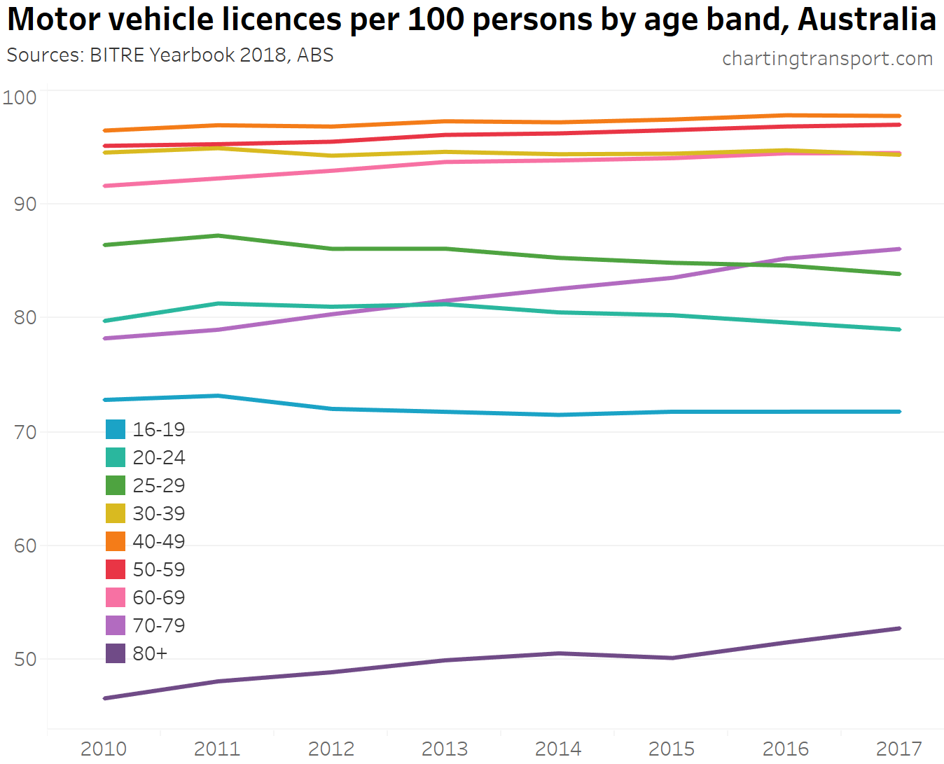
Motor vehicle licence ownership rates have increased for people over 70 (presumably due to a healthier ageing population), and declined for people under 30.
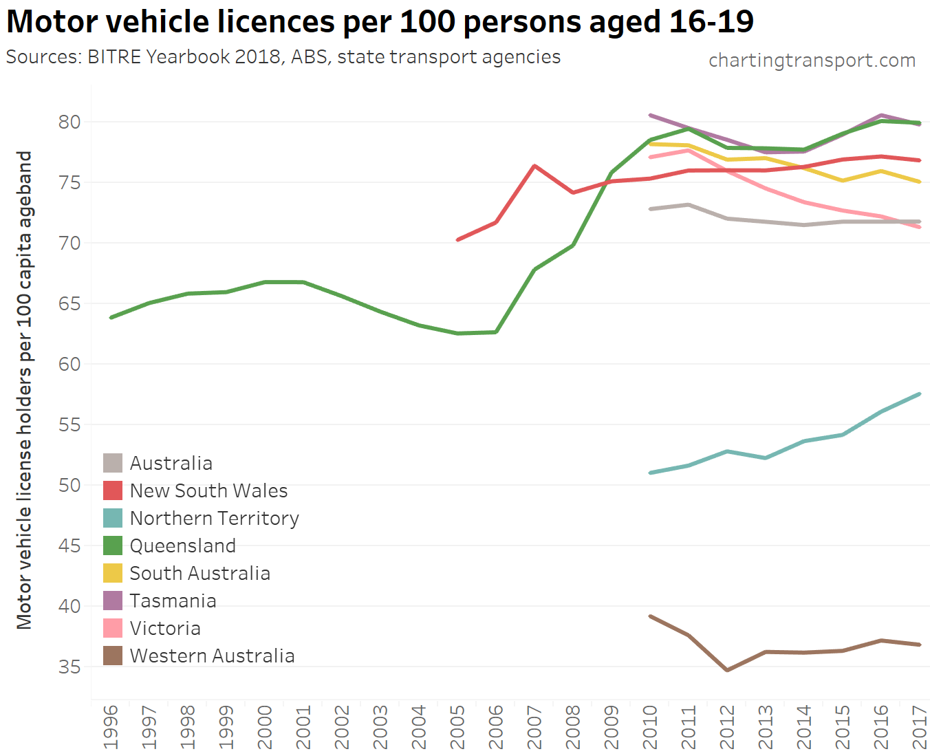
Licencing rates for teenagers have been trending down in South Australia and Victoria recently, but not in other states:
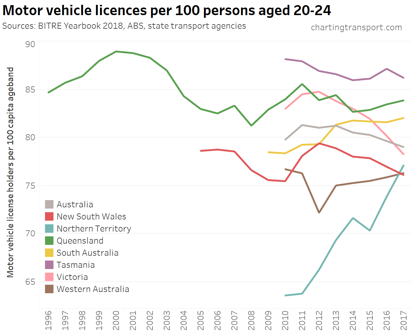
The trends are mixed for 20-24 year-olds:
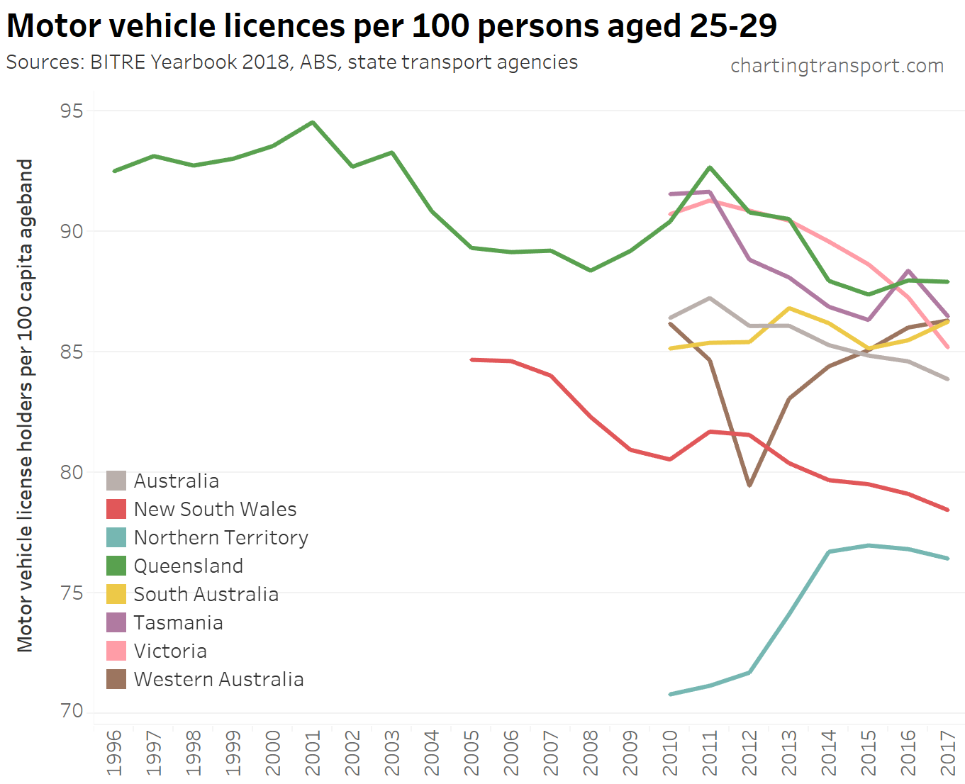
New South Wales and Victoria are seeing downward trends in the 25-29 age bracket:
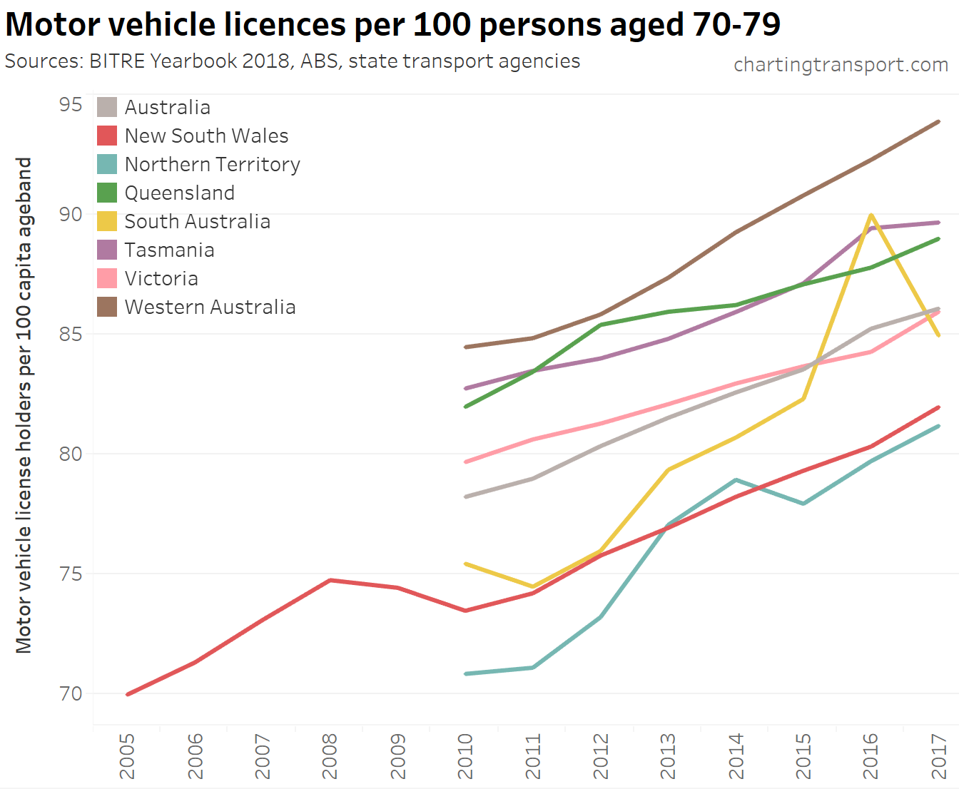
Licencing rates for people in their 70s are rising in all states (I suspect a data error for South Australia in 2016):
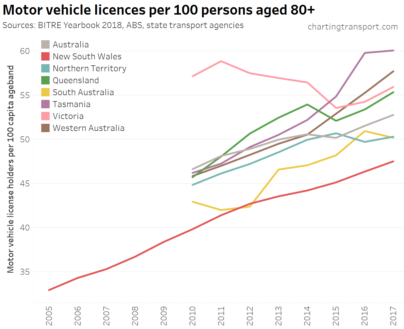
A similar trend is clear for people aged 80-89 (Victoria was an anomaly before 2015):
(see also an older post on driver’s licence ownership for more detailed analysis)
Transport greenhouse gas emissions
Australia’s domestic non-electric transport emissions have increased steadily since 1990 and show no signs of slowing down, let alone declining (latest data at the time of writing is up to June 2018):
![]()
Depending on how you disaggregate total emissions, transport is the second largest sector and the fastest growing.
Here’s breakdown of transport emissions (detailed data only available to 2016 at time of writing):
![]()
And the growth in each sector since 1990:
![]()
Domestic aviation has had the fastest growth, followed by buses. In more recent years rail emissions have grown strongly (note: most of this is rail freight as the vast majority of passenger train movements are electric). Car emissions have grown 27%, but make up the largest share of transport emissions.
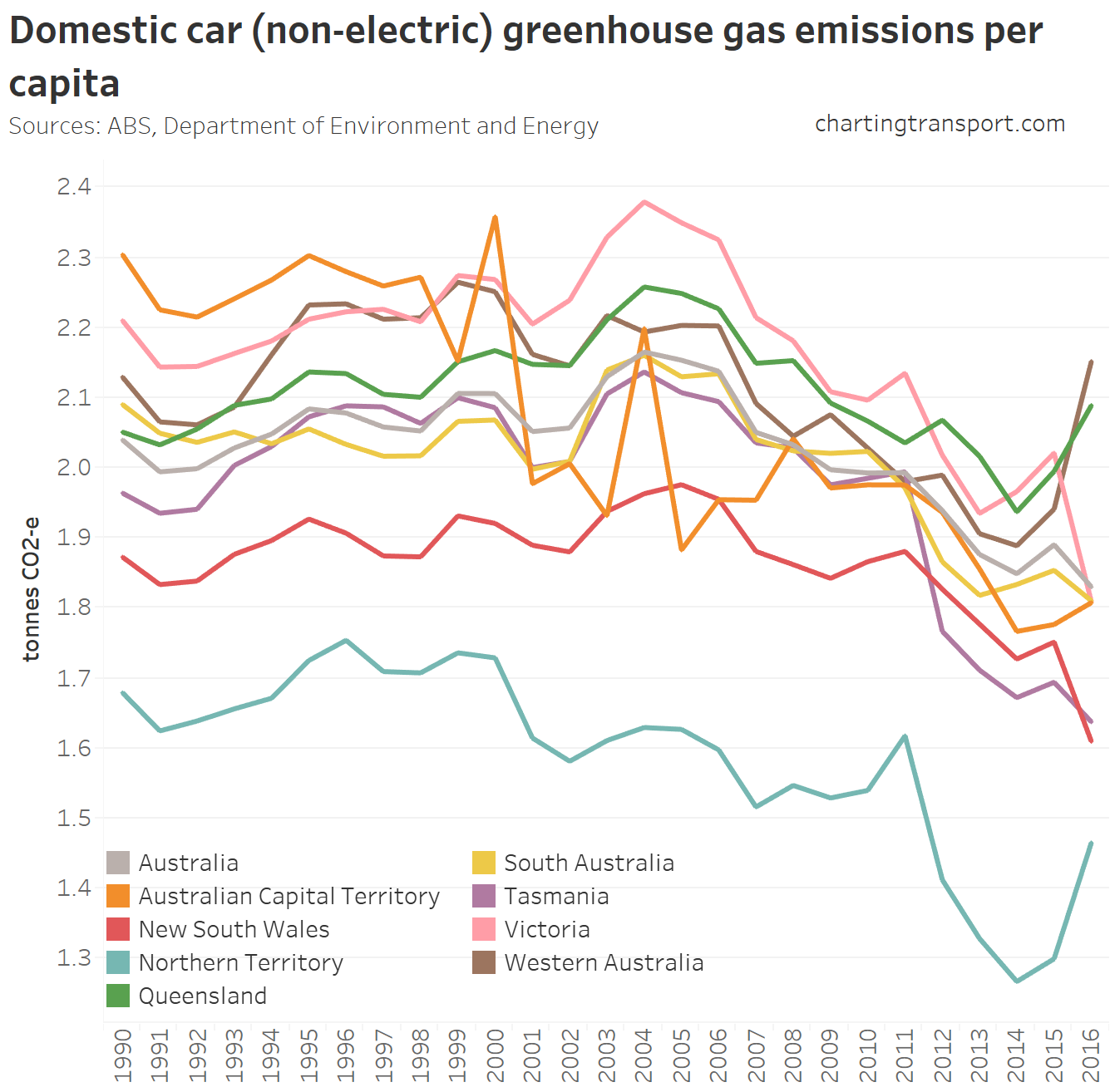
Here are per capita transport emissions for each state:
![]()
The data is a bit noisy (largely due to fluctuations in aviation emissions). Here are road emissions per capita:
![]()
In 2016 there were sharp increases in Western Australia, Queensland and the Northern Territory, while most other states appear to be on a downward trend.
Car emissions per capita have been generally trending downwards in most states, again except Queensland, Western Australia, and the Northern Territory:
Of course if we are to avoid dangerous climate change, total emissions need to reduce substantially, not just per capita emissions!
It’s possible to combine data sets to estimate average emissions per vehicle kilometre for different vehicle types:
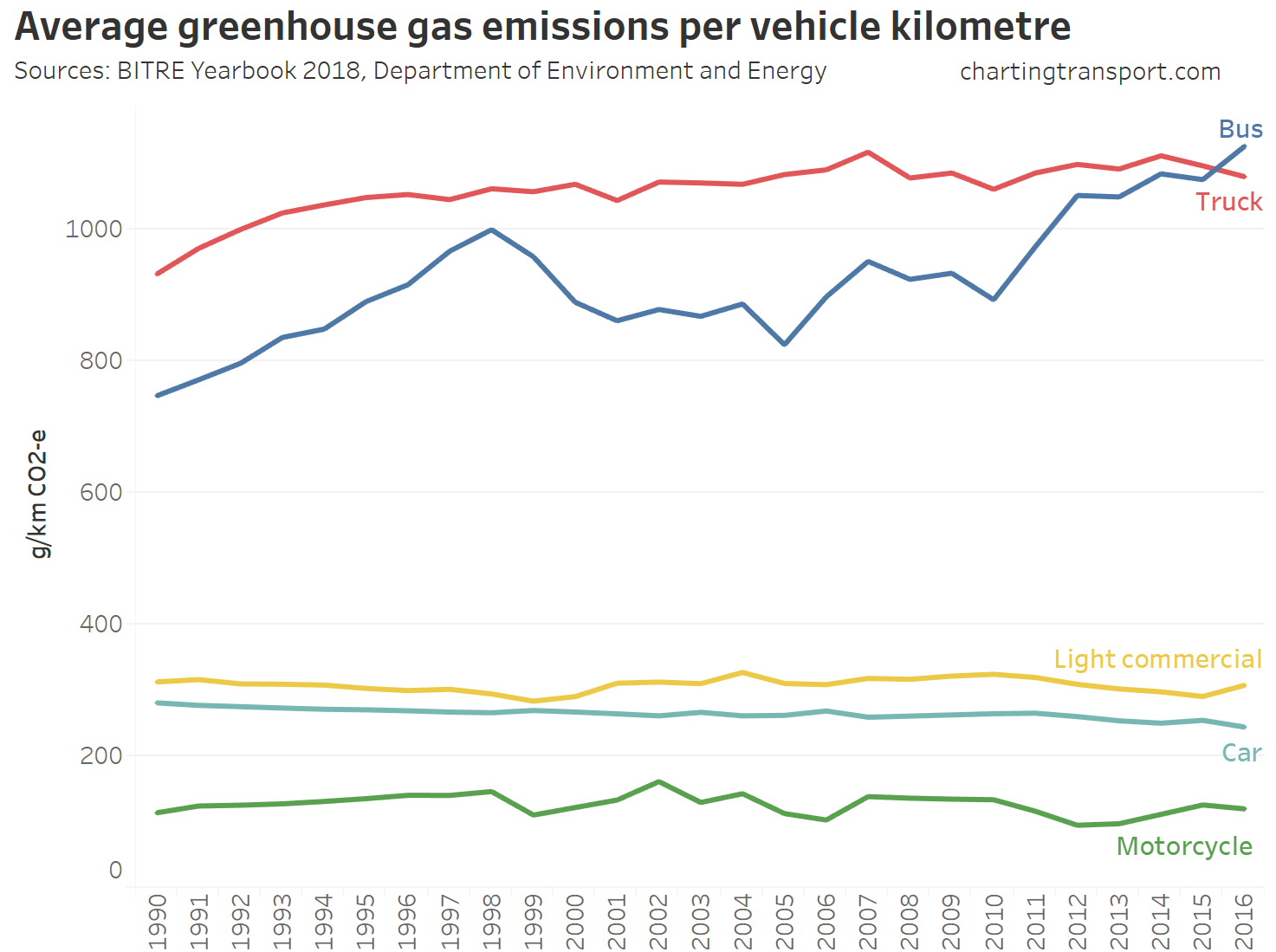
It’s difficult to see any significant reductions in emissions intensity, while average bus emissions intensity has increased recently (not sure why). Average car emissions have fallen slightly from 281 g/km in 1990 to 244 g/km in 2016.
However, the above figures don’t take into account the average passenger occupancy of vehicles. To get around that we can calculate average emissions per passenger kilometre for the high person-capacity modes:
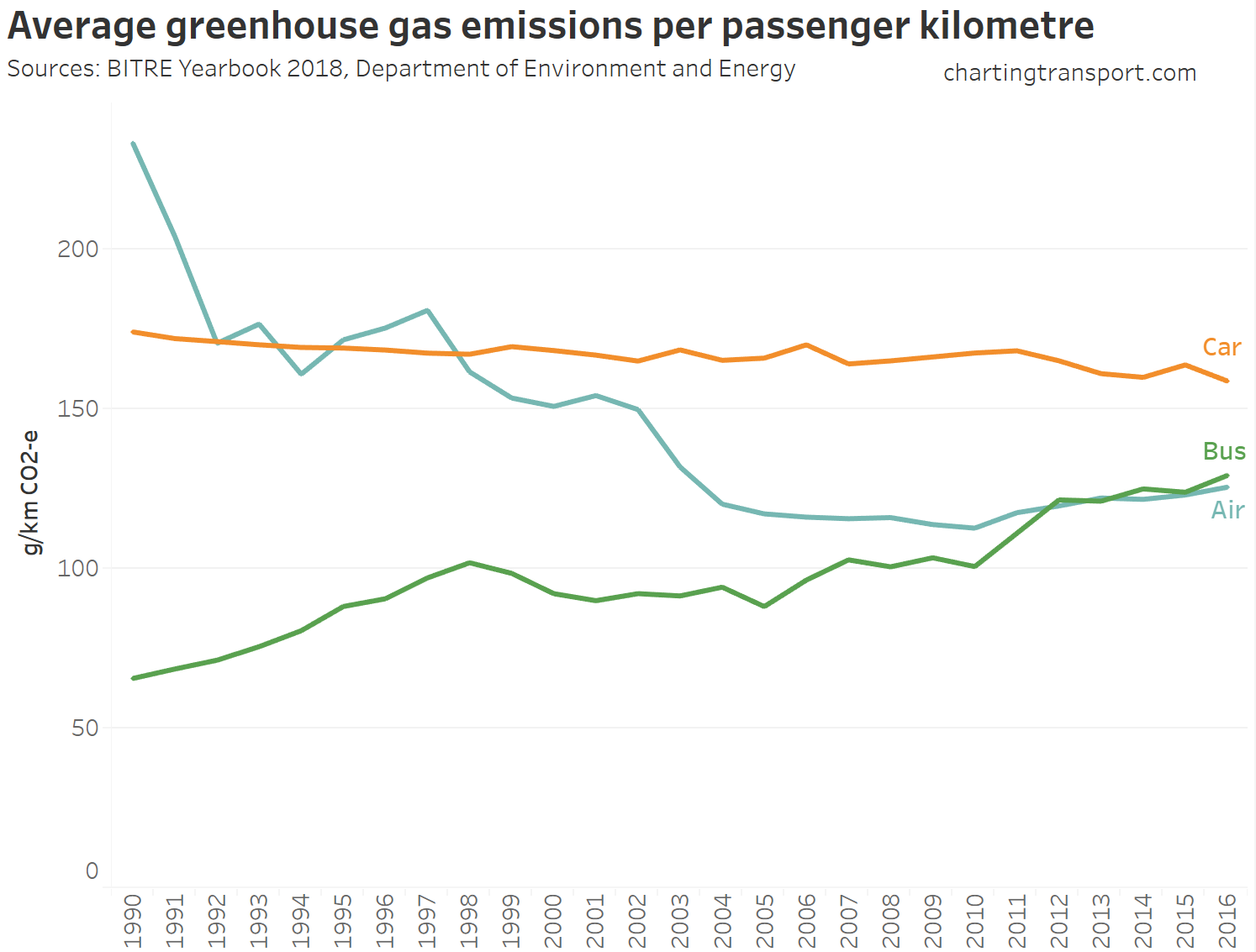
Of course the emissions per passenger kilometres of a bus or plane will depend on occupancy – a full aeroplane or bus will have likely have significantly lower emissions per passenger km. Indeed, the BITRE figures imply an average bus occupancy of around 9 people (typical bus capacity is around 60) – so a well loaded bus should have much lower emissions per passenger km. The operating environment (city v country) might also impact car and bus emissions. On the aviation side, BITRE report a domestic aviation average load factor of 78% in 2016-17.
Cost of transport
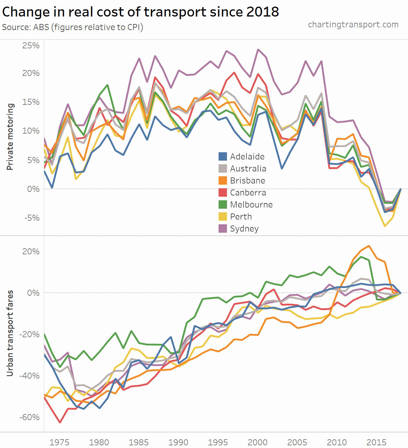
The final topic for this post is the real cost of transport. Here are headline real costs (relative to CPI) for Australia:
![]()
Technical note: Private motoring is a combination of factors, including motor vehicle retail prices and automotive fuel. Urban transport fares include public transport as well as taxi/ride-share.
The cost of private motoring has tracked relatively close to CPI, although has been trending down since around 2008. The real cost of motor vehicles has plummeted since 1996. Urban transport fares have been increasing faster than CPI since the late 1970s.
Here’s a breakdown of the real cost of private motoring and urban transport fares by city (note different Y-axis scales):
![]()
Urban transport fares have grown the most in Brisbane, Perth and Canberra – relative to 1973.
However if you choose a different base year you get a different chart:
![]()
What’s most relevant is the relative change between years – eg. you can see Brisbane’s experiment with high urban transport fare growth between 2009 and 2017 in both charts.
To illustrate the data visualisation problem of choosing a base year – here is the same data for every base year between 1973 and 2018:
Hopefully this post has provided some useful insights into transport trends in Australia. A future post might examine the relationships between the data sets further.


Thanks for providing yet another interesting post Chris. There has been some commentary that the millennials trend towards not driving (as well as living in apartments rather than housing) is not a game-changer and instead is only a delay in them eventually deciding to drive more and move into traditional suburbia. Do you feel that the above data can tell this story?
LikeLike