[post updated in April 2016 with 2015 data. For some more recent data see this post published in December 2018]
Is the rate of car ownership still growing in Australia?
Firstly, by car ownership rate I mean the ratio of the number of registered “passenger vehicles” (from the ABS Motor Vehicle Census) to population (also from ABS). So while some of the measures in the post are not strictly for cars only, I’ve not worried too much about the distinction because I’m most interested in the trends.
The oldest motor vehicle census data is from 1955, and it is no surprise to see car ownership rates in Australia have risen considerably since then:

What is interesting in this chart is the relative rate of car ownership between states and territories. The Northern Territory is consistently the lowest – I’m guessing related to remote indigenous populations with low car ownership. New South Wales may reflect the relatively dense Sydney where car ownership is less important for many. I’m not sure of the reasons for other differences. It might be slight differences in reporting from the state agencies (see ABS’s explanatory notes).
But what about the most recent trends? Here is the same data from 2000 onwards (NT off the chart): 
You can see growth across all states, although there are several periods where some states flat-lined, particularly around 2008.
So while we have reached peak car use, we haven’t reached peak car ownership as a nation.
What about car ownership in cities?
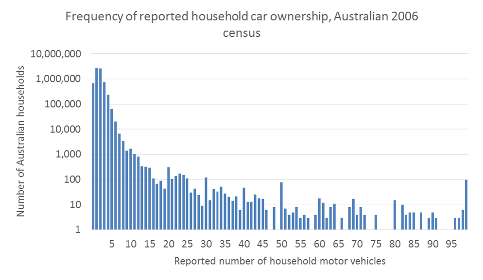
Motor vehicle ownership data is also available from the census, with data provided on the number of households with different numbers of vehicles. The 2006 census reported the number of households with every number of motor vehicles 0 to 99, and here is the frequency distribution:
In 2011 census data ABS only report the number of households with “4 or more” motor vehicles. I’ve calculated the average number of cars for this category for 2006 for each city and applied that to the 2011 data to get total motor vehicle estimates for 2011.
The following chart shows household motor vehicle ownership rates for major city areas for 2006 and 2011 (boundaries changing slightly to include more peripheral areas that are likely to have higher car ownership):
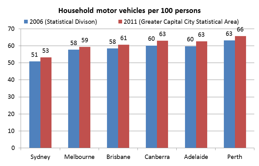
Sydney has the lowest rate of motor vehicle ownership, and Perth the highest, with Melbourne showing the least growth.
Here is the relationship between car ownership and journey to work by car-only:

While all cities had an increase in car ownership between 2006 and 2011, all but two had a reduction in car-only mode share of journeys to work. They were Adelaide and Canberra which also had the largest increases in car ownership rates.
While cities overall show increasing ownership rates, there were reductions in motor vehicles per capita in many municipalities between 2006 and 2011, including the City of Perth, the City of Melbourne, the City of Adelaide, the City of Willoughby, and the City of North Sydney. This suggests car ownership is in decline in some inner city areas of Australian cities (more spatial detail for Melbourne is available in another post). These areas generally have good public transport and many local services within walking distance, and I’d guess many new residents are not bothering with car ownership.
The following chart compares motor vehicle ownership rates between capital city areas and the rest of each state or territory for 2011 census data:
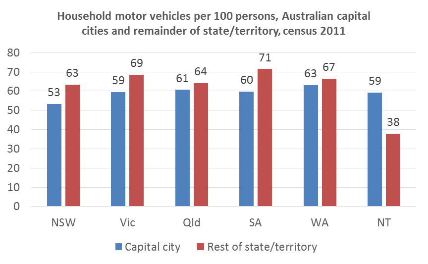
Car ownership is certainly higher outside most capital cities – except in the Northern Territory as I suspected (curiously Darwin has around the same car ownership rate as Melbourne).
How does car ownership vary by demographics?
The Victorian Integrated Survey of Travel and Activity (VISTA) provides detailed data about households in Melbourne and regional Victorian cities for the years 2007-2009. So while I cannot extract trends, we can look at the patterns of car ownership rates.
I have classified all households in the VISTA dataset into one of three categories:
- household with no motor vehicles
- limited motor vehicle ownership: less motor vehicles than people of driving age (arbitrarily defined as 18-80), or
- saturated motor vehicle ownership: motor vehicle count equals or exceeds the number of people of driving age (“MV saturated” in the chart).
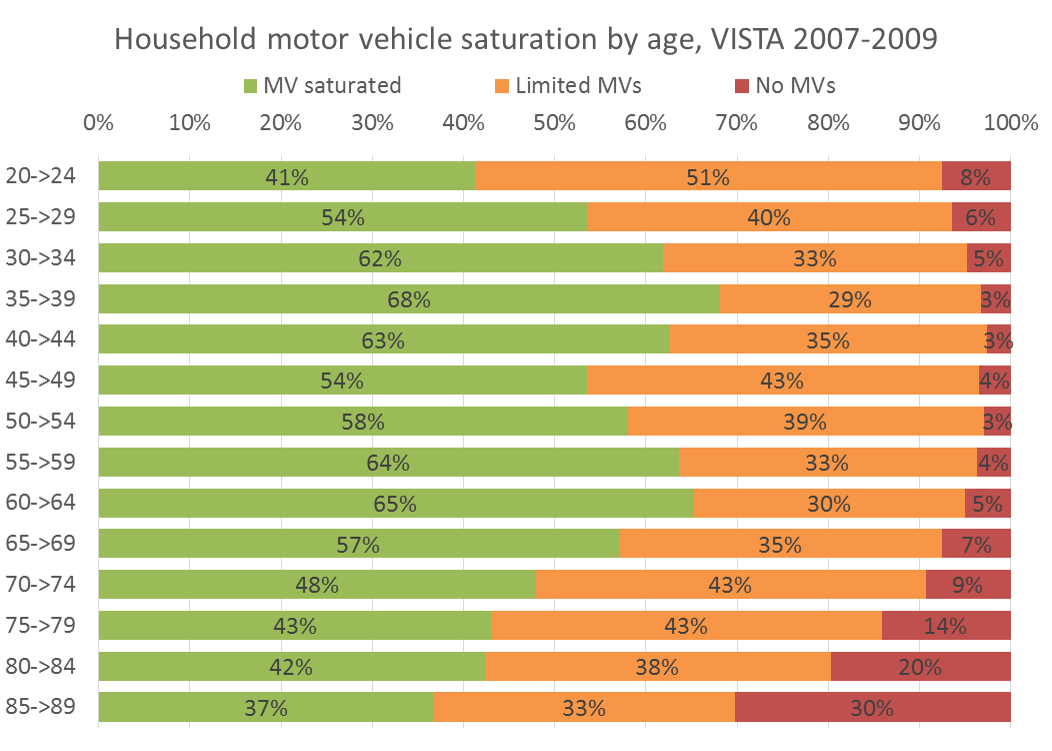
You can see that people aged 35 to 59 are least likely to live in households without motor vehicles, while younger adults are most likely to live in a household with limited car ownership. There are curiously two peaks in saturated car ownership – aged 35-39 and 60-64. The saddle in between might be explained by family households with driving age children.
The following chart looks at household car ownership by household type, with “young families” classed as households where all children are under 10 years of age.

Some very clear patterns emerge, with households incorporating parents and children very likely to own at least one motor vehicle. Sole person households were most likely to not own a motor vehicle. Limited motor vehicle ownership was most common in “other” household structures, parent+children households with older children, and couple households with no kids.
It seems Australians find car ownership a high priority if they have young children. Other analysis on this blog found that such households also have the lowest rates of public transport use, and a very strong inverse relationship between motor vehicle ownership and public transport use.
What about usage of each car?
Using data from the BITRE 2015 yearbook, it is possible to calculate estimated annual kms per passenger car. For this I’m comparing the number of vehicles at the motor vehicle census date with an estimate of total car kms in the previous 12 months (straight line interpolation of BITRE year ending June figures). This isn’t a perfect measure as the number of cars grows throughout the 12 month period where kilometres are taken, but it is still a guide to the trend.

The steeper downwards trend since 2005 is similar to the downwards trend in car passenger kms per capita in Australian cities:

Since around 2005, car ownership has continued to rise while car passenger kilometres per capita has fallen. This suggests we are driving cars shorter distances and/or less often.
What about motorcycles?
Are more people owning motorcycles instead of cars? Here’s the long-term trend:

You can see motorcycle ownership rates peaked around 1980, dipped in the mid 1990s and have grown significantly since around 2004 (although still very small). Does it explain the slowdown in the car ownership rate from 2008?

This chart still shows a slow-down after 2008, so it doesn’t look like rising motorcycle ownership fully explains the slow-down in car ownership. Motorcycle ownership took off in 2004, but car ownership slowed in 2008.
What about the ageing population?
Could the data be impacted by a changing age profile? We know that older aged people are less likely to have their driver’s license and are more likely to live in a household with lower car ownership (refer above), so maybe this would lead to a declining car ownership rate per head of population as a greater portion of the population is older.
Suppose most car owners are aged 18 to 80 years. Here’s the percentage of Australia’s population within that age band:
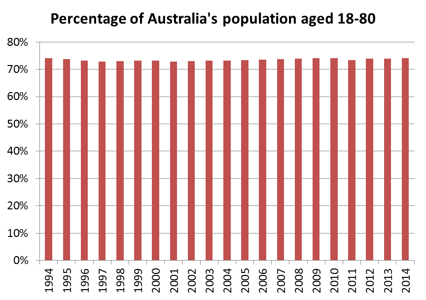
The share has been very steady at around 73 to 74% for all of the last 21 years, which suggests little impact on overall car ownership rates. Then again, those aged 80 today are more likely to have a driver’s license that those aged 80 in 1994. So the rate of car ownership of younger people has probably grown less. We know their rate of driver’s license ownership has declined over time, but I’m not aware of any readily available data that would confirm a lower rate of car ownership by younger people over time (it’s probably available from the Sydney Household Travel Survey datasets).
Notes on the data:
- The ABS Motor Vehicle Census has been taken in different months in different years. State population estimates are only available on a quarterly basis. I have used the nearest quarterly population figure for each motor vehicle census where they do not align (never more than one month out).


Hi Chris, another informative post as usual.
I suspect the best explanation for the lack of difference between car ownership rates in Melbourne and Victoria overall is that to some extent car ownership is not a direct response to need but simply an indicator of wealth.
It’s been observed that in many wealthy European cities, including those such as Paris and Vienna with excellent public transport and low car use, car ownership rates have been up around 60 per cent for longer than they have been in Melbourne. It appears wealthy populations like to have cars around even if they’re not being used from day to day.
It seems Sydney and Melbourne have now caught up with Europe in this regard (and it would be interesting to compare capital city with regional/rural figures for car ownership in other states). But it appears 60 per cent is the saturation level except in severely car-dependent places like the US.
LikeLike
Hi Chris,
Certainly a useful post as always.
As an indicator of car use, car ownership is becoming less reliable than it used to be. Clearly we own more cars per head although we seem to use them less. Meanwhile car occupancy is also declining, so we apparently use them less efficiently… It would be good to explore that in more detail!
William
LikeLike
Chris,
Interesting data indicating a real shift in consumer preferences. You are right the age issues does not explain it. Looking age state specific age age graphs based on ABS estimated population the share of population aged 18 to 80 is rising but this largely driven by increases in the lower age groups for all states but WA and TAS.
WIth Public transport use rising, car use and ownership falling, maybe the explanation is more closely related to the origin destination matrices. Certainly the new jobs and (employment) growth industries are those located in the inner urban and more public transport accessible areas.
Bill
LikeLike
[…] 100 people. (For more information on this and easy to read graphs please see the first section of Charting Transport’s blog at https://chartingtransport.com/2011/08/07/trends-in-car-ownership/) This majority of the […]
LikeLike
Chris
I am interested to know about motorcycle/scooters.
sometime this year there will be 1,000,000 motorcycles registered. that makes 1 bike/scooter for every 24(ish) Australians. but thats not really true… because from ages 0-16 you cant drive… so what is that actual number of
1 motorcycle for every X number of licensed drivers
or
1 motorcycle for every X number of people older than 16
LikeLike