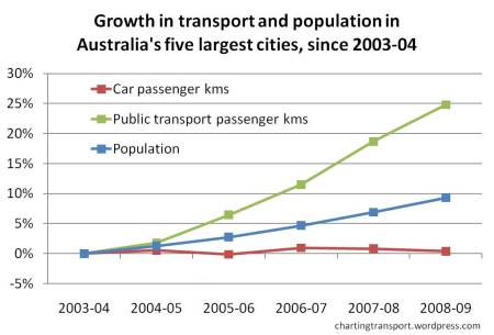
While I’ve covered passenger transport trends in detail in another post, here are a couple of simple views of the data that provide a pretty stark summary of the recent mode shifts:
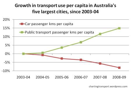
Or per capita growth:
I think those charts mostly speak for themselves.
(For the record, the five biggest cities are Sydney, Melbourne, Brisbane, Perth, and Adelaide)
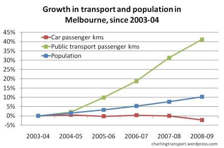
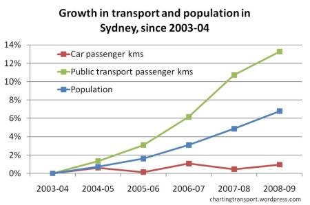
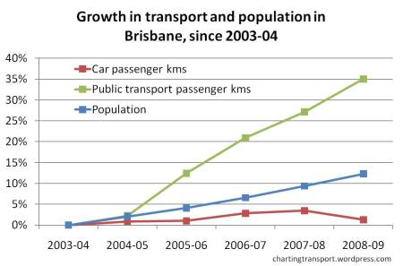
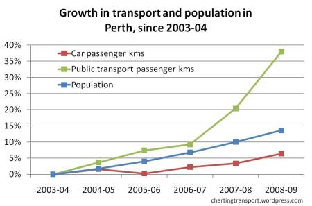
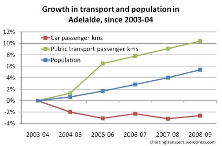
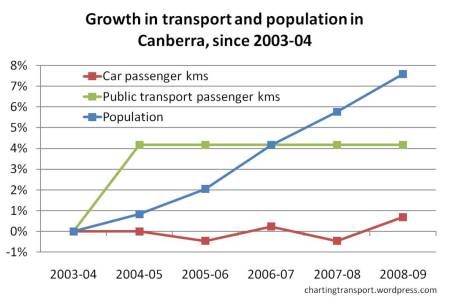
By popular demand, here are charts for each city (plus Canberra):
Note:
- These charts have very different scales on the Y axis. Compare with caution.
- Canberra public transport passenger km (actually just bus passenger kms) is reported as “0.25” billion passenger kms for five straight years, hence the straight green line.
- While I haven’t drawn the second set of charts for each city, in all cities, car passenger kms per capita have reduced (red lines below blue lines). Public tranpsort passenger kms per capita have increased in all cities except Canberra.
