Transport mode share to employment areas in Melbourne 2006

Fri 19 November, 2010

In another post, I’ve mapped out the transport mode shares by residential origins. These maps are fairly common. But what are the mode shares like for employment destinations across Melbourne?

In this post I have mapped out the public transport, car and bicycle mode shares for journey work in each “destination zone” (the smallest unit in the ABS journey to work census data) from the 2006 census.

Note:

  • In the mode share maps I have only shown zones with an employment density of 1000 people per square km or higher to avoid small sample sizes causing issues (people work almost everywhere, but I want to focus on denser employment areas).
  • I’ve removed “did not travel”, “worked from home”, “all other modes” and “method not stated” from my mode share calculations. We don’t know the real mode share, but hopefully the mode shares under “all other modes” and “method not stated” are not too different from those where we know the mode.

Employment Density

But before looking at mode shares, it is worth looking at employment density. To view these maps you’ll need to click to zoom (open them in a new window if you can).

You can see:

  • Dense employment in the inner city (no surprises)
  • Industrial areas like Monash, South Dandenong, Somerton, North Altona, Moorabbin, and Bayswater.
  • Major shopping centres (at least those that have their own destination zone) such as Werribee Plaza, Sunshine, Moonee Ponds, Northland, Box Hill, Doncaster Shoppingtown, Greensborough, Ringwood, Knox City, Chadstone, Fountain Gate, Southland, Forest Hill.
  • Other dense suburban spots include Tooronga (Coles headquarters) and Camberwell (shops plus some office buildings)

Looking at the inner city area:

Obviously the CBD is dense, but there is a corridor north of the CBD towards Melbourne University, and south along St Kilda Road. The densities are very high when you have high-rise buildings, so it is a little difficult to show the variation. But can at least look for building shadows on Near Maps.

Public Transport mode share

You can pretty clearly see a high public transport mode share for destinations in the inner city, and very low mode shares in the suburbs.

However there are a few spots in the suburbs with relatively higher public transport mode shares than surrounding areas:

  • Monash University Clayton campus (parking is not easy and this is a focal point for the local bus network)
  • Huntingdale near the station (unclear why the high mode share in 2006)
  • Moorabbin near the station (an activity centre including some office buildings)
  • Box Hill (a Central Activities District on a frequent train line and significant bus interchange).
  • Ringwood (also a Central Activities District on a rail junction in the outer east)

And the mode shares to large suburban shopping centres (remember these are journeys to work only) are surprisingly high (relatively anyway):

  • Chadstone 13%
  • Southland 12%
  • Northland 10%
  • Highpoint 10%
  • Doncaster (Shoppingtown) 8%
  • Fountain Gate 7%
  • Knox City 7%
  • Werribee Plaza 6%

An aside: it’s unfortunate that some shopping centre owners are less enthusiastic about providing good facilities for buses, even though around 1 in 10 of their workforce comes by bus (all of the above listed centres are not served by trains). I am now armed with some factoids.

Notably, public transport mode shares were quite low at three of the nominated Central Activities Districts (CADs), including Broadmeadows, Dandenong and Frankston. If these are to be successful CADs, then public transport will need to be made a much more attractive access mode. I suspect this requires a focus on the local bus networks, as peak rail services to these centres are already quite frequent).

So what about the inner city area? This map zooms in, and I’ve actually labelled the public transport mode share for each destination zone (again you will need to open the enlargement in a new tab to see).

You can see public transport has a high mode share in the CBD grid and surrounds. It peaks at 70% at a few places in the CBD grid.

But it drops off fairly quickly as you move away:

  • Mode share drops into the 21-45% range in the Southbank/South Melbourne area. Essentially most people need to transfer to tram to get there (the 55 tram runs through the middle of it, but the only real train interchange location is Flagstaff, in the north of the CBD)
  • The Parkville precinct has mode shares around 35% (accessible by frequent trams that do interchange with Melbourne Central station).
  • The northern parts of Docklands have only 22% public transport mode share. These areas are awkward to reach by public transport (long walk from Southern Cross station, a slow tram connection, or a walk from a bus stop)
  • The Dynon area (WNW of the CBD) has only 8% mode share, despite being served by frequent buses. This is probably to do with the industries present – freight transport (early starts) and the Wholesale Fruit and Vegetable Market (which opens at 3:30 am or 4:30 am depending on the day of the week).
  • St Kilda Road to the south of the CBD has many high-rise office blocks, but public transport mode share ranges from 23 to 32% in the lower section, despite extremely frequent tram services along St Kilda Road that provide direct access from many inner south-eastern suburbs. In the AM peak, the busiest direction for trams on St Kilda Road is actually southbound – as people transfer from trains at Flinders Street.  The new rail tunnel is proposed to run through the CBD and terminate at Domain Road. The tunnel won’t improve public transport access for the thousands of employees who live  in the inner south-east until it is extended to Caulfield (I’ll look at this in more detail in another post).
  • The Fishermans Bend area (across the river, WSW of the CBD) has mode shares around 5%. This area is served by buses from the CBD that actually have a peak flow out of the CBD in the AM peak. As I will show in another post, most of the workers in Fishermans Bend come from the western suburbs of Melbourne, and presumably a great many of them drive to work across the Westgate Bridge. There is one bus route (232) that runs across the Westgate Bridge and along Williamstown Road (which borders the Port Melbourne industrial area to the south), however it has a very limited catchment in North Altona.

If density is good for public transport, then where are the dense employment areas with low public transport mode share? The following map shows destination zones with employment density over 3000 per square kilometre and public transport mode share less than 10% (arbitrary cut-offs I realise):

These should be strong candidates for gaining greater public transport mode share, perhaps if they were better served by better public transport.

Walking through the locations:

  • Fishermans Bend already has reasonable peak period public transport, but it comes from the CBD, while the workers come from the western suburbs and have to transfer.
  • Werribee town centre and Werribee Plaza Shopping Centre – the bus routes to these centres run every 40 or 60 minutes in the peak.
  • Tooronga – the Coles Headquarters – a long walk from the station or nearby tram, or a half hourly north-south bus service. Not to mention some big hills and presumably cheap parking.
  • Large areas of Monash including Clayton, Notting Hill, Mount Waverley. Some parts of this area were serviced by SmartBus routes (703 along Blackburn and 888/9 along Springvale Roads) in 2006. Another (900) has been introduced along Wellington Road since. However issues in this area include that many of the employees come from the south-eastern suburbs (requiring transfers from a train as opposed to easy access from the Monash Freeway), and that the road grid spacing is large – many workplaces will be a long walk from bus stops.
  • Glen Waverley – around the train station. Note really sure why, it has good access by bus and train.
  • The Tally Ho business park in Burwood East (at the intersection of tram 75 and a SmartBus route 888/9). A classic car-orientated suburban business park (including a VicRoads office no less).
  • The south-eastern corner of Moorabbin – this area is served by a few peak period only bus trips.
  • Central Dandenong – many bus routes into Dandenong operate only hourly. A SmartBus route has since been introduced (901).
  • Fountain Gate – again many hourly or worse bus frequencies in the outer south-eastern suburbs.
  • Cranbourne Shops – many low frequency bus routes (some trips bypass the shopping centre in peak periods).
  • Central Frankston – on a train line, but many low frequency bus routes. A SmartBus route has since been introduced from the north (901).
  • A patch in Kew along Denmark Street. Which happens to include the VicRoads head office and Xavier College  (PT mode share around 9%).
  • Along Whitehorse Road in Blackburn and Mitcham, including areas a decent walk from the train stations. A SmartBus service (901) has just been introduced along this stretch of Whitehorse Road.
  • Bayswater industrial area – served by some peak period only bus deviations.
  • Heidelberg – just west of the rail line include the Austin Hospital. A SmartBus route (903) has since been introduced through Heidelberg. The area around Box Hill Hospital shows up – this may reflect the many shift workers involved in a hospital operation.
  • Preston around High Street. A SmartBus service (903) now goes through here also.
  • Broadmeadows – a Central Activities District which was at the end of a metropolitan train line in 2006 and buses ran relatively infrequently (many every 30-40 minutes). On Near Map it looks like half the landspace is occupied by car parking! It’s recently had two SmartBus routes introduced (901 and 902).
  • Sunshine, north of the station. The main retail area was developed away from the station and bus interchange and half the landscape is filled with car parking. A SmartBus route (903) now runs through this area. And would you believe there is a major VicRoads office there also?
  • Central Greensborough – two SmartBus routes have now been introduced to this centre (901 and 902), improving access from all directions

Car mode share

Public transport doesn’t represent the full sustainable transport mode share as many people can walk or cycle. So the following chart looks at non-sustainable mode share – ie cars.

Apart from the inner city areas, car clearly dominates. The furthest out any level of escape from the car reaches is St Kilda in the south, Brunswick in the north, and Glenferrie in the east (probably the Swinburne University campus).

In the inner city area:

You can see high car mode shares even near the city:

  • Car mode share is in the 60s around Melbourne University (the main university campus area itself at 40%)
  • Most of St Kilda Road around the 60s
  • 92% in Fishermans Bend
  • 80% in Abbotsford on the north side of Victoria Street (a very heavily congested street due to lack of options in the area)

But you can also see the area immediately east of the CBD block at 28%. This block is full of decision makers from the Parliament House and several central agencies of state government. Is that encouraging? For the record: census day in 2006 was a parliamentary sitting day.

Bicycle mode share

Finally, a look at bicycle mode share (although actually this is any trip involving bicycle, including riding to a train station). This is a bit unkind because it all depends on the weather of the day (I cannot find records, but as I recall it was not a very rainy day).

The numbers are very small, but there are a few standouts:

  • 10% mode share to the main Melbourne University campus (and remember, this is only journeys to work, not journeys to study)
  • 9% mode share to the Victorian College of the Arts in Southbank
  • 8% in central Fitzroy Street, around Brunswick Street. Very bike friendly streets in this area, and car parking is more limited.

It will be very interesting to see these numbers for 2011, as there has been a boom in cycling in Melbourne in recent year.

A future post will look at where employees come from for each major employment area. Do public transport join homes and workplaces well?


A spatial analysis of Melbourne 2006 journey to work mode shares

Fri 16 July, 2010

The census journey to work dataset contains a wealth of data, but analysis of this data is rarely published. This post includes 16 maps showing the concentrations of different modes in the journey to work in Melbourne as recorded in the 2006 Census.

About the maps

Before jumping into the maps, I need to state a few things and disclaimers:

  • All of these maps are based on the home Census Collection District of each worker who travelled to work.
  • Many of the maps show Melbourne’s tram, train and high (AM) peak frequency bus networks as of 2006. High frequency buses are those with an average AM peak headway of less than 20 minutes (not including 20 minutes – which makes it a somewhat arbitrary cut-off). There may be minor omissions in the display of the bus network, particularly where several bus routes overlap to provide a high frequency corridor, so use this as a guide only.
  • I’ve filtered out larger sized CCDs on the assumption they are most likely to be non-urban areas. However some smaller non-residential areas are still present in the results (perhaps they shouldn’t be, but I haven’t really got the time to redo all the maps).
  • The colour scales vary for each map and are based on quintiles with rounding. I’ve aimed to highlight variations within each mode, so the same colours will mean different mode shares on different maps.
  • Click to enlarge the maps to see more detail.

Much of the commentary in this post will assume some geographic knowledge of Melbourne, apologies for that. But I have included some links to Google Maps to show you places I am talking about.

High level modal shares

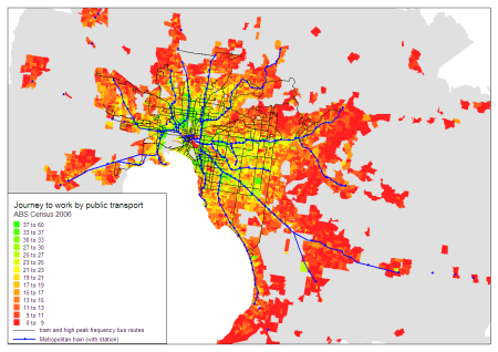
The first map shows the share of journeys work involving public transport (and possibly also private transport and/or bicycle).

You can see:

  • Large areas of high mode share in the inner suburbs. In particular the inner northern suburbs (Brunswick) and inner south-eastern suburbs (St Kilda/Malvern to South Yarra) where there is a dense frequent public transport network in most directions.
  • Some points of relatively high mode share in the middle and outer suburbs around train stations (but not always around train stations).
  • A high mode share in the area around the Monash University Clayton Campus – though note the area north of the campus is largely industrial so this might be misleading.
  • Very low mode share in the outer suburbs in areas away from train stations and high frequency bus routes, indicating high car dependence.
  • Low mode share in the CBD and immediate surrounds (related to a large number of destinations being in walking distance, more on this below).
  • There are some frequent bus routes in the outer suburbs that still have low public transport mode share. These services may be focussed on moving school children, but also many of them do not provide fast direct travel in a radial direction. For example,
    • Route 476 through Keilor has a number of deviations off the main road and then gets caught in congestion on Keilor Road before reaching Essendon Station.
    • Route 477 from Broadmeadows to Essendon via Airport West is highly indirect and also gets caught in congestion before reaching Essendon Station.
    • A couple of the bus routes north of Ringwood Station are quite indirect.
    • Some of the north-south bus routes in East Doncaster are indirect.
    • Route 571, which largely serves Epping to South Morang, has a large one way loop around Centenary Drive making it less direct for some people. Although for many people it is direct. This bus route operates a “TrainLink” service between Epping and Plenty Valley Town Centre – meeting every train at Epping, seven days a week.

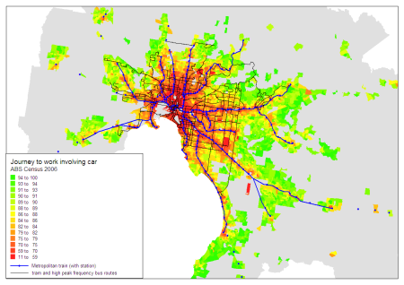
The next maps shows mode share of car-only journeys to work.

You can see:

  • Lower car mode shares around train stations and through the inner and middle suburbs where better public transport is available.
  • Very high car mode share in the outer suburbs where public transport service levels are poor.
  • Low car mode share around Monash University Clayton campus, Deakin University Burwood campus, Latrobe University Bundoora, the Simpson Army Barracks in Yallambie (near Greensborough)

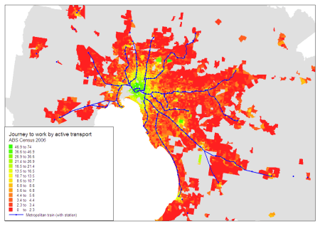
The next chart shows people using active transport – that is walking only or any journey involving a bicycle (and possibly other modes).

This map shows:

  • A remarkably circular region around the CBD with high active transport mode share (though it seems to extend a bit further north into Brunswick).
  • Pockets of high mode share around Footscray, Broadmeadows, Box Hill, Ringwood, and Frankston – which have all since been nominated as Central Activities Districts (CADs).
  • Pockets of high mode share around suburban university campuses – suggesting concentrations of staff living within walking distance (note: journey to work is not supposed to include journey to education). The Victorian Police Academy in Glen Waverley also shows up.
  • A few unexpected concentrations:
    • in West Reservoir (between the Upfield and Epping train lines). This is a lower socioeconomic residential area adjacent to (and in some cases mixed in with) a light industrial area, which is something planners have been actively avoiding in recent times. But this historical land use pattern seems to facilitate a high share of people walking to (presumably local) employment.
    • Some pockets around off-rail major shopping centres – eg Highpoint, Werribee Plaza, Altona Gate, Southland, Cranbourne.

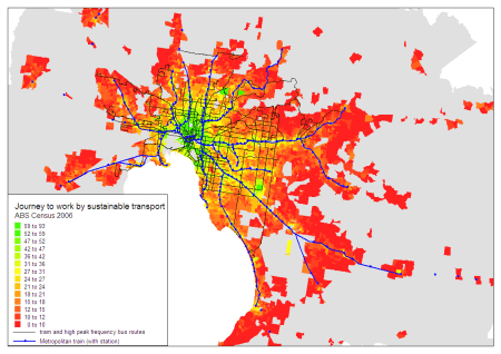
Putting together active and public transport, the following chart shows the mode share of “sustainable” transport modes:

Not unexpectedly, it shows high sustainable transport mode share in the inner city – with active transport taking over from public transport as you approach the CBD.

A more detailed look at each mode

Trains

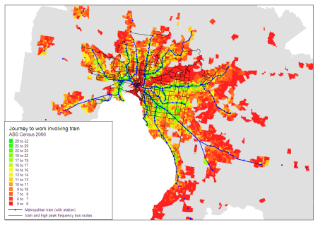
The next map shows the share of journeys to work involving train (and in many cases other modes as well).

Unsurprisingly there are concentrations around train stations, but also:

  • Very low train mode share in the Doncaster/Manningham corridor – where freeway buses operate to the CBD. This suggests few people driving to train stations from this region.
  • A low mode share between the Upfield and Epping train corridors in Brunswick/Northcote – where there are several very frequent tram services that are often competitive with train travel times.
  • Some higher concentrations at the western edge of the north-western suburbs, which were very poorly served by public transport in 2006. This might represent a pocket of park (car) and ride (train) commuters.
  • A concentration stretching west from Newport station more than typical. Perhaps a high number of people catching buses to Newport station? More on that below.

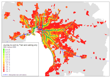
Limiting the analysis to train (and walking) only journeys produces the following map:

While there are concentrations around train stations, there are above 3% shares in areas well beyond reasonable walking distance of stations. While a few people might actually be walking several kms to a station, I’d suggest it is more likely to reflect a tendency for people to fail to report ALL modes used in their journey to work. Perhaps these people have a perception that the “obvious” way to reach a train station is by car and so the car leg was not worth reporting on the census form. An issue for people designing census forms.

Note there is the same concentration we saw on the previous map at the western edge of the north-western suburbs.

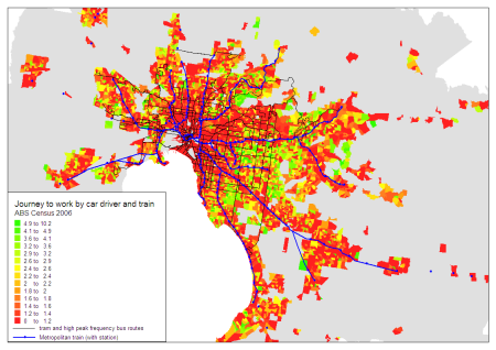
These off-rail “train only” concentrations actually correspond with people who report using both car-as-driver and train, as shown on the following map:

Some observations:

  • There are high concentrations in the middle eastern and southern suburbs, including along tram route 75. These areas are just outside fare zone 1, so perhaps they involve people driving to from zone 2 homes to zone 1 stations to take advantage of cheaper fares to the city. But it also might reflect the lower service levels of local buses for reaching the train network.
  • There are many pockets of concentration in the outer western and northern suburbs, particularly on the fringe of the urban area where bus services may not have existed at the time. There have been employment shortages in the western suburbs of Melbourne with a higher share of journeys to the inner city.

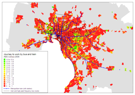
What about feeder modes to trains? The next chart shows people using both bus and train:

There are some interesting localised pockets:

  • Newport west shows a high bus-train mode share – routes 432 and 471 operate in this area feeding Newport station (both every 20 minutes in the AM peak). Ironically there used to be a train station at Paisley in the south-west corner of the green pocket but it has been closed for several decades.
  • There are many high frequency bus routes between Sunshine and Footscray and this area shows up quite clearly.
  • East of Essendon station along Buckley Street (route 465) and between Moonee Ponds and Aberfeldie (route 467) there are high concentrations of bus-train commuters. Route 465 is timetabled to meet every train during the day (including the peaks) and route 467 also runs a high frequency in peak periods designed to meet trains. This strategy of high frequency bus feeder services is clearly highly successful at attracting bus-train commuters. (If only there were more such routes in Melbourne!)
  • There are concentrations north (and to some extent south) of Box Hill station. A number of relatively high frequency routes converge in this area.
  • There is an area around Monash University Clayton campus – which probably doesn’t represent people working at that campus as you can’t use a train to travel the short distance.
  • The bus routes north of Ringwood station do appear to facilitate a relatively high number of bus-train commuters, despite some route indirectness (the mode share drops further from Ringwood where commuters endure more of the indirectness).
  • South of Blackburn and Nunawading stations – where SmartBus routes operate to the south of these stations. The high frequency bus service appears to be attracting bus-train commuters.
  • Around Warrigal Road, south of Holmesglen and Oakleigh stations – again probably the impact of the high frequency SmartBus route (then route 700, now 903).
  • Around Doveton (east of Dandenong), where four bus routes each running approximately every 45-50 minutes converge to provide an average 12 minute service for most of the day on a weekday.
  • Curiously around Pakenham, where hourly bus routes operated in 2006 with a limited span of hours.
  • Some pockets west of St Albans station, where there are some places with overlapping bus routes (however they only run every 40 minutes).

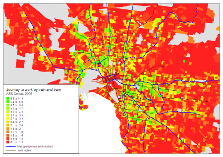
The next map shows people using both trains and trams. While there is a smattering of such people across Melbourne (probably reflecting people changing onto trams after arriving in the inner city by train), I have zoomed into the tram network area to look for areas where tram feeds trains.

Some clear corridors are visible:

Note that route 75 does not act as an effective feeder to the Alemein train line – most likely because there is no station conveniently located to allow an easy interchange between these lines (probably a product of historical competition between modes).

Trams

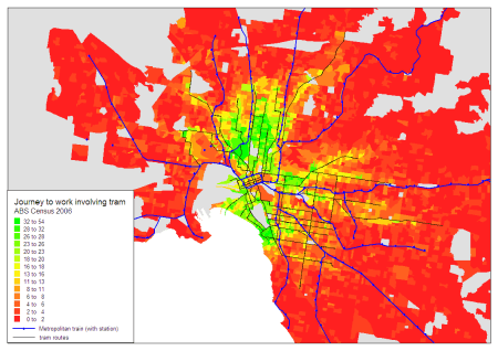
The next map shows journeys involving tram (and possibly other modes). Again, I have zoomed in around the tram network.

There are several interesting things to note:

  • The highest concentrations of tram use are in the northern suburbs (north to Brunswick area particularly), east to Richmond, and south to Port Melbourne, South Melbourne, Albert Park and St Kilda.
  • A more moderate tram mode share is achieved in the inner south-eastern suburbs, likely due to the area also being well serviced by trains.
  • The outer reaches of the tram network are generally not very effective at attracting a high tram mode share – particularly tram 86 to Bundoora, tram 75 to Vermont South, and tram 64 to East Brighton. These outer reaches provide long travel times to the jobs-rich inner city. This evidence does not support the case for outward extensions of the tram network. That said, tram 86 serves two universities in Bundoora and tram 75 serves Deakin University Burwood campus, so the trams probably attract a fair share of journeys to education. Unfortunately the census does not include journey to education.

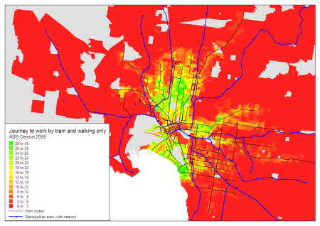
The next map shows journeys to work involving tram (and walking) only:

This map is very similar, except that there is a low tram-only mode share where tram lines cross train lines before reaching the city centre. Refer to the map above on train + tram journeys.

Buses

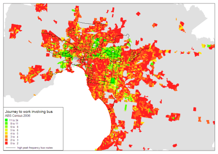
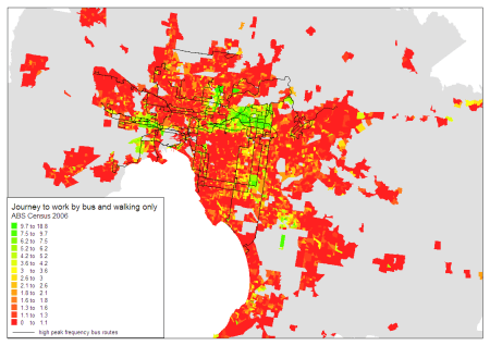
The next map shows journeys to work involving buses (and possibly other modes):

This map shows several bus hot spots in Melbourne:

  • The Sunshine-Footscray corridor which is served by several high frequency bus routes, and much of which is beyond walking distance of train stations.
  • The Doncaster/Manningham area, which is served by several high (peak) frequency bus routes that run along the Eastern Freeway into the city (using bus lanes to get around congestion).
  • North Altona along Millers Road. Bus route 232 runs every 10 minutes (or better) in peak periods across the Westgate Bridge into the city.
  • A pocket around Monash University Clayton campus, which is only served by buses (however note much of the green area is industrial land so this may be misleading).
  • Around Oriel Road in Heidelberg West where there is a (combined route) high frequency bus service to the city and Latrobe University Bundoora.
  • Some patches around central Dandenong, where some bus routes overlap to provide a higher frequency combined service.

For completeness, the following map shows bus (and walking) only journeys:

Cycling

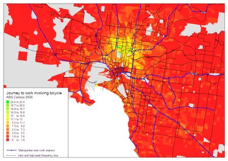
The following map shows the concentrations of journeys to work involving bicycle. I’ve zoomed in on the inner city as most of the rest of the Melbourne has very low bicycle mode share.

There is a very strong concentration in the inner northern suburbs – in the City of Yarra and the southern part of the City of Moreland (Brunswick). This area is very well served by high quality on road bicycle facilities. In many areas, over 1 in 10 journeys to work involve cycling.

Walking only

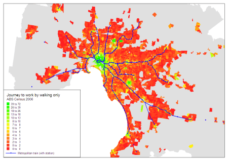
The next map shows concentrations of walking-only journeys to work:

Again, the inner city area has a high concentration, but there are also concentrations around major education campuses and larger activity centres in the suburbs.

Car passenger

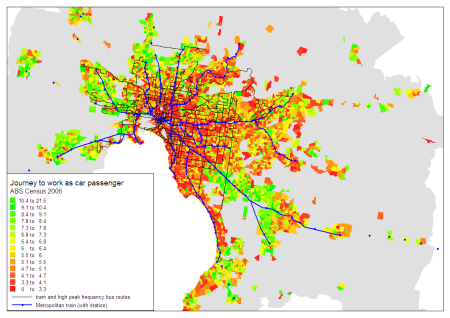
The next map shows the mode share of “car as passenger” as part of the journey to work. This effectively shows a combination of car pooling and lift-giving trips.

The highest concentrations are in the outer suburbs (particularly in newer areas), where public transport service levels are lowest, but also many areas with lower incomes. I’d suggest it is likely that car passenger trips are a product of lower incomes (lower car ownership?) and/or poor public transport provision where lift giving is required. A pure lift giving trip is highly time inefficient for the driver, and the vehicle travels twice the distance that the passenger needs to travel – roughly doubling the congestion and environmental impacts. However, the car passenger trips might be partial car pooling – eg a driver drops a passenger at a train station on the way to work, which is relatively efficient.

I hope these maps are useful.