On Tuesday 20 March 2012 I gave this presentation to the Transport Economics Forum in Melbourne using material from this blog and some recently released data in BITRE’s Working Paper 127 on traffic growth in Australia. The presentation challenges some orthodox assumptions about transport trends in Australia and Melbourne.
When I get time, I hope to update existing posts to include the most recent data on (the lack of ) traffic growth.
What are the trends in traffic volumes on major toll roads in Australian cities? How sensitive are motorists to toll prices? How accurate have traffic forecasts been? Are traffic volumes on toll roads growing faster than traffic in general?
This post aims to shed some light on these questions.
I have sourced traffic data from various sources, including Transurban ASX releases, annual reports, Transport for NSW, operator websites and media reports (I cannot guarantee error-free data gathering).
Average daily volumes
Firstly, here is a chart showing the average daily volumes for toll roads where I have been able to obtain data. Note that I have used a log scale on the Y-axis. The label includes the most recent volume figure available. For some roads and time periods only report annual figures are available (shown as dots rather than lines).
The following charts show traffic volume growth since an early reference year, compared to BITRE estimates of total vehicle kms for each city:
Citylink volumes grew faster than general traffic for the first decade, but has been more in line with general traffic since then. You can see there are periods of suppressed demand, which very likely correlate with periods of major roadworks. After each period of roadworks, traffic volumes have rebounded strongly and shown further growth (probably eroding congestion reduction benefits). The underlying rate of growth appears to be declining.
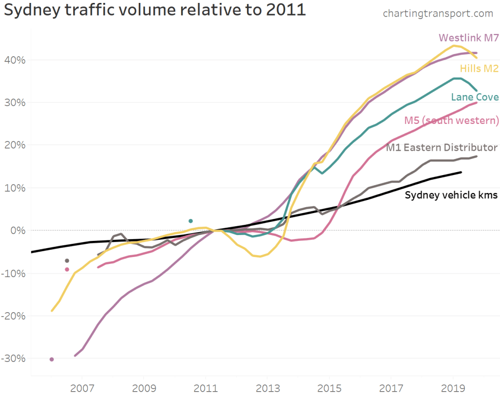
It’s a little more difficult to construct a chart for Sydney as different lengths of history are available for different roads. I’ve anchored the chart at 2011:
Most toll roads have had traffic growing faster than general traffic in Sydney. Westlink M7 and Hills M2 have had the highest growth since 2011, with the M1 Eastern Distributor showing the least growth. You can see declines on the Hills M2 and M5 (presumably during roadworks) followed by significant growth as capacity was made available.
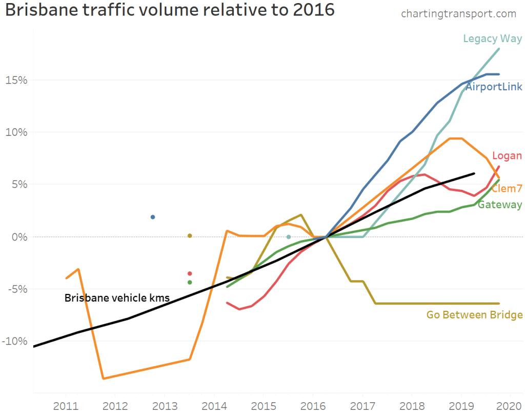
Not all of Brisbane’s toll roads have growth faster than overall traffic. Transurban report that AirportLink and Clem7 volumes have recently been impacted by upgrades on the Gateway motorway.
An important note on growth rate precision: Transurban report daily traffic volumes rounded to the nearest thousand. For roads with relatively small volumes (eg Clem7), the growth rates will be more impacted by rounding errors. For example, the traffic volumes on Clem7 went from 27+26+27+27=107 thousand in 2014/15 to 27+26+26+27=106 thousand in 2015/16, which is notional growth of -0.9%. But actual values for each quarter will be within +/-500, and the rounding errors will add up over the eight quarters making up the calculation. The actual growth could be anywhere between -4.6% and 2.9%, but is more likely to be in the middle of that range.
Unfortunately data isn’t always readily available:
The Brisbane Gateway Bridge and Logan/Gateway Motorway extension data is only available for financial years in annual reports up until 2010. Transurban took over these roads and have reported traffic volumes since 2013 but they do not appear to be comparable measures so I have listed them separately.
In October 2011, Horizon Roads purchased Melbourne’s Eastlink, and they do not seem to be publishing traffic volumes.
I haven’t been able to source Clem7 data for 2012 and the first half of 2013.
Traffic growth on other toll roads
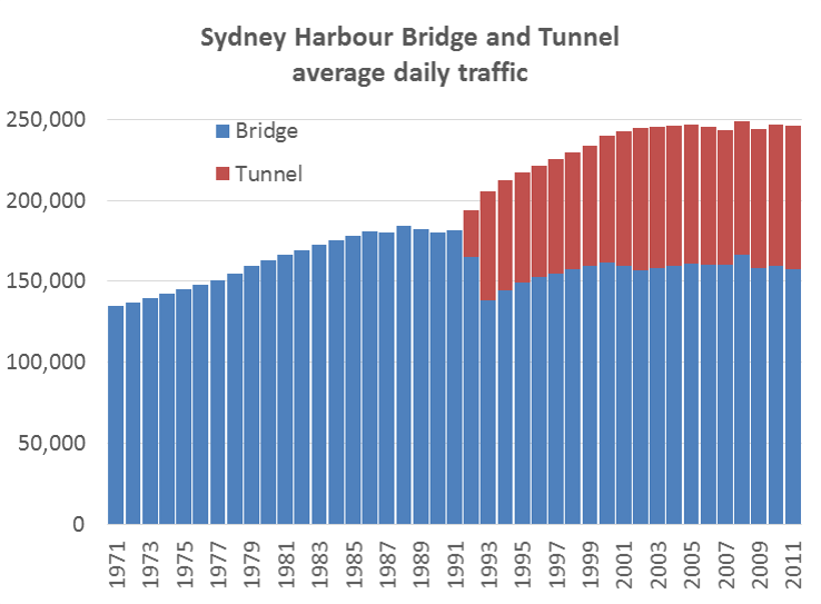
Sydney Harbour Bridge and Tunnel
Calum Hutcheson from Hyder Consulting has generously compiled and shared time-series data with me on traffic volumes going back to 1971 for these two toll roads. He has sourced data from several available sources but has had to estimate some figures where data is missing.
Traffic volumes levelled off on the bridge around 1988 and on the combined bridge and tunnel around 2005. It would appear the tunnel brought additional vehicle capacity good for around 17 years’ growth but that has now been exhausted (although I’m far from an expert in Sydney traffic). Traffic volumes on the tunnel have barely growth since 2010.
In 1992 one southbound lane of the bridge was converted to a bus lane (presumably related to the capacity freed up by the tunnel). The bridge’s vehicular traffic levels have not returned to 1988 levels, but I suspect the number of people moved in (road-based) vehicles has increased significantly (not to mention the train line across the bridge).
Sydney Cross City Tunnel
The Cross City Tunnel was forecast to carry 87,088 vehicles per day in 2006, but in 2019 was still less than half this amount.
I have not been able to source much data pre-2013, but a 2006 NSW Auditor General’s report contains some traffic volume data for 2005 and 2006, reproduced here (from page 32 of the report).
It would appear that motorists are highly sensitive to toll pricing, and the forecast volumes were not achieved even when tolls were removed.
Brisbane’s Clem7 cross-city tunnel
Brisbane’s first new road tunnel, the Clem7, opened in March 2010. During the first three weeks of toll-free operation, there was an average of 59,109 vehicles per day. During the first week of tolling, this fell to 20,602. The forecast was for initial traffic of around 60,000 vehicles per day, rising to 100,000 within 18 months. Owners at the time, Rivercity Motorways, went to the extraordinary step of publishing daily traffic data, as can be seen in the following chart showing traffic volumes since tolling commenced:
You can see an up-tick from the beginning of July 2010, when toll prices were cut. Tolls were raised in November 2010 and again in April 2011 and you can see corresponding drops in traffic volumes. Average daily traffic in calendar 2011 was 10% lower than for the first 12 months of operation (includes one overlapping quarter).
During the 2011 flood crisis tolls were waived for one week, and at the end of that period on Monday 17 January 2011, 40,566 vehicles were recorded, the highest since tolling commenced. This may or may not have also reflected closures to other roads making Clem7 more attractive. (footnote: actual weekend volumes have not been published for April 2010, so I have substituted the average non-workday figures, that have been published).
Traffic volumes on the Clem7 peaked at 30,000 in 2018, less than a third of the forecast for the year 2010.
Brisbane’s Airportlink
This toll road was forecast to attract 135,000 vehicles per day one month into operations, and have 165,000 vehicles per day after the ramp up period. Volumes in 2019 were around 63,000 – less than half the forecast after ramp up.
The traffic volumes declined as tolls were progressively introduced to all traffic. BrisConnections, the owner of the road, went into voluntary administration in February 2013.
The Clem7 and Airportlink roads are the first two major tollways as part of the TransApex plan for adding major road capacity to Brisbane.
The third piece of this puzzle is the Go Between Bridge, now part-owned by Transurban and they report a flat 11,000 vehicles per day as of 2019. The forecast was for 17,500 by 2011 and 21,000 by 2021.
I’m guessing it may be a very long time before these TransApex roads reach capacity.
Eastlink
The following chart shows that Eastlink actual traffic volumes were fairly consistently around 60-65% of original (2004) forecast after tolling began. It suggests the forecasts were good at estimating the ramp-up shape, but not so much the overall traffic volumes.
Note: ConnectEast issued revised forecasts in August 2009, including that (steady state annual) average daily trips in 2011 would be 209,900. That forecast doesn’t appear to have been realised either. Unfortunately data reporting stopped in October 2011 following the sale to Horizon Roads.
See another post on Melbourne traffic volumes. Some interesting recent data on Brisbane traffic volumes is in this report prepared for RiverCity Motorways (who operated the Clem7). It shows many major roads in Brisbane with stable or declining traffic volumes (possibly because they are at capacity, or possibly because of a mode shift to public transport).
New South Wales traffic data is available for selected locations, as well as detailed data for toll roads.
Victorian data for non-tolled roads is available here, but unfortunately does not include time series history.
Just a quick note to let you know of an updated post on public transport patronage trends. I’ve got almost all 2010-11 data for Australian and now New Zealand cities.
Patronage is growing strongly in Perth, Melbourne and Auckland. South East Queensland has possibly stalled, although issues in patronage estimation methodology may be masking underlying growth. Adelaide and Wellington are showing more modest growth, while Sydney, Canberra and Hobart continue to be laggards. Christchurch patronage unfortunately collapsed following the terrible earthquake.
For all the details, as well as some 110 year trends in Australian public transport patronage, read the updated post.
In other news, this blog is now available at the easier to remember address chartingtransport.com and there is a new public twitter stream if you want to track updates that way.
A frequently cited forecast is that the avoidable costs of congestion in Australia will double in most Australian cities between 2005 and 2020. These BITRE forecasts were published in 2007 (Working Paper 71), assuming continued strong growth in vehicle kms in our cities (“business-as-usual” conditions). But as this blog has demonstrated several times, transport trends have not been business-as-usual in recent years.
In August 2011, BITRE published revised estimates of vehicle kms in Australia (Report 124), derived from fuel sales data (using with fleet/fuel mix and fuel intensities etc).
How are we tracking with forecast traffic volumes?
I don’t have access to the complex model BITRE used to forecast congestion costs, but vehicle kilometres is an obvious major driver of congestion costs, and it is easy to compare the 2007 forecast (Working Paper 71) of vehicle kms in major cities with the most recent estimates of actuals (Report 124):
Consistent with other evidence, the growth in vehicle kilometres appears to be significantly below forecast. In 2007, BITRE assumed that city travel growth would fall to population growth rates, and that mode shares of travel would remain static. They also assumed world oil prices would peak at around US$65 in 2008 and drop to the low US$50s by 2011 (in 2004 dollars). None of these assumptions have played out in reality.
When looking at the components of the vehicle km estimates, the estimated actuals (in Report 124) for 2009-10 appear to be 15% lower than forecasts for cars and light commercial vehicles. For trucks, the 2009-10 estimated actual is around 8% lower than forecast.
To be fair, there was little evidence of the emerging mode shifts available at the time. That said, a BITRE forecast presented at ATRF in September 2011 showed a return to business as usual upwards growth, despite the last 6 years showing little growth.
What cost of congestion might we have avoided?
The relationship between travel volume and congestion costs is not linear. It is usually conceptually represented as an exponential curve. That is, a small reduction in traffic volumes will have a large impact on congestion costs (as evidenced each school holiday period where a claimed 5% reduction in traffic volumes has a significant impact on congestion levels).
While I am not equipped to do a robust calculation, the recent shift away from private car motoring is probably having a significant impact on the avoidable costs of congestion. Estimated actual capital city vehicle kms in 2010 (117.9 billion km) were just under the forecast for 2004 (118.2 billion km). The estimated cost of congestion for forecast 2004 vehicle km levels was $9.1b, while it 2010 it was forecast to be $12.9b. Road capacity has been increased in most cities between 2004 and 2010, which would reduce congestion costs for the same traffic volume, so the difference in 2010 between actual and forecast avoidable congestion costs might be in the order of around $3 billion.
So what is happening with vehicle kms per capita?
In another post, I used BITRE yearbook data on motorised passenger kms per capita. BITRE Report 124 only includes figures on vehicle (not passenger) kms, but they are still interesting figures.
And in response to requests from across the Tasman, I’ve added New Zealand’s one “big” city Auckland (data for ‘Auckland Region’ from their Transport Indicator Monitoring Framework, accessed October 2011).
Total vehicle kms per capita appear to be trending down in all Australian cities since around 2004/2005, with the sharpest drop in Melbourne in 2008-09. Auckland appears to be showing no such trend, with perhaps a flattening at best since 2005-06 (the vehicle km data is marked as under review, as is the public transport data which shows patronage growth of 25% in the four years to 2009-10).
Comparing values for different cities requires caution. The physical size of the urbanised area, and the administrative boundaries used to define cities will have an impact. For example, Adelaide shows up with lower vehicle kms per capita than Melbourne, even though it has much lower public transport mode share. The Adelaide urban area has a smaller footprint and is more constrained than Melbourne, which might explain this difference.
Car vehicle kms per capita appear to have peaked in either 2003-04 or 2004-05 in the five big cities, with Melbourne showing the biggest decline (a 14% decline since 2004-05).
The last two charts showed financial year estimates, but data is actually available at a quarterly level. I’ve created the following chart using simple interpolation of June estimates of residential population for each of the large Australian cities:
The underlying fuel data was actually seasonally adjusted, but there still appears to be some noise in the data (or the world may just be that variable, but I doubt it).
Vehicle use outside the big cities
What about traffic volumes in the rest of Australia? I’ve extracted the five big cities (Sydney, Melbourne, Brisbane, Perth and Adelaide) from the remainder:
The reduction in vehicle use does not appear to be limited to the big cities (most of which have seen strong growth in public transport). The trends for car km per capita outside the five cities are no different to overall vehicle use.
I should note: the report does not actually specify how vehicle kms for each state were split between capital city and other areas (section 8.2, citing unpublished data), but the fractions used were published.
What about total vehicle kms in cities?
While I like to look at per capita transport usage (everything is relative), it is instructive to look at trends in total volume as well. They provide some input into whether increased road capacity might be required, for example.
This charts shows that total vehicle kms in Melbourne, Sydney and Adelaide have been relatively flat since around 2004, while Auckland, Perth and Brisbane have shown continued growth. Perth and Brisbane show a downturn only in more recent times, but have had several years of declining vehicle kms per capita, the difference probably explained by stronger population growth.
How do BITRE Melbourne figures compare with VicRoads’ data?
Here is a chart comparing vehicle km index values for Melbourne from BITRE report 124, and an index created from annual growth figures reported in VicRoads Traffic Systems Performance Monitoring reports (with fully revised history):
A significant gap opens around 2003-04, but this substantially closes from 2008-09. Both datasets show a stabilisation of total traffic volumes, with BITRE data stabilising one year later than for VicRoads. BITRE aimed to estimate total metropolitan traffic, while the VicRoads figures are based on a defined set of monitored roads that might not reflect total traffic, particularly in growth areas on the fringe.
(Note: I did a similar comparison of VicRoads data to BITRE Working Paper 71 estimates of actuals in an earlier post).
In conclusion
There is strong evidence that “business-as-usual” growth in vehicle kms is just not happening in Australian cities, and thus the 2007 forecast doubling of congestion costs by 2020 is very unlikely to play out.
The dampened growth in travel demand is probably saving the economy a few billion in avoidable congestion costs, and has implications on the need for multi-billion dollar expansions of road capacity (though changes in demand will not be uniform across road networks).
I’d also suggest it is important that planners and policy makers understand why travel demand trends have changed so significantly, and apply this understanding to forecasts of future demand.
I’d like to acknowledge BITRE for conducting the excellent work that went into Report 124 and making the data publicly available, without which this analysis would not have been possible.


 Posted by chrisloader