Updated December 2025 with annual data up to 2024-25.
Data sources:
- BITRE Australian Infrastructure and Transport Statistics Yearbook (published annually)
- ABS Census of Population and Housing (every five years)
It’s possible to calculate “mass transit” mode share using the passenger kilometres estimates from BITRE (note: I use “mass transit” as BITRE do not appear to differentiate between public and private bus travel).
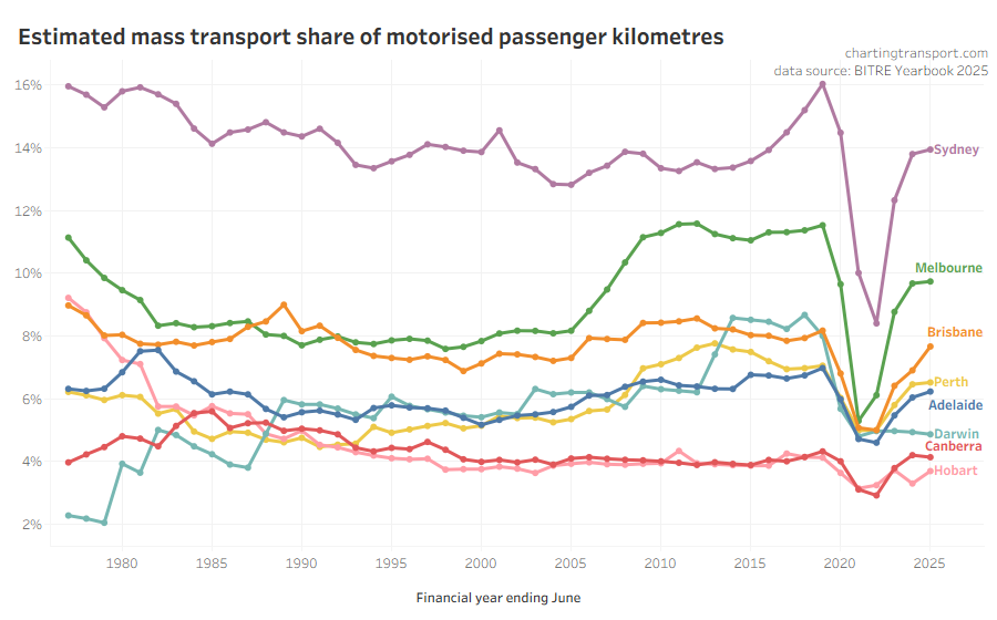
Mass transit mode shares obviously took a dive during the pandemic, but have since risen, although only Sydney and Brisbane appear to be close to pre-pandemic levels. The lower mass transit mode shares post-COVID are presumably at least partly because of working from home.
In the most recent financial year mass transit more share increased in all cities except Canberra and Darwin. Brisbane had a the biggest jump in mass transport mode share from 6.9% in 2023-24 to 7.7% in 2024-25, probably related to the introduction of 50 cent fares in August 2024.
The relative estimates of share of motorised passenger kilometres are quite different to estimates of passengers trips per capita. Canberra is much lower than the other cities, and Brisbane and Melbourne are closer together. The passenger kilometre estimates rely on data around average trip lengths (which is probably not regularly measured in detail in all cities), while the passenger boardings per capita figures are subject to varying transfer rates between cities. Neither are perfect.
Journey to work mode split
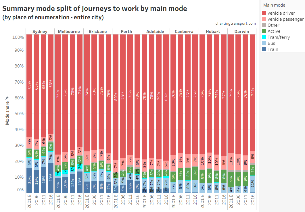
This chart doesn’t include 2021 as many cities were impacted by COVID pandemic lockdowns. For more breakdowns of journey to work mode splits see this post.
Household travel survey mode split
I have been looking at recent household travel survey data to calculate travel mode splits, but I am getting unexpected results that are quite different to BITRE estimates (especially Melbourne) and with unexpected trends over time (especially Brisbane), so I’m not comfortable to publish such analysis at this time.
Proxies for mode share
What would be excellent is if agencies published estimated volumes of public transport passenger journeys (that might involve multiple boardings), so we could compare cities on public transport journeys per capita. See public transport patronage trends for charts of public transport trips per capita.

