Updated December 2025 with annual data up to 2024-25, and quarterly data to September 2025.
Data sources:
- Australian Bureau of Infrastructure and Transport Research Economics (BITRE) Infrastructure and Transport Statistics Yearbook 2025, updated annually.
- National Greenhouse Gas Inventory Quarterly Update June 2025, updated quarterly (which includes preliminary estimates for September 2025) plus the September 2022 report which was the last to include estimates for September 2001 to June 2004.
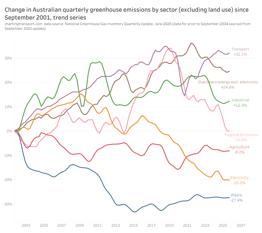
Australia’s greenhouse gas emissions (excluding land use) at September 2025 were only slightly below those at September 2001, and transport’s share has risen from 15% in 2001 to 19% in 2025.
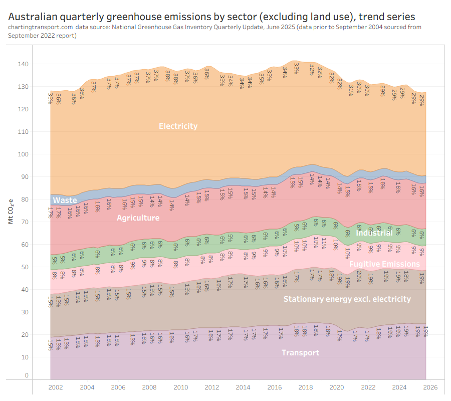
Emissions reductions in the electricity sector have been offset by increases in other sectors, including transport.
Australia’s transport rolling 12 month emissions dropped significantly with COVID lockdowns, but are bouncing back strongly. The following chart shows transport emissions from both data sources (they don’t align perfectly due to slightly difference methodologies used – you’ll need to refer to the BITRE Yearbook end notes for details).
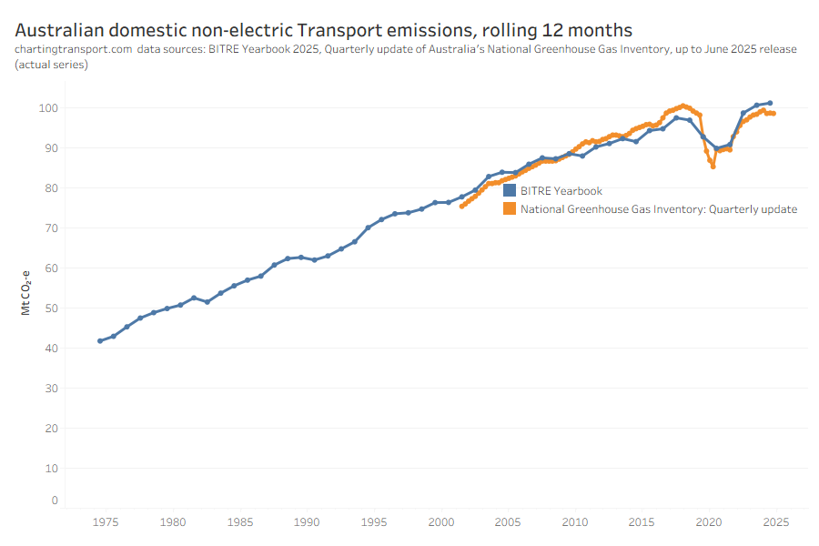
BITRE has transport emissions hitting a new high in 2024-25, while the the National Greenhouse Gat Inventory quarterly update has transport emissions peaking in calendar 2018.
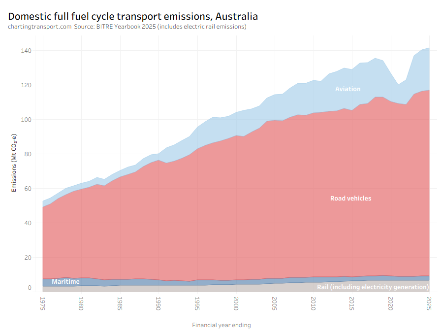
When it comes to estimating emissions for road-based modes there is a slight challenge. For all transport modes there are estimates of direct emissions (tail pipe) but of course this does not include electricity emissions which is significant for electrified rail. Full fuel cycle emissions are available for road, aviation, maritime, and rail, but not for individual road-based modes. The ratio of full fuel cycle emissions to direct emissions for road has been steady at around 126% over time. For aviation it has been steady around 126% and for maritime it has been steady around 125%. But these ratios can be calculated for each year, in case anything impacts them over time (eg electric vehicles).
So to enable a fair comparison of road-based modes, I am going to estimate full fuel cycle emissions for each road-based mode as the direct emissions factored up by the ratio of full fuel cycle to direct emissions for road transport as a whole.
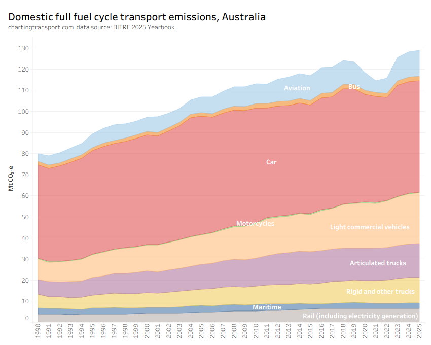
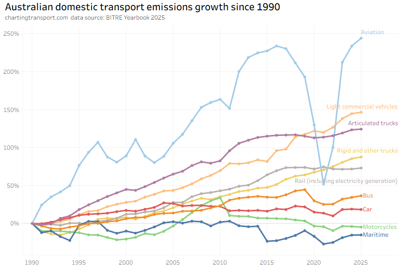
Aviation emissions saw the biggest dip during the pandemic but are now setting new highs.
Here are per capita emissions by transport sector (note: log scale used on Y-axis):
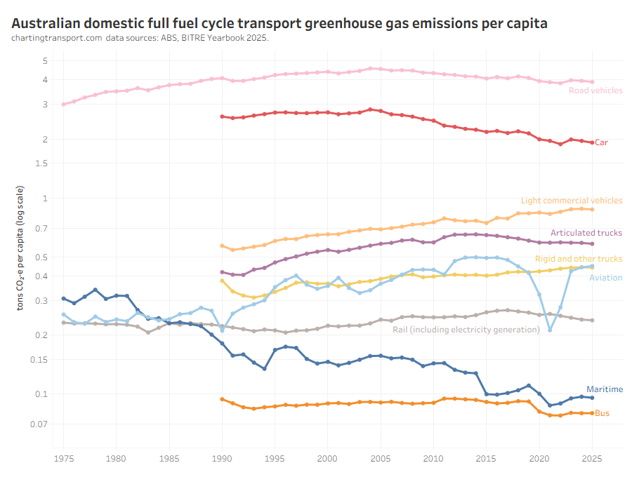
Truck and light commercial vehicle emissions per capita have continued to grow while many other modes have been declining, including a trend reduction in car emissions per capita since around 2004.
BITRE advise that the dip in bus and truck emissions in 2015 was related to the short-lived importation of large volumes of biodiesel which are allocated zero emissions in reporting.
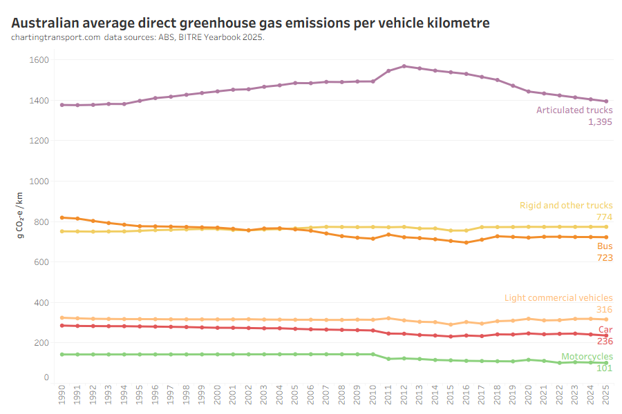
Emissions per passenger kilometre can also be estimated for some modes:
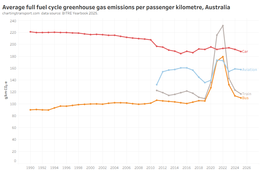
Technical note: this chart has changed from previous versions as BITRE now explicitly estimate passenger-related emissions for aviation and train (previously freight-related emissions were included).
Car emissions have been relatively stable around 190 g/km since around 2013 (I’m not sure why emissions dropped so much between 2010 and 2013 – perhaps ethanol inclusion in fuel?). This might change with New Vehicle Efficiency Standard.
During the pandemic years the emissions per passenger km increased for buses, trains, and aviation as passenger load factors no doubt plummeted, but have returned to pre-pandemic levels.
I’m not sure why aviation emissions per passenger km declined substantially from 2017 to 2019 – perhaps there was some shift to newer more efficient fleet, but I cannot identify significant fleet changes in Qantas or Virgin Australia. Since the pandemic, emissions per passenger km has bounced back to the higher ~2017 levels since the pandemic, so this efficiency gain appears to have been lost.
During the pandemic Qantas retired older less-efficient aircraft like the B747, but these were rarely used for domestic routes so might not have impacted domestic emissions intensity much post-pandemic. Virgin Australia went through a restructuring in 2020 which meant retiring higher capacity A330 aircraft – that may have been more efficient than the retained B737 fleet. However those A330s were acquired between 2011 and 2014, so they probably don’t explain the efficiency gains between 2017 and 2019 either. Maybe an avgeek could provide an explanation for 2017 to 2019?
For a chart showing freight emissions intensity – see Trends in freight volumes and mode split.

