It’s now much easier to find the latest key transport and city trends on Charting Transport. A new “Trends” menu item links to 13+ pages covering a range of key transport and city-related metrics (for Australia and sometimes also New Zealand). The pages cover passenger and freight mode shares, public transport patronage, city density, car and driver’s licence ownership, emissions, road deaths, and more.
I will endeavour to keep these pages updated as new data is released – which is mostly annually, but for sources that update monthly I will probably update the pages a few times a year (depending on the level of interest).
These pages will generally focus on the most useful summary charts, which will make it easier for me to update them relatively quickly. I’ll still be writing deeper once-off analysis on various topics, and I’ve included links from the Trends pages to these related blog posts.
This new approach also helps where I’m joining disparate data sources that update at different times of the year. For example, each December BITRE publish their Infrastructure and Transport Statistics Yearbook with lots of volume data, but I have to wait until March for ABS Regional Population data to extend per-capita metrics. Now I can update the volume charts in December, and the per-capita charts in March.
Often I find the addition of more recent data for a metric is not interesting enough to justify a new a blog post, but I’d still like it to be available to my readers. It doesn’t make sense to sit on this data waiting for an excuse to publish a new post, and now I won’t need to.
But if there are interesting new trends emerging, I will push out new blog posts (probably quite short ones with selected charts only) so my subscribers are alerted. If you are not already subscribed you can do that here:
Indeed, here are some…
Interesting trends from recently updated data
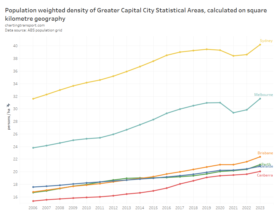
City population density has shot up in Melbourne and Sydney to reach new highs in June 2023. Other Australian cities also saw relatively large increases in population density during 2022-23.
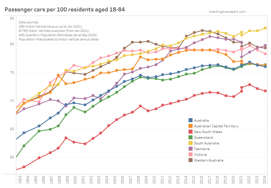
Car ownership rates have dropped slightly in most states and territories (probably with the resumption of immigration):
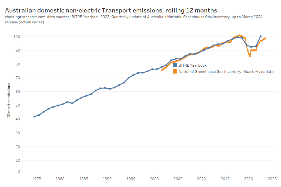
Transport emissions are growing strongly again, and are back near 2019 levels:
I hope you find this new feature useful (I wish I had done this years ago).
Also let me know in the comments if you want to suggest Trends pages for more topics (subject to there being broad interest and relevant open data).


Hi Chris
I put census Journey to work stats for each of Canberra’s 115 suburbs
into the attached spreadsheet, used Google Maps to tell me the distance
to each suburb from the GPO, and came up with graphs such as this one,
that shows the rate at which bicycle commuting declines with distance
from the GPO.
With warm regards
Leon Arundell
25 Legge St, Downer ACT 2602
ph. 0431 979 184
LikeLike