Which trips are shifting modes in Melbourne?

Sun 20 June, 2010

We know there has been a strong shift to public transport in Australian cities, but which trips are changing modes?

I thought it worth examining Melbourne journey-to-work data from the ABS census for years 2001 and 2006 to look for patterns. Although much of the recent mode shift has occurred post 2006, this analysis still provides insights into the earlier mode shift that started in Melbourne around 2004.

I’ve specifically looked at trips with and between concentric rings of Melbourne, to keep the analysis relatively simple.

Note that journeys to work only represent around 27-30% of weekday trips in Melbourne (depending whether you measure trips or trip legs), so this isn’t a complete look at travel. However, the census does provide an extremely comprehensive dataset as pretty much the entire population was captured.

This isn’t a short post, so grab a cuppa. The second last chart is possibly the most interesting. And apologies that not all charts are easy to read as I haven’t quite mastered the best way to import charts into WordPress. Click on charts to see a larger cleaner version.

Defining regions:

Firstly, I’ve used the following definitions of “city” (or inner city), “inner” (or inner suburbs), “middle” and “outer” Melbourne:

(Note: these region definitions are quite different to those used in another post on urban sprawl and consolidation which had larger “inner” and “middle” regions).

Melbourne’s trams generally service the inner city and inner suburbs, while buses mostly service the inner, middle and outer suburbs. The metropolitan train network is shown in blue.

Note: this post looks at journeys to work between these rings, and not journeys that start or finish outside the Melbourne Statistical District. I don’t see this as an issue as I’m not trying to represent total Melbourne mode shares.

Total journey to work volumes

The journey to work data includes 1.25 million trips, 115,890 from the “city”, 191,556 from the “inner”, 442,282 from the “middle” and 498,595 from the “outer”.

To start the analysis, the following two charts shows the number of trips between each ring of Melbourne:

The next chart shows the change in number of journeys between each ring:

There has been a significant growth in trips from the outer suburbs (in line with population growth).

The next two charts show the 2006 flows looking at the destination share of each origin ring (adds to 100% for each “from region”), and as origin share for each destination ring (adds to 100% for each “to region”):

Some observations:

  • The largest movements are within the middle and outer suburbs, and to the city and inner suburbs.
  • People in the middle and outer suburbs are more likely to work in the inner city than the inner suburbs. Perhaps because it is easier to get to the inner city.
  • The middle suburbs are the biggest source of inner city workers (33%). Little wonder the trains are under stress.
  • Few people in the inner city and suburbs commute to the middle and outer suburbs, but there has been an increase in the number of people in the middle suburbs commuting to the outer suburbs.

Public transport mode shares

The following chart shows the public transport mode share for trips between the rings (those being any trip involving public transport):

Not surprisingly:

  • Public transport has a high mode share for trips to the inner city, but less so for people coming from the outer suburbs. Other evidence I have seen shows consistently high public transport mode share for trips to the CBD and surrounds, so this would probably suggest lower public transport mode share to the inner city outside vicinity of the CBD (remember from the above that “inner city” includes several local government areas).
  • Public transport mode share is higher for origins and destinations closer to the city centre, where service levels are more attractive than the middle and outer suburbs.
  • Public transport mode share for trips wholly within the middle and outer suburbs is very low. This presents challenges for the new Central Activities Districts, which will need higher quality public transport to avoid heavy car dependence.

The next chart shows the change in public transport mode share between 2001 and 2006:

Observations:

  • The biggest shifts have occurred for trips to the inner city from the suburbs.
  • The next biggest mode shifts have been for outward trips from the inner city to the suburbs – although these are small in number.
  • Following that there have been small mode shifts to public transport for trips to the inner suburbs.
  • The figures actually suggest a 1.4% decline in public transport mode share for trips wholly within the inner city, even though there were around 3000 more such journeys in 2006. More on this follows below.
  • There was very little mode shift for journeys within the middle and outer suburbs, where public transport service levels are relatively low.

Looking at percent mode shares is not the fully story, as it depends on the volumes. The following chart shows the absolute change in trips by public transport between 2001 and 2006:

The chart shows significant growth in public transport trips to the inner city, particularly from the suburbs.

The following charts look at the increase in journeys involving each mode of public transport.

The biggest growth in train journeys has been from the outer suburbs to the inner city, followed by the middle and inner suburbs. This is consistent with evidence in another post that suggests train patronage is strongly linked to CBD employment.

Interestingly, this chart shows that additional journeys involving trams come from all parts of Melbourne. I would suggest this would be a combination of people living in the inner city and suburbs using nearby trams to get to jobs in the inner city, as well as people using trains from all parts of the city and transferring onto trams for the final leg to work. Melbourne’s multi-modal time-based ticketing removes any cost barrier from making such transfers – something still largely lacking in Sydney (is this a reason why there has been less mode shift in Sydney?).

You can also see an increase in train and tram usage for trips wholly within the inner city – despite the mode shift away from public transport in the inner city. This suggests the growth in public transport use from the inner city is being swamped by the growth in people walking and cycling to work (refer to charts on private car mode share below).

These generally small figures probably reflect the growth in population in the outer suburbs, more than anything else. However there is a notable increase in the use of buses by outer suburban commuters for trips to the inner city – suggesting more use of buses to access train stations (as very few outer suburban buses travel to the inner city).

Buses primarily serve the middle and outer suburbs of Melbourne, but they do aim to feed the train network. These figures suggest just 500 of the 7400 additional commuters from the outer suburbs to the inner city got to the station by bus. The average AM peak bus headway in the outer suburbs of Melbourne is over 40 minutes – which probably explains why new train users are not using buses to get to the station!

But curiously the data also shows only around 560 extra trips using both public and private transport to travel from the outer suburbs to the inner city, suggesting the other 6900 new commuters walked to stations in the outer suburbs. Perhaps this reflects full car parks at train stations.

This chart might suggest that people from the outer suburbs might be stealing parking places from those in the middle suburbs. However, there is an overall decline of around 1076 in people using private and public transport for journeys to work. As car parks are notorious for being full early on weekdays, this might suggest that the car parks are being used by journeys to places other than work.

For reference, the following chart shows who is using both private and public transport (mostly park and ride, but also car passengers who also used PT (kiss and ride)). I understand there are around 30,000 car parking spaces at Melbourne train stations, and the journey to work data shows around 23,500 car + train journeys to work.

In a future post I plan to look at concentrations of combinations of modes in journeys to work. The results are quite interesting if you know local conditions around Melbourne.

Active transport mode shares

Along the same lines as above, the next charts shows mode shift towards active transport. I have considered a trip active transport if it involves a bicycle, or if it only involves walking.

No surprises that active transport trips are generally within the same ring (short trips), and active transport has a higher mode share closer to the city (better cycling facilities and closer origins and destinations). Growth in the number of active transport trips in the outer suburbs probably reflects population growth as much as anything.

The mode shift has occurred mostly in the inner city, but also for trips from the inner suburbs to the inner city. Perhaps disturbingly, active transport mode share in the outer suburbs has declined, although this is simply growth in non-active transport trips swamping growth in active transport trips:

Of particular interest is the increase in cycling trips, shown in the following chart:

Not surprisingly, the growth is primarily from the inner city and suburbs to the inner city (which has been a major focus on bicycle infrastructure investment).

Private transport

First chart shows private transport mode share by trip type:

No surprises that private transport has the highest mode share for trips between the middle and outer suburbs, and the lowest mode share for trips to the inner city.

The greatest asymmetry involves trips to and from the inner city. Private transport has a higher mode share for trips from the inner city to the inner suburbs than vice-versa, despite counter-peak public transport service levels still being reasonably good in the AM peak. I’d suggest this probably largely reflects the relative ease of parking in the inner suburbs compared to the inner city, although outbound traffic congestion would also be slightly lower.

There has been an almost universal mode shift away from private transport, as shown in the following chart (note these are mode shifts AWAY from private transport, which is different to other charts in this post):

Again, the biggest mode shifts have been on trips to the inner city (and on the small number of outbound trips from the inner city), and higher closer to the city. There has actually been a mode shift towards private transport in the outer suburbs, which are generally poorly served by public transport, walking and cycling infrastructure. In particular, new suburbs often don’t receive any public transport until well after most residents have moved in.

The above chart also represents the mode shift towards ‘sustainable’ transport modes (walking, cycling and public transport). It shows a more consistent pattern than the mode shift towards public transport. It appears that there is a consistent mode shift to sustainable modes for trips to the inner city, but those originating from the inner city and suburbs are more likely to be a shift to active transport. Or perhaps simultaneous shifts from private to public transport and public to active transport.

Which leads to perhaps the most interesting chart in this post:

  • According to the data, there were 6 (yes, just six) less private transport trips within the inner city (although this number is certainly not precise due to ABS’s randomisation introduced to protect privacy).
  • There was a net decline in the number of private transport trips from the inner and middle suburbs to the inner city.
  • There were almost 11,000 additional private transport trips from the outer suburbs to the inner city. These create maximum congestion and probably reflect the low public transport service levels in the outer suburbs, and the lack of jobs in the outer suburbs for the new residents.
  • The 100,000 additional private transport trips from the outer suburbs largely reflects the large population growth.

This is entirely consistent with the trends of traffic volume’s on Melbourne’s roads, which show stagnation of inner metropolitan traffic volumes. Further evidence that mode shift to public transport is preventing congestion from getting a lot worse.

Mode share of new trips

The following chart looks at the mode share of the absolute increase in journeys from each region. It essentially assumes that the existing population haven’t changed modes, but the new residents have chosen a different set of modes, which of course is very unlikely to be the case. But it does show the share of the growth in trips for region – for example, for every 100 new trips in the inner suburbs, only 20% of them were by private transport.

It shows that growth in active transport trips has dominated the inner city, while growth in public transport trips has dominated the inner and middle suburbs. Meanwhile, private transport has dominated the growth in trips in the outer suburbs. This is a very worrying statistic given half of Melbourne’s urban growth is in the outer suburbs.

Further reading:

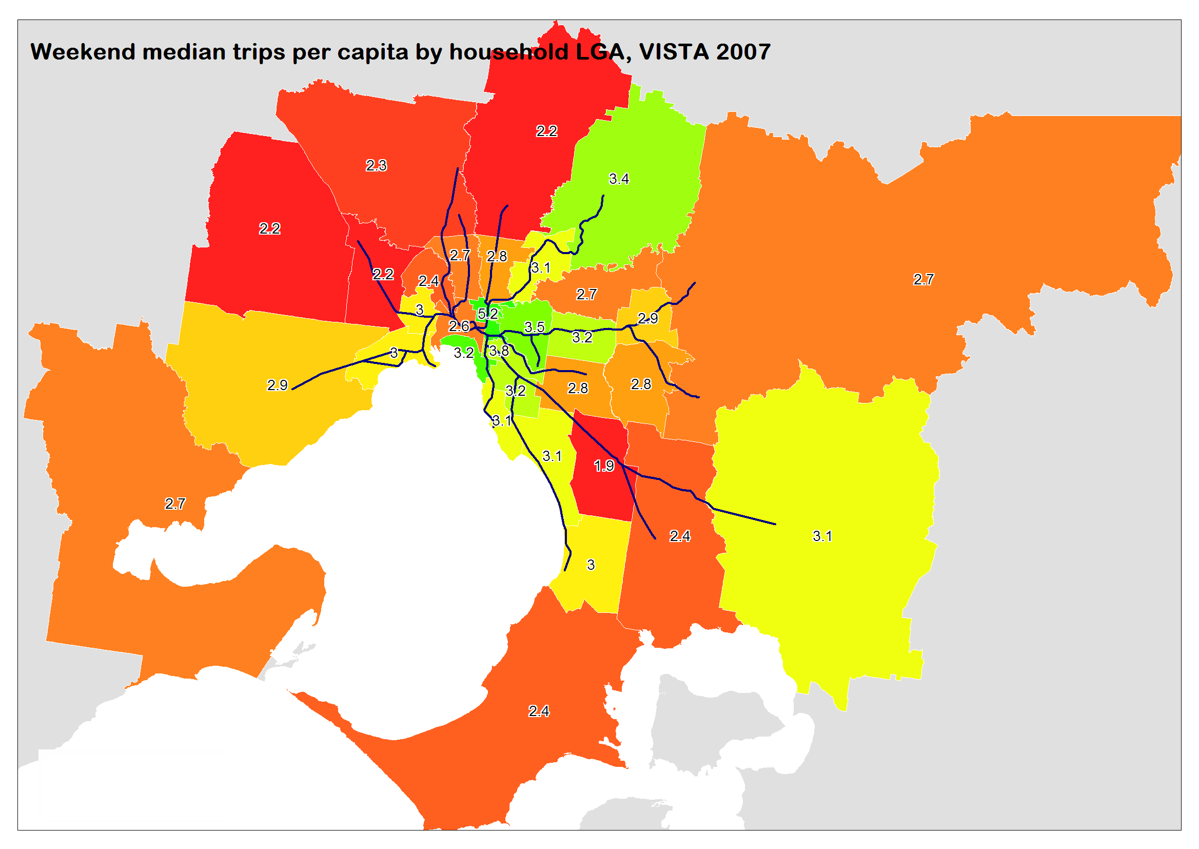
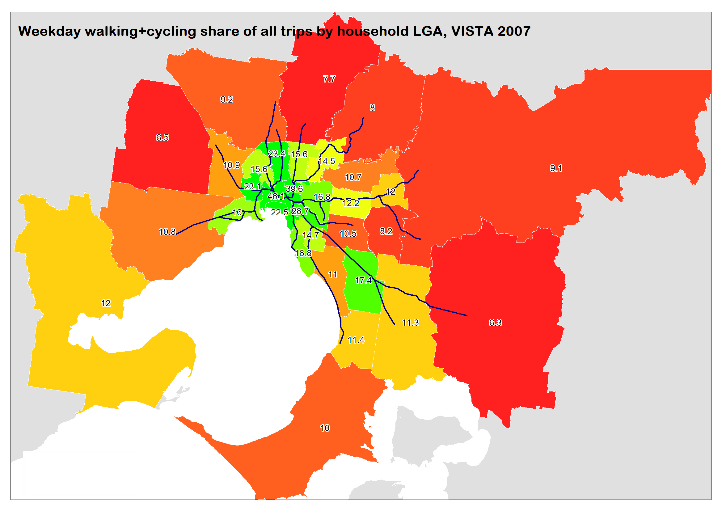
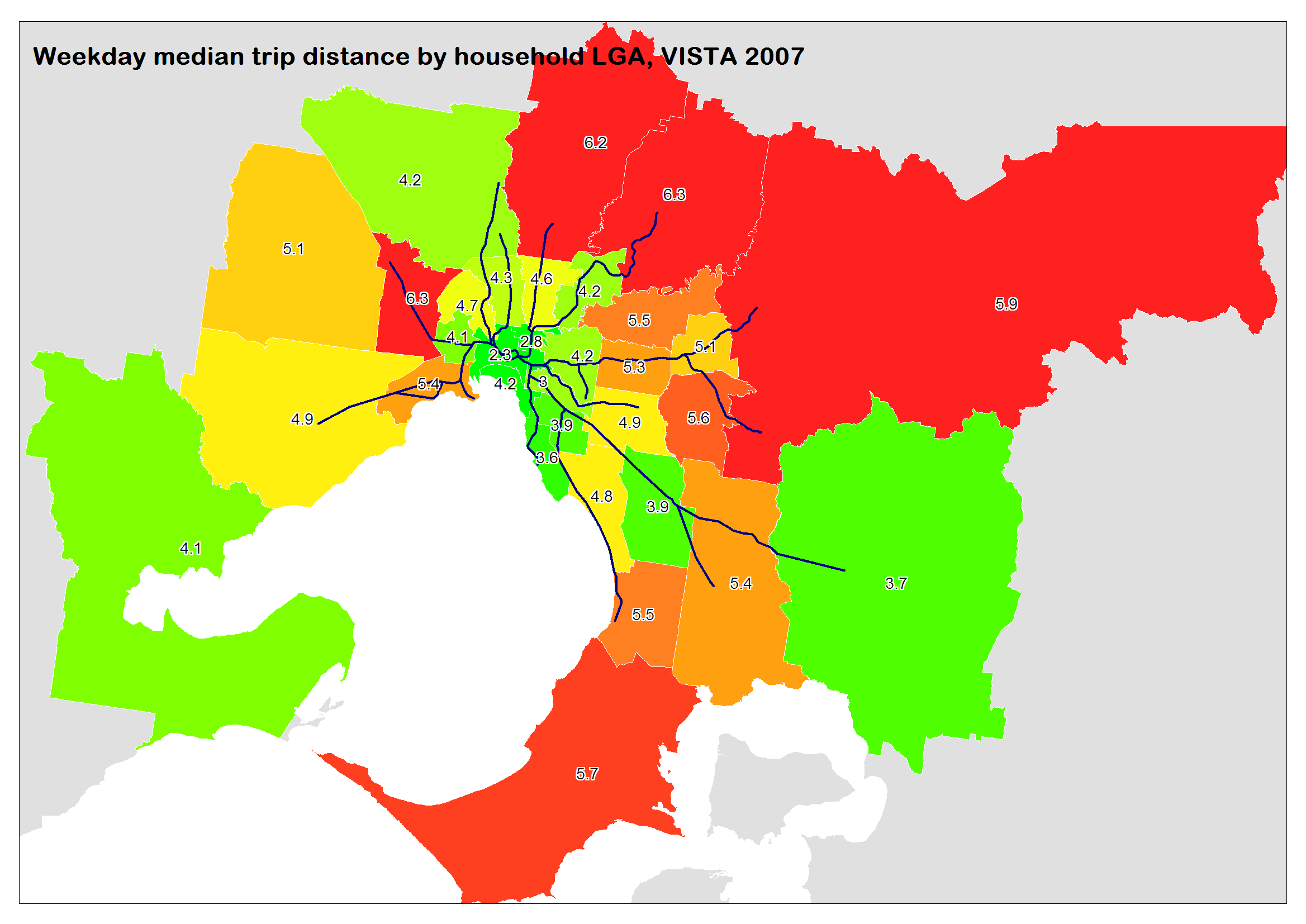
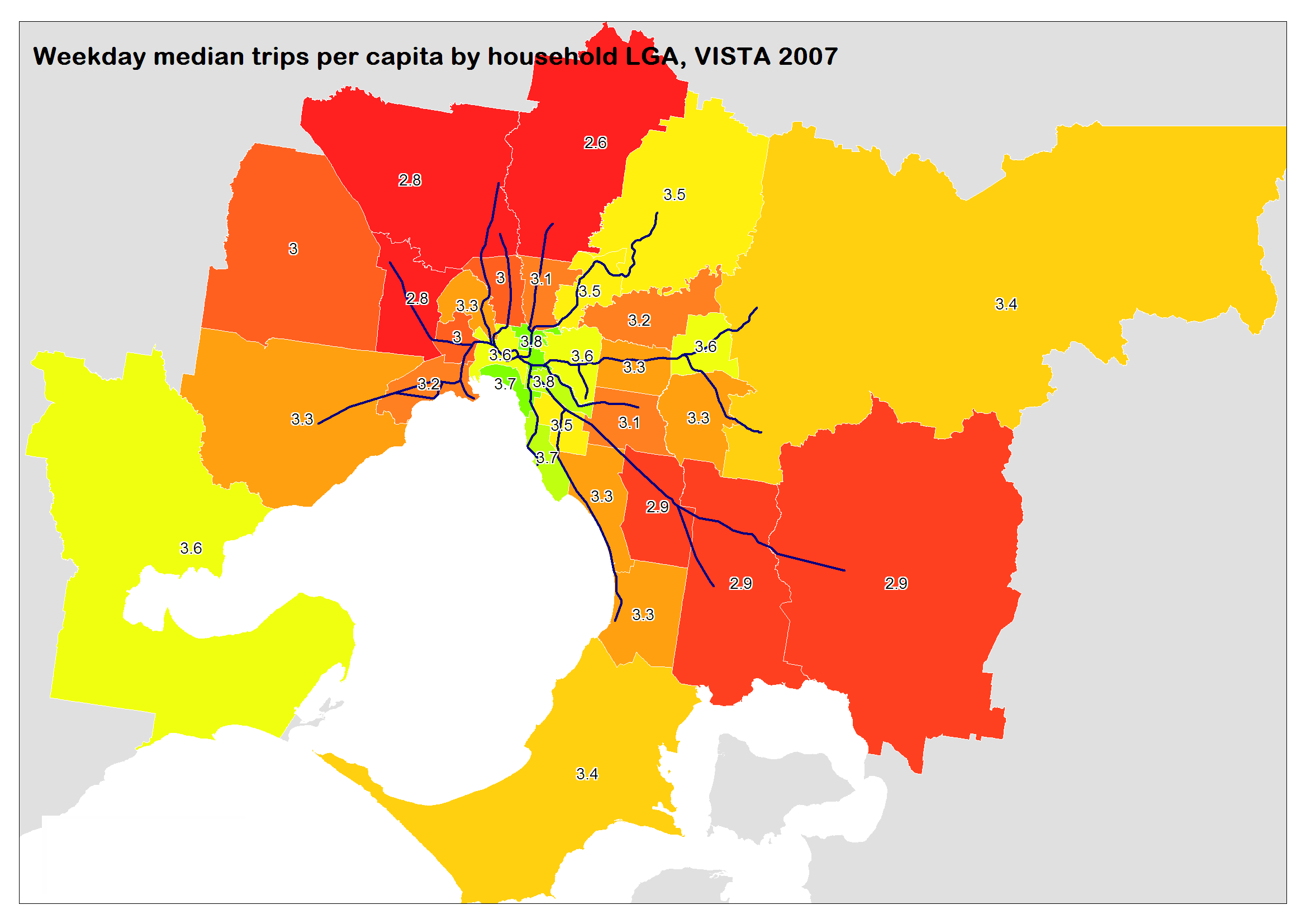
Transport Demand Information Atlas for Victoria 2008, Volume 1,  Department of Transport

Travel to work in Australian capital cities, 1976-2006: an analysis of census data, Paul Mees, Eden Sorupia & John Stone, December 2007

I plan to make another post soon looking at the spatial distribution of mode use in journey to work. Stay tuned.


Public transport mode share – according to household travel surveys

Sat 10 April, 2010

[post revised and updated October 2012 with new data from Sydney, Brisbane, and New Zealand]

Arguably the best source of public transport mode share statistics is from household travel surveys that are conducted in most large Australia cities and all of New Zealand (unfortunately some surveys more regularly than others). A common measure is public transport’s share of motorised trips (although public transport will also be competing with unmotorised transport modes).

In household travel survey speak, a linked trip is a journey between two distinct non-travel activities, and may involve several trip legs or unlinked trips. For example, if you walk to a bus stop, catch a bus to the train station, then catch a train to the city, then walk to your workplace, that is one linked trip made up of 4 unlinked trips (walk, bus, train, walk). Similarly if you drive from your home to your workplace, that’s one linked trip made up of one unlinked trip (unless you decide to count walking to and from the car). Hence mode share figures that relate to unlinked motorised trips will always be higher than mode share figures that relate to linked trips.

The data I have been able to obtain for cities is sometimes linked trips, sometimes unlinked trips, and sometimes both. It should be possible to get figures for both for any city, and I hope to obtain such data from state transport agencies in the future.

Here is the data I have for linked trips:

And here are the results for unlinked trips:

The Melbourne and Sydney measures are for weekdays only, whereas the New Zealand data appears to be for all days of the year.

In 2008, Melbourne appeared on track to overtake Sydney on unlinked trip public transport mode share, however the 2009-10 result for Melbourne was lower than predicted. Note that the error bars on the 2007-08 and 2009-10 VISTA survey results for Melbourne indicate the actual mode share might not have actually gone down significantly (similar error bars would apply to the linked trip data points). Over the same period public transport patronage grew by 11% and arterial road traffic grew by around 1.2%.

How reliable is this data?

Given that most household travel surveys interview thousands of households in any one year, the results should be pretty accurate for a high level reported figure such as mode share of trips. Household travel survey techniques have matured over the years, so it is likely they are reasonably reliable (particularly more recent results in larger cities).

The Perth survey data for 2003 to 2006 does not correlate with public transport patronage figures, that show a 12% growth over the same period.

For Brisbane 2003-04 I had to add whole number shares for each mode and divide by the sum of motorised mode shares. So there is some uncertainty about the precise motorised mode share.

The Melbourne official estimates for 2002-2007 were calculated using VicRoads traffic data, and public transport patronage figures.

(For more detail see the end of this post).

Linked or unlinked trips?

Calculating mode share based on linked trips removes the impact of public transport transfers. Cities where the public transport network is structured around feeder services with free transfers (eg bus to train) may have more public transport boardings (unlinked trips) than cities where transfers are “less encouraged” by the network design and fare systems (eg Wellington, Auckland, Sydney).

In fact, here is a chart showing the ratio of unlinked to linked public transport trips for four cities where I have data:

The Perth and Adelaide data is based on patronage figures that are reported as ‘initial boardings’ and ‘all boardings’. Annual reports comment that recent through-routing of bus services through the Adelaide CBD may have reduced the number of transfer boardings. You can see the transfer rate for Perth jumped after the southern suburbs railway opened at the end of 2007 (replacing many CBD bus routes with train feeder bus routes).

The Perth, Adelaide and Melbourne public transport fare systems are dominated by products that allow unlimited transfers within a time window (anywhere from 2 hours to 365 days). So while there may be a time and convenience penalty for transferring between two services, there is no financial penalty. Sydney’s public transport fare system has largely involved tickets for a single trip and/or one mode, such that another fare must be paid to transfer. Sydney’s CBD is also served by seemingly hundreds of bus routes – many of which parallel train lines – which enable people to travel to the city without having to transfer onto trains and pay a higher fare (even if that could provide a faster over journey).

The lower Sydney transfer rate partly explains why Melbourne and Sydney are much closer on mode share of unlinked trips, compared to mode share of linked trips. Network design will probably also have an impact.

There was a slight dip in the trend for Sydney around 2007-08 followed by a rise. I’m not sure what might explain that trend – the revamp of the fare system in April 2010 (introducing more multi-modal and multi-operator tickets) may have had a small impact on the 2009-10 figure.

The difference in these rates suggests that there could be quite substantial change in Sydney public transport use patterns should the fare system be revised to make free transfers the norm. Perhaps this might help ease the bus congestion issues in the CBD and allow higher bus frequencies in the suburbs? (assuming there is capacity to transfer bus passengers onto trains in the suburbs). There is one small area of Sydney where train+bus link tickets are available (no fare penalty for transferring), and the census data reveals a very significant rate of bus+train journeys to work in the Bondi Beach area, much higher than anywhere else in Sydney.

Other measures of public transport mode share

In another post, I looked at BITRE data on estimated passenger kms per mode in Australian cities (presumably calculated using patronage figures and average trip lengths from household travel survey data or elsewhere). That enabled calculation of estimated public transport mode share of motorised passenger kilometres, with continuous time series available for all Australia cities. However there will be many assumptions involved in these estimates.

Another measure is boardings per capita (covered here), although this also has the problem of different transfer rates in different cities.

The quest for a fair measure of public transport use continues!

Household travel survey sources:

Melbourne: Victorian Department of Transport (personal communications), but also available in the Growing Victoria Together Progress Report (page 387), in the 2009-10 Victorian State Budget Papers. Figures until 2001 were from the VATS survey, while the 2008 result is from the VISTA survey.

Sydney Household Travel Survey: Data was supplied by NSW Transport Data Centre by email. Public transport trips are inclusive of trains, buses, ferries, monorail and light rail.

Adelaide Household Travel Survey (AHTS): Adelaide Travel Patterns: an overview (if anyone can tell me about whether more recent surveys have been conducted I would be very appreciative, better still if I can get results data!).

South East Queensland Travel Survey: Brisbane Fast Facts Brochure (unclear dating, but PDF was created in 2006 so I assume the results are for 2003-04. The report does not mention whether these are mode shares for trips or kms, however it seems highly likely they are for trips as the walking mode share was 10% and we know walking trips are generally shorter than motorised trips). I also have results for 2008-09 courtesy of Ian Wallis and Associates. I unfortunately do not yet have results for the 2006-2008 survey.

Perth and Regions Travel Survey (PARTS): Data is from the PARTS Key Findings Report (by Data Analysis Australia). The  2003-2006 results are from PARTS, the 2000 figure is a TravelSmart estimate, and 2001 and 2008 estimates are from unspecified sources.

The New Zealand Household Travel Survey: Because of sample sizes, the figures for the New Zealand cities are two years combined (ie the “2010” figure is for 2008/09 and 2009/10). The Canterbury region includes Christchurch as well as a not insignificant surrounding population. The Auckland region is more similar to the Australian cities statistical divisions. The Wellington figures are for the Wellington Region, but are dominated by metropolitan Wellington.


Spatial analysis of Melbourne household travel data

Sun 17 January, 2010

Thanks to the Department of Transport providing public access to VISTA (Victorian Integrated Survey of Travel and Activity) 2007-2008 travel data, it is fairly easy to plot some results geographically for Melbourne (I’m planning to plot some other patterns, but this is a first installment with some general patterns).

The gallery below contains maps showing mode shares and trip distances for each LGA (Local Government Area) in Melbourne.

If you don’t know Melbourne’s LGAs by name, a reference map is included above (also showing train lines).

Notes:

  • All data is by LGA of residence, which is different to LGA of trip origin.
  • Total weekday travel distance sums the kms of all trips (as opposed to median trip length)
  • Mode shares are for all trips, not just motorised trips.
  • The colour scale for each map is different. I have a 14 colour scale (using “equal count” ranges) and I have deliberately not included a legend. So refer to the numbers for each LGA for relative values. Note the colour band jumps are not always ideal, do refer to the numbers as well as colours when comparing.

Observations:

  • Average trip distances don’t actually vary a huge deal if you look at the numbers (except the inner city, Brimbank and the outer north-east) – probably because most trips are local trips. Longer median trip distances in the outer north-east might be due to a larger rural population (smaller urban areas in these LGAs).
  • Trips per capita seem to be lowest in the growth interface councils. This might be related to more babies being present in these areas(?).
  • Total weekday travel distance seems to be highest in the outer west and east (less so the outer north)
  • Walking and cycling rapidly declines with distance from the CBD, with Greater Dandenong something of an outlier.
  • Private transport mode share tends to increase with distance from CBD, with Dandenong again something of an outlier (probably due to low socio-economic status).
  • Public transport mode share is higher in the inner city and inner northern areas. Lowest in the outer south east and south west (Dandenong again perhaps a bit of a local outlier – even though many parts have relatively poor bus service levels).

Of course there are lots of factors at play in all this (income, household types, demographics, PT supply, employment distribution, etc) and I’ve mostly speculated on some potential causes – certainly not attempted to explain all the causes in this post!

How reliable is this data?

VISTA is a very comprehensive household travel survey, and it includes over 17,000 households, almost 44,000 people who made over 145,000 trips – all in 12 months. The median trips per LGA is around 3500 – by around 1000 people (although some more than others – the smallest is Cardinia with 578 trips measured).

So in most cases the sample sizes are very large, giving a small margin of error. The data has been weighted to match the demographics of Melbourne in the 2006 census, which will control against under or over sampling of particular demographic groups.

Travel distances aren’t perfect – straight line distances between points are scaled up to take account of indirect routes being used for all modes (except trains where exact distances are known).

Household travel surveys are never perfect, but I think VISTA is a well developed and comprehensive survey and the outputs will be quite reliable as long as you are not disaggregating data into small segments. The weekend data in the maps above has the smallest sample sizes the (median sample of trips for the weekend is around 700 per LGA).


Urban density and public transport mode share

Sat 16 January, 2010

Are all the statistics we see about urban density and transport reliable?

In his most recent book Transport for Suburbia (and his paper to ATRF 2009), Paul Mees highlights mis-use of urban densities figures by some researchers – the trouble being inconsistent determination of what exactly is the urban area of a city when you calculate density (= population/area).

To redress the issue of data quality, Paul has used calculations based on the actual urbanised area for Australia, US, Canadian and English cities (looking at entire greater metropolitan areas). He’s used figures based on urbanised areas as opposed to a statistical district, municipal council area, or other arbitrary administrative boundary which could contain large areas of non-urbanised land.

The calculations define urbanised areas using the following criteria:

  • US and Canadian cities: minimum 400 per square km,
  • Australian cities: minimum 200 per square km (meaning Australian cities might be slightly understated)
  • English cities: detailed mapping, likely to lead to slighty higher density figures.

So the calculations are not perfectly aligned, but they are more comparable than density calculations that use simple administrative boundaries. And they are also certainly consistent within each country.

He publishes tables of this data, talks about the relationships between them, but for some reason fails to plot the results on a chart. So I’ve decided to chart them (if you are after the data tables consult the ATRF paper above and/or the book).

The table of data is quite interesting in that it debunks some myths about the densities of various cities. Los Angeles is the highest density city in the entire table (the Freakonomics blog has a good series on Los Angeles Transportation: Facts and Fiction that is worth reading).

Firstly, car mode share in journey to work:

Is there a relationship between urban density and car mode share on journey to work? What do correlation coefficients say (closer to 1 and -1 means stronger) – something Mees didn’t calculate:

  • Australia: -0.74
  • Canada: -0.58
  • US: -0.46
  • England: -0.68

That suggests a relationship does exist, but it isn’t particularly strong. In reality, every city has unique characteristics and other attributes will explain the differences (the quality of services and infrastructure of alternative modes would certainly have a lot to do with it).

Looking at some outliers:

  • London has the highest density and lowest car mode share. It compares so favourably to all other English cities in car mode share, despite being only slightly more dense than Brighton/Worthing/Littlehampton (one combined urban area).
  • Canadian cities with the lowest car mode share are Toronto (highest density) and Victoria (second lowest density).

What about public transport mode share for journey to work?

This chart shows relationships stronger in some countries than others. Indeed the correlation coefficients are:

  • Australia: 0.79
  • Canada: 0.87
  • US: 0.42
  • England: 0.58

So much stronger relationships in Canada and Australia. Again there is a lot at work (particularly the quality and quantity of available public transport, which is one of Paul’s points).

In terms of outliers:

  • London is off the chart at 45.9% public transport.
  • Brisbane is perhaps an outlier for Australia – low density but pretty much the same rate of public transport use as Melbourne.
  • Los Angeles – which actually has the highest density of all the US cities but still relatively low public transport use.
  • The city with the highest PT mode share in the US is New York, even though it isn’t the most dense city in the US (there is lots of sprawl outside Manhattan).

The following walking chart might seem to suggest a strong relationship when you look at all cities, but remember that the density measurements aren’t quite the same, so it’s not fully conclusive. However, English cities still tend to have higher densities, particularly as many have green belts to prevent sprawl.

There is actually a negative correlation between density and walking (and cycling) for Australia and Canada. However I wouldn’t read too much into that as the sample size if small and there are lots of unique factors affecting each city.

But if you reckon there should be a positive correlation between walking and density, the outliers are:

  • Victoria (Canada) – low density but high walking mode share.
  • San Francisco and Los Angeles have low walking share.
  • Hobart – highest walking share in Australia, despite low density (and a big river dividing it in two).
  • Toronto – Canada’s most dense walking city, but least walking mode share
  • London – highest density but lowest walking share (9.2%)

Same again for cycling:

It looks like almost no one cycles in the US, despite having more favourable climate than Canada. Again higher cycling rates in the UK.

Cycling outliers:

  • Victoria (Canada) – high walking and cycling mode share
  • Kingston upon Hull (UK) 11% – off the chart’s scale (Mees suggests a large university may be the cause)
  • Canberra – which has a good network of bike paths (but still only 2.5% cycling mode share)
  • Sydney – with just 0.7% cycling – hilly terrain not helping.

What if you add up all the sustainable transport modes (PT, walking and cycling)? In theory, density should help all sustainable transport modes.

The correlations are:

  • Australia: 0.77
  • Canada: 0.62
  • US: 0.44
  • England: 0.70

The English result is actually stronger than PT (0.58), walking (0.32) and cycling (0.02). Do people respond to density using different, but sustainable modes?

Can public transport be effective in low density cities?

Paul’s main argument is that low transport density isn’t a barrier to successful public transport, and that it is easier to change public transport provision in a city, than it is to change urban densities (not that increasing urban densities isn’t a worthy goal).

Certainly urban density makes it easier to make public transport successful, but I’d agree that it is possible to make public transport work a lot better in low density environments.

Indeed, in Melbourne, relatively high quality SmartBus routes (that run every 15 minutes for most of the day on weekdays, very good by suburban Melbourne standards!) have been trialled in the outer suburbs, and the patronage response has been much stronger than typical elasticities (the subject of another post).

More generally, in Melbourne over the last three years we’ve seen a very strong correlation between growth in service provision (26% more kms) and growth in patronage (29%) – more than any other potential driver of patronage (again, topic for another post).

Comparable cities for population and density

Finally, by plotting population and density, you can see which cities are most similar – at least in these two respects (I’ve only looked at cities under 7 million and UK cities are off the density scale). I’ve labelled Australian cities and nearby equivalents. Note: the US and Canadian data is year 2000, while Australia is 2006.