How did Sydney get to work in 2006?

Fri 26 October, 2012

With the imminent release of 2011 census journey to work data (30 October 2012), I thought it would be worth completing a look at 2006 data for Sydney and other cities. This post will take a more detailed look at Sydney, thanks to the free data provided by ABS and the Bureau of Transport Statistics New South Wales (BTS NSW).

There are five parts to this post:

  1. Mode share by home location
  2. Mode share by work location
  3. Mode share for Sydney CBD workers
  4. An employment density map of Sydney
  5. The relationship between employment density and mode share

(get ready for 25 charts!)

In future posts I hope to look at Adelaide, Perth and Brisbane in more detail, and also compare 2006 and 2011 results.

Firstly a few definitions for mode shares:

  • Public transport: Any journey involving any public transport mode (private transport might also have been involved – eg park and ride).
  • Active transport: A journey that only involved only walking and/or cycling.
  • Sustainable transport: Public transport + Active transport (note: this includes private+public journeys, but not private+cycling journeys).

Also, I have included railway lines on the following maps, however the data I have is unfortunately quite old and doesn’t show the CBD area rail network or the airport line (the Epping-Chatswood line was not operational in 2006).

Method of journey to work by home location

Data is readily available on journey to work by home census collection district, however this is by place of usual residence. Ideally mode shares should be measured using place of enumeration (where people actually were on census night), but I haven’t forked out the $750 required to get access to ABS TableBuilder Pro which would provide that data. So the data I’m presenting is not ideal as some people would have been away from home on census morning and their modes of travel will be associated with their usual residence.

But the data still provides a fairly good feel for what happened as most people were probably at their usual residence, and hopefully most people filled out their forms accurately.

Public transport mode share

Sydney is a sea of green on this map (other cities will have the same colour scale, stay tuned!). Public transport use in journey to work was highest in the inner city area and along the train lines. It was lowest in the outer suburbs beyond the rail lines.

Train

There are three large and stark areas of red near the CBD and close to train lines. Most of these areas are served by direct and frequent bus services to the CBD, and while for some it might be quicker to change onto a train, this would probably be more expensive. Also, the area around Castle Hill has very low train mode share, although we will see shortly that of the small number who do commute to the CBD about three-quarters use public transport.

I note that the airport rail line (not drawn on the map) resulted in a high train mode share at Mascot but not at Green Square.

Bus

Bus mode share was high in the suburbs close to the Sydney CBD, but very low in the outer suburbs (with exceptions around Palm Beach in the north, Castle Hill (served by freeway buses), and seemingly random pockets north of Mount Druitt).

Train and bus

The following map shows people who used both train and bus in their journey to work:

I’ve used the same colour scale as other maps, and so most of the city is red indicating very few bus-train transfers. The curious exception is around Bondi Beach/Bronte. This is probably all to do with the special Link Tickets that allow bus and train travel on the one ticket in this area only. They are designed for people visiting these areas, but they seem to be very popular with locals travelling to work.

I do wonder what would happen if there were valuable integrated tickets for more places (perhaps we’ll see some differences for 2011 thanks to MyZone).

Ferry

I’ve zoomed into the harbour for this map, and included the ferry wharves (some receiving a much more frequent peak period service than others).

You can see high mode shares on the north shore, to the inner east, and around Manly (wharves which probably have fairly direct services to the CBD). This includes some areas a fair walk from the ferry terminals – with some people probably using connecting buses. In fact, here is a map showing bus and ferry commuters mostly on the north shore (note different colour scale):

Public and Private transport combined

The following map shows the percentage of people who used public transport as well as car, motorcycle and/or truck to get to work (again using a different colour scale):

Use of both public and private modes is most common in the northern suburbs around Hornsby (areas away from the train line), around Macquarie Park (now served by rail), north of Blacktown (now serviced by bus rapid transit), and west of Sutherland.

Cycling

The following map also uses the different scale, and I have zoomed into the areas with significant bicycle mode share.

The cycling mode share peaks at 11% from a pocket of Enmore, and seems to be the domain of the inner southern suburbs.

Active transport (only)

The following map shows people who only used walking and/or cycling to get to work:

You can see the walking/cycling hot spots are around the CBD, North Sydney, Parramatta, Chatswood, Liverpool, Penrith, and around Randwick/UNSW.

Method of journey to work by work location

Here is a map showing the public transport mode share of journeys to travel zones in Sydney in 2006 (where 200 or more journeys were made):

It’s not just the Sydney CBD that had reasonably high public transport mode share. Public transport mode share peaked in the centre of the following regional hubs:

  • North Sydney 53%
  • Bondi Junction: 41%
  • Parramatta: 38%
  • Chatswood: 35%
  • St Leonards: 34%

(these are the highest value recorded by any travel zone in each centre).

By contrast, analysis of destination mode share for Melbourne showed all major suburban centres to have well less than 15% public transport mode share (most less than 10%).

Public transport mode share was also quite clearly higher along the train lines – particularly in the middle and outer suburbs.

Here are enlargements of inner Sydney and the Sydney CBD area:


Here’s a map showing active transport mode share for greater Sydney workplace destinations:

Active transport was most commonly used to inner city areas including Newtown, Camperdown, Bondi Beach, Randwick, Paddington and Potts Point.  However it was low in the Sydney CBD. The Holsworthy Military Camp as a large green area in the south with high active transport mode share – probably because the military staff live on site. People more familiar with Sydney might be able to comment further.

Here is sustainable transport mode share (public transport and active transport combined, everything else being private motorised transport). You can see that private transport was by far the dominant for western Sydney jobs.

Journeys to work in the Sydney CBD

Here’s a map showing the public transport mode share by home location of journeys to work in the Sydney CBD (defined as the Sydney – inner SLA, the only red SLA on the map):

Public transport had a mode share around 70-80% for large areas of Sydney (in contrast to Melbourne where 60-70% was more common). However there was a much lower share from the CBD itself and areas adjacent.

Were they walking or cycling instead?

Well, yes for the City of Sydney areas, but not for Woollahra to the east. On the following sustainable transport mode share map, you can see that around 35% of workers from Woollahra commuted to the CBD by private transport (note I have used a different scale for this map):

Sustainable mode share is highest from the western and south-western suburbs, whereas many people chose to drive from the northern suburbs, the southern coastal areas, and even the inner eastern suburbs.

But what proportion of the working population commuted to the CBD?

Compared to the Melbourne CBD, the Sydney CBD seems to have a stronger role, even though Sydney has major employment centres outside the central CBD.

For anyone interested, here are similar maps for North Sydney and Parramatta as work destinations:

Sydney’s employment density

The BTS data also allows the construction of an employment density map. I’ve drawn this map based on people who travelled to each destination zone on census day.

And a zoom in on the inner city:

Employment density and mode share

Finally. here is a look at the relationship between employment density and public, active and private transport mode share (by workplace zone).

I must stress that these results will strongly reflect the design of public transport – which is heavily geared towards places with high employment density (such as the Sydney CBD) as that is where public transport can generally complete strongest with private transport (the cost of parking and traffic congestion etc). By increasing employment density in any parcel of land you won’t automatically get high public transport mode share – you have to provide high quality public transport to that destination first!

No surprises there!

Was that what you expected? Active transport actually had the highest mode share in areas with the lower employment densities. These are likely to be mixed residential/employment areas where employees can live close by, military camps, and farms.

Finally, it will be little surprise that the lower employment densities had the highest private transport mode shares. These areas are likely to have ample room for free employee parking, and public transport is likely to struggle to efficiently deliver a small number of employees over a large area.


Traffic volumes on Australian toll roads

Sat 3 March, 2012

[Fully revised March 2020]

What are the trends in traffic volumes on major toll roads in Australian cities? How sensitive are motorists to toll prices? How accurate have traffic forecasts been? Are traffic volumes on toll roads growing faster than traffic in general?

This post aims to shed some light on these questions.

I have sourced traffic data from various sources, including Transurban ASX releases, annual reports, Transport for NSW, operator websites and media reports (I cannot guarantee error-free data gathering).

Average daily volumes

Firstly, here is a chart showing the average daily volumes for toll roads where I have been able to obtain data. Note that I have used a log scale on the Y-axis. The label includes the most recent volume figure available. For some roads and time periods only report annual figures are available (shown as dots rather than lines).

Interact with this data in Tableau.

How have growth rates changed over time?

The following charts show traffic volume growth since an early reference year, compared to BITRE estimates of total vehicle kms for each city:

Citylink volumes grew faster than general traffic for the first decade, but has been more in line with general traffic since then. You can see there are periods of suppressed demand, which very likely correlate with periods of major roadworks. After each period of roadworks, traffic volumes have rebounded strongly and shown further growth (probably eroding congestion reduction benefits). The underlying rate of growth appears to be declining.

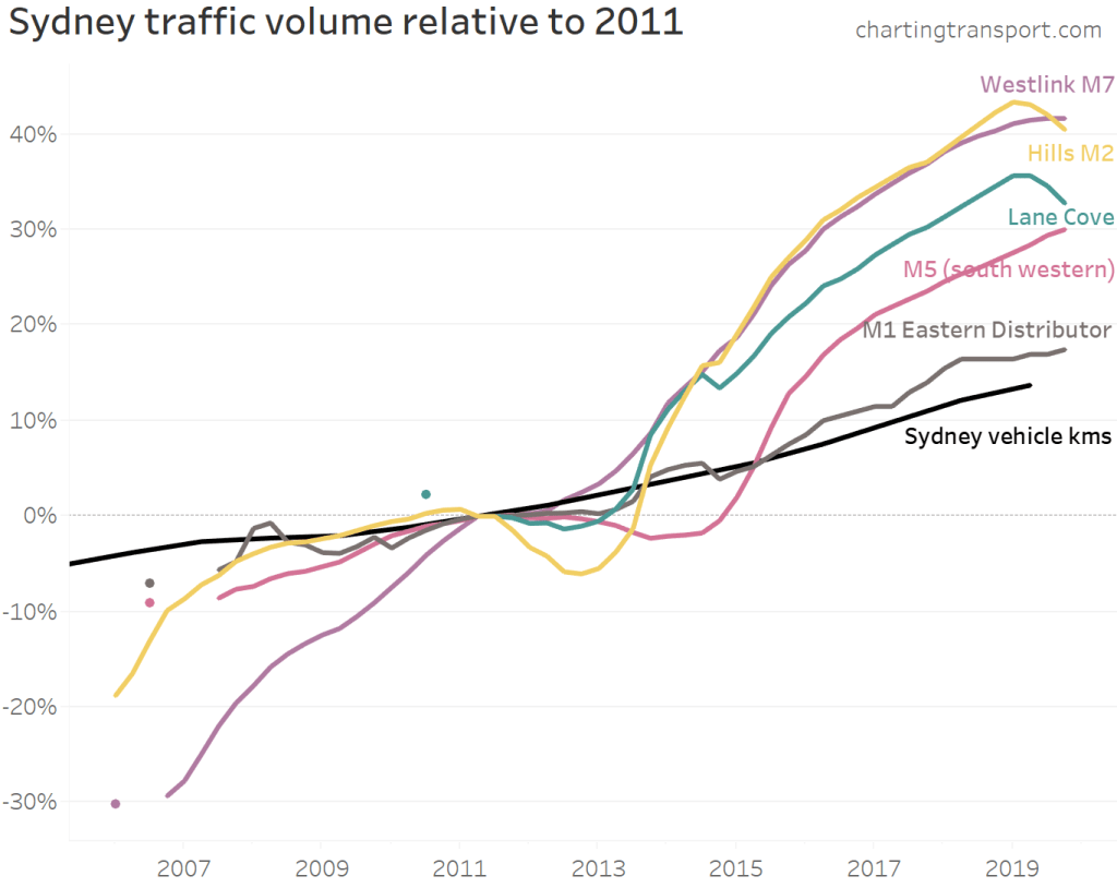
It’s a little more difficult to construct a chart for Sydney as different lengths of history are available for different roads. I’ve anchored the chart at 2011:

Most toll roads have had traffic growing faster than general traffic in Sydney. Westlink M7 and Hills M2 have had the highest growth since 2011, with the M1 Eastern Distributor showing the least growth. You can see declines on the Hills M2 and M5 (presumably during roadworks) followed by significant growth as capacity was made available.

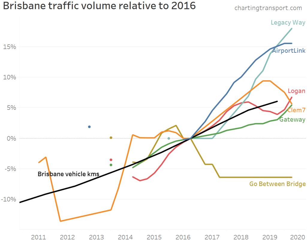
Not all of Brisbane’s toll roads have growth faster than overall traffic. Transurban report that AirportLink and Clem7 volumes have recently been impacted by upgrades on the Gateway motorway.

An important note on growth rate precision: Transurban report daily traffic volumes rounded to the nearest thousand. For roads with relatively small volumes (eg Clem7), the growth rates will be more impacted by rounding errors. For example, the traffic volumes on Clem7 went from 27+26+27+27=107 thousand in 2014/15 to 27+26+26+27=106 thousand in 2015/16, which is notional growth of -0.9%. But actual values for each quarter will be within +/-500, and the rounding errors will add up over the eight quarters making up the calculation. The actual growth could be anywhere between -4.6% and 2.9%, but is more likely to be in the middle of that range.

Unfortunately data isn’t always readily available:

  • The Brisbane Gateway Bridge and Logan/Gateway Motorway extension data is only available for financial years in annual reports up until 2010. Transurban took over these roads and have reported traffic volumes since 2013 but they do not appear to be comparable measures so I have listed them separately.
  • In October 2011, Horizon Roads purchased Melbourne’s Eastlink, and they do not seem to be publishing traffic volumes.
  • I haven’t been able to source Clem7 data for 2012 and the first half of 2013.

Traffic growth on other toll roads

Sydney Harbour Bridge and Tunnel

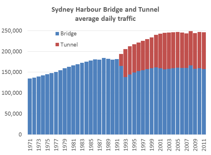
Calum Hutcheson from Hyder Consulting has generously compiled and shared time-series data with me on traffic volumes going back to 1971 for these two toll roads. He has sourced data from several available sources but has had to estimate some figures where data is missing.

Sydney Harbour Traffic 2

Traffic volumes levelled off on the bridge around 1988 and on the combined bridge and tunnel around 2005. It would appear the tunnel brought additional vehicle capacity good for around 17 years’ growth but that has now been exhausted (although I’m far from an expert in Sydney traffic). Traffic volumes on the tunnel have barely growth since 2010.

In 1992 one southbound lane of the bridge was converted to a bus lane (presumably related to the capacity freed up by the tunnel). The bridge’s vehicular traffic levels have not returned to 1988 levels, but I suspect the number of people moved in (road-based) vehicles has increased significantly (not to mention the train line across the bridge).

Sydney Cross City Tunnel

The Cross City Tunnel was forecast to carry 87,088 vehicles per day in 2006, but in 2019 was still less than half this amount.

I have not been able to source much data pre-2013, but a 2006 NSW Auditor General’s report contains some traffic volume data for 2005 and 2006, reproduced here (from page 32 of the report).

It would appear that motorists are highly sensitive to toll pricing, and the forecast volumes were not achieved even when tolls were removed.

Brisbane’s Clem7 cross-city tunnel

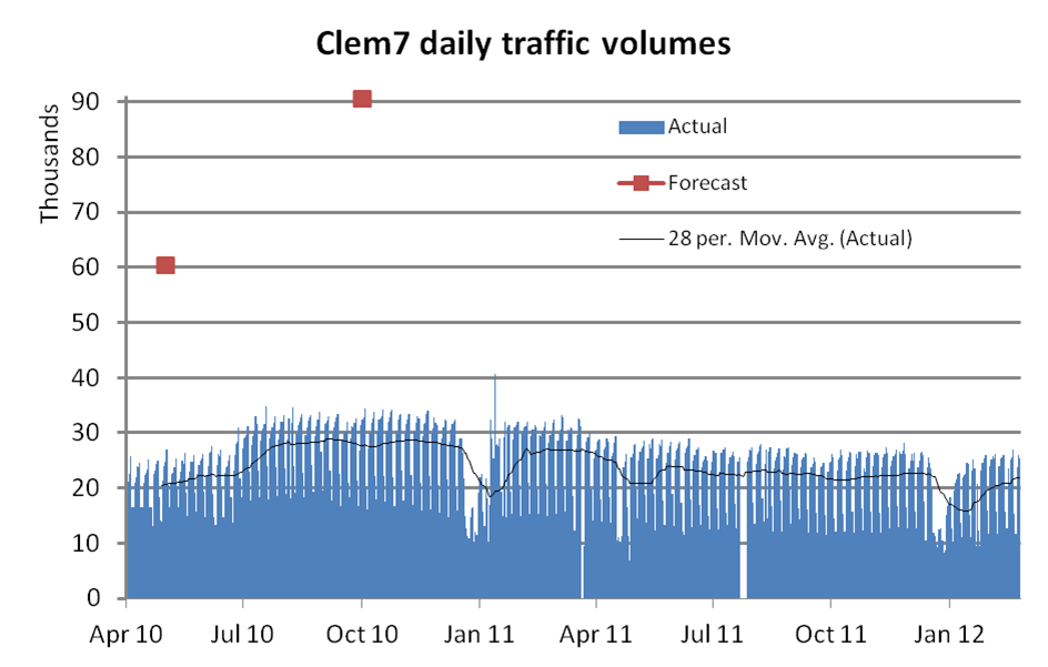
Brisbane’s first new road tunnel, the Clem7, opened in March 2010. During the first three weeks of toll-free operation, there was an average of 59,109 vehicles per day. During the first week of tolling, this fell to 20,602. The forecast was for initial traffic of around 60,000 vehicles per day, rising to 100,000 within 18 months. Owners at the time, Rivercity Motorways, went to the extraordinary step of publishing daily traffic data, as can be seen in the following chart showing traffic volumes since tolling commenced:

You can see an up-tick from the beginning of July 2010, when toll prices were cut. Tolls were raised in November 2010 and again in April 2011 and you can see corresponding drops in traffic volumes. Average daily traffic in calendar 2011 was 10% lower than for the first 12 months of operation (includes one overlapping quarter).

During the 2011 flood crisis tolls were waived for one week, and at the end of that period on Monday 17 January 2011, 40,566 vehicles were recorded, the highest since tolling commenced. This may or may not have also reflected closures to other roads making Clem7 more attractive. (footnote: actual weekend volumes have not been published for April 2010, so I have substituted the average non-workday figures, that have been published).

Traffic volumes on the Clem7 peaked at 30,000 in 2018, less than a third of the forecast for the year 2010.

Brisbane’s Airportlink

This toll road was forecast to attract 135,000 vehicles per day one month into operations, and have 165,000 vehicles per day after the ramp up period. Volumes in 2019 were around 63,000 – less than half the forecast after ramp up.

AirportLink traffic

The traffic volumes declined as tolls were progressively introduced to all traffic. BrisConnections, the owner of the road, went into voluntary administration in February 2013.

The Clem7 and Airportlink roads are the first two major tollways as part of the TransApex plan for adding major road capacity to Brisbane.

The third piece of this puzzle is the Go Between Bridge, now part-owned by Transurban and they report a flat 11,000 vehicles per day as of 2019. The forecast was for 17,500 by 2011 and 21,000 by 2021.

I’m guessing it may be a very long time before these TransApex roads reach capacity.

Eastlink

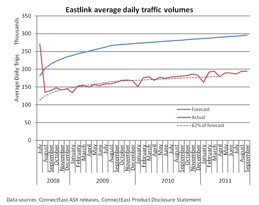
The following chart shows that Eastlink actual traffic volumes were fairly consistently around 60-65% of original (2004) forecast after tolling began. It suggests the forecasts were good at estimating the ramp-up shape, but not so much the overall traffic volumes.

Note: ConnectEast issued revised forecasts in August 2009, including that (steady state annual) average daily trips in 2011 would be 209,900. That forecast doesn’t appear to have been realised either. Unfortunately data reporting stopped in October 2011 following the sale to Horizon Roads.

Maps of Australian Toll Roads

Here are some rough Google maps: Melbourne Sydney Brisbane.
Maps and more information about many of the roads is also available on the Transurban website.

Other sources of traffic volume data

See another post on Melbourne traffic volumes. Some interesting recent data on Brisbane traffic volumes is in this report prepared for RiverCity Motorways (who operated the Clem7). It shows many major roads in Brisbane with stable or declining traffic volumes (possibly because they are at capacity, or possibly because of a mode shift to public transport).

New South Wales traffic data is available for selected locations, as well as detailed data for toll roads.

Victorian data for non-tolled roads is available here, but unfortunately does not include time series history.


Public transport mode share – according to household travel surveys

Sat 10 April, 2010

[post revised and updated October 2012 with new data from Sydney, Brisbane, and New Zealand]

Arguably the best source of public transport mode share statistics is from household travel surveys that are conducted in most large Australia cities and all of New Zealand (unfortunately some surveys more regularly than others). A common measure is public transport’s share of motorised trips (although public transport will also be competing with unmotorised transport modes).

In household travel survey speak, a linked trip is a journey between two distinct non-travel activities, and may involve several trip legs or unlinked trips. For example, if you walk to a bus stop, catch a bus to the train station, then catch a train to the city, then walk to your workplace, that is one linked trip made up of 4 unlinked trips (walk, bus, train, walk). Similarly if you drive from your home to your workplace, that’s one linked trip made up of one unlinked trip (unless you decide to count walking to and from the car). Hence mode share figures that relate to unlinked motorised trips will always be higher than mode share figures that relate to linked trips.

The data I have been able to obtain for cities is sometimes linked trips, sometimes unlinked trips, and sometimes both. It should be possible to get figures for both for any city, and I hope to obtain such data from state transport agencies in the future.

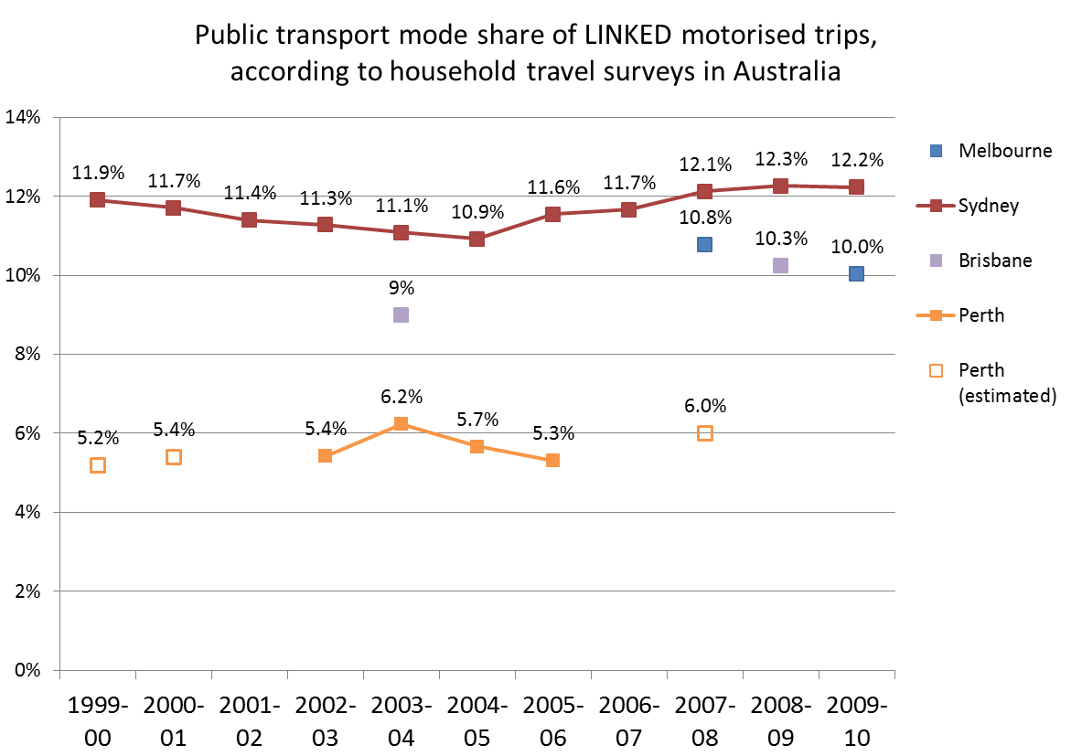
Here is the data I have for linked trips:

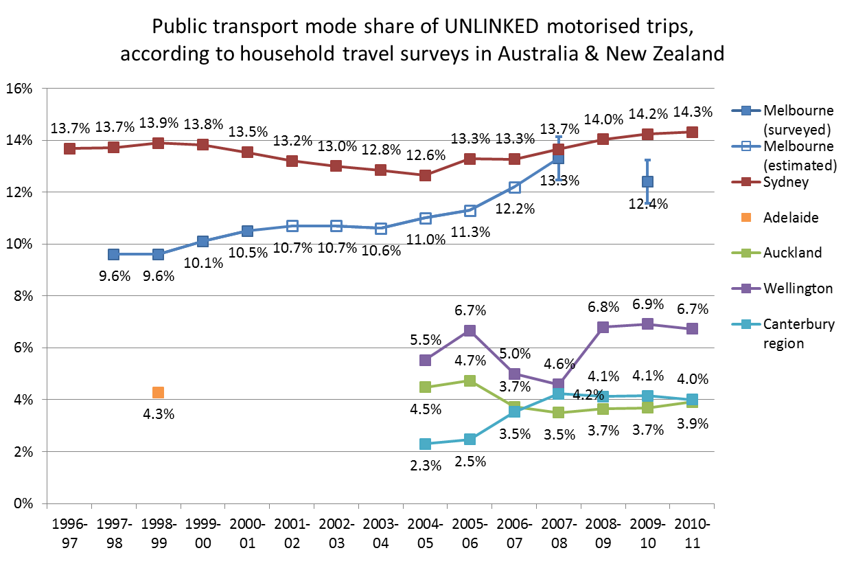
And here are the results for unlinked trips:

The Melbourne and Sydney measures are for weekdays only, whereas the New Zealand data appears to be for all days of the year.

In 2008, Melbourne appeared on track to overtake Sydney on unlinked trip public transport mode share, however the 2009-10 result for Melbourne was lower than predicted. Note that the error bars on the 2007-08 and 2009-10 VISTA survey results for Melbourne indicate the actual mode share might not have actually gone down significantly (similar error bars would apply to the linked trip data points). Over the same period public transport patronage grew by 11% and arterial road traffic grew by around 1.2%.

How reliable is this data?

Given that most household travel surveys interview thousands of households in any one year, the results should be pretty accurate for a high level reported figure such as mode share of trips. Household travel survey techniques have matured over the years, so it is likely they are reasonably reliable (particularly more recent results in larger cities).

The Perth survey data for 2003 to 2006 does not correlate with public transport patronage figures, that show a 12% growth over the same period.

For Brisbane 2003-04 I had to add whole number shares for each mode and divide by the sum of motorised mode shares. So there is some uncertainty about the precise motorised mode share.

The Melbourne official estimates for 2002-2007 were calculated using VicRoads traffic data, and public transport patronage figures.

(For more detail see the end of this post).

Linked or unlinked trips?

Calculating mode share based on linked trips removes the impact of public transport transfers. Cities where the public transport network is structured around feeder services with free transfers (eg bus to train) may have more public transport boardings (unlinked trips) than cities where transfers are “less encouraged” by the network design and fare systems (eg Wellington, Auckland, Sydney).

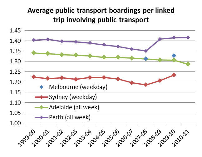
In fact, here is a chart showing the ratio of unlinked to linked public transport trips for four cities where I have data:

The Perth and Adelaide data is based on patronage figures that are reported as ‘initial boardings’ and ‘all boardings’. Annual reports comment that recent through-routing of bus services through the Adelaide CBD may have reduced the number of transfer boardings. You can see the transfer rate for Perth jumped after the southern suburbs railway opened at the end of 2007 (replacing many CBD bus routes with train feeder bus routes).

The Perth, Adelaide and Melbourne public transport fare systems are dominated by products that allow unlimited transfers within a time window (anywhere from 2 hours to 365 days). So while there may be a time and convenience penalty for transferring between two services, there is no financial penalty. Sydney’s public transport fare system has largely involved tickets for a single trip and/or one mode, such that another fare must be paid to transfer. Sydney’s CBD is also served by seemingly hundreds of bus routes – many of which parallel train lines – which enable people to travel to the city without having to transfer onto trains and pay a higher fare (even if that could provide a faster over journey).

The lower Sydney transfer rate partly explains why Melbourne and Sydney are much closer on mode share of unlinked trips, compared to mode share of linked trips. Network design will probably also have an impact.

There was a slight dip in the trend for Sydney around 2007-08 followed by a rise. I’m not sure what might explain that trend – the revamp of the fare system in April 2010 (introducing more multi-modal and multi-operator tickets) may have had a small impact on the 2009-10 figure.

The difference in these rates suggests that there could be quite substantial change in Sydney public transport use patterns should the fare system be revised to make free transfers the norm. Perhaps this might help ease the bus congestion issues in the CBD and allow higher bus frequencies in the suburbs? (assuming there is capacity to transfer bus passengers onto trains in the suburbs). There is one small area of Sydney where train+bus link tickets are available (no fare penalty for transferring), and the census data reveals a very significant rate of bus+train journeys to work in the Bondi Beach area, much higher than anywhere else in Sydney.

Other measures of public transport mode share

In another post, I looked at BITRE data on estimated passenger kms per mode in Australian cities (presumably calculated using patronage figures and average trip lengths from household travel survey data or elsewhere). That enabled calculation of estimated public transport mode share of motorised passenger kilometres, with continuous time series available for all Australia cities. However there will be many assumptions involved in these estimates.

Another measure is boardings per capita (covered here), although this also has the problem of different transfer rates in different cities.

The quest for a fair measure of public transport use continues!

Household travel survey sources:

Melbourne: Victorian Department of Transport (personal communications), but also available in the Growing Victoria Together Progress Report (page 387), in the 2009-10 Victorian State Budget Papers. Figures until 2001 were from the VATS survey, while the 2008 result is from the VISTA survey.

Sydney Household Travel Survey: Data was supplied by NSW Transport Data Centre by email. Public transport trips are inclusive of trains, buses, ferries, monorail and light rail.

Adelaide Household Travel Survey (AHTS): Adelaide Travel Patterns: an overview (if anyone can tell me about whether more recent surveys have been conducted I would be very appreciative, better still if I can get results data!).

South East Queensland Travel Survey: Brisbane Fast Facts Brochure (unclear dating, but PDF was created in 2006 so I assume the results are for 2003-04. The report does not mention whether these are mode shares for trips or kms, however it seems highly likely they are for trips as the walking mode share was 10% and we know walking trips are generally shorter than motorised trips). I also have results for 2008-09 courtesy of Ian Wallis and Associates. I unfortunately do not yet have results for the 2006-2008 survey.

Perth and Regions Travel Survey (PARTS): Data is from the PARTS Key Findings Report (by Data Analysis Australia). The  2003-2006 results are from PARTS, the 2000 figure is a TravelSmart estimate, and 2001 and 2008 estimates are from unspecified sources.

The New Zealand Household Travel Survey: Because of sample sizes, the figures for the New Zealand cities are two years combined (ie the “2010” figure is for 2008/09 and 2009/10). The Canterbury region includes Christchurch as well as a not insignificant surrounding population. The Auckland region is more similar to the Australian cities statistical divisions. The Wellington figures are for the Wellington Region, but are dominated by metropolitan Wellington.