Recent updates of transport trend posts

Wed 3 November, 2010

I’ve updated four posts on transport trends with more recent data. They probably won’t appear in your feeds, so here are some links:

(I’m editing existing posts instead of creating new posts when I update data)

I’ve also created an index page of all posts to make them easier to find.


Trends in Melbourne Traffic

Sun 31 October, 2010

[first posted January 2010, last updated July 2013]

Each year, VicRoads publishes Traffic Systems Performance Monitoring bulletins that contain a wealth of data. However the bulletins don’t always show the longer term trends, so here are some charts to illuminate some of what is happening, particularly around congestion and total traffic volumes in Melbourne, and also a comparison of road traffic and public transport use growth.

Since the 2010-11 bulletin, VicRoads have changed the way they report various statistics. This post includes some charts of measures no longer reported, and in many cases the figures for 2010-11 and 2011-12 have been read off charts (as numbers were not published), so there is a little less precision.

Travel Speeds

The first chart shows average travel speed around Melbourne by time of day.

Melbourne average travel speed 5

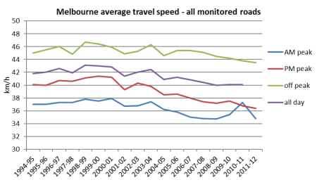
The figures show a gradual slowing of speeds, although with some more erratic results in the AM peak in recent time (VicRoads haven’t offered an explanation, and I don’t have one either).

What about for different types of roads?

Melbourne average speed AM peak 3

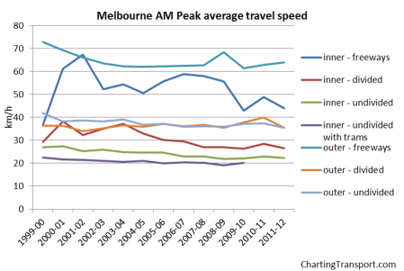
Speeds have been declining on some road types, particularly inner freeways and inner undivided roads. Upgrades to the M1 completed in late 2009 may have increased speeds in 2010-11, but this appears to have been largely eroded in 2011-12.

Curiously, freeways slowed down after CityLink opened in 2001. Inner roads have been trending downwards slightly while outer roads seem to be steady (though with a slight increase in 2009-10). Outer freeways showed an increase in speed in 2008-09, which is related to the opening of Eastlink, but this was more than eroded in 2009-10, possibly related to the Ring Road widening works.

How does Melbourne compare to other Australian cities? This data is from AustRoads (except the 2011-12 figure for Melbourne):

Australian cities average speed AM peak 2

A gradual slowing trend is evident in most cities, except for speeding up in Melbourne and Brisbane up to 2010-11 (although Melbourne slowed down again in 2011-12). The Perth and Brisbane data seems to move around a lot more than the other cities. See the AustRoads website for qualifications on the data.

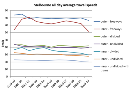
All-day average speeds by road type have not been reported for years after 2009-10, but here are the previous results:

Melbourne all day speed by road type

Is speed a good thing? If you want to get to your destination sooner, then obviously it is. If you want to improve safety and the liveability of streets, it possibly isn’t. A lot of road safety initiatives (eg right turn signal controls) actually slow down traffic. The other consideration is whether you experience the same travel speed each day – which brings us to…

Travel time variability

Another measure of congestion is travel time variability. If it sometimes takes 40 minutes to get to work, and you need to arrive at work on time, you have to leave yourself 40 minutes, even if on average it takes 30 minutes.

Melbourne variability of travel time 3

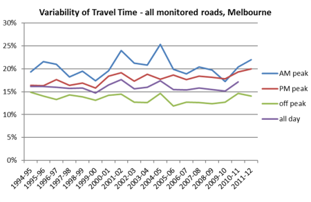
The recent trend has been towards increased variability after some improvements in 2009-10.

Traffic volumes

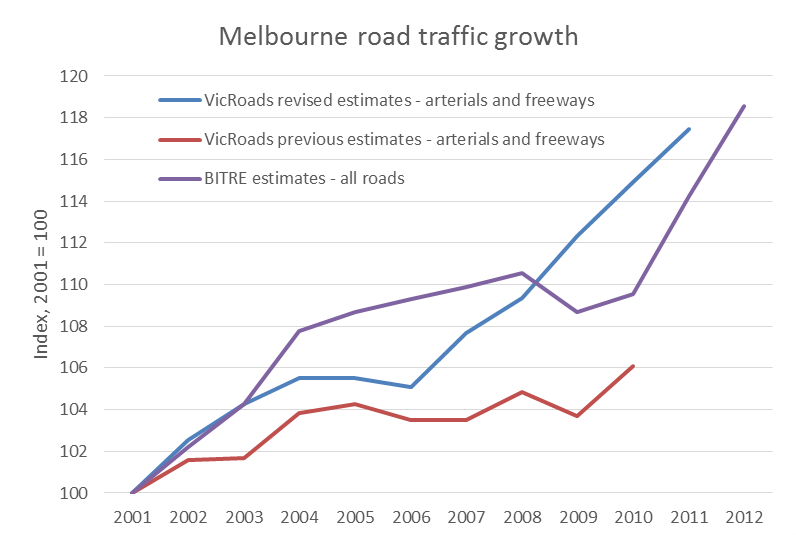
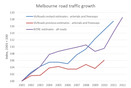
Since the 2010-11 Traffic Monitor report, VicRoads have completely revised their estimates for total arterial road traffic volumes and have divided Melbourne into three zones (inner, middle and outer) whereas previous results were for two zones (inner and outer). The new results show some quite different trends. I’ve read the data off the charts (not an exact process), to produce the following chart showing growth index figures (old figures in blue, revised figures in orange):

Melbourne traffic volumes by zone old and new

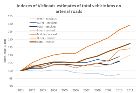
The previous estimates suggested traffic volumes stopped growing around 2004-05, whereas the revised estimates suggest an outer suburban growth spurt from around 2006, and a strong middle suburban growth spurt from around 2010. The 2011-12 bulletin did not include estimates for 2011-12.

This is what VicRoads says about the new method:

VicRoads has recently developed a new method for estimating road use in Melbourne. The new method uses all available vehicle counts to calculate VKT for all arterial roads and freeways in Melbourne. VKT values used in previous editions of the Traffic Monitor were derived from the monitored network only. The new method captures travel for the whole of Melbourne and allows estimates to be retrospectively made for previous years.

BITRE also estimate total Melbourne vehicle kilometres (using fuel sales data, so including all roads, not just arterials and freeways). The most recent data at the time of updating this post was Information Sheet 44. Here’s a comparison (again using index values):

Melbourne total vkms growth estimates

The BITRE data suggests a slightly different trend, but a similar overall growth figure and recent stronger growth. Putting the two VKT estimates together suggests that around 75% of Melbourne vehicle kilometres are travelled on arterials and freeways.

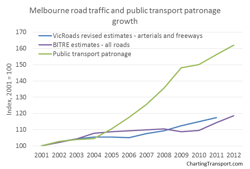
To add a little more context, here is a chart comparing road traffic and public transport patronage growth:

Melbourne total vkms and PT growth estimates

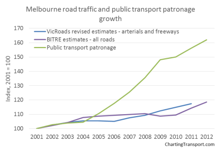
This chart really tells a story. Over eleven years to 2012, Melbourne public transport patronage has grown around three times more than road traffic.

Traffic growth on different road types

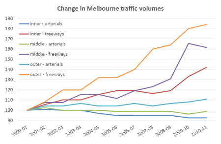
Here is a chart with 2010-11 data using the new road type classifications:

Melbourne traffic growth by road type

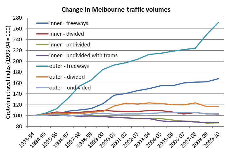
And here is the longer term trend using the older road types (up to 2009-10 only):

Melbourne index of traffic volume by road type 4

Traffic on freeways has risen substantially – not surprising given massive investment in freeway infrastructure over the last couple of decades. There has been a substantial growth in the last few years, reflecting the opening of Eastlink in 2008, the widening of the M1 in 2009, and diversion of some traffic off other outer roads (and you can see a decline in “outer – divided”). Otherwise, freeway traffic volumes seem to be growing while arterial roads are showing stagnant or declining traffic volumes.

Take the freeways off the chart and you can see trends on other roads a bit more clearly:

Melbourne index of traffic volume by road type ex freeways 3

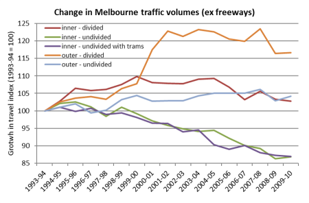
Traffic volumes have trended downwards on undivided inner roads (including those with trams), and have largely stagnated on all other non-freeway roads in recent times. You can also see a significant drop on outer-divided roads in 2008-09 – possible some of it from Springvale and Stud Roads that parallel EastLink.

For more detail (including other charts), I suggest reading the Traffic Systems Performance Monitoring bulletins on the VicRoads website.


A spatial analysis of Melbourne 2006 journey to work mode shares

Fri 16 July, 2010

The census journey to work dataset contains a wealth of data, but analysis of this data is rarely published. This post includes 16 maps showing the concentrations of different modes in the journey to work in Melbourne as recorded in the 2006 Census.

About the maps

Before jumping into the maps, I need to state a few things and disclaimers:

  • All of these maps are based on the home Census Collection District of each worker who travelled to work.
  • Many of the maps show Melbourne’s tram, train and high (AM) peak frequency bus networks as of 2006. High frequency buses are those with an average AM peak headway of less than 20 minutes (not including 20 minutes – which makes it a somewhat arbitrary cut-off). There may be minor omissions in the display of the bus network, particularly where several bus routes overlap to provide a high frequency corridor, so use this as a guide only.
  • I’ve filtered out larger sized CCDs on the assumption they are most likely to be non-urban areas. However some smaller non-residential areas are still present in the results (perhaps they shouldn’t be, but I haven’t really got the time to redo all the maps).
  • The colour scales vary for each map and are based on quintiles with rounding. I’ve aimed to highlight variations within each mode, so the same colours will mean different mode shares on different maps.
  • Click to enlarge the maps to see more detail.

Much of the commentary in this post will assume some geographic knowledge of Melbourne, apologies for that. But I have included some links to Google Maps to show you places I am talking about.

High level modal shares

The first map shows the share of journeys work involving public transport (and possibly also private transport and/or bicycle).

You can see:

  • Large areas of high mode share in the inner suburbs. In particular the inner northern suburbs (Brunswick) and inner south-eastern suburbs (St Kilda/Malvern to South Yarra) where there is a dense frequent public transport network in most directions.
  • Some points of relatively high mode share in the middle and outer suburbs around train stations (but not always around train stations).
  • A high mode share in the area around the Monash University Clayton Campus – though note the area north of the campus is largely industrial so this might be misleading.
  • Very low mode share in the outer suburbs in areas away from train stations and high frequency bus routes, indicating high car dependence.
  • Low mode share in the CBD and immediate surrounds (related to a large number of destinations being in walking distance, more on this below).
  • There are some frequent bus routes in the outer suburbs that still have low public transport mode share. These services may be focussed on moving school children, but also many of them do not provide fast direct travel in a radial direction. For example,
    • Route 476 through Keilor has a number of deviations off the main road and then gets caught in congestion on Keilor Road before reaching Essendon Station.
    • Route 477 from Broadmeadows to Essendon via Airport West is highly indirect and also gets caught in congestion before reaching Essendon Station.
    • A couple of the bus routes north of Ringwood Station are quite indirect.
    • Some of the north-south bus routes in East Doncaster are indirect.
    • Route 571, which largely serves Epping to South Morang, has a large one way loop around Centenary Drive making it less direct for some people. Although for many people it is direct. This bus route operates a “TrainLink” service between Epping and Plenty Valley Town Centre – meeting every train at Epping, seven days a week.

The next maps shows mode share of car-only journeys to work.

You can see:

  • Lower car mode shares around train stations and through the inner and middle suburbs where better public transport is available.
  • Very high car mode share in the outer suburbs where public transport service levels are poor.
  • Low car mode share around Monash University Clayton campus, Deakin University Burwood campus, Latrobe University Bundoora, the Simpson Army Barracks in Yallambie (near Greensborough)

The next chart shows people using active transport – that is walking only or any journey involving a bicycle (and possibly other modes).

This map shows:

  • A remarkably circular region around the CBD with high active transport mode share (though it seems to extend a bit further north into Brunswick).
  • Pockets of high mode share around Footscray, Broadmeadows, Box Hill, Ringwood, and Frankston – which have all since been nominated as Central Activities Districts (CADs).
  • Pockets of high mode share around suburban university campuses – suggesting concentrations of staff living within walking distance (note: journey to work is not supposed to include journey to education). The Victorian Police Academy in Glen Waverley also shows up.
  • A few unexpected concentrations:
    • in West Reservoir (between the Upfield and Epping train lines). This is a lower socioeconomic residential area adjacent to (and in some cases mixed in with) a light industrial area, which is something planners have been actively avoiding in recent times. But this historical land use pattern seems to facilitate a high share of people walking to (presumably local) employment.
    • Some pockets around off-rail major shopping centres – eg Highpoint, Werribee Plaza, Altona Gate, Southland, Cranbourne.

Putting together active and public transport, the following chart shows the mode share of “sustainable” transport modes:

Not unexpectedly, it shows high sustainable transport mode share in the inner city – with active transport taking over from public transport as you approach the CBD.

A more detailed look at each mode

Trains

The next map shows the share of journeys to work involving train (and in many cases other modes as well).

Unsurprisingly there are concentrations around train stations, but also:

  • Very low train mode share in the Doncaster/Manningham corridor – where freeway buses operate to the CBD. This suggests few people driving to train stations from this region.
  • A low mode share between the Upfield and Epping train corridors in Brunswick/Northcote – where there are several very frequent tram services that are often competitive with train travel times.
  • Some higher concentrations at the western edge of the north-western suburbs, which were very poorly served by public transport in 2006. This might represent a pocket of park (car) and ride (train) commuters.
  • A concentration stretching west from Newport station more than typical. Perhaps a high number of people catching buses to Newport station? More on that below.

Limiting the analysis to train (and walking) only journeys produces the following map:

While there are concentrations around train stations, there are above 3% shares in areas well beyond reasonable walking distance of stations. While a few people might actually be walking several kms to a station, I’d suggest it is more likely to reflect a tendency for people to fail to report ALL modes used in their journey to work. Perhaps these people have a perception that the “obvious” way to reach a train station is by car and so the car leg was not worth reporting on the census form. An issue for people designing census forms.

Note there is the same concentration we saw on the previous map at the western edge of the north-western suburbs.

These off-rail “train only” concentrations actually correspond with people who report using both car-as-driver and train, as shown on the following map:

Some observations:

  • There are high concentrations in the middle eastern and southern suburbs, including along tram route 75. These areas are just outside fare zone 1, so perhaps they involve people driving to from zone 2 homes to zone 1 stations to take advantage of cheaper fares to the city. But it also might reflect the lower service levels of local buses for reaching the train network.
  • There are many pockets of concentration in the outer western and northern suburbs, particularly on the fringe of the urban area where bus services may not have existed at the time. There have been employment shortages in the western suburbs of Melbourne with a higher share of journeys to the inner city.

What about feeder modes to trains? The next chart shows people using both bus and train:

There are some interesting localised pockets:

  • Newport west shows a high bus-train mode share – routes 432 and 471 operate in this area feeding Newport station (both every 20 minutes in the AM peak). Ironically there used to be a train station at Paisley in the south-west corner of the green pocket but it has been closed for several decades.
  • There are many high frequency bus routes between Sunshine and Footscray and this area shows up quite clearly.
  • East of Essendon station along Buckley Street (route 465) and between Moonee Ponds and Aberfeldie (route 467) there are high concentrations of bus-train commuters. Route 465 is timetabled to meet every train during the day (including the peaks) and route 467 also runs a high frequency in peak periods designed to meet trains. This strategy of high frequency bus feeder services is clearly highly successful at attracting bus-train commuters. (If only there were more such routes in Melbourne!)
  • There are concentrations north (and to some extent south) of Box Hill station. A number of relatively high frequency routes converge in this area.
  • There is an area around Monash University Clayton campus – which probably doesn’t represent people working at that campus as you can’t use a train to travel the short distance.
  • The bus routes north of Ringwood station do appear to facilitate a relatively high number of bus-train commuters, despite some route indirectness (the mode share drops further from Ringwood where commuters endure more of the indirectness).
  • South of Blackburn and Nunawading stations – where SmartBus routes operate to the south of these stations. The high frequency bus service appears to be attracting bus-train commuters.
  • Around Warrigal Road, south of Holmesglen and Oakleigh stations – again probably the impact of the high frequency SmartBus route (then route 700, now 903).
  • Around Doveton (east of Dandenong), where four bus routes each running approximately every 45-50 minutes converge to provide an average 12 minute service for most of the day on a weekday.
  • Curiously around Pakenham, where hourly bus routes operated in 2006 with a limited span of hours.
  • Some pockets west of St Albans station, where there are some places with overlapping bus routes (however they only run every 40 minutes).

The next map shows people using both trains and trams. While there is a smattering of such people across Melbourne (probably reflecting people changing onto trams after arriving in the inner city by train), I have zoomed into the tram network area to look for areas where tram feeds trains.

Some clear corridors are visible:

Note that route 75 does not act as an effective feeder to the Alemein train line – most likely because there is no station conveniently located to allow an easy interchange between these lines (probably a product of historical competition between modes).

Trams

The next map shows journeys involving tram (and possibly other modes). Again, I have zoomed in around the tram network.

There are several interesting things to note:

  • The highest concentrations of tram use are in the northern suburbs (north to Brunswick area particularly), east to Richmond, and south to Port Melbourne, South Melbourne, Albert Park and St Kilda.
  • A more moderate tram mode share is achieved in the inner south-eastern suburbs, likely due to the area also being well serviced by trains.
  • The outer reaches of the tram network are generally not very effective at attracting a high tram mode share – particularly tram 86 to Bundoora, tram 75 to Vermont South, and tram 64 to East Brighton. These outer reaches provide long travel times to the jobs-rich inner city. This evidence does not support the case for outward extensions of the tram network. That said, tram 86 serves two universities in Bundoora and tram 75 serves Deakin University Burwood campus, so the trams probably attract a fair share of journeys to education. Unfortunately the census does not include journey to education.

The next map shows journeys to work involving tram (and walking) only:

This map is very similar, except that there is a low tram-only mode share where tram lines cross train lines before reaching the city centre. Refer to the map above on train + tram journeys.

Buses

The next map shows journeys to work involving buses (and possibly other modes):

This map shows several bus hot spots in Melbourne:

  • The Sunshine-Footscray corridor which is served by several high frequency bus routes, and much of which is beyond walking distance of train stations.
  • The Doncaster/Manningham area, which is served by several high (peak) frequency bus routes that run along the Eastern Freeway into the city (using bus lanes to get around congestion).
  • North Altona along Millers Road. Bus route 232 runs every 10 minutes (or better) in peak periods across the Westgate Bridge into the city.
  • A pocket around Monash University Clayton campus, which is only served by buses (however note much of the green area is industrial land so this may be misleading).
  • Around Oriel Road in Heidelberg West where there is a (combined route) high frequency bus service to the city and Latrobe University Bundoora.
  • Some patches around central Dandenong, where some bus routes overlap to provide a higher frequency combined service.

For completeness, the following map shows bus (and walking) only journeys:

Cycling

The following map shows the concentrations of journeys to work involving bicycle. I’ve zoomed in on the inner city as most of the rest of the Melbourne has very low bicycle mode share.

There is a very strong concentration in the inner northern suburbs – in the City of Yarra and the southern part of the City of Moreland (Brunswick). This area is very well served by high quality on road bicycle facilities. In many areas, over 1 in 10 journeys to work involve cycling.

Walking only

The next map shows concentrations of walking-only journeys to work:

Again, the inner city area has a high concentration, but there are also concentrations around major education campuses and larger activity centres in the suburbs.

Car passenger

The next map shows the mode share of “car as passenger” as part of the journey to work. This effectively shows a combination of car pooling and lift-giving trips.

The highest concentrations are in the outer suburbs (particularly in newer areas), where public transport service levels are lowest, but also many areas with lower incomes. I’d suggest it is likely that car passenger trips are a product of lower incomes (lower car ownership?) and/or poor public transport provision where lift giving is required. A pure lift giving trip is highly time inefficient for the driver, and the vehicle travels twice the distance that the passenger needs to travel – roughly doubling the congestion and environmental impacts. However, the car passenger trips might be partial car pooling – eg a driver drops a passenger at a train station on the way to work, which is relatively efficient.

I hope these maps are useful.


Public transport mode shift and road congestion

Sun 4 July, 2010

Is a modal shift to public transport an effective way to reduce road traffic congestion pressures?

I’ve discussed this issue in a few posts, but I think the following simple chart pretty much sums it all up:

You can see a significant change in both trends from around 2004 onwards.

Arguably public transport mode shift has been the most effective method for relieving congestion pressures in Melbourne in the last five years.

That is not to say traffic congestion has been solved or significantly eased, but it would likely have become much worse if road traffic volumes had continued to grow after 2004-05.

More posts on road traffic and mode shift.