Australia is just starting to shift toward electric vehicles. How much of the fleet has shifted, and which vehicle types and geographies are shifting the fastest?
This post draws on BITRE data of registered road vehicles (collected at the end of January each year). At the time of writing data was available for 2021 to 2024. I’ve used EV as shorthand for battery electric and fuel cell vehicles (the vast majority will be battery), and hybrid EV describes vehicles with battery and another energy source (usually petrol or diesel).
Share of registered fleet
Here’s the motive power share of registered vehicles by vehicle type across Australia over the last four years:

If you look carefully you’ll see tiny slithers of EV (dark green) within passenger vehicles, motorcycles, and heavy buses, plus an increasing share of hybrid EVs in the passenger vehicle segment. Apart from motorcycles, diesel is the increasingly dominant motive power for most other vehicle types. EVs are extremely rare in the commercial vehicle space at this time.
You might be wondering about “Non-freight carrying vehicles” – these are special vehicles like ambulances, fire trucks, tow trucks, hearses, etc.
Here’s a closer look the national electric vehicle share by vehicle type:
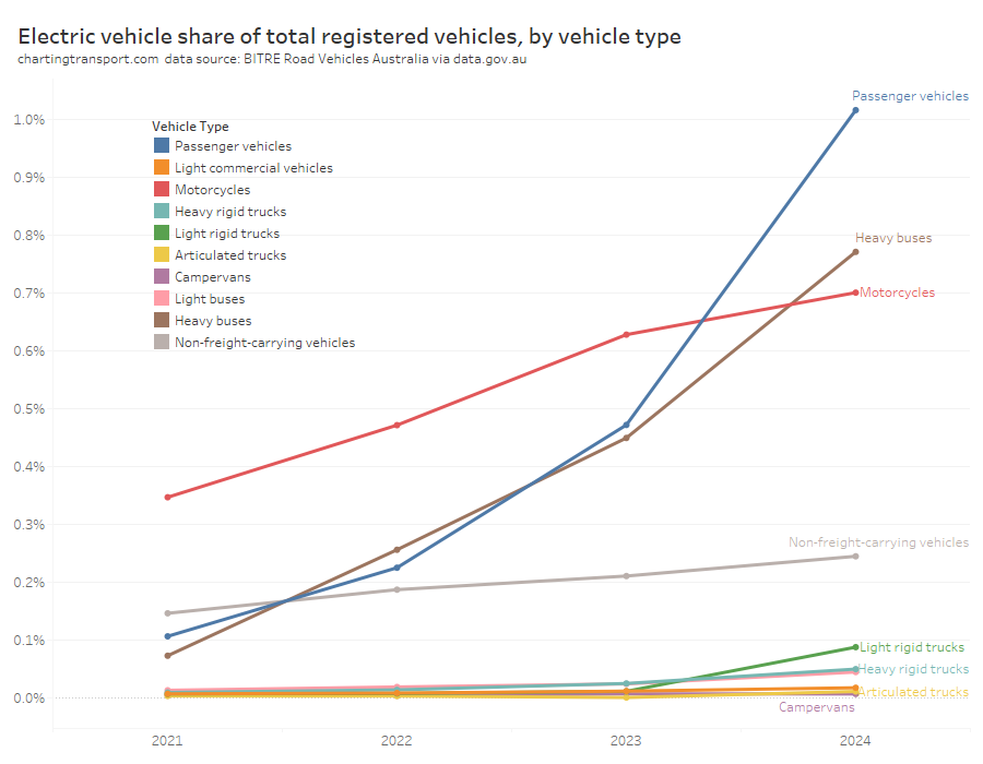
EVs are making inroads into passenger vehicles, heavy buses, and motorcycles, but not so much in other categories.
Here’s a breakdown of those three vehicle types by state/territory:
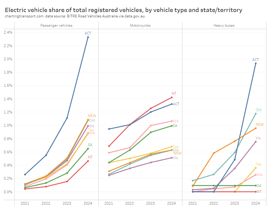
The ACT is leading EV take up for passenger vehicles and heavy buses. It’s population is also almost entirely urban.
So electric vehicles are still a tiny share of the total fleet, but do they make up more of the growth in the fleet?
Share of the net change in registered vehicles
Here I’m looking at the difference in registered vehicles between January 2023 and January 2024. Note that this analysis is different to analysing vehicle sales as it effectively accounts for deregistered vehicles as well as new vehicles.
The following chart shows the motive power share of net new registered vehicles of each vehicle type. Each column adds to 100%, but the chart will extend below 0% and above 100% when one motive power has a net reduction in registered vehicles, offset by gains in other motive powers (it’s a bit confusing, but I hope you get the idea).
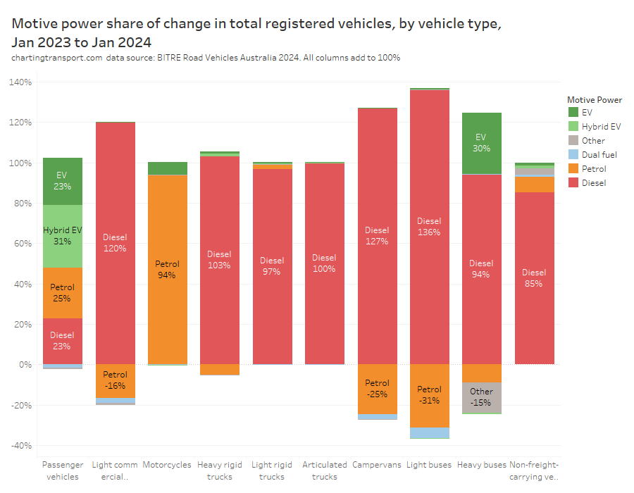
A quite different picture emerges here. Of the net increase in passenger vehicles (think cars) nationally, EVs accounted for 23% and hybrid EVs 31%. EVs also accounted for 6% of the growth in motorcycles and 30% of the growth in heavy buses. Many vehicles remain registered for 20+ years, so it takes a long time before the trends in new vehicles influence the overall fleet mix.
Passenger vehicles
The passenger vehicle story is even more interesting if you drill down to state/territory level:
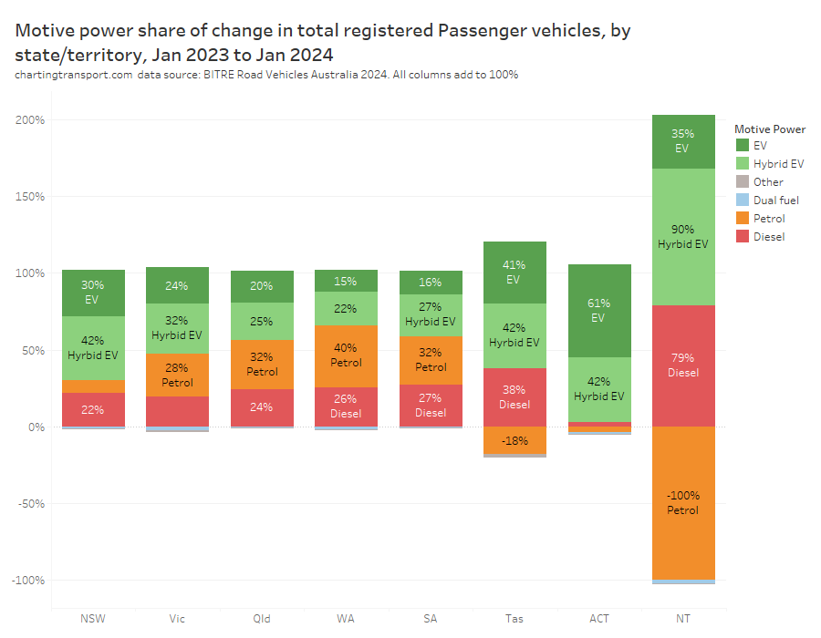
In the ACT, electric vehicles accounted for 61% of the growth in passenger vehicles, with hybrids accounting for most of the rest. A majority of the increase in passenger vehicles were also EVs or hybrids in NSW, Victoria, and Tasmania.
That’s not to say that there weren’t plenty of new petrol and diesel passenger vehicles in the ACT and other states, however many of these new vehicles would have been offset by deregistered petrol/diesel vehicles.
The Northern Territory saw a continuing decline in registered petrol passenger vehicles which makes the chart a little confusing – but the biggest increase there was hybrids.
Buses
Here’s the volume change in registered heavy buses by state/territory:
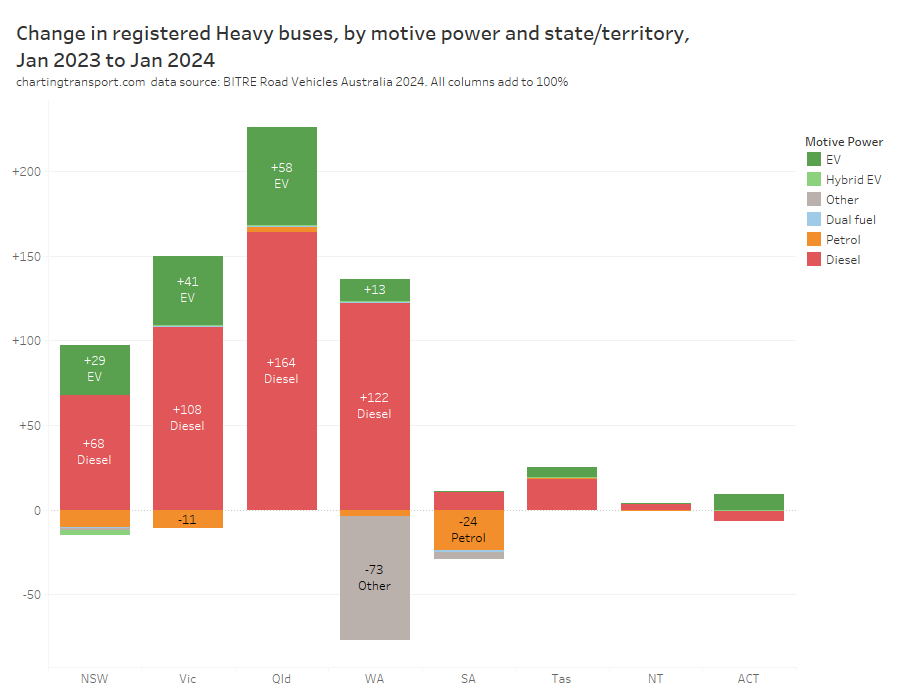
Queensland had the biggest increase in heavy buses overall, and also the biggest increase in electric buses. Victoria had the next largest increase in electric buses followed by NSW. I am guessing the -73 “other” heavy buses in WA might have been gas buses retired and replaced by mostly diesel buses.
South Australia had a net decline in the number of registered heavy buses, with no increase in electric buses registered between Jan 2023 and 2024.
Technical note: I’ve not used a chart of share changes for buses because South Australia had a net decline (which makes a share of the net change chart even more confusing!).
Motorcycles
Electric motive power also featured for motorcycles. Here’s the motive power share of net growth in registered motorcycles by state/territory:
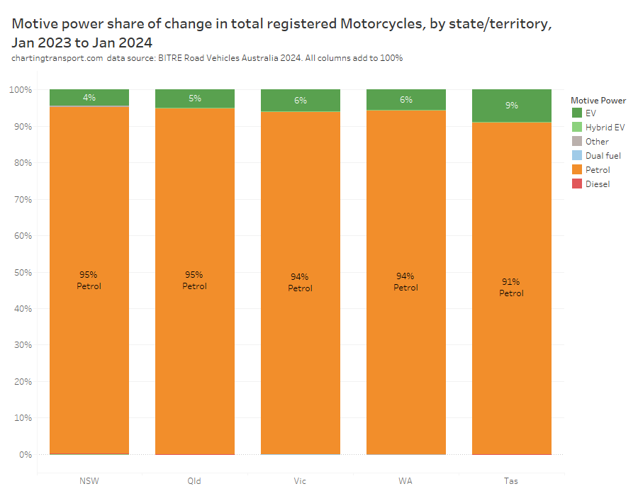
The number of electric motorbikes increased in all states. But I’ve excluded South Australia, the Northern Territory, and the Australian Capital Territory from the chart because the total volume of motorcycles declined (a large decline in petrol not fully offset by an increase in electrics).
This data is only up to January 2024. What’s been happening since then?
How does this compare to EV share of vehicle sales?
The Federal Chamber of Automotive Industries (FCAI) keeps track of vehicle sales, but doesn’t share all of their data (unless you pay). However there are monthly news items that drop some useful statistics from time to time. At the time of writing, they’ve been quoting EV share of sales around 6.4% to 6.6% in mid-2024, down from 9.5% to 9.6% in early 2024. For calendar 2023 they report EV sales share at 7.2%.
How does that square up with 23% EV share of net new passenger vehicles in the BITRE data?
FCAI reported 890,823 passenger and SUV sales in 2023, while BITRE reported a net increase in registered passenger vehicles of 374,513 between January 2023 and January 2024. That means roughly half a million passenger vehicles were deregistered in 2023, and probably the vast majority of these would have been petrol or diesel vehicles. Plenty of new petrol and diesel vehicles will have offset these deregistered vehicles, with hybrids and EVs then accounting for a larger share of the net growth in fleet.
Also, about a third of vehicles sales are not passenger vehicles, and the EV share of passenger vehicles was undoubted higher than than the EV share of all vehicles.
Where are EVs most prevalent?
BITRE publish data down to postcode level, so it’s easy to calculate the EV share of garaged vehicles by postcode.
But we have to be careful of postcodes that have a large number of vehicles not registered and/or garaged at homes, particularly those around major airports that have a large number of rental cars, and some industrial areas with large business fleets. I’ve excluded postcodes with fewer than 500 residents but that doesn’t always exclude these non-residential areas.
Australian postcodes were introduced in the 1960s to assist with the delivery of mail and parcels, and are often not great for statistical analysis. But sometimes postcodes are the only form of geographic information you can get.
Here’s the EV share of passenger vehicles around Melbourne:
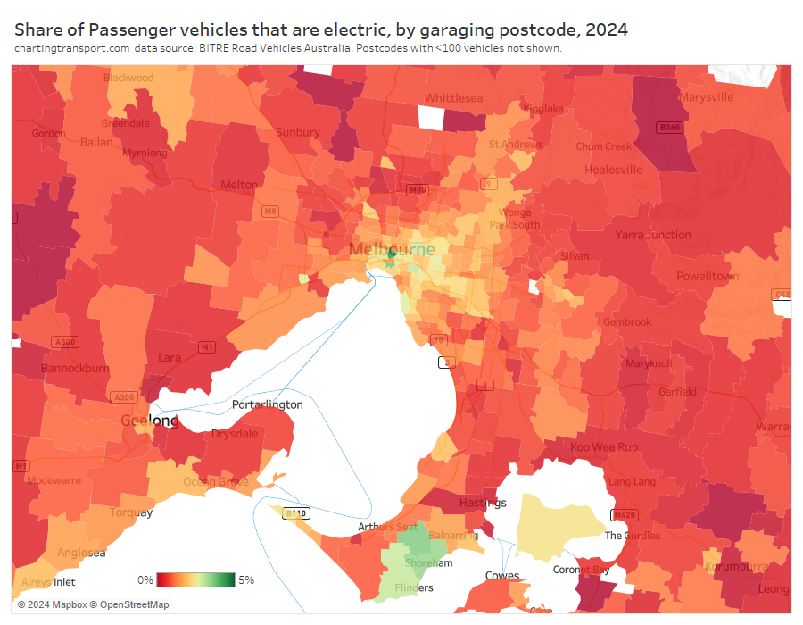
The highest shares were in the CBD, some inner eastern suburbs, and the southern coast of the Mornington Peninsula.
Here’s Sydney:
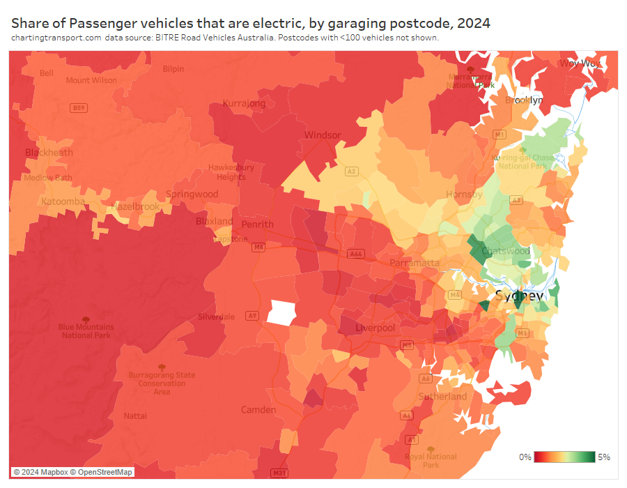
The highest shares were in the CBD, inner south-eastern suburbs, and the north shore.
Brisbane:
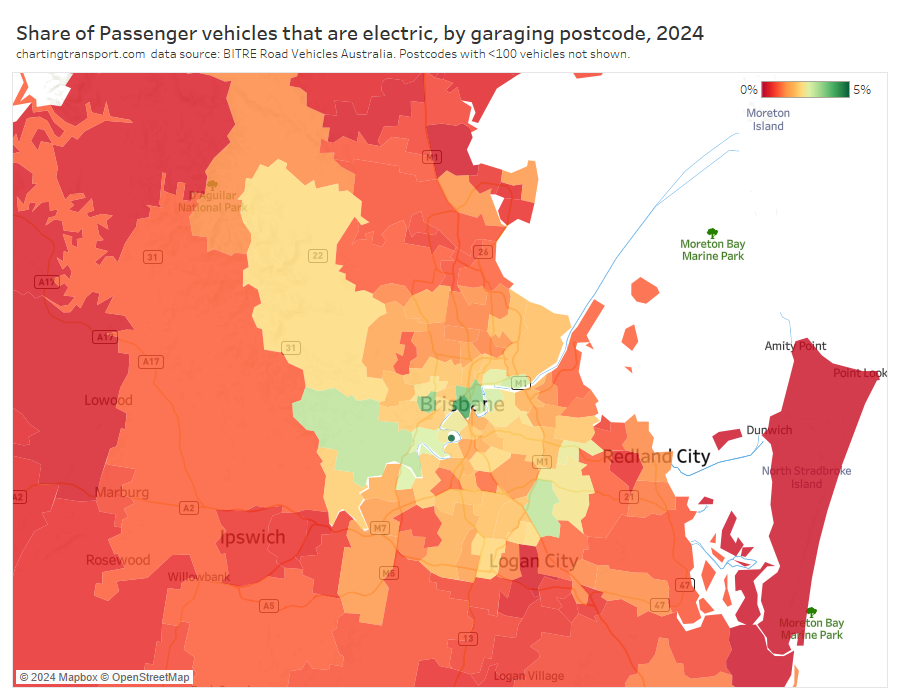
The highest EV shares were in the CBD, central suburbs around the river, Brookfield to the west, and Rochdale to the south.
Perth:
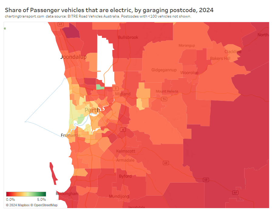
The highest shares were in the western suburbs, and in Malaga in the north (might include many non-residential vehicles).
Adelaide:
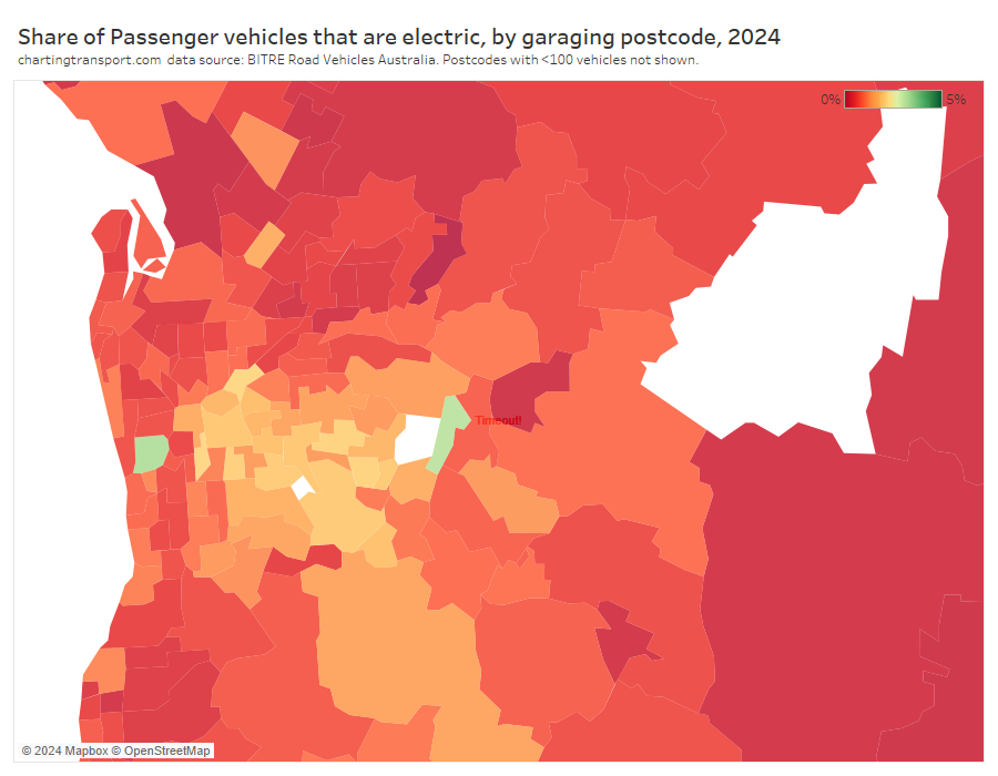
The highest shares were around Adelaide Airport and Forest Range in the hills.
If you know a bit about the demographics of these cities you might be noticing higher EV shares in more advantaged areas. Is there a pattern here?
EV share and socio-economic advantage
The following chart shows the 2024 EV share of passenger vehicles of postcodes within each percentile of ABS’s 2021Index of Relative Socio-economic Advantage and Disadvantage (IRSAD):
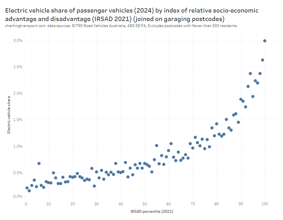
That’s a very strong and curved relationship, with the EV share rising most steeply towards the most advantaged percentiles. I suppose this makes sense considering the historic EV purchase price differential (hopefully soon disappearing).
But could EVs be more prevalent in advantaged areas simply because those areas are also more likely to have newer vehicles?
BITRE also publish year-of-manufacture data, but only for postcodes of vehicle registration, which are sometimes different to garaging postcodes, so it’s not perfect for this question. Here’s a chart showing the percentage of vehicles manufactured in 2020 or later, as of January 2024:
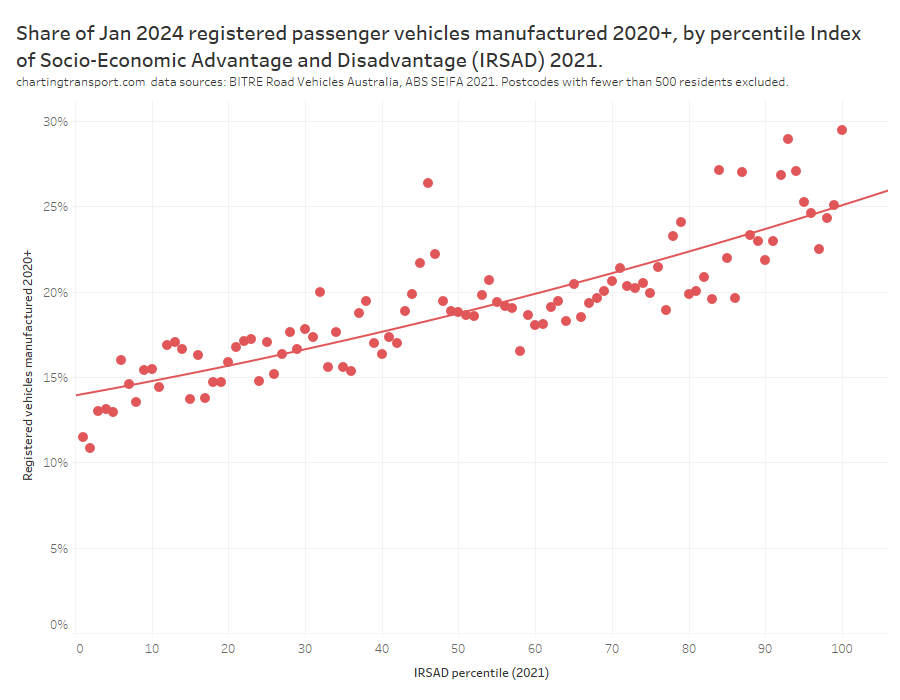
So, yes there is a strong relationship between socio-economic advantage and newness of vehicles, but this is more of a linear relationship (I’ve actually fitted a binomial trend line but it comes out very close to linear). EV share is much higher in the most advantaged areas, even if you were to control for relative newness of vehicles.
You might be wondering why these findings don’t reflect some media reports on EV take up. Unfortunately some journalists might not be aware that postcode and local government areas are not consistently sized across the country. One article in The Driven suggested the Cities of Brisbane (population 1.2 million in 2021) and Gold Coast (625k) were EV uptake hot spots, but the truth is these LGAs are so much larger than LGAs in other states (most of which were under 300k in 2021) so will almost always have the highest counts of anything you want to measure. Likewise, the median postcode population in Australia is around 5000 residents, but six huge postcodes have a population over 110,000 – four of which are in the outer suburbs of Melbourne. As you saw above, the outer suburbs of Melbourne are not EV share hotspots, unlike the implication in this article from The Age. It’s a classic mistake in spatial analysis; never colour a map by volumes, always use a meaningful ratio.
We’re only at the beginning of a shift to electric vehicles, so I’ll aim to keep tracking these statistics in the years ahead.


 Posted by chrisloader
