I’ve recently completed my big annual refresh of the Trends pages on Charting Transport (accessible from the Trends menu above). Here is a quick scan of some headline trends, plus a few new interesting charts.
Most of these updates use data from the BITRE Australian Infrastructure and Transport Statistics—Yearbook 2025 released in December. (The other big annual trigger of updates is the release of SA2 population estimates in late March each year, which enables calculation of per-capita metrics for cities).
First up: mass transport mode share has increased around 0.75% in Brisbane following the introduction of 50 cent fares, but is relatively flat in most other cities, and below pre-pandemic levels (probably related to CBD workers working from home much more often).
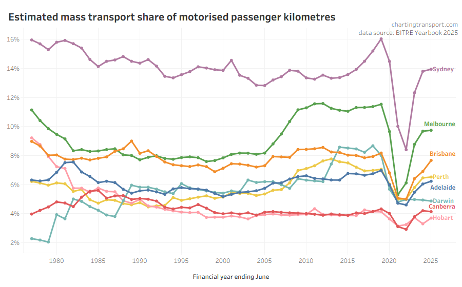
See more trends in passenger travel mode share.
Public transport patronage levels relative to 2019 are highest in Perth (likely due to many new rail lines) and South East Queensland (likely due to 50c fares):
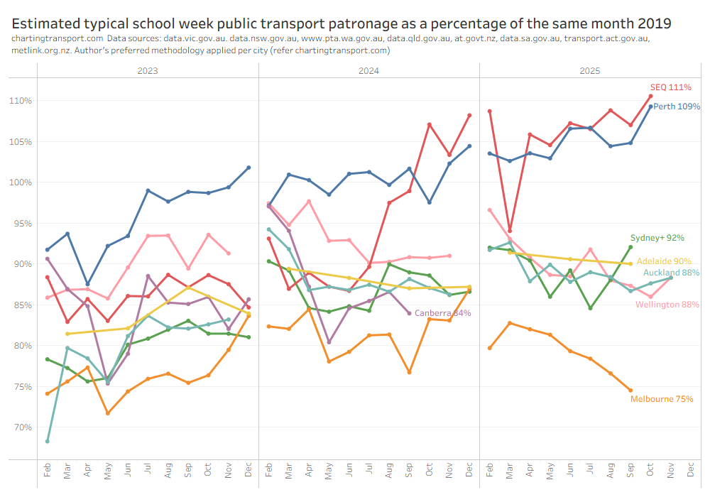
See more trends in public transport patronage.
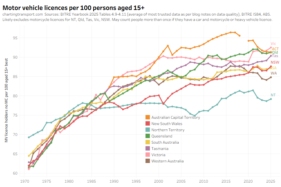
Driver’s licence ownership rates have risen slightly in most states:
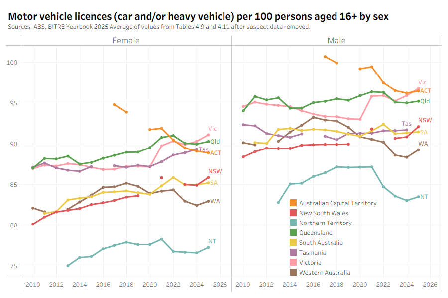
I’ve now got more analysis by gender, and females seem to be slowly closing the gap with males when it comes to motor vehicle licence ownership (but the male figures may double count those with car and heavy vehicle and/or motorcycle licences – it’s not entirely clear – data quality is a bit of a nightmare):
Motor vehicle licence ownership continues to rise rapidly for older people, especially females:

That said, people are still losing their licences as they get older, but the ages at which they lose their licence has been shifting older.
See more trends in motor vehicle licence ownership.
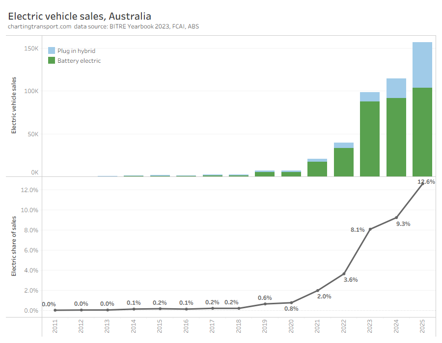
Plug-in hybrid vehicle sales have taken off, whilst pure battery vehicle sales are growing more slowly:
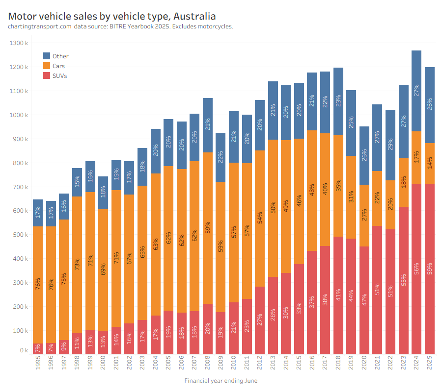
Sales of regular passenger cars are down again, as SUVs take a much larger share:
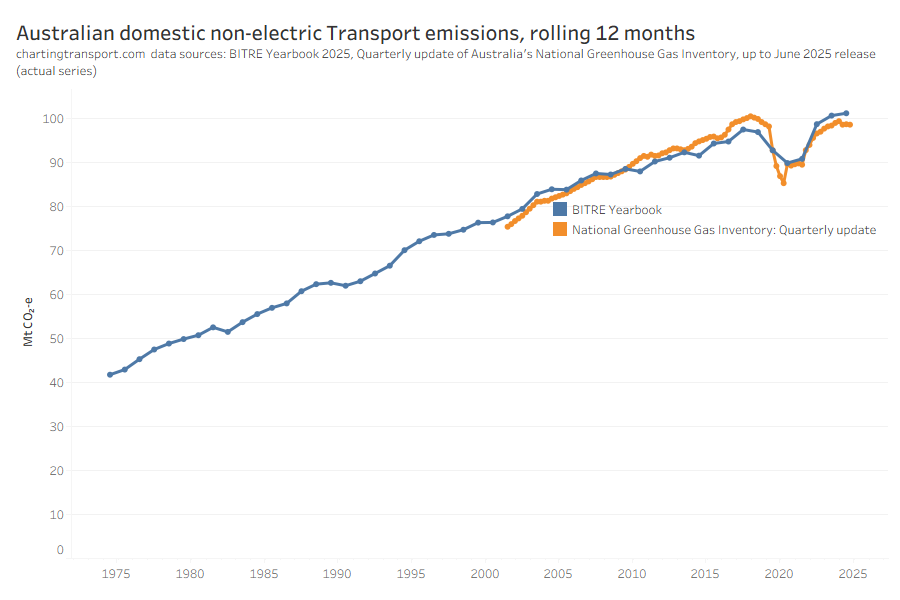
Transport emissions are not coming down. According to BITRE they are hitting new highs:
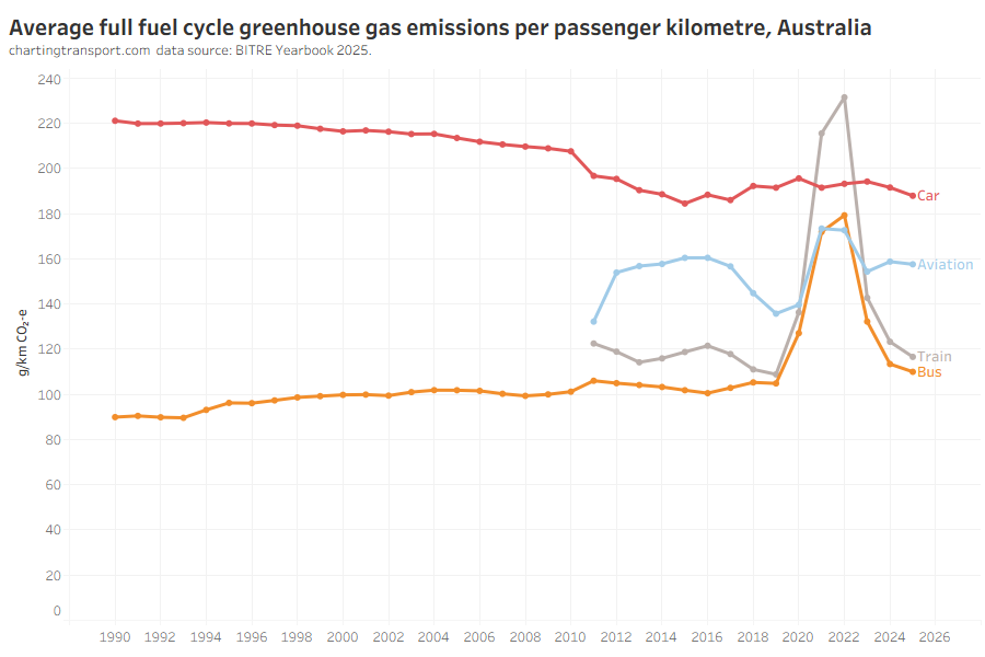
Here’s a new chart on estimated emissions per passenger kilometre for passenger transport, interestingly showing (domestic) aviation more efficient than cars:
See more trends in transport emissions.
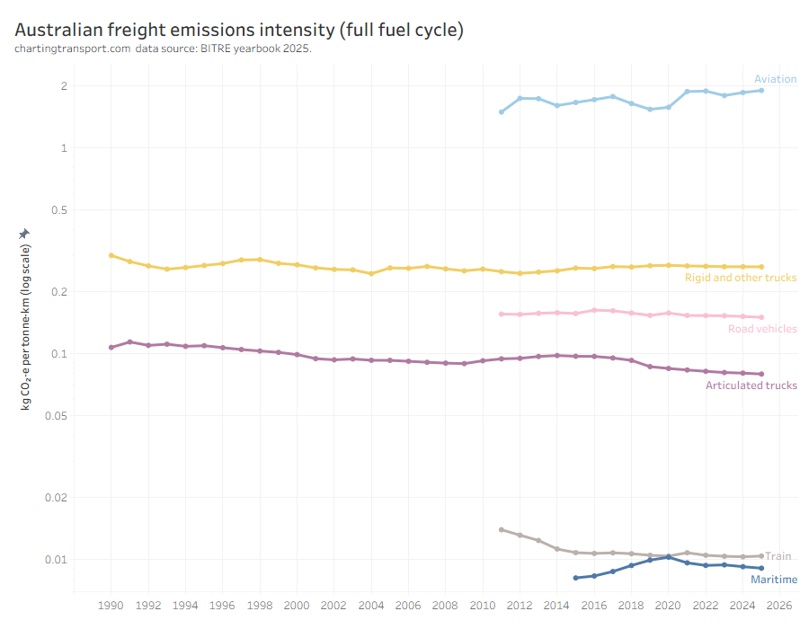
Next is a new chart showing freight emissions intensity. You may have known that trains and ships are very efficient at moving freight – but did you know they emit around 8 times less emissions than articulated trucks (per tonne-km), and around 190 times less emissions than than aeroplanes?
Note the Y-axis is a log scale.
See more trends in freight volumes and mode split.
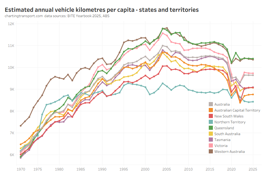
Estimated vehicle kilometres travelled per capita was very flat over 2024-25:
See more trends in vehicle kilometres travelled.
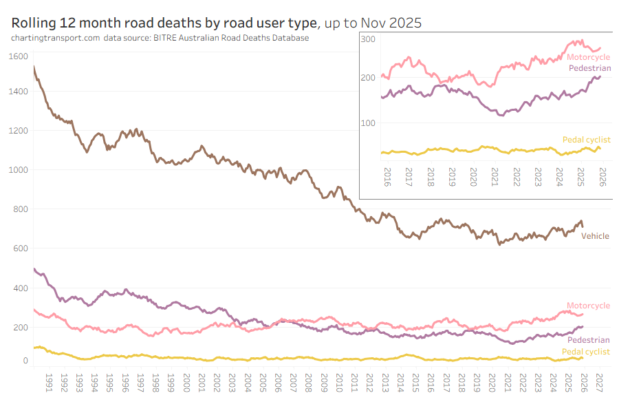
Pedestrian road deaths are continuing to increase:
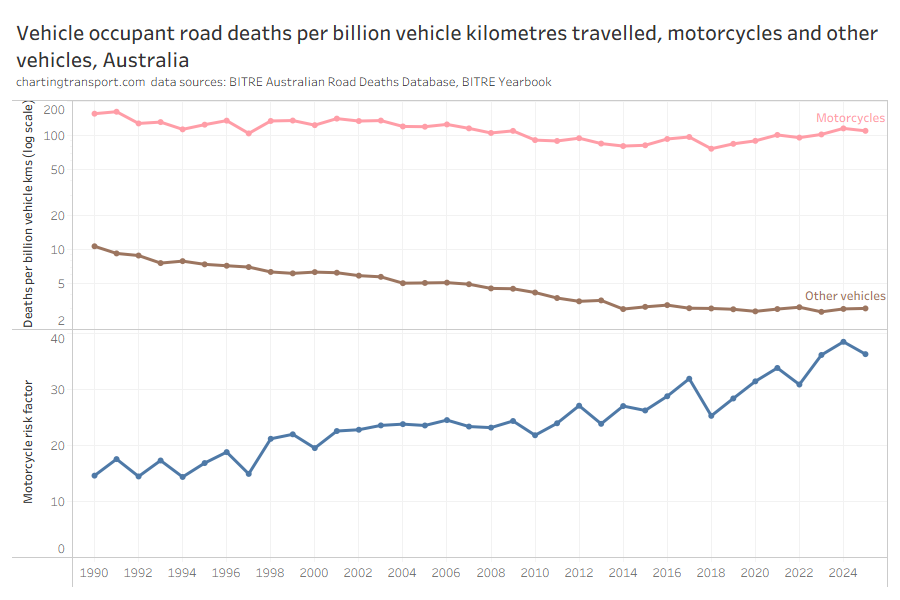
Motorcycles are around 36 times more deadly for vehicle occupants compared to other vehicles on a per-kilometre travelled basis:
This new chart might take a little time to get your head around, but it shows road deaths per capita by age band, sex, and road user category. There’s a lot going on, and you’ll likely need to click/tap to enlarge this one.
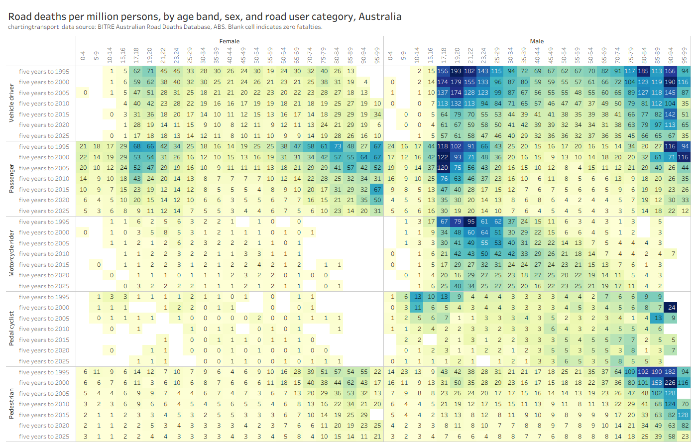
Deaths per capita have thankfully been coming down across most ages, both sexes, and most road user types since the 1990s.
The elderly are still significantly over-represented in deaths per capita for vehicle drivers, vehicle passengers, and pedestrians. And males still have much higher death rates per capita than females in most categories (except older vehicle passengers).
However there have been concerning increases in deaths per capita over time for males on motorcycles across most age bands, despite a decline in motorcycle kilometres travelled per capita since 2010.
See more trends in road deaths.


 Posted by chrisloader
