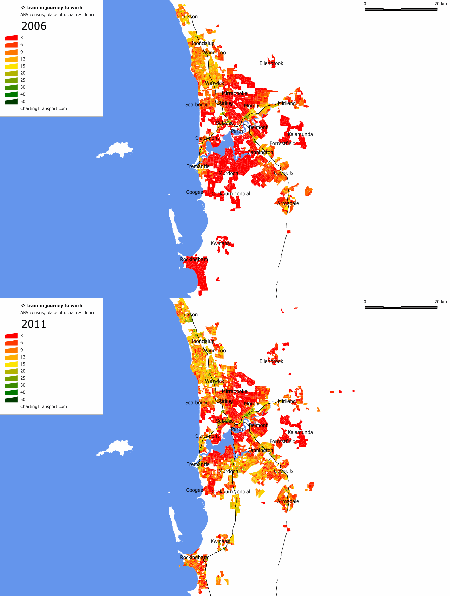
How have mode shares of journeys to work from different home locations changed in Perth? What impact has the new Mandurah rail line had?
In my post on city level mode share changes we saw that Perth had a 2.1% mode shift to public transport between 2006 and 2011. This post will uncover which areas shifted the most.
The following animations show various mode shares for journeys to work from census collection districts for 2006 and Statistical Area Level 1 (SA1) for 2011. These are the smallest geographies available for each census. All the data is by place of usual residence.
I’ve animated each image to alternate between 2006 and 2011, so you can gaze at them and spot the changes. You’ll need to click on them to enlarge and see the animation.
(I’ve used a slightly faster flip speed compared to my equivalent Melbourne post. Is this better? Please let me know).
Public transport
You can see dramatic increases in public transport mode share in the southern suburbs, most strikingly around Kwinana, Rockingham, and Atwell/Success/Hammond Park/Aubin Grove (south of Cockburn Central). You would have to say the new Mandurah rail line is fairly transformational public transport infrastructure.
You can also see people moved in near Clarkson train station (south-east corner of the urban block labelled “Clarkson” in the far north) and 29% of commuters nearest the station caught public transport to work (most on the fast train service to the Perth CBD). If Clarkson is supposed to be a transit orientated development with high public transport use, it seems to have been successful. The public transport mode share is extraordinarily high for such an outer suburban area. Note that Clarkson station opened in 2004.
Areas of Perth with little discernible shift to public transport include Ellenbrook, the Forrestfield/Kalamunda area to the east, and Ballajura (north-east of Mirrabooka). These outer suburbs do have bus routes linking them to the centre of Perth, but they don’t exactly get a high-speed run into the city.
Sustainable transport (only)
This map excludes those who used private transport to reach public transport. In the outer suburbs of Perth, it seems the vast majority of people are using private motorised transport as part of their journey to work, including to get to train stations.
[minor corrections to map made 5 Nov 2012]
Train
As you would expect, there is a huge change in the southern suburbs around the new Mandurah rail line.
It is also interesting to see that train mode share was much higher north of Warwick than it is south of Warwick. In fact for the inner suburbs significant train mode shares only showed up in the immediate area around stations. Those further from the train line were a little less likely to use public transport, and were more likely to use buses, as the next map shows.
Bus
There’s not a lot of change across Perth. In particular, there isn’t much change in the middle southern suburbs (between Fremantle and Cannington). That might suggest the net increase in public transport mode share in this area came from people getting to train stations by modes other than feeder bus.
Ferry
I’ve added ferries for completeness. I’m not sure what conclusions you can draw, especially with the change in geographies between 2006 and 2011. Certainly ferries did get used by a group of commuters in the South Perth area to get across to the Perth CBD (note there is no train station in South Perth).
Train and bus
You can see the middle southern suburbs used feeder bus services in significant numbers, though not as strongly around Kwinana and Rockingham (perhaps parking at the station is easier?). Train + bus commuting also grew somewhat in the northern suburbs between Warwick and Joondalup, and west of Stirling.
Mode shift to public transport overall
Here’s a map showing the mode shift towards public transport by Statistical Local Area (SLA), the smallest geography for which results are available for both the 2006 and 2011 censuses.
The biggest mode shift was in Kwinana, followed by Perth – remainder (areas of the City of Perth excluding the CBD core), Cockburn, Canning and Melville – all around the new Mandurah rail line. Just off the map is the City of Mandurah area, which had a 5.7% mode shift to public transport (from 3.2% to 8.9%). Nowhere in Perth did public transport mode share go down, although in Kalamunda it was stagnant at 6.7%.
And before you get excited about Rottnest Island showing a mode shift to public transport, it is simply part of the Cockburn SLA. For the record, only 73 people on Rottnest travelled to work in 2011, 21% by bicycle and 64% by walking only (none by ferry or other public transport).
Walking only
The biggest change was in the CBD, where there is now a significant density of workers living (and thus making it onto the map). Walking to work was largely confined to the Perth CBD, around the University of Western Australia (UWA, east of Claremont), Fremantle, Joondalup, and Claremont
Cycling
Cycling has grown rapidly (off a small base), particularly in the inner northern and western suburbs, south of Fremantle, and around UWA.
I’m sure other people will find more patterns – please comment on any interesting finds.


Chris – Great post and thanks for doing this. I struggle to even find the data on the ABS website! I think the main reason for the middle south having higher bus + train than the southern stations is the huge difference in bus service levels. Most of the middle south has main road feeder buses every 15 min off-peak, whereas it’s mostly hourly from about Kwinana down (558 being the main exception). Also the bus operating spans are less around Rockingham/Mandurah and frequency drops off dramatically outside narrow peak periods.
LikeLike