[Updated in July 2013 with higher resolution maps using Destination Zone data]
My earlier post about Melbourne journey to work 2011 focussed on where people live. This post focuses on where people work and what modes of transport they used to get there in 2006 and 2011. It also covers employment density and the home locations and associated mode shares for people travelling to the central city.
As per other posts, you will need to click on maps to see the detail/animation.
In this post you will see some maps at the SA2 level (approximately suburb size) and some at the destination zone level (the smallest resolution available):
- For SA2 maps, I have mapped 2006 destination zones to (2011) SA2 areas based on the centroid of each 2006 destination zone (so not a perfect mapping – see here for a comparison map).
- For destination zone maps, the boundaries of destination zones changed between 2006 and 2011, most commonly involving smaller destination zones in 2011, although the boundaries don’t always align. For both 2006 and 2011, I have only shown mode shares for destination zones where more than 100 people travelled with known mode(s) of transport. I don’t have destination zone level data for individual public transport (PT) modes for 2011.
See also an earliersimilar postcovering 2006 journey to work data for Melbourne, and a similar post covering journeys to workplaces in Brisbane.
Employment density
Firstly, what does the employment density of Melbourne look like?
Click on the following map to see an animation flipping between 2006 and 2011:

While it looks like a lot of jobs have disappeared from Melbourne between 2006 and 2011, the difference in amount of shaded area is because 2011 has smaller destination zones than 2006. The destination zones from 2006 have been split into smaller zones, and often only one of those zones has significant employment.
You can see Melbourne’s second biggest jobs cluster – the Monash precinct – in the south-eastern suburbs near Clayton.
Here’s another look at the employment distribution (for people with a known travel destination) as well as people in the labour force:

Note that this is a measure of employment in rings around Melbourne, and the outer rings have significantly more land area than the inner rings.
Between 2006 and 2011, significant employment growth occurred in the inner city, and at around 18 km from the CBD. That 18 km ring happens to include the significant employment precincts at Southland/Cheltenham, Monash, Nunawading, Burwood East, Greensborough, and Campbellfield.
While around 30% of the labour force did not travel to a known work location on census day, there’s still an imbalance between jobs and workers by distance from the city (many distance rings have twice as many people in the labour force and jobs), which of course leads to a lot of generally radial commuter travel.
Mode share by workplace location
So what are mode share like for different places of employment across Melbourne?
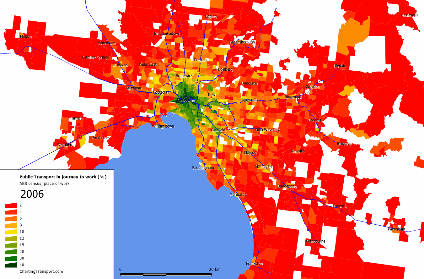
Public transport
Firstly a map showing mode share for destination zones (click to zoom in and animate):

Please try not to be too distracted by the changing red and white areas on the fringe of Melbourne. The white areas are destination zones with less than 100 employees who travelled on census day. Because the destination zones were re-cut between 2006 and 2011, the location of zones with less than 100 employees changed significantly.
The inner city area shows a lot of change, so here is a zoomed-in animated map at destination zone level, with public transport mode share numbers overlaid (sorry the CBD is a bit hard to read as the destination zones were almost all halved in size in 2011).
To perhaps enable a fairer comparison, the following animated map shows public transport mode share at SA2 level (2006 being a mapping of destination zones to SA2s):

Public transport mode share was highest in the CBD, then for areas around the CBD and stretching a little more to the inner east. Box Hill stands out as a suburban location with a relatively high mode share (13% in 2011).
Here is a map that shows the mode shift to public transport for each SA2 (bearing in mind that there isn’t a perfect mapping from 2006 destination zones to 2011 SA2s):
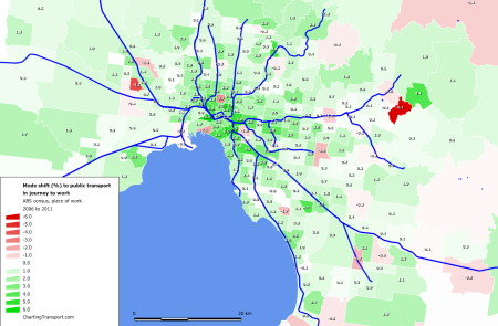
The biggest mode shifts towards public transport were:
| Docklands |
10.5% |
| South Yarra – East |
6.5% |
| South Yarra – West |
6.0% |
| Fitzroy |
5.8% |
| Richmond |
4.8% |
| Collingwood |
4.7% |
| Albert Park |
4.4% |
| Watsonia |
4.4% |
| North Melbourne |
4.3% |
| Caulfield – North |
4.3% |
| Mount Evelyn |
4.1% |
| Springvale South |
4.1% |
| Parkville |
3.8% |
| Camberwell |
3.8% |
| Prahran – Windsor |
3.8% |
| Hawthorn |
3.6% |
| Kensington |
3.6% |
| Abbotsford |
3.6% |
| Carnegie |
3.6% |
| South Melbourne |
3.3% |
Most of the above are in the inner city, but there are exceptions of Watsonia, Mount Evelyn and Springvale South (all off a very small base in 2006).
Some interesting rises in the suburbs include:
- Doncaster 5.5% to 8.3%, probably related to the introduction of several SmartBus services
- Frankston North 2.6% to 5.0%, again probably influenced by the introduction of SmartBus services
- Forest Hill 5.2% to 7.8% (not sure why)
- Mill Park North 1.7% to 4.2% (note the South Morang rail extension was not open in 2011, but SmartBus services had been introduced by the 2011 census)
- Box Hill 10.2% to 12.7%, possibly related to upgraded SmartBus services
- Noble Park 3.0% to 5.4% (not sure why)
Some interesting declines include:
- Montrose – there are boundary differences between 2006 and 2011 with many more jobs counted in 2011. It would appear there might be an employer around the western end of York Road with higher PT mode share.
- Cairnlea 6.6% to 2.4% (almost certainly because Victoria University St Albans Campus is mapped to this SA2 in 2006 but not in 2011)
- Carlton North – Princes Hill 13.1% to 10.4% (which also had an increase in walking and cycling)
- Port Melbourne 14.7% to 12.6% (not sure why, perhaps more people walked to work from the increasingly dense local residential area)
As an aside, here are 2011 public transport mode shares for journeys to work at major Australian airports (where there is an “Airport” named SA2):
- Sydney 13.9%
- Melbourne 3.8% (up from 2.5% in 2006)
- Brisbane 3.1%
- Adelaide 2.6%
- Perth 1.7%
- Darwin 1.7%
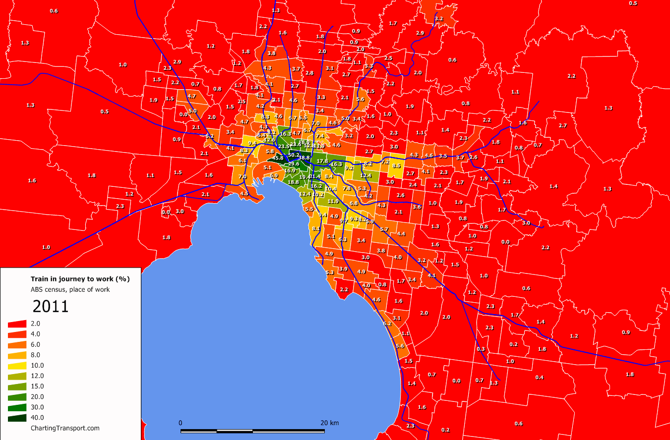
Train

Train mode share was highest in the CBD and surrounding inner city areas. Notably, mode shares were relatively higher in the inner east and south-east (particularly Caulfield, Camberwell and Hawthorn) compared to other inner areas.
Here is the mode shift to trains between 2006 and 2011:
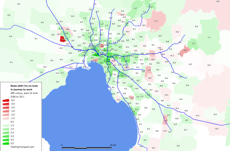
The biggest rises were in Docklands (up 9.2%), South Yarra (up 5.6%) and then a few other inner suburban destinations.
In 2011, 47% of journeys to work in Greater Melbourne involving train were to the Melbourne CBD. This rises to 59% when adding Southbank and Docklands.
Tram
Unfortunately I do not have 2006 data for “any journey involving tram” below the SLA level, so here is the 2011 picture at SA2 level, with the tram network shown as green lines:
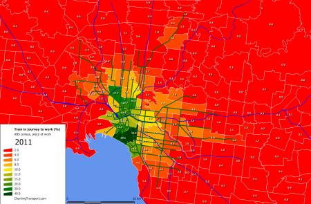
I must say I was surprised by the CBD figure of only 14.9% (and I did double-check the data).
Tram mode share was highest in the SA2s of Albert Park and South Yarra West (which straddle the St Kilda Road office precinct which has very high tram frequencies). Other work destinations with higher tram mode shares included Parkville, Carlton, Fitzroy and South Melbourne.
Perhaps there was some under-reporting of tram journeys as a “secondary” mode in people’s journey to work? In Parkville (which includes the main University of Melbourne campus, the hospitals precinct and Royal Park), there were more people reporting only train (934) than train+tram (772) and train+bus (275). I would expect most of those jobs to be remote from Royal Park station, and the southern section of the SA2 is at least a 1 km walk from Melbourne Central train station. Another example is South Melbourne – all of which is more than 1.2 km from a train station, yet 1240 people reported only train in their journey to work, while 894 reported train+tram. While of course some people will walk longer distances from train stations to work, the numbers seem a little high to me.
37% of journeys to work in Greater Melbourne involving tram were to a destination in the Melbourne CBD. If you add in Southbank, Docklands, Parkville and South Melbourne the share goes to 56%.
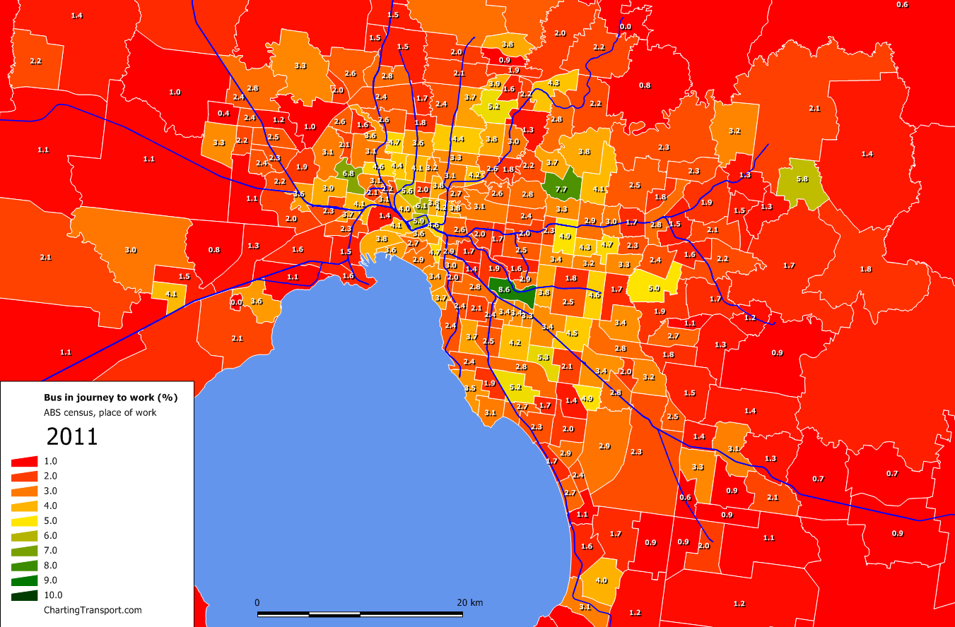
Bus
Again, I do not have comparable data for 2006, so here is a 2011 map:

Bus mode share was highest in Malvern East (which includes Chadstone Shopping Centre), followed by Doncaster, Maribyrnong (which includes Highpoint Shopping Centre), Carlton and the Melbourne CBD. Mount Evelyn is curiously high at 5.8%, with 45 people travelling by bus to workplaces there.
Only 21% (9905) of journeys to Greater Melbourne workplaces involving bus were to the CBD, with the next highest SA2 counts in Docklands (1175), Clayton (1160), Dandenong (1157), Southbank (1071) and Parkville (1046). This would suggest that growth in CBD employment is unlikely to be one of the major factors in bus patronage growth in Melbourne (unlike train and tram).
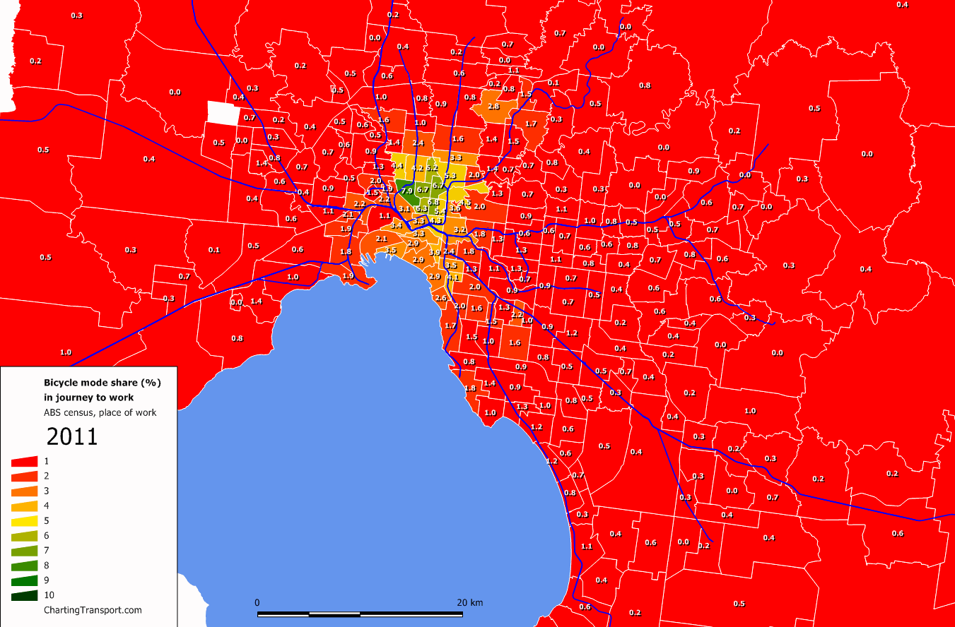
Cycling
Due to the nature of the data I have for 2006, this analysis excludes journeys also involving public transport or trucks (yes, there were 39 people who said they travelled to work by truck and bicycle in Australia in 2011!). This is another animated map, so click to enlarge and see the changes.

Here’s an animated close up of the inner city area for destination zones (with a different scale):

Cycling to work boomed in inner Melbourne between 2006 and 2011, particularly to workplaces in the inner north. Princess Hill had the highest bike share of 14% in 2011 (possibly dominated by Princess Hill Secondary College employees), followed by a pocket of south-west Carlton that jumped from around 5% to 13%. Apart from the inner north, there were notable increases in Richmond, Balaclava, Yarraville and Southbank
Here’s a view of the mode shift to bicycle at SA2 level:

Relatively small mode shifts away from bicycle were observed in the outer eastern suburbs and around Aspendale to Carrum.
I should point out that the census is conducted in winter (August), and warmer weather bicycle mode shares of journeys to work are likely to be higher.
Variations in daily weather can also cause differences in behaviour between censuses, that don’t actually reflect longer term trends. On census day in 2006, Melbourne had a temperature range of 5.3 – 17.9 degrees and no reported rain. On census day in 2011 the temperature ranged from 7 to 12.6, and there was 0.2mm of rain reported. So 2011 weather was perhaps a little less favourable for cycling (and walking). I’m not sure what time of day that rain fell in 2011.
Other time series data on cycling in Melbourne is published by VicRoads.
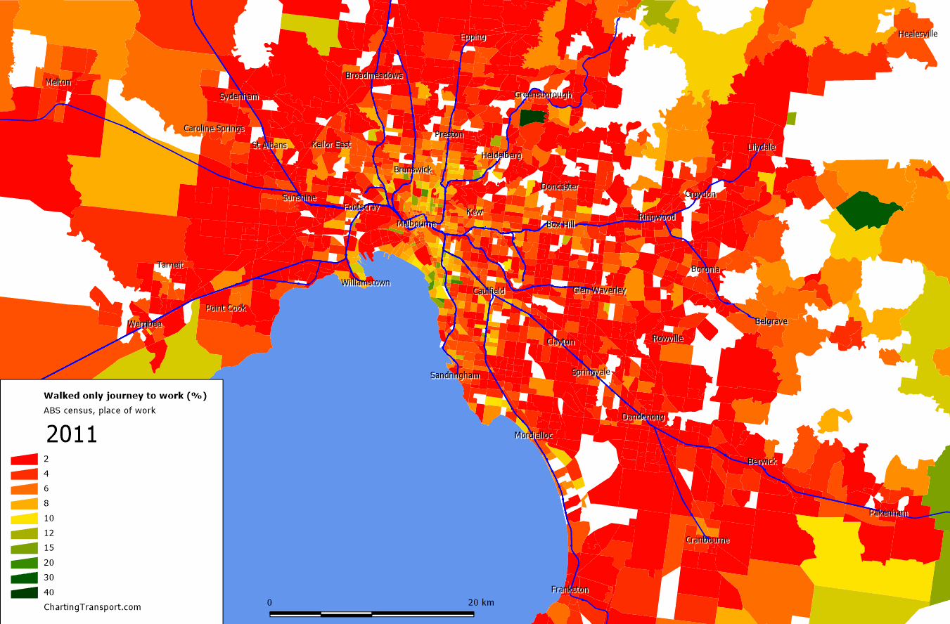
Walking (only)
Here’s a look walk-only mode shares by destination zones:

Click to see the animation, and again, please try not to be distracted by the changes in white areas.
Here’s walking mode share by SA2 2006 v 2011 (but with a different colour scale):
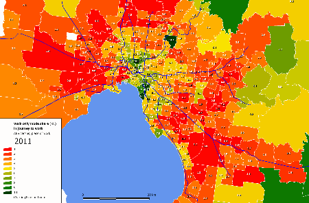
Walking mode share is a mixed bag across the city. High walking mode shares are evident in Parkville, Carlton North/Princes Hill, around St Kilda, the Simpson Army Barracks (in Yallambie), but also some rural areas. In the Koo Wee Rup SA2, 8.7% of employees walked to work, 41% of whom were in the “Agriculture, Forestry and Fishing” industry.
The lowest walking-only mode shares were at the airports (Melbourne, Essendon and Moorabbin), some industrial areas and generally in the outer suburbs of Melbourne.
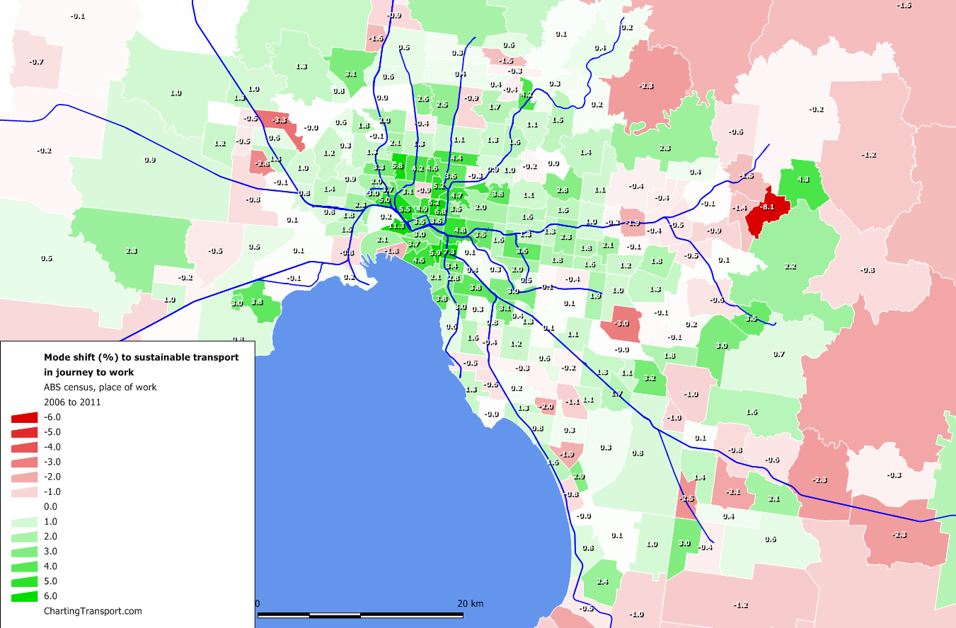
Here is mode shift to walking:

Mode shift to walking was more common in the northern suburbs and some outer eastern suburbs, but not so much in the inner city. Mode shift away from walking only to work was observed in many outer eastern and north-eastern suburbs. Again, daily weather variations might explain some of the changes that are not really trends.
Note: the neighbouring SA2s of Wheelers Hill and Glen Waverley East each showed mode shifts in opposite directions. This is almost certainly to do with the Police Academy being mapped into a different SA2 in 2006 due to the imperfect mapping between 2006 destination zones and 2011 SA2s.
Sustainable transport
I’ve defined sustainable transport here as any journey involving public transport, plus any journey that only involved walking and/or cycling.

Sustainable transport mode share was highest in the CBD and immediate surrounding areas. Sustainable transport was relatively higher for workplaces in the inner north, east and south-east compared to the inner west.

Mode shift to sustainable transport was most prevalent in the inner north and inner south.
Some interesting suburban mode shifts to sustainable transport include:
- Upwey – Tecoma (mainly walking)
- Dandenong North (mostly a mix of walking and public transport)
- Gladstone Park – Westmeadows 3.1% (most of which was public transport mode shift, possibly relating to the introduction of SmartBus services),
- Altona Meadows (mostly public transport, probably relating to the City West waste purification plant being mapped into this SA2 only in 2006)
- Watsonia (possibly a result of destination zone to SA2 mapping issues)
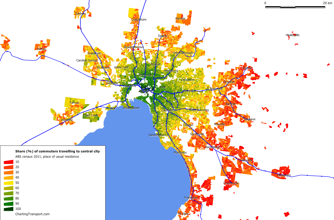
Commuting to the central city, 2011
The central city is an important destination as it has the highest employment density and is where public transport is best-placed to compete against the car. For analysis in this section I am using the combination of the Melbourne CBD, Southbank, Docklands, Carlton, North Melbourne and East Melbourne SA2s as my definition of the “central city” (which is different to other posts on this blog – I am deliberately choosing a larger area to get a better sense of origins and mode shares).
Here’s a map showing the proportion (%) of commuters who had a destination of central Melbourne in 2011 (by place of usual residence at SA1 geography):

The prevalence of the CBD as a work destination is almost directly proportional to the distance people live from the CBD, although rates are relatively higher around train lines.
Notable outliers include:
- Point Cook, Tarneit, Caroline Springs in the western suburbs with a higher central city share, possibly reflecting a workers-to-jobs imbalance in the outer western suburbs, particularly for white-collar workers (I might explore that more in a future post)
- East Doncaster, which has a relatively high central city share, possibly as a result of frequent express bus services to the city
- A pocket of St Kilda East and Caulfield North between the Sandringham and Caulfield rail lines that has a low share despite being relatively close to the city (not sure why that might be)
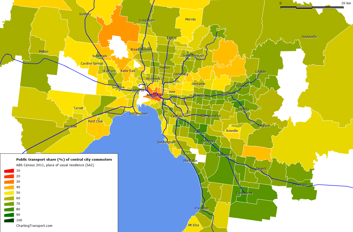
The next map shows the share of central city commuters who used public transport in their journey to work (by home location). I’ve only shaded SA1s with 20 or more central city commuters (which I admit is quite small for calculating mode shares).
Note: I have not filtered SA1s by density on the following maps (unlike others), so some low density SA1s are included.

Here’s a similar map showing mode shares at SA2 level (SA2s with less than 100 central city workers not shown), which overcomes the problem of low densities of central city workers in the outer suburbs:
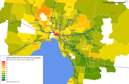
Public transport mode share was particularly high for those in middle to outer suburbs around the rail lines, although less so along the Sandringham, Sydenham and Werribee lines.
It was lowest around:
- the city centre itself (more on that in a moment)
- Western Kew in the inner east (a relatively wealthy area)
- Sanctuary Lakes in the south-western suburbs (largely remote from public transport in 2011)
- Pockets of Caroline Springs
- Areas of Templestowe, Donvale, Research and North Warrandyte in the east-north-eastern suburbs (but not central Doncaster where there is a high frequency freeway bus service to the CBD)
- Areas around Keilor East and Avondale Heights (like Kew, close to the CBD but remote from train lines)
- Greenvale (a relatively wealthy area)
- Brighton and Toorak (very wealthy areas)
Here’s the share of people who only used private motorised transport to commute to the CBD (as SA1 level):

This map is largely the inverse of the previous SA1 map, except for areas near the inner city, suggesting active transport is being used by residents of the central city to get to work in the central city, as you might expect.
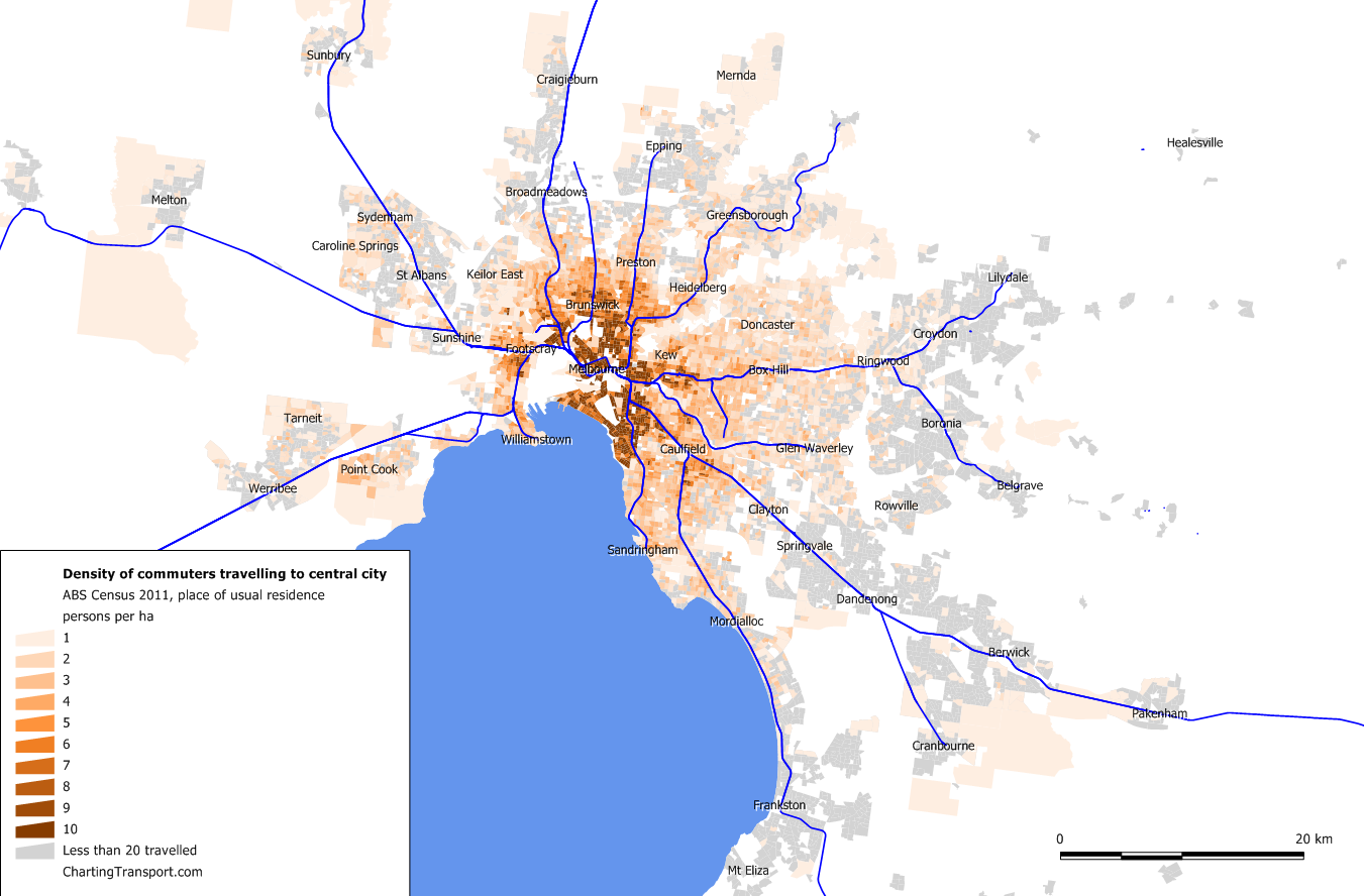
Finally, here is a map showing the density of people who work in the central city:

This map effectively combines population density with the proportion of workers travelling to the central city. The density falls away with distance from the city (quite markedly south of Elwood), but there are outliers in pockets of Carnegie, Point Cook, East Doncaster, Deer Park, Mitcham, Bundoora, and Heatherton (not all of which are connected to the city by high quality public transport).
A similar analysis could be conducted to other employment centres, although numbers per SA1 will be much smaller, and it would be time-consuming.
If you spot any other interesting changes and/or have explanations for them, I would welcome comments.


 Posted by chrisloader