The growth of Melbourne 1986-2011, animated

Tue 29 October, 2013

Following on from my recent post about the changing socio-economic landscape of Melbourne, this post simply looks at the changing shape and density of urban Melbourne using 5-yearly census data at collector district (1986-2006) and SA1 level (2011).

Straight to it: here is map of Melbourne residential density, click to enlarge and animate:

Melb CD SA1 density

You can see the sprawl of Melbourne over the years, including changes that suggest shifts in the urban growth boundary after development previously seemed to have stopped against a line (particularly evident on the western edge of the City of Brimbank).

Here is another animated map showing the inner city area, with a density scale ranging from 10 to 100 persons/ha, so you can distinguish higher densities than the map above. Click to enlarge and animate.

Melb inner density

You can see a lot more going on in established areas on this map, including densification in the CBD, St Kilda, St Kilda Road (conversion from office space), Parkville, Port Melbourne around Bay Street, Kensington Banks, Brunswick, Fitzroy, Southbank, South Melbourne, Elwood, Maribyrnong, Carlton, and many more.

A few things to note:

  • The size of the districts changes each year, particularly around the fringe. You’ll often see a large red patch where a larger block is only partly inhabited in one year, only to be replaced by smaller denser patches in future years. Patches of green that disappear might be the enlargement of a district causing a blending out of a small pocket of high density, rather than an actual drop in density.
  • Shades of pink indicate densities between 5 and 10 per hectare on the large map, and between 10 and 20 per hectare on the inner map. Lower densities are shown as white.
  • In 2011 the ABS changed their statistical geography. I have used SA1s from 2011 as the most comparable area unit to a census collector district, however they are generally smaller and so densities may appear to jump slightly in 2011 in some areas.

See also earlier posts for:


Visualising the changing socio-economic landscape of Melbourne

Sun 29 September, 2013

This post is drifting a little away from transport, but I hope you will find this interesting…

How has the spatial distribution of socio-economic advantage and disadvantage changed over time in Melbourne? (oh, and Geelong too)

The animated maps below are fascinating, but of course there’s lots of important caveats regarding the data.

About the data

Since 1986, the Australian Bureau of Statistics (ABS) has calculated Socio-Economic Indexes For Areas (SEIFA) based on five-yearly census data. These include indexes of relative socio-economic disadvantage (IRSD), and – since 2001 – an index of relative socio-economic advantage and disadvantage (IRSAD). For 2006 and 2011, SEIFA was explicitly designed to measurepeople’s access to material and social resources, and their ability to participate in society” (with similar intent for prior years).

This post looks at the spatial changes over time in these index values. I must be upfront: ABS explicitly cautions this type of analysis. This is mostly because the component census variables that make up SEIFA scores and their respective weightings vary between each census, but also because statistical area boundaries change, the number of areas has increased, and indexes were calculated on usual residents from 2006 onwards (as opposed to people present on census night for 2001 and earlier). ABS also notes that middle range scores are very similar, so time-series analysis should focus more on the top and bottom ends of the spectrum. More discussion on this issue is available from ABS and .id consulting.

However, I’m going ahead noting the above (as readers also should!), on the following basis:

  • The intent of the indexes has not changed over time, although the quality has (perhaps one day ABS will recalculate SEIFA values for previous census using better measures where possible)
  • I’ve used percentile ranks within Victoria to get around the issue of the changing meaning of particular index values (although this might cause some issues if there has been a relative difference in changes between Melbourne and regional Victoria)
  • I’ve included a summary of the component variables that have changed between censuses (documentation is available from 1996 onwards)
  • I’m mapping this at a metropolitan scale with a view to looking at regional variations, rather than very local changes. In the following maps you’ll see fairly strong regional patterns
  • My analysis will focus only on substantial shifts (which have indeed occurred)
  • Excessive caution may mean that we never do any interesting analysis!

Changes in Index of Relative Socio-economic Disadvantage (IRSD)

This index has been available from 1986 onwards.

More significant changes in the make up of this index in recent years include:

  • 2011 added: families with jobless parents
  • 2011 dropped: indigenous persons, renting housing from government authority
  • 2006 added: household overcrowding (replacing multiple-family households), low rent payments, lack of an internet connection, low skill community and personal services workers, people who need assistance with core activities
  • 2006 dropped Elementary Clerical, Sales and Service workers and tradepersons
  • 2006 changed the evaluation of household income to consider ‘equivalised household income’ replacing a number of measures that try to capture income levels relating different household make-up scenarios. It also stopped using gender specific measures of people with certain occupations or unemployed
  • 2001 saw no changes to the included variables from 1996
  • Variables for persons who did or didn’t finish year 12 at school have changed slightly in both 2006 and 2011

check the SEIFA documentation for full details.

Click on this map to enlarge and see an animation of IRSD percentile values for the years 1986 to 2011.

Melbourne SIEFA ISRD

You can see some quite dramatic changes over time. Two big trends of note are:

  • Most inner city suburbs have gone from being some of the most disadvantaged to much less disadvantaged. It’s hard to imagine suburbs such as South Yarra and East Melbourne as being highly disadvantaged, but the data suggests that was the case in the 1980s. During this transformation, pockets of high disadvantage have remained, probably reflecting older government housing estates. There appears to have a been a fairly large change between 1986 and 1991. This could represent dramatic demographic change and/or reflect changes in the calculations of SEIFA index values.
  • Areas with the highest disadvantage have generally shifted away from the city centre (including some middle suburbs such as Carnegie), perhaps reflecting the growth in high-end CBD jobs driving the attractiveness of near city living.
  • New urban fringe growth areas often begin with low levels of disadvantage, but have become more disadvantaged over time. This is particularly evident in areas such as Hoppers Crossing, Werribee, Melton, Deer Park, Craigieburn, Keysborough, Karingal, Epping, Hampton Park, Cranbourne, Altona Meadows and Keilor Downs. Perhaps this is because when these areas were initially settled there were many double-income-no-kids households that now have more kids and less income? It could also be a reflection of a turnover in the resident population.
  • The maps only show geographic units with a population density of 5 per hectare or more, so you can also see the urban growth of Melbourne (more on that in a upcoming post).

Changes in Index of Relative Socio-economic Advantage and Disadvantage (IRSAD)

This index was first calculated in 2001 and aims to also measure advantage, not just factors that suggest disadvantage. In 2011 it included all but one of the IRSD variables, plus a number that describe levels of advantage (eg high income, higher education, occupations such as managers and professionals, high rent or mortgage payments, spare bedrooms).

The component variables of IRSAD have changed in line with the changes to IRSD, plus some other variables:

  • 2011 added people with occupation classed as managers, houses with spare bedrooms, households with 3 or more cars
  • 2006 added people paying low/high rent, high mortgage payments, renting from government authority, households with no car, households with broadband internet connection (replacing persons using the internet at home)

Again, check the SEIFA documentation for full details.

An aside: SEIFA associates higher car ownership with advantage, but I suspect some inner-city types might consider not needing to own a car an advantage.

Here is an animation of the Index of Relative Socio-economic Advantage and Disadvantage for years 2001 to 2011.  Again, click to enlarge and see the animation.

Melbourne SIEFA ISRAD

The changes between 2001 and 2011 are much less dramatic, probably because of the shorter time span. Some observations:

  • The Melbourne CBD drops in 2011 – possibly because of a change of demographics (more students?) and/or a change in the component variables.
  • Many parts of the middle eastern suburbs (particularly the Whitehorse area) appear to drop from the upper to the middle percentiles in 2011.

What’s also interesting to see is some socio-economic fault lines in Melbourne, such as:

  • Altona North versus South Kingsville/Newport (north-south divide along Blenheim Road/Hansen Street/New Street)
  • Skeleton Creek between Point Cook (including Sanctuary Lakes) and Altona Meadows
  • A north-south line being the boundary between the Shire of Melton and the City of Brimbank in the north-western suburbs
  • Along Hume Drive / Lady Nelson Way (an east/west line in northern Brimbank)
  • Greenvale versus Meadow Heights (split by the proposed north-south Aitken Boulevard)
  • A north-south divide through Heidelberg Heights, roughly parallel to the Hurstbridge rail line
  • Along the Dingley Arterial between Dingley Village and Springvale

How different are IRSAD and IRSD values?

IRSAD contains a lot more variables and uses different weightings. See the ABS website for full details.

For those who are interested in the correlation between the two, here’s a scatter plot for both 2006 and 2011 data comparing the two index values (as percentile ranks) for all CDs and SA1s (respectively) in Victoria:

SEIFA IRSD v IRSAD v2

You can see the relationships between the two indexes is stronger in 2011 (R-squared = 0.96) versus 2006 (R-squared = 0.89). This might reflect the make up of the variables in each year and/or the smaller geographic units in 2011 (SA1s) which may reduce diversity within each geographic unit.

I’m sure others could spot other interesting patterns, and/or offer explanations for the changes over time (comments welcome).


A detailed look at changes in Melbourne residential density 2006-2011

Mon 8 July, 2013

Since my first post looking at 2011 Melbourne residential density, there’s been a heap of new 2011 census data released. This post includes new maps showing Melbourne’s population density in maximum detail, as well as some more calculations of Melbourne’s urban/residential density for the density nerds.

Melbourne’s residential density in extremely high resolution

2011 population figures are now available for mesh blocks – the smallest ABS geographic unit. This allows a fine-grained look at 2011 residential density, and comparisons with 2006 as we now have a time series.

Here’s a very large animated map (4.7MB, 6825 x 4799 pixels) showing residential density at mesh block level for 2006 and 2011. You’ll need to click on it to download and see the animation (I’d suggest a new tab or window). Use your browser to zoom in and scroll around to areas of interest.

Melbourne mesh block density


[update 10 July: It has been brought to my attention that some people are unable to view this map because they are restricted to using certain versions of Internet Explorer. If you cannot see the large map above, I have also created a smaller animated map showing only the inner areas of Melbourne]

You can see that new growth areas on the fringe actually have relatively high densities, contrary to conventional wisdom. I also note a relatively high and increasing density in the Springvale/Keysborough/Noble Park area, quite some distance from the CBD. If you look carefully you will also spot infill developments like Waverley Park, Parkville (ex-Commonwealth Games village), Gresswell Hill in Macleod, Docklands, Maidstone, Edgewater estate in Maribyrnong, along St Kilda Road, Waterways, and no doubt many more.

More values for the urban/residential density of Melbourne

Okay, you might want to stop reading here unless you have a deep interest in density calculation methodology.

Along with mesh blocks, the recently released census data provides boundaries for urban centres and localities, which each representing a relatively continuous urban area (including residential and non-residential land). There is an urban centre of “Melbourne” defined, which excludes the satellite urban centres of Pakenham, Melton, Sunbury, Healesville and towns along the Warburton Highway, but includes the major urban regions along the Mornington Peninsula to Portsea and Hastings.

All this new data enables calculation of yet more values of the urban/residential density of Melbourne, adding to my previous list (some of which I have repeated for comparison purposes). The areas covered by each calculation are shown on the map below.

Geography Area 
(km2)
Population Average density 
(pop/ha)
Areas on map below
“Greater Melbourne” Greater Capital City Statistical Area 9990.5 3,999,982 4.0 white + yellow + green
SA1s within Greater Melbourne with population density > 1 person/ha 2211.4 3,903,450 17.7  (not shown exactly, slightly less than yellow + green)
Mesh blocks within Greater Melbourne, with population density > 1 person/ha 1713.1 3,913,215 22.8  yellow + green
Mesh blocks within Greater Melbourne, with population density > 5 person/ha 1348.5 3,824,999 28.4 green
Melbourne urban centre 2543.2 3,707,530 14.6 all within blue boundary
Mesh blocks within Melbourne urban centre, with population density > 1 person/ha 1443.8 3,696,316 25.6 yellow + green within blue boundary
Mesh blocks within Melbourne urban centre, with population density > 5 person/ha 1238.3 3,642,685 29.4 green within blue boundary

I note that the Melbourne urban centre is approximately a quarter of the area of “Greater Melbourne”.

Here’s a reference map of Melbourne showing the Greater Capital City Statistical Area, Statistical Division and Urban Centre boundaries of “Melbourne”, together with mesh blocks of above 1 and 5 persons/ha.

Density area scope map mesh blocks2

Finally, for the density nerds who are still reading this post, I have calculated the 2011 population-weighted density of Greater Melbourne using mesh blocks to be 42.8 persons/ha, which is much higher than the population-weighted density using SA1 geography of 31.8 persons/ha. It’s higher because more non-residential land parcels have been excluded from the overall calculation. If I restrict myself to mesh blocks within the Melbourne urban centre, the population-weighted density is only slightly higher at 45.1 persons/ha.

So if you want to compare population-weighted densities of different cities, you’ll need to make sure you are using equivalent geographic units, which I suspect would be very difficult for international comparisons. An attempt at Australian and Canadian city comparisons was made in the comments section of a previous post.

There you go. Next time someone claims to know the urban density of Melbourne, you can now argue with them for hours about whether you agree with their number and how it should be measured.


What other modes did train commuters use in their journey to work?

Sun 23 June, 2013

Following on from my last post about public transport multi-modality in the journey to work, this post takes a more detailed look at what modes were used in conjunction with trains in journeys to work.

Trains provide a backbone for public transport systems in Australia’s five largest cities, but only a minority of the population within each city is within walking distance of a train station. So what other modes were used in combination with trains for journeys to work in 2011? (according to the ABS census)

2011 train other modes

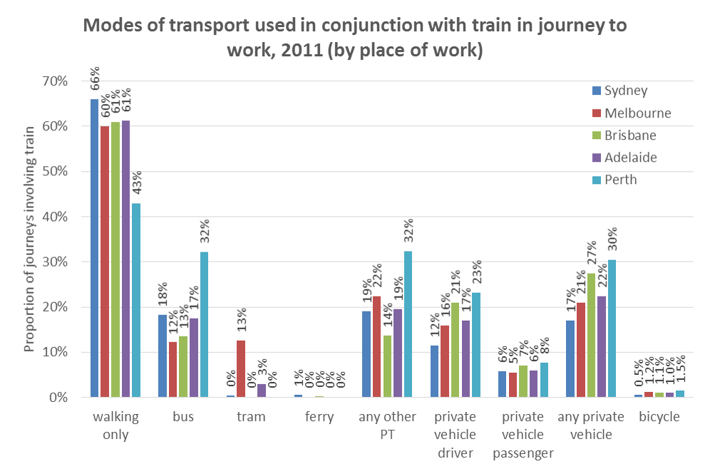
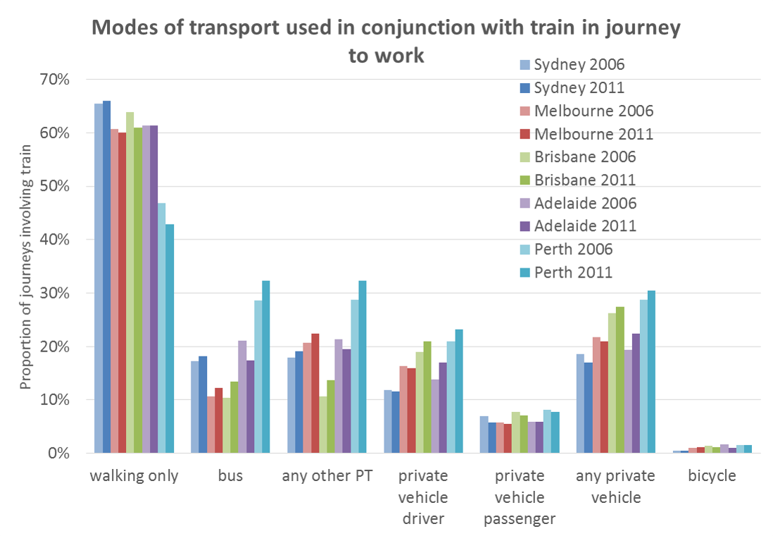
This chart shows that ‘walking only’ (ie no modes other than ‘train’ specified) was the most common response for people who used trains in four of the five cities, with Perth the notable exception. Perth’s rail network includes two heavily patronised lines that are largely within freeway corridors, with longer than traditional station spacing and much smaller walking catchments for each station. Perth train commuters were therefore much more likely to involve other modes of transport in their journey to work.

Private (motorised) vehicle transport was more common than other modes of public transport in Brisbane, but the other cities were fairly evenly balanced between private vehicle transport and other public transport modes.

Perth had the highest share of train commuters reporting also using buses (almost a third), suggesting the train feeder bus networks are working quite well.

Sydney had a similar rate of other public transport mode use to other cities, despite limited multi-modal fare integration, although Sydney did have the highest reported rate of ‘walking only’ for train commuters.

Melbourne had the second highest rate of other public transport modes being involved, with roughly equal amounts of bus and tram.

What modes are used to access train stations?

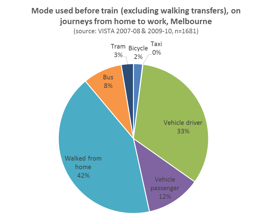
The census doesn’t tell us the order of modes used in the journey to work, but I can get a picture of this from Melbourne’s household travel survey, VISTA:

VISTA JTW pretrain mode

(note that train does not appear as this analysis looks at the mode preceding the first use of train).

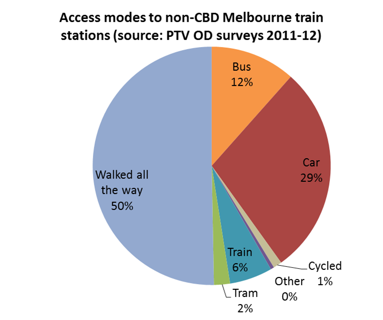
Some recently published PTV data on use of train stations also allows analysis of estimated access mode splits for 7am-7pm weekday train station entries based on origin-destination surveys of journeys of any purpose.

The following chart shows access modes to non-CBD stations (i.e. excluding Flinders Street, Southern Cross, Flagstaff, Melbourne Central, and Parliament):

Access modes to Melbourne non CBD train stations

The data sets aren’t in strong agreement about ‘walking only’ and private vehicle use, although they all have different measurement frames.

The disparity may support the suggestion that there is under-reporting of rail-feeder modes other than walking in the census – particularly vehicle driver/passenger (see also an earlier post that found people living beyond reasonable walking distance of train stations reporting train and walking only to get to work). On the other hand, it may also be that train-based journeys to work have lower rates of private vehicle use than for other journey purposes.

All the figures also suggest that trams are much more likely to be used after trains in the journey to work in Melbourne, which makes sense, as there are only a few tram lines in suburban Melbourne that feed the rail network, and trams provide comprehensive street-based transport within the inner city area helping to distribute people who arrive by train.

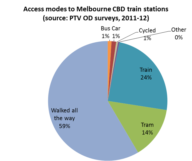
In fact, here is a chart showing the reported access modes for Melbourne’s CBD train stations, showing a much higher tram share of access modes:

Access modes to Melbourne CBD train stations

The data shows walking as the dominant access mode, but also a quite large number of train-train transfers at CBD stations.

Changes over time

So how have these trends changed over time? (at least, as far as people fill out their census forms)

Unfortunately sufficiently detailed data isn’t available for 2001, but here is a comparison of 2006 and 2011 census journey to work data for the five cities:

2006 and 2011 train other modes

You can see for Perth that the ‘walking only’ share dropped in favour of most other modes (following opening of the Mandurah rail line).

Brisbane also had a notable shift away from ‘walking only’, particularly to the use of other public transport modes, which might reflect continued changes in travel habits following full multi-modal fare integration in 2004-05. However Brisbane retained the rate of use of other public transport modes in journeys involving train of all cities.

Adelaide had a decline in buses being part of train-based journeys to work, but an increase in trams and private vehicle drivers.

Melbourne saw an increase in bus use with train journeys, with a decline in all other modes and ‘walking only’.

Sydney saw small increases in ‘walking only’ and bus use for people making journeys to work involving trains.

In terms of bicycles being part of train-based journeys, Melbourne had the biggest increase (from 1.0% to 1.2% of journeys involving trains), while Adelaide went backwards (1.6% to 1.0%, although I have no idea if this might have been weather related).

You might be wondering about trucks, taxis and motorbikes. Okay, well even if you aren’t, I should point out that I have made some assumptions in aggregating the census data:

  • Anyone reporting truck or motorcycle/scooter has been counted as private vehicle driver (although they may have been passengers on such vehicles, although I’m guessing this is less likely than them being drivers)
  • Anyone reporting taxi I have counted as private vehicle passenger.

For more information on other modes used with trains in Melbourne see pages 26-27 of the PTV Network Development Plan for Metropolitan Rail, and recently published PTV data for use of train stations, including access modes.