Trends in transport greenhouse gas emissions

Fri 4 May, 2012

[Updated in June 2015 with 2013 inventory data. First published May 2012. For some more recent data see this post published in December 2019]

Are greenhouse gas emissions from transport still on the rise in Australia? Are vehicle fuel efficiency improvements making a difference?

This post takes a look at available emissions data.

Australian Transport Emissions

The Department of Environment’s National Greenhouse Gas Inventory reports Australia’s emissions in great detail, and 1990 to 2013 data was available at the time of updating this post (there is usually more than a year’s lag before this data is released).

More recent but less detailed data is available in quarterly reports and here’s what the rolling 12 month trend looks like up to September 2014:

transport emissions quarterly 2

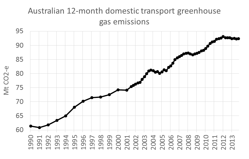
Emissions have grown by 50% since 1990, although a peak was experienced in the 12 months to December 2012 with a slight decline since then.

Transport was responsible for 17.2% of total Australian emissions in the year to September 2014 (excluding land use), an increase from around 15% in 2002.

Here’s the make up of those emissions to 2013:

Australia Transport Emissions 3

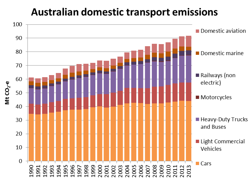
Road transport contributed 84% of transport emissions in 2013 (down slightly from a peak of 89% in 2004). Cars accounted for 48% of Australia’s transport emissions in 2013, down from 57% in 1990.

Note that the above chart does not include electric rail emissions (see below), indirect emissions, or emissions from international shipping and aviation. Estimates for these are included in the following chart lifted from an 2008 ATRF paper by BITRE’s David Cosgrove. It shows this components add a lot on top (and the future projections are frightfully unsustainable). International transport emissions seem to sneak under the radar in the published figures.

Per capita transport emissions

The following chart shows Australian transport emissions per capita have been fairly flat at around 4 tonnes per person since around 2004:

Australia transport emissions per capita 3

To put that in context, 4 tonnes per capita is just above Romania or Mexico’s total greenhouse gas emissions per capita (from all sectors, not just transport).

An aside on electric rail emissions

Electric rail emissions are included under stationary energy, rather than “transport” in the main inventory. Melbourne train and tram electricity emissions have been estimated at 505 Gg for 2007 (ref page 8). Apelbaum 2006 estimated that Australia electric rail emissions in 2004/05 were 2,082 Gg (ref page 68), which is very similar to the inventory figures. I’ve struggled to find any other figures on electric rail emissions in the public domain.

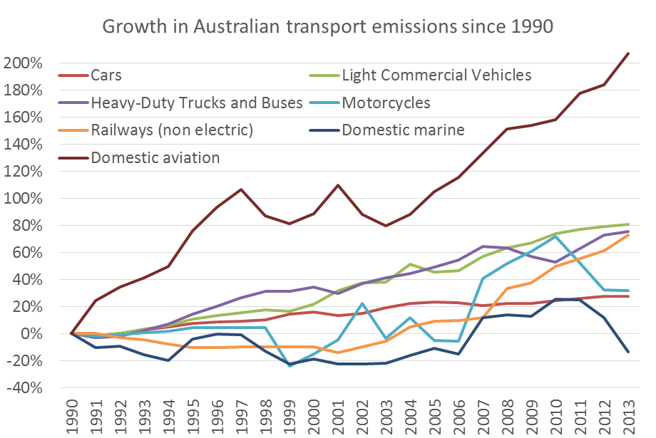
Sectoral growth trends

Transport is now Australia’s second largest emissions sector (after stationary energy), and transport has had the highest rate of emissions growth since 1990:

Australia emissions growth by sector 2

Within the transport sector, civil aviation has had by far the strongest growth since 1990 (but note this comes off a low 1990 base as airlines were recovering from the 1989 pilot’s strike). There’s been a lot of growth in light commercial vehicles, trucks and buses, and in more recent times, railways. Emissions from cars are continuing to grow, while domestic marine and motorcycle emissions have fallen (there appears to be a lot of fluctuation in the motorcycle estimates so I’m not sure I’d read too much into the movements).

Australia transport emissions growth by sector 2

Road transport emissions by state

The national inventory data allows us to see what is happening at a state level. Here is a chart of road emissions by state:

Australia Road Transport Emissions 2

The quantities largely reflect the sizes of each state, but here are the growth trends since 1990:

Australia Road Transport Emissions growth by state

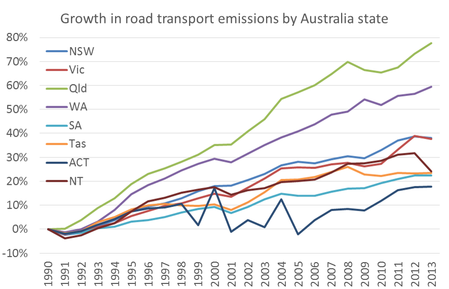
Queensland and WA have grown the fastest by far, followed by New South Wales and Victoria.

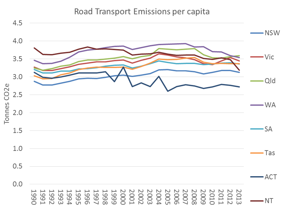
The following charts remove the impact of population growth on trends by showing emissions per capita figures for each state. Some states appear to be declining while others appear relatively static.

Australia Road Transport Emissions per capita 2

Car emissions reductions – mode shift or fuel efficiency?

The following chart shows car emissions per capita (which essentially removes freight from the road transport figures).

Australia Car Emissions per capita 2

Again, all states show a decline in recent years.

So is the drop in road transport emissions related to behaviour change and/or fuel/emissions efficiency?

The following chart shows that the average emissions per km of Australia cars was trending downwards until around 2007 but has since increased (I’ve used BITRE 2014 Yearbook data on car kms travelled hence a little noise):

car emissions per km 2

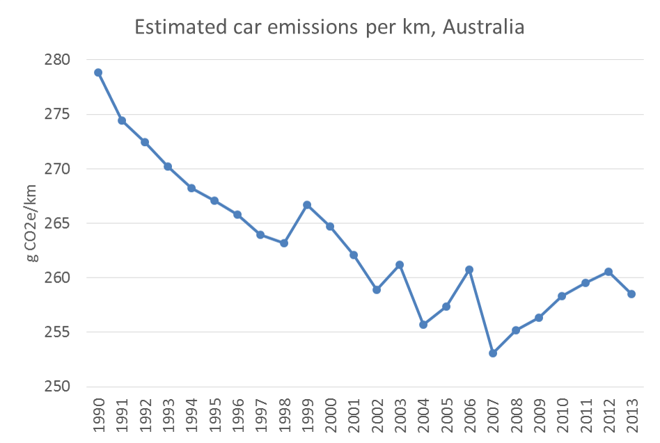
Since 2007, car emissions per capita have been declining, but car emissions per kilometre have not – suggesting the reduction in emissions would be primarily due to changes in travel behaviour, not improvements in engine technology (or at least that improvements in engine technology are being cancelled out by us buying cars that are heavier and/or that have more energy intensive features).

What about transport emissions in cities?

As part of the Victorian Transport Plan, the Victorian Department of Transport commissioned the Nous Group to do a wedges exercise on Victorian transport emissions. This report included estimates of Melbourne’s 2007 transport emissions (12,270 Mt). In addition, Apelbaums’s Queensland Transport Facts 2006 was for a brief time on the internet and I was lucky enough to grab a copy. From that report, estimates of Brisbane’s 2003-04 transport emissions can be derived (7,312 Mt).

The breakdowns are remarkably similar:

What does this look like per capita? I’ve also added London and Auckland figures (though I am not aware of the make up of the Auckland data) to create the following chart:

Obviously these cities’ transport systems and energy sources are very different, but it shows what is possible even for a large city like London. Transport emissions will closely follow transport energy use per capita, which has been the focus of a lot of research, particularly by Prof Peter Newman (eg his Garnaut Review submission).

For 1995 measures of passenger transport emissions per capita for other cities, see this wikipedia chart created using UITP Millenium Cities Database for 1995. Note: these figures only include passenger transport and hence are different to the above.

Also, here is some data for US cities from the Brookings Institute, but it excludes industry and non-highway transportation so is not comparable to the above chart.

Where are transport emissions headed?

Numerous projections of Australia’s domestic transport emissions have been made over recent years, as summarised by the following chart:

Australian transport emissions reported and projected

We appear to be tracking fairly closely to the 2007 projections. The 2010 projections anticipated a reduction in emissions per kilometre travelled, which has not eventuated, as we saw above.

Note the 2015 projections do not include abatement measures – no prediction was made about the effect of abatement measures of which there are few in the transport space of which I am aware.

The only projection that included a decline in transport emissions was a 2012 scenario including a carbon price, which has since been abandoned by the Abbott Government.


Melbourne urban sprawl and consolidation

Wed 4 April, 2012

[Last updated April 2016 with revised June 2015 population estimates. First posted April 2010]

How much is Melbourne sprawling, and how much is urban consolidation happening?

This post sheds some light by looking at ABS population data and dwelling approval data.

Note that this analysis uses local government areas (LGAs) within the Melbourne Statistical Division (although with all of the Shire of Yarra Ranges), rather than the new Greater Melbourne Statistical Area.  ABS now publish annual population estimates at an SA2 level (essentially suburb level). I’ve had a look at this data and the trends are very similar to the results for LGAs, so I am continuing with LGAs for now in this post.

Population growth

The first chart shows net annual population growth by regions of Melbourne. “outer-growth” refers to the designated growth LGAs on the fringe of Melbourne, namely Wyndham, Melton, Hume, Whittlesea, Casey and Cardinia (see the end of this post for definitions of regions and note that the areas have different sizes and starting populations).

As you can see, Melbourne’s population growth accelerated in the years up to 2008-09, slowed down dramatically for a couple of years but has since bounced back to strong growth. The big slump in growth in 2010 and 2011 was largely a reduction in urban consolidation in established areas, while the outer-growth areas continued strongly.

There were an estimated net 89,856 new residents in 2014/15, an average of 1728 per week (annual growth rate of 2.1%).

The following chart shows how the growth was spread across Melbourne:

In 2009-10 there was a significant shift in the balance of growth towards the outer suburban designated growth areas as population growth in established areas slowed dramatically. However we appear to have reverted to the previous pattern, and now 47% of population growth is in the outer growth areas.

The following chart compares the estimated actual share of population growth in the outer-growth areas with the 2008, 2012 and 2014 Victorian Government’s “Victoria In Future” population projections (which DTPLI stresses are not targets or predictions).

Apart from 2010-11, the share of population growth in the outer suburbs has been significantly below all projections, mostly because established area population growth has been much higher than projected. The 2008 projection was for the share of population growth in the outer-growth areas to decline slowly over time, the VIF 2012 projection was for the share to be steady around 55% for the next 15 years, while the new VIF 2014 forecast is for an increasing share in the outer growth areas, peaking in 2028. The 2015 estimated actual is closer to the VIF 2014 projection.

Note:

  • these figures don’t include Mitchell which is now partly within the Melbourne Urban Growth Boundary.
  • not all greenfields sites are in “outer growth” LGAs – smaller greenfields developments occur in established LGAs (eg Keysborough in Greater Dandenong).

If you’d like a more detailed idea about where changes in density is occurring see my posts showing changes in Melbourne density over time and a comparison of 2006 and 2011 at meshblock level.

Population growth compared to projections

The following chart shows the variations between the VIF 2008, 2012, and 2014, and estimated actual population for Melbourne:

The 2015 estimated result is remarkably close to the VIF 2014 projection – out by only 1085 people or 0.024%!

The next charts shows the VIF2008 projected population growth 2007 to 2015, compared to the estimated actuals:

Actual population growth in the inner and middle suburbs was more than double the 2008 projections, growth in the centre and outer regions was above projections, whilst population growth in outer-growth areas was slightly less than projected. That’s a lot of urban infill that was not accurately foreseen in the 2008 projections (the VIF 2004 projections foresaw even less of the urban consolidation in established areas).

The VIF2014 projections for 2014-15 are much closer to the estimated actuals:

The next chart shows estimated actual annual population growth by region to 2014, along with VIF2014 projections for upcoming years:

Growth in dwellings

Two readily available dwelling-based datasets are dwelling approvals (data available to a fine geography level) and dwelling completions (unfortunately these area estimates available at state level only). There will always be a time lag between approval and completion, and many approved dwellings don’t end up getting built. The ratio of dwelling completions to dwelling approvals in Victoria for the last 15 years is 92%. Comparing the two datasets for whole of Victoria, I found a 12 month offset provides the strongest correlation between approvals and completions:

dwelling approvals versus completions

Further complicating the analysis, the RBA has estimated that around 15% of dwelling approvals replace demolished dwellings, and around 8% are second homes or holiday homes.

There isn’t a strong correlation between Melbourne dwelling approvals and Melbourne population growth either, but for the purposes of this post I’ll look at dwelling building approvals because that is the only data I can get in any geographic detail.

The following chart shows a recent acceleration in dwelling approvals across Melbourne, with 55,303 new dwellings approved in 2014/15, more than double the 2007 figure.

Of particular interest are the recent surges in approvals in central, inner and middle Melbourne. The number of dwelling approvals in “inner” Melbourne almost match the outer growth areas in number. If these dwellings actually get built and occupied, then perhaps we will see a surge in population growth in established areas.

Comparing dwelling and population growth

The following chart shows the ratio of population growth to dwelling approvals, which provides indicators of average household size. In 2008-09, there was one new dwelling approved for every 3.2 new residents, but this dropped to around one new dwelling for every 1.7-1.8 new residents in 2009-10 and 2010-11, thanks to a surge of dwelling approvals combined with slower population growth. From 2012 to 2014 population growth picked up relative to dwelling approvals, but the surge in dwelling approvals in 2015 has sent it down to 1.6.

The chart also shows the VIF 2008 projection of average household size (of occupied dwellings), the forecast ratio of population growth to dwelling growth, and the average household size based on census data for 2006 and 2011. The forecast was for slowly declining average household size (following a recent trend). The census-derived average household size in 2011 was 2.445 persons, essentially unchanged since 2006.

Curiously, the ratio of new residents to dwelling approvals was only 1.5 in the early parts of the decade, much lower than average household sizes. Does this reflect small dwelling sizes approved in those years, or maybe a large number of dwelling demolitions?

Measuring progress against the Melbourne 2030 urban consolidation target

Melbourne doesn’t have population targets for different regions, but there was a target for dwellings growth in the (now defunct) Melbourne 2030 strategy. It stated the aim to:

reduce the overall proportion of new dwellings in greenfield sites from the current figure of 38 per cent to 22 per cent by 2030

The greenfield sites in Melbourne 2030 were mostly (but not entirely) located in the designated growth areas. As “greenfields” dwelling approval data isn’t readily available, I have used dwelling approvals in the designated outer growth LGAs as a proxy (the stated figure of 38% appears to match the data for these LGAs)

The dashed red line is a straight line interpolation of the Melbourne 2030 target for greenfields dwelling share. The outer growth LGA’s share of dwelling approvals had been higher than the target until the end of 2012, but has fluctuated a fair bit.

The 2012 Victoria in Future projections had around 48% of net new dwellings in Melbourne occurring in the outer-growth areas between 2011 and 2026, far higher than the old Melbourne 2030 target of 22%.

Now the 2014 Victoria in Future projections (released with the final version of Plan Melbourne) have around 45% of dwelling growth occurring in the outer growth areas between 2011 and 2031. The Plan Melbourne share of dwelling growth in the outer growth areas to the year 2051 is 39%, which suggests more urban consolidation between 2031 and 2051.

In reality, we seem to be tracking much closer to the original Melbourne 2030 target.

(Note: The outer-growth LGAs’ share early in the 2000s was much lower. This may reflect urban growth that was still occurring in areas I have classified as “outer” as opposed to “outer-growth” before the Melbourne 2030 plan was released in 2002.)

Appendix: Definitions of regions

I have allocated local government areas to regions as follows:

Centre = Melbourne, Yarra, Port Phillip

Inner = Hobsons Bay, Maribyrnong, Moonee Valley, Moreland, Darebin, Banyule, Boroondara, Stonnington, Glen Eira, Bayside

Middle = Brimbank, Manningham, Whitehorse, Monash, Kingston, Greater Dandenong (all but one in the east)

Outer = Nillumbik, Maroondah, Yarra Ranges, Knox, Frankston, Mornington Peninsular (all in the east and south-east)

Outer growth = Wyndham, Melton, Hume, Whittlesea, Casey, Cardinia

Here is a map of Melbourne with the regions shaded (dotted white area indicates within the 2006 urban growth boundary, sorry the colours don’t match exactly).

Here is a reference map for those unfamiliar with Melbourne LGAs. You’ll need to click to enlarge so you can read the text.


Questioning assumptions about transport trends (presentation to Transport Economics Forum)

Wed 21 March, 2012

On Tuesday 20 March 2012 I gave this presentation to the Transport Economics Forum in Melbourne using material from this blog and some recently released data in BITRE’s Working Paper 127 on traffic growth in Australia. The presentation challenges some orthodox assumptions about transport trends in Australia and Melbourne.

When I get time, I hope to update existing posts to include the most recent data on (the lack of ) traffic growth.


Traffic volumes on Australian toll roads

Sat 3 March, 2012

[Fully revised March 2020]

What are the trends in traffic volumes on major toll roads in Australian cities? How sensitive are motorists to toll prices? How accurate have traffic forecasts been? Are traffic volumes on toll roads growing faster than traffic in general?

This post aims to shed some light on these questions.

I have sourced traffic data from various sources, including Transurban ASX releases, annual reports, Transport for NSW, operator websites and media reports (I cannot guarantee error-free data gathering).

Average daily volumes

Firstly, here is a chart showing the average daily volumes for toll roads where I have been able to obtain data. Note that I have used a log scale on the Y-axis. The label includes the most recent volume figure available. For some roads and time periods only report annual figures are available (shown as dots rather than lines).

Interact with this data in Tableau.

How have growth rates changed over time?

The following charts show traffic volume growth since an early reference year, compared to BITRE estimates of total vehicle kms for each city:

Citylink volumes grew faster than general traffic for the first decade, but has been more in line with general traffic since then. You can see there are periods of suppressed demand, which very likely correlate with periods of major roadworks. After each period of roadworks, traffic volumes have rebounded strongly and shown further growth (probably eroding congestion reduction benefits). The underlying rate of growth appears to be declining.

It’s a little more difficult to construct a chart for Sydney as different lengths of history are available for different roads. I’ve anchored the chart at 2011:

Most toll roads have had traffic growing faster than general traffic in Sydney. Westlink M7 and Hills M2 have had the highest growth since 2011, with the M1 Eastern Distributor showing the least growth. You can see declines on the Hills M2 and M5 (presumably during roadworks) followed by significant growth as capacity was made available.

Not all of Brisbane’s toll roads have growth faster than overall traffic. Transurban report that AirportLink and Clem7 volumes have recently been impacted by upgrades on the Gateway motorway.

An important note on growth rate precision: Transurban report daily traffic volumes rounded to the nearest thousand. For roads with relatively small volumes (eg Clem7), the growth rates will be more impacted by rounding errors. For example, the traffic volumes on Clem7 went from 27+26+27+27=107 thousand in 2014/15 to 27+26+26+27=106 thousand in 2015/16, which is notional growth of -0.9%. But actual values for each quarter will be within +/-500, and the rounding errors will add up over the eight quarters making up the calculation. The actual growth could be anywhere between -4.6% and 2.9%, but is more likely to be in the middle of that range.

Unfortunately data isn’t always readily available:

  • The Brisbane Gateway Bridge and Logan/Gateway Motorway extension data is only available for financial years in annual reports up until 2010. Transurban took over these roads and have reported traffic volumes since 2013 but they do not appear to be comparable measures so I have listed them separately.
  • In October 2011, Horizon Roads purchased Melbourne’s Eastlink, and they do not seem to be publishing traffic volumes.
  • I haven’t been able to source Clem7 data for 2012 and the first half of 2013.

Traffic growth on other toll roads

Sydney Harbour Bridge and Tunnel

Calum Hutcheson from Hyder Consulting has generously compiled and shared time-series data with me on traffic volumes going back to 1971 for these two toll roads. He has sourced data from several available sources but has had to estimate some figures where data is missing.

Sydney Harbour Traffic 2

Traffic volumes levelled off on the bridge around 1988 and on the combined bridge and tunnel around 2005. It would appear the tunnel brought additional vehicle capacity good for around 17 years’ growth but that has now been exhausted (although I’m far from an expert in Sydney traffic). Traffic volumes on the tunnel have barely growth since 2010.

In 1992 one southbound lane of the bridge was converted to a bus lane (presumably related to the capacity freed up by the tunnel). The bridge’s vehicular traffic levels have not returned to 1988 levels, but I suspect the number of people moved in (road-based) vehicles has increased significantly (not to mention the train line across the bridge).

Sydney Cross City Tunnel

The Cross City Tunnel was forecast to carry 87,088 vehicles per day in 2006, but in 2019 was still less than half this amount.

I have not been able to source much data pre-2013, but a 2006 NSW Auditor General’s report contains some traffic volume data for 2005 and 2006, reproduced here (from page 32 of the report).

It would appear that motorists are highly sensitive to toll pricing, and the forecast volumes were not achieved even when tolls were removed.

Brisbane’s Clem7 cross-city tunnel

Brisbane’s first new road tunnel, the Clem7, opened in March 2010. During the first three weeks of toll-free operation, there was an average of 59,109 vehicles per day. During the first week of tolling, this fell to 20,602. The forecast was for initial traffic of around 60,000 vehicles per day, rising to 100,000 within 18 months. Owners at the time, Rivercity Motorways, went to the extraordinary step of publishing daily traffic data, as can be seen in the following chart showing traffic volumes since tolling commenced:

You can see an up-tick from the beginning of July 2010, when toll prices were cut. Tolls were raised in November 2010 and again in April 2011 and you can see corresponding drops in traffic volumes. Average daily traffic in calendar 2011 was 10% lower than for the first 12 months of operation (includes one overlapping quarter).

During the 2011 flood crisis tolls were waived for one week, and at the end of that period on Monday 17 January 2011, 40,566 vehicles were recorded, the highest since tolling commenced. This may or may not have also reflected closures to other roads making Clem7 more attractive. (footnote: actual weekend volumes have not been published for April 2010, so I have substituted the average non-workday figures, that have been published).

Traffic volumes on the Clem7 peaked at 30,000 in 2018, less than a third of the forecast for the year 2010.

Brisbane’s Airportlink

This toll road was forecast to attract 135,000 vehicles per day one month into operations, and have 165,000 vehicles per day after the ramp up period. Volumes in 2019 were around 63,000 – less than half the forecast after ramp up.

AirportLink traffic

The traffic volumes declined as tolls were progressively introduced to all traffic. BrisConnections, the owner of the road, went into voluntary administration in February 2013.

The Clem7 and Airportlink roads are the first two major tollways as part of the TransApex plan for adding major road capacity to Brisbane.

The third piece of this puzzle is the Go Between Bridge, now part-owned by Transurban and they report a flat 11,000 vehicles per day as of 2019. The forecast was for 17,500 by 2011 and 21,000 by 2021.

I’m guessing it may be a very long time before these TransApex roads reach capacity.

Eastlink

The following chart shows that Eastlink actual traffic volumes were fairly consistently around 60-65% of original (2004) forecast after tolling began. It suggests the forecasts were good at estimating the ramp-up shape, but not so much the overall traffic volumes.

Note: ConnectEast issued revised forecasts in August 2009, including that (steady state annual) average daily trips in 2011 would be 209,900. That forecast doesn’t appear to have been realised either. Unfortunately data reporting stopped in October 2011 following the sale to Horizon Roads.

Maps of Australian Toll Roads

Here are some rough Google maps: Melbourne Sydney Brisbane.
Maps and more information about many of the roads is also available on the Transurban website.

Other sources of traffic volume data

See another post on Melbourne traffic volumes. Some interesting recent data on Brisbane traffic volumes is in this report prepared for RiverCity Motorways (who operated the Clem7). It shows many major roads in Brisbane with stable or declining traffic volumes (possibly because they are at capacity, or possibly because of a mode shift to public transport).

New South Wales traffic data is available for selected locations, as well as detailed data for toll roads.

Victorian data for non-tolled roads is available here, but unfortunately does not include time series history.