How do Australian and European cities compare for population and area?

Sun 6 December, 2015

Following on from my previous post comparing the density of Australian and European cities, there has been some interest in the relative size of Australian and European cities. This post takes a quick look.

To make comparisons, I’ve taken the square kilometre population grid data for Europe and Australia, and summed the population and number of cells within the urban area/centre boundaries (as discussed in last post) that have at least 100 residents (ie 1 person per hectare or more) for each city. I’ve included this (arbitrary) threshold as some urban area boundaries seem to include some non-urban land. It means that I’m approximately measuring the populated areas of cities, and large parks, industrial areas, airports, etc may therefore be excluded in this analysis.

Here’s a chart of population versus populated area (click to enlarge):


So Melbourne is about the same size as London and Paris but has less than half the population. Brisbane is a similar size to Milan, with half the population. Perth is larger than Berlin, but has around half the population. Adelaide has a similar population to Seville and Sofia, which are about a third the size. Sydney has a similar population as Barcelona but is almost four times larger.

Because I couldn’t label all the cities in the chart above, here is a data table (smaller values in red, larger values in blue):

AU EU city data table
I’m hoping to add Canadian and US cities to my analysis soon.


Comparing the densities of Australian, European, Canadian, and New Zealand cities

Thu 26 November, 2015

[updated March 2016 to add Canadian and New Zealand cities]

Just how much denser are European cities compared to Australian cities? What about Canadian and New Zealand cities? And does Australian style suburbia exist in European cities?

This post calculates the population-weighted density of 53 Australian, European, and Canadian cities with a population over 1 million, plus the three largest New Zealand cities (only Auckland is over 1 million population). It also shows a breakdown of the densities at which these cities’ residents live, and includes a set of density maps with identical scale and density shading.

Why Population Weighted Density?

As discussed in previous posts, population-weighted density attempts to measure the density at which the average city resident lives. Rather than divide the total population of a city by the entire city area (which usually includes large amounts of sparsely populated land), population weighted density is a weighted average of population density of all the parcels that make up the city. As I’ve shown previously, the size of the parcels used makes a big difference in the calculation of population-weighted density, which makes comparing cities difficult internationally.

To overcome the issue of different parcel sizes, I’ve used kilometre grid population data that is now available for both Europe and Australia. I’ve also generated my own kilometre population grids for Canadian and New Zealand cities by proportionally summing populations of the smallest census parcels available.

Some measures of density exclude all non-residential land, but the square kilometre grid approach means that partially populated grid parcels are counted, and many of these parcels will include non-residential land, and possibly even large amounts of water. It’s not perfect, particularly for cities with small footprints. For example, here is a density map around Sydney harbour (where light green is lower density, dark green is medium density and red is higher density):

Sydney harbour

You can see that many of the grid cells that include significant amounts of water show a lower density, when it fact the population of those cells are contained within the non-water parts of the grid cell. The more watery cells, the lower the calculated density. This is could count against a city like Sydney with a large harbour.

Defining cities

The second challenge with these calculations is a definition of the city limits. For Australia I’ve used Urban Centre boundaries, which attempt to include contiguous urbanised areas (read the full definition). For Europe I’ve used 2011 Morphological Urban Areas, which have fairly similar rules for boundaries. For Canada I’ve used Population Centre, and for New Zealand I’ve used Urban Areas.

These methodologies tend to exclude satellite towns of cities (less so in New Zealand and Canada). While these boundaries are not determined in the exactly the same way, one good thing about population-weighted density is that parcels of land that have very little population don’t have much impact on the overall result (because their low population has little weighting).

For each city, I’ve included every grid cell where the centroid of that cell is within the defined boundaries of the city. Yes that’s slightly arbitrary and not ideal for cities with dense cores on coastlines, but at least I’ve been consistent. It also means some of the cells around the boundary are excluded from the calculation, which to some extent offsets the coastline issues. It also means the values for Australian cities are slightly different to a previous post.

All source data is dated 2011, except for France which is 2010, and New Zealand which is 2013.

Comparing population-weighted density of Australian, European, Canadian and New Zealand cities

AU EU CA NZ Population Weighted Density

You can see the five Australian cities are all at the bottom, most UK cities are in the bottom third, and the four large Spanish cities are within the top seven.

Sydney is not far below Glasgow and Helsinki. Adelaide, Perth and Brisbane are nothing like the European cities when it comes to (average) population-weighted density.

Three Canadian cities (Vancouver, Toronto and Montreal) are mid-range, while the other three are more comparable with Australia. Of the New Zealand cities, Auckland is surprisingly more dense than Melbourne. Wellington is more dense that Vancouver (both topographically constrained cities).

But these figures are only averages, which makes we wonder…

How much diversity is there in urban density?

The following chart shows the proportion of each city’s population that lives at various urban density ranges:

AU EU CA NZ urban density distribution

Because of the massive variations in density, I had to break the scale interval sizes at 100 persons per hectare, and even then, the low density Australian cities are almost entirely composed of the bottom two intervals. You can see a lot of density diversity across European cities, and very little in Australian cities, except perhaps for Sydney.

You can also see that only 10% of Barcelona has an urban density similar to Perth or Adelaide. Which makes me wonder…

Do many people in European cities live at typical Australian suburban densities?

Do many Europeans living in cities live in detached dwellings with backyards, as is so common in Australian cities?

To try to answer this question, I’ve calculated the percentage of the population of each city that lives at between 10 and 30 people per hectare, which is a generous interpretation of typical Australian “suburbia”.

AU EU CA NZ cities percent at 10 to 30 per hectare

It’s a minority of the population in all European cities (and even for Sydney). But it does exist. Here are examples of Australian-style suburbia in outer Hamburg, Berlin, LondonMilan, and even Barcelona (though I hate to think what some of the property prices might be!)

How different is population-weighted density from regular density?

Now that I’ve got a large sample of cities, I can compare regular density with population weighted densities (PWD):

PWD v regular density 2

The correlation is relatively high, but there are plenty of outliers, and rankings are very different. Rome has a regular density of 18, but a PWD of 89, while London has a regular density of 41 and PWD of 80. Dublin’s regular density of 31 is relatively close to its PWD of 47.

Wellington’s regular density is 17, but its PWD is 49 (though the New Zealand cities regular density values are impacted by larger inclusions of non-urbanised land within definitions of Urban Areas).

So what does the density of these cities look like on a map?

The following maps are all at the same scale both geographically and for density shading. The blue outlines are urban area boundaries, and the black lines represent rail lines (passenger or otherwise, and including some tramways). The density values are in persons per square kilometre (1000 persons per square kilometre = 10 persons per hectare). (Apologies for not having coastlines and for some of the blue labels being difficult to read).

Here’s Barcelona (and several neighbouring towns), Europe’s densest large city, hemmed in by hills and a coastline:

Barcelona

At the other extreme, here is Perth, a sea of low density and the only city that doesn’t fit on one tile at the same scale as the other cities (Mandurah is cut off in the south):


Perth

Here is Paris, where you can see the small high density inner core matches the high density Metro railway area:

Paris

Similarly the dense inner core of London correlates with the inner area covered by a mesh of radial and orbital railways, with relatively lower density outer London more dominated by radial railways:

London

There are many more interesting patterns in other cities.

What does this mean for transport?

Few people would disagree that higher population densities increase the viability of high frequency public transport services, and enable higher non-car mode shares – all other things being equal. But many (notably including the late Paul Mees) would argue that “density is not destiny” – and that careful design of public and active transport systems is critical to transport outcomes.

Zurich is a city often lauded for the high quality of its public transport system, and its population weighted density is 51 persons/ha (calculated on the kilometre grid data for a population of 768,000 people) – which is quite low relative to larger European cities.

In a future post I’ll look at the relationship between population-weighted density and transport mode shares in European cities.

All the density maps

Finally, here is a gallery of grid density maps of all the cities for your perusing pleasure (plus Zurich, plus many smaller neighbouring cities that fit onto the maps). All maps have the same scale and density shading colours.

Please note that the New Zealand and Canada maps do not include all nearby urbanised areas. Apologies that the formats are not all identical.


Are Australian cities becoming denser?

Tue 5 November, 2013

Please refer to a fully revised second edition of this post – published in April 2019.

[Updated April 2017 with 2015-16 population estimates. First published November 2013]

While Australian cities have been growing outwards with new suburbia, they have also been getting denser in established areas, and the new areas on the fringe are often more dense than growth areas used to be (see last post). So what’s the net effect – are Australian cities getting more or less dense?

This post also explores measures of population-weighted density for Australian cities large and small over time. It also tries to resolve some of the issues in the calculation methodology by using square kilometre geometry, looks at longer term trends for Australian cities, and then compares multiple density measures for Melbourne over time.

Measuring density

Under the traditional measure of density, you’d simply divide the population of a city by the metropolitan area’s area (in hectares). As the boundary of the metropolitan areas seldom change, the average density would simply increase in line with population with this measure. But that density value would also be way below the density at which the average resident lives because of the inclusion of vast swaths of unpopulated land within “metropolitan areas”, and so be not very meaningful.

Enter population-weighted density (which I’ve looked at previously here and here). Population-weighted density takes a weighted average of the density of all parcels of land that make up a city, with each parcel weighted by its population. One way to think about it is the residential density in which the “average resident” lives.

So the large low-density parcels of rural land outside the urbanised area but inside the “metropolitan area” count very little in the weighted average because of their small population relative to the urbanised areas. This means population-weighted density goes a long way to overcoming having to worry about the boundaries of the “urban area” of a city. Indeed, in a previous post I found that removing low density parcels of land had very little impact on calculations of population-weighted density for Australian cities. However, the size of the parcels of land used in a population-weighted density calculation will have an impact, as we will see shortly.

Calculations of population-weighted density can answer the question about whether the “average density” of a city has been increasing or decreasing. But as we will see below, using geographic regions put together by statisticians based on historical boundaries is not always a fair way to compare different cities.

Population-weighted density of Australian cities over time

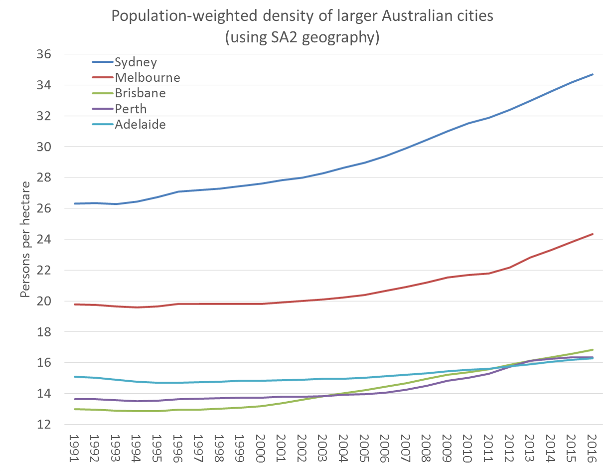
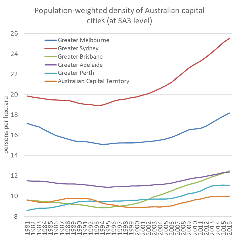
Firstly, here is a look at population-weighted density of the five largest Australian cities (as defined by ABS Significant Urban Areas), measured at SA2 level (the smallest geography for which there exists a good consistent set of time-series estimates). SA2s roughly equate to suburbs.

According to this data, most cities bottomed out in density in the mid 1990s. Sydney, Melbourne and Brisbane have shown the fastest rates of densification in the last three years.

What about smaller Australian cities? (120,000+ residents in 2014):

Darwin comes out as the third most dense city in Australia on this measure, with Brisbane rising quickly in recent years into fourth place. Most cities have shown densification in recent times, with the main exception being Townsville. On an SA2 level, population weighted density in Perth hardly rose at all in 2015-16 (a year when 92% of population growth was in the outer suburbs)

However, we need to sanity test these values. Old-school suburban areas of Australian cities typically have a density of around 15 persons per hectare, so the values for Geelong, Newcastle, Darwin, Townsville, and Hobart all seem a bit too low for anyone who has visited them. I’d suggest the results may well be an artefact of the arbitrary geographic boundaries used – and this effect would be greater for smaller cities because they would have more SA2s on the interface between urban and rural areas (indeed all of those cities are less than 210,000 in population).

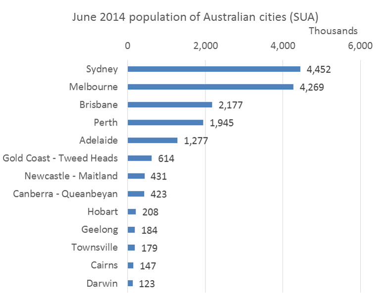
For reference, here are the June 2014 populations of all the above cities:

Australian cities population 2014

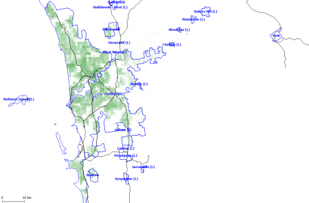
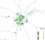
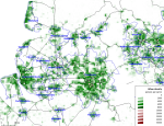
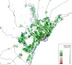
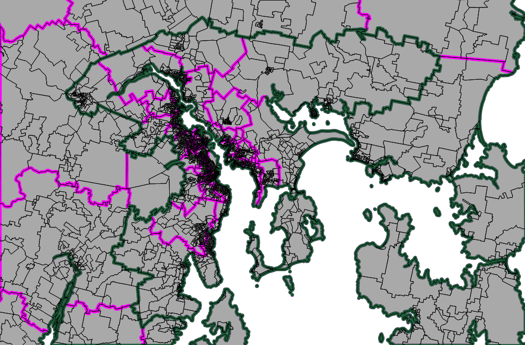
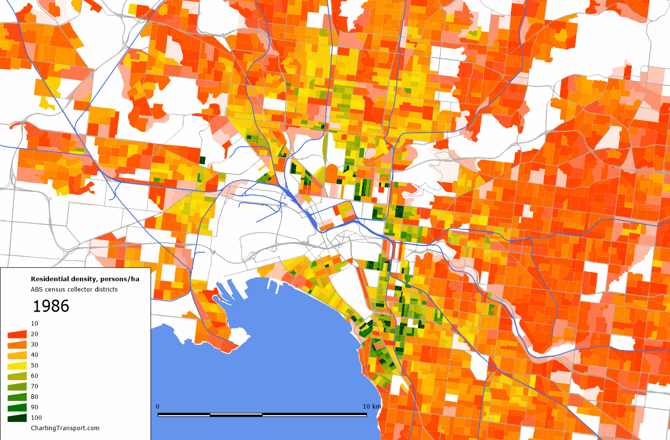
The following map shows Hobart, with meshblock boundaries in black (very small blocks indicate urban areas), SA2s in pink, and the Significant Urban Area (SUA) boundary in green.  You can see that many of the SA2s within the Hobart SUA have pockets of dense urban settlement, together with large areas that are non-urban – ie SA2s on the urban/rural interface. The density of these pockets will be washed out because of the size of the SA2s.

Hobart SUA image

Reducing the impact of arbitrary geographic boundaries

As we saw above, the population-weighted density results for smaller cities were very low, and probably not reflective of the actual typical densities, which might be caused by arbitrary geographic boundaries.

Thankfully ABS have followed Europe and released of a square kilometre grid density for Australia which ensures that geographic zones are all the same size. While it is still somewhat arbitrary where exactly this grid falls on any given city, it is arguably less arbitrary than geographic zones that follow traditional notions of area boundaries.

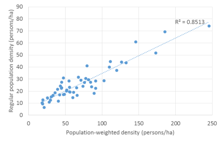
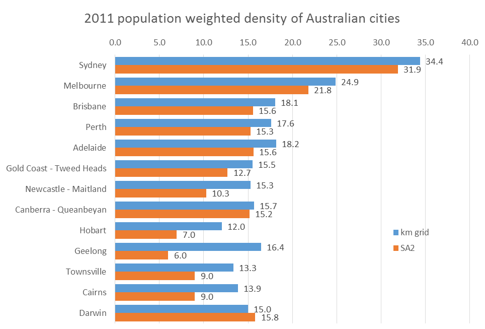
Using that data, I’ve been able to calculate population weighted density for the larger cities of Australia. The following chart shows those values compared to values calculated on SA2 geography:

pop weighted density 2011 grid and SA2 australian cities

You’ll see that the five smaller cities (Newcastle, Hobart, Geelong, Townsville and Cairns) that had very low results at SA2 level get more realistic values on the kilometre grid.

You’ll notice that most cities (except big Melbourne and Sydney) are in the 15 to 18 persons per hectare range, which is around typical Australian suburban density.

While the Hobart figure is higher using the grid geography, it’s still quite low (indeed the lowest of all the cities). You’ll notice on the map above that urban Hobart hugs the quite wide and windy Derwent River, and as such a larger portion of Hobart’s grid squares are likely to contain both urban and water portions – with the water portions washing out the density (pardon the pun!). While most other cities also have some coastline, much more of Hobart’s urban settlement is near to a coastline.

But stepping back, every city has urban/rural and/or urban/water boundaries and the boundary has to be drawn somewhere. So smaller cities are always going to have a higher proportion of their land parcels being on the interface – and this is even more the case if you are using larger parcel sizes. There is also the issue of what “satellite” urban settlements to include within a city which ultimately becomes arbitrary at some point. Perhaps there is some way of adjusting for this interface effect depending on the size of the city, but I’m not going to attempt to resolve it in this post.

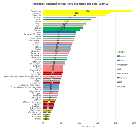
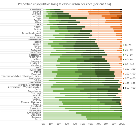
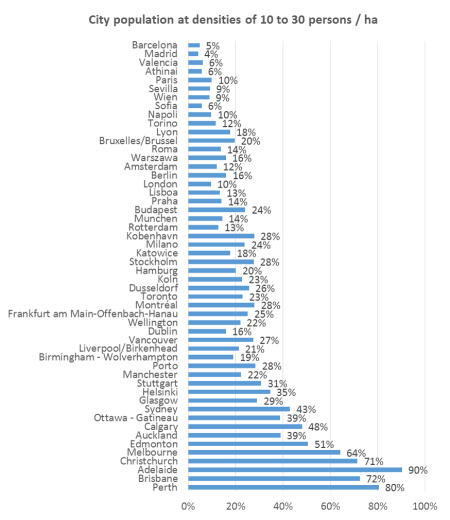
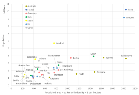
International comparisons of population-weighted density

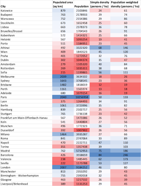
See another post for some international comparisons using square km grids.

Changes in density of larger Australian cities since 1981

We can also calculate population-weighted density back to 1981 using the larger SA3 geography. An SA3 is roughly similar to a local government area (in Melbourne at least), so getting quite large and including more non-urban land. Also, as Significant Urban Areas are defined only at the SA2 level, I need to resort to Greater Capital City Statistical Areas for the next chart:

This shows that most cities were getting less dense in the 1980s (Melbourne quite dramatically), with the notable exception of Perth. I expect these trends could be related to changes in housing/planning policy over time. This calculation has Adelaide ahead of the other smaller cities – which is different ordering to the SA2 calculations above.

On the SA3 level, Perth declined in population-weighted density in 2015-16.

When measured at SA2 level, the four smaller cities had almost the same density in 2011, but at SA3 level, there is more separating them. My guess is that the arbitrary nature of geographic boundaries is having an impact here. Also, the share of SA3s in a city that are on the urban/rural interface is likely to be higher, which again will have more impact for smaller cities. Indeed the trend for the ACT at SA3 level is very different to Canberra at SA2 level.

Melbourne’s population-weighted density over time

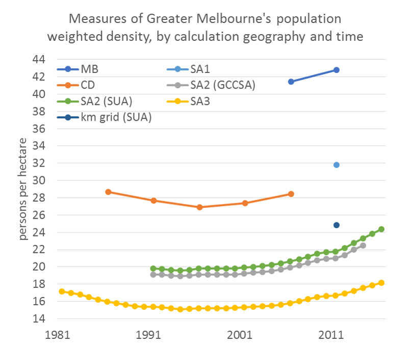
I’ve taken a more detailed look at my home city Melbourne, using all available ABS population figures for the geographic units ranging from mesh blocks to SA3s inside “Greater Melbourne” (as defined in 2011) or inside the Melbourne Significant Urban Area (SUA, where marked), to produce the following chart:

Note: I’ve calculated population-weighted density at the SA2 level for both the Greater Capital City Statistical Area (ie “Greater Melbourne”, which includes Bacchus Marsh, Gisborne and Wallan) and the Melbourne Significant Urban Area (slightly smaller), which yield slightly different values.

All of the time series data suggests 1994 was the turning point in Melbourne where the population-weighted density started increasing (not that 1994 was a particularly momentous year – the population-weighted density increased by a whopping 0.0559 persons per hectare in the year to June 1995 (measured at SA2 level for Greater Melbourne)).

You’ll also note that the density values are very different when measured on different geographic units. That’s because larger units include more of a mix of residential and non-residential land. The highest density values are calculated using mesh blocks (MB), which often separate out even small pockets of non-residential land (eg local parks). Indeed 25% of mesh blocks in Australia had zero population, while only 2% of SA1s had zero population (at the 2011 census). At the other end of the scale, SA3s are roughly the size of local councils and include parklands, employment land, rural land, airports, freeways, etc which dilutes their average density.

In the case of SA2 and SA3 units, the same geographic areas have been used in the data for all years. On the other hand, Census Collector Districts (CD) often changed between each five-yearly census, but I am assuming the guidelines for their creation would not have changed significantly.

Now why is a transport blog so interested in density again? There is a suggested relationship between (potential) public transport efficiency and urban density – ie there will be more potential customers per route kilometre in a denser area. In reality longer distance public transport services are going to be mostly serving the larger urban blob that is a city – and these vehicles need to pass large parklands, industrial areas, water bodies, etc to connect urban origins and destinations. The relevant density measure to consider for such services might best be based on larger geographic areas – eg SA3. Buses are more likely to be serving only urbanised areas, and so are perhaps more dependent on residential density – best calculated on a smaller geographic scale, probably km grid (somewhere between SA1 and SA2).

You may also like


The growth of Melbourne 1986-2011, animated

Tue 29 October, 2013

Following on from my recent post about the changing socio-economic landscape of Melbourne, this post simply looks at the changing shape and density of urban Melbourne using 5-yearly census data at collector district (1986-2006) and SA1 level (2011).

Straight to it: here is map of Melbourne residential density, click to enlarge and animate:

Melb CD SA1 density

You can see the sprawl of Melbourne over the years, including changes that suggest shifts in the urban growth boundary after development previously seemed to have stopped against a line (particularly evident on the western edge of the City of Brimbank).

Here is another animated map showing the inner city area, with a density scale ranging from 10 to 100 persons/ha, so you can distinguish higher densities than the map above. Click to enlarge and animate.

Melb inner density

You can see a lot more going on in established areas on this map, including densification in the CBD, St Kilda, St Kilda Road (conversion from office space), Parkville, Port Melbourne around Bay Street, Kensington Banks, Brunswick, Fitzroy, Southbank, South Melbourne, Elwood, Maribyrnong, Carlton, and many more.

A few things to note:

  • The size of the districts changes each year, particularly around the fringe. You’ll often see a large red patch where a larger block is only partly inhabited in one year, only to be replaced by smaller denser patches in future years. Patches of green that disappear might be the enlargement of a district causing a blending out of a small pocket of high density, rather than an actual drop in density.
  • Shades of pink indicate densities between 5 and 10 per hectare on the large map, and between 10 and 20 per hectare on the inner map. Lower densities are shown as white.
  • In 2011 the ABS changed their statistical geography. I have used SA1s from 2011 as the most comparable area unit to a census collector district, however they are generally smaller and so densities may appear to jump slightly in 2011 in some areas.

See also earlier posts for: