A detailed look at changes in Melbourne residential density 2006-2011

Mon 8 July, 2013

Since my first post looking at 2011 Melbourne residential density, there’s been a heap of new 2011 census data released. This post includes new maps showing Melbourne’s population density in maximum detail, as well as some more calculations of Melbourne’s urban/residential density for the density nerds.

Melbourne’s residential density in extremely high resolution

2011 population figures are now available for mesh blocks – the smallest ABS geographic unit. This allows a fine-grained look at 2011 residential density, and comparisons with 2006 as we now have a time series.

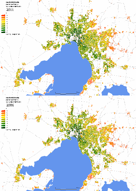
Here’s a very large animated map (4.7MB, 6825 x 4799 pixels) showing residential density at mesh block level for 2006 and 2011. You’ll need to click on it to download and see the animation (I’d suggest a new tab or window). Use your browser to zoom in and scroll around to areas of interest.

Melbourne mesh block density


[update 10 July: It has been brought to my attention that some people are unable to view this map because they are restricted to using certain versions of Internet Explorer. If you cannot see the large map above, I have also created a smaller animated map showing only the inner areas of Melbourne]

You can see that new growth areas on the fringe actually have relatively high densities, contrary to conventional wisdom. I also note a relatively high and increasing density in the Springvale/Keysborough/Noble Park area, quite some distance from the CBD. If you look carefully you will also spot infill developments like Waverley Park, Parkville (ex-Commonwealth Games village), Gresswell Hill in Macleod, Docklands, Maidstone, Edgewater estate in Maribyrnong, along St Kilda Road, Waterways, and no doubt many more.

More values for the urban/residential density of Melbourne

Okay, you might want to stop reading here unless you have a deep interest in density calculation methodology.

Along with mesh blocks, the recently released census data provides boundaries for urban centres and localities, which each representing a relatively continuous urban area (including residential and non-residential land). There is an urban centre of “Melbourne” defined, which excludes the satellite urban centres of Pakenham, Melton, Sunbury, Healesville and towns along the Warburton Highway, but includes the major urban regions along the Mornington Peninsula to Portsea and Hastings.

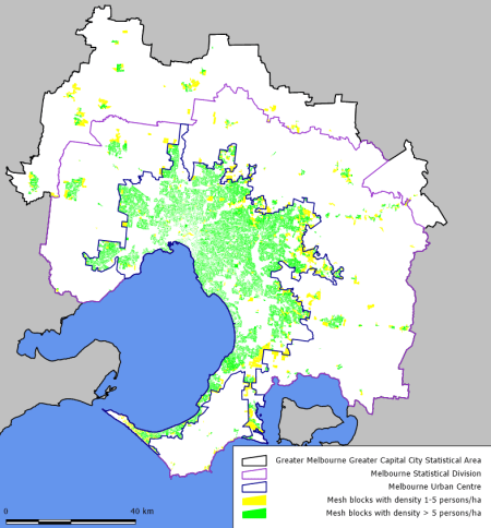
All this new data enables calculation of yet more values of the urban/residential density of Melbourne, adding to my previous list (some of which I have repeated for comparison purposes). The areas covered by each calculation are shown on the map below.

Geography Area 
(km2)
Population Average density 
(pop/ha)
Areas on map below
“Greater Melbourne” Greater Capital City Statistical Area 9990.5 3,999,982 4.0 white + yellow + green
SA1s within Greater Melbourne with population density > 1 person/ha 2211.4 3,903,450 17.7  (not shown exactly, slightly less than yellow + green)
Mesh blocks within Greater Melbourne, with population density > 1 person/ha 1713.1 3,913,215 22.8  yellow + green
Mesh blocks within Greater Melbourne, with population density > 5 person/ha 1348.5 3,824,999 28.4 green
Melbourne urban centre 2543.2 3,707,530 14.6 all within blue boundary
Mesh blocks within Melbourne urban centre, with population density > 1 person/ha 1443.8 3,696,316 25.6 yellow + green within blue boundary
Mesh blocks within Melbourne urban centre, with population density > 5 person/ha 1238.3 3,642,685 29.4 green within blue boundary

I note that the Melbourne urban centre is approximately a quarter of the area of “Greater Melbourne”.

Here’s a reference map of Melbourne showing the Greater Capital City Statistical Area, Statistical Division and Urban Centre boundaries of “Melbourne”, together with mesh blocks of above 1 and 5 persons/ha.

Density area scope map mesh blocks2

Finally, for the density nerds who are still reading this post, I have calculated the 2011 population-weighted density of Greater Melbourne using mesh blocks to be 42.8 persons/ha, which is much higher than the population-weighted density using SA1 geography of 31.8 persons/ha. It’s higher because more non-residential land parcels have been excluded from the overall calculation. If I restrict myself to mesh blocks within the Melbourne urban centre, the population-weighted density is only slightly higher at 45.1 persons/ha.

So if you want to compare population-weighted densities of different cities, you’ll need to make sure you are using equivalent geographic units, which I suspect would be very difficult for international comparisons. An attempt at Australian and Canadian city comparisons was made in the comments section of a previous post.

There you go. Next time someone claims to know the urban density of Melbourne, you can now argue with them for hours about whether you agree with their number and how it should be measured.


Comparing the residential densities of Australian cities (2011)

Fri 19 October, 2012

I’ve looked at Melbourne residential density in detail, so what about other Australian cities?  Is population weighted density a useful measure? Does population weighted density help explain differences in public transport mode shares?

For this exercise, I’ve looked at 2011 census data at the Statistical Area Level 1 (SA1) geography (currently the smallest geography for which population data is available) for Greater Capital City Statistical Areas (which include large tracts of rural hinterland). I’ve sometimes applied an arbitrary threshold of 3 persons per hectare to define urban residential areas.

Measures of overall density

Population weighted density is a weighted average of the density of all the parcels of land in the city, with the population of each parcel of land providing the weighting. This provides a figure indicative of the residential density of the “average person”, although that’s still a little abstract. A city where a large proportion of people live in dense areas will have a much higher weighted population density than average population density.

Average density is simply the total population divided by the area of the city (or if you like, the average density weighted by the areas of each parcel of land). In calculating average residential density (which I’m doing in this post), the area would only include residential areas (I’ve arbitrarily used a threshold of SA1s with at least 3 persons per hectare).

Another measure is urban density, which considers all the land that makes up the urban city, including non-residential areas, but excluding the rural land that makes up large parts of most metropolitan areas when defined by administrative boundaries. I have not attempted to measure ‘urban’ density in this post.

Firstly here’s a table of data for the six largest Australian cities with three different measures of 2011 residential density:

Greater Capital City Statistical Area Pop Pop (>3/ha) Area, square km (>3/ha) Pop-weighted density, persons/ ha (all SA1s) Pop-weighted density, persons/ ha (SA1s >3/ha) Average residential density, persons/ ha (SA1s >3/ha)
Greater Sydney 4391578 4225278 1530 50.2 52.1 27.6
Greater Melbourne 3999924 3832366 1812 31.8 33.1 21.1
Greater Brisbane 2066134 1866794 1127 22.6 24.8 16.6
Greater Perth 1728567 1639849 963 21.6 22.7 17.0
Greater Adelaide 1225136 1161668 644 21.2 22.3 18.0
Australian Capital Territory 356563 350917 221 20.5 20.8 15.9

You’ll notice that Melbourne has a lower population than Sydney, but the total land area above 3 persons/ha is much larger.

Here are those densities in chart form:

You can see Sydney has around double the population weighted density of most other cities, but its average density is only about 60% higher. These figures show Sydney has a very different density pattern compared other Australian cities.

You can also see very little difference in weighted density whether you exclude low density land parcels or not (the blue and red bars). The density is brought down only slightly by the relatively small number of people living in very low density areas (below 3 persons/ha) within the statistical geography. Thus weighted average density is a good way to get around arguments about the boundary of the “urban” area. But then we are only measuring residential density here – and the large unoccupied spaces between residents of a city are very important when it comes to transport issues.

Can you compare population weighted density of Australian cities with international cities? Yes, but only if the parcels of land used are of a similar size and created in a similar fashion. The more fine-grained the geography (ie smaller the parcels of land), the more non-residential pockets of land will be excluded from the calculation. Anyone doing an international comparison should compare how the ABS create their geography at SA1 level with approaches of other statistical agencies. And please comment below if you get a set of comparable figures.

Density by distance from the CBD

The differences in density can be seen a little more clearly when you look at weighted average density by distance from the city centre:

(note: I’ve chopped the vertical scale at 100 persons/ha so parts of central Sydney, Melbourne and Brisbane are off the scale).

For Perth, Adelaide, Brisbane and Canberra (ACT) you can see a weighted average density in the mid to low 20s for large areas of the city, indicating large tracts of what you might describe as traditional Australian suburbia. In Canberra this kicks in at just 2 km from the CBD, and in Adelaide it kicks in 3 km from the city.

In Melbourne the weighted average density doesn’t get below 30 until 9 kms from the CBD indicating a larger denser inner area, and in Sydney it doesn’t drop below 30 until you are 39 km from the CBD!

Distribution of population at different densities

Here’s a frequency distribution of densities in the cities:

I’m using an interval of 1 person/ha, and the figures are rounded down to form the values on the X axis (ie: the value you see at 20 persons/ha is the proportion of the population living between 20 and 21 persons/ha).

You can see Sydney has the flattest distribution of all – indicating it has the widest range of densities of any city. Melbourne is not far behind, whereas Canberra has a lot of people living in areas between 12 and 24 persons/ha.

Note that many cities have a significant proportion of the population living at rural densities (0 to 1 person per hectare), particularly Greater Brisbane.

Another way to look at this data is a cumulative frequency distribution:

You can read off the median densities for the cities: Sydney 33, Melbourne 28, Brisbane 22, Perth 22, Adelaide 22, Canberra 19.

You can also see that 30% of people in Sydney live in densities of 44 persons/ha or more – compared to only 12% of Melburnians, 5% of Brisbanites, and less than 2% of people in the other cities.

If 15-30 persons per hectare is what you define as suburbia, then that’s 26% of Sydney, 37% of Melbourne, 44% of Brisbane, 55% of Perth, 57% of Canberra and 62% of Adelaide.

Spatial distribution of density

For the purest view of density you cannot get past a map. The following maps show a simple density calculation at the SA1 geography.

Update 22 Oct 2012: maps now include railway lines using OpenStreetMap data provided by Maps Without Borders. The data is licensed under Creative Commons Attribution-ShareAlike 2.0, copyright OpenStreetMap and contributors.

Sydney

You can see vast areas of darker green (40+/ha), particularly between Sydney Harbour and Botany Bay. There are also quite a few green areas in the western suburbs, while the northern north shore has the lowest density. There are many concentrations of density around the passenger rail lines.

Melbourne (and Geelong)

You can see areas of dark green around the inner city, with large tracts of yellow and green in the suburbs (25-35 persons/ha). There are however areas of moderate green (30-40) in some of the newer outer growth areas to the west and north, reflecting recent planning. There’s a not a strong relationship to train lines, but this might reflect higher densities equally attracted to tram lines (not shown on the map).

Note this map is slightly different to that in a recent post where I masked out non-residential mesh blocks.

Brisbane

You can see dark green patches around the river/CBD, but then mostly medium to low densities in the suburbs. There’s very little evidence of higher densities in fringe growth areas. There are some denser areas around railway lines (note the map does not show Brisbane’s busway network).

Perth

You can see green patches around the city, but also in some fringe growth areas where new planning controls are presumably forcing up densities. There are however vast tracts of orange (15-25 persons/ha), and little evidence of higher density around the rail lines (note: a lot of the lines are freight only and the north-south passenger line has very broad station spacing and limited walking catchment as most of it is within a freeway median).

Adelaide

Adelaide some inner city blocks of high density, but once you get outside the green belt surrounding the city blocks, you fairly quickly head into suburban densities. There are only a few pockets of high density in the middle and outer suburbs, and very little relationship evident between density and the rail lines.

Canberra (and Queanbeyan)

Canberra has vast areas at low density, and only a few pockets with dark green. There are however green patches on the fringes (particularly in the far north and far south), perhaps again reflecting planning policies forcing up densities.

Sydney is really quite a different city compared to the rest of Australia, with a much larger share of the population living in high density residential areas (more than I had expected). Melbourne has a much lower population weighted density (still quite a few people living in high density areas, but much less so than Sydney), followed by four cities that aren’t that different when it comes to density: Brisbane, Perth, Adelaide and Canberra.

What about density and public transport use?

Here’s a comparison of density (measured as both average and population weighted) and the most recent estimate of public transport mode share of motorised passenger kms for Australian cities:

Population weighted density certainly shows a stronger relationship with public transport use than average density (r-squared of 0.89 versus 0.82 on a linear regression).

If you believe that higher population density will lead to higher public transport use (for a given level of public transport service), then you would expect Sydney to be well placed to have a higher public transport mode share. Which indeed it does, but does it have the same level of public transport supply as other cities, and are all other factors equal? That’s a very difficult question to answer.

You could measure public transport service kilometres per capita, but different modes have different speeds, stopping frequencies and capacities, public transport supply will vary greatly across the city, and some cities might have more effective service network designs that others.

If all cities had the same levels of public transport supply and all other things were equal, you might expect a straight line relationship (or perhaps an exponential relationship). But Brisbane and Melbourne (and to a small extent Perth) seem to be bucking what otherwise might be a linear pattern. Are these cities doing much better with quality and quantity of public transport supply? Or is it something else about those cities?

Car ownership rates do vary between Australian cities, but this might be more a product of public transport viability for particular residents:

Also, we know that car ownership doesn’t have a strong relationship with car use.

When working population census data comes out I would like to look at the distribution of employment within cities. We know that public transport use is highest for journeys to work in the CBD (as it usually competes strongly against the car), so the proportion of a city’s jobs that are in the CBD is likely to impact the public transport mode share (at least for journeys to work). Moreover, a higher average employment density in general might be easier to serve with competitive public transport, and thus lead to a higher public transport mode share. It will hopefully also be possible to calculate weighted density of employment (at least at the SA2 level).

Finally, I’d like thank Alan Davies (The Urbanist) for inspiring this post.

Other posts about density:

Visualising the changing density of Australian cities

Mon 1 October, 2012

[This is an older post. For more recent analysis, see: How is density changing in Australian cities?]

Following on from my last post on Melbourne density, I thought it would be worth creating animations of the change in population density in other large Australian cities.

Below are animated maps showing density using estimated annual population on the ABS Statistical Area Level 2 (SA2) geography for the period 1991 to 2011. You’ll need to click on them to see the animation (and you may have to wait a little if you have a slow connection).

I’ve used SA2 geography because it is the smallest geography for which I can get good time series data. Please note that some SA2s with substantial residential populations will still show up with low average density because they contain large parks and/or industrial areas, or are on the urban fringe and so only partially populated (the non-urban areas bringing down the average density).

Sydney

You can see the growth out to the north-west and south-west, the rapid population growth in the CBD and to the south of the CBD, and general densification of the inner suburbs.

Perth

Perth is a little less dramatic, but you can see strong growth to the far north in the late 2000s, populating of the CBD area, and increasing density in the inner northern suburbs. Many of the middle suburbs show very little change. A lot of Perth’s growth areas don’t seem to show up, probably due to low average densities of fringe SA2s that include non-urban areas.

Brisbane

You can see rapid population growth all over Brisbane, particularly in the CBD are inner suburbs.

Melbourne

In case you missed my last post, here is the map for Melbourne.

I had a bit of a look at Adelaide, but the changes between 1991 and 2011 were not very pronounced due to slow population growth. The process of creating these maps is fairly labour intensive so sorry Adelaide, no map for you (unless I get lots of requests).

I hope this is of interest.


A first look at 2011 Melbourne residential density, and how it has changed

Fri 21 September, 2012

With the gradual release of 2011 census data, I thought it would be worth looking at some transport related themes. I’ll start with residential density (for my look at 2006 density, see an earlier post). This post looks at 2011 density, and how density has changed over the years.

The big issue with residential density is how you measure it. In showing it graphically, I prefer to use the smallest available geographic areas, as that can remove tracts of land that are not used for residential purposes (such as parks, creeks, wide road reservations etc).

At the time of posting, 2011 census population data was only available at “Statistical Area Level 1” (SA1). In 2013, population figures for the smallest ABS geographic unit – mesh blocks – will be available for a fine grain look at density.

However, land use descriptions for mesh blocks were available at the time of posting. I have used the indicated land use of each block to mask out land where you would not expect people to live – including land that is classed as parkland, industrial, water, or transport.

So the map below shows the residential density of Melbourne for SA1s, after stripping out non-residential land. The densities will be higher than if you simply looked at straight SA1 density, but I think they will be a better representation (although not as good as what can be drawn when 2011 mesh block population figures are available). You’ll want to click on the map to zoom in.

The map doesn’t show areas with less than 5 persons per hectare (otherwise there would be a sea of red in rural areas). Many of the red areas on the urban fringe are larger SA1s which will be fully residential in future but were only partially populated at the time of the census. However some are just low density semi-rural areas.

Note that the older middle and outer eastern suburbs are much less dense than the newer growth areas to Melbourne’s north and north-west.

How has density changed between 2006 and 2011?

I think the most interesting comparison will be between 2006 and 2011 mesh block density maps. We will be able to see in detail where densification has occurred, and it will be particularly interesting to look at activity centres.

The smallest unchanged geography level with time series data available is at Statistical Area Level 2 (SA2) – which generally contain one large suburb or a couple of smaller suburbs. Data is available for all years 1991 to 2011 (estimates for June 30, based on census results).

The following map shows the change in estimated density from 2006 to 2011 (using full SA2 land parcels, including any non-residential land). This could equally be considered density of population growth. Unfortunately urban growth in pockets of larger SA2s are less likely to show up as the impacts are washed across the entire SA2, but it gives some idea.

The map shows several SA2s with reduced population density, mostly outer established suburbs:

  • Mill Park – South -1.4 persons/ha
  • Mill Park – North -0.6 persons/ha
  • Bundoora West -0.5 persons/ha
  • Kings Park -1.5 persons/ha
  • Keilor Downs -0.8 persons/ha
  • Wheelers Hill -0.7 persons/ha
  • Toorak -0.4 persons/ha
  • Hoppers Crossing South -0.9 persons/ha
  • Rowville Central -0.5 persons/ha
  • Clarinda – Oakleigh South -0.5 persons/ha

There are increases in many areas, particularly:

  • the Melbourne CBD and immediate north
  • many of the inner suburbs
  • the outer growth areas, particularly to the west, north and south-east.
  • Ormond – Glen Huntly, up 4.4 persons per hectare (not sure what the story is there!)

How has density changed between 1991 and 2011?

Here is an animation showing how Melbourne’s density has changed between 1991 and 2011. You’ll need to click on this to see the animation and more detail.

Note in particular:

  • The CBD and Southbank area going from very sparse to very dense population.
  • The significant densification of Port Melbourne.
  • The significant densification of the inner northern suburbs, particularly in the late 2000s.
  • Some large SA2s in the growth areas don’t show up as becoming more dense as they are very large parcels of land with urbanisation only occurring in a small section. This is especially the case for Wyndham and Whittlesea.

So what was Melbourne’s “urban” density in 2011?

That all depends how you define “urban” Melbourne! The table below shows some calculations based on different criteria for including land. The more restrictive criteria will give an answer that is more of a “residential” than “urban” density.

The different geographies are confusing, so I have produced a map below to try to help.

When more census data is available I will aim to update this list (eg to include density of the Melbourne urban locality).

Geography Area 
(km2)
Population Density 
(pop/ha)
Areas on map
“Greater Melbourne” Greater Capital City Statistical Area 9990.5 3,999,982 4.0 white + yellow + green + red
SA1s, within Greater Melbourne, with population density >= 1 person/ha 2211.4 3,903,450 17.7 yellow + green + red
SA1s less non-residential land, within Greater Melbourne, with population density >= 1 person/ha 2295.2* 3,906,680 17.0 yellow + green
SA1s less non-residential land, within Melbourne Statistical Division, with population density > 1 person/ha 2199.7 3,862,387 17.6 yellow + green within purple boundary
SA1s less non-residential land, within Greater Melbourne, with population density >= 5 person/ha 1740.1 3,787,610 21.8 green

*This area is actually larger than the row above, because more SA1s meet the criteria. Confused? It’s because I’ve cut out the non-residential land from each SA1, which increases the average density of what remains meaning more SA1s meet the criteria. The residential land area of the extra SA1s was slightly more than the non-residential land that was cut out. On the map below there are some yellow and green areas that do not have red “underneath”. The red areas you see on the map below are non-residential land in SA1s.

I’ve calculated the average density of “Greater Melbourne” in the first row for completeness, but this is a bit meaningless as the vast majority of land in “Greater Melbourne” is non-urban land (the white area in the map below).

Here is a map showing the various land areas used in the calculations above (note green and yellow areas overlay most red areas):

I’ll aim to post more about 2011 density when ABS release more census data (including population figures for mesh blocks and ‘urban centres and localities’)