How complex is Sydney’s new MyZone PT fare system?

Sun 14 February, 2010

Related to another post reviewing fare systems, here is a more detailed look at Sydney’s new MyZone fare system, that starts in April 2010.

If you think Sydney is about to get simple integrated multi-modal fares, read on.

The following charts compare the costs of the different MyZone tickets for different travel distances (note: ferries kick up a fare level after 9km) assuming travel to and from central Sydney (it is yet another ball game if you are not travelling into the city centre).

Starting with single fares…

Ferries are clearly expensive. And there is a curious overlap between buses and trains. If you have a choice, then buses are cheaper for travel under 2kms and over 35kms (but no doubt slower).

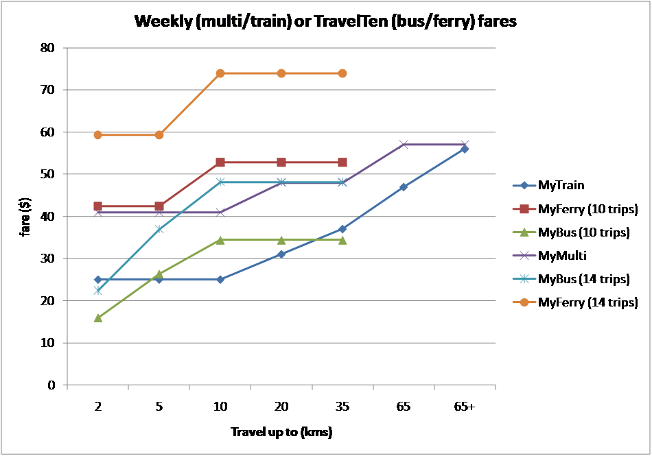
Unfortunately MyTrain and MyMulti have weeklies, while buses and ferries have TravelTens. The following chart shows buses and ferries with 10 and 14 trips, compared to MyTrain and MyMulti weeklies.

If you use buses 14 trips a week, then a MyMulti is better value, but only if you are travelling between 5 and 35kms. If you use buses 12 trips a week, then a MyMulti might be good value, but only if you travel 5-10km trips. And if you don’t know whether you will be making 10, 12 or 14 trips, then you have to make a guess and you might rip yourself off, or you might not.

And don’t even think about MyFerry TravelTens if you are using ferries at least 5 days in a row.

What about quarterly?

Trains are now cheaper than buses for everything over 2kms.

So now if you use buses 14 trips a week, a MyMulti is worthwhile if you travel more than 2 kms. But if you travel 12 trips a week, then MyMulti is worthwhile between 5 and 10kms, but probably much the same as a MyMulti between 10 and 35kms.

But if you travel more than 10kms and only use trains in MyMulti Zone 1, then MyMulti is better, even if you make 10 bus trips a week.

Are you following?

Finally, yearly:

It looks like the MyTrain yearly for over 65kms is actually a product no one should buy – you are better off with a MyMulti 3 yearly!

If you can avoid buses, you’ll save money with a MyTrain ticket on most travel distances.

But on the buses, the MyMulti is better value when travelling 11-14 trips per week for more than 2kms. For 5-10kms get yourself a MyMulti if you are travelling 10 times a week. But if you are going to average 11 trips a week, then a MyMulti yearly is borderline with MyBus for 10-35 kms.

But they were all simple comparisons with fixed distances to and from the inner city. While MyMulti and MyFerry tickets are based on distance from the city, MyTrain and MyBus tickets are on distance between stations and stop.

In fact a MyMulti 1 might be worthwhile if you frequently travel in the outer suburbs on buses, even if it is not valid for the trains in those outer suburbs.

And there is plenty more complexity.

What’s the best fare product for you if:

  • you make 10 x 20km trips per week and 4 x 5km trips per week?
  • you occasionally also take the train? in one direction only? for return trips? in the peak? in the off-peak?
  • you use multiple modes but don’t travel into inner Sydney?
  • you usually use the train but sometimes use the bus?
  • only travel occasionally but like to make stopovers on the way?
  • have a choice of two journey paths, one faster involving a transfer, and one slower but without a transfer?

And is there one website where can you find out where sections points are on any bus route in Sydney?

I trust it is not just my head that is spinning trying to think through this.

So unfortunately it is still extremely difficult to work out what is likely to be best value for your travel in Sydney, because different modes have inconsistent fares, inconsistent fare bands, and inconsistent ticket products. And there are sometimes even unintended fare incentives to avoid certain modes or transfers even they mean a faster trip.

The alternative?

I am a fan of consistent multi-modal fares because they avoid most of the complexity found in Sydney. See another post for what might be the best attributes of a fare system.

In any other city in Australia, each of the above charts will have only one line that applies for all modes (and usually regardless of transfers). The only choice you might have to make is whether to go for periodicals (passes) or multi-trip tickets/a stored value smartcard. That choice depends on how many times you travel per week.

In Melbourne, Brisbane and Canberra you need to compare the weekly cost of using multi-trip tickets at the frequency you travel to the cost of a weekly, and work out which is cheaper. Then if they are close, you might want to compare them with monthlies. And it essentially doesn’t matter what mode you use, or how many times you transfer to get from A to B.

In fact here are the comparisons:

  • In Melbourne 10 trips on a 10×2 hour ticket is the same as a weekly, and 37 trips is the same as a monthly (about 8.5 trips per week).
  • In Brisbane 12 trips on a go card is about the same as a weekly, and 47 go card trips cost about the same as a monthly (about 11 per week).
  • In Canberra a weekly is the same as 11 trips using Faresaver 10  tickets, and a monthly is 36 trips (about 8 per week).

In Adelaide a multi-trip ticket is a no-brainer (there is no weekly or monthly).

In Perth and Hobart you are always better off with a smartcard.

But for Sydney you almost need to get a spreadsheet going to suss out the best fare product(s) for a particular trip from A to B.

Or just go with something that works knowing you are probably paying too much.

Or just drive a car.

Other commentary on the new Sydney fares:

Action for Public Transport (NSW)

Western Sydney Public Transport Users

Melbourne on Transit

Daniel Bowen

Life Hacker


Car ownership and public transport

Sun 17 January, 2010


Is there a link between good quality public transport and car ownership rates? Will high density urban develop around good quality public transport lead to significant increases in car ownership?

Obviously not a new topic, but in this post I hope to at least illuminate the state of play in Melbourne (as per the 2006 census).

The Australian Census provides very detailed data on car ownership to a high resolution. The data includes the number of 0, 1, 2, 3 and 4 or more car households in each Census Collection District (which average around 225 dwellings). Most spatial representations of car ownership show the number of households with 0,1,2,3, or 4 or more cars. This is fine, except it ignores household size. Single occupant households are unlikely to have 3 cars, while large family households with grown up children are more likely to have 4 cars.

So I have looked at the data differently in two ways:

  • Rather than cars per household, I’ve used cars per 100 adults for an area (I define “adults” below). This removes household size from the equation. Essentially what I did was add up the number of reported cars in each CCD, which for 0,1,2 and 3 car households is straight forward. 5.1% of households in Victoria reported “4 or more” motor vehicles and a further 3.7% did not specify the number of motor vehicles. In the absence of more detailed information, I have assumed an average of 4.2 motor vehicles for households reporting “4 or more” and zero motor vehicles present where households did not respond. While this means there is a small level of uncertainty as to the actual total number of motor vehicles in each census collection district, these represent small percentages of the total, and it is still possible to compare relative levels of car ownership between areas. Hence I refer to the car ownership rates as estimate.
  • I divide the number of cars by the number of “adults” – ie people who are generally of driving age. As the census reports age in 5 year blocks, I’ve used 20-74 as the age range where most people would be eligible and confident to obtain a drivers license. This is fairly arbitrary I agree. People under 20 can drive and own cars, as can those over 74, but they are perhaps less likely to do so.

So the calculations are not an exact science, but give a pretty good idea of the car ownership rates for different areas. It also allows me to show car ownership rates on a single map, rather than the need for multiple maps. In the maps below I have only shown urban areas that come within a minimum urban residential density, so the boundaries between urban and regional areas are clearer.

Superimposed on the map are high quality public transport routes that existed in Melbourne in 2006. I’ve used all train lines (stations are marked), all tram routes, and selected bus routes with “high” service levels – reasonable frequency and long span (at most a 16 minute headway on weekdays inter-peak). It’s hard to define a perfect threshold for bus routes as some have good frequency but poor span of hours in 2006. Again not a perfect science.

Here are the maps for greater Melbourne and inner Melbourne (click on them for higher resolution – you may need to click again to zoom in).


Observations and Analysis

Pockets of low car ownership rates are generally found:

  • In lower socio-economic areas (eg around Broadmeadows, St Albans, Dandenong)
  • Near large activity centres with public transport hubs (eg Ringwood, Box Hill, Dandenong, Frankston)
  • Where there is a dense grid of high quality public transport – ie you can catch public transport in multiple directions relatively easily to get to a range of destinations. This includes areas where the high frequency transport is provided by buses and not trams (eg the Footscray to Sunshine Corridor).
  • Residential colleges near universities (eg Clayton, Caulfield, Bundoora, Maribyrnong)
  • Army bases (eg near Watsonia)
  • Prisons (you can see a couple in the west)
  • Areas of higher income generally have higher car ownership. Higher than local trend car ownership can be seen in areas like (west) Kew, Toorak, Brighton and Greenvale.

Note that this exercise does not aim to fully explain the reason for rates of car ownership in Melbourne. There is extensive literature available about this subject. We have primarily set out to highlight car ownership rates in Melbourne to inform debate.

Conclusions and Commentary

  • The maps show low levels of car ownership in many places where there is a dense network of high quality public transport. That suggest that high frequency public transport routes operating from early to late in multiple directions is an enabler for people to choose not to own a car.
  • Increasing population in areas with dense networks of high quality public transport is therefore less likely to result in high levels of car ownership and use.
  • The tram network provides the radial links in most cases, while bus routes are needed to provide links across the tram routes. By upgrading a few more inner city bus routes, a larger area could support higher populations with low car ownership rates and high liveability.
  • Even those people who do bring cars with them will probably leave them parked most of the time as walking, cycling or public transport will be an easier option for most trips. High rates of car ownership do not necessarily translate into high rates of car use.

This analysis was the subject a media story in The Age, in November 2009.


Spatial analysis of Melbourne household travel data

Sun 17 January, 2010

Thanks to the Department of Transport providing public access to VISTA (Victorian Integrated Survey of Travel and Activity) 2007-2008 travel data, it is fairly easy to plot some results geographically for Melbourne (I’m planning to plot some other patterns, but this is a first installment with some general patterns).

The gallery below contains maps showing mode shares and trip distances for each LGA (Local Government Area) in Melbourne.

If you don’t know Melbourne’s LGAs by name, a reference map is included above (also showing train lines).

Notes:

  • All data is by LGA of residence, which is different to LGA of trip origin.
  • Total weekday travel distance sums the kms of all trips (as opposed to median trip length)
  • Mode shares are for all trips, not just motorised trips.
  • The colour scale for each map is different. I have a 14 colour scale (using “equal count” ranges) and I have deliberately not included a legend. So refer to the numbers for each LGA for relative values. Note the colour band jumps are not always ideal, do refer to the numbers as well as colours when comparing.

Observations:

  • Average trip distances don’t actually vary a huge deal if you look at the numbers (except the inner city, Brimbank and the outer north-east) – probably because most trips are local trips. Longer median trip distances in the outer north-east might be due to a larger rural population (smaller urban areas in these LGAs).
  • Trips per capita seem to be lowest in the growth interface councils. This might be related to more babies being present in these areas(?).
  • Total weekday travel distance seems to be highest in the outer west and east (less so the outer north)
  • Walking and cycling rapidly declines with distance from the CBD, with Greater Dandenong something of an outlier.
  • Private transport mode share tends to increase with distance from CBD, with Dandenong again something of an outlier (probably due to low socio-economic status).
  • Public transport mode share is higher in the inner city and inner northern areas. Lowest in the outer south east and south west (Dandenong again perhaps a bit of a local outlier – even though many parts have relatively poor bus service levels).

Of course there are lots of factors at play in all this (income, household types, demographics, PT supply, employment distribution, etc) and I’ve mostly speculated on some potential causes – certainly not attempted to explain all the causes in this post!

How reliable is this data?

VISTA is a very comprehensive household travel survey, and it includes over 17,000 households, almost 44,000 people who made over 145,000 trips – all in 12 months. The median trips per LGA is around 3500 – by around 1000 people (although some more than others – the smallest is Cardinia with 578 trips measured).

So in most cases the sample sizes are very large, giving a small margin of error. The data has been weighted to match the demographics of Melbourne in the 2006 census, which will control against under or over sampling of particular demographic groups.

Travel distances aren’t perfect – straight line distances between points are scaled up to take account of indirect routes being used for all modes (except trains where exact distances are known).

Household travel surveys are never perfect, but I think VISTA is a well developed and comprehensive survey and the outputs will be quite reliable as long as you are not disaggregating data into small segments. The weekend data in the maps above has the smallest sample sizes the (median sample of trips for the weekend is around 700 per LGA).


Urban density and public transport mode share

Sat 16 January, 2010

Are all the statistics we see about urban density and transport reliable?

In his most recent book Transport for Suburbia (and his paper to ATRF 2009), Paul Mees highlights mis-use of urban densities figures by some researchers – the trouble being inconsistent determination of what exactly is the urban area of a city when you calculate density (= population/area).

To redress the issue of data quality, Paul has used calculations based on the actual urbanised area for Australia, US, Canadian and English cities (looking at entire greater metropolitan areas). He’s used figures based on urbanised areas as opposed to a statistical district, municipal council area, or other arbitrary administrative boundary which could contain large areas of non-urbanised land.

The calculations define urbanised areas using the following criteria:

  • US and Canadian cities: minimum 400 per square km,
  • Australian cities: minimum 200 per square km (meaning Australian cities might be slightly understated)
  • English cities: detailed mapping, likely to lead to slighty higher density figures.

So the calculations are not perfectly aligned, but they are more comparable than density calculations that use simple administrative boundaries. And they are also certainly consistent within each country.

He publishes tables of this data, talks about the relationships between them, but for some reason fails to plot the results on a chart. So I’ve decided to chart them (if you are after the data tables consult the ATRF paper above and/or the book).

The table of data is quite interesting in that it debunks some myths about the densities of various cities. Los Angeles is the highest density city in the entire table (the Freakonomics blog has a good series on Los Angeles Transportation: Facts and Fiction that is worth reading).

Firstly, car mode share in journey to work:

Is there a relationship between urban density and car mode share on journey to work? What do correlation coefficients say (closer to 1 and -1 means stronger) – something Mees didn’t calculate:

  • Australia: -0.74
  • Canada: -0.58
  • US: -0.46
  • England: -0.68

That suggests a relationship does exist, but it isn’t particularly strong. In reality, every city has unique characteristics and other attributes will explain the differences (the quality of services and infrastructure of alternative modes would certainly have a lot to do with it).

Looking at some outliers:

  • London has the highest density and lowest car mode share. It compares so favourably to all other English cities in car mode share, despite being only slightly more dense than Brighton/Worthing/Littlehampton (one combined urban area).
  • Canadian cities with the lowest car mode share are Toronto (highest density) and Victoria (second lowest density).

What about public transport mode share for journey to work?

This chart shows relationships stronger in some countries than others. Indeed the correlation coefficients are:

  • Australia: 0.79
  • Canada: 0.87
  • US: 0.42
  • England: 0.58

So much stronger relationships in Canada and Australia. Again there is a lot at work (particularly the quality and quantity of available public transport, which is one of Paul’s points).

In terms of outliers:

  • London is off the chart at 45.9% public transport.
  • Brisbane is perhaps an outlier for Australia – low density but pretty much the same rate of public transport use as Melbourne.
  • Los Angeles – which actually has the highest density of all the US cities but still relatively low public transport use.
  • The city with the highest PT mode share in the US is New York, even though it isn’t the most dense city in the US (there is lots of sprawl outside Manhattan).

The following walking chart might seem to suggest a strong relationship when you look at all cities, but remember that the density measurements aren’t quite the same, so it’s not fully conclusive. However, English cities still tend to have higher densities, particularly as many have green belts to prevent sprawl.

There is actually a negative correlation between density and walking (and cycling) for Australia and Canada. However I wouldn’t read too much into that as the sample size if small and there are lots of unique factors affecting each city.

But if you reckon there should be a positive correlation between walking and density, the outliers are:

  • Victoria (Canada) – low density but high walking mode share.
  • San Francisco and Los Angeles have low walking share.
  • Hobart – highest walking share in Australia, despite low density (and a big river dividing it in two).
  • Toronto – Canada’s most dense walking city, but least walking mode share
  • London – highest density but lowest walking share (9.2%)

Same again for cycling:

It looks like almost no one cycles in the US, despite having more favourable climate than Canada. Again higher cycling rates in the UK.

Cycling outliers:

  • Victoria (Canada) – high walking and cycling mode share
  • Kingston upon Hull (UK) 11% – off the chart’s scale (Mees suggests a large university may be the cause)
  • Canberra – which has a good network of bike paths (but still only 2.5% cycling mode share)
  • Sydney – with just 0.7% cycling – hilly terrain not helping.

What if you add up all the sustainable transport modes (PT, walking and cycling)? In theory, density should help all sustainable transport modes.

The correlations are:

  • Australia: 0.77
  • Canada: 0.62
  • US: 0.44
  • England: 0.70

The English result is actually stronger than PT (0.58), walking (0.32) and cycling (0.02). Do people respond to density using different, but sustainable modes?

Can public transport be effective in low density cities?

Paul’s main argument is that low transport density isn’t a barrier to successful public transport, and that it is easier to change public transport provision in a city, than it is to change urban densities (not that increasing urban densities isn’t a worthy goal).

Certainly urban density makes it easier to make public transport successful, but I’d agree that it is possible to make public transport work a lot better in low density environments.

Indeed, in Melbourne, relatively high quality SmartBus routes (that run every 15 minutes for most of the day on weekdays, very good by suburban Melbourne standards!) have been trialled in the outer suburbs, and the patronage response has been much stronger than typical elasticities (the subject of another post).

More generally, in Melbourne over the last three years we’ve seen a very strong correlation between growth in service provision (26% more kms) and growth in patronage (29%) – more than any other potential driver of patronage (again, topic for another post).

Comparable cities for population and density

Finally, by plotting population and density, you can see which cities are most similar – at least in these two respects (I’ve only looked at cities under 7 million and UK cities are off the density scale). I’ve labelled Australian cities and nearby equivalents. Note: the US and Canadian data is year 2000, while Australia is 2006.