How multi-modal are public transport journeys to work in Australian cities?

Mon 17 June, 2013

It seems public transport intermodal integration is a frequent topic of conversation in Australia’s larger cities. So how multi-modal is public transport travel in our cities?

In this post I’ll look at journeys to work from the 2011 census for the five larger Australian cities with multi-modal public transport networks. The results might not be quite what you expect.

Before looking at the data, I think it is important to think about the factors that might influence the degree of multi-modal public transport commuter trip-making, particularly with regard to radial trips towards city centres:

  • Commuters from the middle and outer suburbs are more likely to require a rapid transit component to their commute to ensure an attractive travel time.
    • Cities with CBD-orientated busways (primarily Brisbane, Adelaide and to a lesser extent Perth) are perhaps less likely to see multi-modal journeys as buses provide both the local pick up and the rapid transit component of the journey.
    • Cities with more extensive train networks are also perhaps less likely to see multi-modal journeys because a greater share of the population will be within walking distance of a train station and not require a feeder mode (eg bus).
  • In cities where transfers are a fundamental part of the network design, there might be higher transfer rates. For example, very few middle and outer suburban bus routes in the larger cities service the CBD, rather they run to train stations where passengers generally transfer to trains to access inner city areas. This is particularly the case in Melbourne and Perth.
  • The same issue applies for people arriving in city centres. For example, Sydney ferry commuters travelling to areas of the CBD not within easy walking distance of a ferry terminal would need to transfers to buses or trains. Adelaide only has one train station which is on the edge of the CBD, effectively forcing transfers onto buses or the tram for most CBD destinations. Perth has two main CBD train stations, although the core employment areas are within reasonable walking distance of these stations. That said, one might argue that an ideal integrated public transport network would encourage people to use local modes (bus or tram) to travel between destinations and major transport nodes within city centres (in all cities except Sydney, such transfers are almost always free). All cities do offer street-based public transport to help circulate commuters within city centres. I also wonder whether these short trips within city centres might be under-reported in census data (perhaps something to explore another time).

Journeys to work in city centres

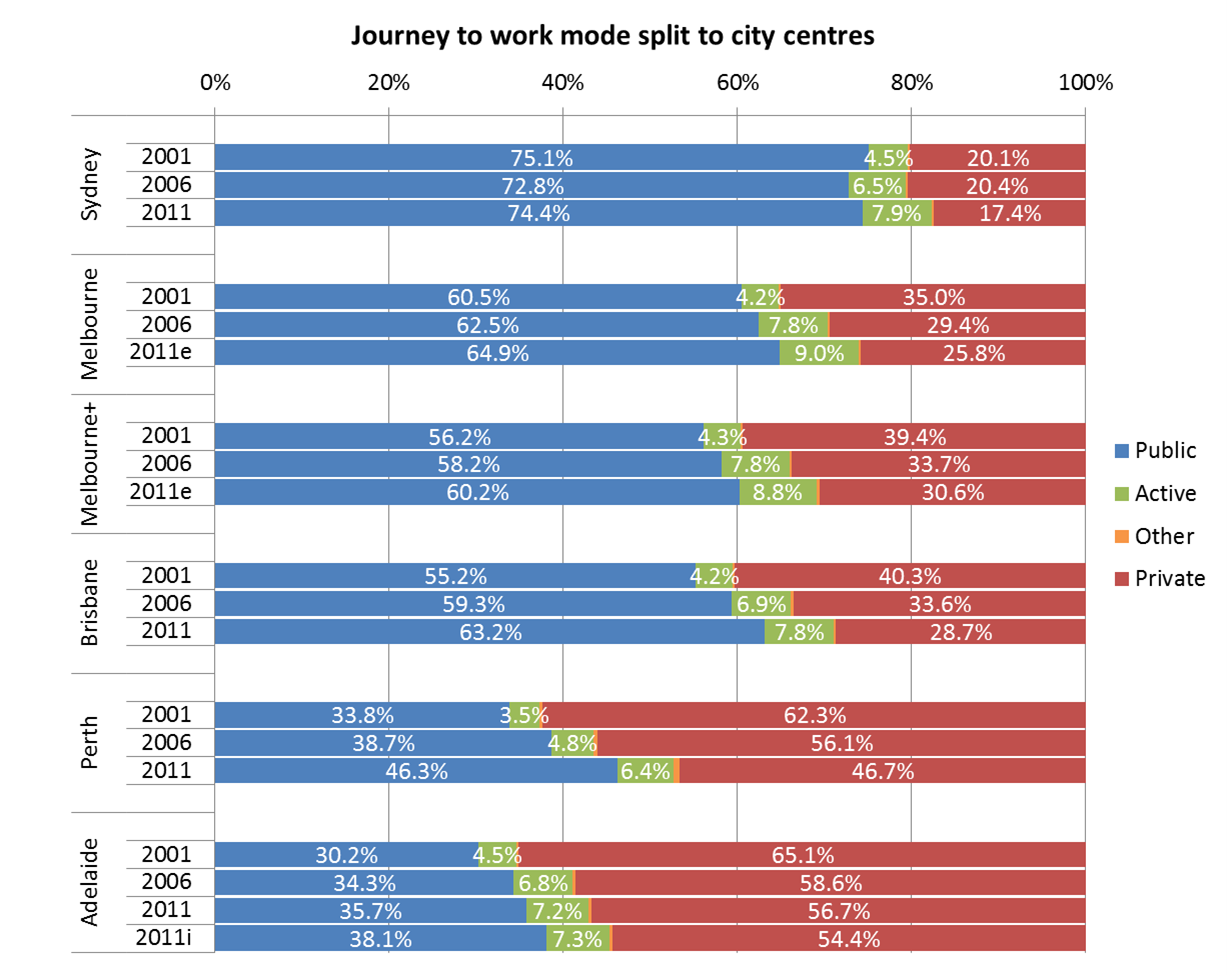
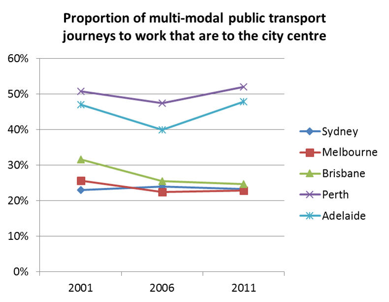
So, what percentage of all journeys to work in city centres involve multiple public transport modes? (see note at the end of this post about estimation for 2001 figures)

multimodal PT share to city centres

Note the definitions of city centres aren’t perfectly comparable (see earlier post for maps):

  • Melbourne is primarily the CBD (excluding Southbank and Docklands)
  • Perth includes all of the City of Perth
  • Adelaide includes North Adelaide (entire of City of Adelaide)
  • Brisbane is the “Brisbane City” SA2

The first thing to note is that the share of commuters who use multiple public transport modes is very low (considering public transport mode share to city centres is generally very high).

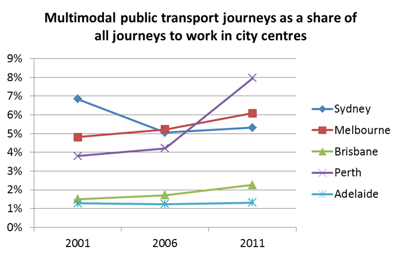
The following chart shows the proportion of public transport journeys to work in city centres that involved multiple modes of public transport:

proportion of PT trips multimodal to city centres

The vast majority of people who use public transport to access jobs in city centres only use one mode. Given that most city centre workers don’t actually live all that far from the CBD, it’s not too surprising as an overall pattern.

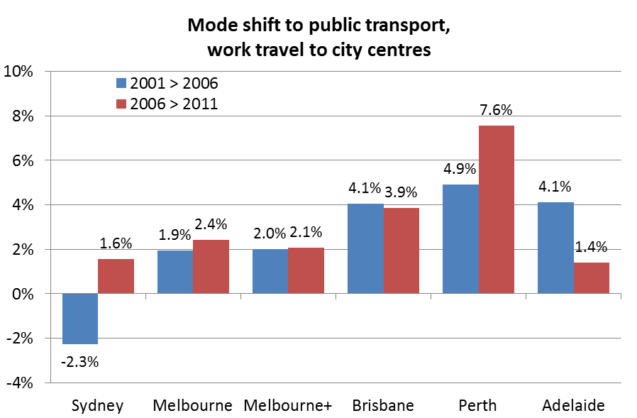
Perth is the stand-out for highest multi-modal public transport travel, and largest increase in this type of journey between 2006 and 2011. A few things might explain this:

  • Perth’s rapid transit network is relatively sparse (five train lines and one busway), meaning fewer people can walk to a rapid transit station.
  • Indeed, most train stations on the northern and southern lines have very limited walking catchments, but relatively strong bus feeder services and excellent interchange layouts that make transferring easy.
  • The increase between 2006 and 2011 is no doubt related to the Mandurah line where many previously bus-only journeys have been replaced by bus-train journeys, but it might also relate to improved feeder bus services on other lines.
  • Perth’s high multi-modal share may also reflect a strong focus on timetable coordination. My understanding is that Transperth don’t try to “optimise” train-bus connection times, they force bus timetables to have ideal bus-train connection times, with high vehicle utilisation a secondary priority.

Melbourne comes in second (if Southbank and Docklands were included, the 2011 figure would be 10.3%). Interestingly, there were more train+bus journeys to the city centre, than train+tram journeys.

Sydney is third, despite having four modes of public transport. This perhaps reflects the lack of a fully integrated fare system (ie multi-modal tickets are usually more expensive that single-mode tickets) and the fact many bus routes run parallel to train lines (and it is usually cheaper to stay on the bus rather than transfer onto the train). It’s not clear to me why Sydney would have had a reduction in multi-modality between 2001 and 2006.

Brisbane had a much lower multi-modal share, probably related to a high bus mode share, the presence of busways providing efficient single-mode (often single-seat) travel for a large number of commuters to the central city, many bus routes running parallel to train lines, and the only relatively recent introduction of full multi-modal fare integration in 2004-05.

Adelaide also rates lowly and has been in decline, perhaps relating to the low-frequency train system (that is now receiving an upgrade including electrification). The extension of the Adelaide tram route from Victoria Square to the Entertainment Centre may have reduced the need for existing tram passengers to transfer, but on the other hand may be helping to circulate people arriving in the city on buses and trains.

Outside city centres

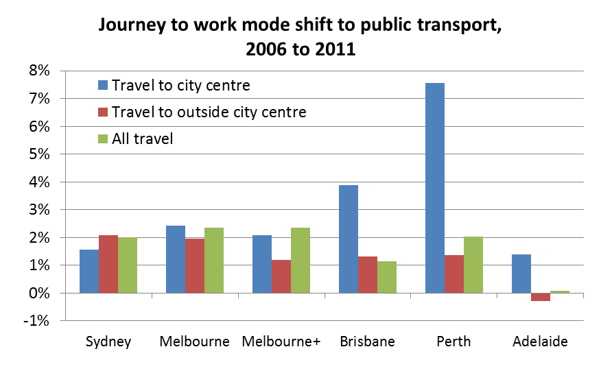
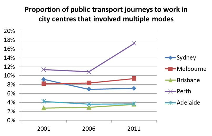
The following chart shows how multi-modality compares for public transport journeys to work in city centres and elsewhere: proportion of PT trips multimodal by work loc

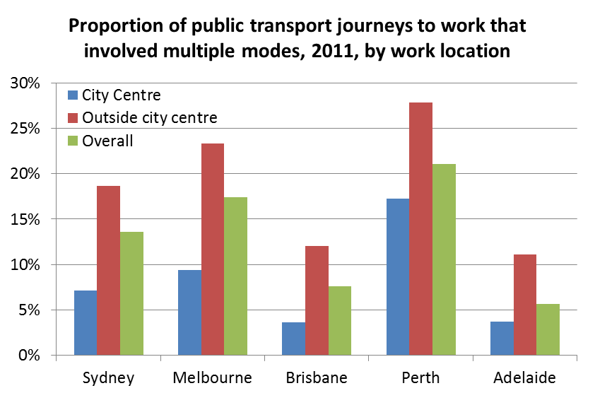
Public transport journeys to work in locations outside city centres were much more likely to involve multiple modes, which makes sense as direct rapid services are probably less likely to be available to reach such workplaces. Keep in mind also that public transport mode share of journeys to workplaces outside the city centre are much lower.

Here are the trends over time for multi-modality of public transport journeys to workplaces outside city centres. It shows increases in Perth and Brisbane, declines in Adelaide and Sydney, and little recent change in Melbourne: proportion of PT trips multimodal outside city centres

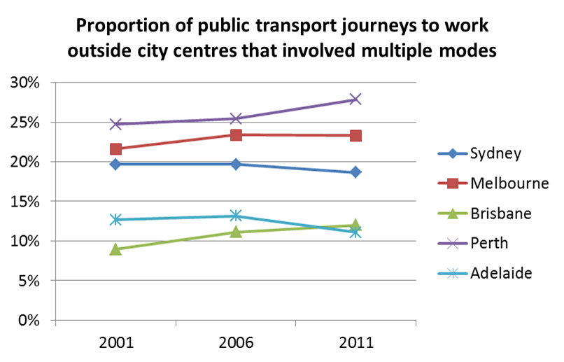
Perhaps the increase in Brisbane might be attributed to full multi-modal fare integration introduced in 2004/05, providing free transfers between modes. The increase in Perth is no doubt related to the Mandurah rail line opening.

So is the city centre the main destination for multi-modal public transport journeys to work?

CBD share of multimodal PT JTW

In the larger cities the answer is no. In Adelaide and Perth – where over 60% of PT journeys to work are to the CBD – only around half of the multi-modal PT trips are to the city centre.

While a large proportion of multi-modal public transport journeys to work are not to the city centre, I would expect most would still be radial in nature (as jobs are on average closer to the city centre than homes). This is perhaps something to explore in a future post (my guess would be concentrations of multi-modal public transport travel to workplaces surrounding the city centre).

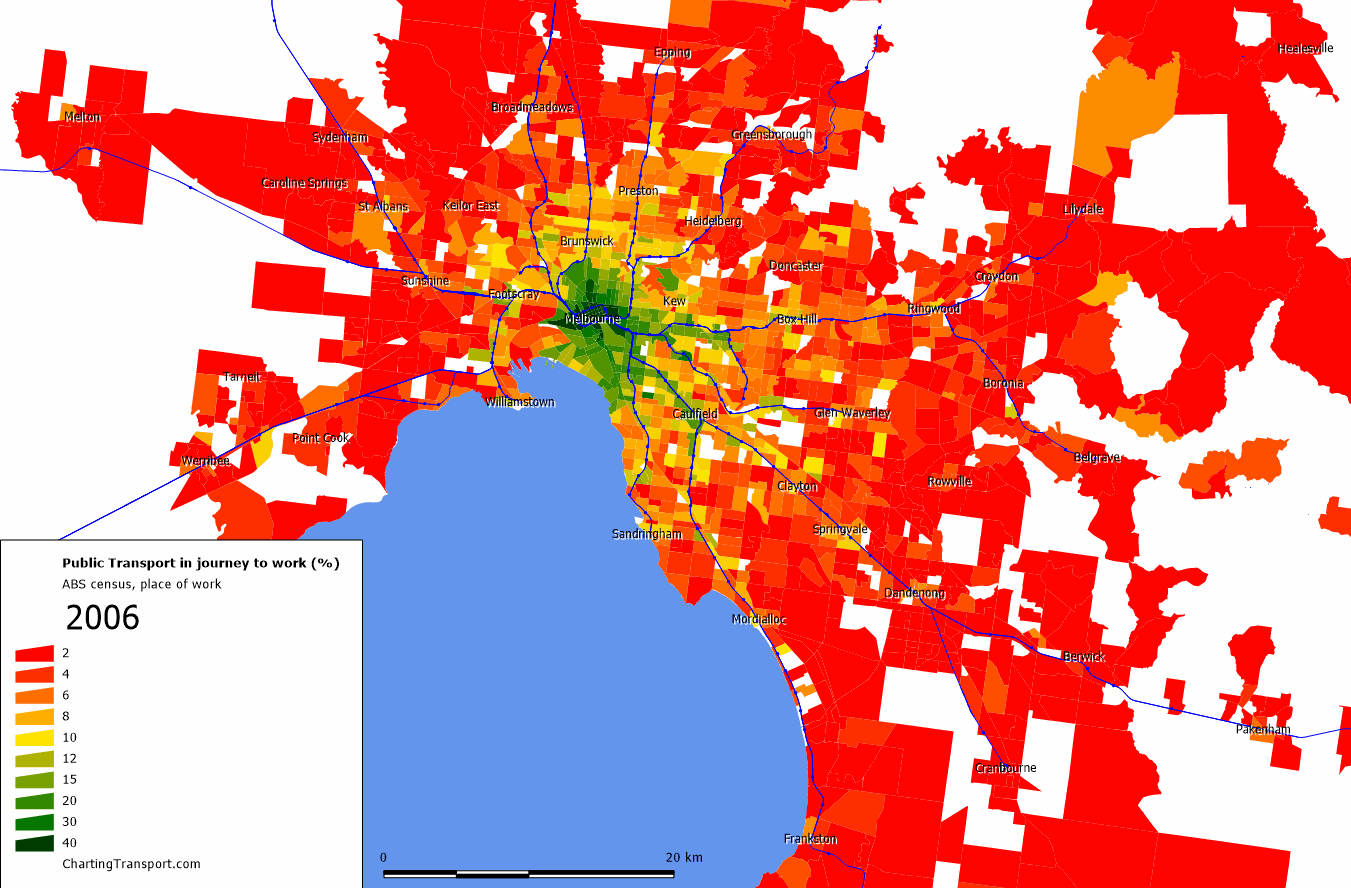
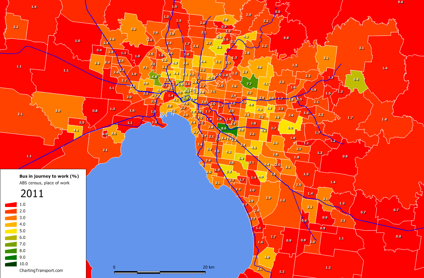
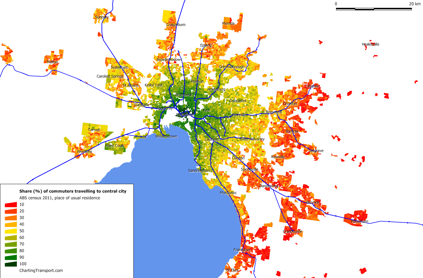
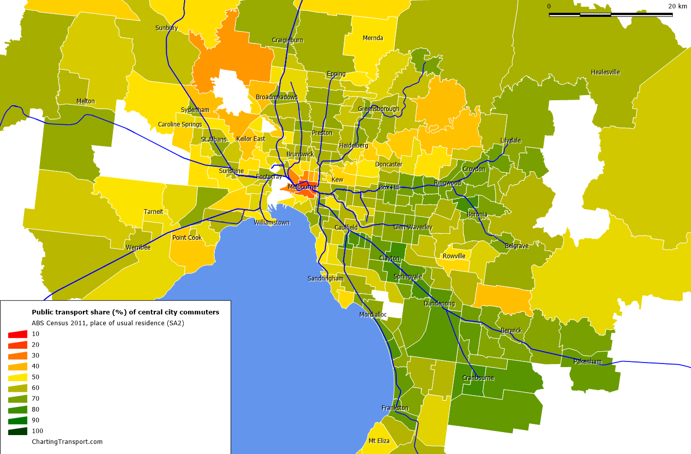
Finally, I’ve had a look at the home origins for multi-modal public transport journeys to work for Melbourne and Perth in 2011. Click to enlarge maps, and note the colour scale is for mode shares 1 to 10%.

Melb 2011 multi PT

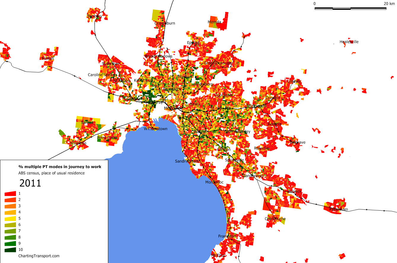
In Melbourne the highest concentrations are north of Footscray, where several frequent tram and bus routes feed Footscray station. There are also concentrations in the middle-eastern and middle-northern suburbs, particularly around SmartBus routes.

Perth 2011 multi

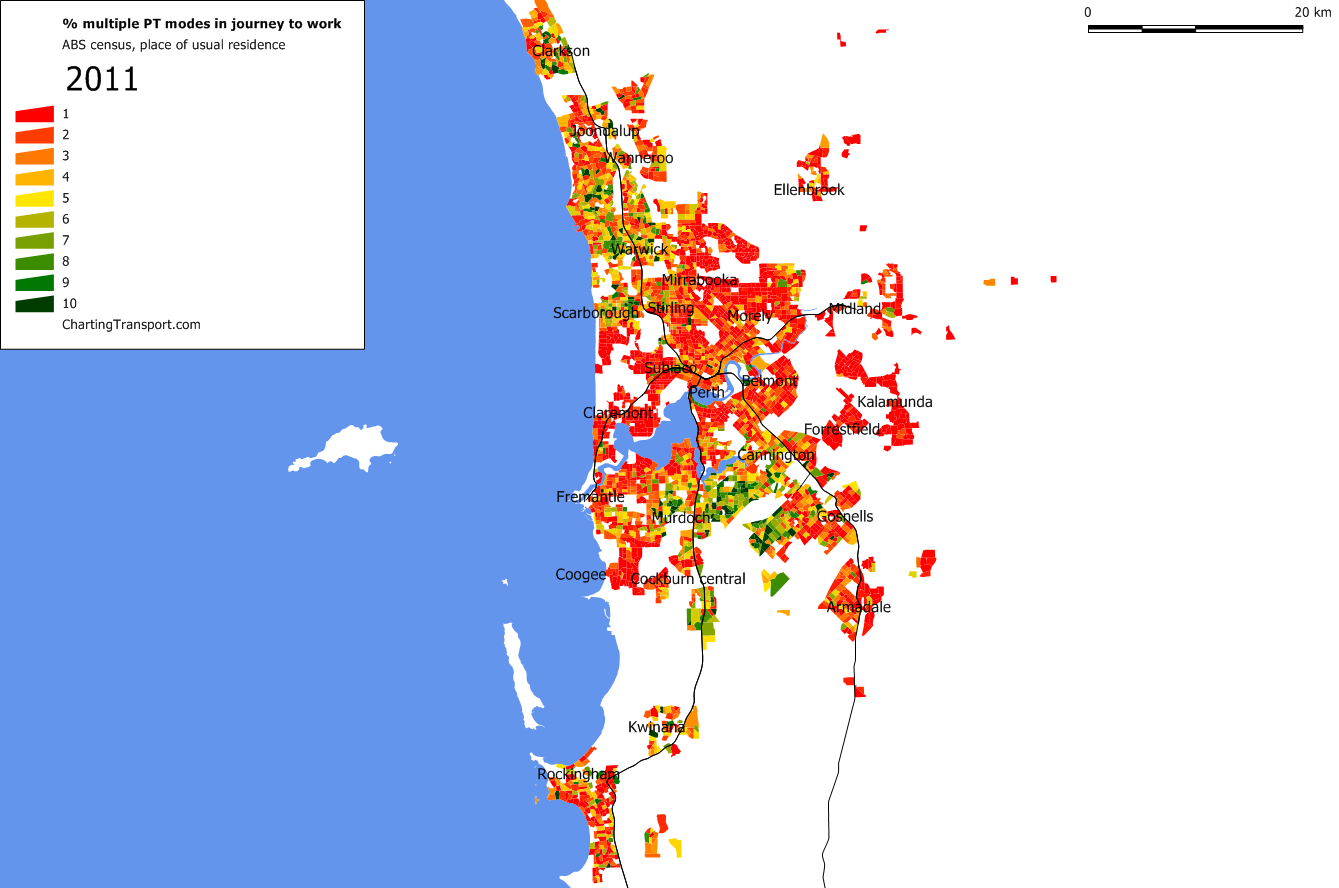
In Perth the highest concentrations are in the northern and southern suburbs, where frequent bus routes connect people’s homes to high-speed train services in peak periods.

My next post will continue the multi-modal theme and look at what modes were used in conjunction with trains in the journey to work.

Footnote regarding 2001 estimates

Available data for 2001 only shows mode share in an aggregated summary, including figures for “train and two other modes” and “bus and two other modes”. Not all of these journeys involved multiple public transport modes, and I don’t know exactly how many did.

To estimate 2001 figures of total multi-modal PT journeys, for each city I have calculated the proportion of 2006 journeys that would come under these headings that actually involved multiple PT modes (as detailed data is available for 2006), and then applied these percentages to the 2001 figures for “train and two other modes” and “bus and two other modes” figures.

The result is that around 20% of the total 2001 multi-modal PT journeys are estimated.

I also checked these percentages in the 2011 data, and they were very similar to 2006. For example, 89% of journeys that could be described as “train and two other modes” in 2006 for Melbourne involved multiple PT modes, and in 2011 that figure was 88%. The similarities were weaker for “bus and two other modes”, but the numbers for this category were very small (less than 65 journeys in all cities except Sydney at 145).


How commuters got to workplaces in Melbourne, 2006 and 2011

Sun 3 March, 2013

[Updated in July 2013 with higher resolution maps using Destination Zone data]

My earlier post about Melbourne journey to work 2011 focussed on where people live. This post focuses on where people work and what modes of transport they used to get there in 2006 and 2011. It also covers employment density and the home locations and associated mode shares for people travelling to the central city.

As per other posts, you will need to click on maps to see the detail/animation.

In this post you will see some maps at the SA2 level (approximately suburb size) and some at the destination zone level (the smallest resolution available):

  • For SA2 maps, I have mapped 2006 destination zones to (2011) SA2 areas based on the centroid of each 2006 destination zone (so not a perfect mapping – see here for a comparison map).
  • For destination zone maps, the boundaries of destination zones changed between 2006 and 2011, most commonly involving smaller destination zones in 2011, although the boundaries don’t always align. For both 2006 and 2011, I have only shown mode shares for destination zones where more than 100 people travelled with known mode(s) of transport. I don’t have destination zone level data for individual public transport (PT) modes for 2011.

See also an earliersimilar postcovering 2006 journey to work data for Melbourne, and a similar post covering journeys to workplaces in Brisbane.

Employment density

Firstly, what does the employment density of Melbourne look like?

Click on the following map to see an animation flipping between 2006 and 2011:

DZ employment density

While it looks like a lot of jobs have disappeared from Melbourne between 2006 and 2011, the difference in amount of shaded area is because 2011 has smaller destination zones than 2006. The destination zones from 2006 have been split into smaller zones, and often only one of those zones has significant employment.

You can see Melbourne’s second biggest jobs cluster – the Monash precinct – in the south-eastern suburbs near Clayton.

Here’s another look at the employment distribution (for people with a known travel destination) as well as people in the labour force:

jobs and labour force by distance from GPO

Note that this is a measure of employment in rings around Melbourne, and the outer rings have significantly more land area than the inner rings.

Between 2006 and 2011, significant employment growth occurred in the inner city, and at around 18 km from the CBD. That 18 km ring happens to include the significant employment precincts at Southland/Cheltenham, Monash, Nunawading, Burwood East, Greensborough, and Campbellfield.

While around 30% of the labour force did not travel to a known work location on census day, there’s still an imbalance between jobs and workers by distance from the city (many distance rings have twice as many people in the labour force and jobs), which of course leads to a lot of generally radial commuter travel.

Mode share by workplace location

So what are mode share like for different places of employment across Melbourne?

Public transport

Firstly a map showing mode share for destination zones (click to zoom in and animate):

PT mode share Melbourne

Please try not to be too distracted by the changing red and white areas on the fringe of Melbourne. The white areas are destination zones with less than 100 employees who travelled on census day. Because the destination zones were re-cut between 2006 and 2011, the location of zones with less than 100 employees changed significantly.

The inner city area shows a lot of change, so here is a zoomed-in animated map at destination zone level, with public transport mode share numbers overlaid (sorry the CBD is a bit hard to read as the destination zones were almost all halved in size in 2011).

PT mode share Melbourne inner

To perhaps enable a fairer comparison, the following animated map shows public transport mode share at SA2 level (2006 being a mapping of destination zones to SA2s):

Melb dest public

Public transport mode share was highest in the CBD, then for areas around the CBD and stretching a little more to the inner east. Box Hill stands out as a suburban location with a relatively high mode share (13% in 2011).

Here is a map that shows the mode shift to public transport for each SA2 (bearing in mind that there isn’t a perfect mapping from 2006 destination zones to 2011 SA2s):

Melb dest PT mode shift 06 to 11

The biggest mode shifts towards public transport were:

Docklands 10.5%
South Yarra – East 6.5%
South Yarra – West 6.0%
Fitzroy 5.8%
Richmond 4.8%
Collingwood 4.7%
Albert Park 4.4%
Watsonia 4.4%
North Melbourne 4.3%
Caulfield – North 4.3%
Mount Evelyn 4.1%
Springvale South 4.1%
Parkville 3.8%
Camberwell 3.8%
Prahran – Windsor 3.8%
Hawthorn 3.6%
Kensington 3.6%
Abbotsford 3.6%
Carnegie 3.6%
South Melbourne 3.3%

Most of the above are in the inner city, but there are exceptions of Watsonia, Mount Evelyn and Springvale South (all off a very small base in 2006).

Some interesting rises in the suburbs include:

  • Doncaster 5.5% to 8.3%, probably related to the introduction of several SmartBus services
  • Frankston North 2.6% to 5.0%, again probably influenced by the introduction of SmartBus services
  • Forest Hill 5.2% to 7.8% (not sure why)
  • Mill Park North 1.7% to 4.2% (note the South Morang rail extension was not open in 2011, but SmartBus services had been introduced by the 2011 census)
  • Box Hill 10.2% to 12.7%, possibly related to upgraded SmartBus services
  • Noble Park 3.0% to 5.4% (not sure why)

Some interesting declines include:

  • Montrose – there are boundary differences between 2006 and 2011 with many more jobs counted in 2011. It would appear there might be an employer around the western end of York Road with higher PT mode share.
  • Cairnlea 6.6% to 2.4% (almost certainly because Victoria University St Albans Campus is mapped to this SA2 in 2006 but not in 2011)
  • Carlton North – Princes Hill 13.1% to 10.4% (which also had an increase in walking and cycling)
  • Port Melbourne 14.7% to 12.6% (not sure why, perhaps more people walked to work from the increasingly dense local residential area)

As an aside, here are 2011 public transport mode shares for journeys to work at major Australian airports (where there is an “Airport” named SA2):

  • Sydney 13.9%
  • Melbourne 3.8% (up from 2.5% in 2006)
  • Brisbane 3.1%
  • Adelaide 2.6%
  • Perth 1.7%
  • Darwin 1.7%

Train

Melb dest train

Train mode share was highest in the CBD and surrounding inner city areas. Notably, mode shares were relatively higher in the inner east and south-east (particularly Caulfield, Camberwell and Hawthorn) compared to other inner areas.

Here is the mode shift to trains between 2006 and 2011:

Melb dest train shift

The biggest rises were in Docklands (up 9.2%), South Yarra (up 5.6%) and then a few other inner suburban destinations.

In 2011, 47% of journeys to work in Greater Melbourne involving train were to the Melbourne CBD. This rises to 59% when adding Southbank and Docklands.

Tram

Unfortunately I do not have 2006 data for “any journey involving tram” below the SLA level, so here is the 2011 picture at SA2 level, with the tram network shown as green lines:

Melb dest tram 2011

I must say I was surprised by the CBD figure of only 14.9% (and I did double-check the data).

Tram mode share was highest in the SA2s of Albert Park and South Yarra West (which straddle the St Kilda Road office precinct which has very high tram frequencies). Other work destinations with higher tram mode shares included Parkville, Carlton, Fitzroy and South Melbourne.

Perhaps there was some under-reporting of tram journeys as a “secondary” mode in people’s journey to work? In Parkville (which includes the main University of Melbourne campus, the hospitals precinct and Royal Park), there were more people reporting only train (934) than train+tram (772) and train+bus (275). I would expect most of those jobs to be remote from Royal Park station, and the southern section of the SA2 is at least a 1 km walk from Melbourne Central train station. Another example is South Melbourne – all of which is more than 1.2 km from a train station, yet 1240 people reported only train in their journey to work, while 894 reported train+tram. While of course some people will walk longer distances from train stations to work, the numbers seem a little high to me.

37% of journeys to work in Greater Melbourne involving tram were to a destination in the Melbourne CBD. If you add in Southbank, Docklands, Parkville and South Melbourne the share goes to 56%.

Bus

Again, I do not have comparable data for 2006, so here is a 2011 map:

Melb dest bus 2011

Bus mode share was highest in Malvern East (which includes Chadstone Shopping Centre), followed by Doncaster, Maribyrnong (which includes Highpoint Shopping Centre), Carlton and the Melbourne CBD. Mount Evelyn is curiously high at 5.8%, with 45 people travelling by bus to workplaces there.

Only 21% (9905) of journeys to Greater Melbourne workplaces involving bus were to the CBD, with the next highest SA2 counts in Docklands (1175), Clayton (1160), Dandenong (1157), Southbank (1071) and Parkville (1046). This would suggest that growth in CBD employment is unlikely to be one of the major factors in bus patronage growth in Melbourne (unlike train and tram).

Cycling

Due to the nature of the data I have for 2006, this analysis excludes journeys also involving public transport or trucks (yes, there were 39 people who said they travelled to work by truck and bicycle in Australia in 2011!). This is another animated map, so click to enlarge and see the changes.

Melb dest bicycle

Here’s an animated close up of the inner city area for destination zones (with a different scale):

bicycle mode share DZ Melbourne inner

Cycling to work boomed in inner Melbourne between 2006 and 2011, particularly to workplaces in the inner north. Princess Hill had the highest bike share of 14% in 2011 (possibly dominated by Princess Hill Secondary College employees), followed by a pocket of south-west Carlton that jumped from around 5% to 13%. Apart from the inner north, there were notable increases in Richmond, Balaclava, Yarraville and Southbank

Here’s a view of the mode shift to bicycle at SA2 level:

Melb dest bicycle shift

Relatively small mode shifts away from bicycle were observed in the outer eastern suburbs and around Aspendale to Carrum.

I should point out that the census is conducted in winter (August), and warmer weather bicycle mode shares of journeys to work are likely to be higher.

Variations in daily weather can also cause differences in behaviour between censuses, that don’t actually reflect longer term trends. On census day in 2006, Melbourne had a temperature range of 5.3 – 17.9 degrees and no reported rain. On census day in 2011 the temperature ranged from 7 to 12.6, and there was 0.2mm of rain reported. So 2011 weather was perhaps a little less favourable for cycling (and walking). I’m not sure what time of day that rain fell in 2011.

Other time series data on cycling in Melbourne is published by VicRoads.

Walking (only)

Here’s a look walk-only mode shares by destination zones:

Walk only mode share Melbourne

Click to see the animation, and again, please try not to be distracted by the changes in white areas.

Here’s walking mode share by SA2 2006 v 2011 (but with a different colour scale):

Melb dest walk only

Walking mode share is a mixed bag across the city. High walking mode shares are evident in Parkville, Carlton North/Princes Hill, around St Kilda, the Simpson Army Barracks (in Yallambie), but also some rural areas. In the Koo Wee Rup SA2, 8.7% of employees walked to work, 41% of whom were in the “Agriculture, Forestry and Fishing” industry.

The lowest walking-only mode shares were at the airports (Melbourne, Essendon and Moorabbin), some industrial areas and generally in the outer suburbs of Melbourne.

Here is mode shift to walking:

Melb dest walk only shift

Mode shift to walking was more common in the northern suburbs and some outer eastern suburbs, but not so much in the inner city. Mode shift away from walking only to work was observed in many outer eastern and north-eastern suburbs. Again, daily weather variations might explain some of the changes that are not really trends.

Note: the neighbouring SA2s of Wheelers Hill and Glen Waverley East each showed mode shifts in opposite directions. This is almost certainly to do with the Police Academy being mapped into a different SA2 in 2006 due to the imperfect mapping between 2006 destination zones and 2011 SA2s.

Sustainable transport

I’ve defined sustainable transport here as any journey involving public transport, plus any journey that only involved walking and/or cycling.

Melb dest sustainable

Sustainable transport mode share was highest in the CBD and immediate surrounding areas. Sustainable transport was relatively higher for workplaces in the inner north, east and south-east compared to the inner west.

Melb dest sustainable shift

Mode shift to sustainable transport was most prevalent in the inner north and inner south.

Some interesting suburban mode shifts to sustainable transport include:

  • Upwey – Tecoma (mainly walking)
  • Dandenong North (mostly a mix of walking and public transport)
  • Gladstone Park – Westmeadows 3.1% (most of which was public transport mode shift, possibly relating to the introduction of SmartBus services),
  • Altona Meadows (mostly public transport, probably relating to the City West waste purification plant being mapped into this SA2 only in 2006)
  • Watsonia (possibly a result of destination zone to SA2 mapping issues)

Commuting to the central city, 2011

The central city is an important destination as it has the highest employment density and is where public transport is best-placed to compete against the car. For analysis in this section I am using the combination of the Melbourne CBD, Southbank, Docklands, Carlton, North Melbourne and East Melbourne SA2s as my definition of the “central city” (which is different to other posts on this blog – I am deliberately choosing a larger area to get a better sense of origins and mode shares).

Here’s a map showing the proportion (%) of commuters who had a destination of central Melbourne in 2011 (by place of usual residence at SA1 geography):

Melb 2011 share to central city v2

The prevalence of the CBD as a work destination is almost directly proportional to the distance people live from the CBD, although rates are relatively higher around train lines.

Notable outliers include:

  • Point Cook, Tarneit, Caroline Springs in the western suburbs with a higher central city share, possibly reflecting a workers-to-jobs imbalance in the outer western suburbs, particularly for white-collar workers (I might explore that more in a future post)
  • East Doncaster, which has a relatively high central city share, possibly as a result of frequent express bus services to the city
  • A pocket of St Kilda East and Caulfield North between the Sandringham and Caulfield rail lines that has a low share despite being relatively close to the city (not sure why that might be)

The next map shows the share of central city commuters who used public transport in their journey to work (by home location). I’ve only shaded SA1s with 20 or more central city commuters (which I admit is quite small for calculating mode shares).

Note: I have not filtered SA1s by density on the following maps (unlike others), so some low density SA1s are included.

Melb 2011 PT share to central city

Here’s a similar map showing mode shares at SA2 level (SA2s with less than 100 central city workers not shown), which overcomes the problem of low densities of central city workers in the outer suburbs:

Melb 2011 PT share to central SA2

Public transport mode share was particularly high for those in middle to outer suburbs around the rail lines, although less so along the Sandringham, Sydenham and Werribee lines.

It was lowest around:

  • the city centre itself (more on that in a moment)
  • Western Kew in the inner east (a relatively wealthy area)
  • Sanctuary Lakes in the south-western suburbs (largely remote from public transport in 2011)
  • Pockets of Caroline Springs
  • Areas of Templestowe, Donvale, Research and North Warrandyte in the east-north-eastern suburbs (but not central Doncaster where there is a high frequency freeway bus service to the CBD)
  • Areas around Keilor East and Avondale Heights (like Kew, close to the CBD but remote from train lines)
  • Greenvale (a relatively wealthy area)
  • Brighton and Toorak (very wealthy areas)

Here’s the share of people who only used private motorised transport to commute to the CBD (as SA1 level):

Melb 2011 Private share to central city

This map is largely the inverse of the previous SA1 map, except for areas near the inner city, suggesting active transport is being used by residents of the central city to get to work in the central city, as you might expect.

Finally, here is a map showing the density of people who work in the central city:

Melb 2011 density of central city workers

This map effectively combines population density with the proportion of workers travelling to the central city. The density falls away with distance from the city (quite markedly south of Elwood), but there are outliers in pockets of Carnegie, Point Cook, East Doncaster, Deer Park, Mitcham, Bundoora, and Heatherton (not all of which are connected to the city by high quality public transport).

A similar analysis could be conducted to other employment centres, although numbers per SA1 will be much smaller, and it would be time-consuming.

If you spot any other interesting changes and/or have explanations for them, I would welcome comments.


The journey to work and the city centre (Australian cities 2001-2011)

Sat 16 February, 2013

The city centre is a traditional market for public transport, and certainly where public transport mode shares are the highest. Recent strong growth in city centre employment is likely to be the cause of public transport patronage growth in some cities. So I thought it would be interesting to look at public transport mode shares and mode shifts to workplaces within and outside Australian city centres.

Definition of city centres

First up, its important to understand what data I’m analysing. In 2011 the ABS restructured their geography for census and other data. While this change brings many benefits, it creates some challenges when comparing data from previous years. In the analysis I generally compare Statistical Local Areas (SLAs) with Statistical Area Level 2 (SA2) geography, but sometimes I’m just comparing Local Government Areas (LGAs).

Here are the areas I have used as the “central city” for each of the five large Australian cities:

Sydney

The “Sydney – Haymarket – The Rocks” SA2 which is very similar (but not entirely identical) to the “Sydney (C) – inner” SLA. There are only minor variations on the fringe of this area. On the following maps, the dark green area is included in all years, the red areas are only included in 2011, and the blue areas are only included in 2001 and 2006.

Melbourne

The “Melbourne” SA2 and the “Melbourne (C) – Inner” SLA, the former being larger as it includes a triangle of land between Peel/William Street, Victoria Street and Latrobe Street. City of Melbourne CLUE data from 2010 suggests 7.6% of jobs in the SA2 are in this triangle (and not included in the SLA). A previous post found that 2006 journey to work public transport mode shares in this triangle were around 56-61% whereas most of the CBD was around 60-70%. So this study is likely to understate increases in public transport mode share for central Melbourne.

Melbourne+

As Southbank and Docklands include significant employment density, I have created a second definition of central Melbourne that includes these areas, and labelled it “Melbourne+”. Note this area also gains the triangle north of the CBD for 2011 due to boundary changes. While arguably I should also include East Melbourne, data is not available at that resolution for 2001 and 2006, which would mean I would need to expand to include all of the City of Melbourne which is starting to be a lot more than the central city core.

The following map shows the Melbourne and Melbourne+ areas: the green area is included for all years, the red area is only included in 2011, and the yellow area is Southbank/Docklands, that is included in all years for Melbourne+ only.

Brisbane

The “Brisbane City” SA2, which precisely covers the “City – inner” and “City – remainder” SLAs combined. In 2006, “City – inner” accounted for 62% of the entire SA2 employment population, but the public transport mode share of the overall combined area was only about 1% lower than “City – inner”.

This Brisbane SA2 area is shown in green on the following map (the area in yellow represents Fortitude Valley and South Brisbane, referred to later in this post).

Adelaide

The City of Adelaide LGA (which includes North Adelaide). The new SA2 geography splits central Adelaide and North Adelaide, but historical data is not available at smaller resolution than the entire LGA. This area is shown in green in the following map:

Perth

The City of Perth LGA. While there are smaller SLAs and SA2s, there is weak correspondence between the old and new geographies so I had to use local government boundaries instead. This area is shown in green on the following map:

As these central city areas are not consistently defined, comparisons between cities need to be made with caution. That said, the high employment density core of the city is likely to dominate any geography that includes the CBD. For example, of the 94,764 people who travelled to the City of Adelaide, only 7501 travelled to North Adelaide, with the remainder travelling to central Adelaide. Thus, central Adelaide is likely to dominate the results for the City of Adelaide area.

Mode shares for journeys to work in city centres

Previous posts have looked at public transport mode share overall for cities, and journey to work by work location for some cities (Brisbane 2006 and 2011, Sydney 2006Melbourne 2006 with more to come). Here’s a look at the mode split for city centre areas (as defined above).

Mode split to city centres v2

Note:

  • as discussed above the central areas for Melbourne and Melbourne+ in 2011 are larger that for in 2001 and 2006
  • Adelaide “2011i” refers to central Adelaide excluding North Adelaide.

The chart shows public and active transport mode share increasing in all cities, with the exception of Sydney where there was an increase in private transport use between 2001 and 2006. Public transport dominates in Sydney, Melbourne and Brisbane, with Perth now roughly evenly split between private and public transport, and private transport still being in the majority in central Adelaide. Active transport (walk/cycle) has posted significant gains in all city centres, with Melbourne having the highest share (9.0% in 2011) followed by Sydney (7.9%) and Brisbane (7.8%), with Perth the lowest (6.4%).

mode shift to PT

The above chart shows central Perth has having the strongest mode shift to public transport (in no small part due to the opening of the Mandurah rail line in late 2007), followed by Brisbane, and (perhaps surprisingly) then Melbourne (although Melbourne’s poorer performance may be related to the change in geographic boundaries as discussed above). Adelaide and Sydney were the laggards of public transport mode shift between 2006 and 2011.

mode shift from Private

Again, Perth is the stand-out in mode shift away from private transport in 2011.

Here is another look on the above mode split data with a little more detail, assigning each journey a “main mode” (precedence given to train, bus, any other public transport, vehicle driver, vehicle passengers, bicycle, in that order).

Mode split to city centres detailed

This chart shows trains accounting for around half of all journeys to work in central Sydney and Melbourne and buses being a significant mode in all cities except Melbourne where trams have a significant share. Notably Melbourne’s tram mode share is smaller than all the other cities’ bus mode shares. I note that Sydney is now moving to light rail to try to alleviate CBD bus congestion. Trains delivered less than 10% of central Adelaide commuters to work.

Vehicle passenger journeys are much more common in Adelaide (8.2%) and least common in Sydney, but are in decline in all cities, suggesting a move away from car pooling.

Central Melbourne is the leader in cycling with 3.3% of journeys primarily by bicycle, with Sydney the lowest bicycle share (1.4%).

Number of car journeys to city centres

The following chart shows the absolute change in the number of people whose primary method of journey to work was vehicle driver.

change in vehicle drivers to city centres

*Caution should be applied for Melbourne, as the 2011 geographic area included additional area that in 2006 (and that areas had a lower public transport mode share in 2006).

The stand-out result is Melbourne+, which indicates a lot more vehicle driver commuter trips generated as Docklands and Southbank employment centres expand. Public transport’s mode share for Southbank and Docklands combined increased from 39.4% in 2006 to 46.8% in 2011, but this was not enough to stop an increase in the overall number of vehicle driver trips. My understanding is that parking costs are generally cheaper in Southbank and Docklands compared to the CBD core.

There was a decline in city centre commuter car parking requirements in Sydney, Brisbane and Perth between 2006 and 2011, while central Adelaide had a substantial increase in vehicle driver commuters (despite some mode shift to public transport), no doubt putting pressure on traffic congestion.

Share of jobs in city centres

Are jobs within metropolitan areas concentrating within city centres? The following chart shows the percentage of metropolitan jobs located within the city centre areas defined above, as well as a wider city centre definition for Brisbane.

city centre share of jobs

Comparing cities is dangerous as there is not a consistent definition of city centre. What the data does show is that central Perth is reducing its share of metropolitan jobs, central Adelaide’s share seems relatively static, central Sydney’s share is growing, and for Melbourne and Brisbane, the central city share is growing but only if you also include nearby employment-focussed areas (Southbank and Docklands for Melbourne, South Brisbane and Fortitude Valley for Brisbane).

In the above analysis I have used my own definitions for metropolitan areas, as ABS have changed from using Statistical Divisions to sometimes larger Greater Capital City Statistical Areas for metropolitan areas. See the appendix at the end of this post for how I have defined metropolitan regions.

Comparing journeys to work inside and outside city centres

Here is a chart comparing 2011 public transport mode shares for journeys to work inside city centres, outside city centres, and for each city overall:

PT mode share in out of city centre

The differences are very stark, but as you might expect as it is generally easier to drive and cheaper to park at workplaces outside the city centre (plus public transport service quality is often lower). Note that many city fringe areas are included in the “outside city centre” figures, and public transport mode shares are generally higher in these areas, and lower further out. You can see the mode share for trips to workplaces outside “Melbourne+” (Melbourne + Southbank + Docklands) is only 9%.

Here’s the trend for public transport mode share to destinations outside city centres, showing increases between 2006 and 2011 for all cities except Adelaide.

PT mode share to outside city centre

The following chart shows that mode shifts to public transport have been much higher in central city areas for Brisbane, Perth and Adelaide, but not Sydney (low mode shift to both city centre and elsewhere) and Melbourne. Mode shift to public transport outside the “Melbourne+” city centre was just over 1%.

mode shift to PT by in out city centre

Growth in public transport for journeys to work versus all purposes

The following chart compares the growth in the absolute number of people choosing public transport to get to work (between census 2006 and 2011), versus overall growth in public transport patronage (comparing financial years 2010-11 to 2005-06).

JTW versus overall PT growth v2

Note: For Brisbane, the overall patronage growth figure refers to all of South East Queensland (SEQ).

In all cities except Melbourne, the number of public transport journeys to work increased faster than overall patronage, suggesting growth in public transport use for other trip purposes was weaker.

Do city centres dominate journeys to work by public transport?

We think of city centres as the main workplace location where people would use public transport to get to work. But is this accurate?

central city share of PT JTW

The answer is yes in the smaller cities, no in Sydney, and in Melbourne it depends on whether you include Southbank and Docklands.

Conclusions

We have seen that:

  • Public transport is the dominant mode of journeys to work in city centres in the larger cities, but a minority mode in central Adelaide
  • Perth has shown the greatest shift to public transport for travel to the central city
  • Melbourne has shown the greatest shift to public transport for journeys to work overall
  • Melbourne has the highest active transport (and bicycle-only) mode share for journeys to city centres
  • In Brisbane, Perth and probably the Melbourne CBD, there was a net decline in private vehicles being driven to city centres for work between 2001 and 2011
  • Public transport’s share of journeys to workplaces outside city centres is much lower in all cities
  • Mode shift to public transport for journeys to work was higher for city centres except Sydney and Melbourne
  • Growth in public transport use for journeys to work was higher than overall public transport patronage growth in all cities except Melbourne
  • The central city share of all metropolitan jobs is increasing in Sydney, Melbourne (when Southbank and Docklands are included), and to a lessor extent Adelaide. Central Perth and Brisbane are declining in their share of metropolitan jobs.
  • Most public transport journeys to work in the smaller cities are to the city centre, but this is not the case for Sydney and Melbourne (without Southbank and Docklands)

Appendix: Common definitions of city metropolitan regions 2001-2011

The change in ABS geography makes it difficult to have a fair time series estimate of the total number of jobs in each metropolitan area. To try for maximum consistency across the change, I have calculated the number of jobs in each city as follows:

Melbourne: Melbourne Statistical Division, plus Shire of Yarra Ranges – Part B (ie includes all of the Shire of Yarra Ranges)

Perth: Perth Statistical Division plus the City of Mandurah (which was incorporated into the Greater Perth definition in 2011)

Brisbane: The Greater Brisbane Capital City Geographic Area, which for 2006 was approximated by the Brisbane Statistical Division plus the SLAs of Beaudesert Part C, Beenleigh, Bethania-Waterford, Boonah, Eagleby, Edens Landing-Holmview, Esk, Kilcoy, Laidley, Mt Warren Park and Wolfdene-Bahrs Scrub.

Sydney: there are very few differences between the Sydney Statistical Division and Greater Sydney, so I assumed equivalence.

Adelaide: All LGAs in the Adelaide Statistical Division, including all parts of the Adelaide Hills Council.


Spatial changes in Sydney journey to work 2006-2011

Sun 25 November, 2012

How have mode shares of journeys to work from different home locations in Sydney changed between 2006 and 2011? What has the impact been of the new T-Ways and the Epping-Chatswood railway?

In my recent post on city level mode share changes we saw that Sydney had a 2.1% mode shift to public transport between 2006 and 2011. This post will uncover which areas shifted the most. For more analysis of patterns in the 2006 journey to work, see an earlier post.

The following animations show various mode shares for journeys to work from Census Collection Districts for 2006 and Statistical Area Level 1 (SA1) for 2011, with a minimum density of 3 workers travelled per hectare. These are the smallest geographies available for each census. All the data is by place of usual residence. I’ve animated each image to alternate between 2006 and 2011, so you can gaze at them and spot the changes. You’ll need to click on them to enlarge and see the animation.

Public transport

A shift to public transport is particularly evident in the north-western suburbs between Blacktown, Castle Hill and Epping. This is like to be a result of the new T-Ways (busways) between Parramatta, Blacktown and Rouse Hill, and express bus services from the area to the city along bus lanes on the M2 motorway.

There is also some evidence of mode shift along the Cronulla rail line.

Many new patches of green appear in the 2011 map which were blank in the 2006 map. I’m not sure if these are a result of the changed ABS geography (CD to SA1), or new transit orientated developments (I suspect mostly the former).

Sustainable transport (only)

This map excludes those who used private transport to reach public transport.

As well as the above public transport shifts, shifts to sustainable transport are evident around Turramurra and Forestville in the northern suburbs.

Train

Areas with a noticeable shift to train include Hornsby, Quakers Hill and Epping.

There is little change evident around the new Epping-Chatswood rail line, other than for a small residential pocket near Macquarie University station. Most of the stations on the new line are surrounded by non-residential land uses and show up as white. There has been quite a substantial impact on the public transport share of journeys to workplaces along the new line, which you’ll see in an upcoming post.

Bus

A shift to bus is most evident in the region between Parramatta and Castle Hill (as mentioned above).

Ferry

(ferry wharves are shown as blue dots)

Shifts to ferry are most evident around Manly, Balmain, and Watsons Bay (which is a little odd as it does not have peak period services).

Train and bus

43,815 people in Greater Sydney travelled to work by train and bus (and no other modes except walking) in 2011, up from 34,377 in 2006.

Journeys involving train and bus remain most heavily concentrated around Bondi Beach, where special cheap integrated train/bus link tickets are available. Areas with some shift to train and bus travel include Epping, south of Blacktown, Bossley and St Johns Park (served by the Liverpool-Parramatta T-way), and North Parramatta.

Multiple public transport modes

Here is a summary over the Greater Sydney area of journeys using single and multiple public transport modes (using place of enumeration data and thus losing journeys with ferry + non PT modes):

Sydney’s public transport mode share went backwards between 2001 and 2006, particularly for multi-modal public transport trips. There was a strong shift towards public transport between 2006 and 2011, with roughly equal growth in single mode and multi-mode public transport journeys. The data doesn’t tell us whether this represents a shift from single mode to multi-modal journeys (following the change to the fare system in April 2010).

Mode shift to public transport overall

Here’s a map showing the overall mode share to public transport in Statistical Local Areas (SLAs), the smallest geography where data is available for both 2006 and 2011 (you’ll need to click to enlarge).

The biggest mode shifts are in different locations when aggregated at the SLA level. The biggest shifts were in Hornsby south, Concord, Manly, Parramatta north west and Baulkham Hills. I suspect the large mode shift in Hornsby south is a result of the new train line connecting this area to the major employment areas around Macquarie Park.

Campbelltown south was the only SLA to record a mode shift away from public transport.

Walking only

I cannot spot any significant shifts between 2006 and 2011.

Cycling

There were quite noticeable shifts to cycling in the inner south and around Manly. The total number of people cycling as part of their journey to workplaces in Sydney went from 12,128 in 2006 to 17,838 in 2011.

Here is an enlargement of the inner suburban areas:


Cycling’s mode share peaked at 21% in a pocket of Redfern between Telopea Street and Phillip Street, closely followed by a pocket of Dulwich Hill around Kintore Street at 20%.

I’m sure other people will find more patterns in these maps – please comment on any interesting finds.