The city centre is a traditional market for public transport, and certainly where public transport mode shares are the highest. Recent strong growth in city centre employment is likely to be the cause of public transport patronage growth in some cities. So I thought it would be interesting to look at public transport mode shares and mode shifts to workplaces within and outside Australian city centres.
Definition of city centres
First up, its important to understand what data I’m analysing. In 2011 the ABS restructured their geography for census and other data. While this change brings many benefits, it creates some challenges when comparing data from previous years. In the analysis I generally compare Statistical Local Areas (SLAs) with Statistical Area Level 2 (SA2) geography, but sometimes I’m just comparing Local Government Areas (LGAs).
Here are the areas I have used as the “central city” for each of the five large Australian cities:
Sydney
The “Sydney – Haymarket – The Rocks” SA2 which is very similar (but not entirely identical) to the “Sydney (C) – inner” SLA. There are only minor variations on the fringe of this area. On the following maps, the dark green area is included in all years, the red areas are only included in 2011, and the blue areas are only included in 2001 and 2006.
Melbourne
The “Melbourne” SA2 and the “Melbourne (C) – Inner” SLA, the former being larger as it includes a triangle of land between Peel/William Street, Victoria Street and Latrobe Street. City of Melbourne CLUE data from 2010 suggests 7.6% of jobs in the SA2 are in this triangle (and not included in the SLA). A previous post found that 2006 journey to work public transport mode shares in this triangle were around 56-61% whereas most of the CBD was around 60-70%. So this study is likely to understate increases in public transport mode share for central Melbourne.
Melbourne+
As Southbank and Docklands include significant employment density, I have created a second definition of central Melbourne that includes these areas, and labelled it “Melbourne+”. Note this area also gains the triangle north of the CBD for 2011 due to boundary changes. While arguably I should also include East Melbourne, data is not available at that resolution for 2001 and 2006, which would mean I would need to expand to include all of the City of Melbourne which is starting to be a lot more than the central city core.
The following map shows the Melbourne and Melbourne+ areas: the green area is included for all years, the red area is only included in 2011, and the yellow area is Southbank/Docklands, that is included in all years for Melbourne+ only.
Brisbane
The “Brisbane City” SA2, which precisely covers the “City – inner” and “City – remainder” SLAs combined. In 2006, “City – inner” accounted for 62% of the entire SA2 employment population, but the public transport mode share of the overall combined area was only about 1% lower than “City – inner”.
This Brisbane SA2 area is shown in green on the following map (the area in yellow represents Fortitude Valley and South Brisbane, referred to later in this post).
Adelaide
The City of Adelaide LGA (which includes North Adelaide). The new SA2 geography splits central Adelaide and North Adelaide, but historical data is not available at smaller resolution than the entire LGA. This area is shown in green in the following map:
Perth
The City of Perth LGA. While there are smaller SLAs and SA2s, there is weak correspondence between the old and new geographies so I had to use local government boundaries instead. This area is shown in green on the following map:
As these central city areas are not consistently defined, comparisons between cities need to be made with caution. That said, the high employment density core of the city is likely to dominate any geography that includes the CBD. For example, of the 94,764 people who travelled to the City of Adelaide, only 7501 travelled to North Adelaide, with the remainder travelling to central Adelaide. Thus, central Adelaide is likely to dominate the results for the City of Adelaide area.
Mode shares for journeys to work in city centres
Previous posts have looked at public transport mode share overall for cities, and journey to work by work location for some cities (Brisbane 2006 and 2011, Sydney 2006, Melbourne 2006 with more to come). Here’s a look at the mode split for city centre areas (as defined above).
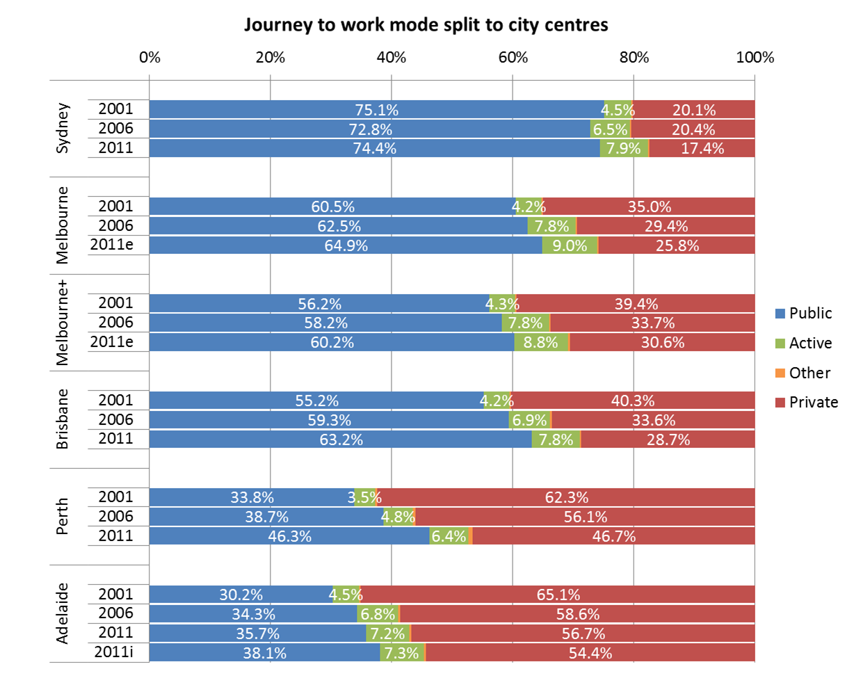
Note:
- as discussed above the central areas for Melbourne and Melbourne+ in 2011 are larger that for in 2001 and 2006
- Adelaide “2011i” refers to central Adelaide excluding North Adelaide.
The chart shows public and active transport mode share increasing in all cities, with the exception of Sydney where there was an increase in private transport use between 2001 and 2006. Public transport dominates in Sydney, Melbourne and Brisbane, with Perth now roughly evenly split between private and public transport, and private transport still being in the majority in central Adelaide. Active transport (walk/cycle) has posted significant gains in all city centres, with Melbourne having the highest share (9.0% in 2011) followed by Sydney (7.9%) and Brisbane (7.8%), with Perth the lowest (6.4%).
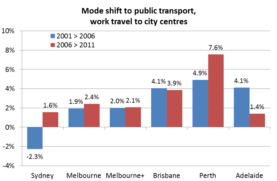
The above chart shows central Perth has having the strongest mode shift to public transport (in no small part due to the opening of the Mandurah rail line in late 2007), followed by Brisbane, and (perhaps surprisingly) then Melbourne (although Melbourne’s poorer performance may be related to the change in geographic boundaries as discussed above). Adelaide and Sydney were the laggards of public transport mode shift between 2006 and 2011.
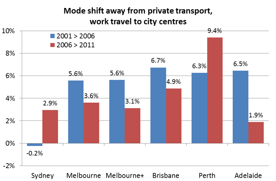
Again, Perth is the stand-out in mode shift away from private transport in 2011.
Here is another look on the above mode split data with a little more detail, assigning each journey a “main mode” (precedence given to train, bus, any other public transport, vehicle driver, vehicle passengers, bicycle, in that order).
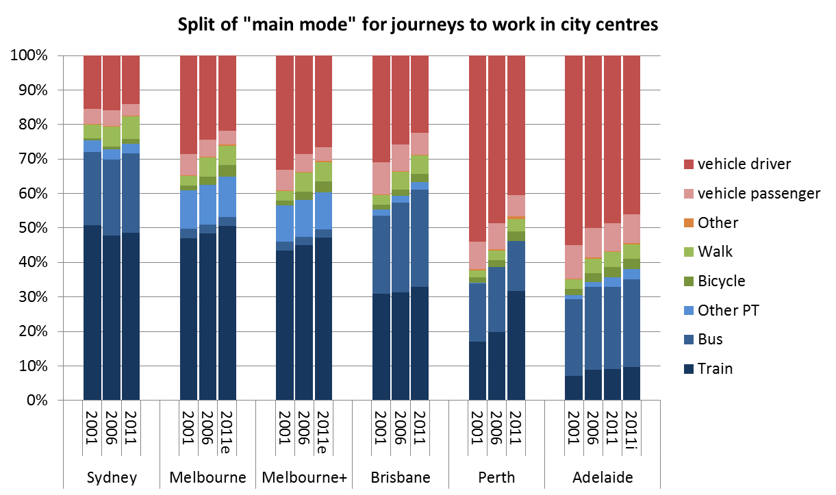
This chart shows trains accounting for around half of all journeys to work in central Sydney and Melbourne and buses being a significant mode in all cities except Melbourne where trams have a significant share. Notably Melbourne’s tram mode share is smaller than all the other cities’ bus mode shares. I note that Sydney is now moving to light rail to try to alleviate CBD bus congestion. Trains delivered less than 10% of central Adelaide commuters to work.
Vehicle passenger journeys are much more common in Adelaide (8.2%) and least common in Sydney, but are in decline in all cities, suggesting a move away from car pooling.
Central Melbourne is the leader in cycling with 3.3% of journeys primarily by bicycle, with Sydney the lowest bicycle share (1.4%).
Number of car journeys to city centres
The following chart shows the absolute change in the number of people whose primary method of journey to work was vehicle driver.

*Caution should be applied for Melbourne, as the 2011 geographic area included additional area that in 2006 (and that areas had a lower public transport mode share in 2006).
The stand-out result is Melbourne+, which indicates a lot more vehicle driver commuter trips generated as Docklands and Southbank employment centres expand. Public transport’s mode share for Southbank and Docklands combined increased from 39.4% in 2006 to 46.8% in 2011, but this was not enough to stop an increase in the overall number of vehicle driver trips. My understanding is that parking costs are generally cheaper in Southbank and Docklands compared to the CBD core.
There was a decline in city centre commuter car parking requirements in Sydney, Brisbane and Perth between 2006 and 2011, while central Adelaide had a substantial increase in vehicle driver commuters (despite some mode shift to public transport), no doubt putting pressure on traffic congestion.
Share of jobs in city centres
Are jobs within metropolitan areas concentrating within city centres? The following chart shows the percentage of metropolitan jobs located within the city centre areas defined above, as well as a wider city centre definition for Brisbane.

Comparing cities is dangerous as there is not a consistent definition of city centre. What the data does show is that central Perth is reducing its share of metropolitan jobs, central Adelaide’s share seems relatively static, central Sydney’s share is growing, and for Melbourne and Brisbane, the central city share is growing but only if you also include nearby employment-focussed areas (Southbank and Docklands for Melbourne, South Brisbane and Fortitude Valley for Brisbane).
In the above analysis I have used my own definitions for metropolitan areas, as ABS have changed from using Statistical Divisions to sometimes larger Greater Capital City Statistical Areas for metropolitan areas. See the appendix at the end of this post for how I have defined metropolitan regions.
Comparing journeys to work inside and outside city centres
Here is a chart comparing 2011 public transport mode shares for journeys to work inside city centres, outside city centres, and for each city overall:

The differences are very stark, but as you might expect as it is generally easier to drive and cheaper to park at workplaces outside the city centre (plus public transport service quality is often lower). Note that many city fringe areas are included in the “outside city centre” figures, and public transport mode shares are generally higher in these areas, and lower further out. You can see the mode share for trips to workplaces outside “Melbourne+” (Melbourne + Southbank + Docklands) is only 9%.
Here’s the trend for public transport mode share to destinations outside city centres, showing increases between 2006 and 2011 for all cities except Adelaide.

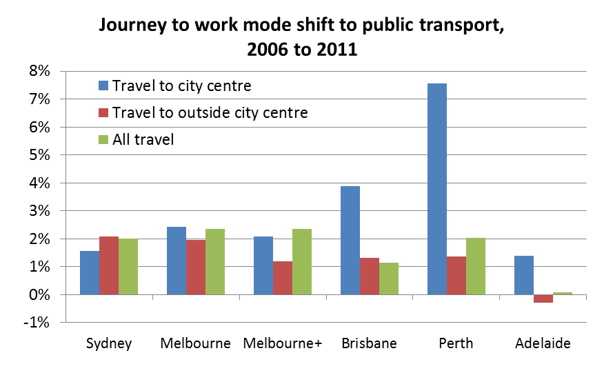
The following chart shows that mode shifts to public transport have been much higher in central city areas for Brisbane, Perth and Adelaide, but not Sydney (low mode shift to both city centre and elsewhere) and Melbourne. Mode shift to public transport outside the “Melbourne+” city centre was just over 1%.
Growth in public transport for journeys to work versus all purposes
The following chart compares the growth in the absolute number of people choosing public transport to get to work (between census 2006 and 2011), versus overall growth in public transport patronage (comparing financial years 2010-11 to 2005-06).

Note: For Brisbane, the overall patronage growth figure refers to all of South East Queensland (SEQ).
In all cities except Melbourne, the number of public transport journeys to work increased faster than overall patronage, suggesting growth in public transport use for other trip purposes was weaker.
Do city centres dominate journeys to work by public transport?
We think of city centres as the main workplace location where people would use public transport to get to work. But is this accurate?

The answer is yes in the smaller cities, no in Sydney, and in Melbourne it depends on whether you include Southbank and Docklands.
Conclusions
We have seen that:
- Public transport is the dominant mode of journeys to work in city centres in the larger cities, but a minority mode in central Adelaide
- Perth has shown the greatest shift to public transport for travel to the central city
- Melbourne has shown the greatest shift to public transport for journeys to work overall
- Melbourne has the highest active transport (and bicycle-only) mode share for journeys to city centres
- In Brisbane, Perth and probably the Melbourne CBD, there was a net decline in private vehicles being driven to city centres for work between 2001 and 2011
- Public transport’s share of journeys to workplaces outside city centres is much lower in all cities
- Mode shift to public transport for journeys to work was higher for city centres except Sydney and Melbourne
- Growth in public transport use for journeys to work was higher than overall public transport patronage growth in all cities except Melbourne
- The central city share of all metropolitan jobs is increasing in Sydney, Melbourne (when Southbank and Docklands are included), and to a lessor extent Adelaide. Central Perth and Brisbane are declining in their share of metropolitan jobs.
- Most public transport journeys to work in the smaller cities are to the city centre, but this is not the case for Sydney and Melbourne (without Southbank and Docklands)
Appendix: Common definitions of city metropolitan regions 2001-2011
The change in ABS geography makes it difficult to have a fair time series estimate of the total number of jobs in each metropolitan area. To try for maximum consistency across the change, I have calculated the number of jobs in each city as follows:
Melbourne: Melbourne Statistical Division, plus Shire of Yarra Ranges – Part B (ie includes all of the Shire of Yarra Ranges)
Perth: Perth Statistical Division plus the City of Mandurah (which was incorporated into the Greater Perth definition in 2011)
Brisbane: The Greater Brisbane Capital City Geographic Area, which for 2006 was approximated by the Brisbane Statistical Division plus the SLAs of Beaudesert Part C, Beenleigh, Bethania-Waterford, Boonah, Eagleby, Edens Landing-Holmview, Esk, Kilcoy, Laidley, Mt Warren Park and Wolfdene-Bahrs Scrub.
Sydney: there are very few differences between the Sydney Statistical Division and Greater Sydney, so I assumed equivalence.
Adelaide: All LGAs in the Adelaide Statistical Division, including all parts of the Adelaide Hills Council.


It would be great to see this kind of analysis for the other concentrations of employment in each city (to the extent that there are such concentrations outside central city areas).
LikeLike
Another good piece of analysis Chris.
Your remark about tram mode share for city centre travel in Melbourne being lower than the bus mode share in other cities I think has a simple explanation. First, the tram catchment in Melbourne is smaller than the bus catchment in other cities. Second, other cities have much greater use of buses for journeys which in Melbourne would be made by train. Compared with other cities Melbourne has relatively fewer long-distance commuter trips by bus, and more by train (as your chart makes fairly clear). And I believe Sydney would have a much higher ‘train’ share at the expense of bus if it hadn’t allowed its train service to deteriorate so much after the Olympics (likely the main cause of the shift away from PT to 2006).
LikeLike
Perhaps one explanation for Sydney’s PT mode share stats between 2001 and 2006 is that there were numerous timetable changes and service cuts to train services and some lines were most likely operating at above capacity (I think the Western line is always above capacity) hence the problems with dwell times at stations etc.
If the trains are full, you can’t grow the service.
Cityrail (or Sydney Trains) are changing the timetables and adding mroe services. That’s likely to grow train share even more.
LikeLike
Very late but I’m curious to find out the figures for “Global Sydney”, aka Sydney + North Sydney.
Thanks
LikeLike